breakdown & review: taco bell mobile app
TRANSCRIPT


This is the first thing that showed up after I downloaded and opened the application.

This is the first thing that showed up after I downloaded and opened the application.
This is smart of Taco Bell to take advantage of push notifications. At any time, they can reach out to customers to inform them of deals and basically work on maintaining brand loyalty.

The app allows gives two options to sign up either through Facebook or email.

The app allows gives two options to sign up either through Facebook or email.
Users are also allowed to skip this entirely if they are not interested and just want to order food immediately.

This is the screen you are taken to if you selected to sign up by email.

This is the screen you are taken to if you selected to sign up by email.
Basic form with very minimal information requested to allow users to easily sign up.

This is the screen displayed after you signed up or if you skipped the sign up.

The app employs an “endless” scrolling screen where you scroll down to see all the offers and menu categories.

What I like don’t is when you try to tap on either of these two images, it does nothing. To me this is a waste of screen realty.

I do not see a purpose in telling me to tap below to order. Why not a “tap here to order” instead? This should be the first image screen.

I do not see a purpose in telling me to tap below to order. Why not a “tap here to order” instead? This should be the first image screen.
As a user, when I open the mobile app, I want to be able to order immediately instead of having to scroll all the way down to order.

I have to make a few scrolls before I can reach the section that offers a “menu” of the categories of food I can order.
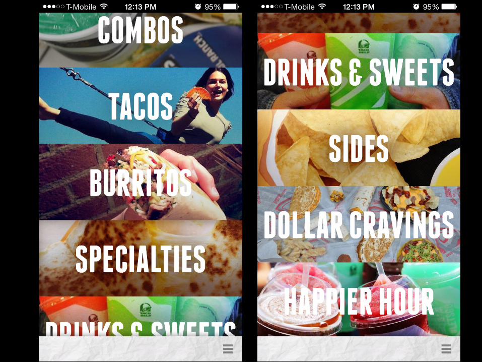

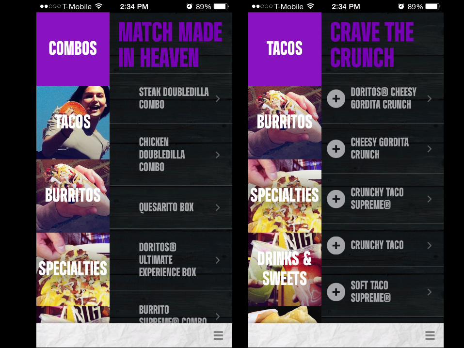
When you click on a category, a menu slides out showing the menu item available.

As you continue scrolling down the menu on the right, it will smoothly transition into the next “category” and displays the menu items for the next category.

Ordering is simple.

Ordering is simple.
The app tells you what ingredients are in the item so you can determine if you want to modify your item.

Adding extra ingredients to your item is simple. Just select the “add-ons” tab and check the box of the extra you want.

The “shopping cart” screen is easy to understand. Clicking on the item gives me the option to “remove item”

The “shopping cart” screen is easy to understand. Clicking on the item gives me the option to “remove item”

Payment is relatively easy. There are only two methods provided. One method is with a Taco Bell card and the other is with your credit/debit card.

Conclusion

• The app made online ordering a breeze.

• The app made online ordering a breeze.• I tested the ease of pick up through both the
drive-through and inside the restaurant. Both transactions were quick.

• The app made online ordering a breeze.• I tested the ease of pick up through both the
drive-through and inside the restaurant. Both transactions were quick.
• The app takes the pain out of waiting in line to order and you have the whole menu right in the palm of your hand.

• The most important feature that I personally liked is the fact that you get to see what ingredients are in each item and you are able to customize it by taking out or adding on ingredients.