bre's portfolio
DESCRIPTION
My portfolio of my work through the past 3 years of my degree.TRANSCRIPT
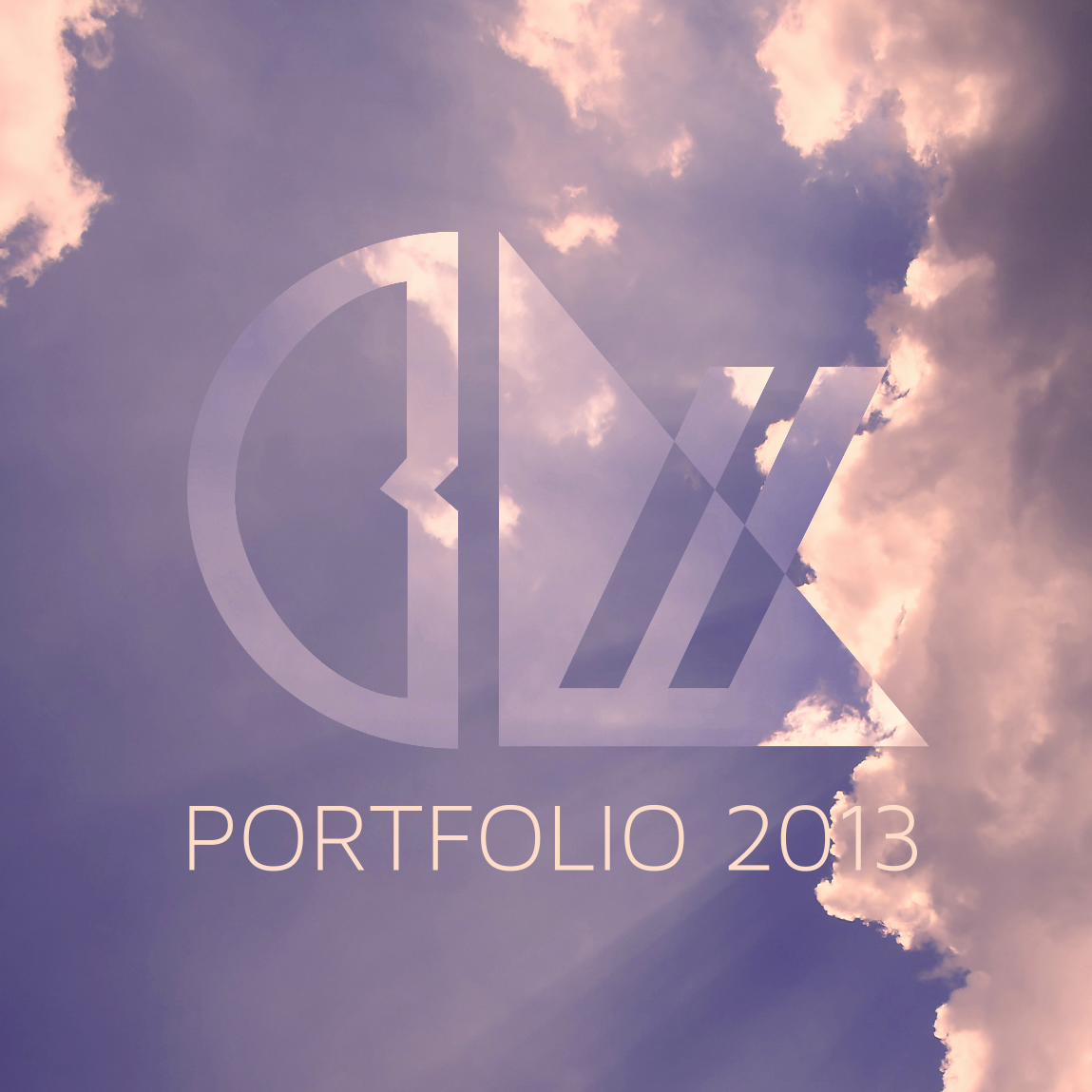
PORTFOLIO 2013
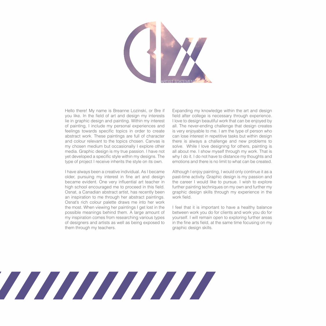
ARTIST STATEMENT
Expanding my knowledge within the art and design field after college is necessary through experience. I love to design beautiful work that can be enjoyed by all. The never-ending challenge that design creates is very enjoyable to me. I am the type of person who can lose interest in repetitive tasks but within design there is always a challenge and new problems to solve. While I love designing for others, painting is all about me. I show myself through my work. That is why I do it. I do not have to distance my thoughts and emotions and there is no limit to what can be created.
Although I enjoy painting, I would only continue it as a past-time activity. Graphic design is my passion and the career I would like to pursue. I wish to explore further painting techniques on my own and further my graphic design skills through my experience in the work field.
I feel that it is important to have a healthy balance between work you do for clients and work you do for yourself. I will remain open to exploring further areas in the fine arts field, at the same time focusing on my graphic design skills.
Hello there! My name is Breanne Lozinski, or Bre if you like. In the field of art and design my interests lie in graphic design and painting. Within my interest of painting, I include my personal experiences and feelings towards specific topics in order to create abstract work. These paintings are full of character and colour relevant to the topics chosen. Canvas is my chosen medium but occasionally I explore other media. Graphic design is my true passion. I have not yet developed a specific style within my designs. The type of project I receive inherits the style on its own.
I have always been a creative individual. As I became older, pursuing my interest in fine art and design became evident. One very influential art teacher in high school encouraged me to proceed in this field. Osnat, a Canadian abstract artist, has recently been an inspiration to me through her abstract paintings. Osnat’s rich colour palette draws me into her work the most. When viewing her paintings I get lost in the possible meanings behind them. A large amount of my inspiration comes from researching various types of designers and artists as well as being exposed to them through my teachers.

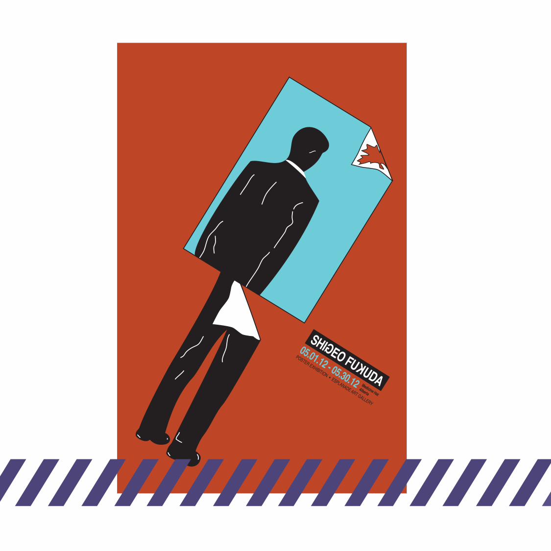

FUKUDA SHIGEOConcept Poster
I incorporated some of Fukuda Shigeo’s design concepts to create an exhibition poster to promote his work. I chose red for the background because it is a popular colour in much of his works.
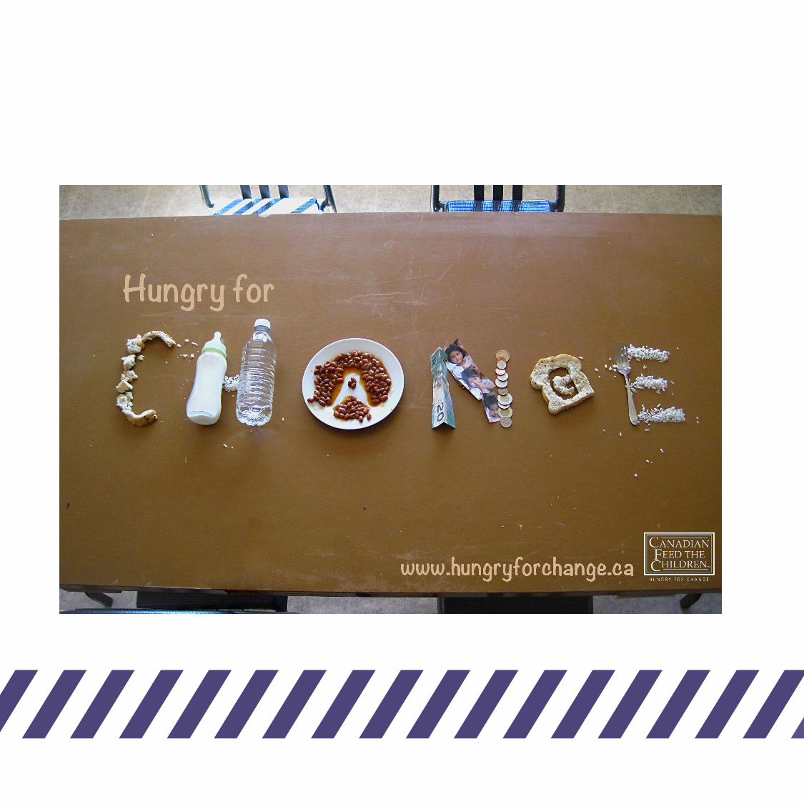

Handmade Typeface
Using everyday objects and food, this ad for the “Canadian Feed the Children” organization was created. I used their pre-existing slogan and manipulated the food and objects to create the word “Change”.
HUNGRY FOR CHANGE
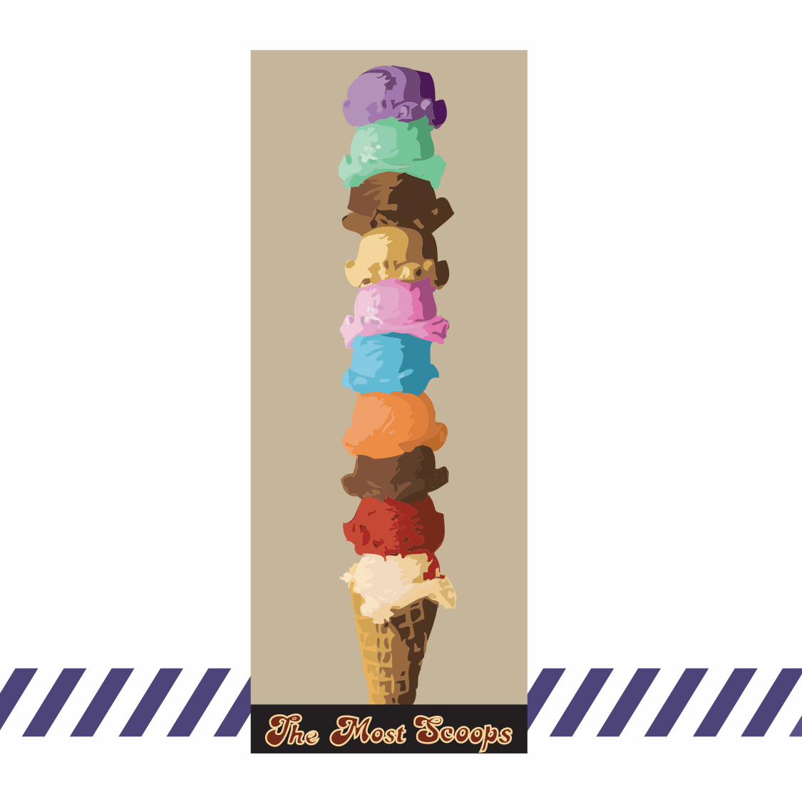

DELICIOUSColour Concept
Colour is a major focus in this layout. I used multiple colours to express ice cream flavours in an eye-catching image. Emphasis of the colours was attained by implementing a tan backgound.
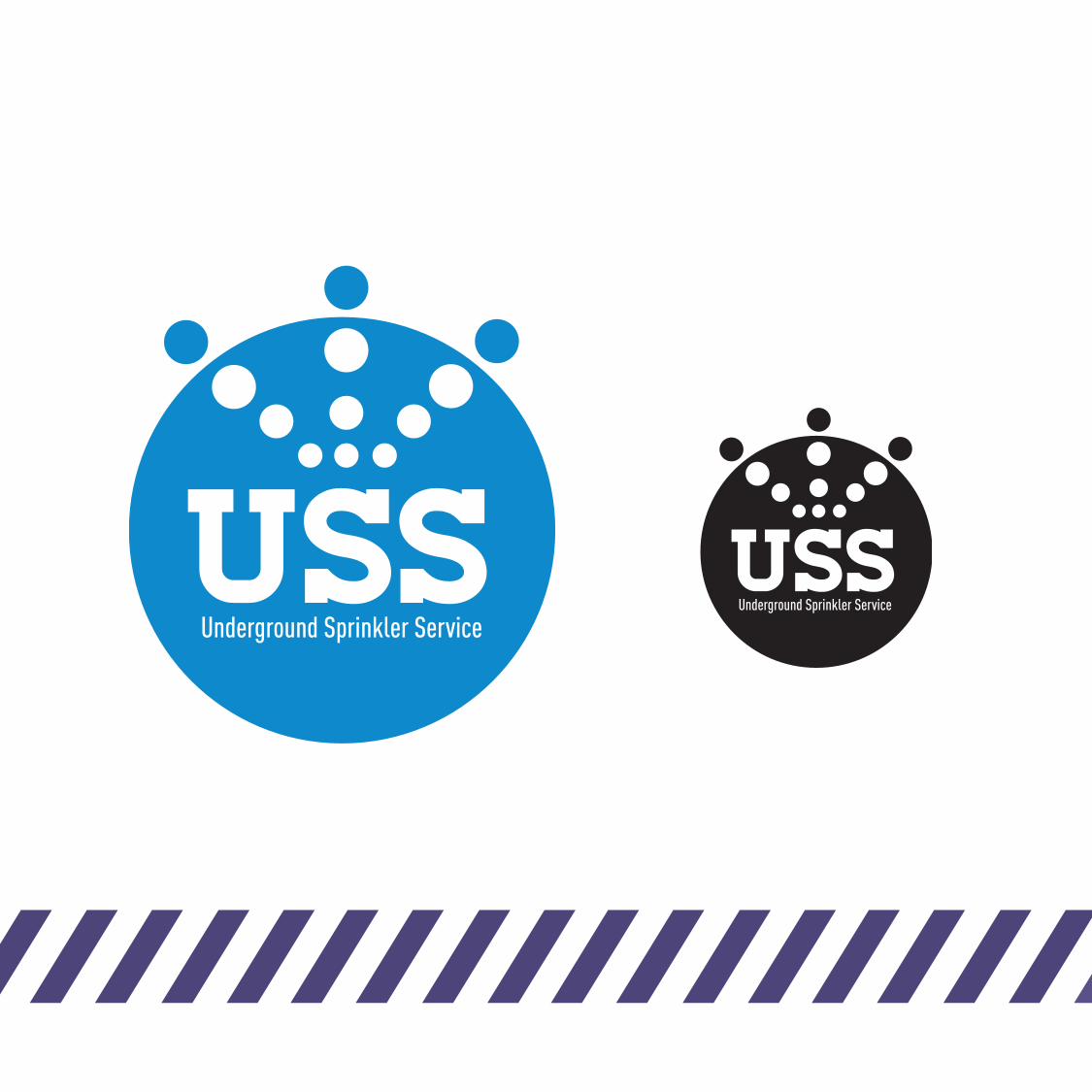

Logo Design
Using a minimal approach, I represented water droplets from a sprinkler within this logo. Blue represents water so it seemed the perfect colour to use.
UNDERGROUND SPRINKLER SERVICE
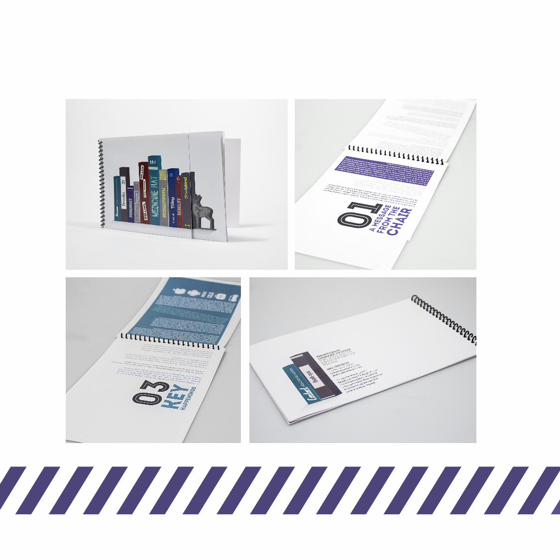
Editorial Design
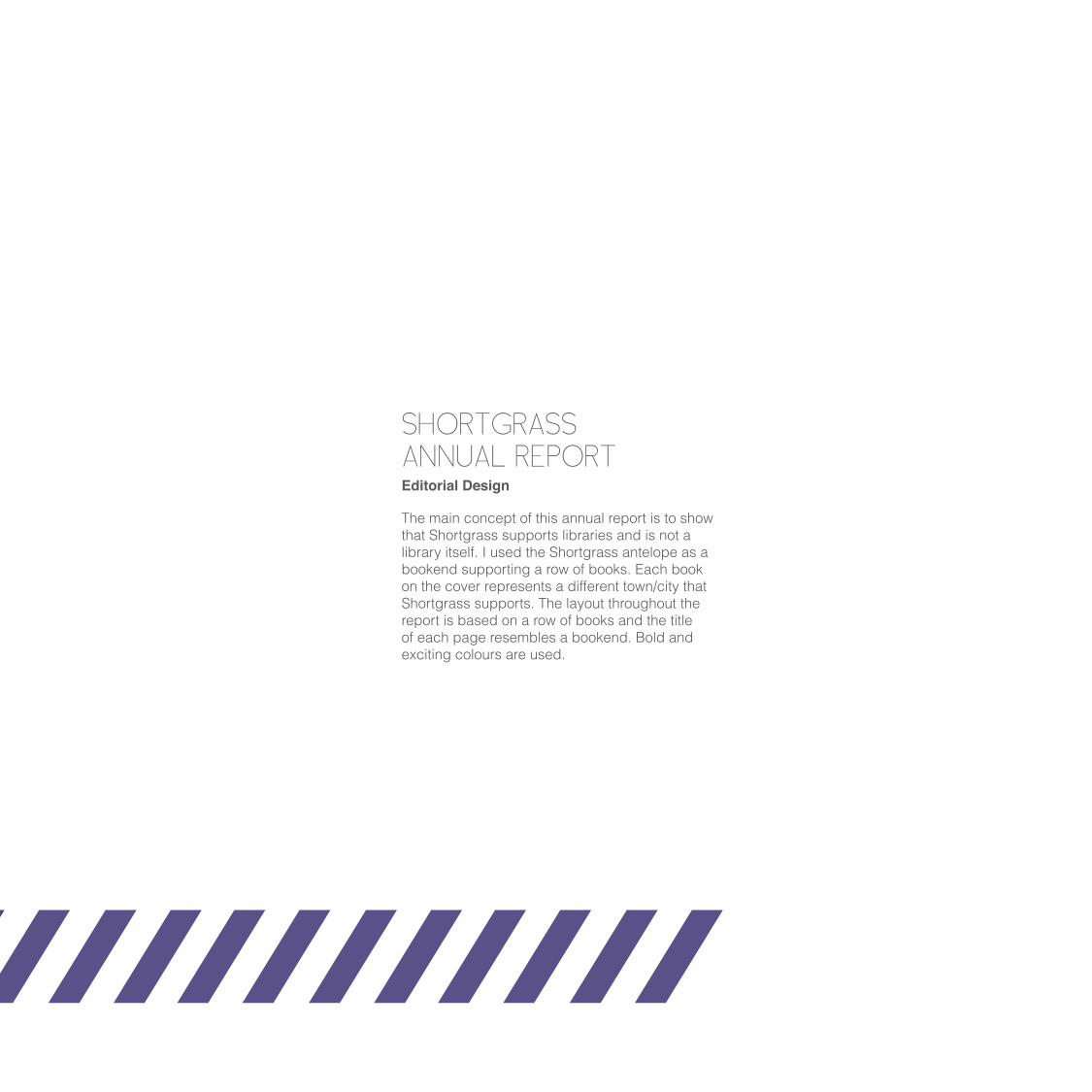
The main concept of this annual report is to show that Shortgrass supports libraries and is not a library itself. I used the Shortgrass antelope as a bookend supporting a row of books. Each book on the cover represents a different town/city that Shortgrass supports. The layout throughout the report is based on a row of books and the title of each page resembles a bookend. Bold and exciting colours are used.
SHORTGRASSANNUAL REPORT
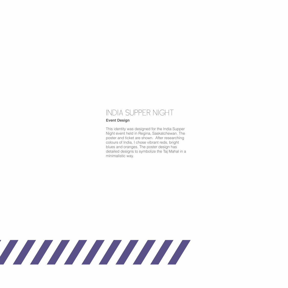
Event Design
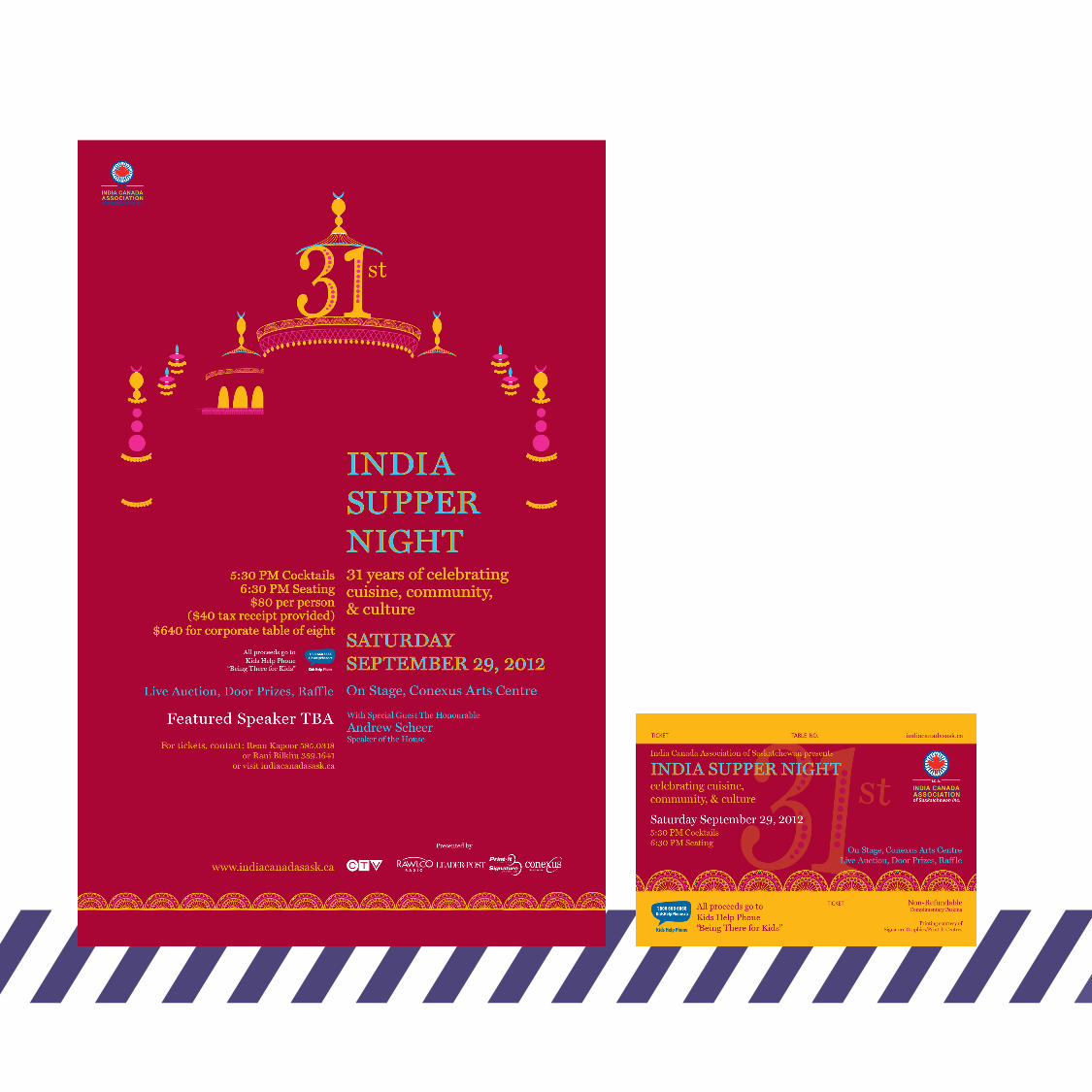
This identity was designed for the India Supper Night event held in Regina, Saskatchewan. The poster and ticket are shown. After researching colours of India, I chose vibrant reds, bright blues and oranges. The poster design has detailed designs to symbolize the Taj Mahal in a minimalistic way.
INDIA SUPPER NIGHT
N o t h i n g n e a r t h e o r d i n a r y .
B o x f y s h D e s i g n s
w w w . b o x f y s h . c a 5 0 9 S k a S t . M e d i c i n e H a t 1 . 4 0 3 . 5 6 3 . 8 2 2 5
B o x f y s h D e s i g n s

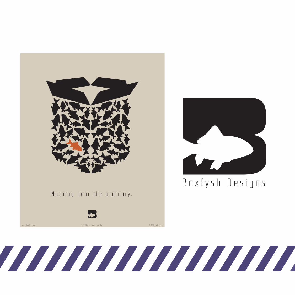
BOXFYSH DESIGNLogo/Poster Concept
Boxfysh Design is an imaginary design company that I created. The idea behind this company is to show that nothing is near the ordinary and plays upon the saying: “There are plenty of fish in the sea”. For the logo I used an uppercase B with a negative space fish. The poster highlights my theme “Standing out from the crowd”. It shows a unique fish among the crowd.

REFLECTAbstract Painting 5’ x 5’
This abstract painting is a reflection of my thoughts. In a crazy mess of randomness; organization and calmness is revealed. I chose warm browns, purples and greens with hits of distinct colours. These colours attract and carry the eye around the painting.
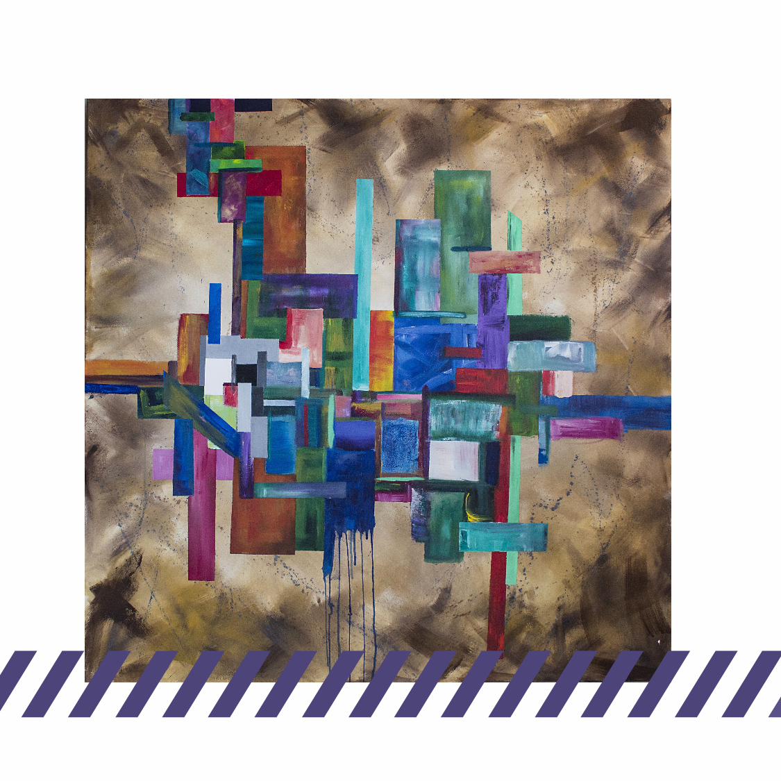
THE CITYAbstract Painting 5’ x 5’
The geometric shapes juxtaposed onto a brushed brown background allows the colours to pop. Although not intentional, this abstract painting resembles a city landscape.
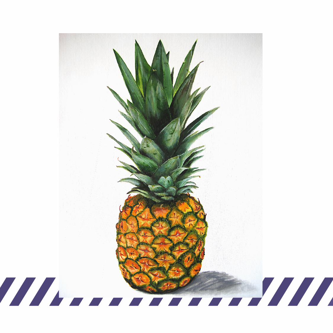
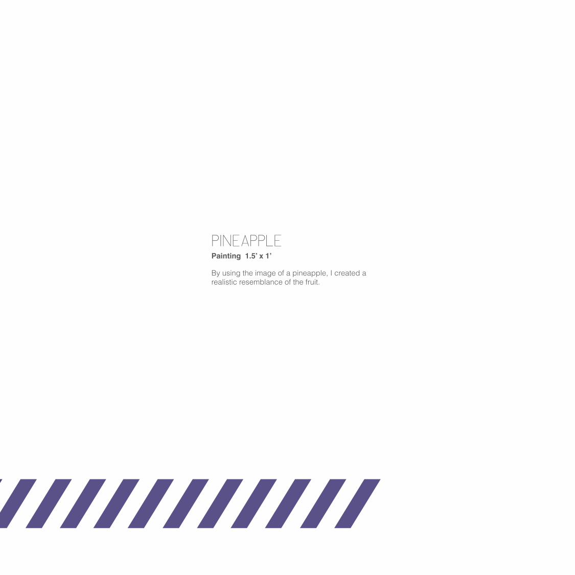
PINEAPPLEPainting 1.5’ x 1’
By using the image of a pineapple, I created a realistic resemblance of the fruit.
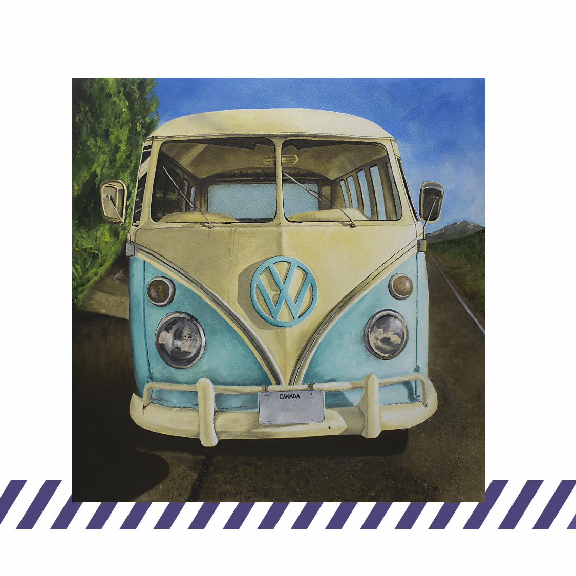

VOLKSWAGONPainting 3’ x 3’
This painting of a Volkswagon is one piece from a three piece series. The series focuses on recognizing vintage transportation.
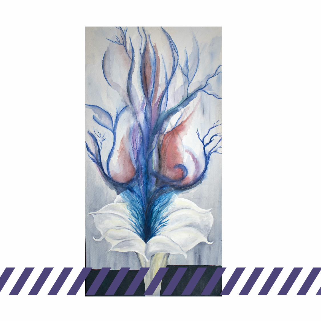

TRANSLUCENT VAPOURPainting 2’ 6” x 1’ 6”
Influenced by Georgia O’Keefe, this painting was created. I wanted to capture her translucent sense of colour. Translucent fumes are being released from a version of Georgia’s flowers.

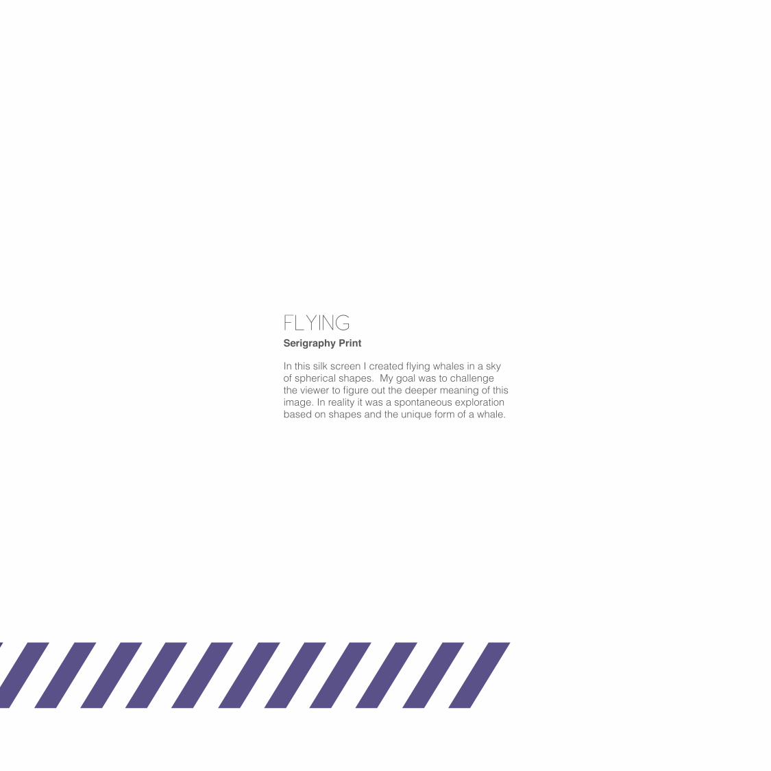
FLYINGSerigraphy Print
In this silk screen I created flying whales in a sky of spherical shapes. My goal was to challenge the viewer to figure out the deeper meaning of this image. In reality it was a spontaneous exploration based on shapes and the unique form of a whale.
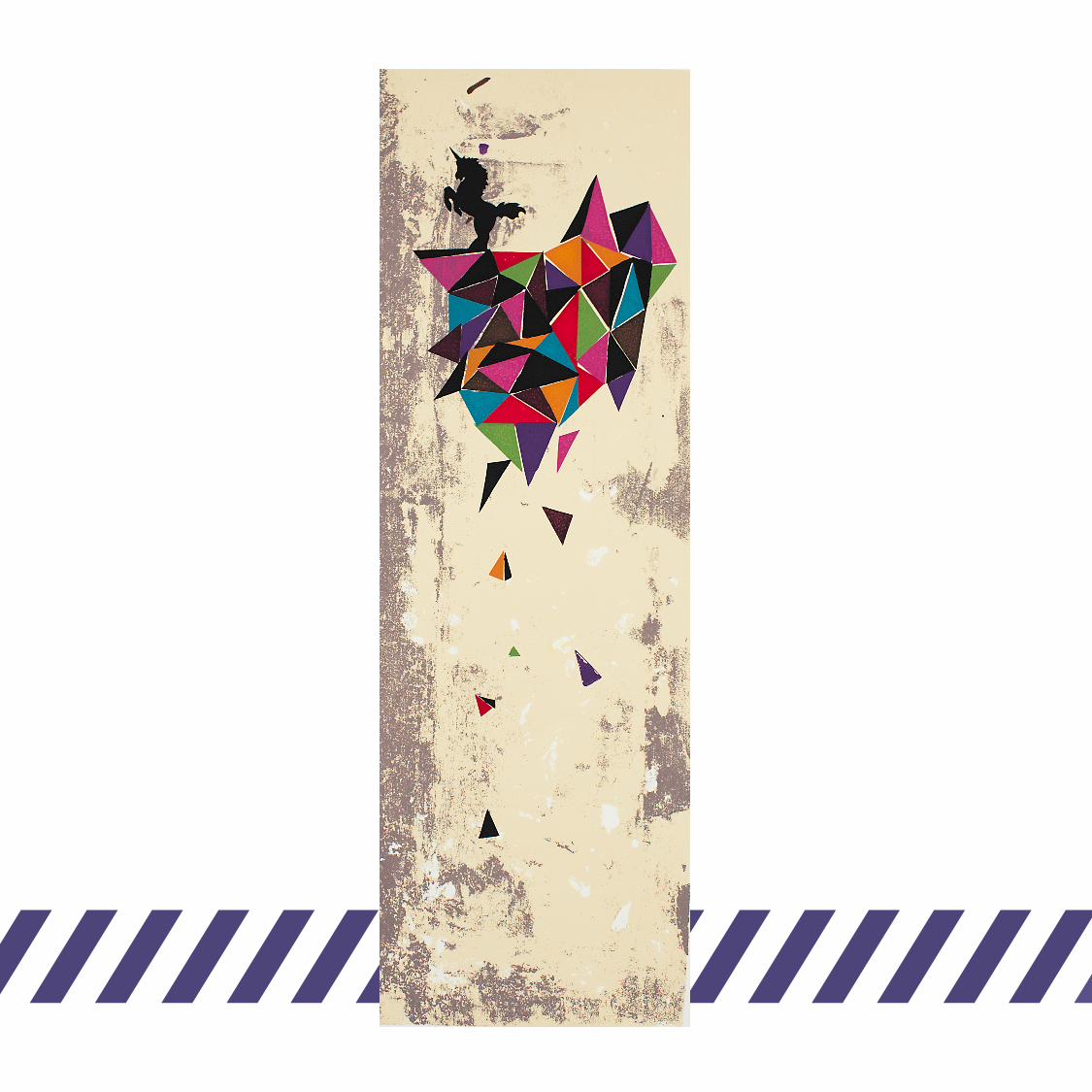
TRIUMPHSerigraphy Print
The basis of this idea is that of a floating island. I made the island of triangles with vibrant colours juxtaposed with solid black triangles. It is printed in a tall format with a textured background. A unicorn stands on the floating island in a triumphant manner.

DEERFOXSerigraphy Mono print
I wanted to explore the idea of integrating two animals into one and so the Deerfox was born. The Deerfox consists of deer antlers on a fox head. I juxtaposed the Deerfox on an abstract background full of textures. The forest was my inspiration for the background and colour scheme.