bridgei2i - dashboard and a cake walk
TRANSCRIPT

Dashboards & A
‘CAKE WALK’
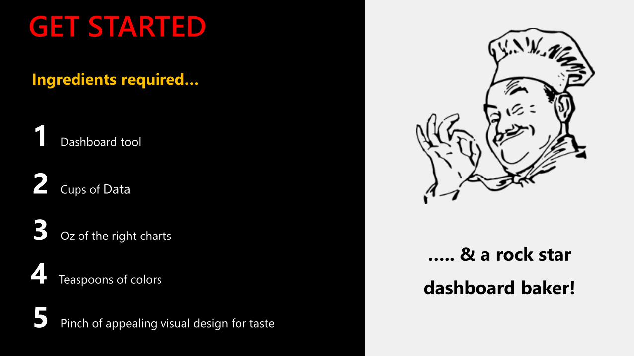
GET STARTED
Ingredients required…
2 Cups of Data
3 Oz of the right charts
4 Teaspoons of colors
5 Pinch of appealing visual design for taste
1 Dashboard tool
….. & a rock star
dashboard baker!

So, let’s start baking?

Source the right data for your dashboard STEP
#1
Your visualization tells the story
of your data. You cannot
empower business users with
decision making capabilities
with suspect or erroneous data
and limited context. Get the data
right and you’re on your way to
baking that perfect dashboard!
Ever heard of anyone
baking a cake with
cucumbers, peppers
and mustard?
No? Exactly!
“Data is what distinguishes the dilettante from the artist”- George V. Higgins
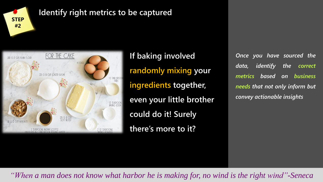
Identify right metrics to be captured STEP
#2
If baking involved
randomly mixing your
ingredients together,
even your little brother
could do it! Surely
there’s more to it?
“When a man does not know what harbor he is making for, no wind is the right wind”-Seneca
Once you have sourced the
data, identify the correct
metrics based on business
needs that not only inform but
convey actionable insights

Choose right charts to correctly communicate
your story STEP
#3
A master chef chooses
the layers of his cake
carefully to bring out his
intended flavors
“In the end that was the choice you made, and it doesn't matter how hard it was to make it”-Cassandra Clare
Identify compelling charts that
help users interpret the data
quickly and easily – what use
is a pie that doesn’t satisfy?

Variety is not always the spice of life
How about a raspberry
infused banana apple
chocolate cake topped
with cherries and hot
fudge? Sounds good? I
think not!
“Too many cooks spoil the broth” – Jane Austen
STEP
#4
Use visualizations that work
best, rather than introducing
meaningless variety.
Sometimes, simple design can
make a CUSTOMER HAPPY !!

Take that ‘EXTRA’ care for colors shapes and sizes
What use is a misshapen
cake that sticks out like a
sore thumb? If you’ve
taken the effort to make
it, wouldn’t you go the
extra mile to make sure
it looks just right?
“Color is like cooking. The cook puts in more or less salt, that's the difference” – Joseph Albers
STEP
#5
Look for incongruity in your
dashboards – colors that don’t
fit the same palette, wildly
varying font sizes, red and
green charts that don’t have a
negative and positive
connotation.

Good looks are everything, but placement of data
also matters
Would you want to
dig the cherry and
icing from within the
cake? Or would prefer
it right on top?
“The goal is to arrange the data in the manner that fits the way its used” – Stephen Few
STEP
#6
Important information should
lead from the top left corner of
the dashboard, and then flow
seamlessly across it, revealing
insights as you go.
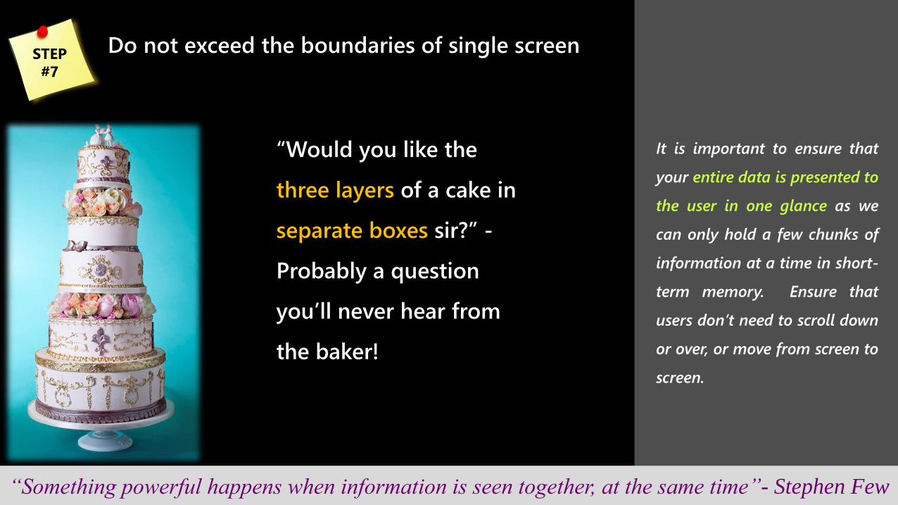
Do not exceed the boundaries of single screen
“Would you like the
three layers of a cake in
separate boxes sir?” -
Probably a question
you’ll never hear from
the baker!
“Something powerful happens when information is seen together, at the same time”- Stephen Few
STEP
#7
It is important to ensure that
your entire data is presented to
the user in one glance as we
can only hold a few chunks of
information at a time in short-
term memory. Ensure that
users don’t need to scroll down
or over, or move from screen to
screen.

Finally, avoid unnecessary artistic efforts
or decoration
Munched onto that
plastic rose on the cake
and couldn’t take
another bite?
“If a diagram is worth 1000 words, then it’s worth 1000 words of our attention” – Edward Tufte
STEP
#8
AVOID 3d effect charts, meters,
stretched graphs, time period
selector that looks like manual
switch etc.
Graphics dedicated to this end
are pure decoration, visual
content that the viewer must
process to get to the data.
The secrets to creating effective
dashboards are out now!
So what’s stopping you?
13
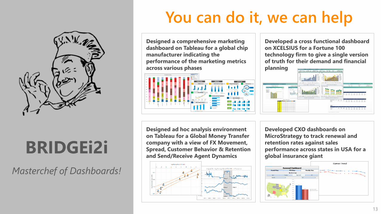
BRIDGEi2i
Masterchef of Dashboards!
Designed a comprehensive marketing
dashboard on Tableau for a global chip
manufacturer indicating the
performance of the marketing metrics
across various phases
Developed a cross functional dashboard
on XCELSIUS for a Fortune 100
technology firm to give a single version
of truth for their demand and financial
planning
You can do it, we can help
Designed ad hoc analysis environment
on Tableau for a Global Money Transfer
company with a view of FX Movement,
Spread, Customer Behavior & Retention
and Send/Receive Agent Dynamics
Developed CXO dashboards on
MicroStrategy to track renewal and
retention rates against sales
performance across states in USA for a
global insurance giant
14
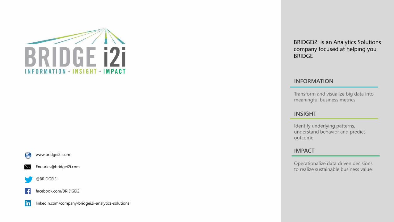
BRIDGEi2i is an Analytics Solutions
company focused at helping you
BRIDGE
Transform and visualize big data into
meaningful business metrics
INFORMATION
Identify underlying patterns,
understand behavior and predict
outcome
INSIGHT
Operationalize data driven decisions
to realize sustainable business value
IMPACT www.bridgei2i.com
@BRIDGEi2i
facebook.com/BRIDGEi2i
linkedin.com/company/bridgei2i-analytics-solutions