building delightful online user experiences
TRANSCRIPT

http://www.hclib.org
BUILDING DELIGHTFUL
ONLINE USER
EXPERIENCES
Amy M. Drayer
Senior IT Developer
Front end developer focused on UX
Amy Luedtke
Senior Librarian
Web content
librarian
#delightfulUX2015

http://www.hclib.org
PROFILE
41 locations spanning 611 square
miles
1.2 million residents
Nearly 840,000 total library cards in
use.

http://www.hclib.org
PROFILE
5 million collection items, including
books, eBooks and more, in 40-plus
languages
1.6 million item records
Almost 15.9 million visits to public
website

http://www.hclib.org
SirsiDynix Horizon (in-library built ILS API)
Sitecore content management system
Solr, LDAP, and SQL databases
ColdFusion/ASP.NET and Perl
Twitter Bootstrap and jQuery
Git code management
Content vendors with APIs
Syndetics, NoveList, OverDrive, BookLens
4-5 developers
4-5 content librarians
Web design firm (for initial launch)
TOOLS
TEAM
#delightfulUX2015

http://www.hclib.org
DELIGHTFUL?
REALLY?
Empower users to do and find what they want - not what
we assume they want
Clean design, easy-to-use
Positive user experience
#delightfulUX2015

http://www.hclib.org#delightfulUX2015

http://www.hclib.org
WEBSITE CHANGES
Responsive design for mobile accessibility
User-centered focus on core tasks
Catalog fully integrated into website
More robust search
Focus on library information and resources
Less audience-based navigation
Fewer links to non-library websites
#delightfulUX2015

http://www.hclib.org
KEY
CONSIDERATIONS
What are the core decision points for patrons?
What labels will work best for the most users?
#delightfulUX2015

http://www.hclib.org
USER
ENGAGEMENT
How are we in conversation with patrons and staff about
catalog and website?
Iterative process of ongoing dialogue and change
#delightfulUX2015

http://www.hclib.org
BE PREPARED
What will users ask?
Where and when and how will they ask?
How will you respond?
#delightfulUX2015

http://www.hclib.org
WHAT?
Why the change?
Where did you move what I want?
What about my access? (technology, habit)
What about me?
#delightfulUX2015

http://www.hclib.org
THERE’S A TIME
AND PLACE
What will you tell users before, during, and after
change?
How will you have these conversations?
#delightfulUX2015

http://www.hclib.org
WHO & HOW
Who will respond to questions and troubleshoot?
How will you track and coordinate response?
#delightfulUX2015

http://www.hclib.org
FEEDBACK PROCESS
#delightfulUX2015

http://www.hclib.org
Staff previews with bug reporting form
3 rounds of internal usability
1 semester with University usability class
1 month public beta preview with bug
reporting form
Online bug reporting form
PRE-LAUNCH
(CATALOG ONLY)
AT LAUNCH
FEEDBACK PROCESS Input
#delightfulUX2015

http://www.hclib.org
Monthly usability tests
Collaboration with U of MN usability class
“Ask Us” online customer service
Comments and feedback online form
Social media
Google Analytics
(existing “to do” list)
ONGOING
FEEDBACK PROCESS Input
#delightfulUX2015

http://www.hclib.org#delightfulUX2015

http://www.hclib.org
1. All feedback stored in a large electronic spreadsheet
2. Feedback is sorted into urgency and priority by small team of three that
meets weekly
Bugs are reported and fixed immediately (unless it requires
additional staff and deliberation)
3. Team writes a Project Initiation Document and adds an entry in
SharePoint project site
4. Resources (personnel) are assigned and timeline outlined
5. Discuss the feature with stakeholders and design mockups
6. Developers work with content editors to create the feature
7. Quality assurance testing (and usability testing if timed well)
8. Launch
FEEDBACK PROCESS Analysis and implementation
#delightfulUX2015

http://www.hclib.org
Search (not a page unto itself)
Search engine results page (SERP)
Record display
My Account
Login
Summary
Items out
Requests
Fines
My lists
My reviews
My authors
Account settings
THE PAGES
#delightfulUX2015

http://www.hclib.org
SEARCH
#delightfulUX2015

http://www.hclib.org
“All” searchSEARCH
Desktop
Mobile
#delightfulUX2015

http://www.hclib.org
Search tabs need reconsideration. This has now been
changed for mobile.
Pros and cons to Google-style search, especially when it
doesn’t include all the content.
“Catalog” label is (was) important to some.
Search box should always be visible. This is now true on
mobile.
“All” searchSEARCH
#delightfulUX2015

http://www.hclib.org
New searchSEARCH
Desktop
Mobile
#delightfulUX2015

http://www.hclib.org
People have a love-hate relationship with the modal, but no
one misses the “New search” button.
New searchSEARCH
#delightfulUX2015

http://www.hclib.org
LimitsSEARCHDesktop Mobile

http://www.hclib.org
Digital users want digital holdings broken down to specific
formats.
“Checked in at” means “owning library” to some, but this
represents available now copies only.
Subject (Genre, Topic, Place, Time Period) not utilized
enough because they are particularly difficult to grasp.
LimitsSEARCH
#delightfulUX2015

http://www.hclib.org
SEARCH RESULTS
(SERP)
#delightfulUX2015
http://www.hclib.org
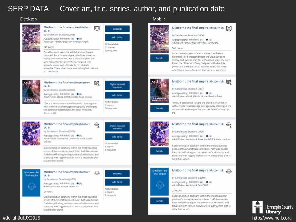
Cover art, title, series, author, and publication dateSERP DATA
#delightfulUX2015
Desktop Mobile

http://www.hclib.org
Cover art requires more vertical space, which means more
scrolling.
Cover art adds load “weight” causing concern for user
patience and mobile limited data plans.
Series links are overlooked but were even less visible under
the author statement.
Despite displaying series information with the title, people
still often use publication date to determine book sequence.
Cover art, title, series, author, and publication dateSERP DATA
#delightfulUX2015

http://www.hclib.org
Ratings and reviewsBOOKLENS
#delightfulUX2015

http://www.hclib.org
Presenting the three rating possibilities - average rating,
predicted rating, and your rating – is not clear.
Ratings and reviewsBOOKLENS
#delightfulUX2015

http://www.hclib.org
Collection, duration, and summarySERP DATA
#delightfulUX2015
Desktop Mobile

http://www.hclib.org
Call numbers only display if inside the library so the correct
call number is shown.
Digital formats are included after the collection statement.
Is this now too much data?
Collection, duration, and summarySERP DATA
#delightfulUX2015

http://www.hclib.org
AvailabilitySERP DATA
#delightfulUX2015

http://www.hclib.org
What does available mean?
AvailabilitySERP DATA
#delightfulUX2015

http://www.hclib.org
Title status (logged in)SERP DATA
#delightfulUX2015

http://www.hclib.org
Thought this might have had more impact than we have
heard.
Finding text that conveys all that data on a button next to the
functionality took some effort.
Title status (logged in)SERP DATA
#delightfulUX2015

http://www.hclib.org
ADD TO LISTS
Desktop Mobile
#delightfulUX2015

http://www.hclib.org
Label Possibilities: Add to List, Save For Later, Add to
Wishlist, Add to Bookbag, Add to Cart
Hard to offer full set of features with fewest clicks for all user
levels.
ADD TO LISTS
#delightfulUX2015

http://www.hclib.org
RECORD DISPLAY
#delightfulUX2015

http://www.hclib.org
DetailsRECORD DISPLAY
Desktop Mobile
#delightfulUX2015

http://www.hclib.org
Using external content alongside internal content can be
difficult to present seamlessly.
Is it better to offer the “most useful” data or all the data for
the user to decide what is most useful for them?
Lexile data needs to be searchable to be truly helpful.
DetailsRECORD DISPLAY
#delightfulUX2015

http://www.hclib.org
You may also likeRECORD DISPLAY
Desktop Mobile
#delightfulUX2015
http://www.hclib.org
Cover art is a good selling point for recommendations but
not as a delivery means for title/author exclusively.
A small carousel (fewer entries than visible number of slots)
is messy.
You may also likeRECORD DISPLAY
#delightfulUX2015

http://www.hclib.org
MY ACCOUNT
#delightfulUX2015

http://www.hclib.org
SummaryMY ACCOUNT
Desktop Mobile
#delightfulUX2015

http://www.hclib.org
Importance of each box depends on the person and the
content.
In mobile view, scrolling for all the content is less evident.
SummaryMY ACCOUNT
#delightfulUX2015

http://www.hclib.org
Items out and OverDriveMY ACCOUNT
Desktop Mobile
#delightfulUX2015

http://www.hclib.org
What content was most critical to display is subjective.
Mixing physical and digital titles hasn’t caused too much
confusion; however, displaying circulation limits has.
Items out and OverDriveMY ACCOUNT
#delightfulUX2015

http://www.hclib.org#delightfulUX2015
http://www.hclib.org
Amy M. Drayer
Amy Luedtke
Hennepin County Library
http://www.hclib.org
QUESTIONS
#delightfulUX2015