business intelligence asterclass eries dashboards
TRANSCRIPT
Dashboardsthat mean business
Gill Stanilandwith
Business IntelligenceMasterclass Series

● Edward Tufte ● Stephen Few (perceptualedge.com) ● Steve Krug (web usability)
● InformationisBeautiful.net ● many-eyes.com (an IBM Research / Cognos collaboration) ● www.ge.com
● Juice Analytics ● Bona Vista System
Acknowledgements
Dashboards that mean businessii

Contents
About The Author 1Introduction 2Information Is Beautiful VS Information Is Enlightening 4Back To The Beginning 7Seeing Is Believing 10What Not To Do 16Pulling It All Together 21And For Something Different 25
Dashboards that mean business iii

Dashboards that mean business 1
Gill Staniland has been tinkering with data for almost 30 years. From the early days of punch cards and scaling mountains as a land surveyor, she has earned her stripes as a software developer, data warehouse designer, data modeler and Cognos consultant. She now consults on a wide range of BI topics, including business analysis, information architecture, strategy, process, visualisation and BI job design. Gill believes BI is essential to any successful business, and needs to be tackled in a pragmatic, imaginative yet business-relevant way.
BI is that much sought-after bridge between business and IT, making sure that the whole organisation reaps the rewards of all those machines and bytes humming away in the server room.
About The Author
Gill Staniland

Dashboards that mean business2
Every weekday, at 7.30am, Bob the Manager (not his real name), sits down at his desk and takes yet another shot at understanding the dashboard on his computer screen. When George from IT first introduced him to dashboards he knew it was exactly what he needed, even though the on-screen execution was rather bland and uninspiring. Then George left and Judy, his replacement, discovered both the colour palette and an uncanny ability to fit an inordinate number of fiercely clashing hues on one screen. Bob’s early mornings were considerably brighter, but it became increasingly more difficult to navigate his way through the colours to where the actual crucial data was lurking. Judy left and Keith, a master of Flash and all things Powerpoint, read through the dashboard software manual, declared himself up to the task, and now spices up Bob’s daily dashboard with every pie, bar, bullet, graph, sparkline, gauge and clipart illustration at his disposal. Keith makes sure each available pixel of screen space is jam-packed with lines, squiggles, bubbles and blocks that shout out their summaries of the previous day of business. Bob knows there is vital and valuable information contained in those charts; data that can inform his decisions, alert him to negative trends, highlight successes and shape the future of the company. It’s just that deciphering the dashboards makes. him long for the days when daily reports were so late, and thus quite useless, that he at least had the pleasure of feeding them to the shredder. Bob likes the concept of dashboards. He just doesn’t like the one on his computer screen.
That is Bob’s story. It’s also the story of many others who understand and appreciate the significant value and benefits of dashboards, but have been discouraged by their unsatisfactory day-to-day implementation. Instead of being, what dashboard guru Stephen Few defines as “a visual display of the most important information needed to achieve one or more objectives; consolidated and arranged on a single screen so the information can be monitored at a glance”, to form a launching pad for further analysis, navigation and interaction, a poorly executed dashboard can be no more than a confusing collection of statistics.
So what went wrong with Bob’s dashboard? Both he and his technical staff had the will and the tools, but missed a few key steps in the design and execution phases. In the next few pages, we will look at some of the fundamentals of a dashboard that truly delivers.
Introduction
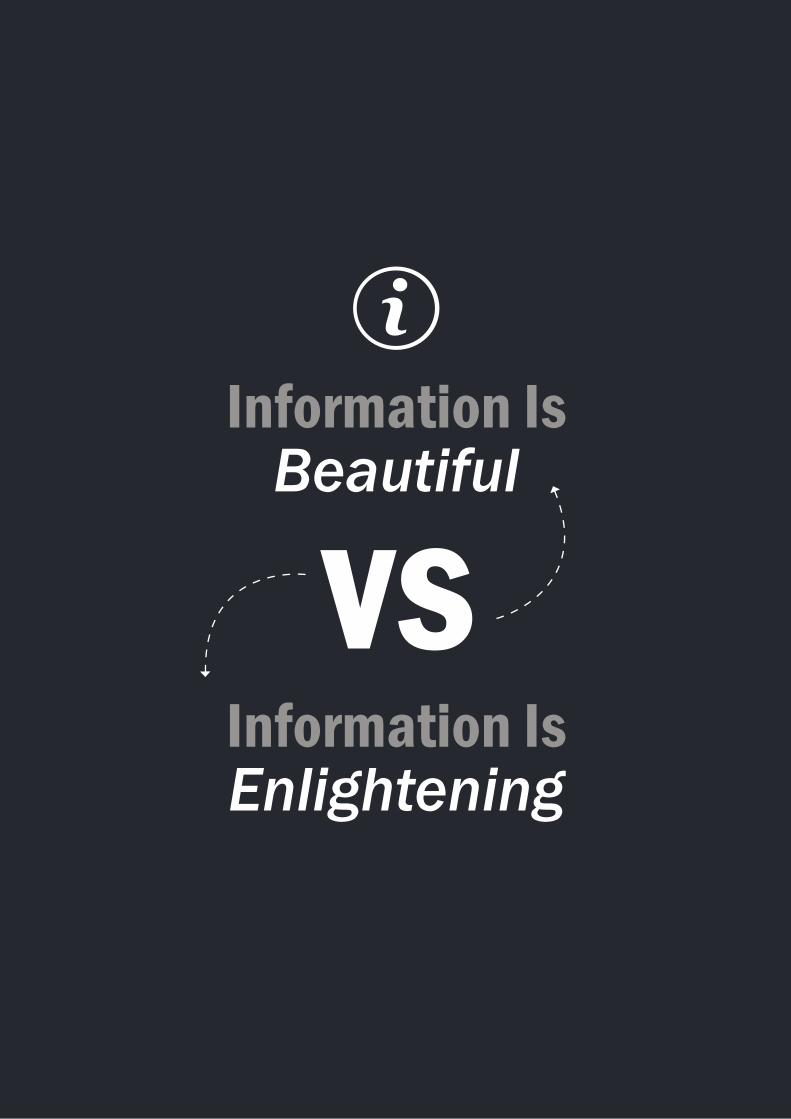
Information Is Beautiful
Information Is Enlightening

Dashboards that mean business4
Before we head off into the what, where and why of dashboards, let’s take a look at Bob’s dashboard experience. Using these industry examples, Bob may have started his day with something like this on his screen:
Information Is Beautiful VS Information Is Enlightening

Dashboards that mean business 5
So we see that George, his initial IT man left a legacy of dull layout, which Judy, his replacement jazzed up with splashes of colour. Bob now had a screen filled with a variety of pigments, but this was no presentation of performance measures that allowed him to monitor the contribution of each department and gauge the overall health of the organisation. Instead, Bob needed to spend more time than he had available to interpret the presentation. Once he figured out that the black block was what everything else had to be compared with, he needed a lot more coffee to work out which of the blocks were bigger, smaller or the same size as others so that he could focus on those that required his immediate intervention. If he had the inclination to wade through them all, Bob undoubtedly would have found the information enlightening.
If Bob had someone who could take the same data and present it in a format that is both enlightening and beautiful, it would paint a strikingly clear picture: pleasing to the eye and intelligently arranged. Judy’s colours remain intact, but George’s blocks make way for bars that need only a glance to reveal a wealth of information, leading Bob to prioritise data so that he can recognise trends and note areas that call for prompt action.
Now Bob’s dashboard is crisp and concise; it is informative, prompts a next move, feels natural (i.e. user-friendly), and provides clarity – ticking all the boxes of what a dashboard should, and could, be.

Back to the beginning

Dashboards that mean business 7
Back To The Beginning
To restore Bob’s confidence in dashboards in general, and his in particular, we’ll walk him through the basics.
First, and foremost, Bob and his IT team or consultants must establish what value the dashboard will bring to the organisation. What they will find is that, when embarking on a dashboard design, it should:
● Help management define what is important; ● Educate people in the organisation about the things that matter; ● Set goals and expectations for specific individuals or groups; ● Encourage specific actions in a timely manner; ● Highlight exceptions and provide alerts when problems occur; ● Communicate progress and success; and ● Provide a common interface for interacting with and analysing important business data.
Next up, they will determine who their audience is. In this case it is Bob the Manager, and so the team will look at:
● What decisions does Bob make? ● What questions does he need answered? ● In what context will he be viewing the dashboard? ● What information is he using on a daily basis? ● How much time does he have to review the numbers? ● How sophisticated is he with using data? ● Is he proficient in multi-dimensional analysis? ● Does he enjoy digging into the numbers?

Dashboards that mean business8
● How familiar is he with the key performance metrics? ● Does he understand where the data comes from? ● Is he familiar with internal company or industry terminology?
Now the team will be able to structure the information to make it super easy to answer high priority questions, and they will ensure that the form and data display fit into Bob’s existing workflow. They will understand that, since Bob spends most of his time in the office, the information must be designed for an online wide-screen monitor (as opposed to a format suitable for an on-the-road sales person using a smartphone). In addition, they will discover that the dashboard’s level of detail and analytical capabilities should match Bob’s comfort zone.
Once the team has established its audience, they can dig deeper into the type of dashboard that is being created.
In consultation with Bob, they will look at the:
● Scope: Is it broad or specific; does Bob need information about the entire organisation, or must they focus on specifics, such as function, process or product.
● Business role: Should the dashboard provide a high-level, broad and long-term view of performance, or a focused, near-term and tactical view?
● Time horizon: Here there are more options, such as looking backwards to track trends; showing performance at a single point in time; monitoring activity as it happens; or using past performance to predict future performance.
● Customisation: Now the team will look at whether they are presenting the data as a single view for all users, or whether Bob will have the functionality to create a view that specifically reflects his needs.
● Level of detail: Will Bob only need the most critical top-level numbers, or will he need the ability to drill down to detailed numbers to gain more context?
● Point of view: Last, but not least, they will decide if the dashboard should explicitly tell Bob what the data means and what to do about it, or if he will have the latitude to interpret the results as he sees it.
It is vital that Bob at this stage has input into the information that will be delivered to him – it is his opportunity to single out what is important for him to know and which pulses his finger needs to be on. This may seem like a logical step, but there are times when an organisation fails to take serious stock of the exact data it requires to fully understand itself and its potential and, more importantly, whether the information will drive productive action. Bob must also be clear on the goals he wants to achieve, as a dashboard filled with graphs but nothing to compare them against, will be a waste of space and time.

Seeing Is Believing

Dashboards that mean business10
At this point it will probably be good for both Bob and his team to explore the principles of visual perception so that the right method is used to relay data in a meaningful and concise way.
A good dashboard design will show Bob how the right visual display can make it much easier to understand the results of complex analytics and increase his adoption. Because of our human ability to understand relationships quickly based on size, position and other spatial attributes, the eye can summarise what may otherwise require thousands of numbers to convey.
As Bob gives shape to the data he requires, his team will have a better idea of which charts and graphs to employ. All graphs aren’t equal, with some better suited to specific data presentation than others. Here are some examples:
Seeing Is Believing
BarsColumns

Dashboards that mean business 11
Lines
Sparklines
Scatterplots
Bubble charts
Bullet charts

Pie charts, gauges and all things circular

Dashboards that mean business 13
Pie charts, gauges and all things circular are best avoided – they are generally hard to read, require vigorous interpretation and take up too much valuable space.
For example, it is almost impossible to draw a meaningful comparison between the different pie segments, whereas the same data, turned into a bar chart, is presented in a clear, concise way that takes up half the space while making it easy to come to an accurate conclusion.
Bob’s team will now know that the same data, presented in two different charts or graphs, can create two independent scenarios.
For example, if Bob wants to see the trend in each of the four regions, a line chart will be the best option, giving him an overall picture without focusing on detail.

Dashboards that mean business14
However, if he wants to compare the performance of each region, then the column graph will fit the bill, giving him a clearer month-by-month indication of the targets reached.
To explore the most beneficial use of the various charts and graphs, the team may find this diagram useful:

What not to do

Dashboards that mean business16
What Not To DoArmed with information, and equipped with tools for the task, Bob and his team will be wise to learn from the mistakes of their own past efforts and, more to the point, not to repeat them. For example, Bob should never again be subjected to a dashboard like any of these:
This sales dashboard fragments the data into many slices, which will require Bob to select individual pieces without any means to see the whole.

Dashboards that mean business 17
The display media on this dashboard appear to have been chosen for the sake of variety rather than based on clear choices of the most appropriate medium for each type of data.
With everything visually prominent, this dashboard will give Bob no clue where to focus.To avoid these pitfalls, Bob’s team will take note of:
Data to ink ratio

Dashboards that mean business18
Maximise the contract between data and the background. The standard Microsoft Excel default chart, for example, makes it more difficult than necessary to distinguish the line from the background. A white background and de-emphasised gridlines can help.
Readable labels
Whenever possible, avoid rotated labels; they are hard to read and distract from focusing on the numbers.
Gradients
Use flat colours or a bare minimum gradient. Ensure that the bar endpoint is visible. When the gradient fades toward the endpoint, it reduces the ability to clearly see the length of the bar.

Dashboards that mean business 19
Sorting
Add structure and clarity to the chart by sorting by a metric of interest.
Avoiding repetition
It is not necessary to have both a legend and a title for single series graphs. Likewise, the title of a chart may suffice to explain what the reader is looking at.
These are but a few hints and tips for visualisation and functionality that will help to create a dashboard to facilitate Bob’s situational awareness and make sense of data that will improve operational efficiency, identify opportunities for growth, and identify and mitigate risks. A final step is to pull it all together:

Pulling it all together

Dashboards that mean business 21
Generally we scan, we don’t read a screen or webpage, so Bob’s team must make sure that they have a clear understanding of the data that must be placed in the most prominent positions on his dashboard. The diagram shows the trend of how we scan for importance, more often starting in the top left-hand corner, going down to the middle and, interestingly, moving back up again. Given this information, it would make little sense to place the company logo in the top left-hand corner of Bob’s dashboard when the latest sales figures are clamouring for his attention.
The best way for the team to start designing a dashboard is with a pen and paper (or whiteboard) – the simple principle is if you can’t draw it, technology isn’t going to help you create it. Bob’s team must have an idea of where they want to place information so that they can show him where they’re heading with their design. While their ideas are on paper, Bob will feel more encouraged to give his input, and more at liberty to move things around to ensure he derives maximum value from the data presentation.
Pulling It All Together

Dashboards that mean business22
Given Bob’s bad experience, the team will be wise to select colour with great care – and to call on the experts if their own sense of colour is questionable. A website such as kuler.adobe.com offers valuable information, free of charge, a small sample of which is shown in this screen grab:
With Bob’s confidence restored, the team can now swing into action and perhaps look at some dashboards that can serve as good examples:
Despite the hole at the bottom of the page, this dashboard makes good use of colour and white space. The main information is at the top, dropping down into more detail. What is particularly good about this dashboard is that there is a story line, a natural flow of data.

Dashboards that mean business 23
Putting the name of the dashboard right at the bottom of the page is a good strategy as it makes way for more important information at the top of the page. Besides, Bob won’t need constant reminding of the name of a dashboard he looks at every day.
This dashboard breaks the norm of a typical frame structure, and places information horizontally. Bob will be drawn to read from left to right; from high level numbers and trends to more and more detail, even linking to related reports.
This is a Synergy BI designed dashboard – crucial data is arranged at the top of the screen and good use of colour, column and bar graphs, as well as sparklines, present substantial information in a clear, easy-to-digest way.

And for something different

Dashboards that mean business 25
This dashboard broke a few rules, but it perfectly suited the organisation’s culture. Despite the graphics and bright colours, there is still enough white space to prevent overcrowding. It also allows for the customer to dig down for more information on specific figures, keeping the screen clutter-free, with only at-a-glance vital data.
Another organisation was quite taken by this design, thought they had a handle on the concept of grids and, assuming that throwing a dashboard together was a simple enough task, came this far before throwing in the towel and calling in the experts who, using the same content – and even some of the same graphics – transformed their effort into this daily offering, connecting information in a meaningful way (after much thought and careful planning):
With a sharpened ability to distinguish between useful, productive information and interesting but extraneous information; a clearer understanding of the function of different graphs and charts, and a renewed appreciation for the correct use of colour and graphics, Bob and his team are well on their way to derive maximum benefit from dashboard technology.
And For Something Different

Dashboards that mean business26
Notes

Dashboards that mean business 27
Notes

Dashboards that mean business28
It would, however, be in their interest to keep referring to the key foundation principles of dashboards to ensure they stay on track, thus giving the organisation a valuable tool to monitor its well-being.
To recap:
Before you, or your team, start throwing charts on a page, make sure you can answer these questions…
● How is the dashboard going to add value to my organisation? ● What type of dashboard am I creating? ● Who is the audience of the dashboard, and what are their needs? ● What is the central thought-line of my dashboard story? ● What are the key metrics that will focus users on actionable information?
And if Bob wanted to make a poster for his office, with a duplicate for his IT team (and a special desktop version for Keith), he’d be hard-pressed to find a more suitable quote than this one from Antoine de Saint-Exuper, who said:
“Perfection is achieved, not when there is nothing more to add, but when there is nothing left to take away.”
Synergy works closely with companies from a wide range of industries, assisting them to use their BI, FPM and Predictive Analytics technology to achieve business goals. Synergy comprises over 90 consultants, with offices in Cape Town, Durban, Johannesburg and Switzerland.
Dashboards that mean business 29
Cape Town1st Floor, Block B, Granger Bay Court,Beach Road, V&A Waterfront,Cape TownTel: 021 425 3430
DurbanSouth Block, 20 Westville Road,Westville, DurbanTel: 031 266 1363
JohannesburgBlock F, EOH Business Park,Gillooly’s View, Osborne Lane, BedfordviewTel: 011 607 8299
Priscilla Doig - Marketing ManagerEml: [email protected]
Websitewww.synergy.co.za
