c copyright 2001 by robert m. kirby ii · this project report describes the work of three projects...
TRANSCRIPT

Abstract of “Visualizing Fluid Flow Data:
From the Canvas to the CAVE” by Robert M. Kirby II, Sc.M., Brown University, May 2001.
Scientific visualization not only expands our understanding of fluid flow phenomena by
allowing us to examine the evolution of different flow quantities, but also it can be used as
a catalyst for the development of mathematical models which describe the time evolution
of complex flows. We believe that the simultaneous examination of multiple flow quantities
can provided a better understanding of the underlying processes of fluid flow.
This project report describes the work of three projects in which I have participated. All
research contained herein had as its end goal the investigation of techniques for visualizing
fluid flow data.
The first project sought to use concepts from painting for visualizing two dimensional
flows. For the two dimensional flow examples, we present visualizations of three flow exam-
ples and observations concerning some of the physical relationships made apparent by the
multi-valued data display technique that we employed.
The second and third projects had as a goal the use of interactive immersive envi-
ronments for studying three dimensional flows. For the three dimensional flow examples,
we describe the development of two components sufficient for interactive immersion in the
Cave. The second project was the implementation of DOGL, an OpenGL-based library for
distributed rendering systems used for distributing geometry for display on our four-wall
immersive display system. The third project was the implementation of a C++ class within
the Jot graphics system for visualizing fluid flow data produced by NεκT αr. An arterial
bypass flow simulation provides a case study for the combination of DOGL and NεκT αr
simulation data for visualizing fluid flow phenomena in 3D using an interactive immersive
viewing environment.

Visualizing Fluid Flow Data:
From the Canvas to the CAVE
by
Robert M. Kirby II
B.S., Applied Mathematics and Computer and Information Sciences, Florida State
University, 1997
Sc.M., Applied Mathematics, Brown University, 1999
A project report submitted in partial fulfillment of the
requirements for the Degree of Master of Science
in the Department of Computer Science at Brown University
Providence, Rhode Island
May 2001

c© Copyright 2001 by Robert M. Kirby II
Abstract
Scientific visualization not only expands our understanding of fluid flow phenomena by
allowing us to examine the evolution of different flow quantities, but also it can be used as
a catalyst for the development of mathematical models which describe the time evolution
of complex flows. We believe that the simultaneous examination of multiple flow quantities
can provided a better understanding of the underlying processes of fluid flow.
This project report describes the work of three projects in which I have participated. All
research contained herein had as its end goal the investigation of techniques for visualizing
fluid flow data.
The first project sought to use concepts from painting for visualizing two dimensional
flows. For the two dimensional flow examples, we present visualizations of three flow exam-
ples and observations concerning some of the physical relationships made apparent by the
multi-valued data display technique that we employed.
The second and third projects had as a goal the use of interactive immersive envi-
ronments for studying three dimensional flows. For the three dimensional flow examples,
we describe the development of two components sufficient for interactive immersion in the
Cave. The second project was the implementation of DOGL, an OpenGL-based library for
distributed rendering systems used for distributing geometry for display on our four-wall
immersive display system. The third project was the implementation of a C++ class within
the Jot graphics system for visualizing fluid flow data produced by NεκT αr. An arterial
bypass flow simulation provides a case study for the combination of DOGL and NεκT αr
simulation data for visualizing fluid flow phenomena in 3D using an interactive immersive
viewing environment.
i
Acknowledgements
Acknowledgments are those things which are often written last but are presented first in
the document. I am truly blessed to have had the opportunity to interact with many people
in my quest for an advanced degree in Computer Science, and for this I am grateful.
First of all, I must express my gratitude to Professor George Em Karniadakis, my Ph.D.
advisor in Applied Mathematics, for affording me the opportunity to work on an advanced
degree in Computer Science while also working on my Ph.D. in Applied Mathematics. He
has both encouraged and supported my collaboration with scientists in Computer Science
and in other fields. My apprenticeship under him has refined my skills as a simulation
scientist.
Secondly, I would like to thank Professor Andries van Dam, my advisor in Computer
Science. From the very beginning, Andy made me feel “part of the team”; I was not
considered an Applied Mathematician trying to do Computer Science, but rather I was
respected and encouraged as a simulation scientist who could combine skills in both areas.
Andy continually encouraged me to seek out those things which I do well, and do them
better; to objectively see those areas which need improvement, and to refine them. His
mentoring is very much appreciated.
Thirdly, I would like to thank Professor David Laidlaw of Computer Science. When I
was starting my collaborative work with Computer Science, Andy encouraged me to work
with “the new faculty member” David Laidlaw. Shortly thereafter Andy sent me to IEEE
Vis’98 as part of the STC team from Brown. While at Vis, during the banquet dinner,
I was able to finally meet up with David. After enjoying a nice dinner, we spoke the
remainder of the evening about scientific visualization. It was during that meeting that
our future collaboration, and our friendship, was birthed. I have had the opportunity to
interact with David on many different levels – as a student in the classroom, as co-author
on several papers, as consultant on a variety of projects, and most importantly, as a friend.
His scientific insight, his humor, his candor, and most of all his friendship are greatly
ii

appreciated.
I would like to thank those who have worked with me on the projects outlined in this
report: Andy Forsberg for his assistance on a multitude of things, among them being my
primary contact with the graphics group, Jon Reiter for his help with DOGL and the user-
study, and Dr. Spencer Sherwin for providing me with the arterial bypass graft mesh and
providing me with insight into the flow dynamics of the arterial bypass graft fluid flow
simulation. I would also like to acknowledge and thank the following for their help: Sam
Fulcomer, George Loriot, Loring Holden, Joe LaViola, Dr. Haralambos Marmanis, Dr. Tim
Warburton and Dr. Constantinos Evangelinos.
iii

Contents
List of Figures vi
1 Introduction 1
1.1 Objective . . . . . . . . . . . . . . . . . . . . . . . . . . . . . . . . . . . . . 1
1.1.1 Visualizing Fluid Flow Using Concepts from Painting . . . . . . . . 2
1.1.2 Visualizing Fluid Flow Using Immersive Environments . . . . . . . . 3
1.2 Breakdown . . . . . . . . . . . . . . . . . . . . . . . . . . . . . . . . . . . . 4
2 Visualizing Fluid Flow with Concepts from Painting 5
2.1 Related Work . . . . . . . . . . . . . . . . . . . . . . . . . . . . . . . . . . . 5
2.1.1 Multi-valued Data Visualization . . . . . . . . . . . . . . . . . . . . 5
2.1.2 Flow Visualization . . . . . . . . . . . . . . . . . . . . . . . . . . . . 6
2.1.3 Computer Graphics Painting . . . . . . . . . . . . . . . . . . . . . . 7
2.2 Visualization methodology . . . . . . . . . . . . . . . . . . . . . . . . . . . . 7
2.3 Example 1: Rate of strain tensor . . . . . . . . . . . . . . . . . . . . . . . . 9
2.3.1 Data breakdown . . . . . . . . . . . . . . . . . . . . . . . . . . . . . 9
2.3.2 Visualization design . . . . . . . . . . . . . . . . . . . . . . . . . . . 10
2.3.3 Observations . . . . . . . . . . . . . . . . . . . . . . . . . . . . . . . 11
2.4 Example 2: Turbulent charge and turbulent current . . . . . . . . . . . . . 12
2.4.1 Data breakdown . . . . . . . . . . . . . . . . . . . . . . . . . . . . . 13
2.4.2 Visualization design . . . . . . . . . . . . . . . . . . . . . . . . . . . 14
2.4.3 Observations . . . . . . . . . . . . . . . . . . . . . . . . . . . . . . . 15
2.5 Preliminary User-Study Results . . . . . . . . . . . . . . . . . . . . . . . . . 16
2.6 Summary . . . . . . . . . . . . . . . . . . . . . . . . . . . . . . . . . . . . . 17
3 DOGL - Distributed OpenGL using MPI 19
3.1 Motivation . . . . . . . . . . . . . . . . . . . . . . . . . . . . . . . . . . . . 19
iv

3.2 Related Work on Distributed Rendering . . . . . . . . . . . . . . . . . . . . 20
Scenegraph Approach . . . . . . . . . . . . . . . . . . . . . . . . . . 20
Broadcast OpenGL Approach . . . . . . . . . . . . . . . . . . . . . . 20
3.3 Design . . . . . . . . . . . . . . . . . . . . . . . . . . . . . . . . . . . . . . . 21
3.4 MPI . . . . . . . . . . . . . . . . . . . . . . . . . . . . . . . . . . . . . . . . 22
3.4.1 Simplicity of DOGL-MPI Programming Model . . . . . . . . . . . . 23
3.4.2 Portability of DOGL-MPI Programming Model . . . . . . . . . . . . 24
3.5 Implementation . . . . . . . . . . . . . . . . . . . . . . . . . . . . . . . . . . 24
3.6 Utilization . . . . . . . . . . . . . . . . . . . . . . . . . . . . . . . . . . . . . 26
3.6.1 Code modifications . . . . . . . . . . . . . . . . . . . . . . . . . . . . 26
3.6.2 Overriding Broadcast Behavior . . . . . . . . . . . . . . . . . . . . . 27
3.6.3 Running a DOGL program . . . . . . . . . . . . . . . . . . . . . . . 28
3.7 Results . . . . . . . . . . . . . . . . . . . . . . . . . . . . . . . . . . . . . . . 28
4 Arterial Flow in a Bypass Graft: A Case Study 31
4.1 Immersive Environments for Scientific Visualization . . . . . . . . . . . . . 31
4.2 Problem Statement . . . . . . . . . . . . . . . . . . . . . . . . . . . . . . . . 32
4.3 Simulating Complex-Geometry Flows with NεκT αr . . . . . . . . . . . . 33
4.4 Simulation/Visualization Coupling . . . . . . . . . . . . . . . . . . . . . . . 34
4.5 A Virtual Cardiovascular Laboratory . . . . . . . . . . . . . . . . . . . . . . 34
5 Summary and Conclusions 39
5.1 Lessons Learned . . . . . . . . . . . . . . . . . . . . . . . . . . . . . . . . . 40
Bibliography 42
v
List of Figures
1.1 Typical visualization methods for 2D flow past a cylinder at Reynolds num-
ber 100. On the left, we show only the velocity field. On the right, we
simultaneously show velocity and vorticity. Vorticity represents the rota-
tional component of the flow. Clockwise vorticity is blue, counterclockwise
yellow. . . . . . . . . . . . . . . . . . . . . . . . . . . . . . . . . . . . . . . . 2
2.1 Visualization of simulated 2D flow past a cylinder at Reynolds number =
100 and 500 (top left and top right) Velocity, vorticity, and rate of strain
(including divergence and shear) are all encoded in the layers of this image.
With all six values at each point visible, the image shows relationships among
the values that can verify known properties of a particular flow or suggest
new relationships between derived quantities. . . . . . . . . . . . . . . . . . 8
2.2 Visualization of the turbulent charge and the turbulent current for a Reynolds
number 500 simulated flow. Observe that charge concentrates near the cylin-
der and is negligible in other parts the flow. The cylinder geometry is now
white to contrast with the visual representation for the turbulent sources . 13
2.3 Close up visualization of the turbulent charge and the turbulent current
at Reynolds number 100 and 500 (left and right). We are able to see the
high concentrations of negative charge at the places where vorticity is being
generated. . . . . . . . . . . . . . . . . . . . . . . . . . . . . . . . . . . . . . 13
2.4 Combination of velocity, vorticity, rate of strain, turbulent charge and tur-
bulent current for Reynolds number 100 flow. A total of nine values are
simultaneously displayed. . . . . . . . . . . . . . . . . . . . . . . . . . . . . 16
3.1 Diagram denoting the relationship between the DOGL server and clients. . 23
3.2 Frames per second verses packet size for various triangle numbers using the
IBM switch in userspace mode. . . . . . . . . . . . . . . . . . . . . . . . . 29
vi

3.3 Frames per second verses triangle count for various packet sizes using the
IBM switch in userspace mode. . . . . . . . . . . . . . . . . . . . . . . . . 30
4.1 One image from an angiogram showing the “bird’s eye” view that doctors
are typically limited to. These angiograms give an excellent image of where
problems lie, but are not very reliable indicators of the genesis of lesions. . 32
4.2 Image created in tecplot showing a typical visualization that might be used
to explore simulated flow data within an artery. The top image shows the
geometry in wireframe while the bottom image shows wall shear stress mag-
nitude mapped to the vessel surface. Exploration using tools like tecplot are
less interactive than the immersive visualization environment we describe. . 33
4.3 A view of the immersive artery visualization looking at the bifurcation where
the graft enters the original artery. The visualization is within a 4-wall cave,
with head-tracked stereo. A gestural interface provide easily-learned interac-
tion techniques for navigating through the environment and for studying the
flow. . . . . . . . . . . . . . . . . . . . . . . . . . . . . . . . . . . . . . . . . 35
4.4 When the user looks down a toolbelt appears. Tools include dust, for advect-
ing particles through the flow; a widget for choosing wall coloring; a round
alkaseltzer widget for creating a persistent source of advecting particles; an
isosurface “microphone” widget (the square cube here); and a streamline and
rake widget. . . . . . . . . . . . . . . . . . . . . . . . . . . . . . . . . . . . . 36
4.5 Wall shear stress is encoded in wall color, with blue showing low values, green
midrange values, and red high values. Regions of low shear stress tend to be
correlated with sites of future lesions. . . . . . . . . . . . . . . . . . . . . . . 37
vii

Chapter 1
Introduction
The numerical simulation of fluid flow phenomena has become a scientific tool used for
discovery and understanding of the principles which govern fluid flow. The data produced
by numerical simulations is often processed using a variety of techniques whose purpose is
to enhance our understanding of the physical phenomena. One increasingly common tech-
nique is visualization for developing physical intuition of mathematically defined quantities.
Scientific visualization not only expands our understanding of fluid flow phenomena by al-
lowing us to examine the evolution of flow quantities, but also it provides a catalyst for the
development of mathematical models which describe the time evolution of complex flows.
1.1 Objective
The simultaneous display of fluid quantities can be accomplished in many ways. We have
chosen to investigate two particular methods: using concepts from painting for visualizing
multi-valued data for two dimensional flows, and using immersive environments for visualiz-
ing fluid flow data for three dimensional flows. The first project’s focus was the visualization
of two dimensional fluid flow data. The objective of the first project was to provide the
seamless integration of multiple flow quantities into one visualization. Independent of the
first project, the second and third projects focused on the visualization of three dimensional
fluid flow data. Our objective was to utilize our four-walled interactive, immersive envi-
ronment, referred to as a Cave 1, for fluid flow visualizations of simulation data produced
by the computational fluid dynamics code NεκT αr [1]. A description of the particular
objectives of both viewing methodologies is presented below.1Here we use the term Cave to refer to our CAVE-style derivative of the original CAVE developed at theUniversity of Illinois’ Electronic Visualization Laboratory.
1

2
Figure 1.1: Typical visualization methods for 2D flow past a cylinder at Reynolds number100. On the left, we show only the velocity field. On the right, we simultaneously showvelocity and vorticity. Vorticity represents the rotational component of the flow. Clockwisevorticity is blue, counterclockwise yellow.
1.1.1 Visualizing Fluid Flow Using Concepts from Painting
The simultaneous examination of multiple flow quantities can provided a better understand-
ing of the underlying processes of fluid flow. In addition to the examination of the primitive
variables, i.e., the velocity and the pressure, the examination of derived quantities has pro-
vided a better understanding of the underlying processes of fluid flow.
Vorticity, a quantity denoting the rotational tendency of the fluid, is a classic example
of a mathematical construct which provides information not immediately assimilated by
merely viewing the velocity field. In Figure 1.1, we illustrate this idea. When examining
only the velocity field, it is difficult to see that there is a rotational component of the flow in
the wake region downstream of the cylinder. However when vorticity is combined with the
velocity field the underlying dynamics of vortex generation and advection is more apparent.
Though vorticity cannot be measured directly, its relevance to fluid flow was recognized
as early as 1858 with Helmholtz’s pioneering work. Vorticity as a physical concept is not
necessarily intuitive to all, yet visualizations of experiments demonstrate its usefulness, and
hence account for its popularity. Vorticity is derived from velocity, and vice versa under
certain constraints [2]. Hence, vorticity does not give any new information that was not
already available from the velocity field, but it does emphasize the rotational component of
the flow. The latter is clearly demonstrated in Figure 1.1, where the rotational component
is not apparent when one merely views the velocity.
In the same way that vorticity as a derived quantity provides us with additional infor-
mation about the flow characteristics, other derived quantities such as the rate of strain
tensor, the turbulent charge and the turbulent current (all of which are defined in Chapter
3) could be of equal use. Because the examination of the rate of strain tensor, the turbulent
3
charge and the turbulent current within the fluids community is relatively new, few people
have ever seen visualizations of these quantities in well-known fluid mechanics problems.
Simultaneous display of the velocity and quantities derived from it is done both to allow the
CFD researcher to examine these new quantities against the canvas of previously examined
and understood quantities, and also to allow the researcher to accelerate the understanding
of these new quantities by visually correlating them with well known fluid phenomena.
To demonstrate the application of these concepts, we present visualizations of a geome-
try that, although simple in form, demonstrates many of the major concepts which motivate
our work. By examining the well studied problem of flow past a cylinder we demonstrate
the usefulness of the visualizations in a context familiar to most fluids researchers. We
examined two-dimensional direct numerical simulation of flow past a cylinder for Reynolds
number 100 and 500 [3]. This range of Reynolds numbers provides sufficient phenomeno-
logical variation to allow us to discuss the impact of visualization of the newly visualized
quantities.
We extended the visualization methods presented in [4] to problems in fluid mechanics.
As in [4], we sought representations that are inspired by the brush strokes artists apply in
layers to create an oil painting. We copied the idea of using a primed canvas or underpaint-
ing that shows through the layers of strokes. Rules borrowed from art guided our choice
of colors, texture, visual elements, composition, and focus to represent data components.
Our new methods simultaneously display 6-9 data values, qualitatively representing the un-
derlying phenomena, emphasizing different data values to different degrees, and displaying
different portions of the data from different viewing distances.
1.1.2 Visualizing Fluid Flow Using Immersive Environments
To investigate the use of interactive immersive environments for the interaction with and the
visualization of three dimensional fluid flow data, we chose to study the fluid flow patterns of
an arterial bypass graft. Coronary artery grafts regularly fail for unknown reasons, requiring
repeated heart surgeries and often causing heart failure. Medical imaging modalities provide
varying views of these arteries, via x-ray angiography, ultrasound, and magnetic resonance
imaging, but simulation of the flow of blood in the vessels holds significant potential for
understanding why these grafts fail. We combined the simulation capability of NεκT αr,
a CFD code for simulating fluid flow in complex three-dimensional time dependent domains
with the interaction and visualization software “Jot”, an in-house interactive 3D graphics
system. In our attempts to use this interactive software environment in our four-wall Cave,
4
we had tremendous difficulty in successfully displaying on all four walls simultaneously,
the primary problems being synchronization and latency issues. To this end, we developed
DOGL to begin to address the distributed rendering problem at our facility where we are
driving our four-wall Cave with four or more graphics adapters in multiple nodes of our
IBM SP running AIX. DOGL is an acronym for “Distributed OpenGL” and describes our
approach to addressing the problem: all OpenGL calls from one process are intercepted
and are subsequently broadcast to multiple graphics adapters. DOGL also allows OpenGL
calls to be explicitly sent to individual graphics adapters. After the development of DOGL,
we were able to combine it with Jot-NεκT αr for successfully visualizing, in the Cave,
the fluid flow simulation of an arterial bypass graft. In this project report we present both
the design and implementation of DOGL and a discussion of the arterial bypass graft case
study for which it was used.
1.2 Breakdown
In Chapter 2 we describe the painting-motivated method we employed for visualizing two di-
mensional fluid flow data, with specific details concerning the combination of scalar, vector,
and tensor data into one visualization. We present fluid flow examples where multi-valued
data visualization of two dimensional fluid flow phenomena was used. In Chapter 3 we
present a description of the design and implementation of DOGL, the distributed OpenGL
software used to allow Jot to display in our four-wall interactive immersive viewing envi-
ronment. In Chapter 4 we present a case study of combining NεκT αr, Jot and DOGL
for the immersive viewing of and interaction with an arterial bypass graph fluids simula-
tion. We briefly describe the biological problem, the numerical simulation methodology,
and the immersive virtual Cave environment. In Chapter 5 we conclude by summarizing
the contributions of this project report, with specific emphasis to which components of this
multi-person work were specifically mine, along with presenting the lessons learned from
these endeavors.
Chapter 2
Visualizing Fluid Flow with
Concepts from Painting
Artists have the ability to take a tremendous amount of information and compose it into
a painting. Even the simplest of paintings can consist of many pieces of information, all
interconnected and intertwined in such a way that it presents a cohesive whole. Scientific
visualization can be viewed as the simultaneous display of many quantities, which the
objective being to display the information in such a way that the inherent structure and
interconnection between the different quantities is apparent. We desired to extend concepts
from painting to fluid flow visualization.
2.1 Related Work
2.1.1 Multi-valued Data Visualization
Hesselink et al. [5] give an overview of research issues in visualization of vector and tensor
fields. While they describe several methods that apply to specific problems, primarily
for vector fields, the underlying data are still difficult to comprehend; this is particularly
true for tensor fields. The authors suggest that “feature-based” methods, i.e., those that
visually represent only important data values, are the most promising research areas, and
our approach embraces this idea.
Statistical methods such as principal component analysis (PCA) [6] and eigenimage
filtering [7] can be used to reduce the number of relevant values in multi-valued data. In
reducing the dimensionality, these methods inevitably lose information from the data. Our
approach complements these data-reduction methods by increasing the number of data
5

6
values that can be visually represented.
Different visual attributes of icons can be used to represent each value of a multi-
valued dataset. In [8], temperature, pressure, and velocity of injected plastic are mapped
to geometric prisms that sparsely cover the volume of a mold. Similarly, in [9] data values
were mapped to icons of faces: features like the curve of the mouth or size of the eyes
encoded different values. In both cases, the icons capture many values simultaneously but
can obscure the continuous nature of fields. A more continuous representation using small
line segment-based icons shows multiple values more continuously [10]. Our work builds
upon these earlier types of iconic visual representation.
Layering has been used in scientific visualization to show multiple items: in [11, 12],
transparent stroked textures show surfaces without completely obscuring what is behind
them. These results are related to ours, but our application is 2D, and so our layering is
not as spatial as in the 3D case. Our layering is more in the spirit of oil painting where
layers are used more broadly, often as an organizing principle.
2.1.2 Flow Visualization
A number of flow-visualization methods display multi-valued data. The examples in [13,
14] combine surface geometries representing cloudiness with volume rendering of arrows
representing wind velocity. In some cases, renderings are also placed on top of an image
of the ground. Unlike our 2D examples, however, the phenomena are 3D and the layering
represents this third spatial dimension. Similarly, in [15], surface particles, or small facets,
are used to visualize 3D flow: the particles are spatially isolated and are again rendered as
3D objects.
A “probe” or parameterized icon can display detailed information for one location within
a 3D flow [16]; it faithfully captures velocity and its derivatives at that location, but does
not display them globally. Our data contain fewer values at each location, because we are
working with 2D flow, but our visualization methods display results globally instead of at
isolated points.
Spot noise [17] and line integral convolution [18] methods generate texture with structure
derived from 2D flow data; the textures show the velocity data but do not directly represent
any additional information, e.g., divergence or shear. The authors of [17] mention that spot
noise can be described as a weighted superposition of many “brush strokes,” but they do
not explore the concept. Our method takes the placement of the strokes to a more carefully
structured level. Of course, placement can be optimized in a more sophisticated manner,

7
as demonstrated in [19]; we would like to explore combining these concepts with ours.
Currently our stroke placement is simple and quick to implement while providing adequate
results.
2.1.3 Computer Graphics Painting
Reference [20] was the first to experiment with painterly effects in computer graphics.
Reference [21] extended the approach for animation and further refined the use of layers and
brush strokes characteristic for creating effective imagery. Both of these efforts were aimed
toward creating art, however, and not toward scientific visualization. Along similar lines,
references [22, 23, 24] used software to create pen and ink illustrations for artistic purposes.
The pen and ink approach has successfully been applied to 2D tensor visualization in [25].
In reference [4], painterly concepts as used in our work were presented for visualizing
diffusion tensor images of the mouse spinal cord. In that work both a motivation and a
methodology for the techniques used here were presented. The goal of our work was to
visualize simultaneously both new and commonly used scientific quantities within the field
of fluid mechanics by building on those concepts.
2.2 Visualization methodology
The work described here was presented at IEEE Visualization ’99 in [26]. This work was
build upon the methodology and system of [4]. We review the methodology here. Devel-
oping a visualization method involves breaking the data into components, exploring the
relationships among them, and visually expressing both the components and their relation-
ships. For each example we explored different ways of breaking down the data so that we
could gain understanding as to how the components were related. Once we achieved an
initial understanding, we proceeded to the next step: designing a visual representation.
In the design, we used artistic considerations to guide how we mapped data components
to visual cues of strokes and layers. Our brush strokes are affinely transformed images with
a superimposed texture. In choosing mappings we looked for geometric components and
mapped them to geometric cues like the length or direction of a stroke. We considered
the relative significance of different components and mapped them to cues that emphasized
them appropriately. For example, two related parameters could map to the length and
width of a stroke, giving a clear indication of their relative values. We also considered the
order in which components would best be understood and mapped earlier ones to cues that

8
Reynolds number 100 simulated flow Reynolds number 500
KEYdata visualization
velocity arrow directionspeed arrow area
vorticity underpainting/ellipsecolor (blue=cw,yellow=ccw), andellipse texturecontrast
rate of strain log(ellipse radii)divergence ellipse area
shear ellipse eccentricity
Figure 2.1: Visualization of simulated 2D flow past a cylinder at Reynolds number = 100and 500 (top left and top right) Velocity, vorticity, and rate of strain (including divergenceand shear) are all encoded in the layers of this image. With all six values at each pointvisible, the image shows relationships among the values that can verify known propertiesof a particular flow or suggest new relationships between derived quantities.
would be seen more quickly. The set of mappings we selected defined a series of stroke
images and a scheme for how to layer them.
An iterative process of analysis and refinement followed. Sometimes our refinements
involved choosing a mapping we found effective in one visualization and incorporating it
into another. Sometimes we needed to change the emphasis among data components by
adjusting transparency, size, or color or by representing a component with a different or
additional mapping. Sometimes we needed to go further back in the process and choose a
new way of breaking down the data.

9
2.3 Example 1: Rate of strain tensor
The rate of strain tensor (sometimes called the deformation-rate tensor [27]), is a commonly
used derived quantity within fluid mechanics. Though commonly used and reasonably well
comprehended, few have visualized this tensor due to the added complexity necessary to
view multi-valued data. Our motivation for combining visualization of the rate of strain
tensor with velocity and vorticity was that despite many years of intense scrutiny, scientific
understanding of fluid behavior is still not complete, and qualitative descriptions can still
be helpful. Researchers often examine images of individual velocity-related quantities. We
thought that good intuition might come from a visual representation that related these
values to one another in a single image.
2.3.1 Data breakdown
We began by choosing a breakdown of data values into components that can be mapped
onto stroke attributes. Both the velocity and its first spatial derivatives have meaningful
physical interpretations [27], and hence we treat them independently. The velocity is a 2-
vector with a direction and a magnitude in the plane, and can be visually mapped directly.
The spatial derivatives of velocity form a second-order tensor known at the velocity gradient
tensor. This tensor can be written as the sum of symmetric and antisymmetric parts,
∂ui
∂xj=
12
(∂ui
∂xj+
∂uj
∂xi
)+
12
(∂ui
∂xj− ∂uj
∂xi
), (2.1)
= eij + Ωij. (2.2)
The antisymmetric part Ωij reduces to the vector quantity vorticity (ωk = 12εijkΩij), and
the symmetric part eij is known as the rate of strain tensor [28]. The vorticity field de-
termines the axis and the magnitude of rotation for all fluid elements. The rate of strain
tensor determines the rate at which a fluid element changes its shape under the particular
flow conditions. In incompressible flows, the instantaneous rate of strain consists always
of a uniform elongation process in one direction and a uniform foreshortening process in
a direction perpendicular to the first. That is, a small circle will change its shape into
an ellipse, whose major and minor axes represent the rate of elongation and the rate of
squeezing, respectively. In compressible flows, the latter statement is not necessarily true
since expansion and compression is allowed. Nevertheless, the visualization of the rate of
strain remains valuable and instructive in these flows as well.
10
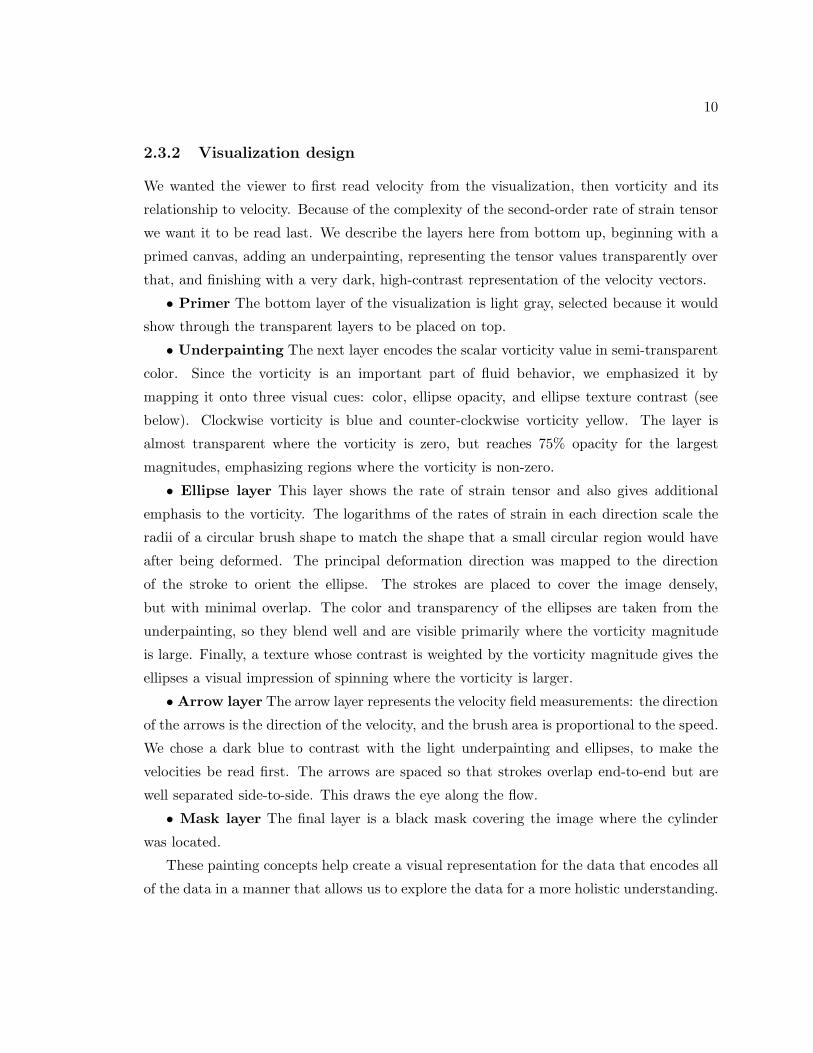
2.3.2 Visualization design
We wanted the viewer to first read velocity from the visualization, then vorticity and its
relationship to velocity. Because of the complexity of the second-order rate of strain tensor
we want it to be read last. We describe the layers here from bottom up, beginning with a
primed canvas, adding an underpainting, representing the tensor values transparently over
that, and finishing with a very dark, high-contrast representation of the velocity vectors.
• Primer The bottom layer of the visualization is light gray, selected because it would
show through the transparent layers to be placed on top.
• Underpainting The next layer encodes the scalar vorticity value in semi-transparent
color. Since the vorticity is an important part of fluid behavior, we emphasized it by
mapping it onto three visual cues: color, ellipse opacity, and ellipse texture contrast (see
below). Clockwise vorticity is blue and counter-clockwise vorticity yellow. The layer is
almost transparent where the vorticity is zero, but reaches 75% opacity for the largest
magnitudes, emphasizing regions where the vorticity is non-zero.
• Ellipse layer This layer shows the rate of strain tensor and also gives additional
emphasis to the vorticity. The logarithms of the rates of strain in each direction scale the
radii of a circular brush shape to match the shape that a small circular region would have
after being deformed. The principal deformation direction was mapped to the direction
of the stroke to orient the ellipse. The strokes are placed to cover the image densely,
but with minimal overlap. The color and transparency of the ellipses are taken from the
underpainting, so they blend well and are visible primarily where the vorticity magnitude
is large. Finally, a texture whose contrast is weighted by the vorticity magnitude gives the
ellipses a visual impression of spinning where the vorticity is larger.
• Arrow layer The arrow layer represents the velocity field measurements: the direction
of the arrows is the direction of the velocity, and the brush area is proportional to the speed.
We chose a dark blue to contrast with the light underpainting and ellipses, to make the
velocities be read first. The arrows are spaced so that strokes overlap end-to-end but are
well separated side-to-side. This draws the eye along the flow.
• Mask layer The final layer is a black mask covering the image where the cylinder
was located.
These painting concepts help create a visual representation for the data that encodes all
of the data in a manner that allows us to explore the data for a more holistic understanding.

11
2.3.3 Observations
Figure 2.1 (top left and top right) shows visualizations of 2d flow simulation results obtained
using Hybrid NεκT αr [1], a spectral element code for solving the incompressible Navier-
Stokes equations. These results were obtained from the work presented in [3].
The visualization of single quantities is useful by itself. For instance, if we contrast
the simulation results (Figure 2.1 top right and left) with the experimental data of the
airfoil (Figure 2.1 bottom), we observe that all the ellipses have the same area in the former
case whereas they do not have the same area in the latter case. In incompressible flows,
the continuity equation implies that the velocity field is divergence-free, which in turn
implies that the trace of the rate of strain tensor (i.e. the sum of its diagonal elements)
is always zero. This simply means that the area of the fluid elements remains constant in
time, regardless of their instantaneous shape. Hence, we can infer that the simulation has
reproduced properly the incompressible character of the fluid flow whereas the airfoil data
show either compressibility effects or out of plane motion, neither of which can easily be
detected by other means.
The multi-valued data visualization, however, has additional merits. For instance, we
observe that the simultaneous viewing of the vorticity field and the rate of strain tensor
provides us with a physical understanding about the deformation of the fluid elements.
It clearly shows that at the centers of the vortices the deformation can be rather small,
dependent on the eccentricity of the fluid element with respect to the center of the vortex,
whereas at the edges of vortices the fluid elements suffer a huge shearing effect. Thus
the mathematical decomposition of the velocity gradient tensor (i.e. ∂ui/∂xj) into its
symmetric (i.e. the rate of strain) and antisymmetric (i.e. the vorticity) parts acquires a
visual representation.
Until now the deformation of the fluid elements was represented with qualitative sketches
[29] whose direct connection to the rest of the flow field was not obvious. Through our
visualization technique, we obtain not only the qualitative character of the fluid element
deformation but also its quantitative properties. Moreover, all the information about the
deformation can now be visually correlated to the velocity and the vorticity fields.
12
2.4 Example 2: Turbulent charge and turbulent current
Turbulent charge and turbulent current are flow quantities that have not been extensively
visualized. Our motivation for viewing these quantities, in conjunction with other well-
studied quantities (e.g. the vorticity), has its roots in our desire to solve problems that
are concerned with drag reduction. The importance of fluid mechanics to the problem of
reducing the drag on a moving body is unequivocal. All airplane, boat, and car designers,
at some stage of their research, have consulted engineers about possible ways of reducing
the drag. This is quite reasonable, since drag reduction translates to less fuel consumption.
One method of reducing the drag on a body is the appendage of riblets on the surface
of the body. Though experimentally verified, the physical mechanism behind the drag re-
duction is not well understood. For example, some configurations and shapes of riblets do
give drag reduction but some others do not. Thus, the question arises as to why this hap-
pens. What are the shapes and which are the configurations that produce drag reduction?
The use of riblets everywhere on the surface is costly, thus another question is: what is
the location, on the surface of an object, that will provide maximum drag reduction? The
answers to the above questions can be found by inspecting visually the turbulent charge on
the surface of the body [30].
Suppose we are interested in reducing the drag on a submarine. Our goal from the
engineering standpoint is to find geometric modifications to our structure so that we get
reasonable drag reduction with a minimum cost (and without inhibiting the purpose of our
submarine). Modeling the turbulent charge on the surface of the submarine immediately
delineates those regions of the geometry which could most benefit from drag reduction
techniques. Unlike all other drag reduction models, the concept of turbulent charge and
turbulent current succinctly provide information that is applicable to engineering design.
Unlike the case of simple flows, which can be described easily in terms of vorticity, there
are cases in which the visualization of vorticity, and the subsequent description of the flow
by it, can be as complex as the one in terms of velocity. For example, in the case of turbulent
flows, vortices are shed from the boundaries of the flow domain, they are convected away
from it, and subsequently interact with each other in a fashion that has defied a satisfactory
solution of practical importance for more than a century. Hence, we can legitimately ask
whether we can find other quantities whose visualization in these cases can be as beneficial
to our understanding as vorticity is in more simple flows.

13
KEYdata visualization
velocity arrow directionspeed arrow area
vorticity underpainting:blue=cw, yellow=ccw
turbulentcharge
stroke color
turbulentcurrent
stroke direction/area
Figure 2.2: Visualization of the turbulent charge and the turbulent current for a Reynoldsnumber 500 simulated flow. Observe that charge concentrates near the cylinder and isnegligible in other parts the flow. The cylinder geometry is now white to contrast with thevisual representation for the turbulent sources
Reynolds number 100 Reynolds number 500
Figure 2.3: Close up visualization of the turbulent charge and the turbulent current atReynolds number 100 and 500 (left and right). We are able to see the high concentrationsof negative charge at the places where vorticity is being generated.
2.4.1 Data breakdown
We began by choosing a breakdown of data values into components that can be mapped
onto stroke attributes. It has recently been suggested that two newly introduced quantities,
namely, the turbulent charge n(x, t) and the turbulent current j(x, t), collectively referred
to as the turbulent sources, could substitute the role of vorticity in more complicated flows.

14
The nomenclature is not coincidental, it reflects the fact that the derivation of these quan-
tities was based on an analogy between the equations of hydrodynamics and the Maxwell
equations [31].
In particular, if we denote by u the velocity and by p the pressure then the vorticity, w,
is given by ∇× u, and the Lamb vector is given by l ≡ w × u. The turbulent sources are
given by the following expressions:
n(x, t) ≡ ∇ · l(x, t) = −∇2
(p
ρ+
u2
2
), (2.3)
and
j = un + ∇× (u ·w)u + w ×∇(
p
ρ+
3u2
2
)+ 2(l · ∇)u . (2.4)
The later two quantities (i.e. n, j) are related to each other through a continuity type
of equation where the turbulent current is the flux of the turbulent charge. In the cases
where turbulent charge is generated solely at the wall, small turbulent charge implies small
turbulent current.
2.4.2 Visualization design
We designed the turbulent source visualizations so that the overall location of the turbulent
charge would be visible early. The vorticity was our next priority, since comparison between
the two quantities was important. Our third priority was the structure of the flow, as
represented by the velocity field. Finally, we wanted fine details about the structure of all
the fields, charge, current, velocity, and vorticity, available upon close examination.
We describe the layers here from bottom up, as in the last example. Beginning with
the same primed canvas and underpainting, continuing with a low-contrast representation
of the velocity vectors, and finishing with a high-contrast representation of the turbulent
sources. A final layer represents the geometry of the cylinder.
• Primer and underpainting Same as first example.
• Arrow layer The arrow layer for this example has the same geometric components –
brush area proportional to speed, velocity direction mapped to brush direction, and strokes
arranged closer end-to-end to give a sense of flow. This layer differs in that its emphasis
is decreased. It has a low contrast with the layers below it. The low contrast is partly
achieved through the choice of a light color for the arrows and partly through transparency
of the arrows. Without the transparency, the arrows would appear very independent of the
underlying layers.

15
• Turbulent sources layer In this layer we encode both the turbulent charge and
the turbulent current. The current, a vector, is encoded in the size and orientation of the
vector value just as the velocity in the arrow layer. The scalar charge is mapped to the
color of the strokes. Green strokes represent negative charge and red strokes positive. The
magnitude of the charge is mapped to opacity. Where the charge is large, we get dark,
opaque, high-contrast strokes that strongly emphasize their presence. Where the charge is
small, the strokes disappear and do not clutter the image. For these quantities, that tend
to lie near surfaces, this representation makes very efficient use of visual bandwidth. The
strokes in this layer are much smaller than the the strokes in the arrow layer. This allows
for finer detail to be represented for the turbulent sources, which tend to be more localized.
It also helps the turbulent sources layer to be more easily distinguished from the arrows
layer than in the previous visualization, where the stroke sizes were closer and, therefore,
harder to disambiguate visually.
• Mask layer The final layer is a mask representing the geometry of the cylinder. The
mask is white in this example to contrast better with the turbulent sources layer.
2.4.3 Observations
The regions where the turbulent charge achieves its maximum values are the regions where
the vorticity field has also very large values. Nevertheless, as we have already mentioned,
the advantage in thinking of terms of turbulent charge is related to its permanence close to
the boundaries, in contrast to the vorticity field which is conveyed downstream.
The theory proposed in [31] predicts that the turbulent charge, n, and turbulent current,
j, are the source terms (those terms for which no evolution equation is given and hence
need to be inputed as part of the definition of the problem) of the following linear system
of equations
∇ ·W = 0 ,∂ W∂t
= −∇× L − ν∇×∇×W ,
∇ · L = N(x, t) ,
∂ L∂t
= c2∇×W − J(x, t) + ν∇×∇× L , (2.5)
where c2 = 〈u2〉, and the use of capital letters denotes that the corresponding quantities
have been spatially filtered. From these equations it can be shown that the turbulent current
is the dominant forcing term for the velocity. An immediate consequence of this is that the
turbulent current and the velocity field should be aligned. In Figure 2.3 we observe this
16
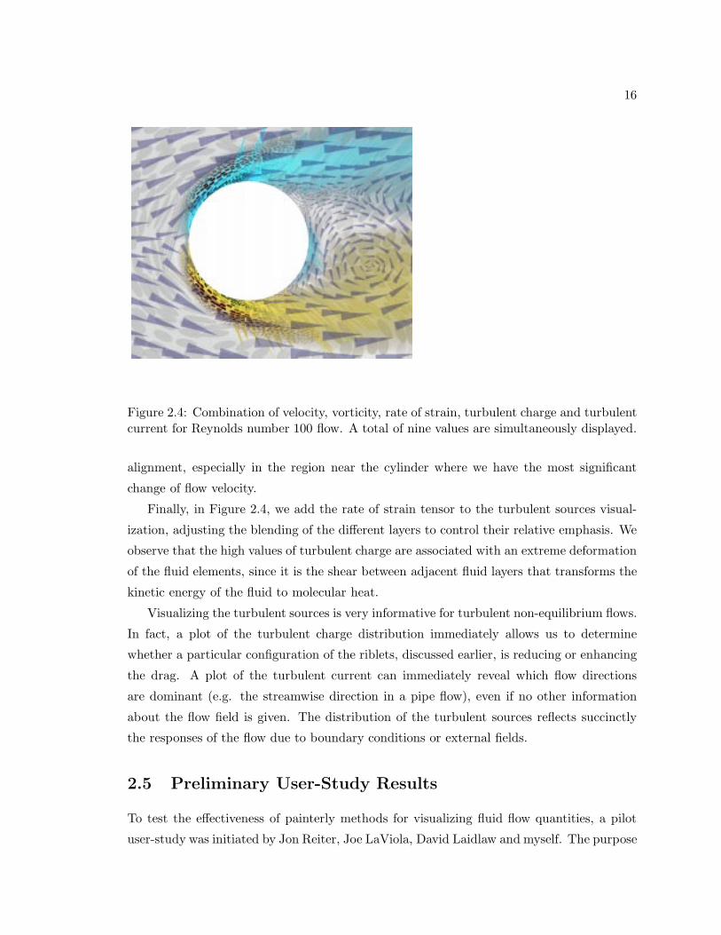
Figure 2.4: Combination of velocity, vorticity, rate of strain, turbulent charge and turbulentcurrent for Reynolds number 100 flow. A total of nine values are simultaneously displayed.
alignment, especially in the region near the cylinder where we have the most significant
change of flow velocity.
Finally, in Figure 2.4, we add the rate of strain tensor to the turbulent sources visual-
ization, adjusting the blending of the different layers to control their relative emphasis. We
observe that the high values of turbulent charge are associated with an extreme deformation
of the fluid elements, since it is the shear between adjacent fluid layers that transforms the
kinetic energy of the fluid to molecular heat.
Visualizing the turbulent sources is very informative for turbulent non-equilibrium flows.
In fact, a plot of the turbulent charge distribution immediately allows us to determine
whether a particular configuration of the riblets, discussed earlier, is reducing or enhancing
the drag. A plot of the turbulent current can immediately reveal which flow directions
are dominant (e.g. the streamwise direction in a pipe flow), even if no other information
about the flow field is given. The distribution of the turbulent sources reflects succinctly
the responses of the flow due to boundary conditions or external fields.
2.5 Preliminary User-Study Results
To test the effectiveness of painterly methods for visualizing fluid flow quantities, a pilot
user-study was initiated by Jon Reiter, Joe LaViola, David Laidlaw and myself. The purpose

17
of this study was to compare traditional visualization methods with the painterly methods
discussed in this thesis. Eight Brown University students were asked a series of questions
on sample visualizations produced by traditional and painterly methods. We found that
subjects were 13% more accurate for determining where a scalar field’s value was greater
in the artistic images over traditional ones. Subjects were 4% more accurate for vector
magnitude comparisons when using the artistic methods, and subjects were 18% more
accurate when asked questions pertaining to inter-variable correlations. These preliminary
results suggest that painterly methods may provide an effective means for visualizing multi-
dimensional quantities effectively.
2.6 Summary
The methods we employed produce images that are visually rich and represent many values
at each spatial location. From different perspectives, they show the data at different levels
of abstraction – more qualitatively at arm’s length, more quantitatively up close. Finally,
the images emphasize different data values to different degrees, leading a viewer through
the temporal cognitive process of understanding the relationships among them.
We visualize quantities that have rarely been viewed before: rate of strain, turbulent
charge, and turbulent current. We visualize these new quantities together with more com-
monly viewed quantities, allowing a scientist to use previously acquired intuition in inter-
preting the new values and their relationships to one another and to the more traditional
quantities.
Our visualization of the rate of strain tensor combined with both the velocity and
vorticity fields provides a unique pedagogical tool for explaining the dominant mechanisms
responsible for certain fluid flow phenomena. Because an understanding of the deformation
tensor (i.e. ∂ui/∂xj) is of paramount importance for one’s understanding of fluid flow
phenomena, visualizing its symmetric and antisymmetric parts separately (i.e. the rate
of strain tensor and the vorticity, respectively) clearly accentuates the interplay between
rotational and shearing mechanisms within the flow.
The visualization of turbulent charge and turbulent current combined with both velocity
and vorticity allows us to use knowledge concerning the latter fields in our effort to under-
stand the usefulness of the newly visualized quantities. It is evident from the visualizations
shown that, unlike vorticity, the turbulent charge and the turbulent current are far more lo-
calized. This validates the conjectures about the potential usefulness of the model, and also
suggests that we focus our attention on viewing the turbulent charge and turbulent current

18
regions close to the surface of the cylinder. By focusing our examination to regions close
to the cylinder, we see a high visual correlation between regions where turbulent charge
accumulates and regions of vorticity generation.
By visualizing velocity with all the subsequently derived quantities presented here, we
can observe through one visualization multiple properties of the flow. The freedom to
display multi-valued data simultaneously allows us to get a more complete idea of both
the dynamics and the kinematics of the flow, and hence provides a catalyst for future
understanding of more complex fluid phenomena.

Chapter 3
DOGL - Distributed OpenGL
using MPI
In our attempt to use an immersive environment for fluid flow visualization, our first obstacle
was attempting to obtain software written for the expressed intent of visualization with our
four-walled immersive environment driven by IBM hardware, a distributed memory-based
system.
3.1 Motivation
Nearly all tiled display environments such as a Cave or PowerWall are driven by shared-
memory graphics systems. However, distributed memory-based graphics systems that can
produce comparable performance to typically more expensive shared-memory-based graph-
ics systems are becoming more commonplace.
The key problem to substituting a distributed memory-based graphics system for a
shared-memory graphics system is that, in general, there are no easy-to-use software li-
braries available for managing rendering clusters of graphics adapters. Worse, no commonly
available library for driving tiled displays (e.g., Performer [32], CAVE library (tm) [33], VR
Juggler [34], WorldToolKit [35]) support distributed rendering in a nearly transparent man-
ner. Some libraries are also not available on all architectures.
We developed DOGL to begin to address the distributed rendering problem at our
facility where we are driving our four-wall Cave with four or more graphics adapters in
multiple nodes of our IBM SP running AIX. DOGL is an acronym for “Distributed OpenGL”
and describes our approach to addressing the problem: all OpenGL calls from one process
19

20
are intercepted and are subsequently broadcast to multiple graphics adapters. DOGL also
allows OpenGL calls to be explicitly sent to individual graphics adapters.
3.2 Related Work on Distributed Rendering
There are two primary categories of previous work: ”the Scenegraph” approach and the
”Broadcast OpenGL” approach.
Scenegraph Approach
The original CAVE library (tm) [33], which is now administered by Virtual Reality Soft-
ware and Consulting (VRCO), ran in a distributed rendering environment through the use
of a hardware-assisted shared-memory facility, Scramnet. This became largely obsolete
when larger host systems capable of housing multiple graphics subsystems became avail-
able. Current VRCO developments includes implementations of CAVELib for Linux and
HP systems, and will presumably include mechanisms for networked rendering distribution.
Java3D [36] may have the necessary components to solve the distributed tiled rendering
problem, but it is not currently available for our target architecture. The performance of
Java3D in a distributed environment may also be inadequate.
Before developing DOGL, we ran our Cave for about a year with “Jot”, an in-house 3D
interactive graphics system. Jot is capable of synchronizing scenegraphs between multiple
Jot instances using a network connection. The primary problem with this approach is that
the synchronization of the scenegraphs would frequently fail if synchronization code was
not properly maintained by developers. The larger problem is that Jot was not originally
designed to drive a Cave; it is a research system that evolves daily and, in particular, serves
as a base-framework for several projects not related to the Cave. This problem combined
with the absence of complete regression tests for simulating user interaction in the Cave
enabled non-Cave project members to unknowingly cause Cave applications to fail. It was
decided that both re-designing Jot and developing a new system to drive the Cave would
be more costly than to design and develop DOGL. In fact, as expected, it only took a few
weeks to get DOGL up and running for our needs.
Broadcast OpenGL Approach
Theoretically, GLX [37] could be used to drive a distributed tiled display. However, such
a system would send OpenGL commands to multiple graphics sequentially rather than by
21
broadcasting them. There is also a nontrivial cost to frequently switching the OpenGL
graphics context.
Humphreys et al. developed a system for driving large tiled displays [38] that function-
ally is a superset of DOGL. The primary differences between the two systems are: 1) DOGL
is designed to support a single OpenGL application whereas Humphreys’ system supports
multiple, simultaneous window-based applications, and 2) DOGL uses MPI to broadcast
efficiently data to rendering clients.
Humphreys et al.’s system evolved into WireGL [39] which is an example of a system
that makes it very easy for the user and application programmer to leverage scalable render-
ing systems. Specifically, no modification to an OpenGL program is needed to run it on a
tiled display. These and other systems work by intercepting normal (non-parallel) OpenGL
calls and multicasting them, or channeling them to specific graphics processors. WireGL
includes optimizations to minimize network traffic for a tiled display and, for most applica-
tions, provides scalable output resolution with minimal performance impact. The rendering
subsystem relies not only on parallelism, but also on traditional techniques for geometry
simplification such as view-dependent culling. To run a sequential OpenGL program written
for a conventional 3D display device without modification requires that the ”interceptor”
deal with the complexities of managing head-tracking and stereo. In particular, this requires
transformations that conflict with those in the original OpenGL code. Furthermore, any
additional interaction devices must be provided by the application programmer.
The Scalable Display Wall [40] is driven by a network of PC’s with 3D graphics accelera-
tors. Normal OpenGL programs run on the display wall after copying a special DLL library
into the same directory as the application. This system does not use MPI for networking
and runs on only one architecture at this time.
3.3 Design
The primary design feature of DOGL is that it was to be minimally invasive; that is,
programmers which had developed OpenGL code for desktop applications would be able to
easily transition to running their application in the Cave with minimal code additions or
changes. To accomplish this goal, DOGL is designed to intercept all OpenGL calls made
by the master application and to distribute them to a collection of “rendering engines”
(DOGL clients). From the programming perspective, only a few DOGL initialization calls
for setting up the MPI environment and projection matrices for each wall of the Cave, along
with linking with the DOGL library allow the programmer to quickly get their application

22
up and running in a Cave.
After initialization, each OpenGL call that the master program (called a DOGL server)
makes is intercepted, and the necessary function arguments stored within a buffer. Imme-
diately after buffering the call, the server then makes the OpenGL call and returns any
necessary values to the calling application. DOGL also allows OpenGL calls to be explicitly
sent to individual graphics adapters in the cluster. Once the buffer has attained a certain
user set size (the size of which is currently determined by familiarity with the capabilities
of the system on which one is running), the buffer is broadcast to the DOGL clients for
rendering. A diagram of this is presented in Figure 3.1. Once a DOGL client has obtained
a buffer of executable commands, it merely runs through its buffer executing each OpenGL
command in the order in which they were placed in the buffer. Synchronization occurs
when the frame buffers are swapped by calling synchronization calls within MPI.
The nomenclature used here is different from that of an X-Windowing system. Our
assignment of the terms “server” and “client” to the functions of particular nodes came
from our scientific computing experience. The term server here is used to refer to that node
which is always initiating broadcast calls, and clients are those nodes which are always only
receiving broadcast calls.
DOGL only enables a subset of OpenGL programs to run on a distributed memory-based
graphics system. The restriction is that the state of and data from remote clients can not
be queried. However, the state and data can be queried from the master node. Currently,
DOGL’s master node is used to run both the primary application and the renderer. This
implies that OpenGL state is implicitly held by the OpenGL adapter which resides on the
master node. Hence when OpenGL state information is necessary, OpenGL state calls can be
used on the master node to obtain information which is indicative of the state on each client
node. If the master node does not have a graphics adapter, but rather merely broadcasts
all OpenGL information to rendering nodes, then it would be necessary either to maintain
some of the OpenGL state information on the master, or to develop a communications
strategy for retrieving information from remote nodes. For simplification, we chose to have
the master node run both the application and to be one of the rendering nodes. For many
applications this is not a problem.
3.4 MPI
The Message-Passing Interface (MPI) is one of the most widely used communication li-
braries used within scientific computing [41]. This standardized library runs on almost

23
DOGLServer
DOGLClient
DOGLClient
DOGLClient
OpenGLCard
OpenGLCard
OpenGLCard
OpenGLCard
Figure 3.1: Diagram denoting the relationship between the DOGL server and clients.
every platform that can be used within the field of scientific computing, from networked
PC clusters running under ethernet to IBM SPs communicating via a their proprietary
high-speed switch. MPI is designed to work in the most general of parallel computing en-
vironments, the fully distributed environment. Although MPI at the implementation level
may take advantage of the shared-memory capability of a particular hardware, the program
remains focussed on the distributed memory model for parallel programming. We chose to
use MPI for two major reasons: simplicity and portability.
3.4.1 Simplicity of DOGL-MPI Programming Model
Very few MPI calls are necessary in the current DOGL programming model. Other than the
standard initialization calls which are necessary prior to invoking any message passing calls,
the backbone of DOGL’s communications is MPI Bcast. The MPI Bcast call broadcasts a
buffer from one MPI process to all other MPI processes within the same MPI communica-
tions world. Each DOGL client calls MPI Bcast to receive its buffer of OpenGL calls, and
then proceeds to execute the commands contained within the buffer.
We chose to use MPI Bcast for one primary reason: MPI Bcast most closely accom-
plishes what DOGL requires, the distribution of all OpenGL calls from the master appli-
cation (the DOGL server) to all DOGL clients. Although this could be accomplished by a
loop which sends an identical buffer to each DOGL client, this methodology only admits
optimizations for one-to-one communication. The beauty of MPI is that each hardware
vendor can optimize MPI for their particular hardware configuration without changing the

24
API. Hence, in the case of MPI Bcast, a vendor may choose to implement this command
by looping over all MPI processes and sending one-to-one communications; however, the
vendor is allowed the freedom to optimize the broadcast to utilize hardware features such as
hardware multicast. In addition, since MPI is commonly used within the scientific comput-
ing community, optimization of MPI on a variety of platforms is certain as vendors attempt
to set their mark within the area of high performance computing. Since these optimizations
are at no cost to the application programmer, MPI allows the user to develop code which
will continue to improve as computing hardware and MPI software developments progress.
3.4.2 Portability of DOGL-MPI Programming Model
MPI allows the programmer to develop parallel code with no knowledge of the underlying
hardware. This is particularly advantageous to those people who do not wish to be tied down
to a particular hardware vendor. Although most people have a vendor of choice, quite often
a computer graphics lab consists of a plethora of different machine types. Again, due to
MPI’s prevalence in the scientific computing world, MPI runs on a wide variety of platforms
with no modification to the code. From commodity PCs running under Linux or WinNT,
to supercomputers such as IBM SPs and Origin 2000s, MPI allows for an easy software
transition of DOGL to any platform which supports both MPI and OpenGL.
3.5 Implementation
An example DOGL function is presented in code form below. In the master application,
a call to glVertex3d would be intercepted, and instead doglVertex3d would be called. The
variables dogl command and dogl psize are used in the packing of the buffer. The first
variable, dogl command, denotes which OpenGL command was called. The second variable,
dogl psize, denotes the size in bytes needed to pack this command into the buffer. The
arguments are first copied into temporary storage, and then an if-statement is executed to
determine whether DOGL server or DOGL client commands should be executed.
If the DOGL server (the master application) has called this function by the interception
of an OpenGL call, then first the buffer is checked to make sure that sufficient space is
available to store all data necessary for the OpenGL command. If there is not sufficient
space on the buffer, then the buffer is broadcast to the clients (thus emptying the buffer).
After verification of buffer space is guaranteed, then both the command and the neces-
sary arguments are packed into the DOGL buffer. Finally, the DOGL server executes the
OpenGL call and the function returns.

25
void doglVertex3d (GLdouble x, GLdouble y, GLdouble z)
int dogl_command = DOGL_GLVERTEX3D;
int dogl_psize = sizeof(int) + 3*sizeof(GLdouble);
GLdouble aval[3];
aval[0] = x;
aval[1] = y;
aval[2] = z;
if(mynode == mpiroot)
doglPrepareBuffer(dogl_psize);
doglPackBuffer(&dogl_command, sizeof(int));
doglPackBuffer(aval ,3*sizeof(GLdouble));
else
doglUnpackBuffer(aval,3*sizeof(GLdouble));
glVertex3d(aval[0],aval[1],aval[2]);
return;
The DOGL client, upon receipt of a buffer, extracts the OpenGL function calling info
packed by the server. This information is used to determine which DOGL command is to
be executed on the client. In this case, the client would extract the dogl command from the
buffer, from which it would know to call doglVertex3d. When doglVertex3d is called on the
client, the second part of the if-statement is executed, and hence the three doubles used as
arguments in the original function call are then unpacked into the temporary storage space.
The OpenGL command glVertex3d is then called on the client, and the function returns.
26
3.6 Utilization
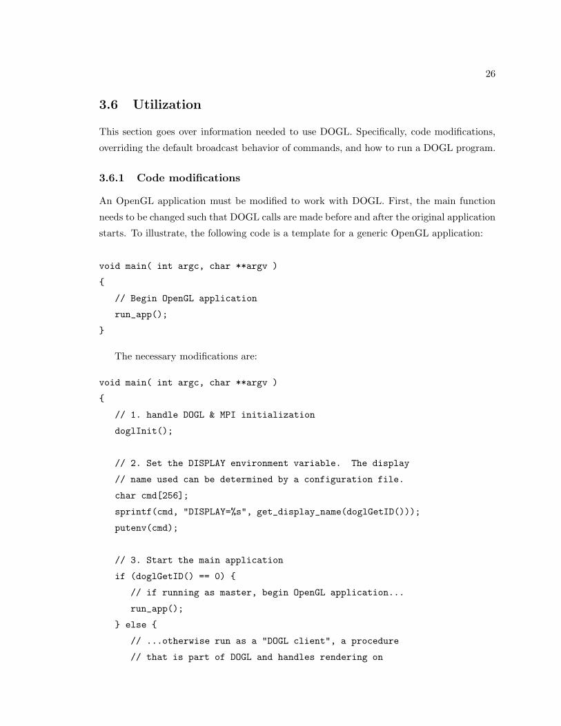
This section goes over information needed to use DOGL. Specifically, code modifications,
overriding the default broadcast behavior of commands, and how to run a DOGL program.
3.6.1 Code modifications
An OpenGL application must be modified to work with DOGL. First, the main function
needs to be changed such that DOGL calls are made before and after the original application
starts. To illustrate, the following code is a template for a generic OpenGL application:
void main( int argc, char **argv )
// Begin OpenGL application
run_app();
The necessary modifications are:
void main( int argc, char **argv )
// 1. handle DOGL & MPI initialization
doglInit();
// 2. Set the DISPLAY environment variable. The display
// name used can be determined by a configuration file.
char cmd[256];
sprintf(cmd, "DISPLAY=%s", get_display_name(doglGetID()));
putenv(cmd);
// 3. Start the main application
if (doglGetID() == 0)
// if running as master, begin OpenGL application...
run_app();
else
// ...otherwise run as a "DOGL client", a procedure
// that is part of DOGL and handles rendering on
27
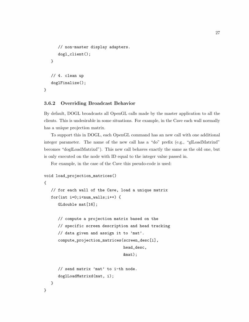
// non-master display adapters.
dogl_client();
// 4. clean up
doglFinalize();
3.6.2 Overriding Broadcast Behavior
By default, DOGL broadcasts all OpenGL calls made by the master application to all the
clients. This is undesirable in some situations. For example, in the Cave each wall normally
has a unique projection matrix.
To support this in DOGL, each OpenGL command has an new call with one additional
integer parameter. The name of the new call has a “do” prefix (e.g., “glLoadMatrixd”
becomes “doglLoadMatrixd”). This new call behaves exactly the same as the old one, but
is only executed on the node with ID equal to the integer value passed in.
For example, in the case of the Cave this pseudo-code is used:
void load_projection_matrices()
// for each wall of the Cave, load a unique matrix
for(int i=0;i<num_walls;i++)
GLdouble mat[16];
// compute a projection matrix based on the
// specific screen description and head tracking
// data given and assign it to ’mat’.
compute_projection_matrices(screen_desc[i],
head_desc,
&mat);
// send matrix ’mat’ to i-th node.
doglLoadMatrixd(mat, i);

28
3.6.3 Running a DOGL program
DOGL converts a conventional executable into a “MPI” executable. Each architecture may
have a slightly different procedure for executing an MPI executable. However, To give a
sense of what’s involved, the following code is sufficient to execute a DOGL program on an
IBM:
setenv MP_EUILIB ip
setenv MP_EUIDEVICE css0
setenv MP_PROCS 4
setenv MP_HOSTFILE host_config_file
/usr/bin/poe dogl_executable
In the example above, “MP PROCS” is set to 4, so the “MP HOSTFILE” environment
variable must point to the ASCII file containing the four node names on which DOGL is to
run.
3.7 Results
The primary result of this work was a working system that we are using with a distributed
rendering environment to drive our four-wall Cave. Specifically, we have used DOGL to
develop a prototype system for visualization blood flow through an artery described in the
next chapter and several students used it for on-going projects and course work including
an initial implementation of the “Cave Painting” program.
We accomplished some preliminary measurements of DOGL’s performance. All perfor-
mance measurements discussed herein were accomplished on the IBM SP gnodes a and b
at the Center for Advanced Scientific Computation and Visualization at Brown University.
The only adjustable parameter within the DOGL system is the packet size used for trans-
mission of the buffered OpenGL calls. Figure 3.3 plots the performance of DOGL measured
in frames per second verses the packet size used for various triangle counts. Observe that
there exists a minimum packet size, around two kilobytes, which should be used for max-
imum performance. This packet size indicates the tradeoff point between network latency
and bandwidth on the IBM SP. In Figure 3.3 we plot the the performance of DOGL mea-
sured in frames per second verses the number of triangles for various packet sizes. This
plot demonstrates the effect of increased triangle counts on the total time, which consists
of both the networking and rendering time on the IBM hardware available.
29
0
20
40
60
80
100
120
140
160
0 1000 2000 3000 4000 5000 6000 7000 8000 9000
FP
S
PacketSize
FPS vs. PacketSize
Triangles = 1Triangles = 2Triangles = 4Triangles = 8
Triangles = 16Triangles = 32Triangles = 64
Triangles = 128Triangles = 256Triangles = 512
Triangles = 1024
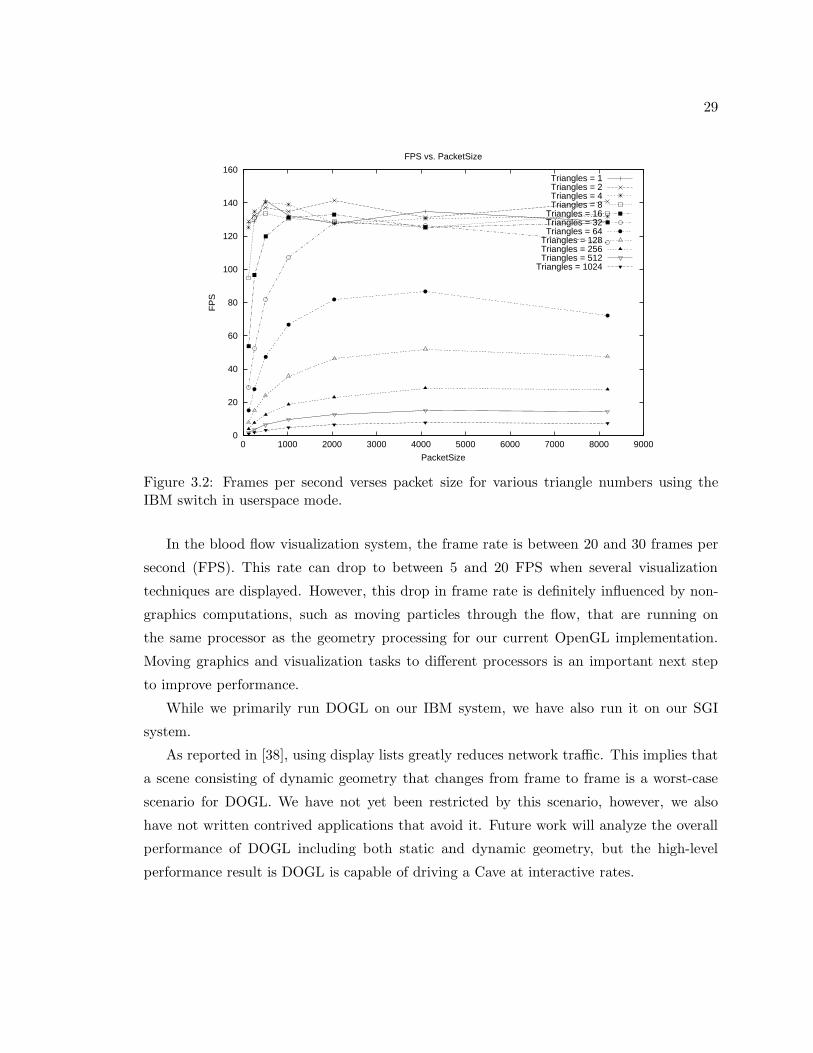
Figure 3.2: Frames per second verses packet size for various triangle numbers using theIBM switch in userspace mode.
In the blood flow visualization system, the frame rate is between 20 and 30 frames per
second (FPS). This rate can drop to between 5 and 20 FPS when several visualization
techniques are displayed. However, this drop in frame rate is definitely influenced by non-
graphics computations, such as moving particles through the flow, that are running on
the same processor as the geometry processing for our current OpenGL implementation.
Moving graphics and visualization tasks to different processors is an important next step
to improve performance.
While we primarily run DOGL on our IBM system, we have also run it on our SGI
system.
As reported in [38], using display lists greatly reduces network traffic. This implies that
a scene consisting of dynamic geometry that changes from frame to frame is a worst-case
scenario for DOGL. We have not yet been restricted by this scenario, however, we also
have not written contrived applications that avoid it. Future work will analyze the overall
performance of DOGL including both static and dynamic geometry, but the high-level
performance result is DOGL is capable of driving a Cave at interactive rates.

30
0
20
40
60
80
100
120
140
160
0 200 400 600 800 1000 1200
FP
S
Triangles
FPS vs. Triangles
PacketSize = 128PacketSize = 256PacketSize = 512
PacketSize = 1024PacketSize = 2048PacketSize = 4096PacketSize = 8192
Figure 3.3: Frames per second verses triangle count for various packet sizes using the IBMswitch in userspace mode.

Chapter 4
Arterial Flow in a Bypass Graft: A
Case Study
Given the computational and graphical hardware capabilities present here at Brown, we
desired to combine simulation and visualization into a package which would utilize the
interactive, immersive environment housed at Brown’s Center for Advanced Scientific Com-
putation and Visualization. As a first stage in this effort, we chose to combine two research
codes developed at Brown: NεκT αr, a computational fluid dynamics code developed un-
der the direction of Professor George Karniadakis in the Division of Applied Mathematics,
and “Jot”, a graphical user interface research code developed under the direction of Profes-
sor Andries van Dam in the Department of Computer Science. Specifically, as a first step,
we developed a software interface which allowed Jot to load and manipulate NεκT αr ge-
ometry and flow data files. This first step allowed us to take three dimensional simulations
of fluid flow phenomena created by NεκT αr, load them into Jot, and to use software tools
engineered into Jot for the interaction with, and manipulation of, the flow data.
4.1 Immersive Environments for Scientific Visualization
The use of virtual environments for visualizing fluid flow phenomena is not new. The Virtual
Windtunnel [42] visualizes air flow around geometric objects such as the space shuttle. Our
system differs in terms of the actual application– blood flow versus air flow visualization.
The combination of the Virtual Director[43] VR interface and the CAVE5D[44] visual-
ization system is one of the few virtual reality-based scientific visualization applications that
uses multimodal input. However, their system combines voice and wand input which limits
31

32
Figure 4.1: One image from an angiogram showing the “bird’s eye” view that doctors aretypically limited to. These angiograms give an excellent image of where problems lie, butare not very reliable indicators of the genesis of lesions.
the naturalness of their interface since users will typically only interact with one hand. By
combining voice and whole-hand input using Pinch Gloves instead of a wand, our system
allows users to interact with two hands which has been shown to be beneficial for many
interaction tasks[45].
4.2 Problem Statement
In a multi-disciplinary effort, we used our newly designed system in an attempt to under-
stand the haemodynamic effects due to three-dimensional modifications of the geometry
within arterial bypass grafts. Atherosclerotic lesions tend to develop near areas of flow
disturbances such as at arterial branches and bifurcations.
Fig. 4.1 shows one image from an angiogram of a damaged artery. Images like these are
current state-of-the-art for how clinicians view blocked arteries. Angiograms are effective
for showing the degree of blockage in an artery but do not show why or how future lesions
may form.
Although a great deal of flow data has been obtained experimentally, certain flow quan-
tities which are inaccessible to the physician using commonly available clinical techniques
can be modeled accurately through the use of numerical simulation. Fig. 4.2 shows output
from tecplot [46], a widespread fluid dynamics visualization package. We believe that an im-
mersive environment can permit more effective visualization of fluid simulation results than
conventional desktop display devices. tightly-coupled interdisciplinary project is aimed at
understanding how to reduce the failure rate of these grafts. To this end, we designed and

33
Figure 4.2: Image created in tecplot showing a typical visualization that might be usedto explore simulated flow data within an artery. The top image shows the geometry inwireframe while the bottom image shows wall shear stress magnitude mapped to the ves-sel surface. Exploration using tools like tecplot are less interactive than the immersivevisualization environment we describe.
implemented an immersive system for exploring numerically simulated flow data through a
model of a coronary artery graft. Key software components were obtained from NεκT αr
and from Jot. NεκT αr-Jot, combined with DOGL, allowed us a mechanism for exploring
the multi-valued data simultaneously for the purpose of exploring potential sources of fu-
ture lesions. We present an example session using the system and discuss our experiences
developing, testing, and using it.
4.3 Simulating Complex-Geometry Flows with NεκT αr
The flow solver corresponds to a particular version of the code NεκT αr, which is a general
purpose CFD code for simulating incompressible, compressible and plasma flows in unsteady
three-dimensional geometries. The major algorithmic developments are described in [47]
and [1]. The code uses meshes similar to standard finite element and finite volume meshes,
consisting of structured or unstructured grids or a combination of both. The formulation
is also similar to those methods, corresponding to Galerkin and discontinuous Galerkin
projections for the incompressible and compressible Navier-Stokes equations, respectively.

34
4.4 Simulation/Visualization Coupling
Maintaining a common data format for the numerical simulation software and for the visu-
alization software helped us to iterate more quickly and experiment with more interaction
and rendering techniques. In an early prototype of our system the simulation data had to
be reformatted significantly before the visualization system could process it. We found that
significant time was spent doing this reformatting. In our second visualization system, we
built a library to access the simulation data directly. Although the library took some time
to implement, the increased coupling between simulation and visualization more than paid
off with faster iterations and less wasted time on data conversions. It also helped keep the
thrust of the work at a higher level where we could concentrate more on the science and
less on the data.
The library which we developed contained interfacing code between NεκT αr and Jot.
This software layer consisted of a NEKTAR DATA class constructed into the Jot class
hierarchy. This class contains methods for loading and manipulating NεκT αr geometry
and simulation data. The following functionality has been created:
• Load reference geometry.
• Load fluid flow simulation data (velocity and pressure).
• Compute important derived quantities (vorticity, divergence and wall shear stress).
• Generate streamlines.
• Generate isosurface information (for use with NOISE, University of Utah’s interactive
isosurfacing system [48]).
• Allow the sampling of data at an arbitrary point in the domain.
The above functionality was created with the specific purpose of successfully creating
an arterial bypass graft demonstration. However, the functionality provided is not specific
to arterial flows, and hence this interface provides a general means of interacting with
NεκT αr generated fluid flow data.
4.5 A Virtual Cardiovascular Laboratory
An example user scenario in the virtual cardiovascular laboratory describes its functionality.
A few frames illustrate the main points.

35
Figure 4.3: A view of the immersive artery visualization looking at the bifurcation where thegraft enters the original artery. The visualization is within a 4-wall cave, with head-trackedstereo. A gestural interface provide easily-learned interaction techniques for navigatingthrough the environment and for studying the flow.
The session begins with an overall view of the bifurcated artery, which shows both the
originally blocked artery, and the newly grafted segment into which the blood now flows.
Since the vascular geometry is the primary determinant of the flow field, the researcher
begins by examining the reference geometry. Here, the reference geometry is manipulated
using a combination of hand gestures. A 3D tracker locates each hand and pinch gloves
[49] provide information about relationships between fingers. The user places himself at
the entrance of the bypass graft by gesturally pulling himself through space and begins to
examine the artery structure and moves further down the artery to investigate the area of
the bifurcation, shown in Fig. 4.3.
The user selects tools from a virtual tool-belt around his waist and controls these tools
using both voice commands and hand gestures. Tools can be retrieved from the tool-belt
when the user looks down, as he is demonstrating in Fig. 4.4. To orient himself to the flow
conditions, the researcher uses two different particle advection widgets. The first, a dust
widget, allows the user to throw particles into the flow just as if he were throwing chaff
into the wind. This type of normal action allows the user to comfortably acclimate himself
to the flow conditions. Although convenient, this widget is not very precise. For a more
precise and persistent stream of particles, the metaphor of a fizzing “alkaseltzer tablet” is
used. Using this widget, the researcher interactively places particles precisely in areas of
interest and watches as the particles are advected along by the natural flow of blood. This
type of interactive investigation gives the researcher an initial indication of the flow patterns
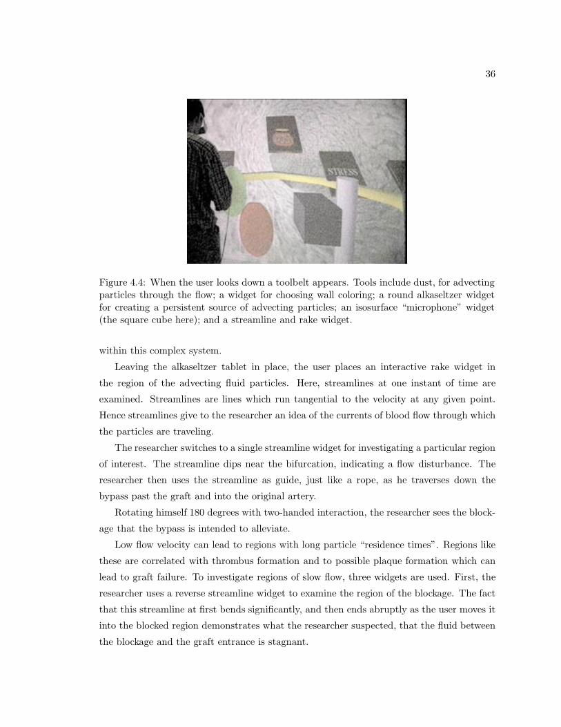
36
Figure 4.4: When the user looks down a toolbelt appears. Tools include dust, for advectingparticles through the flow; a widget for choosing wall coloring; a round alkaseltzer widgetfor creating a persistent source of advecting particles; an isosurface “microphone” widget(the square cube here); and a streamline and rake widget.
within this complex system.
Leaving the alkaseltzer tablet in place, the user places an interactive rake widget in
the region of the advecting fluid particles. Here, streamlines at one instant of time are
examined. Streamlines are lines which run tangential to the velocity at any given point.
Hence streamlines give to the researcher an idea of the currents of blood flow through which
the particles are traveling.
The researcher switches to a single streamline widget for investigating a particular region
of interest. The streamline dips near the bifurcation, indicating a flow disturbance. The
researcher then uses the streamline as guide, just like a rope, as he traverses down the
bypass past the graft and into the original artery.
Rotating himself 180 degrees with two-handed interaction, the researcher sees the block-
age that the bypass is intended to alleviate.
Low flow velocity can lead to regions with long particle “residence times”. Regions like
these are correlated with thrombus formation and to possible plaque formation which can
lead to graft failure. To investigate regions of slow flow, three widgets are used. First, the
researcher uses a reverse streamline widget to examine the region of the blockage. The fact
that this streamline at first bends significantly, and then ends abruptly as the user moves it
into the blocked region demonstrates what the researcher suspected, that the fluid between
the blockage and the graft entrance is stagnant.

37
Figure 4.5: Wall shear stress is encoded in wall color, with blue showing low values, greenmidrange values, and red high values. Regions of low shear stress tend to be correlated withsites of future lesions.
The researcher then uses the alkaseltzer widget to place particles around the stagnation
area. What becomes immediate apparent is the relative stagnation of the particles placed
within the blocked artery as opposed to the particles flowing through the newly grafted
artery.
A gray cube isosurface microphone widget creates isosurfaces which help expose the
gross features within the flow region. Low order isosurfaces increase interactivity; high
order isosurfaces are available to show greater flow detail. Isosurfaces are computed at
interactive rates by the NOISE isosurface extraction system developed at the University of
Utah’s Center for Scientific Computing and Imaging [48].
The researcher then examine wall shear stress mapped to the color of the vessel walls, a
quantity which was previously unavailable using either clinical or experimental techniques
(see Fig. 4.5). Quantities like wall shear stress can give important insights into flow behav-
ior [50, 51, 52, 53]. Since the bypass graft is much larger than the original diseased artery,
the flow velocity within the bypass graft is slower than that of the flow downstream of the
bypass in the smaller diameter artery. This naturally implies a lower relative shear stress
in the bypass compared to the original diseased artery. Also of interest to the researcher
are anomalous regions of shear stress. The researcher notices a region of extremely high
mean shear stress immediately downstream of the bypass entry point. Just as if you were
pointing a garden hose of running water at the floor, we see a region downstream of the
graft in which the shear stress is much higher than what the original unblocked artery had

38
experienced. The examination of these types of anomalies within the bypass flow system
are regions of interest to both flow researchers and physicians.

Chapter 5
Summary and Conclusions
We chose to investigate two particular CFD visualization techniques: using concepts from
painting for visualizing multi-valued data for two dimensional flows, and using immersive
environments for visualizing fluid flow data for three dimensional flows. For our two dimen-
sional visualizations, our objective was to provide the seamless integration of multiple flow
quantities into one visualization. For our three dimensional visualizations, our objective was
to utilize our interactive, immersive environment here at Brown for fluid flow visualizations
of simulation data produced by the computational fluid dynamics code NεκT αr. Our
projects had the following milestones:
• The painterly methods we employed produced images that are visually rich and repre-
sent many values at each spatial location. From preliminary user-study data obtained
in a pilot user-study, we concluded that these methods allow the viewer to identify
more rapidly and more accurately the correlation between different flow quantities.
Our hope is that in addition to accelerating the process of identifying correlations,
the viewer will be able to use this method to postulate new correlations between flow
quantities which have not yet been identified.
• We visualized quantities that have rarely been viewed before: rate of strain, turbu-
lent charge, and turbulent current. Doing so provided us with a good testbed for
attempting to understand how scientists visually correlate quantities.
• We developed DOGL, a distributed OpenGL software library which broadcasts via
MPI OpenGL commands to multiple graphics adapters.
• We developed a software interface useful for visualization applications (such as Jot)
for the CFD code NεκT αr. The interface was an approximately 2000 line C++ class
39

40
which encapsulated the internal data format of NεκT αr. Methods for evaluating
field values at an arbitrary point within the computation domain, for calculating
streamlines given a collection of starting points, and for computing derived quantities
such as vorticity and wall shear-stress were implemented. The high-level goal for the
development of this interface was to provide a bridge between the software of the
graphics group in Computer Science and Professor George Karniadakis’ group (the
CRUNCH group) in Applied Mathematics.
• We successfully demonstrated the merger of NεκT αr, Jot, and DOGL in the exam-
ination of the simulation of an arterial bypass graft.
Due to the highly collaborative nature of the projects presented in this project report,
it is necessary to comment on the components of this work which are significantly mine
from those accomplished by others involved in these projects. My primary role in all of
the projects presented in this report was as a mediator between the graphics group and
the CRUNCH group. As a Ph.D. student in Applied Mathematics and a Sc.M. student in
Computer Science, I had the unique opportunity of helping instigate collaborative efforts
between the two groups. My primary contribution to all the work presented herein was
as a consultant; I actively strived to incorporate both solid mathematical and fluid science
concepts into the collaborative effort. In addition to my role as consultant, I programmed
both DOGL and the NεκT αr interface.
The projects presented herein benefited greatly from the work of many others. For the
two dimensional painterly concepts, modules written in AVS by Professor David Laidlaw
were used, and final renderings of the visualizations were produced by Professor Laidlaw for
our Visualization ’99 paper [26] . Interpretations of the visualization of turbulent current
and turbulent charge were accomplished by Dr. Haralambos Marmanis, the co-author with
me of the Visualization ’99 paper [26].
For both DOGL and the artery work, I benefited greatly from Andrew Forsberg’s help
with interfacing both codes with Jot. All Jot-specific work was accomplished by Andrew
Forsberg.
5.1 Lessons Learned
Multi-valued data presentation using painterly methods shows tremendous promise. Many
scientific endeavors require the simultaneous viewing of multiple pieces of data in order
to understand a particular phenomena. The two dimensional visualizations presented here
41
demonstrate the potential of this methodology. Future work includes the comparison of
these painterly methods with commonly used plotting techniques for visualizing two dimen-
sional fluid flow data, and extending the painterly rendering techniques to three dimensional
fluid flow data.
DOGL was born out of necessity; no consistent, reliable software was available to us at
the time to visualize fluid flow data in the Cave. Quite often the effort invested in getting
a particular demonstration ready for a deadline would lead to weeks of re-engineering, with
no forethought for the next possible demonstration. We thus decided to develop DOGL
to allow us to run Jot consistently in the Cave. This allowed Jot to continue along its
normal, desktop-environment development cycle, with minimum intrusion for distributed
rendering needs. After having almost finished the implementation of DOGL we learned
about WireGL [39]. Much effort has been put into optimizing WireGL, and hence after
completing the arterial bypass graft case study we decided not to persue DOGL, but rather
to focus on understanding WireGL, and seeing how we might integrate it into our existing
software infrastructure.
We also have presented a virtual environment for visualization of fluid flow through
a simulated arterial graft. This environment allowed both visualization and interaction
with the output of the CFD code NεκT αr. The effort of combining NεκT αr with Jot
illuminated many of the problems associated with interacting with large data. Issues such
as effective use of concurrent processing and efficient data management stood out as the
next step for consideration in the evolution of this project.
Use of the environment shows good potential for helping to develop our understanding
of failure modalities for these grafts and, hopefully, for reducing their failure rate. Doctors
speculated that they would potentially be able to combine the currently available clinical
knowledge with information that could be discovered in the Cave to pose new hypotheses
about lesion genesis and progression.

Bibliography
[1] T.C.E. Warburton. Spectral/hp Methods on Polymorphic Multi-Domains: Algorithms
and Applications. PhD thesis, Division of Applied Mathematics, Brown University,
1999.
[2] P.G. Saffman. Vortex Dynamics. Cambridge University Press, Cambridge, UK, 1992.
[3] C. Evangelinos. Parallel Simulations of Flexible Cylinders subject to VIV. PhD thesis,
Division of Applied Mathematics, Brown University, 1999.
[4] David H. Laidlaw, Eric T. Ahrens, David Kremers, Matthew J. Avalos, Carol Read-
head, and Russell E. Jacobs. Visualizing diffusion tensor images of the mouse spinal
cord. In Proceedings Visualization ’98. IEEE Computer Society Press, 1998.
[5] Lambertus Hesselink, Frits H. Post, and Jarke J. van Wijk. Research issues in vector
and tensor field visualization. IEEE Computer Graphics and Applications, 14(2):76–79,
1994.
[6] K Jain. Fundamentals of Digital Image Processing. Prentice Hall, 1989.
[7] Joe P. Windham, Mahmoud A. Abd-Allah, David A. Reimann, Jerry W. Froelich, and
Allan M. Haggar. Eigenimage filtering in MR imaging. Journal of Computer-Assisted
Tomography, 12(1):1–9, 1988.
[8] Robert B. Haber and David A. McNabb. Visualization idioms: A conceptual model
for scientific visualization systems. Visualization in scientific computing, pages 74–93,
1990.
[9] Herman Chernoff. The use of faces to represent points in k-dimensional space graphi-
cally. Journal of the American Statistical Association, 68(342):361–368, 1973.
42

43
[10] Robert F. Erbacher, Georges Grinstein, John Peter Lee, Haim Levkowitz, Lisa Mas-
terman, Ron Pickett, and Stuart Smith. Exploratory visualization research at the
University of Massachusetts at Lowell. Computers and Graphics, 19(1):131–139, 1995.
[11] Victoria Interrante, Henry Fuchs, and Stephen M. Pizer. Conveying the 3D shape of
smoothly curving transparent surfaces via texture. IEEE Transactions on Visualization
and Computer Graphics, 3(2), April–June 1997. ISSN 1077-2626.
[12] Victoria L. Interrante. Illustrating surface shape in volume data via principal direction-
driven 3D line integral convolution. In Turner Whitted, editor, SIGGRAPH 97 Con-
ference Proceedings, Annual Conference Series, pages 109–116. ACM SIGGRAPH, Ad-
dison Wesley, August 1997. ISBN 0-89791-896-7.
[13] Nelson Max, Roger Crawfis, and Dean Williams. Visualization for climate modeling.
IEEE Computer Graphics and Applications, 13(4):34–40, July 1993.
[14] Roger Crawfis, Nelson Max, and Barry Becker. Vector field visualization. IEEE Com-
puter Graphics and Applications, 14(5):50–56, 1994.
[15] Jarke J. van Wijk. Flow visualization with surface particles. IEEE Computer Graphics
and Applications, 13(4):18–24, July 1993.
[16] Jarke J. van Wijk, Andreaj S. Hin, Willem C. de Deeuw, and Frits H. Post. Three
ways to show 3d fluid flow. IEEE Computer Graphics and Applications, 14(5):33–39,
1994.
[17] Jarke J. van Wijk. Spot noise-texture synthesis for data visualization. In Thomas W.
Sederberg, editor, Computer Graphics (SIGGRAPH ’91 Proceedings), volume 25, pages
309–318, July 1991.
[18] Brian Cabral and Leith (Casey) Leedom. Imaging vector fields using line integral convo-
lution. In James T. Kajiya, editor, Computer Graphics (SIGGRAPH ’93 Proceedings),
volume 27, pages 263–272, August 1993.
[19] Greg Turk and David Banks. Image-guided streamline placement. In Holly Rushmeier,
editor, SIGGRAPH 96 Conference Proceedings, Annual Conference Series, pages 453–
460. ACM SIGGRAPH, Addison Wesley, August 1996. held in New Orleans, Louisiana,
04-09 August 1996.

44
[20] Paul E. Haeberli. Paint by numbers: Abstract image representations. In Forest Baskett,
editor, Computer Graphics (SIGGRAPH ’90 Proceedings), volume 24, pages 207–214,
August 1990.
[21] Barbara J. Meier. Painterly rendering for animation. In Holly Rushmeier, editor,
SIGGRAPH 96 Conference Proceedings, Annual Conference Series, pages 477–484.
ACM SIGGRAPH, Addison Wesley, August 1996. held in New Orleans, Louisiana,
04-09 August 1996.
[22] Georges Winkenbach and David H. Salesin. Rendering parametric surfaces in pen
and ink. In Holly Rushmeier, editor, SIGGRAPH 96 Conference Proceedings, Annual
Conference Series, pages 469–476. ACM SIGGRAPH, Addison Wesley, August 1996.
held in New Orleans, Louisiana, 04-09 August 1996.
[23] Georges Winkenbach and David H. Salesin. Computer–generated pen–and–ink illustra-
tion. In Andrew Glassner, editor, Proceedings of SIGGRAPH ’94 (Orlando, Florida,
July 24–29, 1994), Computer Graphics Proceedings, Annual Conference Series, pages
91–100. ACM SIGGRAPH, ACM Press, July 1994. ISBN 0-89791-667-0.
[24] Michael P. Salisbury, Sean E. Anderson, Ronen Barzel, and David H. Salesin. Interac-
tive pen–and–ink illustration. In Andrew Glassner, editor, Proceedings of SIGGRAPH
’94 (Orlando, Florida, July 24–29, 1994), Computer Graphics Proceedings, Annual
Conference Series, pages 101–108. ACM SIGGRAPH, ACM Press, July 1994. ISBN
0-89791-667-0.
[25] Michael P. Salisbury, Michael T. Wong, John F. Hughes, and David H. Salesin. Ori-
entable textures for image-based pen-and-ink illustration. In Turner Whitted, edi-
tor, SIGGRAPH 97 Conference Proceedings, Annual Conference Series, pages 401–406.
ACM SIGGRAPH, Addison Wesley, August 1997. ISBN 0-89791-896-7.
[26] R.M. Kirby, H. Marmanis, and D.H. Laidlaw. Visualizing multivalued data from 2d
incompressible flows using concepts from painting. In Proceedings Visualization ’99.
IEEE Computer Society Press, 1999.
[27] Philip A. Thompson. Compressible-Fluid Mechanics. Advanced engineering series.
Maple Press Co., 1984.
[28] Rutherford Aris. Vectors, Tensors, and the Basic Equations of Fluid Mechanics. Dover
Publications, Inc, New York, 1989.
45
[29] M.J. Lighthill. Laminar Boundary Layers. (ed. E. Rosenhead), Dover Publications,
Inc, New York, 1988.
[30] H. Marmanis, Y. Du, and G.E. Karniadakis. Turbulent control via geometry modifi-
cations and electromagnetic fields. 1998.
[31] H. Marmanis. Analogy between the navier-stokes and maxwell’s equations: Application
to turbulence. Phys. Fluids, 10(6):1428–1437, 1998.
[32] J. Rohlf and J. Helman. Iris performer: A high performance multiprocessing toolkit
for real-time 3d graphics. In Proceedings of SIGGRAPH 94, 1994.
[33] See http://www.vrco.com.
[34] See http://www.vrjuggler.org.
[35] See http://www.sense8.com.
[36] See http://java.sun.com/products/java-media/3d/index.html.
[37] See http://www.opengl.org/documentation/glx.html.
[38] G. Humphreys and P. Hanrahan. A distributed graphics system for large tiled displays.
In Proceedings Visualization ’99. IEEE Computer Society Press, 1999.
[39] Greg Humphreys, Ian Buck, Matthew Eldridge, and Pat Hanrahan. Distributed render-
ing for scalable displays. In Proceedings IEEE Supercomputing 2000. IEEE Computer
Society Press, 2000.
[40] See http://www.cs.princeton.edu/omnimedia/index.html.
[41] P. Pacheco. Parallel Programming with MPI. Morgan Kaufmann, 1997.
[42] Steve Bryson and Creon Levit. The virtual windtunnel: An environment for the ex-
ploration of three-dimensional unsteady flows. In vis 91, pages 17–24, 1991.
[43] See http://virdir.ncsa.uiuc.edu/virdir.
[44] See http://www.ccpo.odu.edu/ cave5d/homepage.html.
[45] W. Buxton and B. Myers. A study in two-handed input. In In Proceedings of CHI ’86,
pages 321–326, 1986.
[46] See http://www.amtec.com. Amtec Engineering, Inc., Bellevue, WA 98005.

46
[47] S. J. Sherwin. Triangular and Tetrahedral spectral/hp finite element methods for fluid
dynamics. PhD thesis, Princeton University, 1995.
[48] Y. Livnat, H.W. Shen, and C.R. Johnson. A near optimal isosurface extraction al-
gorithm using the span space. IEEE Transactions on Visual Computing, 2(1):73–84,
1996.
[49] See http://www.fakespace.com.
[50] R.M. Nerem. Vascular fluid mechanics, the arterial wall, and atherosclerosis. Journal
of Biomechanical Engineering, 114:274–282, 1992.
[51] J.E. Moore, D.N. Ku, C.K. Zarins, , and S. Glagov. Pulsatile flow visualization in
the abdominal aorta under diering physiology conditions: implications for increased
susceptibility to atherosclerosis. Journal of Biomechanical Engineering, 114:391–197,
1992.
[52] D.N. Ku and D.P. Giddens. Pulsatile flow in a model carotid bifurcation. Arterioscle-
rosis, 3:31–39, 1983.
[53] C.K. Zarins, D.P. Giddens, B.K. Bharadvaj, R.F. Mabon, , and S. Glagov. Carotid
bifurcation atherosclerosis: quantitative correlation of plaque localization with flow
velocity profiles and wall shear stress. Circulation Research, 53:502–514, 1983.