capstone presentation guideline february 2010 middletown high school middletown public schools
TRANSCRIPT

Capstone Presentation Guideline
February 2010
Middletown High School
Middletown Public Schools
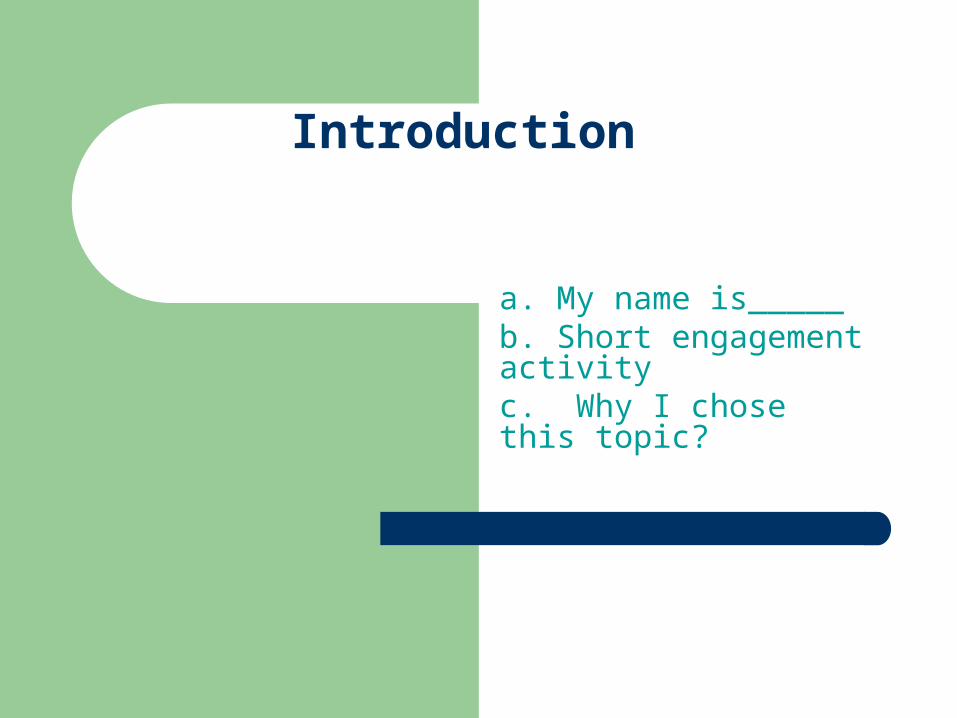
Introduction
a. My name is_____b. Short engagement activityc. Why I chose this topic?

Core Question
a. Address the core question
b. Note the learning stretch

Content Standard/Main Applied Learning Standard
a. Show alignment of the standards

Research – Present an overview of your I-Search paper
a. What did you know?b. What did you want to find
out?c. Show how you supported
the core question with research.
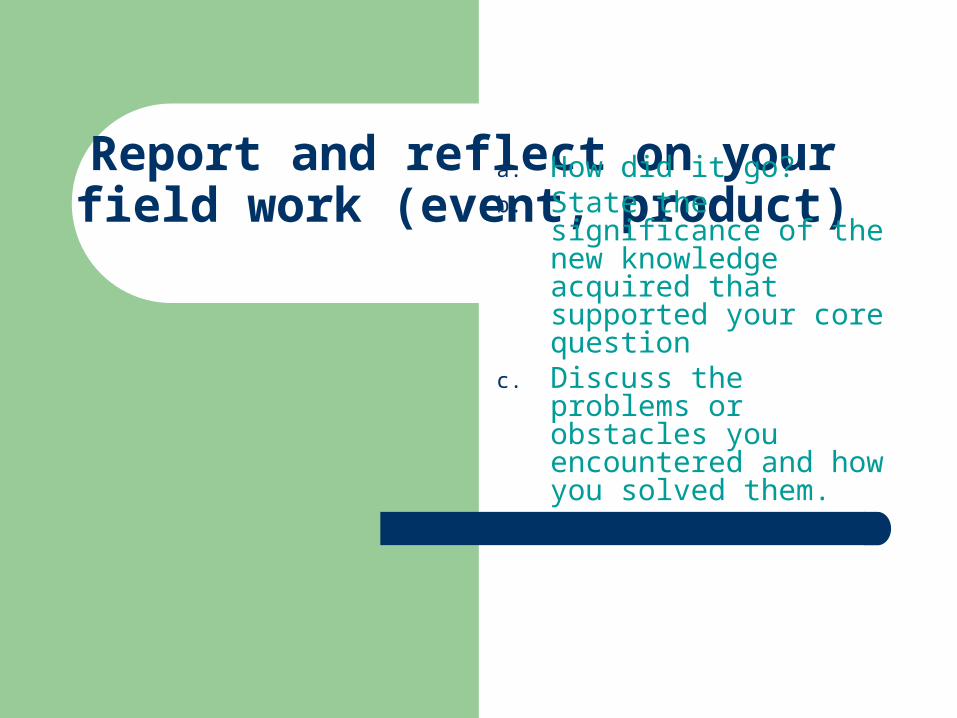
Report and reflect on your field work (event, product)
a. How did it go?b. State the significance of
the new knowledge acquired that supported your core question
c. Discuss the problems or obstacles you encountered and how you solved them.

Conclusion
a. Based on your core question, discuss the impact of the project on you.
b. Share some insights; the next time I do this type of a project I would…

Making PowerPoint Slides
Avoiding the Pitfalls of Bad Slides
Adapted from the International Association of Science and Technology for Development (IASTED) version.www.iasted.org/conferences/formatting/Presentations-Tips.ppt

Tips to be Covered
Outlines Slide Structure Fonts Color Background Graphs and Images Spelling and Grammar Conclusions Questions
Outline
Make your 1st or 2nd slide an outline of your presentation– Ex: previous slide
Follow the order of your outline for the rest of the presentation
Only place main points on the outline slide– Ex: Use the titles of each slide as main points

Slide Structure – Good
Use 1-2 slides per minute of your presentation Write in bullet form, not complete sentences Include 4-5 bullets per slide Avoid wordiness: use key words and phrases
only
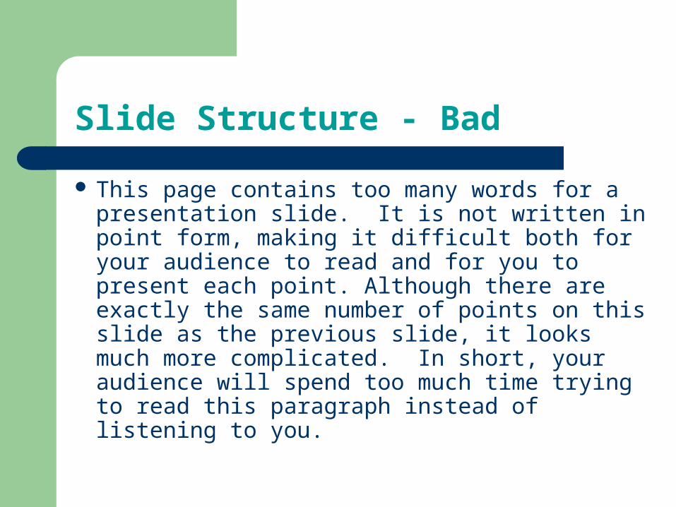
Slide Structure - Bad
This page contains too many words for a presentation slide. It is not written in point form, making it difficult both for your audience to read and for you to present each point. Although there are exactly the same number of points on this slide as the previous slide, it looks much more complicated. In short, your audience will spend too much time trying to read this paragraph instead of listening to you.
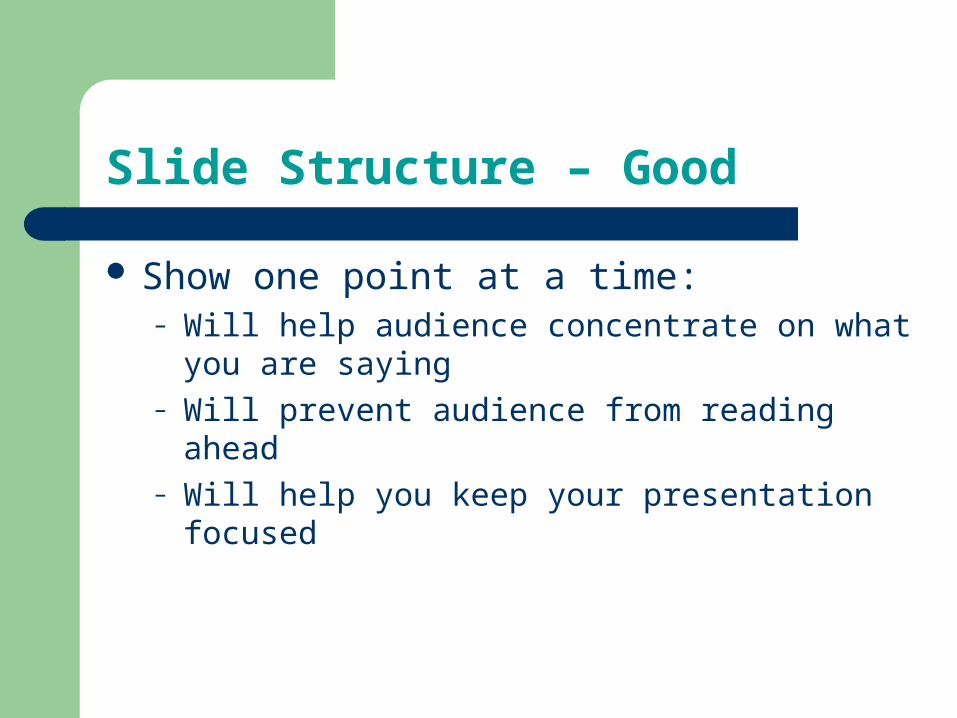
Slide Structure – Good
Show one point at a time:– Will help audience concentrate on what you are
saying– Will prevent audience from reading ahead– Will help you keep your presentation focused
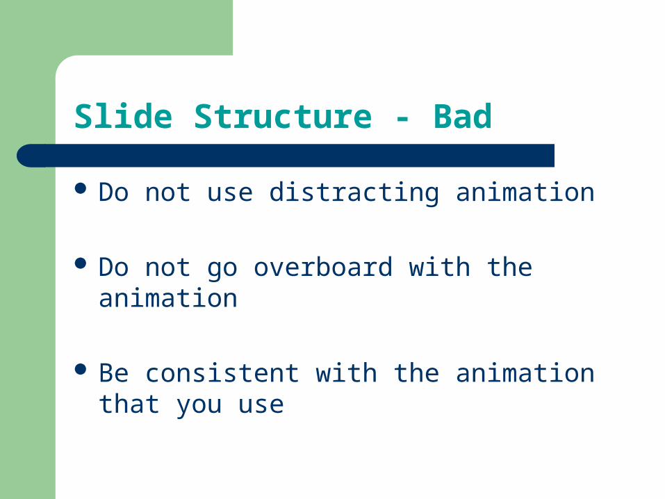
Slide Structure - Bad
Do not use distracting animation
Do not go overboard with the animation
Be consistent with the animation that you use

Fonts - Good
Use at least an 18-point font Use different size fonts for main points and
secondary points– this font is 24-point, the main point font is 28-point,
and the title font is 36-point
Use a standard font like Times New Roman or Arial

Fonts - Bad
If you use a small font, your audience won’t be able to read what you have written
CAPITALIZE ONLY WHEN NECESSARY. IT IS DIFFICULT TO READ
Don’t use a complicated font

Color - Good
Use a color of font that contrasts sharply with the background– Ex: blue font on white background
Use color to reinforce the logic of your structure– Ex: light blue title and dark blue text
Use color to emphasize a point– But only use this occasionally

Color - Bad
Using a font color that does not contrast with the background color is hard to read
Using color for decoration is distracting and annoying.
Using a different color for each point is unnecessary– Using a different color for secondary points is also
unnecessary Trying to be creative can also be bad
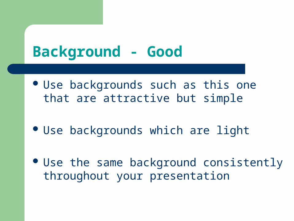
Background - Good
Use backgrounds such as this one that are attractive but simple
Use backgrounds which are light
Use the same background consistently throughout your presentation
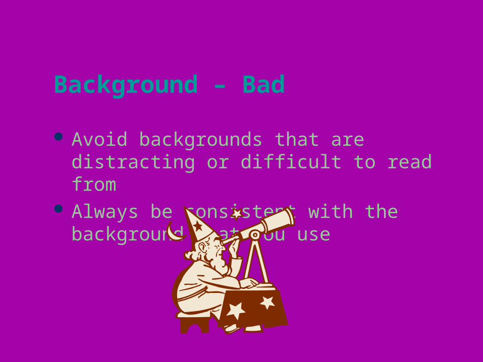
Background – Bad
Avoid backgrounds that are distracting or difficult to read from
Always be consistent with the background that you use

Graphs - Good
Use graphs rather than just charts and words– Data in graphs is easier to comprehend & retain
than is raw data– Trends are easier to visualize in graph form
Always title your graphs

Graphs - Bad
January February March AprilBlue Shoes 20.4 27.4 90 20.4Red Shoes 30.6 38.6 34.6 31.6

Graphs - Good
0
10
20
30
40
50
60
70
80
90
100
January February March April
Items Sold in First Quarter of 2002
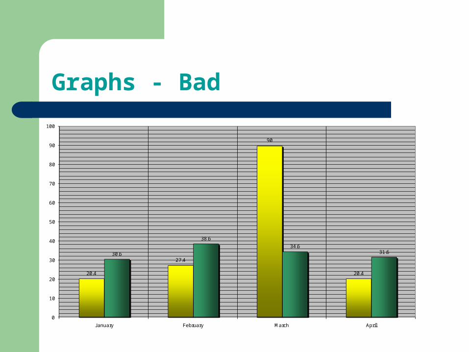
Graphs - Bad
20.4
27.4
90
20.4
30.6
38.6
34.631.6
0
10
20
30
40
50
60
70
80
90
100
January February March April

Graphs - Bad
Minor gridlines are unnecessary Font is too small Colors are illogical Title is missing Shading is distracting

Spelling and Grammar
Proof your slides for:– speling mistakes– the use of of repeated words– grammatical errors you might have make
If English is not your first language, please have someone else check your presentation!

Conclusion
Use an effective and strong closing– Your audience is likely to remember your last words
Use a conclusion slide to:– Summarize the main points of your presentation
Conclusion
Remember that you are focus of your presentation.
Use the slides to guide your thinking. Grab attention immediately. Design quality slides that enhance what you
say.
Conclusion
Stand away from a podium and talk to the audience.
Make good eye contact and be responsive. Provide a handout with key points.

Questions??
End your presentation with a simple question slide to:– Invite your audience to ask questions– Provide a visual aid during question period– Avoid ending a presentation abruptly

Final Advice
Be prepared. Come early and make sure all technical details (computer, remote, software, etc.) are set up and working.
Have a backup. Carry a flash drive with your presentation
Practice, practice, practice