cartograms in theory and practice - irlogi · cartograms in theory and practice martin charlton...
TRANSCRIPT

Mapping People
Cartograms in
Theory and
Practice
Martin Charlton
Chris Brunsdon
National Centre for Geocomputation
Maynooth University
Maynooth, Co Kildare, IRELAND
Outline
• Boundaries and scale
• Creating cartograms
• Software
• Experiments
• Evaluation
• Results
• Caveat emptor
• Conclusions
1. Boundaries and scale
The task
• Mapping mortality data for Ireland
• Among the choices to make are those of the appropriate spatial unit...
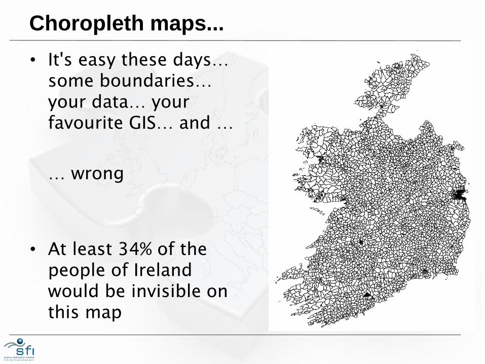
Choropleth maps...
• It's easy these days… some boundaries… your data… your favourite GIS… and …
… wrong
• At least 34% of the people of Ireland would be invisible on this map
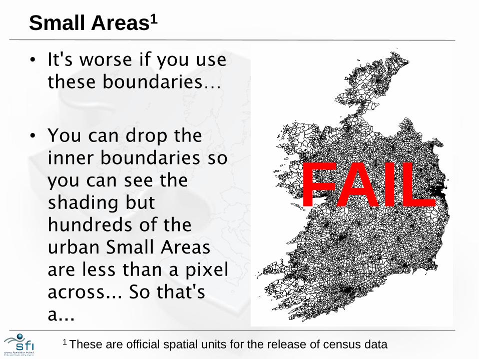
Small Areas1
• It's worse if you use these boundaries…
• You can drop the inner boundaries so you can see the shading but hundreds of the urban Small Areas are less than a pixel across... So that's a...
FAIL
1 These are official spatial units for the release of census data
Er…
• So the Small Areas are a waste of time?
• No… They have a consistent definition and internal homogeneity.
• Good for collecting and reporting data
• They're reasonably comparable with Output Areas used in Northern Ireland
• Good as building blocks
Let's not forget...
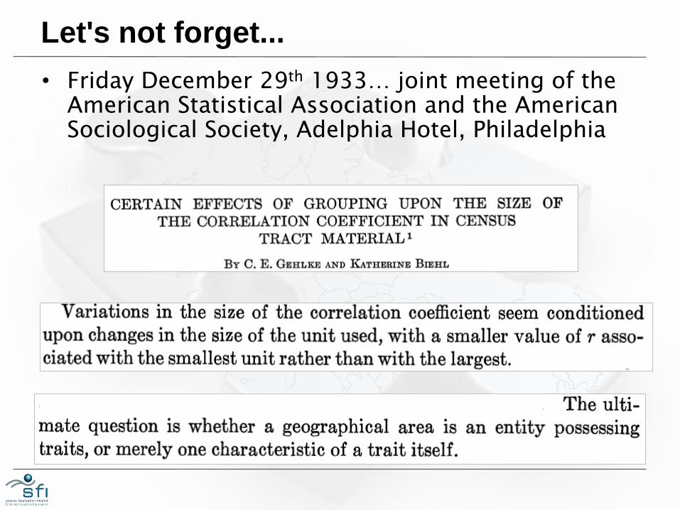
• Friday December 29th 1933… joint meeting of the American Statistical Association and the American Sociological Society, Adelphia Hotel, Philadelphia
Small and too small
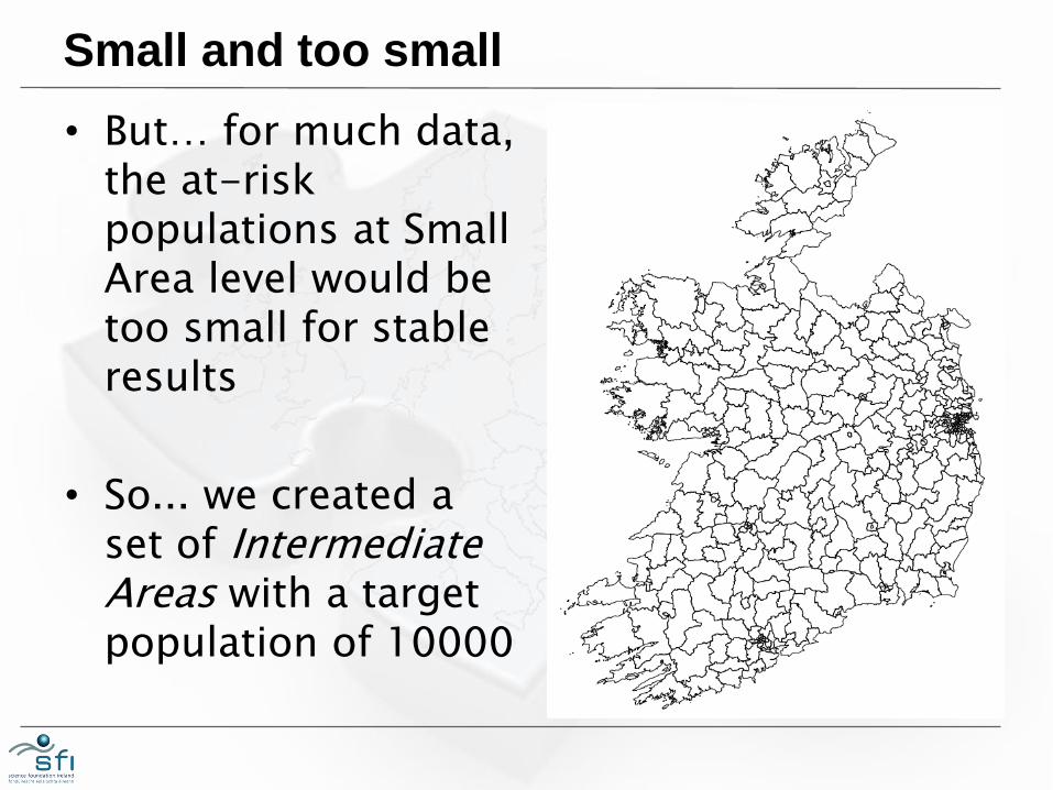
• But… for much data, the at-risk populations at Small Area level would be too small for stable results
• So... we created a set of Intermediate Areas with a target population of 10000
Analysis and display
• The requirements for analysis and display are different
• These Intermediate Areas are fine for our analysis, but not for display…
• … Intermediate Areas in Dublin, Cork, Limerick, Galway, Waterford are still too small for visualisation
• Rural areas are given disproportionate emphasis
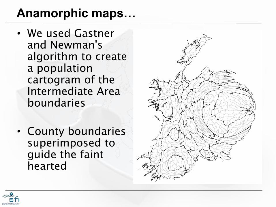
Anamorphic maps…
• We used Gastner and Newman's algorithm to create a population cartogram of the Intermediate Area boundaries
• County boundaries superimposed to guide the faint hearted
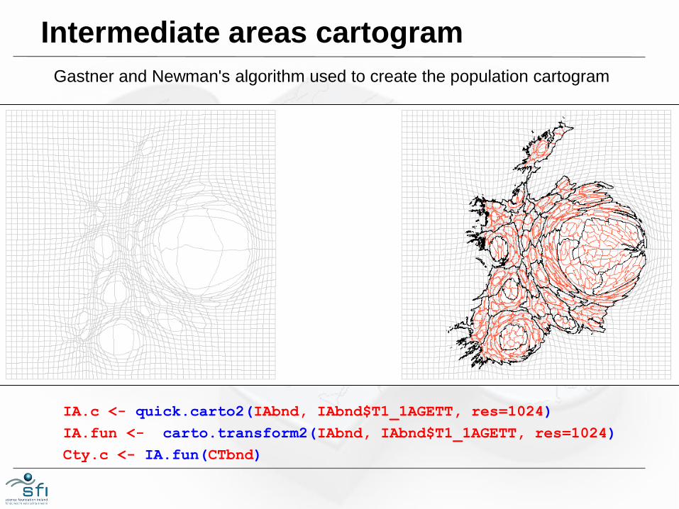
Intermediate areas cartogram
IA.c <- quick.carto2(IAbnd, IAbnd$T1_1AGETT, res=1024)
IA.fun <- carto.transform2(IAbnd, IAbnd$T1_1AGETT, res=1024)
Cty.c <- IA.fun(CTbnd)
Gastner and Newman's algorithm used to create the population cartogram
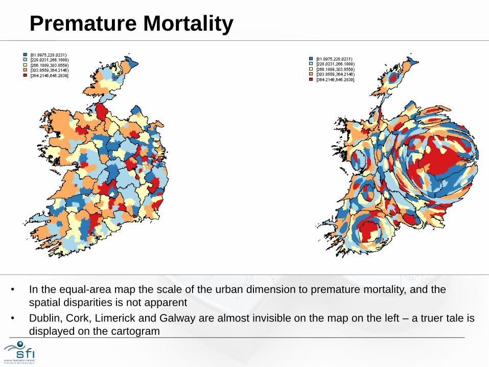
Premature Mortality
• In the equal-area map the scale of the urban dimension to premature mortality, and the
spatial disparities is not apparent
• Dublin, Cork, Limerick and Galway are almost invisible on the map on the left – a truer tale is
displayed on the cartogram
2: CREATING CARTOGRAMS
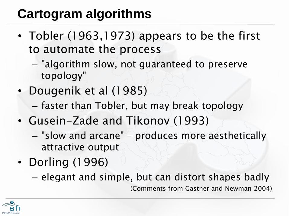
Cartogram algorithms
• Tobler (1963,1973) appears to be the first to automate the process
– "algorithm slow, not guaranteed to preserve topology"
• Dougenik et al (1985)
– faster than Tobler, but may break topology
• Gusein-Zade and Tikonov (1993)
– "slow and arcane" – produces more aesthetically attractive output
• Dorling (1996)
– elegant and simple, but can distort shapes badly (Comments from Gastner and Newman 2004)
Gastner and Newman 2004
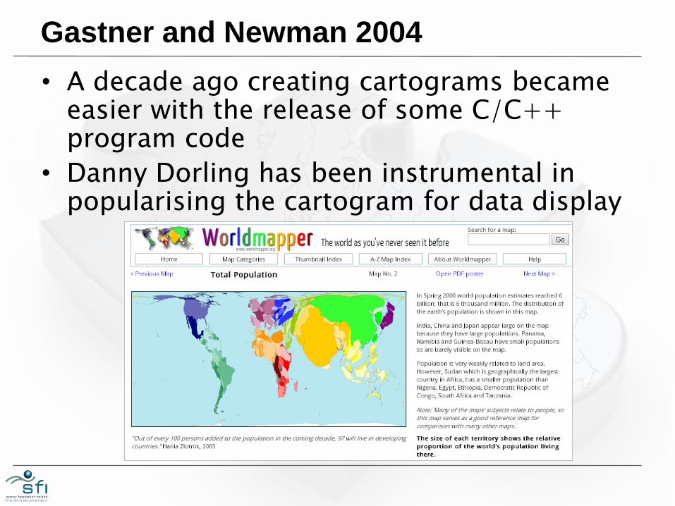
• A decade ago creating cartograms became easier with the release of some C/C++ program code
• Danny Dorling has been instrumental in popularising the cartogram for data display
Gastner and Newman
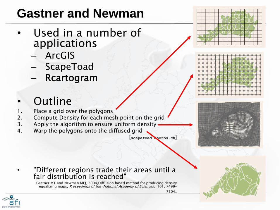
• Used in a number of applications – ArcGIS – ScapeToad – Rcartogram
• Outline 1. Place a grid over the polygons 2. Compute Density for each mesh point on the grid 3. Apply the algorithm to ensure uniform density 4. Warp the polygons onto the diffused grid
[scapetoad.choros.ch]
• "Different regions trade their areas until a fair distribution is reached"
Gastner MT and Newman MEJ, 2004,Diffusion based method for producing density equalizing maps, Proceedings of the National Academy of Sciences, 101, 7499-
7504.
3: SOFTWARE: Rcartogram and getcartr
Rcartogram
• Duncan Lang of UC Davis wrote an R interface to Mark Newman's code
• But it's not in CRAN – the official repository for R packages
• Compilation issues in Windows
• http://www.omegahat.org/Rcartogram
Creating the cartograms: getcartr
• Brunsdon's getcartr package provides an interface to the Rcartogram package
• There are two functions of interest
– quick.carto(spdf,variable,res)
– carto.transform(spdf,variable,res)
• Arguments:
– spdf: spatial polygons data frame
– variable: mass variable for polygons in SPDF
– res: cartogram grid resolution
Twiddling options
• We can change:
– The spatial data frame
– The variable which we will use
– The resolution of the warp grid (default is 128)
• Hearsay advice is that we should start with an equal area projection:
– It’s a good idea to use an equal area projection. [http://www.gislounge.com/how-to-make-area-cartogram-maps-in-arcgis/]
• Is 128 a good resolution?

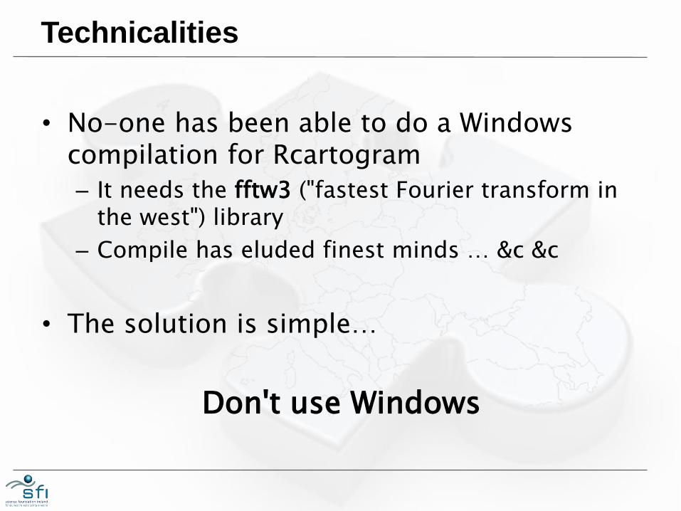
Technicalities
• No-one has been able to do a Windows compilation for Rcartogram
– It needs the fftw3 ("fastest Fourier transform in the west") library
– Compile has eluded finest minds … &c &c
• The solution is simple…
Don't use Windows

Not using Windows
• This is possible if you're a Mac user.
• This is also possible if you're running Linux
• You can run Linux on Windows, but you need some Virtual Machine software
VMWare® Player… it's freeware
• You can run a virtual Linux system on top of Windows – Copy/paste between the virtual machine and
Windows applications
– Access Windows disk drives
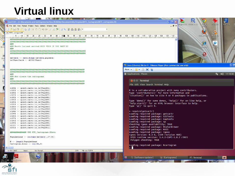
Virtual linux
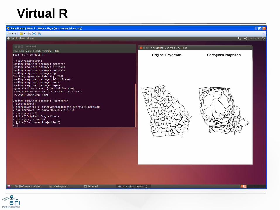
Virtual R
4: EXPERIMENTS
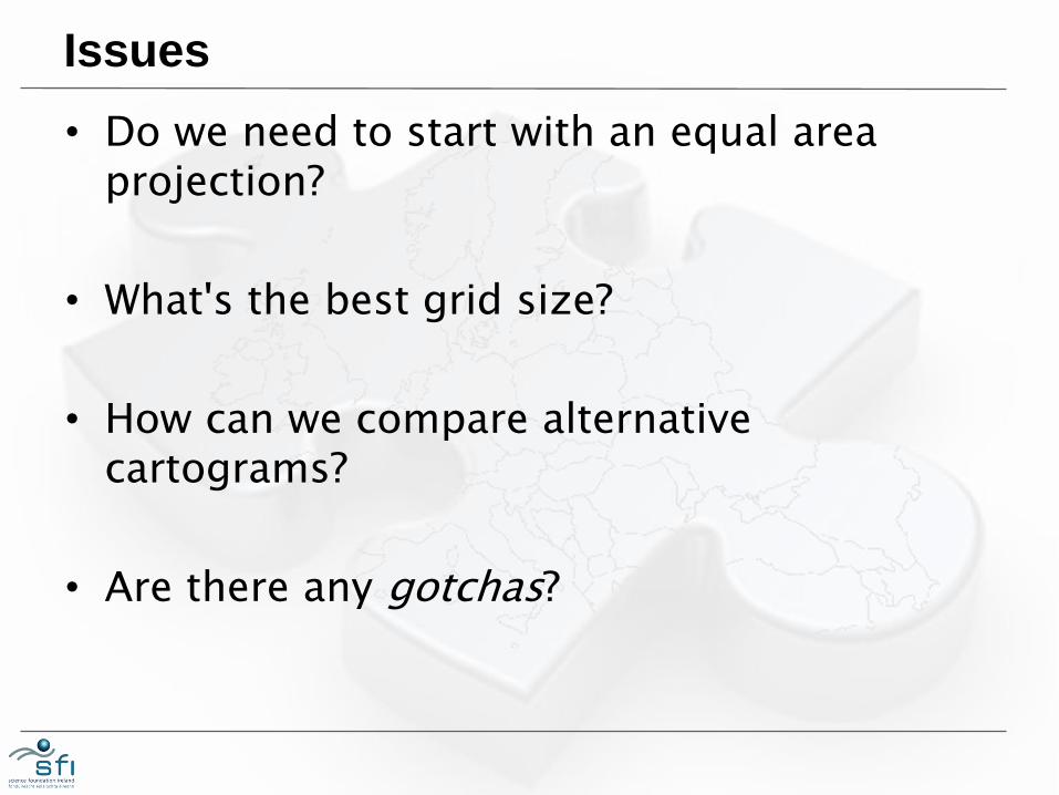
Issues
• Do we need to start with an equal area projection?
• What's the best grid size?
• How can we compare alternative cartograms?
• Are there any gotchas?
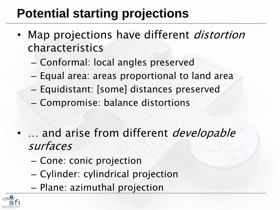
Potential starting projections
• Map projections have different distortion characteristics
– Conformal: local angles preserved
– Equal area: areas proportional to land area
– Equidistant: [some] distances preserved
– Compromise: balance distortions
• … and arise from different developable surfaces – Cone: conic projection
– Cylinder: cylindrical projection
– Plane: azimuthal projection
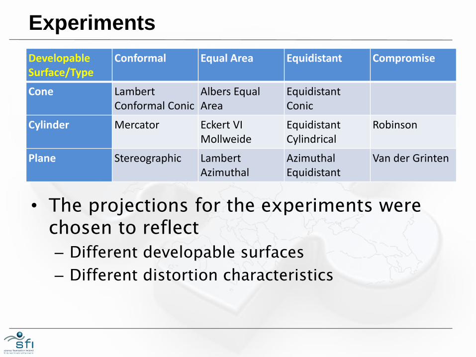
Experiments
Developable Surface/Type
Conformal Equal Area Equidistant Compromise
Cone Lambert Conformal Conic
Albers Equal Area
Equidistant Conic
Cylinder Mercator Eckert VI Mollweide
Equidistant Cylindrical
Robinson
Plane Stereographic Lambert Azimuthal
Azimuthal Equidistant
Van der Grinten
• The projections for the experiments were chosen to reflect
– Different developable surfaces
– Different distortion characteristics
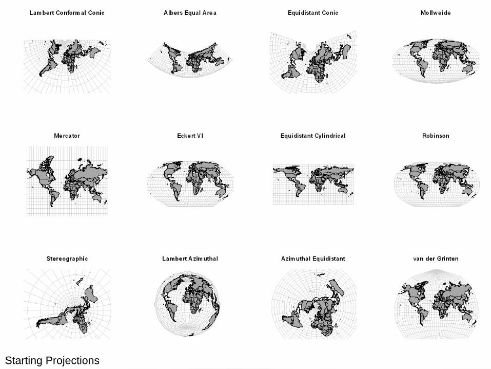
Projections
Starting Projections
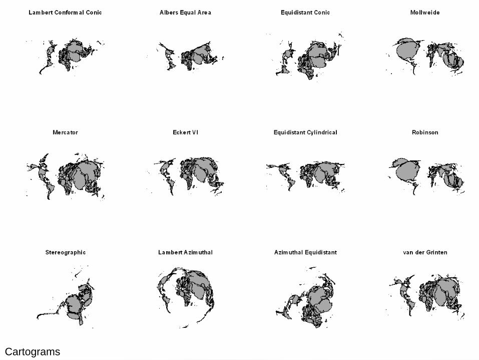
Cartograms
Cartograms
5: EVALUATION
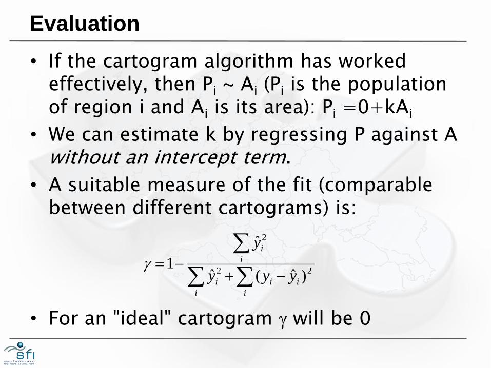
Evaluation
• If the cartogram algorithm has worked effectively, then Pi ~ Ai (Pi is the population of region i and Ai is its area): Pi =0+kAi
• We can estimate k by regressing P against A without an intercept term.
• A suitable measure of the fit (comparable between different cartograms) is:
• For an "ideal" cartogram g will be 0
i
ii
i
i
i
i
yyy
y
22
2
)ˆ(ˆ
ˆ
1g
6: RESULTS

Experiments
• We created 216 world cartograms using the twelve starting projections described earlier
• We used 18 different grid resolutions:
– Too coarse
– Too fine
– 64 ... 1152 in steps of 64
• Run using Ubuntu linux through VMware on a Dell laptop with 8GB RAM and a 2.8GHz 4-core processor
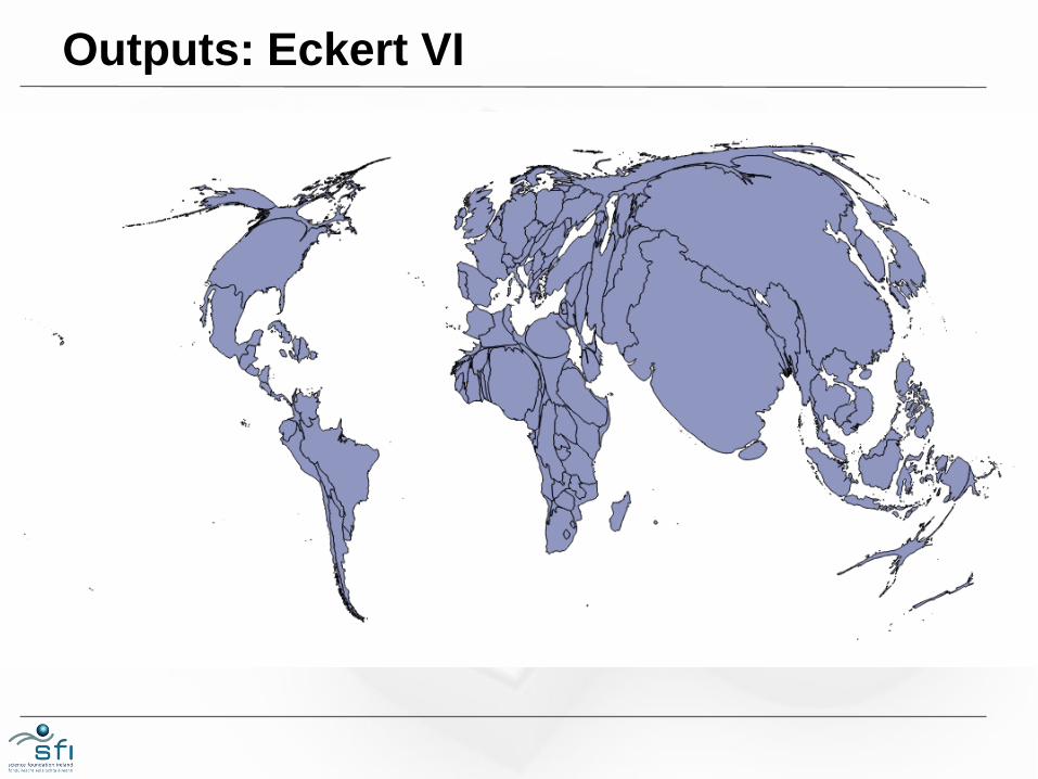
Outputs: Eckert VI
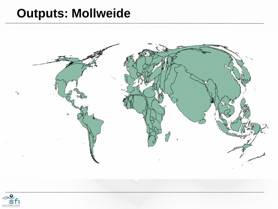
Outputs: Mollweide
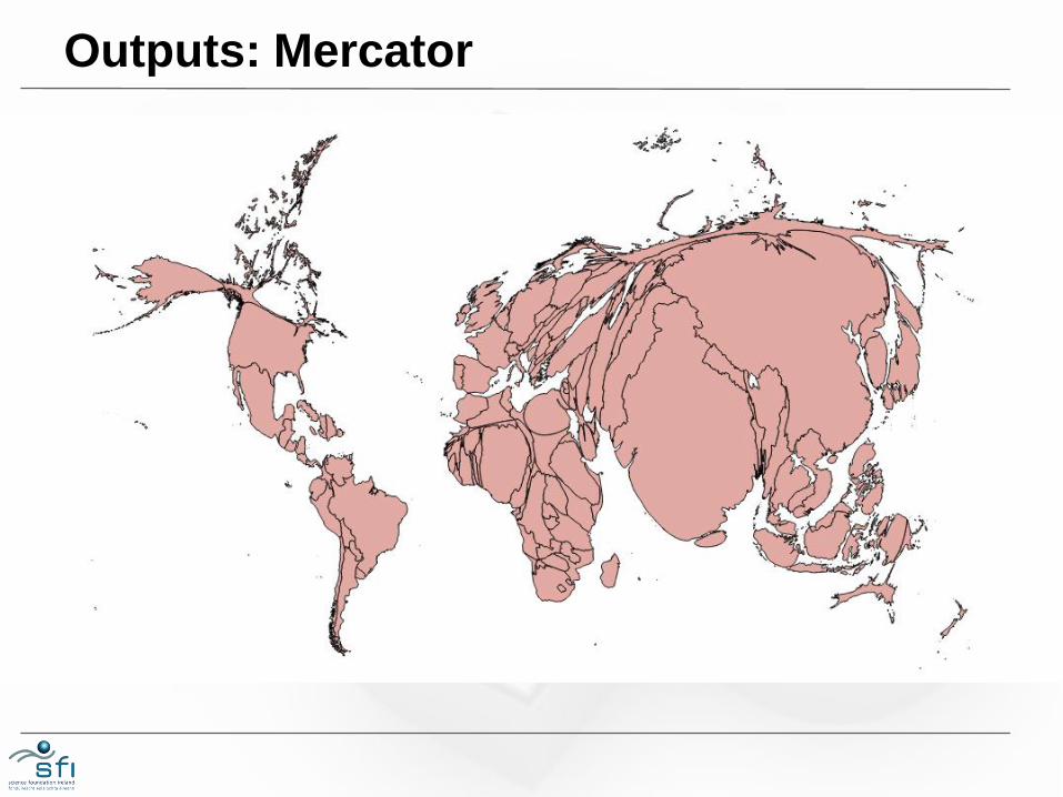
Outputs: Mercator
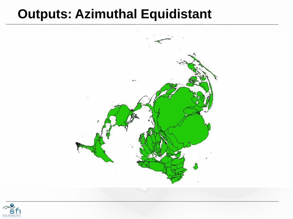
Outputs: Azimuthal Equidistant
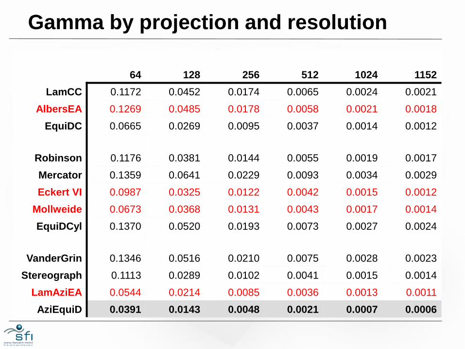
Gamma by projection and resolution
64 128 256 512 1024 1152
LamCC 0.1172 0.0452 0.0174 0.0065 0.0024 0.0021
AlbersEA 0.1269 0.0485 0.0178 0.0058 0.0021 0.0018
EquiDC 0.0665 0.0269 0.0095 0.0037 0.0014 0.0012
Robinson 0.1176 0.0381 0.0144 0.0055 0.0019 0.0017
Mercator 0.1359 0.0641 0.0229 0.0093 0.0034 0.0029
Eckert VI 0.0987 0.0325 0.0122 0.0042 0.0015 0.0012
Mollweide 0.0673 0.0368 0.0131 0.0043 0.0017 0.0014
EquiDCyl 0.1370 0.0520 0.0193 0.0073 0.0027 0.0024
VanderGrin 0.1346 0.0516 0.0210 0.0075 0.0028 0.0023
Stereograph 0.1113 0.0289 0.0102 0.0041 0.0015 0.0014
LamAziEA 0.0544 0.0214 0.0085 0.0036 0.0013 0.0011
AziEquiD 0.0391 0.0143 0.0048 0.0021 0.0007 0.0006
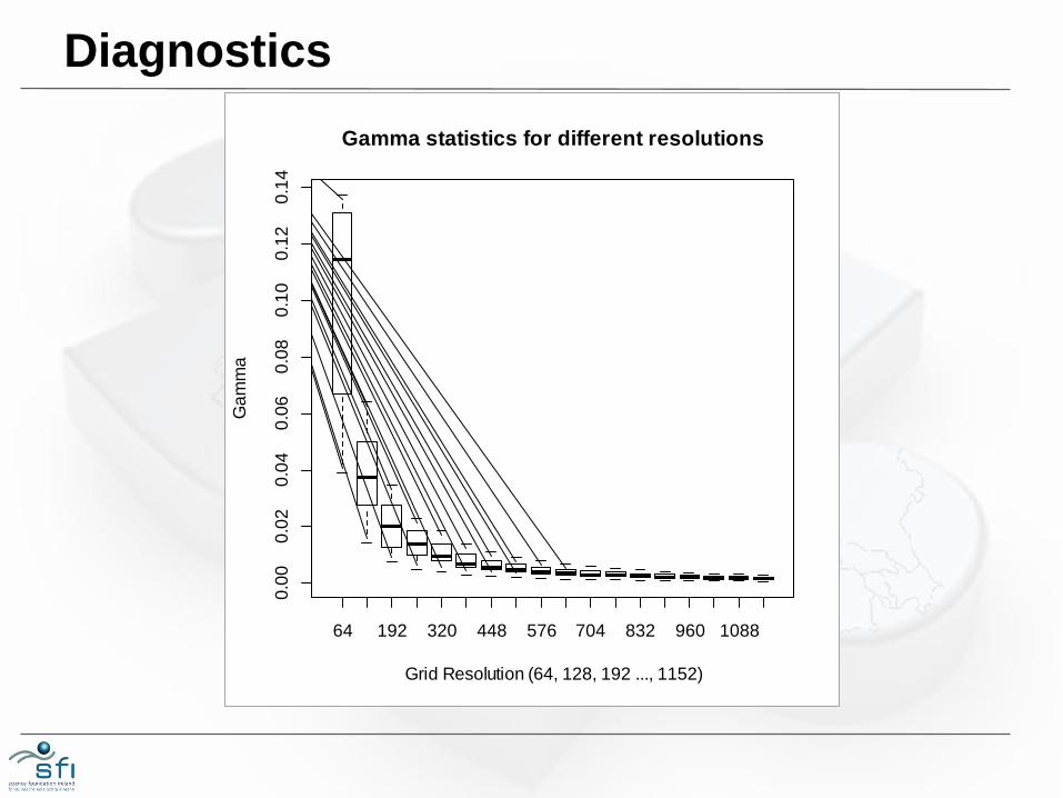
Diagnostics
64 192 320 448 576 704 832 960 1088
0.0
00
.02
0.0
40
.06
0.0
80
.10
0.1
20
.14
Gamma statistics for different resolutions
Grid Resolution (64, 128, 192 ..., 1152)
Ga
mm
a
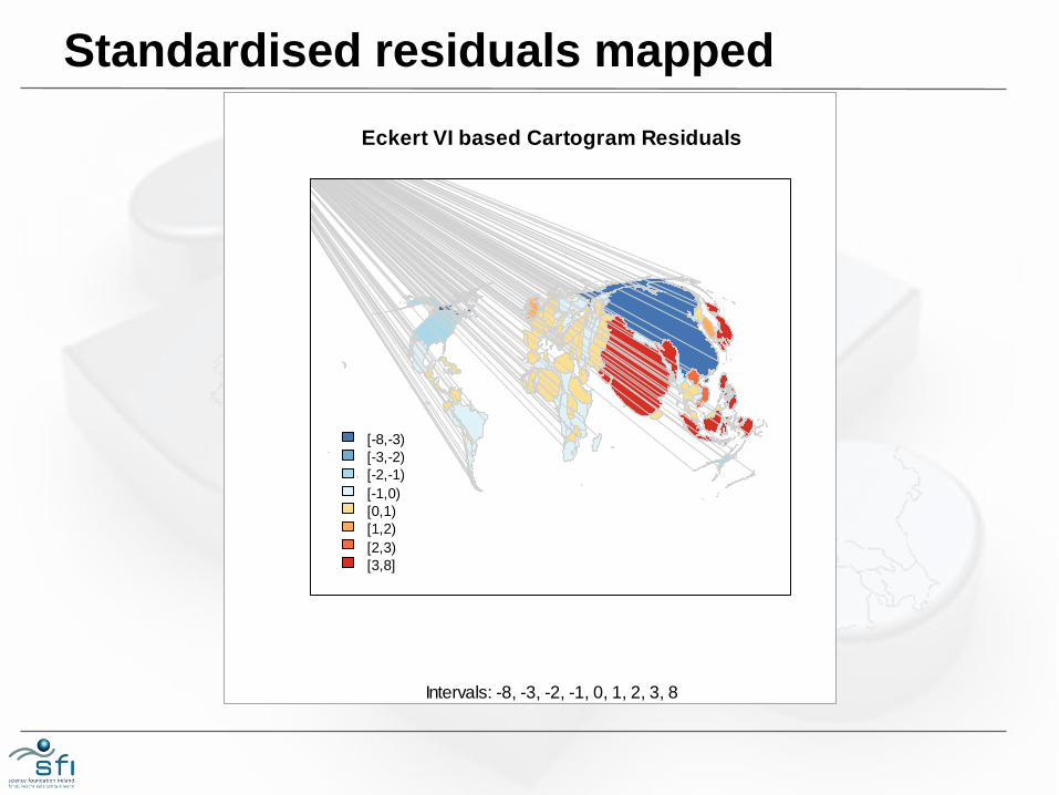
Standardised residuals mapped
Eckert VI based Cartogram Residuals
Intervals: -8, -3, -2, -1, 0, 1, 2, 3, 8
[-8,-3)
[-3,-2)
[-2,-1)
[-1,0)
[0,1)
[1,2)
[2,3)
[3,8]
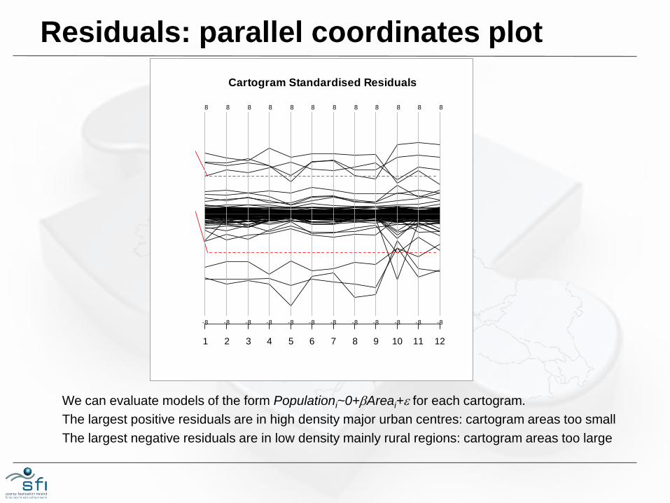
Residuals: parallel coordinates plot
Cartogram Standardised Residuals
1 2 3 4 5 6 7 8 9 10 11 12
-8
8
-8
8
-8
8
-8
8
-8
8
-8
8
-8
8
-8
8
-8
8
-8
8
-8
8
-8
8
We can evaluate models of the form Populationi~0+bAreai+e for each cartogram.
The largest positive residuals are in high density major urban centres: cartogram areas too small
The largest negative residuals are in low density mainly rural regions: cartogram areas too large
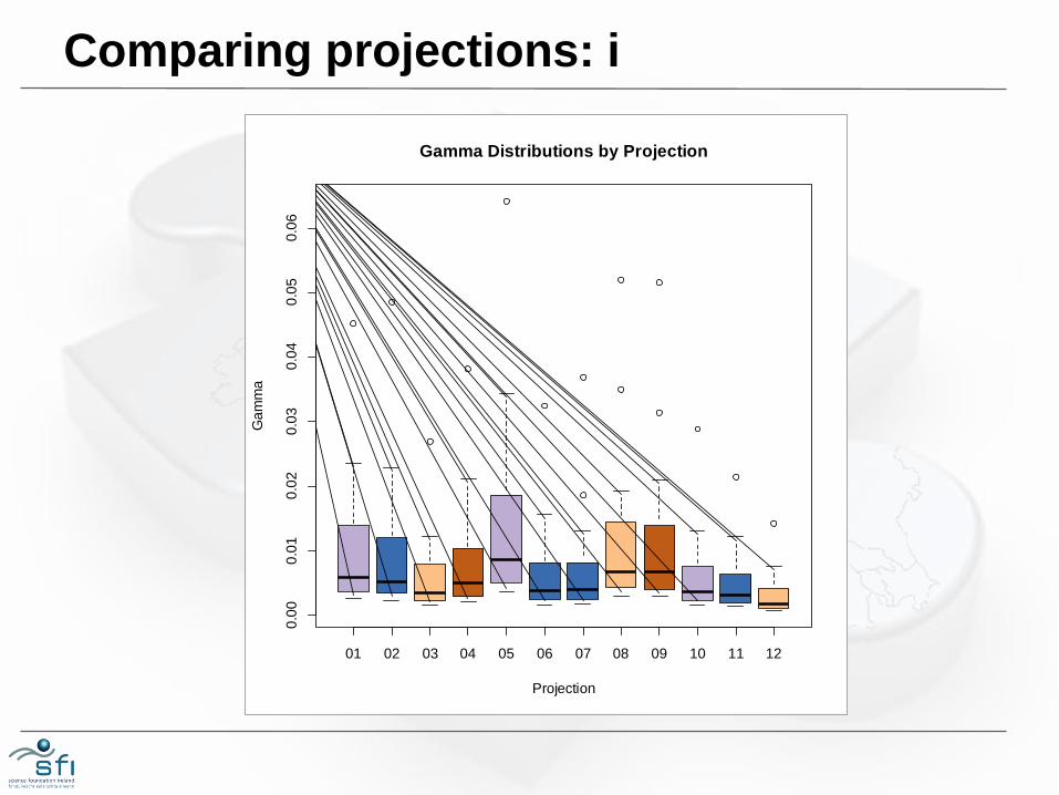
Comparing projections: i
01 02 03 04 05 06 07 08 09 10 11 12
0.0
00
.01
0.0
20
.03
0.0
40
.05
0.0
6
Gamma Distributions by Projection
Projection
Ga
mm
a
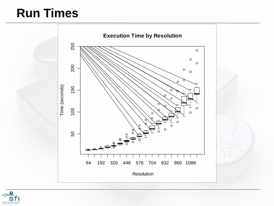
Run Times
64 192 320 448 576 704 832 960 1088
50
10
01
50
20
02
50
Execution Time by Resolution
Resolution
Tim
e (
se
co
nd
s)
Time required
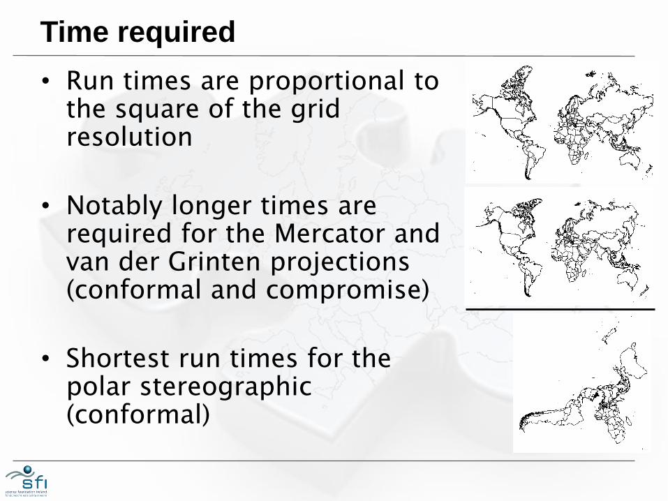
• Run times are proportional to the square of the grid resolution
• Notably longer times are required for the Mercator and van der Grinten projections (conformal and compromise)
• Shortest run times for the polar stereographic (conformal)
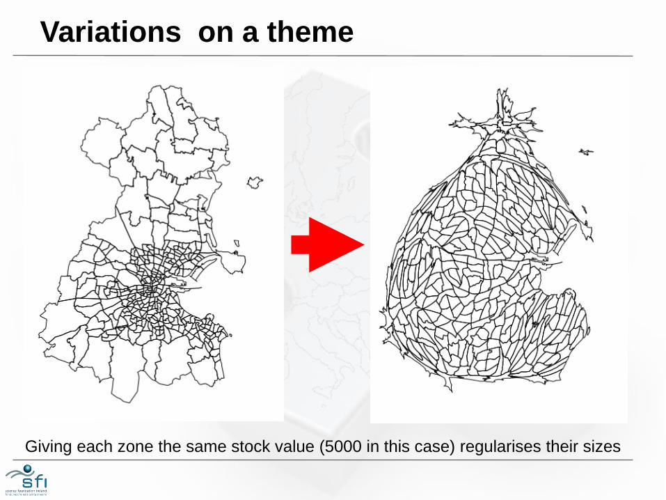
Giving each zone the same stock value (5000 in this case) regularises their sizes
Variations on a theme

Software sources
• Rcartogram
http://www.omegahat.org/Rcartogram/
• getcartr
https://github.com/chrisbrunsdon/getcartr
• VMware Player
https://my.vmware.com/web/vmware/free#des
ktop_end_user_computing/vmware_player/7_
0
7: GOTCHAS
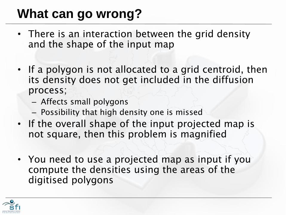
What can go wrong?
• There is an interaction between the grid density and the shape of the input map
• If a polygon is not allocated to a grid centroid, then its density does not get included in the diffusion process; – Affects small polygons
– Possibility that high density one is missed
• If the overall shape of the input projected map is not square, then this problem is magnified
• You need to use a projected map as input if you compute the densities using the areas of the digitised polygons
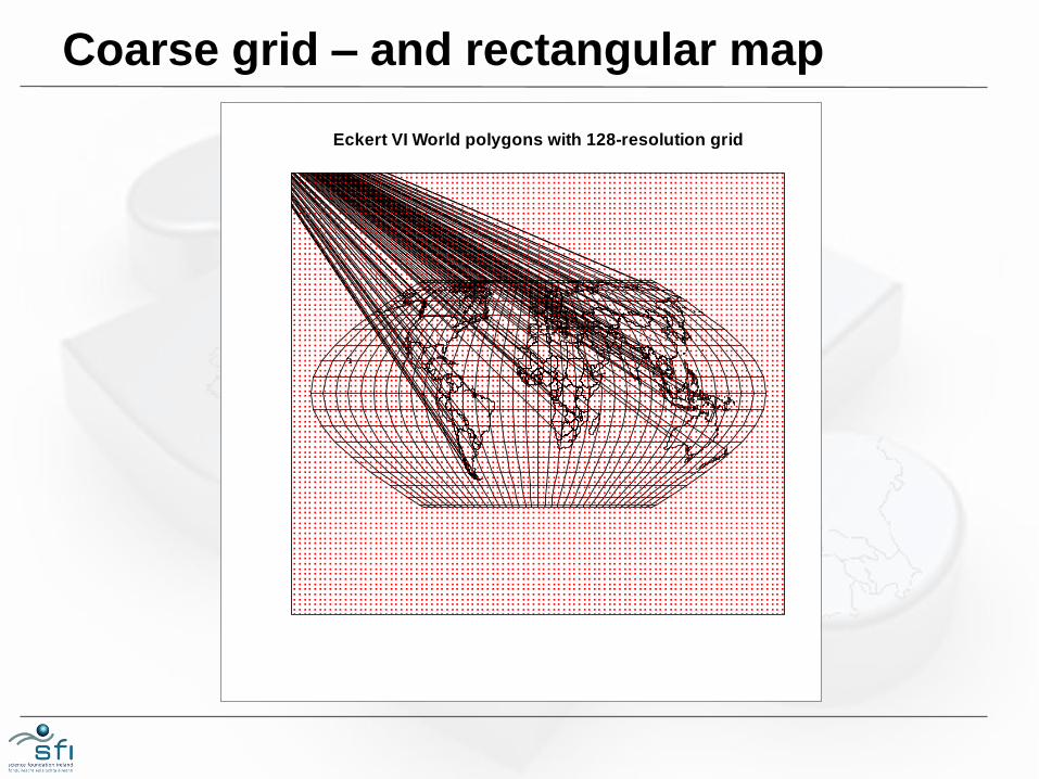
Coarse grid – and rectangular map
Eckert VI World polygons with 128-resolution grid
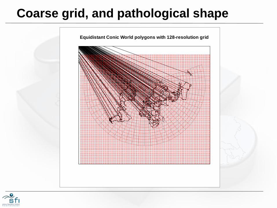
Coarse grid, and pathological shape
Equidistant Conic World polygons with 128-resolution grid
8: CONCLUSIONS
Observations…
• You should always undertake a quality check
• Better results would appear to be linked to higher resolution density grids (g -> 0)
• There's little to choose between the different projections in terms of fit to the data – No need to start with an equal area projection!
• There is an interaction between the disposition of the polygons in the projected data projection and those in the resulting cartogram

Acknowledgements
We gratefully acknowledge support from the ESPON Programme under the
Multidimensional Database Design and Development (M4D) Project
Texts and maps stemming from research projects under the ESPON
Programme presented here do not necessarily reflect the opinion of the ESPON Monitoring Committee
Thank you