chapter 1: analyzing trade flows · chapter 1: analyzing trade flows 13 chapter 1 a. overview and...
TRANSCRIPT

11
CH
AP
TER
1
CHAPTER 1: Analyzing trade flows
TABLE OF CONTENTS
A. Overview and learning objectives 13
B. Analytical tools 141. Overall openness 152. Trade composition 193. Comparative advantage 264. Analyzing regional trade 285. Other important concepts 32
C. Data 341. Databases 342. Measurement issues 37
D. Applications 391. Comparing openness across countries 392. Trade composition 413. Comparative advantage 484. Terms of trade 53
E. Exercises 541. RCA, growth orientation and geographical composition 542. Offshoring and vertical specialization 55
Endnotes 56
References 59
12
LIST OF FIGURES
Figure 1.1. Trade openness and GDP per capita, 2000 16Figure 1.2. Overlap trade and country-similarity index vis-à-vis Germany, 2004 20Figure 1.3. Decomposition of the export growth of 99 developing
countries, 1995–2004 22Figure 1.4. Export concentration and stages of development 23Figure 1.5. Import matrix, selected Latin American countries 29Figure 1.6. EU regional intensity of trade indices with the CEECs 30Figure 1.7. HS sections as a proportion of trade and subheadings 35Figure 1.8. Zambia’s import statistics against mirrored statistics 38Figure 1.9. Distribution of import–export discrepancies 38Figure 1.10. Main export sectors, Colombia, 1990 and 2000 41Figure 1.11. Main trade partners, Colombia (export side), 1990 and 2000 42Figure 1.12. Geographical orientation of exports, Colombia vs. Pakistan, 2000 43Figure 1.13. Geographical/product orientation of exports, Colombia vs.
Pakistan, 2000 44Figure 1.14. Grubel-Lloyd indexes at different level of aggregation of trade data 45Figure 1.15. Normalized Herfindahl indexes, selected Latin American countries 47Figure 1.16. Chile trade complementarity index, import side 48Figure 1.17. Evolution of Costa Rica’s export portfolio and endowment 49Figure 1.18. Relationship between per-capita GDP (in logs) and
EXPY (in logs), 2002 51Figure 1.19. EXPY over time for selected countries 51Figure 1.20. Barter terms of trade of developing countries, 2001–2009 53
LIST OF TABLES
Table 1.1. Evolution of aggregated GL indices over time: central and eastern Europe, 1994–2003 21
Table 1.2. Regional imports, selected Latin American countries, 2000 28Table 1.3. Complementarity indices: illustrative calculations 31Table 1.4. Real exchange rate: illustrative calculations 32Table 1.5. Grubel-Lloyd index: illustrative calculations 45Table 1.6. Decomposition of export growth 1995–2004, selected OECD countries 46Table 1.7. Largest and smallest PRODY values (2000 US$) 50Table 1.8. Correlates of EXPY 52
LIST OF BOXES
Box 1.1. Intensive and extensive margins of diversification 24
CHAPTER 1: AnAlyzing TRAdE flows
13
CH
AP
TER
1
A. overview and learning objectives
This chapter introduces the main techniques used for trade data analysis. It presents an overview of the simple trade and trade policy indicators that are at hand and of the databases needed to construct them. The chapter also points out the challenges in collecting and analyzing the data, such as measurement errors or aggregation bias.
In introducing you to the main indices used to assess trade performance, the discussion is organized around how much, what and with whom a country trades. We start with a discussion of the main indices used to assess trade performance. These indices are easy to calculate and require neither programming nor statistical knowledge. They include openness, both at the aggregate level and at the industry level (the “import content of exports” and various measures of trade in parts and components). We will also show you how to analyze and display data on the sectoral composition and structural characteristics of trade, including intra-industry trade, export diversification and margins of export growth. Next, we will discuss various measures that capture the concept of comparative advantage, including revealed comparative advantage indexes and revealed technology and factor-intensity indexes.
Then we will illustrate how regional trade data can be analyzed and displayed, a subject of particular importance in view of the spread of regionalism and the high policy interest in it. In particular, we will discuss the use of trade complementarity and regional intensity of trade indices, applying them to intra-regional trade in Latin America. Before turning to data, we will further introduce two other concepts related to trade performance, namely the real effective exchange rate and terms of trade.
There exists a large variety of data sources for trade data. Original data are affected by two major problems, however. On the one hand, import value data are known to be more reliable than export values or import volumes, which calls for prudence in interpretation when dealing with bilateral flows or unit values. On the other hand, trade and production classifications differ, which means that it is often necessary to aggregate data when both types of information are needed. Both problems being well known, a number of secondary data sources provide partial answers to these problems. We discuss these problems and their possible solutions in the second part of the chapter.
In the last part of this chapter you will find a number of applications that will guide you in constructing the structural indicators introduced in the first part. The applications will help you understand how they should and how they should not be interpreted in order to reduce the scope for misunderstanding. A typical case is the traditional trade openness indicator (exports plus imports over GDP). We will mention all the controls that should be taken into account and will illustrate why the concept of trade “performance” can be misleading.
In this chapter, you will learn:
•• how goods are classified in commonly used trade nomenclatures•• where useful trade databases can be found and what their qualities and pitfalls are
A PRACTICAL GUIDE TO TRADE POLICY ANALYSIS
14
•• what the key measurement issues are that any analyst should know before jumping into data processing
•• what main indices are used to assess the nature of foreign trade in terms of structural, sectoral and geographical composition
•• how to display trade data graphically in a clear and appealing way.
After reading this chapter, you will be able to perform a trade analysis that will draw on the relevant types of information, will be presented in an informative but synthetic way and will be easy to digest for both specialists and non-specialists alike.
B. Analytical tools
Descriptive statistics in trade are typically needed to picture the trade performance of a country. What do we mean by “trade performance”? The answer we will provide in this chapter is based on three main questions around which we can organize a description of a country’s foreign trade: (i) How much does a country trade?; (ii) What does it trade?; and (iii) With whom does it trade? Each of these three questions is implicated in the effects trade can be expected to have on the domestic economy. The answer to each of them has a distinct “performance” flavour, depending on the policy objectives that motivate the study of a country’s foreign trade.
Let us start with “how much”. This question is intimately related to the concept of “trade openness”, which typically measures the economy’s ability to integrate itself into world trade circuits. Trade openness can also be understood as an indicator of policy performance inasmuch as it results from policy choices (e.g. trade barriers and the foreign-exchange regime). Geographical and other natural factors that are by and large given (sea access, remoteness etc.) also play a role in determining a country’s openness. Another measure of the integration of a country into the world economy is the extent to which it is involved in global value chains. We will therefore show how to construct country- and sector-level indicators that capture the sourcing of intermediate inputs beyond national borders (offshoring and vertical specialization measures).
As to the “what” question, a country’s import and export patterns are determined in the standard trade model by its endowment of productive factors and the technology it has available. Some factors, such as land and natural resources, are given by nature, while others, such as physical and human capital, are the result of past and present policies. The question of “what” is also directly linked to the question of diversification of a country’s exports, a subject of concern for many governments. We will show how to assess properly the degree of diversification of a country’s exports.
Influencing trade patterns may be a legitimate policy objective. Governments typically try to achieve this with supply-side policies aimed at “endowment building” and technology enhancement (and to a lesser extent with demand-side policies such as reducing trade barriers). Moreover, any meaningful discussion of what a country trades should take into account what it can trade, ideally through direct measurement of factor and technology endowments. As endowment data are rarely available, in their absence revealed comparative advantage (RCA) indices are used; because they are based on trade data, however, they cannot be used to compare actual with potential sectoral trade patterns. We will also discuss

CHAPTER 1: AnAlyzing TRAdE flows
15
CH
AP
TER
1
other measures that build upon the index of revealed comparative advantage to measure the technology and endowment content of exports.
In contrast to the framework of comparative advantage, in the “intra-industry trade” (IIT) paradigm, e.g. Krugman’s monopolistic-competition model (Krugman, 1979) or Brander and Krugman’s reciprocal-dumping one (Brander and Krugman, 1983), a country’s specialization pattern cannot be determined ex ante and diversification increases with country size. The IIT and standard paradigms do not necessarily compete for a unique explanation of trade patterns. They describe different dimensions of trade. Because their implications differ both for the effectiveness of trade policy and for the sources of the gains from trade (specialization in the standard model, scale economies, competition and product diversity in IIT), it is useful to separate empirically the two types of trade. We will show how this can be done using IIT indices.
Finally, consider the “with whom” question. The characteristics of a country’s trading partners affect how much it will gain from trade. For instance, trade links with growing and technologically sophisticated markets can boost domestic productivity growth. So it matters to know who the home country’s “natural trading partners” are, which typically depends on geography (distance, terrain), infrastructure and other links, such as historical ties. A full discussion of the determinants of bilateral trade, including the gravity equation, is postponed until Chapter 3. In this chapter we will limit ourselves to descriptive measures concerning the geographical composition of a country’s foreign trade and its complementarity with its trading partners.
We will show how to assess and illustrate whether an economy is linked with the “right” partners, for instance those whose demand growth is likely to help lift the home country’s exports. We will also show how the observation of regional trade patterns can help government authorities assess whether potential preferential partners are “natural” or not, in other words whether they appear to have something to trade with the home country.
An excellent introduction to some commonly used indices, together with some examples, can be found on the World Bank’s website.1 We will present some of these indices in this section, illustrate their uses and limitations, and propose some additional ones.
1. overall openness
a. Trade over GDP measure
The most natural measure of a country’s integration in world trade is its degree of openness. One might suppose that measuring a country’s openness is a relatively straightforward endeavour. Let X i, M i and Yi be respectively country i ’s total exports, total imports and GDP.2 Country i ’s openness ratio is defined as:
i ii
i
X MO
Y+= (1.1)
The higher O i, the more open is the country. For small open economies like Singapore, it may even be substantially above one. The index can be traced over time. For example, the Penn World Tables (PWTs) include this measure of openness covering a large number of years.3

A PRACTICAL GUIDE TO TRADE POLICY ANALYSIS
16
However, it is far from clear whether we can use O i as such for cross-country comparisons because it is typically correlated with several country characteristics. For instance, it varies systematically with levels of income, as shown in the scatter plots of Figure 1.1, where each point represents a country. The curve is fitted by ordinary least squares. Countries below the curve can be considered as trading less than their level of income would “normally” imply.
Stata do file for Figure 1.1 can be found at “Chapter1\Applications\1_comparing openness across countries\openness.do”
use openness.dta, replacereplace gdppc = gdppc/1000replace ln_gdppc = ln(gdppc)twoway (scatter openc gdppc) (qfit openc gdppc) if (year==2000 &openc<=200), /**/ title(“Quadratic fit”) legend(lab(1 “Openness”)) /**/ xtitle (“”GDP per capita”) twoway (scatter openc ln_gdppc) (qfit openc ln_gdppc) if (year==2000 &openc<=200), /**/ title(“Quadratic fit after log transformation”) /**/ legend(lab(1 “Openness”)) xtitle (“”log GDP per capita”)
Does it matter that openness correlates with country characteristics such as the level of income (as just shown), location (e.g. landlocked-ness) or size? It does, for two reasons. One has to do with measurement and the other has to do with logic.
Figure 1.1 Trade openness and gdP per capita, 2000
0
50
100
150
200
0 10000 20000 30000 40000 GDP per capita
Openness Fitted values Openness Fitted values
Quadratic fit(a) (b)
0
50
100
150
200
4 6 8 10 12 log GDP per capita
Quadratic fit after log transformation
Source: Author calculations from World Bank WDI
Notes: Openness is measured as the sum of imports and exports over GDP. Per capita GDP is in US dollars at Purchasing Power Parity. In panel (a), the curve is an OLS regression line in which the dependent variable is openness and the repressor GDP per capita. In panel (b), GDP per capita is in logs. Observe how the appearance of the scatter plot changes: the influence of outliers is reduced, and even though panel (b) still gives a concave relationship, the turning point is not at the same level of per-capita GDP as in panel (a). In the latter it is slightly below PPP$20,000. In the former it is around exp(9.5) = PPP$13,400 (roughly). This is to attract your attention to the fact that qualitative conclusions (the concave shape of the relationship) may be robust while quantitative conclusions (the location of the turning point) can vary substantially with even seemingly innocuous changes in the estimation method. All in all, it looks as if openness rises faster with GDP per capita at low levels than when it is at high levels.

CHAPTER 1: AnAlyzing TRAdE flows
17
CH
AP
TER
1
Concerning measurement, because “raw” openness embodies information about other country characteristics it cannot be used for cross-country comparisons without adjustment. For instance, Belgium has a higher ratio of trade to GDP than the United States, but this is mainly because the United States is a larger economy and therefore trades more with itself. If we want to generate meaningful comparisons we will have to control for influences such as economic size that we think are not interesting in terms of the openness ratio. This controlling can be done with regression analysis and we will provide an example in Application 1 below.
As for logic, suppose that one wants to assess the influence of openness on growth econometrically. The measure of openness used as an explanatory variable in the regression analysis will have to be cleansed of influences that may embody either reverse causality (from growth to openness) or omitted variables (such as the quality of the government or institutions, which can affect both openness and growth). If we failed to do this, any relationship we would uncover would suffer from what is called “endogeneity bias”.
In order to get rid of endogeneity bias in growth/openness regression, one must adopt an identification strategy consisting of using “instrumental variables” that correlate with openness but do not influence income except through openness. For instance, Frankel and Romer (1999) used distance from trading partners and other so-called “gravity” variables (more on this will be discussed in later chapters) as instrumental variables. Using this strategy, they found that openness indeed has a positive influence on income levels. Another approach consists of using measures of openness based on policies rather than outcomes. We will look at measures of openness based on policy in Chapter 2.
Observe in passing that even for something seemingly straightforward like interpreting the share of trade in GDP raw numbers can be meaningless. The same degree of openness has a very different meaning for a country with a large coastline and close to large markets than for one that is landlocked, remote and with a lower level of income.
b. Import content of exports and external orientation
The import content of exports is a measure of the outward orientation of an exporting industry. In order to calculate it, we need to introduce its building blocks. First, we define the import-penetration ratio for good j as µjt = mjt /cjt , where mjt is imports of good j in year t and cjt is domestic consumption (final demand) of the same good in the same year.4 Let also ykt and zjk be respectively industry k’s output and consumption of good j as an intermediate. Note that zjk has no time subscript because, in practice, it will be taken from an input–output table and will therefore be largely time-invariant (input–output tables available to the public are updated rather infrequently).5 Then the imported input share of industry k can then be calculated as:
µα ==
∑ 1
n
kt jkjkt
kt
z
y (1.2)
Next, let xkt be good k’s exports at time t. The net external orientation of industry k can thus be estimated as the difference between the traditional export ratio (or “openness to trade” index, xkt /ykt ) and the imported input share given by expression (1.2); that is,

A PRACTICAL GUIDE TO TRADE POLICY ANALYSIS
18
1
n
kt kt kt jk
kt kj
t
kt kt
x x z
y y
µα α =
−= − =
∑ (1.3)
In practice, this measure is rather difficult to calculate because of its heavy data requirements and its dependence on input–output tables; one may think of its primary virtue as serving as a reminder of what the analyst would want to consider. With sufficiently detailed input–output tables, however, it is a particularly good measure of the real outward orientation of an industry.6
c. Trade in intermediate goods
The integration of an industry in the world economy can also be measured by the amount of trade in parts and components along with the related international fragmentation of production.7
Various measures of foreign sourcing of intermediate inputs (henceforth, offshoring) have been proposed. First, there exist classifications of all product codes containing the words “part” or “component”.8 The problem with using trade data on parts and components is that they do not allow us to distinguish between goods/services used as intermediate inputs from those used for final consumption. In order to take this distinction into account, input–output tables can be used instead.
d. Offshoring
The measure of offshoring based on input–output tables, originally suggested by Feenstra and Hanson (1996), is the ratio of imported intermediate inputs used by an industry to total (imported and domestic) inputs. For industry k, we define offshoring as:
jk j
j
Mpurchaseof imported inputs j by industry kOS
total inputsused by industry k D
=
∑ (1.4)
where Mj represents imports of goods or services j and Dj represents domestic demand for goods or services j. When input–output tables include information on imported inputs,9 this formula simplifies to:
k j
purchaseof imported inputs j by industry kOS
total inputsused by industry k
=
∑ (1.5)
A similar measure can be calculated at country level, as:
[ ]
[ ]k ji
k
purchaseof imported inputs j by industry kOS
total inputsused by industry k=
∑ ∑∑
(1.6)
where i indexes countries.
CHAPTER 1: AnAlyzing TRAdE flows
19
CH
AP
TER
1
e. Vertical specialization
The index of vertical specialization proposed by Hummels et al. (2001) indicates the value of imported intermediate inputs embodied in exported goods. It can be calculated from input–output tables as:
= ×
ii ikk ki
k
imported inputsVS export
gross output
(1.7)
where i indexes countries and k indexes sectors. The first term expresses the contribution of imported inputs into gross production. Multiplying this ratio by the amount that is exported provides a dollar value for the imported input content of exports. If no imported inputs are used, vertical specialization is equal to zero. A similar measure can also be calculated at country level as the simple sum of sector level vertical specialization:
i ikk
VS VS= ∑ (1.8)
2. Trade composition
a. Sectoral and geographical orientation of trade
The sectoral composition of a country’s trade matters for a variety of reasons. For instance, it may matter for growth if some sectors are drivers of technological improvement and subsequent economic growth, although whether this is true or not is controversial.10 Moreover, constraints to growth may be more easily identified at the sectoral level.11
Geographical composition highlights linkages to dynamic regions of the world (or the absence thereof) and helps to think about export-promotion strategies. It is also a useful input in the analysis of regional integration, an item of rising importance in national trade policies.
Simple indexes for the share of each sector in a country’s total imports or exports can be constructed using a dataset with sector-level trade data. Likewise, one can construct indexes of the share of each partner in a country’s total imports or exports using bilateral trade data. One can go a step further and assess to what extent a country’s export orientation is favourable, i.e. to what extent the country exports in sectors and toward partners that have experienced faster import growth.12
b. Intra-industry trade
For many countries, a large part of international trade takes place within the same industry, even at high levels of statistical disaggregation. A widely used measure of the importance of intra-industry trade is the Grubel-Lloyd (GL) index:
1
ij ijk kij
k ij ijk k
X MGL
X M
−= −
+
(1.9)
where, as usual, ijkX is i ’s exports to j of good (or in sector) k and the bars denote absolute values.
By construction, the GL index ranges between zero and one. If, in a sector, a country is either only

A PRACTICAL GUIDE TO TRADE POLICY ANALYSIS
20
an exporter or only an importer, the second term will be equal to unity and hence the index will be zero, indicating the absence of intra-industry trade. Conversely, if a country in this sector both exports and imports, the index will be closer to the number one as similarity in the value of imports and exports increases. High values of the GL index are consistent with the type of trade analyzed in, say, Krugman’s monopolistic-competition model.13 For this reason, for a developing country’s trade with an industrial country, rising values are typically associated with convergence in income levels and industrial structures.14
Typically, similar countries (in terms of economic size, i.e. GDP) share more intra-industry trade. This is shown in Figure 1.2, which scatters the similarity index and the share of overlap trade between Germany and its trading partners for 2004. The similarity index on the horizontal axis is constructed as in Helpman (1987) as:
2 2
1i j
iji j i j
GDP GDPSI
GDP GDP GDP GDP
= − − + +
(1.10)
where GDP is in real terms. The trade overlap index is defined as the sum of exports plus imports in products (HS, six digit) characterized by two-way trade (GL index > 0), divided by the sum of total exports and imports. Countries that have per capita income levels similar to Germany’s have a higher share of overlap trade (see Figure 1.2).
Figure 1.2 overlap trade and country-similarity index vis-à-vis germany, 2004
AGO
ALB ARG
ARM
AUS
AUT
AZE
BDIBENBFA
BGD
BGR
BIH
BLR
BLZBOL
BRA
BTNBWACAF
CAN
CHE
CHL
CHN
CIVCMR
COG
COLCRI
CYP
CZE
DJIDMA
DNK
DOM DZA
ECU
EGY
ERI
ESP
EST
ETH
FIN
FJI
FRA
GAB
GBR
GEO
GHA
GINGMB
GRC
GRDGTM
GUY
HKG
HND
HRV
HTI
HUN
IDN
IND
IRL
IRN
ISL
ISR
ITA
JAM
JOR
JPN
KAZ
KEN
KGZ
KHM
KNA
KOR
LAO
LBN
LBR
LBYLCA
LKA
LTULVA
MAR
MDA
MDG
MDV
MEX
MKD
MLI
MLT
MNG
MOZMRT
MUS
MWI
MYS
NAM
NER
NGANIC
NLD
NOR
NPL
NZLPAK
PAN PER
PHL
PNG
POLPRT
PRY
ROM
RUS
RWA
SAU
SDNSEN
SGP
SLB
SLE
SLVSUR
SVKSVN
SWE
SWZSYC
SYR
TGO
THA
TJKTKMTTO
TUN
TUR TWN
TZAUGA
UKR
URY
USA
UZBVEN
VNM
VUT
YEM
ZAF
ZARZMB0
.2
.4
.6
.8
1
0 .1 .2 .3 .4 .5
Similarity index
Share of overlap trade Fitted values
Source: Author calculations from World Bank WDI and UN Comtrade

CHAPTER 1: AnAlyzing TRAdE flows
21
CH
AP
TER
1
Stata do file for Figure 1.2 can be found at “Chapter1\Applications\Other applications\overlap_trade.do”
use “overlap.dta”, replacetwoway (scatter overlap simil_index, mlabel(partner)) /**/ (lfit overlap simil_index), /**/ title(“Overlap trade and country-similarity index vis a vis Germany,2004”) /**/ legend(lab(1 “Share of overlap trade”)) xtitle (“”Similarity index”)
GL indices should however be interpreted cautiously. First, they rise with aggregation (i.e. they are lower when calculated at more detailed levels), so comparisons require calculations at similar levels of aggregation.15 More problematically, unless calculated at extremely fine degrees of disaggregation GL indices can pick up “vertical trade”, a phenomenon that has little to do with convergence and monopolistic competition. If, say, Germany exports car parts (powertrains, gearboxes, braking modules) to the Czech Republic which then exports assembled cars to Germany, a GL index calculated at an aggregate level will report lots of intra-industry trade in the automobile sector between the two countries; but this is really “Heckscher-Ohlin trade” driven by lower labour costs in the Czech Republic (assembly is more labour-intensive than component manufacturing, so according to comparative advantage it should be located in the Czech Republic rather than Germany).16
Note that GL indices typically rise as income levels converge, as shown in Table 1.1 for the central and eastern European countries (CEECs) and the EU.
The rise of IIT indices reflects two forces. First, as economic integration progresses so does “vertical trade” of the type described above. Second, as low-income countries catch up with high-income ones they produce more of the same goods (technological sophistication increases). This produces “horizontal trade” in similar but differentiated goods, consistent with the monopolistic-competition model.
c. Margins of export growth
Trade patterns are not given once and for all but rather constantly evolve. A particularly important policy concern, which motivates much of reciprocal trade liberalization, is to get access to new
Table 1.1 Evolution of aggregated gl indices over time: central
and eastern Europe, 1994–2003
Year GL index
1994 69%1995 72%1996 74%1997 77%1998 81%1999 82%2000 84%2001 85%2002 84%2003 83%
Source: Tumurchudur (2007)

A PRACTICAL GUIDE TO TRADE POLICY ANALYSIS
22
markets and expand export opportunities. Export expansion, in terms of either products or destinations, can be at the intensive margin (growth in the value of existing exports to the same destination(s)), at the extensive margin (new export items, new destinations) or at the “sustainability margin” (longer survival of export spells). A useful decomposition goes as follows. Let K0 be the set of products exported by the home country in a year taken as the base year, and K1 the same set for the year taken as the terminal one. The monetary value of base-year exports is given by:
00 0kK
X X= ∑ (1.11)
and that of terminal exports by:
11 1kK
X X= ∑ (1.12)
The variation in total export value between those two years can be decomposed into:
10 1 0 0 1/ /k kK K K K KKX X X X∆ ∆
∩= + −∑ ∑ ∑ (1.13)
where the first term is export variation at the intensive margin, the second is the new-product margin and the third is the “product death margin”. In other words, export growth can be boosted by exporting more of existing products, by exporting more new products or by fewer failures. More complicated decompositions can be constructed, along the same lines, combining products and destinations. A useful fact to know is that the contribution of the new-product margin to export growth is generally small (see Figure 1.3).17
There are two reasons for that, one technical and one substantive. The technical one is that a product appears in the extensive margin only the first year it is exported; thereafter, it is in the
Figure 1.3 decomposition of the export growth of 99 developing countries, 1995–2004
−20 0 20 40 60 80 100 120
Shrinking export relationships
Death of export relationships
New products to new destinations
New products, existing destinations
New destinations, existing products
Expanding export relationships
Source: Brenton and Newfarmer (2007)

CHAPTER 1: AnAlyzing TRAdE flows
23
CH
AP
TER
1
intensive margin. Therefore, unless a firm starts exporting on a huge scale the first year (which is unlikely), the extensive margin’s contribution to overall export growth can only be small. The substantive reason is that most new exports fail shortly after they have been launched: median export spell length is about two years for developing countries. There is a lot of export entrepreneurship out there but there is also a lot of churning in and out. Raising the sustainability of exports (which requires an understanding of the reasons for their low survival) is one under-explored margin of trade support.18
d. Export diversification
The simplest measure of export diversification is the inverse of the Herfindahl concentration index, which is constructed using the sum of the squares of sectoral shares in total export. That is, indexing countries by i and sectors by k, the Herfindahl index is equal to 2( )i i
kkh s= ∑ , where 2( )i i
kkh s= ∑ is the share
of sector k in country i ’s exports or imports.19
By construction, h i ranges from 1/K to one, where K is the number of products exported or imported. The index can be normalized to range from zero to one, in which case it is referred to as the normalized Herfindahl index:
1/1 1/
ii h K
nhK
−=−
(1.14)
If concentration indices such the Herfindahl index are calculated over active export lines only, they measure concentration/diversification at the intensive margin. Diversification at the extensive margin can be measured simply by counting the number of active export lines. The first thing to observe is that, in general, diversification at both the intensive and extensive margins goes with economic development, although rich countries re-concentrate (see Figure 1.4).
Figure 1.4 Export concentration and stages of development
3
4
5
6
7
Thei
l ind
ex
0
1000
2000
3000
4000
5000
Num
ber o
f exp
orte
d pr
oduc
ts
0 20000 40000 60000GDP per capita PPP (constant 2005 international $)
# Active export lines
Theil index
Active lines – quadratic
Theil index – non-parametric Theil index – quadratic
Active lines – non-parametric
Source: Cadot et al. (2011)

A PRACTICAL GUIDE TO TRADE POLICY ANALYSIS
24
Whether diversification is a policy objective in itself is another matter. Sometimes big export breakthroughs can raise concentration. On the other hand, in principle diversification reduces risk (although the concept of “export riskiness” remains relatively unexplored).20 In addition, diversification at the extensive margin reflects “export entrepreneurship” and in that sense is useful evidence concerning the business climate. However, one should be careful in taking diversification as a policy objective per se. For example, diversification has often been justified as a means to avoid the so-called “natural resource curse” (a negative correlation between growth and the importance of natural resources in exports), but whether that “curse” is real or is rather a statistical illusion has recently become a matter of controversy. 21
Box 1.1 intensive and extensive margins of diversification22
One drawback of measuring diversification by simply counting active export lines (as in Figure 1.4) is that whether a country diversifies by starting to export crude petroleum or mules, asses and hinnies is considered the same: one export line is added (at a given level of product disaggregation). Hummels and Klenow (2005) have proposed a variant where new export lines are weighted by their share in world trade. According to that approach, starting to export a million dollars worth of crude oil counts more than starting to export a million dollars worth of asses because the former is more important in world trade (and therefore represents stronger expansion potential).
Let K i be the set of products exported by country i, ikX the dollar value of i ’s exports of product
k to the world and WkX the dollar value of world exports of product k. The (static) intensive
margin is defined by Hummels and Klenow as:
i
i
ikKiWkK
XIM
X=
∑∑
(1.15)
In other words, the numerator is i ’s exports and the denominator is world exports of products that are in i ’s export portfolio. That is, IM i is i ’s market share in what it exports. The extensive margin (also static) is:
i
W
WkKiWkK
XXM
X=
∑∑
(1.16)
where K w is the set of all traded goods. XM i measures the share of the products belonging to i ’s portfolio in world trade.

CHAPTER 1: AnAlyzing TRAdE flows
25
CH
AP
TER
1Stata implementation of Hummels and Klenow’s product decomposition can be found at “Chapter1\Applications \Other applications\IM_EM_hummels_klenow.do”
g x_i_k = trade_valuebysort reporter year: egen sum_i_x_i_k = total(x_i_k) /*Sum of i ’s export of all products exported by i*/bysort year: g temp1 = x_i_k if reporter==”All”bysort year product: egen temp2 = max(temp1) /*World exports of product k in year t*/bysort reporter year: egen sum_i_x_w_k = total(temp2) /*Total world exports of all products exported by i*/bysort year: egen sum_w_x_w_k = total(x_i_k) /*Total world exports of all products in the world*/
g im_i = sum_i_x_i_k / sum_i_x_w_kg em_i = sum_i_x_w_k / sum_w_x_w_ksum im_i em_ikeep reporter year im_i em_iduplicates dropreplace im_i = im_i*100replace em_i = em_i*100sum im_i em_i
Hummels and Klenow’s decomposition can be adapted to geographical markets instead of products. Let D i be the set of destination markets where i exports (anything from one to 5,000 products – it does not matter), X id the dollar value of i ’s total exports to destination d and X Wd the dollar value of world exports to destination d (i.e. d ’s total imports). All these dollar values are aggregated over all goods.
The intensive margin is then:
i
i
idDiWdD
XIM
X=
∑∑ (1.17)
where Dw is the set of all destination countries. In other words, it is i ’s market share in the destination countries where it exports (i ’s share in their overall imports). The extensive margin is:
i
W
WdDiWdD
XXM
X=
∑∑
(1.18)
It is the share of i ’s destination markets in world trade (their imports as a share of world trade). Clearly, the decomposition can be further refined to destination/product pairs and to the import side.
Stata implementation of Hummels and Klenow’s geographical decomposition can be found at “Chapter1\Applications \Other applications\IM_EM_hummels_klenow.do”
use BilateralTrade.dta, replaceegen tt=sum(exp_tv)sum tt collapse (sum) exp_tv imp_tv, by ( ccode pcode year)egen tt=sum(exp_tv)
(Continued)

A PRACTICAL GUIDE TO TRADE POLICY ANALYSIS
26
Box 1.1 (Continued)
drop ttg x_i_d = exp_tvbysort ccode year: egen sum_i_x_i_d = total(exp_tv) /*Sum of ccode’s export to all its destinations*/bysort pcode year: egen x_w_d = total(exp_tv) /*Total world exports to each destination*/bysort ccode year: egen sum_i_x_w_d = total(x_w_d) /*Total world exports to all destinations served by
ccode*/bysort year: egen sum_w_x_w_d = total(exp_tv) /*Total world exports to all destinations in the world*/g em_i = sum_i_x_w_d / sum_w_x_w_dg im_i = sum_i_x_i_d / sum_w_x_w_dsum im_i em_ikeep ccode year im_i* em_i*duplicates dropreplace im_i = im_i*100replace em_i = em_i*100sum im_i em_i
3. Comparative advantage
a. Revealed comparative advantage
The current resurgence of interest in industrial policy sometimes confronts trade economists with demands to identify sectors of comparative advantage. However, this is not a straightforward task. The traditional measure is the revealed comparative advantage (RCA) index (Balassa, 1965). It is a ratio of product k’s share in country i ’s exports to its share in world trade. Formally,
//
i ii kk
k
X XRCA
X X= (1.19)
where ikX is country i ’s exports of good k, i i
kkX X= ∑ its total exports, i
k kiX X= ∑ world exports
of good k and iki k
X X= ∑ ∑ total world exports. A value of the RCA above one in good (or sector)
k for country i means that i has a revealed comparative advantage in that sector. RCA indices are very simple to calculate from trade data and can be calculated at any degree of disaggregation.
A disadvantage of the RCA index is that it is asymmetric, i.e. unbounded for those sectors with a revealed comparative advantage, but it has a zero lower bound for those sectors with a comparative disadvantage. One alternative is to refer to imports rather than exports applying the same formula as above, but where X is replaced by M. Another solution is to rely on a simple normalization proposed by Laursen (2000). The normalized RCA index, NRCA, becomes:
11
ii kk i
k
RCANRCA
RCA−=+
(1.20)
The interpretation of the NRCA index is similar to the standard RCA measure except that the critical value is 0 instead of 1 and the lower (–1) and upper (+1) bounds are now symmetric.

CHAPTER 1: AnAlyzing TRAdE flows
27
CH
AP
TER
1
Balassa’s index simply records country i ’s current trade pattern. Other indicators, presented below, are better suited for suggesting whether or not it would make sense to support a particular sector.
b. Revealed technology content: PRODY index
An alternative approach draws on the PRODY index developed by Hausmann et al. (2007). The PRODY approximates the “revealed” technology content of a product by a weighted average of the GDP per capita of the countries that export it, where the weights are the exporters’ RCA indices for that product:
i ik k
i
PRODY RCA Y= ∑ (1.21)
where Yi denotes country i ’s GDP per capita. Intuitively, PRODY describes the income level associated with a product, constructed giving relatively more weight to countries with a revealed comparative advantage in that product, independent of export volumes.23
Hausmann et al. (2007) further define the productivity level associated with country i ’s export basket as:
ii k
kik
XEXPY PRODY
X= ∑ (1.22)
which is a weighted average of the PRODY for country i, using product k’s share in country i ’s exports as weights. In calculating EXPY, products are ranked according to the income levels of the countries that export them. Products that are exported by rich countries get ranked more highly than commodities that are exported by poorer countries.
c. Revealed factor intensities
A recent database constructed by UNCTAD (Shirotori et al., 2010) estimates “revealed” factor intensities of traded products, using a methodology similar to Hausmann et al. (2007). Let k i = K i/Li be country i ’s stock of capital per worker. Let H i be a proxy for its stock of human capital, say the average level of education of its workforce, in years. These are national factor endowments. Good k’s revealed intensity in capital is:
ki i
k kIk kω= ∑ (1.23)
where I k is the set of countries exporting good k. This is a weighted average of the capital abundance of the countries exporting k, where the weights ω are RCA indices adjusted to sum up to one.24 “Revealed” simply means that a product exported by a country that is richly endowed in physical capital is supposed to be capital intensive. For instance, if good k is exported essentially by Germany and Japan, it is revealed to be capital intensive. If it is exported essentially by Viet Nam and Lesotho, it is revealed to be labor-intensive. Similarly, product k’s revealed intensity in human capital is:
ki i
k kIh hω= ∑ (1.24)
where h i = Hi ⁄ L i is country i ’s stock of human capital per worker. The database covers 5,000 products at HS6 and over 1,000 at SITC4–5 between 1962 and 2007.25

A PRACTICAL GUIDE TO TRADE POLICY ANALYSIS
28
4. Analyzing regional trade
Preferential trade agreements (PTAs) are very much in fashion. The surge in PTAs has continued unabated since the early 1990s. Some 474 PTAs have been notified to the GATT/WTO as of July 2010. By that same date, 283 agreements were in force.26 It has been frequently argued since Lipsey (1960) that forming a free trade agreement (FTA) is more likely to be welfare-enhancing if its potential members already trade a lot between themselves, a conjecture called the “natural- trading partners hypothesis”. However, the theory so far suggests that these agreements do not necessarily improve the welfare of member countries.27 We will discuss ways to measure trade diversion and trade creation ex post in Chapter 3 when we consider the gravity equation and in Chapter 5 when we treat partial equilibrium models. Here we will focus on another aspect, namely whether the countries that form or plan to form a preferential area are “natural trading partners” or not.
A first step is to visualize intra-regional trade flows, showing raw figures and illustrating them in a visually telling way. Raw data on regional trade flows for four Latin American countries (Argentina, Brazil, Chile and Uruguay) are shown in Table 1.2.
Table 1.2’s data can be illustrated in a three-dimensional bar chart as shown in Figure 1.5. The figure highlights the overwhelming weight of Brazil and Argentina in regional trade.
Table 1.2 Regional imports, selected latin American countries, 2000
Importer
Exporter Argentina Brazil Chile Uruguay
ARG — 4397 1100 694
BRA 5832 — 1270 603
CHL 494 695 — 50
URY 379 535 56 —
Total Cono Sur + BRA 6705 5627 2426 1347
As % of total imports 30.5% 11.3% 18.5% 47.9%
COL 43 169 176 5
ECU 34 18 47 2
PER 23 140 195 3
VEN 23 811 103 1
Total other Latin America 123 1139 521 12
As % of total imports 0.6% 2.3% 4.0% 0.4%
CAN 278 1024 420 19
MEX 540 777 607 38
USA 4268 13000 3129 332
Total NAFTA 5087 14800 4156 388
As % of total imports 23.1% 29.7% 31.6% 13.8%
Total imports 22000 49800 13100 2813
Source: Author calculations from Trade, Production and Protection Database (Nicita and Olarreaga, 2006)

CHAPTER 1: AnAlyzing TRAdE flows
29
CH
AP
TER
1
a. Regional intensity of trade
Regional intensity of trade (RIT) indices measure, on the basis of existing trade flows, to what extent countries trade with each other more intensely than with other countries, thus providing information on the potential welfare effects of a regional integration agreement.29 These indices are purely descriptive and do not control – or only imperfectly so − for factors that affect bilateral trade, factors that are truly controlled for only in a gravity equation. Chapter 3 will illustrate how econometric analysis can shed additional light on the welfare effects of PTAs using the gravity equation. It should be kept in mind, of course, that econometric analysis requires observable effects and can thus be performed only “ex-post”, once the agreement is in place (and preferably has been for several years).
Yeats’ RIT indices (Yeats, 1997) are perhaps the most cumbersome to calculate among our simple indices, although no particular difficulty is involved. Let ij
kX be country i ’s exports of good k to
country j, ij ijkk
X X= ∑ be country i ’s all export to country j, i ijk kj
X X= ∑ be country i ’s export of
good k to the world, i ij
kj kX X= ∑ ∑ be country i ’s export to the world aggregated over all
goods. On the export side, the RIT index measures the share of region j in i ’s export of good k relative to its share in i ’s overall exports, and is given by:
//
ij iij k kk ij i
X XR
X X= (1.25)
A similar index can be calculated on the import side.
As an example30 of what RIT indices can be used for, let i be the European Union (EU) and j be one of the central and eastern European countries (CEECs). Next, let k = I for intermediate goods
ARG BRACHL
URY
Imports from ARG
Imports from BRA
Imports from CHL
Imports from URY
0
1000
2000
3000
4000
5000
6000
Figure 1.5 import matrix, selected latin American countries
Source: Author calculations from Trade, Production and Protection Database (Nicita and Olarreaga, 2006) 28

A PRACTICAL GUIDE TO TRADE POLICY ANALYSIS
30
or F for final ones. Taking 1 and 2 as periods 1 and 2 respectively, a rise of vertical trade between western and eastern Europe would imply:
(2) (2)(1) (1)
ij ijI Fij ijI F
R RR R
> (1.26)
that is, a faster rise in the CEECs’ share of EU intermediate-good exports than in their share of final-good exports. This is indeed what the data shows in Figure 1.6.31
b. Trade complementarity
Trade complementarity indices (TCIs) introduced by Michaely (1996) measure the extent to which two countries are “natural trading partners” in the sense that what one country exports overlaps with what the other country imports.32
A trade complementarity index between countries i and j , say on the import side (it can also be calculated on the export side), approximates the adequacy of j ’s export supply to i ’s import demand by calculating the extent to which i ’s total imports match j ’s total exports. With perfect correlation between sectoral shares, the index is one hundred; with perfect negative correlation, it is zero. Formally, let mi
k be sector k ’s share in i ’s total imports from the world and x jk its share in j ’s total
exports to the world. The import TCI between i and j is then:
1100 1 | | /2
mij i jk kk
c m x=
= − − ∑ (1.27)
Table 1.3 shows two illustrative configurations with three goods. Both in panel (a) and (b), country i ’s offer does not match j ’s demand, as revealed by their exports and imports respectively. Note that these exports and imports are by commodity but relative to the world and not to each other. In panel (a), however, there is a partial match between j ’s offer and i ’s demand, leading to an
0.9
0.95
1
1.05
1.1
Export Import
Intermediate goods Final goods
Figure 1.6 EU regional intensity of trade indices with the CEECs
Source: Tumurchudur (2007)

CHAPTER 1: AnAlyzing TRAdE flows
31
CH
AP
TER
1
Table 1.3 Complementarity indices: illustrative calculations
(a) i ’s offer doesn’t match j ’s demand and j ’s offer only partly matches i ’s demand
Dollar amount of trade
Country i Country j
Goods X ik M ik X jk
M jk
1 0 55 108 932 0 0 0 03 23 221 35 0
Total 23 276 143 93
Shares in each country’s trade Intermediate calculations
Country i Country j Cross differences Absolute values
Goods x ik m ik x jk
m jk
m jk – x ik m ik – x j
k|m ik – x j
k | / 2 |m j
k – x j
k | / 2
1 0.00 0.20 0.76 1.00 1.00 -0.56 0.50 0.282 0.00 0.00 0.00 0.00 0.00 0.00 0.00 0.003 1.00 0.80 0.24 0.00 -1.00 0.56 0.50 0.28
Sum 1.00 1.00 1.00 1.00 0.00 0.00 1.00 0.56Index value 0.00 44.40
(b) i ’s offer doesn’t match j ’s demand but j ’s offer perfectly matches i ’s demand
Dollar amount of trade
Country i Country j
Goods X ik M ik X jk
M jk
1 0 55 55 272 0 0 0 503 23 108 108 0
Total 23 163 163 77
Shares in each country’s trade Intermediate calculations
Country i Country j Cross differences Absolute values
Goods x ik m ik x jk
m jk
m jk – x ik m ik – x j
k| m ik – x j
k | / 2 | m j
k – x j
k | / 2
1 0.00 0.34 0.34 0.35 0.35 0.00 0.18 0.002 0.00 0.00 0.00 0.65 0.65 0.00 0.32 0.003 1.00 0.66 0.66 0.00 -1.00 0.00 0.50 0.00
Sum 1.00 1.00 1.00 1.00 0.00 0.00 1.00 0.00Index value 0.00 100.00

A PRACTICAL GUIDE TO TRADE POLICY ANALYSIS
32
overall TCI equal to 44.4. In panel (b) the match between j ’s offer and i ’s demand is perfect, leading to a TCI of 100.33
5. other important concepts
a. Real effective exchange rate
The real effective exchange rate (REER) is a measure of the domestic economy’s price competitiveness vis-à-vis its trading partners. The evolution of the REER is often a good predictor of looming balance-of-payments crises. It has two components: the “real” and the “effective”. Let us start with the “real” part. Table 1.4 shows an illustrative calculation of the real bilateral exchange rate between two countries, home and foreign. Suppose that price indices are normalized in both countries to 100 in 2010. Inflation is 4 per cent abroad but 15 per cent at home, an inflation differential of around 11 percentage points. The exchange rate is 3.80 local currency units (LCUs) per one foreign currency unit (say, if home is Argentina, 3.80 pesos per dollar) at the start of 2010, but 3.97 at the start of 2011, a depreciation of about 4.5 per cent.
Country i ’s bilateral real exchange rate with country j, e ij, is calculated as the ratio of i ’s nominal exchange rate, E ij, divided by the home price index relative to the foreign one (p i/p j ):
/
ij ij jij
i j i
E E pe
p p p= = (1.28)
It can be seen in the last row of Table 1.4 that whereas the nominal exchange rate rises (the home currency depreciates by 4.51 per cent in nominal terms), the real exchange rate drops (the home currency appreciates by 4.40 per cent in real terms). That is, the home economy loses price competitiveness because of the 8.82 per cent inflation differential and regains some (4.51 per cent) through the nominal depreciation but not enough to compensate, so on net it loses price competitiveness.
Now for the “effective” part. The REER is simply a trade-weighted average of bilateral real exchange rates. That is, let ( ) / ( )ij ij ij i i
t t t t tX M X Mγ = + + be the share of country j in country i ’s trade, both on the export side ( ij
tX stands for i ’s exports to j in year t ) and on the import side ( ijtM is i ’s imports
from j in year t ). Then:
1
ni ij ijt t tj
e eγ=
= ∑ (1.29)
Table 1.4 Real exchange rate: illustrative calculations
2010 2011 Change (%)
Price indices Domestic 100.00 111.00 11.00Foreign 100.00 102.00 2.00Ratio 1.00 1.09 8.82Nominal exchange rate 3.80 3.97 4.51Real exchange rate 3.80 3.64 -4.40
Source: Author’s calculations
CHAPTER 1: AnAlyzing TRAdE flows
33
CH
AP
TER
1
Note that the time index t is the same for the exchange rates and for the weights ijtγ . However, like
price-index weights they are unlikely to vary much over time and can be considered quasi-constant over longer time horizons than exchange rates.
REER calculations are time-consuming but are included in the International Monetary Fund (IMF)’s International Financial Statistics (IFS) publication, as well as in the World Bank’s World Development Indicators (WDI).34 Historically, episodes of long and substantial real appreciation of a currency as measured by the REER have often been advanced warnings of exchange-rate crises.
b. Terms of trade
Terms of trade (TOT) are the relative price, on world markets, of a country’s exports compared to its imports. If the price of a country’s exports rises relative to that of its imports, the country improves its purchasing power on world markets. The two most common indicators are barter terms of trade and income terms of trade. Let’s analyze them in turn.
c. Barter terms of trade
The barter terms of trade or commodity terms of trade of country i in year t, itBTT , are defined as the
ratio between a price index of country i ’s exports, iXtP , and a price index of its imports, iM
tP :35
iXi tt iM
t
PBTT
P= (1.30)
where the price indices are usually measured using Laspeyres-type (fixed weights) formulas over the relevant range of exported (NX) and imported products (NM ):
0X
iX iX iXt k ktk N
P s p∈
= ∑ (1.31)
0M
iM iM iMt k ktk N
P s p∈
= ∑ (1.32)
where iXktp is the export price index of product k in year t while 0
iXks is the share of product k
in country i ’s exports in the base year, and similarly for p iMkt and 0
iMks .
Ideally, these calculations should be based on the individual product level data, with f.o.b. (free on board) values for export prices and c.i.f. (cost insurance freight) values for import prices. However, these data are very difficult to collect, in particular for low-income countries. Most estimates are thus based on a combination of market price quotations for a limited number of leading commodities and unit value series for all other products for which prices are not available (usually at the SITC three-digit commodity breakdown, with the well-known caveat of not controlling for quality changes). A particular case is the price of oil, which may distort the picture if not corrected to take into account the terms of agreements governing the exploitation of petroleum resources in the country.
Another caveat is the bias in the weights that may arise from shocks in the base year, which is normally corrected by replacing base year values by three-year averages around the base year.

A PRACTICAL GUIDE TO TRADE POLICY ANALYSIS
34
Finally, import prices in certain countries must often be derived from (more reliable) partner country data36 that are f.o.b. and therefore do not reflect changes in transport and insurance costs.
Once constructed, these country-specific TOT indices can be aggregated at the regional level (usually using a Paasche-type formula).
d. Income terms of trade
The income terms of trade of country i in year t, itITT , is defined as the barter terms of trade times
the quantity index of exports, Q iXt :
i i iXt t tITT BTT Q= (1.33)
where Q iXt is calculated as the ratio between the value index of exports (i.e. the ratio between the
value of exports in year t and the value of exports in the base year) and the overall price index, iXktp .
The itITT index measures the purchasing power of exports. The difference between the income
terms of trade and the quantity index of exports ( i iXt tITT Q− ) corresponds to the trading gain
(or loss if negative) experienced by a given country.
C. data
1. databases
a. Aggregated trade data
The IMF’s Direction of Trade Statistics (DOTS)37 is the primary source of aggregated bilateral trade data (by a country’s “aggregate” bilateral exports we mean the sum of its exports of all products to one partner in a year).38
b. Disaggregated trade and production data
i. Trade classification systems
Whenever one wants to deal with trade data by commodity (“disaggregated”), the first issue is to determine which nomenclature is used in the data at hand. Several trade nomenclatures and classification systems exist, some based on essentially administrative needs and others designed to have economic meaning.39
The first and foremost of “administrative” nomenclatures is the Harmonized System (HS) in which all member countries of the World Customs Organization (WCO) report their trade data to UNCTAD. Tariff schedules and systems of rules of origin are also expressed in the HS. Last revised in January 2007, it has four harmonized levels; by decreasing degree of aggregation (increasing detail), sections (21 lines), chapters (99 lines; also called “HS 2” because chapter codes have two digits), headings (HS 4; 1,243 lines) and subheadings (HS 6; 5,052 lines including various special categories).40 Levels beyond HS 6 (HS 8 and 10) are not harmonized, so the description of product categories and their number differs between countries. They are not reported by UNCTAD and must be obtained directly from member countries’ customs or statistical offices.41

CHAPTER 1: AnAlyzing TRAdE flows
35
CH
AP
TER
1
One of the oft-mentioned drawbacks of the HS system is that it was originally designed with a view to organize tariff collection rather than to organize economically meaningful trade statistics, so traditional products like textile and clothing (Section XI both in the 2002 and the 2007 revisions) are over-represented in terms of number of subheadings compared to newer products in machinery, vehicles and instruments (Sections XVI, XVII and XVIII). Figure 1.7 shows that this is partly true. In the figure, each HS section is represented as a point with its share in the number of total subheadings (HS 6) on the horizontal axis and its share in world exports on the vertical one. If subheadings were of roughly equal size, points would be on or near the diagonal. They are not, and clearly sections XVI (machinery) and XVII (vehicles) represent a far larger proportion of world exports than of HS subheadings. The converse is true of chemicals (VI), basic metals (XV) and, above all, textiles and clothing (XI).
Trade data are also sometimes classified using the Standard International Trade Classification (SITC). Adopted by the United Nations in its March 2006 session, the SITC Rev. 4 has, like its predecessors (the system itself is quite old), five levels: sections (1 digit, 10 lines), divisions (2 digits, 67 lines), groups (3 digits, 262 lines), subgroups (4 digits, 1,023 lines) and basic headings (5 digits, 2,970 lines). A table of concordance between HS 6 2007 subheadings and SITC Rev. 4 basic headings is provided in Annex I of United Nations (2006), and a table of concordance between SITC Rev. 3 and SITC Rev. 4 is provided in Annex II.42
ii. Production classification systems
Going from HS to the SITC nomenclatures is easy enough and entails limited information loss using concordance tables. Much more difficult is going from trade nomenclatures to production ones,
Figure 1.7 Hs sections as a proportion of trade and subheadings
Vehicles
17
5
14
193 182 13
204187
156
11
16
219
0
0 .05 .1 .15 .2
.1
.2
.3
Sha
re in
wor
ld tr
ade
Chemicals
Machinery
Textile & clothingBase metals
Share in number of HS 6 lines
Source: Author calculations from UN Comtrade
A PRACTICAL GUIDE TO TRADE POLICY ANALYSIS
36
which are not, or only imperfectly, harmonized across countries. Among production nomenclatures, the most widely used until recently was the Standard Industrial Classification (SIC), which classifies goods in categories labelled A to Q at the highest degree of aggregation and in 4-digit codes at the lowest. Very close to the SIC, ISIC Rev. 4 was released by the United Nations in 2008. Its main drawback is a high degree of aggregation of service activities, reflecting a focus on manufacturing, but this may not be a major concern to trade analysts. The United Nations’ Central Product Classification (CPC) was created in 1990 to remedy that problem by covering all economic activities. It defines “products” in categories going from one to five digits with boundaries designed to allow easy matching with ISIC categories. The CPC Version 2.0 was completed at the end of 2008.43 The European Union created a nomenclature similar to CPC in 1993, the so-called Classification of Products by Activity (CPA).
The Nomenclature des Activités économiques dans la Communauté Européenne (NACE) was introduced by the EU in 1990. NACE Rev. 2, approved in 2006 (Eurostat, 2006), was phased in over 2008–9. At the one- and two-digit levels, NACE Rev. 2 categories are fully compatible with ISIC Rev. 4. NACE is harmonized across member states to four digits. Finally, the North American Industrial Classification System (NAICS; last revised in 2007) was devised in the early 1990s for common use by members of the North American Free Trade Agreement (NAFTA). Thus Mexico, Canada and the United States do not use the SIC any longer (since 1997 for the United States).
Concordance tables between these nomenclatures can be found in various places.44 However, none is perfect, meaning that one typically has to jump up one or several levels of aggregation in order to match trade with production data. This has the unfortunate implication that simple indices like import-penetration ratios, which require both trade and production data, can be calculated only at fairly aggregate levels.
In addition to “administrative” nomenclatures, a number of tailor-made classifications have been designed for specific purposes. Introduced in 1970, the United Nations’ Broad Economic Categories (BEC) classifies products in four categories by end use: capital goods (01), intermediate goods (02), consumer goods (03) and other (04; mainly car parts, which can be re-classified “by hand” into categories 01–03). Details can be found in United Nations (2003). James Rauch (1999) designed a reclassification of SITC four-digit categories by degree of product differentiation. The first category is made of products traded on organized exchanges such as the London Metal Exchange; the second is made of products with reference prices (listed in widely available publications like the Knight-Ridder CRB Commodity Yearbook); the third is made of differentiated products whose prices are determined by branding.45
iii. Databases
The first and foremost database for trade by commodity is UN Comtrade. It is a voluminous database available online by subscription (or through the World Bank’s WITS portal), covering bilateral trade flows at up to the HS 6 level for almost all countries since 1962.46 Various country groupings are available on the reporter side. All trade values are in thousands of current US dollars converted from national currencies at nominal exchange rates. UN Comtrade also reports volumes (in physical units) so that unit values can, at least in principle, be calculated for each good (more on this below).

CHAPTER 1: AnAlyzing TRAdE flows
37
CH
AP
TER
1
The Base Analytique du Commerce International (BACI) was created by CEPII (Centre d’Etude Prospectives et d’Informations Internationales), a Paris-based institute, to reconcile discrepancies between UN Comtrade’s import and export data (see the discussion in the next section). BACI also provides “cleaned-up” unit values. Like UN Comtrade from which it derives, it is at the HS 6 level and also reports, as a by-product, estimates of freight costs derived from differences between CIF and FOB trade data. The price to pay for the analytical processing of raw trade data is that BACI trails UN Comtrade with a two-year lag (the latest version covers around 200 countries from 1995 to 2008).47
The World Bank’s Trade, Production and Protection database, developed by Nicita and Olarreaga, merges trade flows, production and trade protection data available from different sources into ISIC Rev. 2 data. The availability of data varies, but the database, which updates the earlier 2001 release, potentially covers 100 developing and developed countries over 1976–2004. It includes a variety of data useful for the estimation, inter alia, of gravity equations. Perhaps one of its most useful features is the presence of input–output tables that makes it possible to trace vertical linkages.48
The database can be freely downloaded from the World Bank’s research department page49
and details can be found in Nicita and Olarreaga (2006).
2. Measurement issues
Trade is measured very imperfectly, but some measures are better than others and it is important to use the right ones if one is to minimize measurement errors. Export data, which is typically not (or marginally) part of the tax base, is monitored less carefully by customs administrations than import data. Thus, even when the object of analysis is exports, one should in general prefer import data from partner countries, a technique called “mirroring”. However, in countries with high tariffs and weak customs monitoring capabilities, the value of imports is sometimes deliberately underestimated by traders to avoid tariffs or the product is declared under a product heading with a lower tariff. As a result, country A reports imports from country B whose value is lower than B’s reported exports to A.50 In such case mirroring should be avoided.
Import data are also subject to further reporting errors. The data are typically compiled by national statistical offices and reviewed by trade ministries on the basis of raw data provided by customs administrations, but this filtering does not eliminate all aberrations. Under automated systems such as ASYCUDA,51 data are increasingly entered in computer systems directly by employees of transit companies, resulting in occasional − or more than occasional − input errors. Many LDCs have benefited in recent years from technical assistance programmes designed to raise the awareness among customs administrations to provide government authorities with reliable data and to improve their capacity to do so, but progress is slow.52 Figure 1.8 illustrates the problem. Each point represents an import value at the HS 6 level for Zambia in 2002. The horizontal axis measures values reported by Zambia’s partners on the export side and the vertical axis measures values reported by Zambia on the import side. Along the diagonal, they are equal. It can be seen that they are correlated and roughly straddle the diagonal, suggesting no systematic bias but rather a wide variation. Figure 1.9 shows the distribution of discrepancies, which should normally have the bell shape of a Gaussian density. In contrast, it is spread out almost uniformly.

A PRACTICAL GUIDE TO TRADE POLICY ANALYSIS
38
Figure 1.8 zambia’s import statistics against mirrored statistics
Zambia’s stats (log scale) diagonal
mirrored stats (log scale)0 2 4 6 8 10 12 14 16 18
0
2
4
6
8
Dire
ct s
tats
(log
sca
le)
10
12
14
16
18
Source: Cadot et al. (2005)
Note: Truncation point along horizontal axis equal to US$ 403,000; no partner indications for annual trade values below that threshold.
2.63653
0
−.999494 1.00099mirror minus direct
Kernel Density Estimate
Figure 1.9 distribution of import–export discrepancies
Source: Cadot et al. (2005)
Notes: The variable plotted is the relative discrepancy between Zambia’s imports as reported directly and mirrored exports reported by partners. The unit of observation is the HS 6 tariff line (3,181 observations). Values between zero and one on the horizontal axis (i.e. to the right of the sharp peak) correspond to tariff lines where Zambia reports an import value lower than the export value reported by its trading partners, and conversely for values between minus one and zero (to the left of the peak). Observations at the extremes (mirror or direct trade value at zero) have been taken out.

CHAPTER 1: AnAlyzing TRAdE flows
39
CH
AP
TER
1
Reliability problems are compounded when trade is overland and − relatedly − partly informal as it is between many developing countries. Official data on overland trade between sub-Saharan African or Central Asian countries, for instance, understates true trade by unknown but probably wide margins, making any assessment of the extent of regional trade hazardous at best.
Missing values create particular problems. First, very often lines with zero trade are omitted by national customs rather than reported with a zero value, which makes it easy to overlook them. Second, it is generally difficult to tell true zero trade from unreported trade or entry errors. Sometimes the missing data can be complemented by mirroring, which is what the IMF DOTS do. Sometimes the nature of the data suggests entry errors rather than zero trade; for instance, when a regular trade flow is observed over several years with a zero in between. In that case “interpolation” (taking the average of the previous and next entries) is valid. However, trade data at high degrees of disaggregation is typically volatile, making interpolation risky. Basically, judgment must be exercised on a case-by-case basis as to how to treat missing values.53
We mentioned that UN Comtrade provides not only trade values but also volumes. Volumes, however, are seldom used. First, they cannot be aggregated (tons of potatoes cannot be added to tons of carrots); second, volumes are badly monitored by customs for the same reason that exports are: typically they are not what trade taxes are assessed on. That said, sometimes the researcher is interested in calculating prices or, in trade parlance, “unit values”; for that, values must be divided by volumes. The result is often tricky to interpret, however, for two reasons.
First, as soon as trade categories cover several types of products (as they always do − be it only because similar goods of different qualities will be lumped together) unit values will suffer from a so-called “composition problem”: what will be observed will not be the price of a good but an average price of several (unobserved) sub-goods. Wider categories worsen composition problems. But narrower categories suffer from a second problem. Because measurement errors in volumes are in the denominator, they can have brutally nonlinear effects. Suppose, for example, that a very small volume is mistakenly entered in the system. Because the unit value is the ratio of trade value to volume, it will become very large and thus seriously bias subsequent calculations. Narrow categories are likely to have small volumes and thus be vulnerable to this problem.
One needs to strike a balance between composition problems and small-volume problems; there is no perfect solution. Calculations or statistics based on unit values must therefore start with a very serious weeding out of aberrant observations in the data. As mentioned in the previous section, however, the CEPII ’s BACI database provides unit values with treatment of aberrant values.
d. Applications
1. Comparing openness across countries
In order to measure correctly how much a country trades relative to how much it can be expected to, given its fundamentals, one can run a trade-openness regression of the type:
0 1 2 3i ii i i iO y LL R uα α α α= + + + + (1.34)

A PRACTICAL GUIDE TO TRADE POLICY ANALYSIS
40
where yi is GDP per capita, LLi is equal to one if country i is landlocked and zero otherwise (a so-called “dummy variable”), Ri is remoteness54 and ui is an error term. This approach goes back to the work of Leamer (1988). The equation can be estimated by OLS.
With these right-hand side (RHS) variables, note that we are already in trouble. Should GDP be measured at current values and current exchange rates or at Purchasing-Power Parity levels? We will defer a full discussion of these issues until Chapter 3, but suffice it to note here that non-trivial questions are involved in the cross-country measurement of GDPs.
The difference between O i and its predicted value, Ôi , called the residual, can be read as a “purged” measure of country i ’s openness: positive, the country trades more than it can be expected to, given its characteristics; negative, the country trades less.
Stata do file can be found at “Chapter1\Applications\1_comparing openness across countries\openness.do”
use openness.dta, replacexi: reg ln_open ln_gdppc i.ccode, r xi: reg ln_open ln_gdppc pop i.ccode, rxi: reg ln_open ln_gdppc pop ldlock i.ccode, r
xi: reg ln_open ln_gdppc pop ldlock ln_remot_head i.ccode, r
(1)
ln_open
(2)
ln_open
(3)
ln_open
(4)
ln_open
ln_gdppc 0.0990*** 0.0443*** 0.0443*** 0.0441***
(0.0101) (0.0112) (0.0112) (0.0112)
ln_pop 0.360*** 0.360*** 0.360***
(0.0301) (0.0301) (0.0301)
ldlock -0.392*** -0.392***
(0.101) (0.101)
ln_remot_head 0.0213
(0.0200)
Constant 3.964*** 1.044*** 1.044*** 0.530
(0.121) (0.270) (0.270) (0.542)
Observations 3,039 3,039 3,039 3,039
R-squared 0.839 0.850 0.850 0.850
Country fixed effects always includedRobust standard errors in parentheses*** p<0.01, ** p<0.05, * p<0.1
The estimation results indicate that GDP per capita is positively related to openness, as shown in the descriptive statistics of Figure 1.1. A larger population is associated with a higher openness,

CHAPTER 1: AnAlyzing TRAdE flows
41
CH
AP
TER
1
while being landlocked reduces openness. The inclusion of country fixed effects is necessary to reduce the problem of omitted variables that might be correlated with explanatory variables, introducing a bias in the estimation.
2. Trade composition
a. Sectoral orientation of trade
The simplest way of portraying the sectoral orientation of a country’s export is in the form of a bar graph. Figure 1.10 portrays the share of each sector (ISIC, 3 digit) in total exports of Colombia in 1990 and in 2000. The figure shows that petroleum refineries constituted the main export sector in both years, though its share in total exports declined from more than 20 per cent to less than 15 per cent between 1990 and 2000. Industrial chemicals, chemicals, apparel and transport equipment, on the other hand, all saw their share grow during the same period. The share of transport equipment in total exports, for instance, grew from less than 1 per cent to more than 5 per cent.
0 .05 .1 .15 .2
Plastic productsTobacco
Wood products, except furnitureBeverages
Furniture, except metalMiscellaneous petroleum and coal products
Professional and scientific equipmentPaper and products
Transport equipmentNon-ferrous metals
Pottery, china, earthenwareGlass and products
Rubber productsMachinery, electric
Machinery, except electricalWearing apparel, except footwear
Other chemicalsFootwear, except rubber or plastic
Other non-metallic mineral productsFabricated metal products
Printing and publishingIndustrial chemicals
Leather productsTextiles
Other manufactured productsIron and steel
Food productsPetroleum refineries
Sectoral share in total exports, 1990−2000
Share 1990 Share 2000
Figure 1.10 Main export sectors, Colombia, 1990 and 2000
Source: Author calculations from Trade, Production and Protection Database (Nicita and Olarreaga, 2006)
A PRACTICAL GUIDE TO TRADE POLICY ANALYSIS
42
Stata do file for Figure 1.10 can be found at “Chapter1\Applications\2_trade composition\sectoral_geographical_orientation_of_trade.do”
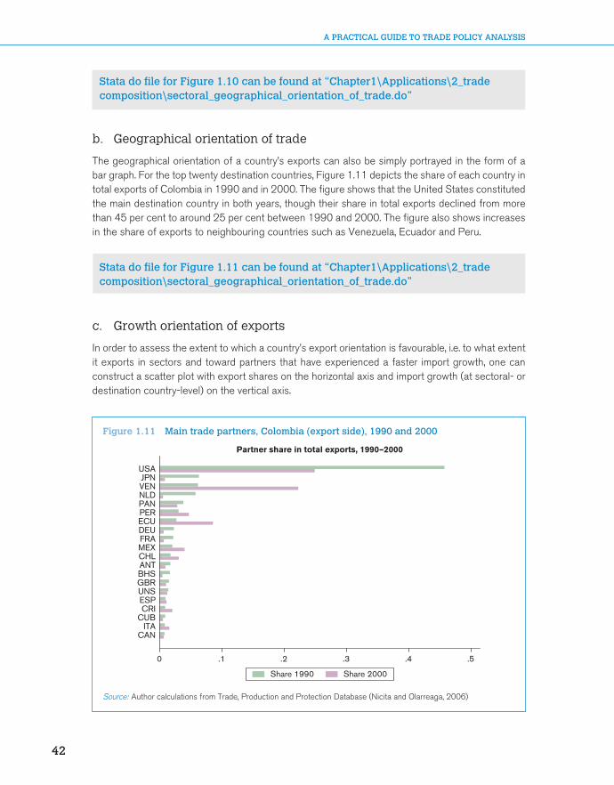
b. Geographical orientation of trade
The geographical orientation of a country’s exports can also be simply portrayed in the form of a bar graph. For the top twenty destination countries, Figure 1.11 depicts the share of each country in total exports of Colombia in 1990 and in 2000. The figure shows that the United States constituted the main destination country in both years, though their share in total exports declined from more than 45 per cent to around 25 per cent between 1990 and 2000. The figure also shows increases in the share of exports to neighbouring countries such as Venezuela, Ecuador and Peru.
Stata do file for Figure 1.11 can be found at “Chapter1\Applications\2_trade composition\sectoral_geographical_orientation_of_trade.do”
c. Growth orientation of exports
In order to assess the extent to which a country’s export orientation is favourable, i.e. to what extent it exports in sectors and toward partners that have experienced a faster import growth, one can construct a scatter plot with export shares on the horizontal axis and import growth (at sectoral- or destination country-level) on the vertical axis.
0 .1 .2 .3 .4 .5
CANITA
CUBCRIESPUNSGBRBHSANTCHLMEXFRADEUECUPERPANNLDVENJPN
USA
Partner share in total exports, 1990–2000
Share 1990 Share 2000
Figure 1.11 Main trade partners, Colombia (export side), 1990 and 2000
Source: Author calculations from Trade, Production and Protection Database (Nicita and Olarreaga, 2006)

CHAPTER 1: AnAlyzing TRAdE flows
43
CH
AP
TER
1
Consider the geographical dimension. Take all destination countries for home exports; calculate their share in total home exports (in logs) and call it x.55 Next, record the average growth rate of total imports for each of those countries over the last ten years; call it y. Do a scatter plot of y against x and draw the regression line. If it slopes up, larger destinations have faster (slower) import growth; the orientation is favourable (unfavourable).
In Figure 1.12 we construct such a plot for Colombia (left panel) and Pakistan (right panel) for the year 2000. In the case of Colombia, the orientation is favourable.56 In the case of Pakistan, it is unfavourable. This could be explained by a mixture of the country’s location and policy choices like trade integration. In Pakistan’s case, proximity to slow-growing Gulf and Central Asian states was joined with failure to promote trade integration with fast-growing India to produce a negative orientation.
Stata do file for Figure 1.12 can be found at “Chapter1\Applications\2_trade composition\growth_orientation_of_exports.do”
A similar scatter plot can be constructed combining the product- and destination-dimension. In the latter case, one would construct a scatter plot using the share of product k to destination j in home export and the rate of growth of world trade of product k to destination j (see Figure 1.13). A negative correlation, indicating positioning on slow-growing products, may provide a useful factual basis for discussions about whether government resources should be used to foster growth at the extensive margin (e.g. through sector-specific fiscal incentives).
GAB
PRKSWE BLX
CHL
ITACHE
ZAFISR DOMARE
USPGRC
ANT
FINJAM
GTMLBN BOLBHS
KWTEGY
BRN
TZA
IRLDMA
VNM
GUYBRB
CHN
MAR
HND
AZE
SLVTUN CANMKD
GNQ
GRDNLD
KEN
ARG
PRT ESPSGP
FRO
SVK
SAU
CYM
SENNGA
HRV BRA
NORLBR
PHL
ECU
PYF
ABWMYSSVN
AGOCIV
VCTTCA
GEO
SUR
ATG
LCACUB
MLTJPN
JOR
COG
AUS
CMR
BHRAUT
PRY
FJI
BFADEU
HTIGHAAFG
IDNCRI
MUSCYP
PER
GMBBGRSDN
MMR
RUS
KOR
IND
VGB
MLI LKA PAN
DNK
TURPOL
USABGD
BEN
GBR
UNS
FRABLZ
URYIRN
CZE
UGA HKG
AND
BMUTTO VEN
TWNTHA
UKR
HUN MEX
NZL
ROMNIC
KNA
–4
–2
0
2
–15 –10 –5 0
Geographical orientation of Colombia’sexports, 2000
BGR GRC
DZA
FJI
MAC
HRV
BRN
EGYLBR
MNG
KHM
SYR
AUT
KAZ
MMR
NCL
WSM
BIH
MLT
IRN
GEO
ZAF
LTU
BLR
RUSISL
AZE
PRY
GIB
CANBRB
IND
BMU
TUNMDV
ARM
ANT
SVN
CMR
BLX
ALB
TGO
IRLDJI
KORSUR
TTO
AREIDN
TJK
BGD
BRABHSSVKPLW
PRKBOL
CIVGMB
IRQ
EST
DOMHND
DNK
VNM
MAR
CHNMLI
ARGHUNCZE
SEN
COG
TUR
NGABFA
ETH
MWIMDG
DEU
QAT
UKR
FRA
OMNHTI
COM
TKM
POL
AUS
UZB
ESP
SAU
MEX
PRT
MYS
SOM
NLD
ECU
ITAJAM
RWA
TZA
FLKLAO
KWT
COLPAN
JOR
NIC
GTM THA UNSGNQ
NER
HKG
ROM
GUY
PHL
SDN CHE
SER
CHLZMB
AFG
BTN
NZL
GAB
KGZ
GINNOR
MDA
BENNRU
MRT
GRL
USACYP
TCD
BHR
LBN
YEM
SWEGBR
CRIUGA LKA
KEN
SYC
TWNURY SGPSLV
ZWEFIN
NPLGHA VEN
BLZ SLE MUSJPN
PER
LVA
–4
–3
–2
–1
0
–15 –10 –5 0log of export share to destination j log of export share to destination j
Geographical orientation of Pakistan’sexports, 2000
log average import growth ofdestination j, 1990–2000Fitted values
log average import growth ofdestination j, 1990–2000Fitted values
Figure 1.12 geographical orientation of exports, Colombia vs. Pakistan, 2000
Source: Author calculations from Trade, Production and Protection Database (Nicita and Olarreaga, 2006)

A PRACTICAL GUIDE TO TRADE POLICY ANALYSIS
44
Stata do file for Figure 1.13 can be found at “Chapter1\Applications\2_trade composition\growth_orientation_of_exports.do”
d. Intra-industry trade
The Grubel-Lloyd (GL) index of intra-industry trade is a useful indicator of how much trade is of the Krugman-type (two-way trade of differentiated varieties). A problem with such index is that it is sensitive to the level of aggregation. Figure 1.14 plots the GL index for European Union countries (constructed using import and export data from all destinations) for different levels of aggregation. The GL index is obviously higher when the data are more aggregated.57
Stata do file for Figure 1.14 can be found at “Chapter1\Applications\2_trade composition\intra_industry_trade.do”
use gl.dta, replacetwoway (connected gl_eu_section year, ms(D)) (connected gl_eu_chapter year, ms(S)) /* */ (connected gl_eu_hs6 year, ms(T)), legend(rows(1) lab(1 “GL index, Section”) /* */ lab(2 “GL index, Chapter”) lab(3 “GL index, HS6”)) /* */ xtitle (year) ytitle(“”)
Notice that the GL index for the European Union’s overall trade has been constructed by aggregating industry- or product-level GL indices, using industry or product trade shares as weights. This procedure is to be preferred to a calculation that uses total exports ( )ij ij
kkX X= ∑ and imports.
−6
−4
−2
0
2
−15 −10 −5 0log of export share of
product k to destination jlog of export share of
product k to destination j
Geographical/product orientationof Colombia's exports, 2000
−10
−5
0
5
−10 −5 0
Geographical/product orientationof Pakistan's exports, 2000
−15
log avg. import growth of productk by destination j, 1990–2000
Fitted values
log avg. import growth of productk by destination j, 1990–2000
Fitted values
Figure 1.13 geographical/product orientation of exports, Colombia vs. Pakistan, 2000
Source: Author calculations from Trade, Production and Protection Database (Nicita and Olarreaga, 2006)

CHAPTER 1: AnAlyzing TRAdE flows
45
CH
AP
TER
1
To see why GL indexes are mechanically higher the higher the level of aggregation, consider the data in Table 1.5, which represents a situation in which Germany exports engines and gearboxes to the Czech Republic that are then assembled into cars and re-exported to Germany.
.4
.5
.6
.7
.8
.9
1994 1996 1998 2000 2002 2004year
GL index, Section GL index, Chapter GL index, HS6
Figure 1.14 grubel-lloyd indexes at different level of aggregation of trade data
Source: Tumurchudur (2007)
Table 1.5 grubel-lloyd index: illustrative calculations
X M X-M X+M GL
Car parts 600 600 600 0Assembled cars 1000 1000 1000 0Chapter 87 1000 600 400 1600 0.75
Source: Author calculations
At the sub-heading level (first two rows), “Car parts” and “Assembled cars” are different goods, so intra-industry trade is zero (last column). At the chapter level, both “Car parts” and “Assembled cars” are part of chapter 87, so intra-industry trade is positive. Thus, in general, one can expect to observe lower measured levels of intra-industry trade at lower levels of aggregation. These values are closer to the real value of IIT, while high values at aggregate levels are statistical illusions.
e. Decomposition of export growth
In this application we implement the decomposition of export growth proposed in equation (1.13) in the text:
10 1 0 01 //K kK K K K K kX X X X∆ ∆∩
= + −∑ ∑ ∑

A PRACTICAL GUIDE TO TRADE POLICY ANALYSIS
46
We will use data on overall exports by product (all destinations) for a number of exporters, using UN Comtrade data for 1995 and 2004. The results of this decomposition for six OECD countries (United States, Japan, Germany, France, United Kingdom and Italy) are presented in Table 1.6. In the table, the first column represents the percentage contribution of the intensive margin; the second column represents the percentage contribution of the new-product margin; the third column represents the percentage contribution of the product death margin.58
As one can clearly see, also in the case of OECD countries almost all of the variation in exports is explained by the expansion of existing export relationships (see main text for an explanation).
Stata do file for Table 1.6 can be found at “Chapter1\Applications\2_trade composition\export_growth_decomposition.do”
use comtrade_exports.dta, replacereshape wide tradevalue, i(reporter product) j(year)bysort reporter: egen tot_trade_all_6_dgt_1995 = total(tradevalue0001995)bysort reporter: egen tot_trade_all_6_dgt_2004 = total(tradevalue0002004)bysort reporter: g change_tot_trade_all_6_dgt = tot_trade_all_6_dgt_2004 - tot_trade_all_6_dgt_1995g delta = (tradevalue0002004 - tradevalue0001995) if (tradevalue0002004!=. & tradevalue0001995!=.)bysort reporter: egen t1 = total(delta) if delta!=.egen temp1= rowtotal(tradevalue0002004 tradevalue0001995) if (tradevalue0002004!=. & tradevalue0001995==.)bysort reporter: egen t2 = total(temp1) if temp1!=.egen temp2= rowtotal(tradevalue0002004 tradevalue0001995) if (tradevalue0002004==. & tradevalue0001995!=.)bysort reporter: egen t3 = total(temp2) if temp2!=.bysort reporter: egen x1 = max(t1)bysort reporter: egen x2 = max(t2)bysort reporter: egen x3 = max(t3)drop temp* t1 t2 t3g dx = x1 + x2 - x3g c1 = x1 / dxlab var c1 “intensive margin contribution”g c2 = x2 / dxlab var c2 “new product margin contribution”g c3 = x3 / dxlab var c3 “product death margin”duplicates drop
Table 1.6 decomposition of export growth 1995–2004, selected oECd countries
Reporter ( )0 1
/K K
X X∆ ∆∩∑ ( )
1 0//kK K
X X∆∑ ( )0 1/
/kK KX X∆∑
USA .9784529 .0432978 .0217508JPN 1.011665 .0137644 .0254291DEU 1.002045 .0079661 .0100109FRA .9663144 .0481832 .0144976GBR .9772262 .1178167 .0950429ITA .9539621 .0632544 .0172165
Source: Author calculations from UN Comtrade

CHAPTER 1: AnAlyzing TRAdE flows
47
CH
AP
TER
1
f. Herfindahl index of concentration
Herfindahl concentration indexes can easily be calculated from trade data and visualized as in Figure 1.15. This figure plots the normalized Herfindahl indexes, both at the export and at the import side, for five Latin American countries (Argentina, Brazil, Chile, Colombia and Peru) in 1995 and 2004. Notice that the higher the index, the more concentrated exports or imports are in a few sectors.
Observe that the indices are higher on the export side than on the import one for Chile and Peru, whose export structures are rather concentrated on mineral products.59
0
.1
.2
.3
COL BRA ARG CHL PER1995 2004 1995 2004 1995 2004 1995 2004 1995 2004
Norm. Herfindahl (export) Norm. Herfindahl (import)
Figure 1.15 normalized Herfindahl indexes, selected latin American countries
Source: Author calculations from UN Comtrade
Stata do file for Figure 1.15 can be found at “Chapter1\Applications\2_trade composition\trade_concentration.do”
use herfindahl_index.dta, replacekeep if (ccode==”ARG”|ccode==”BRA”|ccode==”CHL”|ccode==”COL”|ccode==”PER”)keep if (year==1995|year==2004) graph bar norm_herf_export norm_herf_import, over(year) /**/ over(ccode, sort(1)) legend(label(1 “Norm. Herfindahl (export)”) /**/ label(2 “Norm. Herfindahl (import)”))

A PRACTICAL GUIDE TO TRADE POLICY ANALYSIS
48
g. Trade complementarity
Trade complementarity indices can be traced over time. Figure 1.16 shows the evolution of TCIs (on the import side) for Chile between 1983 and 2004. Panel (a) shows the index vis-à-vis neighbouring countries, while panel (b) shows the index vis-à-vis countries that are now part of NAFTA. All TCIs have increased over time; however, the indexes in panel (a) are lower than the ones in panel (b), indicating that for Chile patterns of import complementarity are more developed with North American than with neighbouring countries.
Stata do file for Figure 1.16 can be found at “Chapter1\Applications\2_trade composition\trade_complementarity.do”
use tc.dta, replacekeep if (country_a == “CHL”)twoway (connected tci year if country_b ==”ARG”, ms(D)) /* */ (connected tci year if country_b ==”PER”, ms(S)) /* */ (connected tci year if country_b ==”BOL”, ms(T)), /* */ legend(rows(1) lab(1 “Argentina”) lab(2 “Peru”) /* */ lab(3 “Bolivia”)) xtitle (Year) ytitle(“TCI, import side”)
twoway (connected tci year if country_b ==”USA”, ms(D)) /* */ (connected tci year if country_b ==”MEX”, ms(S)) /* */ (connected tci year if country_b ==”CAN”, ms(T)), /* */ legend(rows(1) lab(1 “United States”) lab(2 “Mexico”) /* */ lab(3 “Canada”)) xtitle (Year) ytitle(“TCI, import side”)
3. Comparative advantage
a. Revealed factor intensities
The revealed factor intensities database developed by UNCTAD can be used to visualize how revealed factor intensity of exports relates to national factor endowments. Because the weights sum up to one, revealed factor intensities can be shown on the same graph as national factor endowments. The distance between the two is an inverse measure of comparative advantage.
40
50
60
70
80
90
TCI,
impo
rt s
ide
1985 1990 1995 2000 2005Year
10
20
30
40
50
60
(a) (b)
TCI,
impo
rt s
ide
1985 1990 1995 2000 2005Year
Argentina Peru Bolivia MexicoUnited States Canada
Figure 1.16 Chile trade complementarity index, import side
Source: Author calculations from Trade, Production and Protection Database (Nicita and Olarreaga, 2006)

CHAPTER 1: AnAlyzing TRAdE flows
49
CH
AP
TER
1
The two panels of Figure 1.17 show the evolution of Costa Rica’s export portfolio against its endowment of physical and human capital in 1993 and in 2003. Costa Rica is an interesting case because in 1996 Intel decided to locate a US$ 300 million semiconductor assembly and test (A&T) plant in this tiny Caribbean country.
In each panel, the horizontal axis measures capital per worker (in constant PPP dollars) and the vertical axis measures human capital (in average years of educational attainment). The intersection of the two black lines is the country’s endowment point. The ink stains are the country’s export items, with the size of each stain proportional to export value in the period.
The left panel shows Costa Rica before Intel. A dust of small export items in the north-east quadrant indicates exports that are typical of countries with more capital and human capital than Costa Rica has. The right panel shows the huge impact of Intel’s arrival (the large stain in the NE quadrant, which corresponds to semiconductors). Note that it is located not too far from Costa Rica’s comparative advantage: the reason is that semiconductor assembly (which produces the final product) is performed typically in middle-income countries. Yet, it remains the case that semiconductors exports are typical of countries with two years of educational attainment more than Costa Rica (and over twice more capital per worker).
Stata do file for Figure 1.17 can be found at “Chapter1\Applications\ 3_comparative advantage\revealed_factor_intensity.do”
use costarica.dta, replacetwoway (scatter rhci93 rci93 if old==1 | dead==1 [aweight = Export93], /**/ mcolor(blue) msymbol(circle)), yscale(range(0 12)) yline(5.72, /**/ lwidth(thick) lcolor(black)) ylabel(0(2)12) xscale(range(0 200000)) /**/ xline(14192, lwidth(thick) lcolor(black)) xlabel(0(50000)200000) /**/ legend(off) title (Export portfolio 1993) twoway (scatter rhci03 rci03 if old==1 [aweight = Export03], /**/ mcolor(blue) msymbol(circle)), yscale(range(0 12)) yline(6.08, /**/ lwidth(thick) lcolor(black)) ylabel(0(2)12) xscale(range(0 200000)) /**/ xline(17437, lwidth(thick) lcolor(black)) xlabel(0(50000)200000) /**/ legend(off) title (Export portfolio 2003)
0
2
4
6
8
10
12R
evea
led
Hum
an C
apita
lIn
tens
ity In
dex
0 50000 100000 150000 200000Revealed Physical Capital
Intensity Index
Export portfolio 1993
0
2
4
6
8
10
12
Rev
eale
d H
uman
Cap
ital
Inte
nsity
Inde
x
0 50000 100000 150000 200000Revealed Physical Capital
Intensity Index
Export portfolio 2003
Figure 1.17 Evolution of Costa Rica’s export portfolio and endowment
Source: Author calculations from UN Comtrade

A PRACTICAL GUIDE TO TRADE POLICY ANALYSIS
50
b. Revealed technology content
In this application we perform an analysis of PRODY and EXPY indices proposed by Hausmann et al. (2007). The PRODY index ranks products in terms of their implied productivity. It is constructed by taking a weighted average of the per-capita GDPs of the countries exporting a product, where the weights reflect the revealed comparative advantage of each country in that product. The EXPY index is the export-weighted average of PRODY indices of each country; it reflects the income/productivity level of a country’s export portfolio.
Table 1.7 shows the five commodities with the smallest and largest PRODY. As expected, items with low PRODY tend to be primary commodities that constitute a relatively important share of the exports of low income countries. Conversely, products with the highest PRODY value constitute a substantial share of exports of high income countries in our sample.
Stata do file for construction of EXPY and PRODYand for Table 1.7 can be found at “Chapter1\Applications\3_comparative advantage\revealed_technology_content.do”o
Figure 1.18 shows a scatterplot of PRODY index against per-capita GDP for 2000. There is a strong and positive correlation between these two variables. The high correlation between PRODY and per-capita GDP can be partially explained by construction of the index, since a product’s PRODY is determined by the per-capita GDPs of the countries that export this product. However, Hausmann et al. (2007) show that this relationship is not just a mechanical one: excluding a country’s own exports from the calculation of the PRODY index (in this case the index becomes country specific) does not change the results much.
Table 1.7 largest and smallest PRody values (2000 Us$)
Product (k) HS6 Prody_k
1 Equine hides and skins, raw 410140 517.72 Sisal and agave, raw 530410 766.813 Cloves (whole fruit, cloves and stems) 90700 892.154 Vanilla beans 90500 927.775 Natural uranium, its compounds, mixtures 284410 982.94
4955 Nuclear reactors 840110 31565.674956 Railway cars, open, with sides > 60 cm high 860692 31677.954957 Calcium-ammonium nitrate mix, double salts pack >10 kg 310260 31783.254958 Vinyl chloride (chloroethylene) 290321 31826.734959 Leucite, nepheline and nepheline syenite 252930 32218.66
Source: Author calculations based on CEPII Baci and World Bank WDI
Stata do file for Figure 1.18 can be found at “Chapter1\Applications\ 3_comparative advantage\revealed_technology_content.do”
use prody_b_lrst.dta, replacegen lnEXPY=ln(EXPY_i)gen lnGDPpc=ln(GDPpc)duplicates droptwoway (scatter lnEXP lnGDPpc, mlabel(ccode)) (lfit lnEXP lnGDPpc) /**/ if year==2002, title(“ln(EXPY) and ln(GDPpc) in 2002”)

CHAPTER 1: AnAlyzing TRAdE flows
51
CH
AP
TER
1
Figure 1.19 shows the time trend for the EXPY index for China, India, Korea and Hong Kong, China. India and China have the lowest EXPY in 1994 but their EXPY has been steadily drifting upwards. At the other side, South Korea and Hong Kong, China started with the highest EXPYs but over the time period of our sample China has significantly closed the gap with these countries. In 2001, China’s EXPY has even overtaken that of Hong Kong, China even though Hong Kong, China’s per capita GDP is significantly higher than China’s.
ARG
AUS
AUT
BDI
BENBFA
BGD BOL
BRA
CAF
CANCHE
CHL
CHN
CIV
CMR
COL
CRI
CYPDEUDNK
DZA
ECU
EGY
ESP
ETH
FINFRA
GAB
GBR
GHAGIN
GMB
GRC
GTMGUY
HKG
HND
HUN
IDN
IND
IRL
IRN
ISLISRITA
JAM
JPN
KEN
KOR
LKAMAR
MDG
MEX MLT
MOZ MUS
MWI
MYS
NER
NGA NIC
NLD
NORNZL
PAK
PAN
PER
PHL
PNG
POL PRT
PRY
ROM
SEN
SGP
SLE SLV
SWE
SYR
TGO
TTOTUN
TUR
TZAUGA
URY
USA
VENVNMYEM
ZAF
ZMB
7.5
8
8.5
9
9.5
10
6 7 8 9 10 11lnGDPpc
lnEXPY Fitted values
ln(EXPY) and ln(GDPpc) in 2002
Figure 1.18 Relationship between per-capita gdP (in logs) and EXPy (in logs), 2002
9.8
9.6
9.4
1994 1996 1998Year
2000 2002
9.2
9
Income content of export
Inc
EX
PY
India Korea Hong Kong, ChinaChina
Figure 1.19 EXPy over time for selected countries
Source: Author calculations based on CEPII Baci and World Bank WDI
Source: Author calculations based on CEPII Baci and World Bank WDI

A PRACTICAL GUIDE TO TRADE POLICY ANALYSIS
52
What might other determinants be of the variation across countries in levels of EXPY beyond per-capita GDP? Table 1.8 replicates the results of Hausmann et al. (2007), who show that human capital and country size (proxied by population) are both associated positively with EXPY, after controlling for GDP per capita. In the dataset used for this application, however, institutional quality (proxied by the Rule of Law index of the World Bank60) is positively correlated with EXPY, meaning that the index also captures some broad institutional characteristics of a country.61
Stata do file for Figure 1.19 can be found at “Chapter1\Applications\ 3_comparative advantage\revealed_technology_content.do”
use /prody_b_lrst.dta, replacegen lnEXPY=ln(EXPY_i)twoway (connected lnEXP year if ccode==”CHN”, ms(D)) /* */ (connected lnEXP year if ccode==”IND”, ms(S)) /* */ (connected lnEXP year if ccode==”KOR”, ms(T)) /* */ (connected lnEXP year if ccode==”HKG”, ms(O)), /* */ ytitle(“”)legend(rows(1) lab(1 “China”) /* */ lab(2 “India”) lab(3 “Korea”) /* */ lab(4 “Hong Kong”)) xtitle (Year) ytitle(“lnEXPY”) /* */ title(“Income Content of Export”)
Stata do file for Table 1.8 can be found at “Chapter1\Applications\3_comparative advantage\revealed_technology_content.do”
use prody_b.dta,replacekeep EXPY_i year ccode
Table 1.8 Correlates of EXPyDependent Variable: log EXPY in 2000
(1) (2) (3) (4) (5)
ln_GDPpc 0.494*** 0.389*** 0.424*** 0.416*** 0.149**(0.0264) (0.0465) (0.0407) (0.0410) (0.0692)
ln_hum_cap 0.357*** 0.290*** 0.301*** 0.0288(0.100) (0.0875) (0.0877) (0.116)
ln_pop 0.0740*** 0.0929*** 0.0465**(0.0150) (0.0218) (0.0217)
ln_area -0.0206 -0.0280*(0.0172) (0.0160)
ruleoflaw 0.122*(0.0618)
Constant 4.823*** 5.094*** 3.688*** 3.674*** 7.627***(0.233) (0.278) (0.372) (0.371) (0.745)
Observations 81 72 72 72 30R-squared 0.816 0.877 0.910 0.912 0.767
Standard errors in parentheses
*** p < 0.01, ** p < 0.05, * p < 0.1
Source: Author calculations based on CEPII Baci and World Bank WDI

CHAPTER 1: AnAlyzing TRAdE flows
53
CH
AP
TER
150
100
150
200
2001 2003 2005 2007 2009Year
Selected exporters of agricultural productsSelected exporters of manuf. goods and primary commoditiesSelected exporters of minerals and mining productsSelected manufactured goods exportersSelected petroleum exporters
Barter TOT, selected groups of countries
Figure 1.20 Barter terms of trade of developing countries, 2001–2009
Source: UNCTAD Handbook of Statistics (various issues)
duplicates dropjoinby ccode year using controls.dta, unm (b) _merge (_merge)keep if year==2000gen area=pop/densityforeach var in hum_cap GDPpc pop area EXPY_i { gen ln_`var’=ln(`var’) }reg ln_EXPY_i ln_GDPpc reg ln_EXPY_i ln_GDPpc ln_hum_cap reg ln_EXPY_i ln_GDPpc ln_hum_cap ln_pop reg ln_EXPY_i ln_GDPpc ln_hum_cap ln_pop ln_areareg ln_EXPY_i ln_GDPpc ln_hum_cap ln_pop ln_area ruleoflaw
4. Terms of trade
Since the beginning of the 1970s, the evolution of the terms of trade (TOT) of developing countries has been continuously measured and discussed by UNCTAD and reported in the yearly Trade and Development Report (with a special chapter on that topic in the 2005 issue62). UNCTAD collects information on the barter terms of trade (BTT), export volume (Q) and purchasing power of exports (ITT). Figure 1.20 illustrates how the TOT of developing countries exporting oil and mining products have dramatically increased since 2003, while those of agricultural products has been stagnating and those of manufacturing exporters declining.
Stata do file for Figure 1.20 can be found at “Chapter1\Applications\ 3_comparative advantage\terms_of_trade.do”
For any country or region, if you plot ITT and Q on a graph, the vertical distance between them is the trading gain (or loss if negative) experienced over the sample period.63

A PRACTICAL GUIDE TO TRADE POLICY ANALYSIS
54
E. Exercises
1. RCA, growth orientation and geographical composition
Solutions can be found at “Chapter1\Exercises\1_RCA, growth orientation and geographical composition\trade_flows.do”
For this exercise, use the World Bank’s Trade, Production and Protection Database: “TPP.dta”, and bilateral import–export data based on it, respectively “BilateralTrade.dta” for aggregated data and “aBilateralTrade.dta” for disaggregated data (ISIC Rev. 2, 2 digit sectors). The assignment is as follows.
1. Preliminariesa. Use “TPP.dta”. Indicate what nomenclature is used and at what degree of disaggregation
the data are available.b. Select an OECD and a non-OECD country. Check what variables are available for those
countries and for what year. [Hint: Some developing countries may have a large number of missing observations. Make sure you select a country for which enough information is available.]
2. Revealed comparative advantagea. For the two countries of your choice, calculate the normalized RCA (NRCA) index for
every year between 1983 and 1985 (included) and calculate the average for those three years. Do the same for 2002–2004.
b. For the two countries of your choice, draw a scatter plot in which each point represents a sector and NRCA values for 1983–1985 are on the horizontal axis and 2002–2004 values on the vertical one. Interpret the meaning of the diagonal and comment. [Hint: You may want to draw similar plots for other OECD and non-OECD countries and check whether the same patterns emerge.]
3. Growth orientationa. For each sector, using the entire database (“TPP.dta”) calculate the average value of
world trade (exports or imports) in that sector in 1983–1985 and 2002–2004. Calculate the rate of growth of world trade in each sector between these two periods.
b. For the two countries of your choice, draw a scatter plot in which each point represents a sector, world trade growth is on the horizontal axis, and NRCA values for 1983–1985 are on the vertical axis. Draw a regression line on the scatter plot. Comment.
c. Draw a similar scatter plot but using 2002–2004 NRCA values. Comment on any difference with the previous one.
4. Geographical compositiona. Use “aBilateralTrade.dta”. Calculate the Trade Intensity Index (TI) between your selected
countries and their trade partners for 1983–1985. Do the same for 2002–2004.b. Draw a scatter plot with 1983–1985 values on the horizontal axis and 2002–2004
values on the vertical one. [Hint: It is sometimes worth plotting the scatter with data expressed in logarithm and/or dropping zero values.]
c. Now use the disaggregated bilateral data: “BilateralTrade.dta”. For one of the two countries you have selected, identify partners − if any − with which this country has formed preferential trade agreements during the sample period.64 Did the Yeats’ regional intensity of trade (RIT) index increase for those countries? Did it go down for other countries? Does that necessarily indicate trade diversion? Why or why not? [Hint: Consider two years before and after the RTA.]

CHAPTER 1: AnAlyzing TRAdE flows
55
CH
AP
TER
1
2. offshoring and vertical specialization
Solutions can be found at “Chapter1\Exercises\2_Offshoring and vertical specialization\offshoring_vs.do”
In this exercise we use the offshoring and vertical specialization measures calculated from input–output tables. Input–output tables data come from the OECD Input–Output Tables and are available at http:/www.oecd.org/sti/inputoutput/. The selected sample covers 42 countries with data for the years 1995, 2000 and 2005 or nearest years. The assignment is as follows:
1. Descriptive statistics Open the file “OS_kiDeterminants.dta”. Check for which countries and years data are available.
a. Compute the Spearman rank correlation and the simple correlation between the different country- and sector-level offshoring measures available. Comment.
b. Select a country for which data are available for the years 1995, 2000 and 2005. For the country you have selected, consider the measure of offshoring that only takes into account imported goods inputs (OS_GD_GD). Draw a scatter plot in which each point represents offshoring in a given sector. Put 1995 values on the horizontal axis and 2000 values on the vertical axis. Do the same for 1995 and 2005. Determine which industries offshore most.
c. Now use “OS_iVS_iDeterminants.dta”. Consider all the countries available. For the variables that represent offshoring of intermediate goods inputs and vertical specialization at the country-level (respectively, OS_Goods_i and VS_Goods_i), draw a scatter plot in which each point represents 1995 values on the horizontal axis and 2000 values on the vertical axis. Do the same for 1995 and 2005. Determine which countries offshore and vertically specialize the most.
2. The determinants of offshoring / vertical specializationa. In order to determine the variables that mostly affect offshoring, estimate the following
equation using fixed effects and comment on the results:
1
1 3 41
5
ln ln( ) ln( ) ln( )1
ln( )
iit it it
i
it it
OSGDPpc Internet Roads
OS
Rails
α β β β
β ε
= + + + −
+ +
(1.35)
b. In order to account for the fact that the relationship between offshoring and GDP per capita might not be linear, re-estimate the following specification and comment on the results. Determine the level of GDP per capita at which the effect of offshoring is maximized.
21 2 3
4 5
ln ln( ) ln( ) ln( )1
ln( ) ln( )
itit it it
it
it it it
OSGDPpc GDPpc Internet
OS
Roads Rails
α β β β
β β ε
= + + +
+ +
−+
(1.36)
Do the same regressions with the vertical specialization measure. Comment.

A PRACTICAL GUIDE TO TRADE POLICY ANALYSIS
56
Endnotes 1. The address is http://www.worldbank.org/eaptrade. 2. We will try to reserve superscripts for countries and subscripts for commodities and time throughout. 3. The data are freely available at http://www.graduateinstitute.ch/md4stata/datasets/penn_world.html. 4. Note that we are already combining domestic (consumption) data with trade data, meaning that concordance
tables must be used and hence that the µjt will be calculated at a high degree of aggregation. 5. Input–output tables describe the sale and purchase relationships between producers and consumers
within an economy. Data for OECD countries and some non-OECD ones for the years 1995, 2000 and 2005 can be obtained from the OECD at http://www.oecd.org/sti/inputoutput.
6. For an application, see Loschky and Ritter (2006). 7. This phenomenon has been termed “outsourcing” or “offshoring”, depending on the ownership structure of
the foreign intermediate good producer. For a classification, see World Trade Organization (2008). 8. See Schott (2004). He proposes a list of TSUSA (1972–1988) and HTS (1989–1994) product codes
containing the words part or component. The dataset is available at http://www.som.yale.edu/faculty/pks4/files/international/parts_qje_2004_02_27.xls.
9. OECD input–output tables, for instance, report data on domestic, imported and total intermediate input usage by different sectors.
10. See Hausmann et al. (2007).11. On this, see McKinsey Global Institute (2010).12. See Applications 2.a, 2.b and 2.c.13. Krugman (1979).14. In this regard one may prefer to use marginal IIT indices, discussed in Brülhart (2002).15. See Application 2.d and discussion therein.16. For a more detailed discussion see Fontagné and Freudenberg (1997).17. See Application 2.e for the same decomposition for a sample of OECD countries.18. The World Bank is currently exploring the causes of Africa’s low export survival. Surveys highlight the
unavailability of credit as a key binding constraint not just for export entrepreneurship but for the survival of existing export relationships. See Brenton et al. (2009a and 2009b).
19. See Application 2.f. Alternative measures of concentration are the Gini index or the Theil index, which are pre-programmed in Stata (ineqerr command).
20. The World Bank is working on a concept of “export riskiness” for foodstuffs, using econometric analysis of counts of sanitary alerts at the EU and US borders. Di Giovanni and Levchenko (2010) propose a more general measure of riskiness based on the variance–covariance matrix of sectoral value added.
21. On export breakthroughs raising concentration, see Easterly et al. (2009). On the natural resource curse, see e.g. Brunnschweiler and Bulte (2009) and the contributions in Lederman and Maloney (2009).
22. The decompositions suggested by Hummels and Klenow (2005) and discussed in this box are now routinely performed by the World Bank’s WITS interface.
23. Calculating PRODY indexes from disaggregated trade data is straightforward (see Application 3.b). However, as explained by Hausmann et al. (2007), it is essential to use a consistent sample, because not reporting is likely to be correlated with income, and this could introduce a bias in the index. In “Chapter1\Applications\3_comparative advantage\revealed_technology_content.do” you can see how to calculate PRODY in a balanced sample.
24. Adjustments based on the World Bank’s agricultural distortions database (Anderson et al., 2008) were also made to avoid agricultural products subsidized by rich countries (say, milk or bacon) to appear artificially capital and human-capital intensive.
25. The most updated version of the dataset can be downloaded, in Stata format, at http://r0.unctad.org/ditc/tab/research.shtm. See Application 3.a and discussion therein.
26. See WTO website, http://www.wto.org/english/tratop_e/region_e/region_e.htm.27. Overall, whether the members of a PTA gain or lose depends on the level of the initial MFN tariff and on
the elasticities of demand and supply. See World Trade Organization (2011).28. Figure 1.5 is constructed in Excel after manipulating the data in Stata (see “Chapter1\Applications\
Other applications\intra_regional_trade.do”). It should be noted that three-dimensional diagrams should be reserved for three-dimensional variables (here source, destination and trade value). If the data are two-dimensional (items vs. values for those items), diagrams should be kept two-dimensional.
CHAPTER 1: AnAlyzing TRAdE flows
57
CH
AP
TER
1
29. A good example of an exhaustive empirical study of the potential gains from regional integration in sub-Saharan Africa is Yeats (1998), which provides a template on how such a study should be organized and carried out.
30. This example is taken from Tumurchudur (2007).31. Observe that Figure 1.6 also shows RIT indices on the import side.32. The World Bank’s WITS interface routinely computes TCIs.33. Trade complementarity indices are constructed in Application 2.g.34. Freely available at http://www.graduateinstitute.ch/md4stata/datasets/wdi.html. The US Department of
Agriculture also provides REER data at http://www.ers.usda.gov/Data/exchangerates/ on nominal and real exchange rates for 80 countries (plus the European Union), as well as real trade-weighted exchange rate indexes for many commodities and aggregations. All series are updated every other month. Data series start at the beginning of 1970 and run to the last available current monthly information, which is typically two months behind the current date.
35. In fact, this definition corresponds to what is more precisely known as the net barter terms of trade. The gross barter terms of trade is the ratio between the quantity index of exports and the quantity index of imports. Other extensions include adjusting TOT for changes in the productivity of exports or adjusting simultaneously for the productivity of exports and imports. As price and productivity are the two main sources of factor remuneration, those indices are respectively called the single and double factorial terms of trade.
36. In this case the formula becomes: 0M
iM iM iMt k ktk N
P s p∈
= ∑ where the partners of country j are indexed by subscript i and 0
jiMks
represents the share of product k from country i in total imports of country j in the
base year.37. http://www2.imfstatistics.org/DOT/. Because there is only one entry per country pair in a unit of time, the
volume of data is limited.38. UNCTAD’s Comtrade, which is particularly convenient for disaggregated data analysis and which is treated
in detail in the next section, can also be used to analyze data at the aggregated level.39. Useful information on classification systems can be found at the University of Michigan’s library site at
http://www.lib.umich.edu/govdocs/stectrad.html. A Guide to Foreign Trade Statistics is also available at the US Census Bureau’s page at http://www.census.gov/foreign-trade/guide/index.html.
40. Because each revision entails classification changes, care must be exercised when dealing with time series straddling revisions. In all, 17 per cent of the HS 6 lines have been introduced in successive revisions (1 in 1992, 267 in 1996, 316 in 2002, and 260 in 2007).
41. Eurostat − the European Union’s statistical office − provides HS 8 trade statistics in the (expensive) COMEXT database (on CD-ROM). The data requires very careful handling as product classifications are erratic: from one year to the next, one HS 6 category will be split into several HS 8, then re-grouped, then moved to some different code, etc. HS 10 data are not communicated to the public. For the US, building on Robert Feenstra’s early work, John Romalis and Jeffrey Schott compiled a “cleaned-up” database of US exports and imports between 1989 and 2001 at the HS 10 level (see Feenstra et al. 2002). The database can be downloaded from http://www.nber.org/data together with concordance tables between various nomenclatures, tariff data and more. See also the University of California, Davis’ site at http://www.internationaldata.org.
42. More information can be found at http://unstats.un.org/unsd/trade/sitcrev4.htm.43. See http://unstats.un.org/unsd/cr/registry/cpc-2.asp.44. The United Nations’ list of concordance tables is at http://unstats.un.org/unsd/cr/registry/regot.asp?
Lg=1. The EU’s “metadata” server RAMON provides tables at http://ec.europa.eu/eurostat/ramon/index.cfm?TargetUrl=DSP_PUB_WELC. Jon Haveman and Raymond Robertson have a particularly useful page with industry concordance tables (as well as a whole lot of other useful trade data) at http://www.macalester.edu/research/economics/PAGE/HAVEMAN/Trade.Resources/TradeConcordances.html.
45. The data can be found on Jon Haveman and Raymond Robertson’s page at http://www.macalester.edu/research/economics/PAGE/HAVEMAN/Trade.Resources/TradeData.html#Rauch.
46. See http://comtrade.un.org.47. BACI data are downloadable here: http://www.cepii.fr/anglaisgraph/bdd/baci.htm. Details about the
dataset can be found in Gaulier and Zignago (2009). 48. Unfortunately, those linkages cannot be related to trade because the input–output tables do not distinguish
between domestic and imported inputs.

A PRACTICAL GUIDE TO TRADE POLICY ANALYSIS
58
49. See http://go.worldbank.org/EQW3W5UTP0.50. On this, see Anson et al. (2006) who analyze the effect of pre-shipment inspection on tariff avoidance.51. ASYCUDA (Automated SYstem for CUstoms DAta) is an UNCTAD initiative that can be visited at http://
www.asycuda.org. 52. A full − and somewhat depressing − discussion of the reliability of trade statistics can be found in Rozanski
and Yeats (1994).53. When we get to the parametric (econometric) analysis of trade flows later in this handbook, how missing
values are handled will become especially important since omitting the information carried by zero trade lines (when they really represent zero trade) may result in biased estimates of the relationship between trade and its determinants. For the sake of the concepts treated in this chapter, it should be observed that industry or country averages may not be very meaningful in the presence of many missing observations because they will then correspond to different time periods or refer to different countries in different years.
54. If remoteness is thought of as a weighted average of the distance to a country’s trading partners, it is not really a physical characteristic of the country since it is the result of trading decisions. A simple average of distance to all other countries would be closer to a “natural” or exogenous characteristic but it would have the drawback of assigning the same weight, say, to both China and Lesotho. An alternative is to use GDP as weights although there is no perfect fix to this problem.
55. Logs will be negative because shares are less than one. That is not a problem.56. Notice, however, that the regression line is almost flat.57. In the HS nomenclature, there are 21 sections, 96 chapters and around 5,000 (depending on the year and
the concordance) HS 6 products. GL indexes are highest for sections, lowest for products.58. By construction,
0 1 1 0 0 1/ // / / 1k kK K K K K K
X X X X X X∆ ∆ ∆ ∆∩
+ − =∑ ∑ ∑ .59. Notice that Herfindahl concentration indexes are even larger for countries heavily depending on oil exports.
For instance, as you can check in the data, the (normalized) index for Nigeria in 2003 was 0.63. 60. Freely available at http://www.graduateinstitute.ch/md4stata/datasets/wwgov_en.html.61. In Hausmann et al. (2007), the Rule of Law index is uncorrelated with EXPY. The difference in results
might be driven by the year used for the regressions (we do not have data for 2001, the year used by them).62. See http://archive.unctad.org/en/docs/tdr2005_en.pdf.63. You can find the Stata command that does this for the group of developing economies (excluding China)
in the file “Chapter1\Applications\3_comparative advantage\terms_of_trade.do”.64. The WTO provides this information at http://rtais.wto.org/UI/PublicMaintainRTAHome.aspx.

CHAPTER 1: AnAlyzing TRAdE flows
59
CH
AP
TER
1
References
Anderson, K. and Valenzuela, E. (2008), “Estimates of global distortions to agricultural incentives, 1955 to 2007”, Policy Research Working Paper 4612, Washington D.C.: The World Bank.
Anson, J., Cadot, O. and Olarreaga, M. (2006), “Tariff evasion and customs corruption: does PSI help?”, Contributions to Economic Analysis and Policy 5(1): Art. 33.
Bacchetta, M., Grether, J.-M. and de Melo, J. (2003), Introduction to the World Economy: A Course with Emphasis on Transition Economies, CD-ROM, CERDI.
Balassa, B. (1965), “Trade liberalisation and ‘revealed’ comparative advantage”, The Manchester School 33: 99–123.
Brander, J. and Krugman, P. (1983), “A ‘reciprocal dumping’ model of international trade”, Journal of International Economics 15(3–4): 313–21.
Brenton, P. and Newfarmer, R. (2007), “Watching more than the Discovery channel: export cycles and diversification in development”, Policy Research Working Paper 4302, Washington D.C.: The World Bank.
Brenton, P., Pierola, M. D. and von Uexküll, E. (2009a), “The life and death of trade flows: understanding the survival rates of developing-country exporters”, in Newfarmer, R., Shaw W. and Walkenhorst, P. (eds.), Breaking into New Markets: Emerging Lessons for Export Diversification, Washington D.C.: The World Bank.
Brenton, P., Pierola, M. D. and von Uexküll, E. (2009b), “What explains the low survival rate of developing country export flows?”, Policy Research Working Paper 4951, Washington D.C.: The World Bank.
Brülhart, M. (1994), “Marginal intra-industry trade: measurement and relevance for the pattern of industrial adjustment”, Weltwirtschaftliches Archiv 130: 600–13.
Brülhart, M. (2002), “Marginal intra-industry trade: towards a measure of non-disruptive trade expansion”, in Lloyd, P. J. and Lee, H. H. (eds.), Frontiers of Research on Intra-Industry Trade, Hampshire: Palgrave Macmillan.
Brunnschweiler, C. N. and Bulte, E. H. (2009), “Natural resources and violent conflict: resource abundance, dependence, and the onset of civil wars”, Oxford Economic Papers 61(4): 651–74.
Cadot, O., de Melo, J. and Yagci, F. (2005), An Effective Strategy for Zambia’s Regional Trade Agreements, Washington D.C.: The World Bank.
Cadot, O., Carrère, C. and Strauss-Kahn, V. (2011), “Export diversification: what’s behind the hump?”, Review of Economics and Statistics 93(2): 590–605.
Di Giovanni, J. and Levchenko, A. (2009), “International trade and aggregate fluctuations in granular economies”, University of Michigan, Research Seminar in International Economics, Working Paper 585.
Easterly, W., Reshef, A. and Schwenkenberg, J. (2009), “The power of exports”, Policy Research Working Paper 5081, Washington D.C.: The World Bank.
Eurostat (2006), “NACE Rev. 2: structure and explanatory notes”.Feenstra, R. C. and Hanson, G. (1996), “Globalization, outsourcing, and wage inequality”, American
Economic Review 86(2): 240–5.Feenstra, R. C., Romalis, J. and Schott, J. (2002), “U.S. imports, exports and tariff data, 1989–
2001”, National Bureau of Economic Research Working Paper 9387, Cambridge, MA: NBER.Frankel, J. A. and Romer, D. (1996), “Trade and growth: an empirical investigation”, National Bureau
of Economic Research Working Paper 5476, Cambridge, MA: NBER.Gaulier, G. and Zignago, S. (2010), “BACI: international trade database at the product level. The
1994–2007 version”, Working Paper 2010–23, Paris: CEPII.Grigoriou, C. (2007), “Landlockedness, infrastructure and trade in Central Asia”, Policy Research
Working Paper 4335, Washington D.C.: The World Bank.

A PRACTICAL GUIDE TO TRADE POLICY ANALYSIS
60
Grubel, H. G. and Lloyd, P. J. (1975), Intra-Industry Trade: The Theory and Measurement of International Trade in Differentiated Products, New York: Wiley.
Hausmann, R., Hwang, J. and Rodrik, D. (2007), “What you export matters”, Journal of Economic Growth 12(1): 1–25.
Hummels, D., Ishii, J. and Yi, K.-M. (2001), “The nature and growth of vertical specialization in world trade”, Journal of International Economics 54(1): 75–96.
Krugman, P. (1979), “Increasing returns, monopolistic competition, and international trade”, Journal of International Economics 9(4): 469–79.
Laursen, K. (2000), Trade Specialisation, Technology and Economic Growth: Theory and Evidence from Advanced Countries, Cheltenham: Edward Elgar.
Leamer, E. (1988), “Measures of openness”, in Trade Policy Issues and Empirical Analysis: 145–204, Chicago: University of Chicago Press.
Lederman, D. and Maloney, W. F. (2008), “In search of the missing resource curse”, Policy Research Working Paper 4766, Washington D.C.: The World Bank.
Lipsey, R. (1960), “The theory of customs unions: a general survey”, Economic Journal 70: 498–513.
Loschky, A. and Ritter, L. (2006), “Import content of exports”, presented at the 7th International Trade Statistics Expert Meeting, Paris, 11–14 September 2006.
Michaely, M. (1996), “Trade preferential agreements in Latin America: an ex ante assessment”, Policy Research Working Paper 1583, Washington D.C.: The World Bank.
Nicita, A. and Olarreaga, M. (2006), “Trade, production and protection 1976–2004”, World Bank Economic Review 21(1): 165–71.
Organisation for Economic Co-operation and Development (OECD) (2007), “Offshoring and employment”, Paris: OECD.
Rauch, J. E. (1999), “Networks versus markets in international trade”, Journal of International Economics 48: 7–35.
Rozanski, J. and Yeats, A. J. (1994), “On the (in)accuracy of economic observations: an assessment of trends in the reliability of international trade statistics”, Journal of Development Economics 44: 103–30.
Schiff, M. (1999), “Will the real ‘natural trading partner’ please stand up?”, Policy Research Working Paper 2161, Washington D.C.: The World Bank.
Shirotori, M., Tumurchudur, B. and Cadot, O. (2010), “Revealed factor intensity indices at the product level”, Policy Issues in International Trade and Commodities Study Series, No. 44, Geneva: UNCTAD.
Tumurchudur, B. (2007), “Rules of origin and market access in the Europe agreements: preferences undermined”, unpublished.
United Nations (2003), Classifications by Broad Economic Categories, New York: UN-DESA.United Nations (2006), “Standard International Trade Classification, Revision 4”, ST/ESA/STAT/
SER.M/34/REV.4.United Nations Conference on Trade and Development (UNCTAD) (2005), Trade and Development
Report 2005 – New Features of Global Interdependence, New York and Geneva: UNCTAD.World Trade Organization (WTO) (2008), World Trade Report 2008: Trade in a Globalizing World,
Geneva: WTO. World Trade Organization (WTO) (2011), World Trade Report 2011: Preferential Trade Agreements,
Geneva: WTO.Yeats, A. J. (1997), “Does Mercosur’s trade performance raise concerns about the effects of
regional trade arrangements?”, Policy Research Working Paper 1729, Washington D.C.: The World Bank.
Yeats, A. J. (1998), “What can be expected from African regional trade arrangements?”, Policy Research Working Paper 2004, Washington D.C.: The World Bank.