chapter 2 descriptive statistics: tabular … · c. bar charts d . pie charts ans ... distribution...
TRANSCRIPT

CHAPTER 2—DESCRIPTIVE STATISTICS: TABULAR AND GRAPHICAL
DISPLAYS
MULTIPLE CHOICE
1. The minimum number of variables represented in a bar chart is
a. 1
b. 2
c. 3
d. 4
ANS: A PTS: 1
2. The minimum number of variables represented in a histogram is
a. 1
b. 2
c. 3
d. 4
ANS: A PTS: 1
3. Which of the following graphical methods is most appropriate for categorical data?
a. ogive
b. pie chart
c. histogram
d. scatter diagram
ANS: B PTS: 1
4. In a stem-and-leaf display,
a. a single digit is used to define each stem, and a single digit is used to define each leaf
b. a single digit is used to define each stem, and one or more digits are used to define each
leaf
c. one or more digits are used to define each stem, and a single digit is used to define each
leaf
d. one or more digits are used to define each stem, and one or more digits are used to define
each leaf
ANS: C PTS: 1
5. A graphical method that can be used to show both the rank order and shape of a data set
simultaneously is a
a. relative frequency distribution
b. pie chart
c. stem-and-leaf display
d. pivot table
ANS: C PTS: 1
6. The proper way to construct a stem-and-leaf display for the data set {62, 67, 68, 73, 73, 79, 91, 94, 95,
97} is to
a. exclude a stem labeled ‘8’
b. include a stem labeled ‘8’ and enter no leaves on the stem
c. include a stem labeled ‘(8)’ and enter no leaves on the stem

d. include a stem labeled ‘8’ and enter one leaf value of ‘0’ on the stem
ANS: B PTS: 1
7. Data that provide labels or names for groupings of like items are known as
a. categorical data
b. quantitative data
c. label data
d. generic data
ANS: A PTS: 1
8. A researcher is gathering data from four geographical areas designated: South 1; North 2; East 3;
West 4. The designated geographical regions represent
a. categorical data
b. quantitative data
c. directional data
d. either quantitative or categorical data
ANS: A PTS: 1
9. Data that indicate how much or how many are known as
a. categorical data
b. quantitative data
c. label data
d. category data
ANS: B PTS: 1
10. The ages of employees at a company represent
a. categorical data
b. quantitative data
c. label data
d. time series data
ANS: B PTS: 1
11. A frequency distribution is
a. a tabular summary of a set of data showing the fraction of items in each of several
nonoverlapping classes
b. a graphical form of representing data
c. a tabular summary of a set of data showing the number of items in each of several
nonoverlapping classes
d. a graphical device for presenting categorical data
ANS: C PTS: 1
12. The sum of frequencies for all classes will always equal
a. 1
b. the number of elements in a data set
c. the number of classes
d. a value between 0 and 1
ANS: B PTS: 1
13. In constructing a frequency distribution, as the number of classes are decreased, the class width

a. decreases
b. remains unchanged
c. increases
d. can increase or decrease depending on the data values
ANS: C PTS: 1
14. If several frequency distributions are constructed from the same data set, the distribution with the
widest class width will have the
a. fewest classes
b. most classes
c. same number of classes as the other distributions since all are constructed from the same
data
d. None of the other answers are correct.
ANS: A PTS: 1
15. Excel's __________ can be used to construct a frequency distribution for categorical data.
a. DISTRIBUTION function
b. SUM function
c. FREQUENCY function
d. COUNTIF function
ANS: D PTS: 1
16. A tabular summary of a set of data showing the fraction of the total number of items in several
nonoverlapping classes is a
a. frequency distribution.
b. relative frequency distribution.
c. frequency.
d. cumulative frequency distribution.
ANS: B PTS: 1
17. The relative frequency of a class is computed by
a. dividing the midpoint of the class by the sample size.
b. dividing the frequency of the class by the midpoint.
c. dividing the sample size by the frequency of the class.
d. dividing the frequency of the class by the sample size.
ANS: D PTS: 1
18. The sum of the relative frequencies for all classes will always equal
a. the sample size
b. the number of classes
c. one
d. 100
ANS: C PTS: 1
19. A tabular summary of data showing the percentage of items in each of several nonoverlapping classes
is a
a. frequency distribution
b. relative frequency distribution
c. percent frequency distribution
d. cumulative percent frequency distribution

ANS: C PTS: 1
20. The percent frequency of a class is computed by
a. multiplying the relative frequency by 10
b. dividing the relative frequency by 100
c. multiplying the relative frequency by 100
d. adding 100 to the relative frequency
ANS: C PTS: 1
21. The sum of the percent frequencies for all classes will always equal
a. one
b. the number of classes
c. the number of items in the study
d. 100
ANS: D PTS: 1
22. In a cumulative frequency distribution, the last class will always have a cumulative frequency equal to
a. one
b. 100%
c. the total number of elements in the data set
d. None of the other answers are correct.
ANS: C PTS: 1
23. In a cumulative relative frequency distribution, the last class will have a cumulative relative frequency
equal to
a. one
b. zero
c. 100
d. None of the other answers are correct.
ANS: A PTS: 1
24. In a cumulative percent frequency distribution, the last class will have a cumulative percent frequency
equal to
a. one
b. 100
c. the total number of elements in the data set
d. None of the other answers are correct.
ANS: B PTS: 1
25. The difference between the lower class limits of adjacent classes provides the
a. number of classes
b. class limits
c. class midpoint
d. class width
ANS: D PTS: 1
26. A graphical device for depicting categorical data that have been summarized in a frequency
distribution, relative frequency distribution, or percent frequency distribution is a(n)
a. histogram

b. stem-and-leaf display
c. ogive
d. bar chart
ANS: D PTS: 1
27. A graphical device for presenting categorical data summaries based on subdivision of a circle into
sectors that correspond to the relative frequency for each class is a
a. histogram
b. stem-and-leaf display
c. pie chart
d. bar chart
ANS: C PTS: 1
28. Categorical data can be graphically represented by using a(n)
a. histogram
b. frequency polygon
c. ogive
d. bar chart
ANS: D PTS: 1
29. Fifteen percent of the students in a School of Business Administration are majoring in Economics,
20% in Finance, 35% in Management, and 30% in Accounting. The graphical device(s) that can be
used to present these data is (are)
a. a line graph
b. only a bar chart
c. only a pie chart
d. both a bar chart and a pie chart
ANS: D PTS: 1
30. Methods that use simple arithmetic and easy-to-draw graphs to summarize data quickly are called
a. exploratory data analysis
b. relative frequency distributions
c. bar charts
d. pie charts
ANS: A PTS: 1
31. The total number of data items with a value less than or equal to the upper limit for the class is given
by the
a. frequency distribution
b. relative frequency distribution
c. cumulative frequency distribution
d. cumulative relative frequency distribution
ANS: C PTS: 1
32. Excel's __________ can be used to construct a frequency distribution for quantitative data.
a. COUNTIF function
b. SUM function
c. PivotTable Report
d. AVERAGE function
ANS: C PTS: 1
33. A graphical display of a frequency distribution, relative frequency distribution, or percent frequency
distribution of quantitative data constructed by placing the class intervals on the horizontal axis and the
frequencies on the vertical axis is a
a. histogram
b. bar chart
c. stem-and-leaf display
d. pie chart
ANS: A PTS: 1
34. A common graphical display of quantitative data is a
a. histogram
b. bar chart
c. relative frequency
d. pie chart
ANS: A PTS: 1
35. When using Excel to create a __________ one must edit the chart to remove the gaps between
rectangles.
a. scatter diagram
b. bar chart
c. histogram
d. pie chart
ANS: C PTS: 1
36. A __________ can be used to graphically present quantitative data.
a. histogram
b. pie chart
c. stem-and-leaf display
d. both a histogram and a stem-and-leaf display are correct
ANS: D PTS: 1
37. A(n) __________ is a graph of a cumulative distribution.
a. histogram
b. pie chart
c. stem-and-leaf display
d. ogive
ANS: D PTS: 1
38. Excel's Chart Tools can be used to construct a
a. bar chart
b. pie chart
c. histogram
d. All of these can be constructed using Excel's Chart Tools.
ANS: D PTS: 1
39. To construct a bar chart using Excel's Chart Tools, choose __________ as the chart type.
a. column
b. pie

c. scatter
d. line
ANS: A PTS: 1
40. To construct a pie chart using Excel's Chart Tools, choose __________ as the chart type.
a. column
b. pie
c. scatter
d. line
ANS: B PTS: 1
41. To construct a histogram using Excel's Chart Tools, choose __________ as the chart type.
a. column
b. pie
c. scatter
d. line
ANS: A PTS: 1
42. Excel's Chart Tools does not have a chart type for constructing a
a. bar chart
b. pie chart
c. histogram
d. stem-and-leaf display
ANS: D PTS: 1
43. A tabular method that can be used to summarize the data on two variables simultaneously is called
a. simultaneous equations
b. a crosstabulation
c. a histogram
d. a dot plot
ANS: B PTS: 1
44. Excel's __________ can be used to construct a crosstabulation.
a. Chart Tools
b. SUM function
c. PivotTable Report
d. COUNTIF function
ANS: C PTS: 1
45. In a crosstabulation
a. both variables must be categorical
b. both variables must be quantitative
c. one variable must be categorical and the other must be quantitative
d. either or both variables can be categorical or quantitative
ANS: D PTS: 1
46. A graphical display of the relationship between two quantitative variables is
a. a pie chart
b. a histogram

c. a crosstabulation
d. a scatter diagram
ANS: D PTS: 1
47. Excel's __________ can be used to construct a scatter diagram.
a. Chart Tools
b. SUM function
c. CROSSTAB function
d. RAND function
ANS: A PTS: 1
48. When the conclusions based upon the aggregated crosstabulation can be completely reversed if we
look at the unaggregated data, the occurrence is known as
a. reverse correlation
b. inferential statistics
c. Simpson's paradox
d. disaggregation
ANS: C PTS: 1
49. Before drawing any conclusions about the relationship between two variables shown in a
crosstabulation, you should
a. investigate whether any hidden variables could affect the conclusions
b. construct a scatter diagram and find the trendline
c. develop a relative frequency distribution
d. construct an ogive for each of the variables
ANS: A PTS: 1
50. A histogram is not appropriate for displaying which of the following types of information?
a. frequency
b. relative frequency
c. cumulative frequency
d. percent frequency
ANS: C PTS: 1
51. For stem-and-leaf displays where the leaf unit is not stated, the leaf unit is assumed to equal
a. 0
b. .1
c. 1
d. 10
ANS: C PTS: 1
52. Which of the following graphical methods is not intended for quantitative data?
a. ogive
b. dot plot
c. scatter diagram
d. pie chart
ANS: D PTS: 1

53. Which of the following is least useful in studying the relationship between two variables?
a. trendline
b. stem-and-leaf display
c. crosstabulation
d. scatter diagram
ANS: B PTS: 1
54. The sum of the relative frequencies in any relative frequency distribution always equals
a. the number of observations
b. 1.00
c. 100
d. the number of variables
ANS: B PTS: 1
55. The sum of the frequencies in any frequency distribution always equals
a. the number of observations
b. 1.00
c. 100
d. the number of variables
ANS: A PTS: 1
Exhibit 2-1
The numbers of hours worked (per week) by 400 statistics students are shown below.
Number of hours Frequency
0 9 20
10 19 80
20 29 200
30 39 100
56. Refer to Exhibit 2-1. The class width for this distribution
a. is 9
b. is 10
c. is 39, which is: the largest value minus the smallest value or 39 0 39
d. varies from class to class
ANS: B PTS: 1
57. Refer to Exhibit 2-1. The midpoint of the last class is
a. 50
b. 34
c. 35
d. 34.5
ANS: D PTS: 1
58. Refer to Exhibit 2-1. The number of students working 19 hours or less
a. is 80
b. is 100
c. is 180
d. is 300

ANS: B PTS: 1
59. Refer to Exhibit 2-1. The relative frequency of students working 9 hours or less
a. is 20
b. is 100
c. is 0.95
d. 0.05
ANS: D PTS: 1
60. Refer to Exhibit 2-1. The cumulative relative frequency for the class of 20 29
a. is 300
b. is 0.25
c. is 0.75
d. is 0.5
ANS: C PTS: 1
61. Refer to Exhibit 2-1. The percentage of students working 10 19 hours is
a. 20%
b. 25%
c. 75%
d. 80%
ANS: A PTS: 1
62. Refer to Exhibit 2-1. The percentage of students working 19 hours or less is
a. 20%
b. 25%
c. 75%
d. 80%
ANS: B PTS: 1
63. Refer to Exhibit 2-1. The cumulative percent frequency for the class of 30 39 is
a. 100%
b. 75%
c. 50%
d. 25%
ANS: A PTS: 1
64. Refer to Exhibit 2-1. The cumulative frequency for the class of 20 29
a. is 200
b. is 300
c. is 0.75
d. is 0.50
ANS: B PTS: 1
65. Refer to Exhibit 2-1. If a cumulative frequency distribution is developed for the above data, the last
class will have a cumulative frequency of
a. 100
b. 1
c. 30 39

d. 400
ANS: D PTS: 1
66. Refer to Exhibit 2-1. The percentage of students who work at least 10 hours per week is
a. 50%
b. 5%
c. 95%
d. 100%
ANS: C PTS: 1
Exhibit 2-2
Information on the type of industry is provided for a sample of 50 Fortune 500 companies.
Industry Type Frequency
Banking 7
Consumer Products 15
Electronics 10
Retail 18
67. Refer to Exhibit 2-2. The number of industries that are classified as retail is
a. 32
b. 18
c. 0.36
d. 36%
ANS: B PTS: 1
68. Refer to Exhibit 2-2. The relative frequency of industries that are classified as banking is
a. 7
b. 0.07
c. 0.70
d. 0.14
ANS: D PTS: 1
69. Refer to Exhibit 2-2. The percent frequency of industries that are classified as electronics is
a. 10
b. 20
c. 0.10
d. 0.20
ANS: B PTS: 1
Exhibit 2-3
The number of sick days taken (per month) by 200 factory workers is summarized below.
Number of Days Frequency
0 5 120
6 10 65
11 15 14
16 20 1
70. Refer to Exhibit 2-3. The class width for this distribution

a. is 5
b. is 6
c. is 20, which is: the largest value minus the smallest value or 20 0 20
d. varies from class to class
ANS: B PTS: 1
71. Refer to Exhibit 2-3. The midpoint of the first class is
a. 10
b. 2
c. 2.5
d. 3
ANS: C PTS: 1
72. Refer to Exhibit 2-3. The number of workers who took less than 11 sick days per month
a. was 15
b. was 200
c. was 185
d. was 65
ANS: C PTS: 1
73. Refer to Exhibit 2-3. The number of workers who took at most 10 sick days per month
a. was 15
b. was 200
c. was 185
d. was 65
ANS: C PTS: 1
74. Refer to Exhibit 2-3. The number of workers who took more than 10 sick days per month
a. was 15
b. was 200
c. was 185
d. was 65
ANS: A PTS: 1
75. Refer to Exhibit 2-3. The number of workers who took at least 11 sick days per month
a. was 15
b. was 200
c. was 185
d. was 65
ANS: A PTS: 1
76. Refer to Exhibit 2-3. The relative frequency of workers who took 10 or fewer sick days
a. was 185
b. was 0.925
c. was 93
d. was 15
ANS: B PTS: 1
77. Refer to Exhibit 2-3. The cumulative relative frequency for the class of 11 15

a. is 199
b. is 0.07
c. is 1
d. is 0.995
ANS: D PTS: 1
78. Refer to Exhibit 2-3. The percentage of workers who took 0 - 5 sick days per month was
a. 20%
b. 120%
c. 75%
d. 60%
ANS: D PTS: 1
79. Refer to Exhibit 2-3. The cumulative percent frequency for the class of 16 20 is
a. 100%
b. 65%
c. 92.5%
d. 0.5%
ANS: A PTS: 1
80. Refer to Exhibit 2-3. The cumulative frequency for the class of 11 15
a. is 200
b. is 14
c. is 199
d. is 1
ANS: C PTS: 1
Exhibit 2-4
A survey of 400 college seniors resulted in the following crosstabulation regarding their undergraduate
major and whether or not they plan to go to graduate school.
Undergraduate Major
Graduate School Business Engineering Others Total
Yes 35 42 63 140
No 91 104 65 260
Total 126 146 128 400
81. Refer to Exhibit 2-4. What percentage of the students does not plan to go to graduate school?
a. 280
b. 520
c. 65
d. 32
ANS: C PTS: 1
82. Refer to Exhibit 2-4. What percentage of the students' undergraduate major is engineering?
a. 292
b. 520
c. 65
d. 36.5

ANS: D PTS: 1
83. Refer to Exhibit 2-4. Of those students who are majoring in business, what percentage plans to go to
graduate school?
a. 27.78
b. 8.75
c. 70
d. 72.22
ANS: A PTS: 1
84. Refer to Exhibit 2-4. Among the students who plan to go to graduate school, what percentage indicated
"Other" majors?
a. 15.75
b. 45
c. 54
d. 35
ANS: B PTS: 1
PROBLEM
1. Thirty students in the School of Business were asked what their majors were. The following represents
their responses (M Management; A Accounting; E Economics; O Others).
A M M A M M E M O A
E E M A O E M A M A
M A O A M E E M A M
a. Construct a frequency distribution and a bar chart.
b. Construct a relative frequency distribution and a pie chart.
ANS:
a. and b.
Major Frequency Relative Frequency
M 12 0.4
A 9 0.3
E 6 0.2
O 3 0.1
Total 30 1.0
PTS: 1
2. Twenty employees of ABC Corporation were asked if they liked or disliked the new district manager.
Below are their responses. Let L represent liked and D represent disliked.
L L D L D
D D L L D
D L D D L
D D D D L

a. Construct a frequency distribution and a bar chart.
b. Construct a relative frequency distribution and a pie chart.
ANS:
a. and b.
Preferences Frequency Relative Frequency
L 8 0.4
D 12 0.6
Total 20 1.0
PTS: 1
3. A student has completed 20 courses in the School of Arts and Sciences. Her grades in the 20 courses
are shown below.
A B A B C
C C B B B
B A B B B
C B C B A
a. Develop a frequency distribution and a bar chart for her grades.
b. Develop a relative frequency distribution for her grades and construct a pie chart.
ANS:
a. and b.
Grade Frequency Relative Frequency
A 4 0.20
B 11 0.55
C 5 0.25
Total 20 1.00
PTS: 1
4. A sample of 50 TV viewers were asked, "Should TV sponsors pull their sponsorship from programs
that draw numerous viewer complaints?" Below are the results of the survey. (Y Yes; N No; W
Without Opinion)
N W N N Y N N N Y N
N Y N N N N N Y N N
Y N Y W N Y W W N Y
W W N W Y W N W Y W
N Y N Y N W Y Y N Y
a. Construct a frequency distribution and a bar chart.
b. Construct a relative frequency distribution and a pie chart.
ANS:
a. and b.

Response Frequency Relative Frequency
No 24 0.48
Yes 15 0.30
Without Opinion 11 0.22
Total 50 1.00
PTS: 1
5. Forty shoppers were asked if they preferred the weight of a can of soup to be 6 ounces, 8 ounces, or 10
ounces. Below are their responses.
6 6 6 10 8 8 8 10 6 6
10 10 8 8 6 6 6 8 6 6
8 8 8 10 8 8 6 10 8 6
6 8 8 8 10 10 8 10 8 6
a. Construct a frequency distribution and graphically represent the frequency distribution.
b. Construct a relative frequency distribution and graphically represent the relative frequency
distribution.
ANS:
a. and b.
Preferences Frequency Relative Frequency
6 ounces 14 0.350
8 ounces 17 0.425
10 ounces 9 0.225
Total 40 1.000
PTS: 1
6. There are 800 students in the School of Business Administration. There are four majors in the School:
Accounting, Finance, Management, and Marketing. The following shows the number of students in
each major.
Major Number of Students
Accounting 240
Finance 160
Management 320
Marketing 80
Develop a percent frequency distribution and construct a bar chart and a pie chart.
ANS:
Major Percent Frequency
Accounting 30%
Finance 20%
Management 40%
Marketing 10%

PTS: 1
7. Below you are given the examination scores of 20 students.
52 99 92 86 84
63 72 76 95 88
92 58 65 79 80
90 75 74 56 99
a. Construct a frequency distribution for this data. Let the first class be 50 - 59 and draw a
histogram.
b. Construct a cumulative frequency distribution.
c. Construct a relative frequency distribution.
d. Construct a cumulative relative frequency distribution.
ANS:
a. b. c. d.
Relative Cumulative Cumulative
Score Frequency Frequency Frequency Relative Frequency
50 59 3 3 0.15 0.15
60 69 2 5 0.10 0.25
70 79 5 10 0.25 0.50
80 89 4 14 0.20 0.70
90 99 6 20 0.30 1.00
Total 20 1.00
PTS: 1
8. Two hundred members of a fitness center were surveyed. One survey item stated, "The facilities are
always clean." The members' responses to the item are summarized below. Fill in the missing value for
the frequency distribution.
Opinion Frequency
Strongly Agree 63
Agree 92
Disagree
Strongly Disagree 15
No Opinion 14
ANS:
16
PTS: 1
9. Fill in the missing value for the following relative frequency distribution.
Opinion Relative Frequency
Strongly Agree 0.315
Agree 0.460
Disagree
Strongly Disagree 0.075
No Opinion 0.070

ANS:
0.080
PTS: 1
10. Fill in the missing value for the following percent frequency distribution.
Annual Salaries Percent Frequency
Under $30,000 10
$30,000 49,999 35
$50,000 69,999 40
$70,000 89,999
$90,000 and over 5
ANS:
10
PTS: 1
11. The following is a summary of the number of hours spent per day watching television for a sample of
100 people. What is wrong with the frequency distribution?
Hours/Day Frequency
0 1 10
1 3 45
3 5 20
5 7 20
7 9 5
ANS:
The classes overlap.
PTS: 1
12. A summary of the results of a job satisfaction survey follows. What is wrong with the relative
frequency distribution?
Rating Relative Frequency
Poor .15
Fair .45
Good .25
Excellent .30
ANS:
The relative frequencies do not sum to 1.
PTS: 1
13. The frequency distribution below was constructed from data collected from a group of 25 students.
Height in Inches Frequency

58 63 3
64 69 5
70 75 2
76 81 6
82 87 4
88 93 3
94 99 2
a. Construct a relative frequency distribution.
b. Construct a cumulative frequency distribution.
c. Construct a cumulative relative frequency distribution.
ANS:
a. b. c.
Relative Cumulative Cumulative
Height (inches) Frequency Frequency Frequency Relative Frequency
58 63 3 0.12 3 0.12
64 69 5 0.20 8 0.32
70 75 2 0.08 10 0.40
76 81 6 0.24 16 0.64
82 87 4 0.16 20 0.80
88 93 3 0.12 23 0.92
94 99 2 0.08 25 1.00
1.00
PTS: 1
14. The frequency distribution below was constructed from data collected on the quarts of soft drinks
consumed per week by 20 students.
Quarts of Soft Drink Frequency
0 3 4
4 7 5
8 11 6
12 15 3
16 19 2
a. Construct a relative frequency distribution.
b. Construct a cumulative frequency distribution.
c. Construct a cumulative relative frequency distribution.
ANS:
a. b. c.
Relative Cumulative Cumulative
Quarts of Soft Drinks Frequency Frequency Relative Frequency
0 3 0.20 4 0.20
4 7 0.25 9 0.45
8 11 0.30 15 0.75
12 15 0.15 18 0.90
16 19 0.10 20 1.00

Total 1.00
PTS: 1
15. The grades of 10 students on their first management test are shown below.
94 61 96 66 92
68 75 85 84 78
a. Construct a frequency distribution. Let the first class be 60 69.
b. Construct a cumulative frequency distribution.
c. Construct a relative frequency distribution.
ANS:
a. b. c.
Cumulative Relative
Class Frequency Frequency Frequency
60 69 3 3 0.3
70 79 2 5 0.2
80 89 2 7 0.2
90 99 3 10 0.3
Total 10 1.0
PTS: 1
16. You are given the following data on the ages of employees at a company. Construct a stem-and-leaf
display. Specify the leaf unit for the display.
26 32 28 45 58
52 44 36 42 27
41 53 55 48 32
42 44 40 36 37
ANS:
Leaf Unit 1
2 | 6 7 8
3 | 2 2 6 6 7
4 | 0 1 2 4 4 5 8
5 | 2 3 5 8
PTS: 1
17. Construct a stem-and-leaf display for the following data. Specify the leaf unit for the display.
12 52 51 37 47 40 38 26 57 31
49 43 45 19 36 32 44 48 22 18
ANS:
Leaf Unit 1

1 | 2 8 9
2 | 2 6
3 | 1 2 6 7 8
4 | 0 3 4 5 7 8 9
5 | 1 2 7
PTS: 1
18. You are given the following data on the earnings per share for ten companies. Construct a
stem-and-leaf display. Specify the leaf unit for the display.
2.6 1.4 1.3 0.5 2.2
1.1 1.1 0.7 0.9 2.0
ANS:
Leaf Unit 0.1
0 | 5 7 9
1 | 1 1 3 4
2 | 0 2 6
PTS: 1
19. You are given the following data on the annual salaries for eight employees. Construct a stem-and-leaf
display. Specify the leaf unit for the display.
$26,500 $27,850 $25,000 $27,460
$26,890 $25,400 $26,150 $30,000
ANS:
Leaf Unit 100
25 | 0 4
26 | 1 5 8
27 | 4 8
28 |
29 |
30 | 0
PTS: 1
20. You are given the following data on the price/earnings (P/E) ratios for twelve companies. Construct a
stem-and-leaf display. Specify the leaf unit for the display.
23 25 39 47 22 37
8 36 48 28 37 26
ANS:
Leaf Unit 1
0 | 8
1 |
2 | 2 3 5 6 8

3 | 6 7 7 9
4 | 7 8
PTS: 1
21. You are given the following data on times (in minutes) to complete a race. Construct a stem-and-leaf
display. Specify the leaf unit for the display.
15.2 15.8 12.4 11.9 15.2
14.7 14.8 11.8 12.0 12.1
ANS:
Leaf Unit 0.1
11 | 8 9
12 | 0 1 4
13 |
14 | 7 8
15 | 2 2 8
PTS: 1
22. The SAT math scores of a sample of business school students and their genders are shown below.
SAT Math Scores
Gender Less than 400 400 up to 600 600 and more Total
Female 24 168 48 240
Male 40 96 24 160
Total 64 264 72 400
a. How many students scored less than 400?
b. How many students were female?
c. Of the male students, how many scored 600 or more?
d. Compute row percentages and comment on any relationship that may exist between SAT
math scores and gender of the individuals.
e. Compute column percentages.
ANS:
a. 64
b. 240
c. 24
d.
SAT Math Scores
Gender Less than 400 400 up to 600 600 and more Total
Female 10% 70% 20% 100%
Male 25% 60% 15% 100%
From the above percentages it can be noted that the largest percentages of both genders' SAT
scores are in the 400 to 600 range. However, 70% of females and only 60% of males have
SAT scores in this range. Also it can be noted that 10% of females' SAT scores are under
400, whereas, 25% of males' SAT scores fall in this category.

e.
SAT Math Scores
Gender Less than 400 400 up to 600 600 and more
Female 37.5% 63.6% 66.7%
Male 62.5% 36.4% 33.3%
Total 100% 100% 100%
PTS: 1
23. A market research firm has conducted a study to determine consumer preference for a new package
design for a particular product. The consumers, ages were also noted.
Package Design
Age A B C Total
Under 25 18 18 29 65
25 – 40 18 12 5 35
Total 36 30 34 100
a. Which package design was most preferred overall?
b. What percent of those participating in the study preferred package A?
c. What percent of those less than 25 years of age preferred package A?
d. What percent of those aged 25 40 preferred package A?
e. Is the preference for package A the same for both age groups?
ANS:
a. Design A
b. 36%
c. 27.7%
d. 51.4%
e. No, although both groups have the 18 people who prefer Design A, the percentage of those in
the "Under 25" age group who prefer Design A is smaller than that of the "25 40" age group
(27.7% vs. 51.4%).
PTS: 1
24. Partial results of a study follow in a crosstabulation of column percentages.
Method of Payment
Gender Cash Credit Card Check
Female 18% 50% 90%
Male 82% 50% 10%
Total 100% 100% 100%
a. Interpret the 18% found in the first row and first column of the crosstabulation.
b. If 50 of those in the study paid by check, how many of the males paid by check?
ANS:
a. Of those who pay with cash, 18% are female.
b. 5
PTS: 1

25. For the following observations, plot a scatter diagram and indicate what kind of relationship (if any)
exist between x and y.
x y
2 7
6 19
3 9
5 17
4 11
ANS:
A positive relationship between x and y appears to exist.
PTS: 1
26. For the following observations, plot a scatter diagram and indicate what kind of relationship (if any)
exists between women's height (inches) and annual starting salary ($1000).
Height Salary
64 45
63 40
68 39
65 38
67 42
66 45
65 43
64 35
66 33
ANS:
No relationship between women's heights and salaries appears to exist.
PTS: 1
27. For the following observations, plot a scatter diagram and indicate what kind of relationship (if any)
exists between the amount of sugar in one serving of cereal (grams) and the amount of fiber in one
serving of cereal (grams).
Sugar Fiber
1.2 3.2
1.3 3.1
1.5 2.8
1.8 2.4
2.2 1.1
2.8 1.3
3.0 1.0
ANS:
A negative relationship between amount of sugar and amount of fiber appears to exist.
PTS: 1
28. What type of graph is depicted below?

ANS:
A scatter diagram
PTS: 1
29. What type of relationship is depicted in the following scatter diagram?
ANS:
A positive relationship
PTS: 1
30. What type of relationship is depicted in the following scatter diagram?
ANS:
A negative relationship
PTS: 1
31. What type of relationship is depicted in the following scatter diagram?

ANS:
No apparent relationship
PTS: 1
32. It is time for Roger Hall, manager of new car sales at the Maxwell Ford dealership, to submit his order
for new Mustang coupes. These cars will be parked in the lot, available for immediate sale to buyers
who are not special-ordering a car. Roger must decide how many Mustangs of each color he should
order. The new color options are very similar to the past year’s options.
Roger believes the colors chosen by customers who special-order their cars best reflect most
customers’ true color preferences. He has taken a random sample of 40 special orders for Mustang
coupes placed in the past year. The color preferences found in the sample are listed below.
Blue Black Green White Black Red Red White
Black Red White Blue Blue Green Red Black
Red White Blue White Red Red Black Black
Green Black Red Black Blue Black White Green
Blue Red Black White Black Red Black Blue
a. Prepare a frequency distribution, relative frequency distribution, and percent frequency
distribution for the data set.
b. Construct a bar chart showing the frequency distribution of the car colors. c. Construct a pie chart showing the percent frequency distribution of the car colors.
ANS:
a.
Color
of Car Frequency
Relative
Frequency
Percent
Frequency
Black 12 0.300 30.0
Blue 7 0.175 17.5
Green 4 0.100 10.0
Red 10 0.250 25.0
White 7 0.175 17.5
Total 40 1.000 100.0
b.
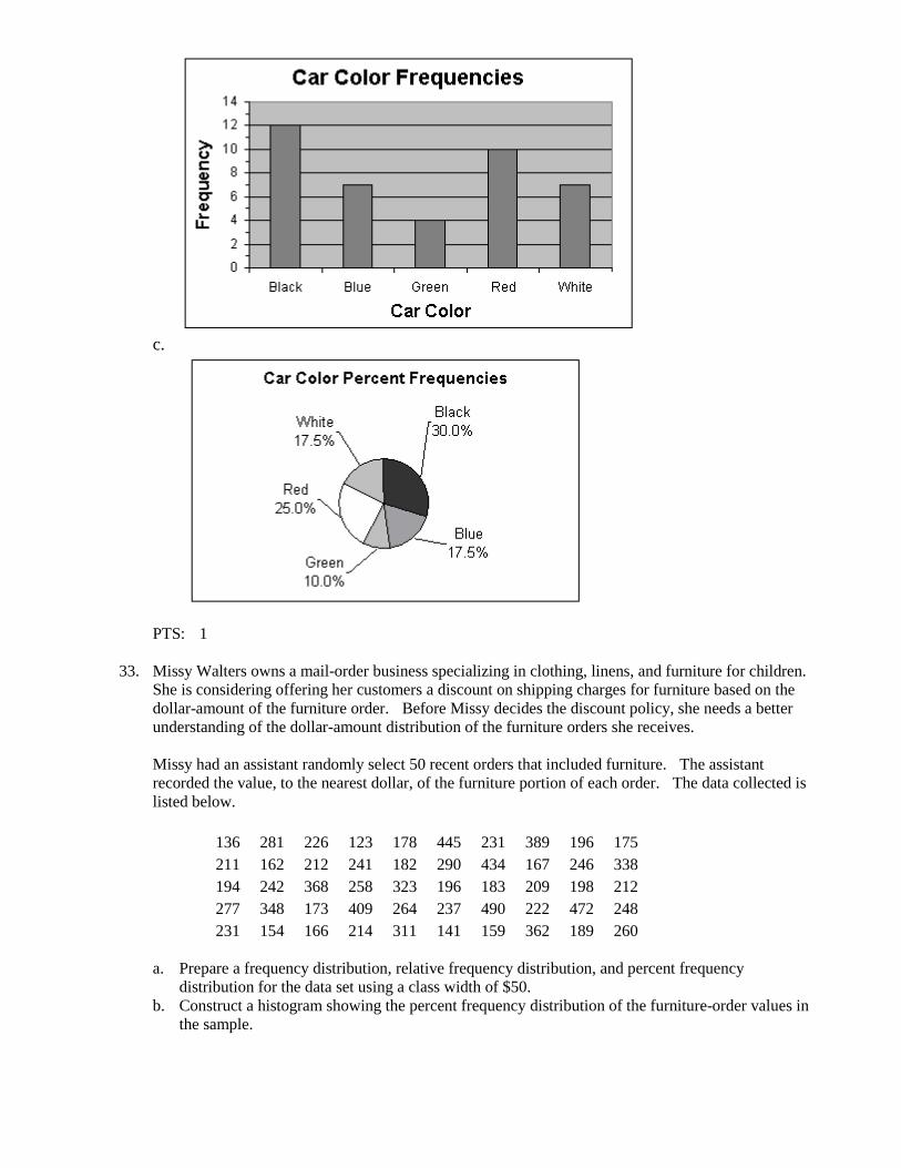
c.
PTS: 1
33. Missy Walters owns a mail-order business specializing in clothing, linens, and furniture for children.
She is considering offering her customers a discount on shipping charges for furniture based on the
dollar-amount of the furniture order. Before Missy decides the discount policy, she needs a better
understanding of the dollar-amount distribution of the furniture orders she receives.
Missy had an assistant randomly select 50 recent orders that included furniture. The assistant
recorded the value, to the nearest dollar, of the furniture portion of each order. The data collected is
listed below.
136 281 226 123 178 445 231 389 196 175
211 162 212 241 182 290 434 167 246 338
194 242 368 258 323 196 183 209 198 212
277 348 173 409 264 237 490 222 472 248
231 154 166 214 311 141 159 362 189 260
a. Prepare a frequency distribution, relative frequency distribution, and percent frequency
distribution for the data set using a class width of $50.
b. Construct a histogram showing the percent frequency distribution of the furniture-order values in
the sample.

c. Develop a cumulative frequency distribution and a cumulative percent frequency distribution for
this data.
ANS:
a.
Furniture
Order Frequency
Relative
Frequency
Percent
Frequency
100-149 3 0.06 6
150-199 15 0.30 30
200-249 14 0.28 28
250-299 6 0.12 12
300-349 4 0.08 8
350-399 3 0.06 6
400-449 3 0.06 6
450-499 2 0.04 4
b.
c.
Furniture
Order Frequency
Cumulative
Frequency
Cumulative
% Frequency
100-149 3 3 6
150-199 15 18 36
200-249 14 32 64
250-299 6 38 76
300-349 4 42 84
350-399 3 45 90
400-449 3 48 96
450-499 2 50 100
PTS: 1
34. Develop a stretched stem-and-leaf display for the data set below, using a leaf unit of 10.
136 281 226 123 178 445 231 389 196 175
211 162 212 241 182 290 434 167 246 338
194 242 368 258 323 196 183 209 198 212
277 348 173 409 264 237 490 222 472 248
231 154 166 214 311 141 159 362 189 260
ANS:
Leaf Unit = 10
1 2 3 4
1 5 5 6 6 6 7 7 7 8 8 8 9 9 9 9
2 0 1 1 1 1 2 2 3 3 3 4 4 4 4
2 5 6 6 7 8 9
3 1 2 3 4
3 6 6 8
4 0 3 4
4 7 9
PTS: 1
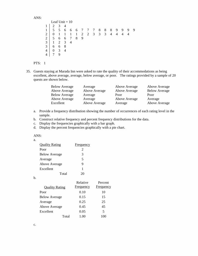
35. Guests staying at Marada Inn were asked to rate the quality of their accommodations as being
excellent, above average, average, below average, or poor. The ratings provided by a sample of 20
quests are shown below.
Below Average Average Above Average Above Average
Above Average Above Average Above Average Below Average
Below Average Average Poor Poor
Above Average Average Above Average Average
Excellent Above Average Average Above Average
a. Provide a frequency distribution showing the number of occurrences of each rating level in the
sample.
b. Construct relative frequency and percent frequency distributions for the data.
c. Display the frequencies graphically with a bar graph.
d. Display the percent frequencies graphically with a pie chart.
ANS:
a.
Quality Rating Frequency
Poor 2
Below Average 3
Average 5
Above Average 9
Excellent 1
Total 20
b.
Quality Rating
Relative
Frequency
Percent
Frequency
Poor 0.10 10
Below Average 0.15 15
Average 0.25 25
Above Average 0.45 45
Excellent 0.05 5
Total 1.00 100
c.

d.
PTS: 1
36. The manager of Hudson Auto Repair would like to get a better picture of the distribution of costs for
new parts used in the engine tune-up jobs done in the garage. A sample of 50 customer invoices for
tune-ups has been taken and the costs of parts, rounded to the nearest dollar, are listed below.
Develop a frequency distribution for these cost data. Use your own judgment to determine the
number of classes and class width that provide a distribution that will be meaningful and helpful to the
manager.
a. Develop a stem-and-leaf display showing both the rank order and shape of the data set.
b. Develop a stretched stem-and-leaf display using two stems for each leading digit(s).
c. Which display is better at revealing the natural grouping and variation in the data?
ANS:
a. Stem-and-leaf
91 78 93 57 75 52 99 80 73 62
71 69 72 89 66 75 79 75 72 76
104 74 62 68 97 105 77 65 80 109
85 97 88 68 83 68 71 69 67 74
62 82 98 101 79 105 79 69 62 73

5 2 7
6 2 2 2 2 5 6 7 8 8 8 9 9 9
7 1 1 2 2 3 3 4 4 5 5 5 6 7 8 9 9 9
8 0 0 2 3 5 8 9
9 1 3 7 7 8 9
10 1 4 5 5 9
b. Stretched stem-and-leaf
5 2
5 7
6 2 2 2 2
6 5 6 7 8 8 8 9 9 9
7 1 1 2 2 3 3 4 4
7 5 5 5 6 7 8 9 9 9
8 0 0 2 3
8 5 8 9
9 1 3
9 7 7 8 9
10 1 4
10 5 5 9
c. The stretched stem-and-leaf display in (b) does a better job of revealing the dispersion of the data.
37. Ithaca Log Homes manufactures four styles of log houses that are sold in kits. The price (in $000)
and style of homes the company has sold in the past year are shown below.
Price Style Price Style Price Style
<99 Colonial >100 A-Frame >100 Colonial
<99 Ranch >100 Split-Level <99 Colonial
>100 Split-Level <99 Colonial <99 A-Frame
>100 Split-Level >100 Ranch >100 Split-Level
<99 Colonial >100 Colonial >100 Ranch
<99 A-Frame <99 A-Frame <99 Split-Level
<99 Split-Level <99 Split-Level >100 Split-Level
<99 A-Frame <99 Split-Level >100 Colonial
>100 Ranch <99 Colonial >100 Ranch
>100 Split-Level <99 Ranch >100 Split-Level
<99 A-Frame >100 Split-Level <99 Colonial
<99 Colonial >100 Colonial >100 Colonial
>100 Ranch <99 Split-Level <99 Split-Level
<99 Colonial
Prepare a crosstabulation for the variables price and style.
ANS:
Count of
Home Style
Price ($1000) Colonial Ranch Split-Level A-Frame Grand Total
<99 8 2 6 5 21
>100 5 5 8 1 19
Grand Total 13 7 14 6 40
38. Tony Zamora, a real estate investor, has just moved to Clarksville and wants to learn about the local

real estate market. He wants to understand, for example, the relationship between geographical seg-
ment of the city and selling price of a house, the relationship between selling price and number of
bedrooms, and so on. Tony has randomly selected 25 house-for-sale listings from the Sunday news-
paper and collected the data listed below.
Segment
of City
Selling
Price
($000)
House Size
(00 sq. ft.)
Number of
Bedrooms
Number of
Bathrooms
Garage
Size
(cars)
Northwest 290 21 4 2 2
South 95 11 2 1 0
Northeast 170 19 3 2 2
Northwest 375 38 5 4 3
West 350 24 4 3 2
South 125 10 2 2 0
West 310 31 4 4 2
West 275 25 3 2 2
Northwest 340 27 5 3 3
Northeast 215 22 4 3 2
Northwest 295 20 4 3 2
South 190 24 4 3 2
Northwest 385 36 5 4 3
West 430 32 5 4 2
South 185 14 3 2 1
South 175 18 4 2 2
Northeast 190 19 4 2 2
Northwest 330 29 4 4 3
West 405 33 5 4 3
Northeast 170 23 4 2 2
West 365 34 5 4 3
Northwest 280 25 4 2 2
South 135 17 3 1 1
Northeast 205 21 4 3 2
West 260 26 4 3 2
a. Construct a crosstabulation for the variables segment of city and number of bedrooms.
b. Compute the row percentages for your crosstabulation in part (a).
c. Comment on any apparent relationship between the variables.
ANS:
a. CROSSTABULATION
Count of Home Number of Bedrooms
Segment of City 2 3 4 5 Grand Total
Northeast 0 1 4 0 5
Northwest 0 0 4 3 7
South 2 2 2 0 6
West 0 1 3 3 7
Grand Total 2 4 13 6 25
b. ROW PERCENTAGES
Percent of Home Number of Bedrooms
Segment of City 2 3 4 5 Grand Total
Northeast 0.0 20.0 80.0 0.0 100.0
Northwest 0.0 0.0 57.1 42.9 100.0
South 33.3 33.3 33.3 0.0 100.0
West 0.0 14.3 42.9 42.9 100.1

c. We see that fewest bedrooms are associated with the South, and the most bedrooms are associated
with the West and particularly the Northwest.