chapter 7 xaml vs. code · pdf filechapter 7 xaml vs. code ... job in a very mechanical manner...
TRANSCRIPT

Creating Mobile Apps with Xamarin.Forms — 2nd Preview Edition — Feb. 3, 2015
Chapter 7
XAML vs. Code
C# is undoubtedly one of the greatest programming languages the world has ever seen. You can write
entire Xamarin.Forms applications in C#, and it’s conceivable that you’ve found C# to be so ideally
suited for Xamarin.Forms that you haven’t even considered using anything else.
But keep an open mind. Xamarin.Forms provides an alternative to C# that has some distinct ad-
vantages for some certain aspects of program development. This alternative is XAML (pronounced
"zammel"), which stands for the eXtensible Application Markup Language. Like C#, XAML was devel-
oped at Microsoft Corporation, and it is only a few years younger than C#.
As its name suggests, XAML adheres to the syntax of XML, the eXtensible Markup Language. This
book assumes that you have familiarity with the basic concepts and syntax of XML.
In the most general sense, XAML is a declarative markup language used for instantiating and initial-
izing objects. That definition might seem excessively general, and XAML is indeed quite flexible. Most
real-world XAML has been used for defining tree-structured visual user interfaces characteristic of
graphical programming environments. The history of XAML-based user interfaces begins with the
Windows Presentation Foundation (WPF), and continues with Silverlight, Windows Phone 7 and 8, and
Windows 8 and 10. Each of these XAML implementations supports a somewhat different set of visual
elements defined by the particular platform. Likewise, the XAML implementation in Xamarin.Forms
supports the visual elements defined by Xamarin.Forms, such as Label, BoxView, Frame, Button, Stack-
Layout, and ContentPage.
As you've seen, a Xamarin.Forms application written entirely in code generally defines the initial
appearance of its user interface in the constructor of a class that derives from ContentPage. If you
choose to use XAML, the markup generally replaces this constructor code. You will find that XAML
provides a more succinct and elegant definition of the user interface, and has a visual structure that
better mimics the tree organization of the visual elements on the page.
XAML is also generally easier to maintain and modify than equivalent code. Because XAML is XML, it
is also potentially toolable: XAML can more easily be parsed and edited by software tools than the
equivalent C# code. Indeed, an early impetus behind XAML was to facilitate a collaboration between
programmers and designers: Designers can use design tools that generate XAML, while programmers
focus on the code that interacts with the markup. While this vision has perhaps only rarely been fulfilled
to perfection, it certainly suggests how applications can be structured to accommodate XAML. You use
XAML for the visuals and code for the underlying logic.
Yet, XAML goes beyond that simple division of labor. As you’ll see in a future chapter, it’s possible to
define bindings right in the XAML that link user-interface objects with underlying data.

Chapter 7. XAML vs. Code Page 120
Creating Mobile Apps with Xamarin.Forms — 2nd Preview Edition — Feb. 3, 2015
When creating XAML for Microsoft platforms, some developers use interactive design tools such as
Microsoft Blend, but many others prefer to hand-write XAML. No design tools are available for Xama-
rin.Forms, so hand-writing is the only option. Obviously all the XAML examples in this book are
hand-written. But even when design tools are available, the ability to hand-write XAML is an important
skill.
The prospect of hand-writing XAML might cause some consternation among developers for another
reason: XML is notoriously verbose. Yet, you’ll see almost immediately that XAML is often more concise
than the equivalent C# code. The real power of XAML becomes evident only incrementally, however,
and won’t be fully apparent until you use XAML for constructing templates for multiple items displayed
in a ListView.
It is natural for programmers who prefer strongly typed languages such as C# to be skeptical of a
markup language where everything is a text string. But you’ll see shortly how XAML is a very strict an-
alog of programming code. Much of what’s allowed in your XAML files is defined by the classes and
properties that make up the Xamarin.Forms application programming interface. For this reason, you
might even begin to think of XAML as a "strongly typed" markup language. The XAML parser does its
job in a very mechanical manner based on the underlying API infrastructure. One of the objectives of
this chapter and the next is to demystify XAML and illuminate what happens when the XAML is parsed.
Yet, code and markup are very different: Code defines a process while markup defines a state. XAML
has several deficiencies that are intrinsic to markup languages: XAML has no loops, no flow control, no
algebraic calculation syntax, and no event handlers. However, XAML defines several features that help
compensate for some of these deficiencies. You’ll see many of these features in future chapters.
If you do not wish to use XAML, you don’t need to. Anything that can be done in XAML can be done
in C#. But watch out: Sometimes developers get a little taste of XAML and get carried away and try to
do everything in XAML! As usual, the best rule is “moderation in all things.” Many of the best techniques
involve combining code and XAML in interactive ways.
Basic XAML Syntax
Let's begin this exploration with a few snippets of code and the equivalent XAML, and then see how
XAML and code fit together in a Xamarin.Forms application.
Properties and Attributes Here is a Xamarin.Forms Label instantiated and initialized in code, much as it might appear in the con-
structor of a page class:
new Label
{
Text = "Hello from Code!",
IsVisible = true,

Chapter 7. XAML vs. Code Page 121
Creating Mobile Apps with Xamarin.Forms — 2nd Preview Edition — Feb. 3, 2015
Opacity = 0.75,
XAlign = TextAlignment.Center,
VerticalOptions = LayoutOptions.CenterAndExpand,
TextColor = Color.Blue,
BackgroundColor = Color.FromRgb(255, 128, 128),
FontSize = Device.GetNamedSize(NamedSize.Large, new Label()),
FontAttributes = FontAttributes.Bold | FontAttributes.Italic
};
Here is a very similar Label instantiated and initialized in XAML, which you can see immediately is more
concise than the equivalent code.
<Label Text="Hello from XAML!"
IsVisible="True"
Opacity="0.75"
XAlign="Center"
VerticalOptions="CenterAndExpand"
TextColor="Blue"
BackgroundColor="#FF8080"
FontSize="Large"
FontAttributes="Bold,Italic" />
Xamarin.Forms classes such as Label become XML elements in XAML. Properties such as Text, IsVisible,
and the rest, become XML attributes in XAML.
To be instantiated in XAML, a class such as Label must have a public parameterless constructor.
(You’ll see later in the next chapter that there is a technique to pass arguments to a constructor in
XAML, but it’s generally used for special purposes.) The properties set in XAML must have public set
accessors. By convention, spaces surround an equal sign in code but not in XML (or XAML), but you can
use as much white space as you want.
The concision of the XAML mostly results from the brevity of the attribute values—for example, the
use of the word "Large" rather than a call to the Device.GetNamedSize method. These abbreviations are
not built into the XAML parser. The XAML parser is instead assisted by various converter classes defined
specifically for this purpose.
When the XAML parser encounters the Label element, it can use reflection to determine if Xama-
rin.Forms has a class named Label, and if so, it can instantiate that class. Now it is ready to initialize that
object. The Text property is of type string, and the attribute value is simply assigned to that property.
Because XAML is XML, you can include Unicode characters in the text using the standard XML syn-
tax. Precede the decimal Unicode value with &# (or the hexadecimal Unicode value with &#x) and follow
it with a semicolon:
Text="Cost — €123.45"
Those are the Unicode values for the em-dash and Euro symbol. To force a line break, use the linefeed
character 
 or (because leading zeros aren’t required) 
 or with the decimal code, 
.
Angle brackets, ampersands, and quotation marks have a special meaning in XML, so to include

Chapter 7. XAML vs. Code Page 122
Creating Mobile Apps with Xamarin.Forms — 2nd Preview Edition — Feb. 3, 2015
those characters in a text string, use one of the standard predefined entities:
< for <
> for >
& for &
' for '
" for "
The HTML predefined entities such as are not supported. For a non-breaking space use  
instead.
The IsVisible and Opacity properties of Label are of type bool and double, respectively, and these are as
simple as you might expect. The XAML parser uses the Boolean.Parse and Double.Parse methods to
convert the attribute values. The Boolean.Parse method is case-insensitive, but generally Boolean values
are capitalized as “True” and “False” in XAML. The Double.Parse method is passed a CultureIn-
fo.InvariantCulture argument so the conversion doesn’t depend on the local culture of the programmer
or user.
The XAlign property of Label is of type TextAlignment, which is an enumeration. For any property that
is an enumeration type, the XAML parser uses the Enum.Parse method to convert from the string to the
value.
The VerticalOptions property is of type LayoutOptions, a structure. When the XAML parser references
the LayoutOptions structure using reflection, it discovers that the structure has a C# attribute defined:
[TypeConverter (typeof(LayoutOptionsConverter))]
public struct LayoutOptions
{
…
}
(Watch out! This discussion involves two types of attributes: XML attributes such as XAlign and C# at-
tributes such as this TypeConverter!)
The TypeConverter attribute is supported by a class named TypeConverterAttribute. This TypeConverter
attribute on LayoutOptions references a class named LayoutOptionsConverter. This is a class private to
Xamarin.Forms but it derives from a public abstract class named TypeConverter that defines methods
named CanConvertFrom and ConvertFrom. When the XAML parser encounters this TypeConverter attrib-
ute, it instantiates the LayoutOptionsConverter. The VerticalOptions attribute in the XAML is assigned the
string “Center”, so the XAML parser passes that “Center” string to the ConvertFrom method of Lay-
outOptionsConverter and out pops a LayoutOptions value. This is assigned to the VerticalOptions property
of the Label object.
Similarly, when the XAML parser encounters the TextColor and BackgroundColor properties, it uses
reflection to determine that those properties are of type Color. The Color structure is also adorned with a

Chapter 7. XAML vs. Code Page 123
Creating Mobile Apps with Xamarin.Forms — 2nd Preview Edition — Feb. 3, 2015
TypeConverter attribute:
[TypeConverter (typeof(ColorTypeConverter))]
public struct Color
{
…
}
ColorTypeConverter is a public class, so you can experiment with it if you'd like. It accepts color defini-
tions in several formats: It can convert a string like “Blue” to the Color.Blue value, and the “Default” and
“Accent” strings to the Color.Default and Color.Accent values. ColorTypeConverter can also parse strings
that encode red-green-blue values such as “#FF8080”, which is a red value of 0xFF, a green value of
0x80, and a blue value also of 0x80.
All numeric RGB values begin with a number sign prefix, but that prefix can be followed with 8, 6, 4,
or 3 hexadecimal digits for specifying color values with or without an alpha channel. Here’s the most
extensive syntax:
BackgroundColor="#aarrggbb"
Each of the letters represents a hexadecimal digit, in the order alpha (opacity), red, green, and blue. For
the alpha channel, keep in mind that 0xFF is fully opaque and 0x00 is fully transparent. Here’s the syntax
without an alpha channel:
BackgroundColor="#rrggbb"
In this case the alpha value is set to 0xFF for fully opaque.
Two other formats allow you to specify only a single hexadecimal digit for each channel:
BackgroundColor="#argb"
BackgroundColor="#rgb"
In these cases, the digit is repeated to form the value. For example, #CF3 is the RGB color
0xCC-0xFF-0x33. These short formats are rarely used.
The FontSize property is of type double. This is a little different from properties of type LayoutOptions
and Color. The LayoutOptions and Color structures are part of Xamarin.Forms so they can be flagged with
the C# TypeConverter attribute, but it’s not possible to flag the .NET Double structure with a TypeCon-
verter attribute just for font sizes!
Instead, the FontSize property within the Label class has the TypeConverter attribute:
public class Label : View, IFontElement
{
…
[TypeConverter (typeof (FontSizeConverter))]
public double FontSize
{
…
}
…

Chapter 7. XAML vs. Code Page 124
Creating Mobile Apps with Xamarin.Forms — 2nd Preview Edition — Feb. 3, 2015
}
The FontSizeConverter determines if the string passed to it is one of the members of the NamedSize
enumeration. If not, FontSizeConverter assumes the value is a double.
The last attribute set in the example is FontAttributes. The FontAttributes property is an enumeration
named FontAttributes, and you already know that the XAML parser handles enumeration types auto-
matically. However, the FontAttributes enumeration has a C# Flags attribute set like so:
[Flags]
public enum FontAttributes
{
None = 0,
Bold = 1,
Italic = 2
}
The XAML parser therefore allows multiple members separated by commas:
FontAttributes="Bold,Italic"
This demonstration of the mechanical nature of the XAML parser should be very good news. It
means that you can include custom classes in XAML, and these classes can have properties of custom
types, or the properties can be of standard types but allow additional values. All you need is to flag
these types or properties with a C# TypeConverter attribute and provide a class that derives from
TypeConverter.
Property-Element Syntax Here is some C# that is similar to the FramedText code in Chapter 4. In one statement it instantiates a
Frame and a Label, and sets the Label to the Content property of the Frame:
new Frame
{
OutlineColor = Color.Accent,
HorizontalOptions = LayoutOptions.Center,
VerticalOptions = LayoutOptions.Center,
Content = new Label
{
Text = "Greetings, Xamarin.Forms!"
}
};
But when you start to duplicate this in XAML, you might become a little stymied at the point where
you set the Content attribute:
<Frame OutlineColor="Accent"
HorizontalOptions="Center"
VerticalOptions="Center"
Content=" what goes here? " />
How can that Content attribute be set to an entire Label object?

Chapter 7. XAML vs. Code Page 125
Creating Mobile Apps with Xamarin.Forms — 2nd Preview Edition — Feb. 3, 2015
The solution to this problem is the most fundamental feature of XAML syntax. The first step is to
separate the Frame tag into start and end tags:
<Frame OutlineColor="Accent"
HorizontalOptions="Center"
VerticalOptions="Center">
</Frame>
Within those tags, add two more tags that consist of the element (Frame) and the property you want to
set (Content) connected with a period:
<Frame OutlineColor="Accent"
HorizontalOptions="Center"
VerticalOptions="Center">
<Frame.Content>
</Frame.Content>
</Frame>
Now put the Label within those tags:
<Frame OutlineColor="Accent"
HorizontalOptions="Center"
VerticalOptions="Center">
<Frame.Content>
<Label Text="Greetings, Xamarin.Forms!" />
</Frame.Content>
</Frame>
That syntax is how you set a Label to the Content property of the Frame.
You might wonder if this XAML feature violates XML syntax rules. It does not. The period has no
special meaning in XML, so Frame.Content is a perfectly valid XML tag. However, XAML imposes its own
rules about these tags: The Frame.Content tags must appear within Frame tags, and no attributes can be
set in the Frame.Content tag. The object set to the Content property appears as the XML content of those
tags.
Once this syntax is introduced, some terminology becomes necessary. In the final XAML snippet
shown above:
Frame and Label are C# objects expressed as XML elements. They are called object elements.
OutlineColor, HorizontalOptions, VerticalOptions, and Text are C# properties expressed as XML at-
tributes. They are called property attributes.
Frame.Content is a C# property expressed as an XML element. It is therefore called a property
element.
Property elements are very common in real-life XAML. You’ll see numerous examples in this chapter
and future chapters, and you’ll soon find property elements becoming second nature to your use of

Chapter 7. XAML vs. Code Page 126
Creating Mobile Apps with Xamarin.Forms — 2nd Preview Edition — Feb. 3, 2015
XAML. But watch out: Sometimes developers must remember so much that we forget the basics. Even
after you’ve been doing XAML for a while, you’ll probably encounter a situation where it doesn’t seem
possible to set a particular object to a particular property. The solution is very often a property element.
You can also use property-element syntax for simpler properties, for example:
<Frame HorizontalOptions="Center">
<Frame.VerticalOptions>
Center
</Frame.VerticalOptions>
<Frame.OutlineColor>
Accent
</Frame.OutlineColor>
<Frame.Content>
<Label>
<Label.Text>
Greetings, Xamarin.Forms!
</Label.Text>
</Label>
</Frame.Content>
</Frame>
Now the VerticalOptions and OulineColor properties of Frame and the Text property of Label have all be-
come property elements. The value of these attributes is the content of the property element without
quotation marks.
Of course, it doesn’t make much sense to define these properties as property elements. It’s unnec-
essarily verbose. But it works as it should.
Let’s go a little further: Instead of setting HorizontalOptions to “Center” (corresponding to the static
property LayoutOptions.Center), you can express HorizontalOptions as a property element and set it to a
LayoutOptions value with its individual properties set:
<Frame>
<Frame.HorizontalOptions>
<LayoutOptions Alignment="Center"
Expands="False" />
</Frame.HorizontalOptions>
<Frame.VerticalOptions>
Center
</Frame.VerticalOptions>
<Frame.OutlineColor>
Accent
</Frame.OutlineColor>
<Frame.Content>
<Label>
<Label.Text>
Greetings, Xamarin.Forms!
</Label.Text>
</Label>
</Frame.Content>
</Frame>

Chapter 7. XAML vs. Code Page 127
Creating Mobile Apps with Xamarin.Forms — 2nd Preview Edition — Feb. 3, 2015
And you can express these properties of LayoutOptions as property elements:
<Frame>
<Frame.HorizontalOptions>
<LayoutOptions>
<LayoutOptions.Alignment>
Center
</LayoutOptions.Alignment>
<LayoutOptions.Expands>
False
</LayoutOptions.Expands>
</LayoutOptions>
</Frame.HorizontalOptions>
…
</Frame>
You can’t set the same property as a property attribute and a property element. That’s setting the
property twice, and it’s not allowed. And remember that nothing else can appear in the property ele-
ment tags. The value being set to the property is always the XML content of those tags.
Now you should know how to use a StackLayout in XAML. First express the Children property as the
property element StackLayout.Children, and then include the children of the StackLayout as XML content
of the property element tags. Here’s an example where each child of the first StackLayout is another
StackLayout with a horizontal orientation:
<StackLayout>
<StackLayout.Children>
<StackLayout Orientation="Horizontal">
<StackLayout.Children>
<BoxView Color="Red" />
<Label Text="Red"
VerticalOptions="Center" />
</StackLayout.Children>
</StackLayout>
<StackLayout Orientation="Horizontal">
<StackLayout.Children>
<BoxView Color="Green" />
<Label Text="Green"
VerticalOptions="Center" />
</StackLayout.Children>
</StackLayout>
<StackLayout Orientation="Horizontal">
<StackLayout.Children>
<BoxView Color="Blue" />
<Label Text="Blue"
VerticalOptions="Center" />
</StackLayout.Children>
</StackLayout>
</StackLayout.Children>
</StackLayout>

Chapter 7. XAML vs. Code Page 128
Creating Mobile Apps with Xamarin.Forms — 2nd Preview Edition — Feb. 3, 2015
Each horizontal StackLayout has a BoxView with a color and Label with that color name.
Of course, the repetitive markup here looks rather scary! What if you wanted to display 16 colors? Or
140? You might succeed at first with a lot of copying and pasting, but if you then needed to refine the
visuals a bit, you’d be in bad shape. In code you’d do this in a loop, but XAML has no such feature.
When markup threatens to be overly repetitious, you can always use code. Defining some of a user
interface in XAML and the rest in code is perfectly reasonable. But there are other solutions, as you’ll see
in later chapters.
Adding a XAML Page to Your Project Now that you’ve seen some snippets of XAML, let’s look at a whole XAML page in the context of a
complete program. First, create a Xamarin.Forms solution named CodePlusXaml using the Portable
Class Library solution template.
Now add a XAML ContentPage to the PCL:
In Visual Studio, right click the CodePlusXaml project in the Solution Explorer. Select Add > New
Item from the menu. In the Add New Item dialog, select Visual C# and Code at the left, and Forms
Xaml Page from the central list. Name it CodePlusXamlPage.cs.
In Xamarin Studio, invoke the drop-down menu on the CodePlusXaml project in the Solution list,
and select Add > New File. In the New File dialog, select Forms at the left and Forms ContentPage
Xaml in the central list. (Watch out: There’s also a Forms ContentView Xaml in the list. You want a
content page.) Name it CodePlusXamlPage.
In either case, two files are created:
CodePlusXamlPage.xaml, the XAML file; and
CodePlusXamlPage.xaml.cs, a C# file (despite the odd double extension on the filename).
In the file list, the second file is indented underneath the first, indicating their close relationship. The C#
file is often referred to as the code-behind of the XAML file. It contains code that supports the markup.
These two files both contribute to a class named CodePlusXamlPage that derives from ContentPage.
Let’s examine the code file first. Excluding the using directives, it looks like this:
namespace CodePlusXaml
{
public partial class CodePlusXamlPage : ContentPage
{
public CodePlusXamlPage()
{
InitializeComponent();
}
}
}

Chapter 7. XAML vs. Code Page 129
Creating Mobile Apps with Xamarin.Forms — 2nd Preview Edition — Feb. 3, 2015
It is indeed a class named CodePlusXamlPage that derives from ContentPage just as anticipated. How-
ever, the class definition includes a partial keyword, which usually indicates that this is only part of the
CodePlusXamlPage class definition. Somewhere else there should be another partial class definition for
CodePlusXamlPage. So if it exists, where is it? It’s a mystery! (For now.)
Another mystery is the InitializeComponent method that the constructor calls. Judging solely from the
syntax, it seems as if this method should be defined or inherited by ContentPage. Yet, you won’t find
InitializeComponent in the API documentation.
Let’s set those two mysteries aside temporarily and look at the XAML file. The Visual Studio and
Xamarin Studio templates generate two somewhat different XAML files. If you’re using Visual Studio,
delete the markup for the Label and replace it with ContentPage.Content property-element tags so it
looks like the version in Xamarin Studio:
<ContentPage xmlns="http://xamarin.com/schemas/2014/forms"
xmlns:x="http://schemas.microsoft.com/winfx/2009/xaml"
x:Class="CodePlusXaml.CodePlusXamlPage">
<ContentPage.Content>
</ContentPage.Content>
</ContentPage>
The root element is ContentPage, which is the class that CodePlusXamlPage derives from. That tag begins
with two XML namespace declarations, both of which are URI’s. But don’t bother checking the web
addresses! There’s nothing there. These URI’s simply indicate who owns the namespace and what func-
tion it serves.
The default namespace belongs to Xamarin. This is the XML namespace for elements in the file with
no prefix, such as the ContentPage tag. The URL includes the year that this namespace came into being,
and the word forms as an abbreviation for Xamarin.Forms.
The second namespace is associated with a prefix of x by convention, and it belongs to Microsoft.
This namespace refers to elements and attributes that are intrinsic to XAML and are found in every
XAML implementation. The word winfx refers to a name once used for the .NET Framework 3.0, which
introduced WPF and XAML. The year 2009 refers to a particular XAML specification, which also implies a
particular collection of elements and attributes that build upon the original XAML specification, which is
dated 2006. However, Xamarin.Forms implements only a subset of the elements and attributes in the
2009 specification.
The next line is one of the attributes that is intrinsic to XAML, called Class. Because the x prefix is
almost universally used for this namespace, this attribute is commonly referred to as x:Class and pro-
nounced “x class.”
The x:Class attribute can only appear on the root element of a XAML file. It specifies the .NET
namespace and name of a derived class. The base class of this derived class is the root element. In other
words, this x:Class specification indicates that the CodePlusXamlPage class in the CodePlusXaml
namespace derives from ContentPage. That’s exactly the same information as the CodePlusXamlPage
class definition in the CodePlusXamlPage.xaml.cs file.

Chapter 7. XAML vs. Code Page 130
Creating Mobile Apps with Xamarin.Forms — 2nd Preview Edition — Feb. 3, 2015
Let’s add some content, which means setting something to the Content property, which in the XAML
file means putting something between ContentPage.Content property element tags. Bbegin the content
with a StackLayout, and then add a Label to the Children property:
<ContentPage xmlns="http://xamarin.com/schemas/2014/forms"
xmlns:x="http://schemas.microsoft.com/winfx/2009/xaml"
x:Class="CodePlusXaml.CodePlusXamlPage">
<ContentPage.Content>
<StackLayout>
<StackLayout.Children>
<Label Text="Hello from XAML!"
IsVisible="True"
Opacity="0.75"
XAlign="Center"
VerticalOptions="CenterAndExpand"
TextColor="Blue"
BackgroundColor="#FF8080"
FontSize="Large"
FontAttributes="Bold,Italic" />
</StackLayout.Children>
</StackLayout>
</ContentPage.Content>
</ContentPage>
That’s the XAML Label you saw at the beginning of this chapter.
You’ll now need to change the App class to instantiate this page just like you do with a code-only
derivative of ContentPage:
namespace CodePlusXaml
{
public class App : Application
{
public App()
{
MainPage = new CodePlusXamlPage();
}
…
}
}
You can now build and deploy this program. After you do so, it’s possible to clear up a couple mys-
teries:
In Visual Studio, in the Solution Explorer, select the CodePlusXamlFile project, find the icon at the
top with the tooltip Show All Files, and toggle that on.
In Xamarin Studio, in the Solution file list, invoke the drop-down menu for the whole solution, and
select Display Options > Show All Files.
In the CodePlusXaml portable class library project, find the obj folder and within that, the Debug
folder. You’ll see a file named CodePlusXamlPage.xaml.g.cs. Notice the g in the filename. That stands for
Chapter 7. XAML vs. Code Page 131
Creating Mobile Apps with Xamarin.Forms — 2nd Preview Edition — Feb. 3, 2015
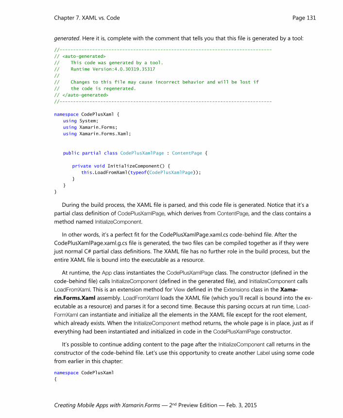
generated. Here it is, complete with the comment that tells you that this file is generated by a tool:
//------------------------------------------------------------------------------
// <auto-generated>
// This code was generated by a tool.
// Runtime Version:4.0.30319.35317
//
// Changes to this file may cause incorrect behavior and will be lost if
// the code is regenerated.
// </auto-generated>
//------------------------------------------------------------------------------
namespace CodePlusXaml {
using System;
using Xamarin.Forms;
using Xamarin.Forms.Xaml;
public partial class CodePlusXamlPage : ContentPage {
private void InitializeComponent() {
this.LoadFromXaml(typeof(CodePlusXamlPage));
}
}
}
During the build process, the XAML file is parsed, and this code file is generated. Notice that it’s a
partial class definition of CodePlusXamlPage, which derives from ContentPage, and the class contains a
method named InitializeComponent.
In other words, it’s a perfect fit for the CodePlusXamlPage.xaml.cs code-behind file. After the
CodePlusXamlPage.xaml.g.cs file is generated, the two files can be compiled together as if they were
just normal C# partial class definitions. The XAML file has no further role in the build process, but the
entire XAML file is bound into the executable as a resource.
At runtime, the App class instantiates the CodePlusXamlPage class. The constructor (defined in the
code-behind file) calls InitializeComponent (defined in the generated file), and InitializeComponent calls
LoadFromXaml. This is an extension method for View defined in the Extensions class in the Xama-
rin.Forms.Xaml assembly. LoadFromXaml loads the XAML file (which you’ll recall is bound into the ex-
ecutable as a resource) and parses it for a second time. Because this parsing occurs at run time, Load-
FormXaml can instantiate and initialize all the elements in the XAML file except for the root element,
which already exists. When the InitializeComponent method returns, the whole page is in place, just as if
everything had been instantiated and initialized in code in the CodePlusXamlPage constructor.
It’s possible to continue adding content to the page after the InitializeComponent call returns in the
constructor of the code-behind file. Let’s use this opportunity to create another Label using some code
from earlier in this chapter:
namespace CodePlusXaml
{

Chapter 7. XAML vs. Code Page 132
Creating Mobile Apps with Xamarin.Forms — 2nd Preview Edition — Feb. 3, 2015
public partial class CodePlusXamlPage : ContentPage
{
public CodePlusXamlPage()
{
InitializeComponent();
Label label = new Label
{
Text = "Hello from Code!",
IsVisible = true,
Opacity = 0.75,
XAlign = TextAlignment.Center,
VerticalOptions = LayoutOptions.CenterAndExpand,
TextColor = Color.Blue,
BackgroundColor = Color.FromRgb(255, 128, 128),
FontSize = Device.GetNamedSize(NamedSize.Large, new Label()),
FontAttributes = FontAttributes.Bold | FontAttributes.Italic
};
(Content as StackLayout).Children.Insert(0, label);
}
}
}
The constructor concludes by accessing the StackLayout that we know is set to the Content property
of the page and inserting the Label at the top. (In the next chapter you’ll see a much better way to ref-
erence objects in the XAML file using the x:Name attribute.) You can create the Label prior to the Initial-
izeComponent call but you can’t add it to the StackLayout because InitializeComponent is what causes the
Stacklayout (and all the other XAML elements) to be instantiated. Here’s the result:

Chapter 7. XAML vs. Code Page 133
Creating Mobile Apps with Xamarin.Forms — 2nd Preview Edition — Feb. 3, 2015
Aside from the text, the two buttons are identical.
You don’t have to spend much time with the code file that the XAML parser generates, but it’s
helpful to understand how the XAML file plays a role both in the build process and during runtime.
Also, sometimes an error in the XAML file raises a runtime exception at the LoadFromXaml call, so you
will probably see the generated code file pop up frequently, and you should know what it is.
Platform Specificity in the XAML File Here is the XAML file for a program named ScaryColorList that’s similar to a snippet of XAML you saw
earlier. But now the repetition is even scarier because each color item is surrounded by a Frame:
<ContentPage xmlns="http://xamarin.com/schemas/2014/forms"
xmlns:x="http://schemas.microsoft.com/winfx/2009/xaml"
x:Class="ScaryColorList.ScaryColorListPage">
<ContentPage.Content>
<StackLayout>
<StackLayout.Children>
<Frame OutlineColor="Accent">
<Frame.Content>
<StackLayout Orientation="Horizontal">
<StackLayout.Children>
<BoxView Color="Red" />
<Label Text="Red"
VerticalOptions="Center" />
</StackLayout.Children>
</StackLayout>
</Frame.Content>
</Frame>
<Frame OutlineColor="Accent">
<Frame.Content>
<StackLayout Orientation="Horizontal">
<StackLayout.Children>
<BoxView Color="Green" />
<Label Text="Green"
VerticalOptions="Center" />
</StackLayout.Children>
</StackLayout>
</Frame.Content>
</Frame>
<Frame OutlineColor="Accent">
<Frame.Content>
<StackLayout Orientation="Horizontal">
<StackLayout.Children>
<BoxView Color="Blue" />
<Label Text="Blue"
VerticalOptions="Center" />
</StackLayout.Children>
</StackLayout>
</Frame.Content>

Chapter 7. XAML vs. Code Page 134
Creating Mobile Apps with Xamarin.Forms — 2nd Preview Edition — Feb. 3, 2015
</Frame>
</StackLayout.Children>
</StackLayout>
</ContentPage.Content>
</ContentPage>
The code-behind file contains only a call to InitializeComponent.
Aside from the repetitious markup, this program has a more practical problem: When it runs on iOS,
the top item overlaps the status bar. This problem can be fixed with a call to Device.OnPlatform in the
page’s constructor (just as you saw in Chapter 2). Because Device.OnPlatform sets the Padding property
on the page and doesn’t require anything in the XAML file, it could go either before or after the Initial-
izeComponent call. Here’s one way to do it:
public partial class ScaryColorListPage : ContentPage
{
public ScaryColorListPage()
{
Padding = Device.OnPlatform(new Thickness(0, 20, 0, 0),
new Thickness(0),
new Thickness(0));
InitializeComponent();
}
}
Or, you could set a uniform Padding value for all three platforms right in the root element of the
XAML file:
<ContentPage xmlns="http://xamarin.com/schemas/2014/forms"
xmlns:x="http://schemas.microsoft.com/winfx/2009/xaml"
x:Class="ScaryColorList.ScaryColorListPage"
Padding="0, 20, 0, 0">
<ContentPage.Content>
…
</ContentPage.Content>
</ContentPage>
That sets the Padding property for the page. The ThicknessTypeConverter class requires the values to be
separated by commas, but you have the same flexibility as the Thickness constructor. You can specify
four values in the order left, top, right, and bottom; two values (the first for left and right, and the sec-
ond for top and bottom); or one value.
However, you can also specify platform-specific values right in the XAML file using the OnPlatform
class, whose name suggests that it is similar in function to the Device.OnPlatform static method.
OnPlatform is a very interesting class, and it’s worthwhile to get a sense of how it works. The class is
generic, and it has three properties of type T, as well as an implicit conversion of itself to T that makes
use of the Device.OS value:
public class OnPlatform<T>
{
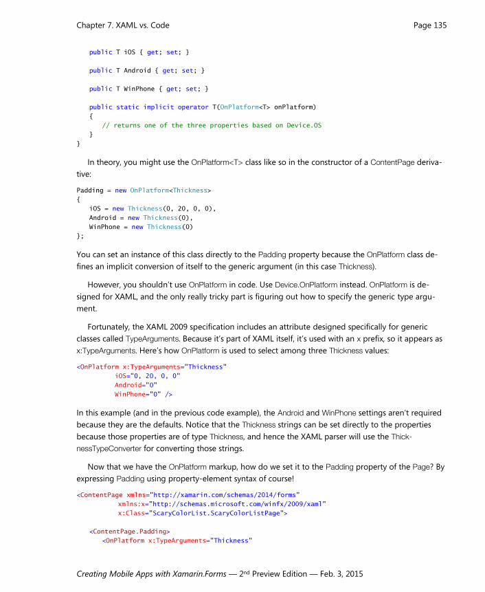
Chapter 7. XAML vs. Code Page 135
Creating Mobile Apps with Xamarin.Forms — 2nd Preview Edition — Feb. 3, 2015
public T iOS { get; set; }
public T Android { get; set; }
public T WinPhone { get; set; }
public static implicit operator T(OnPlatform<T> onPlatform)
{
// returns one of the three properties based on Device.OS
}
}
In theory, you might use the OnPlatform<T> class like so in the constructor of a ContentPage deriva-
tive:
Padding = new OnPlatform<Thickness>
{
iOS = new Thickness(0, 20, 0, 0),
Android = new Thickness(0),
WinPhone = new Thickness(0)
};
You can set an instance of this class directly to the Padding property because the OnPlatform class de-
fines an implicit conversion of itself to the generic argument (in this case Thickness).
However, you shouldn’t use OnPlatform in code. Use Device.OnPlatform instead. OnPlatform is de-
signed for XAML, and the only really tricky part is figuring out how to specify the generic type argu-
ment.
Fortunately, the XAML 2009 specification includes an attribute designed specifically for generic
classes called TypeArguments. Because it’s part of XAML itself, it’s used with an x prefix, so it appears as
x:TypeArguments. Here’s how OnPlatform is used to select among three Thickness values:
<OnPlatform x:TypeArguments="Thickness"
iOS="0, 20, 0, 0"
Android="0"
WinPhone="0" />
In this example (and in the previous code example), the Android and WinPhone settings aren’t required
because they are the defaults. Notice that the Thickness strings can be set directly to the properties
because those properties are of type Thickness, and hence the XAML parser will use the Thick-
nessTypeConverter for converting those strings.
Now that we have the OnPlatform markup, how do we set it to the Padding property of the Page? By
expressing Padding using property-element syntax of course!
<ContentPage xmlns="http://xamarin.com/schemas/2014/forms"
xmlns:x="http://schemas.microsoft.com/winfx/2009/xaml"
x:Class="ScaryColorList.ScaryColorListPage">
<ContentPage.Padding>
<OnPlatform x:TypeArguments="Thickness"
Chapter 7. XAML vs. Code Page 136
Creating Mobile Apps with Xamarin.Forms — 2nd Preview Edition — Feb. 3, 2015
iOS="0, 20, 0, 0" />
</ContentPage.Padding>
<ContentPage.Content>
…
</ContentPage.Content>
</ContentPage>
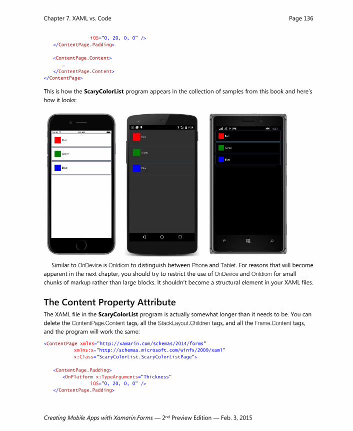
This is how the ScaryColorList program appears in the collection of samples from this book and here’s
how it looks:
Similar to OnDevice is OnIdiom to distinguish between Phone and Tablet. For reasons that will become
apparent in the next chapter, you should try to restrict the use of OnDevice and OnIdiom for small
chunks of markup rather than large blocks. It shouldn’t become a structural element in your XAML files.
The Content Property Attribute The XAML file in the ScaryColorList program is actually somewhat longer than it needs to be. You can
delete the ContentPage.Content tags, all the StackLayout.Children tags, and all the Frame.Content tags,
and the program will work the same:
<ContentPage xmlns="http://xamarin.com/schemas/2014/forms"
xmlns:x="http://schemas.microsoft.com/winfx/2009/xaml"
x:Class="ScaryColorList.ScaryColorListPage">
<ContentPage.Padding>
<OnPlatform x:TypeArguments="Thickness"
iOS="0, 20, 0, 0" />
</ContentPage.Padding>
Chapter 7. XAML vs. Code Page 137
Creating Mobile Apps with Xamarin.Forms — 2nd Preview Edition — Feb. 3, 2015
<StackLayout>
<Frame OutlineColor="Accent">
<StackLayout Orientation="Horizontal">
<BoxView Color="Red" />
<Label Text="Red"
VerticalOptions="Center" />
</StackLayout>
</Frame>
<Frame OutlineColor="Accent">
<StackLayout Orientation="Horizontal">
<BoxView Color="Green" />
<Label Text="Green"
VerticalOptions="Center" />
</StackLayout>
</Frame>
<Frame OutlineColor="Accent">
<StackLayout Orientation="Horizontal">
<BoxView Color="Blue" />
<Label Text="Blue"
VerticalOptions="Center" />
</StackLayout>
</Frame>
</StackLayout>
</ContentPage>
It looks a lot cleaner now. The only property element left is for the Padding property of ContentPage.
As with almost everything about XAML syntax, this elimination of some property elements is sup-
ported by the underlying classes. Every class used in XAML is allowed to define one property as a con-
tent property (sometimes also called the class’s default property). For this content property, the property
element tags are not required, and any XML content within the start and end tags is automatically as-
signed to this property. Very conveniently, the content property of ContentPage is Content, the content
property of StackLayout is Children, and the content property of Frame is Content.
These content properties are documented, but you need to know where to look. A class specifies its
content property using the ContentPropertyAttribute. If this attribute is attached to a class, it appears in
the on-line Xamarin.Forms API documentation along with the class declaration. Here’s how it appears in
the documentation for ContentPage:
[Xamarin.Forms.ContentProperty("Content")]
public class ContentPage : Page
If you say it aloud, it sounds a bit redundant: The Content property is the content property of Con-
tentPage.
The declaration for the Frame class is similar:
[Xamarin.Forms.ContentProperty("Content")]
public class Frame : ContentView

Chapter 7. XAML vs. Code Page 138
Creating Mobile Apps with Xamarin.Forms — 2nd Preview Edition — Feb. 3, 2015
StackLayout doesn’t have a ContentProperty attribute applied but StackLayout derives from Lay-
out<View>, and Layout<T> has a ContentProperty attribute:
[Xamarin.Forms.ContentProperty("Children")]
public abstract class Layout<T> : Layout, IViewContainer<T>
where T : Xamarin.Forms.View
The ContentProperty attribute is inherited by the classes that derive from Layout<T>, so Children is the
content property of StackLayout.
Obviously there’s no problem if you include the property elements when they’re not required, but in
most cases they will no longer appear in the sample programs in this book.
Formatted Text Text displayed by a XAML file might involve just a word or two, but sometimes an entire paragraph is
required, perhaps with some embedded character formatting. This is not always as obvious or as easy in
XAML as might be suggested by our familiarity with HTML.
The TextVariations solution has a XAML file that contains seven Label views in a scrollable Stack-
Layout:
<ContentPage xmlns="http://xamarin.com/schemas/2014/forms"
xmlns:x="http://schemas.microsoft.com/winfx/2009/xaml"
x:Class="TextVariations.TextVariationsPage">
<ContentPage.Padding>
<OnPlatform x:TypeArguments="Thickness"
iOS="0, 20, 0, 0" />
</ContentPage.Padding>
<ScrollView>
<StackLayout>
…
</StackLayout>
</ScrollView>
</ContentPage>
Each of the seven Label views shows a somewhat different way of defining the displayed text. For ref-
erence purposes, here’s the program running on all three platforms:

Chapter 7. XAML vs. Code Page 139
Creating Mobile Apps with Xamarin.Forms — 2nd Preview Edition — Feb. 3, 2015
The simplest approach involves just setting a few words to the Text attribute of the Label element:
<Label VerticalOptions="CenterAndExpand"
Text="Single lines of text are easy." />
You can also set the Text by breaking it out as a property element:
<Label VerticalOptions="CenterAndExpand">
<Label.Text>
Text can also be content of the Text property.
</Label.Text>
</Label>
Text is the content property of Label, so in theory you don’t need the Label.Text tags. But there’s a
problem if you simply remove those tags like so:
<Label VerticalOptions="CenterAndExpand">
Text is the content property of Label.
</Label>
You’ll discover that the whitespace preceding the text string is included as part of the rendered text.
There are a couple ways to fix this problem. The first approach is simply to remove the whitespace in
front of the text by left-justifying the content in the XAML file:
<Label VerticalOptions="CenterAndExpand">
Text is the content property of Label.
</Label>
But that’s actually not a good solution because the text includes an extra line at the beginning and the
end because the content begins at the end of the Label start tag and ends at the beginning of the Label
end tag. You’ll really want to avoid those end-of-line characters, perhaps like this:
Chapter 7. XAML vs. Code Page 140
Creating Mobile Apps with Xamarin.Forms — 2nd Preview Edition — Feb. 3, 2015
<Label VerticalOptions="CenterAndExpand">Text is the content property of Label.</Label>
Another approach is to surround the text with x:String tags:
<Label VerticalOptions="CenterAndExpand">
<x:String>Text is the content property of Label.</x:String>
</Label>
This is how this Label appears in the TextVariations program.
The x:String element is one of several built-in basic types defined in the XAML 2009 specification.
You can use these tags to clarify the types of elements or to specify generic types in OnPlatform. Here’s
the complete set supported by Xamarin.Forms. Notice that they duplicate the .NET type names rather
than the C# type names:
x:Object
x:Boolean
x:Byte
x:Int16
x:Int32
x:Int64
x:Single
x:Double
x:Decimal
x:Char
x:String
x:TimeSpan
x:Array
You’ll be hard-pressed to find a use for all of these, but you’ll certainly discover uses for some of them.
Displaying a whole paragraph of uniformly formatted text is somewhat problematic. The most fool-
proof approach is setting Text as a property attribute. You can put the whole paragraph as a single line
in the XAML file, but if you prefer to use multiple lines, you should left-justify the whole paragraph in
the XAML file surrounded by quotation marks like so:
<Label VerticalOptions="CenterAndExpand"
Text=
"Perhaps the best way to define a paragraph of
uniformly formatted text is by setting the Text
property as an attribute and left justifying

Chapter 7. XAML vs. Code Page 141
Creating Mobile Apps with Xamarin.Forms — 2nd Preview Edition — Feb. 3, 2015
the block of text in the XAML file. End-of-line
characters are converted to a space character." />
The end-of-line characters are converted to space characters so the individual lines are properly con-
catenated. But watch out: Don’t leave any stray characters at the end or beginning of the individual
lines. Those will show up as extraneous characters within the paragraph.
Multiple lines of text appearing as content of the Label are handled a little differently. Any space at
the beginning or end of lines is retained, but the end-of-line character is not converted to a space:
<Label VerticalOptions="CenterAndExpand">
<Label.Text>
Text as content has the curse
Of breaks at each line's close.
That's a format great for verse
But not the best for prose.
</Label.Text>
</Label>
This means that this text is rendered as four separate lines. If you’re displaying lists or poetry in your
Xamarin.Forms application, that’s exactly what you want. Otherwise, probably not. If you remove the
Label.Text property-element tags, a blank line will be added to the top and bottom of the text block as
discussed earlier, as will replacing them with x:String tags.
If your line or paragraph of text requires some non-uniform paragraph formatting, you’ll want to use
the FormattedText property of Label. As you might recall, you set this to a FormattedString object, and
then set multiple Span objects to the Spans collection of the FormattedString. In XAML, you need prop-
erty element tags for Label.FormattedString but Spans is the content property of FormattedString:
<Label VerticalOptions="CenterAndExpand">
<Label.FormattedText>
<FormattedString>
<Span Text="A single line with " />
<Span Text="bold" FontAttributes="Bold" />
<Span Text=" and " />
<Span Text="italic" FontAttributes="Italic" />
<Span Text=" and " />
<Span Text="large" FontSize="Large" />
<Span Text=" text." />
</FormattedString>
</Label.FormattedText>
</Label>
Notice that the Text properties of the non-formatted items have spaces at the end or beginning of the
text string, or both, so the items don’t run into each other.
In the general case, however, you might be working with an entire paragraph. You can set the Text
attribute of Span to a long line, or you can wrap it on multiple lines. As with Label, keep the entire block
left-justified in the XAML file:
<Label VerticalOptions="CenterAndExpand">
Chapter 7. XAML vs. Code Page 142
Creating Mobile Apps with Xamarin.Forms — 2nd Preview Edition — Feb. 3, 2015
<Label.FormattedText>
<FormattedString>
<Span Text=
"A paragraph of formatted text requires left justifying
it within the XAML file. But the text can include multiple
kinds of character formatting, including " />
<Span Text="bold" FontAttributes="Bold" />
<Span Text=" and " />
<Span Text="italic" FontAttributes="Italic" />
<Span Text=" and " />
<Span Text="large" FontSize="Large" />
<Span Text=
" and whatever combinations you might desire to adorn
your glorious prose." />
</FormattedString>
</Label.FormattedText>
</Label>
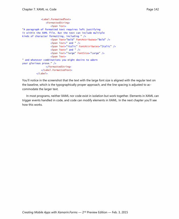
You’ll notice in the screenshot that the text with the large font size is aligned with the regular text on
the baseline, which is the typographically proper approach, and the line spacing is adjusted to ac-
commodate the larger text.
In most programs, neither XAML nor code exist in isolation but work together. Elements in XAML can
trigger events handled in code, and code can modify elements in XAML. In the next chapter you’ll see
how this works.