chapter nine: presenting your data - ssric.org · web viewchapter nine: presenting your data ....
TRANSCRIPT

Chapter Nine: Presenting Your Data
This chapter discusses methods for presenting your data and findings in your reports. Most of it is devoted to introducing you to methods for creating and editing charts. Then, we review ways to edit the tabular output from the various statistical procedures so that you convey just the information you need. Finally, we show you how to copy your work from the IBM SPSS output screen into a word-processing document (Microsoft Word).
Charts
Some of the statistical procedures in IBM SPSS provide optional graphic as well as tabular output. In Chapter 4, we saw that Frequencies can be used to produce bar charts, pie charts, and histograms, and that the Explore procedure can yield stem and leaf diagrams, histograms, Q-Q plots, and boxplots. In addition, the Crosstabs procedure can display clustered bar charts.
Producing charts as a byproduct of these procedures has some limitations. The variety of charts available is quite limited, and those that are provided give users limited control over the output. Fortunately, IBM SPSS also provides a Chart Builder that is much more powerful when it comes to graphics. In Chapter 7, we saw one example when we used the Chart Builder to produce a scatterplot. In this chapter, we’ll explain how the Chart Builder works in general, and then provide three examples in addition to the scatterplots already discussed: bar charts, boxplots (also known as “box and whiskers” plots), and line charts.
General:
We'll use the COUNTRIES.sav file. Open the data file and click on Graphs, then Chart Builder, and then on OK. The Chart Builder box is shown in Figure 9-1.
Figure 9-1
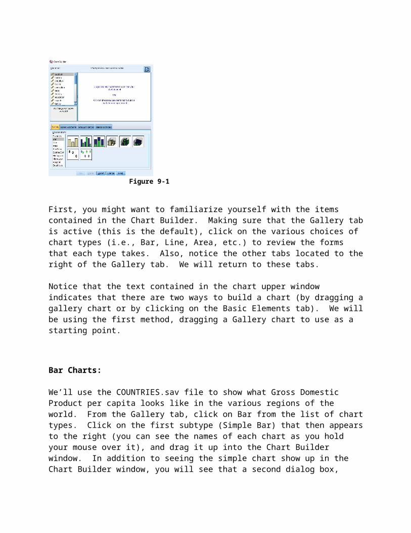
First, you might want to familiarize yourself with the items contained in the Chart Builder. Making sure that the Gallery tab is active (this is the default), click on the various choices of chart types (i.e., Bar, Line, Area, etc.) to review the forms that each type takes. Also, notice the other tabs located to the right of the Gallery tab. We will return to these tabs.
Notice that the text contained in the chart upper window indicates that there are two ways to build a chart (by dragging a gallery chart or by clicking on the Basic Elements tab). We will be using the first method, dragging a Gallery chart to use as a starting point.
Bar Charts:
We’ll use the COUNTRIES.sav file to show what Gross Domestic Product per capita looks like in the various regions of the world. From the Gallery tab, click on Bar from the list of chart types. Click on the first subtype (Simple Bar) that then appears to the right (you can see the names of each chart as you hold your mouse over it), and drag it up into the Chart Builder window. In addition to seeing the simple chart show up in the Chart Builder window, you will see that a second dialog box, called Element Properties, has opened. Figure 9-2 shows what you should be seeing on your screen. For the moment, ignore the Element Properties box.

Figure 9-2

Locate region in the Variable List, click on it, and drag it to the box labeled X-axis? Drag gdpcapita into the box labeled Y-axis? When you do that, your screen should look like the one shown in Figure 9-3.
Figure 9-3
The final step is to give the chart a title. Click on the Titles/Footnotes tab, then click the box next to Title 1. In the right-hand pane, select the circle for Custom and type in your title (for example, Gross Domestic Product per Capita by Region). You may have to uncheck the box next to Title 1 and then recheck it again to open the Custom box. You should notice that the dialog boxes now look like Figure 9-4.

Figure 9-4
We are now finished defining what our chart should look like. Now click on OK. Your finished chart should look like Figure 9-5.
Figure 9-5
If you wish, you may continue to edit your chart from the Output screen. To do this, double-

click anywhere in the chart, and it will open in the Chart Editor. Explore the menus in the Chart Editor to experiment with what you can do. Try this:
double-click on the chart. This will open the Chart Editor right-click on one of the bars in your chart. Then, click Select, This Bar, and Fill and
Border. Choose a new color, then click Apply. Explore some of the other menus in the Chart Editor to find out what they do.
Note: the unit of analysis in the data file is the country, not the individual. This means that a small country contributes as much to the result as does a large one. The mean averages shown in Figure 9.5 are, therefore, for the average country in each region, not the average person. We could obtain the latter by weighting the per capita GDP in each country by its population, using a Compute transformation (see Chapter 3, “Creating New Variables Using COMPUTE”). Try it.
Boxplots:
Figure 9-5 shows that there are substantial differences in per capita GDP from one region to another. If we want to look at differences within as well as between regions, we can do so using boxplots (a.k.a. “box and whiskers” plots).
As before, click on Graphs and then on Chart Builder, then on OK. From the Gallery tab, click on Boxplot from the list of chart types. Click on the first subtype (Simple Boxplot) that then appears to the right, and drag it up into the Chart Builder window. Locate region in the Variable List, click on it, and drag it to the box labeled X-axis?. Drag gdpcapita into the box labeled Y-axis?. Click on the Titles/Footnotes tab, then click the box next to Title 1. Click on Custom in the right-hand pane and then type in your title (for example, Gross Domestic Product per Capita Between and Within Regions). You may have to uncheck the box next to Title 1 and then recheck it again to open the Custom window.
One additional step is needed. Click on the Groups/Point ID tab, then click the box next to Point ID label. Notice that a new box (Point Label Variable?) has opened up in the Chart preview window. Locate name in the Variable List, click on it, and drag it into that box. You should notice that the dialog boxes now look like Figure 9-6.

Figure 9-6
Figure 9-7
Click OK. Your finished chart should look like Figure 9-7. Each boxplot in this figure provides five key pieces of information.
1. The box represents the Inter Quartile Range (IQR), that is, the middle two quartiles of the distribution for the region, with the top of the box indicating the 75th percentile, and the bottom representing the 25th percentile. Some regions (e.g., Central America) have small boxes, indicating that they are relatively homogenous, while the boxes for others (e.g. Europe) are larger, indicating that countries within the region vary considerably from one

another.2. The thick line inside each box represents the median, or 50th percentile. Half of the
countries in the region have a per capita GDP this high or higher, and half this lower or lower.
3. The lines extending above and below the box are the “whiskers.” These represent countries above or below the IQR, but within 1.5 times the IQR. The longer the whiskers, the greater the range within these parts of the distribution.
4. The circles above or below the whiskers are outliers: countries that are outside the box by 1.5 to 3 times the IQR. Gabon, for example, is a poor country, but is relatively well off compared to other countries in Africa.
5. The asterisks above or below the whiskers are extreme outliers: countries outside the box by more than 3 times the IQR. While Asia is, in general, relatively poor, there are several Asian countries that are much wealthier than the region as a whole.
Line Charts We’ll illustrate line charts using the GSS16A.sav file1, and will look at the relationship between respondents’ political ideology (a seven point scale called polviews (with values ranging from lowest “extremely liberal,” to highest “extremely conservative”), and party identification (another seven point scale, this one called partyid, with values ranging from lowest, “strong Democrat,” to highest, “strong Republican”). We want to see whether, and to what degree, respondents’ choices of political parties depend on their political ideology. We’ll then examine whether this pattern is the same or different for Whites, African Americans, Latinos, and those in other racial or ethnic categories.
Simple Line Charts: As before, click on Graphs, then Chart Builder, and then on OK. From the Gallery tab, click on Line from the list of chart types. Click on the first subtype (Simple Line) that then appears to the right, and drag it up into the Chart Builder window. Locate polviews in the Variable List, click on it, and drag it to the box labeled X-axis?. Drag partyid into the box labeled Y-axis?. Click on the Titles/Footnotes tab, and then click the box next to Title 1. Click on Custom in the right-hand pane and then type in your title (for example, Party Identification by Political Ideology). You may have to uncheck the box next to Title 1 and then recheck it again to open the Custom window. In the Element Properties window, under Edit Properties of:, highlight Line 1, select Mean from the drop down menu under Statistic:"
1 It’s important to weight the cases so they better represent the population from which the sample is selected. Our data set – GSS16A.sav – has already been weighted so you don’t need to weight it again.

Figure 9-8
The result should look like Figure 9-8. Near the bottom of the Chart Builder Dialog box, click OK. You should now see a chart like the one shown above. Click OK again. Your finished chart should look like Figure 9-9. The chart shows that, as expected, the more conservative respondents are, the more Republican they tend to be.
Figure 9-9

Multiple Line Charts: Let’s again examine the relationship between party identification and political ideology, but with a separate chart for respondents in each of several racial/ethnic categories.
As before, click on Graphs, then Chart Builder, then on OK. Being sure that the Gallery tab is highlighted above the lower portion of the dialog box, click on Line.
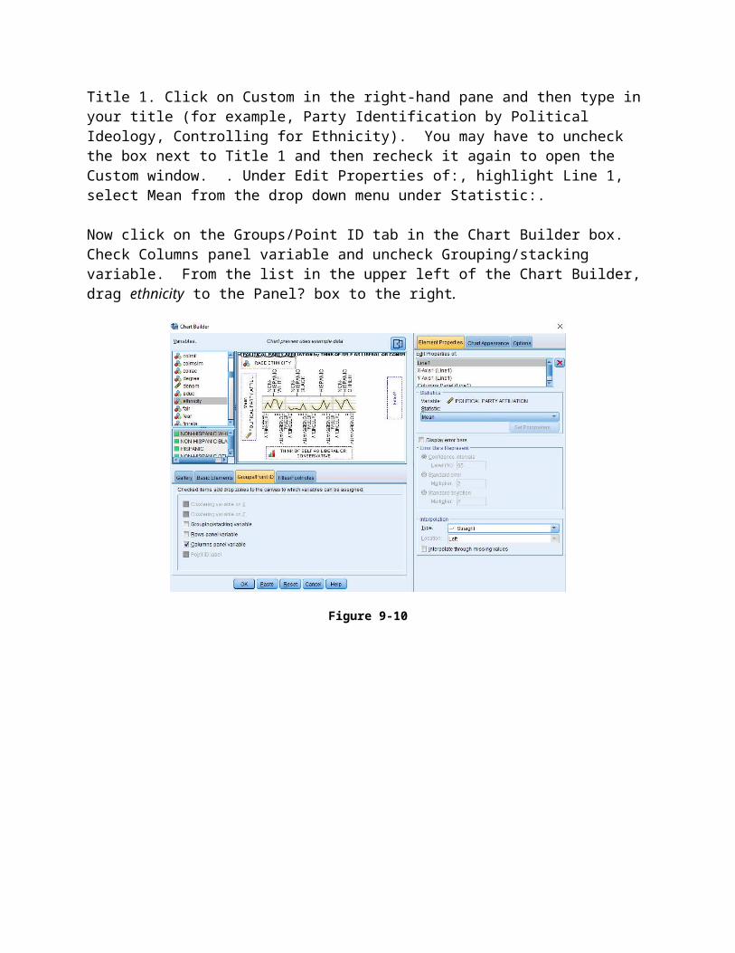
Now select the second image to the right (Multiple Line), and drag it to the window in the upper right portion of the dialog box. As before, click on polviews from the list in the upper left of the box, and drag it to the x-axis? box on the right. In a similar way, click on partyid and drag it to the y-axis? box. Click on the Titles/Footnotes tab, and then click the box next to Title 1. Click on Custom in the right-hand pane and then type in your title (for example, Party Identification by Political Ideology, Controlling for Ethnicity). You may have to uncheck the box next to Title 1 and then recheck it again to open the Custom window. . Under Edit Properties of:, highlight Line 1, select Mean from the drop down menu under Statistic:.
Now click on the Groups/Point ID tab in the Chart Builder box. Check Columns panel variable and uncheck Grouping/stacking variable. From the list in the upper left of the Chart Builder, drag ethnicity to the Panel? box to the right.
Figure 9-10
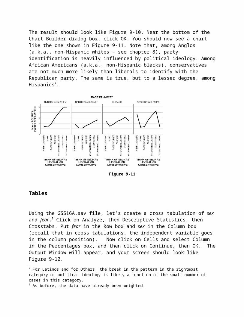
The result should look like Figure 9-10. Near the bottom of the Chart Builder dialog box, click OK. You should now see a chart like the one shown in Figure 9-11. Note that, among Anglos (a.k.a., non-Hispanic whites – see chapter 8), party identification is heavily influenced by political ideology. Among African Americans (a.k.a., non-Hispanic blacks), conservatives are not much more likely than liberals to identify with the Republican party. The same is true, but to a lesser degree, among Hispanics2.
Figure 9-11
Tables
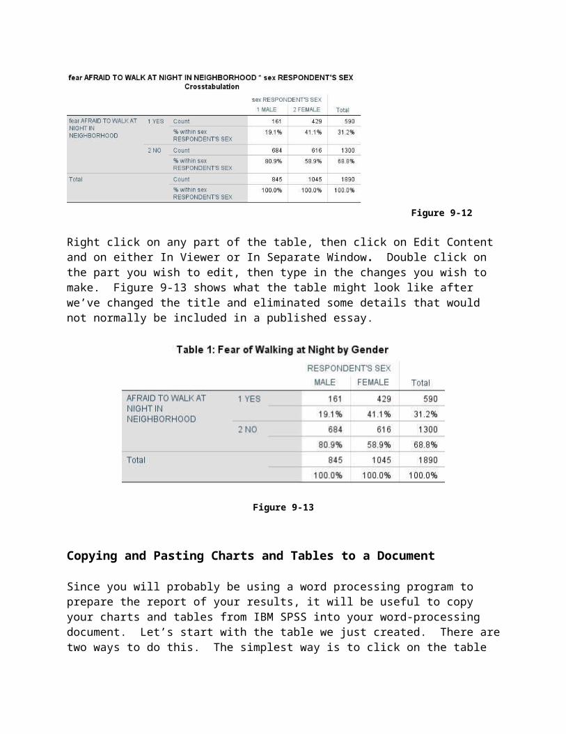
Using the GSS16A.sav file, let’s create a cross tabulation of sex and fear.3 Click on Analyze, then Descriptive Statistics, then Crosstabs. Put fear in the Row box and sex in the Column box (recall that in cross tabulations, the independent variable goes in the column position). Now click on Cells and select Column in the Percentages box, and then click on Continue, then OK. The Output Window will appear, and your screen should look like Figure 9-12.
Figure 9-122 For Latinos and for Others, the break in the pattern in the rightmost category of political ideology is likely a function of the small number of cases in this category.3 As before, the data have already been weighted.
Right click on any part of the table, then click on Edit Content and on either In Viewer or In Separate Window. Double click on the part you wish to edit, then type in the changes you wish to make. Figure 9-13 shows what the table might look like after we’ve changed the title and eliminated some details that would not normally be included in a published essay.
Figure 9-13
Copying and Pasting Charts and Tables to a Document
Since you will probably be using a word processing program to prepare the report of your results, it will be useful to copy your charts and tables from IBM SPSS into your word-processing document. Let’s start with the table we just created. There are two ways to do this. The simplest way is to click on the table using the right mouse button. A small menu will appear; click on Copy. Then, go to your word-processing document, and right-click where you want the table to appear. The small menu will appear again; click Paste.
The second way to copy the table is by using the menu commands. Make sure the table you want is selected (you will see the red arrow pointing to it in the output log on the left side of your screen and the table will have an outline around it). Click on Edit on the menu bar, then click on Copy. Switch over to your word-processing document. Click the mouse where you want to paste your table. Click on Edit on the menu bar, then click on Paste. You might want to paste your graph into a Text box. This will make your graph easier to move. You could also click on Paste Special instead of Paste. This would give you choices about the format for your table. For example, using Paste Special, you can paste is as a picture rather than as text. Note: The method for copying and pasting charts is exactly the same as the method as for copying and pasting tables.
Chapter Nine Exercises
Use GSS16A.sav for all these exercises.
1. Make a bar chart of trust. Then, edit the chart by giving it a proper title. Copy and paste the chart into a word processing file. Write a few sentences that describe the pattern shown in the chart.
2. While views on political issues can influence a person’s party identification, some have suggested that, with American politics having become increasingly partisan in recent years, the reverse may be true as well. In other words, one’s party (as an important reference group) may shape how one feels about political issues. Make a multiple line chart similar to that shown above, but use partyid as the independent (x-axis) variable, and polviews as the dependent (y-axis) variable.
3. Do a cross-tabulation of hapmar and trust. Since hapmar is the independent variable, place it in the column location, and show column percentages (see Chapter 5 for a review). Be sure that your table is properly titled. Copy and paste the table into a word processing file. Write a few sentences that discuss the relationship of the information shown in the table to the information shown in the chart you created for Question 1.