climate4you update april 2012 · climate4you update april 2012 april 2012 global surface air...
TRANSCRIPT
1
Climate4you update April 2012
www.climate4you.com
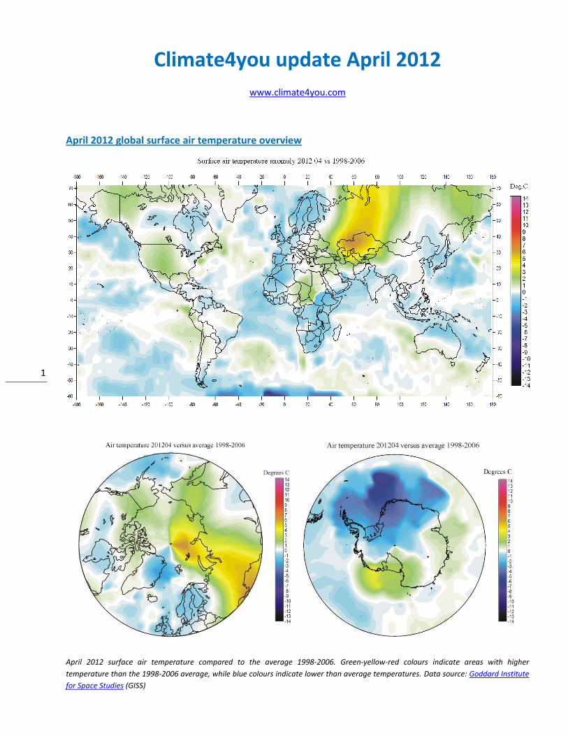
April 2012 global surface air temperature overview
April 2012 surface air temperature compared to the average 1998-2006. Green-yellow-red colours indicate areas with higher
temperature than the 1998-2006 average, while blue colours indicate lower than average temperatures. Data source: Goddard Institute
for Space Studies (GISS)
2
Comments to the April 2012 global surface air temperature overview
General: This newsletter contains graphs showing a selection of key meteorological variables for the past month. All temperatures are given in degrees Celsius. In the above maps showing the geographical pattern of surface air temperatures, the period 1998-2006 is used as reference period. The reason for comparing with this recent period instead of the official WMO ‘normal’ period 1961-1990, is that the latter period is affected by the relatively cold period 1945-1980. Almost any comparison with such a low average value will therefore appear as high or warm, and it will be difficult to decide if and where modern surface air temperatures are increasing or decreasing at the moment. Comparing with a more recent period overcomes this problem. In addition to this consideration, the recent temperature development suggests that the time window 1998-2006 may roughly represent a global temperature peak. If so, negative temperature anomalies will gradually become more and more widespread as time goes on. However, if positive anomalies instead gradually become more widespread, this reference period only represented a temperature plateau. In the other diagrams in this newsletter the thin line represents the monthly global average value, and the thick line indicate a simple running average, in most cases a simple moving 37-month average, nearly corresponding to a three year average. The 37-month average is calculated from values covering a range from 18 month before to
18 months after, with equal weight for every month. The year 1979 has been chosen as starting point in many diagrams, as this roughly corresponds to both the beginning of satellite observations and the onset of the late 20th century warming period. However, several of the records have a much longer record length, which may be inspected in grater detail on www.Climate4you.com.
April 2012 average global surface air temperatures General: Global air temperatures were close to average for the period 1998-2006. The Northern Hemisphere was characterised by high regional variability, and this is where the only major warm anomaly is found between 50oE and 90oE, north of 25oN. Northern and western Europe was relatively cold, as were parts of the Northern Atlantic and northern Pacific. Eastern Siberia, USA and parts of NW Canada experienced relatively warm conditions. Also the Arctic was relatively warm, especially in the Russian sector. The marked thermal contrast extending N-S across the North Pole represents an interpolation artefact, partly reflecting the sparse number of observations in this part of the Arctic, and partly the GISS procedure of extrapolating temperatures measured at lower latitudes to high latitudes. Near Equator temperatures conditions in general were at or below average 1998-2006 temperature conditions, both land and ocean. The Southern Hemisphere was below or near average 1998-2006 conditions. No big land areas experienced temperatures above the 1998-2006 average. Especially Africa and northern Australia had below average temperatures. Most of the oceans in the Southern Hemisphere were near or below average temperature. An El Niño situation is developing along the west coast of South America during the last few months, and the influence of this is now clearly seen in the global temperature. The Antarctic continent in general experienced below average 1998-2006 temperatures, although a region centred on the Ross Sea experienced above average temperatures. The global oceanic heat content has been almost stable since 2003/2004 (page 10).
All diagrams shown in this newsletter and links to original data are available on www.climate4you.com
3
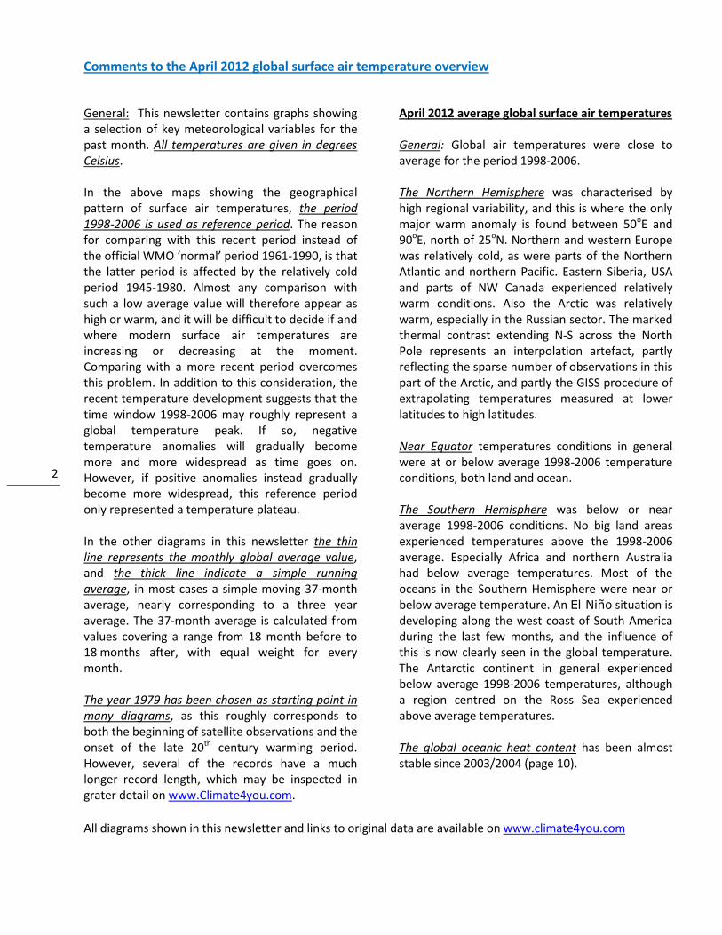
Lower troposphere temperature from satellites, updated to April 2012
Global monthly average lower troposphere temperature (thin line) since 1979 according to University of Alabama at Huntsville, USA. The
thick line is the simple running 37 month average.
Global monthly average lower troposphere temperature (thin line) since 1979 according to according to Remote Sensing Systems (RSS),
USA. The thick line is the simple running 37 month average.
4
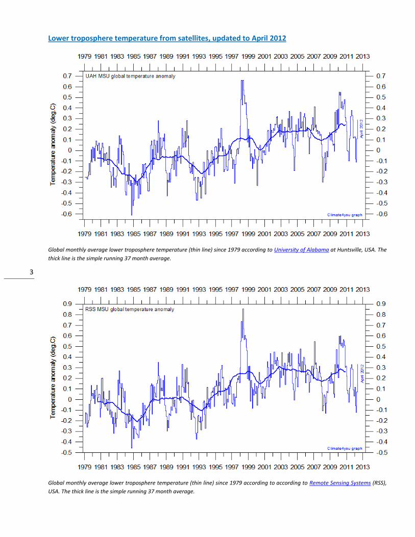
Global surface air temperature, updated to April 2012
Global monthly average surface air temperature (thin line) since 1979 according to according to the Hadley Centre for Climate Prediction
and Research and the University of East Anglia's Climatic Research Unit (CRU), UK. The thick line is the simple running 37 month average.
Please note that this diagram has not been updated beyond March 2012.
Global monthly average surface air temperature (thin line) since 1979 according to according to the Goddard Institute for Space Studies
(GISS), at Columbia University, New York City, USA. The thick line is the simple running 37 month average.
5
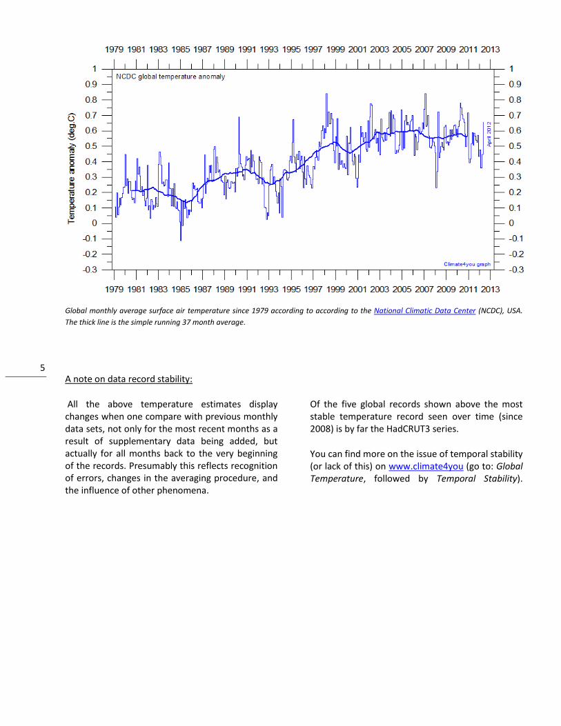
Global monthly average surface air temperature since 1979 according to according to the National Climatic Data Center (NCDC), USA.
The thick line is the simple running 37 month average.
A note on data record stability:
All the above temperature estimates display changes when one compare with previous monthly data sets, not only for the most recent months as a result of supplementary data being added, but actually for all months back to the very beginning of the records. Presumably this reflects recognition of errors, changes in the averaging procedure, and the influence of other phenomena.
Of the five global records shown above the most stable temperature record seen over time (since 2008) is by far the HadCRUT3 series.
You can find more on the issue of temporal stability (or lack of this) on www.climate4you (go to: Global Temperature, followed by Temporal Stability).
6
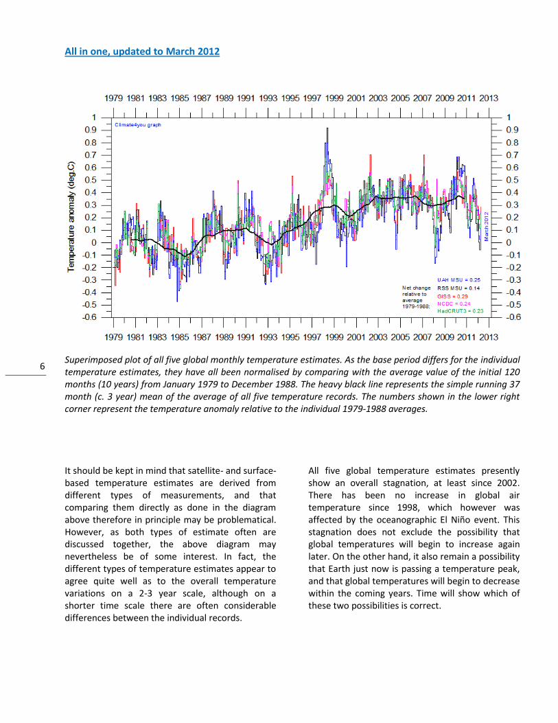
All in one, updated to March 2012
Superimposed plot of all five global monthly temperature estimates. As the base period differs for the individual temperature estimates, they have all been normalised by comparing with the average value of the initial 120 months (10 years) from January 1979 to December 1988. The heavy black line represents the simple running 37 month (c. 3 year) mean of the average of all five temperature records. The numbers shown in the lower right corner represent the temperature anomaly relative to the individual 1979-1988 averages.
It should be kept in mind that satellite- and surface-based temperature estimates are derived from different types of measurements, and that comparing them directly as done in the diagram above therefore in principle may be problematical. However, as both types of estimate often are discussed together, the above diagram may nevertheless be of some interest. In fact, the different types of temperature estimates appear to agree quite well as to the overall temperature variations on a 2-3 year scale, although on a shorter time scale there are often considerable differences between the individual records.
All five global temperature estimates presently show an overall stagnation, at least since 2002. There has been no increase in global air temperature since 1998, which however was affected by the oceanographic El Niño event. This stagnation does not exclude the possibility that global temperatures will begin to increase again later. On the other hand, it also remain a possibility that Earth just now is passing a temperature peak, and that global temperatures will begin to decrease within the coming years. Time will show which of these two possibilities is correct.
7
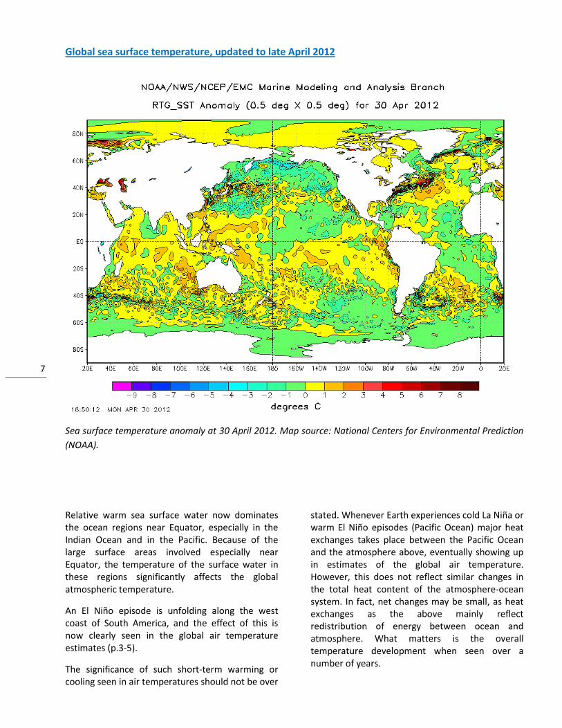
Global sea surface temperature, updated to late April 2012
Sea surface temperature anomaly at 30 April 2012. Map source: National Centers for Environmental Prediction
(NOAA).
Relative warm sea surface water now dominates the ocean regions near Equator, especially in the Indian Ocean and in the Pacific. Because of the large surface areas involved especially near Equator, the temperature of the surface water in these regions significantly affects the global atmospheric temperature.
An El Niño episode is unfolding along the west coast of South America, and the effect of this is now clearly seen in the global air temperature estimates (p.3-5).
The significance of such short-term warming or cooling seen in air temperatures should not be over
stated. Whenever Earth experiences cold La Niña or warm El Niño episodes (Pacific Ocean) major heat exchanges takes place between the Pacific Ocean and the atmosphere above, eventually showing up in estimates of the global air temperature. However, this does not reflect similar changes in the total heat content of the atmosphere-ocean system. In fact, net changes may be small, as heat exchanges as the above mainly reflect redistribution of energy between ocean and atmosphere. What matters is the overall temperature development when seen over a number of years.
8
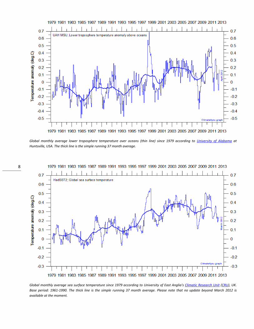
Global monthly average lower troposphere temperature over oceans (thin line) since 1979 according to University of Alabama at
Huntsville, USA. The thick line is the simple running 37 month average.
Global monthly average sea surface temperature since 1979 according to University of East Anglia's Climatic Research Unit (CRU), UK.
Base period: 1961-1990. The thick line is the simple running 37 month average. Please note that no update beyond March 2012 is
available at the moment.
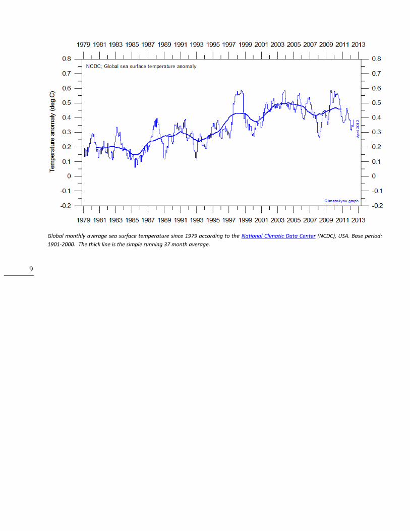
9
Global monthly average sea surface temperature since 1979 according to the National Climatic Data Center (NCDC), USA. Base period:
1901-2000. The thick line is the simple running 37 month average.
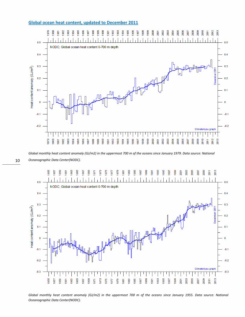
10
Global ocean heat content, updated to December 2011
Global monthly heat content anomaly (GJ/m2) in the uppermost 700 m of the oceans since January 1979. Data source: National
Oceanographic Data Center(NODC).
Global monthly heat content anomaly (GJ/m2) in the uppermost 700 m of the oceans since January 1955. Data source: National
Oceanographic Data Center(NODC).
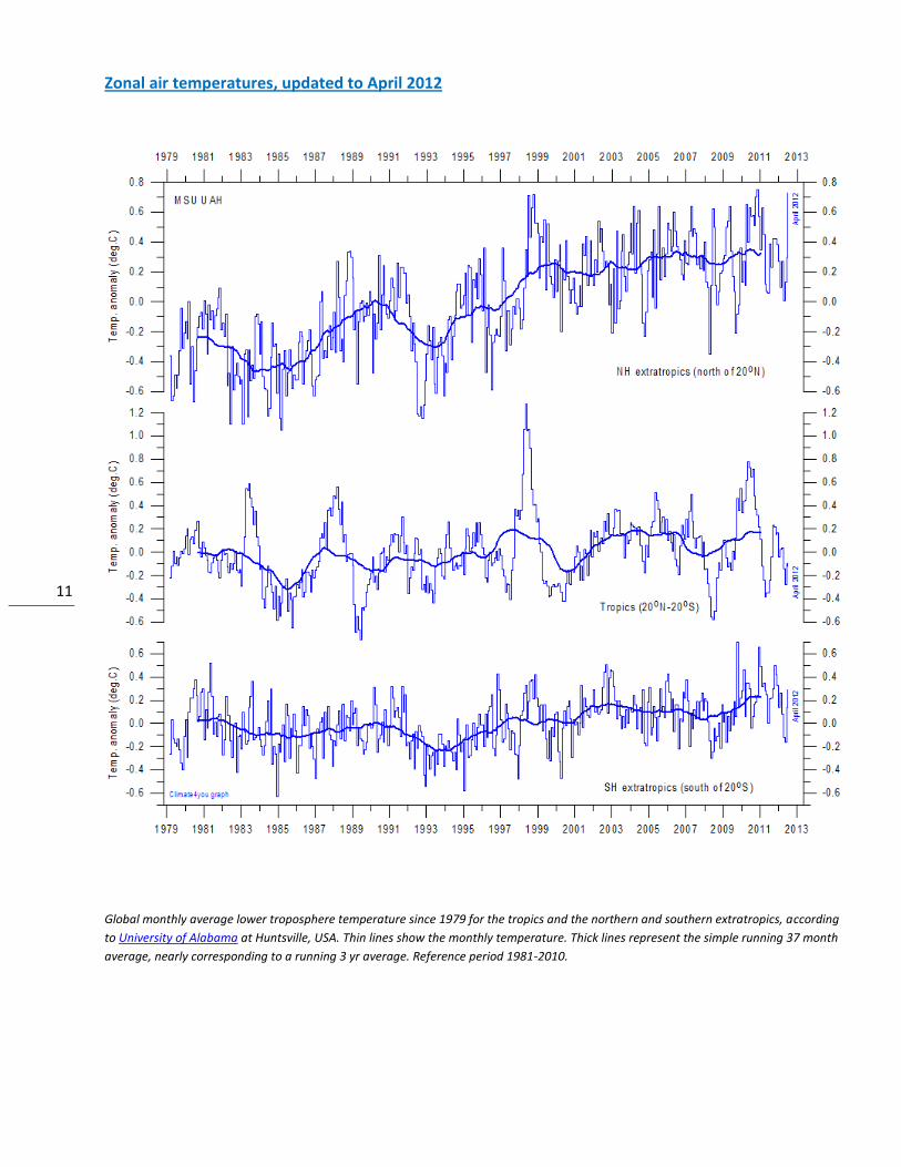
11
Zonal air temperatures, updated to April 2012
Global monthly average lower troposphere temperature since 1979 for the tropics and the northern and southern extratropics, according
to University of Alabama at Huntsville, USA. Thin lines show the monthly temperature. Thick lines represent the simple running 37 month
average, nearly corresponding to a running 3 yr average. Reference period 1981-2010.
12
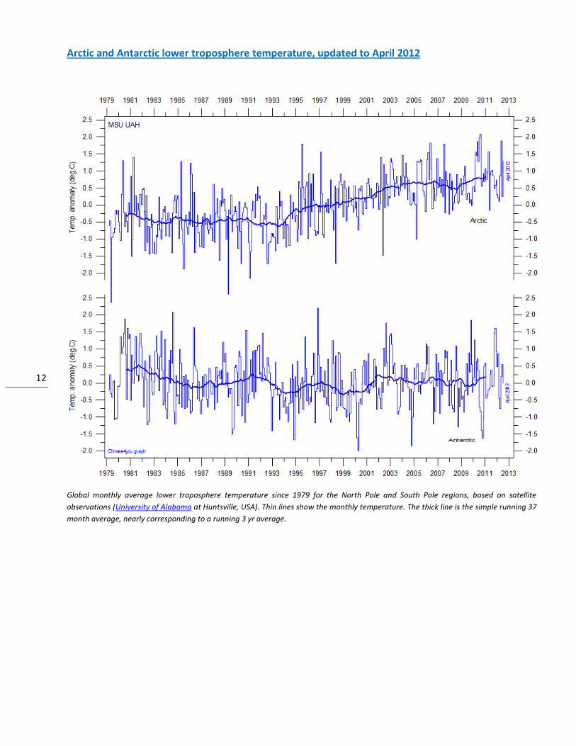
Arctic and Antarctic lower troposphere temperature, updated to April 2012
Global monthly average lower troposphere temperature since 1979 for the North Pole and South Pole regions, based on satellite
observations (University of Alabama at Huntsville, USA). Thin lines show the monthly temperature. The thick line is the simple running 37
month average, nearly corresponding to a running 3 yr average.
13
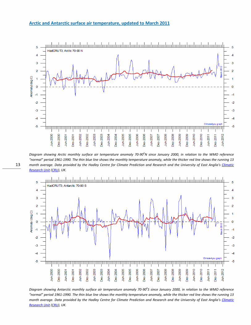
Arctic and Antarctic surface air temperature, updated to March 2011
Diagram showing Arctic monthly surface air temperature anomaly 70-90oN since January 2000, in relation to the WMO reference
“normal” period 1961-1990. The thin blue line shows the monthly temperature anomaly, while the thicker red line shows the running 13
month average. Data provided by the Hadley Centre for Climate Prediction and Research and the University of East Anglia's Climatic
Research Unit (CRU), UK.
Diagram showing Antarctic monthly surface air temperature anomaly 70-90oS since January 2000, in relation to the WMO reference
“normal” period 1961-1990. The thin blue line shows the monthly temperature anomaly, while the thicker red line shows the running 13
month average. Data provided by the Hadley Centre for Climate Prediction and Research and the University of East Anglia's Climatic
Research Unit (CRU), UK.
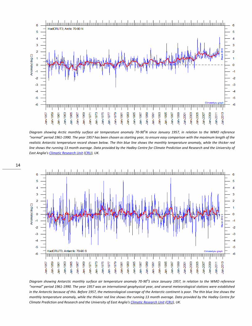
14
Diagram showing Arctic monthly surface air temperature anomaly 70-90oN since January 1957, in relation to the WMO reference
“normal” period 1961-1990. The year 1957 has been chosen as starting year, to ensure easy comparison with the maximum length of the
realistic Antarctic temperature record shown below. The thin blue line shows the monthly temperature anomaly, while the thicker red
line shows the running 13 month average. Data provided by the Hadley Centre for Climate Prediction and Research and the University of
East Anglia's Climatic Research Unit (CRU), UK.
Diagram showing Antarctic monthly surface air temperature anomaly 70-90oS since January 1957, in relation to the WMO reference
“normal” period 1961-1990. The year 1957 was an international geophysical year, and several meteorological stations were established
in the Antarctic because of this. Before 1957, the meteorological coverage of the Antarctic continent is poor. The thin blue line shows the
monthly temperature anomaly, while the thicker red line shows the running 13 month average. Data provided by the Hadley Centre for
Climate Prediction and Research and the University of East Anglia's Climatic Research Unit (CRU), UK.
15
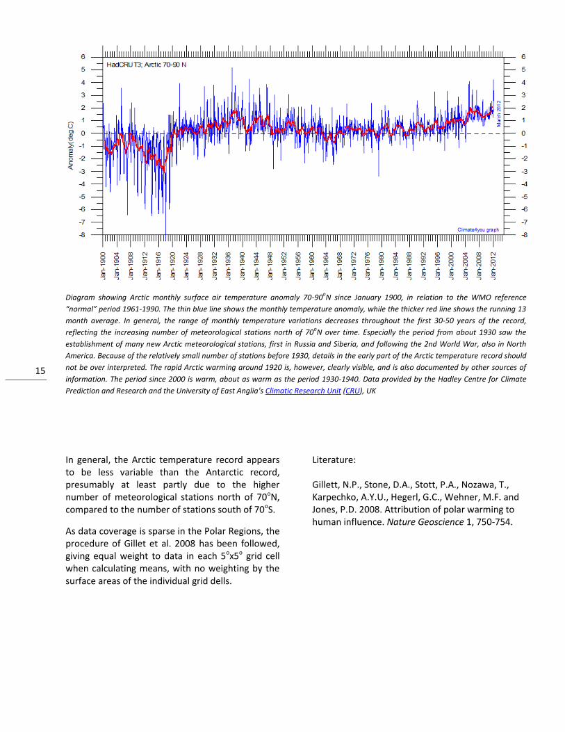
Diagram showing Arctic monthly surface air temperature anomaly 70-90oN since January 1900, in relation to the WMO reference
“normal” period 1961-1990. The thin blue line shows the monthly temperature anomaly, while the thicker red line shows the running 13
month average. In general, the range of monthly temperature variations decreases throughout the first 30-50 years of the record,
reflecting the increasing number of meteorological stations north of 70oN over time. Especially the period from about 1930 saw the
establishment of many new Arctic meteorological stations, first in Russia and Siberia, and following the 2nd World War, also in North
America. Because of the relatively small number of stations before 1930, details in the early part of the Arctic temperature record should
not be over interpreted. The rapid Arctic warming around 1920 is, however, clearly visible, and is also documented by other sources of
information. The period since 2000 is warm, about as warm as the period 1930-1940. Data provided by the Hadley Centre for Climate
Prediction and Research and the University of East Anglia's Climatic Research Unit (CRU), UK
In general, the Arctic temperature record appears to be less variable than the Antarctic record, presumably at least partly due to the higher number of meteorological stations north of 70oN, compared to the number of stations south of 70oS.
As data coverage is sparse in the Polar Regions, the procedure of Gillet et al. 2008 has been followed, giving equal weight to data in each 5ox5o grid cell when calculating means, with no weighting by the surface areas of the individual grid dells.
Literature: Gillett, N.P., Stone, D.A., Stott, P.A., Nozawa, T., Karpechko, A.Y.U., Hegerl, G.C., Wehner, M.F. and Jones, P.D. 2008. Attribution of polar warming to human influence. Nature Geoscience 1, 750-754.
16
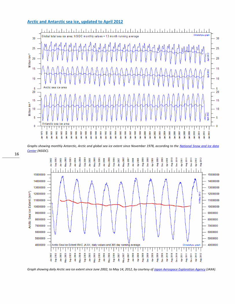
Arctic and Antarctic sea ice, updated to April 2012
Graphs showing monthly Antarctic, Arctic and global sea ice extent since November 1978, according to the National Snow and Ice data
Center (NSIDC).
Graph showing daily Arctic sea ice extent since June 2002, to May 14, 2012, by courtesy of Japan Aerospace Exploration Agency (JAXA).
17
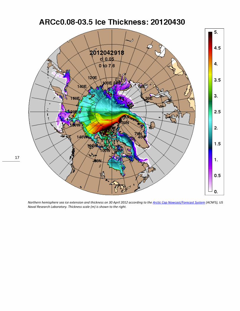
Northern hemisphere sea ice extension and thickness on 30 April 2012 according to the Arctic Cap Nowcast/Forecast System (ACNFS), US Naval Research Laboratory. Thickness scale (m) is shown to the right.
18
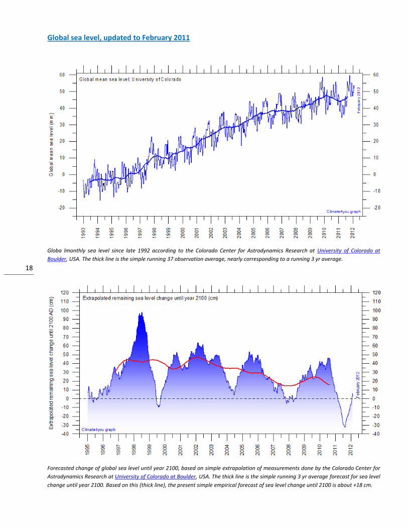
Global sea level, updated to February 2011
Globa lmonthly sea level since late 1992 according to the Colorado Center for Astrodynamics Research at University of Colorado at
Boulder, USA. The thick line is the simple running 37 observation average, nearly corresponding to a running 3 yr average.
Forecasted change of global sea level until year 2100, based on simple extrapolation of measurements done by the Colorado Center for
Astrodynamics Research at University of Colorado at Boulder, USA. The thick line is the simple running 3 yr average forecast for sea level
change until year 2100. Based on this (thick line), the present simple empirical forecast of sea level change until 2100 is about +18 cm.
19
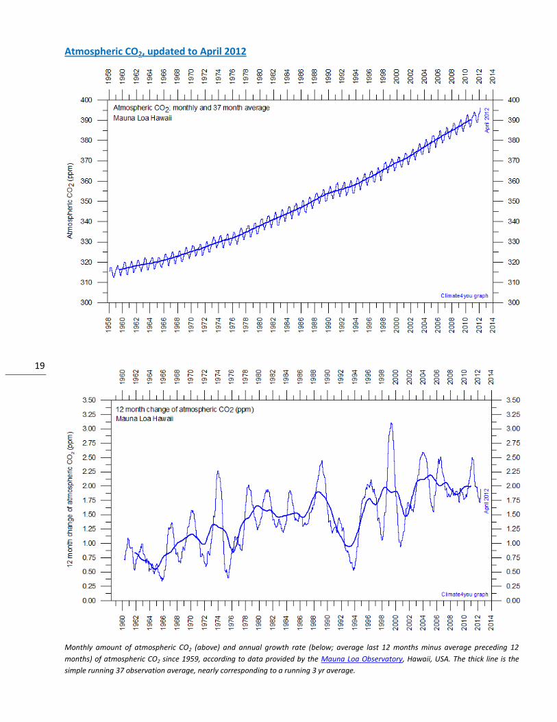
Atmospheric CO2, updated to April 2012
Monthly amount of atmospheric CO2 (above) and annual growth rate (below; average last 12 months minus average preceding 12
months) of atmospheric CO2 since 1959, according to data provided by the Mauna Loa Observatory, Hawaii, USA. The thick line is the
simple running 37 observation average, nearly corresponding to a running 3 yr average.
20
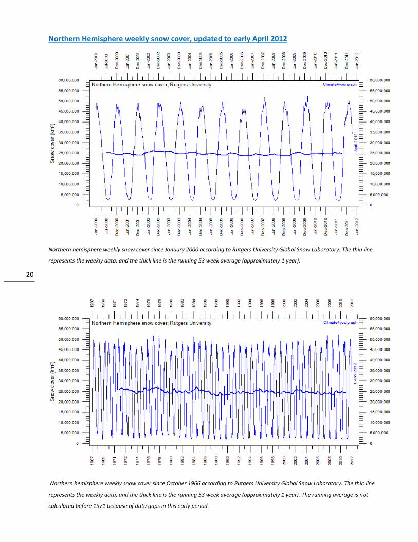
Northern Hemisphere weekly snow cover, updated to early April 2012
Northern hemisphere weekly snow cover since January 2000 according to Rutgers University Global Snow Laboratory. The thin line
represents the weekly data, and the thick line is the running 53 week average (approximately 1 year).
Northern hemisphere weekly snow cover since October 1966 according to Rutgers University Global Snow Laboratory. The thin line
represents the weekly data, and the thick line is the running 53 week average (approximately 1 year). The running average is not
calculated before 1971 because of data gaps in this early period.
21
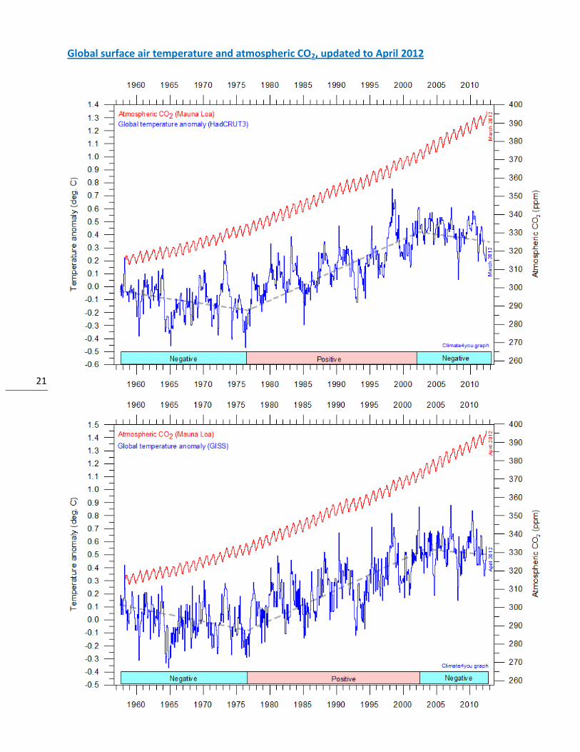
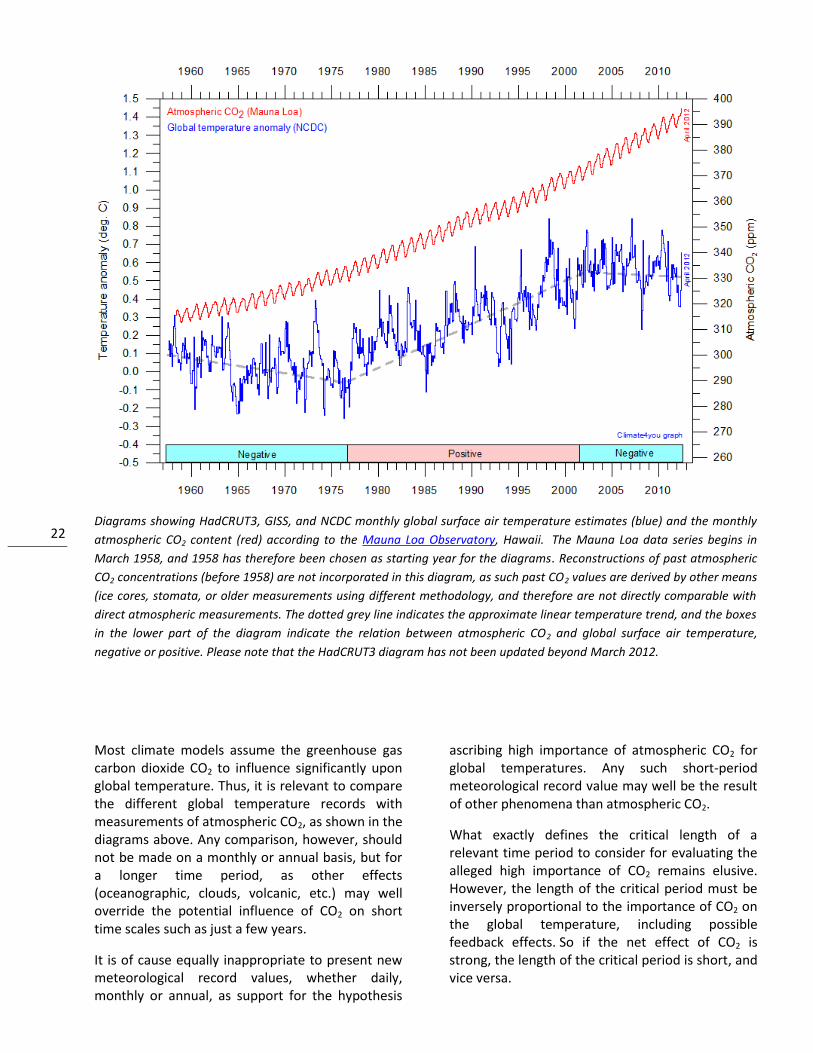
Global surface air temperature and atmospheric CO2, updated to April 2012
22
Diagrams showing HadCRUT3, GISS, and NCDC monthly global surface air temperature estimates (blue) and the monthly
atmospheric CO2 content (red) according to the Mauna Loa Observatory, Hawaii. The Mauna Loa data series begins in
March 1958, and 1958 has therefore been chosen as starting year for the diagrams. Reconstructions of past atmospheric
CO2 concentrations (before 1958) are not incorporated in this diagram, as such past CO2 values are derived by other means
(ice cores, stomata, or older measurements using different methodology, and therefore are not directly comparable with
direct atmospheric measurements. The dotted grey line indicates the approximate linear temperature trend, and the boxes
in the lower part of the diagram indicate the relation between atmospheric CO2 and global surface air temperature,
negative or positive. Please note that the HadCRUT3 diagram has not been updated beyond March 2012.
Most climate models assume the greenhouse gas carbon dioxide CO2 to influence significantly upon global temperature. Thus, it is relevant to compare the different global temperature records with measurements of atmospheric CO2, as shown in the diagrams above. Any comparison, however, should not be made on a monthly or annual basis, but for a longer time period, as other effects (oceanographic, clouds, volcanic, etc.) may well override the potential influence of CO2 on short time scales such as just a few years.
It is of cause equally inappropriate to present new meteorological record values, whether daily, monthly or annual, as support for the hypothesis
ascribing high importance of atmospheric CO2 for global temperatures. Any such short-period meteorological record value may well be the result of other phenomena than atmospheric CO2.
What exactly defines the critical length of a relevant time period to consider for evaluating the alleged high importance of CO2 remains elusive. However, the length of the critical period must be inversely proportional to the importance of CO2 on the global temperature, including possible feedback effects. So if the net effect of CO2 is strong, the length of the critical period is short, and vice versa.
23
After about 10 years of global temperature increase following a period of global cooling 1940-1978, IPCC was established in 1988. Presumably, several scientists interested in climate felt intuitively that their empirical and theoretical understanding of climate dynamics in 1988 was sufficient to conclude about the high importance of CO2 for global temperature. However, for obtaining public and political support for the CO2-hyphotesis the 10 year warming period leading up to 1988 in
all likelihood was very important. Had the global temperature instead been decreasing, political and public support for the CO2-hypothesis would have been difficult to obtain. Adopting this approach as to critical time length (about 10 years), the varying relation (positive or negative) between global temperature and atmospheric CO2 has been indicated in the lower panels of the three diagrams above.
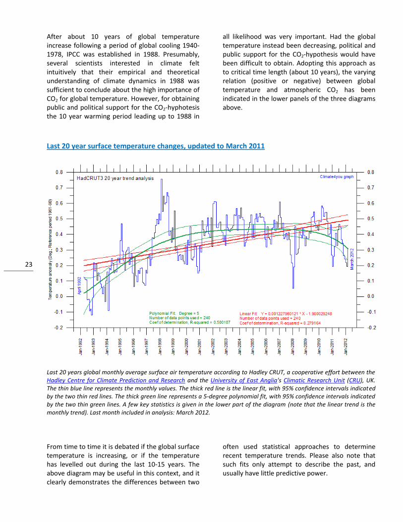
Last 20 year surface temperature changes, updated to March 2011
Last 20 years global monthly average surface air temperature according to Hadley CRUT, a cooperative effort between the Hadley Centre for Climate Prediction and Research and the University of East Anglia's Climatic Research Unit (CRU), UK. The thin blue line represents the monthly values. The thick red line is the linear fit, with 95% confidence intervals indicated by the two thin red lines. The thick green line represents a 5-degree polynomial fit, with 95% confidence intervals indicated by the two thin green lines. A few key statistics is given in the lower part of the diagram (note that the linear trend is the monthly trend). Last month included in analysis: March 2012.
From time to time it is debated if the global surface temperature is increasing, or if the temperature has levelled out during the last 10-15 years. The above diagram may be useful in this context, and it clearly demonstrates the differences between two
often used statistical approaches to determine recent temperature trends. Please also note that such fits only attempt to describe the past, and usually have little predictive power.
24
Climate and history; one example among many
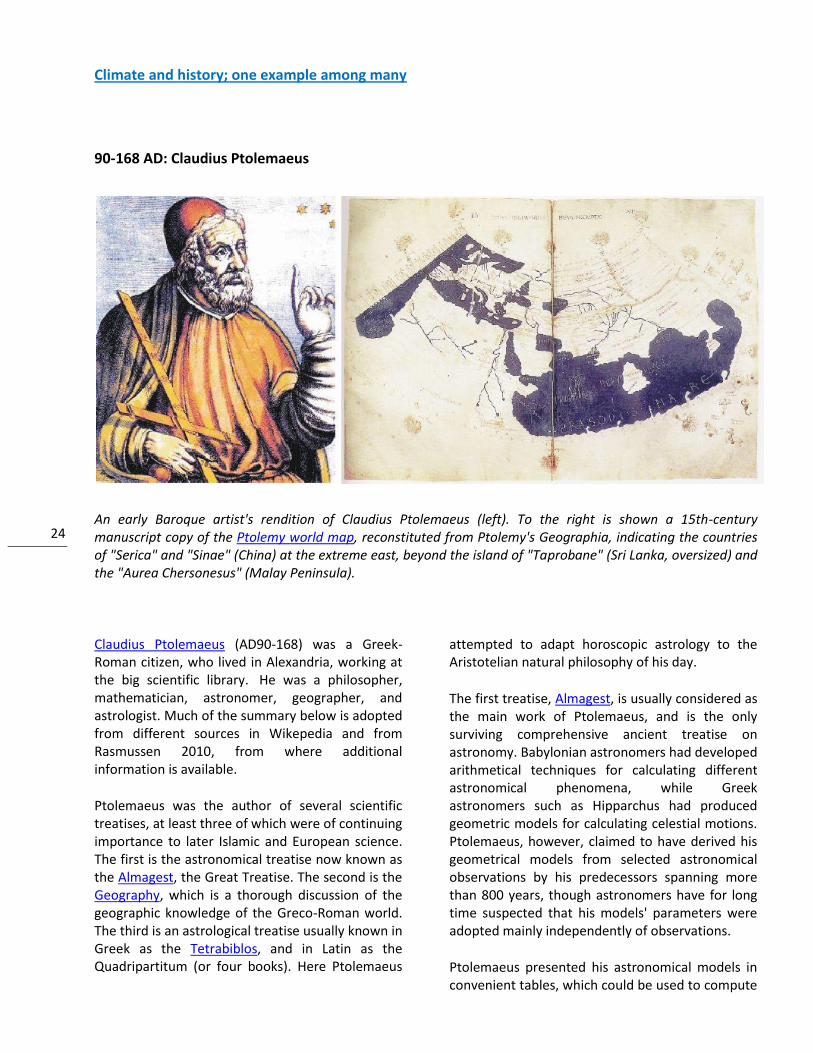
90-168 AD: Claudius Ptolemaeus
An early Baroque artist's rendition of Claudius Ptolemaeus (left). To the right is shown a 15th-century manuscript copy of the Ptolemy world map, reconstituted from Ptolemy's Geographia, indicating the countries of "Serica" and "Sinae" (China) at the extreme east, beyond the island of "Taprobane" (Sri Lanka, oversized) and the "Aurea Chersonesus" (Malay Peninsula).
Claudius Ptolemaeus (AD90-168) was a Greek-Roman citizen, who lived in Alexandria, working at the big scientific library. He was a philosopher, mathematician, astronomer, geographer, and astrologist. Much of the summary below is adopted from different sources in Wikepedia and from Rasmussen 2010, from where additional information is available.
Ptolemaeus was the author of several scientific treatises, at least three of which were of continuing importance to later Islamic and European science. The first is the astronomical treatise now known as the Almagest, the Great Treatise. The second is the Geography, which is a thorough discussion of the geographic knowledge of the Greco-Roman world. The third is an astrological treatise usually known in Greek as the Tetrabiblos, and in Latin as the Quadripartitum (or four books). Here Ptolemaeus
attempted to adapt horoscopic astrology to the Aristotelian natural philosophy of his day.
The first treatise, Almagest, is usually considered as the main work of Ptolemaeus, and is the only surviving comprehensive ancient treatise on astronomy. Babylonian astronomers had developed arithmetical techniques for calculating different astronomical phenomena, while Greek astronomers such as Hipparchus had produced geometric models for calculating celestial motions. Ptolemaeus, however, claimed to have derived his geometrical models from selected astronomical observations by his predecessors spanning more than 800 years, though astronomers have for long time suspected that his models' parameters were adopted mainly independently of observations.
Ptolemaeus presented his astronomical models in convenient tables, which could be used to compute
25
the future or past position of the planets. The Almagest also contains a star catalogue, which is an appropriated version of a catalogue created by Hipparchus. Its list of forty-eight constellations is ancestral to the modern system of constellations, but unlike the modern system they did not cover the whole sky, but only the sky Hipparchus could see from Alexandria.
Ptolemy's model, like those of his predecessors, was geocentric, assuming that that the Earth is the center of the universe, and that all other objects orbit around it.
Two commonly made observations supported the idea that the Earth was the center of the Universe. The first observation was that the stars, sun, and planets appear to revolve around the Earth each day, making the Earth the center of that system. Further, every star was on a "stellar" or "celestial" sphere, of which the earth was the center that rotated each day, using a line through the north and South Pole as an axis. The second common notion supporting the geocentric model was that
the Earth does not seem to move from the perspective of an Earth bound observer, and that it is solid, stable, and unmoving. In other words, it is completely at rest.
Ptolemaeus was convinced that conditions on Earth were influenced by the orbiting celestial objects. The influence of the Sun and the Moon on seasons and tide water, respectively, was obvious, and it was therefore assumed that also the other five planets (Sun and Moon were considered planets by Ptolemaeus) had influence on the conditions on Earth.
In his thesis Tetrabiblos Ptolemaeus outline a series of astrology based rules for weather forecasts, while admitting that that many mistakes are made in its practice - partly because of "evident rascals who profess to practice it without due knowledge and pretend to foretell things which cannot be naturally known”. His conclusion is that this kind of study is only able to give reliable knowledge in general terms.
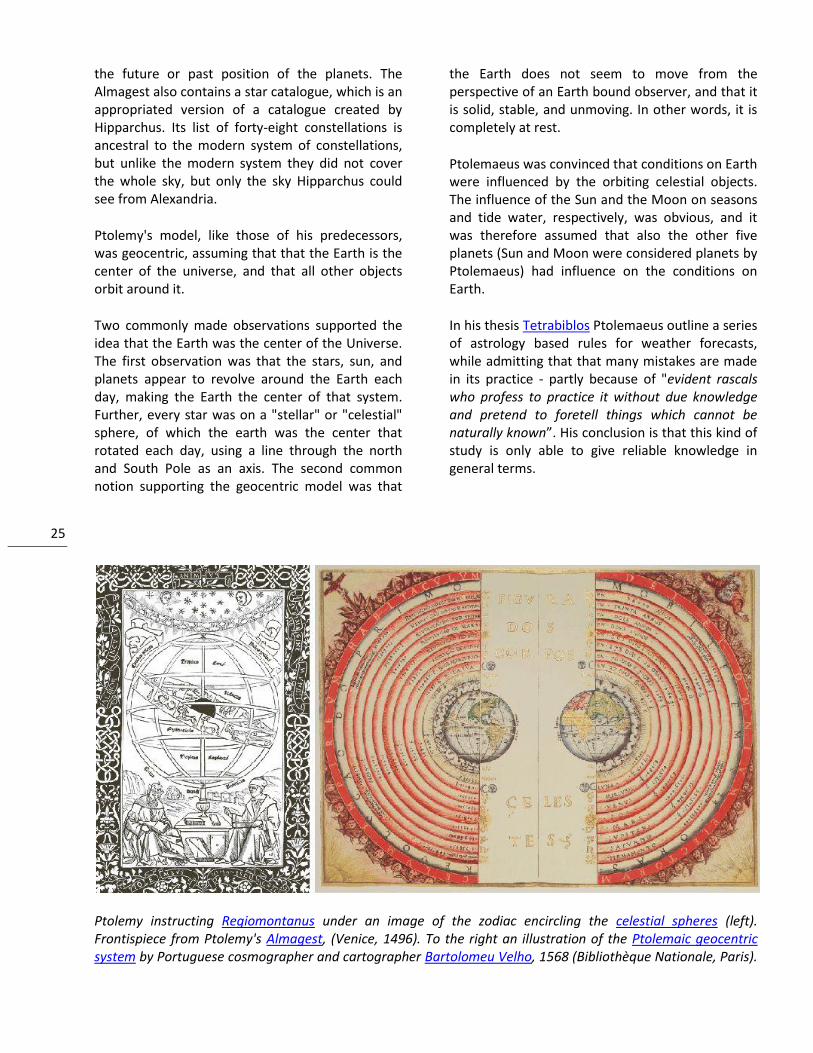
Ptolemy instructing Regiomontanus under an image of the zodiac encircling the celestial spheres (left). Frontispiece from Ptolemy's Almagest, (Venice, 1496). To the right an illustration of the Ptolemaic geocentric system by Portuguese cosmographer and cartographer Bartolomeu Velho, 1568 (Bibliothèque Nationale, Paris).
26
One of the unique features of the Tetrabiblos, amongst the astrological texts of its period, is the extent to which the first book not only introduces the basic astrological principles, but also attempts to explain the reasoning behind their reported associations in line with Aristotelian philosophy. Chapter four in Tetrabiblos, explains the "power of the planets" through their associations with the creative qualities of warmth or moisture, or cold and dryness. Hence Mars is described as a destructive planet because its association is excessive dryness, whilst Jupiter is defined as temperate and fertilising because its association is moderate warmth and humidity.
Chapter nine in Tetrabiblos discusses the "power of the fixed stars". Here, rather than give direct humoral associations, Ptolemy describes their "temperatures" as being like that of the planets he has already defined. Hence Aldebaran (called the Torch) is described as having "a temperature like that of Mars", whilst other stars in the Hyades are "like that of Saturn and moderately like that of Mercury". At the end of this chapter Ptolemy clarifies that these are not his proposals, but are reproduced from historical sources, being "the observations of the effects of the stars themselves as made by our predecessors".
His Planetary Hypotheses went beyond the mathematical model of the Almagest to present a physical realization of the universe as a set of nested spheres, in which he used the epicycles of his planetary model to compute the dimensions of the universe. He estimated the Sun was at an average distance of 1210 Earth radii while the radius of the sphere of the fixed stars was 20,000 times the radius of the Earth.
Ptolemaeus presented a useful tool for astronomical calculations in his Handy Tables, which tabulated all the data needed to compute the positions of the Sun, Moon and planets, the rising and setting of the stars, and eclipses of the Sun and Moon. Ptolemy's Handy Tables thereby provided the model for later astronomical tables. In the Phaseis (Risings of the Fixed Stars) Ptolemy gave a parapegma, a star calendar or almanac based on the appearances and disappearances of stars over the course of the solar year.
Through the Middle Ages the Almagest was considered as the authoritative text on astronomy, with its author becoming an almost mythical figure. Like most of the Classical Greek science the Almagest was preserved in Arabic manuscripts. Because of its reputation, it was widely sought and was translated twice into Latin in the 12th century, once in Sicily and again in Spain.
The astronomical predictions of Ptolemy's geocentric model were used to prepare astrological charts for over 1500 years. The geocentric model survived into the early modern age, but was gradually replaced from the late 16th century onward by the heliocentric model of Copernicus, Galileo and Kepler. However, the transition between these two theories met stiff resistance, not only from the Catholic Church, which was reluctant to accept a theory not placing God's creation Earth at the center of the universe, but also from those who saw geocentrism as an established fact that should not be subverted by a new and apparently weakly justified theory.
Sources and References:
Rasmussen, E.A. 2010. Vejret gennem 5000 år (Weather through 5000 years). Meteorologiens historie. Aarhus Universitetsforlag, Århus, Denmark, 367 pp, ISBN 978 87 7934 300 9.
Wikipedia. http://www.wikipedia.org/
27
*****
All the above diagrams with supplementary information, including links to data sources and previous issues of this newsletter, are available on www.climate4you.com
Yours sincerely, Ole Humlum ([email protected])
May 19, 2012.