climatechange—linear models - people search...
TRANSCRIPT

Chapter 8
Climate Change — Linear Models
Complicated physical and social phenomena rarely behave linearly, but sometimes data points lie close to astraight line. When that happens you can use a spreadsheet to construct a linear approximation. Sometimesthat’s useful and informative. Sometimes it’s misleading. Common sense can help you understand which.
Chapter goals:
Goal 8.1. Draw regression lines using Excel. Interpret regression lines.
Goal 8.2. Recognize when rounding too much distorts conclusions.
Goal 8.3. Think about causation vs correlation.
8.1 Climate change
Climate change (global warming) is a current hot topic. How rapidly is the Earth’s average temperatureincreasing? What might the consequences be? What is the cause? What might we do about it? Should wetry? The science is complex and the politics even more so. In a course like this we can’t begin to unravelthose complexities. But for just a taste of the analysis, we will briefly look at some data on the averagetemperature of the Earth and the concentration of carbon dioxide (CO2) in the atmosphere in recent history.The spreadsheet www.cs.umb.edu/~eb/qrbook/Regression/EarthData.xlsx has data we downloaded fromwww.earth-policy.org/data_center/C23.
The chart on the left in Figure 8.1 shows a scatter plot of the average global temperature, in Celsius degrees,for the years 1960-2000. There is no formula for that relationship, but the points seem to trend upwards(on average). So we asked Excel to connect the dots to see the jagged rise and fall, and then we drew a lineon the graph that looked like a reasonable approximation for the trend. The result is on the right. Thenwe used the line to predict a temperature of 14.58 degrees Celsius for 2010. In fact that average was 14.63degrees Celsius. Given how up and down the data are (despite the long term average trend) we could hardlyexpect an accurate prediction. We added the textboxes and the arrows to the spreadsheet to explain how wedrew the line.
The line we drew is a model — a mathematical construction that approximates something in the real world.This particular model is linear — the line that seems to match the data best. We could have used that model
185

8.1. CLIMATE CHANGE
in 2000 to make a prediction for 2010 — an estimate of what the temperature might be in a future year forwhich we didn’t (at the moment) have data.
13.70
13.80
13.90
14.00
14.10
14.20
14.30
14.40
14.50
14.60
14.70
1960 1970 1980 1990 2000
aver
age
tem
p (C
elsi
us)
year
Global Temperature
13.70
13.80
13.90
14.00
14.10
14.20
14.30
14.40
14.50
14.60
14.70
1960 1970 1980 1990 2000 2010
aver
age
tem
p (C
elsi
us)
year
Global Temperature
Eyeball linear approximation
Guess for 2010: about 14.58 C
Figure 8.1: Global average temperature, 1960-2000
Excel knows the mathematics for finding the model line we guessed at “by eye”. Figure 8.2 shows how invokeit: select the chart, select Layout from Chart Tools, select Trendline and then Linear Trendline. Exceldraws the second line shown in Figure 8.3.
Not quite. Figure 8.4 shows how to format the trendline: select it (by right clicking); select Format
Trendline ...; Forecast Forward 10 periods (10 years). Check the boxes for Display Equation andDisplay R-squared value — we will need that data soon. You can change the Trendline Name, LineColor and Line Style if you wish.
Excel calls the line that best fits a scatterplot a trendline. Its official name is regression line. We learned (orremembered) in Chapter 7 that straight lines are described by linear equations. The one for the regressionline in Figure 8.3 is
y = 0.0116x− 8.9214.
The slope of the regression line matters most. In this example it says that on average global temperature isincreasing at a rate of
0.0116degrees (Celsius)
year.
That’s just over a hundredth of a degree (Celsius) per year, or a tenth of degree per decade. (Remember thatthe units of the slope are (units of y)/(units of x.)
The intercept for this linear equation, with its units, is
−8.9214 degrees (Celsius).
Supposedly, that is the temperature predicted (retroactively) by the regression line for year 0. That’s nonsense,of course.
In principle, we can use the equation of the line instead of our eyeball approximation to make our 2010
� 2015 Mathematical Association of America 186

8.1. CLIMATE CHANGE
Figure 8.2: Adding a trendline to a chart
prediction. If we let x = 2010 we find the prediction
average 2010 temperature = y
= 0.0116× 2010− 8.9214
= 14.2786
≈ 14.29 degrees Celsius.
Something is wrong! When we looked at the trendline that Excel drew, we had an estimate of 14.48 degrees.This calculation is not even close to that estimate. Stop and think: we estimated the 2010 temperaturevisually, using the Excel trendline, as 14.48 degrees Celsius. When we used the equation for that trendline tocalculate the 2010 temperature, we got a number that didn’t make sense with what we saw on the graph.
Be skeptical. Always ask whether the numbers from a newspaper or a website or a television commentator —or from a computer program — make sense. This one clearly doesn’t. If we dig a little deeper we can see why.
It turns out that Excel rounded off the slope and intercept it showed on the chart. It knows the correctvalues, but thought all the digits were too ugly to display . To find them, enter the command
187 2015 Mathematical Association of America

8.1. CLIMATE CHANGE
by = 0.0116x - 8.9214 R² = 0.6331
13.70
13.80
13.90
14.00
14.10
14.20
14.30
14.40
14.50
14.60
14.70
1960 1970 1980 1990 2000 2010
aver
age
tem
p (C
elsi
us)
year
Global Temperature
Eyeball linear approximation
Guess for 2010: about 14.58 C
Trendline prediction for 2010: about 14.48 C
Figure 8.3: Global average temperature, 1960-2000 (prediction to 2010)
=SLOPE(
in a cell (we used cell H27, with a label in G27). Excel prompted for
=SLOPE(known y’s, known x’s)
so we selected the data
=SLOPE(B6:B46,A6:A46)
(the years 1960-2000) and Excel told us the correct value: 0.011642857. That’s more precise than the roundedvalue 0.0116 shown on the chart. We found the intercept, -8.921393728, the same way, with the formula=INTERCEPT(B6:B46,A6:A46) (in cell H28). (In the SLOPE and INTERCEPT functions the y-values come firstand the x-values second, even though in the data table the x-values are first and the y-values second.)
Then the correct equation for the model, before rounding, is
y = 0.011642857 x− 8.921393728.
If we set x = 2010 in that equation Excel tells us y = 14.48074913 ( cell E30). That rounds to our visualestimate of 14.48.
We are not the first to discover this problem. Microsoft’s support page at support.microsoft.com/kb/211967outlines what they call a workaround , to show all the decimal places in the trendline equation displayed onthe chart. Right click the formula for the trendline on the chart, then select Format Trendline Label ....In the Number selection there you can ask for the maximum number of decimal places: 30. Decide for yourselfwhether you like this method better than asking Excel directly for the SLOPE and INTERCEPT.
We’ve said repeatedly that it was wrong to show lots of decimal places when reporting approximate numbers,even when those decimal places appeared in your calculator or spreadsheet. But in this example we saw
� 2015 Mathematical Association of America 188

8.2. THE GREENHOUSE EFFECT
Figure 8.4: Formatting a trendline
that too much rounding is wrong too. Using a slope rounded to four significant digits may give a ridiculousanswer. The short answer to the question “when should you round?” is
While you compute, use all the digits you have, even if it’s more than you need. Round onlywhen you’re done.
Keep this in mind from now on — both when doing the problems in this text and when working with Excel(or another software program) in the future.
8.2 The greenhouse effect
Most climate scientists are convinced that the reason the Earth is warming is the increase in the concentrationof greenhouse gases like carbon dioxide in the air.
A greenhouse is warm in the winter because sunlight enters through the glass roof, which prevents the inside
189 2015 Mathematical Association of America

8.2. THE GREENHOUSE EFFECT
air it heats up from escaping. Carbon dioxide (CO2) behaves similarly in the atmosphere — it lets sunlightin but doesn’t let heat out. The chart on the left in Figure 8.5 displays the data and the regression lineshowing how average temperature varies with the amount of CO2 in the atmosphere. When e asked Excel toshow the equation of the trendline this box appeared on the chart:
.
The slope of the trendline is
0.0088degrees Celsius
part per million of CO2.
An increase of one part per million of CO2 corresponds to somewhat under one hundredth of a degree (Celsius)increase in temperature.
That’s the trendline slope with four significant digits. If we ask Excel for more we see
0.00881808540214804degrees Celsius
part per million of CO2.
We would use that value in any computations we made.
The chart on the right in Figure 8.5 shows the increase in CO2 concentration over the years (it does notmention temperatures at all). There the slope of the regression line is
1.3569parts per million of CO2
year;
on average, every year the CO2 concentration increases by about 1.36 parts per million.
y = 0.0088x + 11.133 R² = 0.6752
13.70
13.80
13.90
14.00
14.10
14.20
14.30
14.40
14.50
14.60
14.70
310.00 320.00 330.00 340.00 350.00 360.00 370.00 380.00
aver
age
tem
p (C
elsi
us)
CO2 concentration (ppm)
Temperature vs CO2
y = 1.3569x - 2346.7 R² = 0.9902
300.00
310.00
320.00
330.00
340.00
350.00
360.00
370.00
380.00
390.00
1960 1970 1980 1990 2000 2010
CO
2 co
ncen
trat
ion
(ppm
)
year
Atmospheric Carbon Dioxide
Figure 8.5: CO2, time and temperature, 1960-2000
The original data set contains three columns of information, listing the year, average global temperature andCO2 concentration. In Section 8.1 we looked at the relationship between year and average global temperature,which documents the trend called “global warming” in the news. In this section we looked at the other tworelationships, between temperature and CO2 concentration and between CO2 concentration and time, inhopes of understanding what might be behind the observed temperature trend. In the next two sections we’llthink about what we may learn this way.
2015 Mathematical Association of America 190

8.3. HOW GOOD IS THE LINEAR MODEL?
8.3 How good is the linear model?
How much a regression line helps understand the data and make predictions depends in part on how closethe data points are to the line. Common sense tells you that the relationship between carbon dioxideconcentration and time (on the right in Figure 8.5) is likely to be more reliable than that between carbondioxide and temperature (on the left), which in turn looks better than that between temperature and time(Figure 8.3).
The official statistical measure of “close to the line” is a number between zero and one called “R-squared”.The closer R-squared is to 1 the better the regression line fits the data. In Figure 8.3 R2 is just 0.63321 —not very good. That matches what we can see in the chart — the temperature seems to be increasing on theaverage, but can go up and down unpredictably from year to year. In the chart on the right in Figure 8.5 theR2 value is 0.9902, which is very close to 1. In fact the measured 2010 concentration was 389.78 parts permillion, so the relative error in the prediction is about −2.5%.
We are being deliberately vague about how close the R2 should be to 1 to declare that the fit is “good.”There are no rules for this. In the exercises below you will have a chance to develop your intuition.
We were careful to use the word “corresponds” when discussing the increase in CO2 concentration and theincrease in average temperature, not the word “causes”. The data only say that the CO2 concentration andthe temperature are correlated — they trend together. They don’t say one causes the other. Data can nevertell you that. Climate scientists who work at understanding the physics and chemistry of carbon dioxide inthe atmosphere have created scientific models that suggest causation. We will return to this distinction inSection 8.4.
There is much more to the climate change debate: some who accept the scientific models that say thatgreenhouse gases cause global average temperatures to increase are not convinced that the increase ingreenhouse gases is due to human activity, and therefore see no need to change the way we use energy.
8.4 Regression nonsense
The graphic in Figure 8.6 resembles one that appeared in The Boston Globe on January 14, 2010 in a storyheadlined “Imaginary fiends”, which began
In 2009, crime went down. In fact it’s been going down for a decade. But more and moreAmericans believe it’s getting worse. [R185]
The data in the accompanying table are from www2.fbi.gov/ucr/cius2008/data/table_01.html and www.
gallup.com/poll/123644/Americans-Perceive-Increased-Crime.aspx. The FBI measures the crimerate in violent crimes per 100,000 people. The fear index is the percentage of people who say crime is goingup.
The headline seems to announce a juicy story. The graph is drawn to accentuate the apparent contradiction,since the scales on both y axes don’t start at 0. We will use these numbers to illustrate the kinds of nonsensearguments you can make with regression lines. There are three variables to play with: the year, the crimerate, and the fear index. We will focus on them two at a time and imagine different kinds of conclusions.
We started by entering the data in Excel, using the table in the online version of Common Sense Mathematicsto save typing and prevent typing errors. To do that, select and copy the data from the table. Then paste it
191 � 2015 Mathematical Association of America

8.4. REGRESSION NONSENSE
00 01 02 03 04 05 06 07 08 09
400
450
500
550
506.5 504.5494.4
475.8
463.2469 473.6
466.9
454.5
435
year
crim
era
te
40%
50%
60%
70%
80%
47%
43%
62%60%
53%
67%68%
71%
67%
74%
fear
inde
x
year crime rate fear index
2000 506.5 472001 504.5 432002 494.4 622003 475.8 602004 463.2 532005 469.0 672006 473.6 682007 466.9 712008 454.5 672009 435.0 74
Figure 8.6: Crime down, fear up
into Excel. The bad news is that it is then just text, all in one column. The good news is that Excel canseparate the columns of data: open the Data tab and select Text to Columns. Then entering Next on allthe dialog windows does the job.
Our work is in the spreadsheet www.cs.umb.edu/~eb/qrbook/Regression/crimeDropsFearsRise.xlsx .
The first graph in Figure 8.7 shows a scatterplot and trendline for the last two columns in the table. Therewe asked Excel to construct a graph with crime rate as the independent variable.
y = -0.3618x + 232.82 R² = 0.6036
40
45
50
55
60
65
70
75
80
420.0 440.0 460.0 480.0 500.0 520.0
fear
inde
x
crime rate
Crime up, fear down
y = -1.6682x + 576.43 R² = 0.6036
420.0430.0440.0450.0460.0470.0480.0490.0500.0510.0520.0
40 50 60 70 80
crim
e ra
te
fear index
Fear up, crime down
Figure 8.7: Crime vs fear regressions
Since we chose crime rate as the independent variable it’s easy to look at the graph — and the trend line —and conclude that the increase in crime rate is closely related to the decrease in the fear index. The regressionline slopes down — high crime rates seem to come along with decreased fear of crime. The R-squared valueis 0.60 — perhaps not compellingly high, but we won’t let that stop us from thinking about the data. Whatmight the correlation mean? Could an increase in crime (the independent variable on the x-axis) cause peopleto be less afraid? Here’s an attempt at an explanation: Perhaps when crime is rare it’s reported spectacularlyin the news and people are frightened, while when it’s common it gets less press and most people don’t noticeit as much because it isn’t happening to them.
Does that make sense? Not to us, but it’s the kind of argument you frequently see or hear — a simplemindedattempt to explain what seems to be a real “this is true because of that” connection, or perhaps what a
� 2015 Mathematical Association of America 192
8.5. EXERCISES
politician would like you to believe is a real connection.
The second graph in Figure 8.7 shows the same data with the fear index as the independent variable. Thatchanges our view of the data. Now we see crime dropping as fear increases. How might we explain that?Perhaps we’d argue that increasing fear of crime leads to more pressure on the police to arrest criminals,thus reducing the amount of crime. That’s more plausible than the other way around, but still a shallowunconvincing analysis of complex social phenomena. Both the crime rate and the fear of crime are changingover time, one decreasing while the other increases, but just because we can find a trendline doesn’t meaneither change causes the other.
y = -6.8594x + 505.21 R² = 0.863
430.0440.0450.0460.0470.0480.0490.0500.0510.0520.0
0 5 10
crim
e ra
te
years since 2000
Crime rate falls!
y = 2.9939x + 47.727 R² = 0.758
0
10
20
30
40
50
60
70
80
0 5 10
fear
inde
x
years since 2000
Fear on the rise!
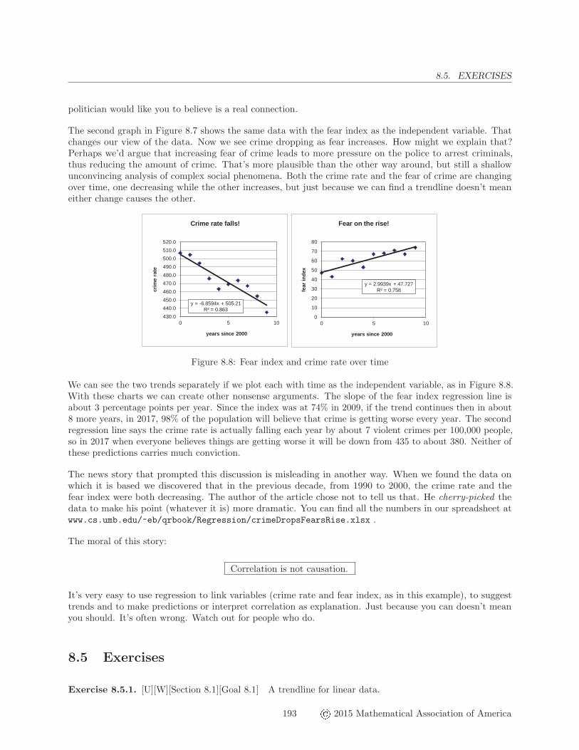
Figure 8.8: Fear index and crime rate over time
We can see the two trends separately if we plot each with time as the independent variable, as in Figure 8.8.With these charts we can create other nonsense arguments. The slope of the fear index regression line isabout 3 percentage points per year. Since the index was at 74% in 2009, if the trend continues then in about8 more years, in 2017, 98% of the population will believe that crime is getting worse every year. The secondregression line says the crime rate is actually falling each year by about 7 violent crimes per 100,000 people,so in 2017 when everyone believes things are getting worse it will be down from 435 to about 380. Neither ofthese predictions carries much conviction.
The news story that prompted this discussion is misleading in another way. When we found the data onwhich it is based we discovered that in the previous decade, from 1990 to 2000, the crime rate and thefear index were both decreasing. The author of the article chose not to tell us that. He cherry-picked thedata to make his point (whatever it is) more dramatic. You can find all the numbers in our spreadsheet atwww.cs.umb.edu/~eb/qrbook/Regression/crimeDropsFearsRise.xlsx .
The moral of this story:
Correlation is not causation.
It’s very easy to use regression to link variables (crime rate and fear index, as in this example), to suggesttrends and to make predictions or interpret correlation as explanation. Just because you can doesn’t meanyou should. It’s often wrong. Watch out for people who do.
8.5 Exercises
Exercise 8.5.1. [U][W][Section 8.1][Goal 8.1] A trendline for linear data.
193 � 2015 Mathematical Association of America

8.5. EXERCISES
(a) What values would you expect to see for the slope, intercept andR-squared if you were to add a trendlineto the Tamworth electricity bill in the spreadsheet www.cs.umb.edu/~eb/qrbook//ElectricityBill/TamworthElectric.xlsx?
(b) What would the trendline look like on the graph in Figure 7.5?
(c) Add the trendline and verify your predictions.
Exercise 8.5.2. [U][Section 8.3][Goal 8.1] Anscombe’s quartet.
Anscombe’s quartet comprises four datasets that have nearly identical simple statisticalproperties, yet appear very different when graphed. Each dataset consists of eleven (x, y) points.They were constructed in 1973 by the statistician Francis Anscombe to demonstrate both theimportance of graphing data before analyzing it and the effect of outliers on statistical properties.[R186]
Use the data in www.cs.umb.edu/~eb/qrbook/Regression/AnscombesQuartet.xlsx for the tasks thatfollow.
(a) For each data set, use Excel to find the mean of the x and y values. Label them in your spreadsheet.
(b) Do the mean values describe these four data sets very well? Explain.
(c) Graph each set of (x, y) values. Label each graph (“data set 1” etc.). Write a sentence or twodescribing the relationship between the x and y values, using what you see on the graph. Talk about howstrong that relationship is (but don’t calculate the R-squared value yet).
(d) Display the trendline, the trend line equation and the R2 value on each graph.
(e) Round the slope and intercept to two decimal places. Write a sentence comparing the slope, interceptand R-squared value for each of the data sets.
(f) Explain in your own words how these examples demonstrate the importance of graphing data beforeanalyzing it.
(g) The short description at the beginning of this problem also talked about the effect of “outliers” onstatistical properties. In this context, an outlier is a number that lies outside most of the numbers in thedata set. Does each of the data sets contain an outlier? If so, how does that outlier influence the basicstatistics for each data set?
Exercise 8.5.3. [S][Section 8.1][Section 8.2][Goal 8.1] Faster than a speeding bullet.
The spreadsheet at www.cs.umb.edu/~eb/qrbook/Regression/MarathonWinningTimes.xlsx shows thehistory of the winning time in the Boston Marathon for men and women from 1966 (when women first ran)through 2013.
(a) Graph the men’s and women’s winning times depending on the year, properly label the axes and adda trendline for each data column.
(b) What is the average rate at which the men’s finishing time changed from year to year?
(c) Use the trendline to predict when the men’s winner will finish in two hours. How confident are you inthat prediction?
� 2015 Mathematical Association of America 194

8.5. EXERCISES
(d) Use the trendline to predict when the men’s winner will finish in one hour. How confident are you inthat prediction?
(e) The trendlines suggest that in about six years the fastest woman will be as fast as the fastest man,and will be faster thereafter. Explain why the lines say that, and why it’s nonsense.
(f) Make a better prediction about the long run relation between men’s and women’s winner finishingtimes.
[See the back of the book for a hint.]
Exercise 8.5.4. [U][Section 8.1][Goal 8.1] The leaning tower of Pisa.
The famous “Leaning Tower of Pisa” began to lean even while it was under construction in the 1170s. Thetable in Figure 8.9 shows the measured lean for the years 1975 through 1987.1
Year Lean (m)
1975 2.96421976 2.96441977 2.96561978 2.96671979 2.96731980 2.96881981 2.96961982 2.96981983 2.97131984 2.97171985 2.97251986 2.97421987 2.9757
Figure 8.9: The Tower of Pisa
(a) Construct the regression line for this data and estimate (visually) what the lean was in the year 2000.
(b) How good is that estimate likely to be?
(c) What is the slope of the regression line? What are its units? What does it mean?
(d) Check your estimate using the equation of the regression line. Can you use the formula as it appearsin the chart, or do you need more decimal places?
(e) Explain why the actual numbers in the data table for the Tower of Pisa depend on the height of the“particular point” at which measurements were taken. What would the numbers be if the point were twiceas high? Would the linear regression line be just as good?
(f) What has happened to the Tower of Pisa since 1987?
1This picture is from www.raphaelk.co.uk/web%2520pics/Italy/second/pisa-lina-1.jpg. The data are from filebox.vt.
edu/users/jemarsh2/LectureNotes/Ch10Examples.pdf. The second column displays the lean as the distance in meters betweenwhere a particular point on the tower would be if the tower were straight and where it actually is.
195 � 2015 Mathematical Association of America

8.5. EXERCISES
Exercise 8.5.5. [S][Section 8.1][Goal 8.1] Beverage consumption.
The spreadsheet at www.cs.umb.edu/~eb/qrbook/Regression/BeverageConsumption.xlsx contains dataon the amounts of milk, bottled water and soft drinks consumed in the United States between 1980 and 2004.
(a) Use Excel to create a scatter plot of this data. Label the data series and the axes correctly.
(b) Explore correlations among the various categories (for example, between milk and water). Writeabout what you discover. In particular, which kinds of consumption are most closely correlated?
(c) Use the regression lines to make some predictions for years following 2004.
(d) Find the source of the data in www.cs.umb.edu/~eb/qrbook/Regression/BeverageConsumption.
xlsx . If you find data for other years there, discuss the validity of your predictions.
[See the back of the book for a hint.]
Exercise 8.5.6. [S][Section 8.1][Goal 8.1] Energy consumption.
The Excel spreadsheet www.cs.umb.edu/~eb/qrbook/Regression/EnergyConsumption.xlsx contains atable showing the annual United States energy consumption, measured in terawatt-hours, between 1949 and2005.
(a) Insert a new column labeled “years since 1949” in between the years column and the consumptioncolumn. Use Excel to fill in the cells for this column.
(b) Use Excel to find a linear trendline for this data. Include the equation and R2-value for the trendlineon the graph.
(c) Is this trendline a good fit for the data?
(d) What is the slope of this line? Include the units in your answer. Use your answer for the slope tocomplete the sentence: “For every additional year that passes, total energy consumption . . . ”
(e) Estimate total energy consumption in the years from 2006 to the present.
(f) Look for data with which to check the estimates from the previous part of the exercise.
Exercise 8.5.7. [S][Section 8.1][Goal 8.1] Supply and demand for office space.
The data in Table 8.10 appeared on page B5 in The Boston Globe on April 3, 2010.
quarter vacancy rate rent (�/ft2)Q1 ’06 11.8% 38.76Q1 ’07 7.5% 47.54Q1 ’08 6.0% 62.20Q1 ’09 9.0% 49.24Q1 ’10 11.1% 42.46
Table 8.10: Less in rent, more in vacancy
(a) Build and then discuss a linear regression line for the dependence of rent per square foot on vacancyrate.
� 2015 Mathematical Association of America 196

8.5. EXERCISES
(b) How do your conclusions change when you adjust rents to take inflation into account?
Exercise 8.5.8. [S][Section 8.1][Goal 8.1] [Goal 8.3] Office rents.
On February 22, 2008 The Boston Globe ran a story under the headline “Office rents reach dizzying heights”that featured graphs like those in Figure 8.11.
0.0%
5.0%
10.0%
15.0%
20.0%
2000 2001 2002 2003 2004 2005 2006 2007
Avai
labl
e Sp
ace
Year
Boston Office Space
0.00
20.00
40.00
60.00
80.00
2000 2001 2002 2003 2004 2005 2006 2007Aver
age
Rent
($/s
q. ft
.)
Year
Boston Office Space
Figure 8.11: Boston office rental rates
The shapes of the curves illustrate the law of supply and demand — the more space is available the less youhave to pay for it.
You can find the data in the spreadsheet www.cs.umb.edu/~eb/qrbook/Regression/BostonOfficeRents.xlsx .
(a) Show how rental cost depends on the percent of space available by creating a scatter plot usingcolumns D and F and a regression line for that scatter plot. Identify the slope and its units. How good isthe correlation?
(b) Use the graph and the formula to estimate office rent when the availability rate is 8%.
(c) The spreadsheet contains data on the vacancy rate as well as the availability rate. Create a scatterplotillustrating how the vacancy rate depends on the availability rate. Add a regression line and discuss whatit tells you.
Exercise 8.5.9. [U][Section 8.3][Goal 8.1] [Goal 8.1] First class mail.
Table 8.13 shows the cost of sending first class mail weighing up to one ounce.
(a) Copy and paste the data into Excel, then draw a graph of the data.
(b) Insert the trendline and display the trendline equation and the R-squared value on the graph.
(c) Write a sentence interpreting the slope of the trendline.
(d) Is this a strong correlation? Explain.
Exercise 8.5.10. [U][Section 8.1] Speed vs. MPG, revisited.
Exercise 3.10.51 looked at the relationship between speed and fuel consumption. You can do this problemeven if you didn’t do that one.
(a) Read data from the graph in Figure 3.7 and enter it in Excel.
197 � 2015 Mathematical Association of America

8.5. EXERCISES
Year Cost (cents)
1976 131978 151981 181985 221988 251991 291995 321999 332001 342002 372006 392007 412008 422009 442012 452013 46
Table 8.12: First class mail
(b) The information cited in Exercise 3.10.51 states that for each 5 mph you drive over 50 mph, yourdecrease in fuel economy means that you pay an additional �0.25 for gas. Use Excel to graph the datacorresponding to speeds above 50 mph. Construct a regression line for this data. What does the slope ofthe regression line tell you about how fuel economy changes as speed increases? If your speed increasesby 5 mph, how does your fuel economy change, on average?
(c) Use Excel to convert the data in your table from mpg to gallons per 100 miles. Graph the data againand insert the regression line. What does the slope of the regression line tell you about how fuel economychanges as speed increases? Is it easier to explain how fuel economy changes when your speed increasesby 5 mpg?
Exercise 8.5.11. [S][Section 8.1][Goal 8.1] College costs.
The spreadsheet www.cs.umb.edu/~eb/qrbook/Regression/CollegeCosts2010.xlsx shows the annualmean cost for tuition and fees at private and public four-year colleges in the U.S. between 1999 and 2010.
(a) Create a properly labeled graph showing how mean private and public education costs changed in theyears 1999-2010.
Insert a linear trendline for each set of data. Use Excel to forecast the trendline out to 2015 (that is, 16years past 1999).
(b) Write the equation for private education costs.
(c) Write the equation for public education costs.
(d) Interpret the numerical value of the slope in each trendline equation. That is, write a sentenceexplaining what the slope represents.
(e) Use your trendline equations to determine the projected mean tuition cost at both private and publicfour year colleges for 2015.
(f) Compare your answers from the previous questions with the graph. Are the answers consistent or doyou need to use more digits in your calculation?
� 2015 Mathematical Association of America 198

8.5. EXERCISES
Year Cost (cents)
1976 131978 151981 181985 221988 251991 291995 321999 332001 342002 372006 392007 412008 422009 442012 452013 46
Table 8.13: First class mail
Exercise 8.5.12. [U][Section 8.3][Goal 8.1] [Goal 8.1] First class mail.
Table 8.13 shows the cost of sending first class mail weighing up to one ounce.
(a) Copy and paste the data into Excel, then draw a graph of the data.
(b) Insert the trendline and display the trendline equation and the R-squared value on the graph.
(c) Write a sentence interpreting the slope of the trendline.
(d) Is this a strong correlation? Explain.
Exercise 8.5.13. [U][Section 8.1] Speed vs. MPG, revisited.
Exercise 3.10.51 looked at the relationship between speed and fuel consumption. You can do this problemeven if you didn’t do that one.
(a) Read data from the graph in Figure 3.7 and enter it in Excel.
(b) The information cited in Exercise 3.10.51 states that for each 5 mph you drive over 50 mph, yourdecrease in fuel economy means that you pay an additional �0.25 for gas. Use Excel to graph the datacorresponding to speeds above 50 mph. Construct a regression line for this data. What does the slope ofthe regression line tell you about how fuel economy changes as speed increases? If your speed increasesby 5 mph, how does your fuel economy change, on average?
(c) Use Excel to convert the data in your table from mpg to gallons per 100 miles. Graph the data againand insert the regression line. What does the slope of the regression line tell you about how fuel economychanges as speed increases? Is it easier to explain how fuel economy changes when your speed increasesby 5 mpg?
Exercise 8.5.14. [U][Section 8.1][Goal 8.1] Manhattan rentals.
199 � 2015 Mathematical Association of America

8.5. EXERCISES
year vacancy rate (%) monthly rent (�)
06 0.849 317307 1.007 325408 1.413 325609 1.841 301010 1.191 314411 1.095 3343
Table 8.14: Apartment rents in Manhattan [R187]
Table 8.14 shows data for Manhattan apartment rentals.
Create a scatterplot from the second and third columns in the table, draw a trendline and discuss thecorrelation between vacancy rate and average monthly rent.
Exercise 8.5.15. [S][Section 8.4][Goal 8.1] Playing with regression lines.
Use the spreadsheet www.cs.umb.edu/~eb/qrbook/Regression/PlayWithRegression.xlsx to explore thefollowing questions.
(a) What happens when all the y-values are the same?
(b) What if all but one of the y-values are the same and you vary that one?
(c) What if y decreases as x increases?
(d) What if the x and y values match?
Exercise 8.5.16. [U][Goal 8.1] [Section 8.4] Should businesses use private jets?
On May 26, 2012 The Boston Globe published a letter to the editor from David V. Dinneen, Executivedirector of the Massachusetts Airport Management Association. He observed that companies using their ownprivate jets had earnings 434 percent higher than those using commercial airlines. [R188]
Explain how and why Dineen is using the statistic he quotes to encourage readers to confuse correlation withcausation.
Exercise 8.5.17. [S][Section 8.4][Goal 8.3] Cherry-picking.
In Section 8.4, we discovered that the author had “cherry-picked” the data. Find out what “cherry-picking”means, and where the phrase comes from. Find and discuss some examples.
Exercise 8.5.18. [S][Section 8.4][Goal 8.1] [Goal 8.3] Watch TV! Live Longer!
The data in the spreadsheet www.cs.umb.edu/~eb/qrbook/Regression/TVData.xlsx show the life ex-pectancy in years for several countries, along with the number of people per television set in those countries.(The idea (and the data) for this problem come from the article www.amstat.org/publications/jse/v2n2/datasets.rossman.html.)
(a) Which countries have the highest and lowest life expectancy at birth? Which have the highest andlowest number of people per television set?
� 2015 Mathematical Association of America 200

8.5. EXERCISES
(b) Use Excel to create a properly labelled scatter plot of the life expectancy and people per televisiondata. Find the trendline and display the equation and the R-squared value on your graph.
(c) What is the slope of the trendline (with its units)? Explain its meaning in a sentence.
(d) Does a small number of people per television set improve health? Would people in countries with lowlife expectancy live longer if we sent them shiploads of television sets?
(e) Does living longer increase the number of television sets? If we improved the life expectancy in acountry by providing better medical care would that cause there to be fewer people per television set?
(f) What else could be going on here? Why might high life expectancy be strongly correlated with a lowratio of people per tv set?
Exercise 8.5.19. [S] [W] Crime rates revisited.
(a) Use the data in www.cs.umb.edu/~eb/qrbook/Regression/crimeDropsFearsRise.xlsx to redothe analysis for the entire period from 1990 to 2009.
(b) Are the crime rates in this exercise consistent with those in the example we studied in Chapter 2?
[See the back of the book for a hint.]
Exercise 8.5.20. [U][Section 8.4] [Goal 8.1] [Goal 8.3] The Mississippi River.
In the space of one hundred and seventy-six years the Lower Mississippi has shortened itselftwo hundred and forty-two miles. That is an average of a trifle over one mile and a third peryear. Therefore, any calm person, who is not blind or idiotic, can see that in the Old OoliticSilurian Period, just a million years ago next November, the Lower Mississippi River was upwardsof one million three hundred thousand miles long, and stuck out over the Gulf of Mexico like afishing-rod. And by the same token any person can see that seven hundred and forty-two yearsfrom now the Lower Mississippi will be only a mile and three-quarters long, and Cairo and NewOrleans will have joined their streets together, and be plodding comfortably along under a singlemayor and a mutual board of aldermen. There is something fascinating about science. One getssuch wholesale returns of conjecture out of such a trifling investment of fact.
Mark TwainLife on the Mississippi [R189]
Discuss this linear model for the length of the Mississippi river. What’s the slope? Can you verify Twain’sarithmetic?
Exercise 8.5.21. [U][Section 8.4][Goal 8.3] Well, maybe.
Explain the joke in the cartoon in Figure 8.15 from xkcd.com/.
201 � 2015 Mathematical Association of America

8.5. EXERCISES
Figure 8.15: Well, maybe.
� 2015 Mathematical Association of America 202