cnp brand guidelines 1104
TRANSCRIPT
8/6/2019 Cnp Brand Guidelines 1104
http://slidepdf.com/reader/full/cnp-brand-guidelines-1104 1/29
CenterPoint Energy Brand Identity System Guidelines
Revised .01.

8/6/2019 Cnp Brand Guidelines 1104
http://slidepdf.com/reader/full/cnp-brand-guidelines-1104 2/29
Letter From the President and Chief Executive Officer
Dear Colleague:
The CenterPoint Energy brand is one of our company's most important and valuable assets, but it is an asset
we must constantly work to build and protect. By following the policies and standards in these guidelines,you can ensure that the CenterPoint Energy brand is always used correctly and consistently. This is
important for two reasons:
• A strong, well-recognized brand is a powerful tool for building the recognition and positive image our
company needs to succeed and excel in the marketplace. Correct and consistent use of our brand identity
is critical to building a strong brand.
• If we do not use our brand identity correctly, we risk losing it. Many well-known trademarks, like
cellophane and nylon, lost their value and legal protection through misuse.
The policies and standards in these guidelines were carefully developed to ensure that all of our
communications will project a consistent and distinctive CenterPoint Energy brand image – our own unique
brand personality. Always follow these policies and standards in the development of all communications for
CenterPoint Energy and its business units. If you are responsible for outside agencies or suppliers, makesure they follow the guidelines as well.
At CenterPoint Energy, we take pride in delivering quality products and services to our customers, day in and
day out. Communications are a critical part of doing business, and every communication we produce should
reflect that same pride. Please join me in making sure that all of our communications reflect positively on our
company and protect the value of the CenterPoint Energy brand.
Thank you for your cooperation and support.
Sincerely,
David M. McClanahanPresident and Chief Executive Officer

8/6/2019 Cnp Brand Guidelines 1104
http://slidepdf.com/reader/full/cnp-brand-guidelines-1104 3/29

8/6/2019 Cnp Brand Guidelines 1104
http://slidepdf.com/reader/full/cnp-brand-guidelines-1104 4/29
Names and Naming Systems
Overview of the CenterPoint Energy Naming SystemThe CenterPoint Energy naming system includes thefollowing tiers:
Corporate Name
CenterPoint Energy • Do not use CenterPoint without Energy.
• Do not include legal designations, such as Inc. or
Corporation, except where required.
• Do not separate the name CenterPoint into two
separate words.
• Do not use a lower case “p” in the CenterPoint name.
Product and Service NamesSee page 7.
Approval Required for New NamesAll product and service names and visual identifiers must beapproved in advance by CenterPoint Energy brandmanagement. For assistance with and approval of names,contact: Melissa RuizVoice: 713.207.6308Fax: 713.207.0640E-mail: [email protected]
2
8/6/2019 Cnp Brand Guidelines 1104
http://slidepdf.com/reader/full/cnp-brand-guidelines-1104 5/29
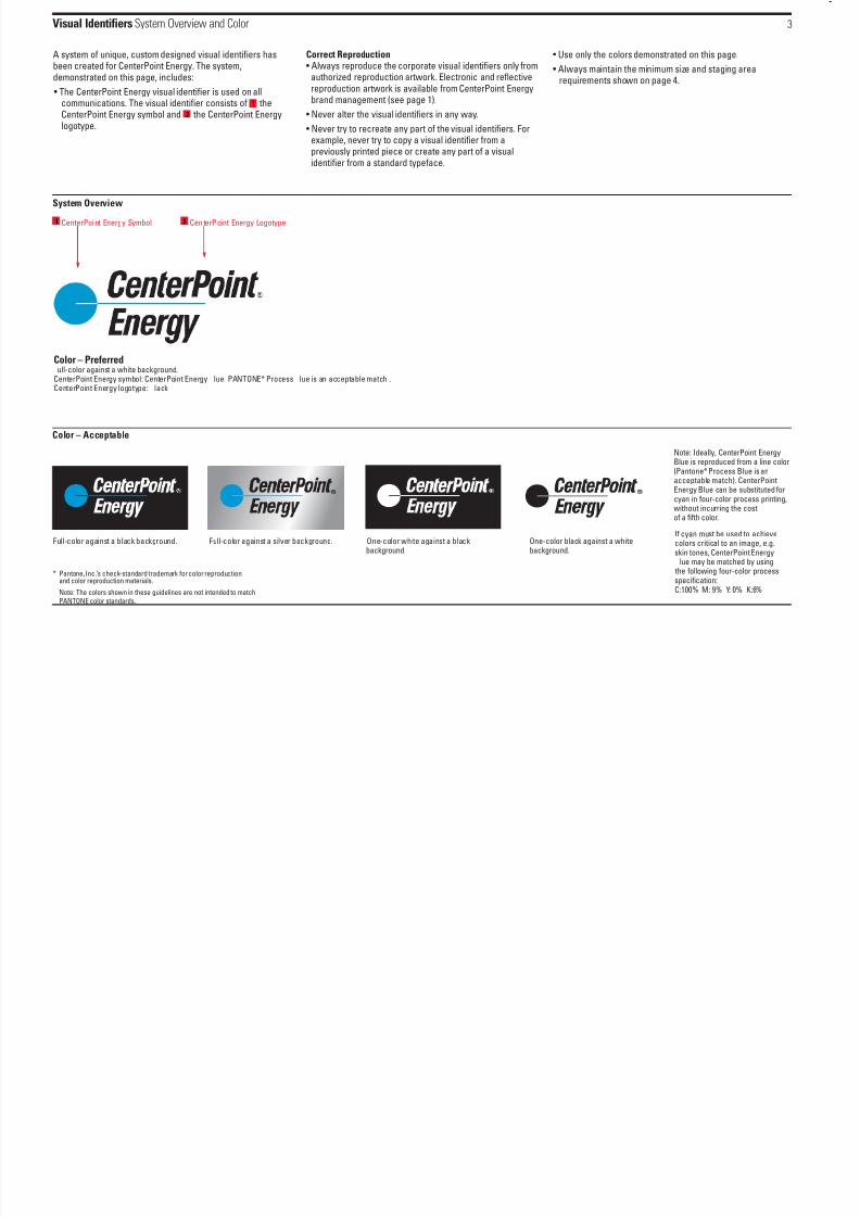
Visual Identifiers System Overview and Color
A system of unique, custom designed visual identifiers hasbeen created for CenterPoint Energy. The system,demonstrated on this page, includes:
• The CenterPoint Energy visual identifier is used on allcommunications. The visual identifier consists of theCenterPoint Energy symbol and the CenterPoint Energylogotype.
Correct Reproduction• Always reproduce the corporate visual identifiers only from
authorized reproduction artwork. Electronic and reflectivereproduction artwork is available from CenterPoint Energybrand management (see page 1).
• Never alter the visual identifiers in any way.
• Never try to recreate any part of the visual identifiers. Forexample, never try to copy a visual identifier from apreviously printed piece or create any part of a visualidentifier from a standard typeface.
• Use only the colors demonstrated on this page.
• Always maintain the minimum size and staging arearequirements shown on page 4.
3
Note: Ideally, CenterPoint EnergyBlue is reproduced from a line color(Pantone*Process Blue is anacceptable match). CenterPointEnergy Blue can be substituted forcyan in four-color process printing,without incurring the costof a fifth color.
Full-color against a black background. Full-color against a silver background. One-color white against a blackbackground.
One-color black against a whitebackground.
CenterPoint Energy Symbol CenterPoint Energy Logotype
* Pantone, Inc.’s check-standard trademark for color reproductionand color reproduction materials.
Note: The colors shown in these guidelines are not intended to matchPANTONE color standards.
System Overview
Color – Acceptable
1
1
2
2
If cyan must be used to achieve
colors critical to an image, e.g.skin tones, CenterPoint Energylue may be matched by using
the following four-color processspecification:C:100% M: 9% Y: 0% K:6%
Color – Preferredull-color against a white background.
CenterPoint Energy symbol: CenterPoint Energy lue PANTONE* Process lue is an acceptable match .CenterPoint Energy logotype: lack

8/6/2019 Cnp Brand Guidelines 1104
http://slidepdf.com/reader/full/cnp-brand-guidelines-1104 6/29
Visual Identifiers Staging Area and Minimum Size
Minimum Staging AreaTo ensure that the CenterPoint Energy visual identifiers arealways highly visible, a minimum staging area, demonstratedbelow, has been established surrounding the identifier on allsides. The staging area is a clear space where no other
typography, photographs, illustrations, visual identifiers orother graphic elements may intrude. Also, maintain theminimum staging area when reproducing the visual identifieron solid black and solid silver backgrounds.
Minimum SizeTo ensure sufficient visibility, readability and reproductionquality, the CenterPoint Energy visual identifiers shouldnever be reproduced below the minimum size shown below.
4
Minimum Staging Area – Corporate Visual Identifier
Minimum Size
1/2 X
1/2 X 1/2 X
1/2 X
X
Minimum Sizeis 7/8"

8/6/2019 Cnp Brand Guidelines 1104
http://slidepdf.com/reader/full/cnp-brand-guidelines-1104 7/29
Visual Identifiers Alignment Axes
To help organize information effectively and ensure thatCenterPoint Energy communications share a distinctivevisual identity, imaginary vertical and horizontal axes havebeen established for the consistent alignment of the visualidentifier with executive titles and contact information onstationery and business cards and with form titles onadministrative communications.
The alignment axes may also be used on marketingcommunications to align headlines, text, photographs,illustrations and other graphic elements with the visualidentifiers.
Preferred and acceptable alignment axes are shown on thispage. For examples of the effective use of these alignmentaxes, see Stationery (pages 12-14), Memorandum and Fax Cover Sheet (page 15), and Marketing and Customer Communications (pages 16-20).
5
CenterPointEnergy.com
Preferred VerticalAlignment Axis
Acceptable VerticalAlignment Axis
HorizontalAlignment Axis
The CenterPoint Energy visualidentifier may be alignedhorizontally with contactinformation, form titles andother graphic elements or text.
The CenterPoint Energy visualidentifier may be alignedvertically with other graphicelements or text.
Use the alternative alignment axisonly where space constraintspreclude the use of the preferred
version (for example, on businessforms with a narrow left margin).
Form Title FormTitle Form Title

8/6/2019 Cnp Brand Guidelines 1104
http://slidepdf.com/reader/full/cnp-brand-guidelines-1104 8/29
Visual Identifiers Incorrect Practices
The examples on this page demonstrate incorrect uses of the CenterPoint Energy visual identifiers.
6
Do not alter the corporate visual identifier in any way.
Do not permit poor quality reproduction of visual identifiers.
Do not place visual identifiers within a border or anysurrounding shape.
Do not allow any other graphic elements to enter the
minimum staging area.
Do not present visual identifiers against patterned, textured, or anyother background that interferes with visibility.
Do not stretch or distort the logo in any way.
The line in the center of the symbol isalways the same color as the background.
Do not use any unapproved color treatments.
Do not use a drop-shadow with the logo.
Do not create visual identifiers for any LDC business units.

8/6/2019 Cnp Brand Guidelines 1104
http://slidepdf.com/reader/full/cnp-brand-guidelines-1104 9/29

8/6/2019 Cnp Brand Guidelines 1104
http://slidepdf.com/reader/full/cnp-brand-guidelines-1104 10/29

8/6/2019 Cnp Brand Guidelines 1104
http://slidepdf.com/reader/full/cnp-brand-guidelines-1104 11/29
Supporting Color Palette
The consistent use of a coordinated color palette will help toensure that all CenterPoint Energy communications project adistinctive brand identity.
A coordinated palette of core supporting and accent colors
has been developed for use in CenterPoint Energycommunications. All were selected because theycomplement CenterPoint Energy Blue. White is the preferredbackground color. Other core supporting colors can be usedas the predominant background color, with accent colorsused for limited background areas, highlights and otheraccents. Use colors from the approved palette whereverpossible.
9
White (Preferredbackground color forprinted marketingcommunications)
CenterPoint EnergyBlue (PANTONE*Process Blue is anacceptable match)
Black
Core Supporting Colors Accent Colors
PANTONE* 444
PANTONE*
Reflex Blue PANTONE* 485
PANTONE*
Orange 021
PANTONE* 123PANTONE* 1375PANTONE* 347PANTONE* 877 PANTONE* 5855
PANTONE* 3995 PANTONE* 3272
* Pantone, Inc.’s check-standard trademark for color reproductionand color reproduction materials.
Note: The colors shown in these guidelines are not intended to matchPANTONE color standards.
Generally, CenterPoint Energy Blue should be used onlyfor the CenterPoint Energy Symbol in the visual identifierand for the CenterPoint Energy Icon.
If restricted to two-color printing (CenterPoint Energy Blueand black), the blue may be used as accents such as
sub-headlines, fine rules and bullets within text.CenterPoint Energy Blue accents should be used withdiscretion, so as to not visually conflict with or overpower
the symbol in the visual identifier or the Icon.
Exceptions
CenterPoint Energy Blue may be used as an accent colorwhen four-color photography is used with two-color printing(CenterPoint Energy blue and black.) However, when there ismore than one spot color on a page, do not use
CenterPoint Energy blue.
8/6/2019 Cnp Brand Guidelines 1104
http://slidepdf.com/reader/full/cnp-brand-guidelines-1104 12/29
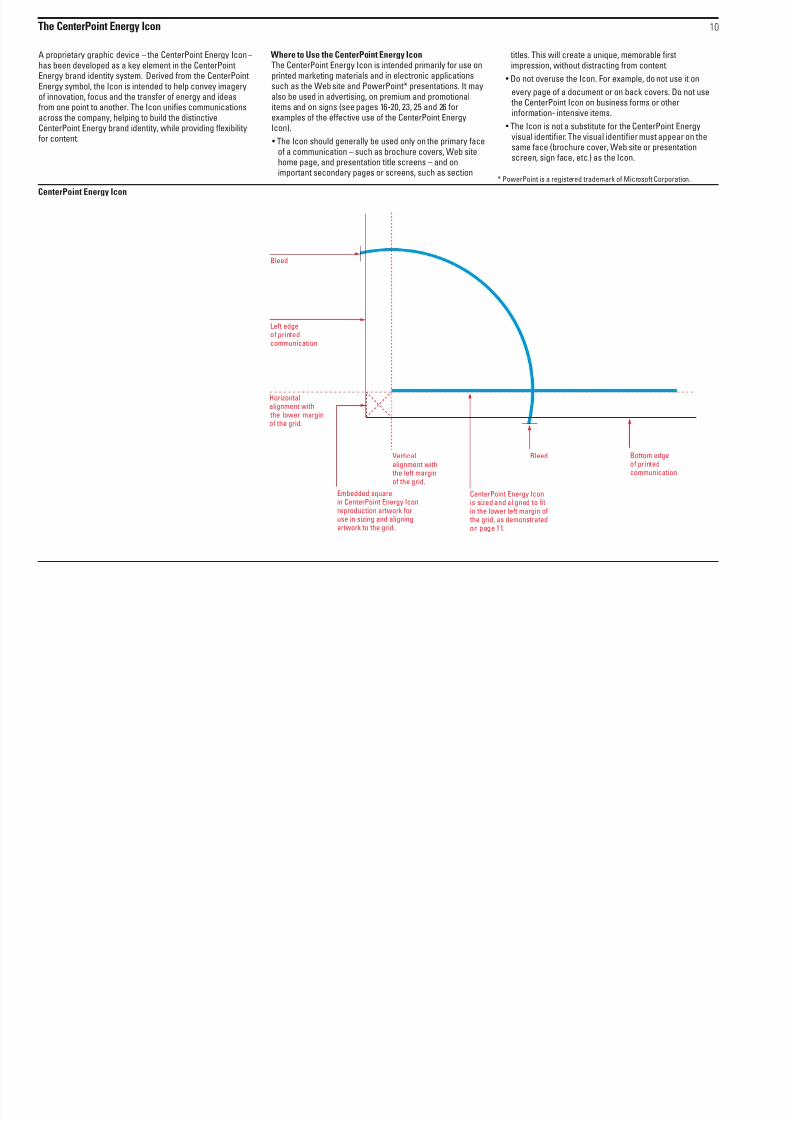
The CenterPoint Energy Icon
A proprietary graphic device – the CenterPoint Energy Icon –has been developed as a key element in the CenterPointEnergy brand identity system. Derived from the CenterPointEnergy symbol, the Icon is intended to help convey imageryof innovation, focus and the transfer of energy and ideasfrom one point to another. The Icon unifies communicationsacross the company, helping to build the distinctiveCenterPoint Energy brand identity, while providing flexibilityfor content.
Where to Use the CenterPoint Energy IconThe CenterPoint Energy Icon is intended primarily for use onprinted marketing materials and in electronic applicationssuch as the Web site and PowerPoint* presentations. It mayalso be used in advertising, on premium and promotionalitems and on signs (see pages 16-20, 23, 25 and 26 forexamples of the effective use of the CenterPoint EnergyIcon).
• The Icon should generally be used only on the primary faceof a communication – such as brochure covers, Web sitehome page, and presentation title screens – and onimportant secondary pages or screens, such as section
titles. This will create a unique, memorable firstimpression, without distracting from content.
• Do not overuse the Icon. For example, do not use it on
every page of a document or on back covers. Do not use
the CenterPoint Icon on business forms or otherinformation- intensive items.
• The Icon is not a substitute for the CenterPoint Energyvisual identifier. The visual identifier must appear on thesame face (brochure cover, Web site or presentationscreen, sign face, etc.) as the Icon.
* PowerPoint is a registered trademark of Microsoft Corporation.
10
CenterPoint Energy Icon
Bottom edgeof printedcommunication
Bleed
Left edgeof printedcommunication
Bleed
Verticalalignment with the left marginof the grid.
Embedded square
in CenterPoint Energy Iconreproduction artwork foruse in sizing and aligningartwork to the grid.
Horizontal
alignment with the lower marginof the grid.
CenterPoint Energy Icon
is sized and aligned to fitin the lower left margin of the grid, as demonstratedon page 11.
8/6/2019 Cnp Brand Guidelines 1104
http://slidepdf.com/reader/full/cnp-brand-guidelines-1104 13/29
The CenterPoint Energy Icon
• Do not use the Icon if it cannot be placed in its specifiedposition and size, or if the circular line in the Icon cannotbleed off the edge of the face of the communication.
• The Icon may be placed over a photograph or illustration.Do not place it over headlines or other typography, but itmay run behind a headline or other typography as long as itdoes not interfere with readability.
11
5-1/2" x 8-1/2" Brochure Cover8-1/2" x 11" Brochure Cover
CenterPointEnergyBlue Icon
8-1/2" x 3-3/4" Brochure Cover/Billing Insert/Notice
A grid system – a system ofevenly spaced, imaginary linesused to align information andother visual elements – hasbeen developed for CenterPointEnergy marketing and customer
communications. Consistent useof the grid system will help giveour communications adistinctive, coordinated identity.See pages 17-20 for a fullerexplanation of the grid system.
Gradation of CenterPointEnergy Blue Icon
Gradation of CenterPointEnergy Blue Icon
3-3/4" x 8-1/2" Brochure Cover
CenterPointEnergyBlue Icon
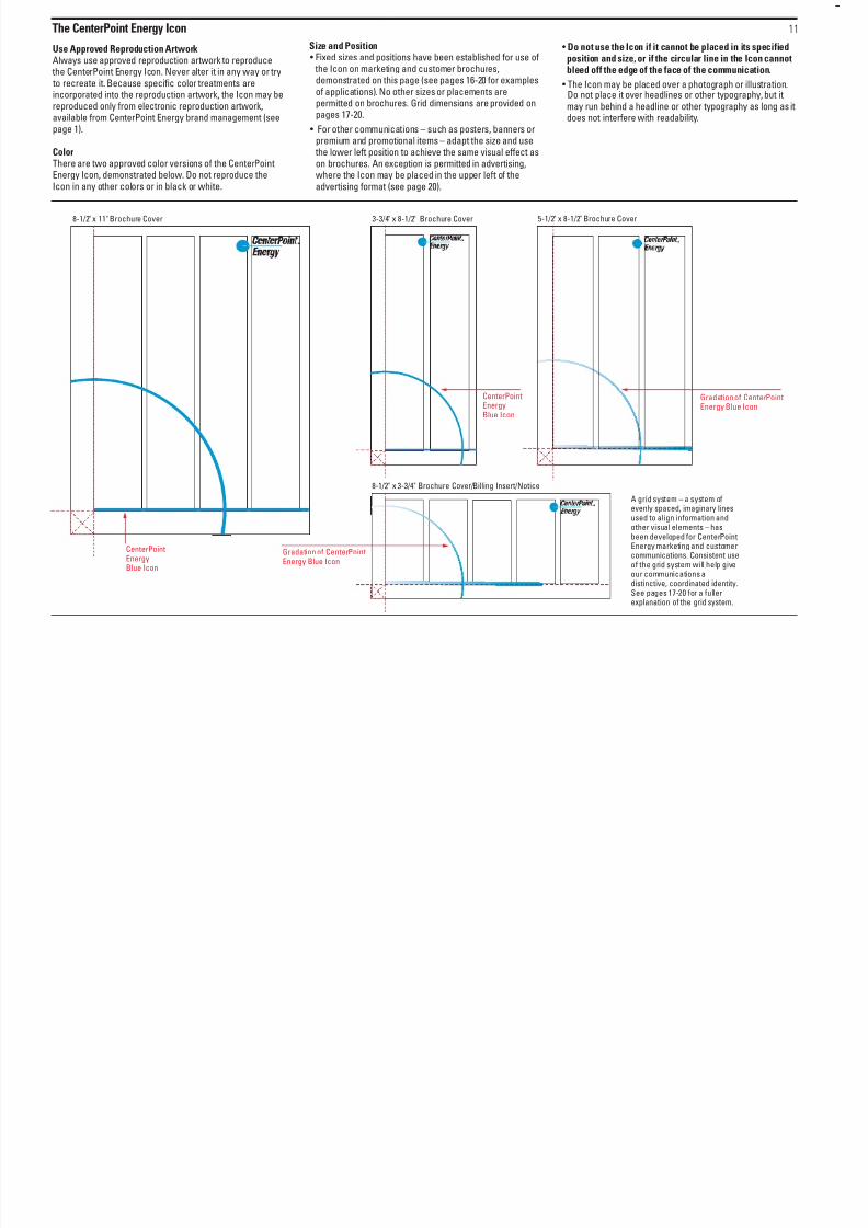
Use Approved Reproduction ArtworkAlways use approved reproduction artwork to reproduce
the CenterPoint Energy Icon. Never alter it in any way or try to recreate it. Because specific color treatments areincorporated into the reproduction artwork, the Icon may bereproduced only from electronic reproduction artwork,available from CenterPoint Energy brand management (seepage 1).
ColorThere are two approved color versions of the CenterPointEnergy Icon, demonstrated below. Do not reproduce theIcon in any other colors or in black or white.
Size and Position• Fixed sizes and positions have been established for use of the Icon on marketing and customer brochures,demonstrated on this page (see pages 16-20 for examplesof applications). No other sizes or placements arepermitted on brochures. Grid dimensions are provided on
pages 17-20.
• For other communications – such as posters, banners orpremium and promotional items – adapt the size and use
the lower left position to achieve the same visual effect ason brochures. An exception is permitted in advertising,where the Icon may be placed in the upper left of theadvertising format (see page 20).
8/6/2019 Cnp Brand Guidelines 1104
http://slidepdf.com/reader/full/cnp-brand-guidelines-1104 14/29
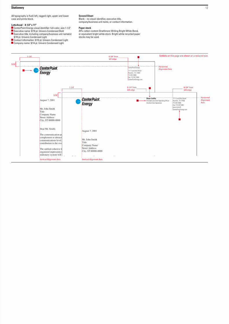
Stationery
All typography is flush left, ragged right, upper and lowercase and prints black.
Letterhead – 8-1/2" x 11"CenterPoint Energy visual identifier: full-color, size 1-1/2"Executive name: 9/10 pt. Univers Condensed BoldExecutive title, including company/business unit name(s):9/10 pt. Univers Condensed LightContact information: 9/10 pt. Univers Condensed LightCompany name: 9/14 pt. Univers Condensed Light
Second SheetBlank – no visual identifier, executive title,company/business unit name, or contact information.
Paper stock25% cotton content Strathmore Writing Bright White Bond,or equivalent bright white stock. Bright white recycled paperstocks may be used.
12
1
2
3
4
5
August 7, 2001
Mr. John Smith
Title
Company Name
Street AddressCity, ST 00000-0000
Dear Mr. Smith:
The communication potential of a letter goes beyond its content. Just as the frame of a picture can
complement or detract from the picture itself, so the letterhead design plays a role at the personal
communications level. Choice of typewriter face, paper, and typing format also make a large
contribution to the over all impression upon the reader.
The unified cohesive look for the stationery items will enable the firm to benefit from a positive,
organized impression made on all audiences who receive our correspondence. The success of the
stationery system will depend largely on the consistency with which it is implemented. Adherence
August 7, 2001
Mr. John Smith
Title
Company NameStreet Address
City, ST 00000-0000
1111 Louisiana Street
Houston, TX 77002
713 207 0000
Fax: 713 207 0000
dean.liollio@
CenterPointEnergy.com
CenterPoint Energy
1111 Louisiana Street
Houston, TX 77002
713 207 3000
Fax: 713 207 3900
CenterPointEnergy.com
Dean LiollioPresident and Chief Operating Officer
Southern Gas Operations
HorizontalAlignment Axis
Vertical Alignment AxisVertical Alignment Axis
1-1/4" 6-3/4" from
left edge
5/16"
Exhibits on this page are shown at a reduced size.
1
3
HorizontalAlignmentAxis
1-1/4" 6-3/4" fromleft edge
5/16"
5-1/4" fromleft edge2
5
4
8/6/2019 Cnp Brand Guidelines 1104
http://slidepdf.com/reader/full/cnp-brand-guidelines-1104 15/29
Stationery 13
Exhibits on this page are shown at actual size.
Mr. John Smith
Title
Company Name
Street AddressCity, ST 00000-0000
HorizontalAlignmentAxis
Vertical
Alignment Axis
Vertical Alignment Axis
Vertical Alignment Axis
HorizontalAlignmentAxis
HorizontalAlignmentAxis
1" 3-1/4" from
left edge
5/16"
Gary CernyPresident andChief Operating OfficerMinnesota Gas
800 La Salle Ave.Minneapolis, MN 55459-0038612 372 0000Fax: 612 372 0000
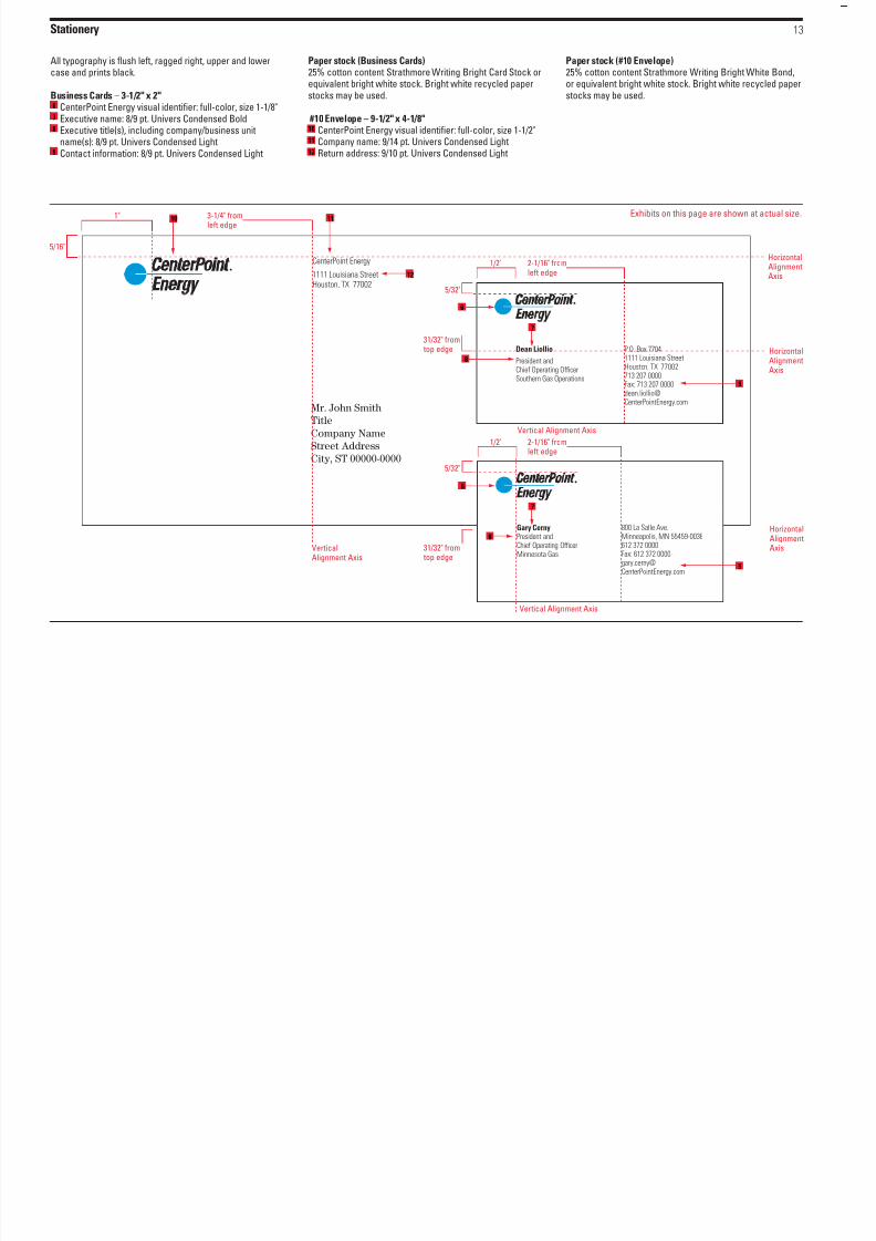
All typography is flush left, ragged right, upper and lowercase and prints black.
Business Cards – 3-1/2" x 2"CenterPoint Energy visual identifier: full-color, size 1-1/8"
Executive name: 8/9 pt. Univers Condensed BoldExecutive title(s), including company/business unitname(s): 8/9 pt. Univers Condensed LightContact information: 8/9 pt. Univers Condensed Light
Paper stock (Business Cards)25% cotton content Strathmore Writing Bright Card Stock orequivalent bright white stock. Bright white recycled paperstocks may be used.
#10 Envelope – 9-1/2" x 4-1/8"CenterPoint Energy visual identifier: full-color, size 1-1/2"Company name: 9/14 pt. Univers Condensed LightReturn address: 9/10 pt. Univers Condensed Light
Paper stock (#10 Envelope)25% cotton content Strathmore Writing Bright White Bond,or equivalent bright white stock. Bright white recycled paperstocks may be used.
6
7
8
9
10
11
12
CenterPoint Energy
1111 Louisiana StreetHouston, TX 77002
P.O. Box 77041111 Louisiana StreetHouston, TX 77002713 207 0000Fax: 713 207 [email protected]
Dean Liollio
President andChief Operating OfficerSouthern Gas Operations
1/2" 2-1/16" from
left edge
5/32"
31/32" from
top edge
8
6
6
10 11
7
7
9
8
12
9
1/2" 2-1/16" fromleft edge
5/32"
31/32" from top edge
St ti
8/6/2019 Cnp Brand Guidelines 1104
http://slidepdf.com/reader/full/cnp-brand-guidelines-1104 16/29
Stationery
All typography is flush left, ragged right, upper and lowercase and prints black.
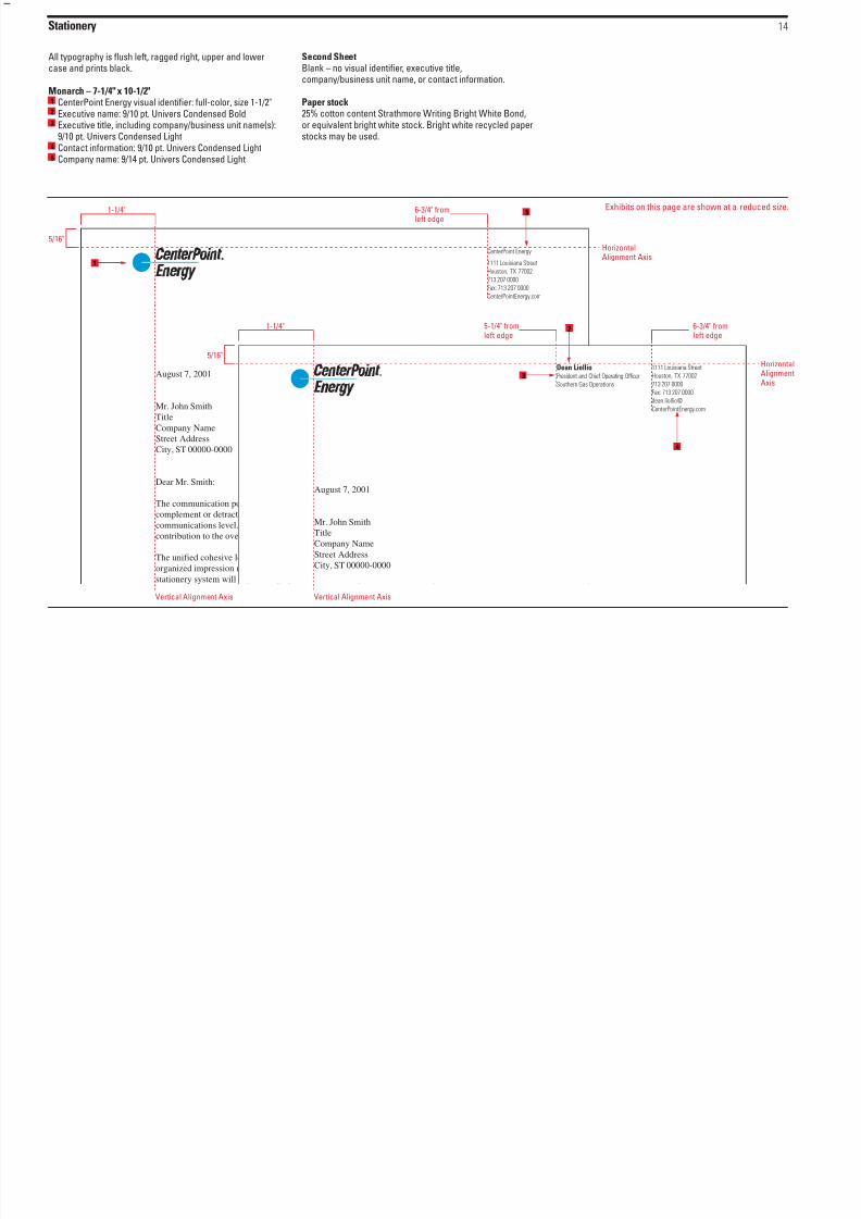
Monarch – 7-1/4" x 10-1/2"CenterPoint Energy visual identifier: full-color, size 1-1/2"
Executive name: 9/10 pt. Univers Condensed BoldExecutive title, including company/business unit name(s):9/10 pt. Univers Condensed LightContact information: 9/10 pt. Univers Condensed LightCompany name: 9/14 pt. Univers Condensed Light
Second SheetBlank – no visual identifier, executive title,company/business unit name, or contact information.
Paper stock
25% cotton content Strathmore Writing Bright White Bond,or equivalent bright white stock. Bright white recycled paperstocks may be used.
14
1
23
4
5
August 7, 2001
Mr. John Smith
Title
Company Name
Street AddressCity, ST 00000-0000
Dear Mr. Smith:
The communication potential of a letter goes beyond its content. Just as the frame of a picture can
complement or detract from the picture itself, so the letterhead design plays a role at the personal
communications level. Choice of typewriter face, paper, and typing format also make a large
contribution to the over all impression upon the reader.
The unified cohesive look for the stationery items will enable the firm to benefit from a positive,
organized impression made on all audiences who receive our correspondence. The success of the
stationery system will depend largely on the consistency with which it is implemented. Adherence
August 7, 2001
Mr. John Smith
Title
Company Name
Street Address
City, ST 00000-0000
1111 Louisiana Street
Houston, TX 77002
713 207 0000
Fax: 713 207 0000
dean.liollio@
CenterPointEnergy.com
CenterPoint Energy
1111 Louisiana Street
Houston, TX 77002
713 207 0000
Fax: 713 207 0000
CenterPointEnergy.com
Dean LiollioPresident and Chief Operating Officer
Southern Gas Operations
HorizontalAlignment Axis
Vertical Alignment AxisVertical Alignment Axis
1-1/4" 6-3/4" from
left edge
5/16"
Exhibits on this page are shown at a reduced size.
1
3
HorizontalAlignmentAxis
1-1/4" 6-3/4" fromleft edge
5/16"
5-1/4" fromleft edge 2
5
4

8/6/2019 Cnp Brand Guidelines 1104
http://slidepdf.com/reader/full/cnp-brand-guidelines-1104 17/29

8/6/2019 Cnp Brand Guidelines 1104
http://slidepdf.com/reader/full/cnp-brand-guidelines-1104 18/29
M k i d C C i i / " " F
8/6/2019 Cnp Brand Guidelines 1104
http://slidepdf.com/reader/full/cnp-brand-guidelines-1104 19/29
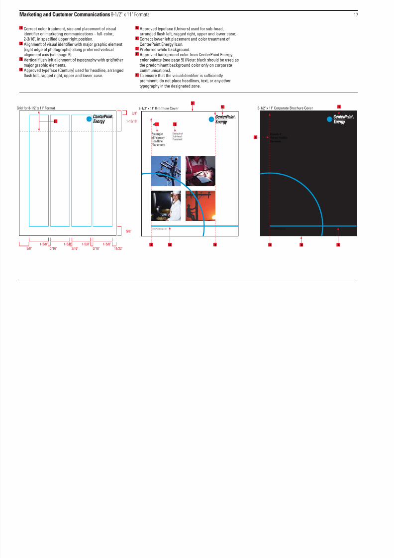
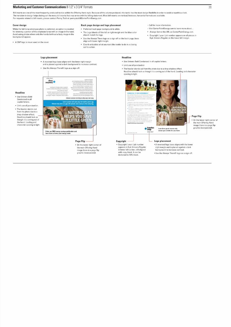
Marketing and Customer Communications 8-1/2" x 11" Formats
Correct color treatment, size and placement of visualidentifier on marketing communications – full-color,2-3/16", in specified upper right position.Alignment of visual identifier with major graphic element(right edge of photographs) along preferred verticalalignment axis (see page 5).Vertical flush left alignment of typography with grid/othermajor graphic elements.Approved typeface (Century) used for headline, arrangedflush left, ragged right, upper and lower case.
Approved typeface (Univers) used for sub-head,arranged flush left, ragged right, upper and lower case.Correct lower left placement and color treatment ofCenterPoint Energy Icon.Preferred white background.Approved background color from CenterPoint Energycolor palette (see page 9) (Note: black should be used as
the predominant background color only on corporatecommunications).To ensure that the visual identifier is sufficientlyprominent, do not place headlines, text, or any other
typography in the designated zone.
17
1
3
6
7
8
9
4
5
2
23
17
4 5
61-5/8"5/8" 3/16"
1-5/8"3/16"
1-5/8"3/16"
1-5/8"
3/8"
11/32"
5/8"
1-13/16"9
Grid for 8-1/2" x 11" Format 8-1/2" x 11" Brochure Cover 8-1/2" x 11" Corporate Brochure Cover
CenterPointEnergy.com
Example of
Primary Headline
Placement
CenterPointEnergy.com
Exampleof Primary HeadlinePlacement
Example ofSub-headPlacement
4
3 6
1
8
Marketing and Customer Communications 3-3/4" x 8-1/2" Formats 18

8/6/2019 Cnp Brand Guidelines 1104
http://slidepdf.com/reader/full/cnp-brand-guidelines-1104 20/29
Marketing and Customer Communications 3-3/4 x 8-1/2 Formats
Correct color treatment, size and placement of visualidentifier on marketing communications – full-color,1-9/16", in upper right, aligned flush left on a grid line.Vertical flush left alignment of typography.Approved typeface (Century) used for headline, arranged
flush left, ragged right, upper and lower case.Approved typeface (Univers) used for sub-head,arranged flush left, ragged right, upper and lower case.
Correct lower left placement and color treatment ofCenterPoint Energy Icon.Alignment of visual identifier with other graphic element(left edge of contact information) along preferred verticalalignment axis (see page 5).
Approved typeface (Univers) used for contact information.Preferred white background.To ensure that the visual identifier is sufficientlyprominent, do not place headlines, text or any other
typography in the designated zone.
18
1
2
3
5
6
78
9
4
Grid for 3-3/4" x 8-1/2" Format 3-3/4" x 8-1/2" Brochure Cover 3-3/4" x 8-1/2" Brochure Cover 3-3/4" x 8-1/2" Brochure Cover (Back)
Example of Primary HeadlinePlacement
Example ofSub-headPlacement
CenterPointEnergy.com
1111 Louisiana Street
Houston, TX 77002
713 207 3000
CenterPointEnergy.com
Example of
Primary HeadlinePlacement
CenterPointEnergy.com
2 5 8 852 6
3
3
4
1 1
7
1
1-13/32"1/2" 3/16"
1-13/32"1/4"
1/2"
5/16"
1-5/16"9
Marketing and Customer Communications 5 1/2" x 8 1/2" Formats 19

8/6/2019 Cnp Brand Guidelines 1104
http://slidepdf.com/reader/full/cnp-brand-guidelines-1104 21/29
Marketing and Customer Communications 5-1/2 x 8-1/2 Formats
Correct color treatment, size and placement of visualidentifier on marketing communications – full-color, 1-5/8",in specified upper right position.Alignment of visual identifier with major graphic element(left edge of photograph) along preferred vertical
alignment axis (see page 5).Vertical flush left alignment of typography with other majorgraphic elements.Approved typeface (Century) used for headline, arrangedflush left, ragged right, upper and lower case.
Correct lower left placement and color treatment ofCenterPoint Energy Icon.Approved background color from CenterPoint Energycolor palette (see page 9).Preferred white background.
To ensure that the visual identifier is sufficientlyprominent, do not place headlines, text or any other
typography in the designated zone.
19
1
4
5
6
7
8
2
3
Grid for 5-1/2" x 8-1/2" Format 5-1/2" x 8-1/2" Brochure Cover
CenterPointEnergy.com
4
1
3 51-7/16" 1-7/16" 1-7/16"
9/16" 3/16" 3/16" 3/16"
5-1/2" x 8-1/2" Brochure Cover
CenterPointEnergy.com
4
1
3 25 6 7
9/16"
3/8"
1-7/16"8
8/6/2019 Cnp Brand Guidelines 1104
http://slidepdf.com/reader/full/cnp-brand-guidelines-1104 22/29

8/6/2019 Cnp Brand Guidelines 1104
http://slidepdf.com/reader/full/cnp-brand-guidelines-1104 23/29
22

8/6/2019 Cnp Brand Guidelines 1104
http://slidepdf.com/reader/full/cnp-brand-guidelines-1104 24/29
The sample template below is for small space advertising.
For approved branding and marketing ads, please contact:Melissa RuizVoice: 713. 207.6308
Fax: 713. 207.0640E-mail: [email protected]
Horizontal small ad template
Photography
©2009 CenterPoint Energy 90451
Logo placement
Use the Always There logo as a sign off.
Copyright
Copyright / year / job number appears in 6 pt.Univers Regular in lower left corner, left alignedwith copy block. It can be darkened to 50% black.
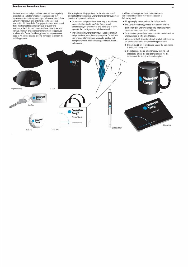
Premium and Promotional Items 23
8/6/2019 Cnp Brand Guidelines 1104
http://slidepdf.com/reader/full/cnp-brand-guidelines-1104 25/29
Because premium and promotional items are used regularlyby customers and other important constituencies, theyrepresent an important opportunity to raise awareness of theCenterPoint Energy brand and make a lasting, positiveimpression. All CenterPoint Energy premium and promotional
items must reflect the same high level of quality andattention to detail that our customers have come to expectfrom us. Premium and promotional items must be approvedin advance by CenterPoint Energy brand management (seepage 1). An on-line catalog is being developed to simplify theordering process.
The examples on this page illustrate the effective use ofelements of the CenterPoint Energy brand identity system onpremium and promotional items.
• On premium and promotional items only, in addition to
approved colors, the CenterPoint Energy visual
identifiers may be presented in one-color gold or silver
against a dark background or blind embossed.
• The CenterPoint Energy Icon may be used on premium
and promotional items, but the appropriate CenterPoint
Energy visual identifier must always be used as well
(except for jewelry and business apparel such as ties
and scarves).
In addition to the approved Icon color treatments,one-color gold and silver may be used against adark background.
• All typography should be from the Univers family.
• The CenterPoint Energy symbol may be used without the CenterPoint Energy logotype only on small jewelryitems, such as a lapel pin or cufflinks.
• On embroidery, the official thread color for the CenterPointEnergy symbol is 1297 Blue-Madeira.
• When using the (registered mark symbol) with the logoon promotional items, use the following discretion:
1. Include the on all print items, unless the size makesit difficult to clearly read.
2. Do not include the on embroidery, etching and
T-ShirtAdjustable Cap
C e n t
e r P o i n t E ner g
y
Mug
Ball Point PenGolf Ball
Mouse Pad
C e n t e r P o i n
t E n e r g
y. c o m
®
Tote Bag
CenterPointEnergy.com
Key Ring
embossing unless the size is large enough for thetrademark to be legibly and neatly applied.
Supporting Color Palette - Clothing 24

8/6/2019 Cnp Brand Guidelines 1104
http://slidepdf.com/reader/full/cnp-brand-guidelines-1104 26/29
The consistent use of a coordinated color palette will help toensure that all CenterPoint Energy communications project adistinctive brand identity.
A coordinated palette of core supporting has been
developed for use in CenterPoint Energy communications.All were selected because they complement CenterPointEnergy Blue.
White(Preferred
background color)
CenterPoint EnergyBlue (PANTONE*
Process Blue is anacceptable match)
Black
Core Supporting Colors
PANTONE* 444PANTONE*Reflex Blue
PANTONE* 347PANTONE* 877 PANTONE* 5855
PANTONE* 3995 PANTONE* 3272
* Pantone, Inc.’s check-standard trademark for color reproductionand color reproduction materials.
Note: The colors shown in these guidelines are not intended to matchPANTONE color standards.
CenterPoint Energy Blue should be used only for theCenterPoint Energy Symbol in the visual identifier and for
the CenterPoint Energy Icon.
• On emro ider, the official thread color for theCenterP oint Energsmol is 1297 lue- Madeira.
• Do not include the ® on emroi der unless the si zeis large enough for the trademark to e legil andneatl applied.
• The line in the center of the CenterPoint Energ smolis alwas the same color as the ackground.
Incorrect:
Correct:
Signage 25

8/6/2019 Cnp Brand Guidelines 1104
http://slidepdf.com/reader/full/cnp-brand-guidelines-1104 27/29
Signs affect the awareness and image of the CenterPointEnergy brand. Consistent, high quality, and highly visiblesigns can result in thousands of positive exposures of ourbrand every day. Clear, consistent, easy-to-follow exteriorand interior directional signs enhance our image by making iteasier for people to find their way around our offices andother facilities.
Sign requirements vary from location to location, dependingon the size, placement and function of the sign and onarchitectural and zoning restrictions. The examples shown
on this page and page 26 will not address every situation, butwill assist you in selecting the best format and color.
To specify and order signs, see page 1.
Primary Signs – FormatsThe optimal size and position for the CenterPoint Energyvisual identifier on a sign should be determined based on thelocation of the sign, available sight lines and available space.The visual identifier should be positioned for maximumvisibility and prominence, considering traffic patterns and
the location of buildings, other signs, foliage, and otherpotential obstructions.
Create signs in simple rectangular or square formatsappropriate to the available space – do not use circular, oval,or unique shapes. Sign edges should be simple and blendwith the overall background of the sign. Do not usedecorative frames or features around signs. The minimumstaging area does not have to be maintained around thevisual identifier on signs, if the resulting increase in the sizeof the visual identifier significantly improves visibility.
Square Format
Vertical Rectangular Format
Horizontal Rectangular Format
1/2 X
1/2 X 1/2 X
1/2 X
X
Minimum Space Requirements for Signs Sign Formats
Minimum space to edge of sign.Minimum space can include thesign frame if the frame is the samecolor as the sign face.
Signage 26

8/6/2019 Cnp Brand Guidelines 1104
http://slidepdf.com/reader/full/cnp-brand-guidelines-1104 28/29
Primary Signs – Color• On internally illuminated exterior signs, the preferred color
presentation of the CenterPoint Energy visual identifier is ablue CenterPoint Energy symbol and a white CenterPointEnergy logotype on a black or very dark background. At
night, only the symbol and logotype(s) should beilluminated.• On non-internally illuminated exterior signs (for example,
surface-lit signs), the preferred color treatment is afull-color CenterPoint Energy visual identifier on a white orvery light background.
• On interior signs, the preferred color treatment is a full-colorCenterPoint Energy visual identifier on a white or very lightbackground.
CenterPoint Energy Icon on Signs
The CenterPoint Energy Icon may be used as a supportinggraphic element on square or vertical rectangular formatsigns (demonstrated below). CenterPoint Energy Blue is thepreferred color for the Icon.
Direction and Informational SignsTypography: Univers Bold, flush left, ragged right, upper andlower case.
Color: White typography against a black or very darkbackground or black typography against a white or very light
background.
All signs must be specified and ordered through the FacilitiesDepartment.
Examples
South District
Service Center
5310
Galveston Road
Internally Illuminated Monument Sign Exterior Directional Sign
Interior Directional Sign
Surface-Lit Monument Sign
Surface-Lit Monument Sign
Reception
Office Services
Marketing
Deliveries
Interior Directional Sign
Reception
Office Services
Marketing
Deliveries
Customer Service
Accounting
Research
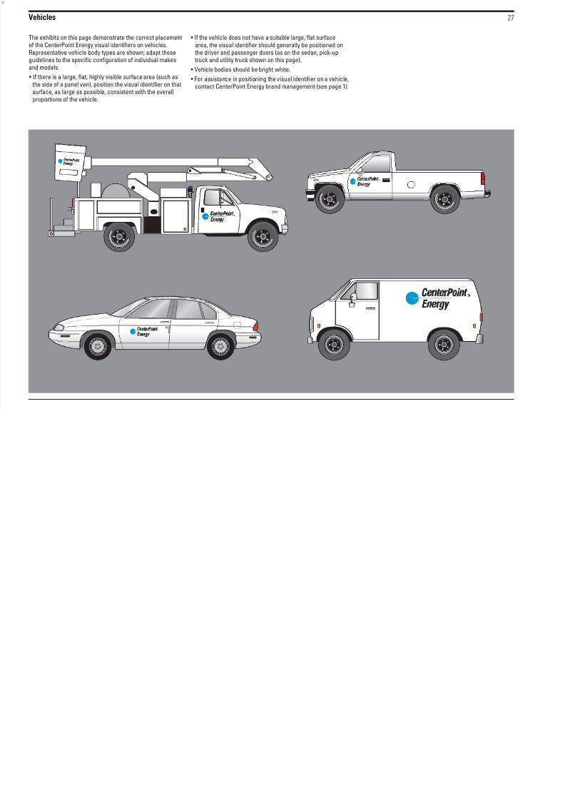
Vehicles 27
8/6/2019 Cnp Brand Guidelines 1104
http://slidepdf.com/reader/full/cnp-brand-guidelines-1104 29/29
The exhibits on this page demonstrate the correct placementof the CenterPoint Energy visual identifiers on vehicles.Representative vehicle body types are shown; adapt theseguidelines to the specific configuration of individual makesand models.
• If there is a large, flat, highly visible surface area (such as the side of a panel van), position the visual identifier on thatsurface, as large as possible, consistent with the overallproportions of the vehicle.
• If the vehicle does not have a suitable large, flat surfacearea, the visual identifier should generally be positioned on
the driver and passenger doors (as on the sedan, pick-up truck and utility truck shown on this page).
• Vehicle bodies should be bright white.
• For assistance in positioning the visual identifier on a vehicle,contact CenterPoint Energy brand management (see page 1).
3584
3584