color theory
TRANSCRIPT

The Element of ColorArt I

Color
Color immediately attracts attention. It is one of the first things we see.
Very young children will group objects by color instead of size or shape.
An interior designer may use rose-red walls to increase emotional warmth or use blue walls in a daycare to encourage calm.
Bright Yellow and Magenta may make an poster more eye-catching with contrast.
Color is a very complex but powerful Element of Art & Design .

Color theory
Color theory is the art and science of color interaction and effects.
In The Art of Color, Johannes Itten lists the following approaches to color theory.
Physics
Chemistry
Physiology
Psychology

Approaches to Color Theory
The physicist studies electromagnetic wavelength in order to measure and classify color.
The chemist works with the molecular structure of dyes and pigments, and seeks to produced highly permanent colors and excellent paint consistency.
The physiologist investigates the effects of color and light on our eyes and brain
The psychologist studies the expressive effect of color on our mind and spirit.
.

Artist Application of Color
The artist needs to take all of the approaches into consideration when using color.
Like the physicist, the artist uses color wavelengths to create various effects
Like the chemist, the artist must be aware of the safety and permanence of dyes and pigments.
When using color to create the illusion of space, the artist puts into practice theories developed by physiologist.
Communication and Expression are strongly affected by the psychological effects of color

The Psychology of Color in Logo DesignInfographic by Logo Company

Color Systems
The two major color systems we use are: Additive Colors (RGB)
Created using beams of light
Subtractive colors (RYB)
Created when white light is reflected off a pigmented or dyed surface

Additive color
Additive Colors are created using beams of light.
The primaries of Additive Color are Red, Green, and Blue.
Green + Blue = Cyan
Red + Green = Yellow
Blue + Red = Magenta
Red + Green + Blue = White
The colors you see on a computer, television screen, and projection are created by light.
Used by Lighting Designers, Videographers, and Website Artists.


Subtractive color (RGB)
Subtractive Color is created when white light is reflected off a pigmented or dyed surface.
The primaries of subtractive color are Red, Yellow and Blue.
A Red surface absorbs Yellow and Blue Light and reflects Red.
A Yellow surface absorbs Red and Blue Light and reflects Yellow.
A Blue surface absorbs Red and Yellow Light and reflects Blue.
A White surface reflects all light.
A Black surface absorbs all light.

Subtractive color (RGB)
Used by Painters, Printmakers, and Illustrators in various media –acrylic paint, oil paint, pastels, ink, etc.
Each pigment or dye used to make these materials are unique. Can be transparent or opaque – will affect blending and layering
Adding color overtones and values will increase varieties of color.
Color Overtones are a secondary hue bias in the primary color. For example, Alizarin Crimson is a red with violet overtones, while
scarlet is a Red with orange overtones.
Achromatic elements, such as Black and White, (non-colors) add value to colors.

Process colors (CMYK)
Process colors are a subtractive color system that we use in print media.
The Primaries of Process colors are Cyan (Blue), Magenta(Red), Yellow, and Black
The process color system is typically used for mass production. Each color is laid down on the paper through a separate roller.
The final image is created as the colors overlap.
Cyan Magenta Yellow Black

Color Separation in CMYK PrintingDots of cyan, magenta, yellow, and black are layered to create a full color image.

Color interaction
Color interaction is the way colors influence one another.
Colors are never seen in isolation. Depending on the associations we have with a color, lighting, and the surrounding colors, our perception of the color is affected.
A blue sheet of paper may remind us of the sky or the ocean.
Incandescent lighting may create a warm orange glow.
A blue sheet of Paper next to an orange sheet seem more vivid.
Simultaneous contrast refers to how the perception of a color is altered by a surrounding color.

Example of Simultaneous ContrastEach Pair of Boxes have the same color in the center, but the colors appear different due to the surrounding colors.

Defining colors(on the color wheel)
Hue is the name of a color, determined by its wavelength. This excludes non-color (black/white)
In the Johannes Itten Color Wheel (for subtractive colors) Primary colors are Red, Yellow, and Blue
They cannot be created by mixing.
Secondary Colors are Orange, Green, and Violet
They are created by mixing two primary colors.
Tertiary Colors are Red-Violet, Red-Orange, Yellow-Orange, Yellow Green, Blue-green, and blue-violet
They are created by mixing a primary color and a secondary color that are next to each other on the color wheel.
The names are a combination of both colors.
The Primary color’s name always comes first!

The 12 Step Itten Color WheelPrimaries (inner triangle)
Secondary (out triangles)
Tertiaries are located between the Primaries and Secondaries on the wheel.

Color Temperature
Color temperature is the heat a color generates, physically and psychologically
Usually divided into Warm colors and Cool colors.
Warm Colors – Red-Violet, Red, Orange, Yellow
Cool Colors – Green, Blue, Purple
Value – relative lightness and darkness of a color

Value
Value – relative lightness and darkness of a color Tint: Hue + White
Tone: Hue + Grey
Shade: Hue + Black
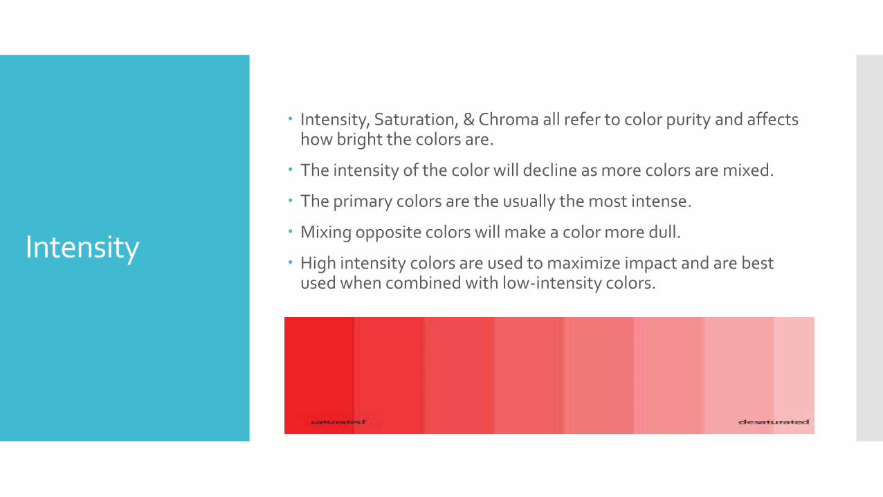
Intensity
Intensity, Saturation, & Chroma all refer to color purity and affects how bright the colors are.
The intensity of the color will decline as more colors are mixed.
The primary colors are the usually the most intense.
Mixing opposite colors will make a color more dull.
High intensity colors are used to maximize impact and are best used when combined with low-intensity colors.