colour-emotion associations in ... - bilkent · pdf filerengin insan psikolojisine etkisi...
TRANSCRIPT

COLOUR-EMOTION ASSOCIATIONS IN INTERIOR SPACES
A DISSERTATION SUBMITTED TO THE DEPARTMENT OF
INTERIOR ARCHITECTURE AND ENVIRONMENTAL DESIGN AND THE GRADUATE
SCHOOL OF ECONOMICS AND SOCIAL SCIENCES OF İHSAN DOĞRAMACI BİLKENT
UNIVERSITY IN PARTIAL FULFILLMENT OF THE
REQUIREMENTS FOR THE DEGREE OF
DOCTOR OF PHILOSOPHY IN ART, DESIGN AND ARCHITECTURE
By Elif Helvacıoğlu
July, 2011


To my parents
Oya & Kadir Helvacıoğlu

COLOUR-EMOTION ASSOCIATIONS IN INTERIOR SPACES
A DISSERTATION SUBMITTED TO THE DEPARTMENT OF
INTERIOR ARCHITECTURE AND ENVIRONMENTAL DESIGN AND THE GRADUATE
SCHOOL OF ECONOMICS AND SOCIAL SCIENCES OF İHSAN DOĞRAMACI BİLKENT
UNIVERSITY IN PARTIAL FULFILLMENT OF THE
REQUIREMENTS FOR THE DEGREE OF
DOCTOR OF PHILOSOPHY IN ART, DESIGN AND ARCHITECTURE
By Elif Helvacıoğlu
July, 2011

ii
iii
ABSTRACT
COLOUR-EMOTION ASSOCIATIONS IN INTERIOR SPACES
Elif Helvacıoğlu
Ph.D. in Art, Design and Architecture
Supervisor: Assist. Prof. Dr. Nilgün Olguntürk
July, 2011
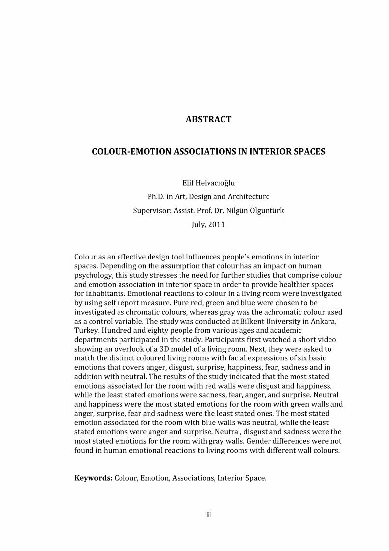
Colour as an effective design tool influences people’s emotions in interior spaces. Depending on the assumption that colour has an impact on human psychology, this study stresses the need for further studies that comprise colour and emotion association in interior space in order to provide healthier spaces for inhabitants. Emotional reactions to colour in a living room were investigated by using self report measure. Pure red, green and blue were chosen to be investigated as chromatic colours, whereas gray was the achromatic colour used as a control variable. The study was conducted at Bilkent University in Ankara, Turkey. Hundred and eighty people from various ages and academic departments participated in the study. Participants first watched a short video showing an overlook of a 3D model of a living room. Next, they were asked to match the distinct coloured living rooms with facial expressions of six basic emotions that covers anger, disgust, surprise, happiness, fear, sadness and in addition with neutral. The results of the study indicated that the most stated emotions associated for the room with red walls were disgust and happiness, while the least stated emotions were sadness, fear, anger, and surprise. Neutral and happiness were the most stated emotions for the room with green walls and anger, surprise, fear and sadness were the least stated ones. The most stated emotion associated for the room with blue walls was neutral, while the least stated emotions were anger and surprise. Neutral, disgust and sadness were the most stated emotions for the room with gray walls. Gender differences were not found in human emotional reactions to living rooms with different wall colours. Keywords: Colour, Emotion, Associations, Interior Space.

iv
ÖZET
İÇ MEKÂNLARDA RENK-DUYGU İLİŞKİLENDİRMELERİ
Elif Helvacıoğlu
Güzel Sanatlar, Tasarım ve Mimarlık Fakültesi
Doktora Çalışması
Danışman: Yrd. Doç. Dr. Nilgün Olguntürk
Temmuz, 2011
Renk, etkili bir tasarım aracı olarak, iç mekânlarda insanların duygularını etkiler. Rengin insan psikolojisine etkisi olduğu varsayımına dayanarak, bu çalışma insanlara daha sağlıklı mekânların sağlanması için, iç mekânlarda renk ve duygu ilişkisine dair çalışmaların geliştirilmesi gerekliliğini vurgular. Oturma odalarında renge verilen duygusal tepkiler özbildirim ölçekleri kullanılarak incelenmiştir. Çalışma için kromatik renkler olarak saf kırmızı, yeşil ve mavi seçilmiş iken, akromatik renk olarak gri kontrol değişkeni olarak kullanılmıştır. Çalışma Bilkent Üniversitesi, Ankara, Türkiye’de yürütülmüştür. Çalışmaya farklı yaş ve akademik bölümlerden olmak üzere yüz seksen kişi katılmıştır. Katılımcılara öncelikle 3 boyutlu olarak modellenmiş bir oturma odasına bakışı gösteren kısa bir video izlettirilmiştir. Daha sonra katılımcılardan farklı renklerdeki oturma odalarını kızgınlık, iğrenme, şaşkınlık, mutluluk, korku, üzüntü ve ek olarak nötr duygularını temsil eden yüz ifadeleri ile eşleştirmeleri istenmiştir. Çalışma sonuçlarına göre kırmızı duvarlı oda ile en çok eşleştirilen duygular iğrenme ve mutluluk iken, en az eşleştirilen duygular üzüntü, korku, kızgınlık ve şaşkınlıktır. Nötr ve mutluluk, yeşil duvarlı oda ile en çok eşleştirilirken, üzüntü, korku, kızgınlık ve şaşkınlık en az eşleştirilen duygulardır. Mavi duvarlı oda ile en çok eşleştirilen duygu nötr iken, en az eşleştirilen duygular kızgınlık ve şaşkınlıktır. Nötr, iğrenme ve üzüntü gri duvarlı oda ile en çok eşleştirilen duygulardır. Farklı duvar renklerindeki oturma odalarına verilen duygusal tepkilerde cinsiyete dayalı farklılıklar bulunmamıştır. Anahtar Kelimeler: Renk, Duygu, İlişkilendirme, İç mekân.

v
ACKNOWLEDGEMENTS
I am heartily thankful to my advisor Assist. Prof. Dr Nilgün Olguntürk who introduced me into a colourful world. I would like to express my gratitude to her for the continuous support of my Ph.D. study and research from the initial to the final level. Without her motivation, enthusiasm, and immense knowledge, this dissertation would not have been possible. I wish to keep up any collaboration in our colourful world in the future. I am honoured to thank my committee member Prof. Dr. Halime Demirkan whose encouragement, advice and crucial contribution throughout my graduate and Ph.D. studies I will never forget. I wish also show my appreciation to Assoc. Prof. Dr. Çiğdem Erbuğ as another member of my committee for her valuable and generous suggestions during the preparation process of this dissertation. I owe my deepest gratitude to Assist. Prof. Dr. Meltem Gürel and Assist. Prof. Dr. Güler Ufuk Demirbaş, for their critical comments regarding the finalization of the dissertation. Besides, I would like to express my appreciation to Dr. Dilek Güvenç for her suggestions throughout the statistical analyses of the thesis. I would like to extend my heartfelt gratitude to my dearest friend Segah Sak who patiently was with me from the very beginning of my academic adventure. You were such a wonderful motivator even when coping seemed tough for me. I will never forget out entertaining conversations that evoked wonderful ideas. I owe my gratitude to İnci Cantimur for patiently helping me to create the virtual spaces for my study. In addition, special thanks go to Aslı Çebi, Seden Odabaşıoğlu and Nalan İnalhars for their friendship and moral support. My deepest gratitude goes to my parents Oya and Kadir Helvacıoğlu for their unconditional support. I am very honoured and lucky to have you as my parents. Thank you for giving me chances to prove and improve myself through all my walks of life. Moreover, I would like to give my sincere thanks to my wonderful family Cem and Didem Helvacıoğlu, Sibel and Bahtiyar Yıldız for their invaluable support and trust. Last but not least, I am greatly indebted to my fiancé Alpaslan Güneş for his unflagging love, trust and encouragement in my life. You will always be the most special of my life.
vi
TABLE OF CONTENTS
SIGNATURE PAGE .............................................................................................................................ii
ABSTRACT ..........................................................................................................................................iii
ÖZET ............................................................................................................................. .........................iv
ACKNOWLEDGEMENTS .................................................................................................................v
TABLE OF CONTENTS ....................................................................................................................vi
LIST OF TABLES ............................................................................................................................. ....x
LIST OF FIGURES .............................................................................................................................xv
1. INTRODUCTION 1
1.1. Aim of the Study ..................................................................................................3
1.2. The General Structure of the Dissertation ...............................................4
2. EMOTION 6 2.1. About Emotion .....................................................................................................6
2.1.1. Definition of Emotion .................................................................................6
2.1.2. Related Phenomena .....................................................................................7
2.1.3. Emotion States and Traits ......................................................................10
2.2. Process of Emotion ..........................................................................................11
2.2.1. The Category of Emotion .......................................................................11
2.2.2. Components of Emotions ......................................................................13
2.2.3. The Sequence of Emotion .......................................................................18
2.3. Influences of Emotion on Human Beings ...............................................22
2.4. Universals of Emotion .....................................................................................25
2.5. Measuring Emotion ..........................................................................................26
2.5.1. Self Reports of Subjective Experience ..............................................28
2.5.2. Observer Ratings of Emotion ................................................................39
vii
2.5.3. Facial Measures of Emotion ..................................................................39
2.5.4. Vocal Measures of Emotion ...................................................................40
2.5.5. Physiological Measures of Emotion ...................................................41
3. COLOUR BASICS 43
3.1. Colour: A Definition ..........................................................................................43
3.2. Basic Colour Terminology .............................................................................44
3.3. Colour Order Systems ......................................................................................45
3.3.1. Munsell Colour System ............................................................................46
3.3.2. Natural Colour System (NCS) ...............................................................51
3.3.3. CIELAB ...........................................................................................................56
3.3.4. RGB Colour Model .....................................................................................61
3.4. The Nature of Colour ........................................................................................66
3.4.1. Colour in Physiology .................................................................................66
3.4.2. Colour in Psychology ................................................................................68
4. COLOUR AND EMOTION 69
4.1. Symbolic Associations of Colour – Colour Meanings .........................69
4.2. Empirical Implementations of Colour and Emotion ..........................76
5. COLOUR, INTERIOR SPACE AND EMOTION 84 5.1. Interior Space ......................................................................................................84
5.2. Emotional Response to Colour in Interior Spaces ...............................85
6. THE EXPERIMENT 88
6.1. Aim of the Study ................................................................................................88
6.1.1. Research Questions ...................................................................................89
6.1.2. Hypotheses ...................................................................................................89
6.2. Method of the Study ........................................................................................90
6.2.1. Sample Group ..............................................................................................90

viii
6.2.2. Setting Description ....................................................................................92
6.2.3. Procedures ....................................................................................................96
6.2.3.1. Selecting the Function ................................................96
6.2.3.2. Specifying the Colours ...............................................98
6.2.3.3. Creating the Interior Space ...................................100
6.2.3.4. Phases of the Experiment .....................................101
7. FINDINGS 105 7. 1. 1st Experiment Set – Red Room .................................................................107
7.1.1. Red Room .................................................................................................107
7.1.2. Gray Room ................................................................................................110
7.2. 2nd Experiment Set – Green Room ............................................................112
7.2.1. Green Room .............................................................................................113
7.2.2. Gray Room ................................................................................................115
7.3. 3rd Experiment Set – Blue Room ................................................................118
7.3.1. Blue Room ................................................................................................118
7.3.2. Gray Room ................................................................................................120
8. DISCUSSION 123
9. CONCLUSION 131
REFERENCES 136 APPENDICES 146
APPENDIX A. Descriptions and Images of Action Units
Defined in the Facial Acton Coding System (FACS)
by Paul Ekman, Wallace V. Friesen ............................................146
Appendix A1. Descriptions and Images of Action Units ..................147
Appendix A.2. Prototypical Patterns of Facial
Expressions of Basic Emotions .....................................154
APPENDIX B. Descriptions of the Sample Group .............................................155

ix
APPENDIX C. Setting of the Experiment ..............................................................157
APPENDIX D. Interior Spaces Used in the Experiment .................................159
APPENDIX E. The Questionnaire ............................................................................162
Appendix E.1. The Questionnaire (in Turkish) ...................................163
Appendix E.2. The Questionnaire (in English) ....................................165
APPENDIX F. Information about the Study ........................................................167
Appendix F.1. Information about the Study (in Turkish) ...............168
Appendix F.2. Information about the Study (in English) ................169
APPENDIX G. Facial Expressions of Basic Emotions used in the
Experiment ...........................................................................................170
APPENDIX H. Data Analyses ......................................................................................172

x
LIST OF TABLES
Table 4.1. Emotional associations of colour in the literature .....................................83
Table 6.1. Distribution of the departments .........................................................................91
Table 6.2. Selected colours from RGB additive colour model ..................................100
Table 6.3. Experiment sets showing the number of participants with the
sequence of colours ...............................................................................................103
Table 7.1. The frequency distribution of emotions on the coloured rooms ......106
Table 8.1. Mostly associated emotions with gray room .............................................129
Table 8.2. Mostly associated emotions with chromatic rooms ……………………..129
Table 9.1. Mostly associated emotions with living rooms .........................................135
Table A.1. Descriptions and images of action units ......................................................147
Table A.2. Prototypical patterns of facial expressions (Ekman and Friesen,
1978) ...........................................................................................................................154
Table B.1. Descriptive statistics showing the mean age of the sample group ...156
Table B.2. Sample’s distribution on the basis of age ....................................................156 Table B.3. Computer usage of the sample group ............................................................156 Table B.4. Computer Usage Frequency of the sample group ....................................156 Table H.1. Statistics of the sequence of showing coloured room for
red room ....................................................................................................................173
Table H.2. Independent Samples t-Test results for sequence differences on
emotional reactions to red room ......................................................................173

xi
Table H.3. Statistics for gender differences for red room ..........................................173 Table H.4. Independent Samples t-Test for gender differences on emotional
reactions to red room ............................................................................................173
Table H.5. Frequency of emotions associated with red room in respect to
male gender group ..................................................................................................174
Table H.6. Frequency of emotions associated with red room in respect to
female gender group .............................................................................................174
Table H.7. Chi-square goodness-of-fit test for emotion association
to red room ................................................................................................................175
Table H.8. Frequency of emotions associated with red room ..................................175
Table H.9. Statistics of the sequence of showing gray room .....................................175
Table H.10. Independent Samples t-Test results for sequence differences on
emotional reactions to gray room ....................................................................176
Table H.11. Statistics for gender differences for gray room in the first
experiment set ..........................................................................................................176
Table H.12. Independent Samples t-Test for gender differences on emotional
reactions to gray room in the first experiment set ...................................176
Table H.13. Frequency of emotions associated with gray room in respect
to male gender group in the first experiment set ......................................177
Table H.14. Frequency of emotions associated with gray room in respect
to female gender group in the first experiment set ..................................177
Table H.15. Chi-square goodness-of-fit test for emotion association
to gray room in the first experiment set .......................................................178
Table H.16. Frequency of emotions associated with gray room in the first
experiment set ..........................................................................................................178

xii
Table H.17. Paired Samples t-Test for emotional association differences
between red room and gray room ...................................................................179
Table H.18. Statistics of the sequence of showing coloured rooms for
green room ................................................................................................................179
Table H.19. Independent Samples t-Test results for sequence differences
on emotional reactions to green room ...........................................................179
Table H.20. Frequency of emotions associated with green room in respect to
showing order (viewed after gray room) .....................................................180
Table H.21. Frequency of emotions associated with green room in respect to
showing order (viewed before gray room) ..................................................180
Table H.22. Statistics for gender differences for green room ..................................180
Table H.23. Independent Samples t-Test for gender differences on emotional
reactions to green room .......................................................................................181
Table H.24. Frequency of emotions associated with green room in respect to
male gender group ..................................................................................................181
Table H.25. Frequency of emotions associated with green room in respect to
female gender group ..............................................................................................181
Table H.26. Chi-square goodness-of-fit test for emotion association to green
room (first experience green room) ...............................................................182
Table H.27. Statistics of the sequence of showing coloured room
for gray room ............................................................................................................182
Table H.28. Independent Samples t-Test results for sequence differences on
emotional reactions to gray room ....................................................................182
Table H.29. Statistics for gender differences for gray room in the second
experiment set ..........................................................................................................183

xiii
Table H.30. Independent Samples t-Test for gender differences on emotional
reactions to gray room in the second experiment set .............................183
Table H.31. Frequency of emotions associated with gray room in respect to male
gender group in the second experiment set ................................................183
Table H.32. Frequency of emotions associated with gray room in respect to
female gender group in the second experiment set .................................184
Table H.33. Chi-square goodness-of-fit test for emotion association to gray room
in the second experiment set .............................................................................184
Table H.34. Frequency of emotions associated with gray room in the second
experiment set ..........................................................................................................184
Table H.35. Paired Samples t-Test for emotional association differences between
green room and gray room .................................................................................185
Table H.36. Statistics of the sequence of showing coloured room
for blue room .............................................................................................................185
Table H.37. Independent Samples t-Test results for sequence differences on
emotional reactions to blue room ....................................................................185
Table H.38. Statistics for gender differences for blue room .....................................185 Table H.39. Independent Samples t-Test for gender differences on emotional
reactions to blue room ..........................................................................................186
Table H.40. Frequency of emotions associated with blue room in respect to
male gender group ..................................................................................................186
Table H.41. Frequency of emotions associated with blue room in respect to
female gender group ..............................................................................................186
Table H.42. Chi-square goodness-of-fit test for emotion association
to blue room ..............................................................................................................187

xiv
Table H.43. Frequency of emotions associated with blue room .............................187
Table H.44. Statistics of the sequence of showing coloured room for gray room
in the third experiment set ..................................................................................188
Table H.45. Independent Samples t-Test results for sequence differences on
emotional reactions to gray room in the third experiment set ...........188
Table H.46. Statistics for gender differences for gray room in the third set ...........................................................................................................188
Table H.47. Independent Samples t-Test for gender differences on emotional
reactions to gray room in the third set ..........................................................188
Table H.48. Frequency of emotions associated with gray room in respect to
male participants in the third experiment set ...........................................189
Table H.49. Frequency of emotions associated with gray room in respect to
female participants in the third experiment set ........................................189
Table H.50. Chi-square goodness-of-fit test for emotion association to gray room
in the third experiment set ..................................................................................189
Table H.51. Frequency of emotions associated with gray room in the third
experiment set ..........................................................................................................190
Table H.52. Paired Samples t-Test for emotional association differences between
blue room and gray room ....................................................................................190

xv
LIST OF FIGURES Figure 2.1. ANS activity differences between particular emotions ..........................16 Figure 2.2. An illustration of an emotional experience episode ................................17 Figure 2.3. The U-shape relation relating efficiency of performance to
level of arousal ........................................................................................................20
Figure 2.4. A four-factor theory of emotion ........................................................................21 Figure 2.5. Emotion Measurement Instruments ...............................................................17 Figure 2.6. An illustration of a checklist measure ............................................................29 Figure 2.7. An illustration of a matching measure ...........................................................30 Figure 2.8. An illustration of a rating scale ........................................................................31 Figure 2.9. An illustration of Semantic Differential (SD) ..............................................32 Figure 2.10. The Affect Grid .......................................................................................................33 Figure 2.11. An illustration of Visual Analog Scale (VAS) .............................................34 Figure 2.12. Self Assessment Manikins (SAM) ...................................................................36 Figure 2.13. Paul Ekman’s facial expressions of emotion .............................................36 Figure 2.14. Paul Ekman’s facial expressions of emotion .............................................37 Figure 2.15. Karadoğaner’s facial expressions of emotion ...........................................38 Figure 3.1. A view showing the Munsell hue circle ..........................................................47 Figure 3.2. A view showing hue, value and chroma scales arranged in colour
Space ....................................................................................................................... .....48
Figure 3.3. A view showing a sample page from Munsell Book of Colour .............50

xvi
Figure 3.4. A view showing NCS colour circle ....................................................................53 Figure 3.5. One NCS specification ............................................................................................54 Figure 3.6. One of the NCS hue triangles ..............................................................................54 Figure 3.7. The CIE chromaticity diagram ...........................................................................57 Figure 3.8. The three-dimensions of x, y and Y .................................................................58 Figure 3.9. The CIELAB colour space .....................................................................................59 Figure 3.10. The CIELAB uniform three-dimensional colour space .........................60 Figure 3.11. RGB chromaticity chart ......................................................................................62 Figure 3.12. A view showing RGB lights together ............................................................62 Figure 3.13. RGB colour wheel .................................................................................................65 Figure 6.1. A view showing the experiment booth from outside ..............................94 Figure 6.2. A view showing the interior organization of the experiment
setting ............................................................................................................. ..............95
Figure 6.3. Drawing showing the interior arrangement of the booth .....................95 Figure 6.4. Layout of the living room viewed .....................................................................97 Figure 7.1. The distribution of emotions on the red room in respect to gender
group .............................................108
Figure 7.2. The distribution of emotions on the red room ........................................110 Figure 7.3. The distribution of emotions on gray room in respect to gender
group ....................................................................................................................... ..111
Figure 7.4. The distribution of emotions on the gray room in the first
experiment set .....................................................................................................112
Figure 7.5. The distribution of emotions on the green room in respect to
showing order .......................................................................................................113

xvii
Figure 7.6. The distribution of emotions on the green room in respect to gender
group .........................................................................................................................114
Figure 7.7. The distribution of emotions on the green room ...................................115 Figure 7.8. The distribution of emotions on the gray room in respect to gender
group in the second experiment set ............................................................116
Figure 7.9. The distribution of emotions on the gray room in the second
experiment set .......................................................................................................117
Figure 7.10. The distribution of emotions on the blue room in respect to gender
group .......................................................................................................................119
Figure 7.11. The distribution of emotions on the blue room ...................................120 Figure 7.12. The distribution of emotions on the gray room in respect to
gender group ..........................................................................................................121
Figure 7.13. The distribution of emotions on the gray room in the third
experiment set ....................................................................................................122
Figure C.1. A view showing the public study area next to the Multimedia Room .................................................................................................158 Figure C.2. A view showing the booths for using audio and visual
materials...................................................................................................................158 Figure D.1. A view from red wall-coloured living room .............................................160
Figure D.2. A view from blue wall-coloured living room ...........................................160 Figure D.3. A view from green wall-coloured living room .........................................161
Figure D.4. A view from gray wall-coloured living room ...........................................161
Figure G.1. The facial expressions of six basic emotions used in the study .......171

1
1. INTRODUCTION
Emotion is not a simple phenomenon. Although emotions are accentuated
almost in all of the significant aspects of our lives, they are the least understood
facet of human experience with their nature, causes and consequences (Ben-
Ze’ev, 2001). Even describing emotion is an extremely complex task. People
find it very difficult to articulate what they thought of an emotion to be. They
mostly prefer to simply name some emotions like anger, happiness or sadness
(Lupton, 1998). For those who try to give an explanation, emotion is often
described as a feeling, with respect to the related phenomena such as a mood or
a sentiment.
Colour affects every part of our lives. It has an impact on human being
psychologically and physiologically. In addition, as a vital design element, colour
has a strong relationship with emotion. These statements are supported by
manifestations of colour not only in product design and marketing, but also in a
variety of other fields like colour therapy, colour mediation and image
consulting (Jin, Yu, Kim, Kim, & Chung, 2009).
Just as the phenomenon of colour and emotion relationship has been studied by
consumer, marketing and advertising industry and by industrial design. For the

2
last twenty years, consumer and marketing researchers have been
acknowledging the effective role of emotions in their field of research, and they
have developed instrument for measuring emotional responses to
advertisement and consumer experiences (Desmet, 2003). Due to the rapid
development of technology, computer has also become a player in the field of
measurement of emotions in the last ten years. In industrial design,
measurement of emotional responses to products has become important in
order to link the character of a product with marketing as an important selling
point (Denton, McDonagh, Barker, & Wormald, 2004). The role of emotion is
investigated for being equipped to create positive emotional responses in their
users as people express affection, appreciation or admiration through products
(Norman & Ortony, 2003), and to reduce possible negative emotion issues
drawn by the design of a product (Norman, 2002; Norman, 2004).
Many colour research studies have been conducted on the relationship between
human emotions and colour. These studies mostly focused on the human
emotional reactions to a specific colour sample to form positive and negative
connotations by using defined adjectives for mood tones and emotions. In these
studies, participants simply match the adjectives with different colours without
any reference to interior space (Terwogt & Hoeksma, 1995; Zentner, 2011; Gao
& Xin, 2006; Manav, 2007; Pos & Green-Armytage, 2007).
Although there are numerous studies about both colour and emotion, there are
not enough research handling the association of emotion and interior space, and
also there is a lack of research combining both the concepts of colour and

3
emotion in the scope of interior design. It is important to design colour
according to user’s emotional reaction. When designing with colour, living
environments should be analyzed as they may influence human reaction
psychologically and physiologically: This approach is called ‘emotionally
ergonomic approach to design’ (Jin et al., 2009). Therefore, this research is
based on the argument that a conscious endeavour to demonstrate the strong
relationship between colour and emotion specifically in interior environments
should be developed.
1.1. Aim of the Study
Developing an argument in respect to colour and emotion associations within
the framework of interior environment is necessary for understanding how
colour in spaces influence inhabitants. It is vital for designers and interior
architects to understand the effect of colour to reduce possible psychological
threats and to create environments of emotional well-being.
The main objective of this study is to examine the relationship between two
phenomenons of design colour and emotion in interior space. The research
questions are:
How individual colours affect human emotional reactions in interior
spaces,
Do the human emotional reactions to individual colours differ in the same
interior space?
In what way colours’ emotional influences are differing from each other?

4
Do emotional reactions to individual colours in interior spaces differ with
gender.
1.2. The General Structure of the Dissertation
This section gives a brief overview regarding each chapter for further research.
There is a review of the related literature in each section.
The second section of this dissertation explores the emotion phenomenon.
The definition of emotion, its differences from the related phenomena such as
feeling, mood and sentiment, and its importance on human psychology are
stated. Additionally, the issue of emotion, its main components, process of
occurring, influences on human beings, relation with culture and with human
experiences are explained. Finally, the emotion measurement instruments are
elaborated.
A review on colour phenomenon is presented in the third section. The definition
of colour from different approaches and basic colour terminologies that
includes hue, saturation and brightness and finally the affect of colour on human
physiology and psychology are included.
The relation between colour and emotion is examined in the fourth chapter.
The symbolic meanings of chromatic and neutral colours and review of the
studies on colour emotion associations are given in detail to draw attention to
employed methodologies and emotion measurement instruments.

5
The fifth section explores the place of colour in interior space in the framework
of emotion is stated with some of the conducted studies in the field.
The sixth section describes the experiment with the aim, research questions and
hypotheses. The methodology of the experiment is defined with the
identification of the sample group, description of the setting, and the
explanation of the experiment procedures in detail.
The findings of the experiment that are statistically analyzed and evaluated are
given with the visual materials in the seventh section. In the eighth section the
discussion of the findings follows in relation to previous studies relevant to the
subject. The ninth chapter presents the major conclusions of the study and
suggestions for further research.
Visual and written materials that are involved in the experiment and results of
the statistical analysis which are not stated in the main body of the dissertation
are included in the appendices.

6
“Let's not forget that the little emotions are the great captains of our lives and we obey them without realizing it.” ~Vincent Van Gogh, 1889
2. EMOTION
2.1. About Emotion
2.1.1. Definition of Emotion
Emotions have a central role in peoples’ lives and they are of interest to
everyone. Everyday conversation is loaded with emotion language (Ben-Ze’ev,
2001). Poems, novels, movies, historical accounts, psychological studies, and
philosophical discussions provide a host of information about emotions. Even
though the term is used frequently, the question “what is an emotion?” rarely
derives the same answer from different individuals, scientists or laymen
(Scherer, 2005). It is a highly complex phenomenon that requires a careful and
systematic analysis of its characteristics and components. The complexity of
emotion is due to its great sensitivity to personal and contextual circumstances
(Ben-Ze’ev, 2001). Additionally, as the field of emotion is related to psychology
and other human sciences like clinical psychology and psychiatry,
psychoanalysis neurology, neurophysiology, physiological biochemistry and
psychopharmacology, its’ complexity increases (Izard, 1977; TenHouten, 2007).
The term emotion cannot be described completely by having a person to
describe his/her emotional experiences; by electrophysiological measures of
occurrences in the brain, the nervous system, or in the circulatory, respiratory,

7
and glandular systems; or, by the expressive patterns or motor behaviours that
occurs as a result of emotions (Izard, 1977). A complete definition of emotion
must take into account the three aspects or components as:
“(a) The experience or conscious feeling of emotion,
(b) The processes that occur in the brain and nervous system,
(c) The observable expressive patterns of emotions particularly those on
face” (p. 4).
Parkinson (1997) argued that emotions are characteristically intentional states;
they take an object of some sort. He stated that “it is hard to imagine a pure
state of pride, anger, or love without the state being directed at something: You
are proud of your success; angry with someone who has insulted you, in love
with someone in particular, rather than just proud, angry, or in love per se”
(Parkinson, 1997, p. 2). Thus, emotions express a certain relationship with a
person or some object, person that including the self, or event that may be real,
remembered, or imagined. This relation refers to an intrinsically evaluative one.
If someone is emotional, that person will be good or bad, approving or
disapproving, relieved or disappointed about some state of affairs or some
definite object –whether imagined or real. These reactions are not permanent;
they will not last too long. Therefore, emotions are considered to be evaluative,
affective, intentional, and short-term conditions (Parkinson, 1997).
2.1.2. Related Phenomena
As it is mentioned, emotion is a very complex task to describe; it is not a simple
phenomenon. Emotions are something that people suppose they can recognize

8
when they experience them; however it is difficult to define them
unambiguously (Ben-Ze’ev, 2001). The term is confused with other
terminologies such as feelings, sentiments and moods.
Feelings
Feelings and emotions are generally confederate in everyday discourse
(TenHouten, 2007). Feelings mean “a person’s own state of mind, especially
with reference to an evaluation of what is agreeable and disagreeable, pleasant
or unpleasant” (p. 4). Emotions contain actions and movements, often in public
view, appeared in facial expression, posture, gesture, specific behaviours, and
conversation. Unlike emotions, feelings are private, playing out not in the body
but in the mind and at a higher level (TenHouten, 2007). Thus, feelings contain
some kind of pressure towards action (Levy, 1984).
Sentiments
Sentiments involve romantic love, parental love, loyalty, patriotism, trust,
friendship, happiness. A particular person or object is typically central in
sentiments. “A person can have a longstanding love for a mate or parent, a
longstanding sorrow for someone who has died, and a longstanding hostility to
a rival or competitor” (TenHouten, 2007, p. 6). As they relate to specific objects,
situations, and processes, they are derived and continue to exist.
Sentiments are mostly acquired on the basis of previous experience and social
learning. On the other hand, certain sentiments such as dislike for seeing blood
or of unstable surfaces may have an innate basis (Frijda, 1994).

9
Unlike sentiments, emotions are acute, related to an eliciting situation, and
episodic in nature. Emotions have a powerful feeling dimension, and with
respect to another person or a social situation, they are triggered by perceived
changes in the environment (TenHouten, 2007).
Moods
Moods are distinguished from emotions in terms of time course, moods last
longer than emotion (Ekman, 1994). Moods may last for hours even for days.
However, if it states for weeks or months, it is not identified as a mood but
identified as an affective disorder.
Moods basically cite the subject’s own situation. Contrary to emotions, moods
are generally of less intensity (TenHouten, 2007). Clark and Isen (as cited in
Parkinson, 1997) claimed that moods are affective states like emotions; they
have an evaluative component as feeling of good or bad. But unlike emotions,
moods do not usually take a definite object (you can just be grumpy as a result
of “getting out of bed the wrong side” without any particular focus to the
experience) (Parkinson, 1997, p. 3).
Another feature distinguishing moods from emotion is about having own facial
expression. Contrary to many of the emotions, moods do not have their own
unique facial expression; “one infers an irritable mood by seeing many facial
expressions of anger, but there is no distinctive facial expression of irritability
itself” (Ekman, 1994, p. 57).

10
Emotion and Motivation
Emotion is one of the most important and thoroughly explored forms of affect
(feeling), and motivation is essentially just a new name for conation (willing)
(Parkinson & Colman, 1997). As interlocking processes, biologically defined
urges and desires, acquired affinities and aversions, and the implementation of
conscious intentions, are encompassed by motivation (Parkinson & Colman,
1997). A complete statement of any motivational phenomenon always includes
reference to an interaction of both internal and external factors, and to instinct
as well as learning. Kuhl (as cited in Sorrentino & Yamaguchi, 2008) defined
cognition, motivation, and emotion as:
It is assumed that cognitive, emotional, and motivational subsystems relate to the world in three different ways. The term cognition is reserved for those processes that mediate the acquisition and representation of knowledge about the world, i.e., processes that have a representative relation to the world of objects and facts. Emotional (affective) processes evaluate the personal significance of those objects and facts. Motivational processes relate to the world in an actional way, e.g., they relate to goal states of the organism in its attempt to produce desired changes in its environment. (p. 6)
As it is highlighted, both emotion and motivation are related to the relationship
between the organism and its environment. In the case of motivation, the
emphasis is on how the individual acts with respect to the situation that is of
interest. On the other hand, in the case of emotion, the emphasis is on the
evaluative aspect of this relationship: How the situation makes the person feel.
2.1.3. Emotion States and Traits
Emotion phenomena have two forms, namely, state or trait that indicates if the
emotions are transient or stable. The terms “state” and “trait” show different

11
characteristics primarily in terms of intensity and the duration of an emotion
experience. State and trait do not represent disparities in the quality of the
experience, only emotion state has a greater range of intensity than emotion
trait (Izard, 1977). The term “emotion state” as an instance ‘anger state’,
designates to a particular emotion process of limited duration while the term
“emotion trait” as an instance ‘anger trait’ designates to the tendency of the
individual to experience a particular emotion with frequency in his day-to-day
life. In this context, according to Izard (as cited in Izard, 1977) emotion
threshold is a complementary concept. A person probably experiences guilt
frequently, if he has a low threshold for guilt. Lazarus (1991) defined an
emotion trait as “a characteristic of a person, and so is not really an emotion but
a disposition or tendency to react with one “(p. 46). On the other hand, he
defined an emotion state as “a transient reaction to specific encounters with the
environment, one that comes and goes depending on particular conditions”
(p. 47).
2.2. Process of Emotion
2.2.1. The Category of Emotion
Although many emotion theorists have stated that some emotions are basic and
the others are not, there is not an agreement on what the basic emotions and on
what it means for an emotion to be basic in the literature (Ortony, Clore &
Collins, 1988). Although researchers disagree about how many basic emotions
there are, there is an agreement on some of them. These include joy, distress,
anger, fear, surprise, and disgust (Evans, 2002). These emotions are universal
and innate; they are not learned and they are hardwired into the brain.

12
According to Izard (1992) due to essential biological and social functions in
evolution and adaptation, some emotions are seen as basic. Particular emotions
are assumed to be basic as they have innate neural substrates, innate and
universal expressions, and unique feeling-motivational states. Additionally, in
the conception of emotions becoming motivations, some emotions become basic
as they constitute a basis for some actions such as coping strategies and
adaptation.
On the other side, Ekman and Friesen (1971) suggested that there are six basic
biologically programmed emotions. These involve happiness, sadness, fear,
anger, surprise, and disgust, each with its own distinctive facial expression.
Addition to the categorization of emotion as basic or not, Izard (1977)
approached with a different perspective: ‘it is worth to consider if it is sufficient
to classify emotions simply as positive of negative’. He asserts that emotions
such as anger, fear, and shame cannot be labelled categorically negative or bad.
Under some circumstances anger can positively be correlated with survival,
with defence, maintenance of personal integrity and the correction of social
injustice. Instead of classifying emotions as positive or negative, it is more
suitable to say that “there are some emotions which tend to lead to
psychological entropy, and others which tend to facilitate constructive
behaviour or the converse of entropy” (p. 9).
Higher cognitive emotions are the other category of emotions that are more
cortical than the basic emotions. They are more capable of being affected by

13
conscious thoughts; they exhibit more cultural variations (Evans, 2002). They
take longer time to build up and to die away, than the basic emotions. Higher
cognitive emotions involve love, guilt, shame, embarrassment, pride, envy and
jealousy.
2.2.2. Components of Emotions
According to Parkinson (1997) the way of approaching the question of what
emotion necessitates requires looking at the different aspects and components
of emotional experience that are cognitive evaluations of the situation, bodily
responses, facial (and other) expressions, and action impulses. These four kinds
of phenomena are associated with emotional experience and considered as
characteristics of emotional experience. Thus, it is important to differentiate
emotions and distinguish them from other states by its components
(Desmet, 2003).
1. Situational evaluations and interpretations:
A situation is experiencing something as positive or negative, in a good or bad
light. Appraisal is a crucial concept in evaluative aspect of emotion
(Parkinson, 1997).
The appraisal process includes a set of decision-making components (Lazarus,
1991). These create evaluative patterns that differentiate among each of the
emotions. Lazarus (1968) suggested two facets for emotional appraisal and
classified as primary and secondary appraisal. In primary appraisal, the concern
was on the motivational stakes in adaptation encounter (Lazarus, 1991);

14
the individual evaluates the relevance of the current situation to personal well-
being, weighing up whether it has good or bad implications for pre-eminent
concerns, and implicitly asking the question: Am I in trouble or am I OK?
(Lazarus, 1968). In secondary appraisal, the concern is on the options for coping
and expectations; the individual evaluates his or her capacity for handling the
situation -coping potential-, asking, in other words, What can be done about it?
(Lazarus, 1968). The primary appraisal components are goal relevance, goal
congruency or incongruency and type of ego-involvement; the secondary
appraisal components are blame or credit, coping potential and future
expectations (Lazarus, 1991, p. 39). By the pattern of primary or secondary
appraisal component, each individual emotion is differentiated.
Different emotions are characterized by different evaluations of the situation
(Parkinson, 1997). For instance, happiness and pride as positive emotions are
associated with primary appraisals that the situation is beneficial to personal
concerns, whereas anger, fear, and sadness as negative emotions suggest that
the situation is being appraised as detrimental to the individual.
According to Parkinson (1997) by using a relatively small set of appraisal
dimensions, various emotional experiences can be differentiated. He asserted
that “the most important dimensions relate to the event’s pleasantness or
unpleasantness; its unfamiliarity or familiarity; its unexpectedness; its
beneficial or harmful implications; uncertainty about its implications; your own
and other people’s responsibility for the event; the controllability or
uncontrollability of the event; whether the event is relevant to your well-being

15
or someone else’s; and whether the event conforms to or conflicts with your
norms” (p. 6-7).
2. Bodily changes:
Lazarus (1991) maintained that Autonomic Nervous System (ANS) activity and
its end-organ effects, brain activity, and hormonal secretions are sometimes
phenomena of emotions. The responses may occur in characteristic of increase
in heart rate and blood pressure (Arnold, 1960), perspiration, and other bodily
stirrings (Dennis, 1989). Cannon (1929) argued that all the excited emotions
such as anger and fear are actually accompanied by the following set of
responses characteristically “increased respiratory volume, constriction of the
blood vessels in the skin (pallor), dilation of pupils, arrest of gastro-intestinal
activity, decreased salivation (dry mouth), and increased action of the sweat
glands” (as cited in Parkinson, 1997, p. 7).
Ekman (1984) reported that among emotions there are differential activities
not only in skin temperature but also in heart rate. ANS activity shows
differences both between positive and negative emotions, and in patterns of
ANS (see Figure 2.1).

16
HEART RATE
high low SKIN Happy TEMPERATURE Disgust Surprise high low Anger Fear Sad
Figure 2.1. ANS activity differences between particular emotions. (Ekman, 1984, p. 326)
3. Emotional expression:
Expressive behaviour is one of the most obvious indicators of emotional
experience (Parkinson, 1997). Expression refers to movement and sounds made
by someone indicating the presence of emotion to someone else. These
movement and sounds are expressive to the extent that they communicate
emotional information either be deliberate or intentional. Because of face is
capable of a wide variety of subtly patterned movements, it is the most
important channel of emotional expression. Additionally, emotion can be
expressed through tone of voice, bodily posture, and gestures (Dennis, 1989).
4. Motivated action:
Emotions include the impulse to act in certain ways that is appropriate for the
particular emotion. One may feel a strong urge to hit out at someone in some

17
way when angry; to seek out for the company of your loved one and get as close
as you possibly can to him or her when in love; and may feel the strong desire to
run away, literally or metaphorically when afraid (Parkinson, 1997). In this
perspective, emotions should be seen as inherently motivational states that
serve to particular functions.
From the perspective of all given descriptions above, the components of an
emotional experience can be summarized by Milton’s (2007) explanation:
Emotional episode begins with a stimulus (starting point of an evaluation
process) and ends with an action motivated by feeling (see Figure 2.2). In this
line, there are four elements that are involved in the stated episode. As an
example, seeing a snake causes the stomach to tighten and the heart starts to
beat more quickly, resulting with being afraid, motivated to take an action such
as to throw a stone or to run away (Milton, 2007).
stimulus bodily response feeling action (emotion) (perception of emotion)
snake tight stomach fear throw stone,
quick hearbeat run
Figure 2.2. An illustration of an emotional experience episode. (Milton, 2007)

18
2.2.3. The Sequence of Emotion
The sequence of emotions involves 4 main factors that are appraisal, arousal,
facial expression and action readiness. This sequence refers to the internal
structure of emotional experience and it explains how emotional experience is
produced.
Factor 1: Appraisal:
The process of appraisal involves setting criteria and evaluating the outcome of
coping efforts (Leventhall, 1984). It is defined as “the perception and evaluation
of the emotional event, with regard to its valence and its relevant properties for
dealing with it” (Frijda, 1994, p. 61).
It is the first and most central factor in the generation of emotion (Parkinson,
1997). Appraisals theorists suggested that emotions are not always the direct
reactions to stimulus qualities; rather, what gives an object emotional impact is
its relevance to the individual’s personal concerns. Smith and Lazarus (1993)
maintained an appraisal role as combining emotional responses to
environmental conditions on one side, and personal goals and beliefs on the
other side.
The process of appraisal can be considered as the key in understanding that
emotions are distinguishable for different individuals (Frijda, 1993). Appraisal
illustrates that an emotionally charged event that elicits this specific emotion, in
this specific individual, under this specific condition. It works as a clue not only

19
in understanding the conditions for the criterion of various emotions, but also in
distinguishing emotions from each other.
Factor 2: Arousal:
State of arousal involves diverse processes that control activation, wakefulness,
motor behaviour, and alertness. In physiological patterns, it contains
autonomic activation, hormonal events, mechanisms in the brainstem and
events in the cerebral cortex (DeCatanzaro, 1999). Arousal happens “ when the
body releases chemicals into the brain that act to stimulate emotions, reduce
cortical functioning and conscious control, and create physical agitation and
'readiness for action'” (changingminds, para . 4).
When we feel emotions, we sometimes enter a state of arousal, in which our
bodies experience heightened physiological activity and extremes of emotion
(changingminds, para. 1). States of arousal can be positive and negative.
It involves fear, anger, curiosity and love that are felt with an overpowering
intensity that led us to act in an unthinking way. This acting process affects
human performance. If the quantity of arousal is too little, it leads to poor
performance, if it is in a moderate level it optimizes performance, if it is in
a very high level, it interferes with adaptive behaviour (DeCatanzaro, 1999)
(see Figure 2.3). Therefore, our efficiency of performance can be affected by the
level of arousal.

20
Performance efficiency low medium high arousal
Figure 2.3. The U-shape relation relating efficiency of performance to level of arousal. (DeCatanzaro, 1999, p. 174)
Factor 3: Facial expression:
Unlike the signals available from the autonomic nervous system, the facial
expressive patterns show some consistent relations with specific emotions
(Parkinson, 1997). Ekman (1992) illustrated that every facial expression that
has been precisely identified for each of the emotions occurs with an attempt to
fabricate the appearance of emotion. More than one muscle movement is
necessary for a clear signal of a single emotion. However, to signal disgust
clearly only one muscle that is the “levator labii superiors, alque nasi, which
raises the nares, pulls up the infraorbital triangle, and wrinkle the sides of the
nose” (p. 551) is needed and in any other emotion that muscle action does not
occur systematically. “The zygomatic muscle, which pulls the lip corners
upward, can alone signal enjoyment, while in combination with other muscles
signal sadness” (p. 551).
Factor 4: Action readiness:
In the experience of emotion, there exist some tendencies to carry out
expressive behaviour. Readiness to carry out an action can exist with respect to

21
behaviour and have a sense or intent similar to that expressive behaviour
(Frijda, 1986). These behaviours involve full-fledged actions like attack in which
called expression often is a part. In addition, there are more or less instrumental
actions like crying out when faced by danger, or constantly thinking of a person
when seriously in love.
Parkinson (1997) considered several possible causal routes to the production of
an emotional experience, with different theorists assigning priority to different
categories of variable from the four factors of emotion (see Figure 2.4). The
simple answer to the question of “which of these sequences is the correct one” is
the appraisal sequence: Emotion is determined mainly by our evaluations and
interpretations of the personal significance of events. Feedback from any of the
four factors of the patterned emotional response may sometimes contribute to
the strength or quality of the experience (Parkinson, 1997, p. 16).
Note: Broken lines represent linkages that are possible rather than necessary.
Figure 2.4. A four-factor theory of emotion (Parkinson, 1997, p. 17).
EncounterEvaluative
feelings
Appraisal
(and otherfactors)
Expressiveresponses
Bodily reaction
Action tendencies
Emotional experience

22
2.3. Influences of Emotion on Human Beings
The emotion affects people in many different ways. It tends to affect all aspects
of the individual such as the body, perception, cognition, actions, personality
development, sex, even marriage and parenthood.
1. Emotions and the Body: As part of an integrated whole, both the face and
the body, contribute to convey the emotional state of the individual
(Shan, Gong, & McOwan, 2007). Simonov (as cited in Izard, 1977)
reported that in the electrical activity of the brain, in the circulatory
system, and the respiratory system changes occur.
Due to such dramatic changes in bodily functions occurring during a
strong emotion, it can be suggested that in greater or lesser degree in
emotion states virtually all of the neurophysiological systems and
subsystems of the body are involved (Izard, 1977). These changes
unavoidably affect the perceptions, thoughts, and actions of the person
and in addition may also contribute to medical and mental health
problems.
2. Emotion and Perception: Emotions like some other motivational states
influence perception (Izard, 1977). He attributed that “the joyful person
is more likely to see the world through ‘rose-colored glasses’; the
distressed or sad individual is more likely to interpret others’ remarks as
critical; the fearful person is inclined only to see the frightening object
(tunnel vision)” (Izard, 1977, p. 10).
23
3. Emotion and Cognition: Emotion affects the person’s memory, thinking,
and imagination (Izard, 1977). According to him “the frightened person
has difficulty considering the whole field and examining various
alternatives; the person in anger is inclined to have only “angry
thoughts”; the person in a high state of interest or excitement, the
individual is curious, desirous of learning and exploring”
(Izard, 1977, p. 10).
4. Emotions and Actions: Emotions play an important role in people’s
explanation of action (Zhu & Thagard, 2002). The concept of emotion
deserves a distinctive and central place in philosophical theories of
action. Izard (1977) claimed that the emotions and patterns of it have an
influence on everything the person does-work, study, play. One is eager
to study and to pursue a subject in depth when really interested in it. On
the other hand, he wants to reject the subject if he is disgusted with it.
5. Emotions and Personality Development: The person’s genetic makeup and
the individual’s experiences and learning related to the emotion sphere
are the factors that are important in considering emotion and personality
development (Izard, 1977). The first factor plays an important role in
establishing emotion traits or the thresholds for the several emotions.
The second factor is important in a way that emotion expressions and
emotion-related behaviour are socialized.

24
Especially in infancy and childhood, the social development of an
individual is significantly influenced by the emotion traits (Izard, 1977).
He asserted that “the infant who has frequent temper tantrums, the one
who frightens easily, and the one who often wears a smile, will reach
invite and receive different responses from peers and adults”
(Izard, 1977, p. 11).
6. Emotions and Sex: Virtually the sex drive always interacts with some
emotion (Izard, 1977). The sex drive interacting with anger and
contempt may result in sadism or rape; with guilt may produce
impotence or masochism; with excitement and joy may produce love and
marriage and produce peak experiences of sensory pleasure and
emotion.
7. Emotion, Marriage, and Parenthood: In the selection of a partner in
marriage, an individual’s emotion expressiveness is a factor (Izard,
1977). A person may select a partner whose emotion experiencing and
expressiveness complements his or her own; or he may select a partner
whose emotion experiencing and expressiveness has a similar profile-
similar threshold.
It affects parenthood in a way that an individual’s threshold for
excitement, joy, disgust, or fear may influence his or her response to the
child’s interest, joy, disgust, or fear (Izard, 1977).

25
2.4. Universals of Emotion
Every facet of emotion such as the control of expressions, the symbolic
representation of emotional experience, the evaluation of emotion-relevant
situations, the attitudes to one’s own emotions, and coping with emotion is
influenced by culture and social learning processes (Ekman, 1992).
In widely different cultures, the fundamental emotions have the same
expressions and experiential qualities. Even though, the fundamental emotions
are subserved by innate neural programs, this does not mean that no aspect of
an emotion can undergo a change through experience. By means of different
social backgrounds and different cultures, people may learn quite different
facial movements for modifying innate expressions (Izard, 1977).
Findings of Ekman and Friesen’s (1971) study supported that particular facial
behaviors are universally associated with particular emotions. They reported
that experience within a culture, the kinds of events that elicit particular
emotions, may act to influence the ability to discriminate particular pairs of
emotions. The reason for not differentiating the fear faces from surprise faces
may be due to fearful events are almost always also surprising in this culture
such as the sudden appearance of a hostile member of another village, the
unexpected meeting of a ghost or sorcerer, etc. Ekman (1992) reported that
emotions of happiness, surprise, fear, sadness, anger and disgust are the
consistent emotions that have universally accepted facial expressions.

26
2.5. Measuring Emotion
Emotion is a fact of human experience. Though it seems to be possible to
describe it accurately and measure it adequately as a fact, it has not lent itself to
satisfactory measurement (Arnold, 1960). Researchers offered various
approaches for the ideal measurement of emotion as there is no single method.
Desmet (2003) maintained that psychologists have offered various definitions
in which each focuses on different components of the emotions. As a solution for
specifying more accurate definition of emotion, he stated that “emotions are
best treated as a multifaceted phenomenon consisting of the following
components: Behavioural reactions (e.g. approaching), expressive reactions
(e.g. smiling), physiological reactions (e.g. heart pounding), and subjective
feelings (e.g. feeling amused)” (Desmet, 2003, p. 113). Each instrument that
measures emotion in fact measures one of the stated components.
According to Scherer (2005) ideally, it is needed to measure:
The continuous changes in appraisal processes at all levels of central nervous system processing; the response patterns generated in the neuroendocrine, autonomic, and somatic nervous systems; the motivational changes produced by the appraisal results, in particular action tendencies; the patterns of facial and vocal expression as well as body movements; and the nature of subjectively experienced feeling state that reflects all of these component changes. (p. 709)
To compensate all approaches to ideal measurement of emotion, various
instruments are developed. Today instruments range from simple pen-and-
paper rating scales to dazzling high-tech equipment that measures brain waves
or eye movements (Desmet, 2003) (see Figure 2.5).

27
Figure 2.5. Emotion Measurement Instruments.
(Formed in the light of the previous works from Schubert, 1999; Larsen & Fredrickson, 1999; Desmet, 2003; Scherer, 2005)
Desmet (2003) classified emotion measurement tools as non-verbal and verbal
instruments. Non-verbal instruments measure the expressive and the
physiological component of emotion. An expressive reaction like smiling or
frowning comprises the facial, vocal and postural expression of emotion. A
physiological reaction such as activation or arousal like increases in the hearth
rate refers to the change in activity in the Autonomic Nervous System (ANS).
Verbal instruments on the other side comprise self-report instruments that
typically decide on the subjective feeling component of emotion.
2. Observer Ratings of Emotions
5. Physiological Measures of Emotion
4. Vocal Measures of Emotion
3. Facial Measures of Emotions
a. Open-ended
b. Checklists b.1. ranking and matching
c. Scales c.1. ranking and matching c.2. rating (unipolar, bipolar)
a. Coding Systems
b. Electromyogmphy
a. Autonomic Measures of Emotion
b. Brain-based Measures of Emotion
1. Self Reports of Subjective Experience

28
2.5.1. Self Reports of Subjective Experience
Self-report measures of emotion are used widely and have a broad range of
assessment instruments (Larsen & Fredrickson, 1999). Subjective feelings such
as feeling happy or feeling inspired are the conscious awareness of the
emotional state one is in (Desmet, 2003). The only way of measuring such
subjective feelings can be done through self-report, thus it gives the participant
the opportunity to express a good deal of information that only he or she has
access to, with the use of a set of rating scales, verbal protocols and adjective
checklists (Singh, 1984; Larsen & Fredrickson, 1999; Desmet, 2003). Self
reports are involving open-ended measures, checklist measures, matching
measures, ranking measures, and rating scales (Schubert, 1999):
a. Open-ended measures: To avoid the problem of forcing the participant to
respond with a category that is not provided in the list, free response
format as open-ended instruments are generated (Scherer, 2005). It is a
way of asking participants to respond with freely chosen labels or short
expressions of what is in their mind that most suitably characterize the
nature of the state they experience.
b. Checklist measures: It allows participant to select a word or several
words from a list that describes best the emotions that s/he is/was
feeling (Schubert, 1999; Larsen & Fredrickson, 1999) (see Figure 2.6).
In many cases, participants have the opportunity of adding their own
terms if they wish.

29
Please select word(s) that represent your feeling right now.
Afraid
Hopeful
Amused
Interested
Angry
Joyful
Anxious
Nervous
Calm
Peaceful
Carefree
Regretful
Cheerful
Remorseful
Concerned
Sad
Confide
Tense
Depressed
Troubled
Edgy
Uncomfortable
Emotional
Uneasy
Guilty
Upset
Happy
Worried
Figure 2.6. An illustration of a checklist measure.
(Emotion terms from the adjective checklist measures are taken from Luce, Bettman, & Payne (1997) studies.)
c. Matching measures: These are similar to checklists except when a
selection from the given list is made –generally matched with the
stimulus-, the item selected is removed. Until all the options in the list
have been matched, the process usually continues (Schubert, 1999)
(see Figure 2.7).

30
Figure 2.7. An illustration of a matching measure. (http://studiolab.io.tudelft.nl/desmet/PrEmo)
d. Ranking measures: It allows the participant a series of options and asks
to rank them in accordance to a predetermined criterion, relative to one
another like from highest to lowest (Schubert, 1999).
e. Rating scales: It is the most commonly used self-report scale. It asks
research participants to rate how they are/were feeling on an emotional
construct. The construct might be a global affective dimension like ‘how
unpleasant are you feeling?’ or a specific emotion like ‘how angry do you
feel?’ (Larsen & Fredrickson, 1999). The purpose of rating scales is to
understand the kind of impressions objects or persons have made upon
rates (Singh, 1984). Thus, it is important that the participant have an
experience of the stimuli. Usually rating scale has two, three, five, seven,
nine or eleven points on a line with descriptive categories at both ends

31
followed sometimes with a descriptive category in the middle of the
continuum (see Figure 2.8).
Positive End: Middle: Negative End
Strongly agree Neutral Strongly disagree
Figure 2.8. An illustration of a rating scale. (Singh, 1984)
There are different kinds of rating scales namely, numerical scales, graphic
scales, percentage rating, standard scales, scales of cumulated points and forced
choice scales. In addition, the response scale might be unipolar in which the
measurement is based on a single concept per scale like ‘not at all angry to
extremely angry’ or bipolar in which the scale is anchored at either end by
terms with opposing meaning like ‘unpleasant to pleasant’ (Schubert, 1999).
The most common manifestation of bipolar rating scale is the semantic
differential.
The Semantic Differential (SD) measures people’s reactions to stimuli for rating
on bipolar scales that specified with contrasting adjectives at each end
(Heise, 1970) (see Figure 2.9). Singh (1984) defines SD scale as “a collection of
scales in which absolute ratings of concepts are done; the concept refers to the
object which is to be rated” (p. 256). A concept to be differentiated is provided
to the participant in addition to a set of bipolar adjectival scales against which to
do it (Osgood, Suci, & Tannenbaum, 1978). The only task is to indicate for each
item, the direction of his association and its intensity on a seven-step scale. It is
important for the participant to be as representative as possible of all the ways

32
in which meaningful judgements can vary. The aim of the instrument is to
measure different facets of meaning of the concept, the different facets of
meaning that is being represented by adjectives (Singh, 1984).
(Concept)
Happy_____:_____:_____:_____:_____:_____:_____Sad
Hard _____:_____:_____:_____:_____:_____:_____Soft
(1) (2) (3) (4) (5) (6) (7)
(polar term X) (polar term Y)
Figure 2.9. An illustration of Semantic Differential (SD). (Osgood, Suci, & Tannenbaum, 1978)
The position marked 4 is labelled ‘neutral; neither X nor Y’; the 3 and 5 positions
are labelled ‘slightly X and slightly Y’ respectively; the 2 and 6 positions ‘quite X
and quite Y’, and the 1 and 7 positions ‘extremely X and extremely Y’ (Heise,
1970; Osgood, Suci, & Tannenbaum, 1978). A scale like the Figure 4 measures
directionality of a reaction like happy versus sad, hard versus soft and the
intensity from slight through extreme.
There are other various constructed instruments that are used in self-report
measurements. One of them is a questionnaire measure called the Affect Grid
which is designed to assess two dimensions of affect: Pleasure-displeasure and
arousal-sleepiness (Russell, Weiss, & Mendelson, 1989). It is composed of

33
a nine-by-nine matrix and the emotion adjectives are placed at the midpoints of
each side of the grid (Larsen & Fredrickson, 1999) (see Figure 2.10). The
research participant reads firstly the general instructions and then is given
specific instructions, such as "Please rate how you are feeling right now” and
then places one checkmark somewhere in the grid (Russell, Weiss, &
Mendelson, 1989).
High Stress Arousal Excitement
Unpleasant Feeling Pleasant Feelings
Depression Relaxation
Sleepiness
Figure 2.10. The Affect Grid. (Russell, Weiss, & Mendelson, 1989)
The other scale used in self-report is Mood Adjective Check List (MACL) in
which the participant is asked to rate how s/he felt, during when the emotion
adjective was read on a specific scale such as ‘definitely felt it’, ‘slightly’, ‘cannot
decide’, ‘definitely not’ (Larsen & Fredrickson, 1999). Another important
response scale is Visual Analog Scales (VAS) in which two opposing adjectives

34
are separated in a horizontal line. It is an instrument that tries to measure a
characteristic and emotion that is believed to range across a continuum of
values and cannot easily be directly measured (Gould, Kelly, Goldstone,
& Gammon, 2001) (see Figure 2.11). There are various ways in which VAS have
been represented, involve vertical lines and lines with extra descriptors.
Place a vertical mark on the line below to indicate how sad you feel you are today?
Not at all Extremely much
Figure 2.11. An illustration of Visual Analog Scale (VAS). (Gould, Kelly, Goldstone, & Gammon, 2001)
The advantages of self reports are that rating scales can be confederates to
designate any set of emotions, and can be used to measure not only individual
emotions but also mixed emotions (Desmet, 2003). They are assumed to be the
best sources of information about an individual’s emotional experience
(Larsen & Fredrickson, 1999), and they are simple, straightforward and
generally quite reliable (Scherer, 2005). On the other hand, the main
disadvantage of self-reports is their difficult application between cultures due to
translation (Desmet, 2003). In emotion studies, it is difficult to translate
emotion words as straight translation is not available. Usage of colour emotion
words and their characteristics change with languages (e.g. Nakamura,
Sakolnakorn, Hansuebsai, Pungrassamee, & Sato, 2004). To overcome the
problem of between-culture comparisons, a handful of non-verbal self-report
instruments have recently been developed in which pictograms are used

35
instead of words to designate emotional responses. The Self-Assessment
Manikin (SAM) is an example for that kind of instruments.
The SAM is a non-verbal pictorial scale instrument that directly measures the
arousal, valence and dominance associated with a participants’ affective
reaction to various types of stimuli (Bradley & Lang, 1994; Oliveira, Fonseca,
Teixeira, & Simões, 2005). Participants point out the puppets that they think
best portray their emotions in a specific moment (see Figure 2.12). However,
there is an important limitation for it’s application in between-culture studies:
They do not measure distinct emotions but only generalised emotional states
(Desmet, 2003). Like SAM, there are some other non-verbal pictorial scale
instruments in which universally accepted facial expressions of emotion are
used (see Figures 2.13 and 2.14). Karadoğaner (2010) generated one neutral
and six basic emotions (happiness, sadness, anger, fear, surprise, and disgust)
by using Poser Software according to the Facial Action Coding System (FACS)
descriptions and the results of the Action Units (AU) (see Appendix A2)
(see Figure 2.15).

36
Figure 2.12. Self Assessment Manikins (SAM). (http://www.salle.url.edu/tsenyal/true/imatgesTRUE/plugins/pluginSAM.jpg9)
Figure 2.13. Paul Ekman’s facial expressions of emotion. (Cardinal, 2004)

37
Figure 2.14. Paul Ekman’s facial expressions of emotion. (Evans, 2002)

38
Surprise
Happiness
Disgust
Neutral
Fear
Anger
Sadness
Figure 2.15. Karadoğaner’s facial expressions of emotion. (Karadoğaner, 2010)
One of the most important measurement issues of emotion is the timing (Larsen
& Fredrickson, 1999). Emotions take time and they are “dynamic processes that
unfold, linger, and then dissipate over time-sometimes gradually, other times
rapidly” (p. 42). They consist of cascade of discrete response systems that have
its own time of onset and duration. Therefore, it is critical to capture the

39
dynamic aspects of the concept under study. Self-report measures may increase
the chance of capturing the dynamic moments of the emotional effect
(Larsen & Fredrickson, 1999).
2.5.2. Observer Ratings of Emotion
Any self-report measure can also be collected from a third person perspective
with available sufficient information. Observer reports may be received from
expert observers of a target person’s emotional experiences such as a best
friend, a therapist or from strangers without a special training (Larsen &
Fredrickson, 1999). The crucial point in the observer rating is to supply the
observer-rater with emotion-relevant information about the target person’s
experiences. Written accounts, videotape, photographs of facial behaviour or
their combinations are used for data (Arnold, 1960; Larsen & Fredrickson,
1999). In reviewing process of the collected data, a specially trained observer
makes judgement about the emotional state of the target person.
2.5.3. Facial Measures of Emotion
Facial expression instruments are on the basis of theories that link expression
features to distinct emotions (Desmet, 2003). The measurements are done by
using Coding Systems or Electromyogmphy.
a. Coding System: Facial Action Coding System (FACS) is one of the most
expansive and extensively used instruments for coding emotion in the
face (Larsen & Fredrickson, 1999). It involves forty-six anatomically
based ‘action units’ (AUs) in which each represent a specific observable
change in the face such as AU 1 raises the inner brows, and AU 9 wrinkles

40
the nose (see Appendix A). This instrument illustrates all possible
movements in the skin of the face observable to the naked eye and can
support by photographs and videotape.
Other important instrument is Maximally Discriminative Facial Moving
Coding System (MAX) in which the analyses are based on the visible
expressions that are captured on stills or short video sequences
(Desmet, 2003).
b. Electromyogmphy: Subtle expressions refer to expressions invisible to
the naked eye. They can also be measured because the facial muscle
activities result in electrical potentials (Desmet, 2003). The neural
activation of the striated muscles in the face generates action of muscle
that can be detected by using Facial Electromyographic Activity (EMG).
The recordings are gained by using two electrodes placed over the
muscle bundle of interest, and the electrical signal given off by the
muscle (Larsen & Fredrickson, 1999). Training in electophysiological
measurement and collaboration with appropriate expertise is required.
2.5.4. Vocal Measures of Emotion
Vocal expression instruments can measure the influence of emotion in multiple
vocal cues such as average pitch, pitch changes, intensity colour, speaking rate,
voice quality, and articulation (Desmet, 2003). Vocalization is a bodily process
that is sensitive to emotion-related changes in the broader bodily context
(Larsen & Fredrickson, 1999). Vocal changes have been assessed by using both

41
low-tech means which refers to listen with or without training, to audiotape
speech samples and evaluating them on emotional terms. In some high-tech
means, the same audiotapes are digitized and analyzed by electro-acoustic
equipment or digital computers.
2.5.5. Physiological Measures of Emotion
Physiological reactions refer to activation or arousal such as increases in the
hearth rate. They signify changes in activity in the Autonomic Nervous System
(ANS) that is associated with emotions. Various manifestations of emotions can
be measured by using different array of techniques such as instruments that
measure blood pressure responses, skin responses, papillary responses, brain
waves, and heart responses (Desmet, 2003).
a. Autonomic Measures of Emotion: Emotions are frequently oriented to act
in specific ways like to strike out against a competitor, to escape from
imminent danger, or to be near a loved one (Larsen & Fredrickson,
1999). An autonomic measure is the link between emotions and such
action tendencies of the Autonomic Nervous System (ANS).
b. Brain-Based Measures of Emotion: It refers to the neurophysiological
measures of emotion (Larsen & Fredrickson, 1999). Scalp-recorded brain
electrical activity, or electroencephalogram (EEC), can index the layout of
anterior asymmetries that differentiate specific emotion states.

42
The major advantage of the facial, vocal and physiological measures of emotions
(non-verbal instruments) is that, they are language-independent. Thus they can
be used in between-cultures studies (Desmet, 2003). Additionally, they are
unobtrusive as they do not disturb participants during the measurement.
However, the most obvious limitation of these instruments is that, they can only
reliably assess a limited set of ‘basic’ emotions such as anger, fear, and surprise;
they cannot assess mixed emotions.

43
“Colour, like features, follow the changes of the emotions.” Pablo Picasso
3. COLOUR BASICS
3.1. Colour: A Definition
With no doubt, colour has potency in every side of life. From birth to death, our
life scenario covers colour notionally and perceptibly. We perceive and
experience them, thus we become more aware of them. Day starts with the
sunrise colour and ends with the sunset colour, and in between we also witness
various colours with different tones and shades in the natural environment. We
design our personal environments and feel sense of belonging with the use of
favourite and suitable colours in the design process. Each colour has its own
meaning. Thus, each of them evokes different feelings. This suggests that with
its potency, it may affect human beings psychologically, physiologically and
behaviourally.
It is important to define colour and its dimensions to understand the reason
behind its effectiveness. Colour definitions in the literature have different
approaches. Scientifically, colour is defined as “a specific visual sensation
produced by visible radiation, or colour stimulus that occurs when light from
a natural or artificial source is interrupted by an object or a dust particle”
( Meervein, Rodeck, & Mahnke, 2007, p. 4). A broader definition might be more
suitable for this dissertation as colour being “an inherent property of all

44
materials and surfaces including everything from light and paint to art, from
aesthetics to functionality and as an inseparable element of design”
(Dalke, Little, Niemann, Camgöz, Steadman, Hill, & Stott, 2005, p. 343).
3.2. Basic Colour Terminology
To explain the ‘sensation’ of colour, the three distinct qualities that are hue,
brightness (lightness, value) and saturation (chroma, purity) are important.
These qualities are also known as dimensions of colour as they can be
independently measured (Munsell, 1988; Fehrman & Fehrman, 2000). Without
changing any of the other dimensions, it is possible to change one quality.
For instance, without changing the brightness and hue rate, a colour may be
strengthened or weakened in saturation; without changing the brightness or
saturation, the hue may be modified; without influencing the hue or saturation,
the brightness may be changed (Munsell, 1988).
Hue is the name of a colour and represents the chromatic aspect. It allows us to
differentiate one colour from another such as red from yellow, or green from
blue (Fehrman & Fehrman, 2000). White, gray and black as being achromatic
colours are considered to be colours without hue (Raskin, 1986).
Brightness, also known as lightness and value, represents the lightness or
darkness of a colour (Fehrman & Fehrman, 2000). Thus, it allows us to
differentiate a light colour from a dark one (Munsell, 1988). Wyszecki and Stiles
(1982) defined lightness as “the attribute of a visual sensation according to

45
which the area in which the visual stimulus presented appears to emit more or
less light proportion to that emitted area perceived as a white stimulus”
(p. 494). In making contrast more effective, the attribute of brightness becomes
an important aspect. Colour values are also called shades. Raskin (1986) defined
these terms with the explanations of “adding black to a colour decreases its
brightness and produces a shade” ( p. 7).
Saturation also known as chroma and colourimetric purity is the strength and
vividness of a hue. Thus, it represents the amount of pigment in a colour
(Fehrman & Fehrman, 2000). It allows us to distinguish a strong colour from
a weak one by representing the distance of a colour sensation from that of white
or gray (Munsell, 1988; Saunders, 1998). It is related with the intensity of
colour. Saturation is also related with tints. Raskin (1986) defines this as “while
adding white to a colour decrease its saturation and produces a tint” (p. 7).
3.3. Colour Order Systems
The human eye can differentiate ten million colours (Fehrman & Fehrman,
2000). For differentiating colour from each other fairly accurately, colour order
systems were developed. Different systems systematize colour in various ways,
each being convincing of its own rightness (Holtzchue, 2006). However, a single
colour order system cannot be truly inclusive as colour is a huge topic. Munsell
Colour System, NCS, CIELAB and RGB colour model are the most widely used
colour order systems in different research areas. The primary objectives of
colour ordering systems are to give order to the dimensions of colour

46
(hue, brightness and saturation), and to differentiate and use colour in a
systematic way (Fehrman & Fehrman, 2000; Holtzchue, 2006).
3.3.1. Munsell Colour System
The Munsell system is originated by the artist A. H. Munsell in 1905 and it is one
of the most widely used colour order systems (Hunt, 1987). It identifies surface
colours in terms of three attributes; hue, value and chroma (Agoston, 1987;
Fehrman & Fehrman, 2000). “These attributes of colour are arranged into
orderly scales of equal visual steps; the scales are used as dimensions or
parameters for the accurate specification and description of colour under
standard conditions of illumination and viewing” (Munsell Colour Corporation,
1980, p. 1).
There are ten major hues in the hue circle of the Munsell System that appear in
an order (clockwise) (Agoston, 1987; seen in Figure 3.1). Five principal hues are
red (5R), yellow (5Y), green (5G), blue (5B), and purple (5P). Five intermediate
hues are yellow-red (5YR), green-yellow (5GY), blue-green (5BG), purple-blue
(5PB), and red-purple (5RP). These five intermediate hues are after-images of
the principal hues, forming the basis for Munsell’s complementaries (Hunt,
1987). After-imaging “is an optical reaction that occurs after staring intensely at
a hue and then shifting our eyes to a white surface; this second hue is termed
the after-image” (Feishner, 2006, p. 11).

47
Figure 3.1. A view showing the Munsell hue circle. (http://www.uwgb.edu/heuerc/2D/ColourSystm.html)
The hue circle is subdivided by a scale including 100 equally spaced Hue radii. A
hue range (for example R) consists of eleven hue radii; 0-10. For each hue range
there is a major hue that is located at the middle of each hue range, along hue
radius 5. The numbering of radii works clockwise from 0 to 10 in each range
(Agoston, 1987).
The divisions between 5R and 5YR are designated as; 6R, 7R, 8R, 9R, 10R, YR,
2YR, 3YR and 4YR with similar designations between other hues (Hunt, 1987).
Other divisions are represented by using decimals; 2.5 YR is intended to be
perceptually midway between samples having hues of 2YR and 3YR.
The Value (V) notation is defined on a scale from 0-10 and refers to the lightness
of perceived colour much as the luminance factor (Agoston, 1987). It includes
ten main steps, with white designated 10 and black 0, grays from 1 to 9 as they

48
become lighter (Hunt, 1987). Thus, it shows the lightness or darkness of a
colour in relation to neutral gray scale. The value symbol 0/ represents absolute
black; the symbol 10/ represents absolute white; the symbol 5/ represents
middle gray (Munsell Colour Corporation, 1980). In addition, these symbols are
used for all chromatic colours that appear half-way in value between absolute
black and absolute white (see Figure 3.2). The Munsell value of a sample in
between other samples is designated by using decimals (Hunt, 1987). For
instance, a value of 7.5 would be intended to be perceptually midway in
lightness from samples having values of 7 and 8.
Figure 3.2. A view showing hue, value and chroma scales arranged in colour space. (http://www.aadip9.net/flavie/2010/02/munsells-color-system-document.html)

49
The Chroma (C) notation is considered to be the perceived saturation and is
defined with its difference from neutral gray of the same value (Agoston, 1987).
The scales of chroma are from /0 represent neutral gray out of /10, /12, /4 or
farther (Munsell Colour Corporation, 1980). The chroma scale is open-ended
(Kuehni, 2000; see Figure 3.2). It is measured along a hue-radius that means the
chroma is zero at the centre (neutral gray) and increases outward
progressionally to a maximum chroma (Agoston, 1987).
By a colour solid or colour space, Munsell scales of hue, value and chroma can
be visualized (see Figure 3.2). The central vertical axis steps from black at the
bottom to white at the top. Chroma scales radiate in equal visual steps from the
neutral axis outward to the periphery of the colour space (Munsell Colour
Corporation, 1980). Hues are positioned on vertical axis showing values from
light to dark (Feishner, 2000).
The full Munsell notation for a chromatic colour is always given in the order of
H/V/C. The rotation for a neutral (achromatic) colour is written as NV/
(Munsell Colour Corporation, 1980). For instance, 2.5 Y 6/8 indicates that the
hue is half way between 10YR and 5Y (slightly orange to yellow) that the
lightness is slightly lighter than a medium grey and it has a fairly strong chroma
(Hunt, 1987, p. 80).
The physical samples were arranged to form an atlas and Munsell Books of
Colour were established by visual means. It displays approximately 150 colour
standards arranged in slots on charts for forty different hues. “Each constant

50
hue chart is printed with a V/C grid and labelled with its hue notation” (Munsell
Colour Corporation, 1980, p. 5; see Figure 3.3). The Munsell hue chips are
arranged on a square grid to show variations of Munsell value vertically and
Munsell chroma horizontally (Agoston, 1987; Hunt, 1987).
Figure 3.3. A view showing a sample page from Munsell Book of Colour. (http://dba.med.sc.edu/price/irf/Adobe_tg/models/munsell.html)
The Munsell Colour System has various applications because of its simple use.
It enables artist to determine the components of a colour without
experimentation and provides pigment specifications that are precise
(Hunt, 1987). It is used by colour-scientists in government and industry
throughout the world. In development and specification of colour designs and
the communication of colour information between sales, engineering and
production departments, the Munsell notations and colour standards are used
(Munsell Colour Corporation, 1980).

51
3.3.2. Natural Colour System (NCS)
NCS has been developed as an implementation of the Ewald Hering opponent
colour system conducted in the nineteenth century (Wyszecki, 1975; Kuehni,
2000; Fehrman & Fehrman, 2000). To describe NCS effectively it is necessary to
understand the idea behind the Hering colour system.
According to Hering colour system the hues red, yellow, green and blue are
unique hues because they cannot be described in terms of any combinations of
other colours (Hunt, 1987). For instance, yellowish red or a reddish yellow is
one way to describe orange. However, red cannot be described as such. These
four unique hues include two pairs as red and green, and yellow and blue where
the colours in each of these pairs are opponents. Having reddish green or
a yellowish blue is impossible although yellowish reds as orange or reddish
blues as purple are possible.
Together with white and black, these four unique hues make six basic colours
that constitute one additional colour pair; white and black (Hunt, 1987). This
new colour pair is different from the unique-hue pairs in its opponency, in that
blackish white or whitish blacks are possible, experienced as the colour gray
(p. 86).
These ideas of Hering were developed and revived by the Swedish physicist
Tryggue Johansson since 1964 and produced the Natural Colour System (NCS)
(Hunt, 1987; Agoston, 1987). NCS allows everyone with normal colour vision to
make colour evaluations without the use of colour-measuring instruments or of

52
colour samples for comparison (Agoston, 1987, p. 133). It describes the formal
basic elements of the colour language and it provides the ability to identify
characteristic similarities and relations between colours (Hard and Sivik, 2001).
It is used directly to determine the perceived colour of surface. A colour is
determined in this way as an absolute measure based on colour perception.
NCS is the recognition of six psychological primaries that are six basic colours of
Hering colour system: Yellow, red, blue, green, white and black (Wyszecki,
1975; Agoston, 1987; Fehrman & Fehrman, 2000). The first step in judging
a colour by the NCS is the determination of its hue. The binary compositions of
hues Y, R, B, and G, are presented systematically in NCS colour circle (see Figure
3.4). The NCS hue circle is divided into four quadrants (Y/R, R/B, B/G, and G/Y)
by unitary hues that are Y, R, B, G. “The scale that is read clockwise shows
standard NCS hue designations” (Agoston, 1987, p. 134). The dashed lines
separate hue ranges such as; the hues between G50Y and Y50R are the yellows;
the hues between Y50R and R50B are the reds, continuing in the same manner
around the circle. In this terminology with yellowish reds and bluish reds,
common hue terms such as orange and purple are excluded (Agoston, 1987).

53
Figure 3.4. A view showing NCS colour circle. (http://www.ncscolour.co.uk/information/ncs_system.html)
In the NCS, colours are defined by the relative amounts of the basic colours that
are perceived presented by percentages (Hunt, 1987). For instance, a medium
grey which includes equal amounts of whiteness and blackness is defined as
having a whiteness of 50% and a blackness of 50%. A pure red colour with no
mark of yellowness or blueness or whiteness or blackness is defined as having
a redness of 100%. Therefore, the notation of Y50R in the colour circle
represents a 50/50 mixture of unitary yellow and unitary red. Similarly R50B,
B50G, and G50Y represent 50/50 mixtures (Agoston, 1987).
To judge hue, two unitary hues and the quadrant of the circle in which the hue is
located needs to be identified (Hunt, 1987). For instance, for the mixture of
yellow and red, the location is Y/R quadrant. If the hue has 10% unitary yellow
and 90% unitary red, then the NCS notation for this hue is Y90R. This notation
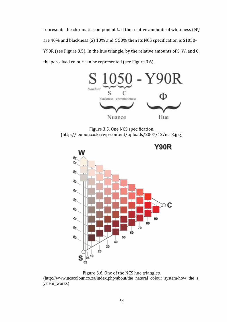
54
represents the chromatic component C. If the relative amounts of whiteness (W)
are 40% and blackness (S) 10% and C 50% then its NCS specification is S1050-
Y90R (see Figure 3.5). In the hue triangle, by the relative amounts of S, W, and C,
the perceived colour can be represented (see Figure 3.6).
Figure 3.5. One NCS specification.
(http://leopon.co.kr/wp-content/uploads/2007/12/ncs3.jpg)
Figure 3.6. One of the NCS hue triangles. (http://www.ncscolour.co.za/index.php/about/the_natural_colour_system/how_the_s
ystem_works)

55
The Swedish Standard Institution (SIS) has adapted the NCS as a Swedish
Standard for colour notation and colour atlas. The NCS colour atlas includes 42
pages and 1750 colour samples (Swedish Standards Institution, 1996). The first
page shows the NCS colour circle with 40 colour samples of high chromaticness
(saturation), showing the hues selected for the atlas (see Figure 3.4). The
second page of the atlas includes colour samples for non-chromatic (purely
gray) and slightly-chromatic (near-gray) colours. The other 40 pages include
NCS triangles that show different hues and relationships to white and black of
a specific hue in each page (see Figure 3.6). In the NCS colour atlas “the
chromatic hues are arranged in a circle with nine intermediate steps between
each, totalling to forty hues. Then, for each hue, a triangular chart is developed
showing the pure hue and its relationship to white and black”
(Fehrman & Fehrman, 2000, p. 205).
To conclude, NCS can be used by people with no particular knowledge about
colour and with no previous experience on colour specification or colour
measurement (Agoston, 1987). It is the only colour system in the psychology
domain; all the descriptions are directly related to the properties of colour
percepts (Tonnquist, 1988). The notation is easily understood when compared
with the other systems and verbal description of the appearance of a colour is
possible. The human brain is the instrument besides a specialized physical
instrument. Thus, it is used for describing and ordering by means of
psychometric methods, the characteristic relationships between all possible
colour percepts of the surface (Hard, Sivik, & Tonnquist, 1996). It is intended to
help colourists, manufacturers and users of different kinds of coloured products

56
to communicate about colour in the sense of colour percepts (Swedish
Standards Institution, 1996).
3.3.3. CIELAB
In 1931, the Commission Internationale de I’Eclairage, (the International
Lighting Commission; referred as the CIE) an international standardizing body,
recommended a system of colourimetric (Padgham & Saunders, 1975). The
system is “based on spectrophometric measurements of colour samples
illuminated by specific types of lighting and related to the visual response of a
standard observer” (Fehrman & Fehrman, 2000, p. 209). As an example; it is
probable for a sample to reflect green light and to look green under a northern
skylight, but it may appear slightly more yellow under artificial light.
The dimensions of colour which are hue, saturation and brightness are the CIE
tristimulus values X, Y, Z (red, green, blue) (Yılmaz, 2002) or three independent
quantities reproduced from them like x, y and Y (Agoston, 1987). CIE has a
chromaticity diagram that companion with x and y. As recognizant of the
wavelength and degree of saturation of a given colour, this diagram is used.
The spectral pure colours and non-spectral colours that are physically possible
to realize are situated inside the diagram (Grandis, 1986). In the centre, there is
white light supplied by the source (see Figure 3.7). The chromaticity diagram
allows locating the position of every colour arising from the mixture of two or
more colours within the given space. Therefore, the chromaticity, purity, and
saturation of a colour can be specific in the CIE triangle (Grandis, 1986).

57
Figure 3.7. The CIE chromaticity diagram. (http://www.cs.berkeley.edu/~sequin/CS184/TOPICS/ColourSpaces/Colour_0.html)
For introducing three-dimensions of x, y and Y graphically and to plot the
points, CIE (x, y, Y) colour space is used. Colour space involves a series of two
dimensional chromaticity diagrams in which one is placed above another. Each
chromaticity diagram in the series would accommodate points that represent
colours of a single luminance Y (Agoston, 1987; see Figure 3.8). The bottom Y=0
represents only one colour: Black.

58
Figure 3.8. The three-dimensions of x, y and Y. (http://dba.med.sc.edu/price/irf/Adobe_tg/models/ciexyz.html)
The measurement of colour is an important issue. On the other hand, the
measurement of colour differences is another important issue. In industry,
“in the production of large amount of paint, fabrics and other coloured materials
and objects, colours are usually required to match the standards within a stated
tolerance of variation; the smaller the tolerance, the more difficult the task of
manufacture” (Agoston, 1987, p. 90). CIE system is limited in that; it does not
uniformly express differences between colours. For designating colour
differences by providing a standard approximately uniform colour scale, CIE
recommended CIELAB in 1976 (HunterLab, 2008). It provides an approximate
uniform colour space for the judgment of colour differences by mathematical
calculation of two sets of tristimulus values X, Y and Z (Agoston, 1987).

59
“ There is a vertical metric lightness L axis in the basic structures of the CIELAB
that passing centrally through evenly spaced horizontal planes that are
subdivided into square grids containing coordinates a and b which are the
tristimulus values”(Agoston, 1987, p. 107; see Figure 3.9). The mathematical
calculations that convert tristimulus values to CIELAB colour space values allow
colours to be considered as existing in an approximately uniform three-
dimensional space (Weatherall & Coombs, 1992). In that space, each specific
colour has a unique location defined in terms of its cartesian coordinates with
respect to the axes L, a, b (see Figure 3.10). The metric-lightness axis L shows
hueless colours ranging upwards from black, through the neutral gray to white.
Points in colour space apart from those on the metric-lightness axis shows
chromatic colours (Agoston, 1987). L represents the lightness coordinate,
a represents the red/green coordinate and b represents the yellow-blue
coordinate.
Figure 3.9. The CIELAB colour space. (http://www.iffo.nl/temp/index.php/en/technicalphotography/colourmanagem
ent/59-adobergbvssrgb.html)

60
Figure 3.10. The CIELAB uniform three-dimensional colour space. (http://www.sapdesignguild.org/resources/glossary_colour/index1.html)
CIELAB was developed to accommodate a standard, uniform colour scale for the
measurement of colour differences. As it was mentioned, CIELAB was
recommended especially for matching the standards in the production of
material and objects and it is mostly used in industrial colour difference
evaluations (Grandis, 1986; Agoston, 1987; Melgosa, 2000; Feishner, 2000).
With an objective standard, it eliminates differences in human interpretation,
as well as problems caused by the fading of painted or coloured products.
Additionally, it has been used by image processing researchers (Connolly &
Fliess, 1997) and by researchers who conduct scientific experiments by using
a specified instrument for the measurement (Grandis, 1986).
The NCS and the Munsell system collections present various samplings of the
same colour (Agoston, 1987). Because of that, a simple relationship exists
between them. “NCS judgments of surface colours viewed in daylight could be
translated into Munsell notation and then into CIE (x, y, Y) notation without the
use of colour measuring instruments” (p. 137). The samples are measured

61
instrumentally and the CIE data can be converted into Munsell notation or
Munsell notations can be converted into CIE by conversion programs (Munsell
Colour Corporation, 1980).
3.3.4. RGB Colour Model
RGB colour model is based on creating colours by mixing various proportions
of coloured light. The mixing of coloured light is called additive colour mixture.
Three basic colours are producing white light: Red, green and blue. These
colours make up what is called the additive or spectral, primary colours
(Raskin, 1986; Ladau, Smith, & Place, 1988).
Mixing red, green and blue light not only creates a white or colourless light but
also, by varying the intensities of colours almost any other colour can be
obtained (Helen, 1983) (see Figure 3.11). In Figure 3.11, red and blue are mixed
to generate magenta; red and green are mixed to generate yellow, while cyan
results from the mixture of green and blue. The lights may be mixed by placing
coloured filters in front of a projected light ray (Feisner, 2006)
(see Figure 3.12).
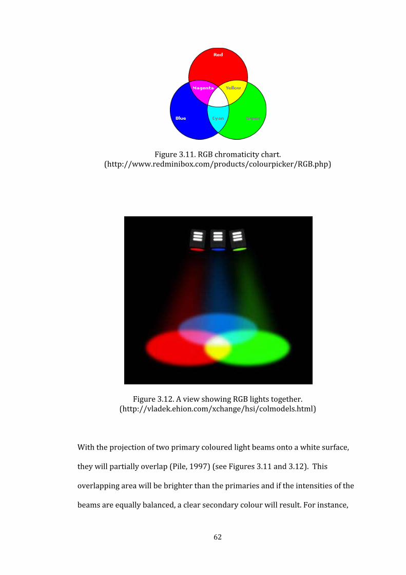
62
Figure 3.11. RGB chromaticity chart. (http://www.redminibox.com/products/colourpicker/RGB.php)
Figure 3.12. A view showing RGB lights together. (http://vladek.ehion.com/xchange/hsi/colmodels.html)
With the projection of two primary coloured light beams onto a white surface,
they will partially overlap (Pile, 1997) (see Figures 3.11 and 3.12). This
overlapping area will be brighter than the primaries and if the intensities of the
beams are equally balanced, a clear secondary colour will result. For instance,

63
when projecting red and green coloured light beams, they will overlap and this
area will be brighter than either the red or the green area. A clear yellow will
result if the intensities of these beams are equally balanced. However, if the red
beam is stronger than the green or if the green is dimmed an orange will result.
If the green is stronger than the red, than it will produce a yellow-green mix
(Pile, 1997). The white that is produced by three additive primaries can be
tinted by increasing or reducing one of the three colours.
In RGB colour model, the primary colours are red, green and blue. In between
each primary is a secondary colour that is the mixture of two primaries and two
tertiary colours that are the mixtures of a primary and a secondary colour
(http://blulob.com) (see Figure 3.14). Thus, yellow, cyan and magenta are the
secondary colours while orange, yellow-green1, cyan-green2, cyan-blue3,
1 Yellow-green is also known as spring green (http://blulob.com), chartreuse green
(http://infoacrs.com/nm/design.html), and lime
(http://eportfolio.pdht.ca/w11_eportfolio/zeliger_isabella/portfolio/print/rgbcolourwheel.php)
2 Cyan-green is also known as turquoise (http://blulob.com), and aqua
(http://eportfolio.pdht.ca/w11_eportfolio/zeliger_isabella/portfolio/print/rgbcolourwheel.php). 3 Cyan-blue is also known as ocean (http://blulob.com), azure
(http://infoacrs.com/nm/design.html), and indigo (http://eportfolio.pdht.ca/w11_eportfolio/zeliger_isabella/portfolio/print/rgbcolourwheel.php).

64
blue-magenta4 and red magenta5 are the tertiary colours in RBG colour mode.
These hues are arranged in RGB colour circle with 12 steps as in Figure 3.13.
There are degrees around the RGB colour wheel, beginning from the top being
0˚ (red) and with a full rotation clockwise being 360˚ and each degree
represents a specific colour. Additionally, there are three values that indicate
the RGB values and can be anywhere from zero to 255 (http://blulob.com). Zero
value to red colour means that there is no red in the selected colour. On the
other side, 255 values to red colour means that red is as strong as it can possibly
be in the selected colour. This formula is the same for green and blue. Therefore,
a 255-0-0 value represents the pure red – there are no other hues in the selected
colour.
4 Blue-magenta is also known as violet (http://bllob.com; http://infoacrs.com/nm/design.html),
and purple (http://eportfolio.pdht.ca/w11_eportfolio/zeliger_isabella/portfolio/print/rgbcolourwheel.php). 5 Red-magenta is also known as raspberry (http://blulob.com) and rose
(http://infoacrs.com/nm/design.html; http://eportfolio.pdht.ca/w11_eportfolio/zeliger_isabella/portfolio/print/rgbcolourwheel.php).

65
Figure 3.13. RGB colour wheel. (synthesis of http://blulob.com/2009/03/08/the-rgb-colour-wheel/ and
http://www.chainstyle.com/tutorials/colwheel.html)
Yellow-
Green
Cyan -
Green
Cyan -
Blue
Blue -
Magenta
Red -
Magenta
a Orange

66
3.4. The Nature of Colour
Colour is one of the most dominant elements that affect every part of our lives.
It works as a guide for making sense of our environment and affects our
behaviour by its informational and cultural role (Martinson & Bukoski, 2005).
In addition, as it is a phenomenon of a wavelength of light that is transmitted
through our eyes, it also has an influence on the quality of our lives. Thus, colour
influences us both psychologically and physiologically (Jin et al., 2009).
3.4.1. Colour in Physiology
Each colour and colour combination has its own sensation. They individually
or as in relation to each other have a potential of becoming eye irritants and
causing headaches. Their appropriate usage can maximize productivity and
relax the whole body (Shehata, 2000). It could affect not only people’s emotions
but also their brain waves, hearth rates, blood pressures and respiratory rates
(Kaiser, 1984; Martinson & Bukoski, 2005), secretions of hormones, reactions to
stresses, the autonomic nervous system and the cerebral cortex where emotions
are located (Jin et al., 2009). In their study, Jin et al. (2009) reported that the red
colour appeared to have the most effect on emotional changes and directly
affected subjects’ parasympathetic nerve system activity which adjusted the
blood pressure, the heart rate and the respiratory rates below the normal level.
The effect of colours on physiological functions of the body has been effectively
used as colour therapy in various medical fields such as depression and cancer.
There is an ancient and widespread faith in the healing power of colour (Helen,
1983). Therefore, colour is suggested to be used as a treatment tool as regard to

67
colour healing. Colour healers believe in chakras that are evaluated as being
energy centres within the human body (O’Connor, 2011). These energy centres
are formed by seven chakras. If there is too much or too little energy in each
chakra in other words no balance in the energy of chakras then emotional well-
being and personality are influenced (Mahnke, 1996). Each chakra gets along
with one of the spectral colours that is illustrated below and proper balance in
the energy of chakras is restored through colour therapy.
1. Vertex chakra (violet) stands for wisdom, and spiritual energy. It influences the pituitary gland.
2. Forehead chakra (indigo) stands for intuition (third eye) and influences the pineal gland.
3. Larynx chakra (blue) stands for religious inspiration, creativity, language and communication. It influences the thyroid gland.
4. Heart chakra (green, pink) stands for love, sympathy and harmony. It influences the heart and the thymus gland.
5. Solar plexus chakra (yellow) stands for knowledge, intellect and is also the seat of tension. It influences the solar plexus and the adrenal body.
6. Spleen chakra (orange) stands for energy, and it influences the spleen and pancreas.
7. Basis chakra (red) stands for life and reproduction. It influences the sex glands and sexual organs. (Mahnke, 1996, p. 35-36)
Kopacz (as cited in O’Connor, 2011) associated colours with body functions and
dysfunctions within each chakra area, such as:
Red: Activates the circulation system and benefits the five senses; used to treat colds, paralysis, anaemia, ailments of the bloodstream and ailments of the lung;
Blue: Raises metabolism; is used to stabilize the heart, muscles and bloodstream; used to treat burns, skin diseases, glaucoma, measles and chicken pox, and throat problems;
Green: Strengthens bones and muscles, disinfects bacteria and virus, and relieves tension; used to treat malaria, back problems, cancer, nervous disorders, and ulcers, and to manage heart problems and blood pressure. (O’Connor, 2011, p. 231)

68
3.4.2. Colour in Psychology
The physical influences of colour on human beings provoke psychological
reactions and psychological manners towards colour impress bodily responses
(Birren, 1988). This means colour pervades all aspects of the whole man, his
body, mind, spirit, and emotion.
Many psychiatrists and psychologists have noted that reactions to colour are
more impulsive and emotional (Birren, 1988). Therefore, colour can have strong
influences on people’s moods and emotions. Helen (1983) explained emotional
reactions to colour as:
Light of different colours entering the eye can indirectly affect the centre of the emotions in the hypothalamus, which in turn affects the pituitary gland. This ‘master’ gland controls the entire endocrine system, including the thyroid and sex glands, and so controls the hormone levels of this system and the moods consequents upon them. (p. 44)
In light of the given reasoned chain, medical circles are using colour as an
effective method of treatment by stimulating psychological emotion with colour
(Jin et al., 2009). The psychological responses to colour are generally studied
with their qualitative descriptions in the literature such as anxiety, aggression,
and happiness.

69
“Emotions are the colours of the souls.”
W.M. Paul Young, The Shack
4. COLOUR AND EMOTION
The symbolism of colour has been a longstanding subject of study. It is highly
intermixed with physiological and psychological responses. Symbolic
associations indicate a base pattern for emotional colour approach.
People’s mood and emotions are influenced by colour. It individually or in
combination might evoke both positive feelings such as happiness, energy,
excitement, calmness and negative feelings such as anger, disgust, and sadness.
The evaluations of emotional responses of colour are called colour emotion
studies.
4.1. Symbolic Associations of Colour – Colour Meanings
Colour symbolism has been stated for centuries from body painting to heraldry
(Fehrman & Fehrman, 2000). Colour can transmit meaning from emotional or
cognitive messages. Some reactions to colour are inborn, intuitive, and universal
to everyone while others lay in the body of learned associations that are
dependent both on realities known to everyone and to meanings learned within
a particular society in a particular time and place (Pile, 1997). Thus, human
beings accept certain colour meanings as facts based on cultural heritage and
family values (Fehrman & Fehrman, 2000).

70
Every colour has a particular set of meanings. Not only physical but also
emotional characteristics can be related to any given colour (Ladau, Smith, &
Place, 1988). However, there are universally agreed meanings for red, orange,
and yellow which are associated with fire, also for blue, green, and violet which
are associated with cool oceans, deep forests, and shadows (Fehrman &
Fehrman, 2000) (to see the range of colour samples of red, green, blue, yellow,
purple, violet and orange from Munsell Book of Colour for Turkish culture,
see Şahin Ekici, Yener, & Camgöz’s (2006) study).
Colour Analysis
RED
Red is one of the oldest colour names. It is the first colour with a defined
wavelength (Petru, 2006). It is assumed to be the colour of blood and fire. These
early associations charged red with passionate emotions. It has a primary
implication of excitement, heat, intensity, and force (Pile, 1997).
Red’s positive connotation involves love (red roses, red heart), luck, passion
(red-blood), sexiness (red lipstick), importance (red carpet), dynamism,
excitement, richness, royalty and courage (Ladau, Smith, & Place, 1988; Feisner,
2006). Red’s negative connotations involve war (red uniforms to disguise
blood), blood, fire, the devil, revolution and anarchy (red flag), revolution,
danger, fire and bureaucracy.
The term red contains many hues in languages that have only a few terms for
colour. Red may include hues of all reds, and hues from the range of oranges,

71
most yellows, browns, pinks, and even purples (Petru, 2006). Red becomes pink
when it is reduced to a tint and loses some of its saturation and psychological
intensity (Pile, 1997). It becomes gentle and feminine with milder warmth, with
charm and delicacy. Pink is associated generally with positive emotions: Being
‘in the pink’ means ‘everything is fine’, as when everything is rosy (Fehrman &
Fehrman, 2000). Its positive connotations contain health, sweetness, prettiness
and femininity (Feisner, 2006).
GREEN
Green has ambivalent connotations, because it is the largest colour family
distinguishable to the human eye (Feisner, 2006). It has its own meanings,
although it is made from blue and yellow (Ladau, Smith, & Place, 1988). Yellow
supplies it some pleasant characteristics while blue makes it seem more calm
(Pile, 1997). It is associated with grass, trees and other vegetations and all these
make it to be calming and restful to the eyes. This is also commonly related with
health and well-being and makes green the most restful colour.
Green’s positive connotations include environment, growth, and renewal in
spring, fertility, freshness, nature, youth, health, peace and calm, things that are
cool and refreshing and wealth, and money (Ladau, Smith, & Place, 1988;
Morton, 1997; Freisner, 2006). Green’s negative connotations contain witch-
craft, jealousy, envy, poison, immaturity, rawness, and sourness.

72
BLUE
It is the coolest of the cool colours and has no inclusion of warmer tones (Pile,
1997). It symbolizes infinity and serenity in relation to the sky and the sea that
surrounds human beings (Fehrman & Fehrman, 2000). On the other hand, it
also symbolizes depression, sadness, and isolation. Additionally, bright blue can
be a lively colour but it can also lower the body temperature, pulse rate, and
blood pressure which stands in opposition to red in its physical effects
(Pile, 1997).
Blue’s positive connotations involve heaven, coolness, truth, tranquillity,
conservatism (in appeal), loyalty and dependability, security, sky water and
eyes (Ladau, Smith, & Place, 1988; Morton, 1997; Freisner, 2006). Blue’s
negative connotations involve introversion, sadness, depression (the winter
blues), things that are cold like frost or ice (blue with cold), drowning or illness
(turning blue), and melancholy.
YELLOW
It has the highest luminosity after white and this makes it the most easily
perceived hue (Feisner, 2006). It can be easily seen before other colours
especially when placed with black. This combination –yellow placing against
black- is used as a warning sign (to signal hazardous situations in industry).
It has an important role in interior design of being sometimes rated as a more
attractive artificial lighting source colour (Pile, 1997). Creams, beiges, and light

73
tans that are some of the most popular background colours all constitute of
yellow tints.
Yellow’s positive connotations involve cheerfulness, sun, gold, happiness,
vitality, hope, warmth, optimism and serenity. Caution (traffic light), sickness,
betrayal, treason, cowardice and fever are the negative connotations of yellow
(Ladau, Smith, & Place, 1988; Morton, 1997; Freisner, 2006).
PURPLE and VIOLET
The terms violet and purple is often confused. Violet is a spectral hue, on the
other hand purple is a mixed colour (Fehrman & Fehrman, 2000). Purple is the
hardest colour for eye to discriminate (Feisner, 2006). Thus, when using violets
and purples, it is critical to approach with caution. In many contexts, they are
avoided as being disturbing to many people (Pile, 1997). Violet and purple’s
associations are conflicting because in the colour circle they are falling in
between red and blue which are associated with two opposing values of
warmness and coolness. In the electromagnetic spectrum violet does not stand
in between two neighbours like orange and green (Pile, 1997). It falls at the end
of farthest from red and closest to the blue. On the other hand, purple is simply
a mixture of red and blue. In addition to negative approaches, violet is also
associated with liveliness, calmness, sensitivity and artistic expression. The
positive connotations of purple are aristocracy, spirituality, mystery, luxury,
loyalty, awareness, inspiration and passion. Negative connotations of purple are
pomposity, mourning, death and rage (Morton, 1997; Freisner, 2006).

74
ORANGE
Orange is a mixture of red and yellow and is a warm colour (Fehrman &
Fehrman, 2000). It shares some of the qualities of its neighbours in the colour
circle such as the intensity of excitement attended by red and the sense of cheer
association with yellow (Pile, 1997). The brown tones of orange are associated
with comfort and security (Fehrman & Fehrman, 2000), and signifies earth,
wood, and chocolate (Feisner, 2006). Orange’s positive connotations are
warmth, fruitfulness, brightness, autumn, energy, activity, excitement; while
negative emotions contain danger (fire) and brashness (Morton, 1997; Feisner,
2006).
THE NEUTRALS
Black, white and gray are the achromatics or neutral colours, constituting only
of brightness and saturation, without having the hue dimension.
BLACK
Black is a total absence of any chromatic colour (Feisner, 2006) as it absorbs
almost all the light of any colour (Ladau, Smith, & Place, 1988). By the addition
of some chromatic colours, black can be perceived as warm or cool, because it
becomes no longer pure black (Pile, 1997). Dark tones such as dark gray or very
dark blues like midnight blue can have the expressive qualities of black.
Black’s positive connotations are sophistication especially in fashion, power,
strength, seriousness, dignity, formality, and luxury (Pile, 1997; Feisner, 2006).

75
Most of the associations with black are negative such as death, emptiness, fear,
depression, disapproval, mystery and bad luck.
WHITE
White is the opposite of black. A white surface reflects all light in theory, thus it
represents maximum lightness (Fehrman & Fehrman, 2000). Although it is
defined as a non colour, it results as a combination of all chromatic colours
(Pile, 1997). In the modern movement, the colour white has been used
extensively. This has made white one of the symbolic attributes of modernism.
In addition, manufacturers use a various range of whites with blue, red, yellow
and green undertones because it is the best-selling paint (Fehrman & Fehrman,
2000). Together with black, they create a very powerful and sharp contrast of
non chromatic colours (Pile, 1997).
White is positively associated with purity, cleanliness, sterility, simplicity,
clarity, peacefulness, innocence, angels, brides and snow (Ladau, Smith, & Place,
1988; Pile, 1997; Freisner, 2006). It is negatively associated with emptiness,
blackness, boredom, surrender, cowardliness, cover-up, perversion of justice
and ghosts.
GRAY
Gray is the mixture of black and white. It is a neutral that can range not only
from light to dark but also from totally neutral (non chromatic) tones to warmer
tones that are the mixture of chromatic tones with white and black (Pile, 1997).

76
Light gray does not have strong associative implications as dark gray. Gray in
darker tones shares the positive and negative characteristics of black.
Gray is associated with technology, machines, aircraft, concrete, cement and the
urban environment (Fehrman & Fehrman, 2000). It implies confusion, loss of
distinction (gray area), intelligence, shadow and work (people in gray suits)
(Feisner, 2006). It also represents the wisdom of age (gray hair). Light gray
especially in warm toned versions are useful as background tones (Pile, 1997).
4.2. Empirical Implementations of Colour and Emotion
Studies on the symbolic association of colour were and are still essential for
empirical colour emotion studies. A great deal of research was conducted on
the relationship between human emotions and colour and other factors as
illustrated in this section. The most common method used for the measurement
of emotion is that of the psychological measurement method, the subjective
evaluation.
Boyatzis and Varghese (1994) studied children’s emotional responses to
colours. They reported their emotional reactions depending on the brightness of
colours. Children had positive reactions to bright colours, which were pink, red,
yellow, blue, purple and green, and had negative reactions to dark colours,
which were brown, black and gray. Children stated their positive emotions by
mentioning happiness, strength and excitement, and their negative emotions by
mentioning sadness, anger and boredom. The colour red created the highest

77
number of emotional responses where pink the lowest. Colour not only effects
human psychological feelings but also effects human physiological responses.
Emotional reactions to colour hue, brightness, and saturation were investigated
by using the Pleasure-Arousal-Dominance emotion model (Valdez & Mehrabian,
1994). Red, yellow, green, blue, purple, yellow-red, green-yellow, blue-green,
purple-blue, and red-purple were used as colour samples. Brighter and more
saturated colours were found more pleasant; less bright and more saturated
colours were found more arousing and induced greater feelings of dominance in
viewers. In addition, short wavelength hues (e.g. blue) were rated as being the
most pleasant, with intermediate wavelength hues (e.g. green) being low levels
of pleasantness. The long wavelength hues such as yellow-red and red showed
an increase in pleasure ratings. Suk and Irtel (2009) also studied the emotional
responses to hues red, yellow, green, blue, and violet by using SAM. Based on
SAM ratings the blue colour rated as less exciting, and more dominant than the
other hues.
Terwogt and Hoeksma (1995) and Zentner (2001) studied colour and emotion
combinations by using matching measures with children and adults. In Terwogt
and Hoeksma (1995) study used colours were the primary colours red, blue,
yellow, and green supplemented with black and white. The emotions involved
were six basic emotions anger, happiness, sadness, fear, surprise, and disgust.
For each emotion, participants were asked to point at the colour that they
thought best fitted to the feeling given. Children aged 7-years-old combined the
colour blue with the emotion happiness, red with surprise and happiness, white

78
with surprise, fear, and sadness, black with anger; aged 11-year-old combined
the colour yellow with the emotion anger, red with happiness and surprise,
white with fear and surprise, green with aversion, and black with anger and
sadness; adults combined the colour blue with the emotion surprise, yellow
with happiness and anger, red with sadness, white with surprise, green with
happiness, and black with fear, anger, sadness, and aversion.
The effect of colour hue on emotion is studied by Odom and Sholtz (2000) by
using rating scales. The colours used were red, yellow, blue, and a lighter shade
of each with the words exciting, calm, and cheerful. Each word had a continuum
from one to ten scales. The participants were asked to circle a number on the
continuum next to each adjective representing an emotion. Primary colours
(red, yellow, blue) were seen as more cheerful and exciting than non primary
colours, while non primary colours were seen as more calming than primary
colours. In addition, yellow was found both cheerful and exciting while blue was
associated with being calm.
In Zentner (2001) study participants were shown three faces displaying a
happy, a sad and an angry expression and were asked to match the colours red,
yellow, green, blue, brown and black. A bright colour (yellow, red, green) for the
happy expression and a dark colour (blue, brown, black) for the sad expression
are chosen by children. Mostly red and yellow are chosen for the happy
expression; blue and brown for the sad expression. On the other hand, red is
rarely matched with happiness and becomes the colour of anger in adults’

79
colour emotion matches. In addition, sadness is associated with black rather
than blue, yellow with happiness, and the non-emotionality of the colour green.
Pos and Green-Armytage (2007) investigated the pairing of six universally
representative facial expressions of basic emotions that are anger, surprise,
disgust, sadness, happiness and fear with colour samples from Natural Colour
System (NCS) by the use of matching measure. Participants were asked to
choose from the NCS collection colour samples that they considered best fit the
faces. Happiness, surprise, and fear integrated with very light colours (lightness
value more than 63); sadness and disgust with colours of intermediate lightness
(lightness value in between 50 and 60); and anger with rather dark colours
(usually red and black). Anger is characterised by redness and blackness;
surprise by yellowness/redness; happiness by yellowness/redness; sadness by
whiteness/blackness; fear by whiteness/blackness and some redness/blueness;
and disgust appears a little more heterogeneous. Thus, colours relative to
sadness and fear are very desaturated, while happiness, surprise and anger are
associated with highly chromatic colours as the results agree the idea of
considering active these last three emotions (happiness, surprise, anger) and
passive the other three (sadness, disgust, fear). The authors maintain that the
colour choices were influenced simply by the emotions conveyed by the facial
expressions.
In Manav’s study (2007) participants were asked to match the given adjective
list with the colour samples from the catalogue according to the emotional
response they associate. The responses indicated that the feelings of enjoyment,

80
cheerfulness, and warmness were attained to the colour samples of pink and
yellow; both green and blue samples were favoured for calmness, peacefulness,
relaxation, and modernism; green samples on the other hand were associated
with boredom, fearfulness, mystery, anxiety, annoyance; blue samples were
considered as calming but also were expressed by being cold and dull; yellow
samples were indicated as dynamic, warm and cheerful.
Kaya and Epps (2004) investigated the reason for colour emotion associations
with open-ended self-report measure. They reported that how individuals
associate colours with specific emotions are highly related with the way they
associate emotions with things, objects or the physical space. Thus, colour
related emotion is dependent on personal preference and ones past experience
with that particular colour. For instance, in their study, the colour green
attained the highest number of positive emotions, including the feelings of
relaxation, followed by happiness, comfort, peace, and hope; and it was
associated with nature and trees that create a feeling of comfort and
accompanying soothing emotions. As another example, yellow was seen to be
energetic and elicited positive emotions as it was associated with the sun and
the summer time.
Individuals’ colour associations with different building types were studied with
college students between ages 18 to 25 years old (Kaya & Crosby, 2006). It was
indicated that, colour associations were based on individual and emotional
aspects. It was reported that red represented energy, vitality, power, happiness
and joy, purple represented fun and creativity, and blue represented truth,
81
serenity, harmony, relaxation and calmness. Shehata (2000) claimed that
orange represented energy, yellow was used for mental stimulation, and green
represented harmony and balance.
Gao and Xin (2006) investigated human emotional responses on colours with
a psychophysical experiment. Totally 218 colour samples that are a textile
version of the Munsell Colour Order System, covering a wide range of hue,
lightness, and chroma were used in the study. Subjects were asked to match a
more suitable word from 12 word pairs to describe the colour, after viewing a
colour sample. Contrary to previously stated studies, it was reported that hue
had less influence on basic emotion variables while people were more sensitive
to colours with low chroma and high lightness.
A new method for emotional connotations of colour was extended by Clarke and
Costall (2008). Unlike the conducted studies in the same field, the participants
were not given actual colour samples, thus they were free to imagine their own
examples. A semi-structured interview –covering red, orange, yellow, green,
blue, purple, black, white, pink, brown and grey- supplied participant freedom
to respond in their own terms of descriptions. Red, orange and yellow did evoke
the more active emotions and were related to love, anger, passion (red),
warmth, sunshine, and sadness (yellow); green and blue to peacefulness,
calmness, relaxation, neutral, and sadness; purple to calming and passive
nature; pink to femininity; black to power, badness, strength, and death. Grey
was mostly regarded as lacking emotion. Most of the participant did not make
any comment about emotive qualities, but referred to un-emotive qualities.
82
Qu, Luo, Sun, Hu, and Chen (2011) examined the impact of age on colour
emotion responses. 30 single colour stimuli covered a wide range of hue,
lightness and chroma; and 190 colour pairs were used. For each colour stimuli,
participants were asked to select words that best describe the shown stimuli.
For single colours; older participants had ratings as less active, less liked, and
cooler than for younger participants. For colour pairs; light colour pairs were
rated as less active and cooler while achromatic colour pairs were rated as
cooler, less liked and less harmonious.

83
Table.4.1. Emotional associations of colour in the literature.
COLOUR EMOTION
Positive emotions Negative emotions
CHROMATIC
COLOURS
RED happiness, surprise, energetic, sadness, anger, fear
powerfulness, enjoyment, passionate
PINK enjoyment, cheerfulness, warmness,
feminineness
GREEN happiness, calmness, peacefulness, aversion, boredom, fearfulness,
hopefulness, relaxation, comfort, anxiety, sadness, annoyance, mystery,
modernism neutral, non-emotional
BLUE happiness, surprise, calmness, sadness, fear, dull, cold
peacefulness, relaxation, modernism,
harmony, serenity
YELLOW happiness, cheerfulness, excitement, anger, sadness
surprise, enjoyment, warmness,
dynamism, energetic
PURPLE creativity, fun, creativity, excitement
NEUTRALS
BLACK powerfulness sadness, anger, fear, boredom, aversion
WHITE surprise sadness, anger, boredom, fear
GRAY - sadness, anger, boredom, un-emotive
(Based on the studies by Boyatzis & Varghese (1994); Terwogt and Hoeksma (1995); Odom and Sholtz (2000); Zentner (2001); Kaya and Epps (2004); Kaya and Crosby (2006); Pos and Green-Armytage (2007); Manav (2007); Clarke and Costall (2008)).

84
“Space is the breath of art.” Frank Lloyd Wright
5. COLOUR, INTERIOR SPACE AND EMOTION
Colour and emotion studies investigate the affinity of these two phenomena
mostly by the use of two dimensional stimuli to draw a frame on colour emotion
associations. However, colour may also be an efficient tool in interior spaces to
cause impressions for various emotions. It is intended for any living
environment to be pleasing regarding to its colour, both psychologically and
emotionally. To analyze colour emotion associations in interior spaces, it is
necessary to identify what an interior space is and the impact of colour on its
limits.
5.1. Interior Space
Human beings spend most of their lives in interior spaces that are created by
the structures and shells of buildings (Ching, 1987). These interior spaces
supply the physical context that involves facts of what we do, and give life to the
architecture that houses them.
Space is formed by the relationships of elements in a specific field and humans
who perceive it (Ching, 1987). Formulation of a space involves several basic
steps; when an element is placed in a field, a visual relationship is constituted;
by intruding another element into the field some relationship are accomplished

85
between the space and the elements as well as among the elements themselves.
Thus, we sense shelter and enclosure upon entering a building due to the
surrounding columns, walls, floors and ceilings of an interior space that are the
major elements of interior spaces (Ching, 1987; Krier, 1992). These
architectural elements draw the boundaries of spaces. Windows and doors are
used to provide connection with the exterior. Besides the major architectural
elements, furniture is another important category of design that acts as an
intermediary between architecture and people (Ching, 1987). The selection and
arrangement of furniture within the spaces are major tasks of interior design,
while walls, floors, ceilings, windows and doors are established in the
architectural design of a building.
5.2. Emotional Response to Colour in Interior Spaces
Colour is a flexible and powerful design element. It plays an essential role in
design and it touches everything. Colours work as a kind of language and serve
as tools of communication between people and the objects surrounding those
(Hard & Sivik, 2001). The colour-person-environment relationship is an
important theoretical concept for not only designers but also environmental
colour researchers. By integrating the concept of colour and the person-
environment, more sensitive and relevant environmental design may be
achieved. It is important to consider the way people exist in different forms of
relationships with the built or physical environment when colouring the
buildings and associated environments (Smith, 2008). Colour can be used for
breaking the monotony and enhancing different spaces with their colour
schemes (Helvacıoğlu & Olguntürk, 2010). However, the colour scheme should

86
not override the overall atmosphere. Careful settings of colour can make warm
environments than they actually are or an appropriate usage can make cool
environments to feel warmer (Danger, 1987). Moreover, colour provides legible
spaces in terms of spatial perception (Helvacıoğlu & Olguntürk, 2011).
Therefore, colours should be used to give the right message to people through
the built environment (Kaya & Crosby, 2006).
Even though it has an active role in the relationship between people and their
surrounded environment, colour emotion studies fail to concentrate on colour
emotion associations in indoor spaces. Studies related with spaces in the
framework of colour emotion mainly focus on influences of colour on user
performances and also preferences of colour on in environment.
The effect of interior office colours on participants clerical task performance,
mood, and colour preferences were studied by Kwallek, Lewis, Lin-Hsiao, and
Woodson (1998). It is reported that participants made significantly more
proofreading errors in the white office than in the blue and red offices. They
scored highest in the orange office, and lowest in the blue and purple offices
after the white office. The subjects in the lower saturated office colours made
significantly more errors than those in the higher saturated office colours.
Overall, they liked the green and red office colours the best and the orange office
the least. Additionally, gender differences were found in the preference of the
office colour. Males like white, green, blue, and gray colours the most, and gave
yellow, purple, and orange colours the lowest score; while females liked green,
red and beige the most, and gray and orange the least.
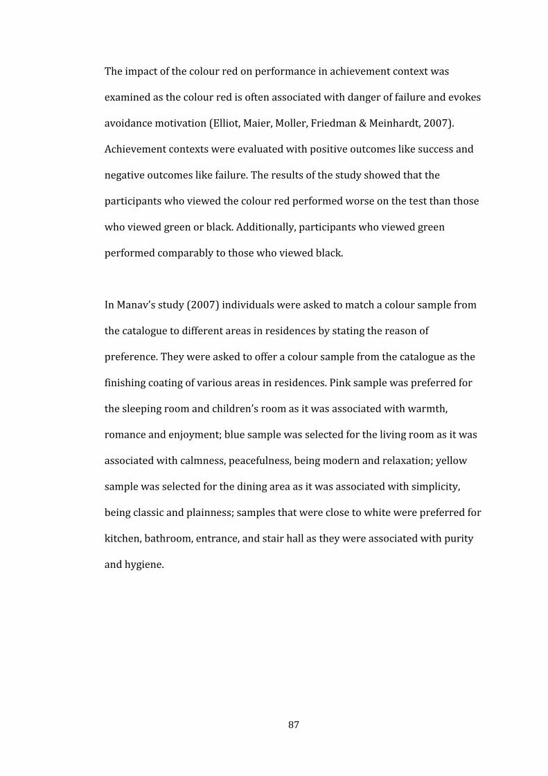
87
The impact of the colour red on performance in achievement context was
examined as the colour red is often associated with danger of failure and evokes
avoidance motivation (Elliot, Maier, Moller, Friedman & Meinhardt, 2007).
Achievement contexts were evaluated with positive outcomes like success and
negative outcomes like failure. The results of the study showed that the
participants who viewed the colour red performed worse on the test than those
who viewed green or black. Additionally, participants who viewed green
performed comparably to those who viewed black.
In Manav’s study (2007) individuals were asked to match a colour sample from
the catalogue to different areas in residences by stating the reason of
preference. They were asked to offer a colour sample from the catalogue as the
finishing coating of various areas in residences. Pink sample was preferred for
the sleeping room and children’s room as it was associated with warmth,
romance and enjoyment; blue sample was selected for the living room as it was
associated with calmness, peacefulness, being modern and relaxation; yellow
sample was selected for the dining area as it was associated with simplicity,
being classic and plainness; samples that were close to white were preferred for
kitchen, bathroom, entrance, and stair hall as they were associated with purity
and hygiene.

88
6. THE EXPERIMENT
6.1. Aim of the Study
Colour as a design element has influence on human psychological and
physiological responses for as much as it evokes discrete feelings. On this
account, it constitutes a key factor in the relationship between people and their
surroundings. Consequently, environments that enclose people should be
carefully and systematically analyzed in association with colour use in order to
design environments willing to reduce possible threats on their users. However,
though quite a few researches on the relationship between human emotions and
colour have been carried out, there are still not enough studies concentrating on
specific emotion associations with colour use in interior spaces.
The main objective of this study is to examine the relationship between two
crucial phenomenon of design colour and emotion in interior spaces. While
analyzing this issue, the main focuses are on:
How individual colours affect human emotional reactions in interior
spaces,
Whether human emotional reactions to individual colours differ in a
distinctive way in the same interior space,
In what way colours emotional influences are distinguished from each
other,

89
Whether emotional reactions to individual colours in interior spaces differ
according to gender.
In addition to the stated focuses, the other objective of the study is to develop a
matrix between colours and emotions associations in interior spaces that would
visualize the colours and their associations with different emotions. Thus, it is
expected to find out the influence of the use of different colours in interior
spaces on human emotions.
6.1.1. Research Questions
1. Do emotional reactions shown to different colours in an interior space differ?
2. Do emotional reactions to a colour in interior space differ according to
gender?
6.1.2. Hypotheses
1. Emotional reactions shown to different colours in an interior space differ.
2. Gender effects emotional reactions to a colour in interior space.

90
6.2. Method of the Study
6.2.1. Sample Group
The study is comprised of a hundred and eighty people who are students
enrolled in the İhsan Doğramacı Bilkent University. They were chosen by
stratified quota sampling on the basis of their design background and sex.
Providing a sample that does not have a design past is thought to be important
to be able to supply information to designers and interior architects specifically
from user perspective. Thus, a person who had a relation with design such as
being a student in the Faculty of Art, Design and Architecture was excluded from
the study (see Table 6.1 for the distribution of departments).

91
Table 6.1. Distribution of the departments.
DEPARTMENT
Frequency Percent Valid
Percent Cumulative
Percent
Valid Computer Science (CS) 47 26,1 26,1 26,1 Industrial Engineering
(IE) 47 26,1 26,1 52,2
Law (LAW) 11 6,1 6,1 58,3 Electrical and
Electronics Engineering (EEE)
9 5,0 5,0 63,3
Molercular Biology and Genetics (MBG)
4 2,2 2,2 65,6
Economics(ECON) 14 7,8 7,8 73,3 Psychology (PSYC) 4 2,2 2,2 75,6 Computer and
Instructional Technology Teacher Education (CTE
3 1,7 1,7 77,2
Chemistry (CHEM) 2 1,1 1,1 78,3 Music (MUS) 2 1,1 1,1 79,4 Business
Administration (BA) 9 5,0 5,0 84,4
Tourism and Hotel Management (THM)
3 1,7 1,7 86,1
Mathematics (MATH) 4 2,2 2,2 88,3 Mechanical
Engineering (ME) 3 1,7 1,7 90,0
International Relations (IR)
5 2,8 2,8 92,8
Archaeology (HART) 4 2,2 2,2 95,0 American Culture and
Literature (AMER) 2 1,1 1,1 96,1
Banking and Finace (BF)
5 2,8 2,8 98,9
Translation and Interpretation (TRIN)
2 1,1 1,1 100,0
Total 180 100,0 100,0

92
The group needed to be balanced as to sex (ninety females and ninety males) to
explore gender differences in colour emotion association in interior spaces. The
age of the sample group varies in between 17 and 26, and the majority of the
subjects were between 19-22 in age (75,63%). The mean age of the sample
group is 21,08 (see Appendix B for the detailed information on age distribution
of the sample group).
All of the participants were familiar with the computer. 47,2% of them have
been using computer for five to ten years, while 52,8% have been using for
more than ten years. 67,2% of the participants stated that they use computer
a few times a day, 30% of them everyday and a minority 2,8% of them use
computer for every other day (see Appendix B, Table B.3 and B.4).
6.2.2. Setting Description
The experiment was conducted at İhsan Doğramacı Bilkent University Library
Multimedia Room where covers of music and film collections (see Appendix C,
Figures C.1 and C.2). There are seventeen private booths in Multimedia Room
which can be used for listening to music, watching films and documentaries and
a bigger public study area. As the booths provide private spaces, students are
generally using these areas for studying as individuals or as a group. The booths
supply an isolated area in which there is not any obvious interaction between
inside and outside. This is one of the reasons for the Multimedia Room chosen
as an experiment setting. The second reason is related with the sample group.
Library is has a collection of sources, resources, and services and is an access

93
point for print, audio, and visual materials. For this reason, library is frequently
used by students who are studying in different departments. Thus, it has
a power of gathering diverse people. The sample group for this study includes
students who have not got a design past. As the library provides this
opportunity and the Multimedia Room supplies a special space for conducting
the experiment, it was decided to be used as the setting.
The permission for conducting the experiment was taken from the Directory
Department of the Library. The Multimedia Room was open between 08:30-
23:00 during the week and 09:00-17:00 at weekends. Thus, the study was
conducted during these hours.
The booths had both artificial and daylight illumination. To fix the variables in
the experiment setting, one booth without any daylight illumination was
selected. However, one side of the selected booth had a window pane.
Therefore, during the experiment participants might be affected or disturbed by
the outside view. In order to control the potential problem, the window pane
was made passive by covering it with a black curtain (see Figure 6.1).
94
Figure 6.1. A view showing the experiment booth from outside.
The illuminance level was measured with Minolta Illuminance Meter T-10 to
understand the lighting situation in the booth after the black curtains were
mounted and it was kept the same during the experiment. The illuminance level
was fixed to 219 lux. A Philips Master TLD-18W/840 fluorescent lamp was used
in the coves for lighting the experiment booth.
The sitting arrangement in the booth was organized to supply the best control
of possible veiling reflections6 on the computer screen (see Figures 6.2 and 6.3).
In addition, participants were faced to an unobstructed surface by this interior
arrangement.
6 Veiling reflections occur when the incident light angle on the horizontal work surface is within
the observer’s viewing zone (Egan, 2002).

95
Figure 6.2. A view showing the interior organization of the experiment setting.
Figure 6.3. Drawing showing the interior arrangement of the booth.

96
6.2.3. Procedures
6.2.3.1. Selecting the Function
In this study the main goal is to discover human emotional reactions to
individual colours in an interior space. In order to specify the kind of space, the
user requirements and human needs are analyzed carefully and translated into
spatial context.
As regard to human needs, love-belonging needs involve feelings of belonging
that involve emotionally based relationships such as friendship and family
(Maslow, 1943). When it comes to user identification requirement it is critical to
analyze if the space is used by an individual or a group – if a group how many?-
of people (Ching, 1987). In territorial requirements it is significant to design
spaces that also provide their users personal space, privacy and interaction
intentional spaces (Ching, 1987).
In this research, a living space was studied. A living space satisfies belonging
needs as one has the opportunity to socialize with one’s family and friends,
refers to large group of user identification, and provides a public space where
interaction is possible.
The layout of spaces as physical settings should also satisfy the stated needs in
relation with their function. All functions that are taking place in living rooms
such as conversing and watching television are analyzed and the required
furniture – a bookcase, a TV unit, couches, and a coffee table are selected and
arranged (see Figures 6.4). The main concern in configuration of the living room

97
layout was to provide a seating arrangement that is ideal for creating an
intimate chatting space. The book case with the TV unit works as a focal point.
Thus, the focal attention will be towards the one area in which by the
arrangement of the furniture eyes will naturally be drawn to. Additionally, the
furniture arrangement does not create an obstacle for the circulation.
Figure 6.4. Layout of the living room viewed.
In this study, it is critical to distinguish the emotional response to colour thus;
other stimulations should be minimal. In order to achieve this intent some
design ideas are generated:
Furniture, floor and ceiling colours are decided to be nearly the same –
grey serve as lack of hue- in all spaces as the main variable is the wall
colour,

98
Simplicity to be another design criteria in decor, line and style of
furnitures and textures,
Spaces to be generic and conventional to eliminate the role of design in
itself,
Natural light or any other special lighting products not to be used to
remove the lighting effect.
6.2.3.2. Specifying the Colours
In this experiment, the interior spaces were shown to participants from
a computer screen. Computer monitors are using RGB colour model as their
method to manage colours. Thus, a computer monitor may allow a wide range of
RGB colours. As RGB colour model is based on the way light mixes on
a computer screen, Additive Colour Synthesis –RGB Colour Model- was used in
specification and selection of colours in this study. The same computer screen
was used in the experiment as different monitors may display the RGB different.
In the experiment the colours chosen are primary additive colours (Red, Green,
Blue) and an achromatic colour as a control tool for being lack of hue. In
experiments concerning colour, it is important to use the colours with the same
brightness (value, lightness) and saturation (chroma, chromaticness) for
controlling the variables. The aim is to change only the hues, while keeping the
perceived lightnesses and saturations of colours the same, in order to
understand the effect of hue. Therefore, the lightness (B value) and saturation

99
(S value) rates were kept the same for each four colours (see Table 6.2).
According to Illuminating Engineering Society of North America (IESNA, 2000)
guideline, 50 % is the recommended reflectance value7 for wall surfaces
(Egan, 2002). In the light of this information, lightness of colours was adjusted
to 50 as they were used for wall surfaces.
To eliminate possible effects of furniture, ceiling and floor colours within the
same interior space, these elements were also coloured in grey as being lack of
hue. To discriminate furniture, floor and ceiling from each other, they needed to
be different in their colour; therefore three different greys were used in the
space for those elements. They were chosen according to IESNA
recommendations. IESNA recommends 70% reflectance value for ceiling and
20% reflectance value for floor in indoor spaces. Thus, the brightness level for
the ceiling was adjusted to 70 and for the floor to 20. For the furniture it was
adjusted to 60 (see Table 6.2).
7 Reflectance is the percentage of light which is reradiated from a surface (Egan, 2002).

100
Table 6.2. Selected colours from RGB additive colour model.
6.2.3.3. Creating the Interior Space
Interior spaces for the experiment were created in Virtual Environment (VE).
The VE were four different coloured living rooms and they were designed in
Second Life (see Appendix D, Figures D.1, D.2, D.3, and D.4). The reason for
using SL is its closeness to real-world perceptual experience.

101
Second Life (SL) is a 3D virtual world imitating the real world. It provides
a space that people have an opportunity to experience real-world or SL games
that are simulations of the world, including a whole simulated ecosystem
(Helmer, 2007). The SL is populated with avatars which refer to virtual
representations of SL members. Almost all of the objects and places in SL have
been created by SL citizens (Rymaszewoski, Wallace, Winters, Ondrejka &
Batstore-Cunningham, 2007). It supplies a user-friendly interface (Hendaoui,
Limayem, & Thompson, 2008). Users are able to navigate by walking, flying and
teleporting between spaces.
After creating the four different wall coloured interior spaces in SL, videos for
all those spaces were generated by CamStudio 2.6 Beta program. Each video
lasts for 35 seconds starting from the entrance (door) of the space and ending
again at the same point.
6.2.3.4. Phases of the Experiment
The study was conducted in two phases;
In the first phase, subjects were asked to fill in a brief questionnaire about
themselves (see Appendix E) where they were asked of their gender, age,
department of study in the University, usage of computers.
The subjects were asked if they had any eye or vision deficiencies. Subjects who
have any vision deficiencies were asked to take the experiment with their
correction equipments such as contact lenses or eyeglasses, which they wore

102
regularly. There were no subjects with severe eye or vision damage who needed
to be excluded from the experiment.
Subjects were also given Ishihara’s Tests for Colour-Blindness (Ishihara, 1975) in
the very same room with the experimental setup, under the same lighting
conditions. It is a series of plates that are designed to provide a test giving a
quick assessment of colour vision deficiency (Camgöz, 2000). It is used to
designate the commonest form of colour vision disturbances among them being
red-green deficiency the most common. “The test controls whether the subject
has a red-green deficiency, which may be of two types: A protan (that may be
complete (protanopia) or partial (protanomalia)) and a deutan (which may be
complete (deuteranopia) or partial (deuteranomalia))” (Camgöz, 2000, p. 77).
After this test, participants were informed about the main objective and
procedure of the experiment both written and oral (see Appendix F).
In the second phase, there was a 3D living space with four versions. For each
space, all walls as one of the major element of an interior space were coloured
with four selected colours (red, green, blue, and gray) separately. Thus, there
were same 3D interior spaces with four different wall colours.
Each participant was shown the same space with two different colours. It is
critical to eliminate the possible effect of a definite sequence of seeing colours.
To control that effect, the sequences of showing the colours were changed
systematically (see Table 6.3). According to this strategy, there were six
different experiment sets and in each the sequences were different. For each set

103
there were thirty subjects (15 female, 15 male). Thus hundred and eighty
subjects were used in the study in respect to gender and different experiment
sets.
Table 6.3. Experiment sets showing the number of participants with the sequence of colours.
Sequence of Colour Participants
SET 1 Gray, Red 30 (15 female, 15 male) 60
SET 2 Red, Gray 30 (15 female, 15 male) (30 female,
30 male)
EXPERIMENT SET 3 Gray, Green 30 (15 female, 15 male) 60
SETS SET 4 Green, Gray 30 (15 female, 15 male) (30 female,
30 male)
SET 5 Gray, Blue 30 (15 female, 15 male) 60
SET 6 Blue, Gray 30 (15 female, 15 male) (30 female,
30 male)
TOTAL 180 (90 female, 90 male)
Self report measure of emotion was used in the experiment to give the
participant the opportunity to express information that only s/he has access.
A matching measure in between coloured interior spaces and expressive
emotional faces was used in addition to an open-ended measure.
Coloured interior space and emotion matching task constituted of four coloured
stimuli and seven faces expressive of six basic emotions and one neutral that
include anger, disgust, surprise, happiness, fear, sadness, and representative of

104
the neutral face expression (see Appendix G, Figure G.1). Firstly, the participant
was seated in front of the computer individually and was shown one 3D interior
space video with one specific wall colour. Then, s/he was shown the seven faces
with no written name of the emotion. S/he was asked to choose a single face
representing a specific emotion that best fit the shown coloured interior space.
The age and sex of the stimulus face shown in the photographs were held
constant with the seven faces. To reduce the influence of coloured photographs
on emotion, photographs were used in black and white chosen from Ekman’s
universal representativeness of basic emotions. Secondly, after choosing a face
s/he was encouraged to state the reason for choosing the specific face. No time
limit was stipulated. One participant was shown two spaces and did the
matching scale two times.

105
7. FINDINGS
To analyze the data, Statistical Package for the Social Sciences (SPSS) 13.00 was
used. Through the analyzing process, Independent Samples t-Test, Paired
Samples t-Test, Chi-Square Goodness-of-Fit Test and frequency tables were
used.
For each coloured room firstly, the effect of sequence of showing coloured
rooms (red, green and blue as chromatic, gray as achromatic) and secondly, the
gender influence on emotional associations to coloured room was analyzed.
Statistical analyses indicated that the showing order of the coloured rooms and
gender has no effect on emotional associations to red room and blue room.
Thus, final emotional associations to red room and blue room are given without
regarding the sequence of showing coloured rooms and gender differences. On
the other hand, contrary to red room and blue room, showing order of the green
room and gray room effects the emotional associations to green room. However,
there is no influence of gender on emotional associations to green room. Thus,
final emotional associations to green room are given without regarding gender
differences.

106
Within the scope of the stated aspects, findings from the statistical analyses are
given in respect of the experiment sets involving coloured rooms created by the
primary additive colours (red, green and blue) and gray colour sequentially. For
each coloured room, findings are beginning with the effect of sequence of
showing coloured rooms; continue with the effect of gender on emotional
associations to coloured rooms and ends with the frequencies that indicate the
distribution of emotions on coloured rooms (see Table 7.1 for the overview of
frequencies). Additionally, for each experiment set, the comparison of red, green
and blue wall coloured room with gray room is given separately in order to
understand if there is a difference in their emotional associations.
Table 7.1. The frequency distribution of emotions on the coloured rooms.

107
7.1. 1st Experiment Set – Red Room
The first experiment set embodied the rooms with red and gray colours. In this
set, there were 60 participants (30 female, 30 male) in total. The sequences of
experiencing the coloured room were changed systematically in order to control
the effect of showing order (see Table 6.3). The first 15 females and 15 males
first experienced the gray room and secondly the red room. The following 15
females and 15 males experienced the red room, then the gray room.
7.1.1. Red Room
To determine the effect of sequence of showing coloured rooms on emotional
reactions to red room, Independent Sample (Two-Sample) t-Test was
conducted. It is used “to determine whether the unknown means of two
populations are different from each other based on independent samples from
each population” (Elliott and Woodward, 2007). If the means of the two-sample
are significantly different from each other, the population means are declared to
be different. In Independent Samples Test, the first result is on F-test (Levene’s
test) to evaluate the equality of variance. If the ρ-value on Levene’s Test is 0.05
or below, than the value on the bottom line that is ‘equal variances not assumed’
should be considered; if the ρ-value on Levene’s Test is more than 0.05, than the
value on the top line that is ‘equal variances assumed’ should be considered. The
t-test points out that there is not a significant effect of seeing red room before or
after gray room on the emotional reactions to red room (F=1.620, df=58,
ρ=.359) (see Appendix H, Tables H.1 and H.2).

108
The effect of gender on emotional reactions to red room was analyzed by
Independent Sample t-Test. The test shows that there is not a significant
difference between gender groups in their emotional reactions to red room
(F=3.242, df=55.682, ρ=.803) (see Appendix H, Tables H.3 and H.4). Thus,
gender has no influence on human emotional reactions to red room
(see Figure 7.1, Appendix H, Tables H.5 and H.6).
Figure 7.1. The distribution of emotions on the red room in respect to gender group.
The findings for emotional associations to red room are given without regarding
the gender differences and sequence of showing the gray room and red room.
The findings involve 60 participant’s responds who experienced the red room.
The equality of parameters of multinomial probability distribution of seven
emotions was tested by the use of Chi-square goodness-of-fit test. It is a non-
parametric test that is used for multinomial frequency distribution in cases of
0
2
4
6
8
10
12
male
female

109
more than two points on the scale (Argyrous, 2005). It is used “to ascertain
whether the distribution of observed counts in the various categories of
a categorical variable matches the expected distribution of counts under
a hypothetical model for the data” (Elliott & Woodward, 2007, p. 143). In this
study, the attention is on the frequency of distribution of seven emotions used
in the experiment. According to the analyses, the parameters are not equal
(χ²=51.067, df=6, ρ=.000) and this indicates that for the red room, the
proportion of participants with seven emotions are not the same (see Appendix
H, Table H.7). In other words, the distribution of emotions for 60 participants is
different. The figure 7.2 illustrates that the number of participants who
associate the emotions of disgust and happiness are significantly larger than the
other emotions. According to the figure, red room was associated with each six
basic emotion that is universally accepted and neutral emotion. The percentages
from the highest to lowest are as follows: Disgust (35%), happiness (33.3%),
neutral (15%), surprise (6.7%), anger (5%), fear (3.3%), and sadness (1.7%)
(see Appendix H, Table H.8).

110
Figure 7.2. The distribution of emotions on the red room.
7.1.2. Gray Room
The impact of sequence of showing coloured rooms on emotional reactions to
gray room was tested by Independent Sample t-Test. According to the analysis,
there is not a significant effect of seeing gray room before or after red room on
the emotional reactions to gray room (F=6.363, df=55.214, ρ=.414)
(see Appendix H, Tables H.9 and H.10).
To determine the effect of gender on emotional reactions to gray room,
Independent Sample t-Test was conducted. The test points out that there is not
a significant difference between gender groups in their emotional reactions to
gray room (F=7.863 df=54.849, ρ=.345) (see Appendix H, Tables H.11 and H.12).
Thus, gender has no influence on human emotional reactions to gray coloured
room in the first experiment set (see Figure 7.3, Appendix H, Tables H.13 and
H.14).

111
Figure 7.3. The distribution of emotions on gray room in respect to gender
group.
The equality of parameters of multinomial probability distribution of seven
emotions was tested. The test points out that the parameters are not equal
(χ²=48.600, df=5, ρ=.000) (see Appendix H, Table H.15). The number of
participants who match the gray room with the emotions of disgust, neutral and
sadness are larger than the other emotions (see Figure 7.4). The gray room was
associated with basic emotions that are universally accepted except happiness
without regarding the gender differences and sequence of showing the spaces.
The gray room was not associated with happiness. The percentages from the
highest to lowest are as follows: Disgust (36.7%), neutral (33.3%), sadness
(23.3%), fear (3.3%), surprise (1.7%), and anger (1.7%) (see Appendix H, Table
H.16).
0
2
4
6
8
10
12
14
male
female

112
Figure 7.4. The distribution of emotions on the gray room in the first experiment set.
In the first experiment set emotional association to red room and gray room
was tested. Emotional associations to red room and gray room were compared
with Paired Samples t-Test. The analysis points out that there is a significant
difference between red room and gray room in terms of their associations with
emotional reactions (df=119, ρ=.000) (see Appendix H, Tables H.17).
7.2. 2nd Experiment Set - Green Room
The second experiment set involved the rooms with green and gray colours. In
this set, there were 60 participants (30 female, 30 male) in total. The sequences
of experiencing the coloured room were changed systematically in order to
control the effect of showing order (see Table 6.3). The first 15 females and 15
males first experienced the gray room and secondly the green room. The
following 15 females and 15 males experienced the green room, then the gray
room.

113
7.2.1. Green Room
The effect of sequence of showing coloured rooms on emotional reactions to
green room was analyzed by Independent Sample t-Test. The t-test points out
that there is a significant effect of seeing green room before or after gray room
on the emotional reactions to green room (F=.019, df=57.549 ρ=.012)
(see Appendix H, Tables H.18 and H.19). 30 participants who experienced green
room after gray room associated green room with all seven emotions tested.
The percentages from the highest to lowest are as follows: Happiness (56.7%),
neutral (13.3%), disgust (10%), fear and sadness (6.7% for each) and anger and
surprise (3.3% for each) (see Figure 7.5; see Appendix H, Table H.20).
30 participants who experienced green room before gray room associated green
room with all emotions except sadness. The percentages from the highest to
lowest are as follows: Neutral (36.7%), happiness (33.3%), disgust (20%), anger,
surprise, and fear (3.3% for each) (see Appendix H, Table H.21).
Figure 7.5. The distribution of emotions on the green room in respect to showing order.
0
2
4
6
8
10
12
14
16
18
1st experience green room
2nd experience green room

114
The effect of gender on emotional reactions to green room was analyzed by
Independent Sample t-Test. The test shows that there is not a significant
difference between gender groups in their emotional reactions to green room
(F=4.513, df=54.048, ρ=.727) (see Appendix H, Tables H.22 and H.23). Thus,
gender has no influence on human emotional reactions to green room
(see Figure 7.6, Appendix H, Tables H.24 and H.25).
Figure 7.6. The distribution of emotions on the green room in respect to gender group.
As the sequence of showing the rooms has an effect on associations, the findings
from 30 participants who first viewed green room are reported for emotion
associations. The equality of parameters of multinomial probability distribution
of seven emotions was tested. The test points out that the parameters are not
equal (χ²=22.000, df=5, ρ=.001) (see Appendix H, Table H.26). The number of
participants who matched the green room with the emotion of neutral,
happiness and disgust are larger than the other emotions (see Figure 7.7).
0
2
4
6
8
10
12
14
16
male
female

115
The percentages from the highest to lowest are as follows: Neutral (36.7%),
happiness (33.3%), disgust (20%), fear, anger and surprise (3.3% for each)
(see Appendix H, Table H.21).
Figure 7.7. The distribution of emotions on the green room.
7.2.2. Gray Room
The effect of sequence of showing coloured rooms on emotional reactions to
gray room was tested by Independent Sample t-Test. According to the analysis,
there is not a significant effect of seeing gray room before or after green room
on the emotional reactions to gray room (F=8.825, df=55.461, ρ=.303)
(see Appendix H, Tables H.27 and H.28).
For establishing the effect of gender on emotional reactions to gray room in the
second experiment set, Independent Sample t-Test was conducted. The test
points out that there is not a significant difference between gender groups in
0
2
4
6
8
10
12
anger disgust neutral surprise happiness fear sadness

116
their emotional reactions to gray room (F=2.266, df=58, ρ=.431) (see Appendix
H, Tables H.29 and H.30). Thus, gender has no influence on human emotional
reactions to gray coloured room in the second experiment set (see Figure 7.8,
Appendix H, Tables, H.31 and H.32).
Figure 7.8. The distribution of emotions on the gray room in respect to gender group in the second experiment set.
The findings for emotional associations to gray room are given within the
responds of 60 participants involved in the second experiment set. The equality
of parameters of multinomial probability distribution of seven emotions was
tested. The test points out that the parameters are not equal (χ²=16.400, df=3,
ρ=.001) (see Appendix H, Table H.33). The number of participant who match the
gray room with the emotions of disgust, neutral and sadness are larger than the
other emotions (see Figure 7.9). The gray room was associated with basic
emotions that are universally accepted except anger, surprise and fear without
regarding the gender differences and sequence of showing the spaces.
0
2
4
6
8
10
12
14
male
female

117
The percentages from the highest to lowest are as follows: Disgust (38.3%),
neutral (30%), sadness (28.3%) and happiness (3.3%) (see Appendix H, Table
H.34).
Figure 7.9. The distribution of emotions on the gray room in the second experiment set.
In the second experiment set emotional association to green room and gray
room was investigated. Emotional associations to green room and gray room
were compared with Paired Samples t-Test. The analysis points out that there is
a significant difference between green room and gray room in terms of their
associations with emotional reactions (df=119, ρ=.000) (see Appendix H,
Table H.35).

118
7.3. 3rd Experiment Set - Blue Room
The third experiment set involved the rooms with blue and gray colours. In this
set, there were 60 participants (30 female, 30 male) in total. The sequences of
experiencing the coloured rooms were changed systematically in order to
control the effect of showing order (see Table 6.3). The first 15 females and 15
males first experienced the gray room and secondly the blue room.
The following 15 females and 15 males experienced the blue room, then the
gray room.
7.3.1. Blue Room
The influence of sequence of showing coloured rooms on emotional reactions to
blue room was investigated by Independent Sample t-Test. The t-test points out
that there is not a significant effect of seeing blue room before or after gray
room on the emotional reactions to blue room (F=.000, df=58, ρ=.880)
(see Appendix H, Tables H.36 and H.37).
To determine if there is a significant difference between gender and the
emotional reactions to blue room, Independent Sample t-Test was used.
According to the statistical analyses, there is not a significant difference
between gender groups in their emotional reactions to blue room (F=1.870,
df=58, ρ=.092) (see Appendix H, Tables H.38 and H.39). Thus, gender has no
influence on human emotional reactions to blue room (see Figure 7.10,
Appendix H, Tables H.40 and H.41).

119
Figure 7.10. The distribution of emotions on the blue room in respect to gender group.
The equality of parameters of multinomial probability distribution of seven
emotions was tested. The test points out that the parameters are not equal
(χ²=39.167, df=6, ρ=.000) (see Appendix H, Table H.42). The number of
participant who match the blue room with the emotion of neutral are larger
than the other emotions (see Figure 7.11). Blue room was associated with each
six basic emotion that is universally accepted and a large number of associations
was with neutral emotion. The percentages from the highest to lowest are as
follows: Neutral (41.7%), disgust and happiness (13.3% for each), fear and
sadness (10% for each), surprise (6.7%) and anger (5%) (see Appendix H,
Table H.43).
0
2
4
6
8
10
12
14
16
male
female

120
Figure 7.11. The distribution of emotions on the blue room.
7.3.2. Gray Room
The effect of sequence of showing gray room before or after blue room on
emotional reactions to gray room was tested by Independent Sample t-Test.
According to the analysis, there is not a significant effect of seeing gray room
before or after blue room on the emotional reactions to gray room (F=2.765,
df=58, ρ=.202) (see Appendix H, Tables H.44 and H.45).
The effect of gender on emotional reactions to gray room in the third
experiment set was analyzed by Independent Sample t-Test. According to the
analyses, there is not a significant difference between gender groups in their
emotional reactions to gray room (F=.370, df=58, ρ=.364) (see Appendix H,
Tables H.46 and H.47). Thus, gender has no influence on human emotional
reactions to gray coloured room in the third experiment set (see Figure 7.12,
Appendix H, Tables H.48 and H.49).

121
Figure 7.12. The distribution of emotions on the gray room in respect to gender group.
The equality of parameters of multinomial probability distribution of seven
emotions was tested. The test points out that the parameters are not equal
(χ²=17.200, df=3, ρ=.001) (see Appendix H, Table 50). The number of
participant who matched the gray room with the emotion of neutral, sadness
and disgust are larger than the other emotions (see Figure 7.13). The
frequencies from highest to lowest are as follows: Neutral (38.3%), sadness
(33.3%), disgust (25%) and happiness (3.3%) (see Appendix H, Table H.51). The
gray room was not associated with anger, surprise and fear.
0
2
4
6
8
10
12
14
male
female

122
Figure 7.13. The distribution of emotions on the gray room in the third experiment set.
In the third experiment set emotional association to blue room and gray room
was investigated. Emotional associations to blue room and gray room were
compared with Paired Samples t-Test. The analysis points out that there is
a significant difference between blue room and gray room in terms of their
associations with emotional reactions (df=119, ρ=.000) (see Appendix H,
Table H.52).

123
8. DISCUSSION
This study comprises three major phenomenons that are ‘colour’, ‘emotion’ and
‘interior space’. The main objective is to investigate the influence of different
colours in interior space on human emotional reactions. Emotional associations
with four different colours were tested in the study. It was hypothesized that
emotional reactions shown to different colours in an interior space differ. Thus,
an inequality on the number of people who associate a specific emotion with
a specific colour was expected. Additionally, this study investigated gender
differences on colour-emotion associations. The selected colours for the study
were red, green and blue. Gray was also tested as being an achromatic “neutral”
colour as a control tool. The colours and their associations with emotions were
analyzed individually.
Findings of the study were analyzed according to the experiment sets involving
coloured rooms of red, green and blue. The first experiment set embodied the
red room. The equality of parameters of multinomial distribution of seven
emotions that covered anger, disgust, neutral, surprise, happiness, fear and
sadness was tested. It was indicated that for the red room, the proportions of
participants with emotions are not the same (ρ=.000; see Appendix H, Table
H.7). The frequency distributions pointed out that the participants who

124
associated the emotions of disgust and happiness are larger than the other
emotions.
Red is one of the powerful colours with its associations with passionate
emotions such as love, blood and fire (Pile, 1997). Furthermore, it is the colour
that creates the highest number of emotional responses (Boyatzis & Varghese,
1994). It is associated with surprise, happiness and sadness (Terwogt &
Hoeksma, 1995), energy, vitality and power (Kaya & Crosby, 2006), fear and
anger (Pos & Green-Armytage, 2007). Thus, red evokes emotions in a range
from the negatives (anger, fear and sadness) to positives (happiness, energy,
power).
In this study it was the same, as disgust and happiness were mostly associated
with red. That shows the ironic side of this colour. The number participants
who matched the red room with happiness were 20 and 14 of them found the
red interior space active and energetic. On the other hand, the ones who
associated the red room with disgust were 21 and 9 of them mentioned about
its discomforting side. Helen (1983) stated the same approach with the
explanation of ‘red wall in a space can be reassuring and discomforting’. Some
expressions recorded after the experiments regarding participants’ feelings for
the association of disgust with red room are as follows:
“[...] I do not want to spent time in a space with red walls. It is a very powerful colour, thus I think that after a while I may feel tired [...]”.
“I hate the idea of a red room”.

125
“[...] In my estimation, red colour is more appropriate for leisure spaces, not for home”.
“Red background can be disturbing especially while trying to focus on something”.
The second experiment set involved the green room. The equality of parameters
of multinomial probability distribution was tested and pointed out that the
parameters are not equal (ρ=.000; see Appendix H, Table H.26). The numbers of
participant who match the green room with neutral and happiness are larger
than the other emotions. Disgust was also associated with green. The green
room was thought to be neutral when it is first experienced. It is interesting to
note that when participants experienced the green room after the gray room,
they thought by a large number that it was inducing happiness rather than
being neutral. Neutral is being allocated to the gray room. Most of the
participant who matched green room with neutral wanted to change their
responds with happiness after seeing gray room. They stated that after seeing
gray, they started to perceive the green room as being a happier environment.
Green is associated with nature and trees which creates a feeling of comfort
(Kaya & Epps, 2004). These connotations make it attain the highest number of
positive emotions such as feelings of relaxation, happiness, comfort, peace and
hope (Kaya & Epps, 2004). Similar to previously done studies, green attained
the positive emotion of happiness and neutral. 11 participants over 15 who
matched the neutral with green room mentioned that they chose it as it
represented calmness and relaxation more than the other facial expressions.
Thus neutral was thought to be an outcome of calmness and relaxation, being

126
a rather positive state. On the other hand, green room was associated with
disgust the participants who indicated that colour green was their least
favourite colour in their daily lives.
The third experiment set covered the blue room. According to the equality of
parameters of multinomial probability distribution of seven emotions, the
number of participants who matched the blue room with neutral was larger
than the other emotions. 9 participants from 25 who matched the blue room
with neutral mentioned that it represented calmness and 8 of them with
relaxation same as the green room, again neutral being a rather positive state of
emotion. This was expected from the connotations of blue with infinity and
serenity in relation to the sky and the sea that represents peacefulness and
relaxation (Fehrman & Fehrman, 2000). The previous studies that were done
without any reference to interior space reported that blue was associated with
happiness (Terwogt & Hoeksma, 1995), calmness, peacefulness, relaxation and
modernism (Manav, 2007). Thus, the blue colour is generally associated with
these emotions whether the fundamental is interior space or not. On the other
hand, in the previous studies blue was also associated with sadness (Zentner,
2001), with being cold and dull (Manav, 2007). In this study participants who
associated the room with negative emotions generally complained about the
tone of the blue. They found its brightness and saturation values high.
In each experiment set, in addition to chromatic wall coloured rooms, the same
interior space was also assessed with an achromatic wall colour. The concern
was to control the emotional reactions to chromatic wall coloured rooms. It was

127
assumed that if the approaches to chromatic room and gray room were the
same than hue (colour) of a room was not asserting any emotions. However,
emotional reactions for each chromatic room were differed from achromatic
spaces. Thus, hue (colour) was found to be significantly affecting emotions for
a space.
Emotional reactions to red room and gray room in the first experiment set were
compared and the analyses pointed out a significant difference between them
(ρ=.000; see Appendix H, Table H.17). The number of participants who matched
gray room with disgust, neutral and sadness was larger than the other
emotions. As it is mentioned before, red room was mostly associated with
disgust and happiness. Although the number of participant who match the
interior spaces with disgust were almost the same, not any of them associated
gray room with happiness contrary to red room. In addition, sadness was
mostly associated with gray room while only one participant over sixty
associated this emotion with red room.
Emotional associations to green room and gray room were investigated and the
analyses showed a significant difference between these rooms (ρ=.000;
see Appendix H, Table H.36). In the second experiment set, the number of
participants who matched gray room with disgust, neutral and sadness was
larger than the other emotions. Although green was mostly associated with
neutral and happiness, only two participants over sixty associated happiness
with gray room. Moreover, contrary to gray room sadness was an emotion

128
within the least associated with green room, while anger, surprise and fear were
not associated with gray room in contrast to green room.
Gray room and blue room was also compared in terms of their emotional
associations and a significant difference was found (ρ=.000; see Appendix H,
Table H.53). According to multinomial probability distribution, the number of
participants who matched gray room with the emotions of neutral, sadness and
disgust were larger than the other emotions. Anger, surprise and fear were not
associated with gray room, while they were associated with blue room. In
addition, sadness was one of the most associated emotions with gray room,
while that was the least associated one with blue room. The association of
neutral with blue and gray room was almost the same. However, the
interpretation of neutral was different for gray and blue rooms. Participants
matched the blue room with neutral, because they felt that neutral had the most
representative facial expressions for relaxation, calmness and peacefulness. On
the other hand, for participants who matched gray room with neutral indicated
that they did not feel anything towards gray room.
An achromatic wall colour of gray, which did not have any hue in it, was
assumed to be a neutral interior with no strong emotional associations. This
study showed that in isolation the achromatic gray acted as a colour
(as in chromatic colours) on its own right. Gray was associated with neutral as
expected as having no feelings towards that colour, but it was also associated
with negative emotions that are disgust and sadness (see Table 4.5). Chromatic
colours were associated more with positive emotions as being more active

129
colours than gray (see Table 4.6). Some participants’ comments on gray room
were:
“It looks like somebody who is pessimistic is living here”
“ I hate it”
“ I do not feel anything towards that room”.
From these perspectives, it is possible to mention that users desire colour in
space in order to feel something or in order to create a psychological bond with
it.
Table 8.1. Mostly associated emotions with gray room.
Table 8.2. Mostly associated emotions with chromatic rooms.

130
The effect of gender on colour-emotion associations was also examined in this
study. It was expected that female and male groups had different approaches to
and associations with colours. Previous studies about individual differences in
preferences of colour supported that gender played an important role in
personal interpretation of colour (Boyatzis & Varghese, 1994; Shehata, 2000).
However, contrary to the literature, gender differences were found in the
emotional associations of colours.
Pile (1997) claims that a living room should be in colour tones ranging from
mildly warm to neutral. Stronger tones should just be used in smaller areas or
as accents. According to Pile, although the idea of a red room, green room and
blue room may seem attractive, they should be used in a situation where there
are a number of living spaces available to give the occupants the opportunity of
choosing among the alternatives (1997). According to Helen (1983), in hospitals
blue walls have a calming effect. However, in a cafe, the same colour causes
employees to complain about a cold environment. Thus, it is fundamental to
become aware of the power of colour and design built environments a respect
for users’ emotional and physiological health.

131
9. CONCLUSION
Both emotion and colour have a central role in peoples’ lives. People are always
experiencing these phenomenons consciously or unconsciously in their daily
lives. These experiences affect people psychologically and physiologically, thus,
colour and emotion have an influence on the quality of our lives. Moreover,
colour as one of the major design tools supplies more legible interior spaces to
people. With an effective planning in the integration process of colour and
space, more sensitive and relevant designs may be achieved. These kinds of
spaces become more user friendly and they reduce the possible stress levels of
users. Therefore, in a manner, all these three important concepts –colour,
interior space, emotion- are related to each other.
A great deal of research on the relationship between human emotions and
colour has been carried out. In these studies generally the subjects were asked
to match colours with emotion words (Terwogt & Hoeksma, 1995; Zenter, 2001;
Manav, 2007), to rate colours with emotional reactions (Kaya & Crosby, 2006;
Suk & Irtel, 2009), to match colours with given facial expressions (Pos & Green-
Armytage, 2007). However, none of these studies were conducted with any
reference to interior space. Thus, there are not enough research dealing with
the association of emotion and interior space, and also there is a lack of research

132
combining both the concepts of colour and emotion in the scope of interior
design.
Within the scope of the stated aspects, the main objective of this study was to
examine the association between colour and emotion in interior space.
Furthermore, it was aimed to develop a general discussion in respect to colour
and emotion associations within the framework of interior space to understand
the impacts of colours used in interior space on its inhabitants.
Colour and emotion associations in a living room providing conversing, resting
and watching functions, were investigated by using self report matching
measure. Red, green and blue as chromatic colours, in addition gray as an
achromatic colour were chosen to be examined in the study. The study was
conducted at Bilkent University, Ankara, Turkey with hundred and eighty
participants from various ages and departments. They first watched a short
video of a 3D model of a living room with different specified wall colours.
Secondly, they were asked to match the coloured living rooms with facial
expressions of emotions that were anger, disgust, neutral, surprise, happiness,
fear and sadness.
As in all experimental research this study also has its own limitations. These
limitations give space for future research to understand more about colour. The
limitations are due to the selection of colour, selection of function to interior
space and selection of the sample group. This study was limited with four
colours out of the available millions. Since the number of colours to be

133
investigated is increased, the required time for conducting the study would be
increased as well. However, the permission taken from the directory
department of the library for conducting the study was limited. Future studies
can continue on different colours. These approaches allow creating and
improving a guideline for designers and interior architects that may be used as
a dictionary to illustrate which colour in interior space is associated with which
specific emotion.
In this study colour-emotion associations were investigated in a living room. As
regard to human needs, a living space provides to fulfil the belonging need as
one has an opportunity to socialize with family and friends. It also provides
a semi-public space where an interaction is possible. The same study could be
repeated and tested with different kinds of spaces. For instance, sleeping room
could be tested as being a different kind of space. This would answer the
physiological needs by providing sleeping, resting and private area for users.
Moreover, spaces serve for diverse functions such as dining, or working, thus
cafes, restaurants, bars and offices could also be examined with the cooperation
of discrete colours in terms of their associations with emotions.
Gender differences in emotional associations to a colour were examined in the
study. The analyses showed that, there were no gender differences in emotional
association to any of the used colours. Different demographics such as age,
education and socio-cultural factors could be tested in future studies.
Additionally, this study was conducted with participants who do not have

134
a design background in order to provide information to designers and
researchers from user perspective. However, future studies could be
concentrated on supplying information from participants with design education
to draw the possible different approaches.
For future studies that will comprise the issues on colour and emotion in
interior spaces, it is critical to point out some suggestions for improving the
strength of the study. When studying with colour, in the selection process of
colours that are planning to be used in the experiment, at least one of the
dimensions of colour should be kept the same. Hue, brightness and saturation
generate the identity of a colour. Controlling these variables are important to
clarify and analyze whether any effect from a colour takes its source from the
hue, brightness or saturation.
Right along with the function, it is also important to decide on the layout of the
space. In order to specify the design of a layout, user requirements and human
needs for specific function should be analyzed and translated into spatial
contexts carefully. Furthermore, the spaces should be generic and conventional;
the decoration should be simple in terms of the line and style of furnitures and
textures to eliminate the effect of design in itself.

135
Table 9.1. Mostly associated emotions with living rooms.
Pile (1997) claimed that a space generates favourable reactions if it presents
a pleasant and proper impression with the use of colour. However, the same
space will be depressing and disappointing with an unpleasant use of colour. In
order to form some design judgements on the use of colour in spaces, it is
utmost to experience colour through exercises and planned experiments. In this
study, according to the statistical analyses, the room with red walls was mostly
associated with the emotions of disgust and happiness, green room was mostly
associated with happiness, blue room was mostly associated with neutral and
gray room was mostly associated with neutral, disgust and sadness (see Table
9.1). All these results and the suggestions should be taken into account by
architects, interior architects, designers and researchers to obtain more
pleasant and healthy spaces.

136
REFERENCES
Agoston, G. A. (1987). Colour theory and its application in art and design. Berlin: Springer-Verlag.
Argyrous, G. V. (2005). Statistics for research: With a guide to SPSS. London: SAGE Publications.
Arnold, M. B. (1960). Emotion and personality: Neurological and physiological
aspects. New York: Columbia University Press. Ben-Ze’ev, A. (2001). The subtlety of emotions. London: The MIT Press. Birren, F. (1988). Light, colour and environment. Pennslvania: Schiffer
Publishing Ltd. Bradley, M. M., & Lang, P.J. (1994). Measuring emotion: The self-assessment
manikin and the semantic differential. Journal of Behaviour Therapy & Experimental Psychiatry, 25 (1), 49-59.
Boyatzis, C. J., & Varghese, R. (1994). Children’s emotional associations with
colors. The Journal of Genetic Psychology, 155 (1), 77-85. Camgöz, N. (2001). Effects of hue, saturation, and brightness on attention and
preference. (Published doctoral dissertation). Ann Arbor: UMI Dissertation Services, A Bell & Howell Company.
Cardinal, R. N. (2004). Emotion and motivation [PDF document]. Retrieved from
http://egret.psychol.cam.ac.uk/psychology/2003-4/PDF_HANDOUT_MRCPsych_2004_Emotion_Motivation.pdf
Ching, F. D. K. (1987). Interior design: Illustrated. New York: Van Nostrand
Reinhold Company. Clark, M. S., & Isen, A. M. (1982). Toward understanding the relationship
between feeling states and social behavior. In A. H. Hastorf & A. M. Isen (Eds.), Cognitive social psychology (pp. 73-108). New York: Elseiver.
Clarke, T., & Costall, A. (2008). The emotional connotations of colour: A
qualitative investigation. Colour Research and Application, 33 (5), 406-410.

137
Connoly, C., & Fliess, T. (1997). A study of efficiency and accuracy in the transformation from RGB to CIELAB colour space. IEEE Transactions on Image Processing, 6 (7), 1046-1048.
Dalke, H., Little, J., Niemann, E., Camgöz, N., Steadman, G., Hill, S., & Stott, L.
Colour and lighting in hospital design. Optics & Laser Technology, 38, 343-365.
Danger, E. P. (1987). The colour handbook: How to use colour in commerce and
industry. England: Gower Technical Press. DeCatanzaro, D. A. (1999). Motivation and emotion: Evolutionary, physiological,
developmental, and social perspectives. New Jersey: Prentice-Hall. Dennis, C. (1989). Introduction to psychology, exploration and application.
St.Paul: West Publishing Company. Denton, H. G., McDonagh, D., Baker, S., & Wormald, P. (2004). In D. McDonagh, P.
Hekkert, Introducing the student designer to the role of emotion in design. J. Van Erp & D. Gyi (Eds.), Design and emotion: The experience of everyday things (pp. 415-420). New York: Taylor & Francis.
Desmet, P. M. A. (2003). Measuring of emotion: Development and application of an instrument to measure emotional responses to products. In M. A. Blythe, A.F. Monk, K. Overbeeke & P.C. Wright (Eds.), Funology: From usability to enjoyment (pp. 111-123). Dordrecht: Kluwer Academic Publishers.
Egan, M.D. (2002). Architectural lighting. New York: McGraw-Hill. Ekici, Ş. E., Yener, C., & Camgöz, N. (2006). Colour naming. Optics & Laser
Technology, 38, 466-485. Ekman, P., & Friesen, W. V. (1971). Constants across cultures in the face and
emotion. Journal of Personality and Social Psychology, 17 (2), 124-129. Ekman, P., & Friesen, W. V. (1978). Facial action coding system (FACS).
Palo Alto: Consulting Psychologist Press.
Ekman, P. (1984). Expression and the nature of emotion. In K. R. Scherer & P. Ekman (Eds.), Approaches to Emotion (pp. 319-343). London: Lawrence Erlbaum Associates, Publishers.
Ekman, P. (1992). Are there basic emotions? Psychological Review, 99 (3),
550-553. Ekman, P. (1994). Moods, emotions, and traits. In P. Ekman & R.J. Davidson
(Eds.), The Nature of Emotion: Fundamental Questions (pp. 56-58). New York: Oxford University Press.

138
Elliot, A. J., Maier, M. A., Moller, A. C., Friedman, R., & Meinhardt, J. (2007). Colour and psychological functioning: The effect of red on performance attainment. Journal of Experimental Psychology, 136 (1), 154-168.
Elliot, A. C., & Woodward, W. A. (2007). Statistical analysis: Quick reference
guidebook with SPSS examples. London: SAGE Publications. Evans, D. (2002). Emotion: The science of sentiment. New York: Oxford
University Press. Fehrman, K. R., & Fehrman, C. (2000). Colour: The secret influence. New Jersey:
Prentice-Hall. Feisner, A. (2000). Colour: How to use colour in art and design. London: Laurence
King Publishing. Feisner, A. (2006). Colour: How to use colour in art and design (2nd ed.). London:
Laurence King Publishing. Frijda, N. H. (1986). The emotions. Cambridge: Cambridge University Press. Frijda, N. H. (1993). Appraisal and beyond. Cognition and Emotion, 7 (3/4),
225-231. Frijda, N. H. (1994). Varieties of affect: emotions and episodes, moods, and
sentiments. In P. Ekman & R. J. Davidson (Eds.), The Nature of Emotion: Fundamental Questions (pp. 59-67). New York: Oxford University Press.
Gao, X. P., & Xin, J. H. (2006). Investigation of human’s emotional responses on
colours. Colour Research and Application, 31 (5), 411-417. Gould, D., Kelly, D., Goldstone, L., & Gammon, J. (2001). Examining the validity of
pressure ulcer risk assessment scales: developing and using illustrated patient simulations to collect the data INFORMATION POINT: Visual Analogue Scale. Journal of Clinical Nursing, 10 (5), 697-706.
Grandis, L. D. (1986). Theory and use of colour. New York: Harry N. Abrahams,
Inc. Hard, A., Sivik, L., & Tonnquist, G. (1996). NCS, Natural Colour System –from
concept to research and applications, Part I. Colour Research and Application, 21 (3), 180-205.
Hard, A., & Sivik, L. (2001). A Theory of colours in combination – A Descriptive
model related to the NCS colour-order system. Colour Research and Application, 26 (1), 4-28.
Heise, D. R. (1970). The semantic differential and attitude research. In F. S. Gene
(Ed.), Attitude measurement (pp. 235-253). Chicago: Rand McNally.

139
Helen, V. (1983). Colour. London: Marshall Editions. Helmer, J. (2007). Second life and virtual worlds. Learning Light Limited, 1-29. Helvacıoğlu, E., & Olguntürk, N. (2011). Colour contribution to children’s
wayfinding in school environments. Optics & Laser Technology, 43 (1), 410-419.
Helvacıoğlu, E., & Olguntürk, N. (2010). Colour and wayfinding. In Zennaro, P.
(Ed.), Colour and light in architecture: Proceedings of an international conference held at the Universita Luav di Venezia, Verona, 11-12 November 2010 (pp. 464-468). Knemesi, Verona (Italy).
Hendaoui, A., Limayem, M., & Thompson, C. W. (2008). 3D Social virtual worlds:
Research issues and challenges, IEEE Internet Computing, 88-92. Holtzchue, L. (2006). Understanding colour: An introduction for designers.
New York: John Wiley & Sons. Hunt, R. W. G. (1987). Measuring colour. New York: John Wiley & Sons. HunterLab. (2008). CIE Lab colour scale. Insight on Colour, 8 (7), 1-3. Retrieved
from http://www.hunterlab.com/appnotes/an07_96a.pdf Illuminating Engineering Society of North America. (2000). The IESNA lighting
handbook: Reference & application. Illuminating Engineering Society of North America.
Ishihara, S. (1975). Ishihara’s tests for colour-blindness. Japan: Kanehara Medical
Publishing Co. Ltd. Izard, C. E. (1977). Human emotions. New York and London: Plenum Press. Izard, C. E. (1992). Basic emotions, relations among emotions, and emotion-
cognition relations. Psychological Review, 99 (3), 561-565. Jin, H. R., Yu, M., Kim, D. W., Kim, N.G., & Chung A. S. W. (2009). Study on
physiological responses to colour stimulation. International Association of Societies of Design Research: Proceedings of an international conference held in COEX, Seoul, 18-22 October 2009, (pp. 1969-1979). Korea: Korean Society of Design Science.
Kaiser, P. K. (1984). Physiological response to colour: A critical review. Colour
Research and Application, 9 (1), 29-36. Karadoğaner, A. (2010). The effect of emotional facial expressions of a virtual
character on people’s performance for interactive digital tasks [Unpublished master thesis]. Middle East Technical University, Ankara, Turkey.

140
Kaya, N., & Epps, H. N. (2004). Relationship between colour and emotion: A study of college students. College Student Journal, 38 (3), 396-405.
Kaya, N., & Crosby, M. (2006). Colour associations with different building types:
An experimental study on American College students. Colour Research and Application, 31 (1), 67-71.
Krier, R. (1992). Elements of architecture A. C. Papadakis, (Ed.). London:
Academy Editions. Kuehni, R. G. (2000). A comparison of five colour order systems. Colour Research
and Application, 25 (2), 123-131. Kwallek, N., Lewis, C.M., Lin-Hsiao, J. W. D., & Woodson, H. (1998). Effects of nine
monochromatic office interior colours on clerical tasks and worker mood. Colour Research and Application, 21 (6), 448-458.
Ladau, R. F., Smith, B. K., & Place, J. (1988). Colour in interior design and
architecture. New York: Van Nostrand Reinhold. Larsen, R. J., & Fredrickson, B. L. (1999). Measurement issues in emotion
research. In D. Kahreman & N. Schwarz (Eds.), Wellbeing: Foundations of Hedonic Psychology (pp. 40-50). New York: Russell Sage.
Lazarus, R. S. (1968). Emotions and adaptation. In W. J. Arnold (Ed.) Nebraska
symposium on motivation (vol.16. pp. 175-265). Lincoln, NE: University of Nebraska Press.
Lazarus, R. S. (1991). Emotion and adaptation. New York: Oxford University
Press. Leventhall, H. (1984). A perceptual motor theory of emotion. In K. R. Scherer &
P. Ekman (Eds.), Approaches to emotion (pp. 271-291). London: Lawrence Erlbaum Associates, Publishers.
Levy, R. I. (1984). The emotions in comparative perspective. In K.R. Scherer & P.
Ekman (Eds.), Approaches to emotion (pp. 397-412). London: Lawrence Erlbaum Associates, Publishers.
Luce, M. F., Bettman, J. R., & Payne, J.W. (1997). Choice processing in emotionally
difficult decisions. Journal of Experimental Psychology: Learning, Memory, and Cognition, 23 (2), 384-405.
Lupton, D. (1998). The Emotional Self: A Sociocultural exploration. London: SAGE
Publications. Mahnke, F. H. (1996). Colour, environment, and human response. New York:
Wiley.

141
Manav, B. (2007). Colour-emotion associations and colour preferences: A case study for residences. Colour Research and Application, 32 (2), 144-150.
Martinson, B., & Bukoski, K. (2005). Implication: Seeing colour. Informe Design,
3 (5), 1-5. Retrieved from http://www.informedesign.umn.edu/_news/may_v03r-p.pdf
Maslow, A. H. (1943). A theory of human motivation. Psychological Review, 50,
370-396. Meervein, G., Rodeck, B., & Mahnke, F. H. 2007. Colour: communication in
architectural space. Switzerland: Birkhauser Verlag. Melgosa, M. (2000). Testing CIELAB -based colour- differences formulas. Colour
Research and Application, 25 (1), 49-55. Milton, K. (2007). Emotion (or life, the universe, everything). In H. Wulff (Ed.),
The emotions: a cultural reader (pp. 61-76). New York: Berg Publishers. Morton, J. (1997). A guide to colour symbolism [PDF Document]. Colour Voodoo.
Retrieved from http://www.colorvoodoo.com/cvoodoo1.html Munsell, A. H. (1988). A colour notation. Baltimore, Maryland: Macbeth. Munsell Colour Corporation. (1980). Munsell Book of Colour – Glossy finish
collection. Baltimore, Maryland. Nakamura, T., Sakolnakorn, O. P. N., Hansuebsai, A., Pungrassamee, P., & Sato, T.
(2004). Emotion induced from colour and its language expression. AIC- Colour and Paints, Interim Meeting of the International Colour Association: Proceedings of an international conference held at the Convention Centre of the Pontificia Universidade Catolica de Rio Grande do Sul, 3-5 November 2004 (pp. 328-332). Porto Alegre: Brazil.
Norman, D. A. (2002). Emotion & design: Attractive things work better.
Interactions, 9 (4), 36-42. Norman, D. A., & Ortony, A. (2003). Designers and users: Two perspectives on
emotion and design. Foundations of interaction design: Symposium held in Ivrea, Italy, Interaction Design Institude, November 2003.
Norman, D. A. (2004). Beauty, goodness, and usability: Introduction to the
special section. Human-Computer Interaction, 19 (4), 311-318. O’Connor, Z. (2011). Colour psychology and colour therapy: Caveat emptor.
Colour Research and Application, 36, 229-234.

142
Odom, A. S., & Sholtz, S. S. (2000, November 30). The reds, whites, and blues of emotion: Examining colour hue effects on mood tones [PDF document]. Retrieved from http://clearinghouse.missouriwestern.edu/manuscripts/184.php
Oliveira, A., Fonseca, I., Teixeira, M., & Simões, F. (2005). A functional
measurement approach to the Self-Assessment Manikin. In J. S. Monahan, S. M. Sheffert & J. T. Townsend (Eds.). Fechner Day 2005. Proceedings of the Twenty-First Annual Meeting of the International Society for Psychophysics (pp. 251-256). Mt. Pleasant, MI: The International Society for Psychophysics.
Orthony, A., Clore, G.L., & Collins, A. (1988). The cognitive structure of emotions.
New York: Cambridge University Press. Osgood, C. E., Suci, G. J., & Tannenbaum, P. H. (1978). The measurement of
meaning. USA: University of Illinois Press. Padgham, C. A., & Saunders, J. E. (1975). The perception of light and colour.
New York: Academic Press. Parkinson, B. (1997). Emotion. In B. Parkinson & A.M. Colman (Eds.), Emotion
and motivation (pp. 1-21). New York: Addison Wesley Longman Publishing. Parkinson, B., & Colman, A.M. (1997). Emotion and motivation. New York:
Addison Wesley Longman Publishing. Petru, S. (2006). Red, black, or white?: The dawn of colour symbolism.
Documenta Praehistorica, 33, 203-208. Pile, J. (1997). Colour in interior design. New York: McGraw-Hill. Pos, O., & Green-Armytage, P. (2007). Facial expressions, colours and basic
emotions. Colour: Design & Creativity, 1 (1):2, 1-20. Qu, L. C., Luo, M. R., Sun, P. L., Hu, N. C., & Chen, H. S. (2011). Age effects on
colour emotion, preference, and harmony. Colour Research and Application, 1-14. doi: 10.1002/col.20672
Raskin, R. (1986). Colour: An outline of terms and concepts. Denmark: Aarhus
University Press. Russell, J. A., Weiss, A., & Mendelson, G. A. (1989). Affect grid: A single-item scale
of pleasure and arousal. Journal of Personality and Social Psychology, 57 (3), 493-502.
Rymaszewoski, M., Wallace, M., Winters, C. Ondrejka, C., & Batstore-
Cunningham, B. (2007). Second Life: The official guide. New Jersey: John Wiley & Sons.

143
Saunders, B. (1998). What is colour?. British Journal of Psychology, 89 (4), 697-704.
Scherer, K. R. (2005). What are emotions? And how can they be measured?.
Social Science Information, 44, 695-729. Schubert, E. (1999). Measurement and time series analysis of emotion in music
(Unpublished doctoral dissertation). University of New South Wales, Sydney, Australia.
Shan, C., Gong, S., & McOwan, P.W. (2007). Beyond Facial Expressions: Learning
Human Emotion from Body Gestures. In Proc. Of British Machine Vision Conference (BMVC'07). Warwick, UK.
Shehata, (2000). Colour: Use in design [PDF document]. Retrieved from
http://www.hodgemony.com/pages/HCI/Color_Use_In_Design.pdf
Singh, A. K. (1984). Tests measurements and research methods in behavioural
sciences. New Delhi: Tata McGraw-Hill Publishing Company Limited. Smith, D. (2008). Colour-person-environment relationship. Colour Research and
Application, 33 (4), 312-319. Smith, C. A., & Lazarus, R. S. (1993). Appraisal components, core relational
themes, and the emotions. Cognition and Emotion, 7 (3/4), 233-269. Sorrentino, R. M., & Yamaguchi, S. (2008). Handbook of motivation and cognition
across cultures. USA: Elseiver. Suk, H. J., & Irtel, H. (2009). Emotional response to colour across media. Colour
Research and Application, 35 (1), 64-77. Swedish Standards Institution. (1996). Natural Colour System Atlas. Stockholm,
Sweden. TenHouten, W. D. (2007). A general theory of emotions and social life.
New York: Routledge, Taylor & Francis Group. Terwogt, M. M., & Hoeksma, J. B. (1995). Colours and emotions: Preference and
combinations. The Journal of General Psychology, 122 (1), 5-17. Tonnquist, G. (1988). Aspects of colour (percept, valence, stimulus, colorant),
what do they mean and how can they be used? AIC Symposium, Colour in Environmental Design, 7-11 August 1988. Switzerland.
Valdez, P., & Mehrabian, A. (1994). Effects of colour on emotions. Journal of
Experimental Psychology, 123 (4), 394-409.

144
Weatherall, I. L., & Coombs, B. D. (1992). Skin colour measurements in terms of CIELAB colour space values. Journal of Investigative Dermatology, 99, 468-473.
Wyszecki, G., & Stiles, W. S. (1982). Colour science: Concepts and methods,
quantitative data and formula. New York: John Wiley & Sons. Yılmaz, İ. (2002). Renk sistemleri, renk uzayları ve dönüşümler. Selçuk
Üniversitesi Jeodezi ve Fotogrameti Mühendisliği Öğretiminde 30. Yıl Sempozyumu, October 2002. Konya, Türkiye.
Zentner, M. R. (2001). Preferences for colours and colour-emotion combinations
in early childhood. Developmental Science, 4 (4), 389-398. Zhu, J., & Thagard, P. (2002). Emotion and action. Philosophical Psychology,
15 (1), 19-36. http://changingminds.org/explanations/emotions/emotion_arousal.htm http://studiolab.io.tudelft.nl/desmet/PrEmo
http://www.salle.url.edu/tsenyal/true/imatgesTRUE/plugins/pluginSAM.jpg9
http://www.uwgb.edu/heuerc/2D/ColourSystm.html http://www.aadip9.net/flavie/2010/02/munsells-color-system-document.html
http://dba.med.sc.edu/price/irf/Adobe_tg/models/munsell.html
http://www.ncscolour.co.uk/information/ncs_system.html
http://leopon.co.kr/wp-content/uploads/2007/12/ncs3.jpg
http://www.ncscolour.co.za/index.php/about/the_natural_colour_system/how_the_sy
stem_works http://www.cs.berkeley.edu/~sequin/CS184/TOPICS/ColourSpaces/Colour_0.html
http://dba.med.sc.edu/price/irf/Adobe_tg/models/ciexyz.html http://www.iffo.nl/temp/index.php/en/technicalphotography/colourmanagem
ent/59-adobergbvssrgb.html http://www.sapdesignguild.org/resources/glossary_colour/index1.html
http://www.redminibox.com/products/colourpicker/RGB.php
http://vladek.ehion.com/xchange/hsi/colmodels.html http://blulob.com

145
http://infoacrs.com/nm/design.html http://eportfolio.pdht.ca/w11_eportfolio/zeliger_isabella/portfolio/print/rgbc
olourwheel.php http://blulob.com/2009/03/08/the-rgb-colour-wheel/
http://www.chainstyle.com/tutorials/colwheel.html

146
APPENDICES
APPENDIX A
DESCRIPTIONS AND IMAGES OF ACTION UNITS DEFINED IN THE FACIAL
ACTION CODING SYSTEM (FACS) by Paul Ekman, Wallace V. Friesen.
(retrieved from http://www.cs.cmu.edu/afs/cs/project/face/www/facs.htm)
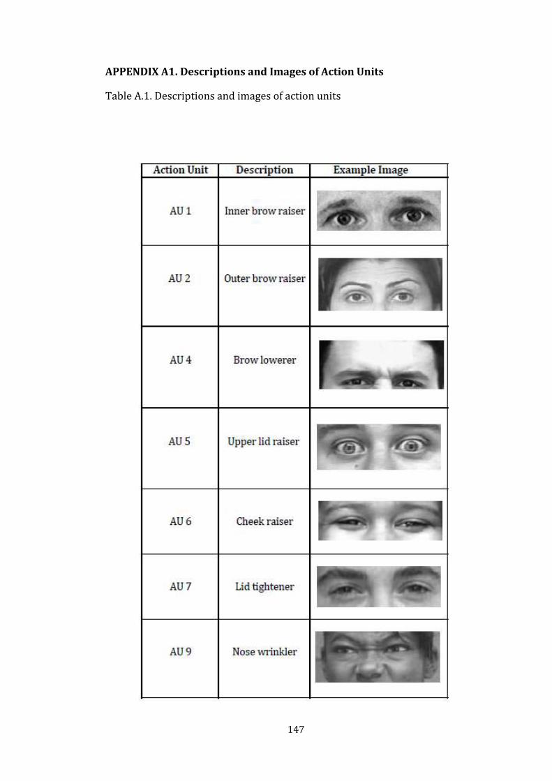
147
APPENDIX A1. Descriptions and Images of Action Units
Table A.1. Descriptions and images of action units

148
Table A.1. (cont’d)

149
Table A.1. (cont’d)

150
Table A.1. (cont’d)

151
Table A.1. (cont’d)

152
Table A.1. (cont’d)

153
Table A.1. (cont’d)

154
APPENDIX A.2. Prototypical Patterns of Facial Expressions of Basic
Emotions
Table A.2. Prototypical patterns of facial expressions (Ekman and Friesen, 1978)
Emotions Prototypical Patterns of Facial Expressions by Action Units (AU)
Happiness
AU 6 +AU 12 AU 12
Anger
AU 4 + AU 5 + AU 7 + AU 10 + AU 22 + AU 23 + AU 25,26 AU 4 + AU 5 + AU 7 + AU 10 + AU 23 + AU 25,26 AU 4 + AU 5 + AU 7 + AU 23 + AU 25,26 AU 4 + AU 5 + AU 7 + AU 17 + AU 23 AU 4 + AU 5 + AU 7 + AU 17 + AU 24 AU 4 + AU 5 + AU 7 + AU 23 AU 4 + AU 5 + AU 7 + AU 24
Sadness
A1 + AU 4 + AU 11 + AU 15 with or without AU 54 + AU 65 A1 + AU 4 + AU 15 with or without AU 54 + AU 65 A6 + AU 15 with or without AU 54 + AU 65 AU 25 & AU 26 may occur with all prototypes
Fear
AU 1 + AU 2 + AU 4 + AU 5 + AU 20 + AU 25 + AU 26 or AU 27 AU 1 + AU 2 + AU 4 + AU 5 + AU 25 + AU 26 or AU 27
Surprise
AU 1 + AU 2 + AU 5 + AU 26 AU 1 + AU 2 + AU 5 + AU 27
Disgust
AU 9 AU 9 + AU 16 + AU 25,26 AU 9 + AU 17 AU 10 AU 10 + AU 16 + AU 25,26 AU 10 + AU 17

155
APPENDIX B
DESCRIPTIONS OF THE SAMPLE GROUP

156
Table B.1. Descriptive statistics showing the mean age of the sample group.
N Minimum Maximum Mean Std.
Deviation
age 180 17,00 26,00 21,0833 1,74930 Valid N (listwise)
180
Table B.2. Sample’s distribution on the basis of age.
Frequency Percent Valid
Percent Cumulative
Percent
Valid 17,00 2 1,1 1,1 1,1 18,00 8 4,4 4,4 5,6 19,00 21 11,7 11,7 17,2 20,00 39 21,7 21,7 38,9 21,00 43 23,9 23,9 62,8 22,00 33 18,3 18,3 81,1 23,00 15 8,3 8,3 89,4 24,00 12 6,7 6,7 96,1 25,00 6 3,3 3,3 99,4 26,00 1 ,6 ,6 100,0 Total 180 100,0 100,0
Table B.3. Computer usage of the sample group.
Frequency Percent Valid
Percent Cumulative
Percent
Valid Five to Ten Years 85 47,2 47,2 47,2 More than Ten
Years 95 52,8 52,8 100,0
Total 180 100,0 100,0
Table B.4. Computer Usage Frequency of the sample group.
Frequency Percent Valid
Percent Cumulative
Percent
Valid A few times a day
121 67,2 67,2 67,2
Everyday 54 30,0 30,0 97,2
Every other day 5 2,8 2,8 100,0
Total 180 100,0 100,0

157
APPENDIX C
SETTING OF THE EXPERIMENT

158
Figure C.1. A view showing the public study area next to the Multimedia Room.
Figure C.2. A view showing the booths for using audio and visual materials.

159
APPENDIX D
INTERIOR SPACES USED IN THE EXPERIMENT

160
Figure D.1. A view from red wall-coloured living room.
Figure D.2. A view from blue wall-coloured living room.

161
Figure D.3. A view from green wall-coloured living room.
Figure D.4. A view from gray wall-coloured living room.

162
APPENDIX E
THE QUESTIONNAIRE

163
APPENDIX E.1. The Questionnaire (in Turkish)
ANKET
AŞAĞIDAKİ SORULARI SİZİN İÇİN EN UYGUN ŞEKİLDE CEVAPLAYINIZ:
Kişisel Bilgiler
1. Cinsiyet: Kız Erkek
2. Yaş: __________________________________
3. Bölüm: __________________________________
4. e-mail: __________________________________
Göz ve Renk Görme Bozukluğu
1. Herhangi bir göz bozukluğunuz var mı? Varsa açıklayınız lütfen.
____________________________________________________________________
2. Bu göz bozukluğunuzu giderecek herhangi bir araç (lens, gözlük, v.b. gibi)
kullanıyor musunuz? Bu araç şu an üzerinizde mi?
____________________________________________________________________
3. Renk Görme Kusuru (Ishihara Renk Körlüğü Testi)
Var Yok
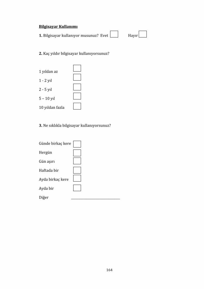
164
Bilgisayar Kullanımı
1. Bilgisayar kullanıyor musunuz? Evet Hayır
2. Kaç yıldır bilgisayar kullanıyorsunuz?
1 yıldan az
1 - 2 yıl
2 - 5 yıl
5 – 10 yıl
10 yıldan fazla
3. Ne sıklıkla bilgisayar kullanıyorsunuz?
Günde birkaç kere
Hergün
Gün aşırı
Haftada bir
Ayda birkaç kere
Ayda bir
Diğer ________________________________

165
APPENDIX E.2. The Questionnaire (in English)
OUESTIONNAIRE
ANSWER THE QUESTIONS APPROPRIATE TO YOUR SITUATION:
Personal Information
1. Gender: Female Male
2. Age: __________________________________
3. Department: __________________________________
4. e-mail: __________________________________
Eye and Colour Vision Deficiency
1. Do you have any eye or vision deficiencies? If yes, please explain.
____________________________________________________________________
2. Do you use any correction equipment (contact lenses, eyeglasses, etc.) for any
eye or vision deficiency you have? Are you wearing this equipment at the
moment?
____________________________________________________________________
3. Colour Deficiency (Ishihara’s Test for Colour Blindness)
Has Has Not

166
Computer Usage
1. Do you use a computer? Yes No
2. About how long have you been using a computer?
Less than one year
One to Two Years
Two to Five Years
Five to Ten Years
More than Ten Years
3. How often do you use a computer?
A few times a day
Every day
Every other day
Once a week
A few times a month
Once a month
Other ______________________

167
APPENDIX F
INFORMATION ABOUT THE STUDY

168
APPENDIX F.1. Information About the Study (in Turkish)
Bu veriler Bilkent Üniversitesi, İç Mimarlık ve Çevre Tasarımı Bölümü’nde
yürütülen “İÇ MEKÂNLARDA RENK-DUYGU İLİŞKİSİ” konulu doktora tezi
çalışması için kullanılacaktır.
Bu çalışma yaklaşık olarak 5 dakikanızı alacaktır.
Bu çalışmada size 7 farklı duyguyu temsil eden yüz ifadeleri verilecektir ve size
2 farklı iç mekânda çekilmiş video görüntüleri izletilecektir. Lütfen gördüğünüz
videolardaki iç mekânları ve onu en iyi temsil eden yüz ifadesini eşleştiriniz.
Bu çalışmada doğru veya yanlış cevap yoktur.
TEŞEKKÜR EDERİZ
Araştırmacının adı: Elif Helvacıoğlu
Yer: Bilkent Üniversitesi Kütüphanesi, Multimedya odası, 8 numaralı kabin,
Ankara-Türkiye.

169
APPENDIX F.2. Information About the Study (in English)
This study is designed to gather data for a Ph.D. Dissertation entitled “Colur-
Emotion Associations in Interior Environments” prepared at Bilkent University,
Department of Interior Architecture and Environmental Design.
This study takes about 5 minutes to complete.
In this study seven faces, each representing different basic emotions, and videos
of two different interior spaces will be shown to you. Please match the shown
interior space with a single face representing a specific emotion that best fit
with each other.
There is no true or wrong answer in this study.
THANK YOU
Name of the researcher: Elif Helvacıoğlu
Location: Bilkent University Library, Multimedia room, 8th booth, Ankara-
Turkey.

170
APPENDIX G
FACIAL EXPRESSIONS OF BASIC EMOTIONS USED IN THE EXPERIMENT
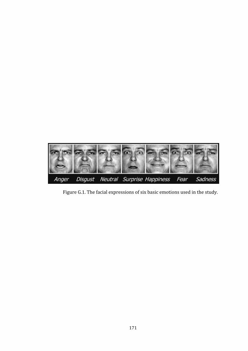
171
Figure G.1. The facial expressions of six basic emotions used in the study.

172
APPENDIX H
DATA ANALYSES

173
Table H.1. Statistics of the sequence of showing coloured room for red room.
SEQUENCE N Mean
Std.
Deviation
Std. Error
Mean
RED ROOM Participants first
experience gray room 30 3,6333 1,42595 ,26034
Participants first
experience red room 30 3,2667 1,63861 ,29917
Table H.2. Independent Samples t-Test results for sequence differences on emotional reactions to red room.
Table H.3. Statistics for gender differences for red room.
GENDER
TOTAL N Mean Std. Deviation Std. Error Mean
RED ROOM Female 30 3,4000 1,37966 ,25189
Male 30 3,5000 1,69685 ,30980
Table H.4. Independent Samples t-Test for gender differences on emotional reactions to red room.
1,620 ,208 ,925 58 ,359 ,36667 ,39659 -,42718 1,16052
,925 56,914 ,359 ,36667 ,39659 -,42751 1,16084
Equal variances
assumed
Equal variances
not assumed
RED
COLOUR
F Sig.
Levene's Test f or
Equality of Variances
t df Sig. (2-tailed)
Mean
Dif f erence
Std. Error
Dif f erence Lower Upper
95% Conf idence
Interv al of the
Dif f erence
t-test for Equality of Means
3,242 ,077 -,250 58 ,803 -,10000 ,39928 -,89925 ,69925
-,250 55,682 ,803 -,10000 ,39928 -,89996 ,69996
Equal variances
assumed
Equal variances
not assumed
RED
COLOUR
F Sig.
Levene's Test f or
Equality of Variances
t df Sig. (2-tailed)
Mean
Dif f erence
Std. Error
Dif f erence Lower Upper
95% Conf idence
Interv al of the
Dif f erence
t-test for Equality of Means

174
Table H.5. Frequency of emotions associated with red room in respect to male gender group.
Frequency Percent Valid
Percent Cumulative
Percent
Valid anger 2 3,3 6,7 6,7 disgust 11 18,3 36,7 43,3 neutral 3 5,0 10,0 53,3 surprise 2 3,3 6,7 60,0 happiness 9 15,0 30,0 90,0 fear 2 3,3 6,7 96,7 sadness 1 1,7 3,3 100,0 Total 30 50,0 100,0
Missing System 30 50,0 Total 60 100,0
Table H.6. Frequency of emotions associated with red room in respect to female gender group.
Frequency Percent Valid
Percent Cumulative
Percent
Valid anger 1 1,7 3,3 3,3 disgust 10 16,7 33,3 36,7 neutral 6 10,0 20,0 56,7 surprise 2 3,3 6,7 63,3 happiness 11 18,3 36,7 100,0 Total 30 50,0 100,0
Missing System 30 50,0 Total 60 100,0

175
Table H.7. Chi-square goodness-of-fit test for emotion association to red room.
Observed
N Expected
N Residual
anger 3 8,6 -5,6 disgust 21 8,6 12,4 neutral 9 8,6 ,4 surprise 4 8,6 -4,6 happiness 20 8,6 11,4 fear 2 8,6 -6,6 sadness 1 8,6 -7,6 Total 60
Test Statistics
RED
Chi-Square(a) 51,067 df 6
Asymp. Sig. ,000
a 0 cells (,0%) have expected frequencies less than 5. The minimum expected cell frequency is 8,6.
Table H.8. Frequency of emotions associated with red room.
Frequency Percent Valid Percent Cumulative
Percent
Valid anger 3 5,0 5,0 5,0 disgust 21 35,0 35,0 40,0 neutral 9 15,0 15,0 55,0 surprise 4 6,7 6,7 61,7 happiness 20 33,3 33,3 95,0 fear 2 3,3 3,3 98,3 sadness 1 1,7 1,7 100,0 Total 60 100,0 100,0
Table H.9. Statistics of the sequence of showing gray room.
SEQUENCE N Mean Std. Deviation
Std. Error
Mean
GRAY ROOM Participants first
experience gray room 30 3,4333 1,79431 ,32759
Participants first
experience red room 30 3,8667 2,25501 ,41171

176
Table H.10. Independent Samples t-Test results for sequence differences on emotional reactions to gray room.
Table H.11. Statistics for gender differences for gray room in the first experiment set.
GENDER
TOTAL N Mean Std. Deviation
Std. Error
Mean
GRAY ROOM Female 30 3,9000 2,26442 ,41342
Male 30 3,4000 1,77337 ,32377
Table H.12. Independent Samples t-Test for gender differences on emotional reactions to gray room in the first experiment set.
6,363 ,014 -,824 58 ,414 -,43333 ,52614 -1,48651 ,61984
-,824 55,214 ,414 -,43333 ,52614 -1,48764 ,62098
Equal variances
assumed
Equal variances
not assumed
GRAY
F Sig.
Levene's Test f or
Equality of Variances
t df Sig. (2-tailed)
Mean
Dif f erence
Std. Error
Dif f erence Lower Upper
95% Conf idence
Interv al of the
Dif f erence
t-test for Equality of Means
7,863 ,007 ,952 58 ,345 ,50000 ,52512 -,55113 1,55113
,952 54,849 ,345 ,50000 ,52512 -,55242 1,55242
Equal variances
assumed
Equal variances
not assumed
GRAY
F Sig.
Levene's Test f or
Equality of Variances
t df Sig. (2-tailed)
Mean
Dif f erence
Std. Error
Dif f erence Lower Upper
95% Conf idence
Interv al of the
Dif f erence
t-test for Equality of Means

177
Table H.13. Frequency of emotions associated with gray room in respect to male gender group in the first experiment set.
Frequency Percent Valid
Percent Cumulative
Percent
Valid anger 1 1,7 3,3 3,3 disgust 9 15,0 30,0 33,3 neutral 13 21,7 43,3 76,7 surprise 1 1,7 3,3 80,0 fear 2 3,3 6,7 86,7 sadness 4 6,7 13,3 100,0 Total 30 50,0 100,0
Missing System 30 50,0 Total 60 100,0
Table H.14. Frequency of emotions associated with gray room in respect to female gender group in the first experiment set.
Frequency Percent Valid
Percent Cumulative
Percent
Valid disgust 13 21,7 43,3 43,3 neutral 7 11,7 23,3 66,7 sadness 10 16,7 33,3 100,0 Total 30 50,0 100,0
Missing System 30 50,0 Total 60 100,0

178
Table H.15. Chi-square goodness-of-fit test for emotion association to gray room
in the first experiment set.
Observed
N Expected
N Residual
anger 1 10,0 -9,0 disgust 22 10,0 12,0 neutral 20 10,0 10,0 surprise 1 10,0 -9,0 fear 2 10,0 -8,0 sadness 14 10,0 4,0 Total 60
Test Statistics
GRAY
Chi-Square(a) 48,600 df 5 Asymp. Sig. ,000
a 0 cells (,0%) have expected frequencies less than 5. The minimum expected cell frequency is 10,0.
Table H.16. Frequency of emotions associated with gray room in the first experiment set.
Frequency Percent Valid Percent Cumulative
Percent
Valid anger 1 1,7 1,7 1,7 disgust 22 36,7 36,7 38,3 neutral 20 33,3 33,3 71,7 surprise 1 1,7 1,7 73,3 fear 2 3,3 3,3 76,7 sadness 14 23,3 23,3 100,0 Total 60 100,0 100,0

179
Table H.17. Paired Samples t-Test for emotional association differences between
red room and gray room.
Table H.18. Statistics of the sequence of showing coloured rooms for green
room.
SEQUENCE N Mean Std. Deviation
Std. Error
Mean
GREEN ROOM Participants first
experience gray room 30 4,4667 1,45586 ,26580
Participants first
experience green room 30 3,5333 1,33218 ,24322
Table H.19. Independent Samples t-Test results for sequence differences on emotional reactions to green room.
,019 ,890 2,591 58 ,012 ,93333 ,36029 ,21214 1,65453
2,591 57,549 ,012 ,93333 ,36029 ,21202 1,65465
Equal variances
assumed
Equal variances
not assumed
GREEN
F Sig.
Levene's Test f or
Equality of Variances
t df Sig. (2-tailed)
Mean
Dif f erence
Std. Error
Dif f erence Lower Upper
95% Conf idence
Interv al of the
Dif f erence
t-test for Equality of Means
Paired Differences
t df Sig. (2-tailed)
Mean Std. Deviation Std. Error
Mean
95% Confidence Interval of the Difference
Lower Upper
Pair COLOUR - EMOTION
-2,05000 1,89138 ,17266 -2,39188 -1,70812 -11,873 119 ,000

180
Table H.20. Frequency of emotions associated with green room in respect to
showing order (viewed after gray room).
Frequency Percent Valid Percent Cumulative
Percent
Valid anger 1 1,7 3,3 3,3 disgust 3 5,0 10,0 13,3 neutral 4 6,7 13,3 26,7 surprise 1 1,7 3,3 30,0 happiness 17 28,3 56,7 86,7 fear 2 3,3 6,7 93,3 sadness 2 3,3 6,7 100,0 Total 30 50,0 100,0
Missing System 30 50,0 Total 60 100,0
Table H.21. Frequency of emotions associated with green room in respect to
showing order (viewed before gray room).
Frequency Percent Valid Percent
Cumulative Percent
Valid anger 1 1,7 3,3 3,3
disgust 6 10,0 20,0 23,3
neutral 11 18,3 36,7 60,0
surprise 1 1,7 3,3 63,3
happiness 10 16,7 33,3 96,7
fear 1 1,7 3,3 100,0
Total 30 50,0 100,0
Missing System 30 50,0
Total 60 100,0
Table H.22. Statistics for gender differences for green room.
GENDER
TOTAL N Mean Std. Deviation Std. Error Mean
GREEN ROOM Female 30 4,0667 1,25762 ,22961
Male 30 3,9333 1,65952 ,30299

181
Table H.23. Independent Samples t-Test for gender differences on emotional reactions to green room.
Table H.24. Frequency of emotions associated with green room in respect to male gender group.
Frequency Percent Valid Percent Cumulative
Percent
Valid anger 2 3,3 6,7 6,7 disgust 5 8,3 16,7 23,3 neutral 7 11,7 23,3 46,7 happiness 13 21,7 43,3 90,0 fear 1 1,7 3,3 93,3 sadness 2 3,3 6,7 100,0 Total 30 50,0 100,0
Missing System 30 50,0 Total 60 100,0
Table H.25. Frequency of emotions associated with green room in respect to female gender group.
Frequency Percent Valid Percent Cumulative
Percent
Valid disgust 4 6,7 13,3 13,3 neutral 8 13,3 26,7 40,0 surprise 2 3,3 6,7 46,7 happiness 14 23,3 46,7 93,3 fear 2 3,3 6,7 100,0 Total 30 50,0 100,0
Missing System 30 50,0 Total 60 100,0
4,513 ,038 ,351 58 ,727 ,13333 ,38016 -,62764 ,89430
,351 54,048 ,727 ,13333 ,38016 -,62882 ,89549
Equal variances
assumed
Equal variances
not assumed
GREEN
F Sig.
Levene's Test f or
Equality of Variances
t df Sig. (2-tailed)
Mean
Dif f erence
Std. Error
Dif f erence Lower Upper
95% Conf idence
Interv al of the
Dif f erence
t-test for Equality of Means

182
Table H.26. Chi-square goodness-of-fit test for emotion association to green room (first experience green room).
Observed N Expected N Residual
anger 1 5,0 -4,0
disgust 6 5,0 1,0
neutral 11 5,0 6,0
surprise 1 5,0 -4,0
happiness 10 5,0 5,0
fear 1 5,0 -4,0
Total 30
Test Statistics
GREEN
Chi-Square 22,000a
df 5
Asymp. Sig. ,001
a 0 cells (,0%) have expected frequencies less than 5. The minimum expected cell frequency is 15,0.
Table H.27. Statistics of the sequence of showing coloured room for gray room.
SEQUENCE N Mean Std. Deviation
Std. Error
Mean
GRAY ROOM Participants first
experience gray room 30 3,5333 1,87052 ,34151
Participants first
experience green room 30 4,1000 2,32453 ,42440
Table H.28. Independent Samples t-Test results for sequence differences on emotional reactions to gray room.
8,825 ,004 -1,040 58 ,303 -,56667 ,54474 -1,65709 ,52375
-1,040 55,461 ,303 -,56667 ,54474 -1,65815 ,52482
Equal variances
assumed
Equal variances
not assumed
GRAY
F Sig.
Levene's Test f or
Equality of Variances
t df Sig. (2-tailed)
Mean
Dif f erence
Std. Error
Dif f erence Lower Upper
95% Conf idence
Interv al of the
Dif f erence
t-test for Equality of Means

183
Table H.29. Statistics for gender differences for gray room in the second experiment set.
GENDER
TOTAL N Mean Std. Deviation
Std. Error
Mean
GRAY ROOM Female 30 4,0333 2,22033 ,40538
Male 30 3,6000 2,01032 ,36703
Table H.30. Independent Samples t-Test for gender differences on emotional reactions to gray room in the second experiment set.
Table H.31. Frequency of emotions associated with gray room in respect to male gender group in the second experiment set.
Frequency Percent Valid Percent Cumulative
Percent
Valid disgust 12 20,0 40,0 40,0 neutral 10 16,7 33,3 73,3 happiness 1 1,7 3,3 76,7 sadness 7 11,7 23,3 100,0 Total 30 50,0 100,0
Missing System 30 50,0 Total 60 100,0
2,266 ,138 ,792 58 ,431 ,43333 ,54685 -,66130 1,52797
,792 57,437 ,431 ,43333 ,54685 -,66153 1,52820
Equal variances
assumed
Equal variances
not assumed
GRAY
F Sig.
Levene's Test f or
Equality of Variances
t df Sig. (2-tailed)
Mean
Dif f erence
Std. Error
Dif f erence Lower Upper
95% Conf idence
Interv al of the
Dif f erence
t-test for Equality of Means

184
Table H.32. Frequency of emotions associated with gray room in respect to
female gender group in the second experiment set.
Frequency Percent Valid Percent Cumulative
Percent
Valid disgust 11 18,3 36,7 36,7 neutral 8 13,3 26,7 63,3 happiness 1 1,7 3,3 66,7 sadness 10 16,7 33,3 100,0 Total 30 50,0 100,0
Missing System 30 50,0 Total 60 100,0
Table H.33. Chi-square goodness-of-fit test for emotion association to gray room in the second experiment set.
Observed N Expected N Residual
disgust 23 15,0 8,0 neutral 18 15,0 3,0 happiness 2 15,0 -13,0 sadness 17 15,0 2,0 Total 60
Test Statistics
GRAY
Chi-Square(a)
16,400
df 3 Asymp. Sig. ,001
a 0 cells (,0%) have expected frequencies less than 5. The minimum expected cell frequency is 15,0.
Table H.34. Frequency of emotions associated with gray room in the second
experiment set.
Frequency Percent Valid
Percent Cumulative
Percent
Valid disgust 23 38,3 38,3 38,3 neutral 18 30,0 30,0 68,3 happiness 2 3,3 3,3 71,7 sadness 17 28,3 28,3 100,0 Total 60 100,0 100,0

185
Table H.35. Paired Samples t-Test for emotional association differences between
green room and gray room.
Paired Differences
t df Sig. (2-tailed)
Mean Std.
Deviation Std. Error
Mean
95% Confidence Interval of the Difference
Lower Upper
Pair COLOUR - EMOTION -2,47500
2,02074 ,18447 -2,84026 -2,10974 -13,417 119 ,000
Table H.36. Statistics of the sequence of showing coloured room for blue room.
SEQUENCE N Mean Std. Deviation
Std. Error
Mean
BLUE ROOM Participants first
experience gray room 30 3,7667 1,67504 ,30582
Participants first
experience blue room 30 3,8333 1,72374 ,31471
Table H.37. Independent Samples t-Test results for sequence differences on emotional reactions to blue room.
Table H.38. Statistics for gender differences for blue room.
GENDER
TOTAL N Mean Std. Deviation Std. Error Mean
BLUE ROOM Female 30 4,1667 1,72374 ,31471
Male 30 3,4333 1,59056 ,29040
,000 1,000 -,152 58 ,880 -,06667 ,43882 -,94507 ,81174
-,152 57,952 ,880 -,06667 ,43882 -,94508 ,81175
Equal variances
assumed
Equal variances
not assumed
BLUE
F Sig.
Levene's Test f or
Equality of Variances
t df Sig. (2-tailed)
Mean
Dif f erence
Std. Error
Dif f erence Lower Upper
95% Conf idence
Interv al of the
Dif f erence
t-test for Equality of Means

186
Table H.39. Independent Samples t-Test for gender differences on emotional reactions to blue room.
Table H.40. Frequency of emotions associated with blue room in respect to male gender group.
Frequency Percent Valid Percent Cumulative
Percent
Valid anger 3 5,0 10,0 10,0 disgust 3 5,0 10,0 20,0 neutral 15 25,0 50,0 70,0 surprise 2 3,3 6,7 76,7 happiness 3 5,0 10,0 86,7 fear 2 3,3 6,7 93,3 sadness 2 3,3 6,7 100,0 Total 30 50,0 100,0
Missing System 30 50,0 Total 60 100,0
Table H.41. Frequency of emotions associated with blue room in respect to
female gender group.
Frequency Percent Valid
Percent Cumulative
Percent
Valid disgust 5 8,3 16,7 16,7 neutral 10 16,7 33,3 50,0 surprise 2 3,3 6,7 56,7 happiness 5 8,3 16,7 73,3 fear 4 6,7 13,3 86,7 sadness 4 6,7 13,3 100,0 Total 30 50,0 100,0
Missing System 30 50,0 Total 60 100,0
1,870 ,177 1,713 58 ,092 ,73333 ,42822 -,12384 1,59051
1,713 57,629 ,092 ,73333 ,42822 -,12396 1,59062
Equal variances
assumed
Equal variances
not assumed
BLUE
F Sig.
Levene's Test f or
Equality of Variances
t df Sig. (2-tailed)
Mean
Dif f erence
Std. Error
Dif f erence Lower Upper
95% Conf idence
Interv al of the
Dif f erence
t-test for Equality of Means

187
Table H.42. Chi-square goodness-of-fit test for emotion association to blue room.
Observed
N Expected
N Residual
anger 3 8,6 -5,6 disgust 8 8,6 -,6 neutral 25 8,6 16,4 surprise 4 8,6 -4,6 happiness 8 8,6 -,6 fear 6 8,6 -2,6 sadness 6 8,6 -2,6 Total 60
Test Statistics
BLUE
Chi-Square(a) 39,167 df 6 Asymp. Sig. ,000
a 0 cells (,0%) have expected frequencies less than 5. The minimum expected cell frequency is 8,6.
Table H.43. Frequency of emotions associated with blue room.
Frequency Percent Valid Percent Cumulative
Percent
Valid anger 3 5,0 5,0 5,0 disgust 8 13,3 13,3 18,3 neutral 25 41,7 41,7 60,0 surprise 4 6,7 6,7 66,7 happiness 8 13,3 13,3 80,0 fear 6 10,0 10,0 90,0 sadness 6 10,0 10,0 100,0 Total 60 100,0 100,0

188
Table H.44. Statistics of the sequence of showing coloured room for gray room
in the third experiment set.
SEQUENCE N Mean Std. Deviation
Std. Error
Mean
GRAY ROOM Participants first
experience gray room 30 3,8000 2,00688 ,36641
Participants first
experience blue room 30 4,5000 2,19325 ,40043
Table H.45. Independent Samples t-Test results for sequence differences on emotional reactions to gray room in the third experiment set.
Table H.46. Statistics for gender differences for gray room in the third set.
GENDER
TOTAL N Mean Std. Deviation
Std. Error
Mean
GRAY ROOM Female 30 4,4000 2,12700 ,38834
Male 30 3,9000 2,10664 ,38462
Table H.47. Independent Samples t-Test for gender differences on emotional
reactions to gray room in the third set.
2,765 ,102 -1,290 58 ,202 -,70000 ,54277 -1,78647 ,38647
-1,290 57,549 ,202 -,70000 ,54277 -1,78665 ,38665
Equal variances
assumed
Equal variances
not assumed
GRAY
F Sig.
Levene's Test f or
Equality of Variances
t df Sig. (2-tailed)
Mean
Dif f erence
Std. Error
Dif f erence Lower Upper
95% Conf idence
Interv al of the
Dif f erence
t-test for Equality of Means
,370 ,545 ,915 58 ,364 ,50000 ,54657 -,59407 1,59407
,915 57,995 ,364 ,50000 ,54657 -,59408 1,59408
Equal variances
assumed
Equal variances
not assumed
GRAY
F Sig.
Levene's Test f or
Equality of Variances
t df Sig. (2-tailed)
Mean
Dif f erence
Std. Error
Dif f erence Lower Upper
95% Conf idence
Interv al of the
Dif f erence
t-test for Equality of Means

189
Table H.48. Frequency of emotions associated with gray room in respect to male participants in the third experiment set.
Frequency Percent Valid
Percent Cumulative
Percent
Valid disgust 9 15,0 30,0 30,0 neutral 12 20,0 40,0 70,0 sadness 9 15,0 30,0 100,0 Total 30 50,0 100,0
Missing System 30 50,0 Total 60 100,0
Table H.49. Frequency of emotions associated with gray room in respect to
female participants in the third experiment set.
Frequency Percent Valid
Percent Cumulative
Percent
Valid disgust 6 10,0 20,0 20,0 neutral 11 18,3 36,7 56,7 happiness 2 3,3 6,7 63,3 sadness 11 18,3 36,7 100,0 Total 30 50,0 100,0
Missing System 30 50,0 Total 60 100,0
Table H.50. Chi-square goodness-of-fit test for emotion association to gray room in the third experiment set.
Observed N Expected N Residual
disgust 15 15,0 ,0 neutral 23 15,0 8,0 happiness 2 15,0 -13,0 sadness 20 15,0 5,0 Total 60
Test Statistics
GRAY
Chi-Square(a) 17,200 df 3
Asymp. Sig. ,001
a 0 cells (,0%) have expected frequencies less than 5. The minimum expected cell frequency is 15,0.
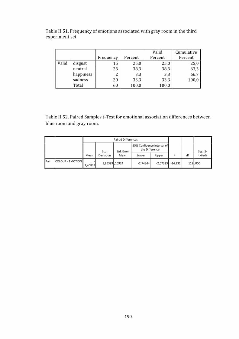
190
Table H.51. Frequency of emotions associated with gray room in the third experiment set.
Frequency Percent Valid
Percent Cumulative
Percent
Valid disgust 15 25,0 25,0 25,0 neutral 23 38,3 38,3 63,3 happiness 2 3,3 3,3 66,7 sadness 20 33,3 33,3 100,0 Total 60 100,0 100,0
Table H.52. Paired Samples t-Test for emotional association differences between
blue room and gray room.
Paired Differences
t df Sig. (2-tailed)
Mean Std.
Deviation Std. Error
Mean
95% Confidence Interval of the Difference
Lower Upper
Pair COLOUR - EMOTION -2,40833
1,85389 ,16924 -2,74344 -2,07323 -14,231 119 ,000