colour meaning and context - white rose research...
TRANSCRIPT

This is a repository copy of Colour meaning and context.
White Rose Research Online URL for this paper:http://eprints.whiterose.ac.uk/110943/
Version: Accepted Version
Article:
Won, S and Westland, S orcid.org/0000-0003-3480-4755 (2017) Colour meaning and context. Color Research and Application, 42 (4). pp. 450-459. ISSN 0361-2317
https://doi.org/10.1002/col.22095
© 2016 Wiley Periodicals, Inc. This is the peer reviewed version of the following article: Won, S and Westland, S (2016) Colour meaning and context. Color Research and Application. ISSN 0361-2317; which has been published in final form at https://doi.org/10.1002/col.22095. This article may be used for non-commercial purposes in accordance with the Wiley Terms and Conditions for Self-Archiving.
[email protected]://eprints.whiterose.ac.uk/
Reuse
Unless indicated otherwise, fulltext items are protected by copyright with all rights reserved. The copyright exception in section 29 of the Copyright, Designs and Patents Act 1988 allows the making of a single copy solely for the purpose of non-commercial research or private study within the limits of fair dealing. The publisher or other rights-holder may allow further reproduction and re-use of this version - refer to the White Rose Research Online record for this item. Where records identify the publisher as the copyright holder, users can verify any specific terms of use on the publisher’s website.
Takedown
If you consider content in White Rose Research Online to be in breach of UK law, please notify us by emailing [email protected] including the URL of the record and the reason for the withdrawal request.

AUTHORS’ PEER REVIEWD SUBMITTED MANUSCRIPT
1
Colour Meaning and Context Won and Westland, Color Research and Application (2016)
Colour Meaning and Context Seahwa Won, Stephen Westland
School of Design, University of Leeds, Leeds, UK
Abstract: This study compares semantic ratings of
colour samples (chips) with those of the same
colours applied to a variety of objects. In total, 25
participants took part in the colour-meaning
experiment, and assessed 54 images using five
semantic scales. In Experiment 1, simplified
images (coloured silhouettes) were used whereas
in Experiment 2 real images were used. In this
article, the terms ‘chip meaning’ and ‘context
meaning’ are used for convenience. Chip meaning
refers to the associated meanings when only
isolated colour chips were evaluated while context
meaning refers to colour meanings evaluated when
colours were applied to a variety of product
categories. Analyses were performed on the data
for the two experiments individually. The results of
Experiment 1 show relatively few significant
differences (28%) between chip meaning and
context meaning. However, differences were found
for a number of colours, objects and semantic
scales i.e. red and black; hand wash and medicine;
and masculine-feminine and elegant-vulgar. The
results of Experiment 2 show more significant
differences (43%) between chip meaning and
context meaning. In summary, the context
sometimes affects the colour meaning; however
the degree to which colour meanings are invariant
to context is perhaps slightly surprising and has
implications for the use of colour chips in colour
planning and for the generality of results from
earlier colour-meaning research.
INTRODUCTION
Colour meanings have been widely researched in
various disciplines including science, design,
psychology, and marketing. Much colour-meaning
research has used isolated colour chips as stimuli
without consideration of context (i.e. without being
placed in the context of a product category, for
example) due to the experiments being easy and
inexpensive1-2. Participants are typically requested
to rate the colour chips against bi-polar scales such
as warm-cold and masculine-feminine.3-4 Whitfield
and Whiltshire, however, have criticised the
absence of the context in such colour-meaning
research and argued that such research has little
value due to methodological shortcomings5.
Crozier also highlighted the importance of
contextualising judgements in colour research6.
The research that has been carried out on colour
in context has led to a confusing situation. In 1957
Osgood et al.7 asked participants to rate 6 colours
on 5 objects (and as a spot colour) against 20
semantic scales and a significant interaction
between colour and object was found; that is,
meanings depend upon context. A later study,
comparing the colour ratings of types of simulated

AUTHORS’ PEER REVIEWD SUBMITTED MANUSCRIPT
2
Colour Meaning and Context Won and Westland, Color Research and Application (2016)
building exteriors reported data that were
somewhat consistent with those of Osgood et al.
although some scales showed a greater
dependence on the context than others8. In the
context of interior architecture design, Ural and
Yilmazer compared four situations such as isolated
colour chips, abstract composition, 2D drawings
and a simulated 3D interior space, and
demonstrated that the colour meanings depend
upon context9. Studies to explore the effect of
context in room interiors have also revealed a
relationship between context and colour
meaning10-11. Also, it has been noted that pink may
be associated with femininity when viewed on a
baby blanket, but not when seen on a piece of
bubble gum2. In a related field, there is growing
evidence that context and experience may drive
individual differences in colour preference12. There
has also been work to suggest that there could be
differences in colour associations made by
professionals and laymen13. However, a study by
Taft (1996) attested that there were few significant
differences between semantic ratings on colour
chips and contextual colours1.
This work is concerned with colour in packaging of
food and household goods. It is widely known that
in packaging (and the often-related area of
branding) colour meanings play an important role;
they convey product and brand meanings. Yet,
published empirical studies on the relationship
between brand-packaging colour and context are
rare and theoretical colour knowledge arises from
the prior studies mostly without the consideration
of the context9. Moreover, choosing isolated colour
samples from design resources and then applying
these decisions to real design outcomes is a widely
used approach by design professionals1,9.
The theory of colour in context has been reviewed
by Elliot and Maier2 who suggest, for example, that
colour meanings (and their associated
psychological responses) result from two sources
(biology and learning). Elliot and Maier also note
that some colour-meaning research has had
methodological short-comings and especially
stress the importance of using colorimetry to
specify and control colours used in experiments2.
The question that this study addresses is whether
it is appropriate to use the colour-meaning
resources derived from prior research or
references without consideration of the specific
context? The answer is unlikely to be a categorical
yes or not but, rather, the question may be
reformulated to explore to what extent do
meanings obtained from chip colours (without
context) apply to real design situations? The lack
of accurate information on colour meaning in
packaging and branding, and the need for such
research, has been suggested in marketing14.
Taft carried out a study to compare semantic
ratings of colour samples with those from the same
colours applied to a set of objects1. Taft found
reported few significant differences between chip
and object ratings for the same colour;
interestingly, when such differences existed, the
chip was always rated more beautiful, elegant,
discreet, feminine and warm than the object colour.
However, some differences were found particularly
for the computer and antique chair objects, for red,
green and purple colours, and for three of the
scales (beautiful-ugly, discreet-loud, and elegant-
vulgar). This work revisits the Taft study to some
extent; however, it is focused on the effect of
context on colours used in a more commercial
environment (packaging) where brand awareness
may also play a factor.
In this study a psychophysical experiment has
been carried out to explore the relationship

AUTHORS’ PEER REVIEWD SUBMITTED MANUSCRIPT
3
Colour Meaning and Context Won and Westland, Color Research and Application (2016)
between the meanings of colours when viewed in
context and when viewed as abstract isolated
patches.
METHOD
Selection of Colour Stimuli and Bi-polar Words
In order to obtain meaningful data it is necessary to
adopt a meaningful set of words (or scales) rather
than using words that simply sound appropriate15.
The contexts selected for this study were
cosmetics, crisps, toilet tissue, hand wash,
medicine and white wine. The scales chosen in this
study were selected with consideration for the
types of product packaging that were used. Thus,
five words - male, warm, expensive, traditional and
luxury - were selected. Some of words such as
male and luxury were changed to approximate
synonyms like masculine and elegant and the
relevant opposite words were chosen according to
the Oxford English Dictionary. Finally, the selected
five bi-polar scales were masculine-feminine,
warm-cold, elegant-vulgar, expensive-inexpensive
and modern-traditional. The first three of these
were used by Taft (1996) but Taft’s beautiful-ugly
and loud-discreet scales have been replaced with
scales that are more meaningful for the context of
this study.
Six colours were selected for study: beige, black,
blue, green, red and yellow. In some sense, the
choice of colours is arbitrary since it is the
difference between chip meaning and context
meaning that is the focus of the study, and it is
simply sufficient to include a variety of colours to
test that. However, red, green, yellow and blue
were chosen as the four hues because they are the
psychological primaries16; they are commonly used
in packaging applications and have been
associated with a number of global brands. These
four primary hues were supplemented with beige
and black. A number of studies17-26 have reported
associations for these six colours (see Table 1 for
summary).
TABLE 1: Colour meanings for colour beige,
black, blue, green, red and yellow.
Experimental Details
Two experiments were conducted. In the first
experiment to explore the effect of context, the
stimuli were either images of product packaging or
simple colour patches. The packaging images
were simplified (to remove, for example, any brand

AUTHORS’ PEER REVIEWD SUBMITTED MANUSCRIPT
4
Colour Meaning and Context Won and Westland, Color Research and Application (2016)
information) so that their colour could easily be
manipulated and was the only variable. In the
second experiment, the simplified packaging
images were replaced by the original packaging
images. Although in this second experiment the
packaging images were realistic, there was usually
more than one colour on the packaging and other
associated graphics and text that make analysis
and general conclusions difficult. However, by
using both simplified (Experiment 1) and real-world
(Experiment 2) packaging images, it may be
possible to make reliable and insightful
conclusions.
In Experiment 1, the colour of each of the simplified
packaging images was manipulated to be one of
the six experimental colours. These six colours
were chosen from the Pantone range and when
viewed as a chip colour were displayed as 6cm x
6cm patches on a light grey (R=G=B=204)
background (Table 2 shows the colour names and
Pantone notations used along with the sRGB
colour values). In Experiment 2, each of the
packaging images was shown as only one of the
colours (manipulation of the colours would be
difficult and would affect contrast, for example, with
others in the image). The colours used in the
Experiment 2 were very similar, but not identical, to
those in Experiment 1 (see Table 2). The colour
stimuli were specified in sRGB values and
displayed in the native colour space of the display;
that is, colour management was not employed, but
then the actual colours that were displayed were
measured (CIE Yxy values) using a
spectroradiometer (Minolta CS-100A). The
measured Yxy values are provided in Appendix A
so that other researchers can reproduce exactly
the colours used.
A total of 54 images (42 for Experiment 1 and 12
for Experiment 2) were generated as shown in
Table 3. In total, 25 participants (male=8 and
female=17) between the ages of 26 and 45 took
part in the study. All participants were students at
the University of Leeds and their nationalities were
British or European (32%), Asian (52%), and
Arabic (16%).
TABLE 2: Specifications of the colours used in the
two phases (see Appendix 1 for colorimetric
measurements).
TABLE 3: 42 images used in part A (from top:
colour chips, cosmetics, crisps, toilet tissue,
hand wash, medicine and white wine) and
12 images used in part B.
Participants were screened and any who reported
that they had a colour deficiency were excluded. All
participants were given both written and verbal
instruction about the task, and received an
informed-consent form. A dark experimental room
(3m x 3m) was prepared. All participants viewed
the images with the same computer in the same
room. Before engaging with the experiment,
participants had a short practice where they rated
several images against the five semantic scales to
AUTHORS’ PEER REVIEWD SUBMITTED MANUSCRIPT
5
Colour Meaning and Context Won and Westland, Color Research and Application (2016)
get used to the survey and the dark condition of the
experimental room. The 54 images with five bi-
polar scales were then presented in random order
(the two experiments were interleaved). On
average, each participant took about 30 minutes to
complete the task. The total number of
observations was 6,750 (54 images × 5 scales × 25
observers). For each observation, observers
indicated the extent of the bi-polar scale for the
colour being displayed using a slider bar.
Data Analysis
The raw scale bar values obtained from the
experiment were averaged across all 25 observers.
The mean scale values from the chip colours and
context colours were then plotted and the
coefficient of determination (r2) was calculated as a
measure of correlation. In addition t-tests were
carried out to ascertain whether the scale values
obtained for chip colour and context colours were
the same. Finally a t-test was carried out between
the scale values obtained from the two
experiments.
RESULTS
Correlation (Experiment 1)
Figures 1-5 present the results from Experiment 1
for the scales masculine-feminine, warm-cold,
expensive-inexpensive, modern-traditional and
elegant-vulgar respectively. In each figure, data
are separately shown for each of the six packaging
contexts. On the left-hand, there is a bar chart
showing the scale values (chip meaning and
context meaning) for each of the six colours. On
the right-hand side, chip meanings are plotted
against context meanings and the correlation is
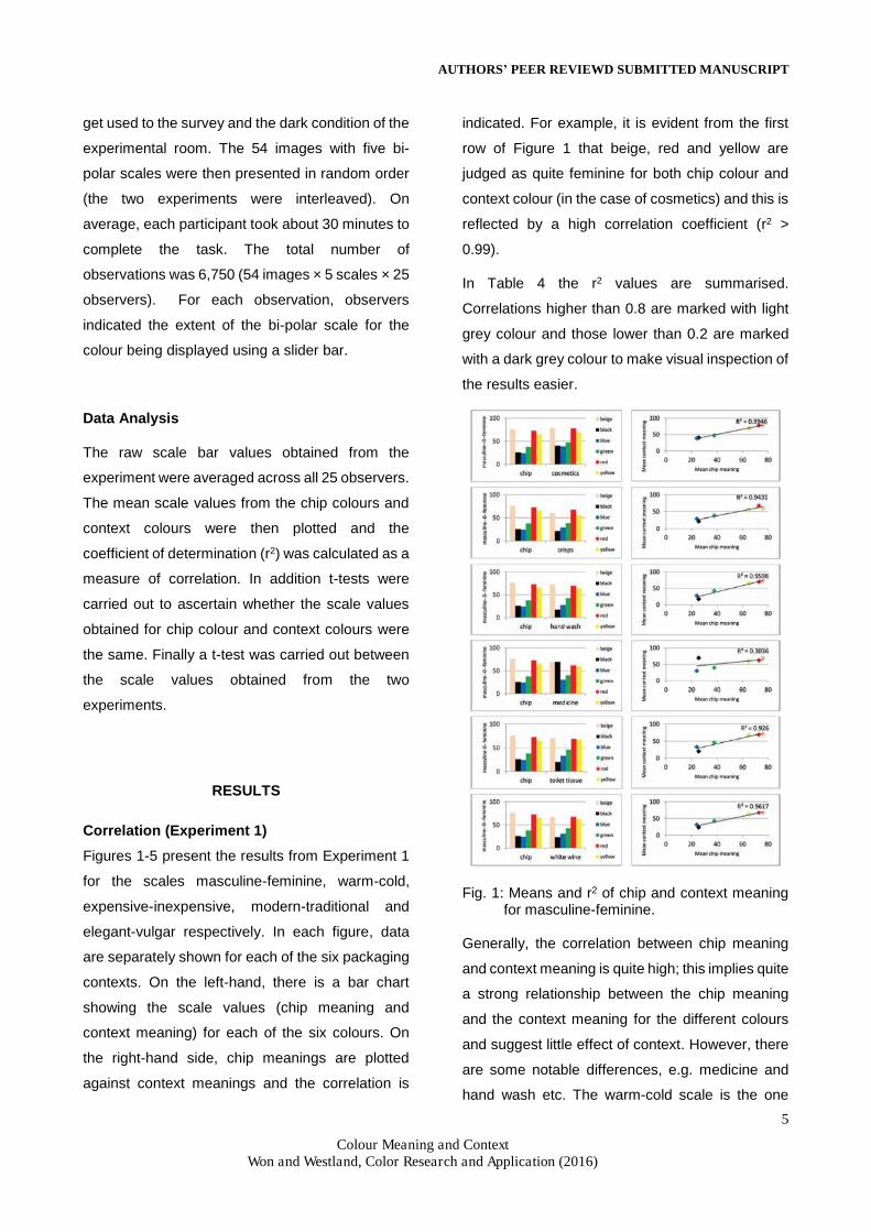
indicated. For example, it is evident from the first
row of Figure 1 that beige, red and yellow are
judged as quite feminine for both chip colour and
context colour (in the case of cosmetics) and this is
reflected by a high correlation coefficient (r2 >
0.99).
In Table 4 the r2 values are summarised.
Correlations higher than 0.8 are marked with light
grey colour and those lower than 0.2 are marked
with a dark grey colour to make visual inspection of
the results easier.
Fig. 1: Means and r2 of chip and context meaning for masculine-feminine.
Generally, the correlation between chip meaning
and context meaning is quite high; this implies quite
a strong relationship between the chip meaning
and the context meaning for the different colours
and suggest little effect of context. However, there
are some notable differences, e.g. medicine and
hand wash etc. The warm-cold scale is the one

AUTHORS’ PEER REVIEWD SUBMITTED MANUSCRIPT
6
Colour Meaning and Context Won and Westland, Color Research and Application (2016)
where there is consistently very high correlation
between chip meaning and context meaning (Table
4). Masculine-feminine also shows particularly high
correlation in every case except for medicine.
Modern-traditional shows the greatest variance
with high correlation in the case of cosmetics and
toilet tissue, much lower correlation in the case of
crisps and medicine, and almost no correlation in
the case of hand wash.
Fig. 2: Means and r2 of chip and context meaning
for warm-cold.
Fig. 3: Means and r2 of chip and context meaning
for expensive-inexpensive.
Fig. 4: Means and r2 of chip and context meaning
for modern-traditional.

AUTHORS’ PEER REVIEWD SUBMITTED MANUSCRIPT
7
Colour Meaning and Context Won and Westland, Color Research and Application (2016)
Fig. 5: Means and r2 of chip and context meaning
for elegant-vulgar.
A high correlation between two things does not
necessarily imply equality between those things.
For example, considering the cosmetic context
(Figure 1) although there is a high correlation, the
colours are generally judged to be a little more
feminine for context meaning rather than for chip
meaning. An additional analysis is the t-test which
will specifically test to see whether the context
meanings and chip meanings are the same or not.
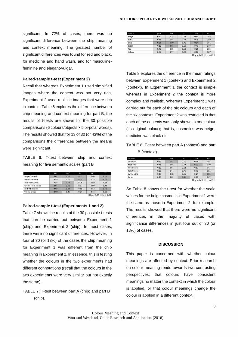
TABLE 4: r2 between chip and context meaning for
the five semantic scales (part A).
TABLE 5: T-test between chip and context
meaning for five semantic scales (part A). Bi-
polar words abbreviations are: M-F =
Masculine-Feminine, W-C = Warm-Cold, E-I
= Expensive-Inexpensive, M-T = Modern-
Traditional, E-V = Elegant-Vulgar.
Paired-sample t-test (Experiment 1)
The paired-sample t-test comparison was used to
test for significant differences between chip
meaning and context meaning.
As shown in Table 5, in Experiment 1 there were
180 different comparisons between chip meaning
and context meaning (6 colours × 6 objects × 5 bi-
polar words) and each was subjected to a paired t-
test. When the p values were higher than 0.05, they
were marked with light grey colour, and when they
were lower than 0.05, they were marked with dark
grey colour.
Statistical significance is therefore notated by a
dark-grey colour. The result showed that 51 of 180
possible mean differences (that is, 28%) were
AUTHORS’ PEER REVIEWD SUBMITTED MANUSCRIPT
8
Colour Meaning and Context Won and Westland, Color Research and Application (2016)
significant. In 72% of cases, there was no
significant difference between the chip meaning
and context meaning. The greatest number of
significant differences was found for red and black,
for medicine and hand wash, and for masculine-
feminine and elegant-vulgar.
Paired-sample t-test (Experiment 2)
Recall that whereas Experiment 1 used simplified
images where the context was not very rich,
Experiment 2 used realistic images that were rich
in context. Table 6 explores the difference between
chip meaning and context meaning for part B; the
results of t-tests are shown for the 30 possible
comparisons (6 colours/objects × 5 bi-polar words).
The results showed that for 13 of 30 (or 43%) of the
comparisons the differences between the means
were significant.
TABLE 6: T-test between chip and context
meaning for five semantic scales (part B
Paired-sample t-test (Experiments 1 and 2)
Table 7 shows the results of the 30 possible t-tests
that can be carried out between Experiment 1
(chip) and Experiment 2 (chip). In most cases,
there were no significant differences. However, in
four of 30 (or 13%) of the cases the chip meaning
for Experiment 1 was different from the chip
meaning in Experiment 2. In essence, this is testing
whether the colours in the two experiments had
different connotations (recall that the colours in the
two experiments were very similar but not exactly
the same).
TABLE 7: T-test between part A (chip) and part B
(chip).
Table 8 explores the difference in the mean ratings
between Experiment 1 (context) and Experiment 2
(context). In Experiment 1 the context is simple
whereas in Experiment 2 the context is more
complex and realistic. Whereas Experiment 1 was
carried out for each of the six colours and each of
the six contexts, Experiment 2 was restricted in that
each of the contexts was only shown in one colour
(its original colour); that is, cosmetics was beige,
medicine was black etc.
TABLE 8: T-test between part A (context) and part
B (context).
So Table 8 shows the t-test for whether the scale
values for the beige cosmetic in Experiment 1 were
the same as those in Experiment 2, for example.
The results showed that there were no significant
differences in the majority of cases with
significance differences in just four out of 30 (or
13%) of cases.
DISCUSSION
This paper is concerned with whether colour
meanings are affected by context. Prior research
on colour meaning tends towards two contrasting
perspectives; that colours have consistent
meanings no matter the context in which the colour
is applied, or that colour meanings change the
colour is applied in a different context.

AUTHORS’ PEER REVIEWD SUBMITTED MANUSCRIPT
9
Colour Meaning and Context Won and Westland, Color Research and Application (2016)
In the first experiment, 42 images (six colour chips
and six objects in each of the six colours) were
evaluated against five bi-polar words (masculine-
feminine, warm-cold, expensive-inexpensive,
modern-traditional and elegant-vulgar). In about
two thirds of cases, there was no significant
difference between chip meaning and context
meaning with significant differences in just 28% of
cases. Notable differences were found for black
and red colours, for hand wash and medicine, and
for masculine-feminine and elegant-vulgar (though
not in every case of course). The main finding here
is that colour meanings sometimes depend upon
context. The data are consistent with neither of the
two extreme positions (that context does not matter
or that it always matters) but reflect a position
somewhat between these two extremes. This
finding is broadly consistent with that of Taft1. Taft
found that that there was no significant effect of
context on colour meaning in the majority of cases
and that is the same as the finding in this study.
Although most earlier studies also found some
variability in the effect of context, many of these
studies reported the main finding that context does
affect colour meaning7,9.
It is interesting to speculate why there is sometimes
and effect of context on colour but not in other
cases. In the medicine context, for example, the
correlation between chip and context colour
meaning is low in terms the masculine-feminine
scale. However, as is seen in Figure 1, the
difference is really only for one colour; black is
scaled as being more feminine in the context of
medicine than for the chip colour. One explanation
is that certain colours may have very specific
connotations in certain contexts. The correlation
between context colour meaning and chip colour
meaning is also low for medicine in terms of
expensive-inexpensive and elegant-vulgar; in
these cases there is little difference in the scale
values for the different colours and it may be that
these scales have relatively little meaning in the
context of medicine.
Experiment 2 was conducted to address the
potential criticism that the images used in
Experiment 1 were insufficiently rich in context. It
was found that the per cent of cases where there
was a significant difference between chip and
context meaning rose from 28% (simple context in
Experiment 1) to 43% (rich context in Experiment
2). Thus the data in Experiment 2 support a greater
effect of context (which is not surprising) but
nevertheless more than halve of all cases showed
no significant effect of context.
The key findings of this study have three
implications. In design practice perspective, colour
meaning information derived from past studies
where colours are simplified into colour chips can
be used to some extent, however, designers and
brand managers may want to consider context
meaning for more sophisticated design strategy.
Especially, it should be careful to use colours of red
and black, specifically in hand wash and medicine
since these colours and are highly affected by
context. In methodological perspective, in the
further investigation of the colour meaning within
brand packaging, it is suggested to use colour
stimuli as a priority of object images used in the
part A (13% differences between context meaning
and real packaging context meaning, which was
corrected in Photoshop), colour chips (28%
differences between chip meaning and context
meaning) and real packaging (43% differences
between chip meaning and context meaning). In a
colour tool development, the insight of this chapter
recognised that a colour-meaning-centred tool,
which provides accurate colour information
according to the different categories, may be useful

AUTHORS’ PEER REVIEWD SUBMITTED MANUSCRIPT
10
Colour Meaning and Context Won and Westland, Color Research and Application (2016)
for designers and brand managers to use colour
more strategically, enhance insight and strong
back up for their colour decision. Also, colour chips
should be organised by different product
categories since some colour meanings are
affected by context.
1. Taft, C. 1996. Color Meaning and Context:
Comparisons of Semantic Ratings of
Colors on Samples and Objects. Color
Research and Application, 22(1), 40-50.
2. Elliot, A.J. and Maier, M. 2012. Color-in-
Context Theory. Advances in
Experimental Social Psychology, 45, 61-
125.
3. Ou, L.C., Luo, M.R., Woodcock, A. and
Wright, A. 2004a. A study of colour
emotion and colour preference. Part I:
Colour emotions for single colours. Color
Research & Application, 29(3), 232-240.
4. Ou, L.C., Luo, M.R., Woodcock, A. and
Wright, A. 2004b. A study of colour
emotion and colour preference. Part II:
Colour emotions for two-colour
combinations. Color Research &
Application, 29(4), 292-298.
5. Whitfield, T.W. and Whiltshire, T.J. 1990.
Color Psychology: A Critical Review.
Genetic, Social, and General Psychology
Monographs, 116(4), 385-411.
6. Crozier, W.R. 1996. The Psychology of
Colour Preferences. Review of Progress
in Coloration and Related Topics, 26(1),
63-72.
7. Osgood, C.E., Suci, G.J. and
Tannenbaum, P.H. 1957. The
Measurement of Meaning. Urbana:
University of Illinois Press.
8. Sivik, L. 1974. Color meaning and
perceptual color dimensions: a study of
exterior colors. Göteborg Psychological
Reports. 4.
9. Ural, S.E. and Yilmazer, S. 2009. The
Architectural Colour Design Process: An
Evaluation of Sequential Media via
Semantic Ratings. Color Research and
Application, 35(5), 343-351.
10. Slatter, P.E. and Whitfield, T.W.A. 1977.
Room function and appropriateness of
judgements of colour. Perceptual and
Motor Skills. 45, 1068-1070.
11. Whitfield, T.W.A. and Slatter, P.E. 1978.
The evaluation of architectural interior
color as a fuction of style of furnishings:
categorization effects. Scandinavian
Journal of Psychology. 19, 251-255.
12. Palmer, S.E. and Schloss, K.B. 2010. An
ecological valence theory of human color
preference, PNAS Psychological and
Cognitive Sciences, 107(19), 8877-8882.
13. Hogg, J., Goodman, S., Porter, T.,
Mikellides, B., Preddy, D.E. 1979.
Dimensions and determinants of
judgements of colour samples and a
simulated interior space by architects and
non-architects. British Journal of
Psychology. 70, 231-242.
14. Kauppinen-Räisänen, H. and Luomala,
H.T. 2010. Exploring Consumers’ Product-
Specific Colour Meanings. Qualitative
Market Research: An International
Journal, 13(3), 287-308.
15. Jayne, A.H. 1996. Considerations When
Constructing a Semantic Differential
Scale. Bundoora Victoria, AU: LaTrobe
University.
16. Zelanski, P. and Fisher, M.P. 1999.
Colour. London: Herbert.

AUTHORS’ PEER REVIEWD SUBMITTED MANUSCRIPT
11
Colour Meaning and Context Won and Westland, Color Research and Application (2016)
17. Smets, G. 1982. A Tool for Measuring
Relative Effects of Hue, Brightness and
Saturation on Color Pleasantness.
Perceptual and Motor Skills, 55, 1159-
116.
18. Eysneck, H.J. 1941. A Critical and
Experimental Study of Colour
Preferences. American Journal of
Psychology, 54(3). 385-94.
19. Grieve, K.W. 1991. Traditional Beliefs and
Colour Perception. Perceptual and Motor
Skills, 72(3c), 1319-1323.
20. Kerfoot, S., Davies, B. and Ward, P. 2003.
Visual Merchandising and the Creation of
Discernible Retail Brands, International
Journal of Distribution and Retail
Management, 31(3), 143-152.
21. Madden, T.J., Hewett, K. and Roth, M.S.
2000. Managing Images in Different
Cultures: A Cross-National Study of Color
Meanings. Journal of International
Marketing, 8(4), 90-107.
22. Aslam, M.M. 2006. Are You Selling the
Right Colour? A Cross-cultural Review of
Colour as a Marketing Cue. Journal of
Marketing Communications, 12(1), 15-30.
23. Grimes, A. and Doole, I. 1998. Exploring
the Relationships between Colour and
International Branding: A Cross Cultural
Comparison of the UK and Taiwan.
Journal of Marketing Management, 14,
799-817.
24. Paul, S. and Okan, A. 2010. Color: Cross
Cultural Marketing Perspectives as to
What Governs Our Response to It.
Proceedings of ASBBS Annual
Conference, February 18-21 2010, Las
Vegas. Las Vegas: ASBBS, 950-954.
25. Kauppinen-Räisänen, H. 2014. Strategic
Use of Colour in Brand Packaging.
Packaging Technology and Science,
27(8), 663-676.
26. Hynes, N. 2009. Colour and Meaning in
Corporate Logos: An Empirical Study.
Journal of Brand management, 16, 545-
555.

AUTHORS’ PEER REVIEWD SUBMITTED MANUSCRIPT
12
Colour Meaning and Context Won and Westland, Color Research and Application (2016)
Appendix A: Yxy values measured by the spectroradiometer
Colour Y x y Colour Y x y
1 191 0.375 0.372 28
45 0.294 0.508
2 0.69 0.303 0.297 29
33.3 0.585 0.325
3 13.8 0.172 0.127 30
200 0.444 0.492
4 46.2 0.295 0.514 31
185 0.373 0.37
5 33.7 0.592 0.326 32
0.76 0.3 0.283
6 203 0.446 0.492 33
13.7 0.174 0.128
7
188 0.376 0.37 34
44.8 0.294 0.506
8
1.24 0.299 0.306 35
41.9 59.1 0.326
9
14.1 0.175 0.129 36
203 0.446 0.492
10
46.4 0.296 0.508 37
189 0.372 0.371
11
34.7 0.588 0.325 38
1.11 0.297 0.301
12
206 0.445 0.491 39
13.5 0.174 0.129
13
188 0.375 0.371 40
44.6 0.296 0.512
14
0.65 0.29 0.29 41
30.8 0.588 0.326
15
13.7 0.172 0.125 42
172 0.442 0.49
16
45.3 0.295 0.511 43 149 0.377 0.367

AUTHORS’ PEER REVIEWD SUBMITTED MANUSCRIPT
13
Colour Meaning and Context Won and Westland, Color Research and Application (2016)
17
41.4 0.592 0.324 44 0.68 0.3 0.287
18
204 0.445 0.492 45 32.9 0.191 0.198
19
189 0.375 0.372 46 59.1 0.295 0.553
20
0.83 0.293 0.287 47 30.8 0.628 0.334
21
13.8 0.172 0.122 48 164 0.46 0.48
22
45.2 0.293 0.508 49
111 0.408 0.385
23
41.4 0.588 0.326 50
6.97 0.313 0.318
24
205 0.443 0.494 51
35.9 0.187 0.192
25
185 0.374 0.371 52
45.6 0.294 0.512
26
0.99 0.298 0.294 53
13.6 0.555 0.323
27
13.9 0.174 0.129 54
162 0.457 0.483