colour scheme ideas
TRANSCRIPT

Colour Schemes

How I started…
The colour scheme used on my ancillary texts is going to be a large part of the aesthetics and I need to make sure that it fits the Indie genre and my band well. Coming up with colour schemes proved quite hard as when looking at existing products I found that there aren’t any colours which are directly related to any one genre and the colour scheme is orientated more towards the bands personal style.
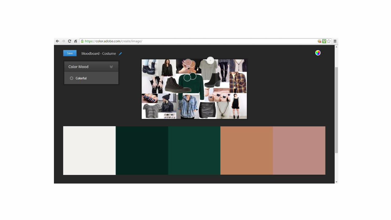
I decided to use the colour scheme creating website ‘color.adobe.com’ to create colour schemes based on images. I started by uploading my mood boards to the site and seeing what was created for me, some of which I quite liked however I mainly found that they didn’t relate to my music video/genre. I then decided to take some screenshots of sections of my own video to see what colour schemes emerged from this, however as there aren’t lots of colours in my music video the palettes tended to be quite plain and bland. After doing this research I decided to make a few colour schemes of my own based around the ones already given.

Mood boards…


Screenshots…


My colour schemes…


Final Decision
I decided after looking at all the possible colour schemes I liked this one the best because I thought that it matched the indie rock genre more than any of the others. After consideration however I worried that this would be too dark and would not attract my intended audience as well as it could, so to improve this I aim to add the colour white to this scheme. This will hopefully improve the aesthetics and will possibly be used for the background colour on both my digipak and magazine ad, whilst the darker colours will be used for the text and on the images. I also chose to include the colour red as this is bright and colourful hopefully attracting my audience. I may choose to use this colour on some of the text to make it stand out. In addition to this through the use of colour matching I found that this would link with the blood prop which is used several times within my video creating cohesion and continuity throughout my products. The use of 3 or 4 colours is also conventional which will ensure that my products are successful in this way.