colour theory - induction. colour theory will be required in two different areas of the standard...
TRANSCRIPT

Gra
phic
G
raphic
C
om
munic
ati
on
Com
mu
nic
ati
on
Colour Theory - Induction
Colour Theory - Induction
Colour theory will be required in two different areas of the Standard Grade Graphic Communication course :
You will need to give detailed reasons about the colours used in your folio rendering exercises.You will need to know about colour theory to be able to answer questions in the final exams at the end of the course.
You will also need to know how colours react to each other and how to make colours stand out or make them less obvious.
You will need to know how to make colours paler or darker.
You will need to know about the structure of the colour wheel and about how to mix and change colours to make other colours.

Colour Theory - Induction
You will also need to know something about the psychology of colour – which colours will make you feel warm, or cold, or angry, or calm, etc.
Colour is very important in design, and an understanding of its use will help you in this and other school courses.
Why are Ferrari sports cars normally painted red?Why are highlighters made in bright yellows, bright oranges and bright greens and not dull dark colours?Why would there be problems if a hospital ward was pained bright red, or very dark blue?Why are red and green used for stop and go signals at traffic lights?

Colour Theory - Induction
Colour theory will be included in most Standard Grade exams that you sit. The following table shows how often these questions have been asked and how many marks they are worth. This shows how important colour theory is for passing this course.
YEAR FOUNDATION GENERAL CREDIT
Marks Available % of KI available Marks Available % of KI available Marks Available % of KI available
1990 7 28% (7/25) 5 16% (5/31) 13 41% (13/32)
1991 4 16% (4/25) 6 25% (6/24) 2 7% (2/29)
1992 6 21% (6/28) 0 0/32 0 0/32
1993 10 30% (10/33) 0 0/38 9 23% (9/39)
1994 7 29% (7/24) 0 0/29 7 21% (7/33)
1995 6 25% (6/30) 0 0/35 9 24% (9/37)
1996 7 23% (7/30) 6 17% (6/36) 8 20% (8/41)
1997 11 37% (11/30) 0 0/35 10 25% (10/40)
1998 8 27% (8/30) 0 0/35 7 18% (7/40)
1999 2 6% (2/33) 10 29% (10/35) 0 0/40
2000 10 33% (10/30) 0 0/35 9 23% (9/40)
2001 10 33% (10/30) 0 0/35 8 20% (8/40)
2002 10 33% (10/30) 7 20% (7/35) 10 25% (10/40)
2003 11 37% (11/30) 0 0/35 9 23% (9/40)
2004 10 33% (10/30) 0 0/35 12 30% (12/40)

The Colour Wheel
The graphic shown here is a colour wheel that will be used during this course, and is the one which will be used for the final exam.
A good understanding of this graphic is necessary for this course, and the next few slides will describe it in greater detail.

The History of the Colour WheelThe theory of colour has been known about for many years.
There have been many different style of colour wheel developed and two well known ones are shown here.
The first design, from nearly 200 years ago was developed by a scientist called Herschel who formed the colours in a circle.
This design was then adapted by Prang who connected different colours together using two triangles.The colour wheel used in this course is based on these two different styles.

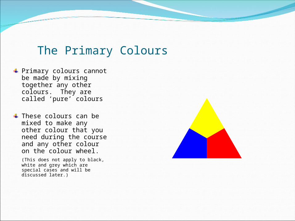
The Primary Colours
The colour wheel used in the course is made up of three different parts starting with the centre which is made up of three colours.
These colours are:BlueYellowRed
These colours are called the PRIMARY COLOURS.
The Primary Colours
Primary colours cannot be made by mixing together any other colours. They are called ‘pure’ colours
These colours can be mixed to make any other colour that you need during the course and any other colour on the colour wheel.(This does not apply to black, white and grey which are special cases and will be discussed later.)

The Secondary Colours
When any two of the three primary colours are mixed together they form other colours.
The colours created are:
Green (mixture of Blue and Yellow)
Orange (mixture of Yellow and Red)
Violet (mixture of Red and Blue)
These colours are called the SECONDARY COLOURS.
These colours are created by mixing EQUAL QUANTITIES of two Primary Colours, and are placed on the colour wheel in a position which shows which two Primary Colours have been used to produce the new colour.

The Outer Ring of the Colour Wheel
The outer ring of the colour wheel includes each of the 6 colours already discussed and will also include 6 new colours.
The outer wheel is constructed in such a way that each of the ‘arrows’ from the inside part of the colour wheel points to the same colour.

The Tertiary Colours
The third group of colours are produced by mixing a Primary colour with a Secondary colour and are called TERTIARY COLOURS.
This produces 6 new colours for the colour wheel.
These new colours are shown in an outer ring along with the original six colours already discussed.
These new colours are made by mixing adjacent Primary and Secondary colours on the outer ring.

The Completed Colour Wheel
These colours do not have ‘ordinary’ names when used in the colour wheel – they use the two names of the mixed colours – normally with the Primary colour named first as this is the most dominant colour.
The six new colours are
Blue - GreenYellow - GreenYellow - OrangeRed - OrangeRed - VioletBlue - Violet

The Completed Colour Wheel
This gives a final colour wheel of:-
Three Primary colours –Blue, Yellow and Red
Three Secondary colours –Green, Orange, and Violet
And six Tertiary colours –
Blue - GreenYellow - GreenYellow - OrangeRed - OrangeRed - VioletBlue - Violet

Black, White and Grey
On a previous slide it was stated that black, white and grey were special cases in a colour wheel.
In colour theory black, white and grey are not colours – they cannot be made by mixing the Primary colours and are not included on the colour wheel.
However, when used as a mixture with other colours they will change the appearance of the colour.
Grey is usually described as ‘percentages’ of how much black is mixed in with the white.
90% grey 80% grey 70% grey 60% grey 50% grey 40% grey 30% grey 20% grey whiteblack 10% grey

Hues, Tints, Shades and Tones
The correct name for a colour is a HUE. The three primary colours are all different hues.
Black, White and Grey are not colours, are not included in the colour wheel, and so are not Hues.
(it is always better to add a little of the darker colour to the lighter colour when mixing. This allows greater control over the colour being mixed)
HUE
TINT
SHADE
TONEBy adding our colour (or hue) to White we get a TINT.
By adding Black to a colour (or hue) we get a SHADE.
By adding Grey to a colour (or hue) we get a TONE.

Warm and Cold Colours
The colour wheel can be broken into two parts to show the WARM colours and the COLD colours.
Warm colours remind us of the sun, or a fire or other ‘warm’ things in life.
The warm colours include the side of the colour wheel with reds, yellows and oranges.
Cold colours remind us of water, ice and other ‘cold’ things in life.
The cold colours include the side of the colour wheel with blues, greens and violets.

Advancing and Receding Colours
Warm colours are described as advancing colours.
Rooms decorated in warm colours will appear to be smaller because the walls will give the feeling of warmth but also closing in on the occupants.
Cool colours are described as receding colours.
Rooms decorated in cool colours will appear to be larger because the walls will give the feeling of coldness and more space.

Advancing and Receding Colours
When a warm colour such as red is used with a cool colour such as blue, the warm advancing colour will appear to stand out from the cold colour.
This can be quite useful when working with text headings. An advancing colour will help the heading to be more noticeable.
When the text and background colours are reversed the red background being the advancing colour stands out and the heading is not as noticeable
Heading
Heading

Contrasting Colours
Contrasting colours are positioned opposite each other on the colour wheel.
Because they are so different to each other they will stand out against each other.
This is useful when deciding the colours of lettering on shop signs or headings for DTP work.
Contrasting colours are sometimes called complimentary colours.
In each case the warm / advancing colour will be the more dominant colour and will be the more prominent colour.
Some examples of contrasting colours are shown here
Red andYellow-Green
GreenBlue-Green
Blue andRed-Orange
OrangeYellow-Orange
Yellow andBlue-Violet
VioletRed-Violet