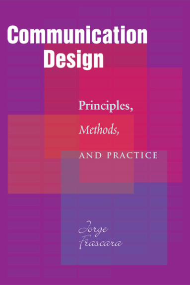
communication design: principles, methods, and practice · new communication technologies and the...
TRANSCRIPT
CommunicationDesign
Communications Title Pages 8/3/04 1:11 PM Page 1

CommDesign 00 a 09/03/04 1:47 PM Page ii

Jorge Frascara
Principles,
Methods,
a ND PRACTICE
CommunicationDesign
ALLWORTH PRESSNEW YORK
Communications Title Pages 8/3/04 1:11 PM Page 2
© 2004 Jorge Frascara
All rights reserved. Copyright under Berne Copyright Convention,Universal Copyright Convention, and Pan-American CopyrightConvention. No part of this book may be reproduced, stored in a retrieval system, or transmitted in any form, or by any means, electronic,mechanical, photocopying, recording, or otherwise, without priorpermission of the publisher.
08 07 06 05 04 5 4 3 2 1
Published by Allworth PressAn imprint of Allworth Communications, Inc.10 East 23rd Street, New York, NY 10010
Cover design by Derek BacchusPage design, composition, and typography by Sharp Des!gns, Lansing, MI
library of congress cataloging-in-publication dataFrascara, Jorge.Communication design : principles, methods, and practice / Jorge Frascara.
p. cm.ISBN: 1-58115-365-1
Includes bibliographical references and index.1. Commercial art. 2. Graphic arts. 3. Visual communication. I. Title.NC997.F695 2004741.6—dc22
2004018346
Printed in Canada
CommDesign 00 a 09/03/04 1:47 PM Page iv

To my wife, Guillermina Noël
CommDesign 00 a 09/03/04 1:47 PM Page v

CommDesign 00 a 09/03/04 1:47 PM Page vi
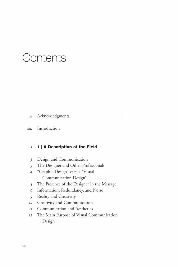
Contents
xi Acknowledgments
xiii Introduction
1 1 | A Description of the Field
3 Design and Communication3 The Designer and Other Professionals4 “Graphic Design” versus “Visual
Communication Design”5 The Presence of the Designer in the Message6 Information, Redundancy, and Noise9 Reality and Creativity
10 Creativity and Communication11 Communication and Aesthetics12 The Main Purpose of Visual Communication
Design
v i i
CommDesign 00 a 09/03/04 1:47 PM Page vii

15 2 | Historical Context
17 The Nineteenth Century22 The Twentieth Century32 The Design of Typefaces
57 3 | Design Principles: Functional
Requirements
58 Perception and Meaning62 Language and Signification63 Communication74 Aesthetics
91 4 | Methods and Planning
93 Design Methods95 The Design Process
122 The Design Process: Two Examples
129 5 | The Practice: Professional Areas
129 Design for Information138 Design for Persuasion152 Design for Education160 Design for Administration167 Elements and Systems167 Two Dimensions, Three Dimensions,
and Movement
commun ica t ion des ign
v i i i
CommDesign 00 a 09/03/04 1:47 PM Page viii
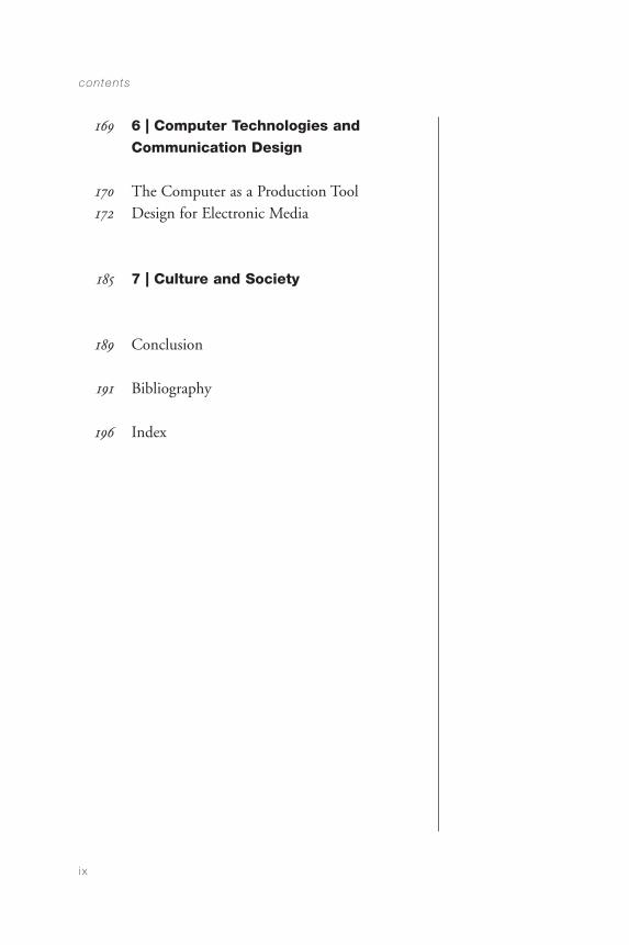
169 6 | Computer Technologies and
Communication Design
170 The Computer as a Production Tool172 Design for Electronic Media
185 7 | Culture and Society
189 Conclusion
191 Bibliography
196 Index
contents
i x
CommDesign 00 a 09/03/04 1:47 PM Page ix

CommDesign 00 a 09/03/04 1:47 PM Page x

Acknowledgments
i owe what i am to all those who, some- how or other, have had a profound effect onmy life. Sometimes through an influential sentence,sometimes through years shared, sometimes throughtheir work. Herbert Spencer taught me to do fieldresearch in a forty-five-minute conversation in 1974.In another forty-five-minute conversation ten yearslater, Paul Rand made me see the value of looking atone’s own work with a critical eye. At a conference inZurich in 1977, Richard Saul Wurman said two thingsthat stuck in my mind because of their clarity anddirectness. When it comes to being clear and direct, I keep on learning from Ronald Shakespear and fromGérard Paris-Clavel. Working with Tom Nelson hasbeen a permanent source of learning and joy. Thework of Armin Hofmann and Juan Carlos Distéfanomade me think about form, back in the 1960s. TomásMaldonado taught me the value of always beingvigilant and informed. Rubén Fontana, the power oftenacity and humility. From Juan Carrera I learned to
x i
CommDesign 00 a 09/03/04 1:47 PM Page xi
think critically, to put things together and to takethem apart, to see the patterns that connect, asGregory Bateson would put it. Bernd Meurer mademe discover different ways of looking at everything:the principles behind the instances of design action.To Ronald Davey I owe a sensitivity to precision inlanguage and a huge debt for my coming to Canada.
I owe lots of joy and learning to Steve Heller, JohnAston, Peter Kneebone, Willy DeMajo, SusumuSakane, Marijke Singer, Paul Stiff, Paul Mijksenaar,Erskine Childers, Dietmar Winkler, SharonPoggenpohl, Karel van der Waarde, David Sless, andmany others. And the list keeps on growing. Thereferences in this book show authors to whom I owemany ideas, as well as to others I do not explicitly cite,such as Anthony Wilden, Gilles Deleuze, and FelixGuatari. To my colleagues Sue Colberg and BonnieSadler Takach, my thanks for their support and theircontinuing friendship. My wife, Guillermina Noël,taught me how valuable and enjoyable all these thingscan be, and continues to keep me vigilant abouteverything I say. I thank Nicole Potter and TadCrawford at Allworth Press for the opportunity tomake this work public.
commun ica t ion des ign
x i i
CommDesign 00 a 09/03/04 1:47 PM Page xii
Introduction
this book is intended to outline the field of communication design, its areas of concern, its working methods, and its purposes. It is directed at visual communication design students (not atexperienced designers) and includes discussions ofsome areas that are bound to grow and change in thisera of information explosion and technologicalinnovation.
The demand for designers is greater than ever. This isparticularly true because of the fast development ofnew communication technologies and the need to pay attention to human factors that are outside theexpertise of computer scientists. Beyond recognizingthis phenomenon as a context, this book centers on visual communication design as a humancommunication problem—not as a technologicalproblem—and focuses on essential aspects of theprofession and of the education of designers.
x i i i
CommDesign 00 a 09/03/04 1:47 PM Page xiii
This book will point out important issues in theprofession, but does not claim to provide acomprehensive survey. More than defining boundaries,it intends to identify relevant issues and their impacton the practice.
Some subjects have been developed more than others.This is sometimes because of the greater experience of the author in certain areas; sometimes because agiven problem is more important than others; andsometimes because certain topics have, to a greatextent, been left out by most of the literature.
The book is written in plain language, avoiding theneologisms and jargon that often create a mystiqueabout certain problems, and make the statementsappear more scientific or sophisticated than theyactually are. This fictitious scientism or pretentiouslanguage produces a false sense of certainty thatreduces the complexity, scope, and richness of visualcommunication design problems. Hence this book hasmore descriptions than definitions, and its vocabularyis not extensive.
There are several reasons why terms from linguisticsdo not appear often in this book: The visual languagedoes not have finite dictionaries or glossaries, andtherefore the linguistic duality of signifier/signified isinapplicable. The interpreter plays a more decisive rolewhen looking at images than when reading or hearingwords, and the power of contexts adds anotherelement of uncertainty to the visual language. I preferto say “organization” rather than “syntax” (although
commun ica t ion des ign
x iv
CommDesign 00 a 09/03/04 1:47 PM Page xiv

“syntax” might appear here and there), because“syntax” is a special kind of organization, applied toverbal sequences, in which a series of rules governsentence structure. The term “organization” is broaderand more appropriate for visual communicationsbecause it confronts the reader with the infinitepossibilities of elements and arrangements, instead of creating the notion of limitation that the word“syntax” denotes.
Elements from rhetoric could have been discussed ifthe book dealt more with a linguistics-based theory of communication, but this is not the purpose of this text. It is, instead, directed at discussing visualcommunication design from the experience of apractitioner and with a social sciences–oriented pointof view.
Comments and criticism are welcome.
jorge frascaraDepartment of Art and Design
University of Alberta
Edmonton, Alberta, T6G 2C9
Canada
i n t roduct ion
xv
CommDesign 00 a 09/03/04 1:47 PM Page xv

CommDesign 00 a 09/03/04 1:47 PM Page xvi

CHAPTER 1
A Description of the Field
the term “visual communication design” issubject to a long series of interpretations. The differentdefinitions of the word “design” in everyday languagehave contributed to a lack of precision in understand-ing the job of the visual communication designer.Design is generally understood as the physical productderived from the activity, but the activity itself is oftenoverlooked. Expressions such as “the beautiful designsof aboriginal fabrics” incorrectly use the term “design”instead of more appropriate terms like “ornaments,”“decorations,” or “patterns.” People also speak of thebeauty of the designs that the waves leave on thebeach, or other natural forms. When a profession’sname includes a word that refers as much to a naturalobject as to an activity and an industrial product, therewill certainly be confusion in the minds of many.
Whereas the public tends to perceive “design” asreferring to objects, designers tend to center the wordon action, and see the product as a final step in a longjourney. To design, for the contemporary designer, is
1
CommDesign 01 09/03/04 1:47 PM Page 1
an intentional activity. It is connected to neither themarks on the beach nor the repetition of a traditionalornamentation. To design is to invent, to project, toprogram, to coordinate a long list of human andtechnical factors, to translate the invisible into thevisible, and to communicate. It involves judgmentcalls, the implementation of knowledge, the generation of new knowledge, and the use of educatedintuition and decision-making. In this book, the word “design” will be used to refer to the process of conceiving, planning, projecting, coordinating,selecting, and organizing a series of elements—normally textual and visual—for the creation of visualcommunications. The word “design” will also be usedin relation to the objects created by that process. Thewords “visual communication” modify the word“design,” and relate it to the production of visualobjects aimed at communicating specific messages.
The three words put together, “visual communicationdesign,” overflow the sum of their individualmeanings to become the name of a profession whosedescription is in part the aim of this book. To proposea working definition for now, I would say that visualcommunication design, seen as an activity, is theaction of conceiving, programming, projecting, andrealizing visual communications that are usuallyproduced through industrial means and are aimed atbroadcasting specific messages to specific sectors of the public. This is done with a view toward having animpact on the public’s knowledge, attitudes, orbehavior in an intended direction. A graphic design is an object created by that activity (Gorb 6).
commun ica t ion des ign
2
CommDesign 01 09/03/04 1:47 PM Page 2
Design and Communication
The visual communication designer works on theinterpretation, organization, and visual presentation ofmessages. Sensitivity toward form should go hand inhand with sensitivity toward content. Publicationdesigners organize not only typography but alsowords. Their work concentrates on the effectiveness,appropriateness, beauty, and economy of the messages.This job, beyond cosmetics, has to do with theplanning and structuring, production, and evaluationof communications.
The Designer and Other Professionals
Rarely does the communication designer work withtext-free images. In advertising, the writer is in mostcases a key member of the communication team. Inother areas, such as the design of books and bookcovers, a preexisting text drives the content to bevisualized.
In many cases, the designer requires contributionsfrom photographers, illustrators, animators, computerprogrammers, calligraphers, and draftsmen; otherspecialists who are less connected to the designprofession are often needed as well, depending on thecontent and the audience of a given project. Thedesigner must consider equally the communicationalstrategy and its realization the way a music conductormust know the range of the instruments without
a descr ip t ion o f the f ie ld
3
CommDesign 01 09/03/04 1:47 PM Page 3
necessarily knowing how to play them all. Funda-mentally, the designer’s job is that of a coordinator.Visual communication designers coordinate research,conception, and realization, hiring specialists andusing information related to the needs of each project.
Given that the job of the designers includesinteracting with other specialists, they must have anability to work in interdisciplinary teams and toestablish good interpersonal relations. In the finalanalysis, designers are specialists in humancommunication, and their specific medium is visual.
“Graphic Design” versus “VisualCommunication Design”
It is necessary to recognize that the term “graphicdesigner” has contributed to the obscure profile of theprofession. Although better than “graphic artist” andfar better than “artist,” the term still places too muchemphasis on the graphic, physical element and omitsmore essential aspects of the profession—the mainaim of which is not the creation of graphic forms butthe creation of effective communications. Althoughthe most widely accepted term is indeed “graphicdesigner,” it is more descriptive and appropriate to say “visual communication designer,” because thisdefinition includes three essential elements of theprofession: a method (design); an objective(communication); and a medium (vision).
commun ica t ion des ign
4
CommDesign 01 09/03/04 1:47 PM Page 4

The Presence of the Designer in the Message
Designers—as opposed to artists—are not normallythe source of the messages that they communicate. Inaddition, and again as opposed to artists, the job ofcommunication designers must normally be free of thepersonal presence of the author. This is done to avoidnoise in communications that are expected to putclients in touch with their intended audience. Anotherexample from music clarifies this point: According toan article published by the New York Times, a newlyappointed conductor of the Philadelphia SymphonyOrchestra had trouble persuading the musicians thatthe orchestra was supposed to be concerned withquality, not with identity. The previous conductor hadtried to develop a distinct style during his tenure. Thecentral problem, the new conductor argued, was notto obtain a “Philadelphia sound,” but the sound ofHaydn, or Beethoven, or Stravinsky, or whomever thecomposer to be interpreted might be.
While it is commonplace to recognize the creator of apainting by its style, it is not desirable to recognizedesigners through their work, particularly when theirpresence creates noise in the interpretation of amessage. Posters designed by famous artists—likemany produced for the Lincoln Center film festivals—can lend prestige to an institution, but recognizablestyles tend to call more attention to the authors thanto what the posters announce. In this situation, noiseis created in the communicational process—howeverbeautiful the poster could be. The content the posters
a descr ip t ion o f the f ie ld
5
CommDesign 01 09/03/04 1:47 PM Page 5
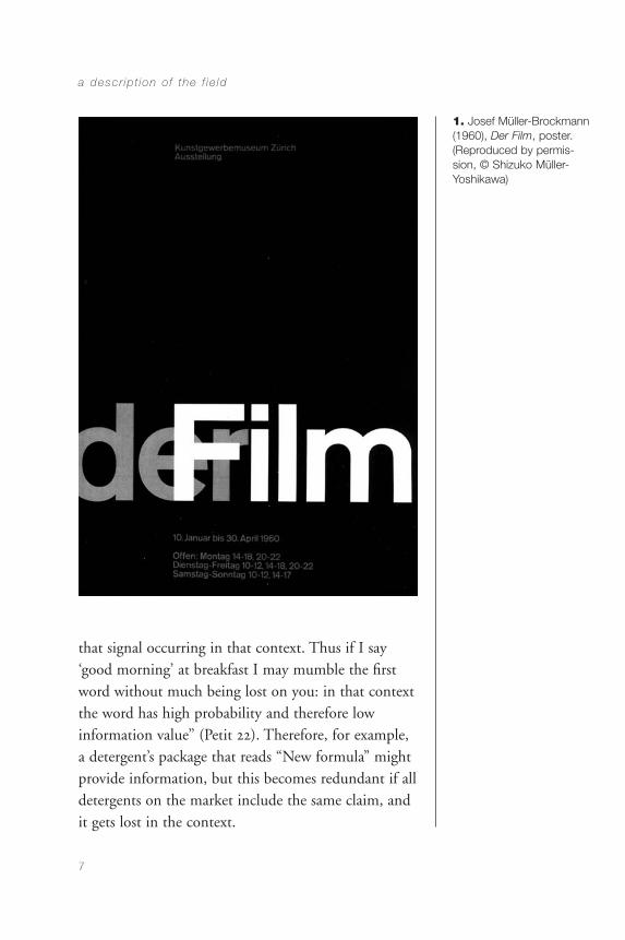
mean to communicate is reduced to a secondary role.This is not a rare occurrence. When famous artists areinvited to design posters for cultural events, they tendto produce images that basically represent their ownwork. This has happened many times with postersdesigned by painters such as by Frank Stella, JosefAlbers, Andy Warhol, and Roy Lichtenstein. JosefMüller-Brockmann’s film poster, by contrast, shows an appropriate solution to a similar problem, since itvisualizes the notions of movement and filmstripthrough an intelligent typographic play of trans-parency. The tonal atmosphere is also an appropriatereference to the movie theater experience (Figure 1).
A poster by Albers that announces a show by Alberswould be quite fitting. What in one context may benoise, in another may be information.
Information, Redundancy, and Noise
The three concepts—information, redundancy, andnoise—come from information science and help toclarify some communication design problems.
The concept of “information” is connected to novelty,which relates to the level of novelty present in amessage. The level of information in a message is ininverse relation to its probability. “The main axiom of[information] theory is that the information carried byone signal in a string of signals—say a word in asentence—is an inverse function of the probability of
commun ica t ion des ign
6
CommDesign 01 09/03/04 1:47 PM Page 6
that signal occurring in that context. Thus if I say‘good morning’ at breakfast I may mumble the firstword without much being lost on you: in that contextthe word has high probability and therefore lowinformation value” (Petit 22). Therefore, for example,a detergent’s package that reads “New formula” mightprovide information, but this becomes redundant if alldetergents on the market include the same claim, andit gets lost in the context.
a descr ip t ion o f the f ie ld
7
1. Josef Müller-Brockmann(1960), Der Film, poster.(Reproduced by permis-sion, © Shizuko Müller-Yoshikawa)
CommDesign 01 09/03/04 1:47 PM Page 7
The connoted information in the example is that “newformula” implies that the product is (a) better than theprevious one, and (b) better than competing brands.When competing brands also state that they have anew, and better, formula, the messages cancel eachother out and become “This detergent is similar to allother detergents” and, possibly, “This ‘new formula’claim is not even true, and if it is, it is not necessarilybetter.” This shows the complexity of communicationprocesses and the presence of information in relationto expectations and redundancy.
On the positive side, “redundancy” has at least twofunctions: insistence and clarification. Insistence, inthe form of repetition, is a rhetorical strategy that,when properly used, can lead to a better memorizationof the information, while giving prominence to amessage. Many people end up believing whatever is sufficiently repeated. The use of repetition asclarification often happens when the same informationis presented in different ways—sometimes usingdifferent coding systems—to ensure that theinformation will be understood by a good number ofdifferent people. In some cases, this strategy mightgenerate noise, when certain target groups becomedistracted by the presence of codes they do notunderstand.
“Noise” is any distraction that appears between theinformation and the public, thereby interfering with,distorting, obliterating, or hiding the message. In thecase of communication design, noise can appear at apurely visual level, because of elements or techniques
commun ica t ion des ign
8
CommDesign 01 09/03/04 1:47 PM Page 8
that obscure the visibility of the stimuli presenting theinformation. It can also be caused at a semantic level,when the logic of the message does not match thecognitive culture of its intended audience.
Noise can exist in the channel (medium), the code(language), or the form (aesthetics or style). Noise is created by irrelevant information, obliteratingelements, or poor technical quality. The consequenceof noise can range from a lack of clarity to the totalincomprehensibility of a message.
Reality and Creativity
“Within this view, designers would appear as guides,as advisors, that, supported by extensive practice andexperience, would provide users and decision-makerswith the originality of their analysis, their creativity,and their realism.” With these words, J. Mullender,former director of the Centre of Industrial Creation ofFrance identified important aspects of the designer’srole back in 1979: originality of analysis, creativity, andrealism. Indeed, a good balance between creativity andrealism is missing in many artists’ posters for theLincoln Center film festivals.
Creativity in design must exist within establishedlimitations. Total freedom should not be taken as anessential condition to permit creativity, and creativityshould not be seen as pertaining exclusively to thearts. Creativity can be defined as the ability to
a descr ip t ion o f the f ie ld
9
CommDesign 01 09/03/04 1:47 PM Page 9
conceive unexpected solutions to apparentlyunsolvable problems. Without magic or mysterioustouches, creativity is nothing other than intelligence—an intelligence that, in certain ways, can be developedand that, in the midst of a flood of unconnected andchaotic data, allows one to discover connections thatothers do not discover, see differences that others donot see, and, as a consequence, produce new andsurprising integrations (Hofstadter 26).
The alleged opposition between creativity and realismhas no grounds except to those people whose romanticconceptions link creativity with Van Gogh’s madnessor Utrillo’s excessive drinking. Creativity—althoughrequiring uncommon skills—is based on a number ofcontrollable processes, such as observation, attention,research, and analysis, and, to a certain extent, on thepossession of thinking strategies that combineflexibility with efficiency.
Creativity and Communication
The duality of “creativity and communication” cannotbe stated as an opposition. Clarity is not opposed tocreativity in communication design. Creativity canmake complex messages easy to understand, and thelack of it can render simple messages obscure.
The belief that clarity is opposed to creativity is basedon misconceptions about both creativity and design:
commun ica t ion des ign
10
CommDesign 01 09/03/04 1:47 PM Page 10
Creativity in design has nothing to do with self-expression and an indulgent egocentrism. It requires,instead, an objective and flexible intelligence, anability to analyze any problem from a multiplicity ofviewpoints, so as to be able to understand theintentions of a client (the originator of the message),and the possible perceptions that a wide range ofsectors of the public could have of a given message.
The creativity of the designer is similar to that of theactor who, working in different genres, addressesvarious audiences and makes diverse literary creationscome alive on stage.
Communication and Aesthetics
Communication and aesthetics are not in opposition,either. The visual communication design problemcannot be seen as a need to choose between communication and aesthetics, because aesthetics is a communication requirement to be satisfied incommunication design. Beauty and visual sophisti-cation are important dimensions of the work of thedesigner, but they must be integrated within theproject’s content and its public, and cannot be dealtwith on the basis of allegedly universal and context-independent criteria. This topic will be discussed laterin the section on aesthetics.
a descr ip t ion o f the f ie ld
11
CommDesign 01 09/03/04 1:47 PM Page 11

The Main Purpose of VisualCommunication Design
Every piece of communication design arises from theneed to communicate a specific message, and toobtain a desired response; in other words, it comes to exist because someone wants to say something to someone else, so that this someone else doessomething in particular. This is why one cannot judge the quality of a design only on the basis of its visual appearance. The aesthetic aspects that affectthe selection of some designs in juried exhibitions andin history books should not distort the evaluation ofthe main purpose of visual communication design,which centers on generating a certain response from acertain public. It seems, however, that some designersconceive their pieces with design exhibitions andbooks in mind, to the detriment of the clarity,effectiveness, and appropriateness of the materialproduced. Although some designs can becomeornaments, historical documents, or aestheticparadigms—once they’ve accomplished their primarygoal—visual communication design is not just aboutlooks; it is fundamentally about performance.
Sometimes, the concern for originality and beauty has contributed to the development of visual sophistication and cultural value, but it has notpromoted the communicational function of design,and has often distracted designers from thefundamental purpose of their work. Many examples of this can be found in the avant-garde work of the 1920s.
commun ica t ion des ign
12
CommDesign 01 09/03/04 1:47 PM Page 12
To understand visual communication design properly,we have to think more about actions than aboutobjects. The emphasis should not be on the product,given that this is only a means. Essentially, thedesigner generates the communication by designing an event, an act in which the public interacts with the design. The objective of the designer is, therefore,the design of communicational situations. Further, theimportant issue is not the communicational act itself,but the impact that this has on the knowledge, theattitudes, and the behavior of people. This makes clearthe need to study the interaction between messagesand people, not only the interaction of visual elementswith one another, which has absorbed the attention ofdesigners so much in the past. Visual composition isimportant, but it is only a tool, a way of organizingthe communicational event. This communicationalevent happens over time—not only in space—and isloaded with complex human elements related tolanguage, experience, age, knowledge, education,memory, cognitive style, preferences, expectations,desires, and other perceptual, intellectual, social,cultural, and emotional dimensions. In sum, thepurpose of communication design is to affect theknowledge, attitudes, and behavior of people—something that happens after the communicationtakes place.
a descr ip t ion o f the f ie ld
13
CommDesign 01 09/03/04 1:47 PM Page 13

CommDesign 01 09/03/04 1:47 PM Page 14
CHAPTER 2
Historical Context
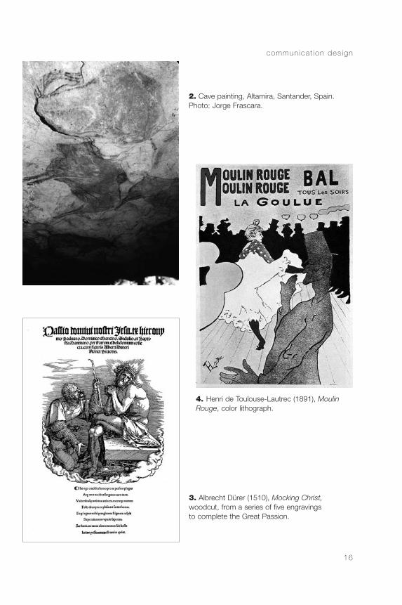
a brief historical survey will help ussee the development of the definition of visualcommunication design as both an activity and a publicperception issue. The perception of the visualcommunication designer as being distinct from theartist developed after the beginning of the twentiethcentury, and it has continued to change ever since. The conception presented in this book centers on anunderstanding that has evolved in the last fifty years,when the notion of visual communication design as artgave way to a growing interest in communicationalissues, ranging from cognitive psychology to marketing.It could be argued that graphic communications withspecific objectives have been developing for 25,000years. Working methods, allied fields, and educationalrequirements to practice the profession are such,however, that one cannot identify the communicationdesigner of today with the caveman warlock fromAltamira, the sixteenth-century woodcutter, or the1890s lithographer (Figures 2, 3, and 4).
15
CommDesign 02 c 09/03/04 1:48 PM Page 15
commun ica t ion des ign
16
3. Albrecht Dürer (1510), Mocking Christ,woodcut, from a series of five engravingsto complete the Great Passion.
4. Henri de Toulouse-Lautrec (1891), MoulinRouge, color lithograph.
2. Cave painting, Altamira, Santander, Spain.Photo: Jorge Frascara.
CommDesign 02 c 09/03/04 1:48 PM Page 16
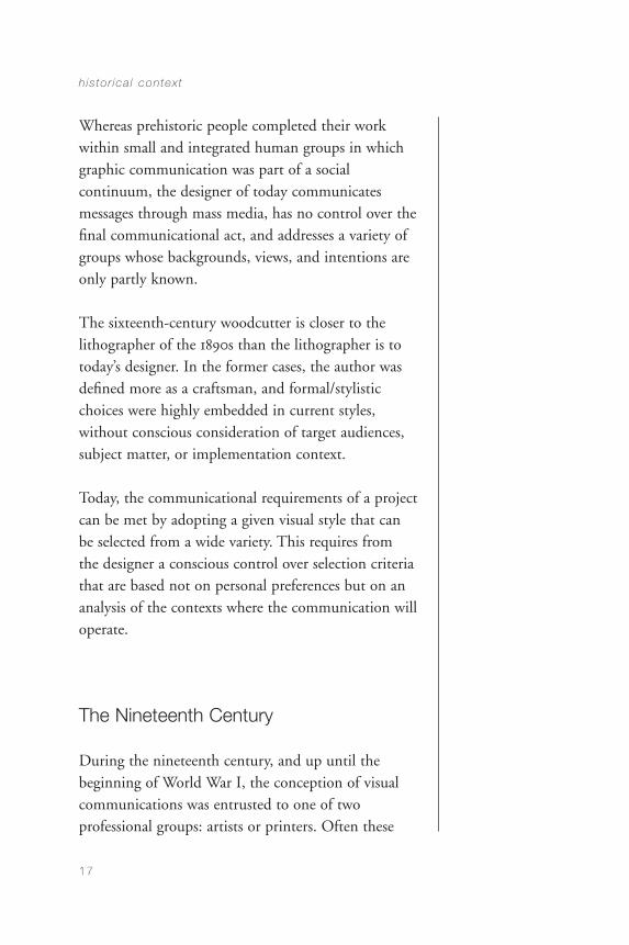
Whereas prehistoric people completed their workwithin small and integrated human groups in whichgraphic communication was part of a socialcontinuum, the designer of today communicatesmessages through mass media, has no control over thefinal communicational act, and addresses a variety ofgroups whose backgrounds, views, and intentions areonly partly known.
The sixteenth-century woodcutter is closer to thelithographer of the 1890s than the lithographer is totoday’s designer. In the former cases, the author wasdefined more as a craftsman, and formal/stylisticchoices were highly embedded in current styles,without conscious consideration of target audiences,subject matter, or implementation context.
Today, the communicational requirements of a projectcan be met by adopting a given visual style that can be selected from a wide variety. This requires from the designer a conscious control over selection criteriathat are based not on personal preferences but on ananalysis of the contexts where the communication willoperate.
The Nineteenth Century
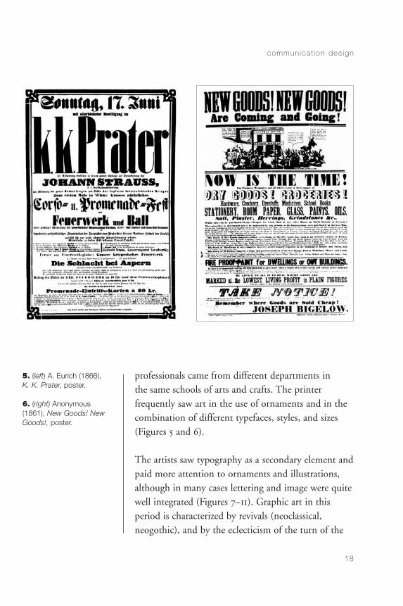
During the nineteenth century, and up until thebeginning of World War I, the conception of visualcommunications was entrusted to one of twoprofessional groups: artists or printers. Often these
h is to r ica l contex t
17
CommDesign 02 c 09/03/04 1:48 PM Page 17
18
5. (left) A. Eurich (1866),K. K. Prater, poster.
6. (right) Anonymous(1861), New Goods! NewGoods!, poster.
professionals came from different departments in the same schools of arts and crafts. The printerfrequently saw art in the use of ornaments and in thecombination of different typefaces, styles, and sizes(Figures 5 and 6).
The artists saw typography as a secondary element andpaid more attention to ornaments and illustrations,although in many cases lettering and image were quitewell integrated (Figures 7–11). Graphic art in thisperiod is characterized by revivals (neoclassical, neogothic), and by the eclecticism of the turn of the
commun ica t ion des ign
CommDesign 02 c 09/03/04 1:48 PM Page 18
century. The extreme typographic variations thatcharacterize much of the work of the nineteenthcentury, however, have not disappeared, as one can see in many of today’s publications.
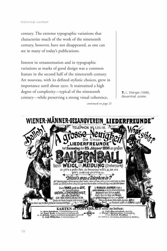
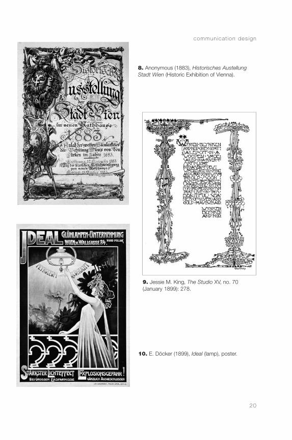
Interest in ornamentation and in typographicvariations as marks of good design was a commonfeature in the second half of the nineteenth century.Art nouveau, with its defined stylistic choices, grew inimportance until about 1920. It maintained a highdegree of complexity—typical of the nineteenthcentury—while preserving a strong visual coherence,
h is to r ica l contex t
19
7. L. Elsinger (1896),Bauernball, poster.
continued on page 21
CommDesign 02 c 09/03/04 1:48 PM Page 19
commun ica t ion des ign
20
9. Jessie M. King, The Studio XV, no. 70 (January 1899): 278.
8. Anonymous (1883), Historisches AustellungStadt Wien (Historic Exhibition of Vienna).
10. E. Döcker (1899), Ideal (lamp), poster.
CommDesign 02 c 09/03/04 1:48 PM Page 20
h is to r ica l contex t
21
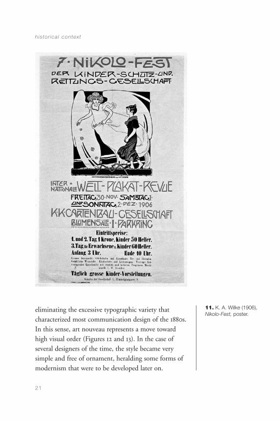
11. K. A. Wilke (1906),Nikolo-Fest, poster.
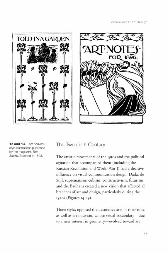
eliminating the excessive typographic variety thatcharacterized most communication design of the 1880s.In this sense, art nouveau represents a move towardhigh visual order (Figures 12 and 13). In the case ofseveral designers of the time, the style became verysimple and free of ornament, heralding some forms ofmodernism that were to be developed later on.
CommDesign 02 c 09/03/04 1:48 PM Page 21
commun ica t ion des ign
22
12 and 13. Art nouveau–style illustrations publishedby the magazine The Studio, founded in 1893.
The Twentieth Century
The artistic movements of the 1910s and the politicalagitation that accompanied them (including theRussian Revolution and World War I) had a decisiveinfluence on visual communication design. Dada, deStijl, suprematism, cubism, constructivism, futurism,and the Bauhaus created a new vision that affected allbranches of art and design, particularly during the1920s (Figures 14–19).
These styles opposed the decorative arts of their time,as well as art nouveau, whose visual vocabulary—dueto a new interest in geometry—evolved toward art
CommDesign 02 c 09/03/04 1:48 PM Page 22
deco. The work by Peter Behrens for the AEGpredates Bauhaus and represents a far morecomprehensive understanding of communicationdesign and the idea of identity (Figure 20). Workingat the beginning of the century, his work was not wellknown internationally, but it represents one of thevery first—if not the first—attempts at an integratedidentity for a corporation. Behrens was a kind ofuniversal designer, serving AEG as both architect andgraphic designer. Walter Gropius was surely aware ofhis work, and must have learned much from it.
The avant-garde movements mentioned before wereborn from a revisionist spirit that permeated all artisticactivities of the time. The second decade of thetwentieth century shows a proliferation not only of
h is to r ica l contex t
23
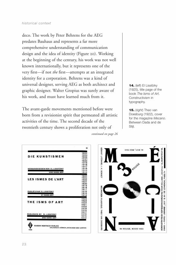
14. (left) El Lissitzky(1925), title page of thebook The Isms of Art.Constructivism in typography.
15. (right) Theo vanDoesburg (1922), coverfor the magazine Mecano.Between Dada and deStijl.
continued on page 26
CommDesign 02 c 09/03/04 1:48 PM Page 23
24
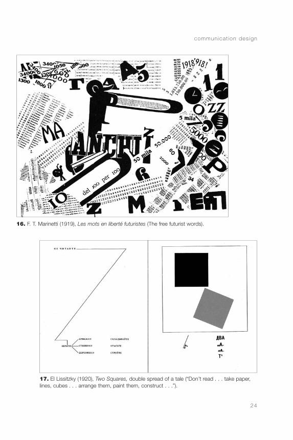
17. El Lissitzky (1920), Two Squares, double spread of a tale (“Don’t read . . . take paper,lines, cubes . . . arrange them, paint them, construct . . .”).
16. F. T. Marinetti (1919), Les mots en liberté futuristes (The free futurist words).
commun ica t ion des ign
CommDesign 02 c 09/03/04 1:48 PM Page 24
h is to r ica l contex t
25
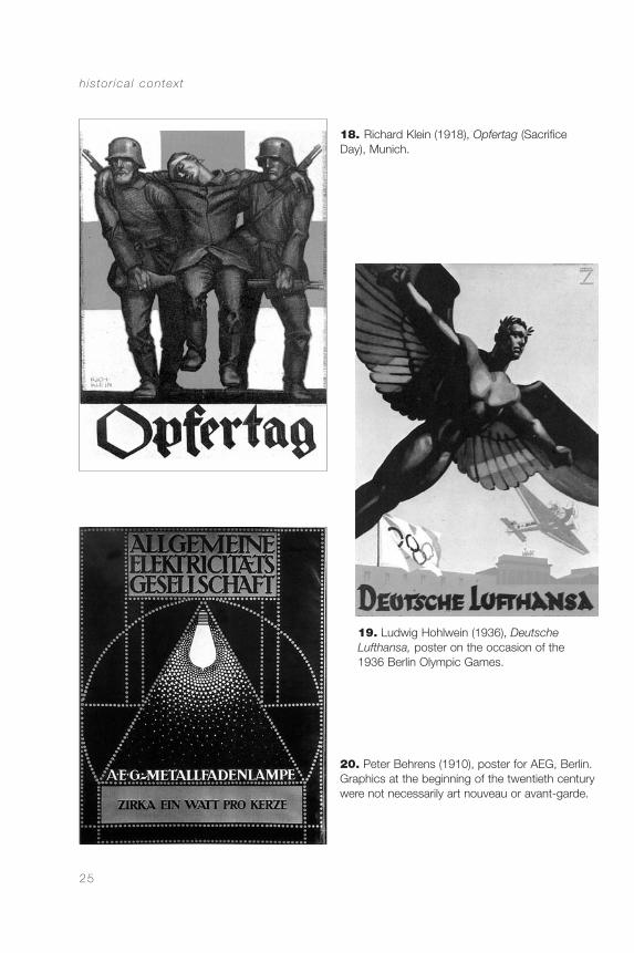
19. Ludwig Hohlwein (1936), DeutscheLufthansa, poster on the occasion of the1936 Berlin Olympic Games.
20. Peter Behrens (1910), poster for AEG, Berlin.Graphics at the beginning of the twentieth centurywere not necessarily art nouveau or avant-garde.
18. Richard Klein (1918), Opfertag (SacrificeDay), Munich.
CommDesign 02 c 09/03/04 1:48 PM Page 25
new artistic styles but also of manifestos andpublications through which artists, designers,architects, and educators expressed their positions.
Two important changes were initiated at the time.One was the change in graphic style, reacting againstornamental eclecticism by proposing a more geometricand minimalist style. This new style, related toconstructivism, suprematism, neo-plasticism, de Stijl,and part of the Bauhaus, had a long-lasting impact onthe development of visual communication design formuch of the twentieth century. The other importantelement introduced at this time was the use of graphicelements as communicational devices. This appearedas much in designs produced by the expressivedadaists as by others who were fundamentallyconstructivists, such as the members of de Stijl.
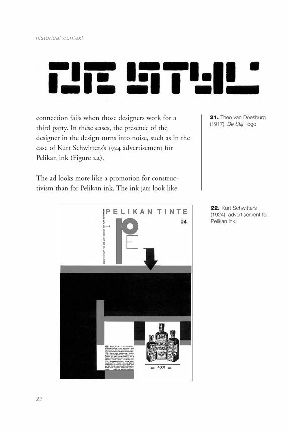
The free typographic layout of the cover of Der Dada,published in Berlin in 1919, immediately expressed thespirit of the movement, its irrational character, itssearch for freedom, and its opposition to issues of thetime, particularly current visual styles. The dadaistsused the visual structure of their messages to expresstheir artistic convictions; the same was done by theartists of de Stijl. The logotype designed by Theo vanDoesburg in 1917 (sometimes attributed to VilmasHuszar) clearly communicates the group’s approach togeometry and formal rigor (Figure 21).
Although the connection found here between formand content appears to be in line with our conceptionof giving form to communication today, this
commun ica t ion des ign
26
CommDesign 02 c 09/03/04 1:48 PM Page 26
connection fails when those designers work for athird party. In these cases, the presence of thedesigner in the design turns into noise, such as in thecase of Kurt Schwitters’s 1924 advertisement forPelikan ink (Figure 22).
The ad looks more like a promotion for construc-tivism than for Pelikan ink. The ink jars look like
h is to r ica l contex t
27
21. Theo van Doesburg(1917), De Stijl, logo.
22. Kurt Schwitters(1924), advertisement forPelikan ink.
CommDesign 02 c 09/03/04 1:48 PM Page 27

commun ica t ion des ign
28
23. Kurt Schwitters (1924), Merz, magazinecover.
24. Schulz-Neudamm (1926), Metropolis,by Fritz Lang, film poster, Germany. Art decoenters communication design.
CommDesign 02 c 09/03/04 1:48 PM Page 28
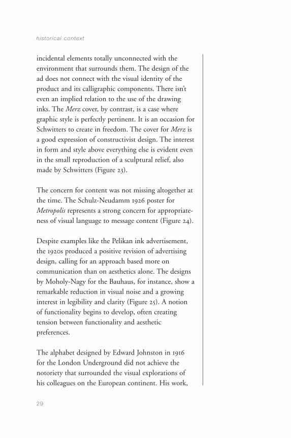
incidental elements totally unconnected with theenvironment that surrounds them. The design of thead does not connect with the visual identity of theproduct and its calligraphic components. There isn’teven an implied relation to the use of the drawinginks. The Merz cover, by contrast, is a case wheregraphic style is perfectly pertinent. It is an occasion forSchwitters to create in freedom. The cover for Merz isa good expression of constructivist design. The interestin form and style above everything else is evident evenin the small reproduction of a sculptural relief, alsomade by Schwitters (Figure 23).
The concern for content was not missing altogether atthe time. The Schulz-Neudamm 1926 poster forMetropolis represents a strong concern for appropriate-ness of visual language to message content (Figure 24).
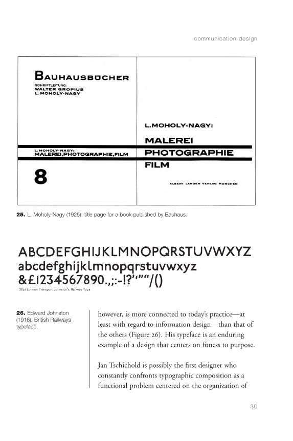
Despite examples like the Pelikan ink advertisement,the 1920s produced a positive revision of advertisingdesign, calling for an approach based more oncommunication than on aesthetics alone. The designsby Moholy-Nagy for the Bauhaus, for instance, show aremarkable reduction in visual noise and a growinginterest in legibility and clarity (Figure 25). A notionof functionality begins to develop, often creatingtension between functionality and aestheticpreferences.
The alphabet designed by Edward Johnston in 1916for the London Underground did not achieve thenotoriety that surrounded the visual explorations ofhis colleagues on the European continent. His work,
h is to r ica l contex t
29
CommDesign 02 c 09/03/04 1:48 PM Page 29
commun ica t ion des ign
30
25. L. Moholy-Nagy (1925), title page for a book published by Bauhaus.
26. Edward Johnston(1916), British Railwaystypeface.
however, is more connected to today’s practice—atleast with regard to information design—than that ofthe others (Figure 26). His typeface is an enduringexample of a design that centers on fitness to purpose.
Jan Tschichold is possibly the first designer whoconstantly confronts typographic composition as afunctional problem centered on the organization of
CommDesign 02 c 09/03/04 1:48 PM Page 30

messages. Aesthetics, albeit not ignored, is placed inthe service of communication. Groupings, sequences,and hierarchies in the text derive from an analysis ofthe contents of the messages and contribute to thepresentation of an organized reading (Figure 27).
It is true that Tschichold’s contribution owes much tothe constructivists who came before, and particularly
h is to r ica l contex t
31
27. Jan Tschichold (1928),promotion for The NewTypography (yellow groundin the original).
CommDesign 02 c 09/03/04 1:48 PM Page 31
to El Lissitzky, but the use of these new visualelements acquires in Tschichold a consistentlyfunctional character that is new, particularly in thetreatment of long texts.
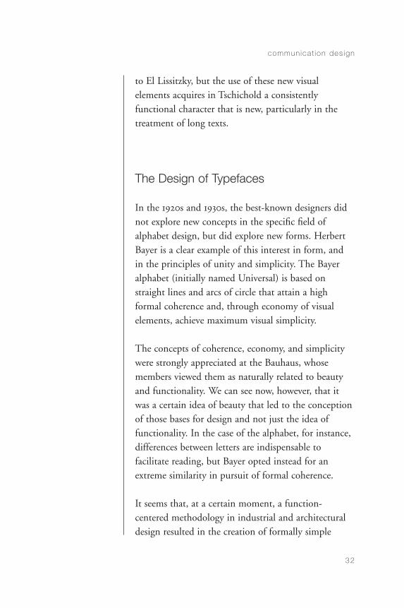
The Design of Typefaces
In the 1920s and 1930s, the best-known designers didnot explore new concepts in the specific field ofalphabet design, but did explore new forms. HerbertBayer is a clear example of this interest in form, and in the principles of unity and simplicity. The Bayeralphabet (initially named Universal) is based onstraight lines and arcs of circle that attain a highformal coherence and, through economy of visualelements, achieve maximum visual simplicity.
The concepts of coherence, economy, and simplicitywere strongly appreciated at the Bauhaus, whosemembers viewed them as naturally related to beautyand functionality. We can see now, however, that itwas a certain idea of beauty that led to the conceptionof those bases for design and not just the idea offunctionality. In the case of the alphabet, for instance,differences between letters are indispensable tofacilitate reading, but Bayer opted instead for anextreme similarity in pursuit of formal coherence.
It seems that, at a certain moment, a function-centered methodology in industrial and architecturaldesign resulted in the creation of formally simple
commun ica t ion des ign
32
CommDesign 02 c 09/03/04 1:48 PM Page 32
solutions. Later, however, simplicity became a stylisticchoice, and some of the Bauhaus’s designers, who hadinitially arrived at simplicity in search of functionalsolutions, went on to create simple-looking visualsolutions that appeared to be functional. What at firstwas a consequence of a certain methodology turnedinto an aesthetic preference later on.
Bayer’s alphabet could be taken as an example of thisphenomenon, but it must be remembered in hisdefense that knowledge about legibility was poor at thetime. It could also be argued that Bayer applied certainaspects of new typographic design to his alphabet in anattempt—however failed—to improve its performance.Indications about the development of knowledge oflegibility can be found in the bibliography thatHerbert Spencer published in his 1969 book The Visible Word. Only sixty-four of the 464 entries listedappeared before 1925 (when Bayer designed hisUniversal font). Miles Tinker’s ninety-sevenpublications on legibility, which are more connected tothe work of the type designer than most other formerentries, were published between 1926 and 1955.
Simplicity and Quality: The 1950s
The idea of simplicity as a condition for good designcontinued for many years, not only in alphabet designbut also in other areas. The search for visual simplicityaffected all communication areas in design during theavant-garde era of the 1950s. This trend, however, didnot benefit design performance in some areas, such asthe design of teaching aids. In their research developed
h is to r ica l contex t
33
CommDesign 02 c 09/03/04 1:48 PM Page 33
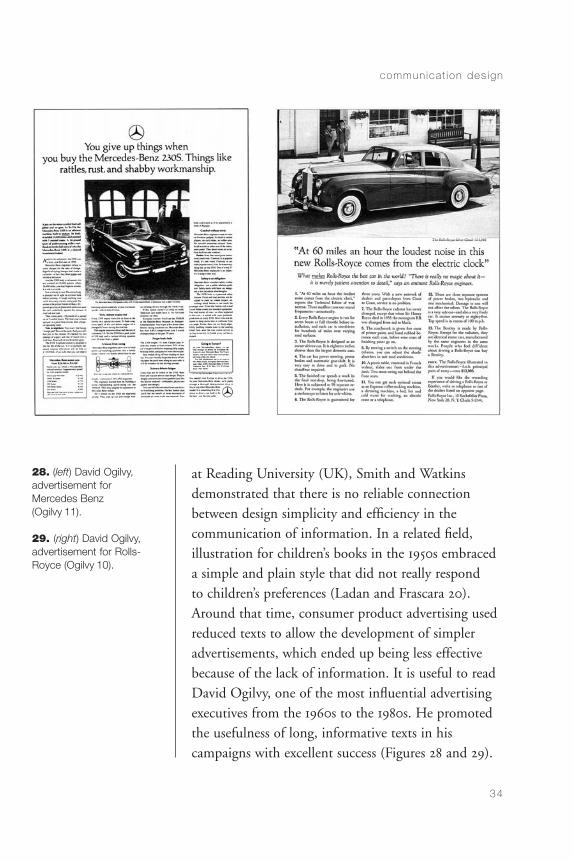
at Reading University (UK), Smith and Watkinsdemonstrated that there is no reliable connectionbetween design simplicity and efficiency in thecommunication of information. In a related field,illustration for children’s books in the 1950s embraceda simple and plain style that did not really respond to children’s preferences (Ladan and Frascara 20).Around that time, consumer product advertising usedreduced texts to allow the development of simpleradvertisements, which ended up being less effectivebecause of the lack of information. It is useful to readDavid Ogilvy, one of the most influential advertisingexecutives from the 1960s to the 1980s. He promotedthe usefulness of long, informative texts in hiscampaigns with excellent success (Figures 28 and 29).
commun ica t ion des ign
34
28. (left) David Ogilvy,advertisement for Mercedes Benz (Ogilvy 11).
29. (right) David Ogilvy,advertisement for Rolls-Royce (Ogilvy 10).
CommDesign 02 c 09/03/04 1:48 PM Page 34
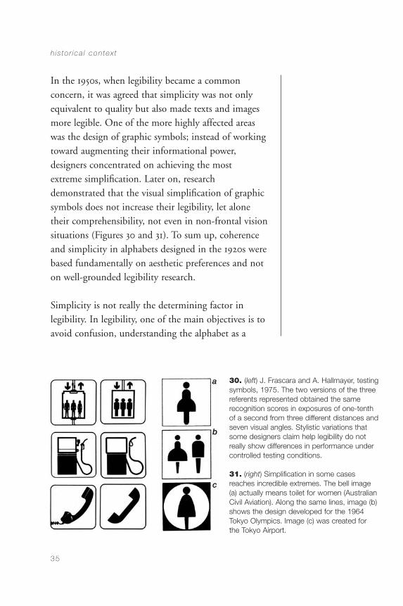
In the 1950s, when legibility became a commonconcern, it was agreed that simplicity was not onlyequivalent to quality but also made texts and imagesmore legible. One of the more highly affected areaswas the design of graphic symbols; instead of workingtoward augmenting their informational power,designers concentrated on achieving the most extreme simplification. Later on, researchdemonstrated that the visual simplification of graphicsymbols does not increase their legibility, let alonetheir comprehensibility, not even in non-frontal visionsituations (Figures 30 and 31). To sum up, coherenceand simplicity in alphabets designed in the 1920s werebased fundamentally on aesthetic preferences and noton well-grounded legibility research.
Simplicity is not really the determining factor inlegibility. In legibility, one of the main objectives is toavoid confusion, understanding the alphabet as a
h is to r ica l contex t
35
30. (left) J. Frascara and A. Hallmayer, testingsymbols, 1975. The two versions of the threereferents represented obtained the samerecognition scores in exposures of one-tenth of a second from three different distances andseven visual angles. Stylistic variations thatsome designers claim help legibility do notreally show differences in performance undercontrolled testing conditions.
31. (right) Simplification in some cases reaches incredible extremes. The bell image (a) actually means toilet for women (AustralianCivil Aviation). Along the same lines, image (b)shows the design developed for the 1964Tokyo Olympics. Image (c) was created for the Tokyo Airport.
CommDesign 02 c 09/03/04 1:48 PM Page 35
system of distinctions in which each component isclearly different from the rest. This principle is notonly applicable to reading by adults but also hasextraordinary importance in learning to read andwrite, where the frequent mistakes children make arethe result of exchanges based on similarity, inversion,and rotation.
The interest Herbert Bayer had in simplicity overlegibility (aesthetics over functionality) is proved by his elimination of capitals. His text designs—including the book on his own work, published in1967, and the catalogue he designed for the Bauhaustraveling exhibition in 1971—exclude capitals, makingit difficult for the reader to identify proper names, andthe beginning of a sentence after a period. Thisreduces ease and speed in reading and comprehension,without offering compensation other than thepresence of a text with a highly homogeneous texture.Presumably, he did this as a reaction to the use ofcapitals in the German language, where all nouns arecapitalized.
These characteristics in Bayer’s work show up in thework of other designers of the 1920s and 1930s but are not common elements in mass production. They are clear examples of the preoccupations andmethodological positions of the avant-garde designersof the time.
In the mid-1950s, research in social sciences had avisible impact on communication design. This mayhave been due to research on human factors
commun ica t ion des ign
36
CommDesign 02 c 09/03/04 1:48 PM Page 36
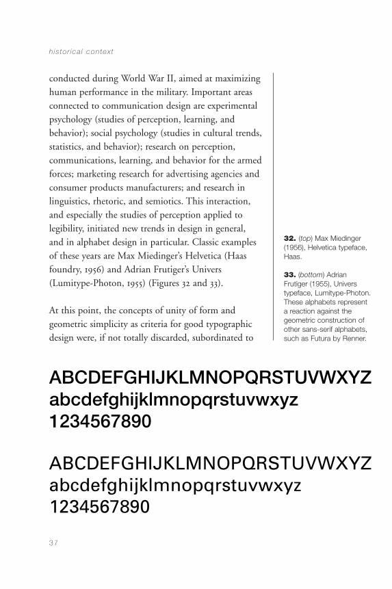
conducted during World War II, aimed at maximizinghuman performance in the military. Important areasconnected to communication design are experimentalpsychology (studies of perception, learning, andbehavior); social psychology (studies in cultural trends,statistics, and behavior); research on perception,communications, learning, and behavior for the armedforces; marketing research for advertising agencies andconsumer products manufacturers; and research inlinguistics, rhetoric, and semiotics. This interaction,and especially the studies of perception applied tolegibility, initiated new trends in design in general,and in alphabet design in particular. Classic examplesof these years are Max Miedinger’s Helvetica (Haasfoundry, 1956) and Adrian Frutiger’s Univers(Lumitype-Photon, 1955) (Figures 32 and 33).
At this point, the concepts of unity of form andgeometric simplicity as criteria for good typographicdesign were, if not totally discarded, subordinated to
h is to r ica l contex t
37
32. (top) Max Miedinger(1956), Helvetica typeface,Haas.
33. (bottom) AdrianFrutiger (1955), Universtypeface, Lumitype-Photon.These alphabets representa reaction against the geometric construction ofother sans-serif alphabets,such as Futura by Renner.
CommDesign 02 c 09/03/04 1:48 PM Page 37
research-based legibility criteria. In this way, moreefficient typographic solutions were developed; onesuch solution was the importance given to letterdifferentiation within the alphabet over and above the system’s unity and simplicity.
Higher-letter differentiation not only facilitates theletters’ individual recognition but also contributes tothe creation of more differentiated configurationsbetween words. This facilitates the job of the reader,who does not read letter by letter but word by word,and sometimes by word groups too, through saccadiceye movements and brief fixations.
The design of Helvetica and Univers integrates thetypographic knowledge and tradition developed byLeonardo, Dürer, Bembo, Griffo, and especiallyClaude Garamond, as proved by his roman alphabet,which he designed around 1544. This tradition wasinterrupted during Bayer and Renner’s times ofgeometric explorations, possibly intending to purgetypographic design of the ornamental elements thateclecticism and art nouveau had introduced by theend of the nineteenth century (Figures 34 and 35).
Many of the subtleties of typographic fonts in the1950s are present in the tradition outlined above;however, the innovations introduced are importantenough to recognize the beginning of a newgeneration in alphabet design in Helvetica andUnivers, which are used here as examples from theircategory because of their massive internationaladoption during the 1960s and 1970s.
commun ica t ion des ign
38
CommDesign 02 c 09/03/04 1:48 PM Page 38
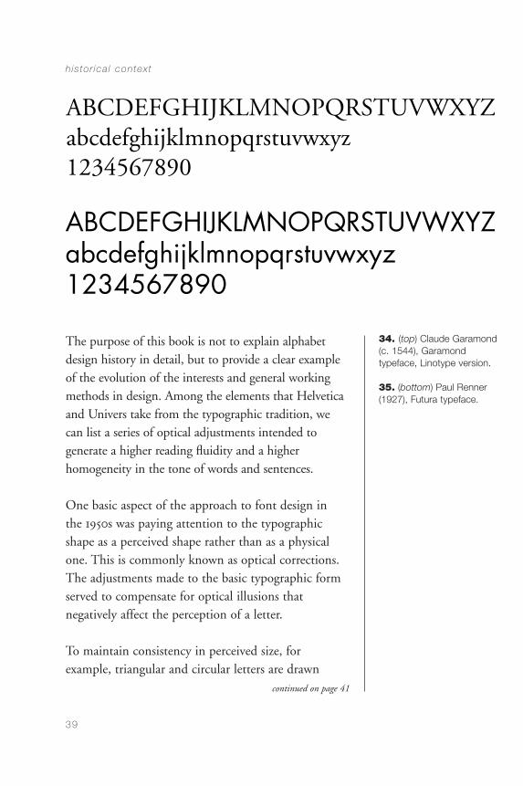
The purpose of this book is not to explain alphabetdesign history in detail, but to provide a clear exampleof the evolution of the interests and general workingmethods in design. Among the elements that Helveticaand Univers take from the typographic tradition, wecan list a series of optical adjustments intended togenerate a higher reading fluidity and a higherhomogeneity in the tone of words and sentences.
One basic aspect of the approach to font design in the 1950s was paying attention to the typographicshape as a perceived shape rather than as a physicalone. This is commonly known as optical corrections.The adjustments made to the basic typographic formserved to compensate for optical illusions thatnegatively affect the perception of a letter.
To maintain consistency in perceived size, forexample, triangular and circular letters are drawn
h is to r ica l contex t
39
34. (top) Claude Garamond(c. 1544), Garamond typeface, Linotype version.
35. (bottom) Paul Renner(1927), Futura typeface.
continued on page 41
CommDesign 02 c 09/03/04 1:48 PM Page 39
commun ica t ion des ign
40
36. Curves inletters extendbeyond the baselines and theheight of squareletters.
37. The middle horizontal strokes are placed above thegeometric half of the letter. This optical correction isdesigned to make the horizontal stroke appear as if itwere in the middle.
38. Vertical strokes are thicker than horizontalones. (See comparison between the horizontalstroke of an E and the vertical of an N.) This correction comes from the architectural traditionand experience, where columns that support areexpected to be thicker than the supported roofs.
39. The thickness of the curved strokes varies, following the principleexplained in the caption for Figure 38; that is, horizontal sections arethinner.
40. The shape of thecurve is not geometricallyregular.
41. The joints between verticals and diagonals are correctedto avoid creating large black areas.
CommDesign 02 c 09/03/04 1:48 PM Page 40
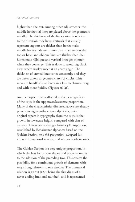
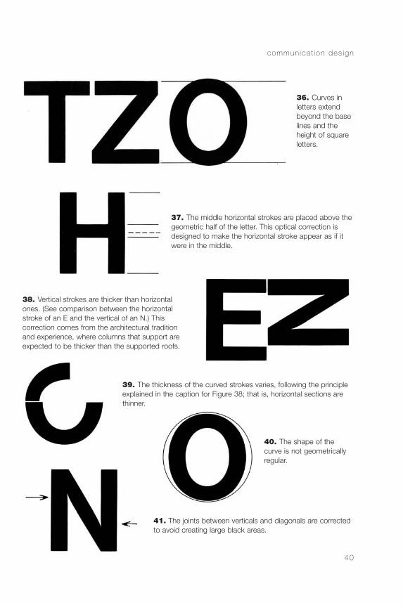
higher than the rest. Among other adjustments, themiddle horizontal lines are placed above the geometricmiddle. The thickness of the lines varies in relation to the direction they have: verticals that visuallyrepresent support are thicker than horizontals; middle horizontals are thinner than the ones on thetop or base; and oblique lines are thicker than thehorizontals. Oblique and vertical lines get thinnerwhen they converge. This is done to avoid big blackareas where strokes meet at an acute angle. Thethickness of curved lines varies constantly, and theyare never drawn as geometric arcs of circles. Thisserves to handle visual forces in a less mechanical way,and with more fluidity (Figures 36–41).
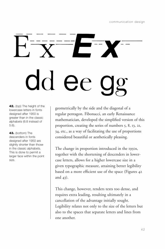
Another aspect that is affected in the new typefaces of the 1950s is the uppercase/lowercase proportion.Many of the characteristics discussed above are alreadypresent in eighteenth-century alphabets, but anoriginal aspect in typography from the 1950s is thegrowth in lowercase height, compared with that ofcapitals. This relation changes from a 5:8 proportion,established by Renaissance alphabets based on theGolden Section, to a 6:8 proportion, adopted forintended functional reasons, and not for aesthetic ones.
The Golden Section is a very unique proportion, inwhich the first factor is to the second as the second isto the addition of the preceding two. This creates thepossibility for a continuous growth of elements withvery strong relations to one another. The numericalrelation is 1:1.618 (1.618 being the first digits of a never-ending irrational number), and is represented
h is to r ica l contex t
41
CommDesign 02 c 09/03/04 1:48 PM Page 41
geometrically by the side and the diagonal of a regular pentagon. Fibonacci, an early Renaissancemathematician, developed the simplified version of thisproportion, creating the series of numbers 5, 8, 13, 21,34, etc., as a way of facilitating the use of proportionsconsidered beautiful or aesthetically pleasing.
The change in proportion introduced in the 1950s,together with the shortening of descenders in lower-case letters, allows for a higher lowercase size in agiven typographic measure, attaining better legibilitybased on a more efficient use of the space (Figures 42and 43).
This change, however, renders texts too dense, andrequires extra leading, resulting ultimately in acancellation of the advantage initially sought.Legibility relates not only to the size of the letters butalso to the spaces that separate letters and lines fromone another.
commun ica t ion des ign
42
42. (top) The height of thelowercase letters in fontsdesigned after 1950 isgreater than in the classicalphabets (6:8 instead of5:8).
43. (bottom) The descenders in fontsdesigned after 1950 areslightly shorter than thosein the classic alphabets.This is done to permit alarger face within the pointsize.
CommDesign 02 c 09/03/04 1:48 PM Page 42
Font Design since the 1950s
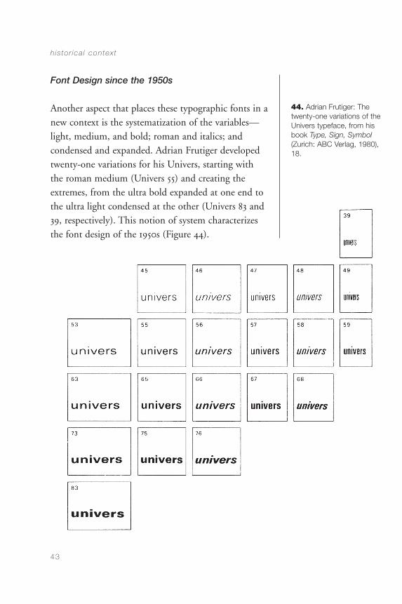
Another aspect that places these typographic fonts in anew context is the systematization of the variables—light, medium, and bold; roman and italics; andcondensed and expanded. Adrian Frutiger developedtwenty-one variations for his Univers, starting withthe roman medium (Univers 55) and creating theextremes, from the ultra bold expanded at one end tothe ultra light condensed at the other (Univers 83 and39, respectively). This notion of system characterizesthe font design of the 1950s (Figure 44).
h is to r ica l contex t
43
44. Adrian Frutiger: Thetwenty-one variations of theUnivers typeface, from hisbook Type, Sign, Symbol(Zurich: ABC Verlag, 1980),18.
CommDesign 02 c 09/03/04 1:48 PM Page 43

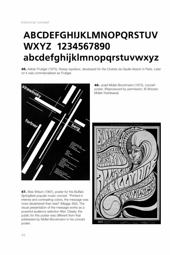
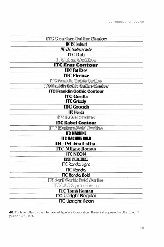
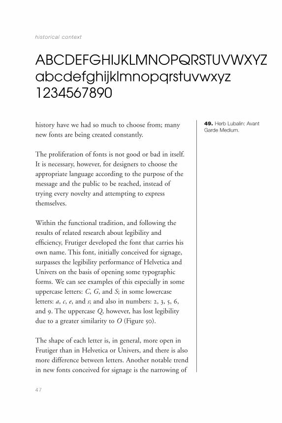
The 1960s and 1970s show two trends in generalgraphic and typographic design. One is thecontinuation of the searches initiated in the 1950s, andcan be represented by the work of Frutiger (and hisseveral fonts) until the design of the Roissy. He didthis for the Charles de Gaulle Airport in Paris, and itbecame commercialized after 1977 under Frutiger’sname (Figure 45). This kind of font was adoptedenthusiastically by many designers of the 1950s and1960s in search of a rational approach to communi-cations with text, as the work of Josef Müller-Brockmann shows (Figure 46). A different trend isrepresented by a more organic, expressive, and freeapproach, such as the one developed in the 1960s in San Francisco (Figure 47). Letraset and ITCcommercialized other fonts with these characteristicsin the 1970s and 1980s (Figure 48) including thereappearance of geometry in typography, as shown in Herb Lubalin’s Avant Garde, whose origin is basedon Renner’s Futura (Figure 49).
The two approaches mentioned above—one morefunctional, the other more expressive—have alwayscoexisted in one way or another. The fundamentaldifference between them is that the development ofthe functional view allows one to speak about progressand working methods in the solution of certainproblems, while in the more expressive approach onecan only see an increasing quantity of availablepossibilities as time goes by. The field of font designhas been dramatically facilitated and revitalized sincethe advent of digital fonts in the 1980s. Never in
commun ica t ion des ign
44
continued on page 47
CommDesign 02 c 09/03/04 1:48 PM Page 44
h is to r ica l contex t
45
45. Adrian Frutiger (1975), Roissy typeface, developed for the Charles de Gaulle Airport in Paris. Lateron it was commercialized as Frutiger.
46. Josef Müller-Brockmann (1972), concertposter. (Reproduced by permission, © ShizukoMüller-Yoshikawa)
47. Wes Wilson (1967), poster for the BuffaloSpringfield popular music concert. “Printed inintense and contrasting colors, the message wasmore deciphered than read” (Meggs 462). Thevisual presentation of the message works as apowerful audience selection filter. Clearly, thepublic for this poster was different from thataddressed by Müller-Brockmann in his concertposter.
CommDesign 02 c 09/03/04 1:48 PM Page 45
commun ica t ion des ign
46
48. Fonts for titles by the International Typeface Corporation. These first appeared in U&lc 8, no. 1(March 1981): 37A.
CommDesign 02 c 09/03/04 1:48 PM Page 46
history have we had so much to choose from; manynew fonts are being created constantly.
The proliferation of fonts is not good or bad in itself.It is necessary, however, for designers to choose theappropriate language according to the purpose of themessage and the public to be reached, instead oftrying every novelty and attempting to expressthemselves.
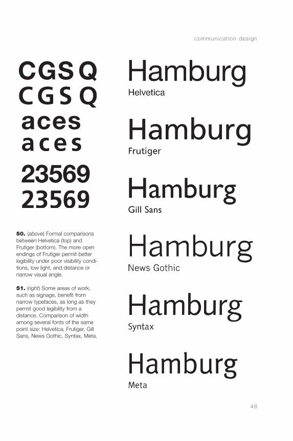
Within the functional tradition, and following theresults of related research about legibility andefficiency, Frutiger developed the font that carries hisown name. This font, initially conceived for signage,surpasses the legibility performance of Helvetica andUnivers on the basis of opening some typographicforms. We can see examples of this especially in someuppercase letters: C, G, and S; in some lowercaseletters: a, c, e, and s; and also in numbers: 2, 3, 5, 6,and 9. The uppercase Q, however, has lost legibilitydue to a greater similarity to O (Figure 50).
The shape of each letter is, in general, more open inFrutiger than in Helvetica or Univers, and there is alsomore difference between letters. Another notable trendin new fonts conceived for signage is the narrowing of
h is to r ica l contex t
47
49. Herb Lubalin: AvantGarde Medium.
CommDesign 02 c 09/03/04 1:48 PM Page 47
commun ica t ion des ign
48
50. (above) Formal comparisonsbetween Helvetica (top) andFrutiger (bottom). The more openendings of Frutiger permit betterlegibility under poor visibility condi-tions, low light, and distance ornarrow visual angle.
51. (right) Some areas of work,such as signage, benefit from narrow typefaces, as long as theypermit good legibility from a distance. Comparison of widthamong several fonts of the samepoint size: Helvetica, Frutiger, GillSans, News Gothic, Syntax, Meta.
CommDesign 02 c 09/03/04 1:48 PM Page 48

letters, which allows more characters per line withoutreducing legibility, a clear advantage for signageprojects (Figure 51).
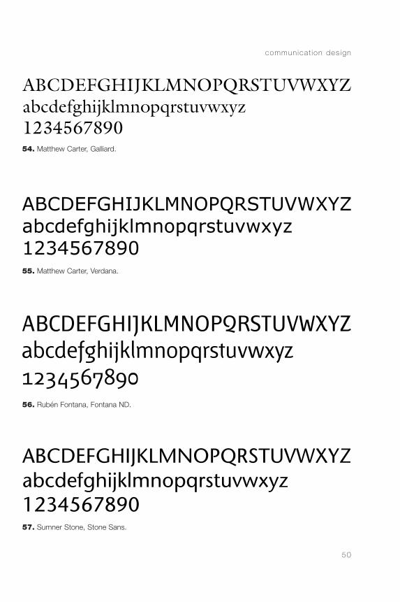
New production technologies have generated aproliferation of type fonts. Aside from those moresubjected to fads and fashions, a recent example of anextremely efficient font designed with signage in mindis Meta, by Eric Spiekermann. Matthew Carter is alsoresponsible for extremely successful fonts, includingthe redesign of Times New Roman for the New YorkTimes. For publication design, one of the mostefficient typefaces developed recently, particularly foruse in small sizes, is FontanaND, published recentlyby Neufville Digital and designed by Rubén Fontana(Figures 52–57).
h is to r ica l contex t
49
52. (top) Erik Spiekermann, OfficinaSans.
53. (bottom) Erik Spiekermann, Meta.
CommDesign 02 c 09/03/04 1:48 PM Page 49
commun ica t ion des ign
50
54. Matthew Carter, Galliard.
55. Matthew Carter, Verdana.
56. Rubén Fontana, Fontana ND.
57. Sumner Stone, Stone Sans.
CommDesign 02 c 09/03/04 1:48 PM Page 50
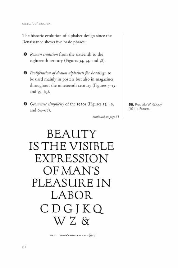
The historic evolution of alphabet design since theRenaissance shows five basic phases:
1 Roman tradition from the sixteenth to theeighteenth century (Figures 34, 54, and 58).
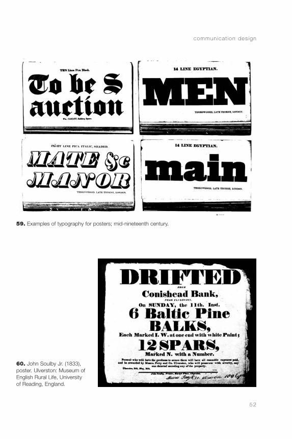
2 Proliferation of drawn alphabets for headings, to be used mainly in posters but also in magazinesthroughout the nineteenth century (Figures 5–13and 59–63).
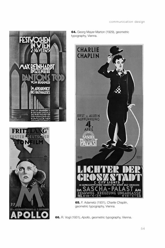
3 Geometric simplicity of the 1920s (Figures 35, 49,and 64–67).
h is to r ica l contex t
51
58. Frederic W. Goudy(1911), Forum.
continued on page 55
CommDesign 02 c 09/03/04 1:48 PM Page 51
commun ica t ion des ign
52
59. Examples of typography for posters; mid-nineteenth century.
60. John Soulby Jr. (1833),poster. Ulverston: Museum ofEnglish Rural Life, Universityof Reading, England.
CommDesign 02 c 09/03/04 1:48 PM Page 52

h is to r ica l contex t
53
61. Klatt Benefit (1845), poster for the Astley Circus. Enthoven Collection, Victoria & AlbertMuseum, London, England.
62. A. A. Turbayne, The Studio magazine,special Winter 1899–1900 issue, p. 18.
63. Examples of calligraphic alphabets from theRoman Scherer catalogue, Luzern.
CommDesign 02 c 09/03/04 1:48 PM Page 53
commun ica t ion des ign
54
64. Georg Mayer-Marton (1929), geometric typography, Vienna.
65. F. Adametz (1931), Charlie Chaplin, geometric typography, Vienna.
66. R. Vogl (1931), Apollo, geometric typography, Vienna.
CommDesign 02 c 09/03/04 1:48 PM Page 54
h is to r ica l contex t
55
4 Functional conception in search for legibility in the1950s (Figures 32 and 33).
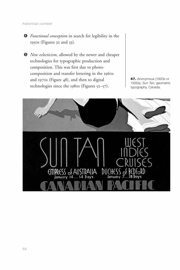
5 New eclecticism, allowed by the newer and cheapertechnologies for typographic production andcomposition. This was first due to photo-composition and transfer lettering in the 1960sand 1970s (Figure 48), and then to digitaltechnologies since the 1980s (Figures 52–57).
67. Anonymous (1920s or1930s), Sun Tan, geometrictypography, Canada.
CommDesign 02 c 09/03/04 1:48 PM Page 55

CommDesign 02 c 09/03/04 1:48 PM Page 56

CHAPTER 3
Design Principles:FunctionalRequirements
visual communication design, as we knowit today, developed its essential components in the 1920s. It changed in the 1950s when new developments in psychology, sociology, linguistics, and marketing attracted the attention of designers,leading them to change their objective from artisticcreation to effective communication. We are nowwitnessing a third stage, primarily based ondevelopments in technology, which have resulted inincreased attention paid to notions of interactionbetween the public and information.
The change that took place between the 1920s and the 1950s goes from an emphasis on aesthetics to one on communication. This change, of course, does nothappen throughout the field, but only in the moreadvanced advertising agencies and design studios. Massproduction of communication design in the 1920s wasas far from the avant-garde as the mass production ofthe 1950s was from the pioneers of that time. Even
57
CommDesign 03 b 09/03/04 1:49 PM Page 57
commun ica t ion des ign
58
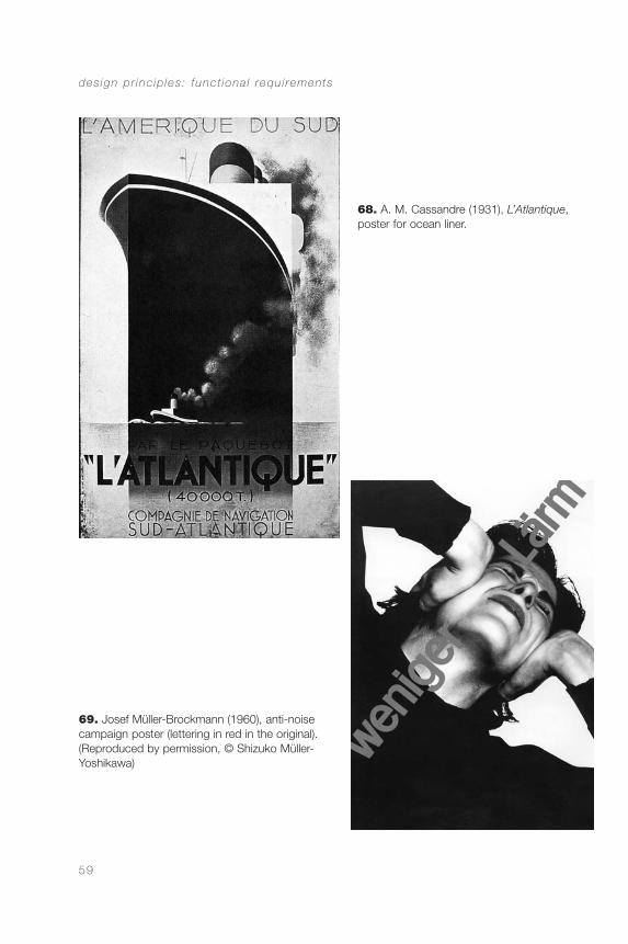
though A. M. Cassandre was already using simplicity of form in the 1930s that clearly related to Müller-Brockmann’s work of the 1950s (Figures 68 and 69),there were designers who, in the 1960s, still producedwork with a strong emphasis on visual sophistication,but that the general public found difficult to interpret.In those cases, the notion of formal innovationoverpowered the need to communicate.
Perception and Meaning
Every design that competes with other visual stimuli(a poster in the streets, an ad in a magazine, a sign in a train station) must both attract and retain theattention of the viewer. To meet the first condition,the image must be strong enough to emerge clearlyfrom its context. This is done through elements ofform and content. The image must be visually strong,that is, it should have a high internal cohesion, andshould at the same time differ from the contextsurrounding it. In addition, the content has to berelevant to the interests of the viewer.
This last aspect, which at first seems to be connectedonly to withholding attention, also plays a significantrole in attracting attention. Looking is not a passiveact. We do not look in order to see; we look tounderstand, and to find what we want. Significationand relevance are major determinants for callingattention. In legibility experiments, it has been foundthat words with negative connotations, such as “war”
CommDesign 03 b 09/03/04 1:49 PM Page 58
des ign pr inc ip les : funct iona l requ i rements
59
69. Josef Müller-Brockmann (1960), anti-noisecampaign poster (lettering in red in the original).(Reproduced by permission, © Shizuko Müller-Yoshikawa)
68. A. M. Cassandre (1931), L’Atlantique,poster for ocean liner.
CommDesign 03 b 09/03/04 1:49 PM Page 59
or “death,” while having the same level of complexityas positive words, normally require more time to beread. It is as if there was a pre-perceptual ability tounderstand the words and to raise or lower the readingthresholds, possibly trying to preserve emotionalbalance. Similarly, content and aesthetics might affectthe performance of a message: “In a crowded orcompetitive market, acceptance or rejection is often a split second decision . . .”(McConnell 131).
Given the number of “attention calls” we receiveconstantly in a city, it is easy to understand that wemake a strong selection of the surrounding stimuli,processing only a small amount of the informationpresent in our environment. This supports the need tocommunicate the content of a message through itsmost immediately visible elements. A poster with ageneral look that is not connected to its content willmost likely be missed by the target public, while othergroups interested in the visual structure of the poster—but not in its subject—might be the only onespaying attention to it.
Nevertheless, it is only fair to recognize theimportance of the contribution made by artists anddesigners of the 1920s and 1930s to visual design inrelation to the conception of visual attraction. Theirexplorations produced a revolution in their time andchanged the spectrum of preoccupations of the visualcommunication designer.
These purely visual explorations are indispensabletoday as much in connection with the education of
commun ica t ion des ign
60
CommDesign 03 b 09/03/04 1:49 PM Page 60
designers as with the practice of design. But visualexcellence is not all. Design should not only aspire to show visual strength and aesthetic excellence butalso to use those dimensions in support of thecommunicational function. Communication, in turn,does not end with attracting attention. Essentially, itinvolves making information understandable, usable,interesting, and, if possible, pleasing. In addition,communication should generate the expected reactionfrom the public.
Beyond attracting and retaining attention, thedesigner should be able to address the following issues,which can be grouped into three major areas:
1 Clarity of form and content (perception andunderstanding) in:
• The presentation of individual elements suchas: letters, numbers, pictograms, diagrams,maps, charts, graphs, signs, symbols, signage,or control panels
• The organization of communicationalsequences, including categorization of complexinformation such as: announcements,timetables, study programs, learning aids, legaldocuments, rules and regulations, theatertickets, emergency instructions, instructionmanuals, Web sites, or user interfaces
2 Facilitation and stimulation of reading(publication design)
des ign pr inc ip les : funct iona l requ i rements
61
CommDesign 03 b 09/03/04 1:49 PM Page 61
3 Consideration of cultural, social, economic,technological, and ecological aspects of all projects
Language and Signification
Today, designers have at their disposal the immensecollection of visual resources that has been generatedby a long tradition of art and design. The problem forthe designer now is to avoid capricious selections andto develop a visual language that meets the needs ofthe project. This is one of the first challenges in thedesign process for visual communications.
The designer should develop a checklist to bear inmind for all projects, adapting and extending that listaccording to the requirements of each case. Thegeneral list could be as follows:
• Fitness to content (Is there a good relationshipbetween the topic and the visual presentation?)
• Fitness to context (Are the visual language andstructure appropriate for the people addressed andthe situation in which the message will appear?)
• Quality of concept (Is there an idea or only alayout?)
• Quality of form (Is there a good perceptualorganization?)
commun ica t ion des ign
62
CommDesign 03 b 09/03/04 1:49 PM Page 62
• Legibility/visibility (Are letters and imagesappropriately readable?)
• Craft (Is the project well presented?)
• Quality of medium (Are the possibilities of themedium well used? Is it the appropriate mediumfor the project? Are technologies and materialswell used?)
In many cases, it will be necessary to add:
• Quality of the research (Is the informationcollected sufficient, interesting, and accurate?)
• Power of the persuasive arguments (What is theperceived advantage for the public to rememberthe information provided or to adopt a newbehavior?)
Communication
An essential aspect of the designer’s job is to constantlyattend to a wide variety of diverse but interrelatedproblem levels. These levels can be organized accordingto five categories: communication, form, economics,technology, and management.
Communication is the reason for the existence ofvisual communication design, and represents theorigin and the objective of all work in the field.
des ign pr inc ip les : funct iona l requ i rements
63
CommDesign 03 b 09/03/04 1:49 PM Page 63
All perception involves a search for meaning, and it is,in this sense, a communicational act or a search forcommunication. The biological function of visualperception is to provide information about thesurrounding environment to secure survival.Perception in general, and visual perception inparticular, has not been developed to allow us to enjoy the beauty of the surroundings but to help usunderstand them; in other words, to interpret the data provided by the senses so as to build meaning.Perception, therefore, is connected to the most basicof the animal instincts: survival. Keeping this in mind,and considering that humans are fundamentallyvisual, it is easy to understand why visual messages can be so strong, even when their content could betrivial; it is the channel that gives them strength.
The Gestalt psychologists went beyond previoustheories when they proposed perception as a structuralprocess, different from the sequential and additivecharacter of previous descriptions. Their attention wasdirected to formal issues related to the organization of the images, leaving matters of meaning out of thepicture. The study of the organizational principles ofhuman perception is important, but it is necessary tosee these principles as strategies used in a search formeaning, and not just as automatic organizationprocesses devoid of other purposes.
We could recognize two fundamental components in any perception: the search for meaning, and theconstruction of meaning based on the organization ofthe stimuli. Essentially, this organization is carried out
commun ica t ion des ign
64
CommDesign 03 b 09/03/04 1:49 PM Page 64
on the basis of principles of integration and segregationthat connect and separate elements through proximity,similarity, and closure (good form)—the basic lawsestablished by the Gestalt school.
In addition to the processes of organization discussedby the Gestalt school, it is worth remembering that the signifying function is an essential andimmediate aspect of the perceptual process. It couldbe sometimes more rational and conscious, andsometimes more emotional and automatic, but it isalways present. Difficulties with this function generateemotional tension, anxiety, fear, fatigue, or boredom,according to the circumstances.
Every shape evokes a response—more or less cognitive,more or less emotional. This demonstrates theimportance of designers in the organization of theperceptual, emotional, and cognitive processes to befollowed by the viewer, beyond purely aesthetic issues.It would be a fundamental error to believe that indesign one can deal with form independent ofcontent, or with the sensorial, independent of thecognitive and the emotional (Sinclair et al. 178).
In some cases, the organization of the elements mightnot have a cognitive function, beyond that of makingthe information accessible, as in the case of timetables,catalogs, programs, and other examples of visualpresentation of information. Design, however, is neverneutral, despite what was believed by the Swissmodernists in the 1950s and 1960s. Every form, inaddition to its fitness for the informational job, has a
des ign pr inc ip les : funct iona l requ i rements
65
CommDesign 03 b 09/03/04 1:49 PM Page 65
cultural root and a cultural impact; it promotescertain values and pertains to a given social class, andmany times to a specific race or gender. Neutral designdoes not exist (Frascara 119).
As previously stated, perception implies a search formeaning and the organization of stimuli in asignifying array. This is a process of interpretation. To perceive is not to receive information passively. To perceive involves searching, selecting, relating,organizing, establishing connections, remembering,identifying, defining hierarchies, judging, learning,and interpreting. The more organized the stimuli arein relation to the public’s cognitive style, the easier itis to interpret them. This is why it is so important touse pertinent symbols in graphic messages, and toorganize them according to systems that areunderstandable by the public.
Designers such as Tschichold or Müller-Brockmannconcentrate on the communicational function of theirvisual compositions; this explains the inclusion ofthese designers in the history of the profession. Thesimplicity of their designs is based on criteria for theselection of content-carrying components, and adedication to the logical and aesthetic organization of those components so as to arrive at the highestpossible effectiveness for the message. Their works,however, cannot be taken today as paradigms, becauseduring their work-life it was not known that differentaudiences require different logics, and, in general,different ways of presenting information that call for a more context-sensitive approach to designing.
commun ica t ion des ign
66
CommDesign 03 b 09/03/04 1:49 PM Page 66
The selection of the components of a messagedetermines to a great extent the semantic content ofthe message. The organization of those componentscan reinforce the meaning of the message. Thisorganization is centered on syntactic issues; that is, onthe ways in which the components can be presentedso as to facilitate the processing and understanding ofthe message by the public.
Followers of Tschichold, Müller-Brockmann, and theSwiss school in general, did not realize that every visualstyle expresses a value system—or in other words, has acontent. It is not possible to design neutral typographyor neutral layouts. Any layout will better support somemessages and work against others. “Walking down acountry lane you see a sign saying ‘Fresh eggs.’ A simpleenough message, but the fact that it is hand-written ona broken piece of board actually makes the freshness ofthe eggs more believable, even though you do notconsciously acknowledge it. But if you then go furtheralong the road and see a similarly hand-written signsaying ‘Flying lessons,’ the effect is exactly the opposite”(McConnell 131).
The visual organization of a message, therefore, mustbe appropriate for its contents. The visual organizationof a design serves to establish clear relations ofimportance, inclusion, connection, and dependence,and serves to guide the sequence in the perception of a message, helping the viewer in the process ofconstructing meaning. Given that the effectiveness ofa message hinges on its interpretation by the public,the evaluation of a design has to be based on
des ign pr inc ip les : funct iona l requ i rements
67
CommDesign 03 b 09/03/04 1:49 PM Page 67
measuring comprehension by the intended audience,and not on aesthetic preference measured by experts.
Every design strategy should be conceived as aworking hypothesis that might require experimentaltesting to become trustworthy, even though it couldbe based on extensive experience. Semiotics, rhetoric,and perception theory on the one hand, andmarketing, social psychology, and learning theories onthe other, provide a good start. But these areas ofknowledge cannot guarantee the performance of a newdesign. In every complex project, it is necessary to go beyond the application of existing knowledge tostudy the specific conditions of the project at hand.This, little by little, continues to develop knowledgein the field and helps to plan communications onincreasingly proven principles.
To sum up, a series of principles can be extracted fromthe preceding discussion:
• Every visual element conveys meaning
• Every layout conveys meaning
• Every meaning presupposes an organization
• Every organization is based on principles ofintegration and segregation
• The principles of integration and segregation arebased on the Gestalt principles of similarity,proximity, and good form
commun ica t ion des ign
68
CommDesign 03 b 09/03/04 1:49 PM Page 68

• Every visual message involves form and meaning
• The meaning of a message requires a process ofinterpretation
• Every message is produced to generate an actionof some kind
Meaning and Interpretation
The interpretation of a message involves two levels:denotation and connotation. Denotation refers to therelatively objective dimensions of a message, such asdescriptions or representations in images or texts.Connotation refers to more subjective aspects of amessage, and it is particularly important when themessage strives for an emotional appeal, as in the case of persuasive messages. At the level of connotation,the public participates more actively in the constructionof meaning. The connoted message is more culture-dependent, and it is built as a combination of thedesigner’s concept and the target public’s experience.
For example, a seventeenth-century Dutch painting of a platter of fruit is a platter of fruit for us and formost people; this is the denoted message. Theconnoted messages, by contrast, may vary from personto person, or from group to group. For some peoplethe painting may mean abundance; for othershedonism; for others it is a painting of good or not-so-good quality; and for still others it is a paintingwithout imagination, or the symbol of a materialisticsociety. For everybody, however, it is a platter of fruit.
des ign pr inc ip les : funct iona l requ i rements
69
CommDesign 03 b 09/03/04 1:49 PM Page 69
Although images are more likely than texts to elicit agreat variety of connoted messages, this is also possiblefor texts, depending either on their style or content. A text could be boring for a sophisticated audiencebut engaging for a more naïve one, or the other wayaround. What could appear as interesting engineeringknowledge for the layperson might sound like a packof lies to an engineer. The text that sounds pompousto some readers might command respect from others.It is, therefore, essential to make every effort tounderstand the cognitive and cultural profile of thetarget audience. This applies as much to the contentas to the form of both images and texts. In the processof crafting a message, it is always advisable to test itwith a sample of the intended audience forcomprehensibility and general reactions. It is difficultto craft the best possible message on existingknowledge alone.
The control of the denoted message is simpler. It isnecessary, nevertheless, to avoid the trap of usingoneself as the sole referent in determining whethersomething is clearly denotative. Different ways ofthinking and different contexts can separate theworld of the designer from that of the audience andgenerate a communication breakdown if the public’scognitive culture is not known to the designer. Someconventions that appear obvious to us—such asreading a cartoon from left to right, or interpretingthe floor plan of a building or a section of the earth’scrust—might create total confusion in the personwho does not share those conventions with us(Figure 70).
commun ica t ion des ign
70
CommDesign 03 b 09/03/04 1:49 PM Page 70
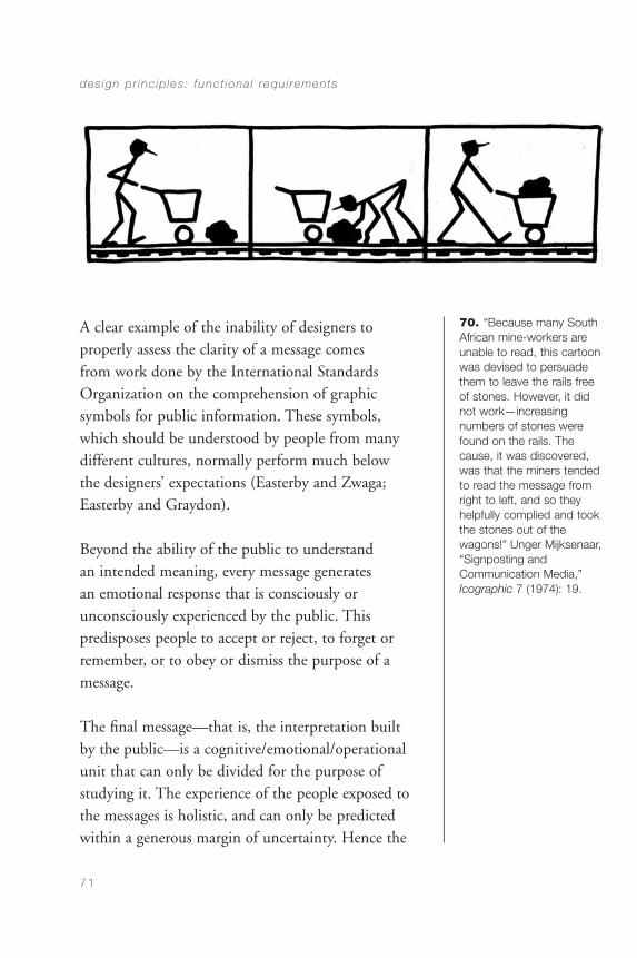
A clear example of the inability of designers toproperly assess the clarity of a message comes from work done by the International StandardsOrganization on the comprehension of graphicsymbols for public information. These symbols, which should be understood by people from manydifferent cultures, normally perform much below the designers’ expectations (Easterby and Zwaga;Easterby and Graydon).
Beyond the ability of the public to understand an intended meaning, every message generates an emotional response that is consciously orunconsciously experienced by the public. Thispredisposes people to accept or reject, to forget orremember, or to obey or dismiss the purpose of amessage.
The final message—that is, the interpretation built by the public—is a cognitive/emotional/operationalunit that can only be divided for the purpose ofstudying it. The experience of the people exposed tothe messages is holistic, and can only be predicted within a generous margin of uncertainty. Hence the
des ign pr inc ip les : funct iona l requ i rements
71
70. “Because many SouthAfrican mine-workers areunable to read, this cartoonwas devised to persuadethem to leave the rails freeof stones. However, it didnot work—increasing numbers of stones werefound on the rails. Thecause, it was discovered,was that the miners tendedto read the message fromright to left, and so theyhelpfully complied and tookthe stones out of the wagons!” Unger Mijksenaar,“Signposting and Communication Media,”Icographic 7 (1974): 19.
CommDesign 03 b 09/03/04 1:49 PM Page 71

need to engage in testing, particularly when thecommunication project attempts something unusual,something that goes against current habits, orsomething that intends to change them.
Contexts
The context for a message requires special attention.The concept of “context” is applicable at several levels,but fundamentally encompasses the ones listed below:
• Perceptual: the visual environment in which themessage appears
• Cultural: the cultural environment of the targetaudience, their values, their habits, their codes,and their attitudes
• Source: the collection of messages already issuedby the same person or organization
• Source’s class: the cluster of messages created bysimilar organizations, such as educational,commercial, or governmental sources
• Aesthetic: formal qualities that position themessage within a given approach, such ascontemporary, traditional, popular, or otherrecognized visual styles
• Media: the environment created by the mediumused; for example, newspapers, TV, books,magazines for women, the World Wide Web, etc.
commun ica t ion des ign
72
CommDesign 03 b 09/03/04 1:49 PM Page 72
(at a finer level of detail, it could be a particularmagazine, a particular TV program, etc.)
• Technical quality: the level of technicalexpectations of the target audience in theparticular medium used
• Language: the environment created by the usualwritten and spoken language in a given place by agiven group
All these contexts affect the message and the processes of interpretation. If we understand thecommunication process as an act in which the publicbuilds a meaning, we realize that the graphic messageby itself is incomplete. It remains relatively uncertainuntil a person completes it through an act not ofreception, but of interpretation. This is a complex act,involving cognitive and emotional responses, and onein which people develop a relationship not only withthe message but also with the source.
Every communication in design involves a source, adesigner, a medium, a code, a form, a content, acontext, and a public (that builds a meaning, developsan attitude, and adopts a visible or internal behavior).Every communication involves perceptual, emotional,and cognitive processes (denotative and connotative).Form and style always communicate. Everycommunication is affected by the different contextsthat surround it.
des ign pr inc ip les : funct iona l requ i rements
73
CommDesign 03 b 09/03/04 1:49 PM Page 73

Aesthetics
There are several reasons why aesthetics is a majorconcern in design:
• It creates attraction or rejection “at first sight”
• It communicates
• It affects the perceptual time an onlookerdedicates to a design
• It affects the memorization of the message
• It affects the active life of the design
• It affects, in a broad sense, the quality of theenvironment
Attention and a good disposition on the part of theobserver are necessary for communication to takeplace. The attention of the observer must be securednot only through the loudness of the stimulus or therelevance of the content but also, and fundamentally,through the positive attraction that the stimulusgenerates. Stimulus strength is necessary, but excessiveloudness can create negative effects. The name of anold advertising agency, “A Punch in the Eye,” belongsto a time in which it was believed that the function ofthe advertising designer was to capture the audience’sattention at all cost, without taking note of thenegative effects that a “noisy” image can have on aproduct.
commun ica t ion des ign
74
CommDesign 03 b 09/03/04 1:49 PM Page 74
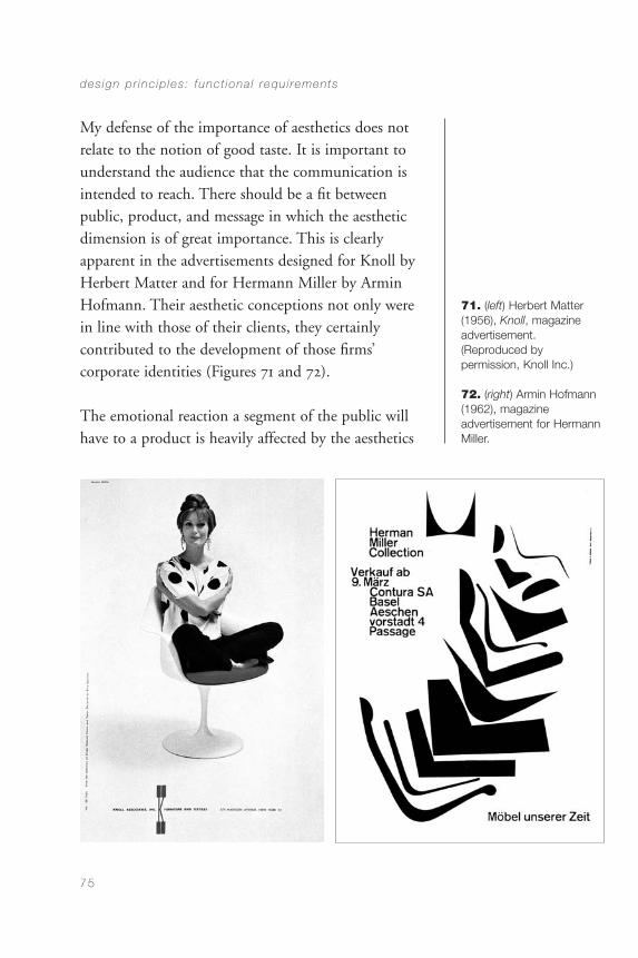
My defense of the importance of aesthetics does notrelate to the notion of good taste. It is important tounderstand the audience that the communication isintended to reach. There should be a fit betweenpublic, product, and message in which the aestheticdimension is of great importance. This is clearlyapparent in the advertisements designed for Knoll byHerbert Matter and for Hermann Miller by ArminHofmann. Their aesthetic conceptions not only werein line with those of their clients, they certainlycontributed to the development of those firms’corporate identities (Figures 71 and 72).
The emotional reaction a segment of the public willhave to a product is heavily affected by the aesthetics
des ign pr inc ip les : funct iona l requ i rements
75
71. (left) Herbert Matter(1956), Knoll, magazineadvertisement. (Reproduced by permission, Knoll Inc.)
72. (right) Armin Hofmann(1962), magazine advertisement for HermannMiller.
CommDesign 03 b 09/03/04 1:49 PM Page 75
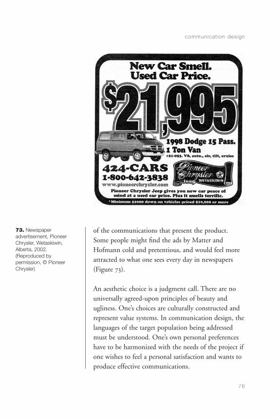
of the communications that present the product.Some people might find the ads by Matter andHofmann cold and pretentious, and would feel moreattracted to what one sees every day in newspapers(Figure 73).
An aesthetic choice is a judgment call. There are nouniversally agreed-upon principles of beauty andugliness. One’s choices are culturally constructed andrepresent value systems. In communication design, thelanguages of the target population being addressedmust be understood. One’s own personal preferenceshave to be harmonized with the needs of the project ifone wishes to feel a personal satisfaction and wants toproduce effective communications.
commun ica t ion des ign
76
73. Newspaper advertisement, PioneerChrysler, Wetaskiwin,Alberta, 2002. (Reproduced by permission, © PioneerChrysler)
CommDesign 03 b 09/03/04 1:49 PM Page 76
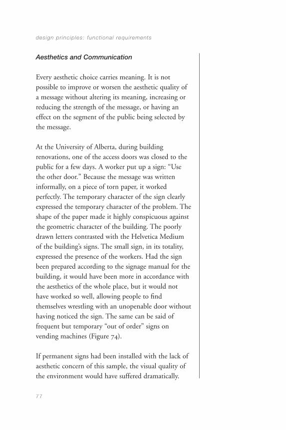
Aesthetics and Communication
Every aesthetic choice carries meaning. It is notpossible to improve or worsen the aesthetic quality ofa message without altering its meaning, increasing orreducing the strength of the message, or having aneffect on the segment of the public being selected bythe message.
At the University of Alberta, during buildingrenovations, one of the access doors was closed to thepublic for a few days. A worker put up a sign: “Usethe other door.” Because the message was writteninformally, on a piece of torn paper, it workedperfectly. The temporary character of the sign clearlyexpressed the temporary character of the problem. Theshape of the paper made it highly conspicuous againstthe geometric character of the building. The poorlydrawn letters contrasted with the Helvetica Mediumof the building’s signs. The small sign, in its totality,expressed the presence of the workers. Had the signbeen prepared according to the signage manual for thebuilding, it would have been more in accordance withthe aesthetics of the whole place, but it would nothave worked so well, allowing people to findthemselves wrestling with an unopenable door withouthaving noticed the sign. The same can be said offrequent but temporary “out of order” signs onvending machines (Figure 74).
If permanent signs had been installed with the lack ofaesthetic concern of this sample, the visual quality ofthe environment would have suffered dramatically.
des ign pr inc ip les : funct iona l requ i rements
77
CommDesign 03 b 09/03/04 1:49 PM Page 77
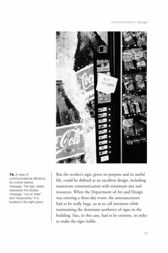
But the worker’s sign, given its purpose and its usefullife, could be defined as an excellent design, includingmaximum communication with minimum size andresources. When the Department of Art and Designwas running a three-day event, the announcement had to be really large, so as to call attention whilemaintaining the dominant aesthetics of signs in thebuilding. Size, in this case, had to be extreme, in orderto make the sign visible.
commun ica t ion des ign
78
74. A case of communicational efficiencyfor a short-lasting message. The sign clearlyexpresses the double message: “out of order”and “temporarily.” It islocated in the right place.
CommDesign 03 b 09/03/04 1:49 PM Page 78
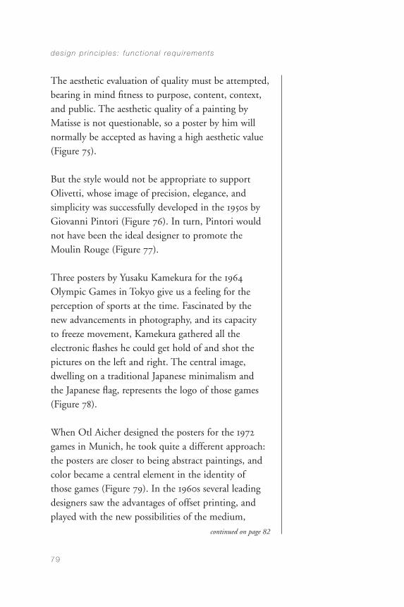
The aesthetic evaluation of quality must be attempted,bearing in mind fitness to purpose, content, context,and public. The aesthetic quality of a painting byMatisse is not questionable, so a poster by him willnormally be accepted as having a high aesthetic value(Figure 75).
But the style would not be appropriate to supportOlivetti, whose image of precision, elegance, andsimplicity was successfully developed in the 1950s byGiovanni Pintori (Figure 76). In turn, Pintori wouldnot have been the ideal designer to promote theMoulin Rouge (Figure 77).
Three posters by Yusaku Kamekura for the 1964Olympic Games in Tokyo give us a feeling for theperception of sports at the time. Fascinated by thenew advancements in photography, and its capacity to freeze movement, Kamekura gathered all theelectronic flashes he could get hold of and shot thepictures on the left and right. The central image,dwelling on a traditional Japanese minimalism and the Japanese flag, represents the logo of those games(Figure 78).
When Otl Aicher designed the posters for the 1972games in Munich, he took quite a different approach:the posters are closer to being abstract paintings, andcolor became a central element in the identity of those games (Figure 79). In the 1960s several leadingdesigners saw the advantages of offset printing, andplayed with the new possibilities of the medium,
des ign pr inc ip les : funct iona l requ i rements
79
continued on page 82
CommDesign 03 b 09/03/04 1:49 PM Page 79
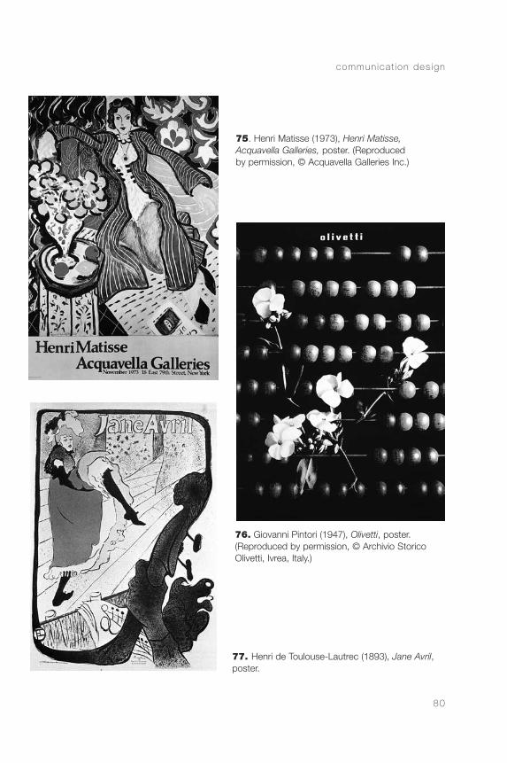
commun ica t ion des ign
80
76. Giovanni Pintori (1947), Olivetti, poster. (Reproduced by permission, © Archivio StoricoOlivetti, Ivrea, Italy.)
75. Henri Matisse (1973), Henri Matisse,Acquavella Galleries, poster. (Reproducedby permission, © Acquavella Galleries Inc.)
77. Henri de Toulouse-Lautrec (1893), Jane Avril,poster.
CommDesign 03 b 09/03/04 1:49 PM Page 80
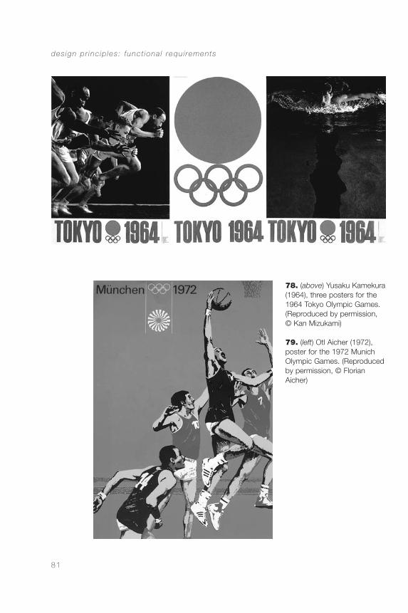
des ign pr inc ip les : funct iona l requ i rements
81
78. (above) Yusaku Kamekura(1964), three posters for the1964 Tokyo Olympic Games.(Reproduced by permission, © Kan Mizukami)
79. (left) Otl Aicher (1972),poster for the 1972 MunichOlympic Games. (Reproducedby permission, © Florian Aicher)
CommDesign 03 b 09/03/04 1:49 PM Page 81
resorting to transparencies and distortions thatextended the vocabulary of the communicationdesigner at the time, while trying to call attention onthe basis of visual innovation. Victor Moscoso, bycontrast, used visual resources to position his work aspertaining to the youth of his era (Figure 80).
His design was meant to slow down reading, so thatthe busy businessperson in a hurry could not readit—and be somewhat outraged by it. Yet, whenDistéfano, Fontana, and Soler created a poster for ashow of Olivetti products, they used a style related tooptical art, but aimed at the segment of the generalpublic that could be interested in the exhibitionbeing promoted (Figure 81). As another example offitness to content, Susan Colberg designed a bookcover in 1996 using an archival photograph offilmmaker Jean-Luc Godard at work, rendered in agrainy texture, to suggest the character of black andwhite film (Figure 82).
Her cover for A Guide to Heidegger’s Being and Timeuses a leaf to symbolize the importance of thetransitory in Heidegger’s philosophy (Figure 83).Whereas Colberg’s covers for SUNY (State Universityof New York) Press are characterized by subtlety,contemporary visual language in editorial design canbe quite “in your face,” as can be seen in many generalinterest magazines, particularly those for the young.The culture of technology also has its own aestheticprinciples. The cover design by Dynamic Diagramscomes from an aesthetic related to the new electronicmedia (Figure 84).
commun ica t ion des ign
82
continued on page 85
CommDesign 03 b 09/03/04 1:49 PM Page 82
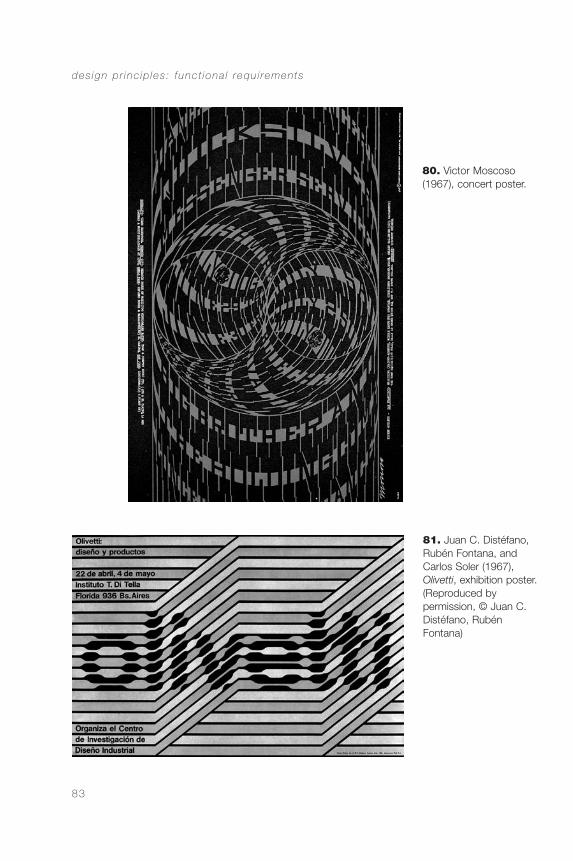
des ign pr inc ip les : funct iona l requ i rements
83
81. Juan C. Distéfano,Rubén Fontana, and Carlos Soler (1967),Olivetti, exhibition poster.(Reproduced by permission, © Juan C.Distéfano, RubénFontana)
80. Victor Moscoso(1967), concert poster.
CommDesign 03 b 09/03/04 1:49 PM Page 83
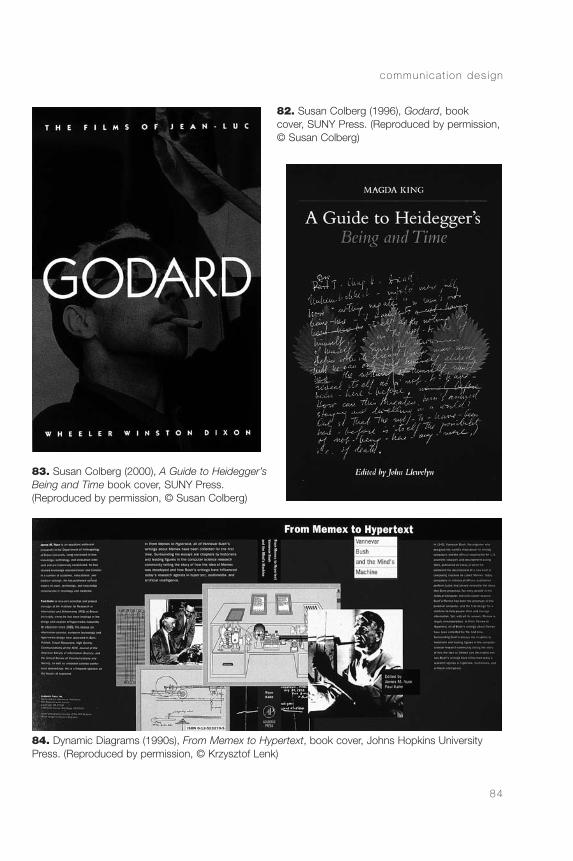
commun ica t ion des ign
84
84. Dynamic Diagrams (1990s), From Memex to Hypertext, book cover, Johns Hopkins UniversityPress. (Reproduced by permission, © Krzysztof Lenk)
82. Susan Colberg (1996), Godard, book cover, SUNY Press. (Reproduced by permission,© Susan Colberg)
83. Susan Colberg (2000), A Guide to Heidegger’sBeing and Time book cover, SUNY Press. (Reproduced by permission, © Susan Colberg)
CommDesign 03 b 09/03/04 1:49 PM Page 84
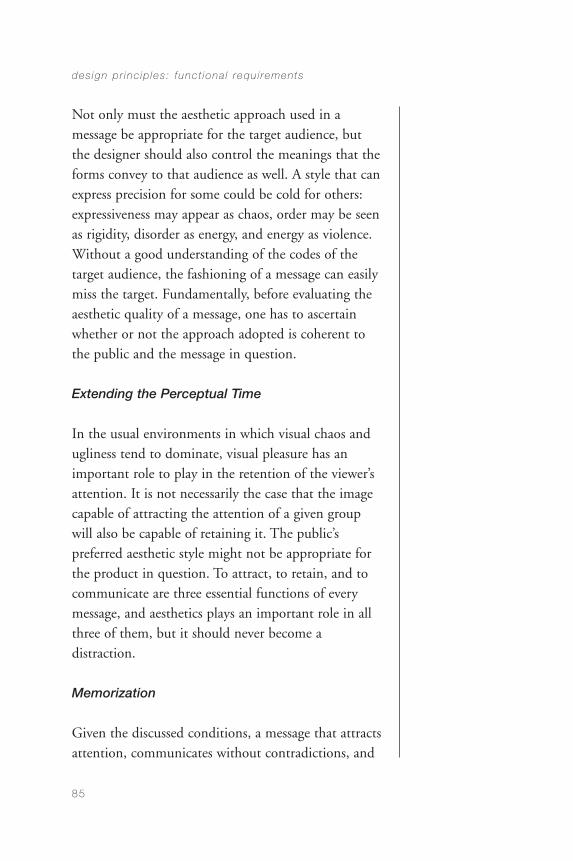
Not only must the aesthetic approach used in amessage be appropriate for the target audience, butthe designer should also control the meanings that theforms convey to that audience as well. A style that canexpress precision for some could be cold for others:expressiveness may appear as chaos, order may be seenas rigidity, disorder as energy, and energy as violence.Without a good understanding of the codes of thetarget audience, the fashioning of a message can easilymiss the target. Fundamentally, before evaluating theaesthetic quality of a message, one has to ascertainwhether or not the approach adopted is coherent tothe public and the message in question.
Extending the Perceptual Time
In the usual environments in which visual chaos andugliness tend to dominate, visual pleasure has animportant role to play in the retention of the viewer’sattention. It is not necessarily the case that the imagecapable of attracting the attention of a given groupwill also be capable of retaining it. The public’spreferred aesthetic style might not be appropriate forthe product in question. To attract, to retain, and tocommunicate are three essential functions of everymessage, and aesthetics plays an important role in allthree of them, but it should never become adistraction.
Memorization
Given the discussed conditions, a message that attractsattention, communicates without contradictions, and
des ign pr inc ip les : funct iona l requ i rements
85
CommDesign 03 b 09/03/04 1:49 PM Page 85
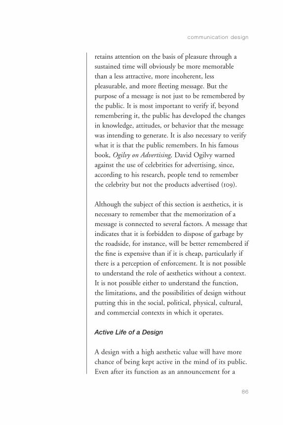
retains attention on the basis of pleasure through asustained time will obviously be more memorablethan a less attractive, more incoherent, lesspleasurable, and more fleeting message. But thepurpose of a message is not just to be remembered bythe public. It is most important to verify if, beyondremembering it, the public has developed the changesin knowledge, attitudes, or behavior that the messagewas intending to generate. It is also necessary to verifywhat it is that the public remembers. In his famousbook, Ogilvy on Advertising, David Ogilvy warnedagainst the use of celebrities for advertising, since,according to his research, people tend to rememberthe celebrity but not the products advertised (109).
Although the subject of this section is aesthetics, it isnecessary to remember that the memorization of amessage is connected to several factors. A message thatindicates that it is forbidden to dispose of garbage bythe roadside, for instance, will be better remembered ifthe fine is expensive than if it is cheap, particularly ifthere is a perception of enforcement. It is not possibleto understand the role of aesthetics without a context.It is not possible either to understand the function,the limitations, and the possibilities of design withoutputting this in the social, political, physical, cultural,and commercial contexts in which it operates.
Active Life of a Design
A design with a high aesthetic value will have morechance of being kept active in the mind of its public.Even after its function as an announcement for a
commun ica t ion des ign
86
CommDesign 03 b 09/03/04 1:49 PM Page 86
show has passed—or any other passing event—printed materials, such as posters, maps, graphs,calendars, and advertisements of high aesthetic valuekeep on showing up in exhibitions and publicationsand continue to issue their message. True, themessage they issue is not the same as the one thatgenerated them, but it is one that contributespositively to the image of those who generated it. Insome cases, such as the designs Cassandre did forDubonnet in the 1930s, the original design was usedfor many years (Figure 85).
The Quality of the Environment
The quality of the environment is one of the socialresponsibilities of the designer. Our urban life issurrounded by design: architectural, industrial, andgraphic. A painting might begin its life in a studio, beshown in a gallery, and end up in someone’s house.The cover of a book, alternatively, printed fivethousand times, shown in dozens of shop windows,placed on top of five thousand tables in five thousand
des ign pr inc ip les : funct iona l requ i rements
87
85. A. M. Cassandre(1932), Dubonnet, advertisement.
CommDesign 03 b 09/03/04 1:49 PM Page 87
houses, reproduced in hundreds of thousands ofnewspapers, on thousands of leaflets, and hundreds of posters has a presence that, although somewhatfleeting, strongly affects our daily environment. This is why communication design quality should beconsidered not only in connection with the specificscope of the project in question but also with regardto the cultural impact that it has on our daily life.
In order to understand the requirements of a project,designers must ask themselves a number of questions:
• What is the purpose of the message?
• What is the content of the message?
• What are the implied messages and their relativeimportance?
• Who is at the origin of the message?
• What is the profile of the target audience?
• What is the budget?
• What are the media to be used?
• In which contexts will the message be issued?
There could be more questions, depending on theproject. This is just an idea of the essential territoriesthat have to be covered by any design project.
commun ica t ion des ign
88
CommDesign 03 b 09/03/04 1:49 PM Page 88
According to the responses to these questions, thedesigner plans the message at many levels: form, code,language, purpose, narrative, and media. The processinvolves technological, logistical, and financialdecisions, and ends up with an evaluation plan aimedboth at measuring the success of the communicativeaction and at collecting feedback to improve thataction.
des ign pr inc ip les : funct iona l requ i rements
89
CommDesign 03 b 09/03/04 1:49 PM Page 89

CommDesign 03 b 09/03/04 1:49 PM Page 90
CHAPTER 4
Methods andPlanning
every communication design project, to a greater or lesser extent, requires planning at the levels of communication, visualization, andproduction. The first two levels imply study of theproblem, development of strategies, and creation ofdesign proposals. Production requires organization ofresources (human, technological, and economic) andfinal fabrication.
The development of a list of requirements and theirrelative importance is one of the first steps takenduring the study of the problem. In this way, thedesigner maps the tensions between the requirementsand is able to take positions regarding priorities. Thesepriorities are not necessarily lists with a clear hierarchy,because design is characterized by the interdependenceof factors. “We know that we shall never findrequirements which are totally independent. If wecould, we could satisfy them one after the other,without ever running into conflicts. The very problem
91
CommDesign 04 b 09/03/04 1:49 PM Page 91

of design springs from the fact that this is not possiblebecause of the field character of the form-contextinteraction” (Alexander 213).
The designer also coordinates the project inconnection with due dates, and plans the sequence of steps of the project. This timeline allows thedesigner to assess the cost of the project, to control its realization, and eventually to evaluate whether the projected timeline was accurate or unrealistic.Although it seems obvious, it is important to state it:to plan, including timeline planning, develops one’sability to plan. Without an articulated intention, itbecomes very difficult to develop one’s own abilities to estimate the time and resources required by a job.Planning allows one to compare estimates to actualoutcomes, and sharpens one’s ability to get ready forthe needs of a project before they show up.
In addition to this organizational task, the designerconsiders space and time as they affect the finalproduct: space, with regard to the physical and visualcomposition of the design product; time, concerningthe way in which the visual product is captured by the public during its interaction with the message.The sequence of this interaction is a central issue in connection with the potential effectiveness of acommunication.
From a different point of view, during the development of the project, the designer must beconcerned with the management of space in the office,and access to information, materials, and people, in
commun ica t ion des ign
92
CommDesign 04 b 09/03/04 1:49 PM Page 92
order to maximize the efficiency of the task. Theorganization of the design process is a design problem.
Design Methods
The 1960s saw a strong development in designmethods. There was an increase of literature onmethods at that time, written by engineers, architects,and industrial designers. Some of those methods, inwhole or in part, can be applied to communicationdesign. The authors, however, normally recommendcaution in their implementation, noting theimportance of specific details in particular situationsfor any design project. Methods, more than amechanical technique, are strategic aids directed atproposing routines that help to resolve a variety ofproblems. They are directed at reducing the timeinvested in the design process, and, in general, atrendering it more efficient and effective. They are notprefabricated solutions.
Nigel Cross and Robin Roy describe fifteen methods intheir Design Methods Manual, and all, in one way oranother, are relevant to visual communication design.These methods, however, are somewhat abstract, and it is advisable always to anchor them in the context ofthe specific situation a design project confronts.
It is as difficult to solve a design problem by firstidentifying all the elements and variables implied as it isto do it without trying to identify them. An integrated
methods and p lann ing
93
CommDesign 04 b 09/03/04 1:49 PM Page 93
method, in which abstract processes and tentativevisualizations alternate, seems to be the most intelligentapproach to working in visual communication design.The search for a solution should be systematic andexhaustive, but the steps in that search must involve avariety of ways of analyzing and formulating theproblem. Normally, these ways include non-rationalstrategies and tentative visualizations at the initial stageswhen one does not yet have sufficient information todevelop final visualizations. At this stage, visualizing isanother way of studying conditions and possibilitiesleading to the solution of the problem. To facilitate thisprocess, it is indispensable at the outset to define nothow the design must look, but what the design must do(Cross and Roy 19).
The information obtained about a project, although itcan provide essential criteria for the configuration ofthe visualization, is never sufficient to generate asolution. There is always a need for a creative leap inthe interpretation process, where the designerconsiders all the information collected, but does notjust respond to it. Visualization is not a mechanicalprocess that results exclusively from the informationcollected for the specific project. Other contexts haveto be brought into play to produce a piece that notonly does the job but also does it well, adding value tothe experience of the public, and attending to cultural,personal, and experiential dimensions. This is why thevisual communication designer should be not only atechnician but also a visually sophisticated and well-educated person, with a high ability to obtain,organize, process, and present information.
commun ica t ion des ign
94
CommDesign 04 b 09/03/04 1:49 PM Page 94
The Design Process
Given the variety of situations that communicationdesign deals with, it is not easy to establish a sequenceof steps that can be applied to any visualcommunication design project. Some essential steps,however, can be identified. The sequence of the designprocess could be outlined as follows:
1 Commission of the project: First definition of theproblem and the budget
2 Collection of information: About the client, theproduct, the competition (if it exists), and thepublic
3 Second definition of the problem: Analysis,interpretation, and organization of theinformation collected
4 Definition of objectives: What should the productdo? Definitions of communication channels (how to get the product physically to the public),arguments (how to cognitively and affectivelycommunicate with the public), form (how toperceptually and aesthetically reach to the public), as well as the preliminary study ofimplementation
5 Third definition of the problem: Productionspecifications, putting the problem in design andproduction terms, and writing the design brief
methods and p lann ing
95
CommDesign 04 b 09/03/04 1:49 PM Page 95
6 Development of the design proposal: Considerationsof form, content, media, and technology
7 Presentation to the client: An informational andpersuasive act
8 Organization of production: Preparation of thefinal design ready for production
9 Supervision of implementation
0 Evaluation of performance: Comparison of resultswith the established operational objectives,eventual adjustments based on the evaluation, and further adjusted implementation
A discussion of this summary might help to clarifysome points.
Commission of the Project
The commission of the project involves thedefinition of the budget and the first definition of the problem. The client is the first person whoattempts to define the problem—identifying a need or a wish, and an objective—and contacting adesigner. Frequently, clients ask designers for aspecific service, reducing their participation to thatof visualizers or draftsmen. The designer needs to get the full picture from the client: the identifiedneed, the essential objective to be achieved, and thefull context. The task of the designer at this stage isto redefine the problem in design terms and
commun ica t ion des ign
96
CommDesign 04 b 09/03/04 1:49 PM Page 96
objectives, and in achievable and measurable ways.Metaphorically speaking, the client can say that heneeds a bridge, when his need might be to cross ariver. There are many ways to cross a river, and it isthe task of the designer to compare the possiblesolutions, recommend the best ones, and eventuallydevelop the most appropriate one.
Although the client initiates the process, the designermust reevaluate the situation and advise the client,sometimes against the client’s initial assumptions, andsometimes to the detriment of the designer’s short-term benefit. This is the case when one advises theclient that, for a given situation, the best option is notto design a product. Some years ago, one of my clientsasked me to design a brochure to communicate to his clients the offering of a new service. Given therequired communication and the clients in question, I advised him to send a letter instead. In that case, aletter was, in my judgment, more credible and a betterpromotional tool than a brochure. I was not hired forthe project, but I strengthened my relationship withthe client.
At this stage, the political problem is that if the client’sidea about the design solution does not work, theperson to be blamed will be the designer. This is whythe designer cannot use the client as the sole source of information about the problem. One has to becomeas informed as possible about the client’s problem, not only using client input but also independentlyseeking relevant information. This applies to thebudget as well, which is normally defined by the
methods and p lann ing
97
CommDesign 04 b 09/03/04 1:49 PM Page 97
client. In some cases, however, through thepresentation of new information, the designer mightpersuade the client to change it.
Collection of Information
This stage aims at gathering information about theclient, the product, the competition (if it exists), andthe public. Here the designer places the project incontext, starting from the definition of the client’sorganization through a description of its operations,its corporate image, and the integration of the projectat hand within the organization’s value system andsociocultural profile. It is also possible that the analysisof the project in question could suggest a need tomodify certain aspects of the client’s existing publicimage or business strategies (or educational,administrative, or whatever category might apply tothe particular client). A broad set of possibilities opensup when one investigates in detail the contexts thatsurround a given design product.
Needless to say, the analysis of the product itself,particularly in advertising, is an essential element ofthis process. A corporate image cannot be developedby a designer who does not have an intimateknowledge of the client’s organization; it should becomparable to what its president or manager has. Atextbook cannot be designed without knowing itscontent; a consumer product cannot be promotedwithout information about the product, so as todevelop convincing sales arguments.
commun ica t ion des ign
98
CommDesign 04 b 09/03/04 1:49 PM Page 98
David Ogilvy, a pioneer in contemporary advertising,stated in his book, Ogilvy on Advertising: “First, studythe product you are going to advertise. The more youknow about it the more likely you are to come upwith a big idea for selling it. When I got the Rolls-Royce account, I spent three weeks reading about thecar and came across a statement that ‘at 60 miles anhour, the loudest noise comes from the electric clock.’This became the headline, and it was followed by 607 words of factual copy” (see page 34, figures 28and 29). “Later,” Ogilvy continues, “when I got theMercedes account, I sent a team to the Daimler-Benzheadquarters in Stuttgart. They spent three weekstaping interviews with the engineers. From this came a campaign of long, factual advertisements whichincreased Mercedes sales in the United States from10,000 cars a year to 40,000” (Ogilvy 11).
This could be defined as content-driven communi-cation design. When Jacqui McFarland set out todesign a workbook for AutoCad for use by interiordesign students in Alberta, the success of her workcame from her intimate knowledge of the programand her understanding of both teaching and visualcommunication design. Other publications producedto help people learn how to use computer programsnormally lack knowledge of visual communications,and, although they show everything that a programcan do, they do not show it in ways that the publiccan understand. Because she is a communicationdesigner, an interior designer using AutoCad, andworks in education, McFarland could deal with allaspects of the project at hand. Visual communication
methods and p lann ing
99
CommDesign 04 b 09/03/04 1:49 PM Page 99
design requires proficiency in both form and content.If the product is a learning aid, then knowledge andexperience in education are indeed strong assets.
An important source of information for the designer isthe public. To gain information from the public, thedesigner can use observations, focus groups, andinterviews, for which there are sophisticated methodsdeveloped in anthropology, marketing, psychology,and sociology. The information obtained from thepublic to aid the initial development of the design canbe complemented by additional information obtainedafter the production of prototypes. Usability testsallow a more accurate way to assess the reactions ofthe public. Participatory approaches have beendeveloped recently whereby samples of potential userscontribute to the design effort (Sanders 1).
Another element to consider is the analysis of similarproducts, including the competition, if it exists. Amilk carton, a book, or an advertisement are allexamples in which the analysis of the competition isessential. A sign system, a banknote, or a user’smanual are samples in which one can analyze similarproducts, but where one cannot really talk aboutcompetition.
Analyses of the product, of similar products, ofcompeting products, and of public reactions to them and to new proposals create a basic mapping for the task at hand. Experts in relevant fields andexperienced colleagues can also provide usefulobservations.
commun ica t ion des ign
100
CommDesign 04 b 09/03/04 1:49 PM Page 100

Second Definition of the Problem
The information collected assists in the developmentof design criteria. This information must be comparedwith what the client provided to organize the processof analysis and interpretation. All the informationcollected forms a basis for the design process, but itdoes not dictate it. It leads to a second definition ofthe problem.
There are two basic issues to keep in mind whenmanaging information: First, it is necessary to be clearabout what one is actually measuring; and second, toremember that surveys indicate tendencies—that is,strengths and weaknesses—not the presence orabsence of a concern. Public preferences are alwaysexpressed in levels of intensity that must beinterpreted. Sometimes it is possible to test twoalternative solutions and find that one is receivedmuch better than the other. In other cases, testingcould be directed at discovering public trends andfavored aspects of the products tested. This could leadto better proposals than any of those tested initially.
In a project developed some years ago for ParksCanada at the University of Alberta, two studentsmeasured the reactions of the public in front of fourvisualizations for a poster, in terms of stylisticpreference and visual attraction. The test was carriedout at a shopping center in Edmonton. To measurevisual attraction, the posters were placed on the walls.The posters took on different visual approaches: oneused bright colors and simple geometric forms,
methods and p lann ing
101
CommDesign 04 b 09/03/04 1:49 PM Page 101
another was photographic with full tonal range, athird one was based on a high-contrast photographicimage, and the fourth one was hand-drawn. Theexperimenters counted the number of people whostopped to look at each poster. The one people lookedat the most was the brightly colored poster ofgeometric shapes.
In the second testing, where people were asked tochoose their preferred poster, the majority favored thephotographic one with full tonal range, and sent thegeometric one to last place. The experimenters weresurprised initially at the apparent contradiction, butthey soon realized that they were measuring twodifferent things (Figures 86 and 87).
A situation of this kind frequently generates somewhatcontradictory recommendations that get solved bylooking at solutions of integration rather than atmutual exclusions. In this case, it was clear that tomake the poster visible it had to have color andcontrast. For it to be enjoyed, it had to usephotographic images. The designer can take the tworecommendations and produce something that is bothattractive and pleasing, or can judge that suchintegration is not possible or advisable and favor oneof the aspects, depending on the circumstances. Thisis why it is necessary to determine, from the outset,which is the most important dimension: Should it beseen or should it be enjoyed? If one decides that theposters must first and foremost be enjoyed, then otherdimensions of implementation could be explored,such as size, placement, or lighting, to ensure that the
commun ica t ion des ign
102
CommDesign 04 b 09/03/04 1:49 PM Page 102
posters will be seen without needing to change themost-liked visual design.
It is always essential to keep in mind the mainobjective of a campaign. In this case, the idea was topromote parks that were not heavily visited to avoidovercrowding at a few popular parks. Initial testingcan only provide some indicators. The final evaluationmust be done after implementation, measuring, in this case, the actual number of people who go to thepromoted parks, and assessing whether the objectiveof the campaign—a better distribution of parkvisitors—is actually achieved.
methods and p lann ing
103
86 and 87. Jane Broadbent and LeilaNachtigall (1979), under art direction by WalterJungkind, posters for ParksCanada. (Reproduced bypermission, © WalterJungkind)
CommDesign 04 b 09/03/04 1:49 PM Page 103
A different kind of project, addressing special-needsusers of parks, was developed by Bonnie Sadler Takachfrom the research she had begun to conduct whendoing her master’s studies in design at the Universityof Alberta. She developed an accessible interpretiveexhibit for visually impaired people, incorporating aset of tactile symbols that were created and tested byher. Sometimes research serves to make choicesbetween existing possibilities; sometimes it serves toinvent new devices (Figures 88 and 89).
The analysis of individual aspects of the design is bothpossible and important in the information-generationprocess. It is equally important to consider therelations between those elements and the centralobjectives of the project, while carefully evaluating theinformation gathered so as to arrive at a good seconddefinition of the problem. The analysis of individualaspects of the design serves to generate hypothesesabout the final design product. However, the design is bound to proceed to the next step with a littleuncertainty. It is impossible to predict precisely theresponse of the public to a given design solution. This is why performance evaluation is such anindispensable part of the design process. This is truenot only for serial or repeated publications, such astextbooks and magazines, but also as a way to checkone’s ability to produce effective solutions based onartificial settings (such as those habitually used inmarket research tests) and partial measurements.
In the design development process, one has tomeasure a number of independent dimensions to
commun ica t ion des ign
104
CommDesign 04 b 09/03/04 1:49 PM Page 104
methods and p lann ing
105
88 and 89. OliveLake tactile map,Parks Canada, cast-bronze tactile map.Research-baseddesign for visuallyimpaired people.(1993) (Reproduced bypermission, CopyrightParks Canada. Designby Bonnie SadlerTakach)
CommDesign 04 b 09/03/04 1:49 PM Page 105
come up with an efficient whole in the end. In theprocess of evaluation, in addition to measuring overallperformance, one must identify strong and weakcomponents in the product’s performance. Researchon individual components may include performancemeasuring of detection, legibility, comprehension,pleasure, recall, and medium. The evaluation shouldidentify possible improvements through themodification of those aspects deemed deficient.
Every detailed definition of a problem helps thedesigner get closer to its solution. The purpose of thediscussion of the last pages is to avoid the temptationto jump into solutions before the problem can beclearly defined and described. Often the trust inintuition, the lack of discipline, the lack of researchknowledge, the immaturity and impatience of theclient or of the designer, and the belief in miraculousinspiration, lead to the design of products that sufferfrom inadequate analysis of the problems involved. Inthese cases, speed is mistaken for efficiency, and theevaluation of performance is ignored, foggy, orimpossible to implement.
Definition of Objectives
The “definition of objectives” means understanding what the product should do: definition of thecommunication channels (how to get the productphysically to the public); definition of the arguments(how to get the product cognitively and affectively tothe public); and definition of the form (how to get theproduct perceptually and aesthetically to the public).
commun ica t ion des ign
106
CommDesign 04 b 09/03/04 1:49 PM Page 106

The projected implementation of the product isstudied in this stage.
The general objective of the project is now redefined,somewhat modifying the initial statement of theclient. In addition, subsidiary objectives are definedwith a view toward ensuring the achievement of themain one. Here one defines what the product shoulddo, and what it should be like, so that it achieves itspurpose. This process includes the definition of media,implementation context, reach, and message. A newanalysis of requirements and their interactions allowsthe implementation team to make final decisions.
Media choice is a key decision because it affectscontext, reach, and message. Every medium has adefinable public, as much in number as in profile.When selecting a medium, one selects a segment ofthe public, with its culture, habits, education,expectations, dreams, and the like. The more preciselyone discusses selection, the more one defines thepublic mix. TV viewers are somewhat different fromnewspaper readers, but this definition is still toovague. Viewers of a particular channel at a particulartime of day, and readers of a specific section of aspecific newspaper are easier to define. In this sense,the selection of the medium results in a selection ofreach, it determines the number and the type ofpeople the message is going to encounter. This mustaffect the conception of the message in question. AsRichard Saul Wurman said at an Icograda conferencein Zürich in 1977, “We can only understand thingsthat are related to things we already understand.” It is
methods and p lann ing
107
CommDesign 04 b 09/03/04 1:49 PM Page 107

indispensable to know the language and theexperience of the public, so that one can speak theirlanguage and refer to issues that they are able tounderstand.
In summation, for the message to reach the public, ithas to be understandable; that is, it has to fall withinthe cognitive world of the public. For it to do what it is supposed to do, it has to be adoptable; it has tofall within the value system of the public. For theadoption to occur, the public must perceive anadvantage in that adoption. This requires a goodknowledge of the value system of the public.
The medium affects the message. There is no need torepeat here the work of Marshall McLuhan. AlthoughI would not go as far as to say that “The medium isthe message,” it certainly conditions it substantially.The process is interactive, because the selection of themedium determines the reachable population, and thereachable population constrains the configuration andthe content of the message.
The analysis of the possibilities and limitations of the medium and the public chosen lead to the third definition of the problem, in which designspecifications for final production take place.
Third Definition of the Problem
At the third definition of the problem, design andproduction specifications are defined, and the designbrief is written. The aim now is to develop design
commun ica t ion des ign
108
CommDesign 04 b 09/03/04 1:49 PM Page 108
criteria to provide precise guidance to the visualizers.Although a certain degree of freedom should be left to the visualizers, there should be clear frames ofreference to guarantee that the functional andcommunicational objectives of the project will be met.In the process of visualization, the designer should beable to understand the totality of the problem and,working within the bounds of the informationcollected, should be able to interpret the informationproperly, surprising the production team with superiormastery of the visual language. The development ofthe design proposal is the time when details of image,type, layout, and color are decided. A prototype isproduced and presented to the client.
The elements of visual communication design aretypography and image. Typography presents thedesigner with an extensive set of options, dramaticallyextensible through the generation of new faces. Images can be conceived as falling into two categories:representational or abstract. Representational imagesrefer to real objects. Abstract images can beornamental—representing processes or relations—or expressive. A good control of the visual languagerequires its analysis in formal terms. All visual thingshave form, tone, and texture. They are formed bydots, lines, and surfaces that can be articulated witheach other through three basic organizationalpossibilities: similarity, proximity, and closure (thethree fundamental principles that, according toGestalt psychology, help integrate and segregateelements in the visual field). These could be defined as follows:
methods and p lann ing
109
CommDesign 04 b 09/03/04 1:49 PM Page 109

• Similarity: The visual system tends to grouptogether those elements that are equal or similar,and segregate the different ones from one another.This can happen at several levels of similaritybased on different visual dimensions (such ascolor, size, orientation, etc.).
• Proximity: The visual system tends to group togetherthose elements that are close to one another, andsegregate them from the more distant ones.
• Closure: The visual system tends to group togetherseries of elements that are placed in such a way asto generate a simple outline.
The importance of the Gestalt theory of perceptionfor design practice and education should not beglossed over. Gestalt theory for basic design has along, although by no means generalized, tradition that is essential to understanding visual phenomena.Historically, in addition to some initial work done inthe area by Josef Albers, Tomás Maldonado isresponsible for introducing Gestalt theory extensivelyin design education in the mid-1950s, at the HfGUlm, assigning exploratory exercises where visualjudgment development was central to the educationalstrategy (Huff 174).
The following visual possibilities also contribute tovisual structure planning:
• Rotation: sequential change of orientation of anelement
commun ica t ion des ign
110
CommDesign 04 b 09/03/04 1:49 PM Page 110
• Repetition: a sequence without changes, thesimplest form of rhythm
• Rhythm: a linear sequence with accents and pauses
• Pattern: related to repetition and rhythm butrequiring two dimensions
• Series: grouping of elements, normally uni-directional, that does not show organized changesamong the elements, but shows them as belongingto the same class
• Sequence: series of elements that show anorganized change
• Balance: equivalence of visual weight or attractionat either side of an imaginary median in anenclosure
• Symmetry: equality or similarity at either side of amedian axis; could be based on two or more axesas well, normally equally distributed around a central point
• Movement: dynamic sensation produced by aseries of static elements
These organizational possibilities affect the nature ofthe groupings as much as the elements themselves.
methods and p lann ing
111
CommDesign 04 b 09/03/04 1:49 PM Page 111
Development of the Design Proposal
During the development of the design proposal,form, content, media, and production technology are defined. The function of the image can be toattract, ornament, or communicate. An image cancommunicate in support of the text, emphasizing itsmessage. It can concentrate on one aspect of the text,bringing it to maximum attention. It can add newaspects to the message, ones that the text does notinclude. The image may also be presented by itself,without text, and convey a clear messagenevertheless. Roland Barthes defined two basicrelations between images and text. In “anchorage,”the text fixes one of the possible meanings of theimage. In “relay,” the text adds an element ofmeaning that is not in the image, so that themeaning of the message becomes the result of thecontribution created by both (Barthes 38).
Typography can also function to attract, ornament, orcommunicate. Communication in typography centerson the representation of words and sentences, but it isalso nonverbal communicating through style, size,tone, and layout.
Presentation to the Client
Presenting to the client requires verbal and persuasiveability. The more systematic the design process hasbeen, the easier it will be to defend the designproposal. At this point, it is necessary to be conversantas much with the general issues of communication
commun ica t ion des ign
112
CommDesign 04 b 09/03/04 1:49 PM Page 112
design as with the specific ones that relate to theclient’s problem.
A precise argumentation and an impeccablevisualization are powerful persuasive tools, above andbeyond the informational purpose of this presentation.The function of this presentation is, therefore, notonly to show where the designer has arrived but alsoto persuade the client that this is the way to go. Theconcern for the perfection of this presentation alwayspays off.
In complex projects, different teams can undertakedifferent stages of development. Research, visualconcept, presentation to client, and final productioneach require different talents and sometimes differentspecialists. In less complex projects, the same personor team can undertake these stages. To quote RonaldShakespear, “The presentation of the design proposalis a design problem.”
Organization of Production
Once the client has approved the proposal (with orwithout modifications), it becomes necessary toorganize the production program and to decide onproduction technology, bearing in mind the economicconstraints.
It is useful to have a good rapport with two or threeproduction houses that have different or competingqualities and prices. Although there are industrialstandards that allow one to prepare electronic files for
methods and p lann ing
113
CommDesign 04 b 09/03/04 1:49 PM Page 113
any printer, it is advisable to work with a known few, so as to avoid surprises, misinterpretations based on different assumptions, and technologicalincompatibilities.
Even though, for clarity’s sake, it is convenient for me to separate aspects of visual communicationdesign, in practice, the designer works constantly withinterdependent variables. Separating economy andtechnology from communication in this book helpsme to establish a clear hierarchy between essential andsecondary preoccupations.
Normally, there is a set budget for a project, butsometimes a powerful idea might cause the managersto rethink it. Design can be seen as an expense or asan investment, and its benefits should justify the cost.Sometimes the justification is direct and easy to prove.In other cases, a government might commission asocial interest campaign for political reasons, or aprivate corporation might invest in revamping itsvisual identity without being able to quantifyimmediately the generated returns. But in any case,with more or with less ability to measure it, a designinvestment must be justified by the returns itgenerates. The designer is a professional equipped toprovide advice about communication problems (andsolutions to those problems) within a technologicaland economic framework.
Once the budget for a project is fixed, the designerselects the most appropriate media and technology,maximizing the reach of the message (the number of
commun ica t ion des ign
114
CommDesign 04 b 09/03/04 1:49 PM Page 114
people exposed to the message and the exposure time). There are always options, and the designerneeds to make choices between possible alternatives.Production costs and media costs (time and space)require careful consideration and cannot just beafterthoughts. The designer is responsible for choosingthe most efficient balance between all the factors foreach project.
The designer cannot be an expert in media, but mustbe aware of the decisions that determine to a greatextent the success of a campaign. Working with amedia specialist, some crucial questions must beanswered: Mass media or direct mail? If mass media ischosen: Print or TV? If it is TV: Long films shown afew times or short films with more money left forairtime? An intense showing schedule for a few days orsparse showing over several weeks? Prime time? If it isprint media: Large advertisements in a few vehicles orsmall ads covering a broad scope? In whichnewspapers and magazines? And what about theWorld Wide Web? The list of decisions is long.
Once the medium has been chosen, the communi-cation designer prepares the artwork so that, withinthe existing limitations and conscious of the contextsfor implementation, the message can get maximumexposure to the target public. The technology used forthe final product must always be borne in mind, forthere is no point in making a 4" × 5" transparency of abuilding for an image that is going to be published onthe World Wide Web or in a newspaper. At the sametime, if the final medium will afford high-quality
methods and p lann ing
115
CommDesign 04 b 09/03/04 1:49 PM Page 115
images, it would be a waste to use low-resolutionelectronic files to do the color separations for a full-color printed annual report on premium coated paper.Technology and economy go hand in hand, and thequality of the final product depends to a great extenton the expertise of the designer.
The most expensive medium is not necessarily themost advisable. Certain messages and certain publicssometimes require low-cost media and technology. Inother cases, a low-cost medium might kill a goodproduct if it does not present the product properly.The choice of a medium for the implementation of a message depends on three sets of criteria:communicational, economic, and technological.
Supervision of Implementation
At this stage, the printer takes over the industrialproduction. This could be followed by distribution. In signage, teaching aids, or packaging projects, afabricator might build the final products. It isadvisable to see proofs, models, or prototypes, and tobe at the production shop when the project begins tobe produced. The designer should not be misled intobelieving that, once one has handed in an electronicfile and a bunch of specifications, the rest is justmechanical implementation. Many steps and subtledetails—the mix of a Pantone printing color, themicroscopic lack of pressure of a color roller, or aminor change in paper quality, varnish viscosity, orother production material—might dramatically affecta final result. For the production of works in
commun ica t ion des ign
116
CommDesign 04 b 09/03/04 1:49 PM Page 116
electronic media, the risks are fewer and mistakes areeasier to correct, but supervision and evaluation arealways required.
Clearly, the most important aspect of a design projectis at the conceptual level. But the power of acommunicational concept can be strengthened orweakened by subtleties of final production. Generally,at this stage, the two most important concerns are thechoice of the best technology available (given thebudget constraints) and the best use of the selectedtechnology.
Luxury is not necessarily always the ideal. The mosteffective health campaign in Southeast Asia in 1973 wasbased on cartoons. They were easy to reproduce andkeep; cheap, understandable, and portable, cartoonswere more successful than films, slides, videotapes, or TV programs, whose technical requirementsdramatically reduced their reach, particularly in thevery areas where they were most needed.
It is just as difficult to be a good designer in a richcountry as in a poor one, using simple or complextechnology, and solving a large or a small project.Design quality is measured within frames of reference,away from absolute and abstract sets of values, andfundamentally independent of production costs. The evaluation criteria must be communicational,functional, and cultural, despite the insistence bymany specialized magazines that good design meansstylistic innovation, and can only be found in projectswith large budgets.
methods and p lann ing
117
CommDesign 04 b 09/03/04 1:49 PM Page 117
Evaluation of Performance
Once the design is produced and distributed, it isnecessary to measure the degree to which theobjectives pursued have been achieved. Thisdetermines the quality of the design, not its success in professional competitions. There are somecompetitions, however, that are trying to measuredesign performance. One of those, organized since1990 by the Advertising Federation of Australia, iscalled Advertising Effectiveness Awards. Entriessubmitted must indicate to what extent the objectivesof the campaign were achieved, and prizes are given in relation to an evaluation of merit based on thoseperformance indicators, not on subjective assessmentsof aesthetic quality.
Design evaluation is an essential component ofprofessional practice. This is the designers’opportunity to determine the quality of theirassumptions, and it is the opportunity to incorporatenew reality criteria to their design experience. At onelevel, the evaluation must help to fine-tune details ofdesign and implementation. At a more general level, it must contribute to the designers’ continuingprofessional development.
It is necessary to have a clear and broad idea about thefunctional aspects a design must respond to. At thispoint in history, we are well aware of the shortcomingsof the Functional Architecture movement of the firsthalf of the twentieth century. It suffered from areduced concept of what the functionality of
commun ica t ion des ign
118
CommDesign 04 b 09/03/04 1:49 PM Page 118
architecture should be. A house is not “a machine forliving.” Living is not reducible to doing and making.When talking about “what a design should do” in thecontext of the operational objectives of a designproject, one has to put that in a cultural context, avalue system, and a humane view of life. Then there ismore hope for design quality to be connected to thequality of life.
The environment created by people is a projection ofthe same people, a sort of self-portrait that shouldinclude all dimensions and not just those that can bemeasured. There is no doubt that the specific aims ofa design must be met, but the design should alsosatisfy cultural needs.
Cultural values frame aesthetics, pleasure, andsocialization. A design project should contribute ingeneral to the quality of life. It should be somethingto be enjoyed and admired as much for its visualaspects as for the intelligence of its concept. Mostdesign problems can be analyzed and solved in arational way. But once appropriate solutions to thechallenges encountered are found, an imaginationleap—genius?—sometimes changes the nature of asolution and transforms designed objects into culturalicons.
The value of a design product is, therefore, the resultof intelligence in the solution, beauty in the form, anddisplay of imagination. A teaching aid, for instance,that is intended to teach how to add, and only teacheshow to add, is an insufficient piece of design. The
methods and p lann ing
119
CommDesign 04 b 09/03/04 1:49 PM Page 119
product should teach how to add, but it should alsopromote learning; it should produce pleasure whenbeing used, so that the user can connect pleasure withlearning. It should also motivate the user to keepgoing further, promoting an interest in numbers andletters, quantities and relations; and it should fosterobservation, memory, dialogue, reasoning, andcommunication. The product should also help theteacher as well as the learner, and it should add valueto the environment and to the activities within whichit is used. This is what is meant by cultural value in aproduct. This is the difference between acceptabledesigners and those who push the conventionalboundaries of the field into new and more meaningfulterrains.
It is true that this is not easy, but without consideringthese kinds of possibilities, it is difficult to producetop-quality design. At the same time, the top priorityof the teaching aid discussed is to teach how to add,and the designer should not get distracted by toomany other concerns that could lead to a poorsolution for the essential function.
Quality criteria in design are often concentrated onbeauty and luxury. The third criterion, which camelater, is performance, and is normally measured throughevaluation techniques. These evaluation techniquesfrequently relate exclusively to the specific objectives ofa product, leaving out the other concerns discussedabove. It should, however, be remembered that inaddition to the operational success of the product inconnection with its expected performance, there are
commun ica t ion des ign
120
CommDesign 04 b 09/03/04 1:49 PM Page 120

other dimensions to be considered that could generallybe regarded as “softer.” These can be defined as cultural,but could just as well have an impact on the economicsuccess of a product, a business, or an idea.
Aesthetics, in the broadest sense, is one of thosedimensions that should be considered in every designprocess. Aesthetics, however, can be a liability when itbecomes the only obsession of the designer. This is thedisease of many design competitions, whose evaluationcriteria decontextualize the design products from thesituations that gave birth to them, and concentrate on measuring visual innovation and some unspokendefinitions of the beautiful. The exclusive attention to luxury that includes cost, and in some casestechnological sophistication, is one of the worstdistortions that can affect design evaluation. To sumup, the design problem requires attention in thefollowing areas:
• Communicational issues, including knowledge ofperception, cognition, and culture of the publicbeing addressed
• Technical and economic issues that affectproduction and implementation
• Methodological, managerial, and logistical issues,including coordination of human and materialresources
• Performance evaluation, to create feedback andimprove the design product
methods and p lann ing
121
CommDesign 04 b 09/03/04 1:49 PM Page 121
The Design Process: Two Examples
The design process is sometimes characterized by aneed to pay simultaneous attention to a variety ofinterconnected problems, for which it is necessary to confront the whole in an integrated way. Othertimes, a problem can be solved in a sequential way,confronting one conflict at a time.
One of the first steps in the design process is thedistinction between the elements that offer optionsand those that do not. For example, it could be thatthe budget and the time line are not flexible in a given project. In this case the designer will have toadapt the flexible dimensions to the fixed ones.
The same methodological situation appears whenconsidering the visualization of a message. In somecases, the visual programming does not presentconflicting options, and it can be based on a series ofrecommendations that arise from research or existingknowledge. As an example, I will describe the visualcriteria I developed with Dr. Thomas Nelson at theUniversity of Alberta for the design of a specialalphabet (Nelson, Frascara et al.; 1979). This alphabetwas intended for children who have a very rareproblem with visual information processing thatprevents them from learning the form of the letters.Sometimes these children do not even understand that the letters are different from one another. Theyjust see undifferentiated squiggles. These children (andsometimes adults as well) suffer from a lack of short-term memory, and do not remember the path followed
commun ica t ion des ign
122
CommDesign 04 b 09/03/04 1:49 PM Page 122
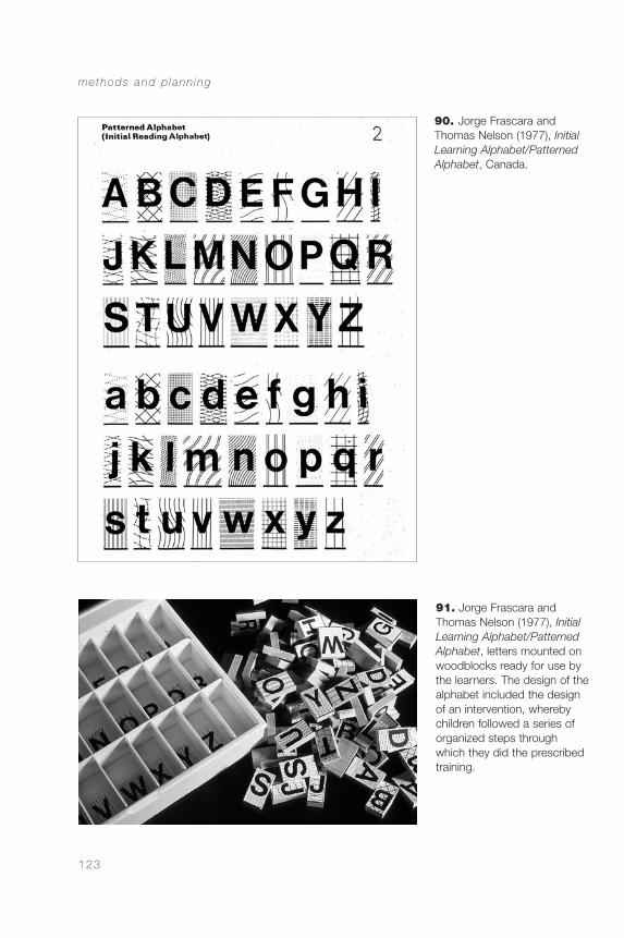
methods and p lann ing
123
91. Jorge Frascara andThomas Nelson (1977), InitialLearning Alphabet/PatternedAlphabet, letters mounted onwoodblocks ready for use bythe learners. The design of thealphabet included the designof an intervention, wherebychildren followed a series oforganized steps through which they did the prescribedtraining.
90. Jorge Frascara andThomas Nelson (1977), InitialLearning Alphabet/PatternedAlphabet, Canada.
CommDesign 04 b 09/03/04 1:49 PM Page 123
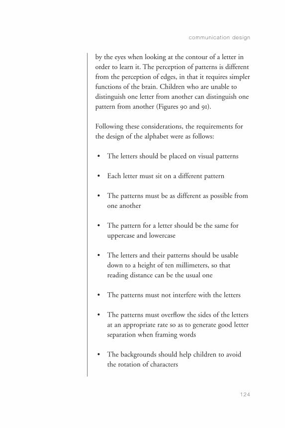
by the eyes when looking at the contour of a letter inorder to learn it. The perception of patterns is differentfrom the perception of edges, in that it requires simplerfunctions of the brain. Children who are unable todistinguish one letter from another can distinguish onepattern from another (Figures 90 and 91).
Following these considerations, the requirements forthe design of the alphabet were as follows:
• The letters should be placed on visual patterns
• Each letter must sit on a different pattern
• The patterns must be as different as possible fromone another
• The pattern for a letter should be the same foruppercase and lowercase
• The letters and their patterns should be usabledown to a height of ten millimeters, so thatreading distance can be the usual one
• The patterns must not interfere with the letters
• The patterns must overflow the sides of the lettersat an appropriate rate so as to generate good letterseparation when framing words
• The backgrounds should help children to avoidthe rotation of characters
commun ica t ion des ign
124
CommDesign 04 b 09/03/04 1:49 PM Page 124
• Color cannot be used because of technical,economic, and perceptual reasons
• It should be possible to produce the design withsimple technologies and low budgets
• Three-dimensional versions of the letters shouldpermit easy manipulation for small children withbelow-normal manual dexterity
• The system should be usable in different languages
In this project, the non-conflictive character of therequirements listed above permitted a sequentialresolution, without calling for difficult choices. Thelist describes the most obvious choices. There were, ofcourse, many more decisions made. But the purposeof the examples in this section is not to describe theirresolution in detail, but to show the different kinds of problems a designer may face, particularly in thecontext of responses to requirements. Many require-ments elicit automatic responses from designers. Thisis because ordinary routines are built into the practiceof the profession. There are, however, other decisionsto be made that require conscious attention. These arethe requirements that overflow the possibility forautomatic response based on experience, requiringconscious, rational, analytical, and sometimes,experimental research responses.
Christopher Alexander suggests that, in the use of aproduct, it is the things that do not work that attractour attention: a knob that does not turn, a button
methods and p lann ing
125
CommDesign 04 b 09/03/04 1:49 PM Page 125
that sticks (Alexander 23). By the same token, asdesigners work, they automatically solve the problemsof a project until something appears that resists beingsolved in the usual way. There is nothing wrong withthe use of automatic routines; they are efficient. If onehad to invent all the solutions for all the problemspresented, for instance, in the design of a toaster or anewspaper, the project would be overwhelming andimpossibly expensive.
In a book I designed a few years ago, Gramsci x3, byWilfred Watson (Longspoon Press, 1983), the situationwas less linear. We were given the size of the book(5.5" × 8.5"), the number of pages (192), and thenumber of copies (500). The financial variablesconfronted were as follows:
• Paper quality
• Number of illustrations
• Colors
• Number of pages
• Height of the print area (bleeds or not, and where)
The conflicting design variables were as follows:
• Book produced for readers or for actors (the bookcontained three plays)
• Integration or segregation of image-text:
commun ica t ion des ign
126
CommDesign 04 b 09/03/04 1:49 PM Page 126
– If text and image were integrated, how to avoidconflict
– If it were necessary to use a different color forthe images, how to avoid exceeding printingbudget by compensating with savings elsewhere
The final production solution was based on thefollowing decisions:
• Paper quality slightly better than the usual inorder to permit 150 lines per inch for thescreening of the images, so as to avoid conflictwith reversed-out type
• The fifty-four illustrations were distributed so that they required six plates in color (each plateprinted eight pages); four with halftones and twoin line art
• In order to accommodate the expense in color, the height of the printed area was taken to themaximum so as to reduce the number of pages
From a communication perspective, decisions were asfollows:
• Book designed for readers rather than for actors
• Integration of texts and images through over-printing, so as to permit continuity of text whileusing the images as dramatizing backgrounds
methods and p lann ing
127
CommDesign 04 b 09/03/04 1:49 PM Page 127
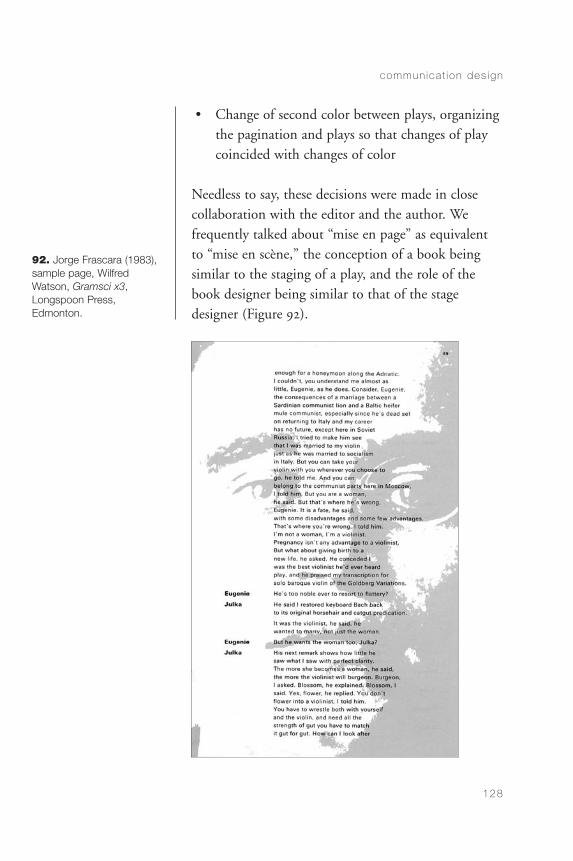
• Change of second color between plays, organizingthe pagination and plays so that changes of playcoincided with changes of color
Needless to say, these decisions were made in closecollaboration with the editor and the author. Wefrequently talked about “mise en page” as equivalentto “mise en scène,” the conception of a book beingsimilar to the staging of a play, and the role of thebook designer being similar to that of the stagedesigner (Figure 92).
commun ica t ion des ign
128
92. Jorge Frascara (1983),sample page, Wilfred Watson, Gramsci x3,Longspoon Press, Edmonton.
CommDesign 04 b 09/03/04 1:49 PM Page 128
CHAPTER 5
The Practice:Professional Areas
visual communicaton design covers four basic areas with somewhat blurred boundaries. Theclassification presented here is based on the idea that each area requires different skills and differentlevels of education, and even, in some cases, thecontribution of outside experts. This is especially true for projects of high complexity. The areas are:design for information, design for persuasion, designfor education, and design for administration.
Design for Information
The vast and varied categories of design for information include: publishing (books, magazines,newspapers); alphanumeric tables (timetables,directories); the informational aspects of tickets andother administrative instruments (theatre tickets,airline tickets, stock documents, banknotes); graphs
129
CommDesign 05 d 09/03/04 1:49 PM Page 129
and diagrams (visualization of abstract, quantitative,or topographic information); some kinds of teachingaids (informational wallcharts); instructions for use(manuals, game rules); reports, programs, catalogues,informational displays; control panels (sound systems,airplane cockpits, driving instruments); signage(symbols, signs, systems); maps and plans (withoutincluding cartography, or blueprints for architecture or engineering that, although they fall within the fieldof information design, are not tasks of informationdesigners); and navigational tools for computerinterfaces (Figures 93 to 106).
Information design consists of two distinct steps: theorganization of the information, and the planning ofits visual presentation. These tasks require the abilityto process, organize, and present information in verbaland nonverbal forms. The organization of informationrequires a good grasp of logical structures and cogni-tive processes. The visual presentation of informationrequires solid knowledge of the legibility of symbols,letters, words, sentences, and texts. It also requires akeen understanding of the informational capacity ofimages, and of their effective articulation with texts.
Visual detection and acuity, and comprehension, are central concerns in information design. Theinformation designer should be conversant withperceptual and cognitive human factors. Sometimesspace constraints and lack of design ability result indifficult situations for the user, from an informationdesign point of view. Sometimes the intelligence of
commun ica t ion des ign
130
continued on page 138
CommDesign 05 d 09/03/04 1:49 PM Page 130
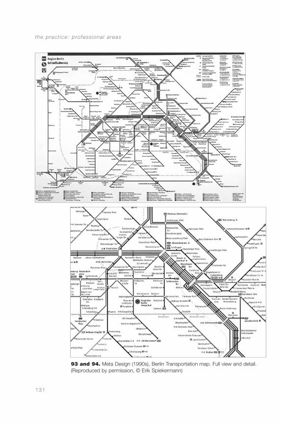
the p rac t ice : p ro fess iona l a reas
131
93 and 94. Meta Design (1990s), Berlin Transportation map. Full view and detail.(Reproduced by permission, © Erik Spiekermann)
CommDesign 05 d 09/03/04 1:49 PM Page 131
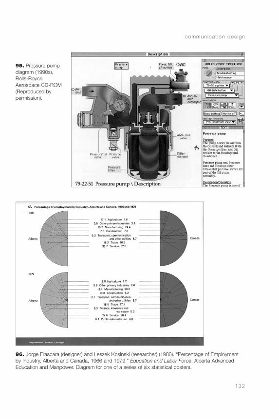
commun ica t ion des ign
132
95. Pressure pumpdiagram (1990s),Rolls-Royce Aerospace CD-ROM(Reproduced by permission).
96. Jorge Frascara (designer) and Leszek Kosinski (researcher) (1980). “Percentage of Employmentby Industry, Alberta and Canada, 1966 and 1979.” Education and Labor Force, Alberta AdvancedEducation and Manpower. Diagram for one of a series of six statistical posters.
CommDesign 05 d 09/03/04 1:49 PM Page 132
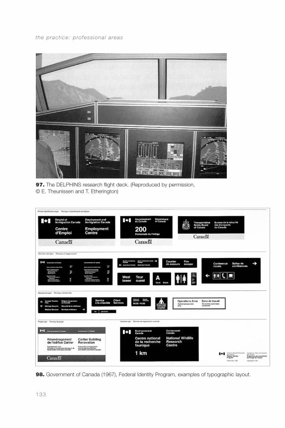
the p rac t ice : p ro fess iona l a reas
133
97. The DELPHINS research flight deck. (Reproduced by permission, © E. Theunissen and T. Etherington)
98. Government of Canada (1967), Federal Identity Program, examples of typographic layout.
CommDesign 05 d 09/03/04 1:49 PM Page 133

commun ica t ion des ign
134
99. Pentagram (1960s), diagram for location of signage, London Heathrow Airport signage system(Crosby, Fletcher, and Forbes 49). (Reproduced by permission, © Alan Fletcher)
100. Paul Mijksenaar,Schiphol airport signage system (1991–2001). (Reproduced bypermission, © PhotoBureau Mijksenaar)
CommDesign 05 d 09/03/04 1:49 PM Page 134
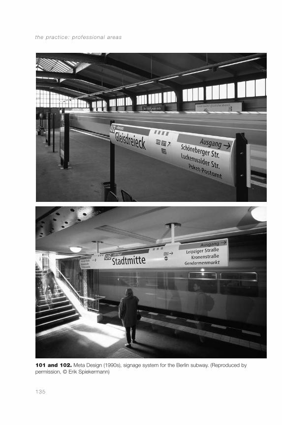
the p rac t ice : p ro fess iona l a reas
135
101 and 102. Meta Design (1990s), signage system for the Berlin subway. (Reproduced by permission, © Erik Spiekermann)
CommDesign 05 d 09/03/04 1:49 PM Page 135
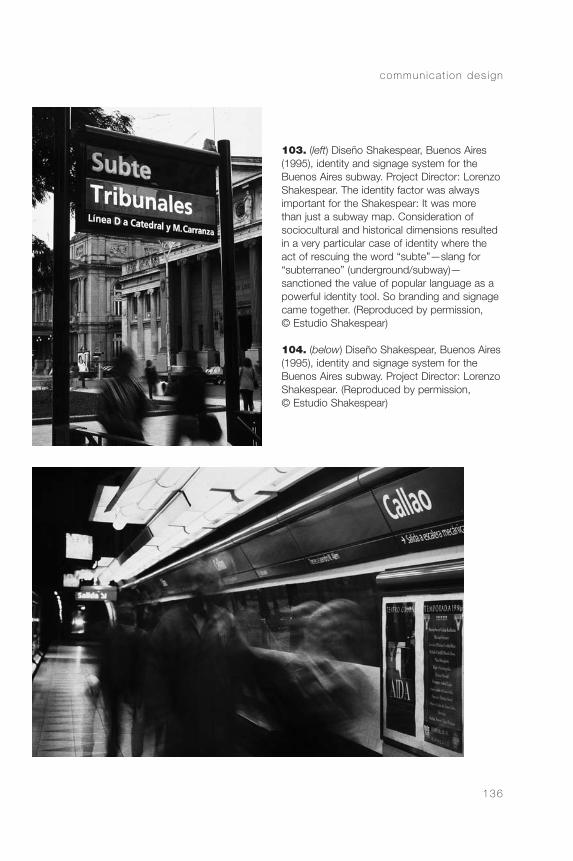
commun ica t ion des ign
136
103. (left) Diseño Shakespear, Buenos Aires(1995), identity and signage system for theBuenos Aires subway. Project Director: LorenzoShakespear. The identity factor was alwaysimportant for the Shakespear: It was more than just a subway map. Consideration of sociocultural and historical dimensions resultedin a very particular case of identity where theact of rescuing the word “subte”—slang for“subterraneo” (underground/subway)—sanctioned the value of popular language as apowerful identity tool. So branding and signagecame together. (Reproduced by permission, © Estudio Shakespear)
104. (below) Diseño Shakespear, Buenos Aires(1995), identity and signage system for theBuenos Aires subway. Project Director: LorenzoShakespear. (Reproduced by permission, © Estudio Shakespear)
CommDesign 05 d 09/03/04 1:49 PM Page 136
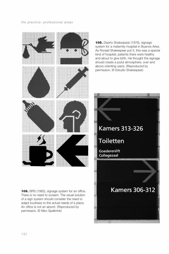
the p rac t ice : p ro fess iona l a reas
137
105. Diseño Shakespear (1976), signage system for a maternity hospital in Buenos Aires.As Ronald Shakespear put it, this was a specialkind of hospital: patients there were healthyand about to give birth. He thought the signageshould create a joyful atmosphere, over andabove orienting users. (Reproduced by permission, © Estudio Shakespear)
106. BRS (1985), signage system for an office.There is no need to scream. The visual solutionof a sign system should consider the need toadapt loudness to the actual needs of a place.An office is not an airport. (Reproduced by permission, © Niko Spelbrink)
CommDesign 05 d 09/03/04 1:49 PM Page 137
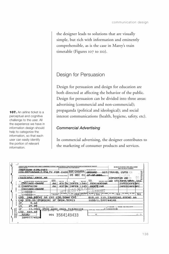
the designer leads to solutions that are visuallysimple, but rich with information and eminentlycomprehensible, as is the case in Marey’s traintimetable (Figures 107 to 110).
Design for Persuasion
Design for persuasion and design for education areboth directed at affecting the behavior of the public.Design for persuasion can be divided into three areas:advertising (commercial and non-commercial);propaganda (political and ideological); and socialinterest communications (health, hygiene, safety, etc).
Commercial Advertising
In commercial advertising, the designer contributes tothe marketing of consumer products and services.
commun ica t ion des ign
138
107. An airline ticket is aperceptual and cognitivechallenge to the user. Allthe experience we have ininformation design shouldhelp to categorize the information, so that eachuser can easily identify the portion of relevantinformation.
CommDesign 05 d 09/03/04 1:49 PM Page 138
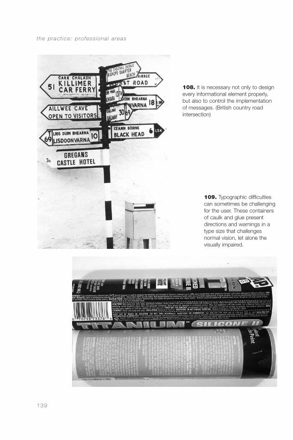
the p rac t ice : p ro fess iona l a reas
139
108. It is necessary not only to designevery informational element properly,but also to control the implementationof messages. (British country road intersection)
109. Typographic difficultiescan sometimes be challengingfor the user. These containersof caulk and glue presentdirections and warnings in atype size that challenges normal vision, let alone thevisually impaired.
CommDesign 05 d 09/03/04 1:49 PM Page 139
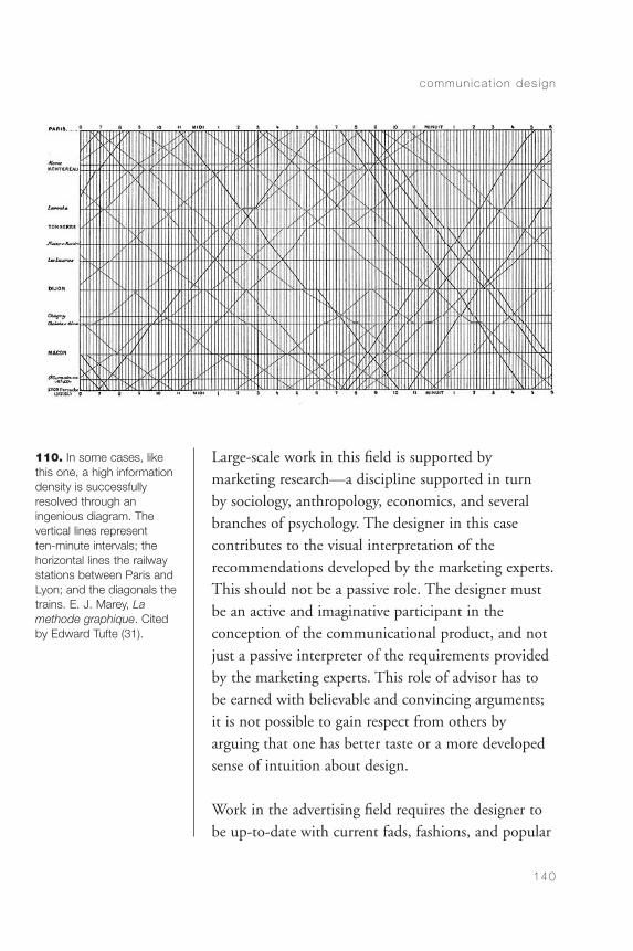
Large-scale work in this field is supported bymarketing research—a discipline supported in turn by sociology, anthropology, economics, and severalbranches of psychology. The designer in this casecontributes to the visual interpretation of therecommendations developed by the marketing experts.This should not be a passive role. The designer mustbe an active and imaginative participant in theconception of the communicational product, and notjust a passive interpreter of the requirements providedby the marketing experts. This role of advisor has tobe earned with believable and convincing arguments;it is not possible to gain respect from others byarguing that one has better taste or a more developedsense of intuition about design.
Work in the advertising field requires the designer tobe up-to-date with current fads, fashions, and popular
commun ica t ion des ign
140
110. In some cases, likethis one, a high informationdensity is successfullyresolved through an ingenious diagram. Thevertical lines represent ten-minute intervals; thehorizontal lines the railwaystations between Paris andLyon; and the diagonals thetrains. E. J. Marey, Lamethode graphique. Citedby Edward Tufte (31).
CommDesign 05 d 09/03/04 1:49 PM Page 140
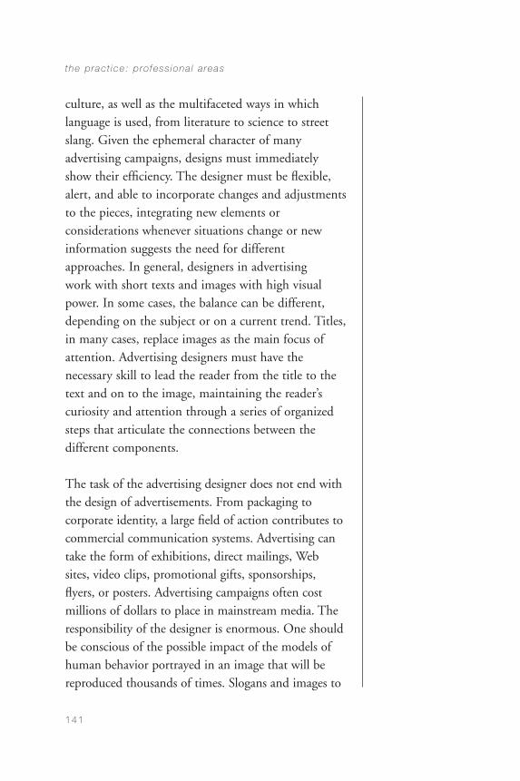
culture, as well as the multifaceted ways in whichlanguage is used, from literature to science to streetslang. Given the ephemeral character of manyadvertising campaigns, designs must immediatelyshow their efficiency. The designer must be flexible,alert, and able to incorporate changes and adjustmentsto the pieces, integrating new elements orconsiderations whenever situations change or newinformation suggests the need for differentapproaches. In general, designers in advertising work with short texts and images with high visualpower. In some cases, the balance can be different,depending on the subject or on a current trend. Titles,in many cases, replace images as the main focus ofattention. Advertising designers must have thenecessary skill to lead the reader from the title to thetext and on to the image, maintaining the reader’scuriosity and attention through a series of organizedsteps that articulate the connections between thedifferent components.
The task of the advertising designer does not end withthe design of advertisements. From packaging tocorporate identity, a large field of action contributes tocommercial communication systems. Advertising cantake the form of exhibitions, direct mailings, Web sites, video clips, promotional gifts, sponsorships,flyers, or posters. Advertising campaigns often costmillions of dollars to place in mainstream media. Theresponsibility of the designer is enormous. One shouldbe conscious of the possible impact of the models ofhuman behavior portrayed in an image that will bereproduced thousands of times. Slogans and images to
the p rac t ice : p ro fess iona l a reas
141
CommDesign 05 d 09/03/04 1:49 PM Page 141
sell cars very often use humor, but different peoplemay read them in different ways. What some peoplefind funny, others find disturbing, while others mightdevelop antisocial behaviors. Persuasive communica-tions in commercial advertising involve a delicatecultural balance. The general public, to a great extent,adopts value systems based on what the media promoteand portray, and this can sometimes involvecontroversial issues, such as the glamorization of risk orthe promotion of questionable social roles (Figure 111).
These fields often require the participation of otherspecialists, so the designer must always be prepared to work as part of a team. Packaging design, forinstance, requires the participation of industrialdesigners (specialists in materials and industrialproduction processes, storage, transportation, andrecycling). In other cases, architects, photographers,and filmmakers are required for the solution ofcommunication design projects.
Corporate identity design is the departure point forthe commercialization of an organization, andrepresents one of the most complex challenges for thecommunication designer. Corporate identity designestablishes patterns for all communications—internaland external—of an organization. It goes beyondgraphics into architecture, the attire of personnel,employee behavior, and every other detail that definesa firm. The image of a firm in a market is the resultnot only of its graphics but also of all its levels ofaction—controlled and uncontrolled, private andpublic. The job of the visual communication designer
commun ica t ion des ign
142
CommDesign 05 d 09/03/04 1:49 PM Page 142
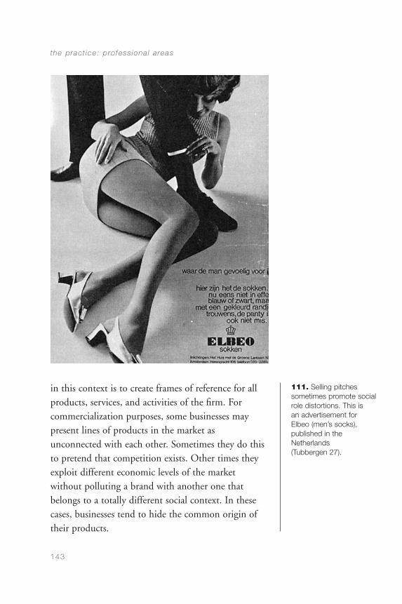
in this context is to create frames of reference for allproducts, services, and activities of the firm. Forcommercialization purposes, some businesses maypresent lines of products in the market asunconnected with each other. Sometimes they do thisto pretend that competition exists. Other times theyexploit different economic levels of the marketwithout polluting a brand with another one thatbelongs to a totally different social context. In thesecases, businesses tend to hide the common origin oftheir products.
the p rac t ice : p ro fess iona l a reas
143
111. Selling pitches sometimes promote socialrole distortions. This is an advertisement for Elbeo (men’s socks), published in the Netherlands (Tubbergen 27).
CommDesign 05 d 09/03/04 1:49 PM Page 143
Many designers regard corporate identity as notbelonging to the marketing field, given that thegraphics that have to be developed include letterheads,forms, bills of sale, administrative forms, signs, andthe like: elements not usually related to advertising. Aslong as those elements contribute to the identity of acommercial firm, however, they all contribute to itscommercial performance. The corporate image of non-commercial organizations could be regarded asdifferent, but to a great extent it is similar, in that thevisual identity of a socially oriented organization willalways need to dwell on the promotion of its ideas,engaging in the persuasive dissemination of politicalor social positions.
Identity is one of the most powerful assets of acommercial firm or of a cultural organization. Notonly does the consumer product industry dwell on image positioning, but publications do as well(Figures 112 to 116).
Magazine covers, editorial material design, and thedesign of newspapers represent a terrain where theidentity emerges from decisions of detail, particularlyconnected to typographic design and layout.
Non-Commercial Advertising
Non-commercial advertising includes the promotion of socially oriented public events, ideas, services, orfacilities. Generally, this advertising is financed bygovernments or nonprofit organizations with a viewtoward contributing to the well-being of people.
commun ica t ion des ign
144
continued on page 147
CommDesign 05 d 09/03/04 1:49 PM Page 144
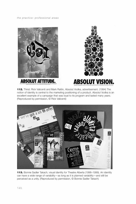
the p rac t ice : p ro fess iona l a reas
145
112. Thirst: Rick Valicenti and Mark Rattin, Absolut Vodka, advertisement. (1994) Thenotion of identity is central to the marketing positioning of a product. Absolut Vodka is anexcellent example of a campaign that was loyal to its program and lasted many years.(Reproduced by permission, © Rick Valicenti)
113. Bonnie Sadler Takach, visual identity for Theatre Alberta (1996–1999). An identitycan have a wide range of variability—as long as it is planned variability—and still beperceived as a unity. (Reproduced by permission, © Bonnie Sadler Takach)
CommDesign 05 d 09/03/04 1:49 PM Page 145
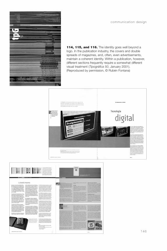
commun ica t ion des ign
146
114, 115, and 116. The identity goes well beyond alogo. In the publication industry, the covers and doublespreads of magazines, and, often, even advertisements,maintain a coherent identity. Within a publication, however,different sections frequently require a somewhat differentvisual treatment (Tipográfica 50, January 2001). (Reproduced by permission, © Rubén Fontana)
CommDesign 05 d 09/03/04 1:50 PM Page 146
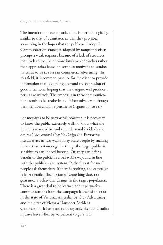
The intention of these organizations is methodologicallysimilar to that of businesses, in that they promote something in the hopes that the public will adopt it.Communication strategies adopted by nonprofits oftenprompt a weak response because of a lack of resourcesthat leads to the use of more intuitive approaches ratherthan approaches based on complex motivational studies(as tends to be the case in commercial advertising). Inthis field, it is common practice for the client to provideinformation that does not go beyond the expression ofgood intentions, hoping that the designer will produce apersuasive miracle. The emphasis in these communica-tions tends to be aesthetic and informative, even thoughthe intention could be persuasive (Figures 117 to 121).
For messages to be persuasive, however, it is necessaryto know the public extremely well, to know what thepublic is sensitive to, and to understand its ideals anddesires (User-centred Graphic Design 61). Persuasivemessages act in two ways: They scare people by makingit clear that certain negative things the target public issensitive to can indeed happen. Or, they can offer abenefit to the public in a believable way, and in linewith the public’s value system. “What’s in it for me?”people ask themselves. If there is nothing, the campaignfails. A detailed description of something does notguarantee a behavioral change in the target population.There is a great deal to be learned about persuasivecommunications from the campaign launched in 1990in the state of Victoria, Australia, by Grey Advertisingand the State of Victoria Transport AccidentCommission. It has been running since then, and trafficinjuries have fallen by 50 percent (Figure 122).
the p rac t ice : p ro fess iona l a reas
147
CommDesign 05 d 09/03/04 1:50 PM Page 147
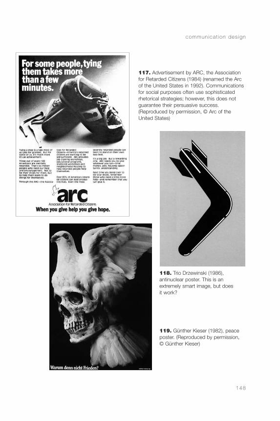
commun ica t ion des ign
148
117. Advertisement by ARC, the Associationfor Retarded Citizens (1984) (renamed the Arcof the United States in 1992). Communicationsfor social purposes often use sophisticatedrhetorical strategies; however, this does notguarantee their persuasive success. (Reproduced by permission, © Arc of the United States)
118. Trio Drzewinski (1986), antinuclear poster. This is an extremely smart image, but does it work?
119. Günther Kieser (1982), peaceposter. (Reproduced by permission, © Günther Kieser)
CommDesign 05 d 09/03/04 1:50 PM Page 148
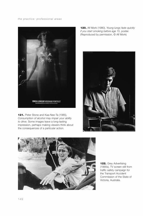
the p rac t ice : p ro fess iona l a reas
149
121. Peter Stone and Kaa-Nee-Ta (1985), Consumption of alcohol may impair your ability to drive. Some images leave a long-lasting impression, perhaps making viewers think aboutthe consequences of a particular action.
122. Grey Advertising(1990s), TV screen still fromtraffic safety campaign for the Transport Accident Commission of the State ofVictoria, Australia.
120. Alf Mork (1980), Young lungs fade quicklyif you start smoking before age 15, poster.(Reproduced by permission, © Alf Mork)
CommDesign 05 d 09/03/04 1:50 PM Page 149
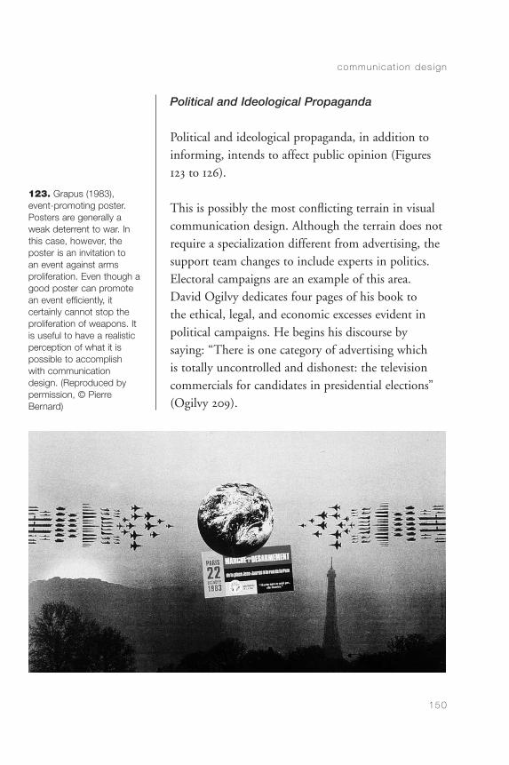
Political and Ideological Propaganda
Political and ideological propaganda, in addition toinforming, intends to affect public opinion (Figures123 to 126).
This is possibly the most conflicting terrain in visualcommunication design. Although the terrain does notrequire a specialization different from advertising, thesupport team changes to include experts in politics.Electoral campaigns are an example of this area. David Ogilvy dedicates four pages of his book to the ethical, legal, and economic excesses evident inpolitical campaigns. He begins his discourse by saying: “There is one category of advertising which is totally uncontrolled and dishonest: the televisioncommercials for candidates in presidential elections”(Ogilvy 209).
commun ica t ion des ign
150
123. Grapus (1983),event-promoting poster.Posters are generally aweak deterrent to war. Inthis case, however, theposter is an invitation to an event against arms proliferation. Even though agood poster can promotean event efficiently, it certainly cannot stop the proliferation of weapons. Itis useful to have a realisticperception of what it ispossible to accomplish with communicationdesign. (Reproduced by permission, © PierreBernard)
CommDesign 05 d 09/03/04 1:50 PM Page 150
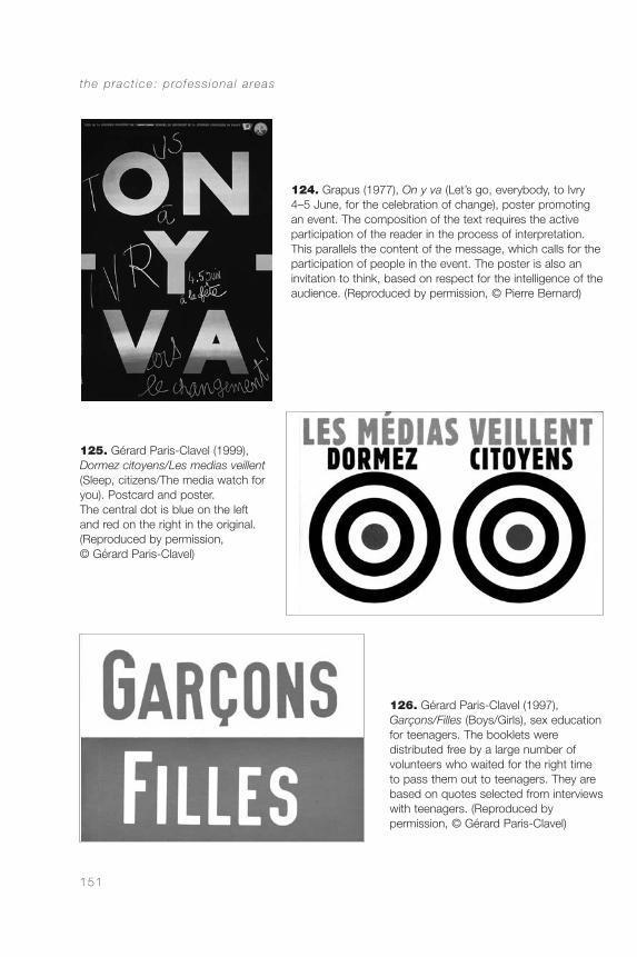
the p rac t ice : p ro fess iona l a reas
151
124. Grapus (1977), On y va (Let’s go, everybody, to Ivry4–5 June, for the celebration of change), poster promotingan event. The composition of the text requires the activeparticipation of the reader in the process of interpretation.This parallels the content of the message, which calls for theparticipation of people in the event. The poster is also aninvitation to think, based on respect for the intelligence of theaudience. (Reproduced by permission, © Pierre Bernard)
125. Gérard Paris-Clavel (1999),Dormez citoyens/Les medias veillent(Sleep, citizens/The media watch foryou). Postcard and poster. The central dot is blue on the left and red on the right in the original.(Reproduced by permission, © Gérard Paris-Clavel)
126. Gérard Paris-Clavel (1997),Garçons/Filles (Boys/Girls), sex educationfor teenagers. The booklets were distributed free by a large number of volunteers who waited for the right timeto pass them out to teenagers. They arebased on quotes selected from interviewswith teenagers. (Reproduced by permission, © Gérard Paris-Clavel)
CommDesign 05 d 09/03/04 1:50 PM Page 151

Design for Education
In design for education, the work of visual commu-nication designers moves between information andpersuasion. Although these poles are of primeimportance for understanding the profession, andalthough they are present in almost any communi-cation design project, it is useful to understand thatdesign for education includes those concerns, but italso extends to other aspects that deserve specialattention.
Education cannot be reduced to the transmission of information. This is clear when one makes adistinction between education and training. Traininginvolves the acquisition of already existing informationand skills, while education is directed at thedevelopment of the person. The active participation of the user of educational materials is central in thiscase. Persuasive communications intend to affect thebehavior of the public. Although educational materialshave the same intention, the purpose is different. It isdifferent because in education one always intends topersuade individuals to think on their own, to judge,and to make decisions on the basis of personalreflection. In sum, the intent of the persuasive messageis normally to convince, while the educational messageintends to contribute to personal development.
Within the educational context, one can find materialsthat are mainly persuasive or mainly informational.
commun ica t ion des ign
152
CommDesign 05 d 09/03/04 1:50 PM Page 152
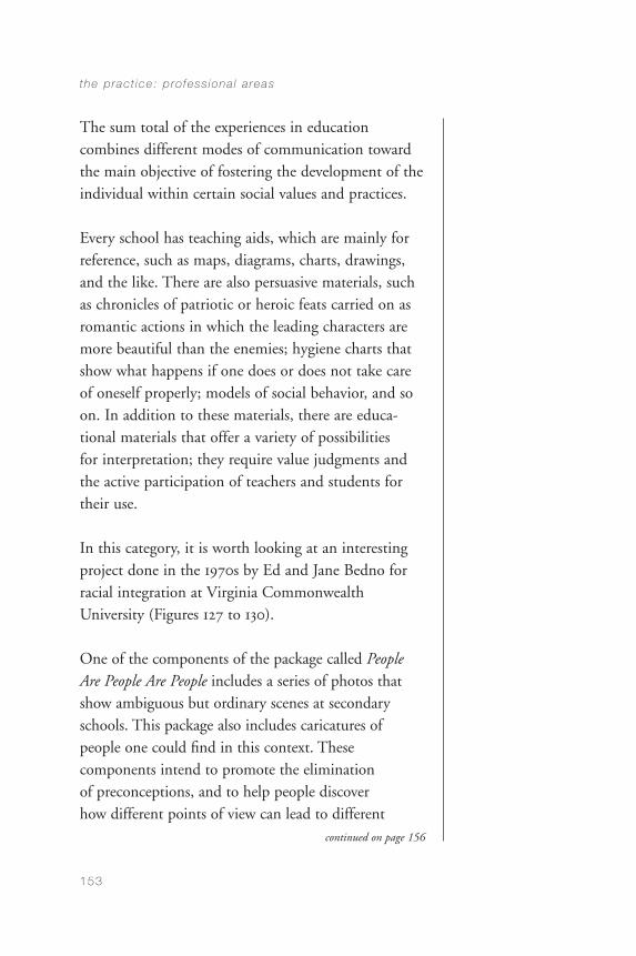
The sum total of the experiences in educationcombines different modes of communication towardthe main objective of fostering the development of theindividual within certain social values and practices.
Every school has teaching aids, which are mainly forreference, such as maps, diagrams, charts, drawings,and the like. There are also persuasive materials, suchas chronicles of patriotic or heroic feats carried on asromantic actions in which the leading characters aremore beautiful than the enemies; hygiene charts thatshow what happens if one does or does not take careof oneself properly; models of social behavior, and soon. In addition to these materials, there are educa-tional materials that offer a variety of possibilities for interpretation; they require value judgments andthe active participation of teachers and students fortheir use.
In this category, it is worth looking at an interestingproject done in the 1970s by Ed and Jane Bedno forracial integration at Virginia CommonwealthUniversity (Figures 127 to 130).
One of the components of the package called PeopleAre People Are People includes a series of photos thatshow ambiguous but ordinary scenes at secondaryschools. This package also includes caricatures ofpeople one could find in this context. Thesecomponents intend to promote the elimination of preconceptions, and to help people discover how different points of view can lead to different
the p rac t ice : p ro fess iona l a reas
153
continued on page 156
CommDesign 05 d 09/03/04 1:50 PM Page 153
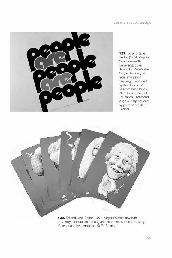
commun ica t ion des ign
154
127. Ed and JaneBedno (1974, VirginiaCommonwealth University), coverdesign for People ArePeople Are People,racial integration campaign producedby the Division ofTelecommunications,State Department ofEducation, Richmond,Virginia. (Reproducedby permission, © EdBedno)
128. Ed and Jane Bedno (1974, Virginia Commonwealth University), characters to hang around the neck for role-playing.(Reproduced by permission, © Ed Bedno)
CommDesign 05 d 09/03/04 1:50 PM Page 154
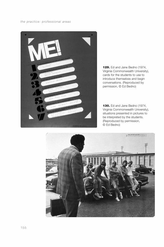
the p rac t ice : p ro fess iona l a reas
155
129. Ed and Jane Bedno (1974, Virginia Commonwealth University),cards for the students to use to introduce themselves and begin conversations. (Reproduced by permission, © Ed Bedno)
130. Ed and Jane Bedno (1974, Virginia Commonwealth University), situations presented in pictures to be interpreted by the students. (Reproduced by permission, © Ed Bedno)
CommDesign 05 d 09/03/04 1:50 PM Page 155
interpretations of the same scene. The material is aninvitation to a critical development of value judgments.
In this sense, the design of educational materialsdiffers from the design for informational andpersuasive materials, adding a third pole to theterritory of visual communication design. Whenpreparing teaching aids, it is fundamental toremember that the learning experience is better whenit is done in an active way. To design according tothis, the designer, more than producing teachingmaterials, plans teaching situations in which studentsand teachers complete the design plan.
This position, which considers the receiver to be anactive component in the communication process, putsthe term “receiver” in a new perspective. In traditionalcommunication theory, the term has a definite passiveconnotation. The reception of messages, however, isnever passive. It is apparently more passive than thetransmission of messages, but it always includes activebehaviors that are indispensable for the interpretationand comprehension of the message confronted. Whenreading this book, the reader is not receiving a givenmessage. Interpretation is a constructive process, onethat contextualizes the material through cognitive andevaluative activities on the part of the reader.
Needless to say, design cannot act alone in thedevelopment of educational materials, and severalbranches of psychology (educational, developmental,cognitive, etc.) become indispensable allies.
commun ica t ion des ign
156
CommDesign 05 d 09/03/04 1:50 PM Page 156
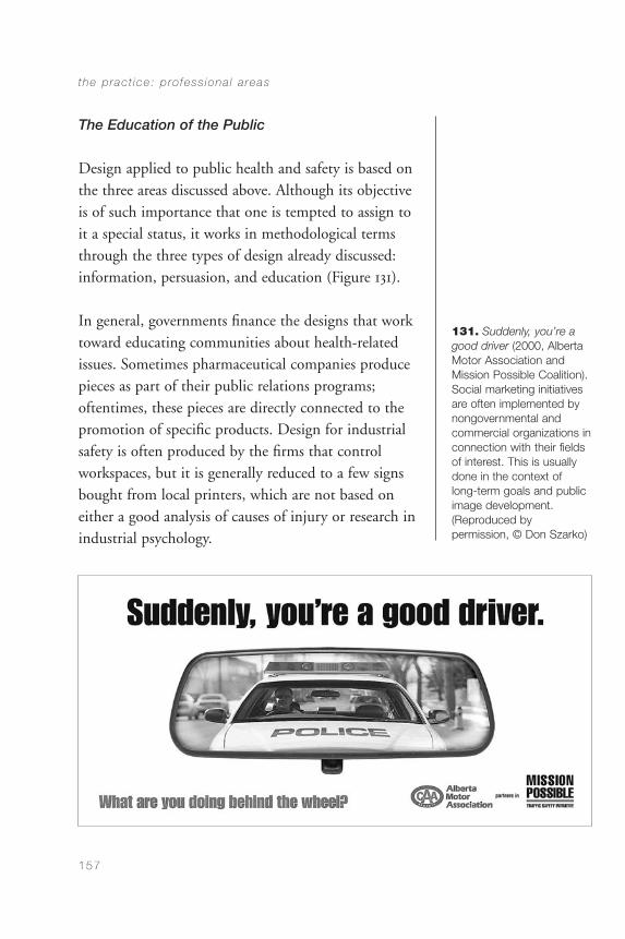
The Education of the Public
Design applied to public health and safety is based onthe three areas discussed above. Although its objectiveis of such importance that one is tempted to assign toit a special status, it works in methodological termsthrough the three types of design already discussed:information, persuasion, and education (Figure 131).
In general, governments finance the designs that worktoward educating communities about health-relatedissues. Sometimes pharmaceutical companies producepieces as part of their public relations programs;oftentimes, these pieces are directly connected to thepromotion of specific products. Design for industrialsafety is often produced by the firms that controlworkspaces, but it is generally reduced to a few signsbought from local printers, which are not based oneither a good analysis of causes of injury or research inindustrial psychology.
the p rac t ice : p ro fess iona l a reas
157
131. Suddenly, you’re agood driver (2000, AlbertaMotor Association and Mission Possible Coalition).Social marketing initiativesare often implemented bynongovernmental and commercial organizations inconnection with their fieldsof interest. This is usuallydone in the context of long-term goals and publicimage development.(Reproduced by permission, © Don Szarko)
CommDesign 05 d 09/03/04 1:50 PM Page 157
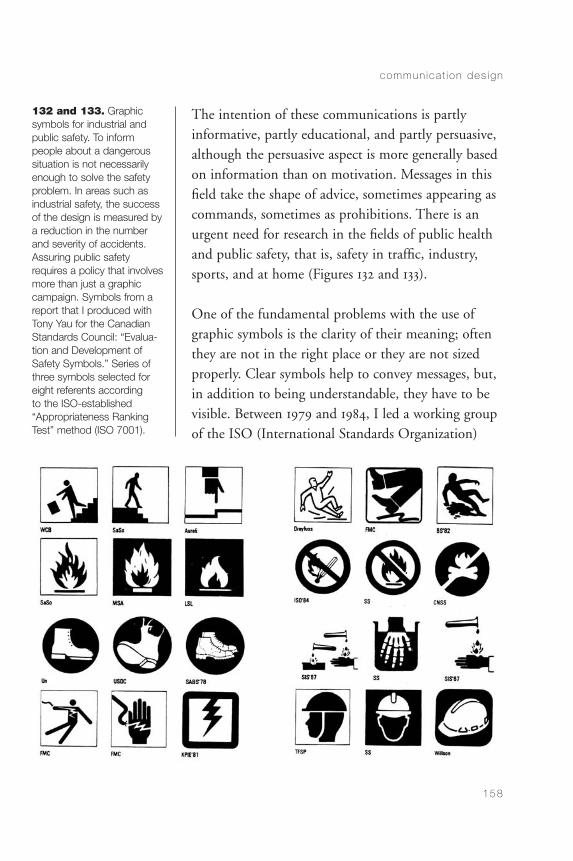
The intention of these communications is partlyinformative, partly educational, and partly persuasive,although the persuasive aspect is more generally basedon information than on motivation. Messages in thisfield take the shape of advice, sometimes appearing ascommands, sometimes as prohibitions. There is anurgent need for research in the fields of public healthand public safety, that is, safety in traffic, industry,sports, and at home (Figures 132 and 133).
One of the fundamental problems with the use ofgraphic symbols is the clarity of their meaning; oftenthey are not in the right place or they are not sizedproperly. Clear symbols help to convey messages, but,in addition to being understandable, they have to bevisible. Between 1979 and 1984, I led a working groupof the ISO (International Standards Organization)
commun ica t ion des ign
158
132 and 133. Graphicsymbols for industrial andpublic safety. To inform people about a dangeroussituation is not necessarilyenough to solve the safetyproblem. In areas such asindustrial safety, the successof the design is measured bya reduction in the numberand severity of accidents.Assuring public safetyrequires a policy that involvesmore than just a graphiccampaign. Symbols from areport that I produced withTony Yau for the CanadianStandards Council: “Evalua-tion and Development ofSafety Symbols.” Series ofthree symbols selected foreight referents according to the ISO-established“Appropriateness RankingTest” method (ISO 7001).
CommDesign 05 d 09/03/04 1:50 PM Page 158
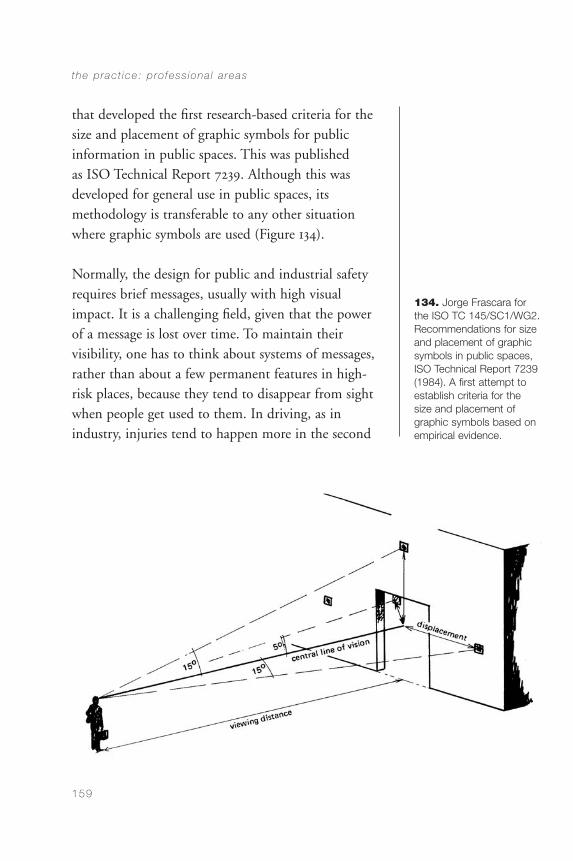
the p rac t ice : p ro fess iona l a reas
159
134. Jorge Frascara forthe ISO TC 145/SC1/WG2.Recommendations for sizeand placement of graphicsymbols in public spaces,ISO Technical Report 7239(1984). A first attempt toestablish criteria for the size and placement ofgraphic symbols based onempirical evidence.
that developed the first research-based criteria for thesize and placement of graphic symbols for publicinformation in public spaces. This was published as ISO Technical Report 7239. Although this wasdeveloped for general use in public spaces, itsmethodology is transferable to any other situationwhere graphic symbols are used (Figure 134).
Normally, the design for public and industrial safetyrequires brief messages, usually with high visualimpact. It is a challenging field, given that the powerof a message is lost over time. To maintain theirvisibility, one has to think about systems of messages,rather than about a few permanent features in high-risk places, because they tend to disappear from sightwhen people get used to them. In driving, as inindustry, injuries tend to happen more in the second
CommDesign 05 d 09/03/04 1:50 PM Page 159
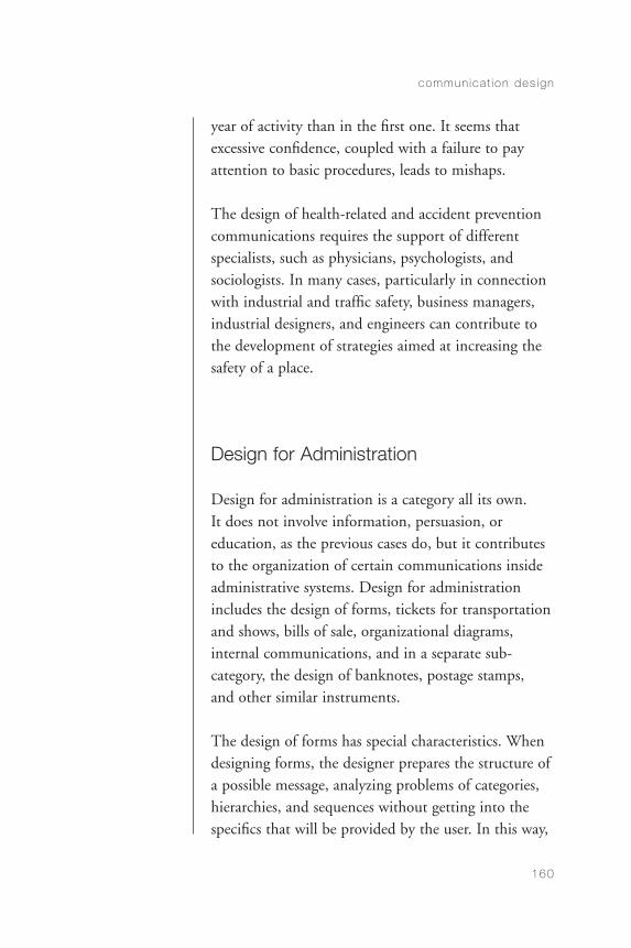
year of activity than in the first one. It seems thatexcessive confidence, coupled with a failure to payattention to basic procedures, leads to mishaps.
The design of health-related and accident preventioncommunications requires the support of differentspecialists, such as physicians, psychologists, andsociologists. In many cases, particularly in connectionwith industrial and traffic safety, business managers,industrial designers, and engineers can contribute tothe development of strategies aimed at increasing thesafety of a place.
Design for Administration
Design for administration is a category all its own. It does not involve information, persuasion, oreducation, as the previous cases do, but it contributesto the organization of certain communications insideadministrative systems. Design for administrationincludes the design of forms, tickets for transportationand shows, bills of sale, organizational diagrams,internal communications, and in a separate sub-category, the design of banknotes, postage stamps, and other similar instruments.
The design of forms has special characteristics. Whendesigning forms, the designer prepares the structure ofa possible message, analyzing problems of categories,hierarchies, and sequences without getting into thespecifics that will be provided by the user. In this way,
commun ica t ion des ign
160
CommDesign 05 d 09/03/04 1:50 PM Page 160
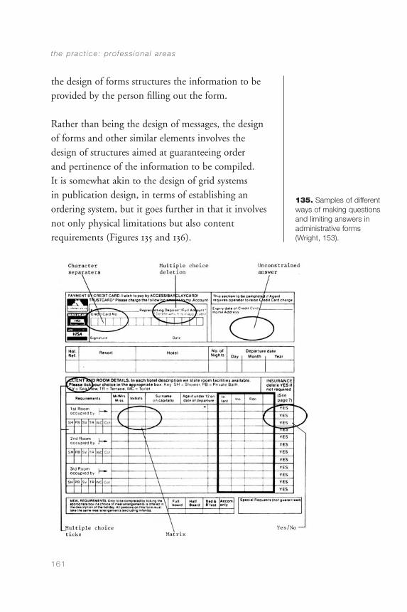
the design of forms structures the information to beprovided by the person filling out the form.
Rather than being the design of messages, the designof forms and other similar elements involves thedesign of structures aimed at guaranteeing order and pertinence of the information to be compiled. It is somewhat akin to the design of grid systems in publication design, in terms of establishing anordering system, but it goes further in that it involvesnot only physical limitations but also contentrequirements (Figures 135 and 136).
the p rac t ice : p ro fess iona l a reas
161
135. Samples of differentways of making questionsand limiting answers inadministrative forms(Wright, 153).
CommDesign 05 09/09/04 7:32 AM Page 161
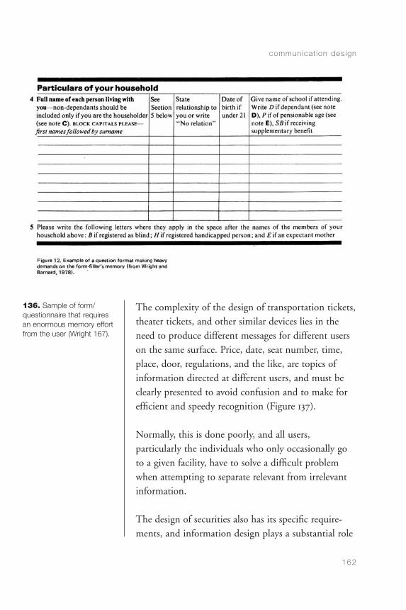
The complexity of the design of transportation tickets,theater tickets, and other similar devices lies in theneed to produce different messages for different userson the same surface. Price, date, seat number, time,place, door, regulations, and the like, are topics ofinformation directed at different users, and must beclearly presented to avoid confusion and to make forefficient and speedy recognition (Figure 137).
Normally, this is done poorly, and all users,particularly the individuals who only occasionally goto a given facility, have to solve a difficult problemwhen attempting to separate relevant from irrelevantinformation.
The design of securities also has its specific require-ments, and information design plays a substantial role
commun ica t ion des ign
162
136. Sample of form/questionnaire that requiresan enormous memory effortfrom the user (Wright 167).
CommDesign 05 d 09/03/04 1:50 PM Page 162
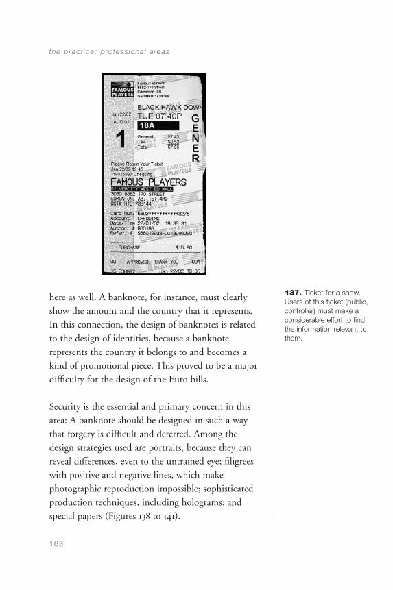
here as well. A banknote, for instance, must clearlyshow the amount and the country that it represents.In this connection, the design of banknotes is relatedto the design of identities, because a banknoterepresents the country it belongs to and becomes akind of promotional piece. This proved to be a majordifficulty for the design of the Euro bills.
Security is the essential and primary concern in thisarea: A banknote should be designed in such a waythat forgery is difficult and deterred. Among thedesign strategies used are portraits, because they canreveal differences, even to the untrained eye; filigreeswith positive and negative lines, which makephotographic reproduction impossible; sophisticatedproduction techniques, including holograms; andspecial papers (Figures 138 to 141).
the p rac t ice : p ro fess iona l a reas
163
137. Ticket for a show.Users of this ticket (public,controller) must make aconsiderable effort to findthe information relevant tothem.
CommDesign 05 d 09/03/04 1:50 PM Page 163
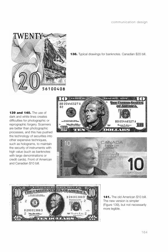
commun ica t ion des ign
164
138. Typical drawings for banknotes. Canadian $20 bill.
141. The old American $10 bill. The new version is simpler (Figure 139), but not necessarilymore legible.
139 and 140. The use ofdark and white lines createsdifficulties for photographic orreprographic forgery. Scannersare better than photographicprocesses, and this has pushedthe technology of securities intoother expensive techniques,such as holograms, to maintainthe security of instruments withhigh value (such as banknoteswith large denominations orcredit cards). Front of Americanand Canadian $10 bill.
CommDesign 05 d 09/03/04 1:50 PM Page 164
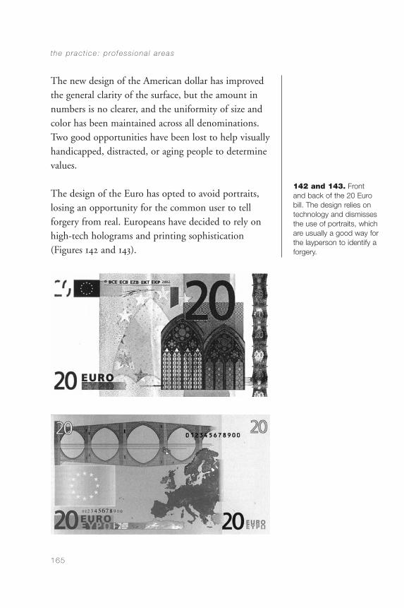
The new design of the American dollar has improvedthe general clarity of the surface, but the amount innumbers is no clearer, and the uniformity of size andcolor has been maintained across all denominations.Two good opportunities have been lost to help visuallyhandicapped, distracted, or aging people to determinevalues.
The design of the Euro has opted to avoid portraits,losing an opportunity for the common user to tellforgery from real. Europeans have decided to rely onhigh-tech holograms and printing sophistication(Figures 142 and 143).
the p rac t ice : p ro fess iona l a reas
165
142 and 143. Front and back of the 20 Eurobill. The design relies ontechnology and dismissesthe use of portraits, whichare usually a good way forthe layperson to identify aforgery.
CommDesign 05 d 09/03/04 1:50 PM Page 165
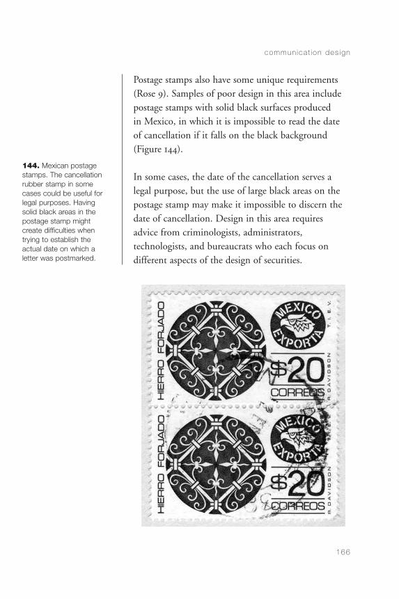
Postage stamps also have some unique requirements(Rose 9). Samples of poor design in this area includepostage stamps with solid black surfaces produced in Mexico, in which it is impossible to read the dateof cancellation if it falls on the black background(Figure 144).
In some cases, the date of the cancellation serves alegal purpose, but the use of large black areas on thepostage stamp may make it impossible to discern thedate of cancellation. Design in this area requiresadvice from criminologists, administrators,technologists, and bureaucrats who each focus ondifferent aspects of the design of securities.
commun ica t ion des ign
166
144. Mexican postagestamps. The cancellationrubber stamp in somecases could be useful forlegal purposes. Havingsolid black areas in thepostage stamp might create difficulties when trying to establish the actual date on which a letter was postmarked.
CommDesign 05 d 09/03/04 1:50 PM Page 166
Elements and Systems
Designers often work on the development of isolatedelements, such as a book, a logotype, a poster, etc.They also work on the design of systems; that is,families of elements that respond to planningdecisions that affect current and future components.This is the case in the design of sign systems,alphabets, corporate identities, magazines, and so on.The design of elements and the design of systemsrequire quite different skills.
The concept of system is essential to the understandingof the designer’s job. Even in the case of isolated pieces, the designer must understand the systems within which the specific pieces operate. The design of systems requires special skills for the categorization of information and for the conception of abstractstructures that organize the production of the necessary,and of the possible. A design program should be able totake into account not only all the current needs of aclient but also that client’s potential needs. When this isnot done, the systems collapse or degenerate over time,suffering from the progressive incorporation of piecesthat are not in line with the established guidelines.
Two Dimensions, Three Dimensions, and Movement
The designer’s job can be categorized according to its physical dimensions. Designers work in two
the p rac t ice : p ro fess iona l a reas
167
CommDesign 05 d 09/03/04 1:50 PM Page 167

dimensions, three dimensions, and movement. Thefollowing table shows a summary of professional areasand where they belong in connection with thesecategories.
commun ica t ion des ign
168
2 DIMENSIONS 3 DIMENSIONS
ISOLATED ELEMENTS & SYSTEMS SEQUENCES MOVEMENT
Advertising Audiovisuals CD-ROMS Exhibitions
Alphabets Brochures Movies Packaging
Banknotes Books TV Point of sale
Book covers Guides Videos Signage
Charts Magazines Web sites
Clock/watch faces Manuals
Control panels Newspapers
Diagrams Periodicals
Dials Storyboards
Flyers Teaching aids
Forms
Graphic symbols
Logotypes
Magazine covers
Maps
Postage stamps
Posters
Signs
Super-graphics
Tickets
Timetables
Visual identities
CommDesign 05 d 09/03/04 1:50 PM Page 168
CHAPTER 6
ComputerTechnologies andCommunicationDesign
the advent of the computer has had adouble influence on visual communication design. On the one hand, it has changed the means ofproduction, eliminating drafting tables, rulers, setsquares, rubber cement, and the like. On the other, ithas brought about a different way of accessing andinteracting with information, through the World WideWeb and CD-ROMs. Digitalization has permitted thecreation of multimedia, which concentrates in oneproduction tool the capability to handle moving visualsand sound. To some extent, this had already beenaccomplished by film. But the difference is that withthe computer media it is possible to randomly accessdata sources, and—under certain conditions—tomodify the data. New areas of work have been openedto visual communication design, and a change of profilehas affected the daily life of the designer.
The central problem of communication design has not changed: to create visual messages for
169
CommDesign 06 a 09/03/04 1:50 PM Page 169
information, education, administration, andpersuasion. Working in this field to affect people’sknowledge, attitudes, and behaviors is just aschallenging as it ever was. Until around 1980, however,design production was quite different from today.Since then, multimedia has opened an enormous newfield of activity.
The Computer as a Production Tool
A few challenges have replaced other challenges. Untilaround 1980, one had to have perfect control overgeometry and craft to produce accurate originals forreproduction to be passed onto the printer. Today, onehas to have perfect control of the current computerprograms to permit a smooth transition from thedesign studio to the print production shop. Printingtechnology has not changed, but practically all theproduction steps that take place before printing have.
One of the major challenges for designers inconnection with production is to be responsible for thecompleteness and accuracy of all elements in the finalelectronic file, including the composition of texts.Although designers in the past always knew abouttypography, there were professional typesetters who,when they were really professional, did a fantastic job.Today, this profession has disappeared. Designers notonly lay out the texts but also set them. That is, onehas to get involved in all details, such as kerning, linebreaks, and minor adjustments of all sorts.
commun ica t ion des ign
170
CommDesign 06 a 09/03/04 1:50 PM Page 170
Furthermore, typesetting shops used to haveprofessional proofreaders, but no longer. Now thedesigners pass on to the printer the finished product,taking responsibility for accuracy and completeness. Itis customary today for designers to spell out anagreement with clients that responsibility for accuracyof texts lies with the client, and that nothing goes topress without the client’s signed approval.
The need to attend to detail has always been there.And good designers in the past not only looked atevery letter and every space in a text but also busiedthemselves in the print shop, making sure that all theproduction steps were done properly. The removal ofthe physicality of the artwork in visual communi-cation design production can be deceiving. Somebeginners are surprised when they see that the color ofthe final printing is not like the color of their inkjetprinter, which in turn was somewhat different fromthe color on the computer screen. It is indispensableto be conversant with those differences, and to use thenecessary reference materials that allow one to foreseehow a printed product might actually look.
Printing colors depend not only on the printing inksbut also on the paper qualities and surface finishings.The same color will appear dramatically different onuncoated newsprint, uncoated bond, coated matte, orcoated glossy paper. There is also a difference if onevarnishes the color (matte or gloss), and if one asksthe printer to pass a color through the press twice.The finished quality of anything that one produces inthe computer can also be deceiving: Things look good,
computer techno log ies and commun ica t ion des ign
171
CommDesign 06 a 09/03/04 1:50 PM Page 171
they look professional, even if the design and theconcept are not that good. It has become necessary towarn students about this deceiving aspect of badlydesigned but neatly produced roughs.
Technology in visual communication design is notlimited to computer technology. Normally, there arefour technologies involved: photography, computers,papers, and printing. Each one of them has to behandled properly if a final job is to be as good as itcan be. Each one of them can destroy a goodintention.
Production work today, although based initially on thecomputer in the design studio, still requires a goodrapport between the designer and the printer. It isalways advisable to become fully informed about theprinter’s requirements, the steps the printer will followwith the disk you provide, and the way you canprepare the files so that no surprises occur when thefiles get transferred into the printer’s systems.
Design for Electronic Media
I call this section “Design for Electronic Media,” not“Interaction Design” or “Interface Design,” becausethe term “interaction” is used wrongly today to assignto computer-based design the exclusive use ofinteractivity. A newspaper is interactive, and in somany ways. We jump from page to page, focus onwhat we please, tear apart the sections we do not
commun ica t ion des ign
172
CommDesign 06 a 09/03/04 1:50 PM Page 172
intend to read, cut out a classified ad selling something that we may want to buy, circle with a pen the ad of the film we intend to see tonight,photocopy something, and then put the newspaper inthe recycle bin. With a newspaper, interaction is notonly cognitive or visual, but also physical. The same,to a great extent, applies to textbooks and to books forany kind of research purpose. Back in the MiddleAges, “marginalia” (notes on the margins) were bornfrom annotations by informed readers.
Interaction is our human way of dealing with thingsand with information. Interaction is central tocommunication. We must forget the old ideas of“transmitter” and “receiver”: Real people do notreceive information. For stimuli to become information, one has to actively interpret, through a variety of actions, whatever one is confronting. To live is to interact. The computer world does notown the function.
As for interface, it is that which is in between. Thecontrol panel of anything is an interface, from a gasstove to a TV set. By extension, Gui Bonsiepe arguesthat all design involves interface design. He contendsthat any task related to an artificial object benefitsfrom good interface design, that is, from a goodunderstanding on the part of the designer that everyobject that is meant to be used should communicateclearly how it is to be used and permit that use withease. Design for electronic media has opened up a new series of problems. In the interaction with anewspaper, a book, or a magazine, we immediately get
computer techno log ies and commun ica t ion des ign
173
CommDesign 06 a 09/03/04 1:50 PM Page 173

a sense of the size of the universe we are entering. Wecan browse it easily, always having a sense of where weare in that universe. The design of interfaces mustrespond to that need—that sense of “Where am I?”—in terms of both the profile of the universe where oneis and one’s location within it. A major concept withindesign thinking that comes into play here is thenotion of usability: How easy is it to use the device?How much does the interface let me know what isbehind the screen? How easy it is to get there? Howeasy it is for me to know where I am and how to getback to where I came from?
Some e-designers are calling themselves “informationarchitects.” It sounds more complex than “informationdesigner,” but it is something designers have been doing for many years, as David Sless clearly put it in an electronic exchange with another colleague. Infor-mation design involves both the organization of theinformation and its visual presentation. These are twodistinct tasks: one dealing fundamentally with content,the second fundamentally with form. In the computerenvironment, as in any other, those aspects are crucialfor the construction of a good communication.
It is quite delicate to design for electronic mediabecause there is no long tradition with it. Conventionsare still being established, and many of the existingones are not user-centered. This is a field where it isindispensable to know the language of the audience,and to speak in plain language. Steve Krug makes anumber of sound suggestions, all dealing withcommon sense in both verbal and visual terms.
commun ica t ion des ign
174
CommDesign 06 a 09/03/04 1:50 PM Page 174
It is important to learn how and in what ways differentgroups of people use the World Wide Web. There are,however, several common features. People tend to wantto get to wherever they want easily and quickly.Instructions, therefore, must be both clear and brief.Clarity should not be sacrificed for the sake of brevity.One of the interesting things in visual communicationdesign is that it requires judgment at every stage.
Some people might think that it is not up to thedesigners to concern themselves with texts. However,since we are responsible for the communicationalsuccess of the things we design, we should be able toadvise clients and production teams in connectionwith the communicational effectiveness of writtenmaterial. We should do this even if we are not able towrite or edit.
Concern about the comprehensibility of texts, beyondlegibility, arose in the 1960s through the work ofHerbert Spencer, who introduced the concept ofreadability to the evaluation of the visual presentationof texts. Merald Wrolstadt, founding editor of VisibleLanguage (now edited by Sharon Poggenpohl),dedicated the journal to a whole range of issues thatrelated to the visual presentation of texts. Followingthis tradition, and understanding our responsibilitiesin connection with the usability of information, it isnatural for a designer to be concerned with thestructure of language as it appears in the electronicmedia. Texts, particularly when used to guide the user, should be brief, clear, and written in easilyunderstandable language.
computer techno log ies and commun ica t ion des ign
175
CommDesign 06 a 09/03/04 1:50 PM Page 175
In addition, we should be aware that people likeshortcuts. Users should be able to see at a glance the“place” they want to go to. On the basis of Appleton’swork, it is useful to see how the notion of “prospect”can be important for the design of interfaces. Appletonsuggests that people have a biologically and historicallyprogrammed need to perceive the landscape aroundthem. This, he claims, comes from the time when ourancestors were surrounded by potential dangers andneeded to have their backs covered while being able tosee everything around them. This may have led peopleto inhabit caves up in the hills, once they wereinspected and known to be safe; their height on thehillside allowed people to see far and wide. We arevisual animals: all of our civilization has been supportedby vision, not by sound or smell. It was this reliance onvision that led us up into the hills in the first place.
Stan Ruecker has just completed his doctoral thesis(under my co-supervision, with colleagues in theEnglish and Computer Science Departments) oninterface design in the context of Appleton’s andGibson’s concepts of prospect, refuge, and affordance.In the case of the computer environment, we need todesign in ways that allow people to visualize theirlocation, and the kind of “landscape” that surroundsthem. I am not using these metaphors just to bepoetic. Lakoff and Johnson (1980, 1987) have clearlyargued the importance of metaphors in thedevelopment of abstract thinking.
There is much terrain to be covered in connectionwith the usability of interfaces, and criteria are being
commun ica t ion des ign
176
CommDesign 06 a 09/03/04 1:50 PM Page 176

developed by different people working on cognitivehuman factors as they apply to interface design.Bonnie Sadler Takach, in collaboration with JasonDaniels and Connie Varnhagen of the PsychologyDepartment at the University of Alberta, developedinterfaces to test the effects of text-based and
computer techno log ies and commun ica t ion des ign
177
145. Bonnie SadlerTakach, Jason Daniels, and Connie Varnhagen(2000), test materials forWeb site navigation design. (Reproduced by permission, © BonnieSadler Takach)
CommDesign 06 a 09/03/04 1:50 PM Page 177
metaphor-based interface design on time and recall inWorld Wide Web navigation (Figure 145).
Interdisciplinary work is indispensable today: itrequires designers to have some understanding ofexperimental research, and it requires psychologistsand other human factors specialists to have someunderstanding of design. We designers are gearedtoward the production of objects. Researchers, on the other hand, are acute observers and mastersophisticated methods. We need situations where theintegration of design and research becomes possible,beyond the traditional separation of disciplines that isso common in universities.
There are visual languages and conventions that havebeen developed to visually explain the structures ofsites and possible paths to follow in these virtualenvironments. New conventions of movement andrepresentation allow interaction using hybrid visuallanguages developed in both print and electronicmedia (Figures 146 to 151).
In sum, interfaces in the computer environmentshould clearly show the contents of their data bank,the hierarchical organization of the contents, and thenavigation tools. In general, they should permitpeople to act intuitively, glancing and guessing.
There are, of course, diverse fields in the design ofelectronic media, including (1) the commercializationof consumer goods and services, (2) governmentalinformation, and (3) educational materials.
commun ica t ion des ign
178
CommDesign 06 a 09/03/04 1:50 PM Page 178
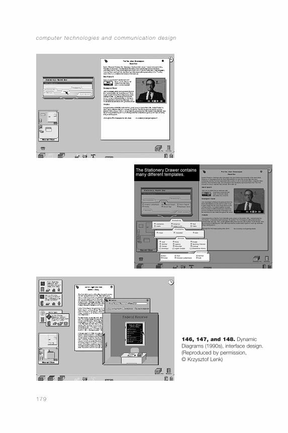
computer techno log ies and commun ica t ion des ign
179
146, 147, and 148. Dynamic Diagrams (1990s), interface design.(Reproduced by permission, © Krzysztof Lenk)
CommDesign 06 a 09/03/04 1:50 PM Page 179
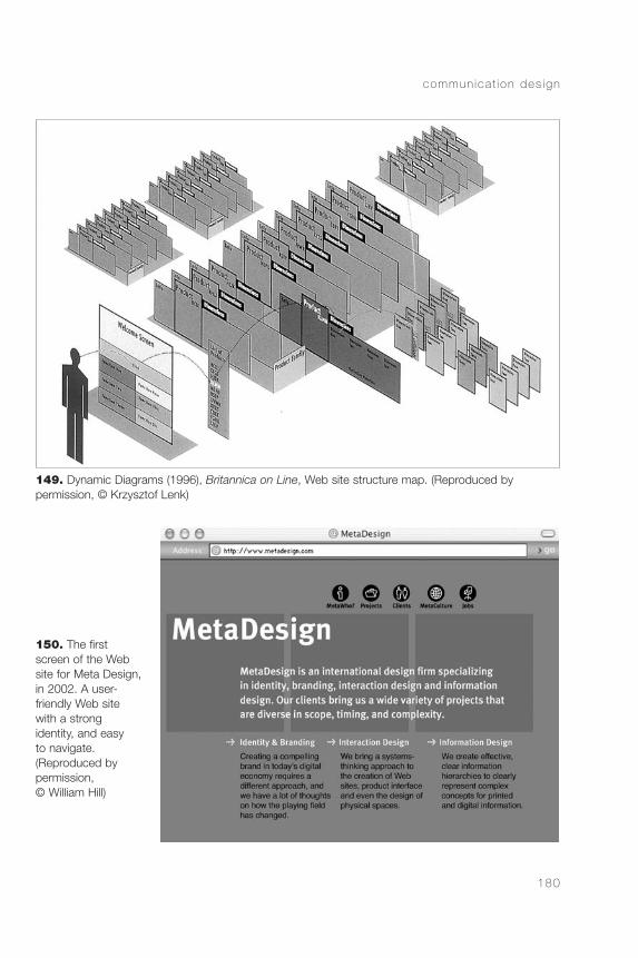
commun ica t ion des ign
180
149. Dynamic Diagrams (1996), Britannica on Line, Web site structure map. (Reproduced by permission, © Krzysztof Lenk)
150. The firstscreen of the Website for Meta Design,in 2002. A user-friendly Web sitewith a strong identity, and easy to navigate. (Reproduced by permission, © William Hill)
CommDesign 06 a 09/03/04 1:50 PM Page 180
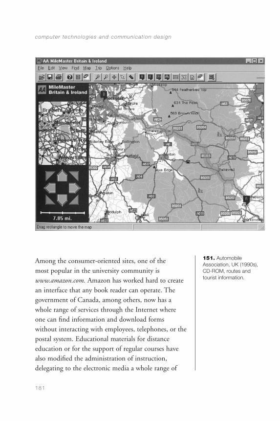
Among the consumer-oriented sites, one of the most popular in the university community iswww.amazon.com. Amazon has worked hard to createan interface that any book reader can operate. Thegovernment of Canada, among others, now has awhole range of services through the Internet whereone can find information and download formswithout interacting with employees, telephones, or thepostal system. Educational materials for distanceeducation or for the support of regular courses havealso modified the administration of instruction,delegating to the electronic media a whole range of
computer techno log ies and commun ica t ion des ign
181
151. Automobile Association, UK (1990s),CD-ROM, routes andtourist information.
CommDesign 06 a 09/03/04 1:50 PM Page 181
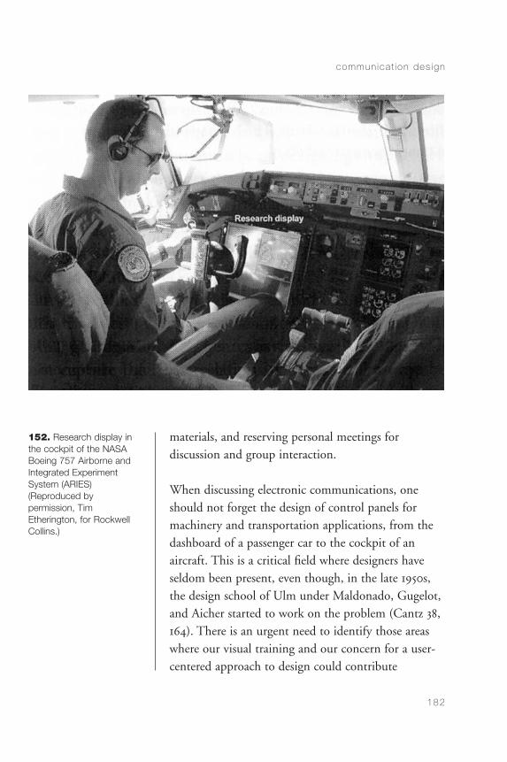
materials, and reserving personal meetings fordiscussion and group interaction.
When discussing electronic communications, oneshould not forget the design of control panels formachinery and transportation applications, from thedashboard of a passenger car to the cockpit of anaircraft. This is a critical field where designers haveseldom been present, even though, in the late 1950s,the design school of Ulm under Maldonado, Gugelot,and Aicher started to work on the problem (Cantz 38,164). There is an urgent need to identify those areaswhere our visual training and our concern for a user-centered approach to design could contribute
commun ica t ion des ign
182
152. Research display inthe cockpit of the NASABoeing 757 Airborne andIntegrated Experiment System (ARIES) (Reproduced by permission, Tim Etherington, for RockwellCollins.)
CommDesign 06 a 09/03/04 1:50 PM Page 182
significantly to the quality of interfaces in manydifferent contexts (Figure 152).
This is a fast-growing field that has significantlyaffected visual communication design in bothproduction and conception. It has also created newcommunication channels for information, education,and entertainment, opening a wide range ofpossibilities for the development of visualcommunication design.
computer techno log ies and commun ica t ion des ign
183
CommDesign 06 a 09/03/04 1:50 PM Page 183

CommDesign 06 a 09/03/04 1:50 PM Page 184
CHAPTER 7
Culture and Society
society develops within a permanentflow of information exchange. The mass media, theurban environment, and public transportation are activesources of information that both express and buildculture. Journalism and advertising create culturalmodels of appearance and behavior, promoting choices,lifestyles, and cultural values. A cursory review of somepublications shows how cultural consensus is built, howsocial roles get defined, and how a cultural language isconstructed within a society. Through this analysis,cultural values become evident. The value of health isquite common to many societies, but it is especiallystrong in ours. More religious societies do not valuehealth that much. When people strongly believe in theafterlife, not much importance is placed on health orthe fear of death. We pursue health through personalcare and through science.
The visual language developed by a culture includesthe codification of color. In our society, science tends
185
CommDesign 07 a 09/03/04 1:50 PM Page 185
to be portrayed as blue or magenta, because green goesto ecology and beige to healthy, natural foods. Thelook of science is strongly related to chemistry andphysics. In the context of advertising, science,technology, and health meet to create myths. Whileno one believes in miraculous medicines, apparentlymyth-based advertisements work, because they arecommonly used.
Another important value in our society is wealth.Without necessarily going as far as luxury, a look atadvertising in mass media shows that a solid financialgrounding seems to be a need in our culture.
Mass media contribute substantially to defininggender. Whereas general news magazines show womenin more varied roles, most magazines for women dwellon fashion, sexuality, and a narrow definition offemininity. Sports magazines are mostly for men andabout men, and they portray athletes as models ofmasculinity, offering a narrow definition ofmasculinity as well. Sometimes even cars stand fortraditionally masculine values. Money and power areprovinces where men prevail, and much editorial spaceis dedicated to male politicians or business leaders.There are different ways in which these roles aredepicted by the media: The Italian magazine L’Espressoconstantly portrays politicians in a non-flattering way,removing pomp from the public perception of theirroles. One should not oversimplify our era by lookingat only two or three publications. We are exposed tomany TV channels, printed publications, and filmsthat constantly build and broadcast cultural models.
commun ica t ion des ign
186
CommDesign 07 a 09/03/04 1:50 PM Page 186

Freedom, power, control, pleasure, self-reliance,financial success, fitness, luxury, and leisure take centerstage in Western mass media in association with news,services, products, and ideas to sell or to persuade.The designer needs to tread lightly in this terrain. Wehave to be conscious that our work contributes to theshaping of the world we live in.
In a relatively recent development, social marketinghas extended the traditional field of communicationdesign. While there have been people with goodintentions for many years, communications orientedtoward addressing social problems were developed in anaïve way. It was thought that merely mentioning theproblem was enough to make it go away. We havenow adopted and adapted the experience ofcommercial advertising, and put it in the service ofthe public good. I believe that this area is bound togrow dramatically in the next few years. Somegovernments are discovering that certain socialproblems, such as traffic and industrial injuries, costcountries billions of dollars a year. The health caresystem in Canada spends about $15 billion a yearlooking after the injured, while 51 million workdaysare lost to injuries in the country. Fifty thousandAmericans die every year in traffic collisions (the same number who died during ten years of war inVietnam).
The state of Victoria, in Australia, after investing $6million in a traffic safety campaign, saved $118 millionin insurance compensations, and it is estimated that,computing other related costs, the community saved
cu l tu re and soc ie ty
187
CommDesign 07 a 09/03/04 1:50 PM Page 187
an additional $360 million (Grey Advertising 191).There is much to do in this terrain, and communi-cation design is a useful tool when applied withintelligence toward the reduction of social problems of many kinds. Leaving tragedies aside, even in theinnocent field of the design of forms, there is quite a bit of money to be saved. The CommunicationResearch Institute of Australia estimates that, in theUnited States, every error made by an Americantaxpayer on a tax form costs that person $10 to fix inadministrative time. Better forms could reduce thenumber of errors, and eliminate the subsequent highcost of correction.
The financial dimension of these problems has beendiscovered in some places, reminding governmentsthat doing nothing is far more expensive thanorganizing well-researched and well-executed massivecommunicational campaigns.
commun ica t ion des ign
188
CommDesign 07 a 09/03/04 1:50 PM Page 188
Conclusion
visual communication design can be, as noted at the beginning, both an activity and aproduct. It is the activity of conceiving, planning,projecting, and producing visual communications,normally implemented through industrial means, andoriented at broadcasting specific messages to specificpublics. This is done to obtain a reaction, connectedto the knowledge, the attitudes, the feelings, or thebehavior of the public. A design is an object createdby that activity.
Communication design is social science, art, technology, and craft. It is a social science because it is always aimed at people, and psychology, sociology,and anthropology have much to offer to theconstruction of effective communications. It is an artbecause it deals with forms and requires awareness ofand sensitivity to the visual languages of people andplaces. It is a technology because it is always producedby industrial means. And it is a craft because the
189
CommDesign 07 a 09/03/04 1:50 PM Page 189
technology used requires an understanding thatcannot rely exclusively on the machines thatimplement it. Design is an intellectual, sensitive, andpractical discipline, requiring many levels of humanactivity: power of analysis, sensitivity to difference,mental flexibility, interpersonal skills, clarity ofjudgment, visual sensitivity, cultural awareness, andtechnical knowledge. In today’s society, whereinformation is a key commodity, the importance ofvisual communication design is only limited by thequality of the designers.
Given the visual nature of our culture in general, andthe increasing volume of visual information inparticular, visual communication designers can makesubstantial contributions to the clarity, effectiveness,beauty, and economic viability of the ever-growingflow of information. They can facilitate this flow andcontribute to the quality of our society and our life.
commun ica t ion des ign
190
CommDesign 07 a 09/03/04 1:50 PM Page 190

Bibliography
Alexander, Christopher. Notes on the Synthesis of Form.Cambridge, Mass.: Harvard University Press, 1979.
Appleton, J. The Experience of Landscape. London:John Wiley, 1975.
Barthes, Roland. “The Rhetoric of the Image.” Image,Music, Text. New York: Hill and Wang, 1977.
Bonsiepe, Gui. Interface: An Approach to Design.Maastricht, Netherlands: Jan van Eyck Akademie,1999.
Cantz, Hatje (ed.). Ulmer Modelle/Modelle nach Ulm.Ulm, Germany: Ulmer Museum/hfg-archiv, 2003.
Crosby, Theo, Fletcher, Alan, and Forbes, Colin. ASign System Manual. New York: Praeger Publishers,1970.
191
CommDesign 07 a 09/03/04 1:50 PM Page 191
Cross, Nigel, and Roy, Robin. A Design MethodsManual. Milton Keynes, UK: Open University, 1975.
Easterby, Ronald, and Graydon, I. R. Evaluation ofPublic Information Symbols, ISO Tests 1979/80 Series,Report 70. Birmingham, UK: University of Aston,1981.
Easterby, Ronald, and Zwaga, Harm. Evaluation ofPublic Information Symbols, ISO Tests 1975 Series,Report 60. Birmingham, UK: University of Aston,1976.
Frascara, Jorge. “Pattern Design and Literacy for theRetarded.” Icographic 14 (1979), 14–15.
———. “Graphic Design: Fine Art or SocialScience?” In Margolin, V. and Buchanan, R. (eds.),The Idea of Design. Cambridge, Mass.: MIT Press,1995.
———. User-centered Graphic Design. London: Taylor& Francis, 1997.
———. “Information Design and CulturalDifference.” Information Design Journal, vol. 9, no. 2/3 (2000): 119.
——— (ed.). Design and the Social Sciences: MakingConnections. London: Taylor & Francis, 2002.
Frutiger, Adrian. Type Sign Symbol. Zurich: ABCVerlag, 1980.
commun ica t ion des ign
192
CommDesign 07 a 09/03/04 1:50 PM Page 192
Gorb, Peter. “Using Design.” In Gorb, Peter (ed.),Living by Design. London: Lund Humphries, 1978.
Goudy, Frederic. The Alphabet and Elements ofLettering. New York: Dover, 1963.
Grey Advertising. “Road Safety: The TransportAccident Commission Campaign.” AdvertisingFederation of Australia. Cited in Effective Advertising.Sydney: Southwood Press, 1990.
Heller, Steven, and Ballance, Georgette. GraphicDesign History. New York: Allworth Press, 2001.
Hofstadter, Douglas. Gödel, Escher, Bach. New York:Vintage, 1979.
Huff, William S. “Grundlehre at the HfG—with aFocus on the ‘Visuelle Grammatik.’” In Cantz, Hatje(ed.), Ulmer Modelle/Modelle nach Ulm. Ulm,Germany: Ulmer Museum/hfg-archiv, 2003.
Johnson, Mark. The Body in the Mind. Chicago:University of Chicago Press, 1987.
Krug, Steve. Don’t Make Me Think. Indianapolis:Que/McMillan, 2000.
Ladan, Carol, and Frascara, Jorge. “Three VariablesInfluencing the Picture Preferences of South andNorth American Boys and Girls.” ReadingImprovement, vol. 14, no. 2 (1977), 120–28.
b ib l iography
193
CommDesign 07 a 09/03/04 1:50 PM Page 193
Lakoff, George, and Johnson, Mark. Metaphors WeLive By. Chicago: University of Chicago Press, 1980.
McConnell, John. “Jobbing graphics.” In Peter Gorb(ed.), Living by Design. London: Lund Humphries,1978.
McLuhan, Marshall. Understanding Media. NewYork/Toronto: McGraw Hill, 1964.
Meggs, Philip. A History of Graphic Design. New York:Van Nostrand Reinhold, 1983.
Mijksenaar, Unger. “Signposting and CommunicationMedia.” Icographic 7. (1974).
Mullender, J. Guide Pratique sur le Design Graphique.Paris: Centre Georges Pompidou, 1979.
Nelson, T., Nilsson, T., Piercey, D., Johnson, T.,Frascara, J., Silva Delano, S., Susuki Sone, E., andVillalon Bravo, M. “Improving Perception of Lettersand Visual Structure of Language.” Perceptual andMotor Skills 88 (1999): 515–530.
Ogilvy, David. Ogilvy on Advertising. New York:Crown Publishers, 1983.
Petit, Philip. The Concept of Structuralism. LosAngeles: University of California Press, 1977.
Pujol, Mónica. Public lecture, “Design as a SocialPractice,” University of Alberta, November 2001.
commun ica t ion des ign
194
CommDesign 07 a 09/03/04 1:50 PM Page 194
Rose, Stewart. “Stamp on It—Some Aspects ofPostage Stamp Design.” Icographic 8. (1974).
Sanders, Elizabeth. “From User-centered toParticipatory Design Approaches.” In Frascara, Jorge(ed.), Design and the Social Sciences: MakingConnections. London: Taylor & Francis, 2002.
Sinclair, S., Moore, S., Lavis, C., and Soldat, A. “The Influence of Affect on Cognitive Processes.” InFrascara, Jorge (ed.), Design and the Social Sciences:Making Connections. London: Taylor & Francis, 2002.
Spencer, Herbert. The Visible Word. New York:Hastings House, 1969.
Theunissen, E., and Etherington, T. “ComputerGraphics in the Cockpit,” Information Design Journal,vol. 11, no. 1 (2002), 4–16.
Tubbergen, Haukje. La Femme et la Publicité.Eindhoven, Netherlands: Icograda and the TechnischeHogeschool Eindhoven, 1976.
Tufte, Edward. The Visual Display of QuantitativeInformation. Cheshire, Conn.: Graphics Press, 1983.
Wildbur, Peter, and Burke, Michael. InformationGraphics. London: Thames & Hudson, 1998.
Woodham, Jonathan. Twentieth-Century Design. NewYork: Oxford University Press, 1997.
b ib l iography
195
CommDesign 07 a 09/03/04 1:50 PM Page 195

Wright, Patricia. “Informed Design for Forms.”Information Design Journal, vol. 2, no. 3/4 (1981):151–178.
commun ica t ion des ign
196
CommDesign 07 a 09/03/04 1:50 PM Page 196
Index
197
AAbsolut Vodka advertisement (Vali-
centi and Rattin), 145active life of design, 86–87Adametz, F.
Charlie Chaplin poster, 54administrative design, 160–166
forms, 160–162postage stamps, 166securities (money), 162–165tickets, 162
advertising/advertisements,140–141
Absolut Vodka (Valicenti andRattin), 145
Association for Retarded Citi-zens (ARC), 149
Dubonnet (Cassandre), 87Elbeo socks for men, 143Hermann Miller Collection
(Hofmann), 75in Knoll (magazine) by Herbert
Matter, 75Mercedes Benz (Oglivy), 34non-commercial, 144, 147Pelikan Ink (Schwitters), 27Pioneer Chrysler, 76Rolls-Royce (Oglivy), 34Suddenly, you’re a good driver,
157Theatre Alberta (Sadler Takach,
Bonnie), 145Advertising Effectiveness Awards
(Advertising Federation of
Australia), 118AEG, 23
poster for, 25aesthetics, 11, 74–89
active life of design, 86–87communication and, 77–85competitions, 118context, 72evaluation of design projects,
121memorization, 85–86quality of environment, 87–88retaining attention, 85style samples, 79–85temporary signage, 77–78
Aicher, Otldesign for control panels on
machinery, 182Munich Olympic Games
poster, 79, 81, 82airline ticket, 138airplane cockpits, 182Albers, Josef, 6, 110Alexander, Christopher, 125–126alphabet design. see
typefaces/typographyAmazon.com, 181anchorage relationship between
text and image, 112anti-noise campaign poster
(Müller-Brockmann), 59anti-nuclear poster (Drzewinski),
148Apollo poster (Vogl), 54
CommDesign 07 a 09/03/04 1:50 PM Page 197
Appleton, J., 176art deco, 22–23art nouveau, 21–22Association for Retarded Citizens
(ARC) advertisement, 149Astley Circus poster (Benefit), 53L’Atlantique poster (Cassandre),
59attention, 60
retaining, 85stimulus attracting, 74
Australia, State of Victoria TrafficAccident Commission,147, 187
AutoCad, 99Automobile Association, UK,
CD-ROM, 181automobile dashboards, 182Avant Garde Medium typeface
(Lubalin), 47
Bbalance, 111banknotes, design for, 163, 164Barthes, Roland, 112Bauernball poster (Elsinger), 19Bauhaus book title page (Nagy),
29, 30Bayer, Herbert, 32–33, 36beauty, 120, 121. see also aes-
theticsBedno, Ed and Jane
People Are People Are Peopleproject, 153–156
Behrens, Peter, 23AEG poster, 25
Benefit, KlattAstley Circus poster, 53
Berlin subway signage (MetaDesign), 135
Berlin Transportation map (MetaDesign), 131
Bernard, Pierreevent against arms prolifera-
tion poster, 150On y va poster, 151
Bonsiepe, Gui, 173book designs, 29, 30, 84,
126–129Britannica on Line (Dynamic Dia-
grams), 180British country road intersection
sign, 139British Railways typeface (John-
ston), 29, 30
Broadbent, Janeposters for Parks Canada, 103
BRS studiosigns for office building, 137
budgets for projects, 114–115,117
Buenos Aires subway signage(Diseno Shakespear), 136
Buffalo Springfield concert poster(Wilson), 45
Ccalligraphic alphabets, 53Canada
Federal Identity Program,samples of typography for,133
health care system, 187paper money for, 164services on Internet, 181
Canadian Standards Council, 158capitals, 36. see also
typefaces/typographyCarter, Matthew, 49
Galliard typeface, 50Verdana typeface, 50
Cassandre, A. M., 58L’Atlantique poster, 59Dubonnet advertisement, 87
caulk and glue containers, 139cave painting, 16Centre of Industrial Creation of
France, 9Charlie Chaplin poster (Adametz),
54clarity, 61client relations. see also process of
designdefining design projects, 97presentation of design propos-
al, 112–113closure (visual system), 110Colberg, Susan
Godard book cover, 82, 84A Guide to Heidegger’s Being
and Time book cover, 82,84
collection of information for project, 98–100
color, 171, 185–186commission of projects, 96–98communication, 63–73
aesthetics and, 77–85 (see alsoaesthetics)
context of, 66–68, 72–73
commun ica t ion des ign
198
CommDesign 07 a 09/03/04 1:50 PM Page 198
creativity, 10–11interpretation of messages,
69–72noise, 5, 8–9perception, 64–66 (see also
perception)principles of design for, 68–69
competition to client, 100competitions, 118computer technologies, 169–183
consumer-oriented Web sitedesign, 181
control panels for machinery,182–183
Dynamic Diagrams’ interfacedesign, 179
interaction with, 172–174interdisciplinary work, 178navigation in World Wide
Web, 176–178print media, 170–172text, use of, 175websites for Meta Design and
Britannica on Line, 180connotation, 69–70constructivism, 26
influence on typography,31–32
The Isms of Art (Lissitzky), 23Merz magazine cover (Schwit-
ters), 28, 29Pelikan Ink advertisement
(Schwitters), 27consumer-oriented Web site
design, 181Consumption of alcohol may impair
your ability to drive poster(Stone and Kaa-Nee-Ta),149
content of design, 5–6context, 66–68, 72–73control panels for machinery,
182–183corporate identity, 142–144
Absolut Vodka (Valicenti andRattin), 145
Theatre Alberta (SadlerTakach, Bonnie), 145
creativity, 9–11Cross, Nigel, 93cultural context, 72, 185–188
evaluation of design project,119
mass media in, 185, 186–187social marketing, 187–188
values, 185–186
DDadaism, 23, 26Daniels, Jason, 177de Stilj, 26
logo by Doesburg, 27Mecano magazine cover (Does-
burg), 23defining design problems, 96–97.
see also process of designDELPHINS research flight deck,
133denotation, 69, 70descenders, 42design
active life of, 86–87contributions from other
fields, 3–4interpretations of word, 1–2non-neutrality of, 65–66, 67
Design Methods Manual (Crossand Roy), 93
Deutsche Lufthansa poster(Hohlwein), 25
digital fonts, 44, 47dimensions of design, 167–168distance education, 181–182Distéfano, Juan C.
Olivetti poster, 82, 83distractions in design, 8–9Döcker, E.
Ideal poster, 20Doesburg, Theo van, 26
De Stijl logo, 27Mecano magazine cover, 23
Drzewinski, Trioanti-nuclear poster, 148
Dubonnet advertisement (Cassan-dre), 87
Dürer, AlbrechtMocking Christ, 16
Dynamic DiagramsBritannica on Line web site,
180interface design, 179From Memex to Hypertext book
cover, 82, 84
EEducation and Labor Force poster,
132educational design, 152–160
distance education, 181–182People Are People Are People
i ndex
199
CommDesign 07 a 09/03/04 1:50 PM Page 199
project, 153–156for public health and safety,
157–160role of “receiver,” 156Suddenly, you’re a good driver,
advertisement, 157teaching aids, 119–120,
122–125Elbeo socks for men advertise-
ment, 143Elsinger, L.
Bauernball poster, 19enjoyment, 102–103environment for design, 87–88L’Espresso (magazine), 186Eurich, A.
K. K. Prater poster, 18Euro (money), 165evaluation
during design process, 104,106
of final product, 118–121“Evaluation and Development of
Safety Symbols” (Frascaraand Yau), 158
FFederal Identity Program (Cana-
da), 133Festwochen in Wien (Mayer-Mar-
ton), 54Fibonacci, 42Der Film poster (Müller-Brock-
mann), 7Fletcher, Alan, 134font design, 39–42. see also type-
faces/typographyFontana, Rubén
FontanaND typeface, 49, 50Olivetti poster, 82, 83Tipográfica (magazine), 146
forms, design of, 160–162, 188Forum typeface (Goudy), 51Frascara, Jorge
Gramsci x3 (book design),126–129, 129
Initial Learning Alphabet/Pat-terned Alphabet, 122–125,123
“Percentage of Employmentby Industry, Alberta andCanada” in Education andLabor Force, 132
placement of signs/symbols inpublic spaces, 159
safety symbols for CanadianStandards Council, 158
testing symbols, 35From Memex to Hypertext book
cover (Dynamic Dia-grams), 82, 84
Frutiger, AdrianFrutiger typeface, 47, 48Roissy typeface, 44, 45Univers typeface, 37, 38, 43
Functional Architecture move-ment, 118–119
functionality, 57–89aesthetics, 74–89 (see also aes-
thetics)checklist of questions for,
62–63, 88communication, 63–70 (see
also communication)expressiveness vs., 44–45perception and meaning,
58–62 (see also perception)Futura typeface (Renner), 39, 44
GGalliard typeface (Carter), 50Garamond, Claude, 38
typeface, 39Garçons/Filles booklets (Paris-Clav-
el), 151gender, 186geometric typography, 54, 55. see
also typefaces/typographyGestalt psychology, 64–65,
109–110Gibson, J., 176Gill typeface, 48Godard book cover (Colberg), 82,
84Golden Section, 41Goudy, Frederic W.
Forum typeface, 51Gramsci x3 (book design by Fras-
cara), 126–129graphic design, 2, 4, 18–19graphic symbols, 35, 158Grapus
event against arms prolifera-tion poster, 150
On y va poster, 151Grey Advertising
traffic safety campaign for Vic-toria, Australia, 147, 149,188
Gropius, Walter, 23
commun ica t ion des ign
200
CommDesign 07 a 09/03/04 1:50 PM Page 200
Gugelot, H., 182A Guide to Heidegger’s Being and
Time book cover (Col-berg), 82, 84
HHallmayer, A.
testing symbols, 35Helvetica typeface (Miedinger),
37, 38, 48Henri Matisse, Acquavella Galleries
poster (Matisse), 80HfG Ulm design school, 110, 182Hill, William
Meta Design website, 180Historisches Austellung Stadt Wien
(anonymous), 20history of visual communication
design, 15–55nineteenth century, 17–21twentieth century, 22–32typefaces, 32–55 (see also type-
faces/typography)Hofmann, Armin
advertisement for HermannMiller, 75
Hohlwien, LudwigDeutsche Lufthansa poster, 25
holograms, 163, 164, 165Huszar, Vilmas, 26
IIcographic (magazine), 71Ideal poster (Döcker), 20ideological propaganda, 150, 152images, 109–110, 112implementation of design,
116–117industrial safety, 157information, collecting for a proj-
ect, 98–100informational design, 129–139,
174. see also computertechnologies
airline ticket, 138Berlin subway signage (Meta
Design), 135Berlin Transportation map
(Meta Design), 131British country road intersec-
tion sign, 139concept of, 6–8DELPHINS research flight
deck, 133Federal Identity Program
(Canada), samples oftypography for, 133
London Heathrow Airport sig-nage system, diagram for,134
office building signs by BRS,137
“Percentage of Employmentby Industry, Alberta andCanada” in Education andLabor Force (Frascara andKosinski), 132
Schiphol airport signage sys-tem (Mijksenaar), 134
sign for maternity hospital(Diseno Shakespear), 137
train timetable (Marey), 140typography on caulk and glue
containers, 139Initial Learning Alphabet/Patterned
Alphabet (Frascara andNelson), 122–125, 123
interactive design, 172–173interdisciplinary work, 178interface design, 173, 179. see also
computer technologiesInternational Standards Organiza-
tion (ISO), 71, 158–159International Typeface Corpora-
tion (ITC), 44, 45Internet, 175. see also computer
technologiesinterpretation, 66, 69–72, 156. see
also perceptionThe Isms of Art (Lissitzky), 23
JJane Avril (Toulouse-Lautrec), 80Johnson, M., 176Johnston, Edward
British Railways typeface, 29,30
Jungkind, Walterposters for Parks Canada, 103
justification of design, 114
KK. K. Prater poster (Eurich), 18Kaa-Nee-Ta
Consumption of alcohol mayimpair your ability to driveposter, 149
Kamekura, YusakuTokyo Olympic Games poster,
79, 81
i ndex
201
CommDesign 07 a 09/03/04 1:50 PM Page 201
Kieser, Güntherpeace poster, 148
King, Jessie M.illustrations for The Studio
(magazine), 20Klein, Richard
Opfertag, 25Knoll (magazine), advertisement in
(Matter), 75Kosinski, Leszek
“Percentage of Employmentby Industry, Alberta andCanada” in Education andLabor Force, 132
Krug, Steve, 174
LLakoff , G., 176Lang, Fritz, 28language, context of, 73legibility of typefaces, 35–36,
37–38, 47, 49Lenk, Krzysztof
Britannica on Line web site,180
interface design, 179Letraset, 44Lichtenstein, Roy, 6Lincoln Center film festivals, 5, 9Lissitzky, El
The Isms of Art, 23Jan Tschichold influenced by,
32Two Squares, 24
London Heathrow Airport signagesystem, diagram for, 134
Lubalin, HerbAvant Garde Medium type-
face, 47luxury, 120, 121
Mmagazines and newspapers
Mecano cover design (Does-burg), 23
Merz cover design (Schwit-ters), 28
New York Times font, 49The Studio, illustrations from,
20, 22, 53Tipográfica cover and layout,
146typography in, 144
Maldonado, Tomás, 110, 182Marey, E. J.
La methode graphique, 138,140
marginalia, 163Marinetti, F. T.
Les mots en liberté futuristes, 24marketing research, 140Matisse, Henri, 79
Henri Matisse, Acquavella Gal-leries poster, 80
Matter, Herbertadvertisement in Knoll (maga-
zine), 75Mayer-Marton, Georg
Festwochen in Wien, 54McFarland, Jacqui, 99–100McLuhan, Marshall, 109meaning, 64–65. see also commu-
nicationMecano magazine cover (Does-
burg), 23media
choice of, 107–108, 115–116computer technologies,
169–183 (see also comput-er technologies)
context in, 72–73gender roles, 186print, 170–172 (see also print
media)memorization, 85–86Mercedes Benz advertisement
(Oglivy), 34Merz magazine cover (Schwitters),
28Meta Design
Berlin Transportation map,131
signage system for the Berlinsubway, 135
website design, 180Meta typeface (Spiekermann), 48,
49La methode graphique (Marey),
140methods for design, 91–128. see
also process of designmethods of design, 91–128. see
also process of designMetropolis poster (Schulz-Neu-
damm), 28Mexican postage stamp, 166Miedinger, Max
Helvetica typeface, 37, 38Mijksenaar, Paul
Schiphol airport signage sys-
commun ica t ion des ign
202
CommDesign 07 a 09/03/04 1:50 PM Page 202
tem, 134Mijksenaar, Unger
South African mine cartoon,71
Miller, Hermann, 75Mocking Christ (Dürer), 16money, design for, 162–165Mork, Alf
Young lungs fade quickly if youstart smoking before age 15poster, 149
Moscoso, Victorconcert poster, 82, 83
Les mots en liberté futuristes(Marinetti), 24
Moulin Rouge (Toulouse-Lautrec),16
movement, 111, 168Mullender, J., 9Müller-Brockmann, Josef, 6, 58
anti-noise campaign poster, 59communicational function of
compositions, 66concert poster, 45Der Film poster, 7
multimedia, 169–170. see alsocomputer technologies
Munich Olympic Games poster(Aicher), 79, 81, 82
NNachtigall, Leila
posters for Parks Canada, 103Nagy, L. Moholy
Bauhaus book title page, 29,30
Dormez citoyens/Les medias veillent, poster and postcard (Paris-Clavel), 151
Nelson, ThomasInitial Learning Alphabet/Pat-
terned Alphabet, 122–125,123
neo-plasticism, 26Neufville Digital, 49New Goods! New Goods! poster
(anonymous), 18New York Times (newspaper), 49News Gothic typeface, 48newspapers. see magazines and
newspapersNikolo-Fest poster (Wilke), 21noise, 5, 8–9novelty, 6, 8
Ooffice building signs by BRS, 137Officina Sans (Spiekermann), 49Ogilvy, David
on political propaganda, 150,152
on studying the product, 99Olive Lake tactile map (Takach),
105Olivetti poster (Distéfano,
Fontana and Soler), 82, 83Olivetti poster (Pintori), 80Olympic Games, 79, 81On y va poster (Grapus), 151Opfertag (Klein), 25organization of projects, 92. see
also process of designinformational designs, 130production phase, 113–116visual composition, 67–68
ornamentation, 19“out of order” signs, 77, 78
Ppaper for printing, 171paper money, design for, 162–165Paris-Clavel, Gérard
Garçons/Filles booklets, 151Ne Pas Plier and Dormez
citoyens/Les medias veillentposter and postcard, 151
Parks Canada, 101Olive Lake tactile map
(Takach), 105posters for (Broadbent,
Nachtigall and Jungkind),103
patterns, 111peace poster (Kieser), 148Pelikan Ink advertisement
(Schwitters), 27Pentagram
diagram for location of sig-nage, London HeathrowAirport signage system,134
People Are People Are People project(Bedno), 153–156
“Percentage of Employment byIndustry, Alberta andCanada” in Education andLabor Force (Frascara andKosinski), 132
perception, 64–66
i ndex
203
CommDesign 07 a 09/03/04 1:50 PM Page 203
context, 72functionality affected by,
58–62retaining attention, 85
performance criteria, 120persuasive design, 138, 140–152
advertising, 140–141 (see alsoadvertising/advertise-ments)
corporate identity, 142–144educational design compared
to, 152non-commercial advertising,
144, 147–149political and ideological prop-
aganda, 150, 152Philadelphia Symphony Orches-
tra, 5Pintori, Giovanni
Olivetti poster, 79, 80Pioneer Chrysler advertisement,
76planning and methods for design,
91–128. see also process ofdesign
Poggenpohl, Sharon, 175political propaganda, 150, 152postage stamps, design for, 166posters
AEG poster (Behrens), 25anti-noise campaign (Müller-
Brockmann), 59anti-nuclear poster (Drzewins-
ki), 148Apollo (Vogl), 54Astley Circus (Benefit), 53L’Atlantique (Cassandre), 59Bauernball (Elsinger), 19Buffalo Springfield concert
poster (Wilson), 45Charlie Chaplin (Adametz), 54for concert (Moscoso), 83for concert (Müller-Brock-
mann), 45Consumption of alcohol may
impair your ability to driveposter (Stone and Kaa-Nee-Ta), 149
Deutsche Lufthansa(Hohlwien), 25
“Drifted” (Soulby), 52for event against arms prolifer-
ation (Grapus), 150Der Film (Müller-Brock-
mann), 7
Henri Matisse, Acquavella Gal-leries (Matisse), 80
Ideal (Döcker), 20Jane Avril (Toulouse-Lautrec),
80K. K. Prater (Eurich), 18Metropolis (Schulz-Neu-
damm), 28Müller-Brockmann concert
poster, 45Munich Olympic Games
(Aicher), 79, 81, 82Dormez citoyens/Les
medias veillentposter and postcard (Paris-Clavel), 151
New Goods! New Goods!(anonymous), 18
Nikolo-Fest (Wilke), 21Olivetti (Distéfano, Fontana
and Soler), 82Olivetti (Pintori), 80Parks Canada (Broadbent,
Nachtigall and Jungkind),103
peace poster (Kieser), 148“Percentage of Employment
by Industry, Alberta andCanada” in Education andLabor Force (Frascara andKosinski), 132
Sun Tan (anonymous), 55Tokyo Olympic Games
(Kamekura), 81typography during nineteenth
century, 52On y va (Grapus), 151Young lungs fade quickly if you
start smoking before age 15(Mork), 149
pressure pump diagram fromRolls-Royce, 132
print media, 115, 170–172advertisements, 140–141 (see
also advertising/advertise-ments)
book designs, 84, 126–129magazines and newspapers,
144 (see also magazinesand newspapers)
paper money, 162–165posters (see posters)publication design, 3
process of design, 91–128collection of information,
commun ica t ion des ign
204
CommDesign 07 a 09/03/04 1:50 PM Page 204
98–100commission of projects, 96–98definition of objectives,
106–109design proposal, development
of, 109–112evaluation, 104, 106,
118–121Gramsci x3 (book design by
Frascara), 126–129implementation, 116–117Initial Learning Alphabet/Pat-
terned Alphabet (Frascaraand Nelson), 122–125
interpretation of information,93–94, 101–106
presentation of design propos-al, 112–113
production, organization of,113–116
requirements for projects,91–92, 124–125
production of designs, 113–116proximity (visual system), 110public, information about the,
100media choices and, 109persuasive design, 147tests for finding, 101–103
public health and safety, 157–160publication design, 3. see also print
media
Qquality criteria, 120
RRattin, Mark
Absolut Vodka advertisement,145
reading from left to right conven-tion, 70
reality, 9–10redundancy, 8relay relationship between text
and image, 112Renner, Paul
Futura typeface, 39, 44repetition, 8, 111research for design projects,
98–100, 140rhythm, 111Roissy typeface (Frutiger), 44, 45Rolls Royce advertisement
(Oglivy), 34
Rolls Royce Aerospace CD-ROM,diagram from, 132
Roman Scherer catalogue, 53rotation, 110Roy, Robin, 93Ruecker, Stan, 176
SSadler Takach, Bonnie, 104
Olive Lake tactile map, 105test materials for Web site nav-
igation design, 177Theatre Alberta brochures,
145safety issues, 157–160Schiphol airport signage system
(Mijksenaar), 134Schulz-Neudamm
Metropolis poster, 28Schwitters, Kurt
Merz magazine cover, 28Pelikan Ink advertisement, 27
securities (money), 162–165sequences, 111, 168series, grouping of elements, 111Shakespear, Diseno
signage system for BuenosAires subway, 136
signage system for maternityhospital, 137
Shakespear, Lorenzo, 136Shakespear, Ronald, 113, 137signs/signage
Berlin subway (Meta Design),135
British country road intersec-tion, 139
Buenos Aires subway (DisenoShakespear), 136
London Heathrow Airport sig-nage system, diagram for,134
for maternity hospital (DisenoShakespear), 137
for office building (BRS), 137placement of in public spaces,
159Schiphol airport signage sys-
tem (Mijksenaar), 134South African mine cartoon,
71similarity (visual system), 110simplicity, 33–38social marketing, 187–188society and culture, 185–188. see
i ndex
205
CommDesign 07 a 09/03/04 1:50 PM Page 205
also cultural contextSoler, Carlos
Olivetti poster, 82, 83Soulby, John Jr.
poster, 52source of design message, 72South African mine cartoon, 71Southeast Asia health campaign,
117special-needs persons, 104Spelbrink, Niko, 137Spencer, Herbert, 33, 175Spiekermann, Erik
Berlin subway signage (MetaDesign), 135
Berlin Transportation map(Meta Design), 131
Meta typeface, 48, 49Officina Sans, 49
State of Victoria Traffic AccidentCommission, 147, 149,187
Stella, Frank, 6stimulus, 74Stone, Peter
Consumption of alcohol mayimpair your ability to driveposter, 149
Stone, SumnerStone Sans typeface, 50
The Studio (magazine), 22Jessie King’s illustration for, 20A. A. Turbayne’s illustration
for, 53Suddenly, you’re a good driver,
advertisement, 157Sun Tan poster, 55suprematism, 26symbols, graphic, 35, 158symmetry, 111Syntax typeface, 48systems in design, 167–168Szarko, Don, 157
Ttax forms, design of, 188teaching aids, 119–120, 122–125,
156. see also educationaldesign
television, 115. see also mediatesting symbols (Frascara and
Hallmayer), 35text in design, 3, 112, 175. see also
typefaces/typographythree-dimensional design, 168
tickets, design of, 138, 162, 163timeline planning, 92Tinker, Miles, 33Tipográfica (magazine), 146Tokyo Olympic Games poster
(Kamekura), 79, 81Toulouse-Lautrec, Henri de
Jane Avril, 80Moulin Rouge, 16
training compared to education,152
Tschichold, Jan, 30–32, 66Tufte, Edward, 140Turbayne, A. A.
The Studio magazine cover, 53TV, 115. see also mediatwo-dimensional design, 168Two Squares (Lissitzky), 24typefaces/typography, 32–55, 109
for British Railways (John-ston), 29, 30
on caulk and glue containers,139
communication in, 112digital fonts, 44, 47examples in posters, 52–54Federal Identity Program
(Canada) samples, 133font design, 39–42fonts, new, 49–50fonts for titles, 46Frutiger, developed by, 47–48functional vs. expressive,
44–45geometric, 54, 55Herbert Bayer’s Universal,
32–33Jan Tschichold’s work, 30–32legibility, 35–36, 37–38, 47,
49magazine and newspaper
designs, 144, 146during nineteenth century,
18–19, 52phases of development
through history, 51, 55simplicity, 33–38variations for font design, 43
typesetting, 170–171
UUlm design school, 110, 182United States
paper money for, 164, 165traffic accidents, 187
commun ica t ion des ign
206
CommDesign 07 a 09/03/04 1:50 PM Page 206

Univers typeface (Frutiger), 37,38, 43
Universal typeface, 32, 33University of Alberta, 101, 104uppercase/lowercase proportions,
41, 42
VValicenti, Rick
Vodka advertisement, 145value systems, 67
evaluation of design projects,119–120
in society, 185–186Varnhagen, Connie, 177Verdana typeface (Carter), 50Virginia Commonwealth Univer-
sityPeople Are People Are People
project, 153–156Visible Language (magazine), 175The Visible Word (Spencer), 33visual communication design, 4,
12–13visual impairment, interpretive
exhibit for, 104visual organization, 67–68visualization, 94Vogl, R.
Apollo poster, 54
WWarhol, Andy, 6Watson, Wilfred, 126, 129Web site design. see also computer
technologiesBritannica on Line (Dynamic
Diagrams), 180consumer-oriented, 181Meta Design, 180test materials for (Sadler
Takach, Bonnie), 177Wilke, K. A.
Nikolo-Fest poster, 21Wilson, Wes
Buffalo Springfield concertposter, 45
World Wide Web, 175, 178. seealso computer technologies
writers, 3Wrolstadt, Merald, 175Wurman, Richard Saul, 107
YYau, Tony, 158Young lungs fade quickly if you start
smoking before age 15poster (Mork), 149
i ndex
207
CommDesign 07 a 09/03/04 1:50 PM Page 207
Please write to request our free catalog. To order by credit card, call 1-800-491-2808 or send a check or money orderto Allworth Press, 10 East 23rd Street, Suite 510, New York, NY 10010. Include $5 for shipping and handling for thefirst book ordered and $1 for each additional book. Ten dollars plus $1 for each additional book if ordering from Cana-da. New York State residents must add sales tax.
To see our complete catalog on the World Wide Web, or to order online, you can find us at www.allworth.com.
BooksfromAllworthPress
Allworth Press
is an imprint
of Allworth Com-
munications, Inc.
Selected titles are
listed below.
American Type Design and Designersby David Conseugra (paperback, 9 × 11, 320 pages, $35.00)
Teaching Graphic Designedited by Steven Heller (paperback, 6 × 9, 304 pages, $19.95)
The Education of a Graphic Designeredited by Steven Heller (paperback, 63⁄4 × 97⁄8, 288 pages, $18.95)
The Education of an E-Designeredited by Steven Heller (paperback, 63⁄4 × 97⁄8, 352 pages, $21.95)
Graphic Design Historyedited by Steven Heller and Georgette Balance (paperback, 63⁄4 × 97⁄8, 352 pages, $21.95)
Editing by Design, Third Editionby Jan V. White (paperback, 81⁄2 × 11, 256 pages, $29.95)
The Elements of Graphic Design: Space, Unity, Page Architecture, and Typeby Alexander White (paperback, 61⁄8 × 91⁄4, 160 pages, $24.95)
Citizen Designer: Perspectives on Design Responsibilityedited by Steven Heller and Véronique Vienne (paperback, 6 × 9, 272 pages, $19.95)
Inside the Business of Graphic Design: 60 Leaders Share Their Secrets of Successby Catharine Fishel (paperback, 6 × 9, 288 pages, $19.95)
Looking Closer 4: Critical Writings on Graphic Designedited by Michael Bierut, William Drenttel, and Steven Heller (paperback, 63⁄4 × 97⁄8,304 pages, $21.95)
CommDesign 07 a 09/03/04 1:50 PM Page 208