comparative study by coral arlene garcia · bouquet the simple ... department of european....
TRANSCRIPT
COMPARATIVE STUDY
This comparative study identifies and examines works of art from the present, and how they have evolved to change modern art forms. Vincent Van Gogh was
part of the Post-Impressionism art movement. This prompt reflects on art forms, pushing people to interpret art beyond what appears to the viewer. Vincent Van
Gogh and Timothy Meyerring (von Thymann), inspired to recreate images and justify the meaning of those images to our natural environment and the use Aztec
culture, Nature and Post-Impressionism. The main goals are to compare Post-Impressionism to contemporary.
Introduction: BY Coral Arlene Garcia
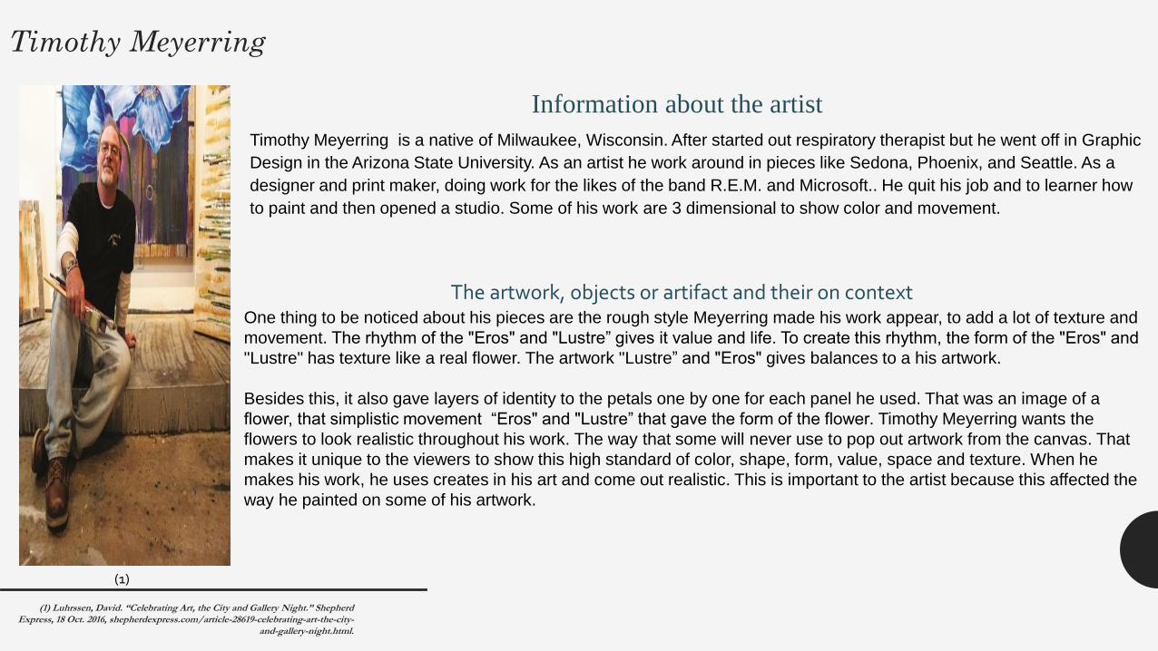
Timothy Meyerring
Timothy Meyerring is a native of Milwaukee, Wisconsin. After started out respiratory therapist but he went off in Graphic
Design in the Arizona State University. As an artist he work around in pieces like Sedona, Phoenix, and Seattle. As a
designer and print maker, doing work for the likes of the band R.E.M. and Microsoft.. He quit his job and to learner how
to paint and then opened a studio. Some of his work are 3 dimensional to show color and movement.
(1)
Information about the artist
One thing to be noticed about his pieces are the rough style Meyerring made his work appear, to add a lot of texture and
movement. The rhythm of the "Eros" and "Lustre” gives it value and life. To create this rhythm, the form of the "Eros" and
"Lustre" has texture like a real flower. The artwork "Lustre” and "Eros" gives balances to a his artwork.
Besides this, it also gave layers of identity to the petals one by one for each panel he used. That was an image of a
flower, that simplistic movement “Eros" and "Lustre” that gave the form of the flower. Timothy Meyerring wants the
flowers to look realistic throughout his work. The way that some will never use to pop out artwork from the canvas. That
makes it unique to the viewers to show this high standard of color, shape, form, value, space and texture. When he
makes his work, he uses creates in his art and come out realistic. This is important to the artist because this affected the
way he painted on some of his artwork.
The artwork, objects or artifact and their on context
(1) Luhrssen, David. “Celebrating Art, the City and Gallery Night.” Shepherd Express, 18 Oct. 2016, shepherdexpress.com/article-28619-celebrating-art-the-city-
and-gallery-night.html.
(2)
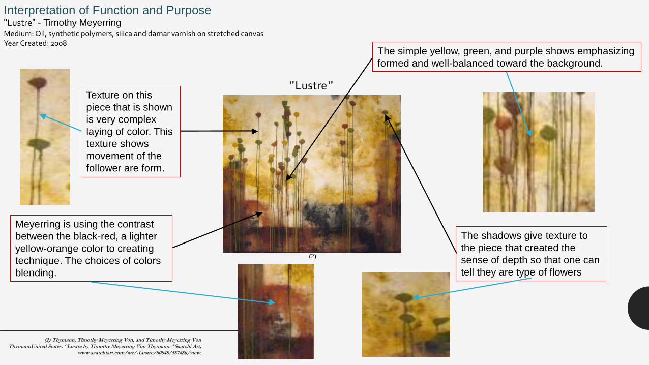
Interpretation of Function and Purpose"Lustre” - Timothy Meyerring Medium: Oil, synthetic polymers, silica and damar varnish on stretched canvasYear Created: 2008
"Lustre"
The simple yellow, green, and purple shows emphasizing
formed and well-balanced toward the background.
The shadows give texture to
the piece that created the
sense of depth so that one can
tell they are type of flowers
Meyerring is using the contrast
between the black-red, a lighter
yellow-orange color to creating
technique. The choices of colors
blending.
Texture on this
piece that is shown
is very complex
laying of color. This
texture shows
movement of the
follower are form.
(2) Thymann, Timothy Meyerring Von, and Timothy Meyerring Von ThymannUnited States. “Lustre by Timothy Meyerring Von Thymann.” Saatchi Art,
www.saatchiart.com/art/-Lustre/80848/587480/view.
(3)
Eros
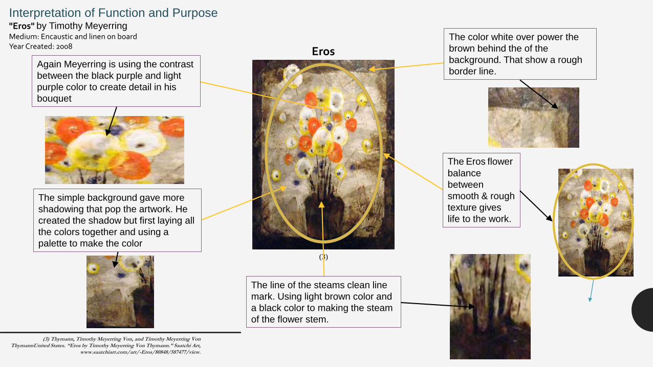
Interpretation of Function and Purpose"Eros" by Timothy Meyerring Medium: Encaustic and linen on boardYear Created: 2008
Again Meyerring is using the contrast
between the black purple and light
purple color to create detail in his
bouquet
The simple background gave more
shadowing that pop the artwork. He
created the shadow but first laying all
the colors together and using a
palette to make the color
The color white over power the
brown behind the of the
background. That show a rough
border line.
The Eros flower
balance
between
smooth & rough
texture gives
life to the work.
The line of the steams clean line
mark. Using light brown color and
a black color to making the steam
of the flower stem.
(3) Thymann, Timothy Meyerring Von, and Timothy Meyerring Von ThymannUnited States. “Eros by Timothy Meyerring Von Thymann.” Saatchi Art,
www.saatchiart.com/art/-Eros/80848/587477/view.
Analysis of formal Qualities
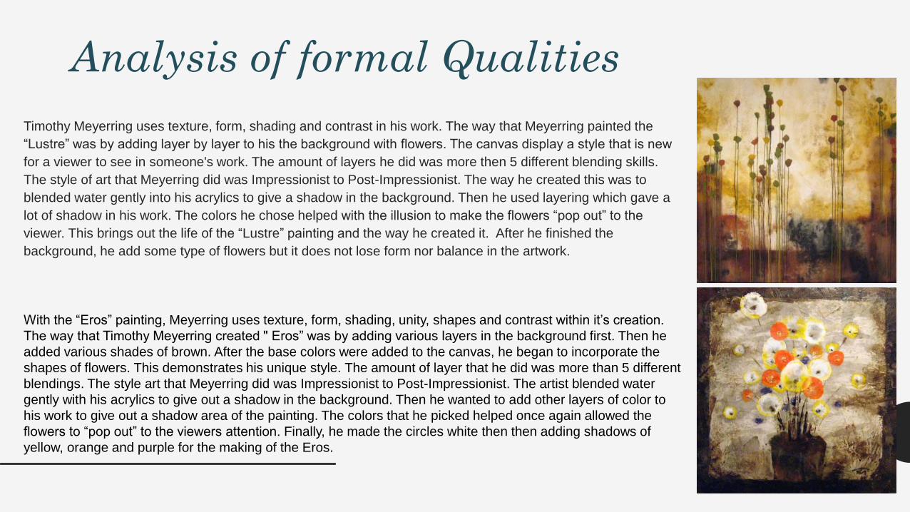
Timothy Meyerring uses texture, form, shading and contrast in his work. The way that Meyerring painted the
“Lustre” was by adding layer by layer to his the background with flowers. The canvas display a style that is new
for a viewer to see in someone's work. The amount of layers he did was more then 5 different blending skills.
The style of art that Meyerring did was Impressionist to Post-Impressionist. The way he created this was to
blended water gently into his acrylics to give a shadow in the background. Then he used layering which gave a
lot of shadow in his work. The colors he chose helped with the illusion to make the flowers “pop out” to the
viewer. This brings out the life of the “Lustre” painting and the way he created it. After he finished the
background, he add some type of flowers but it does not lose form nor balance in the artwork.
With the “Eros” painting, Meyerring uses texture, form, shading, unity, shapes and contrast within it’s creation.
The way that Timothy Meyerring created " Eros” was by adding various layers in the background first. Then he
added various shades of brown. After the base colors were added to the canvas, he began to incorporate the
shapes of flowers. This demonstrates his unique style. The amount of layer that he did was more than 5 different
blendings. The style art that Meyerring did was Impressionist to Post-Impressionist. The artist blended water
gently with his acrylics to give out a shadow in the background. Then he wanted to add other layers of color to
his work to give out a shadow area of the painting. The colors that he picked helped once again allowed the
flowers to “pop out” to the viewers attention. Finally, he made the circles white then then adding shadows of
yellow, orange and purple for the making of the Eros.
Vincent Van Gogh
(4)
Information about the artist
The artwork, objects or artifact and their on context
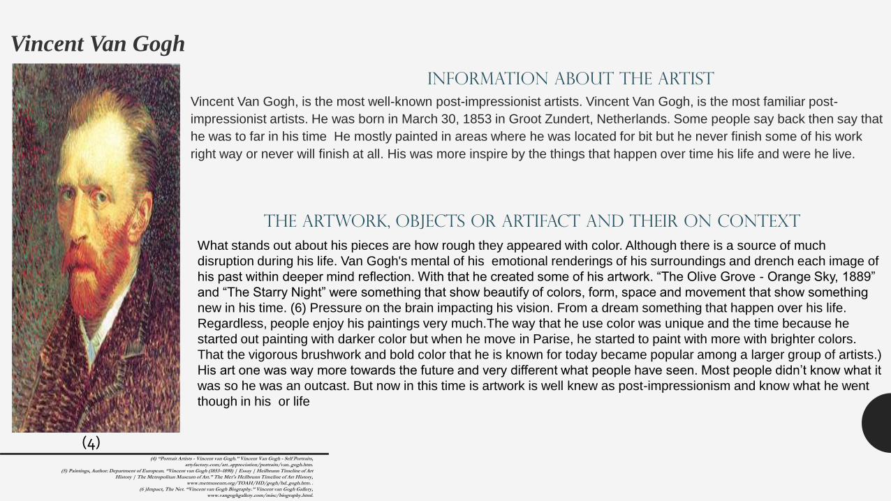
Vincent Van Gogh, is the most well-known post-impressionist artists. Vincent Van Gogh, is the most familiar post-
impressionist artists. He was born in March 30, 1853 in Groot Zundert, Netherlands. Some people say back then say that
he was to far in his time He mostly painted in areas where he was located for bit but he never finish some of his work
right way or never will finish at all. His was more inspire by the things that happen over time his life and were he live.
What stands out about his pieces are how rough they appeared with color. Although there is a source of much
disruption during his life. Van Gogh's mental of his emotional renderings of his surroundings and drench each image of
his past within deeper mind reflection. With that he created some of his artwork. “The Olive Grove - Orange Sky, 1889”
and “The Starry Night” were something that show beautify of colors, form, space and movement that show something
new in his time. (6) Pressure on the brain impacting his vision. From a dream something that happen over his life.
Regardless, people enjoy his paintings very much.The way that he use color was unique and the time because he
started out painting with darker color but when he move in Parise, he started to paint with more with brighter colors.
That the vigorous brushwork and bold color that he is known for today became popular among a larger group of artists.)
His art one was way more towards the future and very different what people have seen. Most people didn’t know what it
was so he was an outcast. But now in this time is artwork is well knew as post-impressionism and know what he went
though in his or life
(4) “Portrait Artists - Vincent van Gogh.” Vincent Van Gogh - Self Portraits, artyfactory.com/art_appreciation/portraits/van_gogh.htm.
(5) Paintings, Author: Department of European. “Vincent van Gogh (1853–1890) | Essay | Heilbrunn Timeline of Art History | The Metropolitan Museum of Art.” The Met's Heilbrunn Timeline of Art History,
www.metmuseum.org/TOAH/HD/gogh/hd_gogh.htm. . (6 )Impact, The Net. “Vincent van Gogh Biography.” Vincent van Gogh Gallery,
www.vangoghgallery.com/misc/biography.html.
Impressionism

(7)
The Olive land has
movement and contrast to
the other plants. This give
out a hot warm hue (Color)
surrounding the plants.
Interpretation of Function and Purpose
“Olive Grove - Orange Sky “– Vincent van GoghDate: 1889; Saint-rémy-de-provence, France *Style: Post-Impressionism
Genre: landscape
Media: oil, canvas
Dimensions: 74 x 93 cm
The tree sits foreground of the sun
raising. This gives out the balances
of texture and movement of the
plants to the sky.
The roots show warm
feeling of the hot dry
texture.
The light sky has yellow, white,
purple and a bit of light blue in his
field of oranges. This gave the
piece texture, balances and hue
(color) to warm feeling in his work.
The layer of color yellow, blue to purple
color that showing line into the sky
Texture smooth that falls down to the
plants because to give out the hot warm
of the plants
Movement show that sky is raining down to
the suffuse because to show that sky is
moving down as the sunlight hits the plants.(7) Gogh, Vincent Van. "Olive Grove - Orange (6)Sky, 1889 - Vincent van Gogh."
Www.wikiart.org. January 01, 1889. Accessed February 03, 2017. https://www.wikiart.org/en/vincent-van-gogh/olive-grove-orange-sky-1889
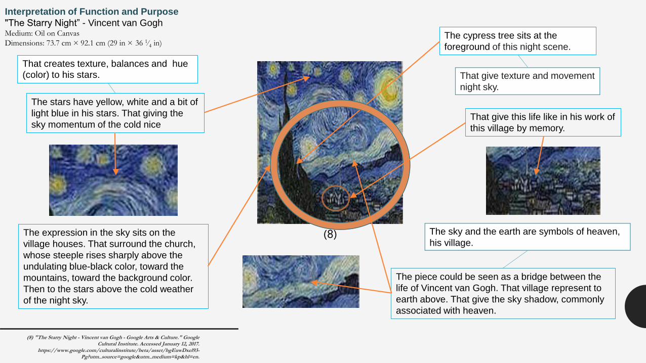
The expression in the sky sits on the
village houses. That surround the church,
whose steeple rises sharply above the
undulating blue-black color, toward the
mountains, toward the background color.
Then to the stars above the cold weather
of the night sky.
(8)
The cypress tree sits at the
foreground of this night scene.
The piece could be seen as a bridge between the
life of Vincent van Gogh. That village represent to
earth above. That give the sky shadow, commonly
associated with heaven.
That give this life like in his work of
this village by memory.
The stars have yellow, white and a bit of
light blue in his stars. That giving the
sky momentum of the cold nice
Interpretation of Function and Purpose
"The Starry Night” - Vincent van GoghMedium: Oil on Canvas
Dimensions: 73.7 cm × 92.1 cm (29 in × 36 1⁄4 in)
That give texture and movement
night sky.
The sky and the earth are symbols of heaven,
his village.
(8) "The Starry Night - Vincent van Gogh - Google Arts & Culture." Google Cultural Institute. Accessed January 12, 2017.
https://www.google.com/culturalinstitute/beta/asset/bgEuwDxel93-Pg?utm_source=google&utm_medium=kp&hl=en.
That creates texture, balances and hue (color) to his stars.
Analysis of formal Qualities
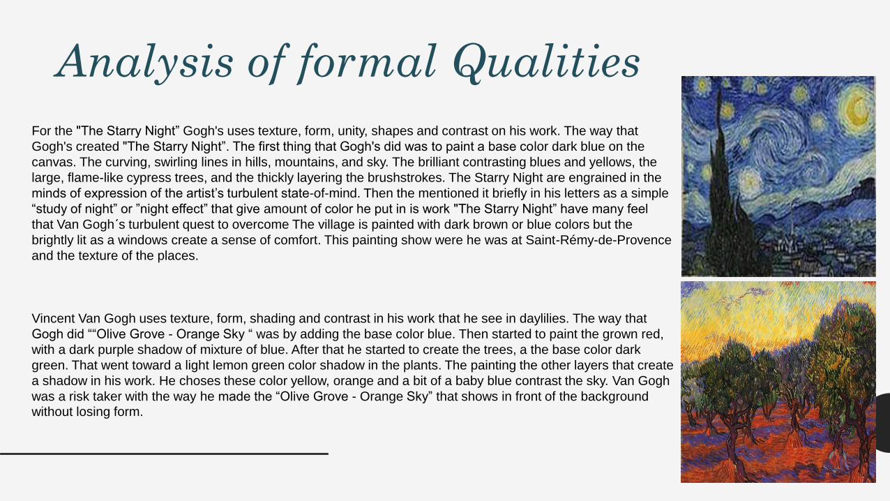
Vincent Van Gogh uses texture, form, shading and contrast in his work that he see in daylilies. The way that
Gogh did ““Olive Grove - Orange Sky “ was by adding the base color blue. Then started to paint the grown red,
with a dark purple shadow of mixture of blue. After that he started to create the trees, a the base color dark
green. That went toward a light lemon green color shadow in the plants. The painting the other layers that create
a shadow in his work. He choses these color yellow, orange and a bit of a baby blue contrast the sky. Van Gogh
was a risk taker with the way he made the “Olive Grove - Orange Sky” that shows in front of the background without losing form.
For the "The Starry Night” Gogh's uses texture, form, unity, shapes and contrast on his work. The way that
Gogh's created "The Starry Night”. The first thing that Gogh's did was to paint a base color dark blue on the
canvas. The curving, swirling lines in hills, mountains, and sky. The brilliant contrasting blues and yellows, the
large, flame-like cypress trees, and the thickly layering the brushstrokes. The Starry Night are engrained in the
minds of expression of the artist’s turbulent state-of-mind. Then the mentioned it briefly in his letters as a simple
“study of night” or ”night effect” that give amount of color he put in is work "The Starry Night” have many feel
that Van Gogh´s turbulent quest to overcome The village is painted with dark brown or blue colors but the
brightly lit as a windows create a sense of comfort. This painting show were he was at Saint-Rémy-de-Provence
and the texture of the places.

Comparing Artistic stylesTimothy Meyerring Vincent Van Gogh
Similarities 1. Appeared the hue.
2. The source of much upset during his life.
3. Cold hue (color)
4. Unique style at his time.
5. The vigorous brushwork andbold hue.
6. Post-Impressionism.
5. Milwaukee County Historical
1. Present a lot of the texture and movement
2. Rhythm
3. Warm hue (color)
4. High stander of hue (colors),shape, value, & texture.
Society
1. Layering hue (color)2. Movement
3. Space 4. From
5. Landscapes
6. This choice of color and technique is great because it show
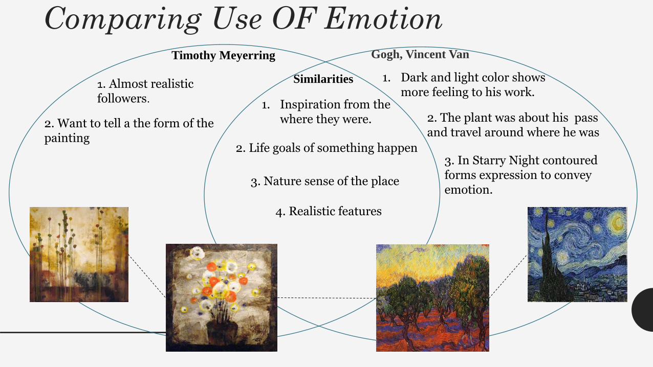
Comparing Use OF Emotion Timothy Meyerring Gogh, Vincent Van
Similarities 1. Dark and light color shows more feeling to his work.
1. Almost realistic followers.
1. Inspiration from the where they were.
2. Life goals of something happen
3. Nature sense of the place
2. The plant was about his pass and travel around where he was
3. In Starry Night contoured forms expression to convey emotion.
2. Want to tell a the form of thepainting
4. Realistic features
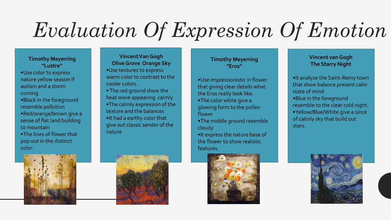
Evaluation Of Expression Of EmotionTimothy Meyerring
"Lustre”•Use color to express nature yellow season if autism and a storm coming•Black in the foreground resemble pollution•Red/orange/brown give a sense of flat land building to mountain •The lines of flower thatpop out in the distinctcolor.
Vincent Van GoghOlive Grove Orange Sky
•Use textures to express warm color to contrast to the cooler colors.• The red ground show the heat wave appearing calmly•The calmly expression of the texture and the balances•It had a earthy color that give out classic sender of the nature
Timothy Meyerring"Eros"
•Use impressionistic in flower that giving clear details what the Eros really look like.•The color white give a glowing form to the pollen flower•The middle ground resemble cloudy•It express the nature base of the flower to show realistic features.
Vincent van GoghThe Starry Night
•It analyze the Saint-Remy town that show balance present calm state of mind•Blue in the foreground resemble to the clear cold night.•Yellow/Blue/White give a sinceof calmly sky that build out stars.
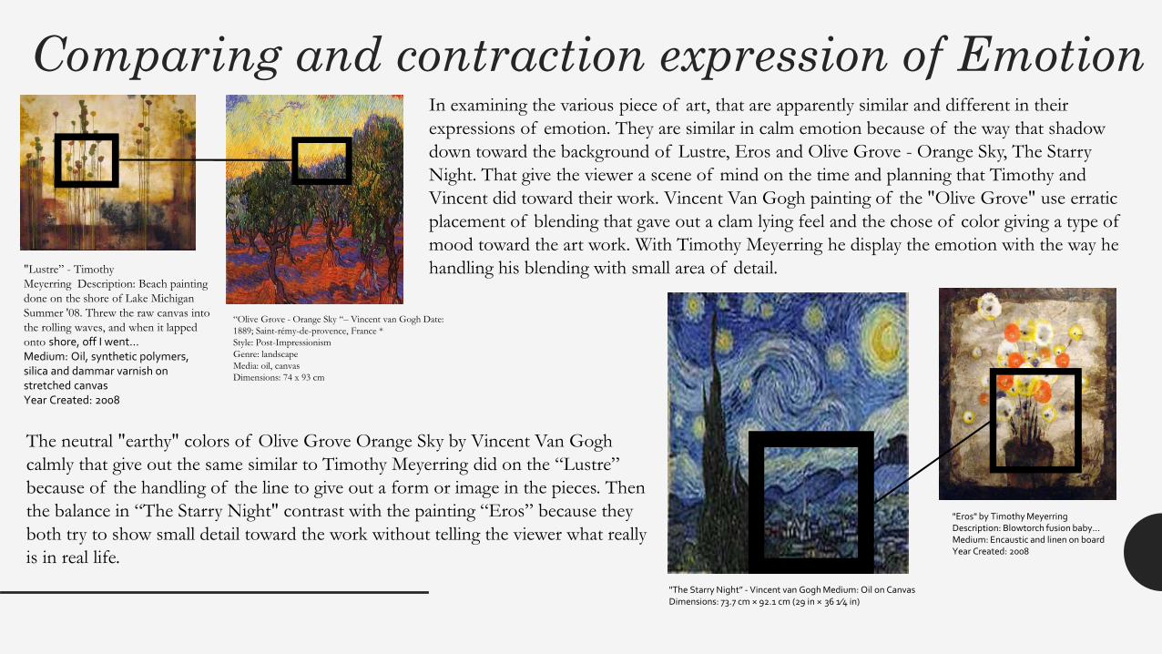
Comparing and contraction expression of EmotionIn examining the various piece of art, that are apparently similar and different in their
expressions of emotion. They are similar in calm emotion because of the way that shadow
down toward the background of Lustre, Eros and Olive Grove - Orange Sky, The Starry
Night. That give the viewer a scene of mind on the time and planning that Timothy and
Vincent did toward their work. Vincent Van Gogh painting of the "Olive Grove" use erratic
placement of blending that gave out a clam lying feel and the chose of color giving a type of
mood toward the art work. With Timothy Meyerring he display the emotion with the way he
handling his blending with small area of detail.
The neutral "earthy" colors of Olive Grove Orange Sky by Vincent Van Gogh
calmly that give out the same similar to Timothy Meyerring did on the “Lustre”
because of the handling of the line to give out a form or image in the pieces. Then
the balance in “The Starry Night" contrast with the painting “Eros” because they
both try to show small detail toward the work without telling the viewer what really
is in real life.
"Lustre” - Timothy
Meyerring Description: Beach painting
done on the shore of Lake Michigan
Summer '08. Threw the raw canvas into
the rolling waves, and when it lapped
onto shore, off I went...Medium: Oil, synthetic polymers, silica and dammar varnish on stretched canvasYear Created: 2008
"Eros" by Timothy Meyerring Description: Blowtorch fusion baby...Medium: Encaustic and linen on boardYear Created: 2008
“Olive Grove - Orange Sky “– Vincent van Gogh Date:
1889; Saint-rémy-de-provence, France *
Style: Post-Impressionism
Genre: landscape
Media: oil, canvas
Dimensions: 74 x 93 cm
"The Starry Night” - Vincent van Gogh Medium: Oil on Canvas Dimensions: 73.7 cm × 92.1 cm (29 in × 36 1⁄4 in)
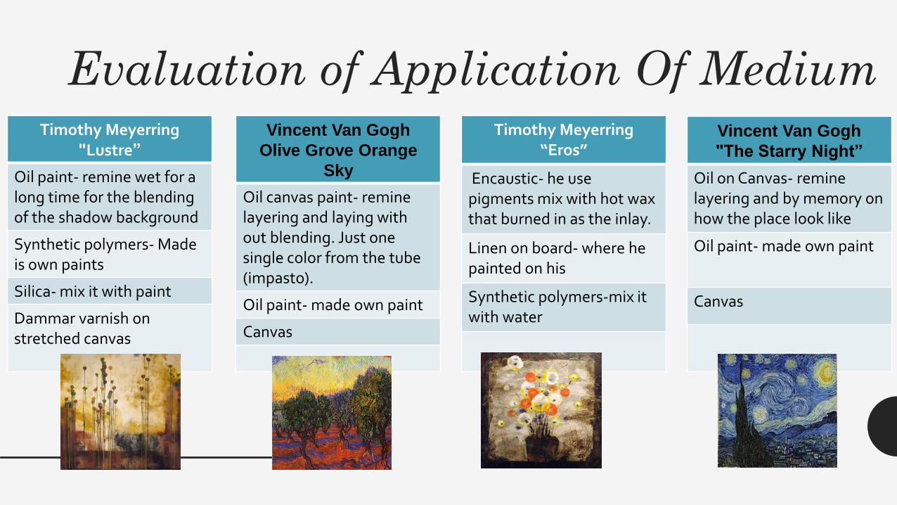
Evaluation of Application Of MediumTimothy Meyerring
"Lustre”
Oil paint- remine wet for a long time for the blending of the shadow background
Synthetic polymers- Made is own paints
Silica- mix it with paint
Dammar varnish on stretched canvas
Vincent Van Gogh
Olive Grove Orange
Sky
Oil canvas paint- remine layering and laying with out blending. Just one single color from the tube (impasto).
Oil paint- made own paint
Canvas
Timothy Meyerring“Eros”
Encaustic- he use pigments mix with hot wax that burned in as the inlay.
Linen on board- where he painted on his
Synthetic polymers-mix it with water
Vincent Van Gogh
"The Starry Night”
Oil on Canvas- remine layering and by memory on how the place look like
Oil paint- made own paint
Canvas

Comparing and Contrasting ApplicationThe comparing of all four of the painting shows element of line because of the way that line is use of various marks to make the surrounding object to appear. That space of the area for the placement of the around objects that show the small detail of texture. Then the color of pieces show that they use darker color to make the form of the base. That give out the movement of where it is going. The most compare thing that is seen is all these work is that there are difference of shape in there work that make one thing to other.
The contrasting of Vincent Van Gogh toward Timothy Meyerring is that Vincent painted his work memory and with Timothy is by planning the work out. All four painting do use a bit of dark color to make the object of there work appear but Vincent was more about the feeling of cool colors and warm color then Timothy just planted what felt right in his artwork.
"Lustre” - Timothy
Meyerring Description: Beach
painting done on the shore of Lake
Michigan Summer '08. Threw the raw
canvas into the rolling waves, and
when it lapped onto shore, off I went...Medium: Oil, synthetic polymers, silica and damar varnish on stretched canvasYear Created: 2008
“Olive Grove - Orange Sky “– Vincent van Gogh Date: 1889; Saint-
rémy-de-provence, France *
Style: Post-Impressionism
Genre: landscape
Media: oil, canvas
Dimensions: 74 x 93 cm
"The Starry Night” - Vincent van Gogh Medium: Oil on Canvas Dimensions: 73.7 cm × 92.1 cm (29 in × 36 1⁄4 in)
"Eros" by Timothy Meyerring Description: Blowtorch fusion baby...Medium: Encaustic and linen on boardYear Created: 2008
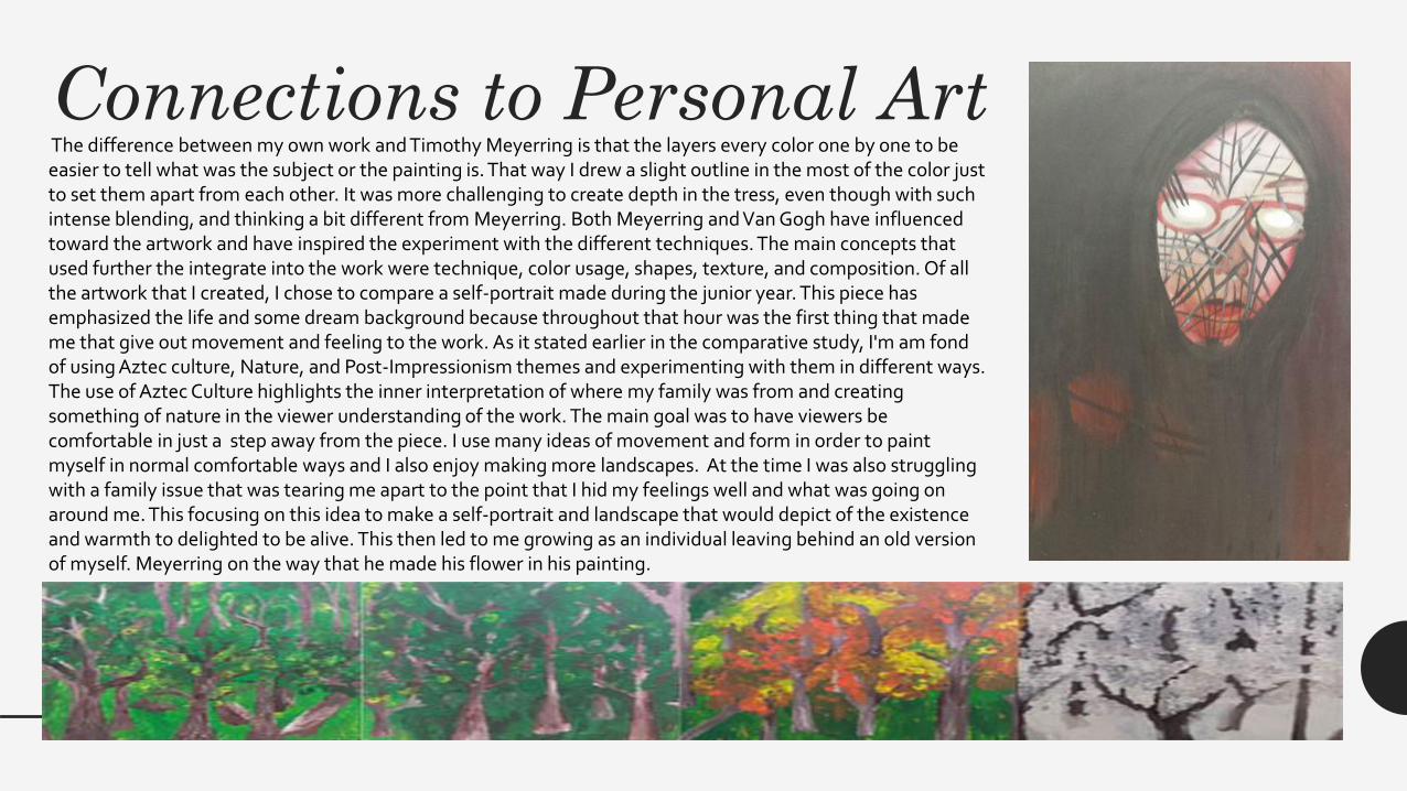
Connections to Personal ArtThe difference between my own work and Timothy Meyerring is that the layers every color one by one to be easier to tell what was the subject or the painting is. That way I drew a slight outline in the most of the color just to set them apart from each other. It was more challenging to create depth in the tress, even though with such intense blending, and thinking a bit different from Meyerring. Both Meyerring and Van Gogh have influenced toward the artwork and have inspired the experiment with the different techniques. The main concepts that used further the integrate into the work were technique, color usage, shapes, texture, and composition. Of all the artwork that I created, I chose to compare a self-portrait made during the junior year. This piece has emphasized the life and some dream background because throughout that hour was the first thing that made me that give out movement and feeling to the work. As it stated earlier in the comparative study, I'm am fond of using Aztec culture, Nature, and Post-Impressionism themes and experimenting with them in different ways. The use of Aztec Culture highlights the inner interpretation of where my family was from and creating something of nature in the viewer understanding of the work. The main goal was to have viewers be comfortable in just a step away from the piece. I use many ideas of movement and form in order to paint myself in normal comfortable ways and I also enjoy making more landscapes. At the time I was also struggling with a family issue that was tearing me apart to the point that I hid my feelings well and what was going on around me. This focusing on this idea to make a self-portrait and landscape that would depict of the existence and warmth to delighted to be alive. This then led to me growing as an individual leaving behind an old version of myself. Meyerring on the way that he made his flower in his painting.
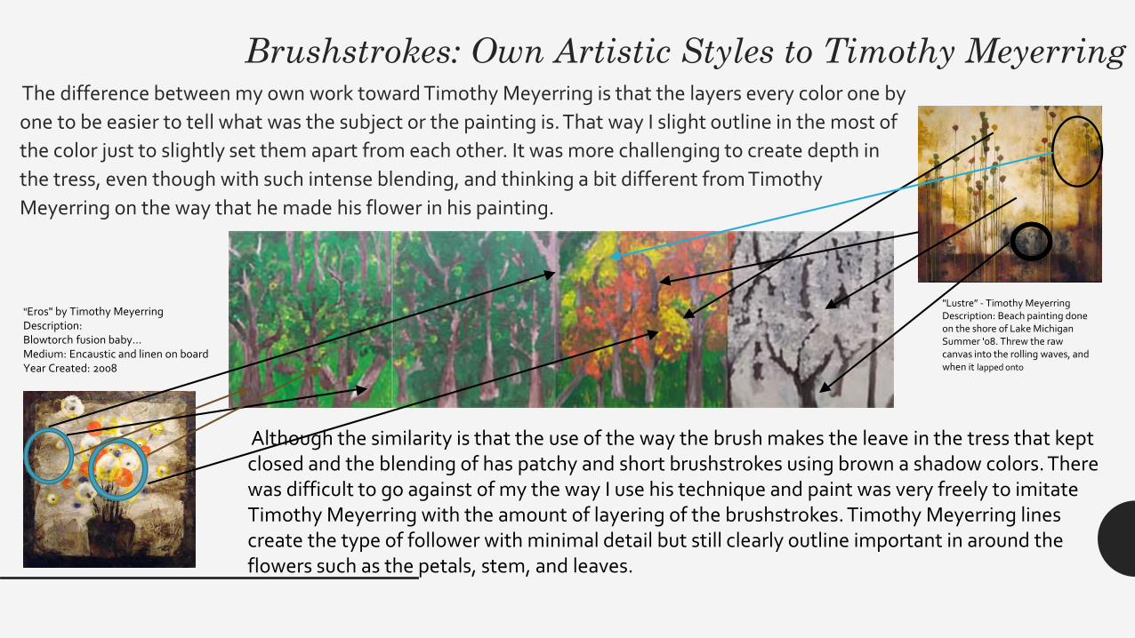
Brushstrokes: Own Artistic Styles to Timothy Meyerring The difference between my own work toward Timothy Meyerring is that the layers every color one by
one to be easier to tell what was the subject or the painting is. That way I slight outline in the most of
the color just to slightly set them apart from each other. It was more challenging to create depth in
the tress, even though with such intense blending, and thinking a bit different from Timothy
Meyerring on the way that he made his flower in his painting.
Although the similarity is that the use of the way the brush makes the leave in the tress that kept closed and the blending of has patchy and short brushstrokes using brown a shadow colors. There was difficult to go against of my the way I use his technique and paint was very freely to imitate Timothy Meyerring with the amount of layering of the brushstrokes. Timothy Meyerring lines create the type of follower with minimal detail but still clearly outline important in around the flowers such as the petals, stem, and leaves.
"Eros" by Timothy Meyerring Description:Blowtorch fusion baby...Medium: Encaustic and linen on boardYear Created: 2008
"Lustre” - Timothy Meyerring Description: Beach painting done on the shore of Lake Michigan Summer '08. Threw the raw canvas into the rolling waves, and when it lapped onto
Brushstrokes Own Artistic Styles to Vincent Van Gogh
"The Starry Night” - Vincent van Gogh Medium: Oil on Canvas Dimensions: 73.7 cm × 92.1 cm (29 in × 36 1⁄4 in)
“Olive Grove - Orange Sky “– Vincent van Gogh Date: 1889; Saint-rémy-de-provence, France *Style: Post-Impressionism Genre: landscapeMedia: oil, canvas Dimensions: 74 x 93 cm
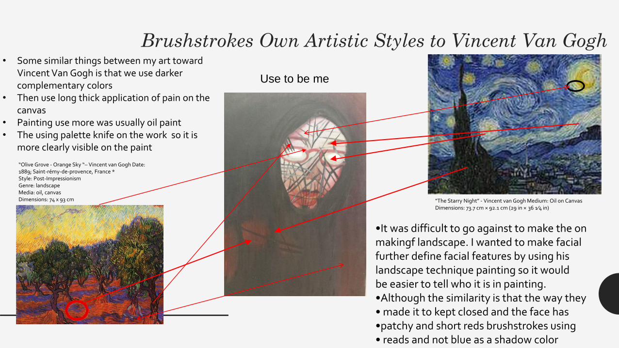
Use to be me
•It was difficult to go against to make the onmakingf landscape. I wanted to make facialfurther define facial features by using hislandscape technique painting so it wouldbe easier to tell who it is in painting.•Although the similarity is that the way they• made it to kept closed and the face has•patchy and short reds brushstrokes using• reads and not blue as a shadow color
• Some similar things between my art toward Vincent Van Gogh is that we use darker complementary colors
• Then use long thick application of pain on the canvas
• Painting use more was usually oil paint• The using palette knife on the work so it is
more clearly visible on the paint
Color: Personal vs Timothy Meyerring vs Vincent Van Gogh
"Lustre” - Timothy Meyerring "Eros" by Timothy Meyerring “Olive Grove - Orange Sky “– Vincent van Gogh"The Starry Night” - Vincent van Gogh
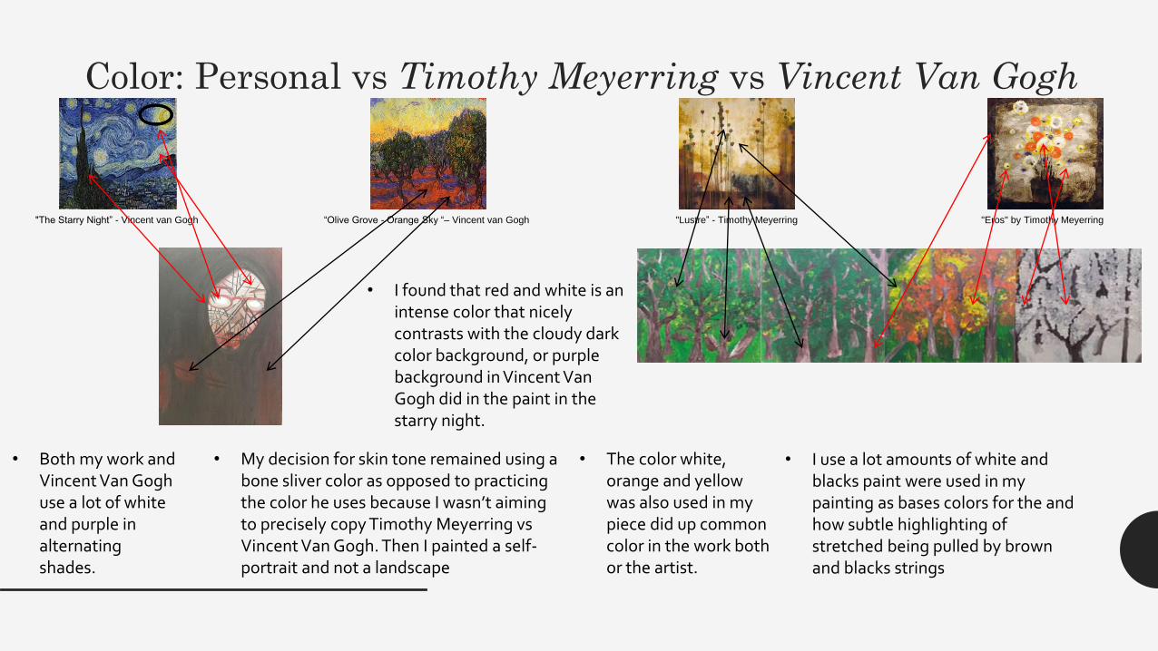
• I use a lot amounts of white and blacks paint were used in my painting as bases colors for the and how subtle highlighting of stretched being pulled by brown and blacks strings
• Both my work and Vincent Van Gogh use a lot of white and purple in alternating shades.
• I found that red and white is an intense color that nicely contrasts with the cloudy dark color background, or purple background in Vincent Van Gogh did in the paint in the starry night.
• My decision for skin tone remained using a bone sliver color as opposed to practicing the color he uses because I wasn’t aiming to precisely copy Timothy Meyerring vs Vincent Van Gogh. Then I painted a self-portrait and not a landscape
• The color white, orange and yellow was also used in my piece did up common color in the work both or the artist.
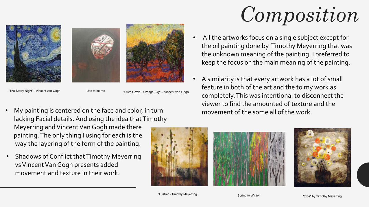
Composition
"Lustre” - Timothy Meyerring "Eros" by Timothy Meyerring
“Olive Grove - Orange Sky “– Vincent van Gogh"The Starry Night” - Vincent van Gogh Use to be me
Spring to Winter
• All the artworks focus on a single subject except for the oil painting done by Timothy Meyerring that was the unknown meaning of the painting. I preferred to keep the focus on the main meaning of the painting.
• A similarity is that every artwork has a lot of small feature in both of the art and the to my work as completely. This was intentional to disconnect the viewer to find the amounted of texture and the movement of the some all of the work.• My painting is centered on the face and color, in turn
lacking Facial details. And using the idea that Timothy Meyerring and Vincent Van Gogh made there painting. The only thing I using for each is theway the layering of the form of the painting.
• Shadows of Conflict that Timothy Meyerring vs Vincent Van Gogh presents added movement and texture in their work.