compositional techniques
TRANSCRIPT
Focal PointsRule of Thirds
The Golden Ratio and the Golden Spiral
Rule of OddsRule of SpaceSimplificationLimiting Focus
Geometry and SymmetryOther Techniques


The focal point is the center of a piece of art. By center I don’t literally the mean center spatially but rather the most important part or parts of a piece. For example, if one were making an image of a bird sitting on a tree, the bird would probably be the focal point.
Why is the focal point important? Without a focal point, a spectator will lose interest quickly because he or she does not know where to look and what part is the most interesting.
Focal points are very important in order to make one’s art powerful and interesting and to keep the viewer intrigued longer.
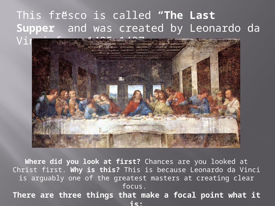
This fresco is called “The Last Supper” and was created by Leonardo da Vinci from 1495-1497.
Where did you look at first? Chances are you looked at Christ first. Why is this? This is because Leonardo da Vinci is arguably one of the greatest masters
at creating clear focus. There are three things that make a focal point what it is:
Color, Contrast, and Structure.
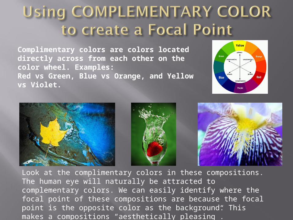
Complimentary colors are colors located directly across from each other on the color wheel. Examples: Red vs Green, Blue vs Orange, and Yellow vs Violet.
Look at the complimentary colors in these compositions.The human eye will naturally be attracted to complementary colors. We can easily identify where the focal point of these compositions are because the focal point is the opposite color as the background. This makes a compositions “aesthetically pleasing”.

Contrast is one of the biggest draws of the human eye. By using it properly, it is the most effective way to create a focal point.
Look at the contrasted parts of these black and white compositions
Brighter colors will draw the human’s eye faster than darker colors. However, there are exceptions where everything is bright and the only dark spot is the focal point but the latter is more uncommon.Be careful not to use too much contrast in your image or else the rest of the image will receive no attention. Also, you do not always have to make the focal point bright but as Leonardo did, you can make the area around the focal point bright.
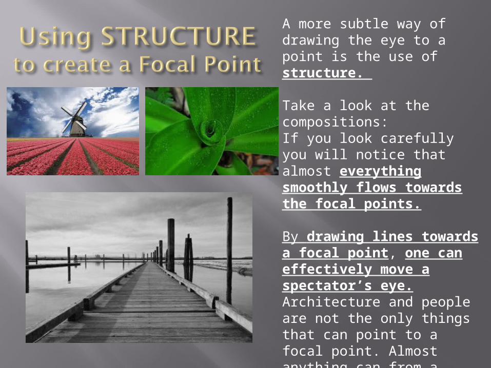
A more subtle way of drawing the eye to a point is the use of structure.
Take a look at the compositions:If you look carefully you will notice that almost everything smoothly flows towards the focal points.
By drawing lines towards a focal point, one can effectively move a spectator’s eye. Architecture and people are not the only things that can point to a focal point. Almost anything can from a river in the background to a abstract 3d spike ball going out from the focal point.
1.What are the three ways to create a Focal Point within a composition?
2.What is one example of complementary colors?
3.Do brighter colors or darker colors attract the human eye more to a specific area of a composition?
4.Give one example of how you would draw a viewer’s attention to the focal point using structure.
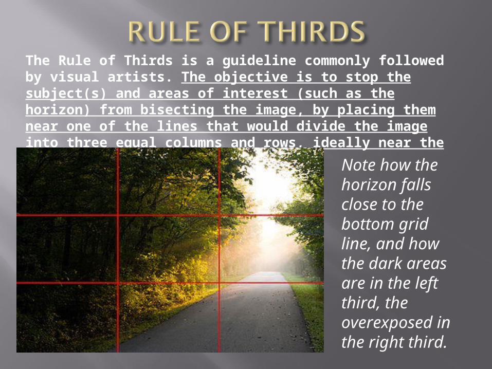
The Rule of Thirds is a guideline commonly followed by visual artists. The objective is to stop the subject(s) and areas of interest (such as the horizon) from bisecting the image, by placing them near one of the lines that would divide the image into three equal columns and rows, ideally near the intersection of those lines.
Note how the horizon falls close to the bottom grid line, and how the dark areas are in the left third, the overexposed in the right third.
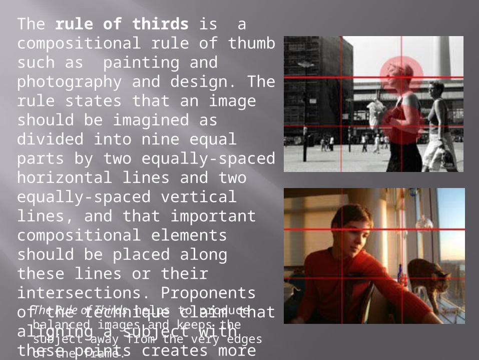
The rule of thirds is a compositional rule of thumb such as painting and photography and design. The rule states that an image should be imagined as divided into nine equal parts by two equally-spaced horizontal lines and two equally-spaced vertical lines, and that important compositional elements should be placed along these lines or their intersections. Proponents of the technique claim that aligning a subject with these points creates more tension, energy and interest in the composition than simply centering the subject would.
The Rule of Thirds helps to produce balanced images and keeps the subject away from the very edges of the frame.
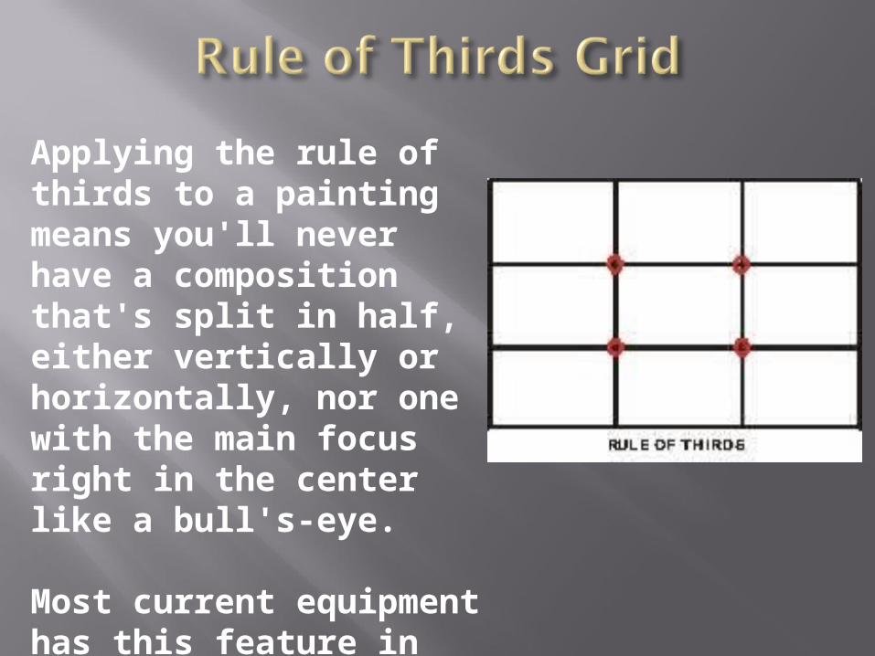
Applying the rule of thirds to a painting means you'll never have a composition that's split in half, either vertically or horizontally, nor one with the main focus right in the center like a bull's-eye.
Most current equipment has this feature in order to enhance the quality of your compositions.
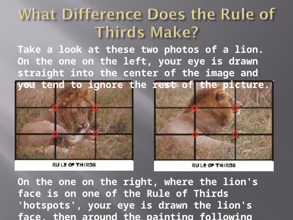
Take a look at these two photos of a lion. On the one on the left, your eye is drawn straight into the center of the image and you tend to ignore the rest of the picture.
On the one on the right, where the lion's face is on one of the Rule of Thirds 'hotspots', your eye is drawn the lion's face, then around the painting following the curve of the body.
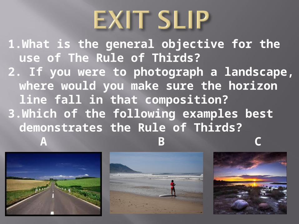
1.What is the general objective for the use of The Rule of Thirds?
2. If you were to photograph a landscape, where would you make sure the horizon line fall in that composition?
3.Which of the following examples best demonstrates the Rule of Thirds? A B C
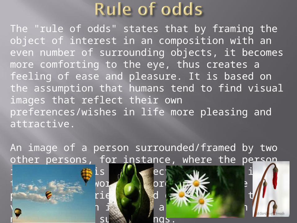
The "rule of odds" states that by framing the object of interest in an composition with an even number of surrounding objects, it becomes more comforting to the eye, thus creates a feeling of ease and pleasure. It is based on the assumption that humans tend to find visual images that reflect their own preferences/wishes in life more pleasing and attractive.
An image of a person surrounded/framed by two other persons, for instance, where the person in the center is the object of interest in that image/artwork, is more likely to be perceived as friendly and comforting by the viewer, than an image of a single person with no significant surroundings.

The Rule of Space applies to artwork (photography, advertising, illustration) picturing object(s): - to which the artist wants to apply the illusion of movement, or - which is supposed to create a contextual bubble in the viewer's mind.
This can be achieved by e.g. leaving white space in the direction the eyes of a portrayed person are looking at. Another example would be when picturing a runner, adding whitespace in front of him rather than behind him to indicate movement.
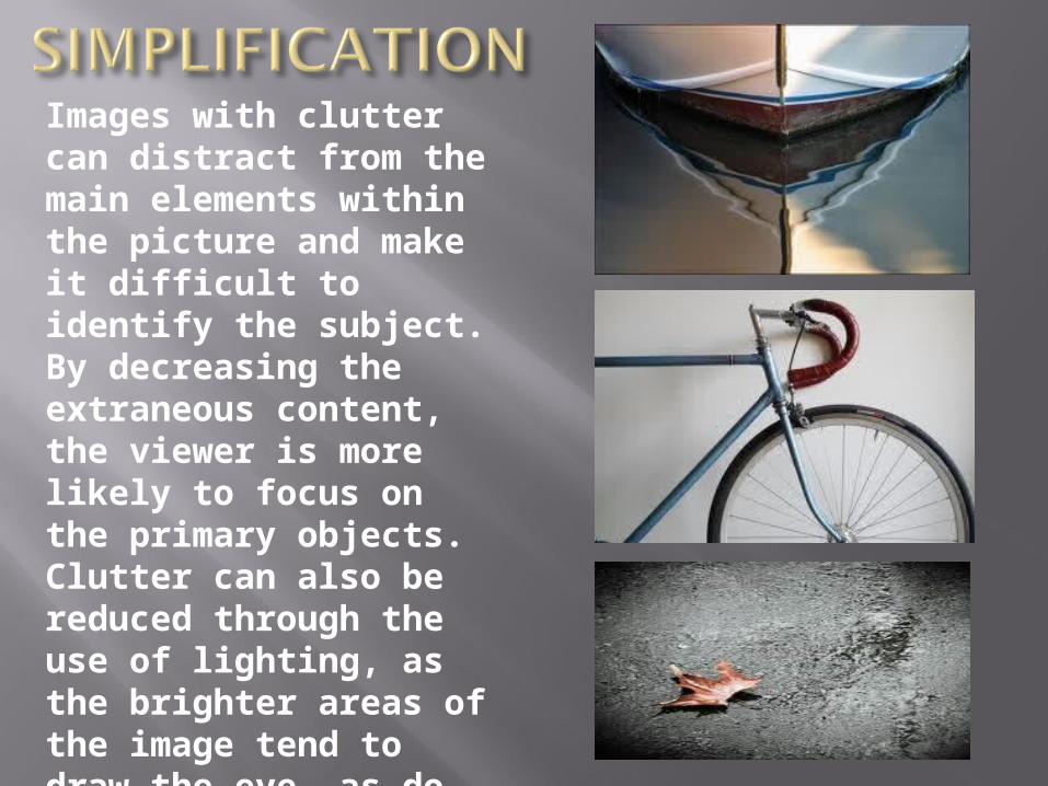
Images with clutter can distract from the main elements within the picture and make it difficult to identify the subject. By decreasing the extraneous content, the viewer is more likely to focus on the primary objects. Clutter can also be reduced through the use of lighting, as the brighter areas of the image tend to draw the eye, as do lines, squares and color. In painting, the artist may use less detailed and defined brushwork towards the edges of the picture.
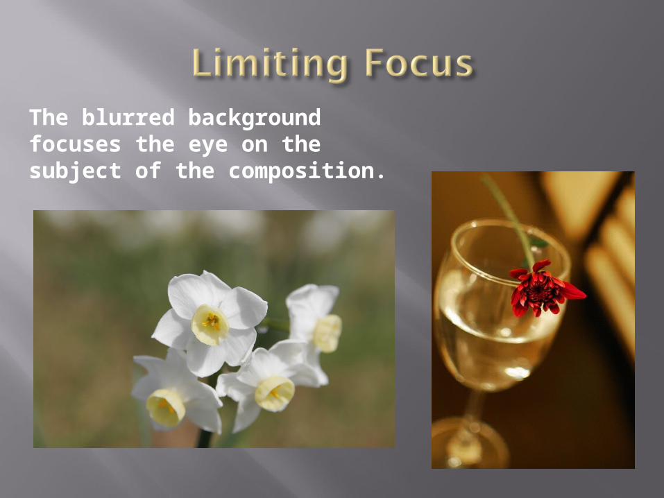
The blurred background focuses the eye on the subject of the composition.


There should be a center of interest or focus in the work, to prevent it becoming a pattern in itself;
The direction followed by the viewer's eye should lead the viewer's gaze around all elements in the work before leading out of the picture;
The subject should not be facing out of the image;
A moving subject should have space in front;
Exact bisections of the picture space should be avoided;
Small, high contrast, elements have as much impact as larger, duller elements;
The prominent subject should be off-centre, unless a symmetrical or formal composition is desired, and can be balanced by smaller satellite elements
the horizon line should not divide the art work in two equal parts but be positioned to emphasize either the sky or ground; showing more sky if painting is of clouds, sun rise/set, and more ground if a landscape