computer graphics and the perception of archaeological...
TRANSCRIPT
18
Computer graphics and the perception of archaeological information: Lies, damned statistics and... graphics!
Dick Spicer
Research Centre for Computer Archaeology, North Staffordshire Polytechnic
18.1 Introduction
What precisely do we mean when we utter the old cliché 'A Picture Is Worth A Thousand Words' in the context of the applications of computer graphics to archaeology? Why are we not filling archaeological reports with pictures? If we take the saying literally, then the exti^ expense of graphical printing would be weU justified. I am not being entirely facetious when I suggest that we ought to look at illustrations—particularly those generated by computer—and rate tiiem according to a notional APIWATW factor, naturally a very informative picture would approach an APIWATW value of 1000.
This is no trivial point, and I want to differentiate fiimly between what I call a diagram and what I shaU call a picture. A picture is a representation of sometiiing witii which we are familiar m our everyday perceptual experiences: a landscape, for example. I «include under tiie heading 'diagram' such tilings as histograms, pie-charts, maps, contours, site-plans and so on A good example might be an Ordnance Survey map, which is so familiar to us tiiat we forget that it uses a 'vocabulary' of conventional symbols to represent real objects Gike telephone boxes railway stations, and hillforts). In its two-dimensional space there are rules of 'grammar' (for example, certain information has priority over otiier when an overiap occurs).
A picture should, of course, have meaning. It should have context and possess structure A picture whose constituent parts do not make sense as a whole is, to stretch die analogy like an unstructured rambling paragraph of text. Style and narrative botii have graphical analogues- consistency of style helps tiie viewer in making comparisons and contrasts; the narrative value of a well-chosen sequence of pictures is acknowledged but often not practised because of tiie need for economy.
18.2 Wire diagrams
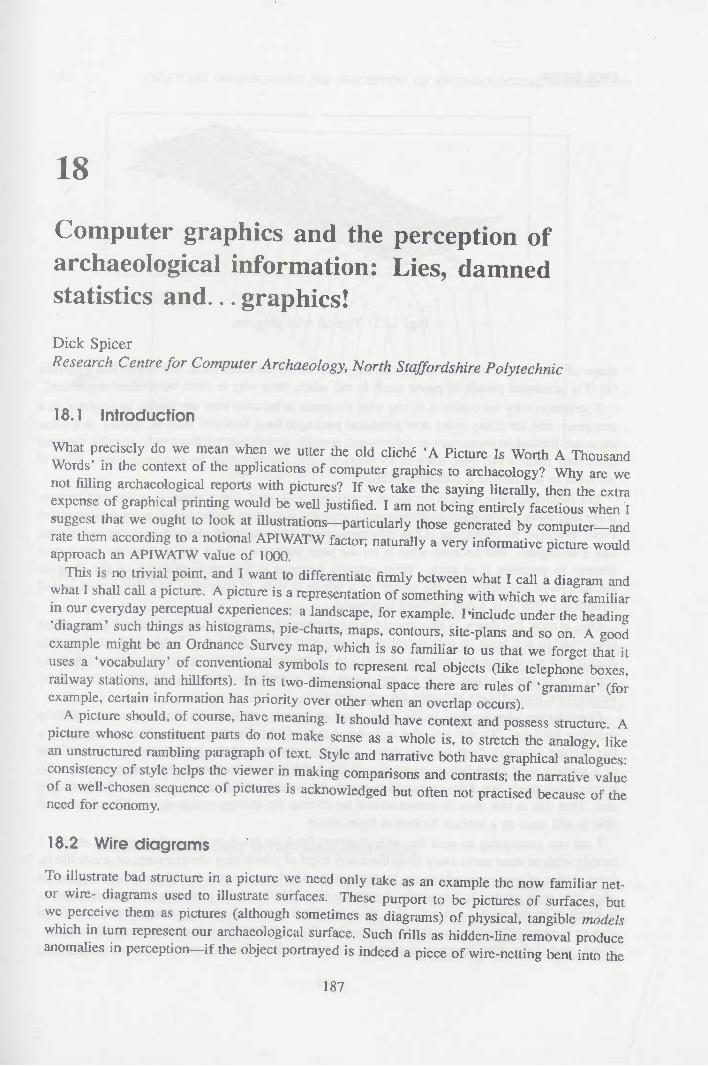
To illustrate bad structure in a picture we need only take as an example tiie now familiar net- or wire- diagrams used to iUustrate surfaces. These purport to be pictures of surfaces, but we perceive tiiem as pictures (altiiough sometimes as diagrams) of physical, tangible models which m turn represent our archaeological surface. Such frills as hidden-line removal produce anomalies in perception—if Üie object portrayed is indeed a piece of wire-netting bent into tiie
187
DICK SPICER
Fig. 18.1: Typical wire diagram
shape of our site, then we should see aU the wire. If, on the other hand, our object has a surface (as if it possessed panels of paper stuck to the wire), then why is there no shadow anywhere?
The reason why we continue to use wire diagrams is because they are simple to produce on a computer, and for many years now graphical packages have included such an option. But often these are limited in some way or other—one popular mainframe package only permits viewing from four comers (all base lines at 45 degrees), and delivers only an isometric view. What if we want to see around a particular feature?
The isometric view is, in my opinion, a perceptual disaster. Once again, it is adopted because it is easy: there is one fewer mathematical transformation to be performed than for a perspective view. Because, by definition, it has no perspective, it is an unreal picture: it is just a diagram, like a histogram. But because what is on the page purports to be a realistic picture our senses attempt to perceive it as such. What actually happens is that small portions of the diagram are perceived correctly, but the image as a whole is seen as distorted, and the overall visual hypothesis (that it is a real surface) is rejected.
One reason for flaws in the correct interpretation is the well-known Necker Cube effect (described in any book on visual perception; see also Spicer 1985, p. 15) in which an isometric drawing of a cube (or any regular object) can be interpreted in two perfectly correct opposing ways. It is not a visual trick in any sense, but a genuine ambiguity in the original data. Perspective immediately removes the ambiguity.
Consider the wire diagram in Fig. 18.1, produced many years ago by a colleague on an elderly graphics package. To my eye, the right-hand side of the diagram is perceived correctly as a flat surface at which I am looking down. Shifting my gaze to the left, the image flips to that of a surface seen from below, even though the hidden lines contradict this interpretation. No matter how much one forces oneself to reject the wrong interpretation it still is the dominant one. That this is true may be demonstrated by turning the picture upside-down. The right-hand side is stiU seen as a surface looked at from above.
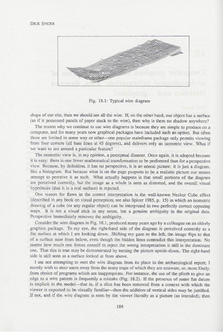
I am not attempting to oust the wire diagram from its place in the archaeological report; I merely wish to steer users away from the many traps of which they are unaware, or, more likely, from choice of programs which are inappropriate. For instance, the use of the plinth to give an edge to a wire pattern is frequently a mistake (Fig. 18.2). If the presence of some flat datum is implicit in the model—that is, if a slice has been removed from a context with which the viewer is expected to be visually familiar—^then the addition of vertical sides may be justified. If not, and if the wire diagram is seen by the viewer literally as a picture (as intended), then
188
18. COMPUTER GRAPHICS AND THE PERCEPTION OF ARCHAEOLOGICAL INFORMATION
Fig. 18.2: Wire diagram with plinth
its accompanying plinth must be perceived as a cliff-edge surrounding the site, with all the problems of perceptual scaling (pun intended) which that entails.
18.3 Stereoscopic presentation
Stereoscopic presentation of wire surfaces has been demonstrated' to be of some value in enhancing the 'data-transfer' of visual perception (Spicer 1985, Lock 1985, Reilly 1985). The diagrams suffer from technical difficulties, not the least of which are correct choice of ink colours, and a very natural resistance by most observers to make the effort required to view the images. As an analytical tool, particularly in attempting to perceive pattern in noisy data such as from a resistivity survey, tiie effort is often repaid. Stereo pictures benefit from long study, and it is the subtie effects of depth perception radier than the immediate 'pop-up' effect which yield most results of archaeological value.
The stereo representation of contour data (Spicer 1985, Fig. 6) is less successful in giving Üie viewer a good impression of die site. The 'meringues' which small contour rings floating in space produce are a perceptual nonsense: nevertheless I would claim tiiat tiiey are less nonsense as a picture than flat contours.
18.4 Contour plans and lit-modeiled surfaces
Contours are difficult to produce, even for a computer. They are the result mosüy of a process of interpolation between surveyed points, and as such must be of dubious accuracy (unless tiie points are very close relative to contour distances). But contours are often given on site plans which otiierwise purport to have a high degree of accuracy. Plans of any kind can only be listed as diagrams, never as pictures: we seldom spend our time in everyday life looking vertically
189

DICK SPICER
Fig. 18.3: Contour plan of an Early Christian enclosure at Malew, Isle of Man
downwards at perfectly flat surfaces with curious lines engraved on them. Yet we expect to be able to see features depicted therein, and, moreover, because the plan is somehow 'objective', we publish it so that others might derive further material from it. How many people have got out compasses and dividers to obtain absolute distances and heights from published plans? Very few, I suspect. On occasions I have digitised contours and converted them to grids because the original data was unavailable: one shudders to imagine how many errors have accrued in this process.
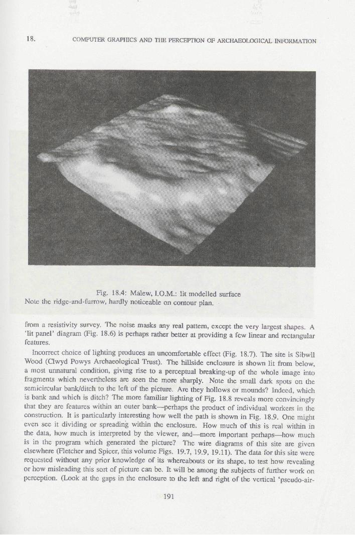
Fig. 18.3 is a contour plan of a very low, ploughed out. Early Christian circular enclosure on the Isle of Man (data provided by Paul Reilly—see ReiUy 1985). If the reader has not peeped at the plates, he or she should spend a few minutes trying to obtain as much data as possible from this plan before looking at Fig. 18.4. In retrospect the small features are seen in the contours—but I would claim that, in addition to being more attractive, the surface modelled from the same data provides the information much more quickly and well.
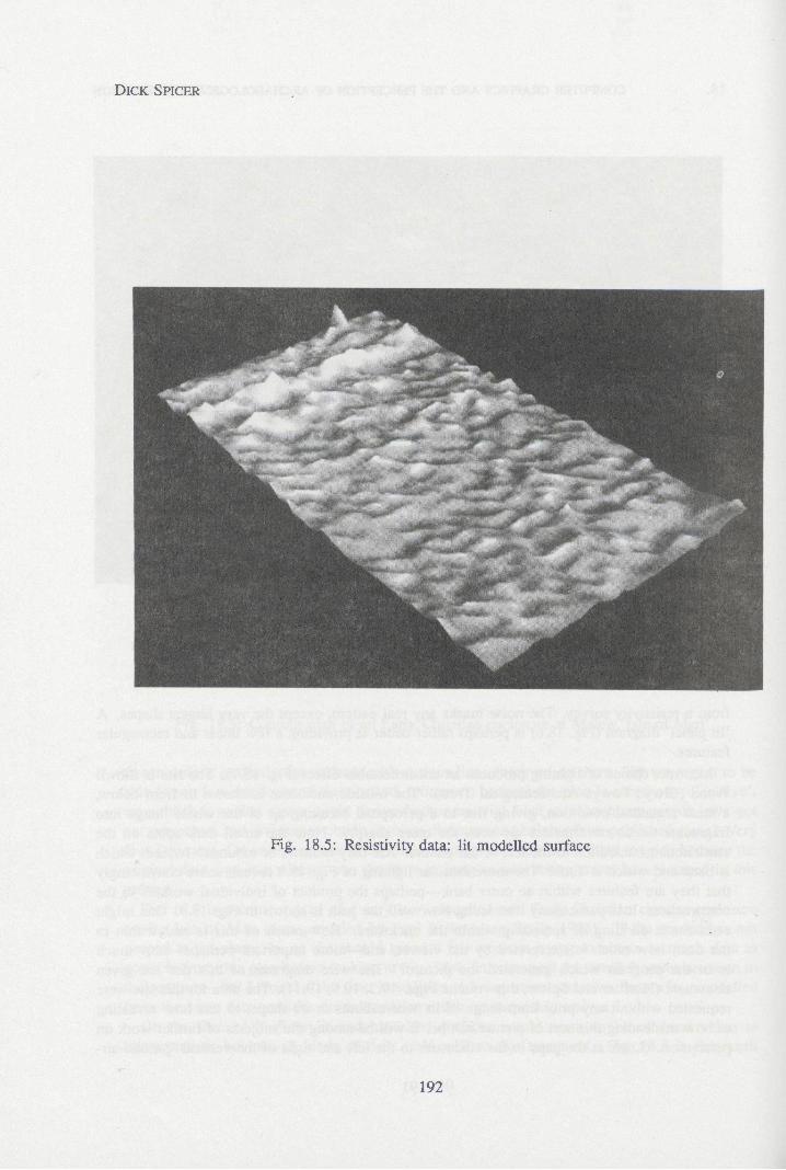
On the face of it, fuUy lit and modelled surfaces would seem to be of great value to interpretation, but not all kinds of data yield well to this treatment. Fig. 18.5 is the result
190
18. COMPUTER GRAPHICS AND THE PERCEPTION OF ARCHAEOLOGICAL INFORMATION
Fig. 18.4: Malew. I.O.M.: lit modeUed surface Note the ridge-and-furrow, hardly noticeable on contour plan.
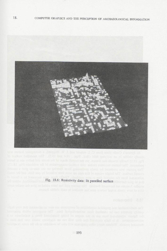
from a resistivity survey. The noise masks any real pattern, except the very largest shapes. A 'lit panel' diagram (Fig. 18.6) is perhaps rather better at providing a few linear and rectangular features.
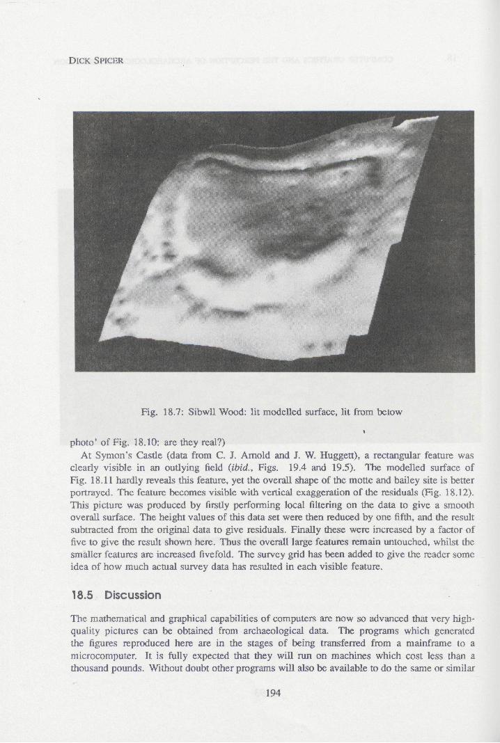
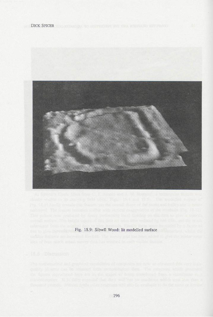
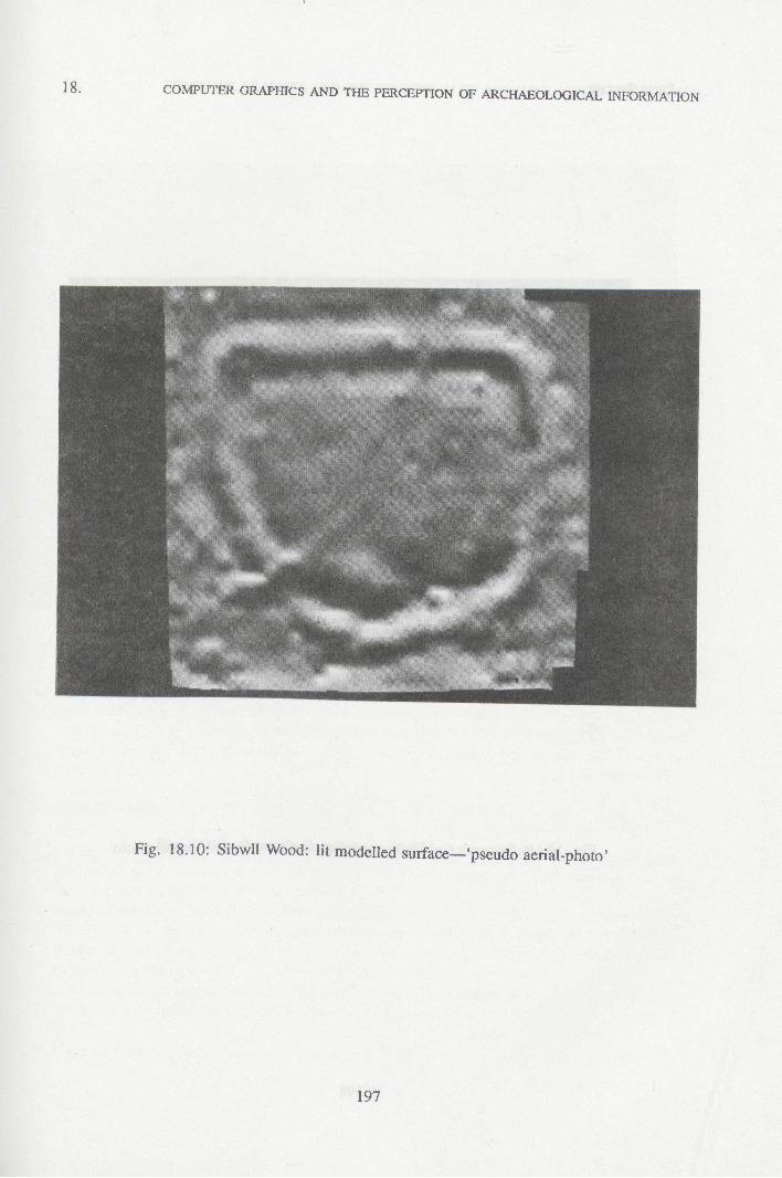
hicorrect choice of Ughting produces an uncomfortable effect (Fig. 18.7). The site is SibwU Wood (Qwyd Powys Archaeological Tnist). The hillside enclosure is shown lit from below, a most unnatural condition, giving rise to a perceptual breaking-up of the whole image into fragments which nevertheless are seen the more sharply. Note the small dark spots on the semicircular bank/ditch to the left of the picture. Are they hoUows or mounds? Indeed, which is bank and which is ditch? The more familiar lighting of Fig. 18.8 reveals more convincingly that they are feauires within an outer bank—perhaps the product of individual workers in the construction. It is particularly interesting how well the path is shown in Fig. 18.9. One might even see it dividing or spreading within the enclosure. How much of this is real within in the data, how much is interpreted by the viewer, and—more important perhaps—how much is in the program which generated the picture? The wire diagrams of this site are given elsewhere (Hetcher and Spicer, this volume Figs. 19.7, 19.9, 19.11). The data for this site were requested without any prior knowledge of its whereabouts or its shape, to test how revealing or how misleading this sort of picture can be. It will be among the subjects of further work on perception. (Look at the gaps in the enclosure to the left and right of the vertical 'pseudo-air-
191
DICK SPICER
Fig. 18.5: Resistivity data: lit modeUed surface
192
18. COMPUTER GRAPHICS AND THE PERCEPTION OF ARCHAEOLOGICAL INFORMATION
Fig. 18.6: Resistivity data: lit panelled surface
193
DICK SPICER
Fig. 18.7; Sibwll Wood: lit modelled surface, lit from below
photo' of Fig. 18.10: are they real?) At Symon's Castle (data from C. J. Arnold and J. W. Huggett), a rectangular feature was
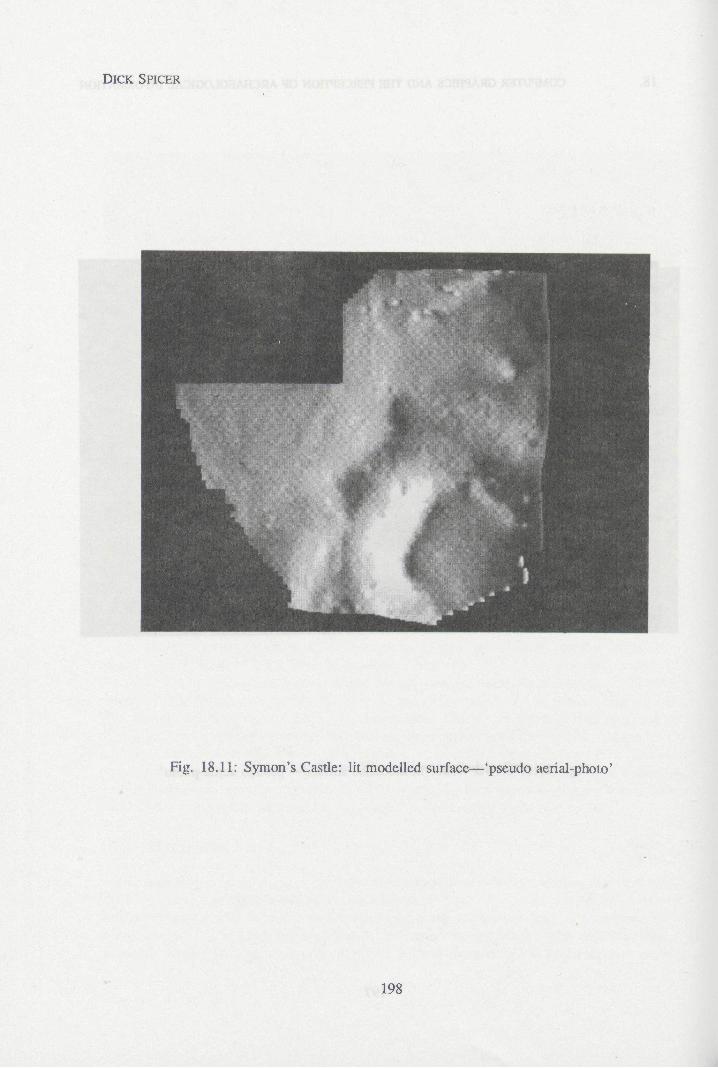
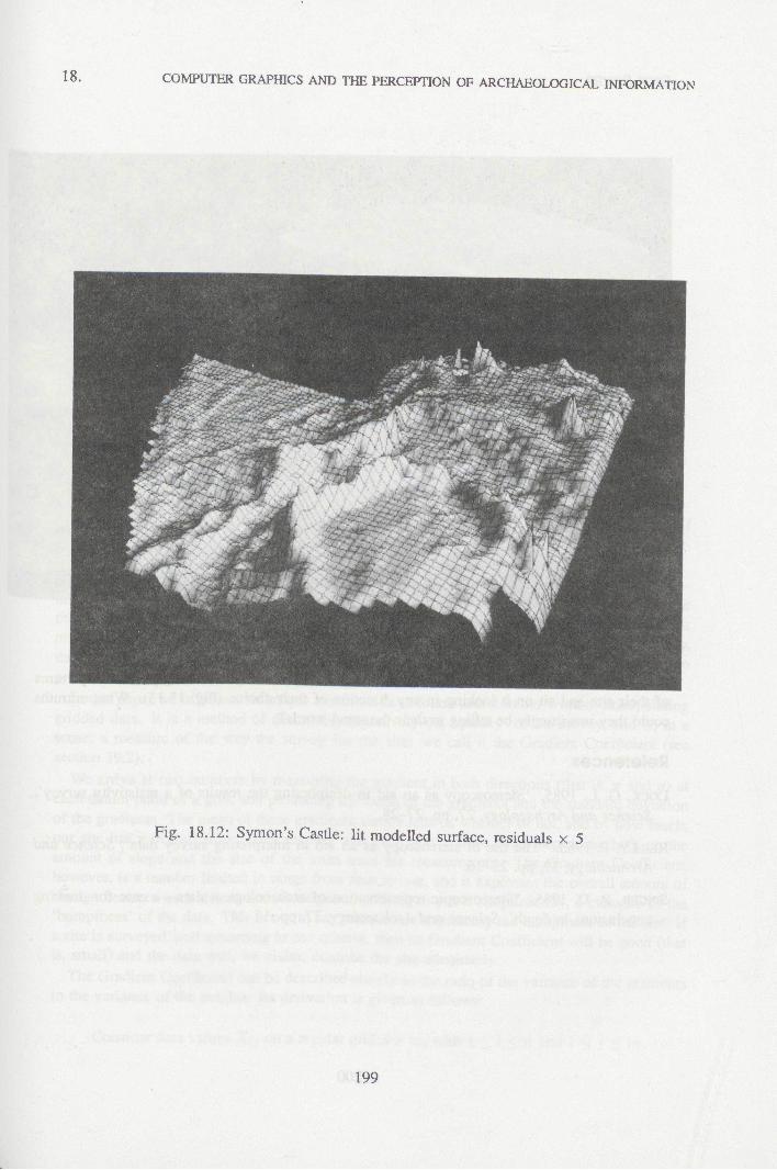
clearly visible in an outlying field (ibid.. Figs. 19.4 and 19.5). The modelled surface of Fig. 18.11 hardly reveals this feature, yet the overall shape of the motte and bailey site is better portrayed. The feature becomes visible with vertical exaggeration of the residuals (Fig. 18.12). This picture was produced by firstly performing local filtering on the data to give a smooth overall surface. The height values of this data set were then reduced by one fifth, and the result subtracted from the original data to give residuals. Finally these were increased by a factor of five to give the result shown here. Thus the overall large features remain untouched, whilst the smaller features are increased fivefold. The survey grid has been added to give the reader some idea of how much actual survey data has resulted in each visible feature.
18.5 Discussion
The mathematical and graphical capabilities of computers are now so advanced that very high- quality pictures can be obtained from archaeological data. The programs which generated the figures reproduced here are in the stages of being transferred from a mainframe to a microcomputer. It is fuUy expected that they will run on machines which cost less than a thousand pounds. Without doubt other programs will also be available to do the same or similar
194

18. COMPUTER GRAPHICS AND THE PERCEPTION OF ARCHAEOLOGICAL INFORMATION
Fig. 18.8: SibwU Wood, lit modelled surface, lit from above
195
DICK SPICER
Fig. 18.9: SibwU Wood: lit modelled surface
196
18. COMPUTER GRAPHICS AND THE PERCEPTION OF ARCHAEOLOGICAL INFORMATION
Fig. 18.10: SibwU Wood: lit modelled surface—'pseudo aerial-photo'
197
DICK SPICER
Fig. 18.11: Symon's Castle: lit modelled surface—'pseudo aerial-photo'
198
18. COMPUTER GRAPHICS AND THE PERCEPTION OF ARCHAEOLOGICAL INFORMATION
Fig. 18.12: Symon's Casüe: lit raodeUed surface, residuals x 5
199
DICK SPICER
Fig. 18.13: Symon's Castie: lit modelled surface; motte seen from bailey
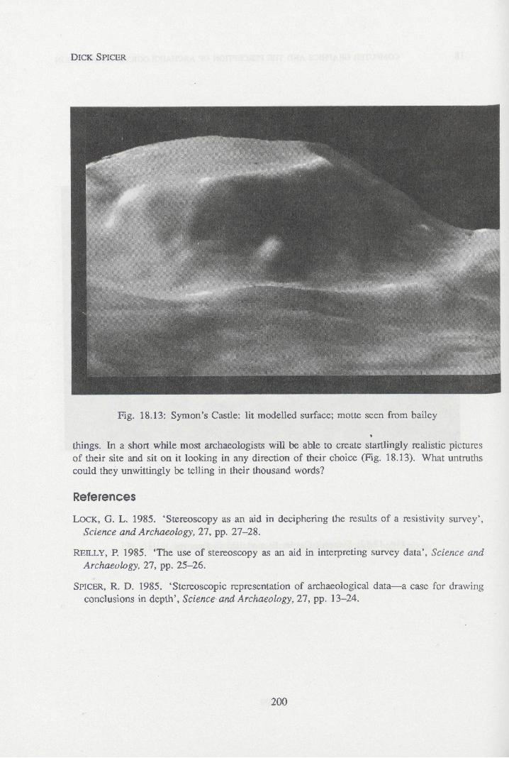
things. In a short while most archaeologists wiU be able to create startlingly realistic pictures of their site and sit on it looking in any direction of their choice (Fig. 18.13). What untruths could they unwittingly be teUing in their thousand words?
References
LOCK, G. L. 1985. 'Stereoscopy as an aid in deciphering the results of a resistivity survey', Science and Archaeology, 27, pp. 27-28.
REILLY, P. 1985. 'The use of stereoscopy as an aid in interpreting survey data', Science and Archaeology, 27, pp. 25-26.
SPICER, R. D. 1985. 'Stereoscopic representation of archaeological data—a case for drawing conclusions in depth'. Science and Archaeology, 27, pp. 13-24.
200