concepts of interface usability and the enhancement … of interface usability and the enhancement...
TRANSCRIPT

Concepts of Interface Usability and the Enhancement of Design through Eye Tracking and Psychophysiology
Kate Ponton
Maritime Operations Division Defence Science and Technology Organisation
DSTO-GD-0547
ABSTRACT
This paper outlines and discusses the dominant usability guidelines and concepts that should be a core feature in the design process of user interfaces for complex systems. The concepts include the impact of colour, ambient light, dark adaptation, symbol and icon, consistency, information layout, and auditory stimulus. This paper also investigates alternative methods of user interface evaluation, which are psychophysiological in nature, such as biometrics and eyetracking. The biometrics covered include heart rate, heart rate variability, and skin conductance; the eye-tracking measures include eye blinks, gaze, fixations, percentage of eyelid closure, and pupil dilation. There is a considerable volume of literature detailing the benefits of eye tracking, although this technology is still advancing to a truly reliable and accurate level. The main concerns with the biometrics mentioned is their sensitivity to other variables and how this impacts the ability to interpet and trust data. The author is particularly interested in usability in the maritime domain, therefore a lot of the examples provided refer to usability issues within Navy and the Submarine environment.
RELEASE LIMITATION
Approved for public release

Published by Maritime Operations Division DSTO Defence Science and Technology Organisation PO Box 1500 Edinburgh South Australia 5111 Australia Telephone: (08) 8259 5555 Fax: (08) 8259 6567 © Commonwealth of Australia 2008 AR-014-279 September 2008 APPROVED FOR PUBLIC RELEASE

Concepts of Interface Usability and the Enhancement
of Design through Eye Tracking and Psychophysiology
Executive Summary
Complex systems, such as a Naval combat data systems, showcase complex user interfaces, resulting from an information rich environment. Without careful design, clutter, information overload, and search and retrieval of information become issues. The most basic requirement for complex systems is their need to be fully operational and functional in the most intense, worst case scenario. This functionality can heavily depend on how easily the operator can navigate through the system. This paper aims to discuss some of the most important usability principles and concepts, and methods for user interface evaluation. General usability principles discussed are: the presentation of information, colour and size of objects and text, ocular perception, clutter, consistency of objects and text, and any connection between visual and auditory stimulus. The surrounding environment imposes other factors that designers need to be aware of including ambient light, user’s cultural expectations, as well as cognitive and physiological responses. Many examples used to demonstrate these principles and factors are from the submarine and general maritime domain as this is of particular interest to the author. In this paper we present methods of user-interface evaluation based on the physiological responses of the users. The physiological responses explored are Heart Rate, Heart Rate Variability, and Skin Conductance; as well as Eye Tracking technology measuring gaze, fixations, blinks, eyelid closure, and pupil dilation. Eye tracking is becoming increasingly accepted in the Human-Computer Interaction field as a method for testing usability. Different eye measurements relate to different aspects of the interface. Generally, blinks and pupil dilation are descriptive of fatigue and cognitive processing, whereas fixations and saccades measure interface difficulty and areas of interest that capture the user’s attention. Heart rate (HR) and heart rate variability (HRV) are biometrics that can be used to identify periods of high mental effort and high stress. HR is known to increase when a person is exposed to mental stressors; HRV will decrease in the same situation. HRV is a much more sensitive measure of the nervous system and can be used for workload evaluation if no response is found from HR. Skin conductance (SC) is another biometric being discussed. One would also expect an increase in conductance with an increase in workload or stress. SC is a reliable measure of workload if measured from the hands and soles of the feet as the sweat glands in these areas are highly responsive to psychological stressors but unresponsive to heat. Interfaces exemplifying essential usability principles will aid the operator to use the system to the best of its ability, to make appropriate decisions, and to execute actions quickly. Most importantly the system should support the operator in high stress

environments such as combat situations in the military domain which are most susceptible to system and operator breakdowns. Heart rate and skin conductance tend to be some of the best and easiest workload measures to use. Whilst heart rate variability is useful as a highly sensitive workload given that strict controls are maintained to accurately record data. The best ocular workload measures are blinks, and percentage of eyelid closure (PERCLOS); fixations and saccades tend to be better at providing information on search and retrieval of data. Pupil dilation is not as highly researched in the area in mental workload measurement, and it can be easily influenced by experimental design, therefore some caution is needed when using this measure.

Contents
1. INTRODUCTION ............................................................................................................... 1
2. DESIGN PRINCIPLES FOR INTERACTIVE ELECTRONIC DISPLAYS ............... 22.1 Peak Performance ..................................................................................................... 42.2 Examples of Usability in the Maritime Domain................................................. 4
3. COLOURS IN ELECTRONIC DISPLAYS...................................................................... 53.1 Application of Colour .............................................................................................. 5
3.1.1 Periphery Sensitivity................................................................................. 93.1.2 Blue .............................................................................................................. 93.1.3 Day/Night Displays ................................................................................. 93.1.4 Bright Colours............................................................................................ 9
3.2 Colour Blindness..................................................................................................... 103.3 Alcohol, Cigarettes, and Pharmaceuticals on colour perception ................... 10
4. AMBIENT LIGHTING IN SUBMARINES .................................................................. 11
5. SYMBOLS AND ICONS.................................................................................................. 11
6. CONSISTENCY ................................................................................................................. 14
7. LAYOUT ...................................................................................................................... 157.1 Cognitive Maps ....................................................................................................... 16
8. AUDITORY STIMULUS.................................................................................................. 18
9. EVALUATING INTERFACES ........................................................................................ 18
10. PHYSIOLOGICAL AND QUALITATIVE EVALUATIONS OF INTERFACES... 1910.1 Eye Tracking ............................................................................................................ 20
10.1.1 Measures and Feedback.......................................................................... 2010.1.2 Technology ............................................................................................... 22
10.2 Biometrics................................................................................................................. 2210.2.1 Nervous System....................................................................................... 2310.2.2 Heart Rate and Heart Rate Variability ................................................. 2410.2.3 Skin Conductance.................................................................................... 25
10.3 Limitations ............................................................................................................... 26
11. CONCLUSION................................................................................................................... 27

12. REFERENCES..................................................................................................................... 28
APPENDIX A: DEFINITIONS OF COLOUR AND ITS EFFECTS ............................ 37

DSTO-GD-0547
1. Introduction
This document discusses principal usability concepts applicable to computer systems. The research outlined should aid a broad understanding of prevailing usability issues, and touch on a several specific context driven issues. Many usability examples discussed in this paper are specific to the requirements of Navy as understanding the issues in this environment was the motivation for this paper. A system that is designed with usability principles is intended to be easy to use, that is, interaction with the system will be void of frustration, annoyance, and inefficiency. Ease of use can be characterised by five attributes, easy to learn, efficient task completion, minimised memorisation of functions, reduced errors, and satisfaction (Nielsen, 1993). The creation of user interfaces (referred to from now on only as interfaces) and interactive electronic displays to be user friendly is essential if the system presented is complex and rich in information. Designing an interface lacking fundamental usability principles can often hinder task completion and increase users’ workload and fatigue (Wickens, 2000; Wickens & Carswell, 1995). System failures in complex systems generally carry greater consequences; this reasoning applies particularly to the need for military systems to be highly usable. Advances in modern communications technology have lead to the production of large volumes of data, which may seem desirable to aid situation awareness. However, it is undesirable if the information is not displayed in a usable manner that can educate and inform the user, encouraging accurate decisions and timely reactions (Baecker et al., 1995). The demand for highly usable interfaces is amplified when the working environment calls for multiple activities to be performed simultaneously, for example, processing both visual and auditory stimulus. The introduction of secondary tasks in job design needs to be carefully considered as humans have finite boundaries regarding their attention, processing capabilities and short-term memory (Noiwan & Norcio, 2006). To minimise the impact high levels of workload can produce, systems need to be as user friendly as possible. Many factors affect usability, the layout and presentation of information is just one contributing component. Ambient lighting, auditory alerts, user’s cultural expectations, use of colour, use of symbols and icons, level of consistency, and physiological, perceptual and cognitive reactions, are crucial elements in interface design. Achieving usability requires knowledge of the intended user’s requirements, abilities, and tasks. Ensuring the core concepts of usability are established, Mayhew (1999) recommends an interface designer should investigate the:
� Cognitive capabilities, � Perceptual capabilities, � Motor capabilities, � Special characteristics of users, � Social work environment of users, � Unique characteristics of the tasks, and � Constraints of the software or hardware to be used.
1

DSTO-GD-0547
Accounting for the above limitations and constraints imposed by the users and/or their surrounding environments will help maintain the usability of a system. Once all usability characteristics are incorporated into a display they can be evaluated both qualitatively and quantitatively. Quantitative measures can include the assessment of physiological responses which highlight stressful tasks and increases in mental workload. Psychophysiological responses (such as heart rate, blinks, and eye gaze) can indicate periods of stress experienced by the user, the effectiveness of search and retrieval, and the complexity of the interface - this information can then be used to enhance usability. Qualitative measures of usability are the most commonly used and involve user satisfaction/interaction surveys, observations of user walkthroughs (cognitive walkthroughs), how well the interface meets usability principles, and user focus groups providing feedback and opinions. This paper focuses on the reasons for usability, what the usability principles are, and information on usability evaluations. It also explores relatively new, quantitative methods of usability evaluation using an eye tracker and psychophysiological responses. 2. Design Principles for Interactive Electronic Displays
Literature on the design of electronic displays outlines prevalent and conventional guidelines for display design. Some research has concentrated on specific design elements for specific working environments such as designing for navigation or designing to account for short-term memory limitations (Eddy, Kribs & Cowen, 1999; Kayton, 1990). Other research intends to outline general design principles that can be applied to any interface, such as Hansen’s (1971) guidelines which were some of the first and most succinct general guidelines for building or designing usable systems. Table 1 Hansen’s guidelines for usability
‘Know the Users’ Profile’ – being aware of education, experience, interests, how much time they have, their manual dexterity, etc.
‘Minimise Memorisation’ – by allowing selection of items rather than entry of data.
‘Optimise Operations’ – by providing rapid execution of common operations, preserve display consistency and organise commands based on use.
‘Engineer for Errors’ – by providing good error messages, allowing actions to be reversible and limiting possible common errors.
2

DSTO-GD-0547
Mahemoff and Johnston (1998, p.136) proposed six similar guidelines which are Table 2 Mahemoff and Johnston’s guidelines for usability
‘Task Efficiency’ – which assumes simplicity whilst easing interaction by both novices and experts.
‘Reuse’ – implying consistency and allowing users to reuse their already established knowledge over other parts of the display.
‘User Computer Communication’ – ensuring that all changes made to the system by either the computer or the user are readily observable and easily understandable.
‘Robustness’ – to limit incorrect actions, not by blocking what we could do but limiting what we think we can do, and ensuring easy paths of recovery when mistakes are made.
‘Flexibility’ – allowing the computer to be suited to the characteristics of the user and making it possible for the computer to take on some of the workload.
‘Comprehensibility’ – similar to task efficiency this guideline proposes that displays should present the right amount of detail in a way that is easy to use for both novices and experts.
The most comprehensive list of what Jakob Nielsen calls Usability Heuristics are outlined in his book ‘Usability Inspection Methods, 1994’. Table 3 Nielsen’s 10 Usability Heuristics
Visibility of System Status
Match between system and the real world
User control and freedom
Consistency and standards
Error prevention
Recognition rather than recall
Flexibility and efficiency of use
Aesthetic and minimalist design
Help users recognise, diagnose and recover from errors
Help and documentation
The function of each guideline and heuristic is to help build an interface whereby an operator can perform their tasks with ease and satisfaction. The guidelines endeavour to significantly improve the information processing model of ‘detection’, ‘cognition’, and ‘response execution’ (Sanders & McCormick, 1993).
3

DSTO-GD-0547
Design guidelines are also applied to particular elements of the display, such as particular fonts or colours which should be used. Marcus (1995) proposed guidelines highlighting the correct use of text on displays, suggesting designers to:
� Use no more than three different types and size of text, � Present the text to the left of the screen, � Present the numbers to the right of the screen, � Avoid short justified lines of text as this can slow reading, � Use a combination of upper and lower case letters – using all upper or all lower can
slow reading speed.
2.1 Peak Performance The levels of competency in people can vary dramatically, however it is reasonable to assume that there will be some degree of similarity in competence within specific user groups. This allows a designer to acquire specific information about the intended users’ limitations and provides some guidelines to assist the development of a display. Mental capacity varies in its complete form between individuals, as well as changing within an individual due to factors such as fatigue, sleep deprivation, emotional strain and various environmental and physiological factors (Martinez-Lopez, 2005), which can negatively impact performance. When a person’s performance is inhibited by one or more of these factors more mental effort is required to complete the task to prevent performance degradation (Kahneman, 1973). If more mental resources are used to accommodate for factors such as fatigue, or to process additional stimuli/tasks, there must be a point where all mental resources are exhausted. If it is possible to determine at what point there is performance degradation then job design and usability can be analysed. If it is the case where people are being asked to complete too many tasks, then job design can be assessed. Or it may be the case that a person cannot handle their workload as they are working with an unusable system, causing frustration and delays in task completion. Regardless of the cause of mental overload, the workload imposition will cause people to delay information processing or bypass some information completely (Ryu & Myung, 2005).
2.2 Examples of Usability in the Maritime Domain
Submariners’ are susceptibile to fatigue as they have: disruptions in their circadian rhythms due to lack of sunlight (van Bommel, 2006), they work 6 hour shifts providing only small windows to sleep, and they must maintain constant vigilance when monitoring displays. Fatigue due to constant monitoring of displays occurs as electronic displays require more visual effort than reading paper-based text (Baecker et al., 1995), which can increase fatigue over long periods of time. To reduce fatigue, display designers should be careful with colour selection to ensure there is clear contrast between colours, and to minimise blurring. Any stimulus which appears out of focus can promote visual fatigue as the user continually tries to bring the stimulus into focus (Dry et al., 2002).
4

DSTO-GD-0547
Short term memory (STM) limitations is another issue which should be accounted for when designing submarine and ship displays, as studies have demonstrated that users can confuse and forget tracking numbers, confuse track data such as approaching versus departing and climbing versus descending tracks (Eddy, Kribs, Cowen, 1999). Eddy et al. (1999) further comments that errors such as these can be remedied by explicitly displaying the track heading and type, by using an arrow to indicate heading.
3. Colours in Electronic Displays
3.1 Application of Colour
Colour can be used to complement a well-designed display to heighten its usability by providing significant support to the user promoting ease of interaction with the display. Colour can aid:
� Visual search (Christ, 1975), � Direction of attention, � Speed of search, � Object recognition, � Organisation of stimulus, � Quantification of stimulus, � Emotional response (Horton, 1994, p.167), � Recognition of important information, � Identification of subsystems, � Realistic portrayal of objects, � Portrayal of time and progress, � Coding, and, � Comprehension (Marcus, 1995, p.430).
Often there are relationships between colour, visual search, recognition and representation of objects. For example if a user were scanning a map and looking for land they may automatically look for the colours green and brown. As well as this, colour can represent emotions, such as red to convey feelings of aggression, or love. Table 4 outlines common colours and their common meanings. Due to the natural association people have with colours it would be inappropriate for example, to use the colour red, in western cultures, to indicate a positive aspect of a system, as it is frequently and normally associated with negative outcomes and consequences. Using colours for meanings that oppose natural and immediate associations requires extra mental effort to be exerted, and a system user must maintain a high level of mental alertness to avoid errors. Furthermore in high states of stress it could be expected that a system user will react automatically, if their natural reaction does not match required responses then errors will rapidly occur.
5

DSTO-GD-0547
Table 4 Colours and associated meanings (in Western cultures)
(Horton, 1994, p.175) Red
Aggression, impulsiveness, warmth, extroversion, crudeness, optimism, danger, shame.
Orange Friendliness, congeniality, deference, warmth, pride, gregariousness
Yellow Novelty, idealism, introspection, warmth, caution, betrayal, cowardice
Green Freshness, hope, health, prosperity, envy, jealousy, madness, nausea, approval
Blue Cold, calm, truth, innocence, precision, doubt, depression, hopelessness
Purple Vanity, wit, nostalgia, spirituality, resignation, regret
Brown Duty, parsimony, reliability, earthiness, barrenness, poverty
Gold Richness, wisdom, honor, high quality, haughtiness, vainglory, power
White Lightness, innocence, purity, wisdom, truth, cold, ghostliness, void
Gray Restraint, neutrality, barrenness, grief, indifference, inertia, maturity
Black Death, grief, morbidity, gloom, despair, dignity, solemnity, sin, negation.
When designing electronic displays using colour there are numerous other guidelines that need to be taken into account. These guidelines concern colour perception, psychophysiological effects, environmental factors, ambient lighting, hardware capabilities and limitations affecting colour reproduction (Kaufmann & Eaton, 1994). Murch (1995, p.442) lists a number of these guidelines under three categories – physiological, perceptual and cognitive. It is important to understand that colour used incorrectly can hinder a user’s interaction and outweigh the potential advantage colour may provide. To avoid the incorrect use of colour a designer must understand the physiological, perceptual and cognitive implications colour can have. (See Appendix A for scientific terms and definitions of colour and colour effects).
"Physiological Guidelines: Avoid the simultaneous display of highly saturated spectrally extreme colours: Red, oranges, yellow and greens can be viewed together without refocusing, but cyan and blues cannot be easily viewed simultaneously with red. To avoid frequent refocusing and visual fatigue, extreme colour pairs such as red and blue or yellow and purple should be avoided. However, desaturating spectrally extreme colours will reduce the need for refocusing. Avoid pure blue for text, thin lines and small shapes: Our visual system is just not set up for detailed, sharp, short-wavelength stimuli. However, blue does make a good background colour and is perceived clearly out into the periphery of our visual field.
6

DSTO-GD-0547
Avoid adjacent colours differing only in the amount of blue: Edges that differ only in the amount of blue will appear indistinct. Older viewers need higher brightness levels to distinguish colours The magnitude of a detectable change in colour varies across the spectrum: Small changes in extreme reds and purples are more difficult to detect than small changes in other colours such as yellow and blue-green. Also, our visual system does not readily perceive changes in green. Difficulty in focusing results from edges created by colour alone: Our visual system depends on a brightness difference at an edge to effect clear focusing. Avoid red and green in the periphery of large-scale displays: Due to the insensitivity of the retinal periphery to red and green, these colours should be avoided in saturated form, especially for small symbols and shapes. Yellow and blue are good peripheral colours. Opponent colours go well together: Red and green or yellow and blue are good combinations for simple displays. The opposite combinations – red with yellow or green with blue – produce poorer images. Perceptual Guidelines: Lightness and brightness are distinguishable on a printed hard copy but not on a colour display Hue change with intensity and background: When grouping elements on the basis of colour, be sure that background or nearby colours do not change the hue of an element in the group. Limiting the number of colours and making sure they are widely separated in the spectrum will reduce confusion. Cognitive Guidelines: Do not overuse colour: The benefits of colour as an attention getter, information grouper, and value assigner are lost if too many colours are used. Cognitive scientists have shown that the human mind experiences great difficulty in maintaining more than five to seven elements simultaneously, so it is best to limit displays to about six clearly discriminable colours. Brightness and saturation draw attention: The brightest and most highly saturated area of colour displayed immediately draws the viewers attention. Warm and cold colours should indicate action levels: Traditionally the warm (long wavelength) colours are used to signify action or requirement of a response. Cool colours on the other hand, indicate status or background information. Most people also experience warm colours advancing towards them – hence forcing attention – and cool colours receding or drawing away. " (Murch, 1995 p.442).
7

DSTO-GD-0547
Additional colour research suggests designers should use bolder fonts when displaying dark characters on a light background as compared to applying light characters on a dark background to compensate for the apparent spread of light areas and to assist perception (MacDonald, 1990). Overuse of colours also affects the usability of a display, with Murch (1995) suggesting to limit the number of colours used. This argument is supported by others including MacDonald (1990) who stated the overuse of colour (more than 12 to code) can create confusion and inaccurate perception of colours. Kaufmann (1990) recommended limiting the number of colours if using it to colour code small stimuli, this will help ensure reliable identification of visual stimulus. In circumstances where the visual stimuli is small a designer should use the colours purple, green, blue and orange as these are correctly identified under many circumstances, such as different levels of lighting; other colours are more easily misinterpreted (Kaufmann, 1990). When using colour for coding it is important to test for chromatic induction to discover if the identification of colours is perceived as intended, or are they affected by ambient light or surrounding colours. McFadden et al. (1994) conducted a study looking at 210 different colours against different backgrounds including black, grey, red, green, blue and yellow. This study concluded only 17 colours from three hues were correctly identified across all backgrounds, these hues were blue, purple and green. McFadden’s study also found the largest variations in identification of colour manifests from red and blue backgrounds with this variation increasing under low ambient light. Widdel and Post (1992) described the use of an electroretinogram (ERG) and pupillometry to examine the use of colour on a display. They also suggested using response time, response speed, search time, legibility, and colour naming as measures for both colour use and display design. Colour naming is frequently used to test if colours are perceived as intended, the importance of this increases with the use of colour coding. Response time and speed will mostly be affected if colours used do not synchronise with common meanings and association, for example displaying a map where blue indicates land, and brown indicates ocean. Subtle colour differences, such as using cyan or green to code a stimulus will not significantly affect user interaction; however when red is used to indicate action completed rather than action failure, whilst using 15 colours for coding, these incorrect uses of colour will start to compound, with the accumulated effect impacting users.
8
DSTO-GD-0547
3.1.1 Periphery Sensitivity
Murch (1995), Helander (1987) and Marcus (1995) found that peripheral vision is less sensitive to red and green, therefore these colours should be concentrated at the centre of attention rather than around the borders of a display. Colours which are detected easier with peripheral vision are blue, black, white and yellow. If reds and greens are chosen for the outer edges of a display for things such as alerts, the designer should consider using some form of blinking or change in symbol size to draw attention (Marcus, 1995). Reds and greens can also be more easily recognised in their purest state when covering small areas, whereas desaturated colours such as aqua and pink could only be recognised when covering a large area (Post, 1985). Research with such findings supplies very important information to designers of complex displays, which use colour for coding as stimuli are usually small and abundant. 3.1.2 Blue
Murch (1995) states blue is best as a background colour and should be avoided in use for thin lines, text and small shapes. However given that McFadden (1994) found identification of coloured stimuli varies with a blue background, blue is perhaps only suitable when colour coding isn’t necessary. Marcus (1995) also argues that blue should be avoided to colour thin lines and text, explaining there are fewer blue receptors in the retina, most especially in the eyes central focusing area – the fovea. This is why blue shouldn’t be used in circumstances requiring detailed visual performance. 3.1.3 Day/Night Displays
A maritime specific colour issue is the impact ambient light has on the perception of colour. The main change occurs as day proceeds to night. Colours need to be clearly visible and unaffected by daylight, whilst the night display needs colours that are dim enough to allow for dark adapted vision (Kaufmann & Eaton, 1994). MacDonald (1990) states the eye is most sensitive to yellow-green, and less sensitive to red and blue during daylight. Whilst Marcus (1995) states for viewing in well lit areas use dark, thin text and small shapes on a light background, such as black or brown on a light yellow or white background. For dark viewing situations it is best to use light, thin text and small shapes on medium to dark backgrounds, for example, white or light red text on a dark green or grey background (Marcus, 1995).
3.1.4 Bright Colours
The proposition by Murch (1995) to abstain from using combinations of bright, spectrally extreme colours is also stated by MacDonald (1990) and Marcus (1995) who comment the combination of intense primary colours such as red, green, yellow and blue can cause ‘vibrations’ in the image and promote the creation of after-images. When kept to a minimum there are certainly situations where the use of bright colours are highly appropriate, such as their purpose and relevance in representing danger signals, they can also be utilised to draw
9

DSTO-GD-0547
attention, and to remind users (Marcus, 1995). High chroma red alerts are nominated to be the best colour to advise for danger and urgent issues as they attract a faster response than a yellow or yellow-orange alert (Marcus, 1995). This is a good example of usability principles being heuristics rather than rules. Usability principles should be applied and adapted where suitable. Colour research definitely highlights a number of factors to consider when intending to use colours. Frequently colours are used to create a certain ‘look and feel’ rather than for a purpose such as coding, regardless, they need to be applied carefully. Environmental factors, specific human deficiencies, and consumed substances can all influence colour perception. 3.2 Colour Blindness
Colour blindness, which occurs in 8% of Caucasian males, poses some interesting obstacles for display design (Marcus, 1995; Horton, 1994). An obvious issue is the use of red to signify dangerous situations. Designers may try and overcome this by combining red warning signals with a blinking signal. To accommodate for colour blindness Horton (1994) recommends to only use colour to reinforce messages already expressed in black and white; to use colour which differs in chroma not just in hue, i.e. contrast a bright yellow, medium green and dark red; and to locate colour legends near the colours they decode.
3.3 Alcohol, Cigarettes, and Pharmaceuticals on colour perception
Studies by Cruz-Coke (1972, as cited in Widdel & Post, 1992) claimed the effects of long-term excessive alcohol consumption can reduce the ability to detect blue and yellow, it is believed this occurs because of a vitamin A deficiency caused by liver damage. Lyle (1974) reported excessive use of tobacco can change the perception of colour, this finding was debated by Dyer (1986) who stated tobacco has no effect on colour vision. Recent studies are now unanimously proving smoking effects colour perception. A study by Erb et al. (1999) found people who smoked more than 20 cigarettes a day had significantly higher errors in colour detection, which they attributed to the carcinogenic and toxic substances accumulating in the blood and the smoking effects on retinal pigment epithelium. Von Restorff and Hebisch (1988) also found that smokers take longer time to become dark adapted which can be explained by the carbon dioxide in cigarettes reducing the ability of blood to carry and delivery oxygen to tissues. As the eye is a part of the central nervous system it is greatly affected by a lack of oxygen (McFarland, 1970) and oxygen consumption of the eye increases in the dark (Riva et al., 1983). Widdel and Post (1982) cite other potential effects from pharmaceuticals, writing that Lakowski & Morton (1978) found oral contraceptives can desensitise blue and yellow vision; antibiotics can degrade colour vision (Laroche & Laroche, 1970), and asprin has been found to increase the level of perceived saturation (Luria et al., 1979). Further research into these specific areas is needed to draw any reliable conclusions; they are stated here merely to draw attention to potential issues.
10

DSTO-GD-0547
4. Ambient Lighting in Submarines
The colour of ambient lighting can be considered to be as important as the use of colour on an electronic display. Specific working conditions such as flight control rooms, aircraft cockpits, ship bridges and submarine control rooms use coloured ambient lighting other than normal white light to aid display interaction (Kaufmann, 1990) and night vision. Red ambient lighting is a common choice as it is thought to interfere minimally with night adaptation, however Luria and Kobus (1985) believe its ability to assist users’ transition from light to dark vision is exaggerated. Aside from the issue of dark adapted vision, researchers have investigated other impacts different colour lighting may have on submariner performance. Kaufmann (1990) reported there is evidence to suggest blue lighting was preferred over red in submarine operation rooms. In terms of submariner performance there is no quantitative data to suggest blue ambient light positively affects reaction times, target detection, contrast sensitivity or visual fatigue, as compared to white and red ambient light (Kinney et al., 1983). Therefore the preference for blue lighting as reported by Kaufmann (1990) may be a pure aesthetic preference rather than a preference attributed to superior performance. Low ambient lighting in Submarine control rooms considerably limits the possible colours that can be used on displays as the normal brightness contrast is lost (Widdel & Post, 1992). Contrast needs to be retained as initially intended as it helps differentiate between stimuli and assists visual search. Kaufmann (1990) investigated the perception of display colours under different coloured lighting and commented that the worst viewing condition was small stimuli under red lighting; furthermore, the study found red ambient lighting negatively affected the selection of pink, purple and aqua stimuli in comparison with white illumination. Alternatively DeCorte (1985, as cited in Kaufmann, 1990) reported no detrimental effects of red ambient lighting on the selection of colours. The lack of consensus over lighting for optimal viewing conditions provides an avenue for further research. Currently the RAN submarines use red or no lighting during the night, therefore this issue is an important area to understand.
5. Symbols and Icons
Essentially symbols and icons can enhance display usability by replacing text. Well designed symbols promote usability as they are learned and recognised more easily than text (Lodding 1983) just as people tend to remember people’s faces better than their names (Horton, 1994). Similar to colour, if symbols are not used correctly they can be wasteful and completely ineffective (Manes, 1985). To be effective the symbols must be the best representation of the object they are portraying. In some instances the best portrayal of an object means to present a single part of that object, for example to present a knife and fork in representation of a restaurant, or a sign with a petrol pump indicating a service station (Horton, 1994). Some pictures may need to be graphically exaggerated to be comprehended (Horton, 1994), see Figure 1. This is commonly seen when drivers are approaching a curve in the road and a sign is displayed indicating a very sharp, sometimes a ninety degree turn, when in reality the curve is less acute. Accurately displaying the curve to scale may not warn drivers adequately.
11

DSTO-GD-0547
Misinterpretation of road signs causing a less vigilant reaction can be dangerous, therefore it can be safer to exaggerate some circumstances.
Figure 1 Exaggerating the curve of a road for safety reasons Horton (1994) describes good symbols as being:
� understandable, � unambiguous, � informative, � distinct, � memorable, � coherent, � familiar, � legible, � few, � compact, � attractive, and, � extensible.
These characteristics are aimed to help efficient information processing. Synonymous with the use of colours you want the symbol to create an automatic reaction in the interface user to match the system’s needs. Preferably, a reaction that is natural, conforms with past experiences as well as resulting from system training. Characteristics at the discretion of the designer are marked borders, use of colour, animated symbols and the development of redesigned symbols or complying with commonly used symbols. Borders drawn around a symbol reassure the user where the symbol ends (Horton, 1994). The importance of borders is raised when symbols used are not internally closed, for example, an arrow directing heading that is not closed as shown in Figure 2. Regardless of the fact that the closed arrow on the right does not have an external border, its ending is obvious.
Figure 2 An open symbol versus a closed symbol
12

DSTO-GD-0547
Literature on usable systems will always define consistency as being a necessary characteristic. This also applies to the consistent use of symbols. It enables quicker comprehension and recognition of symbols if they are universal, however sometimes redesigning traditional symbols is preferable. Kaufmann and Eaton (1994) demonstrated this by suggesting the typical circle symbol used in navigating to show heading would be better replaced by an arrow which immediately educates the user as to the direction. When redesigning symbols the designer should establish if the new symbol will be resisted and to be certain that the benefits of the new symbol will outweigh any resistance (Kaufmann & Eaton, 1994). Whether designing new or using conventional symbols, the culture of the users need to be considered. Symbols can trigger different associations in peoples’ minds depending on that person’s background (Horton, 1994). For example, these common English language symbols are not recognised in all cultures (Horton, 1994).
! ? & #
Figure 3 English language symbols not recognised by all cultures
The use of hands in symbols is another example where designers need to be culturally sensitive. It is recommended to only use hands when shown to manipulate other objects, and not presented by themselves (Horton, 1994) unless the designer is fully aware of the cultural perception of the illustration. Other than using symbols to replace text and to represent common landmarks and common signs, they can also be used to provide system state information. One such example is the use of a small cursor, commonly an hourglass, to inform the user that a selection has been made and the system is processing this (Horton, 1994). A symbol indicating that the system is active and processing the user’s selection is favourable in curbing stress levels as the user can be reassured that the system has not crashed (Horton, 1994). Stress inhibiting symbols like the hourglass symbol is a major requirement in complex systems to prevent skill breakdown from states of stress and to ensure maximum human potential is not compromised (Hockey et al., 1998). Symbols can encourage efficient information processing, but clutter can be an issue if symbols are overused. Relevant or irrelevant clutter can disrupt efficient working practices, producing adverse consequences (Wickens & Carswell, 1995). It is pertinent that designers continuously address the issue of clutter throughout all stages of design. Using icons and symbols is a possible alternative to reduce clutter as they can be made smaller than the text substitute, however symbols with accompanying labels can add clutter to the display. To avoid this the symbol can be designed to present the label only when the cursor is held over the symbol, instead of the label being activated instantaneously when moved across the symbol. This design will confirm the purpose of the symbol and the user’s intention to select it.
13

DSTO-GD-0547
Alternatively the label could be presented when a function key is pressed whilst the cursor is held over the symbol (Horton, 1994). Lastly, it is typical for designers to alter the shape of a symbol to distinguish it from others. Using colour to assist coding is considered to be a simpler way to separate objects on complex displays (Christ, 1975; Widdel & Post, 1992).
6. Consistency
Consistency will facilitate human perception, cognition, visual scanning, learning and remembering (Mahajan & Shneiderman, 1997). The facilitation of learning and remembering occurs by matching each visual stimuli to a stored representation (Kosslyn, 1994), allowing users’ to repeat actions to bring about a similar previous result. Consistency can be both internal and external (Marcus, 1995) as demonstrated in Figure 4 and Figure 5; and should apply to:
� Fonts, � Colours, � Common actions, � Sequences, � Terms, � Units, � Layouts, � Typography, � Pointing, � Selecting, � Area space, � Margins, � Horizontal or vertical alignment, and, � Location and size of stimulus (Mahajan & Shneiderman, 1997).
Consistency should also apply across manufacturers, such as the same positioning of numbers on phones and calculators. An example of consistency in the marine environment is the green colour of the radar illustrated on displays. Kaufmann and Eaton (1994) state a green radar is beneficial as it complies with the norm and because green can be identified at different luminance levels.
14

DSTO-GD-0547
Title 1
Item 2
Item 1
OK Cancel
Figure 4 An example of internal consistency (Marcus, 1995)
T A ABC
Figure 5 An example of external consistency (Marcus, 1995)
Consistency in user interfaces is often described as essential, however there are arguments that consistency is no more important than other design guidelines. Grudin (1989) wrote an article arguing against interface consistency describing it as a generally unworkable concept, attempting to inform readers that consistency should not be more important than other guidelines like spatial or functional proximity. This has some merit, and highlights the importance of careful consistency. Salomon (1993) discovered an interface problem caused by consistency, whereby the designers had made all buttons on the interface visually consistent, which made the functions of the buttons indistinguishable from one another. This made it difficult for the user to separate the uses of the buttons increasing decision making and execution time. This is a good example to encourage designers to follow principles/guidelines/heuristics rather than rules. Designers need to be aware of the main guidelines and what makes them important, so they can apply them successfully. Furthermore, the problem discovered by Salomon (1993) highlights the importance of user testing before a final product is released.
7. Layout
Layout is a fundamental element of usable interfaces and concerns the location of stimuli. Displays which are not laid out to exploit human spatial abilities can increase user orientation time drawing mental resources from user tasks and objectives (Chen & Stanney, 1999). Throughout design, consideration of whether to integrate displays or have separate displays, and whether to display information by either functional (group by similar functions), processing (group by similar information processing needs) or temporal proximity (stimulus
15

DSTO-GD-0547
16
needed in similar time periods) (Wickens & Carswell, 1995) needs to be considered. Integrating displays by combining multiple windows on one display is one way of keeping multiple sources of information at the user’s attention, as well as assimilating all windows of information providing consistency to aid human perception and visual scanning. Integrating information is chosen for its potential benefits for efficient information processing, however there is controversy concerning the implications of integration and if it produces negative or positive outcomes. There are some arguments proposing that the integration of displayed information can result in a cluttered display (Yeh & Wickens, 2001), which would work against the intention to speed information processing. Other studies have demonstrated integrating has enhanced navigational performance at the expense of increased fatigue levels (Sauer et al., 2002) most likely incurred through higher levels of concentration and task engagement (Hockey, 1997). The potential benefits of integration are increased speed of information processing. Yet in complex systems it is not always possible to fit all required information on one window. In this case is it better to toggle between two windows on one interface/monitor, or have two separate interfaces with both windows available to be viewed simultaneously? Sauer et al. (2002) states being able to view all information simultaneously is of greater benefit, and in such a situation to still group information in terms of similar functions and required processing resources.
7.1 Cognitive Maps
As users interact with displays they will acquire information regarding the layout of stimulus and start to form an internal cognitive model of the structure, organisation, and relationships between the stimulus. This is similar to what is referred to as a cognitive map. Cognitive maps enable the user to analyse and interpret the information available to them at speed (Sedig et al., 2005) and orientate themselves through the area. Cognitive maps are generally discussed in wayfinding literature, that is, car or pedestrian travel; and more recently in 3D virtual environments. Passini (1984) suggests that wayfinding can have three processes, Cognitive Mapping, Decision Making, and Decision Execution. While the initial process of forming the cognitive map involves a combination of landmark, route and survey knowledge (Sedig et al., 2005; Parush & Berman, 2004). A model demonstrating the use of cognitive maps for task completion is shown in Figure 6, this model was established for wayfinding.

DSTO-GD-0547
17
Figure 6 Chen and Stanney's (1999) Model of Wayfinding

DSTO-GD-0547
Chen and Stanney’s (1999) model suggests wayfinders will start a task by directly perceiving the environment, or, work from a cognitive map. As complex interfaces can require an operator to memorise actions to efficiently use a system, it is reasonable to assume that operators will form a cognitive model/map of how to manoeuvre through the system. As previously mentioned, the knowledge used to form cognitive maps is landmark, route, and survey knowledge. Landmark knowledge comprises the visual details such as icons and images which are stored in memory and matched to future visual images; Route (or procedure knowledge) knowledge is information acquired by directly navigating a certain route such as the distance between two points; Survey knowledge involves the structure and layout between two points (Sedig et al., 2005; Chen & Stanney, 1999). In most cases landmark knowledge is acquired first, especially in new environments (Parush & Berman, 2004). This can further support the use of symbols to aid cognition and comprehension. Additionally users may benefit from seeing the choices they made to get to a dialog box (e.g. Insert > Break > Page Break) as this may help them form the route/procedure, and survey knowledge of the system. If it can be established that interface operators use cognitive maps to manoeuvre through a 2D system, then this information can help design an interface that can improve the formation of cognitive maps. Improving cognitive maps may improve training and task efficiency.
8. Auditory Stimulus
Designing an interface utilising visual stimulus only, and purposely avoiding auditory alerts is usually an attempt to prevent the users from getting irate with repetitive annoying sounds. Sounds which appear to captivate the user at first can easily become tiresome (Gaver & Smith, 1995). Auditory icons and stimulus can be very beneficial to interface designs. They can be useful for designs which involve multiple windows of information which cannot be viewed simultaneously, and hidden windows which may represent changing information (Gaver & Smith, 1995). In this way sounds are very useful in educating the user about the current state of the system without occupying premium display space. Sounds can be used as the primary alert of some stimulus or used to complement visual stimulus. Regardless if its function is primary or secondary it is important to choose sounds which are easily identified and are not open to misinterpretation, as well as allowing the user to lower or switch off the sound (Gaver & Smith, 1995).
9. Evaluating Interfaces
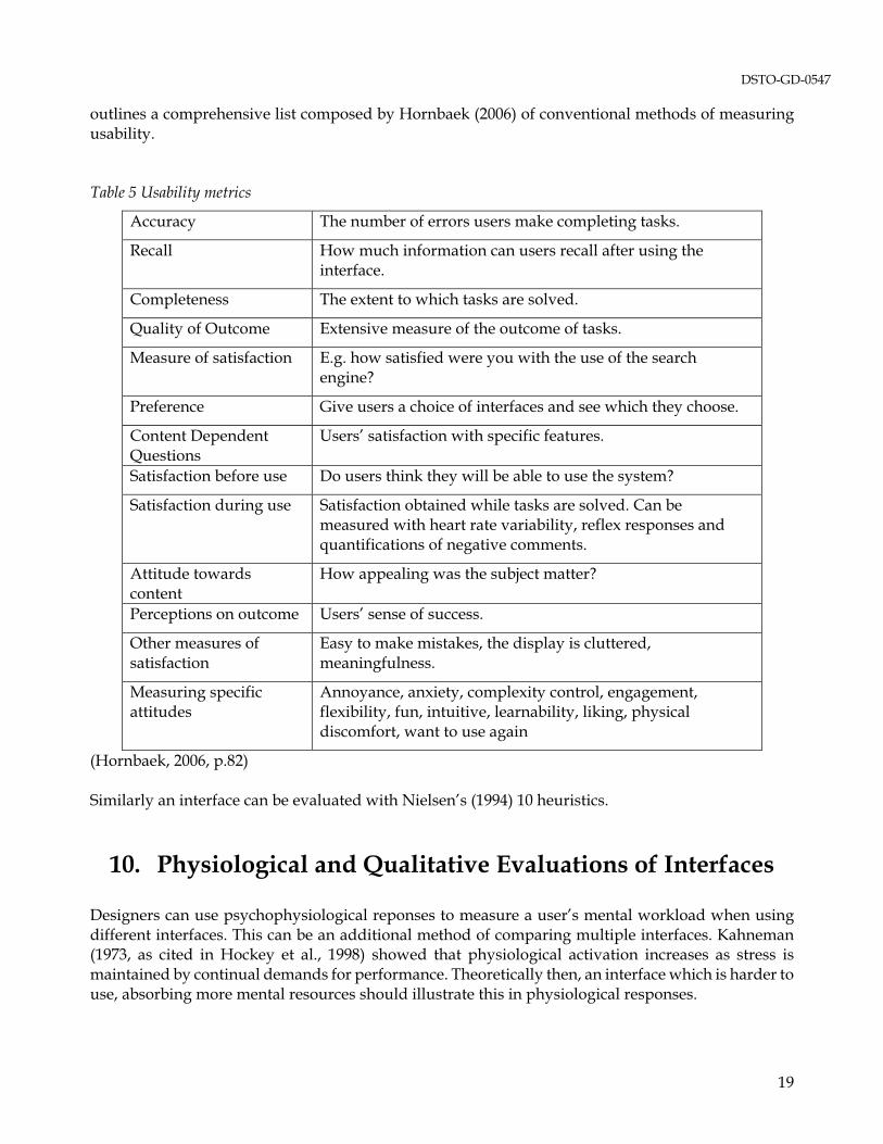
When designing systems with usability principles, designers may develop multiple designs that are then exposed to scrutiny. Designs will conventionally be run through various usability tests and users will be assessed against how well they can achieve certain objectives and as to how satisfied they were with the system. Whether designers developed multiple or single designs, the completion of each phase of testing should be indicative of which design performed above the rest, and/or highlighting improvements which could be made. Continually referring back to the general design principles throughout the development of an interface will help retain a usable structure that performs well when evaluated against usability criteria. Table 5
18
DSTO-GD-0547
outlines a comprehensive list composed by Hornbaek (2006) of conventional methods of measuring usability. Table 5 Usability metrics
Accuracy The number of errors users make completing tasks.
Recall How much information can users recall after using the interface.
Completeness The extent to which tasks are solved.
Quality of Outcome Extensive measure of the outcome of tasks.
Measure of satisfaction E.g. how satisfied were you with the use of the search engine?
Preference Give users a choice of interfaces and see which they choose.
Content Dependent Questions
Users’ satisfaction with specific features.
Satisfaction before use Do users think they will be able to use the system?
Satisfaction during use Satisfaction obtained while tasks are solved. Can be measured with heart rate variability, reflex responses and quantifications of negative comments.
Attitude towards content
How appealing was the subject matter?
Perceptions on outcome Users’ sense of success.
Other measures of satisfaction
Easy to make mistakes, the display is cluttered, meaningfulness.
Measuring specific attitudes
Annoyance, anxiety, complexity control, engagement, flexibility, fun, intuitive, learnability, liking, physical discomfort, want to use again
(Hornbaek, 2006, p.82) Similarly an interface can be evaluated with Nielsen’s (1994) 10 heuristics.
10. Physiological and Qualitative Evaluations of Interfaces
Designers can use psychophysiological reponses to measure a user’s mental workload when using different interfaces. This can be an additional method of comparing multiple interfaces. Kahneman (1973, as cited in Hockey et al., 1998) showed that physiological activation increases as stress is maintained by continual demands for performance. Theoretically then, an interface which is harder to use, absorbing more mental resources should illustrate this in physiological responses.
19

DSTO-GD-0547
The highly repeatable nature and accuracy of physiological measures make them more reliable than other qualitative usability measures (Widdel & Post, 1992). One piece of technology which can explore possible avenues of interface improvement is an Eye Tracking Machine. Eye tracking machines, as suggested by the name, track the movements of one’s eyes; some also calculate blink rate, fixations, saccades, pupil dilation, and percentage of eyelid closure (PERCLOS (fatigue)). Other technology can measure physiological responses such as heart rate, heart rate variability, and skin conductance. These three indices can indicate elevated stress levels created by increased workload and interaction difficulty. With this information a designer can manipulate or choose designs which are more usable. Both of these technologies will be examined as a means to test interface usability. 10.1 Eye Tracking
Enhancing the usability of an interface would result in the user fixating less, scanning / reading quickly (Duchowski, 2002) and making fewer regressions to previously scanned areas (Rayner & Pollatsek, 1989); ultimately improving situation awareness and decision-making capabilities in high stress situations. To determine the usability of an interface, user’s eye movements are tracked to examine if they can utilise it optimally and efficiently in terms of search and retrieval behaviour. Researchers can use eye tracking technology to record and measure responses such as blink rate (Poole & Ball, 2004), fixations, saccades (Jacob & Karn, 2003), pupil dilation (Pomplun & Sunkara, 2003), and percentage of eyelid closure. These measures aid the enhancement of usability as they can yield information on issues such as fatigue, decrements in performance, cognitive activity (Boksem et al., 2005), and workload (Poole & Ball, 2004). The different ocular measures supply different information. Generally blinks, pupil dilation, and percentage of eye closure are descriptive of fatigue and cognitive processing, whereas fixations and saccades measure interface difficulty and areas of interest which capture the user’s attention. 10.1.1 Measures and Feedback
Spontaneous eye blinks are recognised as an indicator of visual and general fatigue (Caffier et al., 2003; Eriksson & Papanikolopoulos, 1997; Yamada, 1998), cognitive processing and mental workload (Boksem et al., 2005; Poole & Ball, 2004; Veltman & Gaillard, 1998; Yamada, 1998) as well as stress (Andreassi, 2000). Visual fatigue produced by VDT tasks can be described and observed by either, physical, physiological or qualitative measures. Physically, visual fatigue is detected through the reddening of the eyes and conjunctivitis; physiologically it is measured with findings of reduced power of accommodation and convergence, reduced visual activity, sensitivity to contrast and speed of perception; qualitatively, VDT users report headaches and double vision (Uetake et al., 2000). Measuring visual fatigue with eye tracking focuses mostly on the physiological factor of visual activity. Visual fatigue can be induced from one (Uetake et al., 2000) to three (Boksem et al., 2005) hours of computer usage, and/or the requirement for rapid and precise eye movements; it can be measured by assessing either or both, blink duration and blink frequency. Eriksson & Papanikolopoulos (1997) state an increase in fatigue can result in longer duration of eye blinks, whilst Yamada (1998) reports eye blinking increases with increasing fatigue. Eyeblink activity has also been linked to high levels of cognitive processing and mental workload, although this is not universal (May et al., 1990). Most findings suggest there is an inverse relationship between blink rate and cognitive workload with frequency of blinks on the decline as workload
20

DSTO-GD-0547
increases (Yamada, 1998; Poole & Ball, 2004; Bauer et al., 1987; May et al., 1990). Differing results may be linked to the type of mental activity subjects undertook. Andreassi (2000) noted that ‘thought’ increased frequency of blinks whereas tasks requiring visualisation resulted in a decrease in blink frequency; which proposes if tasks needed visual attention, subjects would resist blinks to facilitate the continuity of perceived information. Additionally blink duration is likely to increase during periods of low cognitive demand; both blink frequency and blink duration are suspected to decrease in the incidence of increased mental tasks to limit the potential of information to be missed by the user during blinks (Veltman & Gaillard, 1996). Lastly, there are also reports of blink frequency increasing significantly during periods of high stress and negative emotions (Andreassi, 2000). Pupil dilation is another measure of cognitive workload (May et al., 1990). Pomplun and Sunkara (2003) reported the dilation of pupils as a person is engaged in cognitive tasks. Although this finding may be reliable there are a number of situational confounds that can disrupt accuracy of results. Firstly the level of ambient illumination can alter the size of a person’s pupils, secondly, the position of the head must remain at the same distance, so not to assume one’s pupils have dilated if they have simply moved towards the camera (Pomplun & Sunkara, 2003). Accounting for such factors will ensure pupil dilation remains a suitable index for measuring cognitive workload. Fixations and saccades are heavily used by researchers to monitor the complexity of an interface (Rayner, 1998; Rayner & Pollastek, 1989; Duchowski, 2002; Goldberg & Kotval, 1999; Ikehara & Crosby, 2005; Jacob & Karn, 2003; Poole & Ball, 2004). A fixation occurs when the eyes remain still, generally at any point on an interface which the user deems important (Duchowski, 2002). There is some variance in the amount of time a person’s eyes need to be still to differentiate between a saccade and a fixation with Jacob & Karn (2003) stating a fixation needs to last between 100-200 ms, and Rayner (1998) stating 200-250 ms. When using fixations to draw meaning from visual searches there are two metrics that can be gathered, the duration and/or frequency of fixations. When measuring the number of fixations it is an increase that draws a researcher’s attention, and an increase can signify different user experiences depending on if the users are searching for something specific or merely browsing. If the researcher is monitoring a search task then an increase in fixations can express a poor display as the search becomes less efficient (Burns, 2000). An increase can also represent a user’s difficulty to encode information, highlighting that the interface may be too complex (Jacob & Karn, 2003). Goldberg and Kotval (1999) reported increases in fixations in displays that had tightly grouped and single spaced stimulus. The alternative is in a browsing task where increases in fixations can demonstrate a higher interest in some part of the interface (Jacob & Karn, 2003). It is important to remember when calculating fixation numbers to consider the length of the task, with longer tasks normally requiring more fixations (Jacob & Karn, 2003). An increase in fixation duration generally indicates the interface is difficult to encode (Duchowski, 2002; Goldberg & Kotval, 1999; Goldberg & Kotval, 1998; Rayner & Pollastek, 1989). This difficulty usually stems from the defining characteristics of the text. Some researchers have explained that text size and font can influence fixation duration (Rayner, 1998; Rayner, 1997; Rayner & Pollastek, 1989), with smaller text initiating longer fixations (Goldberg & Kotval, 1999). Other problem areas regard the display layout as a potential for increasing fixation duration (Goldberg & Kotval, 1999), with high density displays prolonging duration by up to 100ms (Mackworth, 1976). Concern arises over increased fixations and fixation durations because this demonstrates that users are taking longer to process the displayed information which can lengthen the decision making.
21
DSTO-GD-0547
Saccades are recorded whilst measuring fixations as saccades are the eye movements between each fixation (Poole & Ball, 2004). Saccades are typically 7-9 letter spaces long and have the primary function of bringing a new area of interest into direct sight enabling analysis (Rayner, 1998). Some researchers argue that saccades offer no information as no encoding takes place (Poole & Ball, 2004), whilst other researchers claim that if saccades decrease in length or if regressions are observed then this indicates greater complexity of the interface (May et al., 1990; Rayner & Pollatek, 1989). Rayner (1998) also stated that the amount of information around the latest fixation will influence the direction of the next saccade. Synonymous with fixations, factors such as text size and font can impact the speed of saccades (Rayner, 1997) which suggests that encoding may take place during saccades. 10.1.2 Technology
Eye tracking is a reasonably accurate method for collecting quantitative data on a person’s eye movements. Traditionally the technology used would be mounted firmly to the user’s head to restrict head movement and allow accurate recordings of pure eye movements (i.e. movements that were not contaminated by head movements) (Cooke, 2004). This method is still the most accurate however it destroys the naturalistic component of a study as it is invasive and usually uncomfortable (Cooke, 2004). Some eye tracking technology relies on stereo-vision techniques to compute accurate 3D measurements of head position, orientation, and gaze direction (faceLAB 4 Manual). Typically remote eye tracking devices use an infrared light to generate a reflection off the surface of the eye to distinguish the pupil from the iris (Cooke, 2004; Morimoto et al., 1999). The only disadvantage with remote eye tracking devices relative to head mounted devices is a loss of accuracy. Accuracy for remote devices is susceptible to movements of the head, movements of the face such as laughter also decrease accuracy. The advantages of some remote devices such as the technology developed by Seeing Machines are the absence of constant manual calibration and the potential for a more natural laboratory milieu. An advantage of all Eye Tracking technology is its ability to provide continuous feedback on workload. This is important when measuring workload as it is not a static concept (Veltman & Gaillard, 1996). In other words taking a single measurement of workload by a questionnaire for example, would not capture the quantity of variances in workload and the impacts of this on the individual. Continuous feedback and results will assist a researcher assessing all parts of the interface with various users, ultimately to pinpoint certain areas of concern. The aforementioned material is important to consider when choosing an eye-tracking device; researchers need to consider carefully whether accuracy or a natural setting is of greater importance. 10.2 Biometrics
Determining the point of performance detriment can occur through quantitative biometric (physiological) measurements. It is known that as a person starts to process more information and experiences greater levels of stress, physiological changes will start to occur. Measuring physiological responses can be superior to qualitative form of workload measurement as it can collect a continuous stream of data over a long period of time (Wickens & Holland, 2000), supplying information about momentary fluctuations relative to differing stimuli (Jorna, 1992). Additionally there are many biometrics to choose from (Soga & Wada, 2004), enabling an experimenter to opt for the biometrics best supporting their experiment. Here we will discuss the biometrics Heart Rate (HR), Heart Rate Variability (HRV), and Skin Conductance (SC). Multiple biometrics are investigated as it is recommended when a user’s task has multiple components (Ryu & Myung, 2005).
22
DSTO-GD-0547
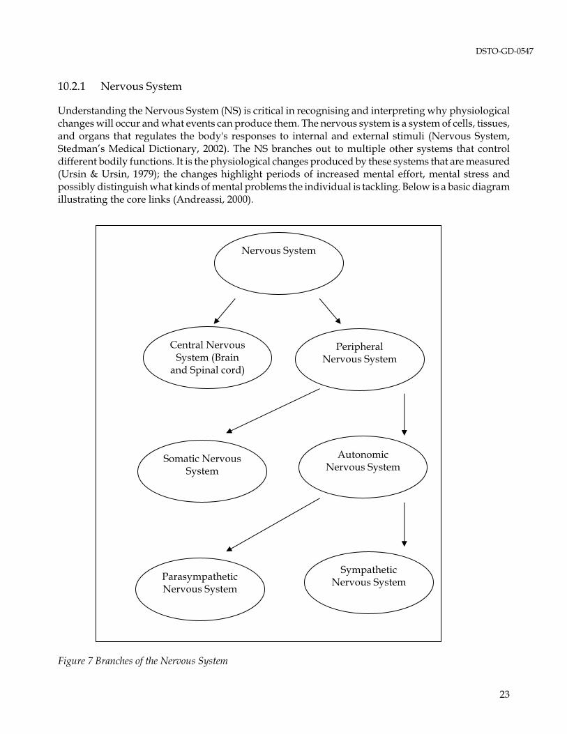
10.2.1 Nervous System
Understanding the Nervous System (NS) is critical in recognising and interpreting why physiological changes will occur and what events can produce them. The nervous system is a system of cells, tissues, and organs that regulates the body's responses to internal and external stimuli (Nervous System, Stedman’s Medical Dictionary, 2002). The NS branches out to multiple other systems that control different bodily functions. It is the physiological changes produced by these systems that are measured (Ursin & Ursin, 1979); the changes highlight periods of increased mental effort, mental stress and possibly distinguish what kinds of mental problems the individual is tackling. Below is a basic diagram illustrating the core links (Andreassi, 2000).
Nervous System
Central Nervous System (Brain
and Spinal cord)
Peripheral Nervous System
Autonomic Nervous System
Somatic Nervous System
Parasympathetic Nervous System
Sympathetic Nervous System
Figure 7 Branches of the Nervous System
23

DSTO-GD-0547
The systems concerning the physiological changes associated with mental effort and mental stress are the Autonomic Nervous System (ANS), and its two branches, the Sympathetic Nervous System (SNS) and the Parasympathetic Nervous System (PNS). The ANS controls the visceral structures – the glands and organs of the body (Andreassi, 2000), as well as the primary emotional responses, smooth muscles (muscles that contract without voluntary control), heart muscles and secretions of glands (Ahuja, 2003). The SNS is what speeds up the heart, causes secretion of glands and inhibits other body functions; it is the system which is heightened during fight/flight reactions to danger, fear, anger and anxiety (Ahuja, 2004), and is dominant in situations requiring the mobilisation of energy (Andreassi, 2000). The PNS is what slows the heart, controls the secretions in the stomach, conserves and stores bodily resources (Ahuja, 2003). 10.2.2 Heart Rate and Heart Rate Variability
Heart Rate and Heart Rate Variability are biometrics that can be used to identify periods of high mental effort and high stress. Research investigating the impact of mental workload on HR generally finds an increase in mental workload will increase HR. Most findings have concluded HR will increase in response to psychological stressors (Freychuss et al., 1990), fatigue (Firth, 1973), and task load (Wierwille, 1979). The findings in this area are not completely unanimous as others have manipulated mental load to find HR falls prior to stimulus presentation and after an incorrect response (Danev & deWinter, 1970). Previously it was mentioned that biometrics have capabilities to distinguish what type of task an individual may be involved in. Lacey et al. (1963) described individuals reacting to stimuli by either accepting it or rejecting it (Dahl & Spence, 1971). ‘Environmental Acceptance’ of a stimulus was theorised as an individual giving visual attention to the stimulus resulting in a fall in HR, whereas, ‘Environmental Rejection’ incurs thinking and problem solving which increases HR; any task requiring both acceptance and rejection will not alter HR (Lacey et al. 1963). Lacey’s theory has also been supported by Johnson and Campos (1967) who found cardiac deceleration in individuals with visual attention tasks and cardiac acceleration in imagination only tasks. These findings should be taken into account when examining changes in HR and the direction in which you expect changes. If physiological changes cannot be observed from HR alone, psychophysiologists can use HRV as it tends to be a more sensitive measure of changes in the NS (Veltman & Gaillard, 1996). Heart Rate Variability (HRV) is a sensitive (Delaney & Brodie, 2000; Miyake, 1997; Rowe, 1999), simple (Lang & Szilagyi, 1991), non-obtrusive method of measuring the status of the ANS (Ahuja, 2003), changes in the SNS (Gellatly & Meyer, 1992), and the PNS (Miyake, 1997). HRV refers to the irregular variation or fluctuations in the beat-to-beat intervals (Miller & Rokicki, 1996), also referred to as the heart period (HP) or R-R intervals (Berntson et al., 1997). The R wave is the prominent part of the heartbeat (Andreassi, 2000), see Figure 8. As seen from Figure 9 the heart rate of a resting person can fluctuate with different respiration behaviour. The basic changes in HR due to respiration are reported as the heart period lengthening during expiration, and shortening during inspiration (Cacioppo et al. 2000). These changes resulting from respiration are called Respiratory Sinus Arrhythmia (RSA). RSA reflects high frequency (.15-.40 Hz) HRV (Berntson et al., 1997). HRV can be broken down into three frequencies, Low Band Frequency (.02-.06 Hz), Mid Band Frequency (.07-.14 Hz), and High Band Frequency. The different frequencies represent different activities, for example, high band is attributed to respiration, low band can be attributed to vasomotor activity regulating body temperature, and mid
24

DSTO-GD-0547
band changes are attributed to vasomotor activity related to regulation of arterial pressure (Althaus et al., 1998). As RSA affects HRV it is imperative to minimise changes in respiration during workload measurement. Therefore experimenters wishing to use HRV as a workload measure should control for, or note, confounds such as talking, sneezing, coughing, and ambient temperature, which can at least momentarily, change respiration.
Time
HR
Figure 8 The interbeat frequencies of an HR used to measure HRV (Andreassi, 2000, p259)
Figure 9 Variations in HR caused by Respiration (Stern et al., 2001, p144)
10.2.3 Skin Conductance
The second biometric to be discussed is skin conductance (SC), also known as galvanic skin response (GSR), and electrodermal activity (EDA). SC is a reliable and easily assessed biometric which is measured through changes in the skin resistance caused by sweating (Ahuja, 2003). There are two types of sweat glands on humans, apocrine and eccrine glands. There are many eccrine sweat glands over the body, including the hands and the soles of the feet. They reliably indicate stress because they are quite unresponsive to heat but very responsive to psychological and sensory stimuli (Andreassi, 2000). When an individual is aroused the SNS activates the sweat glands, and the response will be described as either a decrease in skin resistance (Ahuja, 2003; Wierwille, 1979), or an increase in SC. Skin Conductance is also very responsive to the introduction of secondary stimuli (Johnson & Campos, 1967) making it a suitable biometric to measure increases in stress load. A recent study by Collet et al. (2008) investigated the number of aircraft controlled by an air traffic controller, and the effect of this workload on SC and HR. This study successfully demonstrated that SC and HR correlate highly and significantly with increases in mental workload (increases in air traffic), as well as SC and HR having a high and significant correlation with each other.
25
DSTO-GD-0547
10.3 Limitations
One factor to be cautious of when assessing HR responses to stimuli is habituation. HR responses are known to habituate (accustom by frequent/prolonged exposure) over time decreasing physiological responsibility and accuracy (Andreassi, 2000; Firth, 1973). Secondly, HR is influenced by many other factors which, especially when combined, can have a confounding effect on an experiment. Factors such as physical work, respiratory rates, emotion, age, temperature, past experience, motivation and circadian rhythms (Firth, 1973) have all been suggested as possible influences on HR. HRV also has its limitations, most of which stems from its sensitivity (Hancock et al., 1985). Because it is a very sensitive measure which makes it an attractive biometric to use, it makes HRV vulnerable to contamination of external variables. An experimenter can limit this by placing heavy controls on the experiment, but changes including head tilt, posture and increased respiratory rates can all increase or decrease HRV (van Ravenswaaji-Arts et al., 1993; Althaus et al., 1998). Additionally, motivation, or lack thereof, may explain the difficulty in experimenters further reducing HRV after the implementation of a task. It has been noted, the only way to further decrease HRV after the introduction of a task is to constrict the time given, or to introduce a secondary task differing in functionality. Veltman and Gaillard (1993) report, motivating subjects in experiments is problematic in obtaining a true measure of workload. They state that subjects who are not motivated to solve mental tasks will not compensate for a harder task by allocating more mental resources. They suggest to try and overcome this by arranging for the subjects to arrive in pairs and for the subjects to assess each other’s performance to involve an element of competition. The limitation impacting SC is similar to HR. Skin Conductance is subject to changes in variables such as temperature, humidity, stress, physical work, metabolism, diet and time of day (Wierwille, 1979). Again the experimenter can try to control these, and qualitatively assess for the variables that are outside of the experimenter’s reign, such as personal stress. Lastly, something which can affect all areas of measuring mental effort is the experience of the subjects. Due to the complex and classified nature of military interfaces they can only be tested and evaluated by military personnel. Therefore, in most cases, there will always be some level of experience. Previous studies on pilots have noted that experienced pilots have had enough background and use of planes to react less intensely to stressful situations (Ylonen et al., 1997), we can assume this will be a similar occurrence in assessing military personnel. If assessing reactions to new interfaces this issue is not as discriminating as both experts and novices are inexperienced. Yet it will need to be addressed if current interfaces are used.
26

DSTO-GD-0547
11. Conclusion
Evaluating the display design/interface before the interface is in its final stages is critical. Involving the users in this process is of utmost importance as usability analysts are not the users and can never fully understand all potential interface interaction problems. Workload should always be investigated to truly understand complete usability, as reducing one’s workload by creating a system which is easier to use is always beneficial. Usability is always measured qualitatively, and workload is often, and quite successfully, measured qualitatively too. To increase the accuracy of mental workload measurement quantitative responses like heart rate and skin conductance are valuable for continuous workload measurements, rather than a once-off, self-rated questionnaire. Eye tracking is another quantitative alternative to measuring workload and fatigue. Remote eye trackers are better than heart rate and skin conductance monitors because they are less invasive, but eye trackers can also lack continuous measurement when users move around and out of the line of sight of the eye tracking cameras. Most of the literature supports the use of blinks and percentage of eyelid closure as good workload/fatigue measures. Fixations and saccades are better for descriptive information on what influences the users’ attention. Both the biometric and eye tracking measures do provide valuable information to support qualitative data on usability and workload. To improve the robustness of usability assessments it is recommended to use both quantitative and qualitative data as one type cannot replace the benefit and value of the other.
27

DSTO-GD-0547
12. References
Ahuja, N, D. (2003). GSR and HRV: It’s Application in Clinical Diagnosis. Proceedings of the 16th IEEE Symposium on Computer-Based Medical Systems. Allen, R, C., Melvin, R, L. (1981). Chromostereopsis. Survey of Ophthalmology, 26(1), 22-27.
Althaus, M., Mulder, L, J., Mulder, G., Van Roon, A, M., Minderaa, R, B. (1998). Influence of respiratory activity on the cardiac response pattern to mental effort. Psychophysiology, 35, 420-430.
Andreassi, J, L. (2000). Psychophysiology: Human Behaviour and Physiological Response 4th Edition. Lawrence Erlbaum Associates: New Jersey. Baecker, R, M., Grudin, J., Buxton, W, A., Greenberg, S. (1995). Readings in Human-Computer Interaction: Toward the Year 2000 (Second Edition). California: Morgan Kaufman Publishers, (p.35-47). Bauer, L., Goldstein, R., Stein, J. (1987). Effects of information-processing demands on physiological response patterns. Human Factors, 29, 213-234. Berntson, G, G., Bigger, J, T., Eckberg, D, L., Grossman, P., Kaufmann, P, G., Malik, M., Nagaraja, H, N., Porges, S, W. (1997). Heart Rate Variability: Origins, methods, and interpretive caveats. Psychophysiology, 34, 623-648.
Boksem, M., Meijman, T., Lorist, M. (2005). Effects of mental fatigue on attention: An ERP study. Cognitive Brain Research, 25, 107-116.
Burns, C. M. (2000). Putting it all together: Improving display integration in ecological displays. Human Factors, 42(2), 226-241.
Caffier, P. P., Erdmann, U., Ullsperger, P. (2003). Experimental evaluation of eye-blink parameters as a drowsiness measure. European Journal of Applied Physiology, 89, 319-325. Cacioppo, J, T., Tassinary, L, G., Berntson, G, G. (Eds). (2000). Handbook of Psychophysiology. USA: Cambridge University Press. Chen, J, L., Stanney, K, M. (1999). A theoretical model of wayfinding in virtual environments: proposed strategies for navigational aiding. Presence, 8(6)y, 671-685.
28

DSTO-GD-0547
Christ, R, E. (1975). Review and analysis of color coding research for visual displays. Human Factors, 17, 542-570.
Collet, C., Averty, P., Dittmar, A. (2008). Autonomic nervous system and subjective ratings of strain in air-traffic control. Applied Ergonomics, In Press.
Cooke, L. (2004). Improving Usability Through Eye Tracking Research. IEEE CNF: Professional Communication Conference, 195-198.
Cuevas, H, M., Fiore, S, M., Bowers, C, A., Salas, E. (2003). Fostering constructive cognitive and metacognitive activity in computer-based complex task training environments. Computers in Human Behavior, 20, 225-241. Dahl, H., Spence, D, P. (1971). Mean heart rate predicted by task demand characteristics. Psychophysiology, 7(3), 369-376.
Danev, S, G., DeWinter, C, R. (1970). Expectation, attention and heart rate deceleration – some complications in the use of heart rate variability for assessing mental load. An Internal Report of the Netherlands Instituut Voor Praeventieve Geneeskunde – TNO: Leiden, The Netherlands.
Delaney, J, P., Brodie, A, D. (2000). Effects of short-term psychological stress on the time and frequency domains of heart-rate variability. Perceptual and Motor Skills, 91, 515-524.
Dry, M., Lee, M., Vickers, D., Huf, S., Mansell, T. (2002). Psychological implications for Submarine Display Design. DSTO Systems Sciences Laboratory. South Australia. Duchowski, A. T. (2002). A breadth-first survey of eye-tracking applications. Behaviour Research Methods, Instruments, and Computers, 34(4), 455-470. Dyer, F, N. (1986). Smoking and soldier performance (Report No 86-13). Ft. Detrick, Maryland: U.S. Army Medical Research and Development Command. Eddy, M, F., Kribs, H, D., Cowen, M, B. (1999). Cognitive and Behavioural Task Implications for Three-Dimensional Displays Used in Combat Information/Direction Centers (Technical Report 1792). San Diego, CA: SPAWAR System Center San Diego. Erb, C., Nicaeus, T., Adler, M., Isensee, J., Zrenner, E., Thiel, H-J. (1999). Colour vision disturbances in chronic smokers. Graefe’s Archives in Clinical Experimental Ophthalmology, 237, 377-380.
Eriksson, M., Papanikolopoulos, N. (1997). Eye-Tracking for Detection of Driver Fatigue. IEEE Conference on Intelligent Transportation of System, 314-319.
29

DSTO-GD-0547
Firth, P, A. (1973). Psychological factors influencing the relationship between cardiac arrhythmia and mental load. Ergonomics, 16(1), 5-16.
Freychuss, U., Fagius, J., Wallin, B, G., Bohlin, G., Perski, A., Hjemdahl, P. (1990). Cardiovascular and sympathoadrenal responses to mental stress: a study of sensory intake and rejection reactions. Acta Physiologica Scandinavia, 139, 173-183.
Gaver, W,W., Smith, R, S. (1995). Auditory Icons in Large-Scale Collaborative Environments. In R. M. Baecker., J. Grudin., W. A. Buxton & S Greenberg (Eds), Readings in Human-Computer Interaction: Toward the Year 2000 (Second Edition) (564-569). California: Morgan Kaufman Publishers.
Gellatly, I, R., Meyer, J, P. (1992). The effects of goal difficulty on physiological arousal, cognition, and task performance. Journal of Applied Psychology, 77(5), 694-704.
Goldberg, J. H., Kotval, X. P. (1999). Computer interface evaluation using eye movements: methods and constructs. International Journal of Industrial Ergonomics, 24, 631-645.
Goldberg, J., Kotval, X. (1998). Eye-movements based evaluation of the computer interface. In S.K. Kumar (Ed.), Advances in Occupational Ergonomics and Safety, 529-532. Amsterdam: ISO Press. Grudin, J. (1989). The case against user interface consistency. Communications of the ACM, 32(10), 1164-1173.
Hancock, P. A., Meshkati, N., Robertson, M. M. (1985). Physiological reflections of mental workload. Aviation, Space and Environmental Medicine, 56, 1110-1114.
Hansen, W. (1971). User engineering principles for interactive systems. AFIPS Conference Proceedings 39, Fall Joint Computer Conference. AFIPS Press, 523-532. Helander, M, G. (1987). Design of visual displays. In G. Salvendy (Ed), Handbook of Human Factors. John Wiley and Sons: New York.
Hendy, K, C., Liao, J., Milgram, P. (1997). Combining time and intensity effects in assessing operator information-processing load. Human Factors, 39(1). 30-47. Hockey, G, R. (1997). Compensatory control in the regulation of human performance under stress and high workload: a cognitive-energetical framework. Biological Psychology, 45, 73-93. Hockey, G, R., Wastell, D., Sauer, J. (1998). Effects of sleep deprivation and user interface on complex performance: a multilevel analysis of compensatory control. Human Factors, 40(2), 233-253.
30
DSTO-GD-0547
Hornbaek, K. (2006). Current practice in measuring usability: Challenges to usability studies and research. International Journal of Human-Computer Studies, 64(2), 79-102. Horton, W. (1994). The Icon Book: Visual Symbols for Computer Systems and Documentation. USA: John Wiley & Sons Inc. Hu, P., Ma, P., Chau, P. (1999). Evaluation of user interface designs for information retrieval systems: a computer-based experiment. Decision Support Systems, 27(1), 125-143. Ikehara, C. S., Crosby, M. (2005). Assessing Cognitive Load with Physiological Sensors. Proceedings of the 38th Hawaii International Conference on System Sciences. Jacob, R., Karn, K. (2003). Eye tracking in human-computer interaction and usability research: Ready to deliver the promises. The Minds Eye: Cognitive and Applied Aspects of Eye Movement Research. Ed: J. Hyona., R. Radach., H. Deubel. 573-603: Amsterdam. Johnson, H, J., Campos, J, J. (1967). The effect of cognitive tasks and verbalization instructions on heart rate and skin conductance. Psychophysiology, 4(2), 143-150. Jorna, P, G. (1992). Spectral analysis of heart rate and psychological state: A review of its validity as a workload index. Biological Psychology, 34, 237-257. Kahneman, D. (1973). Attention and effort. Englewood Cliffs, NY: Prentice Hall. Kalsbeek, J, W., Sykes, R, N. (1967). Objective measurement of mental load. Acta Psychologica Amsterdam, 27, 253-261. Kalsbeek, J, W., Ettema, J, H. (1963). Continuous recording of heart rate and the measurement of mental load. Ergonomics, 6, 306-307. Kaufmann, R. (1990). Effects of low-level red ambient lighting and stimulus size on classification of colours on displays. Displays, 11(3), 146-156. Kaufmann, R., Eaton, R, M. (1994). User trials on the colours and symbols for electronic charts. Applied Ergonomics, 25(6), 366-372. Kayton, M. (Ed). (1990). Navigation: Land, Sea, Air and Space. New York: IEEE. Kinney, J, A., Neri, D, F., Mercado, D, T., Ryan, A, P. (1983). Visual Fatigue in sonar control rooms lighted by red, white or blue illumination. Report Number 1000, Naval Submarine Medical Research Laboratory, Submarine Base, Groton, Conn.
Kosslyn, S, M. (1994). Image and Brain. Massachusetts: The MIT Press.
31

DSTO-GD-0547
Lacey, B, C., Kagan, J., Moss, H, A. (1963). The visceral level: Situational determinants and behavioral correlates of autonomic patterns. In P. H. Knapp (Ed), Expression of Emotions in man (pp. 161-196). New York: International Universities Press.
Lang, E., Szilagyi, N. (1991). Significance and assessment of autonomic indices in cardiovascular reactions. Acta Physiologica Hungarica, 78(3), 241-260. Lindholm, E., Cheatham, C, M. (1983). Autonomic activity and workload during learning of a simulated aircraft carrier landing task. Aviation Space and Environmental Medicine, 54, 435-439. Lodding, K. (1983). Iconic interfacing. IEEE Computer Graphics and Applications, 3(2), 11-20.
Luria, S, M., Kobus, D, A. (1985). Red light, white light. Proceedings of the U.S. Naval Institute, 111, 123-126. Luria, S, M., Paulson, H, M., Ryan, A, P., Schlichting, C, L. (1979). Effects of pseudoephedrine and triprolidine on visual performance. Aviation, Space and Environmental Medicine, 50, 1158-1160 Lyle, W, M. (1974). Drugs and conditions which may affect color vision. Journal of the American Optometric Association, 45, 47-60. Mackworth, N. H. (1976). Stimulus density limits the useful field of view. In: Monty, R.A., Senders, J.A (Eds). Eye Movements and Psychological Processes. Lawrence Erlbaum Associates: Hillsdale, NJ.
MacDonald, L, W. (1990). Using colour effectively in displays for computer-human interface. Displays, 11(3), 129-141. Mahajan, R., Shneiderman, B. (1997). Visual and Textual consistency checking tools for graphical user interfaces. IEEE Transactions on Software Engineering, 23(11), 722-735. Mahemoff, M, J., Johnston, L, J. (1998). Principles for a usability-oriented pattern language. In P. Calder., B. Thomas (Eds), OZCHI 1998, IEEE Computer Society, 132-139. Manes, S. (1985). Pushing Picture-Perfect Programs: Smash that icon! PC Magazine, June, 64. Marcus, A. (1995). Principles of Effective Visual Communication for Graphical User Interface Design. In R. M. Baecker., J. Grudin., W. A. Buxton & S Greenberg (Eds), Readings in Human-Computer Interaction: Toward the Year 2000 (Second Edition) (425-441). California: Morgan Kaufman Publishers.
32

DSTO-GD-0547
Martinez-Lopez, M. (2005). Cognitive Performance in Operational Environments. Aviation, Space and Environmental Medicine, 76(7, C2). Matthews, M, L., Mertins, K. (1989). Visual performance and subjective discomfort in prolonged viewing of chromatic displays. Human Factors, 31(3), 259-271.
May, J. G., Kennedy, R. S., Williams, M. C., Dunlap, W. P., Brannan, J. R. (1990). Eye movement indices of mental workload. Acta Psychologica, 75, 75-89.
Mayhew, D, J. (1999). The usability engineering lifecycle: A practioners handbook for user interface design. USA: Academic Press. McFadden, S., Kaufmann, R., Janzen, M. (1994). Classification of colours presented against different coloured backgrounds. Displays, 15(4), 203-214. McFarland, R, A. (1970). The effects of exposure to small quantities of carbon monoxide on vision. Annals of the New York Academy of Sciences, 174, 301-12. Miller, J, C., Rokicki, S, M. (1996) Psychophysiological Test Methods and Procedures. In T. G. O’Brien., S. G. Charlton (Eds), Handbook of Human Factors Testing and Evaluation (135-199). USA: Lawrence Erlbaum Associates.
Miyake, S. (1997). Factors influencing mental workload indexes. Journal of UOEH, 19(4), 313-325.
Morimoto, C. H., Koons, D., Amir, A., Flickner, M., Zhai, S. (1999). Keeping an Eye for HCI. Sibgraphi ’99, XII Brazilian Symposium in Computer Graphics and Image Proceedings.
Murch, G (1995). Color Graphics – Blessing or Ballyhoo. In R. M. Baecker., J. Grudin., W. A. Buxton & S Greenberg (Eds), Readings in Human-Computer Interaction: Toward the Year 2000 (Second Edition) (442-443). California: Morgan Kaufman Publishers. Nervous system. (n.d.). The American Heritage® Stedman's Medical Dictionary. Retrieved April 04, 2007, from Dictionary.com website: http://dictionary.reference.com/browse/nervous system Nielsen, J. (1994). Usability Inspection Methods. New York: John Wiley and Sons. Nielsen, J. (1993). Usability Engineering. California, USA: Morgan Kaufmann. Noiwan, J., Norcio, A, F. (2006). Cultural differences on attention and perceived usability: investigating colour combinations of animated graphics. International Journal of Human-Computer Studies, 64(2), 103-122.
33

DSTO-GD-0547
Parush, A., Berman, D. (2004). Navigation and orientation in 3D user interfaces: the impact of navigation aids and landmarks. International Journal Human-Computer Studies, 61(3), 375-395. Passini, R. (1984). Spatial representation: A Wayfinding perspective. Journal of Environmental Psychology, 4, 153-164. Pomplun, M., Sunkara, S. (2003). Pupil Dilation as an Indicator of Cognitive Workload in Human-Computer Interaction. Proceedings of HCI International, 3, 542-546. NJ: Lawrence Erlbaum Associates. Poole, A., Ball, L. (2004). Eye Tracking in Human-Computer Interaction and Usability Research: Current Status and Future Prospects. Encyclopedia of Human Computer Interaction. Idea Group.
Post, D, L. (1985). Effects of color on CRT symbol legibility. Society for Information Display 1985 Digest, 196-199.
Rayner, K. (1998). Eye Movements in Reading and Information Processing: 20 years of Research. Psychological Bulletin, 124(3), 372-422. Rayner, K. (1997). Understanding eye movements in reading. Scientific Studies of Reading, 1, 303-323. Rayner, K., Pollastek, A. (1989). The psychology of reading. NY: Prentice Hall. Riva, C, E., Grunwald, J, E., Petrig, B, L. (1983). Reactivity of the human retinal circulation to darkness: a laser Doppler velocimetry study. Investigative Ophthalmology and Visual Science, 23, 423-30. Rowe, D, W. (1999). Heart rate variability: Aid to determining user state in the design of analysis of user interfaces. Dissertation Abstracts Int, Section B, The Sciences and Engineering, 60(8-13), 4063.
Ryu, K., Myung, R. (2005). Evaluation of mental workload with a combined measure based on physiological indices during a dual task of tracking and mental arithmetic. International Journal of Industrial Ergonomics, 35, 991-1009.
Salomon, G. (1993). A case study in interface design The CHI ’89 Information Kiosk. In R. M. Baecker., J. Grudin., W. A. Buxton & S Greenberg (Eds), Readings in Human-Computer Interaction: Toward the Year 2000 (Second Edition) (23-34). California: Morgan Kaufman Publishers. Sanders, M, S., McCormick, E, J. (1993). Human Factors in Engineering and Design 7th Edition. Singapore: McGraw-Hill International Editions.
34
DSTO-GD-0547
Sauer, J., Wastell, D, G., Hockey, R, J., Crawshaw, C, M., Ishak, M., Downing, J, C. (2002). Effects of display design on performance in a simulated ship navigation environment. Ergonomics, 45(2), 329-347. Scaife, M., Rogers, Y. (1996). External cognition: how do graphical representations work? International Journal of Human-Computer Studies, 45(2), 185-213. Sedig, K., Rowhani, S., Liang, H. (2005). Designing interfaces that support formation of cognitive maps of transitional processes: An empirical study. Interacting with Computers, 17(4), 419-452. Soga, C., Wada, C. (2004). Quantitative assessment of physiological stress effects correlated with mood states. SICE Annual Conference in Sapporo: Hokkaido Institute of Technology: Japan, 2261-2265. Stern, R, M., Ray, W, J., Quigley, K, S. (2001). Psychophysiological Recording (Second Edition). USA: Oxford University Press. Travis, D. (1991). Effective Color Displays. UK: Academic Press Limited. Thompson, P., May, K., Stone, R. (1993). Chromostereopsis: a multicomponent depth effect? Displays, 14(4), 227-234. Uetake, A., Murata, A., Otsuka, M., Takasawa, Y. (2000). Evaluation of Visual Fatigue during VDT Tasks. IEEE CNF: International Conference on Systems, Man, and Cybernatics, 2, 1277-1282. Ursin, H., Ursin, R. (1979). Physiological indicators of mental load. In: Moray, N. (Ed), Mental Workload, Its Theory and Measurement. Plenum Press: New York. 349-365. van Bommel, W, J. (2006). Non-visual biological effect of lighting and the practical meaning for lighting for work. Applied Ergonomics, 37(4), 461-466. van Ravenswaaji-Arts, C, M., Kollee, L, A., Hopman, J, C., Stoelinga, G, B., van Geijin, H, P. (1993). Heart Rate Variability. Annals of Internal Medicine, 118(6), 436-447. Veltman, J. A., Gaillard, A. W. (1998). Physiological workload reactions to increasing levels of task difficulty. Ergonomics, 41(5), 656-669. Veltman, J, A., Gaillard, A, W. (1996). Physiological indices of workload in a simulated flight task. Biological Psychology, 42, 323-342. Veltman, J, A., Gaillard, A, W. (1993). Indices of mental workload in a complex task environment. Neuropsychobiology, 23, 72-75.
35

DSTO-GD-0547
Wickens, C, D. (2000). Human factors in vector map design: the importance of task-display dependence. Journal of Navigation, 53(1), 54-67. Wickens, C, D., Carswell, C, M. (1995). The proximity compatibility principle: its psychological foundation and relevance to display design. Human Factors, 37(3), 473-494. Wickens, C, D., Hollands, J, G. (2000). Engineering Psychology and Human Performance. Prentice-Hall: Englewood Cliffs, NJ.
Widdel, H., Post, D, L, (Eds) (1992). Color in Electronic Displays. New York: Plenum Press. Wierwille, W, W. (1979). Physiological measures of aircrew mental workload. Human Factors, 21(5), 575-593.
Yamada, F. (1998). Frontal midline theta rhythm and eyeblinking activity during a VDT task and a video game: useful tools for psychophysiology in ergonomics. Ergonomics, 41(5), 678-688.
Yeh, M., Wickens, C, D. (2001). Attentional filtering in the design of electronic map displays: a comparison of color coding, intensity coding, and decluttering techniques. Human Factors, 43(4), 543-562.
Ylonen, H., Lyytinen, H., Leino, T., Leppaluoto, J., Kuronen, P. (1997). Heart rate responses to real and simulated BA Hawk MK 51 Flight. Aviation, Space and Environmental Medicine, 68(7), 601-605.
36

DSTO-GD-0547
Appendix A: Definitions of colour and its effects
Hue is the gradation of color within the visible or optical spectrum of light. It is the word most often used to describe a colour (Travis, 1991), it is the perception of being blue or orange or green etc (Marcus, 1995). Red Orange Green Blue
Figure 8 Some hues of the colours Red, Orange, Green, and Blue
Chroma also called saturation is the perception of the colour on a scale of neutral or grey, to the most pure form of the colour (Marcus, 1995). The chroma can change, for example when white is added to red to produce a paler version of red, this would result in the same hue, but a different purity/chroma/saturation (Encyclopedia Britannica Online, 2006).
Figure 9 Different Chromas of Red Achromatic displays refer to the use of only white, black and shades of grey such as white text on a black ground (Matthews & Mertins, 1989; Widdel & Post, 1992). Monochromatic refers to a display representing a single hue such as red, or green on a black background (Matthews & Mertins, 1989; Widdel & Post, 1992). Multichromatic displays are those with two or more colours such as red on a blue background; this concept is incorporated for colour coded displays (Matthews & Mertins, 1989). Chromatic Induction describes the change in the colour of an object resulting from the surrounding or background colour of that object (Widdel & Post, 1992; McFadden et al., 1994). Because of this possible effect designers must ensure, especially with displays that are colour coded, that colours of objects are not perceived differently due to the surrounding colour. Chromatic Aberration occurs as “short-wavelength (violet) light is brought to a focus slightly in front of the retina, and long-wavelength (red) light is brought to a focus slightly behind the retina” (Travis, 1991) this creates a blurring of the image, or the effect of shimmering as the colours move in and out of focus (Matthews & Mertins, 1989). The worst type of chromatic aberration is the combination of saturated blue and saturated red (Travis, 1991).
37

DSTO-GD-0547
Chromostereopsis is said to be a combination of chromatic aberration and the misalignment of the visual and optical axes within the eye (Thompson et al., 1993). Chromostereopsis occurs when colours appear to have different depths; lines of one colour appear to come forward, whilst another colour appears recessed (Allen & Melvin, 1981). Similar to chromatic aberration, this effect is often found with the colours blue and red, with red appearing closer to the user than the colour blue (Matthews & Mertins, 1989). This can be a problem when red and blue are used to display depth. Chromostereopsis is not apparent in all individuals with some people reporting blue as appearing closer than red, this is termed negative chromostereopsis (Thompson et al., 1993). In addition to chromostereopsis reducing visual performance it can also increase user discomfort from the continuous refocusing performed to view both colours concurrently (Matthews & Mertins, 1989).
38

Page classification: UNCLASSIFIED
DEFENCE SCIENCE AND TECHNOLOGY ORGANISATION
DOCUMENT CONTROL DATA 1. PRIVACY MARKING/CAVEAT (OF DOCUMENT) ,
2. TITLE Concepts of Interface Usability and the Enhancement of Design through Eye Tracking and Psychophysiology
3. SECURITY CLASSIFICATION (FOR UNCLASSIFIED REPORTS THAT ARE LIMITED RELEASE USE (L) NEXT TO DOCUMENT CLASSIFICATION) Document (U) Title (U) Abstract (U)
4. AUTHOR(S) Kate Ponton
5. CORPORATE AUTHOR DSTO Defence Science and Technology Organisation PO Box 1500 Edinburgh South Australia 5111 Australia
6a. DSTO NUMBER DSTO-GD-0547
6b. AR NUMBER AR-014-279
6c. TYPE OF REPORT General Document
7. DOCUMENT DATE September 2008
8. FILE NUMBER 2007/1014564
9. TASK NUMBER NAV 07/093
10. TASK SPONSOR PSO CAPDIV SMFEG
11. NO. OF PAGES 33
12. NO. OF REFERENCES 117
13. URL on the World Wide Web http://www.dsto.defence.gov.au/corporate/reports/DSTO-GD-0547.pdf
14. RELEASE AUTHORITY Chief, Maritime Operations Division
15. SECONDARY RELEASE STATEMENT OF THIS DOCUMENT
Approved for public release OVERSEAS ENQUIRIES OUTSIDE STATED LIMITATIONS SHOULD BE REFERRED THROUGH DOCUMENT EXCHANGE, PO BOX 1500, EDINBURGH, SA 5111 16. DELIBERATE ANNOUNCEMENT No Limitations 17. CITATION IN OTHER DOCUMENTS Yes 18. DSTO RESEARCH LIBRARY THESAURUS http://web-vic.dsto.defence.gov.au/workareas/library/resources/dsto_thesaurus.htm Displays, Human computer interaction, Human factors engineering, Human machine interfaces 19. ABSTRACT This paper outlines and discusses the dominant usability guidelines and concepts that should be a core feature in the design process of user interfaces for complex systems. The concepts include the impact of colour, ambient light, dark adaptation, symbol and icon, consistency, information layout, and auditory stimulus. This paper also investigates alternative methods of user interface evaluation, which are psychophysiological in nature, such as biometrics and eyetracking. The biometrics covered include heart rate, heart rate variability, and skin conductance; the eye-tracking measures include eye blinks, gaze, fixations, percentage of eyelid closure, and pupil dilation. There is a considerable volume of literature detailing the benefits of eye tracking, although this technology is still advancing to a truly reliable and accurate level. The main concerns with the biometrics mentioned is their sensitivity to other variables and how this impacts the ability to interpet and trust data. The author is particularly interested in usability in the maritime domain, therefore a lot of the examples provided refer to usability issues within Navy and the Submarine environment.
Page classification: UNCLASSIFIED