content page: trail
TRANSCRIPT

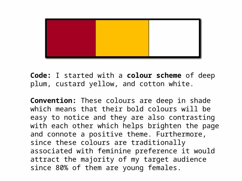
Code: I started with a colour scheme of deep plum, custard yellow, and cotton white.
Convention: These colours are deep in shade which means that their bold colours will be easy to notice and they are also contrasting with each other which helps brighten the page and connote a positive theme. Furthermore, since these colours are traditionally associated with feminine preference it would attract the majority of my target audience since 80% of them are young females.

Code: The images above present how I have used word art with the font 'Bauhaus' for the masthead.Convention: I have learnt that through each font it helps reflect the theme of the magazine through its structure, for instance the font 'Bauhaus' gives letters the soft outline even in capital letters the 'N' looks like a lower case 'n' due to the edge-less form, the 'E' also shows. This font creates the theme of the magazine to look 'modern' and appropriate for 'younger audiences' as it provides an impression of softness and slightly techno.
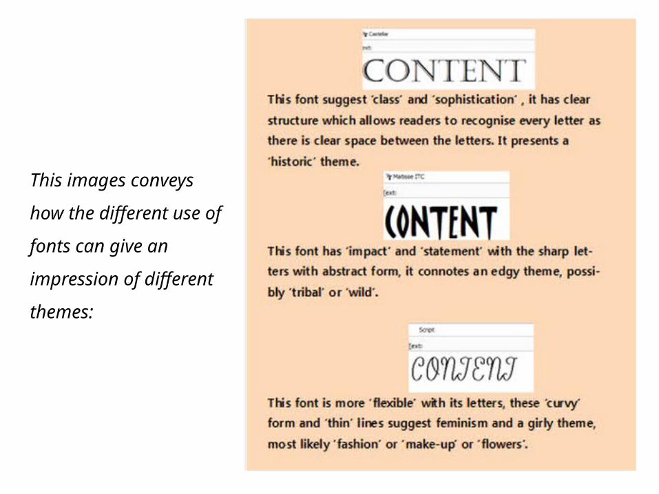
This images conveys how
the different use of fonts
can give an impression of
different themes:
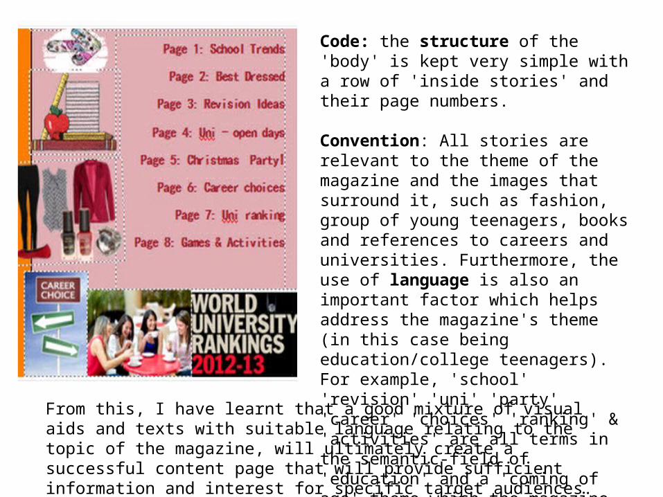
Code: the structure of the 'body' is kept very simple with a row of 'inside stories' and their page numbers.
Convention: All stories are relevant to the theme of the magazine and the images that surround it, such as fashion, group of young teenagers, books and references to careers and universities. Furthermore, the use of language is also an important factor which helps address the magazine's theme (in this case being education/college teenagers). For example, 'school' 'revision' 'uni' 'party' 'career' 'choices' 'ranking' & 'activities' are all terms in the semantic-field of 'education' and a 'coming of age' theme which the magazine wants to provide information on.
From this, I have learnt that a good mixture of visual aids and texts with suitable language relating to the topic of the magazine, will ultimately create a successful content page that will provide sufficient information and interest for specific target audiences.
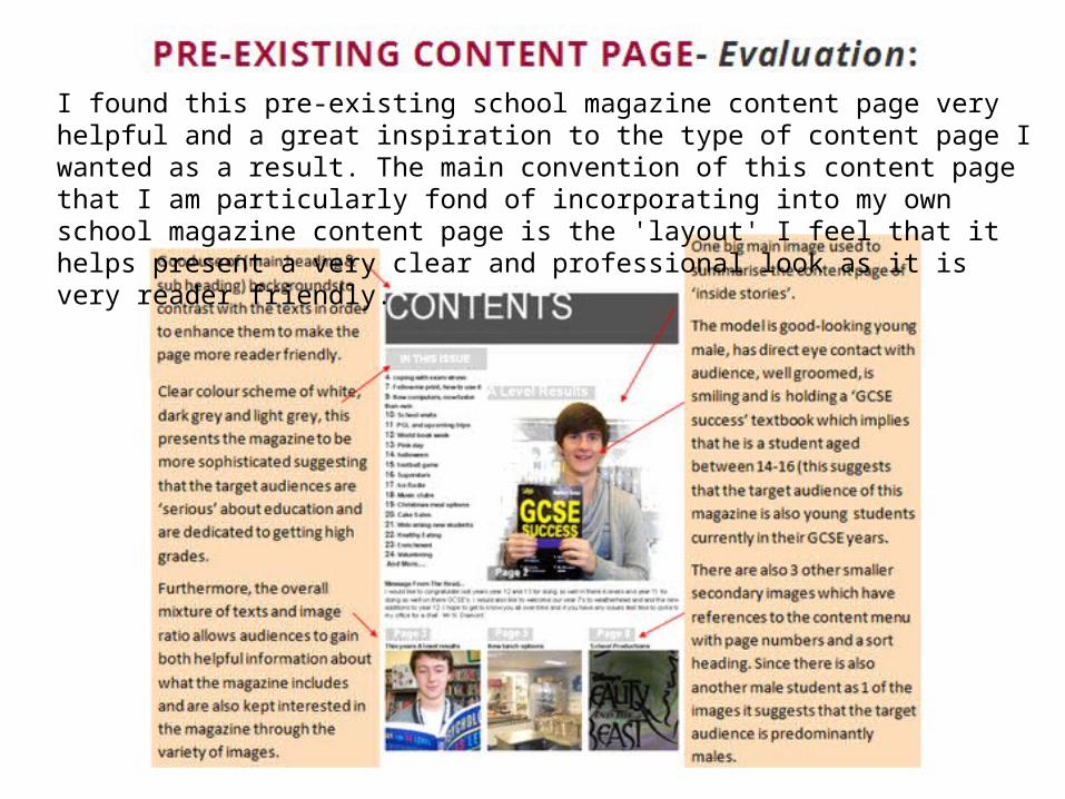
I found this pre-existing school magazine content page very helpful and a great inspiration to the type of content page I wanted as a result. The main convention of this content page that I am particularly fond of incorporating into my own school magazine content page is the 'layout' I feel that it helps present a very clear and professional look as it is very reader friendly.