contents page and double page spread analysis
TRANSCRIPT
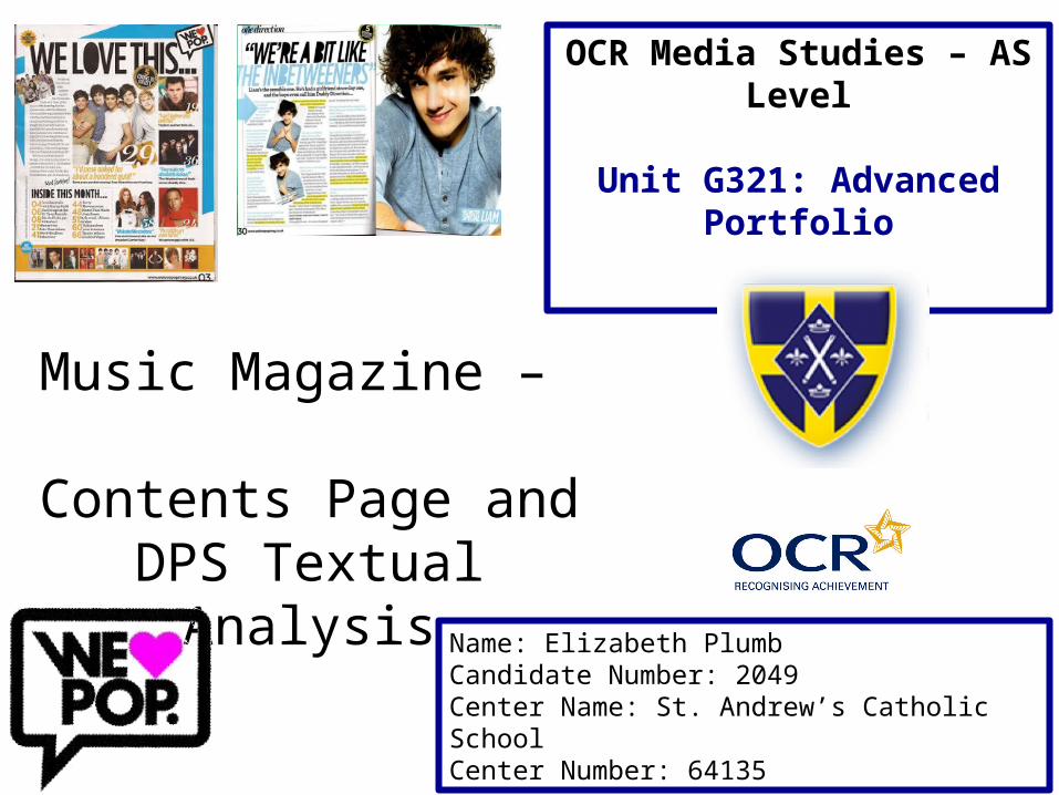
Music Magazine –
Contents Page and DPS Textual Analysis
Name: Elizabeth PlumbCandidate Number: 2049 Center Name: St. Andrew’s Catholic SchoolCenter Number: 64135
OCR Media Studies – AS Level
Unit G321: Advanced Portfolio
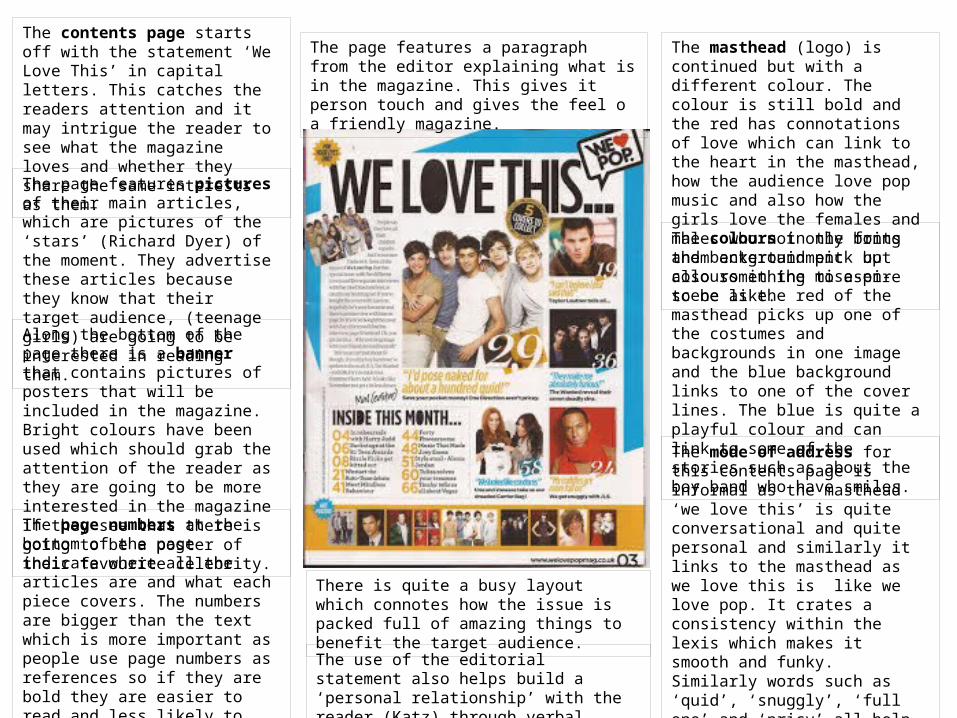
The contents page starts off with the statement ‘We Love This’ in capital letters. This catches the readers attention and it may intrigue the reader to see what the magazine loves and whether they share the same interests as them.
The page features pictures of their main articles, which are pictures of the ‘stars’ (Richard Dyer) of the moment. They advertise these articles because they know that their target audience, (teenage girls) are going to be interested in reading them.
Along the bottom of the page there is a banner that contains pictures of posters that will be included in the magazine. Bright colours have been used which should grab the attention of the reader as they are going to be more interested in the magazine if they see that there is going to be a poster of their favourite celebrity.
The page numbers at the bottom of the page indicate where all the articles are and what each piece covers. The numbers are bigger than the text which is more important as people use page numbers as references so if they are bold they are easier to read and less likely to get confused.
The page features a paragraph from the editor explaining what is in the magazine. This gives it person touch and gives the feel o a friendly magazine.
The masthead (logo) is continued but with a different colour. The colour is still bold and the red has connotations of love which can link to the heart in the masthead, how the audience love pop music and also how the girls love the females and males who not only bring them entertainment but also something to aspire to be like.
The colours in the fonts and background pick up colours in the mise-en-scene as the red of the masthead picks up one of the costumes and backgrounds in one image and the blue background links to one of the cover lines. The blue is quite a playful colour and can link to some of the stories such as about the boy band who have smiles.
The mode of address for this contents page is informal as the masthead ‘we love this’ is quite conversational and quite personal and similarly it links to the masthead as we love this is like we love pop. It crates a consistency within the lexis which makes it smooth and funky. Similarly words such as ‘quid’, ‘snuggly’, ‘full one’ and ‘pricy’ all help add to the informal language in the editorial such as ‘mags’ and ‘twinkle toes’ which again helps to create an easy to read magazine for teens.
There is quite a busy layout which connotes how the issue is packed full of amazing things to benefit the target audience.
The use of the editorial statement also helps build a ‘personal relationship’ with the reader (Katz) through verbal codes.
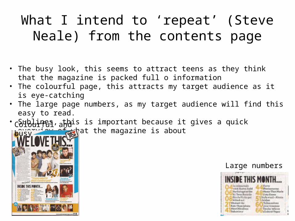
What I intend to ‘repeat’ (Steve Neale) from the contents page
• The busy look, this seems to attract teens as they think that the magazine is packed full o information
• The colourful page, this attracts my target audience as it is eye-catching• The large page numbers, as my target audience will find this easy to read. • Sublines, this is important because it gives a quick overview of what the magazine is
about
Large numbers
Colourful and busy

The technical code of a large medium close up of the celebrity, is large enough to be cut out, as suggested by the scissor lines on the side of the page. He is smiling and again he is giving a direct mode of address to the reader making them feel special and close to the star.
Masthead is small in the corner which allows for the image and the story to take the full control. There is a sophisticated font next to the masthead.
The slanted images add an informal ell as it is almost like they have been placed on so its not too serious. Similarly the rule o thirds makes for an interesting approach that is informal and creative.
Instead of normally a drop capital used they have used an arrow to open the interview. It can link to the bands name (One Direction). Also its quite chunky and modern like the font in the headline creating consistency.
The stand first provides an introduction and ellipses at the end leads the reader in nicely as there is a flow.
The pull quote is interesting, comical; and lures the reader in. Similarly the similar fonts form the content page crate a house style that is quite modern and funky.
The blue used in the fonts and in the mise-en-scene is quite a sot calming colour which can link to how the interview focuses on his girlfriend and love. Similarly it can link to how calm and friendly he looks. Also it can link to him being a male as blue denotes males. But it being light blue adds femininity to bringing it back to the target audience of females. The innocent blue contrasts with the yellow that is highlights certain parts of Liam’s answers showing their importance. It can also add to his playful side which is revealed when he admits to picking up a ‘glass of water’ and lobbing all over a fellow band mate.

What I intend to ‘repeat’ (Steve Neale) from the double page spread
• The constant same colour (house style) as this looks professional• The informal look, as this is was attracts teens as it looks fun to read• The ability to cut out the celebrity. • Differentiated Q’s and A’s
House colour throughout and informal look. Cut out