contrasting my draft and final product
TRANSCRIPT
Viet PhamChrist the King: Aquinas13L4022
Contrasting my draft and final product
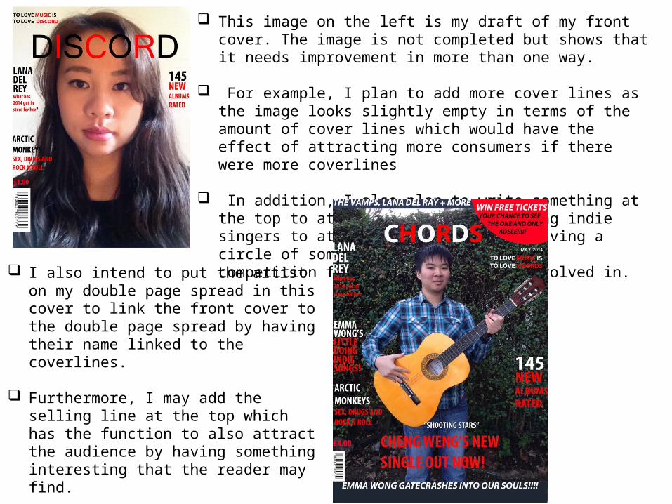
This image on the left is my draft of my front cover. The image is not completed but shows that it needs improvement in more than one way.
For example, I plan to add more cover lines as the image looks slightly empty in terms of the amount of cover lines which would have the effect of attracting more consumers if there were more coverlines
In addition, I also plan to write something at the top to attract the reader by using indie singers to attract them as well as having a circle of some sorts which may have a competition for the readers to be involved in.
I also intend to put the artist on my double page spread in this cover to link the front cover to the double page spread by having their name linked to the coverlines.
Furthermore, I may add the selling line at the top which has the function to also attract the audience by having something interesting that the reader may find.
I am not a hundred per cent sure about the colour scheme and so it may change if I feel it is necessary.
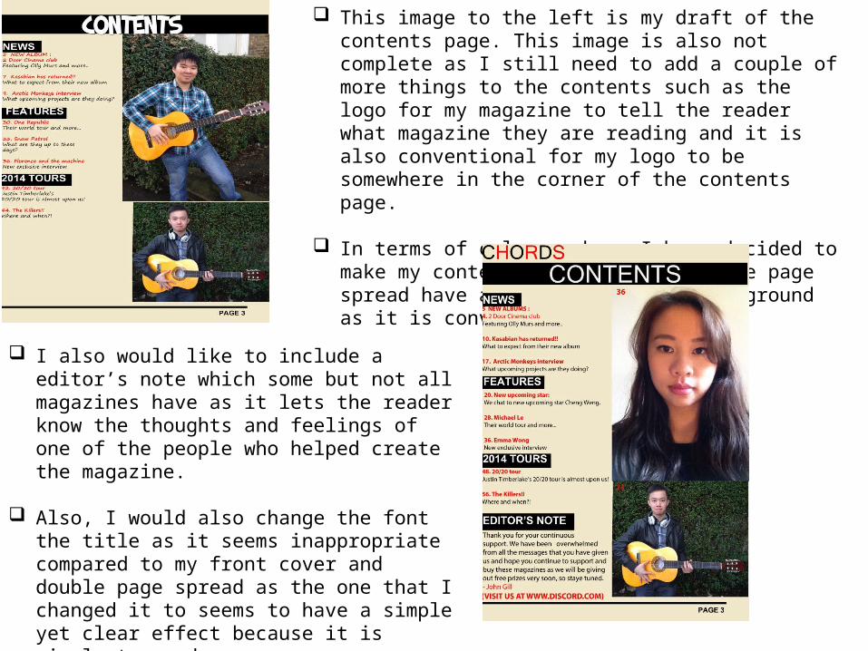
This image to the left is my draft of the contents page. This image is also not complete as I still need to add a couple of more things to the contents such as the logo for my magazine to tell the reader what magazine they are reading and it is also conventional for my logo to be somewhere in the corner of the contents page.
In terms of colour scheme I have decided to make my contents page and the double page spread have a similar coloured background as it is conventional.
I also would like to include a editor’s note which some but not all magazines have as it lets the reader know the thoughts and feelings of one of the people who helped create the magazine.
Also, I would also change the font the title as it seems inappropriate compared to my front cover and double page spread as the one that I changed it to seems to have a simple yet clear effect because it is simple to read.
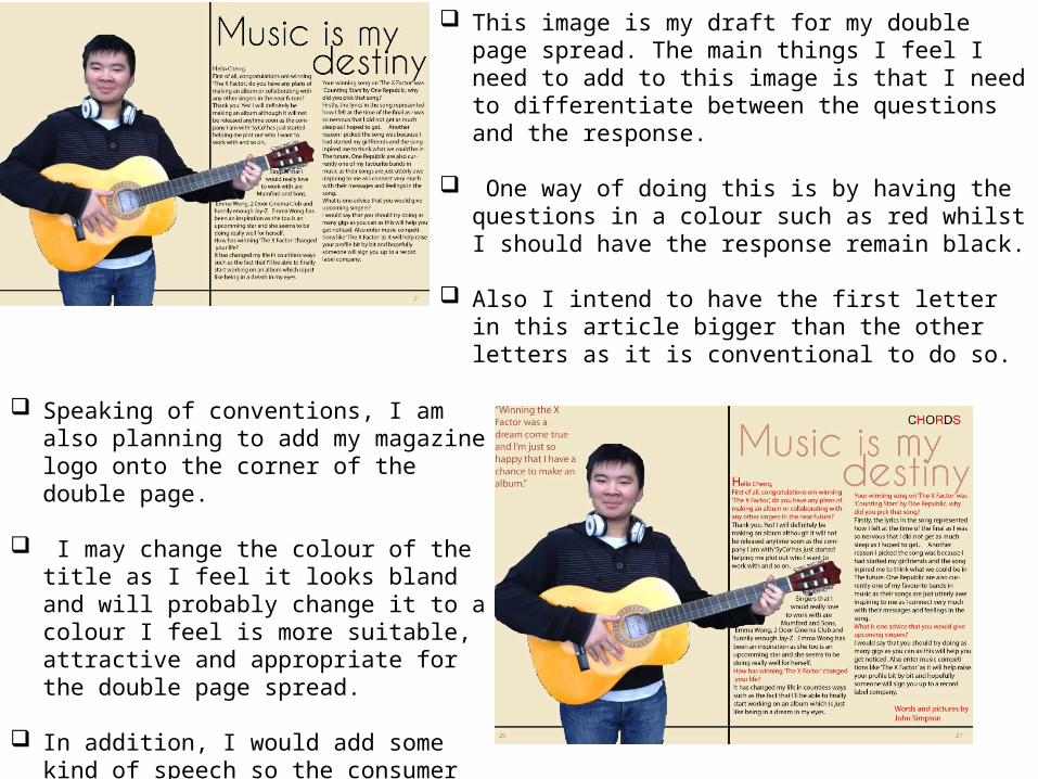
This image is my draft for my double page spread. The main things I feel I need to add to this image is that I need to differentiate between the questions and the response.
One way of doing this is by having the questions in a colour such as red whilst I should have the response remain black.
Also I intend to have the first letter in this article bigger than the other letters as it is conventional to do so.
Speaking of conventions, I am also planning to add my magazine logo onto the corner of the double page.
I may change the colour of the title as I feel it looks bland and will probably change it to a colour I feel is more suitable, attractive and appropriate for the double page spread.
In addition, I would add some kind of speech so the consumer gets a little understanding as to what the double page spread is about.