course contents 1.labview basics – virtual instruments, data flow, palettes 2.structures – for,...
TRANSCRIPT
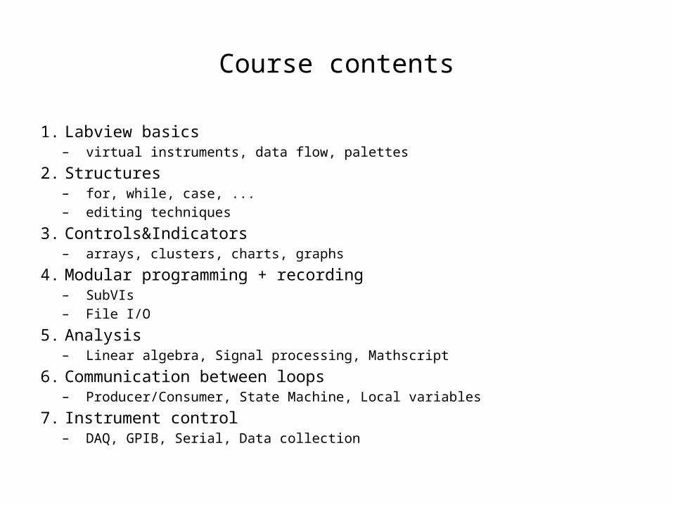
Course contents
1. Labview basics– virtual instruments, data flow, palettes
2. Structures– for, while, case, ...– editing techniques
3. Controls&Indicators– arrays, clusters, charts, graphs
4. Modular programming + recording– SubVIs– File I/O
5. Analysis– Linear algebra, Signal processing, Mathscript
6. Communication between loops– Producer/Consumer, State Machine, Local variables
7. Instrument control– DAQ, GPIB, Serial, Data collection
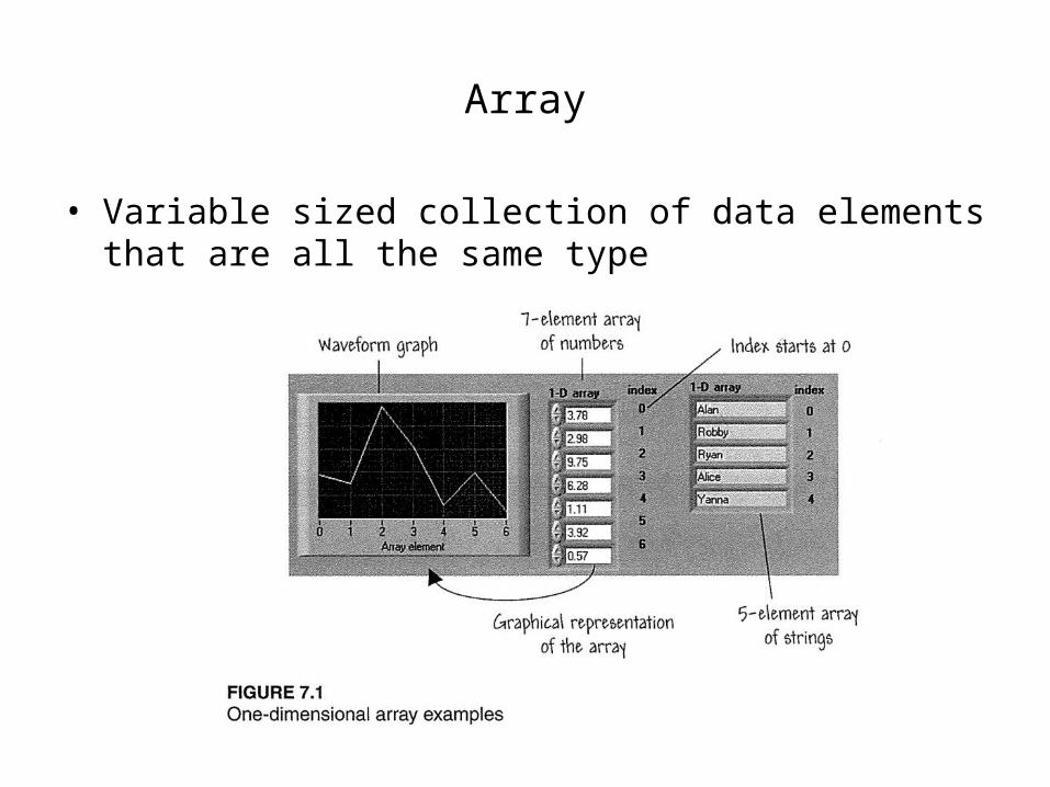
Array
• Variable sized collection of data elements that are all the same type

Array
• How to make an array from front panel
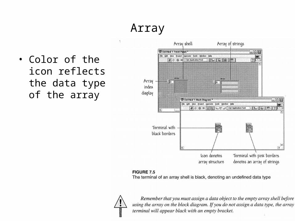
Array
• Color of the icon reflects the data type of the array

Multidimensional array
• How to add dimensions to the array

Auto-indexing• How to make an array from the block diagram

Auto-indexing
• Auto-indexing on loops

Auto-indexing
• Auto-indexing overrides the loop count setting

2D array
• Auto-indexing can create multidimensional arrays

Common wire types

Array functions
• Array size
• Initialize Array– input determines the data type– if zero is wired to dimension size an empty array is created
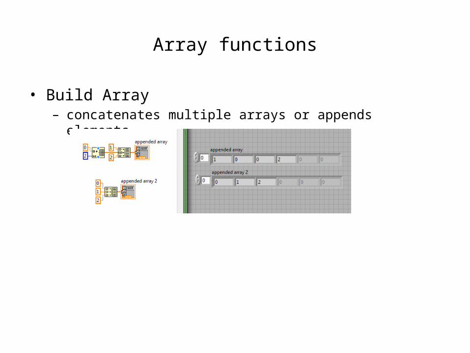
Array functions
• Build Array– concatenates multiple arrays or appends elements

Array functions
• Array subset: select a portion of an array

Array functions
• Index array– select an
element from an array

Polymorphism
• Some functions accept inputs of different dimensions– such as add, multiply, divide

Cluster
• Fixed-sized collection of data elements of mixed type• Reduces the number of wires and connector terminals in
subVIs

Cluster order
• Ordered according to when elements were placed in cluster

• Program won’t execute if there are inconcistencies in the cluster order

Cluster functions: Bundle
• Assemble into a new
• Replace old elements

Cluster functions: Unbundle
• Extract components of a cluster

Cluster functions: (Un)bundle by name
• Instead of cluster order one can refer to the cluster elements by name
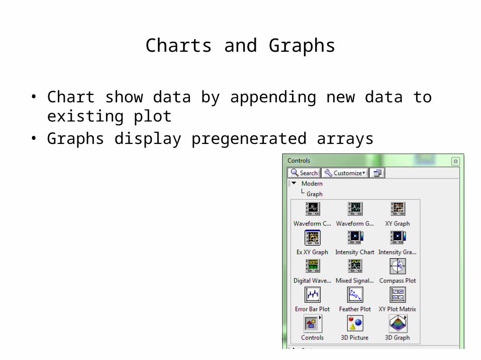
Charts and Graphs
• Chart show data by appending new data to existing plot• Graphs display pregenerated arrays

Waveform chart
• One can select between three different update modes– Strip, scope, or sweep

Multiple traces on Chart
• Depending on the input data, chart can show multiple plots or it can update multiple points on a single run– see Charts.vi for information
(Help >> Find Examples >> Building User Interfaces >> Displaying Data >> Graphs and Charts >> Charts.vi)

Stacked plots
• With multiple plots one can choose between stacked or overlayed plots

Clear chart
• Empty the chart by selecting clear chart

Chart history
• One can change the length of the chart history

Waveform graphs
• Use graphs to plot existing data all at once• Ideal for uniformly distributed arrays• If only one array is wired to the graph, it assumes X0=0 and
ΔX=1

Waveform graph
• Wire a cluster defining X0 and ΔX

Multiple graphs
• Bundle arrays to make multiple plots
• For more ways to use waveform graphs see:– Help >> Find Examples >> Fundamentals >> Graphs and Charts >>
Waveform Graph.vi

Cursors on Graphs
• From Visible Items >> Cursor Legend one can create cursors– right-click on cursor legend and select Create Cursor– cursor can be Free or tied to the plot

Annotations on Graphs
• One can create annotations to graphs– they can be free
or tied to the plot

XY Graph
• For uneven sample intervals or dependent variables (e.g. x vs y)
• Possibility to build XY graph with Express VI– see also: Help >> Find Examples >>
Fundamentals >> Graphs and Charts >> XY Graph.vi

Customizing charts and graphs
• Autoscaling– Right-click and select auto-
scaling for X- or Y-axes– Scales the axes so that all
data points are visible

Axes scaling
• When AutoScaling is off one can change the axis scales by typing in the number that is needed

Plot properties
• Appearance– change visibilities
• Display Format– change format and precision
of e.g. scale numbering
• Plots– appearance of plots: name,
line style, marker
• Scales– tick styles, tick positions

Plot properties
• One can change the line styles etc. from the Plot Legend

Graph palette
• Graph palette can be used for zooming or to pan the graph
zoom pan

Export image or data
• Right-click >> Export

Keynotes