cpb-us-e1.wpmucdn.com€¦ · web viewtaxes as % of gdp % of labor force in agriculture gdp per...
TRANSCRIPT

1. What type of graph is shown above?2. What is the graph displaying?3. What is the source of this graph?4. What is the range in time that the study was conducted?5. What do each of the dashed lines indicate on the graph?6. According to this graph, in the opinion of the WHO (World Health
Organization) does Beijing, China have an air pollution issue?

1. What type of chart/graph is depicted?2. What is the country that is depicted in the chart?3. What is this chart about?4. What is the predominant religious group found in the study?5. What percentage is Muslim in South Africa?6. According to the statistics, how could you describe South Africa’s
primary religion?7. Using historical knowledge and the chart above to support the following
statement:
“The colonization of Arica created rapid growth of Christianity on the continent.”
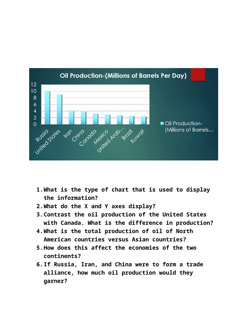
1. What is the type of chart that is used to display the information?2. What do the X and Y axes display?3. Contrast the oil production of the United States with Canada. What is
the difference in production?4. What is the total production of oil of North American countries versus
Asian countries?5. How does this affect the economies of the two continents?6. If Russia, Iran, and China were to form a trade alliance, how much oil
production would they garner?
CHALLENGE QUESTION
7. How can bar graphs like the one displayed above help the public understand the importance of oil production worldwide?
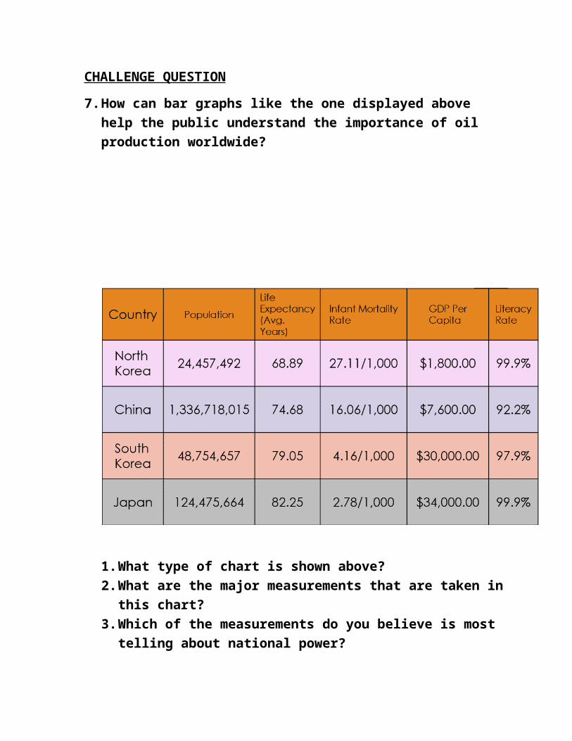
1. What type of chart is shown above?2. What are the major measurements that are taken in this chart?3. Which of the measurements do you believe is most telling about
national power?4. Which country’s citizens enjoy the most economic prosperity per
citizen?5. Rank the countries in terms of population. (Highest to Lowest)6. Which categories do you believe reflect the investment into human
capital?7. Which countries seem to educate their citizens the best? What
category did you use?
CHALLENGE QUESTIONS
8. If you were a company seeking to move into an Asian country, which would you choose?Defend your choice with statistics from the chart.
9. Why is it important for citizens to be able to create and read a table?

Taxes as % of GDP
% of Labor Force in Agriculture
GDP per CapitaLiteracy Rate
Life Expectancy
0
50
100
Chart Title
Nigeria Kenya South Africa
1. What type of graphs are shown above?2. What are the major measurements that are taken in this graph?3. Which of the measurements do you believe is most telling about national
power?4. Rank the countries in terms of life expectancy. (Highest to Lowest)5. Which categories do you believe reflect the investment into human
capital?6. Which countries seem to educate their citizens the best? What category
did you use?
Taxes as % of GDP
% of Labor Force in Agriculture
GDP per Capita Literacy Rate Life Expectancy0
102030405060708090
100
Chart Title
Nigeria Kenya South Africa

1. What two countries are being compared?2. What type of graphs are used to compare the two countries?3. What is the largest population age group of males and females in
Iran versus the UK?4. According to the chart, which country’s population is aging and
likely to decline?5. Who should the United States and allies look to influence today?6. What could this chart suggest in the U.K.’s changing role in the
future? Can it be changed?
