creating and editing scale bars and legends · this exercise demonstrates how to create and edit...
TRANSCRIPT
Tufts University GIS Center
1
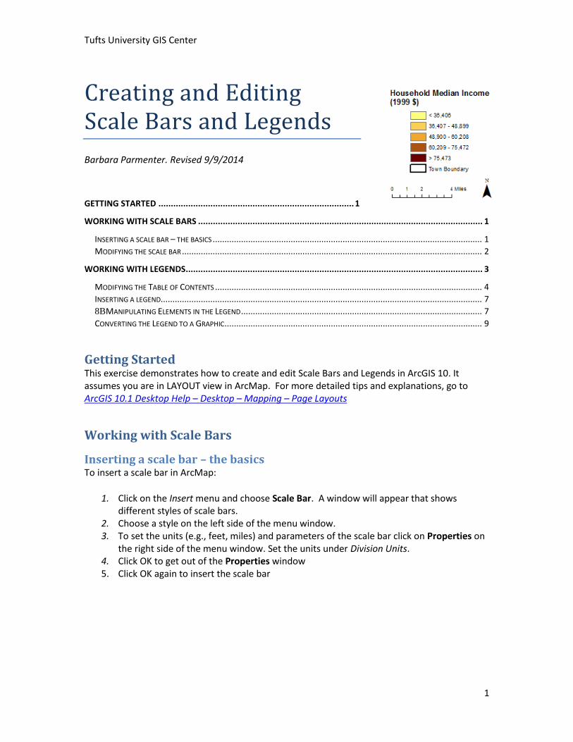
Creating and Editing Scale Bars and Legends
Barbara Parmenter. Revised 9/9/2014
GETTING STARTED ............................................................................... 1
WORKING WITH SCALE BARS ................................................................................................................... 1
INSERTING A SCALE BAR – THE BASICS .................................................................................................................. 1 MODIFYING THE SCALE BAR ............................................................................................................................... 2
WORKING WITH LEGENDS........................................................................................................................ 3
MODIFYING THE TABLE OF CONTENTS ................................................................................................................. 4 INSERTING A LEGEND........................................................................................................................................ 7 8BMANIPULATING ELEMENTS IN THE LEGEND ...................................................................................................... 7 CONVERTING THE LEGEND TO A GRAPHIC ............................................................................................................. 9
Getting Started This exercise demonstrates how to create and edit Scale Bars and Legends in ArcGIS 10. It assumes you are in LAYOUT view in ArcMap. For more detailed tips and explanations, go to ArcGIS 10.1 Desktop Help – Desktop – Mapping – Page Layouts
Working with Scale Bars
Inserting a scale bar – the basics To insert a scale bar in ArcMap:
1. Click on the Insert menu and choose Scale Bar. A window will appear that shows different styles of scale bars.
2. Choose a style on the left side of the menu window. 3. To set the units (e.g., feet, miles) and parameters of the scale bar click on Properties on
the right side of the menu window. Set the units under Division Units. 4. Click OK to get out of the Properties window 5. Click OK again to insert the scale bar
Tufts University GIS Center
2
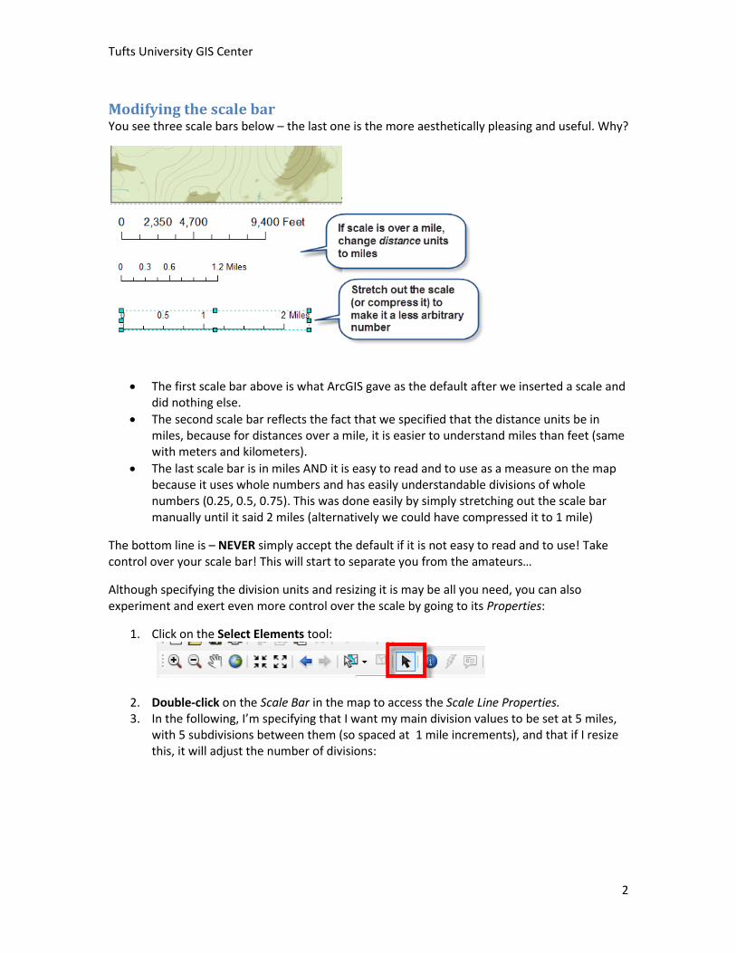
Modifying the scale bar You see three scale bars below – the last one is the more aesthetically pleasing and useful. Why?
The first scale bar above is what ArcGIS gave as the default after we inserted a scale and did nothing else.
The second scale bar reflects the fact that we specified that the distance units be in miles, because for distances over a mile, it is easier to understand miles than feet (same with meters and kilometers).
The last scale bar is in miles AND it is easy to read and to use as a measure on the map because it uses whole numbers and has easily understandable divisions of whole numbers (0.25, 0.5, 0.75). This was done easily by simply stretching out the scale bar manually until it said 2 miles (alternatively we could have compressed it to 1 mile)
The bottom line is – NEVER simply accept the default if it is not easy to read and to use! Take control over your scale bar! This will start to separate you from the amateurs…
Although specifying the division units and resizing it is may be all you need, you can also experiment and exert even more control over the scale by going to its Properties:
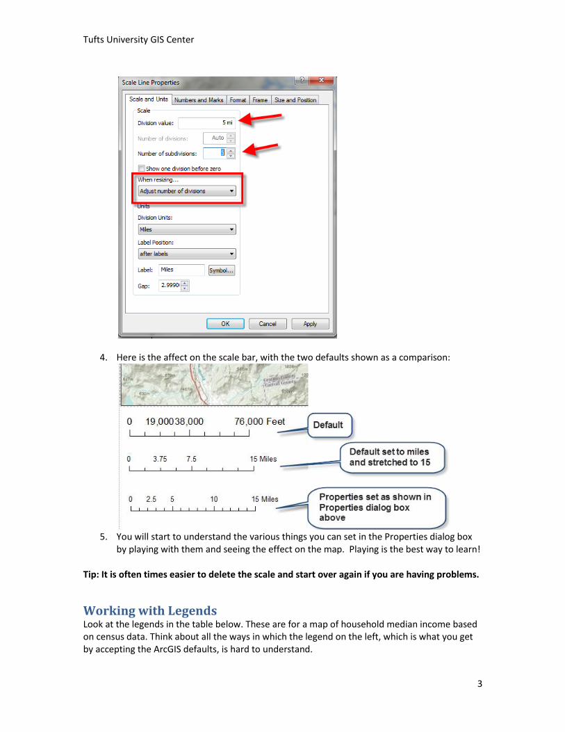
1. Click on the Select Elements tool:
2. Double-click on the Scale Bar in the map to access the Scale Line Properties. 3. In the following, I’m specifying that I want my main division values to be set at 5 miles,
with 5 subdivisions between them (so spaced at 1 mile increments), and that if I resize this, it will adjust the number of divisions:
Tufts University GIS Center
3
4. Here is the affect on the scale bar, with the two defaults shown as a comparison:
5. You will start to understand the various things you can set in the Properties dialog box
by playing with them and seeing the effect on the map. Playing is the best way to learn!
Tip: It is often times easier to delete the scale and start over again if you are having problems.
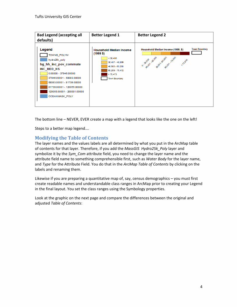
Working with Legends Look at the legends in the table below. These are for a map of household median income based on census data. Think about all the ways in which the legend on the left, which is what you get by accepting the ArcGIS defaults, is hard to understand.
Tufts University GIS Center
4
Bad Legend (accepting all defaults)
Better Legend 1 Better Legend 2
The bottom line – NEVER, EVER create a map with a legend that looks like the one on the left!
Steps to a better map legend….
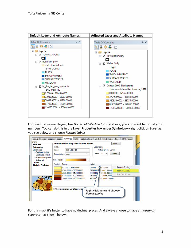
Modifying the Table of Contents The layer names and the values labels are all determined by what you put in the ArcMap table of contents for that layer. Therefore, if you add the MassGIS Hydro25k_Poly layer and symbolize it by the Sym_Com attribute field, you need to change the layer name and the attribute field name to something comprehensible first, such as Water Body for the layer name, and Type for the Attribute Field. You do that in the ArcMap Table of Contents by clicking on the labels and renaming them.
Likewise if you are preparing a quantitative map of, say, census demographics – you must first create readable names and understandable class ranges in ArcMap prior to creating your Legend in the final layout. You set the class ranges using the Symbology properties.
Look at the graphic on the next page and compare the differences between the original and adjusted Table of Contents:
Tufts University GIS Center
5
Default Layer and Attribute Names Adjusted Layer and Attribute Names
For quantitative map layers, like Household Median Income above, you also want to format your numbers. You can do this in the Layer Properties box under Symbology – right-click on Label as you see below and choose Format Labels:
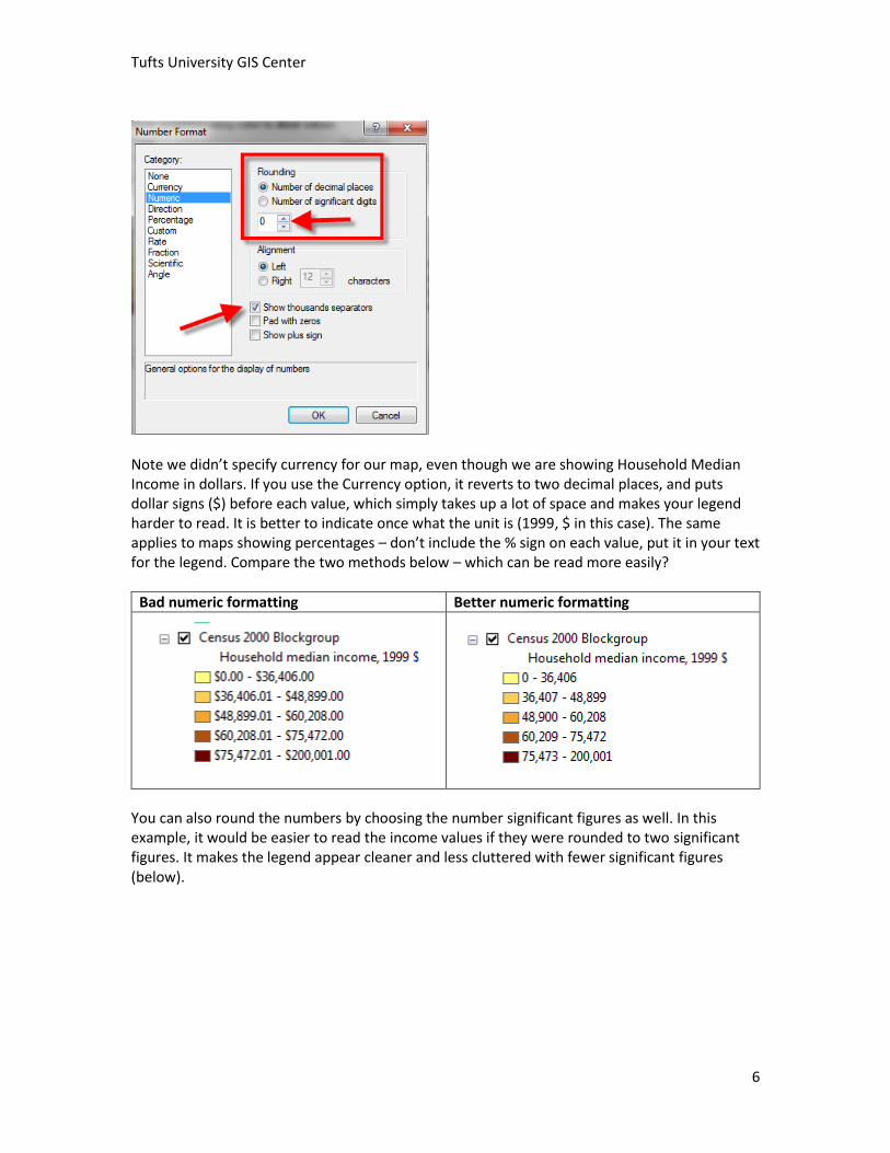
For this map, it’s better to have no decimal places. And always choose to have a thousands separator, as shown below:
Tufts University GIS Center
6
Note we didn’t specify currency for our map, even though we are showing Household Median Income in dollars. If you use the Currency option, it reverts to two decimal places, and puts dollar signs ($) before each value, which simply takes up a lot of space and makes your legend harder to read. It is better to indicate once what the unit is (1999, $ in this case). The same applies to maps showing percentages – don’t include the % sign on each value, put it in your text for the legend. Compare the two methods below – which can be read more easily?
Bad numeric formatting Better numeric formatting
You can also round the numbers by choosing the number significant figures as well. In this example, it would be easier to read the income values if they were rounded to two significant figures. It makes the legend appear cleaner and less cluttered with fewer significant figures (below).
Tufts University GIS Center
7
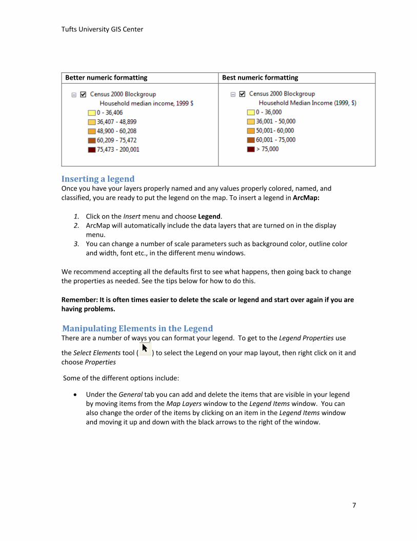
Better numeric formatting Best numeric formatting
Inserting a legend Once you have your layers properly named and any values properly colored, named, and classified, you are ready to put the legend on the map. To insert a legend in ArcMap:
1. Click on the Insert menu and choose Legend. 2. ArcMap will automatically include the data layers that are turned on in the display
menu. 3. You can change a number of scale parameters such as background color, outline color
and width, font etc., in the different menu windows.
We recommend accepting all the defaults first to see what happens, then going back to change the properties as needed. See the tips below for how to do this.
Remember: It is often times easier to delete the scale or legend and start over again if you are having problems.
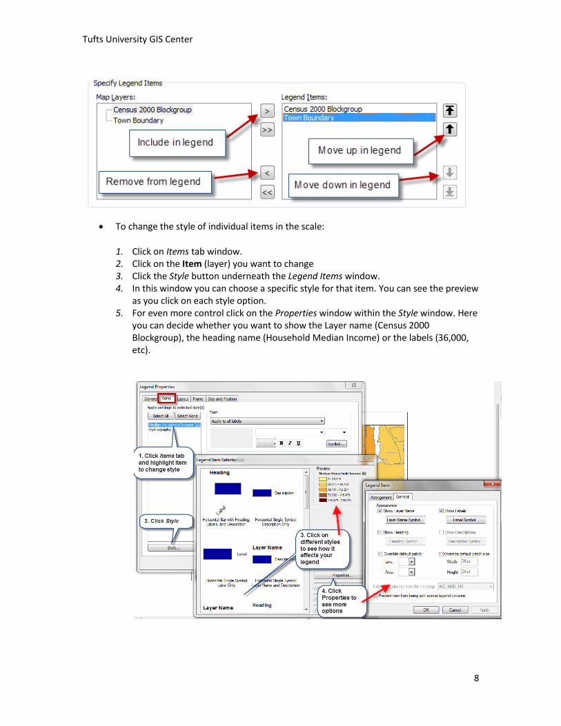
8BManipulating Elements in the Legend There are a number of ways you can format your legend. To get to the Legend Properties use
the Select Elements tool ( ) to select the Legend on your map layout, then right click on it and choose Properties
Some of the different options include:
Under the General tab you can add and delete the items that are visible in your legend by moving items from the Map Layers window to the Legend Items window. You can also change the order of the items by clicking on an item in the Legend Items window and moving it up and down with the black arrows to the right of the window.
Tufts University GIS Center
8
To change the style of individual items in the scale:
1. Click on Items tab window. 2. Click on the Item (layer) you want to change 3. Click the Style button underneath the Legend Items window. 4. In this window you can choose a specific style for that item. You can see the preview
as you click on each style option. 5. For even more control click on the Properties window within the Style window. Here
you can decide whether you want to show the Layer name (Census 2000 Blockgroup), the heading name (Household Median Income) or the labels (36,000, etc).
Tufts University GIS Center
9
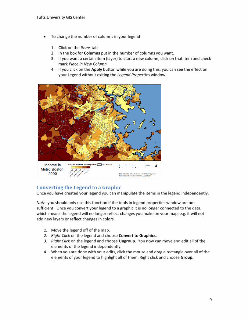
To change the number of columns in your legend
1. Click on the Items tab 2. In the box for Columns put in the number of columns you want. 3. If you want a certain item (layer) to start a new column, click on that item and check
mark Place in New Column 4. If you click on the Apply button while you are doing this, you can see the effect on
your Legend without exiting the Legend Properties window.8B
Converting the Legend to a Graphic Once you have created your legend you can manipulate the items in the legend independently.
Note: you should only use this function if the tools in legend properties window are not sufficient. Once you convert your legend to a graphic it is no longer connected to the data, which means the legend will no longer reflect changes you make on your map, e.g. it will not add new layers or reflect changes in colors.
1. Move the legend off of the map. 2. Right Click on the legend and choose Convert to Graphics. 3. Right Click on the legend and choose Ungroup. You now can move and edit all of the
elements of the legend independently. 4. When you are done with your edits, click the mouse and drag a rectangle over all of the
elements of your legend to highlight all of them. Right click and choose Group.