creation and preservation: teaching colour theory
TRANSCRIPT

University of WollongongResearch Online
Faculty of Law, Humanities and the Arts - Papers Faculty of Law, Humanities and the Arts
2015
Creation and preservation: teaching colour theoryMadeleine T. KellyUniversity of Wollongong, [email protected]
Research Online is the open access institutional repository for the University of Wollongong. For further information contact the UOW Library:[email protected]
Publication DetailsKelly, M. T. "Creation and preservation: teaching colour theory." ACUADS Conference 2015: Art and Design Education in the global24/7. Australia: Australian Council of University Art & Design Schools, 2015. 1-13.

Creation and preservation: teaching colour theory
AbstractColour wheels and colour charts run the risk of seeming elementary. My attempt to revitalise these traditionalforms of relating colour has opened up a gamut of possible approaches within an undergraduate tertiarycontext and, here, I will describe a few in view of an archaeological metaphor.
Keywordscreation, preservation, teaching, theory, colour
DisciplinesArts and Humanities | Law
Publication DetailsKelly, M. T. "Creation and preservation: teaching colour theory." ACUADS Conference 2015: Art and DesignEducation in the global 24/7. Australia: Australian Council of University Art & Design Schools, 2015. 1-13.
This conference paper is available at Research Online: http://ro.uow.edu.au/lhapapers/2236

Australia Council of University Art and Design Schools conference proceedings, Adelaide, 2015
1
Madeleine Kelly University of Wollongong Creation and Preservation: Teaching colour theory Keywords: Colour, Colour Wheel, Colour Chart, Chromatic Grey, Light, Pigment, Additive, Subtractive, Aesthetic, Archaeology Colour wheels and colour charts run the risk of seeming elementary. My attempt to revitalise these traditional forms of relating colour has opened up a gamut of possible approaches within an undergraduate tertiary context and, here, I will describe a few in view of an archaeological metaphor. In teaching colour to my undergraduate painting students I focus on an archaeology of colour, which is to say, a critical attention to the particular historical and scientific contexts from which a knowledge of colour has emerged. This archaeology of colour is, I argue, an enriching pedagogical approach to facilitating student experiences working with and interpreting colour. In many ways, it opens onto a historical discursive moment when disciplinary separations were not yet in existence. As such I suggest that interdisciplinary pedagogy that draws from these earlier archaeological moments can revitalise student learning about the use of colour in painting, and related aesthetic ends. In The Archaeology of Knowledge ([1969] 2010) – an epic investigation into the relationship between knowledge, discourse and the powers of history – Michel Foucault interrogates images from various times in history in order to reveal the conditions of their conception. A Foucauldian approach to the archaeological dimension of colour would attempt to uncover whether in certain periods colour was or was not ‘considered, named, enunciated and conceptualized in a discursive practice,’ (2010, p. 213) and later embodied in theories, teaching and paintings. Similarly, an archaeological approach to pedagogy would endeavor to imbue each act of observing and using colour with this more robust historical sense. In this essay I describe two lessons I have taught in the early stages of a visual arts course, at the University of Wollongong, with particular reference to colour: first through pigments and then through light. The lessons explore the possible productive aesthetic relationships between the disciplines of history, art and science within the media of painting. The archaeological dimension of the first lesson has been
designed so that students will appreciate certain laws of emergence – the material origin of pigments on the one hand; and the shaky ground of naming, defining and categorising colour on the other. The second lesson provides the context from which objective colour theory emerged, as shifting between cultures, specific to context and

Australia Council of University Art and Design Schools conference proceedings, Adelaide, 2015
2
contingent on mutable laws embodied with the aesthetic harmony of colour wheels and colour charts. I want to make it clear here at the outset that subjective colour theory, for instance that conceived by Goethe, or even more intuitive dissonant uses of colour, are just as important, but taught in other lessons. By facilitating these learning experiences, I hope to confer a value of colour that connects an aesthetic way of making and using colour to seeing, thinking and conceiving Immanuel Kant’s notion of aesthetic ideas, ‘animating the mind by opening out for it a prospect into a field of kindred representations stretching beyond its ken’ (Kant 2007, p. 144). First Lesson: Plucking the Rainbow A colourful demonstration where plant pigments change colour upon exposure to acidic or basic solutions introduces the first lesson, Plucking the Rainbow. The use of plant pigments encourages students to think about the material origin of pigments beyond art supply stores, and to appreciate the nuances of naming colour. First students source coloured plant pigments from flower petals.
Figure 1: Students engaged in Plucking the Rainbow, University of Wollongong, 2014 They use a mortar and pestle, and water, to emulsify the petals, a truly popular and enjoyable task. In groups they test the effects of vinegar and bicarbonate soda – a weak acid and base respectively – to yield three different colours from each petal’s pigment (Figure 1). They record their findings on a corresponding group colour wheel or chart, which creates a composition that is akin to a map of the group’s experimentation (Figure 2).

Australia Council of University Art and Design Schools conference proceedings, Adelaide, 2015
3
Figure 2: Student colour charts showing the effects of vinegar and bicarbonate soda on petal
pigments. By experimenting with a less conventional source of pigments, students become aware of the brilliant hues in in the plant world and develop an awareness of the four major plant pigments (chlorophylls, carotenoids, flavonoids, and betalains). And to add to this menagerie of pigments, it is worth noting the event, long ago, when an animal hijacked one of the leaf pigments and incorporated it into the rear of its eye, thereafter becoming the visual pigment, retinal (Brooker et al. 2008, p. 964). Description Later, students describe the resulting colours. In conceptualising different names, they search for an expressive language of interpretation. The practice of using
descriptive language adds a generative layer to the process – students are
compelled towards precision and become aware of the challenge of differentiating between similar colours and those that change as they continue to react. This parallels with the real world when, as Philip Ball explains in his compelling book
Bright Earth (2002, p. 228), historical attempts to specify colour were frequently in vain as colours were often named after the physical substance of origin. Histories and origins In Plucking the Rainbow students realise that describing colour is often a question of origin or visual analogy and become aware of historical views of the origin of pigments. For example, the first century Roman Pliny’s four-colour scheme was rooted in physical substances: ‘“White from Milos” and “red from Sinope on the Black Sea”’ these were specific names referring to their earthly embodiment (Pliny, cited in Ball 2002, p. 18). Homer’s ‘wine-dark sea’ from the Odyssey is famous for not containing blue, as there was no name for blue in ancient Greek society. The Greeks were not as interested in colour or tint as ‘lustre or superficial effect’ – what we now refer to as shiny or matt (Ball 2002, p. 17). Similarly, in 1971, when Danish
Australia Council of University Art and Design Schools conference proceedings, Adelaide, 2015
4
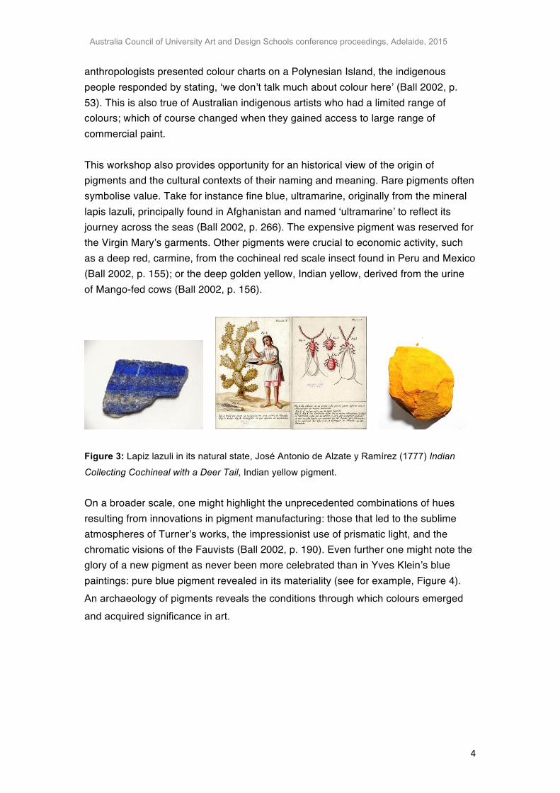
anthropologists presented colour charts on a Polynesian Island, the indigenous people responded by stating, ‘we don’t talk much about colour here’ (Ball 2002, p. 53). This is also true of Australian indigenous artists who had a limited range of colours; which of course changed when they gained access to large range of commercial paint. This workshop also provides opportunity for an historical view of the origin of pigments and the cultural contexts of their naming and meaning. Rare pigments often symbolise value. Take for instance fine blue, ultramarine, originally from the mineral lapis lazuli, principally found in Afghanistan and named ‘ultramarine’ to reflect its journey across the seas (Ball 2002, p. 266). The expensive pigment was reserved for the Virgin Mary’s garments. Other pigments were crucial to economic activity, such as a deep red, carmine, from the cochineal red scale insect found in Peru and Mexico (Ball 2002, p. 155); or the deep golden yellow, Indian yellow, derived from the urine of Mango-fed cows (Ball 2002, p. 156).
Figure 3: Lapiz lazuli in its natural state, José Antonio de Alzate y Ramírez (1777) Indian
Collecting Cochineal with a Deer Tail, Indian yellow pigment. On a broader scale, one might highlight the unprecedented combinations of hues resulting from innovations in pigment manufacturing: those that led to the sublime atmospheres of Turner’s works, the impressionist use of prismatic light, and the chromatic visions of the Fauvists (Ball 2002, p. 190). Even further one might note the glory of a new pigment as never been more celebrated than in Yves Klein’s blue paintings: pure blue pigment revealed in its materiality (see for example, Figure 4). An archaeology of pigments reveals the conditions through which colours emerged
and acquired significance in art.

Australia Council of University Art and Design Schools conference proceedings, Adelaide, 2015
5
Figure 4: Yves Klein 1960 Untitled blue sponge relief, dry pigment in synthetic resin, natural
sponges and pebbles on board. In this workshop, the frictions between art and science are as contemporary as they are ancient. Through the process of distilling and altering pigments from raw ingredients, students appreciate the readymade status of manufactured paint, as Duchamp said, ‘the painter really is making a readymade when he paints with a manufactured object that is called paint’ (de Duve, p. 163). It is also loaded with references to the 18th century when most artists ground and mixed their own pigments informed by alchemy and the natural sciences. The workshop also resonates with a period before art and science came to be considered as separate disciplines (Ball 2002, p. 6). To extend this workshop, students may produce an image or series of images whose primary subject is alchemy, ideally something in the vein of Sigmar Polke who used transforming pigments to signify the possibility of change in the social fabric he critiqued (Holt 1996). Second Lesson: Unweaving the Rainbow The second lesson I want to describe, Unweaving the Rainbow, is designed to foster student reflection on the relationship between mixing pigments and mixing light. The archaeology of colour theory itself requires a sort of history-telling. The lecture which foregrounds this workshop is a fully illustrated account of how discoveries concerning light influenced our understanding of colour. Colour mixing and colour wheels Ball notes that as far back as the 1st century BC, ‘It was common to refer to the blending of pigments as “deflowering”: a loss of virginity ... Aristotle called colour mixing a passing away’ (2002, p. 19). Why is this so? In general, mixing pigments together reduces the luminosity of original pigments, which are purer in hue and generally more durable than those mixed. Thus, genuine orange pigments are more vibrant than mixtures of red and yellow pigments (Ball 2002, pp. 44-45). As Ogden Rood pointed out in 1879 an appreciation of the interaction of coloured light is crucial
Australia Council of University Art and Design Schools conference proceedings, Adelaide, 2015
6
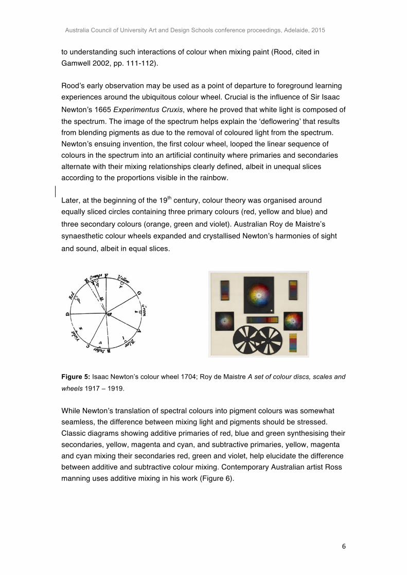
to understanding such interactions of colour when mixing paint (Rood, cited in Gamwell 2002, pp. 111-112). Rood’s early observation may be used as a point of departure to foreground learning experiences around the ubiquitous colour wheel. Crucial is the influence of Sir Isaac Newton’s 1665 Experimentus Cruxis, where he proved that white light is composed of the spectrum. The image of the spectrum helps explain the ‘deflowering’ that results from blending pigments as due to the removal of coloured light from the spectrum. Newton’s ensuing invention, the first colour wheel, looped the linear sequence of colours in the spectrum into an artificial continuity where primaries and secondaries alternate with their mixing relationships clearly defined, albeit in unequal slices according to the proportions visible in the rainbow. Later, at the beginning of the 19th century, colour theory was organised around equally sliced circles containing three primary colours (red, yellow and blue) and three secondary colours (orange, green and violet). Australian Roy de Maistre’s synaesthetic colour wheels expanded and crystallised Newton’s harmonies of sight and sound, albeit in equal slices.
Figure 5: Isaac Newton’s colour wheel 1704; Roy de Maistre A set of colour discs, scales and
wheels 1917 – 1919. While Newton’s translation of spectral colours into pigment colours was somewhat seamless, the difference between mixing light and pigments should be stressed. Classic diagrams showing additive primaries of red, blue and green synthesising their secondaries, yellow, magenta and cyan, and subtractive primaries, yellow, magenta and cyan mixing their secondaries red, green and violet, help elucidate the difference between additive and subtractive colour mixing. Contemporary Australian artist Ross manning uses additive mixing in his work (Figure 6).

Australia Council of University Art and Design Schools conference proceedings, Adelaide, 2015
7
Figure 6: Simulated examples of subtractive and additive colour mixing; Ross Manning
Dichroic Filter Piece, 2012, Dichroic filters, cut glass, DVD player, projector.
Spinning discs I have found the best way to further illustrate the difference is through the use of kinetic colour mixers. In the mid 1800’s Hermann von Helmholtz was the first to distinguish between coloured light and coloured pigments (Gamwell 2002, p. 70). Following Helmholtz, James Clerk Maxwell, with the help of Scottish colour theorist D. R. Hay, employed spinning disks painted with varied colours (Gamwell 2002, p. 114). Light reflected from the revolving disks falls on the observer’s retina in rapid succession and optically mixes. One of his disks (Figure 7) is a particularly interesting example of the difference between mixing light and pigments: I mount it on an electric fan to demonstrate optical mixing, which can be more or less luminous than the corresponding subtractive mixture also located on the spinning disk. I have appropriated other examples of additive mixing by enlarging spinning disks from a didactic toy bought at the Paul Klee museum, Switzerland, made by German/Australian artist and Bauhaus teacher Ludwig Hirschfeld-Mack in 1923. Students then create their own optical colour mixers in order to experiment with spectral light.
Figure 7: James Clerk Maxwell’s disk for showing the difference between mixing light and
mixing coloured pigment, 1879; Optical colour mixers mounted on fans based on Ludwig
Hirschfeld-Mack’s didactic toys,1923.

Australia Council of University Art and Design Schools conference proceedings, Adelaide, 2015
8
Understanding the different sets of primary colours is important, but as Westland et al note, ‘primary colours (additive or subtractive) are neither fundamental properties of light, nor even of matter; rather they are biological constructs based on the physiological responses of the human visual system to light’ (Westland et al. 2007, p. 5). The cellular cones of human eyes roughly peak in sensitivity to red-orange, green and blue-violet, which correlates with the three additive primaries identified by Maxwell (Gamwell 2002, p. 68). Historical colour theory Thus, the frontier of colour theory is not that simple: a single colour wheel is caught up in a system of references to other wheels, other theories, the primary colours mere nodes in a network of nuanced affairs, with ambiguities not only due to differences in mixing light versus pigments, but also varying definitions of colours. The colour blue may be phthalo, cyan, indigo, ultramarine, cobalt or another type. The table below outlines some of the fluid conceptions of primary colours throughout time that I have identified:
Figure 8: Different conceptions of primary colours throughout time. Compiled from Ball
(2002), Gamwell (2002) and Munsell (2015). Discoveries made mixing light informed neo-impressionist painting (Gamwell 2002, p. 113). One can show, for example, how pointillist hues – small coloured brushstrokes which optically fuse from a distance – were influenced not only by generally complementary colours (red and green, violet and yellow, blue and orange) but also

Australia Council of University Art and Design Schools conference proceedings, Adelaide, 2015
9
by Maxwell’s theory of opposing complementary colours for light, complements
included on his colour triangle: purple and green; red and green-blue; and green-
yellow and blue. These additive complements are defined because they optically mix
to produce white light. When equally toned despite variations in hue, they produce
the vibrating and flickering effects known as divisionism or chromoluminarism
(Gamwell 2002, p. 115).
Figure 9: James Clerk Maxwell’s colour triangle
The same additive complements are found in Albert Munsell’s colour wheel, which
emphasises dimensions of hue, value and chroma in three dimensional space.
Theorist David Briggs (2007) advises that two dimensional versions of Munsell’s
colour wheel are best painted using magenta, phthalo blue and lemon yellow as
primaries. These primaries best accommodate discoveries made mixing light that
may be applied to mixing pigments. Munsell chips provide an exhaustive numerical category of over forty hues in varied tones and saturations. Mindful of the aforementioned tensions between reduction and subtle discrimination,
I allow students to choose the number of colour intervals they want to paint on their
colour wheels. I also ask them to design their own colour wheel for homework. The
effective use of any colour wheel entails an awareness of the different philosophies
that determine wheels. A good wheel provides a colour-order system which keeps
colours within a family. Special relationships between colours explored in colour
wheels are visible in paintings by Roy de Maistre and Bryan Spier.
Australia Council of University Art and Design Schools conference proceedings, Adelaide, 2015
10
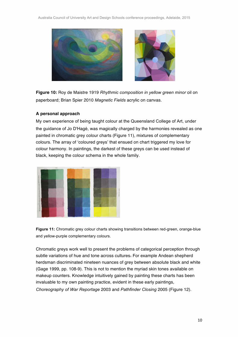
Figure 10: Roy de Maistre 1919 Rhythmic composition in yellow green minor oil on paperboard; Brian Spier 2010 Magnetic Fields acrylic on canvas. A personal approach My own experience of being taught colour at the Queensland College of Art, under
the guidance of Jo D'Hagé, was magically charged by the harmonies revealed as one painted in chromatic grey colour charts (Figure 11), mixtures of complementary colours. The array of ‘coloured greys’ that ensued on chart triggered my love for colour harmony. In paintings, the darkest of these greys can be used instead of black, keeping the colour schema in the whole family.
Figure 11: Chromatic grey colour charts showing transitions between red-green, orange-blue
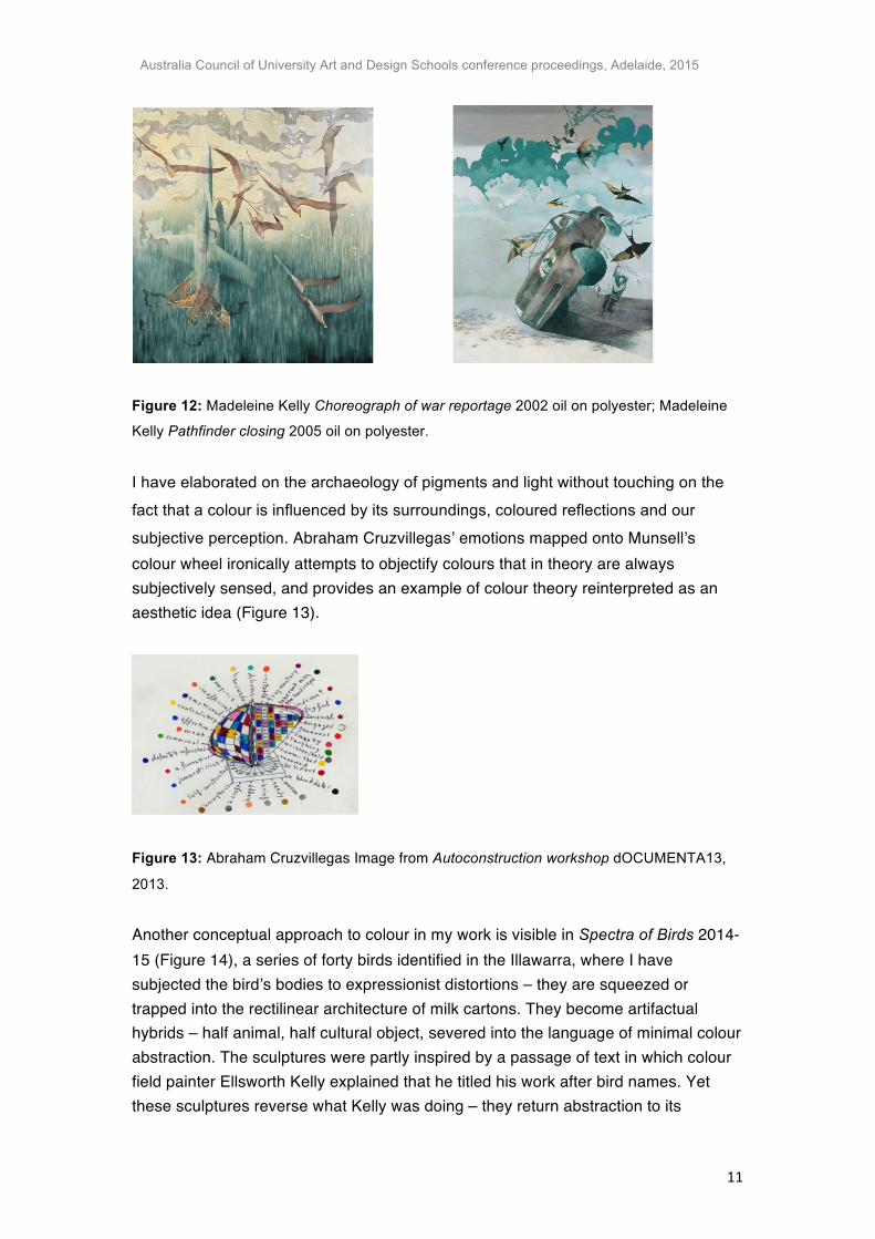
and yellow-purple complementary colours. Chromatic greys work well to present the problems of categorical perception through subtle variations of hue and tone across cultures. For example Andean shepherd herdsman discriminated nineteen nuances of grey between absolute black and white (Gage 1999, pp. 108-9). This is not to mention the myriad skin tones available on makeup counters. Knowledge intuitively gained by painting these charts has been invaluable to my own painting practice, evident in these early paintings, Choreography of War Reportage 2003 and Pathfinder Closing 2005 (Figure 12).
Australia Council of University Art and Design Schools conference proceedings, Adelaide, 2015
11
Figure 12: Madeleine Kelly Choreograph of war reportage 2002 oil on polyester; Madeleine
Kelly Pathfinder closing 2005 oil on polyester. I have elaborated on the archaeology of pigments and light without touching on the
fact that a colour is influenced by its surroundings, coloured reflections and our
subjective perception. Abraham Cruzvillegas’ emotions mapped onto Munsell’s colour wheel ironically attempts to objectify colours that in theory are always subjectively sensed, and provides an example of colour theory reinterpreted as an aesthetic idea (Figure 13).
Figure 13: Abraham Cruzvillegas Image from Autoconstruction workshop dOCUMENTA13,
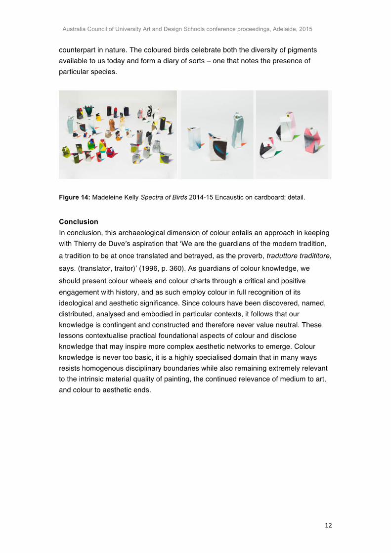
2013. Another conceptual approach to colour in my work is visible in Spectra of Birds 2014-15 (Figure 14), a series of forty birds identified in the Illawarra, where I have subjected the bird’s bodies to expressionist distortions – they are squeezed or trapped into the rectilinear architecture of milk cartons. They become artifactual hybrids – half animal, half cultural object, severed into the language of minimal colour abstraction. The sculptures were partly inspired by a passage of text in which colour field painter Ellsworth Kelly explained that he titled his work after bird names. Yet these sculptures reverse what Kelly was doing – they return abstraction to its
Australia Council of University Art and Design Schools conference proceedings, Adelaide, 2015
12
counterpart in nature. The coloured birds celebrate both the diversity of pigments available to us today and form a diary of sorts – one that notes the presence of particular species.
Figure 14: Madeleine Kelly Spectra of Birds 2014-15 Encaustic on cardboard; detail.
Conclusion In conclusion, this archaeological dimension of colour entails an approach in keeping with Thierry de Duve’s aspiration that ‘We are the guardians of the modern tradition, a tradition to be at once translated and betrayed, as the proverb, traduttore tradititore, says. (translator, traitor)’ (1996, p. 360). As guardians of colour knowledge, we
should present colour wheels and colour charts through a critical and positive engagement with history, and as such employ colour in full recognition of its ideological and aesthetic significance. Since colours have been discovered, named, distributed, analysed and embodied in particular contexts, it follows that our knowledge is contingent and constructed and therefore never value neutral. These lessons contextualise practical foundational aspects of colour and disclose knowledge that may inspire more complex aesthetic networks to emerge. Colour knowledge is never too basic, it is a highly specialised domain that in many ways resists homogenous disciplinary boundaries while also remaining extremely relevant to the intrinsic material quality of painting, the continued relevance of medium to art, and colour to aesthetic ends.
Australia Council of University Art and Design Schools conference proceedings, Adelaide, 2015
13
REFERENCES BALL, P 2002, Bright earth, Penguin Books, London. BRIGGS, D 2007, Colour mixing in paints, The dimensions of colour, viewed 12
August 2015, <http://www.huevaluechroma.com/061.php>
BROOKER RJ, WIDMAIER EP, GRAHAM LE & STILING PD 2008, Biology,
McGraw-Hill, New York. DE DUVE, T 1996, Kant after Duchamp, MIT Press, Cambridge, Massachusetts. FOUCAULT, M 2010 [1969], The archaeology of knowledge, trans. A. M. Sheridan
Smith, Routledge, London. GAGE, J 1999, Colour and meaning, Thames and Hudson, London. GAMWELL, L 2002, Exploring the Invisible: art, science, and the spiritual, Princeton
University Press, Oxford. HOLT, R 1996, ‘Polke's Work: Verbs Posing as Nouns’, in David Thistlewood (ed)
Sigmar Polke: Back to postmodernity, Tate Gallery, Liverpool. KANT, I 2007 Critique of Judgement ed. Nicholas Walker, trans. James Meredith
Oxford University Press, Oxford. OFFICIAL SITE OF MUNSELL COLOUR 2015, Munsell Hue, How Color Notation
Works, Munsell
Color, viewed 1 December 2015, <http://munsell.com/about-munsell-color/how-color-notation-works/munsell-hue>.
WESTLAND S et al. 2007, ‘Colour Harmony’, Colour design and creativity pp. 1-15.