credit suisse global investment returns yearbook …...credit suisse global investment returns...
TRANSCRIPT

Research InstituteThought leadership from Credit Suisse Research
and the world’s foremost experts
February 2016
Credit Suisse Global Investment Returns
Yearbook 2016

Introduction16 December 2015 marked the reversal of the trend that had dominated financial markets for almost a decade: the Federal Reserve finally increased rates. And yet, although the rate hike was widely anticipated in magnitude and timing, markets, which had previously proven surpris-ingly resilient, saw a period of sharp declines and volatility in subsequent weeks. Given the fact that market participants have not dealt with rising rates in the USA and the UK for a considerable amount of time, the level of investor uncertainty is hardly surprising, and we believe that the wealth of long-term asset prices provided by the Credit Suisse Global Investment Returns Yearbook can be particularly helpful in this context. The 2016 Yearbook contains data going back to 1900 across 21 countries. The companion publication, the Credit Suisse Global Investment Returns Sourcebook 2016, extends the scale of this resource further with detailed tables, graphs, listings, sources and references.
In the first chapter of the Yearbook, Elroy Dimson, Paul Marsh and Mike Staunton from the London Business School analyze whether the market’s fixation on interest rate hikes is histori-cally warranted by their impact on equity and bond returns. From that perspective, the market reaction was what we should have expected, based on the evidence from interest rates in the USA for over 100 years and in the UK since 1930. While the announcement day impacts are typically small, particularly for well-signaled policy moves, rate rises are on average bad news for stocks and bonds.
In their second chapter, the authors compare the asset performance of trading strategies over interest-rate hiking and easing cycles. Across a broad set of asset classes – including equities, bonds, currencies, real estate, precious metals and collectibles – the findings point to substantial differences between returns during hiking and
easing cycles. Nevertheless, the analysis also suggests that, tactically, no asset class is likely to offer contracyclical returns in relation to inter-est-rate changes. This reinforces the case for long-term diversification as long as the costs of diversifying are not disproportionate. As we continue to live in a low-return world, bond returns are likely to be much lower and there is no reason to believe that the equity risk premium is unusually elevated. Consequently, the real returns on bonds, equities and risk assets in general seem likely to be relatively low.
In the third chapter, Jonathan Wilmot revisits the similarities and differences between the three great crises of capitalism in the1890s, 1930s and since 2008–09. The history of recoveries from these major deflationary shocks reminds us that rapid monetary policy normalization cannot be taken for granted. It also suggests that real bond returns will be close to zero over the next decade, with real equity returns around their longer run average of 4%–6% per annum. This world of low market returns will likely drive major changes in the fund management industry, as previously successful investment approaches struggle to meet investor needs.
The Yearbook is one of a series of publica-tions from the Credit Suisse Research Institute that link the internal resources of our extensive research teams with world class external research.
Giles Keating Vice Chairman of Investment Solutions & Products Credit Suisse
Stefano NatellaHead of Global Research Global MarketsCredit Suisse
Michael O’Sullivan, Chief Investment Officer, International Wealth Management, Credit Suisse, michael.o’[email protected]
Richard Kersley, Head Global Thematic and ESG Research, Global Markets, Credit Suisse, [email protected]
To contact the authors or to order printed copies of the Yearbook or of the accompanying Sourcebook, see page 68.
For more information on the findings of the Credit Suisse Global Investment Returns Yearbook 2016, please contact either the authors or:
2

5
15
CO
VER
PH
OTO
: MEE
RB
LIC
KZI
MM
ER.D
E /
PH
OTO
CA
SE.
DE
02 Introduction
05 Does hiking damage your wealth?
15 Cycling for the good of your wealth
27 When bonds aren’t bonds anymore
37 Country profiles
38 Australia
39 Austria
40 Belgium
41 Canada
42 China
43 Denmark
44 Finland
45 France
46 Germany
47 Ireland
48 Italy
49 Japan
50 Netherlands
51 New Zealand
52 Norway
53 Portugal
54 Russia
55 South Africa
56 Spain
57 Sweden
58 Switzerland
59 United Kingdom
60 United States
61 World
62 World ex-USA
63 Europe
65 References
67 Authors
68 Imprint
69 Disclaimer
27
Credit Suisse Global Investment Returns Yearbook_3

PH
OTO
: P
HO
TO_C
ON
CE
PTS
/ IS
TOC
KP
HO
TO.C
OM

Credit Suisse Global Investment Returns Yearbook_5
Until late last year, no American or British invest-
ment professionals in their 20s (and only a few in
their early 30s) had experienced a rise in their
domestic interest rate during their working lives.
This changed in December 2015 when the Fed-
eral Reserve raised rates for the first time in al-
most a decade, thus ending the longest run of
unchanged rates (which were also the lowest on
record) since the Fed was established in 1913.
Meanwhile, in the UK, the Bank of England’s
official bank rate has remained at 0.5% since
early 2009, also the lowest on record. The last
UK rate rise was in October 2007; the next could
happen sometime in 2016.
In 2015, the news was dominated by specula-
tion about when and whether the Fed would raise
rates. Commentators attributed a high proportion
of the moves in asset prices, globally as well as in
the USA, to changing perceptions about Fed
policy and timing. Yet when rates were finally
increased by 0.25% on 16 December—a move
that had been widely anticipated in timing and
magnitude—the market’s initial reaction was a
strong rally. However, by the next day, that had
come to an abrupt halt. US Treasury yields re-
treated across the curve, and the dollar rose on a
trade-weighted basis by 1.4%.
Were markets wrong to be so obsessed by the
rate change? Was the market’s volatile response
to be expected, when the Fed had so carefully
managed expectations? In this chapter, we ana-
lyze official interest rate changes in both the USA
and the UK over a long period to assess the typi-
cal impact of rate changes on equities, bonds, and
currencies. We draw on previous research to
distinguish between the impact of expected and
unexpected rate changes. Finally, we look globally
at the impact of interest rate changes on equity
and bond returns using 116 years of data for 21
Yearbook countries.
Long-run interest rate histories
In the United States, the Federal Reserve System
oversees the interest rate at which banks and
other depositary institutions lend money to each
other. The Federal Open Market Committee
(FOMC) sets a target rate in meetings that nor-
mally take place on eight occasions per year. In
the United Kingdom, the Monetary Policy Commit-
tee (the MPC), which meets on twelve occasions
a year, determines the official interest rate at
which the central bank lends to banks.
The Federal funds target rate and the Bank of
England official bank rate are the key interest
rates used by the American and British govern-
ments to enact monetary policy. These official
rates act as the benchmark rates for all other
short-term interest rates in the economy.
Does hiking damage your wealth?
This chapter analyzes whether the market’s preoccupation with interest rate rises by central
banks is justified by the impact they have on financial market prices and returns. We use
over a century of daily returns for the USA together with 85 years of UK data to examine the
immediate effect of rate increases (and decreases) on stock and bond markets. We also look
globally at the impact of interest rate changes on equity and bond returns using annual data
for 21 Yearbook countries spanning the period from 1900 to 2015.
Elroy Dimson, Paul Marsh and Mike Staunton, London Business School
6_Credit Suisse Global Investment Returns Yearbook
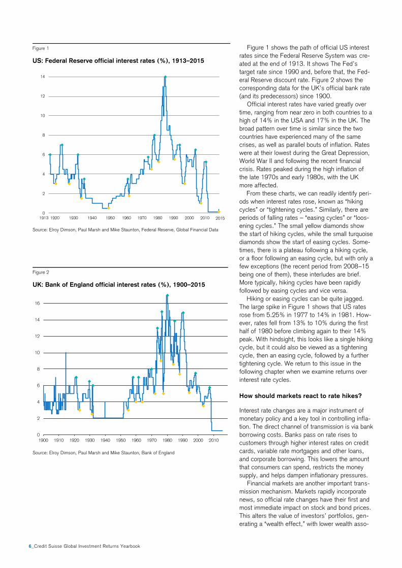
Figure 1 shows the path of official US interest
rates since the Federal Reserve System was cre-
ated at the end of 1913. It shows The Fed’s
target rate since 1990 and, before that, the Fed-
eral Reserve discount rate. Figure 2 shows the
corresponding data for the UK’s official bank rate
(and its predecessors) since 1900.
Official interest rates have varied greatly over
time, ranging from near zero in both countries to a
high of 14% in the USA and 17% in the UK. The
broad pattern over time is similar since the two
countries have experienced many of the same
crises, as well as parallel bouts of inflation. Rates
were at their lowest during the Great Depression,
World War II and following the recent financial
crisis. Rates peaked during the high inflation of
the late 1970s and early 1980s, with the UK
more affected.
From these charts, we can readily identify peri-
ods when interest rates rose, known as “hiking
cycles” or “tightening cycles.” Similarly, there are
periods of falling rates – “easing cycles” or “loos-
ening cycles.” The small yellow diamonds show
the start of hiking cycles, while the small turquoise
diamonds show the start of easing cycles. Some-
times, there is a plateau following a hiking cycle,
or a floor following an easing cycle, but with only a
few exceptions (the recent period from 2008–15
being one of them), these interludes are brief.
More typically, hiking cycles have been rapidly
followed by easing cycles and vice versa.
Hiking or easing cycles can be quite jagged.
The large spike in Figure 1 shows that US rates
rose from 5.25% in 1977 to 14% in 1981. How-
ever, rates fell from 13% to 10% during the first
half of 1980 before climbing again to their 14%
peak. With hindsight, this looks like a single hiking
cycle, but it could also be viewed as a tightening
cycle, then an easing cycle, followed by a further
tightening cycle. We return to this issue in the
following chapter when we examine returns over
interest rate cycles.
How should markets react to rate hikes?
Interest rate changes are a major instrument of
monetary policy and a key tool in controlling infla-
tion. The direct channel of transmission is via bank
borrowing costs. Banks pass on rate rises to
customers through higher interest rates on credit
cards, variable rate mortgages and other loans,
and corporate borrowing. This lowers the amount
that consumers can spend, restricts the money
supply, and helps dampen inflationary pressures.
Financial markets are another important trans-
mission mechanism. Markets rapidly incorporate
news, so official rate changes have their first and
most immediate impact on stock and bond prices.
This alters the value of investors’ portfolios, gen-
erating a “wealth effect,” with lower wealth asso-
Figure 1
US: Federal Reserve official interest rates (%), 1913–2015
Source: Elroy Dimson, Paul Marsh and Mike Staunton, Federal Reserve, Global Financial Data
Figure 2
UK: Bank of England official interest rates (%), 1900–2015
Source: Elroy Dimson, Paul Marsh and Mike Staunton, Bank of England
0
2
4
6
8
10
12
14
2015
0
2
4
6
8
10
12
14
16
1900 1910 1920 1930 1940 1950 1960 1970 1980 1990 2000 2010
Credit Suisse Global Investment Returns Yearbook_7
ciated with less future spending and vice versa.
Bond price changes reflect changes in the costs
of longer-term loans for individuals and corpora-
tions. This also impacts real economic activity.
The conventional wisdom is that rate hikes lead
to falls in both bond and stock prices. Central
banks in market economies set only the short-
term policy rate. They can seek to influence, but
do not control, longer-term rates. However in-
creases in the policy rate often signal (or are ac-
companied by guidance on) the expected path of
future short-term rates. A rise in the policy rate
thus has knock-on effects on longer-term rates.
An increase in longer-term rates will trigger a fall
in the prices of government bonds, corporate
bonds, and fixed rate mortgages and loans.
In principle, stock prices are the discounted
value of companies’ expected future cash flows. If
a rate rise reduces consumer spending, this will
lower corporate revenues, profits and cash flows,
and hence stock prices. But an increase in the
denominator of the discounting formula, i.e. the
discount rate, will also lower stock prices. A high-
er short-term interest rate will increase the dis-
count rate on near-term cash flows, but any
knock-on effect on longer-term interest rates will
have a much larger effect by lowering the present
value of medium- and longer-term cash flows. The
discount rate might also rise because of an in-
crease in the risk premium.
Numerous studies confirm the conventional
wisdom. US evidence that rate rises on average
lead to stock price falls (and vice versa) is provid-
ed by Waud (1970), Jensen and Johnson (1995),
Bernanke and Kuttner (2005) and others. Bredin,
Hyde, Niztsche and O’Reilly (2007) provide UK
evidence, while Bohl, Siklos and Sondermann
(2008) document the impact of European Central
Bank rate changes on Eurozone stocks. For the
USA, Kuttner (2001) shows that rate changes
lead to higher yields (and thus lower prices) for
instruments ranging from 3-month treasury bills
up to 30-year bonds.
Market participants, however, are sophisticated:
they do not simply view all rate rises as bad news.
They also look at any implications or signals that a
rate change conveys. For example, central banks
tend to raise rates only when they believe the
economy is strong enough. Rate rises can thus be
viewed as a positive signal about the economy.
Conversely, a rate cut might be seen as bad
news, especially in a crisis. Similarly, there is
much evidence that high inflation is bad for stocks
and bonds (see Dimson, Marsh and Staunton,
2012). So when inflation is high, rate rises may
be welcomed as evidence of a resolve to drive
inflation down.
More generally, markets will react only to the
surprise element of a rate change. Central banks
go to great lengths to provide guidance on their
criteria, thinking and intentions. The minutes of
their meetings are carefully scrutinized for clues
and textual subtleties (see Rosa, 2011). Further-
more, their decisions are data dependent, and
there is a constant flow of relevant economic data
on employment, GDP and so on that helps guide
markets on the central bank’s likely next move.
Rate changes, or indeed, their failure to hap-
pen at a particular meeting, are thus seldom likely
to be major surprises. Thus when we estimate the
impact of rate-change announcements, the signal-
to-noise ratio will be low. Many other factors im-
pact market prices, and there is also uncertainty
about how to interpret signals about timing and
importance when these vary over time. This ex-
plains why Bernanke and Kuttner (2005) found
that, even on days when rates changed or when
there was a no-change FOMC meeting, only 17%
of the variance in equity prices was associated
with surprises about monetary policy.
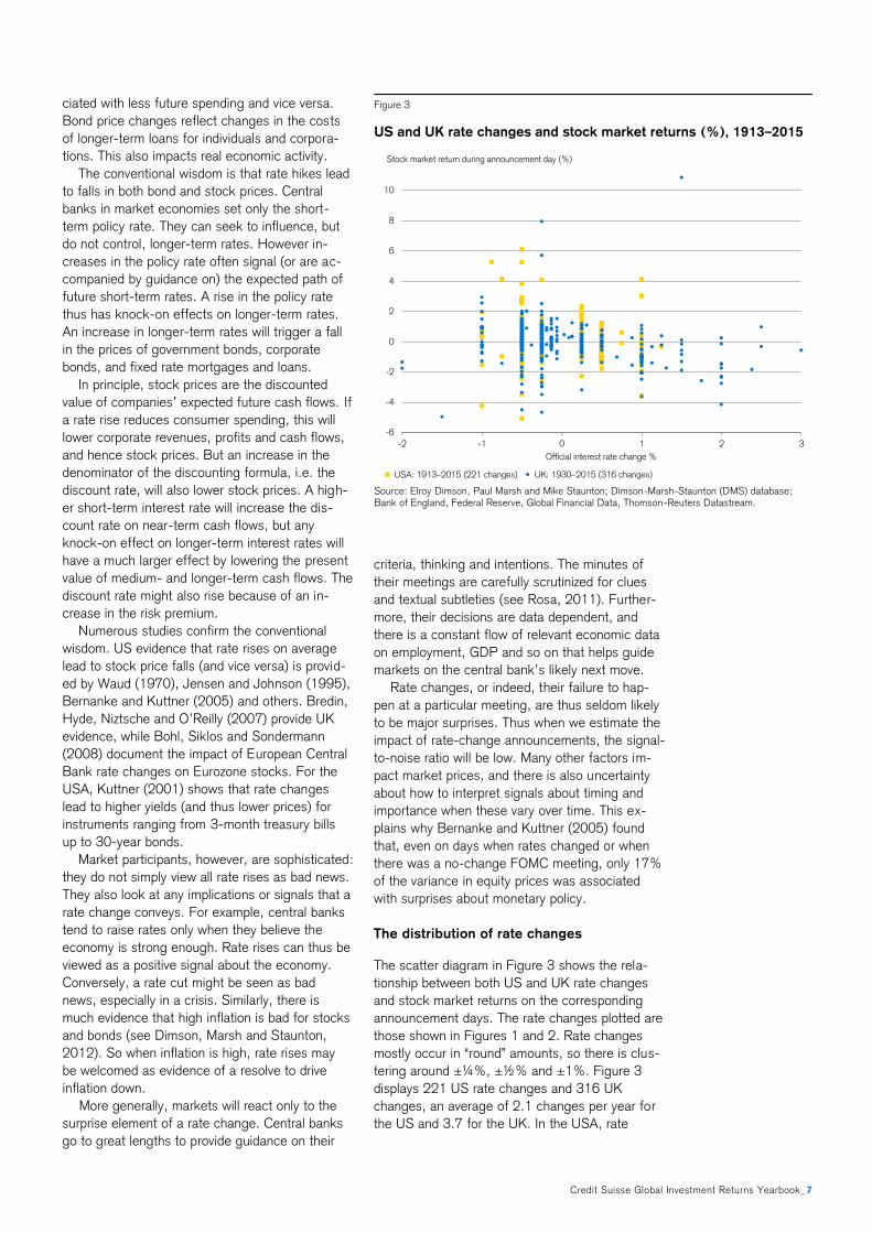
The distribution of rate changes
The scatter diagram in Figure 3 shows the rela-
tionship between both US and UK rate changes
and stock market returns on the corresponding
announcement days. The rate changes plotted are
those shown in Figures 1 and 2. Rate changes
mostly occur in “round” amounts, so there is clus-
tering around ±¼%, ±½% and ±1%. Figure 3
displays 221 US rate changes and 316 UK
changes, an average of 2.1 changes per year for
the US and 3.7 for the UK. In the USA, rate
Figure 3
US and UK rate changes and stock market returns (%), 1913–2015
Source: Elroy Dimson, Paul Marsh and Mike Staunton; Dimson-Marsh-Staunton (DMS) database; Bank of England, Federal Reserve, Global Financial Data, Thomson-Reuters Datastream.
-6
-4
-2
0
2
4
6
8
10
-2 -1 0 1 2 3
Official interest rate change %
USA: 1913–2015 (221 changes) UK: 1930–2015 (316 changes)
Stock market return during announcement day (%)
8_Credit Suisse Global Investment Returns Yearbook
changes ranged from −1% to +1¼%; in the UK,
the dispersion was wider, from −2% to +3%.
At least by eye, there appears to be little rela-
tionship between interest rate changes and stock
market returns. For both countries, however, there
is a statistically significant relationship. The coeffi-
cients on a regression of stock returns on rate
changes are −0.43 (t-value −2.3) for the USA
and −0.36 (t-value −3.4) for the UK. This implies
that stock prices tend to fall by 0.43% in the USA
and 0.36% in the UK for every 1% rise in the
official interest rate. The adjusted R-squareds are
0.02 and 0.03, respectively.
The effects, while quite modest, are in the pre-
dicted direction. But, as anticipated, the noise-to-
signal ratio is high. We are looking here, however,
simply at the impact of the raw rate change, with
no attempt to extract the surprise element. Fur-
thermore, Figure 3 shows just the announcement-
date impact. It is also of interest to investigate
what happens not only on the announcement day,
but also before and afterwards.
Event study of interest rate changes
To look at the market’s behavior around the time
of the announcement, we carry out an event
study. We focus on three windows. First, we
examine investment returns over the announce-
ment day (from the market close prior to an-
nouncement to the market close following the
announcement). Next, we estimate the perfor-
mance of each asset class from 20 trading days
before the announcement to the pre-
announcement market close. Last, we measure
performance from the post-announcement market
close to 20 days later.
We average returns in “event time” across all
rate-change announcements. We include only
dates on which rates changed, ignoring all poten-
tial announcement days on which there was no
rate change. The latter can, of course, also impact
market prices, depending on prior expectations.
We analyze equities, bonds and currency. Our
analysis obviously needs daily returns data. Daily
equity data is available for the full period covered
by Figures 1–3 from the Dimson-Marsh-Staunton
(DMS) US and UK equity series. For bonds, the
DMS series has daily data starting in 1962 for the
USA and 1967 for the UK, so these are the start-
ing dates for the bond event study. For curren-
cies, we look only at the post-Bretton Woods
period. For the USA, we use the Federal Reserve
trade-weighted index of the dollar against other
currencies starting in 1973. For the UK, we use
the sterling-dollar exchange rate from 1972.
Our cumulative event time returns are convert-
ed to abnormal returns using a simple autoregres-
sive model to de-mean them and adjust for the
very small degree of serial correlation. This en-
sures that the returns we observe over the entire
41-day event window (from 20 days before to 20
days after the announcement day) are not impact-
ed by the tendency of stocks and bonds to rise
over time. By construction, the mean daily abnor-
mal return outside of the event window is zero.
The impact of converting to abnormal returns is
modest when it comes to the full 41 days, and
over a 1-day window it makes a particularly small
difference. However, for consistency, perfor-
mance measures employ the same procedure
even when we are estimating returns over the
announcement day.
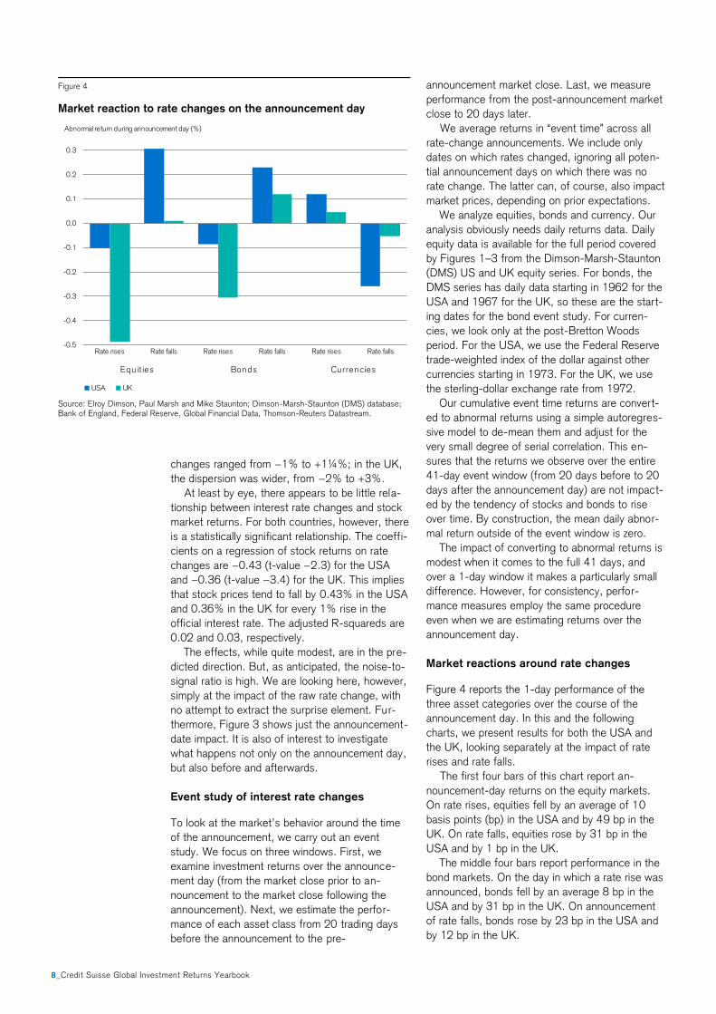
Market reactions around rate changes
Figure 4 reports the 1-day performance of the
three asset categories over the course of the
announcement day. In this and the following
charts, we present results for both the USA and
the UK, looking separately at the impact of rate
rises and rate falls.
The first four bars of this chart report an-
nouncement-day returns on the equity markets.
On rate rises, equities fell by an average of 10
basis points (bp) in the USA and by 49 bp in the
UK. On rate falls, equities rose by 31 bp in the
USA and by 1 bp in the UK.
The middle four bars report performance in the
bond markets. On the day in which a rate rise was
announced, bonds fell by an average 8 bp in the
USA and by 31 bp in the UK. On announcement
of rate falls, bonds rose by 23 bp in the USA and
by 12 bp in the UK.
Figure 4
Market reaction to rate changes on the announcement day
Source: Elroy Dimson, Paul Marsh and Mike Staunton; Dimson-Marsh-Staunton (DMS) database; Bank of England, Federal Reserve, Global Financial Data, Thomson-Reuters Datastream.
-0.5
-0.4
-0.3
-0.2
-0.1
0.0
0.1
0.2
0.3
Rate rises Rate falls Rate rises Rate falls Rate rises Rate falls
USA UK
Equ it ies Bonds Currencies
Abnormal return during announcement day (%)
Credit Suisse Global Investment Returns Yearbook_9
The last four bars report the reaction of the
currency markets on the day of the announce-
ment. On interest rate rises, the home currency
rose by 12 bp (US dollars) or 5 bp (UK pounds).
On interest rate falls, the home currency fell by 26
bp (US dollars) or 5 bp (UK pounds). The an-
nouncement-day returns were as one would pre-
dict from a change in the cost of funds. For each
of the three asset categories, given the interest
rate announcement, market behavior was similar
in direction in the USA and the UK.
A rate change could be triggered by pre-
announcement market conditions, so the behavior
of the market over the preceding 20-day period
depends on a variety of factors. It seems unlikely
that declining equity markets would trigger a rate
hike (as we see mainly in the UK), so it is more
likely that equity and bond markets anticipated the
policy tightening – e.g. through central bank
communication or some data events – which
caused the losses in the run-up to tightening. In
an efficient market, we would expect the implica-
tions of the rate change to be fully impounded in
asset prices by the end of the announcement day.
This would imply cumulative abnormal returns that
were close to zero (i.e. flat-lining) in the subse-
quent 20-day period. We turn next to examining
the pre- and post-announcement performance of
equities and bonds.
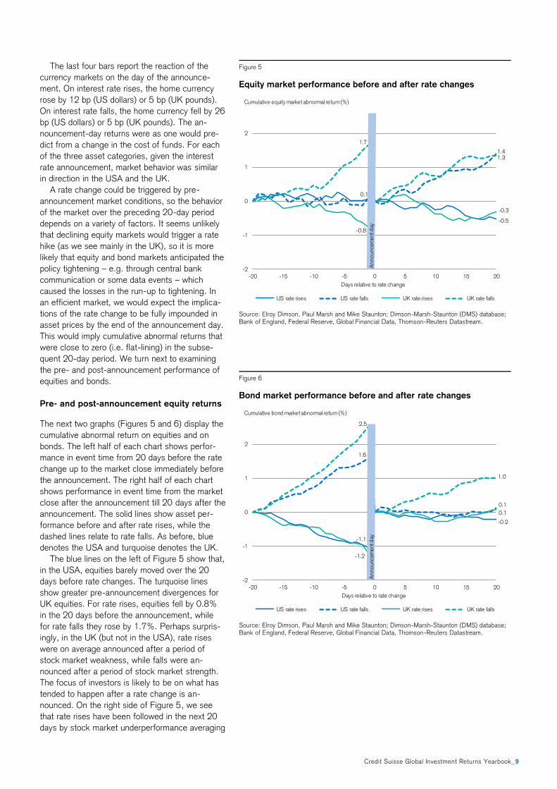
Pre- and post-announcement equity returns
The next two graphs (Figures 5 and 6) display the
cumulative abnormal return on equities and on
bonds. The left half of each chart shows perfor-
mance in event time from 20 days before the rate
change up to the market close immediately before
the announcement. The right half of each chart
shows performance in event time from the market
close after the announcement till 20 days after the
announcement. The solid lines show asset per-
formance before and after rate rises, while the
dashed lines relate to rate falls. As before, blue
denotes the USA and turquoise denotes the UK.
The blue lines on the left of Figure 5 show that,
in the USA, equities barely moved over the 20
days before rate changes. The turquoise lines
show greater pre-announcement divergences for
UK equities. For rate rises, equities fell by 0.8%
in the 20 days before the announcement, while
for rate falls they rose by 1.7%. Perhaps surpris-
ingly, in the UK (but not in the USA), rate rises
were on average announced after a period of
stock market weakness, while falls were an-
nounced after a period of stock market strength.
The focus of investors is likely to be on what has
tended to happen after a rate change is an-
nounced. On the right side of Figure 5, we see
that rate rises have been followed in the next 20
days by stock market underperformance averaging
Figure 5
Equity market performance before and after rate changes
Source: Elroy Dimson, Paul Marsh and Mike Staunton; Dimson-Marsh-Staunton (DMS) database; Bank of England, Federal Reserve, Global Financial Data, Thomson-Reuters Datastream.
Figure 6
Bond market performance before and after rate changes
Source: Elroy Dimson, Paul Marsh and Mike Staunton; Dimson-Marsh-Staunton (DMS) database; Bank of England, Federal Reserve, Global Financial Data, Thomson-Reuters Datastream.
-0.5
0.1
1.4
-0.8
-0.3
1.7
1.3
-2
-1
0
1
2
-20 -15 -10 -5 0 5 10 15 20
Days relative to rate change
US rate rises US rate falls UK rate rises UK rate falls
Cumulative equity market abnormal return (%)
Announc
ement
day
-1.1
-0.2
1.6
0.1
-1.2
0.1
2.5
1.0
-2
-1
0
1
2
-20 -15 -10 -5 0 5 10 15 20
Days relative to rate change
US rate rises US rate falls UK rate rises UK rate falls
Cumulative bond market abnormal return (%)
Announc
ement
day
10_Credit Suisse Global Investment Returns Yearbook
−0.4%. Rate falls have been followed in the next
20 days by outperformance averaging 1.3%.
Adding in the announcement-day returns in the
previous chart, stock market performance from
the pre-announcement market close to 20 days
after was as follows: for a rate rise –0.6% (USA)
and –0.8% (UK), and for a rate fall 1.7% (USA)
and 1.4% (UK). Interest rate rises proved to be
somewhat painful for equity investors, whereas rate
cuts were beneficial.
Bond and currency returns
The lines on the left of Figure 6 show that, in both
the USA and the UK, bonds moved more substan-
tially than equities over the 20 days before rate
changes. The solid lines show that for rate rises,
bonds fell by an average –1.1%, while for rate
falls, the dashed lines show that bonds rose by an
average 2.0% in the 20 days before the an-
nouncement. Either rate changes were a response
to recent changes in bond yields, or bond markets
were anticipating the interest rate change that was
going to be announced.
Turning to what happened post-announcement,
the right side of Figure 6 shows that rate rises
have been followed in the next 20 days by bond
market returns that were close to neutral, while
falls have been followed in the next 20 days by
bond market outperformance averaging 0.5%
(with a marginally positive return after US rate
rises, and a larger 1.0% return in the UK).
Adding in the announcement-day returns from
Figure 4, bond market performance from the
market close before a rise to 20 days after was
−0.3% (US) and −0.2% (UK). Bond market per-
formance from the market close before a fall to
20 days after was 0.4% (US) and 1.1% (UK).
Interest rate rises had a neutral impact for bond
investors, while rate cuts were neutral for US
investors, but, in retrospect, were beneficial for
UK bond investors.
The reaction of the currency markets is more
nuanced. Other things equal, we would expect
rate rises to lead to a stronger domestic currency
and vice versa, and the evidence is broadly con-
sistent with this. After the announcement-day
currency returns shown in Figure 4, subsequent
movements were small. Having risen by 12 bp on
announcement of a rate rise, the dollar declined
by 9 bp over the next 20 days, and having risen
by 5 bp on rate rises, the pound weakened by 27
bp afterwards. Similarly, having declined by 26 bp
on rate cuts, the dollar recovered by 22 bp after-
wards. In slight contrast, having declined by 5 bp
on rate cuts, the pound fell afterwards by 66 bp,
but there was also some weakening over the
period following rate rises (we do not graph the
currencies in event time to conserve space).
In summary, all the announcement-day effects
in the USA and the UK for all three asset classes,
and for rate falls as well as rises, were in the
direction predicted, but their magnitude was quite
small. For US and UK bonds and for UK (but not
US) equities, however, returns over the 20 days
before the announcement were also in the pre-
dicted direction and much larger in size. This is
consistent with central banks preferring to avoid
surprising the markets and with markets correctly
anticipating the direction, magnitude and timing of
rate changes. Markets will have been assisted by
guidance from the central bank and the release of
relevant economic data in the run-up to the rate
change.
Do markets influence central banks?
Clearly, rate changes impact asset prices, but the
relationship also works in reverse. In deciding
when and by how much to change rates, central
banks will be influenced by recent market move-
ments. Rigobon and Sach (2003) analyzed US
stocks over 1985–99 and concluded that rising
stock prices tended to drive short-term interest
rates in the same direction. This is in part because
central banks are concerned about the wealth
effect, which is positive in a bull market and nega-
tive when markets fall sharply, and is one reason
why central banks lowered rates and loosened
policy in reaction to the 1987 crash and the more
recent financial crisis.
Volatility can play a similar role. When contem-
plating rate rises, central banks may choose to
delay if markets seem too volatile. We compute
Figure 7
Market volatility before and around the time of rate changes
Source: Elroy Dimson, Paul Marsh and Mike Staunton; Dimson-Marsh-Staunton (DMS) database; Bank of England, Federal Reserve, Global Financial Data, Thomson-Reuters Datastream.
6
15
-28
-14
-18
63
70
1215 16 17
45
67
-15
43
11
17
79 77
30
51
33 32
-30
-20
-10
0
10
20
30
40
50
60
70
Pre-announcement period Announcement day ± 1 day
Rate rises Rate falls
Equities Bonds Currency Equities Bonds CurrencyUSA UK USA UK USA UK USA UK USA UK USA UK
Increase in volatility compared to non-event periods (%)
Credit Suisse Global Investment Returns Yearbook_11
volatilities over the pre-announcement period by
taking the standard deviation of all daily returns
during the 20-day pre-announcement period, first
across all rate rises, and then across all rate falls.
We compute the announcement-day volatility in
the same way, using data for the 3-day period
from the pre-announcement day to the post-
announcement day.
Figure 7 provides some support for the view
that central banks’ interventions may be influ-
enced by market volatility. The left-hand side of
the chart relates to rate increases. It shows the
extent to which volatility is heightened relative to
normal (i.e. non-event periods) during the 20 days
before the announcement (turquoise bars) and
over the announcement period (the blue bars
show average volatility over the 3-day period cen-
tered on the announcement day). The first set of
four bars is for equities, the next for bonds and
the third for currency.
The first bar on the left thus shows that, for US
equities, volatility prior to rate rises was 6% higher
than normal during the pre-announcement period
and 45% higher over the announcement itself. As
one would expect, volatility is mostly appreciably
higher than normal over the announcement period,
the only exception being US bond volatility. Fur-
thermore, the blue bars are always higher than the
turquoise bars, indicating that volatility is always
higher over the announcement period than be-
forehand.
The surprising feature of Figure 7 is that, prior
to rate rises, volatility is fairly subdued in the pre-
announcement period. In the USA, for example, it
is 6% higher than normal for equities, 28% lower
for bonds and the same as normal for currency.
The right-hand side of Figure 7 shows the corre-
sponding data for rate falls. Before rate falls,
volatility is noticeably higher in all cases than be-
fore rate rises. This is consistent with the notion
that when volatility is high, central banks tend to
defer rate rises. In the case of rate cuts, it is con-
sistent with central banks tending to loosen policy
following crises.
The market reaction to rate surprises
We noted above that markets react only to the
surprise element of a rate change. Our event
studies focused just on the raw rate change, and
did not seek to isolate the surprise element. They
are useful in providing guidance on what to expect
from a rate change. For example, the muted reac-
tion over the actual announcement period of the
important US rate change in December 2015 was
entirely consistent with the typically small reac-
tions we have observed historically.
Rate changes are widely anticipated, however,
not least by the Fed funds futures market. A
number of researchers, including Kuttner (2001)
and Bernanke and Kuttner (2005) have isolated
the surprise element of announcements by defin-
ing the surprise as the actual rate change minus
the rate change inferred from Fed funds futures
prices. Using this definition, even “no change”
meeting days become important, as the lack of a
change can itself be a surprise. Others, such as
Cieslak and Pavol (2014) use survey evidence to
extract the surprise part in a rate change. These
studies demonstrate persuasively that the market
response to the surprise component is significantly
stronger than the response to the raw change.
Figure 8 summarizes the US evidence on the
impact of a 25 bp surprise interest rate rise. The
impact on equities (the blue bar) is taken from the
Bernanke and Kuttner (2005) study which cov-
ered the period from 1989 to 2001. They found
that equities typically fell by almost 1.2% for every
25 bp of “surprise” rate increase.
The impact on fixed income securities (the tur-
quoise bars) is from Kuttner (2001) who analyzed
the period from 1989 to 2000, expressing his
results as the impact on yield, rather than returns.
A 25 bp surprise rate increase leads to a 20 bp
increase in 3- month Treasury bill rates, a 15 bp
increase in 2-year Treasuries, an 8 bp rise in 10-
year bonds, and a 5 bp rise in 30-year Treasury
bond yields.
Finally, the impact of surprise rate rises on the
dollar (the green bar) is taken from a study by
Rosa (2010) spanning 1999–2007, which inves-
tigated the impact of rate changes on currencies
using an event study with intraday data for five
Figure 8
Reaction to US rate change surprises
Source: Bernanke and Kuttner (2005), Kuttner (2001), Rosa (2010)
-1.20
-1.00
-0.80
-0.60
-0.40
-0.20
0.00
0.20
0.40
US stock
returns
3-month TBill
yields
2-year Treasury
yields
10-year
Treasury yields
30-year
Treasury yields
Dollar vs major
currencies
Average reaction (%) to a 25 bp surprise interest rate increase
12_Credit Suisse Global Investment Returns Yearbook
exchange rates (the US dollar versus the euro, the
Canadian dollar, the British pound, the Swiss
franc, and the Japanese yen). Rosa found that a
25 bp surprise rate rise led, on average, to a 48
bp appreciation of the dollar against the other
major currencies.
Long-run global evidence
We have seen that, historically in the USA and the
UK, rate rises have on average been viewed as
bad news for stocks and bonds, while rate falls
have been greeted favorably. The extensive Year-
book database enables us to investigate whether
this has also held true for other countries over
even longer periods, and to study predictive pat-
terns in contrast to contemporaneous ones. The
database now covers asset returns in 23 countries
since 1900.
Our focus up to this point on the USA and the
UK partly reflects the importance of these two
countries’ financial markets, but it is also driven by
data availability. For these two countries, we have
a long sample of daily returns data, as well as a
record of all their official interest rate changes and
when they happened. We do not have the equiva-
lent data on rate changes for other countries, and
the Yearbook database provides only annual data.
Our global analysis of the impact of interest rate
changes on stock and bond returns is therefore, of
necessity, much coarser.
For each of the 21 countries for which we have
a continuous returns history since 1900, we iden-
tify “rate fall” and “rate rise” years. A year is
deemed to be a rate fall year if the Treasury bill
return is at least 25 bp lower than in the previous
year. It is categorized as a rate rise year if the bill
return is at least 25 bp higher than the year be-
fore. Years in which there is only a very small or
no change from the year before are ignored. We
then compute the average returns in the year
following (1) rate fall years and (2) rate rise years
and report the difference between the two.
Figure 9 presents the results of this predictive
analysis for equity returns. It shows that, for every
country other than Japan and New Zealand, real
stock returns were on average higher in the year
following rate fall years than in the year after rate
rise years. The average of the 21 countries is
given by the bar in the center of the chart with a
green border. This shows that, for the average
country, real returns were 8.4% higher in years
following rate falls compared with years following
rate rises. As well as looking at return differences
over a 1-year subsequent period, we also com-
puted the differences over a 5-year period, and
the results were very similar.
Of the 19 countries for which there was a posi-
tive difference in returns, Figure 9 shows that the
magnitude was smallest for the USA and the UK.
Figure 9
Impact of rate changes on real equity returns, 1901–2015
Source: Elroy Dimson, Paul Marsh and Mike Staunton; Dimson-Marsh-Staunton (DMS) database
Figure 10
Impact of rate changes on real bond returns, 1901–2015
Source: Elroy Dimson, Paul Marsh and Mike Staunton; Dimson-Marsh-Staunton (DMS) database
8.4
-5
0
5
10
15
20
25
Jap NZ US UK Can SAf Swe Aus Den Bel Swi Avg Fin Ire Nor Spa Net Fra Ger Aut Prt Ita
Difference in average return in year following interest rate falls compared with year after interest rate rises (%)
1.5
-4
-2
0
2
4
6
Ire Fin UK Spa Swe Can Ger SAf Net US Nor NZ Avg Fra Bel Ita Den Aus Swi Jap Aut Prt
Difference in average return in year following interest rate falls compared with year after interest rate rises (%)

Credit Suisse Global Investment Returns Yearbook_13
This observation – that the USA and the UK expe-
rienced no effective impact on real equity returns
from interest rate changes – may be important as
a message for the future, now that other markets
are more mature. On the other hand, we saw
above that when we utilize higher frequency data
and the actual dates of official rate rises, both the
USA and the UK experienced large positive ef-
fects. This suggests that the results in Figure 9,
which are based on a much less granular analysis,
may understate the extent to which real stock
returns were higher during periods of easing ra-
ther than tightening.
Many of the countries plotted in Figure 9 had a
troubled history during the first half of the 20th
century, largely due to the world wars and the
episodes of high inflation that often followed in
their wake. We have therefore rerun the analysis
for the period from 1950 onward. The results
were very similar, but slightly stronger. In 20 of
the 21 countries, real stock returns were on aver-
age higher following rate fall years than rate rise
years (the exception was New Zealand). The
average difference over the period from 1950 on
was 8.9%.
Figure 10 shows the identical analysis for bond
returns. For two-thirds of the countries, real bond
returns were on average higher in the year follow-
ing rate fall years than in the year after rate rise
years. The average of the 21 countries is given by
the bar in the center of the chart with a green
border. This shows that, for the average country,
real bond returns were 1.5% higher in years fol-
lowing rate falls compared with years following
rate rises.
From 1950 onward, the results were very simi-
lar, with all but five countries showing a positive
effect, and the average difference again being
1.5%. If we look out over five years rather than
just one, then all but one country (South Africa)
showed a positive difference and the average
annualized difference was 1.6%.
Conclusion
Markets took the December 2015 rate rise in their
stride, despite this being the first US rate hike for
almost a decade. This is precisely what we should
have expected as it was widely anticipated. Mar-
kets react only to the surprise element of rate
rises.
We have examined all changes in the official in-
terest rate in the USA for over 100 years and in
the UK since 1930. The announcement-day im-
pacts are small, but in the predicted direction.
Rate rises are on average bad news for stocks
and bonds, while rate falls are greeted favorably.
When we look over the 40-day period around
rate changes, the relationship is more obvious,
and the effects are much larger. This is consistent
with markets correctly anticipating the direction,
timing and magnitude of rate changes. They are
helped in this task by central bank guidance and
macroeconomic data announcements. Research-
ers who have controlled for the surprise element
of rate changes, typically using futures market
rates, also find that the announcement effects are
much larger. Rate changes matter, even though
the reaction on the day itself often seems muted.
The relatively small announcement-day reaction
is a tribute to the fact that markets are effective in
anticipating rate changes and their likely impact.
Public knowledge, such as current central bank
policies and pronouncements, is already impound-
ed in stock and bond prices. It is surprises in
central bank policy and actions that impact asset
prices. So investors with a superior understanding
of central bank policy, or who are better able to
forecast the macroeconomic variables that condi-
tion central bank decisions, should have an edge.
Besides rate changes impacting asset prices,
asset prices and volatility themselves influence
rate changes. There is a tendency for rising stock
prices to drive short-term interest rates in the
same direction, while sharply falling prices can
provoke monetary easing. This effect may partly
be driven by policymakers’ concern with wealth
effects. There is also evidence that, when volatility
is high, central banks tend to defer rate hikes.
Our detailed analysis of the market’s reaction
to interest rate change announcements was lim-
ited to the USA and the UK since these are the
only two countries for which we have long-run
historical daily returns data, as well as a compre-
hensive record of all official rate changes. Howev-
er, when we conducted a coarser analysis based
on annual data, but extended now to 21 countries
over the period from 1900 to date, our findings
were consistent with our finer-grained event-study
analysis. Real equity and bond returns both tend-
ed to be higher in the year following rate falls than
in the year after rate rises. This relationship also
held for subsequent periods longer than a year.
This raises an obvious question; namely, how
do different asset classes perform over entire
hiking and easing cycles? In the following chapter,
we shift our focus away from the immediate im-
pact of rate changes, and instead compare asset
performance over entire interest rate hiking and
easing cycles. We find substantial differences
between the two.

PH
OTO
: G
IBS
ON
PIC
TUR
ES
/ IS
TOC
KP
HO
TO.C
OM

Credit Suisse Global Investment Returns Yearbook_15
When the Fed raised rates in December 2015, its
intention was that this would be the first of a se-
ries of such hikes. The last hiking cycle, which
began in June 2004, also started with a 25 basis-
point rise, taking rates from the floor at that time
of 1% to 1.25%. It was followed by a further 16
rate rises, and a hiking cycle that lasted over three
years. While no one today expects 16 further
rises, no one expected such a prolonged cycle
back in June 2004 either.
At the other extreme, the December rate rise
could turn out to be a one-off. 2016 has not
started well, and a fresh crisis could cause the
Fed to reverse policy. Indeed, there have been
seven instances of a single-rate-rise US hiking
“cycle” over the last 100 years. On average, hik-
ing cycles have lasted just under two years (1.9)
and involved 4.3 rate rises. Easing cycles have
lasted slightly longer (2.2 years) with an average
of 4.7 rate cuts.
Since the financial crisis, US monetary policy
has been very loose with ultra-low interest rates
plus quantitative easing. Over the seven years
since the start of 2009, US stocks have per-
formed strongly with a real return of 12.6% per
annum, while long bonds have enjoyed an annual-
ized real return of 2.4%. Does the start of a new
hiking cycle and the move to a somewhat tighter
policy herald the end of good returns?
In the previous chapter, our focus was on the
immediate impact of rate changes. In this chapter,
our focus is on examining asset performance over
entire hiking and easing cycles.
Defining hiking and easing cycles
A simple approach to measuring performance over
interest rate cycles in the USA and the UK would
be to utilize the cycle start and end dates depicted
in Figures 1 and 2 of the previous chapter. In-
vestment over hiking cycles involves buying assets
on the date corresponding to each of the small
yellow diamonds, which denote the start of the
up-cycle, and selling on the date of the next tur-
quoise diamond, which marks the reversal point
and the start of the down-cycle. Similarly, invest-
ment over easing cycles involves investing at each
turquoise diamond date and selling at the next
yellow diamond.
We follow this procedure for the USA and the
UK – the two countries for which suitable data is
available – measuring returns in real terms since
our main concern is with the impact of rate
changes on the purchasing power of investment
assets. The use of real returns is also important
when making comparisons here, as the average
inflation rate is likely to have differed between
periods of tightening and easing.
Cycling for the good of your wealth
This chapter compares asset performance over entire interest rate hiking and easing cycles,
using a trading strategy that could, in principle, have been implemented in real time. First,
we look at the performance of equities, bonds, bills and currencies and at the corresponding
equity and maturity premia. We then examine performance within the equity market, analyz-
ing factor returns, including industries, as well as the returns from size, value and momen-
tum. Finally, we examine the returns on real assets (including precious metals such as gold
and silver), collectibles (including art, stamps and wine), and real estate (including housing
and farmland). In all cases, we find substantial differences between returns during hiking and
easing cycles.
Elroy Dimson, Paul Marsh and Mike Staunton, London Business School
16_Credit Suisse Global Investment Returns Yearbook
We find large differences in real asset returns
between tightening and loosening cycles. During
all tightening cycle periods, US stocks achieved
an annualized real return of 4.9%, while during
easing cycles they enjoyed a much higher return
of 8.8%. Similarly, the annualized real return on
US bonds over all tightening cycles was −0.2%,
while the corresponding return over easing cycles
was 5.0%. For the UK, the differences were in
the same direction, but even larger.
This strategy could not, however, have been
followed in real time as hindsight was used to
define the cycles. The turning points in Figures 1
and 2 of the previous chapter were identified
visually and we ignored any temporary jaggedness
in the pattern of rates over time. Thus if the chart
shows that rates rose from a low to a subsequent
high, we define this as a hiking cycle, even though
within this there may have been temporary rate
cuts that were soon reversed.
In real time, however, an investor would ob-
serve only the rate cut, not that it was destined to
be temporary and be reversed, and that rates
would then resume their climb to the high. To
have divined the latter would have required clair-
voyance.
Asset returns after rate rises and falls
To circumvent this problem, we adopt a simple
trading rule that could be followed in real time. It
entails investing (1) after unbroken runs of rate
rises, and (2) after unbroken runs of rate falls.
Investing after rate rises involves buying assets on
the announcement of an initial rate hike (e.g. the
December 2015 US rate rise), staying invested as
long as rates continue to rise or stay the same,
then selling on the announcement of the first rate
cut. Investing after rate falls involves purchasing
after an initial rate cut then holding until the next
rate rise. Essentially, this is a mechanical way of
defining hiking and easing cycles.
By defining cycles in this way, there are no
“left-over” periods. All points in time are designat-
ed either as falling within a hiking cycle or an
easing cycle. Our US data starts in 1913, and
from 1913 to 2015, US markets were in a rising
interest rate mode 44% of the time, and in a
falling rates mode 56% of the time. The UK data
starts in 1930, and UK markets spent less time in
hiking mode (30%) and more time in periods of
easier money (70%).
Figure 1 (this page) shows the results of fol-
lowing this strategy. The left side of the chart
refers to the USA and the right-hand side to the
UK. Each group of three bars relates to a different
asset class, with the green bar in each grouping
showing the returns over the entire period, the
blue bar showing returns after rate falls (easing
cycles) and the turquoise bar showing returns
after rate rises (hiking cycles).
Looking first at the USA, there are large differ-
ences between the returns following rate rises and
those after rate falls, especially for stocks and
bonds. Equities gave an annualized real return of
6.2% over the entire period, but just 2.3% during
rate-rise periods, compared with 9.3% during rate
falls. US bonds gave an annualized real return of
2.2% over the full period, but just 0.3% in the
rate-rise regime, compared with 3.6% while rates
fell. In contrast, real bill returns (the short-term
risk-free real interest rate), were virtually the same
under both regimes. The differences in returns
between rate-rise and rate-fall periods were sta-
tistically significant at the 1% level for both equi-
ties and bonds, but insignificant for bills.
The annualized US inflation rate was also high-
er at 4.3% during hiking cycles compared with
2.2% during periods of easing. This difference
was significant at the 0.01% level. Hiking cycles
are often triggered by inflation fears and are tar-
geted at bringing it down. To achieve this typically
requires multiple rate rises and there are also time
lags. So it is unsurprising that inflation tends to be
higher during tightening cycles.
Finally, the performance of the dollar is a some-
what counter-intuitive result. We might expect the
Figure 1
Performance of assets after rate rises and rate falls
Source: Elroy Dimson, Paul Marsh and Mike Staunton; Dimson-Marsh-Staunton (DMS) database;
Bank of England, Federal Reserve, Global Financial Data, Thomson-Reuters Datastream.
6.2
2.2
0.5
3.1
-0.3
6.2
2.5
0.9
4.2
-1.1
9.3
3.6
0.4
2.2
0.6
8.2
2.5
0.5
3.7
-2.3
2.3
0.3 0.4
4.3
-1.7
1.7
2.5
1.8
5.5
1.0
-3
0
3
6
9
Realequity
Realbonds
Realbills
Infl-ation
Curr-ency
Realequity
Realbonds
Realbills
Infl-ation
Curr-ency
All periods (USA:1913–2015; UK: 1930–2015) After rate falls After rate rises
USA UK
Credit Suisse Global Investment Returns Yearbook_17
dollar to be strong during periods of rate rises, but
in fact it has been weaker. Over the entire period
covered by our analysis, the annualized depreciation
of the dollar against other major currencies was
0.3%. During hiking cycles, it depreciated at an
annualized rate of 1.7%, while during easing cy-
cles, it appreciated by 0.6% per annum. This may
reflect the higher inflation rate during tightening
cycles or perhaps the stronger US economy that
tends to prevail during easing cycles.
The right-hand side of Figure 1 on page 16
shows similar findings for the UK. UK stocks gave
an annualized real return of 6.2% over the entire
period, but just 1.7% during periods of rising rates,
versus 8.2% during easing cycles. This difference
is statistically significant at the 3% level. In contrast
to the USA, UK bonds gave very similar returns
during hiking and easing cycles, while the UK real
rate of interest (real bill return) was 1.3% per an-
num higher during tightening than easing cycles. As
in the USA, the annualized inflation rate during UK
tightening cycles was much higher (5.5%) than
during easing cycles (3.7%), and this was statisti-
cally significant at the 1% level. Finally, the pound
strengthened against the dollar by 1% per year
during tightening cycles, but weakened by 2.3%
per year during easing periods. This contrasts with
the findings above for the USA.
Volatility after rate rises and falls
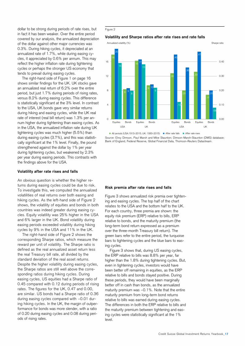
An obvious question is whether the higher re-
turns during easing cycles could be due to risk.
To investigate this, we computed the annualized
volatilities of real returns over both easing and
hiking cycles. As the left-hand side of Figure 2
shows, the volatility of equities and bonds in both
countries was indeed greater during easing cy-
cles. Equity volatility was 25% higher in the USA
and 6% larger in the UK. Bond volatility during
easing periods exceeded volatility during hiking
cycles by 9% in the USA and 11% in the UK.
The right-hand side of Figure 2 shows the
corresponding Sharpe ratios, which measure the
reward per unit of volatility. The Sharpe ratio is
defined as the real annualized asset return less
the real Treasury bill rate, all divided by the
standard deviation of the real asset returns.
Despite the higher volatility during easing cycles,
the Sharpe ratios are still well above the corre-
sponding ratios during hiking cycles. During
easing cycles, US equities had a Sharpe ratio of
0.45 compared with 0.12 during periods of rising
rates. The figures for the UK, 0.47 and 0.00,
are similar. US bonds had a Sharpe ratio of 0.36
during easing cycles compared with −0.01 dur-
ing hiking cycles. In the UK, the margin of outper-
formance for bonds was more slender, with a ratio
of 0.20 during easing cycles and 0.08 during peri-
ods of rising rates.
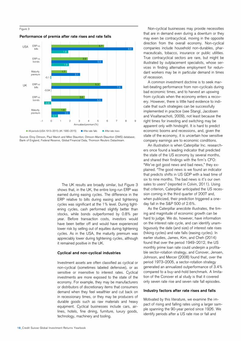
Risk premia after rate rises and falls
Figure 3 shows annualized risk premia over tighten-
ing and easing cycles. The top half of the chart
relates to the USA and the bottom half to the UK.
For each country, three premia are shown: the
equity risk premium (ERP) relative to bills, ERP
relative to bonds, and the maturity premium (the
long-term bond return expressed as a premium
over the three-month Treasury bill return). The
green bars refer to the entire period, the turquoise
bars to tightening cycles and the blue bars to eas-
ing cycles.
Figure 3 shows that, during US easing cycles,
the ERP relative to bills was 8.8% per year, far
higher than the 1.8% during tightening cycles. But,
even in tightening cycles, investors would have
been better off remaining in equities, as the ERP
relative to bills and bonds stayed positive. During
these periods, they would have been marginally
better off in cash than bonds, as the annualized
maturity premium was −0.1%. Note that the entire
maturity premium from long-term bond returns
relative to bills was earned during easing cycles.
The differences in both the ERP relative to bills and
the maturity premium between tightening and eas-
ing cycles were statistically significant at the 1%
level.
Figure 2
Volatility and Sharpe ratios after rate rises and rate falls
Source: Elroy Dimson, Paul Marsh and Mike Staunton; Dimson-Marsh-Staunton (DMS) database;
Bank of England, Federal Reserve, Global Financial Data, Thomson-Reuters Datastream.
18
8
16
9
20
9
17
10
16
8
15
9
.32
.20
.33
.17
.45
.36
.47
.20
.12
.00 .00
.08
0.00
0.10
0.20
0.30
0.40
0
4
8
12
16
Equities Bonds Equities Bonds Equities Bonds Equities Bonds
USA UK USA UK
All periods (USA:1913–2015; UK: 1930–2015) After rate falls After rate rises
Annualized volatility (%) Sharpe ratio
18_Credit Suisse Global Investment Returns Yearbook
The UK results are broadly similar, but Figure 3
shows that, in the UK, the entire long-run ERP was
earned during easing cycles. The difference in the
ERP relative to bills during easing and tightening
cycles was significant at the 1% level. During tight-
ening cycles, cash performed slightly better than
stocks, while bonds outperformed by 0.8% per
year. Before transaction costs, investors would
have been better off and would have experienced
lower risk by selling out of equities during tightening
cycles. As in the USA, the maturity premium was
appreciably lower during tightening cycles, although
it remained positive in the UK.
Cyclical and non-cyclical industries
Investment assets are often classified as cyclical or
non-cyclical (sometimes labeled defensive), or as
sensitive or insensitive to interest rates. Cyclical
investments are more exposed to the state of the
economy. For example, they may be manufacturers
or distributors of discretionary items that consumers
demand when they feel wealthier and cut back on
in recessionary times, or they may be producers of
durable goods such as raw materials and heavy
equipment. Cyclical businesses include cars, air-
lines, hotels, fine dining, furniture, luxury goods,
technology, machinery and tooling.
Non-cyclical businesses may provide necessities
that are in demand even during a downturn or they
may even be contracyclical, moving in the opposite
direction from the overall economy. Non-cyclical
companies include household non-durables, phar-
maceuticals, tobacco, insurance or public utilities.
True contracyclical sectors are rare, but might be
illustrated by outplacement specialists, whose ser-
vices in finding alternative employment for redun-
dant workers may be in particular demand in times
of recession.
A common investment doctrine is to seek mar-
ket-beating performance from non-cyclicals during
bad economic times, and to harvest an upswing
from cyclicals when the economy enters a recov-
ery. However, there is little hard evidence to indi-
cate that such strategies can be successfully
implemented in practice (see Stangl, Jacobsen
and Visaltanachoti, 2009), not least because the
right times for investing and switching may be
apparent only with hindsight. It is hard to predict
economic booms and recessions, and, given the
state of the economy, it is uncertain how sensitive
company earnings are to economic conditions.
An illustration is when Caterpillar Inc. research-
ers once found a leading indicator that predicted
the state of the US economy by several months,
and shared their findings with the firm’s CFO:
“We’ve got good news and bad news,” they ex-
plained. “The good news is we found an indicator
that predicts shifts in US GDP with a lead time of
six to nine months. The bad news is it’s our own
sales to users” (reported in Colvin, 2011). Using
that criterion, Caterpillar anticipated the US reces-
sion coming in the third quarter of 2007 and,
when publicized, their prediction triggered a one-
day fall in the S&P 500 of 2.6%.
As the Caterpillar anecdote illustrates, the tim-
ing and magnitude of economic growth can be
hard to judge. We do, however, have information
on the interest rate cycle, and can identify unam-
biguously the date (and size) of interest rate rises
(hiking cycles) and rate falls (easing cycles). In
earlier studies, James, Kim, and Cheh (2014)
found that over the period 1949–2012, the US
monthly prime loan rate could underpin a profita-
ble sector-rotation strategy, and Conover, Jensen,
Johnson, and Mercer (2008) found that, over the
period 1973–2005, a sector-rotation strategy
generated an annualized outperformance of 3.4%
compared to a buy-and-hold benchmark. A limita-
tion of the Conover et al study is that it covered
only seven rate rise and seven rate fall episodes.
Industry factors after rate rises and falls
Motivated by this literature, we examine the im-
pact of rising and falling rates using a larger sam-
ple spanning the 90-year period since 1926. We
identify periods after a US rate rise or fall and
Figure 3
Performance of premia after rate rises and rate falls
Source: Elroy Dimson, Paul Marsh and Mike Staunton; Dimson-Marsh-Staunton (DMS) database;
Bank of England, Federal Reserve, Global Financial Data, Thomson Reuters Datastream.
0.7
-0.8
-0.04
-0.1
1.9
1.8
2.0
5.5
7.6
3.1
5.5
8.8
1.6
3.6
5.3
1.7
3.9
5.7
-1 0 1 2 3 4 5 6 7 8 9
Maturitypremium
ERP vsbonds
ERP vsbills
Maturitypremium
ERP vsbonds
ERP vsbills
Annualized premium (%)
All periods (USA:1913–2015; UK: 1930–2015) After rate falls After rate rises
USA
UK

Credit Suisse Global Investment Returns Yearbook_19
measure the performance of each industry index.
We estimate industry factor returns, where the
latter are the annualized returns on each industry
index measured relative to the contemporaneous
return on the overall equity market index.
The US results are summarized in Figure 4.
The vertical axis shows the industry factor return
following an interest rate rise (blue bars) and
following an interest rate fall (turquoise bars). The
horizontal axis shows the industries, which are
described below. The underlying data are from
Ken French's 12 Industry Portfolio daily series,
which currently run from July 1926 to July 2015.
The industries are ranked loosely from defensive
to cyclical. On the left are utilities and telecoms.
They are followed by engineering, healthcare and
drugs, business equipment (including software),
financials, and chemicals. Towards the right are
consumer non-durables, manufacturing, other
industries (those not covered by the other 11
groups, such as business services, construction,
hotels, entertainment, mining, and transport), retail
and wholesale, and consumer durables. The rank-
ing is based on the average responsiveness of
these industry groups over the very long term to
changes in interest rates in the USA and (using the
same industry groupings) in the UK.
Interestingly, cutting-edge publications on in-
vestment provide little evidence on whether stock
market returns are robustly related to industry
cyclicality. As we wrote a year ago in the Global
Investment Returns Yearbook (Dimson, Marsh and
Staunton, 2015), “In research terms… industries
are the Cinderella of factor investing.”
Yet as we noted then, industry factors are a
key organizing concept in investment, and there is
an enduring emphasis in portfolio management on
getting industry exposures right. Industry mem-
bership is the most common method for grouping
stocks for portfolio risk management, relative
valuation and peer-group valuation. Much of that
is founded on a belief that industries respond to
the economic environment in a consistent way.
Figure 4 confirms what practitioners knew all
along. Not only do US investment returns corre-
late with broad perceptions about industry cyclical-
ity, but there is a systematic relationship between
performance in tightening and easing cycles.
Industry factor returns during declining interest
rates are systematically in the opposite direction to
industry factor returns during rising interest rates.
There are three small exceptions to this feature
of Figure 4, namely chemicals, manufacturing,
and the “other” category. For these three groups,
industry factor returns tend slightly to be in the
same—rather than the opposite—direction during
tightening and easing cycles. Why might this be?
In part, the industries in Figure 4 are aggregate
groupings and the “other” category contains a
somewhat unconnected selection of leftover fields
of business. We gain additional insight by analyz-
ing the “other” group in more detail in the next
section of this chapter.
For each industry our performance indicator is
the difference between the industry factor return
during hiking cycles and easing cycles. We portray
the difference in the green line plot in Figure 4.
This exposure to monetary conditions varies
markedly across industries. Although the pattern
shown in Figure 4 as a whole is persuasive, the
difference in returns for individual industries be-
tween hiking and easing cycles is statistically
significant only for consumer durables, retail and
wholesale and healthcare.
Remember that the timing rule depicted in Figure
4 could have been followed in real time, and does
not rely on hindsight. Our research design thereby
avoids look-ahead bias. In addition, we have taken
steps to reduce the likelihood that our findings are
valid in-sample but not out-of-sample. We have
done this by evaluating an executable trading rule
that is simple, intuitive and not ad hoc. The periods
in which we are exposed to specific industries are
spread out over time and do not reflect just one
episode in history. And crucially, we have analyzed
and reported just one trading rule, and not selected
a particular scheme that worked well, while ignoring
others that proved less successful.
Figure 4
Impact of rate changes on US industry returns, 1926–2015
Source: Elroy Dimson, Paul Marsh and Mike Staunton; Dimson-Marsh-Staunton (DMS) database;
Bank of England, Federal Reserve, Global Financial Data, Ken French’s website .
1.7
1.1
2.6
4.5
1.8
-1.4
1.1
-0.2.4
-3.6
-2.1
-4.4
-2.7
-1.5
-0.9-0.2
-0.6
0.7 1.0
2.2
.2-0.5
3.0
4.1
-4.3
-2.6
-3.4
-4.6
-2.4
2.1
-0.1
2.4
-0.2
3.1
5.1
-5
-4
-3
-2
-1
0
1
2
3
4
5
6
Utilities Tele-coms
Energy Healthcare
BusinessEquip
Finan-cials
Chem-icals
Non-durables
Manufac-turing
Other Retail/w'sale
Consumerdurables
Periods after rises in US Periods after falls in US After falls minus after rises
=
Fama-French US 12-industry classification
Market-adjusted US industry returns following interest-rate changes (%)
8.5
20_Credit Suisse Global Investment Returns Yearbook
Industry factor robustness
Another way to evaluate the robustness of the US
evidence reported above is to investigate the UK.
We therefore use the London Share Price Data-
base (LSPD) to construct industry indices over the
period 1955–2015, based as closely as possible
on the definitions used by Ken French for the 12
Industry Portfolios used for the USA above. Be-
cause of earlier nationalization, two of the 12
industries, telecoms and utilities, were not repre-
sented within the UK stock market in 1955. The
UK telecoms index started life in 1981, when the
first telecom company was privatized, while the
utilities index began in 1989, when the UK gov-
ernment sold off the first batch of utilities.
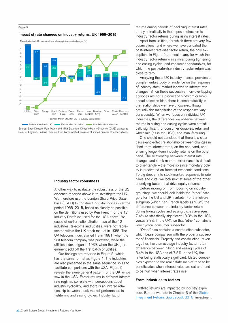
Our findings are reported in Figure 5, which
has the same format as Figure 4. The industries
are also presented in the same sequence so as to
facilitate comparisons with the USA. Figure 5
reveals the same general pattern for the UK as we
saw in the USA. Factor returns in different interest
rate regimes correlate with perceptions about
industry cyclicality, and there is an inverse rela-
tionship between stock market performance in
tightening and easing cycles. Industry factor
returns during periods of declining interest rates
are systematically in the opposite direction to
industry factor returns during rising interest rates.
Apart from utilities, for which there are very few
observations, and where we have truncated the
post-interest rate-rise factor return, the only ex-
ceptions in Figure 5 are healthcare, for which the
industry factor return was similar during tightening
and easing cycles, and consumer nondurables, for
which the post-rate-rise industry factor return was
close to zero.
Analyzing these UK industry indexes provides a
complementary body of evidence on the response
of industry stock market indexes to interest rate
changes. Since these successive, non-overlapping
episodes are not a product of hindsight or look-
ahead selection bias, there is some reliability in
the relationships we have uncovered, though
naturally the magnitudes of the responses vary
considerably. When we focus on individual UK
industries, the differences we observe between
returns in hiking and easing cycles were statisti-
cally significant for consumer durables, retail and
wholesale (as in the USA), and manufacturing.
One should not conclude that there is a clear
cause-and-effect relationship between changes in
short-term interest rates, on the one hand, and
ensuing longer-term industry returns on the other
hand. The relationship between interest rate
changes and stock market performance is difficult
to disentangle – the more so since monetary poli-
cy is predicated on forecast economic conditions.
To dig deeper into stock market responses to rate
hikes and cuts, we look next at some of the other
underlying factors that drive equity returns.
Before moving on from focusing on industry
groupings, we should look inside the “other” cate-
gory for the US and UK markets. For the leisure
subgroup (which Ken French labels as “Fun”) the
difference between the industry factor return
during hiking cycles and easing cycles averages
7.4% (a statistically significant 10.9% in the USA,
versus 3.8% in the UK), so that “other” contains a
very cyclical consumer subsector.
“Other” also contains a construction subsector,
which bears comparison with the property subsec-
tor of financials. Property and construction, taken
together, have an average industry factor return
difference between hiking and easing cycles of
3.4% in the USA and of 7.5% in the UK, the
latter being statistically significant. Listed compa-
nies exposed to the real estate market tend to be
beneficiaries when interest rates are cut and tend
to be hurt when interest rates rise.
From industries to factors
Portfolio returns are impacted by industry expo-
sure. But, as we note in Chapter 3 of the Global
Investment Returns Sourcebook 2016, investment
Figure 5
Impact of rate changes on industry returns, UK 1955–2015
Source: Elroy Dimson, Paul Marsh and Mike Staunton; Dimson-Marsh-Staunton (DMS) database;
Bank of England, Federal Reserve. First bar truncated because of limited number of observations.
7.0
3.5
4.9
-1.2
0.4
-0.9
-4.6
-1.1
-3.7
-6.1
3.3
-0.7
-2.2
3.0
0.0 -0.5
0.12.9
0.70.9 1.4
0.3
-9.4-7.7
-5.8
-2.0
1.1
-0.9
2.92.5
5.3
2.0
5.1
6.4
-8
-7
-6
-5
-4
-3
-2
-1
0
1
2
3
4
5
6
7
Utilities Tele-coms
Energy Healthcare
BusinessEquip
Finan-cials
Chem-icals
Non-durables
Manufac-turing
Other Retail/w'sale
Consumerdurables
Periods after rises in UK Periods after falls in UK After falls minus after rises
-6.1
Dimson-Marsh-Staunton UK 12-industry classification
Market-adjusted UK industry returns following interest-rate changes (%)
0.4
=
8.5
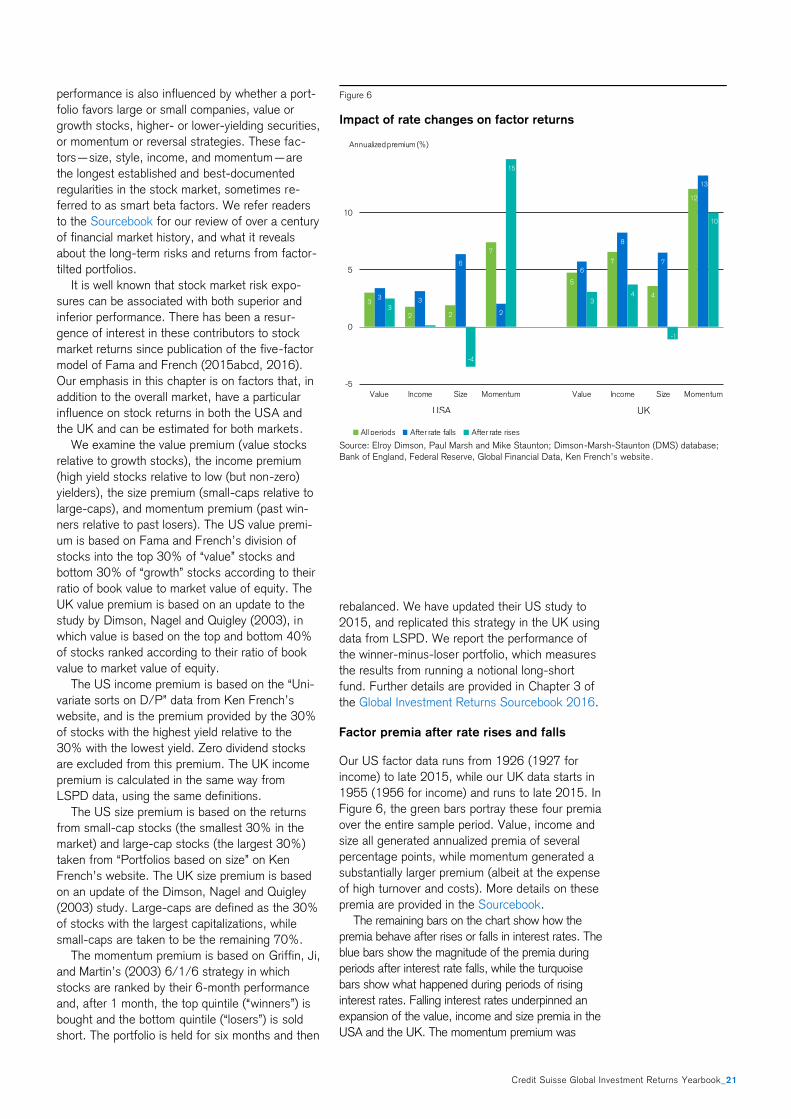
Credit Suisse Global Investment Returns Yearbook_21
performance is also influenced by whether a port-
folio favors large or small companies, value or
growth stocks, higher- or lower-yielding securities,
or momentum or reversal strategies. These fac-
tors—size, style, income, and momentum—are
the longest established and best-documented
regularities in the stock market, sometimes re-
ferred to as smart beta factors. We refer readers
to the Sourcebook for our review of over a century
of financial market history, and what it reveals
about the long-term risks and returns from factor-
tilted portfolios.
It is well known that stock market risk expo-
sures can be associated with both superior and
inferior performance. There has been a resur-
gence of interest in these contributors to stock
market returns since publication of the five-factor
model of Fama and French (2015abcd, 2016).
Our emphasis in this chapter is on factors that, in
addition to the overall market, have a particular
influence on stock returns in both the USA and
the UK and can be estimated for both markets.
We examine the value premium (value stocks
relative to growth stocks), the income premium
(high yield stocks relative to low (but non-zero)
yielders), the size premium (small-caps relative to
large-caps), and momentum premium (past win-
ners relative to past losers). The US value premi-
um is based on Fama and French’s division of
stocks into the top 30% of “value” stocks and
bottom 30% of “growth” stocks according to their
ratio of book value to market value of equity. The
UK value premium is based on an update to the
study by Dimson, Nagel and Quigley (2003), in
which value is based on the top and bottom 40%
of stocks ranked according to their ratio of book
value to market value of equity.
The US income premium is based on the “Uni-
variate sorts on D/P” data from Ken French’s
website, and is the premium provided by the 30%
of stocks with the highest yield relative to the
30% with the lowest yield. Zero dividend stocks
are excluded from this premium. The UK income
premium is calculated in the same way from
LSPD data, using the same definitions.
The US size premium is based on the returns
from small-cap stocks (the smallest 30% in the
market) and large-cap stocks (the largest 30%)
taken from “Portfolios based on size” on Ken
French’s website. The UK size premium is based
on an update of the Dimson, Nagel and Quigley
(2003) study. Large-caps are defined as the 30%
of stocks with the largest capitalizations, while
small-caps are taken to be the remaining 70%.
The momentum premium is based on Griffin, Ji,
and Martin’s (2003) 6/1/6 strategy in which
stocks are ranked by their 6-month performance
and, after 1 month, the top quintile (“winners”) is
bought and the bottom quintile (“losers”) is sold
short. The portfolio is held for six months and then
rebalanced. We have updated their US study to
2015, and replicated this strategy in the UK using
data from LSPD. We report the performance of
the winner-minus-loser portfolio, which measures
the results from running a notional long-short
fund. Further details are provided in Chapter 3 of
the Global Investment Returns Sourcebook 2016.
Factor premia after rate rises and falls
Our US factor data runs from 1926 (1927 for
income) to late 2015, while our UK data starts in
1955 (1956 for income) and runs to late 2015. In
Figure 6, the green bars portray these four premia
over the entire sample period. Value, income and
size all generated annualized premia of several
percentage points, while momentum generated a
substantially larger premium (albeit at the expense
of high turnover and costs). More details on these
premia are provided in the Sourcebook.
The remaining bars on the chart show how the
premia behave after rises or falls in interest rates. The
blue bars show the magnitude of the premia during
periods after interest rate falls, while the turquoise
bars show what happened during periods of rising
interest rates. Falling interest rates underpinned an
expansion of the value, income and size premia in the
USA and the UK. The momentum premium was
Figure 6
Impact of rate changes on factor returns
Source: Elroy Dimson, Paul Marsh and Mike Staunton; Dimson-Marsh-Staunton (DMS) database;
Bank of England, Federal Reserve, Global Financial Data, Ken French’s website .
3
2 2
7
5
7
4
12
3 3
6
2
6
8
7
13
3
0
-4
15
34
-1
10
-5
0
5
10
Value Income Size Momentum Value Income Size Momentum
All periods After rate falls After rate rises
USA UK
Annualized premium (%)

22_Credit Suisse Global Investment Returns Yearbook
elevated in the UK during periods in which interest
rates fell, but that was not the case in the USA. The
transatlantic difference in momentum premia during
hiking and easing cycles is a reminder of the volatile
nature of the momentum premium, which is highly
sensitive to reversals in the stock market.
The value and income premia stayed positive
even during periods of rising interest rates,
although they got smaller, and in the case of in-
come in the USA, almost disappeared. The size
premium, however, not only disappeared during
periods of rising rates, but turned negative. Indeed,
the size premium was the only factor where the
difference in returns between hiking and easing
cycles was statistically significant in both the USA
and the UK.
We can speculate about the reasons for this.
First, small-caps in both the USA and the UK tend
to have a higher proportion of their assets, sales
and profits in their home country. Since we are
looking at the impact of domestic interest rate
rises, and since central banks use rate rises to
dampen domestic inflationary pressures, small-
caps are likely to be affected more than their
larger, more international large-cap counterparts.
Second, smaller companies are generally in a
weaker position during hiking cycles in terms of
funding. They have less easy access to bond
markets, tend to be reluctant to raise equity when
markets are weaker, and are more dependent on
domestic bank lending. Many large-caps are mul-
tinationals that can shop around globally for fi-
nance. Third, the sector profile of small caps may
also be part of the explanation. They have greater
exposure to domestic, consumer facing business-
es and to more cyclical industries.
The Fama-French five-factor model adds two
quality factors to the size and value effects they
had popularized in their early work. They are a
profitability factor (stocks with a high operating
profitability perform better) and an investment
factor (companies with high growth in assets have
inferior returns). In their empirical research, Fama
and French find that these two factors largely
explain the traditional value factor (based on the
market-to-book ratio). We investigate the two
quality factors using data from Ken French’s web-
site, and find that the premia associated with
quality are elevated during expansionary periods.
Fama and French (2015abcd, 2016) omit from
their new model two other factors that make a
documented contribution to stock market perfor-
mance. They are momentum, which we have
addressed above, and the low-volatility anomaly
(portfolios of low-vol stocks have produced higher
risk-adjusted returns than portfolios comprising
high-vol stocks). Using US and UK data, we
therefore examine the low-volatility premium in the
same way as the other factors represented in
Figure 6. We confirm that stocks with low betas,
low specific risk and low variance achieved higher
returns than their higher-risk brethren. Consistent
with our other results, we find that falling interest
rates underpinned an expansion of the low-
volatility premia in both countries.
Real asset returns and interest rate changes
We use the term “real assets” to refer to durable
stores of wealth such as farmland, artworks, and
precious metals, while excluding financial securi-
ties such as public or private equity. Capgemi-
ni/RBC (2015) and Barclays (2012) report that,
in aggregate, real assets represent a larger pro-
portion of household and high-net-worth individual
wealth than fixed income or public equity.
Real assets can in principle be divided into two
groups. There are those that provide a financial
cash flow to owners, and those that provide an
intangible income. The former may be illustrated
by real estate, while the latter are sometimes
referred to as “treasure assets.” The distinction is
not black and white, and many assets share both
attributes. For example, housing offers an imputed
rental value, but it can also provide the owner with
non-financial personal utility; art may provide a
warm feeling to collectors, though it is sometimes
perceived as a store of value and as a form of
protection against high inflation. Housing is often
regarded as an investment, whereas art collecting
is typically viewed as a hobby – yet the distinction
is moot.
Real assets therefore offer the prospect of
long-term price appreciation (or depreciation) plus
non-financial utility that is difficult to estimate. We
researched the long-term price performance of
real estate and gold in Dimson, Marsh and Staun-
ton (2012). Our current focus, however, is not on
long-term returns, but on the shorter-term re-
sponses of real asset values to changes in the
interest rate. Income is rarely available for these
investments, but omission of income fortunately
has a limited impact on measuring sensitivity to
financial market conditions. To illustrate this in a
different context, it is well known that omission of
dividends has little impact on estimates of equity
betas or volatilities.
In contrast to listed securities, real assets are
traded infrequently and in illiquid markets. Conse-
quently, real asset indices are often annual, and
only occasionally quarterly or monthly. Further-
more, intra-year index values generally suffer from
smoothing bias, and are notorious for giving the
misleading impression of having low risk and low
correlation with financial assets. By investigating
assets with annual observations, we benefit from
enlarging the number of series we can study,
lengthening the period of observation to over a
century, mitigating the concern that our findings
might be specific to particular episodes, and re-
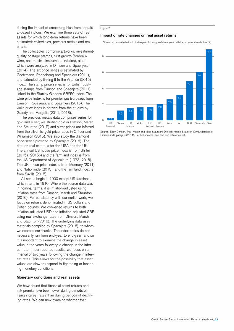
Credit Suisse Global Investment Returns Yearbook_23
ducing the impact of smoothing bias from apprais-
al-based indices. We examine three sets of real
assets for which long-term returns have been
estimated: collectibles, precious metals and real
estate.
The collectibles comprise artworks, investment-
quality postage stamps, first growth Bordeaux
wine, and musical instruments (violins), all of
which were analyzed in Dimson and Spaenjers
(2014). The art price series is estimated by
Goetzmann, Renneboog and Spaenjers (2011),
and extended by linking it to the Artprice (2015)
index. The stamp price series is for British post-
age stamps from Dimson and Spaenjers (2011),
linked to the Stanley Gibbons GB250 Index. The
wine price index is for premier cru Bordeaux from
Dimson, Rousseau, and Spaenjers (2015). The
violin price index is derived from the studies by
Graddy and Margolis (2011, 2013).
The precious metals data comprises series for
gold and silver; we studied gold in Dimson, Marsh
and Staunton (2012) and silver prices are inferred
from the silver-to-gold price ratios in Officer and
Williamson (2015). We also study the diamond
price series provided by Spaenjers (2016). The
data on real estate is for the USA and the UK.
The annual US house price index is from Shiller
(2015a, 2015b) and the farmland index is from
the US Department of Agriculture (1973, 2015).
The UK house price index is from Monnery (2011)
and Nationwide (2015), and the farmland index is
from Savills (2015).
All series begin in 1900 except US farmland,
which starts in 1910. Where the source data was
in nominal terms, it is inflation-adjusted using
inflation rates from Dimson, Marsh and Staunton
(2016). For consistency with our earlier work, we
focus on returns denominated in US dollars and
British pounds. We converted returns to both
inflation-adjusted USD and inflation-adjusted GBP
using real exchange rates from Dimson, Marsh
and Staunton (2016). The underlying data uses
materials compiled by Spaenjers (2016), to whom
we express our thanks. The index series do not
necessarily run from end-year to end-year, and so
it is important to examine the change in asset
value in the years following a change in the inter-
est rate. In our reported results, we focus on an
interval of two years following the change in inter-
est rates. This allows for the possibility that asset
values are slow to respond to tightening or loosen-
ing monetary conditions.
Monetary conditions and real assets
We have found that financial asset returns and
risk premia have been lower during periods of
rising interest rates than during periods of declin-
ing rates. We can now examine whether that
Figure 7
Impact of rate changes on real asset returns
Source: Elroy Dimson, Paul Marsh and Mike Staunton; Dimson-Marsh-Staunton (DMS) database;
Dimson and Spaenjers (2014). For full sources, see text and reference list.
0.3
1.21.5 1.6 1.6
2.0
2.6
3.2
4.9
6.0
8.9
0
2
4
6
8
US farmland
Stamps UK houses
Violins UK farmland
US houses
Wine Art Gold Diamonds Silver
Difference in annualized return in the two years following rate falls compared with the two years after rate rises (%)

24_Credit Suisse Global Investment Returns Yearbook
carries over to real asset returns. For each of the
real asset return series, we identify US and UK
rate fall and rate rise years.
As before, when we examined equities and
bonds around the world in the previous chapter, a
year is deemed to be a rate-fall year if the Treasury
bill return is at least 25 bp lower than in the previ-
ous year. It is categorized as a rate-rise year if the
Treasury bill return is at least 25 bp higher than the
year before. Years in which there is only a very
small or no change from the year before are ig-
nored. We then compute the average inflation-
adjusted annualized asset return in the two years
after rate-fall years and in the two years after rate-
rise years.
In investigating the impact of interest rate
changes, we need to decide which country’s in-
terest rate is likely to be more relevant to the
asset in question. In the case of real assets that
are permanently physically located in a particular
country, we measure the impact of that country’s
interest rate. So we examine the sensitivity of US
housing and farmland returns (in real USD terms)
to US interest rates, while UK housing and farm-
land returns (in real GBP terms) are analyzed
relative to UK interest rates.
The other “treasure assets” are portable, not
restricted to a particular country, and are of inter-
est to global buyers and investors worldwide. In
our analysis, we measure the returns on these
assets in both GBP and USD terms, and analyze
them against both UK and US interest rate
changes. However, the results that we report
below treat these assets as global assets, meas-
uring their returns in real USD, and analyzing their
sensitivity relative to US interest rate changes.
Figure 7 presents our results. The bars show
the difference in the average annualized 2-year
return after interest rate falls, compared with
interest rate rises. Thus, for example, diamonds
have on average given a real USD return that is
6% per year higher over the two years following
an interest rate fall than after an interest rate rise.
Quite clearly, all of the real assets perform better
following interest rate falls than interest rate rises.
This is as we would expect, and consistent with all
of our analysis above on publicly traded assets.
Conclusion
We have looked at asset returns over hiking and
easing cycles. Based on a simple strategy that
investors could follow, we have found marked and
statistically significant differences in stock and
bond returns between periods following interest
rate rises and periods after rate cuts. In the USA,
annualized real equity returns were just 2.5%
during tightening cycles and 10.3% during loos-
ening periods. Real bond returns were 0.2% in
hiking cycles and 3.7% during periods of easing.
Our findings were similar for the UK.
Our results are a record of what has happened
over a long period of capital market history. They
do not address the risks of pursuing particular
strategies. For example, asset returns are gener-
ally higher if investors buy securities after a cut in
interest rates; yet these economic conditions may
coincide with the very times at which investors are
reluctant to invest and are hence more risk-
averse. In an efficient market, the elevated re-
wards from buying during rate cuts may simply be
the compensation required to draw as many buy-
ers as sellers into the market at those times.
Stock and bond returns have been lower during
periods of rising interest rates. But these have
also been periods of higher inflation. Inflation has
historically been associated with lower returns
from stocks and bonds. It thus remains an open
question whether the poorer asset returns during
rate hiking cycles are due to the "illness" (inflation)
or the "cure" (rate hikes).
Now that the USA appears to be entering an
episode of rising interest rates, does this imply
that prospective stock returns are likely to be low?
Should we be similarly pessimistic about asset
returns in the UK, where tightening might start
later in 2016? Meanwhile, should we be optimistic
about Eurozone and Japanese returns, where
central banks are continuing to loosen, or returns
in China where the People’s Bank of China is
cutting rates? Will what has been dubbed the
“Great Divergence” between central bank policies
around the world translate into sharply differing
asset returns?
First, asset returns around the world tend to be
quite highly correlated, and we would expect this
to continue. Second, while history can undoubted-
ly provide clues to the future, we should be cau-
tious about any forecasts. The results we have
presented are based on long-term averages span-
ning many different economic conditions. The
averages conceal considerable differences be-
tween cycles. Indeed, during 40% of US hiking
cycles, equities actually performed better than
during the easing cycles that preceded them.
Markets are very effective at humbling us and
confounding our beliefs, especially if they are
consensus positions.
The expected return from financial assets is
low, and we have been unable to find any evi-
dence that returns are on average elevated as a
consequence of actual or anticipated interest rate
rises. So is this the right time to seek exposure to
other sources of reward in the financial markets?
In other words, can other asset categories offer us
contracyclical returns in relation to interest rate
changes?

Credit Suisse Global Investment Returns Yearbook_25
History tells us that the broad answer is no.
While some sectors and asset classes are less
sensitive than others to tightening cycles, interest
rate rises are accompanied by lower risk premia,
inferior industry returns, smaller rewards from
many factor-investing strategies, and reduced
price appreciation for a wide variety of real assets.
It is hard to identify assets that perform well in
absolute terms during hiking cycles, although we
do detect relative outperformance at such times
from defensive versus cyclical stocks and from
large-cap versus small-cap stocks.
The case for diversification remains important
because different assets generate returns that are
imperfectly correlated. Whenever assets do not
move in lockstep with each other, there is scope
to benefit from risk reduction. Provided the costs
of diversifying are not disproportionate, portfolios
can enhance their expected reward-to-risk ratios
by adopting a multi-asset, multi-national, multi-
strategy approach to investment. Diversifying for
the long-term makes sense. Tactical switches in
anticipation of interest rate changes are less likely
to contribute to long-term portfolio returns.
Furthermore, markets anticipate and public
knowledge, such as current central bank policies,
will surely already be impounded in stock and
bond prices. It is future surprises in policy that will
drive asset prices. So investors with a superior
understanding of central bank policy, or who are
better able to forecast the macroeconomic varia-
bles that condition central bank decisions, should
have a potential edge.
Finally, any concerns about lower prospective
US and UK returns should be extended globally.
We continue to live in a low-return world. Long-
term bond yields remain extremely low throughout
the developed world, so that future bond returns
are likely to be much lower than over the last few
decades. Future real equity returns will depend on
the expected real risk-free interest rate plus the
expected equity premium. Real interest rates
remain low everywhere, and there is no reason to
believe that the equity risk premium is unusually
elevated. Prospectively, therefore, the real returns
on bills, bonds, equities, and indeed all risky as-
sets, seem likely to be relatively low.

PH
OTO
: A
LEX
SAV
A /
ISTO
CK
PH
OTO
.CO
M
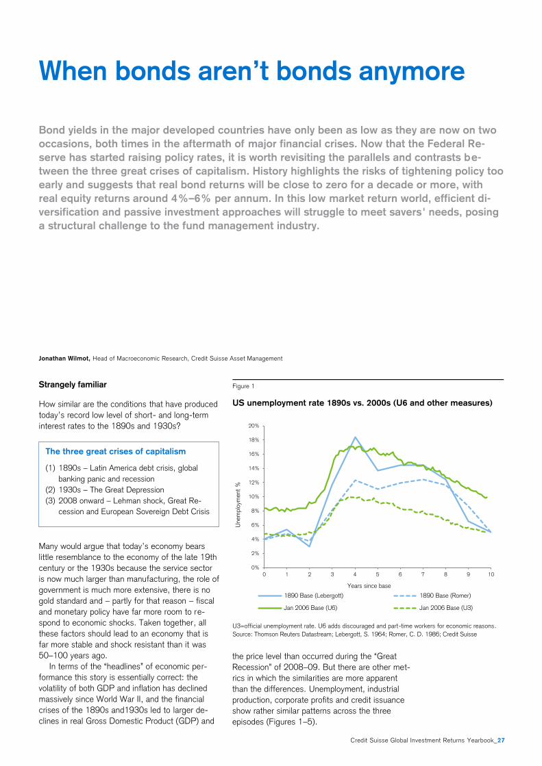
Credit Suisse Global Investment Returns Yearbook_27
Strangely familiar
How similar are the conditions that have produced
today’s record low level of short- and long-term
interest rates to the 1890s and 1930s?
Many would argue that today’s economy bears
little resemblance to the economy of the late 19th
century or the 1930s because the service sector
is now much larger than manufacturing, the role of
government is much more extensive, there is no
gold standard and – partly for that reason – fiscal
and monetary policy have far more room to re-
spond to economic shocks. Taken together, all
these factors should lead to an economy that is
far more stable and shock resistant than it was
50–100 years ago.
In terms of the “headlines” of economic per-
formance this story is essentially correct: the
volatility of both GDP and inflation has declined
massively since World War II, and the financial
crises of the 1890s and1930s led to larger de-
clines in real Gross Domestic Product (GDP) and
the price level than occurred during the “Great
Recession” of 2008–09. But there are other met-
rics in which the similarities are more apparent
than the differences. Unemployment, industrial
production, corporate profits and credit issuance
show rather similar patterns across the three
episodes (Figures 1–5).
When bonds aren’t bonds anymore
Bond yields in the major developed countries have only been as low as they are now on two
occasions, both times in the aftermath of major financial crises. Now that the Federal Re-
serve has started raising policy rates, it is worth revisiting the parallels and contrasts be-
tween the three great crises of capitalism. History highlights the risks of tightening policy too
early and suggests that real bond returns will be close to zero for a decade or more, with
real equity returns around 4%–6% per annum. In this low market return world, efficient di-
versification and passive investment approaches will struggle to meet savers' needs, posing
a structural challenge to the fund management industry.
Jonathan Wilmot, Head of Macroeconomic Research, Credit Suisse Asset Management
Figure 1
US unemployment rate 1890s vs. 2000s (U6 and other measures)
U3=official unemployment rate. U6 adds discouraged and part-time workers for economic reasons.
Source: Thomson Reuters Datastream; Lebergott, S. 1964; Romer, C. D. 1986; Credit Suisse
0 1 2 3 4 5 6 7 8 9 10
0
2
4
6
8
10
12
14
16
18
20
0%
2%
4%
6%
8%
10%
12%
14%
16%
18%
20%
0 1 2 3 4 5 6 7 8 9 10
Unem
plo
yment
%
Years since base
1890 Base (Lebergott) 1890 Base (Romer)
Jan 2006 Base (U6) Jan 2006 Base (U3)
The three great crises of capitalism
(1) 1890s – Latin America debt crisis, global
banking panic and recession
(2) 1930s – The Great Depression
(3) 2008 onward – Lehman shock, Great Re-
cession and European Sovereign Debt Crisis
28_Credit Suisse Global Investment Returns Yearbook
One might add that today’s public hostility to
bankers, regulatory agenda and the rise of popu-
lism in politics would be very familiar to historians
looking at the response to the economic failures
of the 1890s and 1930s.
One darned recession after another
The Great Depression of the 1930s was far more
severe than the other two episodes. Does it make
sense to group them all together?
US real GDP fell 25% from peak to trough in the
Great Depression and nominal GDP by nearly
45%. Germany and France suffered roughly simi-
lar declines in output and price levels, but the UK
fared much less badly after leaving the Gold
Standard in September 1931. Looking at the USA
alone, the peak to trough decline in industrial
production during the 1930s was 40% – double
the decline in the 1890s and 2000s.
Thus we find it helpful to label the 1890s and
2008–09 episodes as Great Recessions and use
the term Great Depression for the 1930s. The
distinction is one of magnitude rather than origin
and type of event, however. All three episodes
were preceded by unusually rapid increases in
credit and by speculative valuations in at least one
important asset class; all three involved acute
stress in the banking and credit system, which
made the following economic contraction more
severe; and all three episodes had an international
contagion dimension via trade and credit linkages.
As argued in a series of classic papers by Ben
Bernanke et al1, the 1930s episode was most se-
vere for those who stayed on the Gold Standard to
the bitter end, and those who suffered the most
severe banking panics and credit dislocations. In
fact, the US experience in the 1930s looks like two
large recessions separated by a brief period of re-
covery. The build-up to the second downturn in
growth starts with the first major round of US bank
failures in November 1930, then moves on through
the failure of Creditanstalt bank in Austria (May
1931), a second round of US bank failures and a
banking crisis in Germany (June/July 1931), fol-
lowed by Britain leaving the gold standard (Septem-
ber 1931). Shortly after that, the US Federal Re-
serve (Fed) raised interest rates to stem an outflow
of gold, precipitating a further cascade of bank fail-
ures and aborting the recovery.
Having plunged nearly 20% from its 1929
peak, US production rose about 7% from January
through August 1931, but then fell some 30%
over the following 19 months. In short, the Great
Depression was indeed very much larger than the
1890s and 2000s episodes, but is most simply
1 See "The Macroeconomics of the Great Depression" by Ben
Bernanke (1995).
Figure 2
US unemployment (starting in 1928) vs. peripheral Europe unem-
ployment (starting in January 2007)
Source: Thomson Reuters Datastream; Lebergott, S. 1964; Credit Suisse
0.0 1.0 2.0 3.0 4.0 5.0 6.0 7.0 8.0 9.0
0.00
5.00
10.00
15.00
20.00
25.00
30.00
0%
5%
10%
15%
20%
25%
30%
0 1 2 3 4 5 6 7 8 9
Unem
plo
yment ra
te
Years since base
Ireland 2007 Greece 2007 Spain 2007 US 1928
Credit Suisse Global Investment Returns Yearbook_29
seen as two back-to-back Great Recessions ex-
perienced by those countries that did not leave the
Gold Standard early enough, or protect their bank
and credit systems from catastrophic failure.
Regime change and policy mistakes
Can different policy regimes and responses ex-
plain different economic outcomes across time
and geography?
Though academic debate still rages, we take the
view that the scale and speed of money and credit
contraction – via the interaction of bank failures
and the gold standard rules – can account for
most of the difference in outcomes across coun-
tries in the 1930s. It also provides a coherent
framework for understanding why the 1931 re-
covery aborted in the USA, leading to the back-to-
back Great Recessions shown in Figure 3. More
generally, an abrupt and system-wide fall in mon-
ey and credit availability relative to demand can be
thought of as the common feature in our three
crises, and policy responses and regimes should
be judged on how well they coped with this non-
linear shock.
In this regard, it is clear that lessons from the
1930s helped guide the worldwide policy re-
sponse to the Lehman shock in 2008–09: fiscal
policy was eased nearly everywhere and monetary
policy focused urgently on preventing bank and
financial system failure cascading into a severe
monetary contraction. Indeed, this time around,
the task of preventing systemic collapse was led
by a leading scholar of the Great Depression, who
just happened to be Fed Chairman at the time!
Other central banks played their part – albeit gen-
erally a smaller part – in limiting the impact of the
Lehman crisis. Most major governments also used
fiscal policy as a stabilizer, but the Chinese credit
and fiscal easing program in early 2009 was both
very large and implemented very swiftly. Arguably,
therefore, it was the US Fed and the Chinese
government that really led the global policy re-
sponse, and contributed most to the recovery in
growth and markets after March 2009.
Perversely, this unprecedented global policy re-
sponse confirms just how systemic and severe the
crisis was, how abruptly the demand for cash and
safety soared, and how severely the availability of
credit and funding liquidity contracted. It is very
striking that the resulting falls in US industrial
production, corporate earnings and share prices
were as large, or larger, than they had been in the
1890s, or in the first half of the Great Depression.
It is also worth noting that, although bank fail-
ures were contained and the headline money
stock itself did not contract, there was a very large
contraction in the “shadow money” stock during
Figure 4
US real corporate earnings (measured from peak in industrial
production)
Source: Thomson Reuters Datastream; Shiller, R. J. 2000; S&P Index Analysis; Credit Suisse
Figure 3
US industrial production since peak in each crisis
Source: Thomson Reuters Datastream; Miron, J. A. and Romer, C. D. 1990; Credit Suisse
0
20
40
60
80
100
120
140
160
0 1 2 3 4 5 6 7 8 9 10
Index
leve
l
Years since start
1891-1900 (Start: Jun 1892) 1928-1939 (Start: Dec 1929)
2007-2015 (Start: June 2007) Operating 2007-2015 (Start: June 2007)
60
80
100
120
140
0 1 2 3 4 5 6 7 8 9
Years since peak in IP
1891-1900 (Peak: May 1892) 1928-1939 (Peak: Apr 1929)
2007-2015 (Peak: Aug 2007)
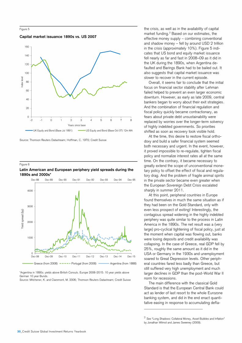
30_Credit Suisse Global Investment Returns Yearbook
the crisis, as well as in the availability of capital
market funding.2 Based on our estimates, the
effective money supply – combining conventional
and shadow money – fell by around USD 2 trillion
in the crisis (approximately 10%). Figure 5 indi-
cates that US bond and equity market issuance
fell nearly as far and fast in 2008–09 as it did in
the UK during the 1890s, when Argentina de-
faulted and Barings Bank had to be bailed out. It
also suggests that capital market issuance was
slower to recover in the current episode.
Overall, it seems fair to conclude that the initial
focus on financial sector stability after Lehman
failed helped to prevent an even larger economic
downturn. However, as early as late 2009, central
bankers began to worry about their exit strategies.
And the combination of financial regulation and
fiscal policy quickly became contractionary, as
fears about private debt unsustainability were
replaced by worries over the longer-term solvency
of highly indebted governments. So priorities
shifted as soon as recovery took visible hold.
At the time, this desire to restore fiscal ortho-
doxy and build a safer financial system seemed
both necessary and urgent. In the event, however,
it proved impossible to re-regulate, tighten fiscal
policy and normalize interest rates all at the same
time. On the contrary, it became necessary to
greatly extend the scope of unconventional mone-
tary policy to offset the effect of fiscal and regula-
tory drag. And the problem of fragile animal spirits
in the private sector became even greater when
the European Sovereign Debt Crisis escalated
sharply in summer 2011.
At this point, peripheral countries in Europe
found themselves in much the same situation as if
they had been on the Gold Standard, only with
even less prospect of exiting! Interestingly, the
contagious spread widening in the highly indebted
periphery was quite similar to the process in Latin
America in the 1890s. The net result was a (very
large) pro-cyclical tightening of fiscal policy, just at
the moment when capital was flowing out, banks
were losing deposits and credit availability was
collapsing. In the case of Greece, real GDP fell by
25%, roughly the same amount as it did in the
USA or Germany in the 1930s and unemployment
soared to Great Depression levels. Other periph-
eral countries fared less badly than Greece, but
still suffered very high unemployment and much
larger declines in GDP than the post-World War II
norm for recessions.
The main difference with the classical Gold
Standard is that the European Central Bank could
act as lender of last resort to the whole Eurozone
banking system, and did in the end enact quanti-
tative easing in response to accumulating defla-
2 See “Long Shadows: Collateral Money, Asset Bubbles and Inflation”
by Jonathan Wilmot and James Sweeney (2009).
Figure 5
Capital market issuance 1890s vs. US 2007
Source: Thomson Reuters Datastream; Hoffman, C. 1970; Credit Suisse
Figure 6
Latin American and European periphery yield spreads during the
1890s and 2000s*
*Argentina in 1890s: yields above British Consuls. Europe 2008-2015: 10 year yields above
German 10 year Bunds.
Source: Mitchener, K. and Claremont, M. 2006; Thomson Reuters Datastream; Credit Suisse
0
20
40
60
80
100
120
140
160
-2 -1 0 1 2 3 4 5 6 7 8
Index
leve
l
Years since base
UK Equity and Bond (Base Jul 1891) US Equity and Bond (Base Oct 07) 12m MA
Dec-88 Dec-89 Dec-90 Dec-91 Dec-92 Dec-93 Dec-94 Dec-95
0
1000
2000
3000
4000
Dec-08 Dec-09 Dec-10 Dec-11 Dec-12 Dec-13 Dec-14 Dec-15
Yie
ld s
pre
ad (
bp)
Greece (from 2008) Portugal (from 2008) Argentina (from 1888)

Credit Suisse Global Investment Returns Yearbook_31
tionary pressure. This has helped narrow sover-
eign bond spreads and allowed most peripheral
yields to fall below nominal GDP growth, improv-
ing debt dynamics and partially restoring credit
availability.
Fiscal transfers between member states also
reduced the speed and scale of the fiscal adjust-
ment that might have been needed otherwise –
though possibly not compared to a system in
which devaluation and formal default were possi-
ble. And in the absence of intra-Eurozone curren-
cy adjustment, we have seen a major depreciation
of the euro bloc versus the dollar. These changes
have seen the Eurozone economic recovery
broaden over the past year or so, but did not
prevent major financial, economic and political
crises occurring in the periphery. Apart from the
first oil shock there is little to compare that experi-
ence with – except the 1890s or the 1930s. And
Greece still defaulted, just as it had done in the
aftermath of the 1890s and 1930s shocks.
In summary, policy response and policy regimes
do matter. We would argue that allowing large-
scale bank failures in the 1930s had intense and
cascading effects on output, confidence and cred-
it availability. For the most part, that mistake was
not repeated in the current crisis. We would also
argue that the Gold Standard rules and the Euro-
pean single currency are ill suited to dealing with
large deflationary shocks. Once such a shock
occurs, policy makers will be faced with tough
choices – get away from the rigid rules and focus
on reflation (expand the money stock, devalue, go
slowly with fiscal consolidation and regulatory
reform) or stick to the rules and deflate.
Rigidity in these circumstances is not a virtue.
The Classical Gold Standard did not ultimately
survive the Great Depression. And many would
argue that the euro will not ultimately survive the
current crisis either. Or at least will not survive
with all its current members. This line of thought
leads to a more general idea of how policy “mis-
takes” happen – bearing in mind that not all of
them need be quite as momentous as the Fed’s
1931 decision to raise interest rates and maintain
the dollar’s parity.
In our view, history suggests that the road to a
bad outcome is almost always paved with good
intentions and miscalculation, specifically a ten-
dency to underestimate the power of the defla-
tionary dynamic unleashed by a large debt build-
up and subsequent systemic shock. Given that
there is nothing in living memory to compare with,
it is all too easy to underestimate the spike in
bank and private sector demand for cash, the size
of non-linear credit effects and the many dimen-
sions of international contagion when a shock first
hits. And even after recovery begins, it is natural
to underplay the residual fragility of private sector
animal spirits, and easy to overestimate the pro-
spect of inflation reviving quickly.
Even in the current crisis, this underlying dy-
namic has been visible – at times exacerbated by
political populism – but the impact on the econo-
my and financial markets has so far been mitigat-
ed by the ability of the major central banks to
respond to each new weakening of growth or
increase in financial market volatility with a further
round of innovative policy. Will that flexibility per-
sist as the US economy reaches full employment
and the Fed moves to gradually normalize policy
rates?
Fighting the wrong war?
What about 1937–38? Did the Fed cause the
recession when industrial production fell by over
25% and equities fell by 50%?
Controversy still rages over the cause(s) of the
1937–38 recession in the USA. The facts are as
follows: industrial output troughed after the sec-
ond Great Recession in March 1933, but then
rebounded very strongly in two phases, regaining
its 1929 peak around the late summer of 1937.
The monetary base had regained its pre-crisis
peak by late 1936, and bank excess reserves
were well above their pre-crisis levels. Real wages
were also rising again – in part due to legislation.
As 1936 wore on, unemployment was falling
and the price level growing, but neither unem-
ployment nor prices had returned to anywhere
near their pre-crisis levels. Even so, at all levels of
government, concern was growing about a return
of inflation, an overheated stock market and the
effects of so much “excess liquidity” in the sys-
tem. As a result, policy priorities shifted: the Fed
raised bank reserve requirements in three stages
beginning in August 1936, the Treasury decided
to start sterilizing gold inflows in December 1936,
and fiscal policy was tightened somewhat. The
monetary base grew almost 60% in the three
years to July 1936, stagnated for six months and
declined somewhat in 1937. The Treasury re-
versed its sterilization policy in April 1938.
But by then output had already plunged and the
stock market had fallen 50% in just 12 months.
Whether it was gold policy and the monetary base,
or reserve requirements and the Fed, fiscal policy,
the devaluations of the French and Swiss francs in
1936, rising real wages or some combination of
all these things may never be clear. Output had
risen very rapidly in 1936–37, and it seems likely
that excess inventories had built up in the system,
making the economy more vulnerable to an accu-
mulation of small shocks to expectations and
confidence. Given how fresh the traumas of
1929–33 were at the time, credit availability,
investor risk appetite and corporate animal spirits
were perhaps more sensitive to the shift in policy
tone than could easily have been foreseen.
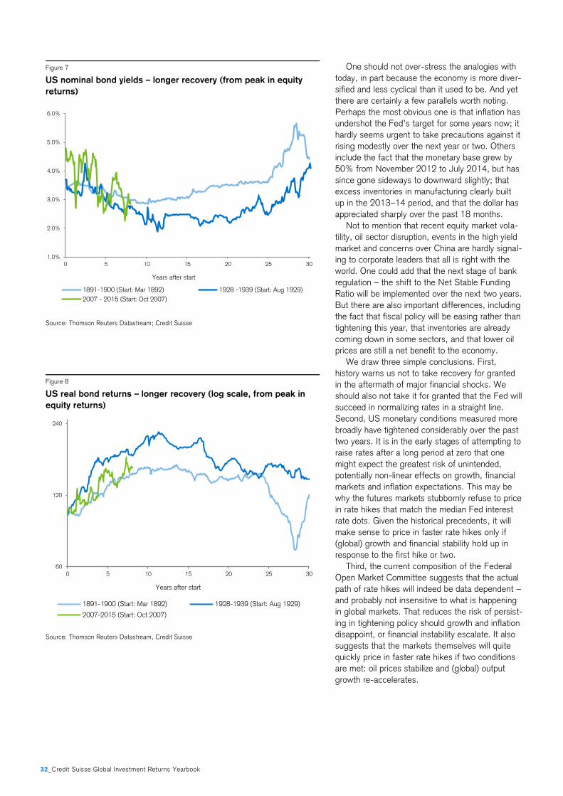
32_Credit Suisse Global Investment Returns Yearbook
One should not over-stress the analogies with
today, in part because the economy is more diver-
sified and less cyclical than it used to be. And yet
there are certainly a few parallels worth noting.
Perhaps the most obvious one is that inflation has
undershot the Fed’s target for some years now; it
hardly seems urgent to take precautions against it
rising modestly over the next year or two. Others
include the fact that the monetary base grew by
50% from November 2012 to July 2014, but has
since gone sideways to downward slightly; that
excess inventories in manufacturing clearly built
up in the 2013–14 period, and that the dollar has
appreciated sharply over the past 18 months.
Not to mention that recent equity market vola-
tility, oil sector disruption, events in the high yield
market and concerns over China are hardly signal-
ing to corporate leaders that all is right with the
world. One could add that the next stage of bank
regulation – the shift to the Net Stable Funding
Ratio will be implemented over the next two years.
But there are also important differences, including
the fact that fiscal policy will be easing rather than
tightening this year, that inventories are already
coming down in some sectors, and that lower oil
prices are still a net benefit to the economy.
We draw three simple conclusions. First,
history warns us not to take recovery for granted
in the aftermath of major financial shocks. We
should also not take it for granted that the Fed will
succeed in normalizing rates in a straight line.
Second, US monetary conditions measured more
broadly have tightened considerably over the past
two years. It is in the early stages of attempting to
raise rates after a long period at zero that one
might expect the greatest risk of unintended,
potentially non-linear effects on growth, financial
markets and inflation expectations. This may be
why the futures markets stubbornly refuse to price
in rate hikes that match the median Fed interest
rate dots. Given the historical precedents, it will
make sense to price in faster rate hikes only if
(global) growth and financial stability hold up in
response to the first hike or two.
Third, the current composition of the Federal
Open Market Committee suggests that the actual
path of rate hikes will indeed be data dependent –
and probably not insensitive to what is happening
in global markets. That reduces the risk of persist-
ing in tightening policy should growth and inflation
disappoint, or financial instability escalate. It also
suggests that the markets themselves will quite
quickly price in faster rate hikes if two conditions
are met: oil prices stabilize and (global) output
growth re-accelerates.
Figure 7
US nominal bond yields – longer recovery (from peak in equity
returns)
Source: Thomson Reuters Datastream; Credit Suisse
Figure 8
US real bond returns – longer recovery (log scale, from peak in
equity returns)
Source: Thomson Reuters Datastream, Credit Suisse
1.0%
2.0%
3.0%
4.0%
5.0%
6.0%
0 5 10 15 20 25 30
Years after start
1891-1900 (Start: Mar 1892) 1928 -1939 (Start: Aug 1929)
2007 - 2015 (Start: Oct 2007)
60
120
240
0 5 10 15 20 25 30
Years after start
1891-1900 (Start: Mar 1892) 1928-1939 (Start: Aug 1929)
2007-2015 (Start: Oct 2007)
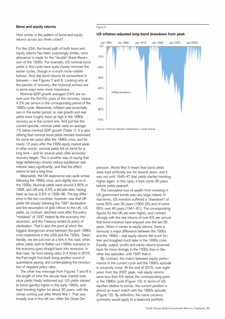
Credit Suisse Global Investment Returns Yearbook_33
Bond and equity returns
How similar is the pattern of bond and equity
returns across our three crises?
For the USA, the broad path of both bond and
equity returns has been surprisingly similar, once
allowance is made for the “double” Great Reces-
sion of the 1930s. For example, US nominal bond
yields in this cycle have quite closely mirrored the
earlier cycles, though in a much more volatile
fashion. And real bond returns lie somewhere in
between – see Figures 7 and 8. Looking only at
the periods of recovery, the historical echoes are
in some ways even more impressive.
Nominal GDP growth averaged 3.6% per an-
num over the first 6½ years of this recovery, versus
4.2% per annum in the corresponding period of the
1890s cycle. Meanwhile, inflation was essentially
zero in the earlier period: so real growth and real
yields were roughly twice as high in the 1890s
recovery as in the current one. And just like the
current episode, nominal yields were on average
1% below nominal GDP growth (Table 1). It is also
striking that nominal bond yields trended downward
for some ten years after the 1890s crisis, and for
nearly 12 years after the 1929 equity market peak.
In other words, nominal yields fell on trend for a
long time – and for several years after economic
recovery began. This is another way of saying that
large deflationary shocks reduce equilibrium real
interest rates significantly, and that the effect
seems to last a long time.
Meanwhile, the UK experience was quite similar
following the 1890s crisis, and slightly less so in
the 1930s. Nominal yields were around 4.60% in
1928, and still only 3.4% a decade later, having
been as low as 2.9% in 1935–36. The big differ-
ence in the two countries, however, was that UK
yields fell sharply following the 1931 devaluation
and the resumption of gold inflows to the UK. US
yields, by contrast, declined most after the policy
“mistakes” of 1937 helped tip the economy into
recession, and the Treasury ended its policy of
sterilization. That is also the point at which the
biggest divergences arose between the post-1890s
crisis experience in the USA and the 1930s. Taken
literally, we are just now at a fork in the road, when
either yields start to flatten out (1890s scenario) or
the economy goes straight back into recession. In
that case, far from raising rates 3–4 times in 2016,
the Fed might find itself doing another round of
quantitative easing, and contemplating the introduc-
tion of negative policy rates.
The other key message from Figures 7 and 8 is
the length of time the secular bear market took
once yields finally bottomed out. US yields started
to trend (gently) higher in the early 1900s, and
kept trending higher for about 20 years, with the
climax coming just after World War I. That was
broadly true in the UK too. After the Great De-
pression, World War II meant that bond yields
were kept artificially low for several years, and it
was not until 1945–47 that yields started trending
higher again. In this case, it took some 35 years
before yields peaked!
The cumulative loss of wealth from investing in
US government bonds was very large indeed. In
real terms, US investors suffered a “drawdown” of
some 50% over 20 years (1900–20) and of some
65% over 40 years (1941–81). The corresponding
figures for the UK are even higher, and contrast
strongly with the real returns of over 6% per annum
that bond investors have enjoyed over the last 35
years. When it comes to equity returns, there is
obviously a major difference between the 1930s
and the 1890s – real equity returns fell much fur-
ther and troughed much later in the 1930s crisis.
Equally, output, profits and equity returns bounced
back far more strongly in the 1930s than in the
other two episodes: until 1937 that is.
By contrast, the match between equity perfor-
mance in the current cycle and the 1890s episode
is uncannily close. At the end of 2015, over eight
years from the 2007 peak, real equity returns
were less than 5% below the corresponding point
in the 1890s cycle (Figure 10). In terms of US
equities relative to bonds, the current position is
almost an exact match with the 1890s episode
(Figure 12). By definition, the same uncanny
symmetry would apply to a balanced portfolio.
Figure 9
US inflation-adjusted long-bond drawdown from peak
Source: Thomson Reuters Datastream, Credit Suisse
-70%
-60%
-50%
-40%
-30%
-20%
-10%
0%
Jan 1850 Jan 1880 Jan-1910 Jan-1940 Jan-1970 Jan-2000
Real drawdown
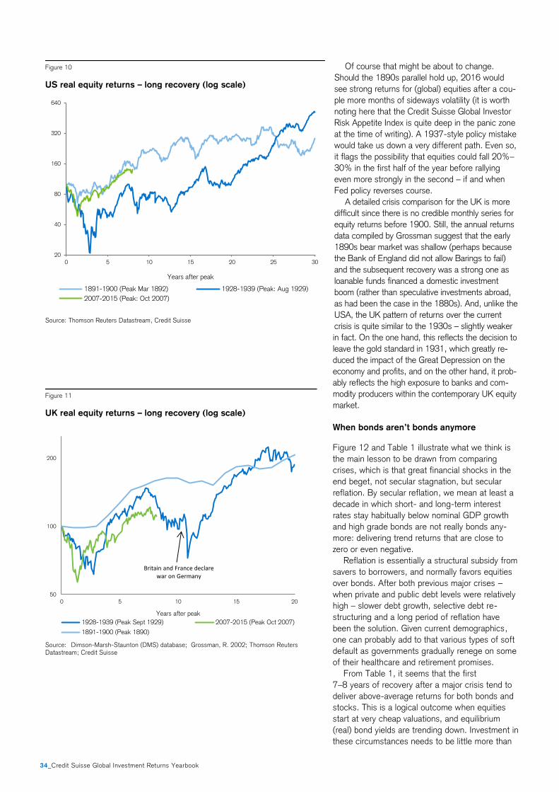
34_Credit Suisse Global Investment Returns Yearbook
Of course that might be about to change.
Should the 1890s parallel hold up, 2016 would
see strong returns for (global) equities after a cou-
ple more months of sideways volatility (it is worth
noting here that the Credit Suisse Global Investor
Risk Appetite Index is quite deep in the panic zone
at the time of writing). A 1937-style policy mistake
would take us down a very different path. Even so,
it flags the possibility that equities could fall 20%–
30% in the first half of the year before rallying
even more strongly in the second – if and when
Fed policy reverses course.
A detailed crisis comparison for the UK is more
difficult since there is no credible monthly series for
equity returns before 1900. Still, the annual returns
data compiled by Grossman suggest that the early
1890s bear market was shallow (perhaps because
the Bank of England did not allow Barings to fail)
and the subsequent recovery was a strong one as
loanable funds financed a domestic investment
boom (rather than speculative investments abroad,
as had been the case in the 1880s). And, unlike the
USA, the UK pattern of returns over the current
crisis is quite similar to the 1930s – slightly weaker
in fact. On the one hand, this reflects the decision to
leave the gold standard in 1931, which greatly re-
duced the impact of the Great Depression on the
economy and profits, and on the other hand, it prob-
ably reflects the high exposure to banks and com-
modity producers within the contemporary UK equity
market.
When bonds aren’t bonds anymore
Figure 12 and Table 1 illustrate what we think is
the main lesson to be drawn from comparing
crises, which is that great financial shocks in the
end beget, not secular stagnation, but secular
reflation. By secular reflation, we mean at least a
decade in which short- and long-term interest
rates stay habitually below nominal GDP growth
and high grade bonds are not really bonds any-
more: delivering trend returns that are close to
zero or even negative.
Reflation is essentially a structural subsidy from
savers to borrowers, and normally favors equities
over bonds. After both previous major crises –
when private and public debt levels were relatively
high – slower debt growth, selective debt re-
structuring and a long period of reflation have
been the solution. Given current demographics,
one can probably add to that various types of soft
default as governments gradually renege on some
of their healthcare and retirement promises.
From Table 1, it seems that the first
7–8 years of recovery after a major crisis tend to
deliver above-average returns for both bonds and
stocks. This is a logical outcome when equities
start at very cheap valuations, and equilibrium
(real) bond yields are trending down. Investment in
these circumstances needs to be little more than
Figure 11
UK real equity returns – long recovery (log scale)
Source: Dimson-Marsh-Staunton (DMS) database; Grossman, R. 2002; Thomson Reuters Datastream; Credit Suisse
Figure 10
US real equity returns – long recovery (log scale)
Source: Thomson Reuters Datastream, Credit Suisse
0 1 2 3 4 5 6 7 8 9 10 11 12 13 14 15 16 17 18 19 20
50
100
200
50
100
200
0 5 10 15 20
Years after peak
1928-1939 (Peak Sept 1929) 2007-2015 (Peak Oct 2007)
1891-1900 (Peak 1890)
Britain and France declarewar on Germany
20
40
80
160
320
640
0 5 10 15 20 25 30
Years after peak
1891-1900 (Peak Mar 1892) 1928-1939 (Peak: Aug 1929)
2007-2015 (Peak: Oct 2007)
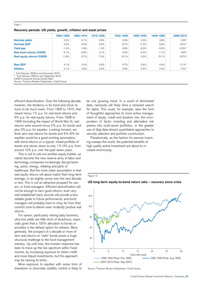
Credit Suisse Global Investment Returns Yearbook_35
efficient diversification. Over the following decade,
however, the tendency is for bond and stock re-
turns to be much lower. From 1900 to 1910, that
meant minus 1% p.a. for real bond returns and
6% p.a. for real equity returns. From 1939 to
1949 (including the impact of World War II), real
returns were around minus 2% p.a. for bonds and
plus 3% p.a. for equities. Looking forward, we
think zero real returns for bonds and 4%–6% for
equities would be a good working assumption,
with trend returns on a typical mixed portfolio of
bonds and stocks down to only 1%–3% p.a. from
around 10% p.a. over the past seven years.
This is not to rule out another equity bubble, as
robots become the new reserve army of labor and
technology companies increasingly disrupt bank-
ing, autos, energy, retailing and parts of
healthcare. But the more sober assumption is that
real equity returns will about match their long-term
average, or do slightly worse over the next decade
or two. This is not an attractive prospect for sav-
ers, or fund managers. Efficient diversification will
not be enough to earn good returns; even very
well established track records will provide a less
reliable guide to future performance; and bond
managers will probably have to stray far from their
comfort zone to deliver even modestly positive real
returns.
For savers, particularly retiring baby boomers,
ultra-low yields are little short of disastrous, espe-
cially given that a 100% allocation to bonds or
annuities is the default option for retirees. More
generally, the prospect of a decade or more of
zero real returns on "safe" bonds poses a huge
structural challenge to the fund management
industry. Up until now, the investor response has
been to move up the risk spectrum within fixed
income, by increasing exposure to riskier credit
and more illiquid investments, but this approach
may be nearing its limits.
More exposure to equities with some form of
drawdown or downside volatility control is likely to
be one growing trend. In a world of diminished
beta, necessity will likely drive a renewed search
for alpha. This could, for example, take the form
of thoughtful approaches to more active manage-
ment of equity, credit and duration risk, the incor-
poration of factor investing and alternative risk
premia into multi-asset portfolios, or the greater
use of (big-data-driven) quantitative approaches to
security selection and portfolio construction.
Paradoxically, as the fashion for passive invest-
ing sweeps the world, the potential benefits of
high quality active investment are about to in-
crease enormously.
Figure 12
US long-term equity-to-bond return ratio – recovery since crisis
Source: Thomson Reuters Datastream, Credit Suisse
Table 1
Recovery periods: US yields, growth, inflation and asset prices
1893–1900 1900–1910 1910–1930 1932–1939 1939–1949 1949–1969 2009–2015
Nominal yields 3.2% 3.1% 3.9% 2.8% 2.3% 3.8% 2.6%*
Nominal GDP 4.2% 5.0% 5.2% 6.7% 11.3% 6.8% 3.6%**
Yield gap -1.0% -1.8% -1.3% -3.8% -9.0% -3.0% -0.9%**
Real bond returns (CAGR) 6.1% -0.8% 2.1% 5.5% -2.4% -1.1% 4.6%*
Real equity returns (CAGR) 11.9% 5.7% 7.0% 19.1% 3.2% 12.1% 16.7%*
Real GDP 4.1% 2.4% 2.6% 5.7% 5.6% 4.4% 2.1%**
Inflation 0.1% 2.5% 2.5% 0.8% 5.4% 2.4% 1.5%**
* End February 2009 to end December 2015 ** End February 2009 to end September 2015 CAGR=Compound Annual Growth Rate. Source: Thomson Reuters Datastream, Credit Suisse
10
20
40
80
160
320
0 5 10 15 20 25 30
Years after peak
1890-1900 (Peak: Feb 1892) 1928-1939 (Peak: Aug 1929)
2007-2015 (Peak: May 2007)

PH
OTO
: G
IBS
ON
PIC
TUR
ES
/ IS
TOC
KP
HO
TO.C
OM
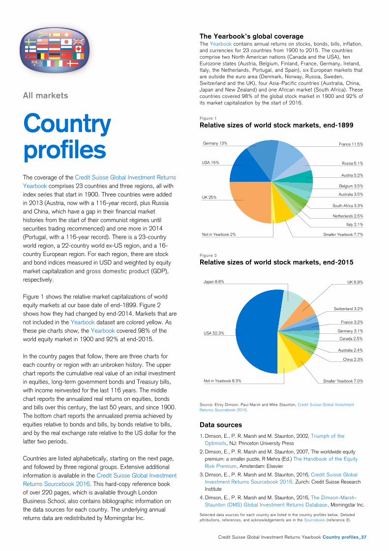
Credit Suisse Global Investment Returns Yearbook Country profiles_37
All markets
Country profiles The coverage of the Credit Suisse Global Investment Returns
Yearbook comprises 23 countries and three regions, all with
index series that start in 1900. Three countries were added
in 2013 (Austria, now with a 116-year record, plus Russia
and China, which have a gap in their financial market
histories from the start of their communist régimes until
securities trading recommenced) and one more in 2014
(Portugal, with a 116-year record). There is a 23-country
world region, a 22-country world ex-US region, and a 16-
country European region. For each region, there are stock
and bond indices measured in USD and weighted by equity
market capitalization and gross domestic product (GDP),
respectively.
Figure 1 shows the relative market capitalizations of world
equity markets at our base date of end-1899. Figure 2
shows how they had changed by end-2014. Markets that are
not included in the Yearbook dataset are colored yellow. As
these pie charts show, the Yearbook covered 98% of the
world equity market in 1900 and 92% at end-2015.
In the country pages that follow, there are three charts for
each country or region with an unbroken history. The upper
chart reports the cumulative real value of an initial investment
in equities, long-term government bonds and Treasury bills,
with income reinvested for the last 116 years. The middle
chart reports the annualized real returns on equities, bonds
and bills over this century, the last 50 years, and since 1900.
The bottom chart reports the annualized premia achieved by
equities relative to bonds and bills, by bonds relative to bills,
and by the real exchange rate relative to the US dollar for the
latter two periods.
Countries are listed alphabetically, starting on the next page,
and followed by three regional groups. Extensive additional
information is available in the Credit Suisse Global Investment
Returns Sourcebook 2016. This hard-copy reference book
of over 220 pages, which is available through London
Business School, also contains bibliographic information on
the data sources for each country. The underlying annual
returns data are redistributed by Morningstar Inc.
The Yearbook’s global coverage The Yearbook contains annual returns on stocks, bonds, bills, inflation,
and currencies for 23 countries from 1900 to 2015. The countries
comprise two North American nations (Canada and the USA), ten
Eurozone states (Austria, Belgium, Finland, France, Germany, Ireland,
Italy, the Netherlands, Portugal, and Spain), six European markets that
are outside the euro area (Denmark, Norway, Russia, Sweden,
Switzerland and the UK), four Asia-Pacific countries (Australia, China,
Japan and New Zealand) and one African market (South Africa). These
countries covered 98% of the global stock market in 1900 and 92% of
its market capitalization by the start of 2016.
Figure 1
Relative sizes of world stock markets, end-1899
Figure 2
Relative sizes of world stock markets, end-2015
Source: Elroy Dimson, Paul Marsh and Mike Staunton, Credit Suisse Global Investment
Returns Sourcebook 2016.
Data sources
1. Dimson, E., P. R. Marsh and M. Staunton, 2002, Triumph of the
Optimists, NJ: Princeton University Press
2. Dimson, E., P. R. Marsh and M. Staunton, 2007, The worldwide equity
premium: a smaller puzzle, R Mehra (Ed.) The Handbook of the Equity
Risk Premium, Amsterdam: Elsevier
3. Dimson, E., P. R. Marsh and M. Staunton, 2016, Credit Suisse Global
Investment Returns Sourcebook 2016, Zurich: Credit Suisse Research
Institute
4. Dimson, E., P. R. Marsh and M. Staunton, 2016, The Dimson-Marsh-
Staunton (DMS) Global Investment Returns Database, Morningstar Inc.
Selected data sources for each country are listed in the country profiles below. Detailed
attributions, references, and acknowledgements are in the Sourcebook (reference 3).
UK 25%
USA 15%
Netherlands 2.5%
France 11.5%
Russia 6.1%
Austria 5.2%
Australia 3.5%
Belgium 3.5%
South Africa 3.3%
Italy 2.1%
Smaller Yearbook 7.7%Not in Yearbook 2%
Germany 13%
Japan 8.8%
Not in Yearbook 8.3%
UK 6.9%
Switzerland 3.2%
Germany 3.1%
France 3.2%
Smaller Yearbook 7.0%
USA 52.3%
China 2.3%
Canada 2.5%
Australia 2.4%
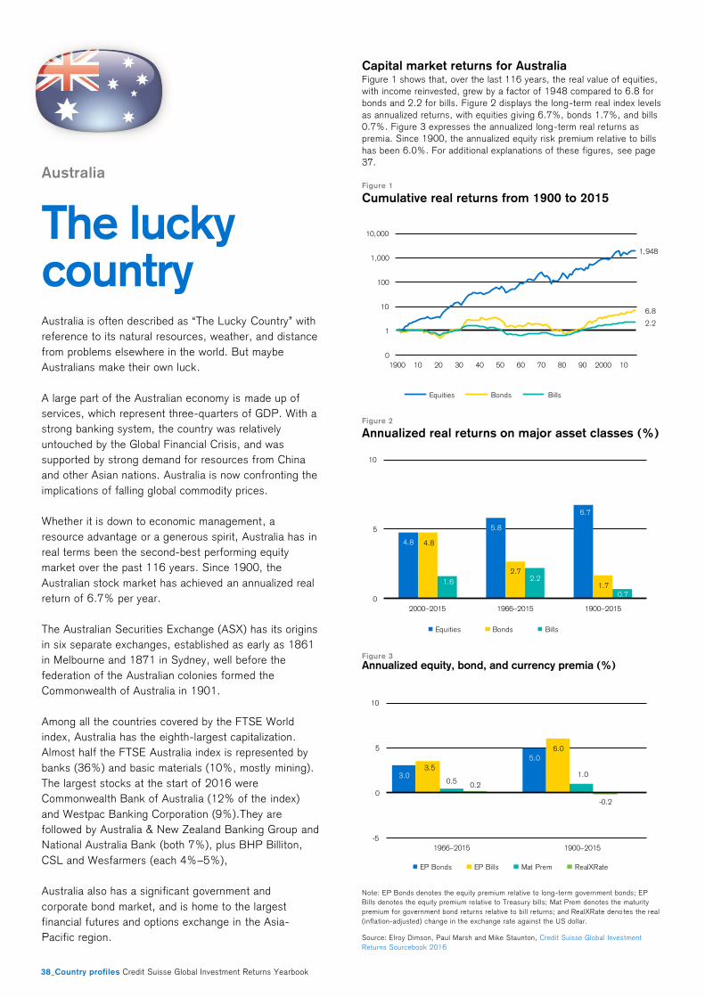
38_Country profiles Credit Suisse Global Investment Returns Yearbook
Australia
The lucky country Australia is often described as “The Lucky Country” with
reference to its natural resources, weather, and distance
from problems elsewhere in the world. But maybe
Australians make their own luck.
A large part of the Australian economy is made up of
services, which represent three-quarters of GDP. With a
strong banking system, the country was relatively
untouched by the Global Financial Crisis, and was
supported by strong demand for resources from China
and other Asian nations. Australia is now confronting the
implications of falling global commodity prices.
Whether it is down to economic management, a
resource advantage or a generous spirit, Australia has in
real terms been the second-best performing equity
market over the past 116 years. Since 1900, the
Australian stock market has achieved an annualized real
return of 6.7% per year.
The Australian Securities Exchange (ASX) has its origins
in six separate exchanges, established as early as 1861
in Melbourne and 1871 in Sydney, well before the
federation of the Australian colonies formed the
Commonwealth of Australia in 1901.
Among all the countries covered by the FTSE World
index, Australia has the eighth-largest capitalization.
Almost half the FTSE Australia index is represented by
banks (36%) and basic materials (10%, mostly mining).
The largest stocks at the start of 2016 were
Commonwealth Bank of Australia (12% of the index)
and Westpac Banking Corporation (9%).They are
followed by Australia & New Zealand Banking Group and
National Australia Bank (both 7%), plus BHP Billiton,
CSL and Wesfarmers (each 4%–5%),
Australia also has a significant government and
corporate bond market, and is home to the largest
financial futures and options exchange in the Asia-
Pacific region.
Capital market returns for Australia Figure 1 shows that, over the last 116 years, the real value of equities,
with income reinvested, grew by a factor of 1948 compared to 6.8 for
bonds and 2.2 for bills. Figure 2 displays the long-term real index levels
as annualized returns, with equities giving 6.7%, bonds 1.7%, and bills
0.7%. Figure 3 expresses the annualized long-term real returns as
premia. Since 1900, the annualized equity risk premium relative to bills
has been 6.0%. For additional explanations of these figures, see page
37.
Figure 1
Cumulative real returns from 1900 to 2015
Figure 2
Annualized real returns on major asset classes (%)
Figure 3
Annualized equity, bond, and currency premia (%)
Note: EP Bonds denotes the equity premium relative to long-term government bonds; EP
Bills denotes the equity premium relative to Treasury bills; Mat Prem denotes the maturity
premium for government bond returns relative to bill returns; and RealXRate deno tes the real
(inflation-adjusted) change in the exchange rate against the US dollar.
Source: Elroy Dimson, Paul Marsh and Mike Staunton, Credit Suisse Global Investment
Returns Sourcebook 2016
1,948
6.8
2.2
0
1
10
100
1,000
10,000
1900 10 20 30 40 50 60 70 80 90 2000 10
Equities Bonds Bills
4.8
5.8
6.7
4.8
2.7
1.71.6 2.2
0.70
5
10
2000–2015 1966–2015 1900–2015
Equities Bonds Bills
3.0
5.0
3.5
6.0
0.51.0
0.2
-0.2
-5
0
5
10
1966–2015 1900–2015
EP Bonds EP Bills Mat Prem RealXRate
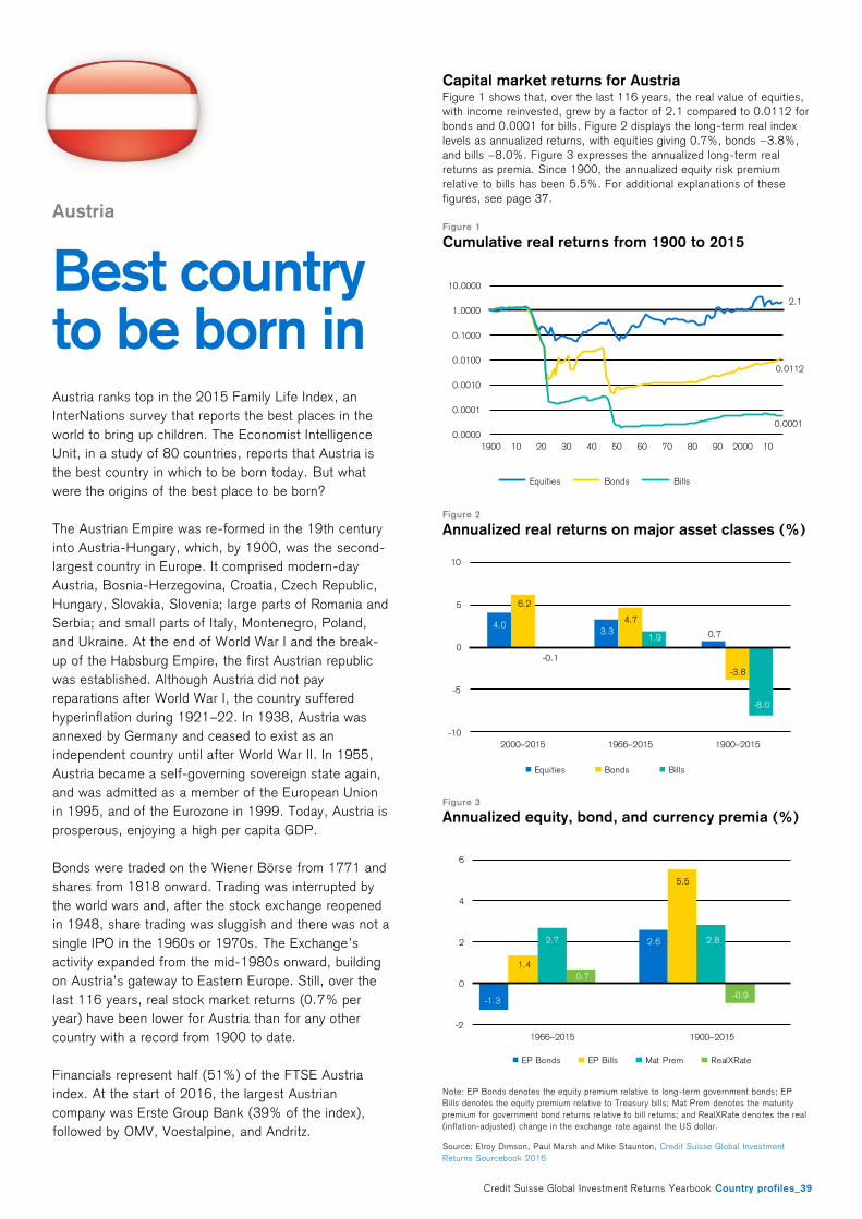
Credit Suisse Global Investment Returns Yearbook Country profiles_39
Austria
Best country to be born in
Austria ranks top in the 2015 Family Life Index, an
InterNations survey that reports the best places in the
world to bring up children. The Economist Intelligence
Unit, in a study of 80 countries, reports that Austria is
the best country in which to be born today. But what
were the origins of the best place to be born?
The Austrian Empire was re-formed in the 19th century
into Austria-Hungary, which, by 1900, was the second-
largest country in Europe. It comprised modern-day
Austria, Bosnia-Herzegovina, Croatia, Czech Republic,
Hungary, Slovakia, Slovenia; large parts of Romania and
Serbia; and small parts of Italy, Montenegro, Poland,
and Ukraine. At the end of World War I and the break-
up of the Habsburg Empire, the first Austrian republic
was established. Although Austria did not pay
reparations after World War I, the country suffered
hyperinflation during 1921–22. In 1938, Austria was
annexed by Germany and ceased to exist as an
independent country until after World War II. In 1955,
Austria became a self-governing sovereign state again,
and was admitted as a member of the European Union
in 1995, and of the Eurozone in 1999. Today, Austria is
prosperous, enjoying a high per capita GDP.
Bonds were traded on the Wiener Börse from 1771 and
shares from 1818 onward. Trading was interrupted by
the world wars and, after the stock exchange reopened
in 1948, share trading was sluggish and there was not a
single IPO in the 1960s or 1970s. The Exchange’s
activity expanded from the mid-1980s onward, building
on Austria’s gateway to Eastern Europe. Still, over the
last 116 years, real stock market returns (0.7% per
year) have been lower for Austria than for any other
country with a record from 1900 to date.
Financials represent half (51%) of the FTSE Austria
index. At the start of 2016, the largest Austrian
company was Erste Group Bank (39% of the index),
followed by OMV, Voestalpine, and Andritz.
Capital market returns for Austria Figure 1 shows that, over the last 116 years, the real value of equities,
with income reinvested, grew by a factor of 2.1 compared to 0.0112 for
bonds and 0.0001 for bills. Figure 2 displays the long-term real index
levels as annualized returns, with equit ies giving 0.7%, bonds −3.8%,
and bills −8.0%. Figure 3 expresses the annualized long-term real
returns as premia. Since 1900, the annualized equity risk premium
relative to bills has been 5.5%. For additional explanations of these
figures, see page 37.
Figure 1
Cumulative real returns from 1900 to 2015
Figure 2
Annualized real returns on major asset classes (%)
Figure 3
Annualized equity, bond, and currency premia (%)
Note: EP Bonds denotes the equity premium relative to long-term government bonds; EP
Bills denotes the equity premium relative to Treasury bills; Mat Prem denotes the maturity
premium for government bond returns relative to bill returns; and RealXRate deno tes the real
(inflation-adjusted) change in the exchange rate against the US dollar.
Source: Elroy Dimson, Paul Marsh and Mike Staunton, Credit Suisse Global Investment
Returns Sourcebook 2016
2.1
0.0112
0.0001
0.0000
0.0001
0.0010
0.0100
0.1000
1.0000
10.0000
1900 10 20 30 40 50 60 70 80 90 2000 10
Equities Bonds Bills
4.03.3 0.7
6.2
4.7
-3.8
-0.1
1.9
-8.0
-10
-5
0
5
10
2000–2015 1966–2015 1900–2015
Equities Bonds Bills
-1.3
2.6
1.4
5.5
2.7 2.8
0.7
-0.9
-2
0
2
4
6
1966–2015 1900–2015
EP Bonds EP Bills Mat Prem RealXRate
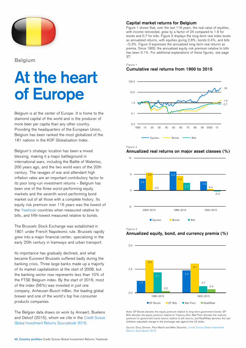
40_Country profiles Credit Suisse Global Investment Returns Yearbook
Belgium
At the heart of Europe Belgium is at the center of Europe. It is home to the
diamond capital of the world and is the producer of
more beer per capita than any other country.
Providing the headquarters of the European Union,
Belgium has been ranked the most globalized of the
181 nations in the KOF Globalization Index.
Belgium’s strategic location has been a mixed
blessing, making it a major battleground in
international wars, including the Battle of Waterloo,
200 years ago, and the two world wars of the 20th
century. The ravages of war and attendant high
inflation rates are an important contributory factor to
its poor long-run investment returns – Belgium has
been one of the three worst-performing equity
markets and the seventh worst-performing bond
market out of all those with a complete history. Its
equity risk premium over 116 years was the lowest of
the Yearbook countries when measured relative to
bills, and fifth-lowest measured relative to bonds.
The Brussels Stock Exchange was established in
1801 under French Napoleonic rule. Brussels rapidly
grew into a major financial center, specializing in the
early 20th century in tramways and urban transport.
Its importance has gradually declined, and what
became Euronext Brussels suffered badly during the
banking crisis. Three large banks made up a majority
of its market capitalization at the start of 2008, but
the banking sector now represents less than 10% of
the FTSE Belgium index. By the start of 2016, most
of the index (56%) was invested in just one
company, Anheuser-Busch InBev, the leading global
brewer and one of the world's top five consumer
products companies.
The Belgian data draws on work by Annaert, Buelens
and Deloof (2015), whom we cite in the Credit Suisse
Global Investment Returns Sourcebook 2016.
Capital market returns for Belgium Figure 1 shows that, over the last 116 years, the real value of equities,
with income reinvested, grew by a factor of 24 compared to 1.6 for
bonds and 0.7 for bills. Figure 2 displays the long-term real index levels
as annualized returns, with equities giv ing 2.8%, bonds 0.4%, and bills
−0.3%. Figure 3 expresses the annualized long-term real returns as
premia. Since 1900, the annualized equity risk premium relative to bills
has been 3.1%. For additional explanations of these figures, see page
37.
Figure 1
Cumulative real returns from 1900 to 2015
Figure 2
Annualized real returns on major asset classes (%)
Figure 3
Annualized equity, bond, and currency premia (%)
Note: EP Bonds denotes the equity premium relative to long-term government bonds; EP
Bills denotes the equity premium relative to Treasury bills; Mat Prem denotes the maturity
premium for government bond returns relative to bill returns; and RealXRate deno tes the real
(inflation-adjusted) change in the exchange rate against the US dollar.
Source: Elroy Dimson, Paul Marsh and Mike Staunton, Credit Suisse Global Investment
Returns Sourcebook 2016
24
1.6
0.7
0.0
0.1
1.0
10.0
100.0
1900 10 20 30 40 50 60 70 80 90 2000 10
Equities Bonds Bills
3.6
5.8
2.8
5.4
4.5
0.40.02.3
-0.3
-5
0
5
10
2000–2015 1966–2015 1900–2015
Equities Bonds Bills
1.3
2.4
3.4
3.1
2.1
0.7
0.20.4
0.0
2.5
5.0
1966–2015 1900–2015
EP Bonds EP Bills Mat Prem RealXRate
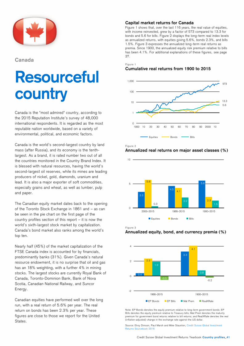
Credit Suisse Global Investment Returns Yearbook Country profiles_41
Canada
Resourceful country Canada is the "most admired" country, according to
the 2015 Reputation Institute’s survey of 48,000
international respondents. It is regarded as the most
reputable nation worldwide, based on a variety of
environmental, political, and economic factors.
Canada is the world’s second-largest country by land
mass (after Russia), and its economy is the tenth-
largest. As a brand, it is rated number two out of all
the countries monitored in the Country Brand Index. It
is blessed with natural resources, having the world’s
second-largest oil reserves, while its mines are leading
producers of nickel, gold, diamonds, uranium and
lead. It is also a major exporter of soft commodities,
especially grains and wheat, as well as lumber, pulp
and paper.
The Canadian equity market dates back to the opening
of the Toronto Stock Exchange in 1861 and – as can
be seen in the pie chart on the first page of the
country profiles section of this report – it is now the
world’s sixth-largest stock market by capitalization.
Canada’s bond market also ranks among the world’s
top ten.
Nearly half (45%) of the market capitalization of the
FTSE Canada index is accounted for by financials,
predominantly banks (31%). Given Canada’s natural
resource endowment, it is no surprise that oil and gas
has an 18% weighting, with a further 4% in mining
stocks. The largest stocks are currently Royal Bank of
Canada, Toronto-Dominion Bank, Bank of Nova
Scotia, Canadian National Railway, and Suncor
Energy.
Canadian equities have performed well over the long
run, with a real return of 5.6% per year. The real
return on bonds has been 2.3% per year. These
figures are close to those we report for the United
States.
Capital market returns for Canada Figure 1 shows that, over the last 116 years, the real value of equities,
with income reinvested, grew by a factor of 573 compared to 13.3 for
bonds and 5.6 for bills. Figure 2 displays the long-term real index levels
as annualized returns, with equities g iving 5.6%, bonds 2.3%, and bills
1.5%. Figure 3 expresses the annualized long-term real returns as
premia. Since 1900, the annualized equity risk premium relative to bills
has been 4.1%. For additional explanations of these figures, see page
37.
Figure 1
Cumulative real returns from 1900 to 2015
Figure 2
Annualized real returns on major asset classes (%)
Figure 3
Annualized equity, bond, and currency premia (%)
Note: EP Bonds denotes the equity premium relative to long-term government bonds; EP
Bills denotes the equity premium relative to Treasury bills; Mat Prem denotes the maturity
premium for government bond returns relative to bill returns; and RealXRate deno tes the real
(inflation-adjusted) change in the exchange rate against the US dollar.
Source: Elroy Dimson, Paul Marsh and Mike Staunton, Credit Suisse Global Investment
Returns Sourcebook 2016
573
13.3
5.6
0
1
10
100
1,000
1900 10 20 30 40 50 60 70 80 90 2000 10
Equities Bonds Bills
3.3
4.5
5.65.8
4.1
2.3
0.32.2
1.5
0
5
10
2000–2015 1966–2015 1900–2015
Equities Bonds Bills
0.4
3.3
2.3
4.1
1.9
0.8
-0.5-0.2
-2
0
2
4
1966–2015 1900–2015
EP Bonds EP Bills Mat Prem RealXRate
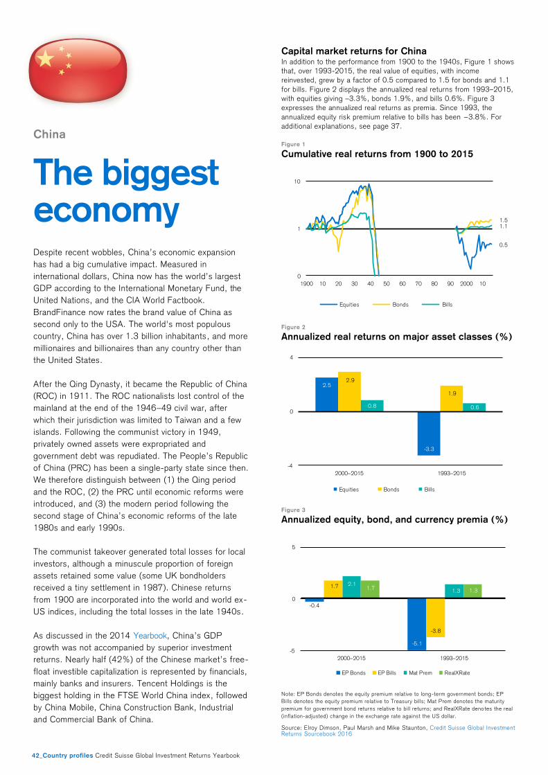
42_Country profiles Credit Suisse Global Investment Returns Yearbook
China
The biggest economy Despite recent wobbles, China’s economic expansion
has had a big cumulative impact. Measured in
international dollars, China now has the world’s largest
GDP according to the International Monetary Fund, the
United Nations, and the CIA World Factbook.
BrandFinance now rates the brand value of China as
second only to the USA. The world's most populous
country, China has over 1.3 billion inhabitants, and more
millionaires and billionaires than any country other than
the United States.
After the Qing Dynasty, it became the Republic of China
(ROC) in 1911. The ROC nationalists lost control of the
mainland at the end of the 1946–49 civil war, after
which their jurisdiction was limited to Taiwan and a few
islands. Following the communist victory in 1949,
privately owned assets were expropriated and
government debt was repudiated. The People’s Republic
of China (PRC) has been a single-party state since then.
We therefore distinguish between (1) the Qing period
and the ROC, (2) the PRC until economic reforms were
introduced, and (3) the modern period following the
second stage of China’s economic reforms of the late
1980s and early 1990s.
The communist takeover generated total losses for local
investors, although a minuscule proportion of foreign
assets retained some value (some UK bondholders
received a tiny settlement in 1987). Chinese returns
from 1900 are incorporated into the world and world ex-
US indices, including the total losses in the late 1940s.
As discussed in the 2014 Yearbook, China’s GDP
growth was not accompanied by superior investment
returns. Nearly half (42%) of the Chinese market’s free-
float investible capitalization is represented by financials,
mainly banks and insurers. Tencent Holdings is the
biggest holding in the FTSE World China index, followed
by China Mobile, China Construction Bank, Industrial
and Commercial Bank of China.
Capital market returns for China In addition to the performance from 1900 to the 1940s, Figure 1 shows
that, over 1993-2015, the real value of equities, with income
reinvested, grew by a factor of 0.5 compared to 1.5 for bonds and 1.1
for bills. Figure 2 displays the annualized real returns from 1993–2015,
with equities giving –3.3%, bonds 1.9%, and bills 0.6%. Figure 3
expresses the annualized real returns as premia. Since 1993, the
annualized equity risk premium relative to bills has been −3.8%. For
additional explanations, see page 37.
Figure 1
Cumulative real returns from 1900 to 2015
Figure 2
Annualized real returns on major asset classes (%)
Figure 3
Annualized equity, bond, and currency premia (%)
Note: EP Bonds denotes the equity premium relative to long-term government bonds; EP
Bills denotes the equity premium relative to Treasury bills; Mat Prem denotes the maturity
premium for government bond returns relative to bill returns; and RealXRate deno tes the real
(inflation-adjusted) change in the exchange rate against the US dollar.
Source: Elroy Dimson, Paul Marsh and Mike Staunton, Credit Suisse Global Investment Returns Sourcebook 2016
0.5
1.51.1
0
1
10
1900 10 20 30 40 50 60 70 80 90 2000 10
Equities Bonds Bills
2.5
-3.3
2.9
1.9
0.8 0.6
-4
0
4
2000–2015 1993–2015
Equities Bonds Bills
-0.4
-5.1
1.7
-3.8
2.1
1.31.7 1.3
-5
0
5
2000–2015 1993–2015
EP Bonds EP Bills Mat Prem RealXRate
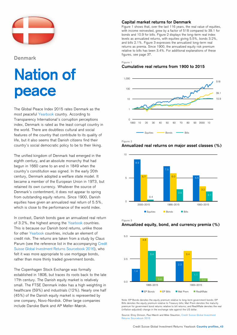
Credit Suisse Global Investment Returns Yearbook Country profiles_43
Denmark
Nation of peace The Global Peace Index 2015 rates Denmark as the
most peaceful Yearbook country. According to
Transparency International’s corruption perceptions
index, Denmark is rated as the least corrupt country in
the world. There are doubtless cultural and social
features of the country that contribute to its quality of
life, but it also seems that Danish citizens find their
country’s social democratic policy to be to their liking .
The unified kingdom of Denmark had emerged in the
eighth century, and an absolute monarchy that had
begun in 1660 came to an end in 1849 when the
country’s constitution was signed. In the early 20th
century, Denmark adopted a welfare state model. It
became a member of the European Union in 1973, but
retained its own currency. Whatever the source of
Denmark’s contentment, it does not appear to spring
from outstanding equity returns. Since 1900, Danish
equities have given an annualized real return of 5.5%,
which is close to the performance of the world index.
In contrast, Danish bonds gave an annualized real return
of 3.2%, the highest among the Yearbook countries.
This is because our Danish bond returns, unlike those
for other Yearbook countries, include an element of
credit risk. The returns are taken from a study by Claus
Parum (see the reference list in the accompanying Credit
Suisse Global Investment Returns Sourcebook 2016), who
felt it was more appropriate to use mortgage bonds,
rather than more thinly traded government bonds.
The Copenhagen Stock Exchange was formally
established in 1808, but traces its roots back to the late
17th century. The Danish equity market is relatively
small. The FTSE Denmark index has a high weighting in
healthcare (59%) and industrials (12%). Nearly one half
(45%) of the Danish equity market is represented by
one company, Novo-Nordisk. Other large companies
include Danske Bank and AP Møller-Mærsk.
Capital market returns for Denmark Figure 1 shows that, over the last 116 years, the real value of equities,
with income reinvested, grew by a factor of 518 compared to 39.1 for
bonds and 10.9 for bills. Figure 2 displays the long-term real index
levels as annualized returns, with equities giving 5.5%, bonds 3.2%,
and bills 2.1%. Figure 3 expresses the annualized long-term real
returns as premia. Since 1900, the annualized equity risk premium
relative to bills has been 3.4%. For additional explanations of these
figures, see page 37.
Figure 1
Cumulative real returns from 1900 to 2015
Figure 2
Annualized real returns on major asset classes (%)
Figure 3
Annualized equity, bond, and currency premia (%)
Note: EP Bonds denotes the equity premium relative to long-term government bonds; EP
Bills denotes the equity premium relative to Treasury bills; Mat Prem denotes the maturity
premium for government bond returns relative to bill returns; and RealXRate denotes the real
(inflation-adjusted) change in the exchange rate against the US dollar.
Source: Elroy Dimson, Paul Marsh and Mike Staunton, Credit Suisse Global Investment
Returns Sourcebook 2016
518
39.1
10.9
0
1
10
100
1,000
1900 10 20 30 40 50 60 70 80 90 2000 10
Equities Bonds Bills
8.9
7.5
5.55.7 6.0
3.2
0.4
2.52.1
0
5
10
2000–2015 1966–2015 1900–2015
Equities Bonds Bills
1.4
2.3
4.8
3.43.4
1.1
0.6 0.40.0
2.5
5.0
1966–2015 1900–2015
EP Bonds EP Bills Mat Prem RealXRate
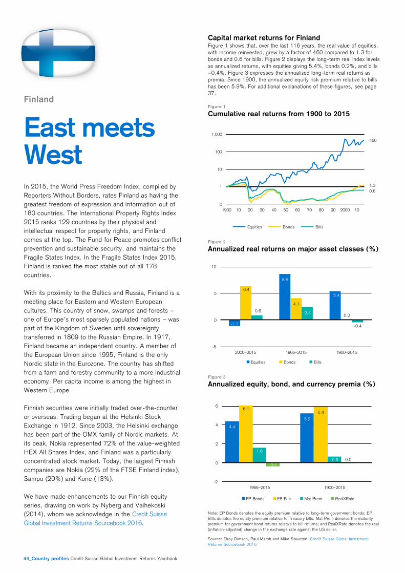
44_Country profiles Credit Suisse Global Investment Returns Yearbook
Finland
East meets West In 2015, the World Press Freedom Index, compiled by
Reporters Without Borders, rates Finland as having the
greatest freedom of expression and information out of
180 countries. The International Property Rights Index
2015 ranks 129 countries by their physical and
intellectual respect for property rights, and Finland
comes at the top. The Fund for Peace promotes conflict
prevention and sustainable security, and maintains the
Fragile States Index. In the Fragile States Index 2015,
Finland is ranked the most stable out of all 178
countries.
With its proximity to the Baltics and Russia, Finland is a
meeting place for Eastern and Western European
cultures. This country of snow, swamps and forests –
one of Europe’s most sparsely populated nations – was
part of the Kingdom of Sweden until sovereignty
transferred in 1809 to the Russian Empire. In 1917,
Finland became an independent country. A member of
the European Union since 1995, Finland is the only
Nordic state in the Eurozone. The country has shifted
from a farm and forestry community to a more industrial
economy. Per capita income is among the highest in
Western Europe.
Finnish securities were initially traded over-the-counter
or overseas. Trading began at the Helsinki Stock
Exchange in 1912. Since 2003, the Helsinki exchange
has been part of the OMX family of Nordic markets. At
its peak, Nokia represented 72% of the value-weighted
HEX All Shares Index, and Finland was a particularly
concentrated stock market. Today, the largest Finnish
companies are Nokia (22% of the FTSE Finland index),
Sampo (20%) and Kone (13%).
We have made enhancements to our Finnish equity
series, drawing on work by Nyberg and Vaihekoski
(2014), whom we acknowledge in the Credit Suisse
Global Investment Returns Sourcebook 2016.
Capital market returns for Finland Figure 1 shows that, over the last 116 years, the real value of equities,
with income reinvested, grew by a factor of 460 compared to 1.3 for
bonds and 0.6 for bills. Figure 2 displays the long-term real index levels
as annualized returns, with equities giving 5.4%, bonds 0.2%, and bills
−0.4%. Figure 3 expresses the annualized long-term real returns as
premia. Since 1900, the annualized equity risk premium relative to bills
has been 5.9%. For additional explanations of these figures, see page
37.
Figure 1
Cumulative real returns from 1900 to 2015
Figure 2
Annualized real returns on major asset classes (%)
Figure 3
Annualized equity, bond, and currency premia (%)
Note: EP Bonds denotes the equity premium relative to long-term government bonds; EP
Bills denotes the equity premium relative to Treasury bills; Mat Prem denotes the maturity
premium for government bond returns relative to bill returns; and RealXRate deno tes the real
(inflation-adjusted) change in the exchange rate against the US dollar.
Source: Elroy Dimson, Paul Marsh and Mike Staunton, Credit Suisse Global Investment
Returns Sourcebook 2016
460
1.3
0.6
0
1
10
100
1,000
1900 10 20 30 40 50 60 70 80 90 2000 10
Equities Bonds Bills
-1.1
8.6
5.4
6.4
4.1
0.20.8 2.4
-0.4
-5
0
5
10
2000–2015 1966–2015 1900–2015
Equities Bonds Bills
4.4
5.2
6.15.9
1.6
0.6-0.4
0.0
-2
0
2
4
6
1966–2015 1900–2015
EP Bonds EP Bills Mat Prem RealXRate
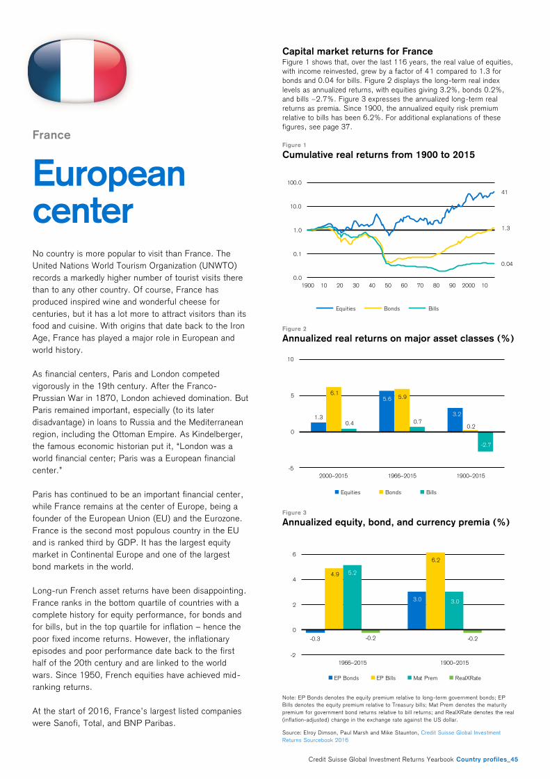
Credit Suisse Global Investment Returns Yearbook Country profiles_45
France
European center
No country is more popular to visit than France. The
United Nations World Tourism Organization (UNWTO)
records a markedly higher number of tourist visits there
than to any other country. Of course, France has
produced inspired wine and wonderful cheese for
centuries, but it has a lot more to attract visitors than its
food and cuisine. With origins that date back to the Iron
Age, France has played a major role in European and
world history.
As financial centers, Paris and London competed
vigorously in the 19th century. After the Franco-
Prussian War in 1870, London achieved domination. But
Paris remained important, especially (to its later
disadvantage) in loans to Russia and the Mediterranean
region, including the Ottoman Empire. As Kindelberger,
the famous economic historian put it, “London was a
world financial center; Paris was a European financial
center.”
Paris has continued to be an important financial center,
while France remains at the center of Europe, being a
founder of the European Union (EU) and the Eurozone.
France is the second most populous country in the EU
and is ranked third by GDP. It has the largest equity
market in Continental Europe and one of the largest
bond markets in the world.
Long-run French asset returns have been disappointing.
France ranks in the bottom quartile of countries with a
complete history for equity performance, for bonds and
for bills, but in the top quartile for inflation – hence the
poor fixed income returns. However, the inflationary
episodes and poor performance date back to the first
half of the 20th century and are linked to the world
wars. Since 1950, French equities have achieved mid-
ranking returns.
At the start of 2016, France’s largest listed companies
were Sanofi, Total, and BNP Paribas.
Capital market returns for France Figure 1 shows that, over the last 116 years, the real value of equities,
with income reinvested, grew by a factor of 41 compared to 1.3 for
bonds and 0.04 for bills. Figure 2 displays the long-term real index
levels as annualized returns, with equities giving 3.2%, bonds 0.2%,
and bills −2.7%. Figure 3 expresses the annualized long-term real
returns as premia. Since 1900, the annualized equity risk premium
relative to bills has been 6.2%. For additional explanations of these
figures, see page 37.
Figure 1
Cumulative real returns from 1900 to 2015
Figure 2
Annualized real returns on major asset classes (%)
Figure 3
Annualized equity, bond, and currency premia (%)
Note: EP Bonds denotes the equity premium relative to long-term government bonds; EP
Bills denotes the equity premium relative to Treasury bills; Mat Prem denotes the maturity
premium for government bond returns relative to bill returns; and RealXRate denotes the real
(inflation-adjusted) change in the exchange rate against the US dollar.
Source: Elroy Dimson, Paul Marsh and Mike Staunton, Credit Suisse Global Investment
Returns Sourcebook 2016
41
1.3
0.04
0.0
0.1
1.0
10.0
100.0
1900 10 20 30 40 50 60 70 80 90 2000 10
Equities Bonds Bills
1.3
5.6
3.2
6.15.9
0.20.4 0.7
-2.7
-5
0
5
10
2000–2015 1966–2015 1900–2015
Equities Bonds Bills
-0.3
3.0
4.9
6.2
5.2
3.0
-0.2 -0.2
-2
0
2
4
6
1966–2015 1900–2015
EP Bonds EP Bills Mat Prem RealXRate
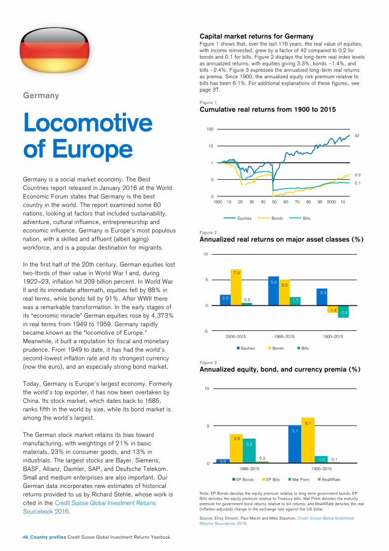
46_Country profiles Credit Suisse Global Investment Returns Yearbook
Germany
Locomotive of Europe
Germany is a social market economy. The Best
Countries report released in January 2016 at the World
Economic Forum states that Germany is the best
country in the world. The report examined some 60
nations, looking at factors that included sustainability,
adventure, cultural influence, entrepreneurship and
economic influence. Germany is Europe’s most populous
nation, with a skilled and affluent (albeit aging)
workforce, and is a popular destination for migrants.
In the first half of the 20th century, German equities lost
two-thirds of their value in World War I and, during
1922–23, inflation hit 209 billion percent. In World War
II and its immediate aftermath, equities fell by 88% in
real terms, while bonds fell by 91%. After WWII there
was a remarkable transformation. In the early stages of
its “economic miracle” German equities rose by 4,373%
in real terms from 1949 to 1959. Germany rapidly
became known as the “locomotive of Europe.”
Meanwhile, it built a reputation for fiscal and monetary
prudence. From 1949 to date, it has had the world’s
second-lowest inflation rate and its strongest currency
(now the euro), and an especially strong bond market.
Today, Germany is Europe’s largest economy. Formerly
the world’s top exporter, it has now been overtaken by
China. Its stock market, which dates back to 1685,
ranks fifth in the world by size, while its bond market is
among the world’s largest.
The German stock market retains its bias toward
manufacturing, with weightings of 21% in basic
materials, 23% in consumer goods, and 13% in
industrials. The largest stocks are Bayer, Siemens,
BASF, Allianz, Daimler, SAP, and Deutsche Telekom.
Small and medium enterprises are also important. Our
German data incorporates new estimates of historical
returns provided to us by Richard Stehle, whose work is
cited in the Credit Suisse Global Investment Returns
Sourcebook 2016.
Capital market returns for Germany Figure 1 shows that, over the last 116 years, the real value of equities,
with income reinvested, grew by a factor of 42 compared to 0.2 for
bonds and 0.1 for bills. Figure 2 displays the long-term real index levels
as annualized returns, with equities giv ing 3.3%, bonds −1.4%, and
bills −2.4%. Figure 3 expresses the annualized long-term real returns
as premia. Since 1900, the annualized equity risk premium relative to
bills has been 6.1%. For additional explanations of these figures, see
page 37.
Figure 1
Cumulative real returns from 1900 to 2015
Figure 2
Annualized real returns on major asset classes (%)
Figure 3
Annualized equity, bond, and currency premia (%)
Note: EP Bonds denotes the equity premium relative to long-term government bonds; EP
Bills denotes the equity premium relative to Treasury bills; Mat Prem denotes the maturity
premium for government bond returns relative to bill returns; and RealXRate deno tes the real
(inflation-adjusted) change in the exchange rate against the US dollar.
Source: Elroy Dimson, Paul Marsh and Mike Staunton, Credit Suisse Global Investment
Returns Sourcebook 2016
42
0.2
0.1
0
0
1
10
100
1900 10 20 30 40 50 60 70 80 90 2000 10
Equities Bonds Bills
2.0
5.6
3.3
7.0
5.0
-1.4
0.5 1.7
-2.4
-5
0
5
10
2000–2015 1966–2015 1900–2015
Equities Bonds Bills
0.6
5.1
3.9
6.1
3.3
1.00.2 0.10
5
10
1966–2015 1900–2015
EP Bonds EP Bills Mat Prem RealXRate

Credit Suisse Global Investment Returns Yearbook Country profiles_47
Ireland
Born free
In 1800, the British and Irish parliaments approved Acts
of Union that merged the Kingdom of Ireland and the
Kingdom of Great Britain to create a United Kingdom of
Great Britain and Ireland. After civil war in the early 20th
century, the Republic of Ireland was born as an
independent country in 1922, named the Irish Free
State. Northern Ireland remained with the United
Kingdom.
In the period following independence, economic growth
and stock market performance were weak and, during
the 1950s, the country experienced large-scale
emigration. Ireland joined the European Union in 1973
and, from 1987, the country’s economic situation
improved.
By the 1990s and early 2000s, Ireland experienced
great economic success and became known as the
Celtic Tiger. By 2007, it had become the world’s fifth-
richest country in terms of GDP per capita, the second-
richest in the EU, and was experiencing net immigration.
Over the period 1987–2006, Ireland had experienced
the second-highest real equity return of any Yearbook
country. The financial crisis changed that, and the
country faced hardship.
The country is one of the smallest Yearbook markets
and, sadly, it became smaller. Too much of the boom
was based on real estate, financials and leverage, and
Irish stocks were decimated after 2006. After a
burgeoning deficit, austerity measures were introduced
which lasted until 2014. However, Ireland is now once
again prospering. The export sector, dominated by
multinationals, has become a key component of its
economy, supported by a low rate of corporate taxation.
There have been stock exchanges in Dublin and Cork
since 1793. To monitor Irish stocks from 1900, we
constructed an index based on stocks traded on these
two exchanges. Currently, Ireland’s largest index
constituents are Kerry Group (32% of the FTSE Ireland
index), Bank of Ireland (26%) and Ryanair (18%).
Capital market returns for Ireland Figure 1 shows that, over the last 116 years, the real value of equities,
with income reinvested, grew by a factor of 151 compared to 5.9 for
bonds and 2.3 for bills. Figure 2 displays the long-term real index levels
as annualized returns, with equities giving 4.4%, bonds 1.5%, and bills
0.7%. Figure 3 expresses the annualized long-term real returns as
premia. Since 1900, the annualized equity risk premium relative to bills
has been 3.7%. For additional explanations of these figures, see page
37.
Figure 1
Cumulative real returns from 1900 to 2015
Figure 2
Annualized real returns on major asset classes (%)
Figure 3
Annualized equity, bond, and currency premia (%)
Note: EP Bonds denotes the equity premium relative to long-term government bonds; EP
Bills denotes the equity premium relative to Treasury bills; Mat Prem denotes the maturity
premium for government bond returns relative to bill returns; and RealXRate deno tes the real
(inflation-adjusted) change in the exchange rate against the US dollar.
Source: Elroy Dimson, Paul Marsh and Mike Staunton, Credit Suisse Global Investment
Returns Sourcebook 2016
151
5.9
2.3
0
1
10
100
1,000
1900 10 20 30 40 50 60 70 80 90 2000 10
Equities Bonds Bills
2.3
6.4
4.4
5.4
3.7
1.5
0.4
1.50.7
0
5
10
2000–2015 1966–2015 1900–2015
Equities Bonds Bills
2.62.8
4.8
3.7
2.2
0.80.2 0.10.0
2.5
5.0
1966–2015 1900–2015
EP Bonds EP Bills Mat Prem RealXRate
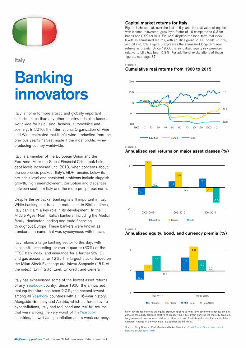
48_Country profiles Credit Suisse Global Investment Returns Yearbook
Italy
Banking innovators
Italy is home to more artistic and globally important
historical sites than any other country. It is also famous
worldwide for its cuisine, fashion, automobiles and
scenery. In 2016, the International Organization of Vine
and Wine estimated that Italy’s wine production from the
previous year’s harvest made it the most prolific wine-
producing country worldwide.
Italy is a member of the European Union and the
Eurozone. After the Global Financial Crisis took hold,
debt levels increased until 2013, when concerns about
the euro-crisis peaked. Italy's GDP remains below its
pre-crisis level and persistent problems include sluggish
growth, high unemployment, corruption and disparities
between southern Italy and the more prosperous north.
Despite the setbacks, banking is still important in Italy.
While banking can trace its roots back to Biblical times,
Italy can claim a key role in its development. In the
Middle Ages, North Italian bankers, including the Medici
family, dominated lending and trade financing
throughout Europe. These bankers were known as
Lombards, a name that was synonymous with Italians.
Italy retains a large banking sector to this day, with
banks still accounting for over a quarter (30%) of the
FTSE Italy index, and insurance for a further 9%. Oil
and gas accounts for 12%. The largest stocks traded on
the Milan Stock Exchange are Intesa Sanpaolo (15% of
the index), Eni (12%), Enel, Unicredit and Generali.
Italy has experienced some of the lowest asset returns
of any Yearbook country. Since 1900, the annualized
real equity return has been 2.0%, the second lowest
among all Yearbook countries with a 116-year history.
Alongside Germany and Austria, which suffered severe
hyperinflations, Italy had real bond and real bill returns
that were among the very worst of theYearbook
countries, as well as high inflation and a weak currency.
Capital market returns for Italy Figure 1 shows that, over the last 116 years, the real value of equities,
with income reinvested, grew by a factor of 10 compared to 0.3 for
bonds and 0.02 for bills. Figure 2 displays the long-term real index
levels as annualized returns, with equities giving 2.0%, bonds −1.1%,
and bills −3.5%. Figure 3 expresses the annualized long-term real
returns as premia. Since 1900, the annualized equity risk premium
relative to bills has been 5.8%. For additional explanations of these
figures, see page 37.
Figure 1
Cumulative real returns from 1900 to 2015
Figure 2
Annualized real returns on major asset classes (%)
Figure 3
Annualized equity, bond, and currency premia (%)
Note: EP Bonds denotes the equity premium relative to long-term government bonds; EP Bills
denotes the equity premium relative to Treasury bills; Mat Prem denotes the maturity premium
for government bond returns relative to bill returns; and RealXRate denotes the real ( inflation-
adjusted) change in the exchange rate against the US dollar.
Source: Elroy Dimson, Paul Marsh and Mike Staunton, Credit Suisse Global Investment
Returns Sourcebook 2016
10
0.3
0.020.0
0.1
1.0
10.0
100.0
1900 10 20 30 40 50 60 70 80 90 2000 10
Equities Bonds Bills
-1.7
1.42.0
6.1
3.5
-1.1
0.2
-0.1
-3.5
-5
0
5
2000–2015 1966–2015 1900–2015
Equities Bonds Bills
-2.0
3.1
1.5
5.8
3.6
2.5
-0.1
0.0
-5
0
5
1966–2015 1900–2015
EP Bonds EP Bills Mat Prem RealXRate
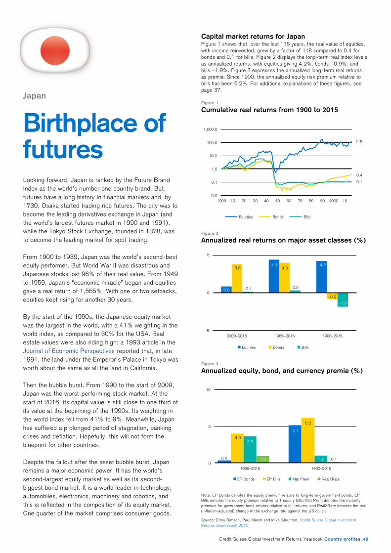
Credit Suisse Global Investment Returns Yearbook Country profiles_49
Japan
Birthplace of futures Looking forward, Japan is ranked by the Future Brand
Index as the world’s number one country brand. But,
futures have a long history in financial markets and, by
1730, Osaka started trading rice futures. The city was to
become the leading derivatives exchange in Japan (and
the world’s largest futures market in 1990 and 1991),
while the Tokyo Stock Exchange, founded in 1878, was
to become the leading market for spot trading.
From 1900 to 1939, Japan was the world’s second-best
equity performer. But World War II was disastrous and
Japanese stocks lost 96% of their real value. From 1949
to 1959, Japan’s “economic miracle” began and equities
gave a real return of 1,565%. With one or two setbacks,
equities kept rising for another 30 years.
By the start of the 1990s, the Japanese equity market
was the largest in the world, with a 41% weighting in the
world index, as compared to 30% for the USA. Real
estate values were also riding high: a 1993 article in the
Journal of Economic Perspectives reported that, in late
1991, the land under the Emperor’s Palace in Tokyo was
worth about the same as all the land in California.
Then the bubble burst. From 1990 to the start of 2009,
Japan was the worst-performing stock market. At the
start of 2016, its capital value is still close to one third of
its value at the beginning of the 1990s. Its weighting in
the world index fell from 41% to 9%. Meanwhile, Japan
has suffered a prolonged period of stagnation, banking
crises and deflation. Hopefully, this will not form the
blueprint for other countries.
Despite the fallout after the asset bubble burst, Japan
remains a major economic power. It has the world’s
second-largest equity market as well as its second-
biggest bond market. It is a world leader in technology,
automobiles, electronics, machinery and robotics, and
this is reflected in the composition of its equity market.
One quarter of the market comprises consumer goods.
Capital market returns for Japan Figure 1 shows that, over the last 116 years, the real value of equities,
with income reinvested, grew by a factor of 118 compared to 0.4 for
bonds and 0.1 for bills. Figure 2 displays the long-term real index levels
as annualized returns, with equities giving 4.2%, bonds −0.9%, and
bills −1.9%. Figure 3 expresses the annualized long-term real returns
as premia. Since 1900, the annualized equity risk premium relative to
bills has been 6.2%. For additional explanations of these figures, see
page 37.
Figure 1
Cumulative real returns from 1900 to 2015
Figure 2
Annualized real returns on major asset classes (%)
Figure 3
Annualized equity, bond, and currency premia (%)
Note: EP Bonds denotes the equity premium relative to long-term government bonds; EP
Bills denotes the equity premium relative to Treasury bills; Mat Prem denotes the maturity
premium for government bond returns relative to bill returns; and RealXRate deno tes the real
(inflation-adjusted) change in the exchange rate against the US dollar.
Source: Elroy Dimson, Paul Marsh and Mike Staunton, Credit Suisse Global Investment
Returns Sourcebook 2016
118
0.4
0.1
0.0
0.1
1.0
10.0
100.0
1,000.0
1900 10 20 30 40 50 60 70 80 90 2000 10
Equities Bonds Bills
0.8
4.3 4.23.8 4.0
-0.9
0.1 0.3
-1.9
-5
0
5
2000–2015 1966–2015 1900–2015
Equities Bonds Bills
0.4
5.1
4.0
6.2
3.6
1.01.0 0.10
5
10
1966–2015 1900–2015
EP Bonds EP Bills Mat Prem RealXRate
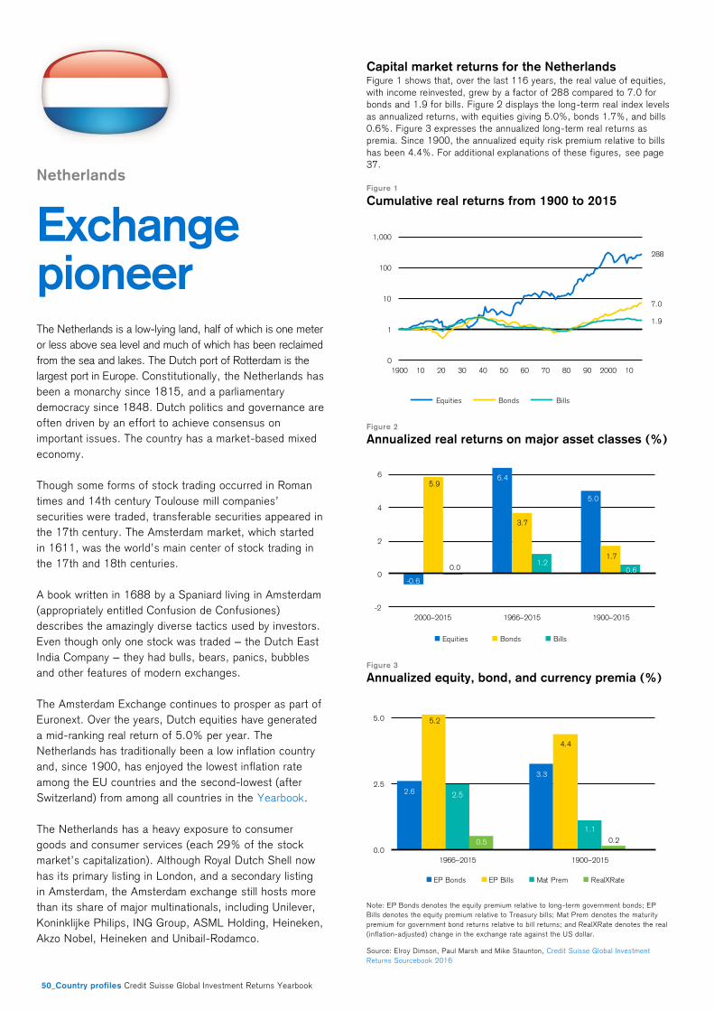
50_Country profiles Credit Suisse Global Investment Returns Yearbook
Netherlands
Exchange pioneer
The Netherlands is a low-lying land, half of which is one meter
or less above sea level and much of which has been reclaimed
from the sea and lakes. The Dutch port of Rotterdam is the
largest port in Europe. Constitutionally, the Netherlands has
been a monarchy since 1815, and a parliamentary
democracy since 1848. Dutch politics and governance are
often driven by an effort to achieve consensus on
important issues. The country has a market-based mixed
economy.
Though some forms of stock trading occurred in Roman
times and 14th century Toulouse mill companies’
securities were traded, transferable securities appeared in
the 17th century. The Amsterdam market, which started
in 1611, was the world’s main center of stock trading in
the 17th and 18th centuries.
A book written in 1688 by a Spaniard living in Amsterdam
(appropriately entitled Confusion de Confusiones)
describes the amazingly diverse tactics used by investors.
Even though only one stock was traded – the Dutch East
India Company – they had bulls, bears, panics, bubbles
and other features of modern exchanges.
The Amsterdam Exchange continues to prosper as part of
Euronext. Over the years, Dutch equities have generated
a mid-ranking real return of 5.0% per year. The
Netherlands has traditionally been a low inflation country
and, since 1900, has enjoyed the lowest inflation rate
among the EU countries and the second-lowest (after
Switzerland) from among all countries in the Yearbook.
The Netherlands has a heavy exposure to consumer
goods and consumer services (each 29% of the stock
market’s capitalization). Although Royal Dutch Shell now
has its primary listing in London, and a secondary listing
in Amsterdam, the Amsterdam exchange still hosts more
than its share of major multinationals, including Unilever,
Koninklijke Philips, ING Group, ASML Holding, Heineken,
Akzo Nobel, Heineken and Unibail-Rodamco.
Capital market returns for the Netherlands Figure 1 shows that, over the last 116 years, the real value of equities,
with income reinvested, grew by a factor of 288 compared to 7.0 for
bonds and 1.9 for bills. Figure 2 displays the long-term real index levels
as annualized returns, with equities giving 5.0%, bonds 1.7%, and bills
0.6%. Figure 3 expresses the annualized long-term real returns as
premia. Since 1900, the annualized equity risk premium relative to bills
has been 4.4%. For additional explanations of these figures, see page
37.
Figure 1
Cumulative real returns from 1900 to 2015
Figure 2
Annualized real returns on major asset classes (%)
Figure 3
Annualized equity, bond, and currency premia (%)
Note: EP Bonds denotes the equity premium relative to long-term government bonds; EP
Bills denotes the equity premium relative to Treasury bills; Mat Prem denotes the maturity
premium for government bond returns relative to bill returns; and RealXRate denotes the real
(inflation-adjusted) change in the exchange rate against the US dollar.
Source: Elroy Dimson, Paul Marsh and Mike Staunton, Credit Suisse Global Investment
Returns Sourcebook 2016
288
7.0
1.9
0
1
10
100
1,000
1900 10 20 30 40 50 60 70 80 90 2000 10
Equities Bonds Bills
-0.6
6.4
5.0
5.9
3.7
1.7
0.01.2
0.6
-2
0
2
4
6
2000–2015 1966–2015 1900–2015
Equities Bonds Bills
2.6
3.3
5.2
4.4
2.5
1.1
0.5 0.2
0.0
2.5
5.0
1966–2015 1900–2015
EP Bonds EP Bills Mat Prem RealXRate
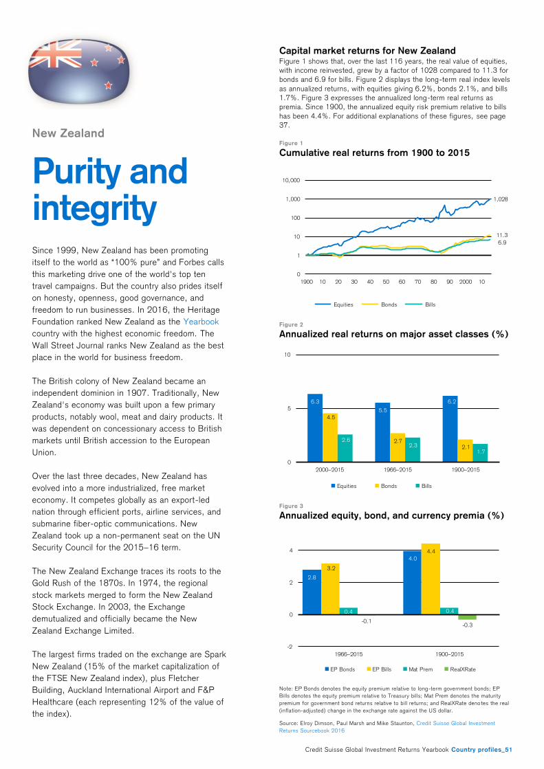
Credit Suisse Global Investment Returns Yearbook Country profiles_51
New Zealand
Purity and integrity
Since 1999, New Zealand has been promoting
itself to the world as “100% pure” and Forbes calls
this marketing drive one of the world's top ten
travel campaigns. But the country also prides itself
on honesty, openness, good governance, and
freedom to run businesses. In 2016, the Heritage
Foundation ranked New Zealand as the Yearbook
country with the highest economic freedom. The
Wall Street Journal ranks New Zealand as the best
place in the world for business freedom.
The British colony of New Zealand became an
independent dominion in 1907. Traditionally, New
Zealand's economy was built upon a few primary
products, notably wool, meat and dairy products. It
was dependent on concessionary access to British
markets until British accession to the European
Union.
Over the last three decades, New Zealand has
evolved into a more industrialized, free market
economy. It competes globally as an export-led
nation through efficient ports, airline services, and
submarine fiber-optic communications. New
Zealand took up a non-permanent seat on the UN
Security Council for the 2015–16 term.
The New Zealand Exchange traces its roots to the
Gold Rush of the 1870s. In 1974, the regional
stock markets merged to form the New Zealand
Stock Exchange. In 2003, the Exchange
demutualized and officially became the New
Zealand Exchange Limited.
The largest firms traded on the exchange are Spark
New Zealand (15% of the market capitalization of
the FTSE New Zealand index), plus Fletcher
Building, Auckland International Airport and F&P
Healthcare (each representing 12% of the value of
the index).
Capital market returns for New Zealand Figure 1 shows that, over the last 116 years, the real value of equities,
with income reinvested, grew by a factor of 1028 compared to 11.3 for
bonds and 6.9 for bills. Figure 2 displays the long-term real index levels
as annualized returns, with equities giving 6.2%, bonds 2.1%, and bills
1.7%. Figure 3 expresses the annualized long-term real returns as
premia. Since 1900, the annualized equity risk premium relative to bills
has been 4.4%. For additional explanations of these figures, see page
37.
Figure 1
Cumulative real returns from 1900 to 2015
Figure 2
Annualized real returns on major asset classes (%)
Figure 3
Annualized equity, bond, and currency premia (%)
Note: EP Bonds denotes the equity premium relative to long-term government bonds; EP
Bills denotes the equity premium relative to Treasury bills; Mat Prem denotes the maturity
premium for government bond returns relative to bill returns; and RealXRate deno tes the real
(inflation-adjusted) change in the exchange rate against the US dollar.
Source: Elroy Dimson, Paul Marsh and Mike Staunton, Credit Suisse Global Investment
Returns Sourcebook 2016
1,028
11.3
6.9
0
1
10
100
1,000
10,000
1900 10 20 30 40 50 60 70 80 90 2000 10
Equities Bonds Bills
6.3
5.5
6.2
4.5
2.72.1
2.62.3
1.7
0
5
10
2000–2015 1966–2015 1900–2015
Equities Bonds Bills
2.8
4.0
3.2
4.4
0.4 0.4
-0.1-0.3
-2
0
2
4
1966–2015 1900–2015
EP Bonds EP Bills Mat Prem RealXRate
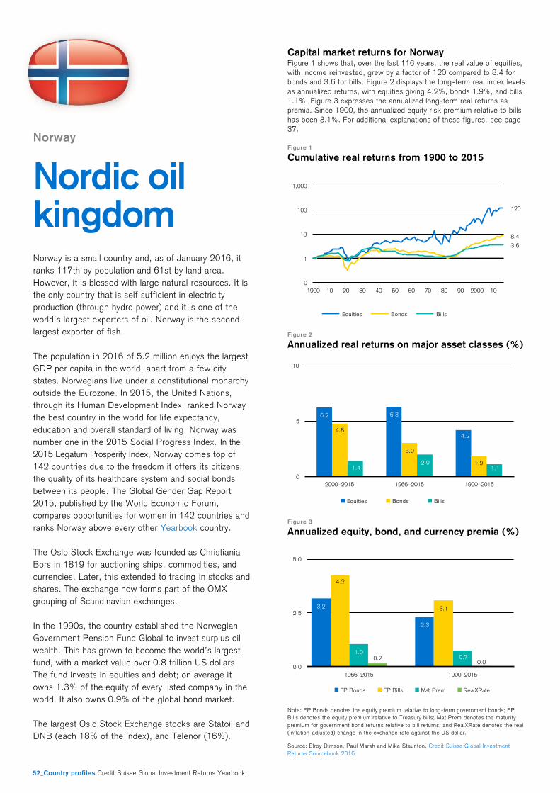
52_Country profiles Credit Suisse Global Investment Returns Yearbook
Norway
Nordic oil kingdom
Norway is a small country and, as of January 2016, it
ranks 117th by population and 61st by land area.
However, it is blessed with large natural resources. It is
the only country that is self sufficient in electricity
production (through hydro power) and it is one of the
world’s largest exporters of oil. Norway is the second-
largest exporter of fish.
The population in 2016 of 5.2 million enjoys the largest
GDP per capita in the world, apart from a few city
states. Norwegians live under a constitutional monarchy
outside the Eurozone. In 2015, the United Nations,
through its Human Development Index, ranked Norway
the best country in the world for life expectancy,
education and overall standard of living. Norway was
number one in the 2015 Social Progress Index. In the
2015 Legatum Prosperity Index, Norway comes top of
142 countries due to the freedom it offers its citizens,
the quality of its healthcare system and social bonds
between its people. The Global Gender Gap Report
2015, published by the World Economic Forum,
compares opportunities for women in 142 countries and
ranks Norway above every other Yearbook country.
The Oslo Stock Exchange was founded as Christiania
Bors in 1819 for auctioning ships, commodities, and
currencies. Later, this extended to trading in stocks and
shares. The exchange now forms part of the OMX
grouping of Scandinavian exchanges.
In the 1990s, the country established the Norwegian
Government Pension Fund Global to invest surplus oil
wealth. This has grown to become the world’s largest
fund, with a market value over 0.8 trillion US dollars.
The fund invests in equities and debt; on average it
owns 1.3% of the equity of every listed company in the
world. It also owns 0.9% of the global bond market.
The largest Oslo Stock Exchange stocks are Statoil and
DNB (each 18% of the index), and Telenor (16%).
Capital market returns for Norway Figure 1 shows that, over the last 116 years, the real value of equities,
with income reinvested, grew by a factor of 120 compared to 8.4 for
bonds and 3.6 for bills. Figure 2 displays the long-term real index levels
as annualized returns, with equities giving 4.2%, bonds 1.9%, and bills
1.1%. Figure 3 expresses the annualized long-term real returns as
premia. Since 1900, the annualized equity risk premium relative to bills
has been 3.1%. For additional explanations of these figures, see page
37.
Figure 1
Cumulative real returns from 1900 to 2015
Figure 2
Annualized real returns on major asset classes (%)
Figure 3
Annualized equity, bond, and currency premia (%)
Note: EP Bonds denotes the equity premium relative to long-term government bonds; EP
Bills denotes the equity premium relative to Treasury bills; Mat Prem denotes the maturity
premium for government bond returns relative to bill returns; and RealXRate denotes the real
(inflation-adjusted) change in the exchange rate against the US dollar.
Source: Elroy Dimson, Paul Marsh and Mike Staunton, Credit Suisse Global Investment
Returns Sourcebook 2016
120
8.4
3.6
0
1
10
100
1,000
1900 10 20 30 40 50 60 70 80 90 2000 10
Equities Bonds Bills
6.2 6.3
4.24.8
3.0
1.91.4
2.01.1
0
5
10
2000–2015 1966–2015 1900–2015
Equities Bonds Bills
3.2
2.3
4.2
3.1
1.00.70.2
0.00.0
2.5
5.0
1966–2015 1900–2015
EP Bonds EP Bills Mat Prem RealXRate
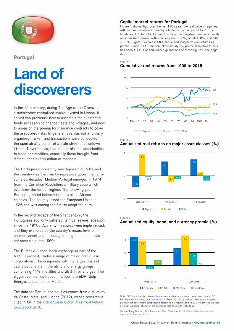
Credit Suisse Global Investment Returns Yearbook Country profiles_53
Portugal
Land of discoverers
In the 15th century, during The Age of the Discoveries,
a rudimentary centralized market existed in Lisbon. It
solved two problems: how to assemble the substantial
funds necessary to finance fleets and voyages, and how
to agree on the premia for insurance contracts to cover
the associated risks. In general, this was not a formally
organized market, and transactions were conducted in
the open air at a corner of a main street in downtown
Lisbon. Nevertheless, that market offered opportunities
to trade commodities, especially those brought from
distant lands by this nation of mariners.
The Portuguese monarchy was deposed in 1910, and
the country was then run by repressive governments for
some six decades. Modern Portugal emerged in 1974
from the Carnation Revolution, a military coup which
overthrew the former regime. The following year,
Portugal granted independence to all its African
colonies. The country joined the European Union in
1986 and was among the first to adopt the euro.
In the second decade of the 21st century, the
Portuguese economy suffered its most severe recession
since the 1970s. Austerity measures were implemented,
and they exacerbated the country’s record level of
unemployment and encouraged emigration on a scale
not seen since the 1960s.
The Euronext Lisbon stock exchange (a part of the
NYSE Euronext) trades a range of major Portuguese
corporations. The companies with the largest market
capitalizations are in the utility and energy groups,
comprising 44% in utilities and 29% in oil and gas. The
biggest companies traded in Lisbon are EDP, Galp
Energia, and Jeronimo Martins.
The data for Portuguese equities comes from a study by
da Costa, Mata, and Justino (2012), whose research is
cited in full in the Credit Suisse Global Investment Returns
Sourcebook 2016.
Capital market returns for Portugal Figure 1 shows that, over the last 116 years, the real value of equities,
with income reinvested, grew by a factor of 57 compared to 2.6 for
bonds and 0.3 for bills. Figure 2 displays the long-term real index levels
as annualized returns, with equities giving 3.5%, bonds 0.8%, and bills
−1.1%. Figure 3 expresses the annualized long-term real returns as
premia. Since 1900, the annualized equity risk premium relative to bills
has been 4.7%. For additional explanations of these figures, see page
37.
Figure 1
Cumulative real returns from 1900 to 2015
Figure 2
Annualized real returns on major asset classes (%)
Figure 3
Annualized equity, bond, and currency premia (%)
Note: EP Bonds denotes the equity premium relative to long-term government bonds; EP
Bills denotes the equity premium relative to Treasury bills; Mat Prem denotes the maturity
premium for government bond returns relative to bill returns; and RealXRate denotes the real
(inflation-adjusted) change in the exchange rate against the US dollar.
Source: Elroy Dimson, Paul Marsh and Mike Staunton, Credit Suisse Global Investment
Returns Sourcebook 2016
57
2.6
0.3
0
1
10
100
1,000
1900 10 20 30 40 50 60 70 80 90 2000 10
Equities Bonds Bills
-2.5
3.1
3.5
4.7
-1.3
0.8
-0.2-0.8 -1.1
-5
0
5
2000–2015 1966–2015 1900–2015
Equities Bonds Bills
4.5
2.7
3.9
4.7
-0.6
1.9
0.90.0
-2
0
2
4
1966–2015 1900–2015
EP Bonds EP Bills Mat Prem RealXRate
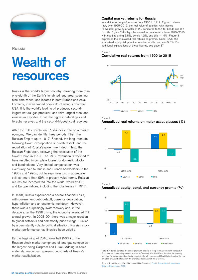
54_Country profiles Credit Suisse Global Investment Returns Yearbook
Russia
Wealth of resources Russia is the world’s largest country, covering more than
one-eighth of the Earth's inhabited land area, spanning
nine time zones, and located in both Europe and Asia.
Formerly, it even owned one-sixth of what is now the
USA. It is the world’s leading oil producer, second-
largest natural gas producer, and third-largest steel and
aluminium exporter. It has the biggest natural gas and
forestry reserves and the second-biggest coal reserves.
After the 1917 revolution, Russia ceased to be a market
economy. We can identify three periods. First, the
Russian Empire up to 1917. Second, the long interlude
following Soviet expropriation of private assets and the
repudiation of Russia’s government debt. Third, the
Russian Federation, following the dissolution of the
Soviet Union in 1991. The 1917 revolution is deemed to
have resulted in complete losses for domestic stock-
and bondholders. Very limited compensation was
eventually paid to British and French bondholders in the
1980s and 1990s, but foreign investors in aggregate
still lost more than 99% in present value terms. Russian
returns are incorporated into the world, world ex-US,
and Europe indices, including the total losses in 1917.
In 1998, Russia experienced a severe financial crisis,
with government debt default, currency devaluation,
hyperinflation and an economic meltdown. However,
there was a surprisingly swift recovery and, in the
decade after the 1998 crisis, the economy averaged 7%
annual growth. In 2008–09, there was a major reaction
to global setbacks and commodity price swings. Fuelled
by a persistently volatile political situation, Russian stock
market performance has likewise been volatile.
By the beginning of 2016, over half (56%) of the
Russian stock market comprised oil and gas companies,
the largest being Gazprom and Lukoil. Adding in basic
materials, resources represent two-thirds of Russia’s
market capitalization.
Capital market returns for Russia In addition to the performance from 1900 to 1917, Figure 1 shows
that, over 1995-2015, the real value of equities, with income
reinvested, grew by a factor of 2.2 compared to 2.4 for bonds and 0.7
for bills. Figure 2 displays the annualized real returns from 1995–2015,
with equities giving 3.8%, bonds 4.2%, and bills −1.9%. Figure 3
expresses the annualized real returns as premia. Since 1995, the
annualized equity risk premium relative to bills has been 5.8%. For
additional explanations of these figures, see page 37.
Figure 1
Cumulative real returns from 1900 to 2015
Figure 2
Annualized real returns on major asset classes (%)
Figure 3
Annualized equity, bond, and currency premia (%)
Note: EP Bonds denotes the equity premium relative to long-term government bonds; EP
Bills denotes the equity premium relative to Treasury bills; Mat Prem denotes the maturity
premium for government bond returns relative to bill returns; and RealXRate deno tes the real
(inflation-adjusted) change in the exchange rate against the US dollar.
Source: Elroy Dimson, Paul Marsh and Mike Staunton, Credit Suisse Global Investment
Returns Sourcebook 2016
2.22.4
0.7
0
1
10
1900 10 20 30 40 50 60 70 80 90 2000 10
Equities Bonds Bills
-0.2
3.8
4.74.2
-3.5
-1.9
-5
0
5
2000–2015 1995–2015
Equities Bonds Bills
-4.7
-0.4
3.3
5.8
8.5
6.2
2.61.5
-5
0
5
10
2000–2015 1995–2015
EP Bonds EP Bills Mat Prem RealXRate

Credit Suisse Global Investment Returns Yearbook Country profiles_55
South Africa
Golden opportunity
The discovery of diamonds at Kimberley in 1870 and the
Witwatersrand gold rush of 1886 had a profound impact
on South Africa’s subsequent history. Gold and diamond
production have declined from their peaks, although
South Africa is still the fifth-biggest gold producer
globally. Today, South Africa is the world's largest
producer of chrome, manganese, platinum, vanadium
and vermiculite. The country is also a major producer of
coal, iron ore and other minerals such as ilmenite,
palladium, rutile and zirconium.
The 1886 gold rush led to many mining and financing
companies opening up. To cater to their needs, the
Johannesburg Stock Exchange (JSE) opened in 1887.
Over the years since 1900, the South African equity
market has been one of the world’s most successful,
generating a real equity return of 7.3% per year, which
is the highest return among the Yearbook countries.
South Africa held its first multi-racial elections in 1994
and the apartheid era was replaced by a government run
by the African National Congress. The country is still
struggling to resolve apartheid-era inequities related to
education, health and housing. Still, South Africa is the
second-largest economy in Africa (Nigeria is the largest)
and it has a sophisticated financial system.
In 1900, South Africa, together with several other
Yearbook countries, would have been deemed an
emerging market. According to index compilers, it has
not yet emerged and today ranks as the fourth-largest
emerging market, below China, India and Taiwan.
Gold, once key to South Africa’s wealth, has declined in
importance as the economy has diversified. Financials
account for 24%, while basic minerals lag behind with
only 12% of the market capitalization. Taken together,
media and mobile telecoms account for 31% of the
market index. The largest JSE stocks are Naspers (23%
of the index), and Sasol and MTN (each 6%).
Capital market returns for South Africa Figure 1 shows that, over the last 116 years, the real value of equities,
with income reinvested, grew by a factor of 3,547 compared to 7.7 for
bonds and 3.1 for bills. Figure 2 displays the long-term real index levels
as annualized returns, with equities giving 7.3%, bonds 1.8%, and bills
1.0%. Figure 3 expresses the annualized long-term real returns as
premia. Since 1900, the annualized equity risk premium relative to bills
has been 6.3%. For additional explanations of these figures, see page
37.
Figure 1
Cumulative real returns from 1900 to 2015
Figure 2
Annualized real returns on major asset classes (%)
Figure 3
Annualized equity, bond, and currency premia (%)
Note: EP Bonds denotes the equity premium relative to long-term government bonds; EP
Bills denotes the equity premium relative to Treasury bills; Mat Prem denotes the maturity
premium for government bond returns relative to bill returns; and RealXRate deno tes the real
(inflation-adjusted) change in the exchange rate against the US dollar.
Source: Elroy Dimson, Paul Marsh and Mike Staunton, Credit Suisse Global Investment
Returns Sourcebook 2016
3,547
7.7
3.1
0
1
10
100
1,000
10,000
1900 10 20 30 40 50 60 70 80 90 2000 10
Equities Bonds Bills
9.0
7.97.3
4.9
1.7 1.8
2.2
1.9
1.00
5
10
2000–2015 1966–2015 1900–2015
Equities Bonds Bills
6.1
5.4
5.9 6.3
-0.1
0.8
-1.7-1.1
-2
0
2
4
6
1966–2015 1900–2015
EP Bonds EP Bills Mat Prem RealXRate
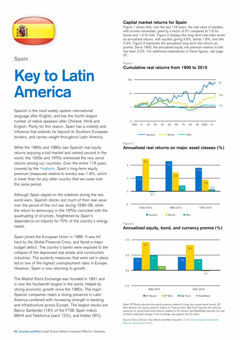
56_Country profiles Credit Suisse Global Investment Returns Yearbook
Spain
Key to Latin America
Spanish is the most widely spoken international
language after English, and has the fourth-largest
number of native speakers after Chinese, Hindi and
English. Partly for this reason, Spain has a visibility and
influence that extends far beyond its Southern European
borders, and carries weight throughout Latin America.
While the 1960s and 1980s saw Spanish real equity
returns enjoying a bull market and ranked second in the
world, the 1930s and 1970s witnessed the very worst
returns among our countries. Over the entire 116 years
covered by the Yearbook, Spain’s long-term equity
premium (measured relative to bonds) was 1.8%, which
is lower than for any other country that we cover over
the same period.
Although Spain stayed on the sidelines during the two
world wars, Spanish stocks lost much of their real value
over the period of the civil war during 1936–39, while
the return to democracy in the 1970s coincided with the
quadrupling of oil prices, heightened by Spain’s
dependence on imports for 70% of the country’s energy
needs.
Spain joined the European Union in 1986. It was hit
hard by the Global Financial Crisis, and faced a major
budget deficit. The country’s banks were exposed to the
collapse of the depressed real estate and construction
industries. The austerity measures that were set in place
led to one of the highest unemployment rates in Europe.
However, Spain is now returning to growth.
The Madrid Stock Exchange was founded in 1831 and
is now the fourteenth-largest in the world, helped by
strong economic growth since the 1980s. The major
Spanish companies retain a strong presence in Latin
America combined with increasing strength in banking
and infrastructure across Europe. The largest stocks are
Banco Santander (18% of the FTSE Spain index),
BBVA and Telefonica (each 12%), and Inditex (9%).
Capital market returns for Spain Figure 1 shows that, over the last 116 years, the real value of equities,
with income reinvested, grew by a factor of 61 compared to 7.8 for
bonds and 1.4 for bills. Figure 2 displays the long-term real index levels
as annualized returns, with equities giv ing 3.6%, bonds 1.8%, and bills
0.3%. Figure 3 expresses the annualized long-term real returns as
premia. Since 1900, the annualized equity risk premium relative to bills
has been 3.3%. For additional explanations of these figures, see page
37.
Figure 1
Cumulative real returns from 1900 to 2015
Figure 2
Annualized real returns on major asset classes (%)
Figure 3
Annualized equity, bond, and currency premia (%)
Note: EP Bonds denotes the equity premium relative to long-term government bonds; EP
Bills denotes the equity premium relative to Treasury bills; Mat Prem denotes the maturity
premium for government bond returns relative to bill returns; and RealXRate deno tes the real
(inflation-adjusted) change in the exchange rate against the US dollar.
Source: Elroy Dimson, Paul Marsh and Mike Staunton, Credit Suisse Global Investment
Returns Sourcebook 2016
61
7.8
1.4
0
1
10
100
1900 10 20 30 40 50 60 70 80 90 2000 10
Equities Bonds Bills
2.3
4.6
3.6
5.0
2.9
1.8
-0.1
0.9 0.3
-2
0
2
4
2000–2015 1966–2015 1900–2015
Equities Bonds Bills
1.7 1.8
3.7
3.3
2.0
1.5
0.6
-0.1
-2.0
0.0
2.0
4.0
1966–2015 1900–2015
EP Bonds EP Bills Mat Prem RealXRate
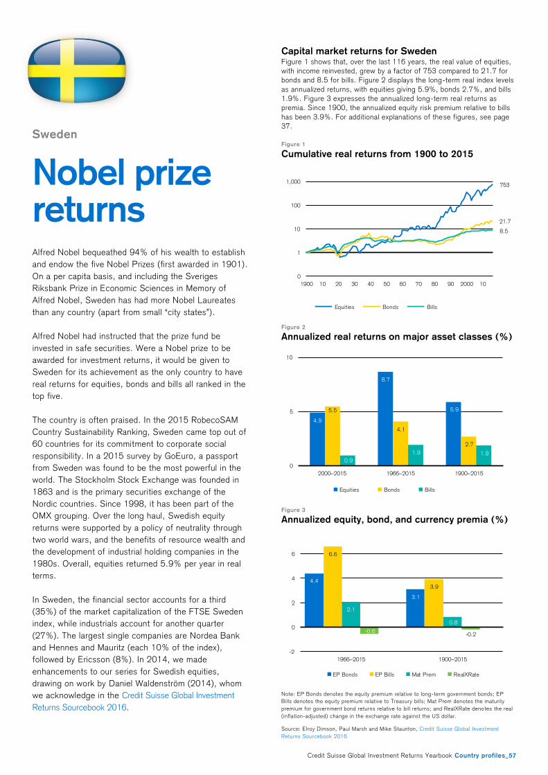
Credit Suisse Global Investment Returns Yearbook Country profiles_57
Sweden
Nobel prize returns
Alfred Nobel bequeathed 94% of his wealth to establish
and endow the five Nobel Prizes (first awarded in 1901).
On a per capita basis, and including the Sveriges
Riksbank Prize in Economic Sciences in Memory of
Alfred Nobel, Sweden has had more Nobel Laureates
than any country (apart from small “city states”).
Alfred Nobel had instructed that the prize fund be
invested in safe securities. Were a Nobel prize to be
awarded for investment returns, it would be given to
Sweden for its achievement as the only country to have
real returns for equities, bonds and bills all ranked in the
top five.
The country is often praised. In the 2015 RobecoSAM
Country Sustainability Ranking, Sweden came top out of
60 countries for its commitment to corporate social
responsibility. In a 2015 survey by GoEuro, a passport
from Sweden was found to be the most powerful in the
world. The Stockholm Stock Exchange was founded in
1863 and is the primary securities exchange of the
Nordic countries. Since 1998, it has been part of the
OMX grouping. Over the long haul, Swedish equity
returns were supported by a policy of neutrality through
two world wars, and the benefits of resource wealth and
the development of industrial holding companies in the
1980s. Overall, equities returned 5.9% per year in real
terms.
In Sweden, the financial sector accounts for a third
(35%) of the market capitalization of the FTSE Sweden
index, while industrials account for another quarter
(27%). The largest single companies are Nordea Bank
and Hennes and Mauritz (each 10% of the index),
followed by Ericsson (8%). In 2014, we made
enhancements to our series for Swedish equities,
drawing on work by Daniel Waldenström (2014), whom
we acknowledge in the Credit Suisse Global Investment
Returns Sourcebook 2016.
Capital market returns for Sweden Figure 1 shows that, over the last 116 years, the real value of equities,
with income reinvested, grew by a factor of 753 compared to 21.7 for
bonds and 8.5 for bills. Figure 2 displays the long-term real index levels
as annualized returns, with equities giving 5.9%, bonds 2.7%, and bills
1.9%. Figure 3 expresses the annualized long-term real returns as
premia. Since 1900, the annualized equity risk premium relative to bills
has been 3.9%. For additional explanations of these figures, see page
37.
Figure 1
Cumulative real returns from 1900 to 2015
Figure 2
Annualized real returns on major asset classes (%)
Figure 3
Annualized equity, bond, and currency premia (%)
Note: EP Bonds denotes the equity premium relative to long-term government bonds; EP
Bills denotes the equity premium relative to Treasury bills; Mat Prem denotes the maturity
premium for government bond returns relative to bill returns; and RealXRate deno tes the real
(inflation-adjusted) change in the exchange rate against the US dollar.
Source: Elroy Dimson, Paul Marsh and Mike Staunton, Credit Suisse Global Investment
Returns Sourcebook 2016
753
21.7
8.5
0
1
10
100
1,000
1900 10 20 30 40 50 60 70 80 90 2000 10
Equities Bonds Bills
4.9
8.7
5.95.5
4.1
2.7
0.9
1.9 1.9
0
5
10
2000–2015 1966–2015 1900–2015
Equities Bonds Bills
4.4
3.1
6.6
3.9
2.1
0.8
-0.6-0.2
-2
0
2
4
6
1966–2015 1900–2015
EP Bonds EP Bills Mat Prem RealXRate
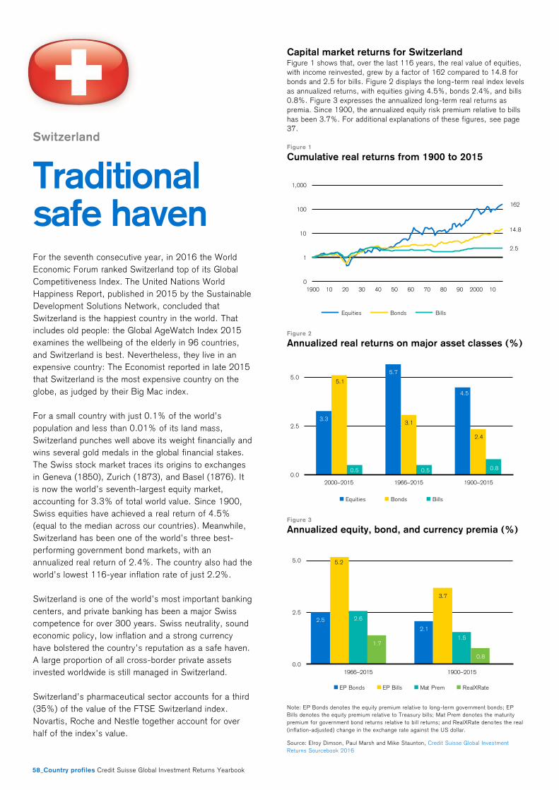
58_Country profiles Credit Suisse Global Investment Returns Yearbook
Switzerland
Traditional safe haven
For the seventh consecutive year, in 2016 the World
Economic Forum ranked Switzerland top of its Global
Competitiveness Index. The United Nations World
Happiness Report, published in 2015 by the Sustainable
Development Solutions Network, concluded that
Switzerland is the happiest country in the world. That
includes old people: the Global AgeWatch Index 2015
examines the wellbeing of the elderly in 96 countries,
and Switzerland is best. Nevertheless, they live in an
expensive country: The Economist reported in late 2015
that Switzerland is the most expensive country on the
globe, as judged by their Big Mac index.
For a small country with just 0.1% of the world’s
population and less than 0.01% of its land mass,
Switzerland punches well above its weight financially and
wins several gold medals in the global financial stakes.
The Swiss stock market traces its origins to exchanges
in Geneva (1850), Zurich (1873), and Basel (1876). It
is now the world’s seventh-largest equity market,
accounting for 3.3% of total world value. Since 1900,
Swiss equities have achieved a real return of 4.5%
(equal to the median across our countries). Meanwhile,
Switzerland has been one of the world’s three best-
performing government bond markets, with an
annualized real return of 2.4%. The country also had the
world’s lowest 116-year inflation rate of just 2.2%.
Switzerland is one of the world’s most important banking
centers, and private banking has been a major Swiss
competence for over 300 years. Swiss neutrality, sound
economic policy, low inflation and a strong currency
have bolstered the country’s reputation as a safe haven.
A large proportion of all cross-border private assets
invested worldwide is still managed in Switzerland.
Switzerland’s pharmaceutical sector accounts for a third
(35%) of the value of the FTSE Switzerland index.
Novartis, Roche and Nestle together account for over
half of the index’s value.
Capital market returns for Switzerland Figure 1 shows that, over the last 116 years, the real value of equities,
with income reinvested, grew by a factor of 162 compared to 14.8 for
bonds and 2.5 for bills. Figure 2 displays the long-term real index levels
as annualized returns, with equities g iving 4.5%, bonds 2.4%, and bills
0.8%. Figure 3 expresses the annualized long-term real returns as
premia. Since 1900, the annualized equity risk premium relative to bills
has been 3.7%. For additional explanations of these figures, see page
37.
Figure 1
Cumulative real returns from 1900 to 2015
Figure 2
Annualized real returns on major asset classes (%)
Figure 3
Annualized equity, bond, and currency premia (%)
Note: EP Bonds denotes the equity premium relative to long-term government bonds; EP
Bills denotes the equity premium relative to Treasury bills; Mat Prem denotes the maturity
premium for government bond returns relative to bill returns; and RealXRate deno tes the real
(inflation-adjusted) change in the exchange rate against the US dollar.
Source: Elroy Dimson, Paul Marsh and Mike Staunton, Credit Suisse Global Investment
Returns Sourcebook 2016
162
14.8
2.5
0
1
10
100
1,000
1900 10 20 30 40 50 60 70 80 90 2000 10
Equities Bonds Bills
3.3
5.7
4.5
5.1
3.1
2.4
0.5 0.5 0.80.0
2.5
5.0
2000–2015 1966–2015 1900–2015
Equities Bonds Bills
2.5
2.1
5.2
3.7
2.6
1.51.7
0.8
0.0
2.5
5.0
1966–2015 1900–2015
EP Bonds EP Bills Mat Prem RealXRate
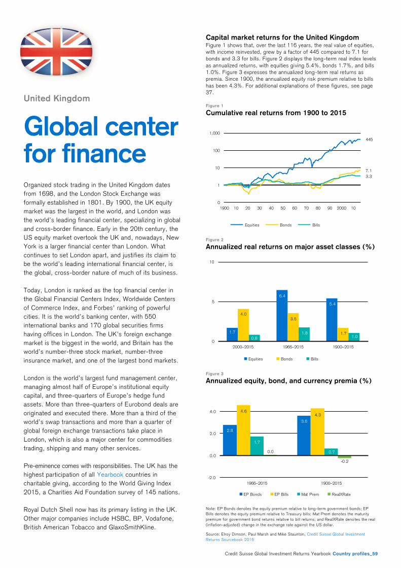
Credit Suisse Global Investment Returns Yearbook Country profiles_59
United Kingdom
Global center for finance Organized stock trading in the United Kingdom dates
from 1698, and the London Stock Exchange was
formally established in 1801. By 1900, the UK equity
market was the largest in the world, and London was
the world’s leading financial center, specializing in global
and cross-border finance. Early in the 20th century, the
US equity market overtook the UK and, nowadays, New
York is a larger financial center than London. What
continues to set London apart, and justifies its claim to
be the world’s leading international financial center, is
the global, cross-border nature of much of its business.
Today, London is ranked as the top financial center in
the Global Financial Centers Index, Worldwide Centers
of Commerce Index, and Forbes’ ranking of powerful
cities. It is the world’s banking center, with 550
international banks and 170 global securities firms
having offices in London. The UK’s foreign exchange
market is the biggest in the world, and Britain has the
world’s number-three stock market, number-three
insurance market, and one of the largest bond markets.
London is the world’s largest fund management center,
managing almost half of Europe’s institutional equity
capital, and three-quarters of Europe’s hedge fund
assets. More than three-quarters of Eurobond deals are
originated and executed there. More than a third of the
world’s swap transactions and more than a quarter of
global foreign exchange transactions take place in
London, which is also a major center for commodities
trading, shipping and many other services.
Pre-eminence comes with responsibilities. The UK has the
highest participation of all Yearbook countries in
charitable giving, according to the World Giving Index
2015, a Charities Aid Foundation survey of 145 nations.
Royal Dutch Shell now has its primary listing in the UK.
Other major companies include HSBC, BP, Vodafone,
British American Tobacco and GlaxoSmithKline.
Capital market returns for the United Kingdom Figure 1 shows that, over the last 116 years, the real value of equities,
with income reinvested, grew by a factor of 445 compared to 7.1 for
bonds and 3.3 for bills. Figure 2 displays the long-term real index levels
as annualized returns, with equities giving 5.4%, bonds 1.7%, and bills
1.0%. Figure 3 expresses the annualized long-term real returns as
premia. Since 1900, the annualized equity risk premium relative to bills
has been 4.3%. For additional explanations of these figures, see page
37.
Figure 1
Cumulative real returns from 1900 to 2015
Figure 2
Annualized real returns on major asset classes (%)
Figure 3
Annualized equity, bond, and currency premia (%)
Note: EP Bonds denotes the equity premium relative to long-term government bonds; EP
Bills denotes the equity premium relative to Treasury bills; Mat Prem denotes the maturity
premium for government bond returns relative to bill returns; and RealXRate deno tes the real
(inflation-adjusted) change in the exchange rate against the US dollar.
Source: Elroy Dimson, Paul Marsh and Mike Staunton, Credit Suisse Global Investment
Returns Sourcebook 2016
445
7.1
3.3
0
1
10
100
1,000
1900 10 20 30 40 50 60 70 80 90 2000 10
Equities Bonds Bills
1.7
6.4
5.4
4.03.5
1.70.8
1.81.0
0
5
10
2000–2015 1966–2015 1900–2015
Equities Bonds Bills
2.8
3.6
4.64.3
1.7
0.70.0
-0.2
-2.0
0.0
2.0
4.0
1966–2015 1900–2015
EP Bonds EP Bills Mat Prem RealXRate
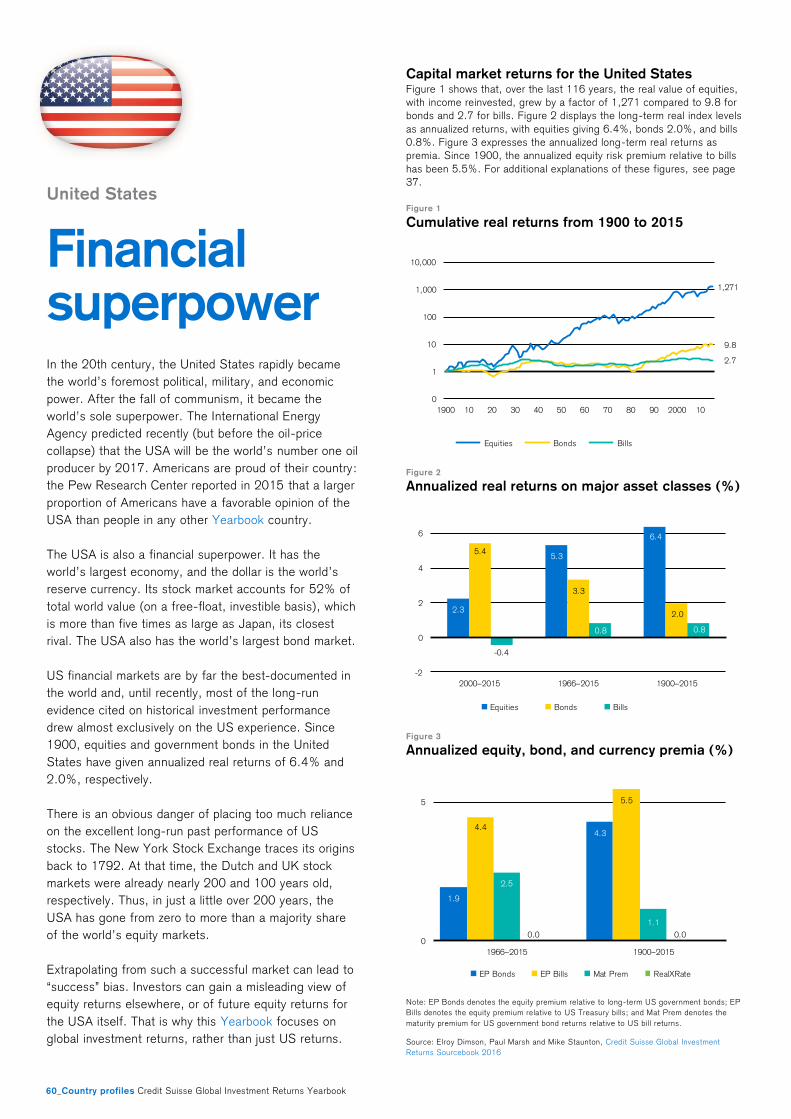
60_Country profiles Credit Suisse Global Investment Returns Yearbook
United States
Financial superpower
In the 20th century, the United States rapidly became
the world’s foremost political, military, and economic
power. After the fall of communism, it became the
world’s sole superpower. The International Energy
Agency predicted recently (but before the oil-price
collapse) that the USA will be the world’s number one oil
producer by 2017. Americans are proud of their country:
the Pew Research Center reported in 2015 that a larger
proportion of Americans have a favorable opinion of the
USA than people in any other Yearbook country.
The USA is also a financial superpower. It has the
world’s largest economy, and the dollar is the world’s
reserve currency. Its stock market accounts for 52% of
total world value (on a free-float, investible basis), which
is more than five times as large as Japan, its closest
rival. The USA also has the world’s largest bond market.
US financial markets are by far the best-documented in
the world and, until recently, most of the long-run
evidence cited on historical investment performance
drew almost exclusively on the US experience. Since
1900, equities and government bonds in the United
States have given annualized real returns of 6.4% and
2.0%, respectively.
There is an obvious danger of placing too much reliance
on the excellent long-run past performance of US
stocks. The New York Stock Exchange traces its origins
back to 1792. At that time, the Dutch and UK stock
markets were already nearly 200 and 100 years old,
respectively. Thus, in just a little over 200 years, the
USA has gone from zero to more than a majority share
of the world’s equity markets.
Extrapolating from such a successful market can lead to
“success” bias. Investors can gain a misleading view of
equity returns elsewhere, or of future equity returns for
the USA itself. That is why this Yearbook focuses on
global investment returns, rather than just US returns.
Capital market returns for the United States Figure 1 shows that, over the last 116 years, the real value of equities,
with income reinvested, grew by a factor of 1,271 compared to 9.8 for
bonds and 2.7 for bills. Figure 2 displays the long-term real index levels
as annualized returns, with equities giving 6.4%, bonds 2.0%, and bills
0.8%. Figure 3 expresses the annualized long-term real returns as
premia. Since 1900, the annualized equity risk premium relative to bills
has been 5.5%. For additional explanations of these figures, see page
37.
Figure 1
Cumulative real returns from 1900 to 2015
Figure 2
Annualized real returns on major asset classes (%)
Figure 3
Annualized equity, bond, and currency premia (%)
Note: EP Bonds denotes the equity premium relative to long-term US government bonds; EP
Bills denotes the equity premium relative to US Treasury bills; and Mat Prem denotes the
maturity premium for US government bond returns relative to US bill returns.
Source: Elroy Dimson, Paul Marsh and Mike Staunton, Credit Suisse Global Investment
Returns Sourcebook 2016
1,271
9.8
2.7
0
1
10
100
1,000
10,000
1900 10 20 30 40 50 60 70 80 90 2000 10
Equities Bonds Bills
2.3
5.3
6.4
5.4
3.3
2.0
-0.4
0.8 0.8
-2
0
2
4
6
2000–2015 1966–2015 1900–2015
Equities Bonds Bills
1.9
4.34.4
5.5
2.5
1.1
0.0 0.00
5
1966–2015 1900–2015
EP Bonds EP Bills Mat Prem RealXRate
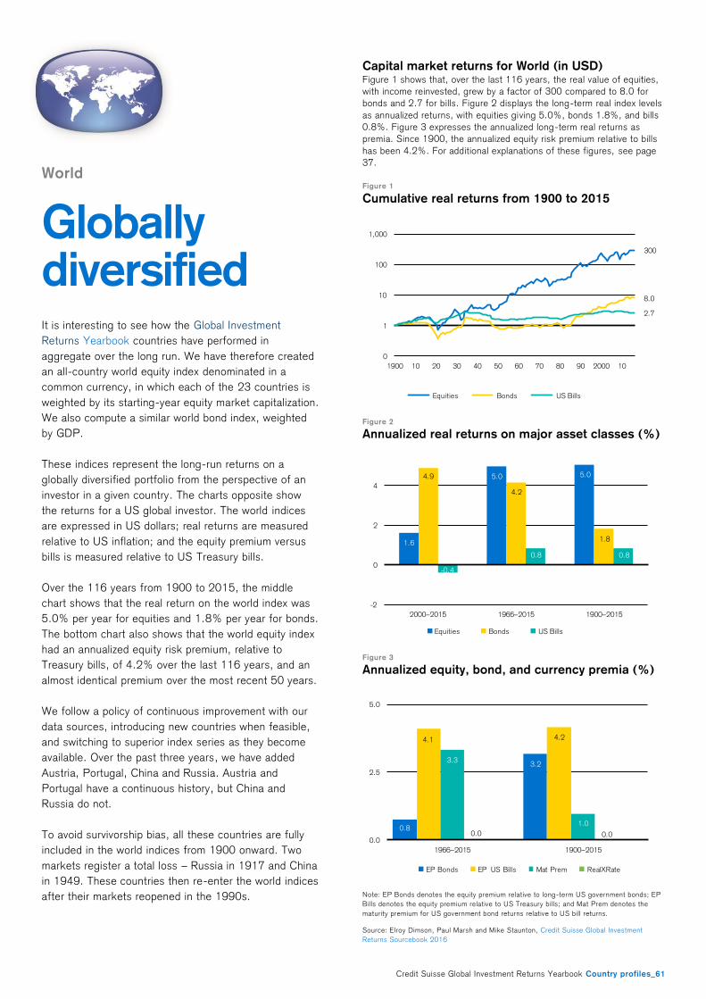
Credit Suisse Global Investment Returns Yearbook Country profiles_61
World
Globally diversified
It is interesting to see how the Global Investment
Returns Yearbook countries have performed in
aggregate over the long run. We have therefore created
an all-country world equity index denominated in a
common currency, in which each of the 23 countries is
weighted by its starting-year equity market capitalization.
We also compute a similar world bond index, weighted
by GDP.
These indices represent the long-run returns on a
globally diversified portfolio from the perspective of an
investor in a given country. The charts opposite show
the returns for a US global investor. The world indices
are expressed in US dollars; real returns are measured
relative to US inflation; and the equity premium versus
bills is measured relative to US Treasury bills.
Over the 116 years from 1900 to 2015, the middle
chart shows that the real return on the world index was
5.0% per year for equities and 1.8% per year for bonds.
The bottom chart also shows that the world equity index
had an annualized equity risk premium, relative to
Treasury bills, of 4.2% over the last 116 years, and an
almost identical premium over the most recent 50 years.
We follow a policy of continuous improvement with our
data sources, introducing new countries when feasible,
and switching to superior index series as they become
available. Over the past three years, we have added
Austria, Portugal, China and Russia. Austria and
Portugal have a continuous history, but China and
Russia do not.
To avoid survivorship bias, all these countries are fully
included in the world indices from 1900 onward. Two
markets register a total loss – Russia in 1917 and China
in 1949. These countries then re-enter the world indices
after their markets reopened in the 1990s.
Capital market returns for World (in USD) Figure 1 shows that, over the last 116 years, the real value of equities,
with income reinvested, grew by a factor of 300 compared to 8.0 for
bonds and 2.7 for bills. Figure 2 displays the long-term real index levels
as annualized returns, with equities giving 5.0%, bonds 1.8%, and bills
0.8%. Figure 3 expresses the annualized long-term real returns as
premia. Since 1900, the annualized equity risk premium relative to bills
has been 4.2%. For additional explanations of these figures, see page
37.
Figure 1
Cumulative real returns from 1900 to 2015
Figure 2
Annualized real returns on major asset classes (%)
Figure 3
Annualized equity, bond, and currency premia (%)
Note: EP Bonds denotes the equity premium relative to long-term US government bonds; EP
Bills denotes the equity premium relative to US Treasury bills; and Mat Prem denotes the
maturity premium for US government bond returns relative to US bill returns.
Source: Elroy Dimson, Paul Marsh and Mike Staunton, Credit Suisse Global Investment
Returns Sourcebook 2016
300
8.0
2.7
0
1
10
100
1,000
1900 10 20 30 40 50 60 70 80 90 2000 10
Equities Bonds US Bills
1.6
5.0 5.04.9
4.2
1.8
-0.4
0.8 0.8
-2
0
2
4
2000–2015 1966–2015 1900–2015
Equities Bonds US Bills
0.8
3.2
4.1 4.2
3.3
1.0
0.0 0.00.0
2.5
5.0
1966–2015 1900–2015
EP Bonds EP US Bills Mat Prem RealXRate
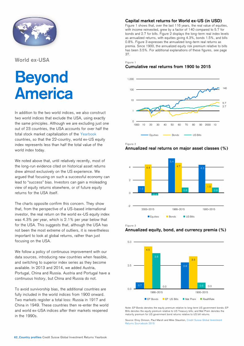
62_Country profiles Credit Suisse Global Investment Returns Yearbook
Capital market returns for World ex-US (in USD) Figure 1 shows that, over the last 116 years, the real value of equities,
with income reinvested, grew by a factor of 140 compared to 5.7 for
bonds and 2.7 for bills. Figure 2 displays the long-term real index levels
as annualized returns, with equities giving 4.3%, bonds 1.5%, and bills
0.8%. Figure 3 expresses the annualized long-term real returns as
premia. Since 1900, the annualized equity risk premium relative to bills
has been 3.5%. For additional explanations of these figures, see page
37.
Figure 1
Cumulative real returns from 1900 to 2015
Figure 2
Annualized real returns on major asset classes (%)
Figure 3
Annualized equity, bond, and currency premia (%)
Note: EP Bonds denotes the equity premium relative to long-term US government bonds; EP
Bills denotes the equity premium relative to US Treasury bills; and Mat Prem denotes the
maturity premium for US government bond returns relative to US bill returns.
Source: Elroy Dimson, Paul Marsh and Mike Staunton, Credit Suisse Global Investment
Returns Sourcebook 2016
140
5.7
2.7
0
1
10
100
1,000
1900 10 20 30 40 50 60 70 80 90 2000 10
Equities Bonds US Bills
1.0
5.4
4.34.44.7
1.5
-0.4
0.8 0.8
-2
0
2
4
2000–2015 1966–2015 1900–2015
Equities Bonds US Bills
0.7
2.8
4.5
3.53.8
0.60.0 0.00.0
2.5
5.0
1966–2015 1900–2015
EP Bonds EP US Bills Mat Prem RealXRate
World ex-USA
Beyond America
In addition to the two world indices, we also construct
two world indices that exclude the USA, using exactly
the same principles. Although we are excluding just one
out of 23 countries, the USA accounts for over half the
total stock market capitalization of the Yearbook
countries, so that the 22-country, world ex-US equity
index represents less than half the total value of the
world index today.
We noted above that, until relatively recently, most of
the long-run evidence cited on historical asset returns
drew almost exclusively on the US experience. We
argued that focusing on such a successful economy can
lead to “success” bias. Investors can gain a misleading
view of equity returns elsewhere, or of future equity
returns for the USA itself.
The charts opposite confirm this concern. They show
that, from the perspective of a US-based international
investor, the real return on the world ex-US equity index
was 4.3% per year, which is 2.1% per year below that
for the USA. This suggests that, although the USA has
not been the most extreme of outliers, it is nevertheless
important to look at global returns, rather than just
focusing on the USA.
We follow a policy of continuous improvement with our
data sources, introducing new countries when feasible,
and switching to superior index series as they become
available. In 2013 and 2014, we added Austria,
Portugal, China and Russia. Austria and Portugal have a
continuous history, but China and Russia do not.
To avoid survivorship bias, the additional countries are
fully included in the world indices from 1900 onward.
Two markets register a total loss: Russia in 1917 and
China in 1949. These countries then re-enter the world
and world ex-USA indices after their markets reopened
in the 1990s.
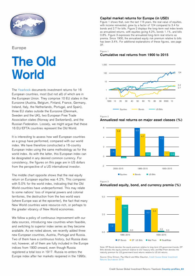
Credit Suisse Global Investment Returns Yearbook Country profiles_63
Europe
The Old World
The Yearbook documents investment returns for 16
European countries, most (but not all) of which are in
the European Union. They comprise 10 EU states in the
Eurozone (Austria, Belgium, Finland, France, Germany,
Ireland, Italy, the Netherlands, Portugal, and Spain),
three EU states outside the Eurozone (Denmark,
Sweden and the UK), two European Free Trade
Association states (Norway and Switzerland), and the
Russian Federation. Loosely, we might argue that these
16 EU/EFTA countries represent the Old World.
It is interesting to assess how well European countries
as a group have performed, compared with our world
index. We have therefore constructed a 16-country
European index using the same methodology as for the
world index. As with the latter, this European index can
be designated in any desired common currency. For
consistency, the figures on this page are in US dollars
from the perspective of a US international investor.
The middle chart opposite shows that the real equity
return on European equities was 4.2%. This compares
with 5.0% for the world index, indicating that the Old
World countries have underperformed. This may relate
to some nations’ loss of imperial powers and colonial
territories, the destruction from the two world wars
(where Europe was at the epicenter), the fact that many
New World countries were resource-rich, or perhaps to
the greater vibrancy of New World economies.
We follow a policy of continuous improvement with our
data sources, introducing new countries when feasible,
and switching to superior index series as they become
available. As we noted above, we recently added three
new European countries, Austria, Portugal and Russia.
Two of them have a continuous history, but Russia does
not; however, all of them are fully included in the Europe
indices from 1900 onward, even though Russia
registered a total loss in 1917. Russia re-enters the
Europe index after her markets reopened in the 1990s.
Capital market returns for Europe (in USD) Figure 1 shows that, over the last 116 years, the real value of equities,
with income reinvested, grew by a factor of 124 compared to 3.4 for
bonds and 2.7 for bills. Figure 2 displays the long-term real index levels
as annualized returns, with equities giving 4.2%, bonds 1.1%, and bills
0.8%. Figure 3 expresses the annualized long-term real returns as
premia. Since 1900, the annualized equity risk premium relative to bills
has been 3.4%. For additional explanations of these figures, see page
37.
Figure 1
Cumulative real returns from 1900 to 2015
Figure 2
Annualized real returns on major asset classes (%)
Figure 3
Annualized equity, bond, and currency premia (%)
Note: EP Bonds denotes the equity premium relative to long-term US government bonds; EP
Bills denotes the equity premium relative to US Treasury bills; and Mat Prem denotes the
maturity premium for US government bond returns relative to US bill returns.
Source: Elroy Dimson, Paul Marsh and Mike Staunton, Credit Suisse Global Investment
Returns Sourcebook 2016
124
3.4
2.7
0
1
10
100
1,000
1900 10 20 30 40 50 60 70 80 90 2000 10
Equities Bonds US Bills
1.6
6.0
4.2
5.8
4.7
1.1
-0.4
0.8 0.8
-2
0
2
4
6
2000–2015 1966–2015 1900–2015
Equities Bonds US Bills
1.2
3.2
5.1
3.4
3.9
0.20.0 0.0
0.0
2.5
5.0
1966–2015 1900–2015
EP Bonds EP US Bills Mat Prem RealXRate

PH
OTO
: S
CR
EE
NY
/ P
HO
TOC
AS
E.D
E

Credit Suisse Global Investment Returns Yearbook_65
References
Artprice, 2013. Artprice Global Indices.
http://imgpublic.artprice.com/pdf/agi.xls.
Barclays, 2012. Profit or pleasure? Exploring the motivations
behind treasure trends. Barclays Wealth Insights 15.
Bernanke, B.S., 1995. The macroeconomics of the Great
Depression: A comparative approach. Journal of Money, Credit
and Banking 27, 1–28.
Bernanke, B.S., Kuttner K.N., 2005. What explains the stock
market’s reaction to Federal Reserve policy. Journal of Finance
60, 1221–1257.
Bohl, Martin T., Siklos, P.L. Sondermann, D., 2008. European
stock markets and the ECB’s monetary policy surprises.
International Finance 11, 117–130.
Bredin, D., Hyde, S., Nitzsche, D., O’Reilly, G., 2007. UK stock
returns and the impact of domestic monetary policy shocks.
Journal of Business Finance & Accounting 34, 872–888.
Capgemini and RBC Wealth Management, 2015. World Wealth
Report 2015.
Cieslak, A., Pavol, P., 2014. Expecting the Fed.
ssrn.com/id=2239725.
Colvin, G., 2011. Caterpillar is absolutely crushing it. Fortune 23
May, 136–144.
Conover, C.M., Jensen, G.R., Johnson, R.R., Mercer, J.M.,
2008. Sector rotation and monetary conditions. Journal of
Investing Spring, 34–46.
Dimson, E., 1979. Risk measurement when shares are subject
to infrequent trading. Journal of Financial Economics 7, 197–
226.
Dimson, E., Marsh, P., Staunton, M., 2002. Triumph of the
Optimists: 101 Years of Global Investment Returns. Princeton
NJ: Princeton University Press.
Dimson, E., Marsh, P., Staunton, M., 2012. The real value of
money, Global Investment Returns Yearbook. Zurich: Credit
Suisse Research Institute.
Dimson, E., Marsh, P., Staunton, M., 2015. Industries: Their
rise and fall, Global Investment Returns Yearbook. Zurich: Credit
Suisse Research Institute.
Dimson, E., Marsh, P., Staunton, M., 2016. Global Investment
Returns Sourcebook. Zurich: Credit Suisse Research Institute.
Dimson, E., Nagel, S., Quigley, G., 2003. Capturing the value
premium in the UK. Financial Analysts Journal 59, 35–45.
Dimson, E., Rousseau, P., Spaenjers, C., 2015. The price of
wine. Journal of Financial Economics 118, 431–449.
Dimson, E., Spaenjers, C., 2011. Ex post: The investment
performance of collectible stamps. Journal of Financial
Economics 100, 443–458.
Dimson, E., Spaenjers, C., 2014. Investing in emotional assets.
Financial Analysts Journal 70, 20–25.
Fama, E.F., French, K.R., 2015a. A five-factor asset pricing
model. Journal of Financial Economics 116, 1–22.
Fama, E.F., French, K.R., 2015b. Incremental variables and the
investment opportunity set. Journal of Financial Economics 117,
470–488.
Fama, E.F., French, K.R., 2015c. Choosing factors. Tuck
School of Business Working Paper No. 2668236.
ssrn.com/id=2668236.
Fama, E.F., French, K.R., 2015d. International Tests of a Five-
Factor Asset Pricing Model. Tuck School of Business Working
Paper No. 2622782. ssrn.com/id=2622782.
Fama, E.F., French, K.R., 2016. Dissecting anomalies with a
five-factor model. Review of Financial Studies 29, 69–103.
Goetzmann, W., Renneboog, L., Spaenjers, C., 2011. Art and
money. American Economic Review 101, 222–226.
Graddy, K., Margolis, P., 2011. Fiddling with value: violins as an
investment? Economic Inquiry 49, 1083–1097.
Graddy, K., Margolis, P., 2013. Old Italian violins: A new
investment strategy? Global Finance Brief 8. Brandeis
International Business School.

66_Credit Suisse Global Investment Returns Yearbook
Griffin, J., Ji, X., Martin, S., 2003. Momentum investing and
business cycle risk: evidence from pole to pole. Journal of
Finance 58, 2515–2547.
Hoffman, C., 1970. The Depression of the Nineties: An
Economic History. Contributions in Economics and Economic
History. Westport CT: Greenwood Publishing Corporation.
James, P.C., Kim, I., Cheh, J.J., 2014. Sector rotation and
interest rate policy. International Journal of Business and Social
Research 4, 1–7.
Jensen, G.R., Johnson, R.R., 1993. An examination of stock
price reactions to discount rate changes under alternative
monetary policy regimes. Quarterly Journal of Business and
Economics 32, 25–51.
Kuttner, K.N., 2001. Monetary policy surprises and interest
rates: Evidence from the Fed funds. Journal of Monetary
Economics 47, 523–544.
Lebergott, S., 1964. Manpower in economic growth: The
American record since 1800. New York: McGraw-Hill.
Miron, J.A., Romer, C.D., 1990. A new monthly index of
industrial production, 1884–1940. Journal of Economic History
50, 321–337.
Monnery, N., 2011. Safe as Houses? A Historical Analysis of
Property Prices. London: London Publishing Partnership.
Nationwide, 2015. UK House Prices Adjusted for Inflation.
www.nationwide.co.uk/about/house-price-index.
Officer, L., Williamson, S., 2015. The Price of Gold, 1257–
Present. www.measuringworth.com/gold.
Rigobon, R., Sack, B., 2003. Measuring the response of
monetary policy to the stock market. Quarterly Journal of
Economics 118, 639–669.
Romer, C., 1986. Spurious volatility in historical unemployment
data. Journal of Political Economy 94, 1–37.
Rosa, C., 2011. The high-frequency response of exchange rates
to monetary policy actions and statements. Journal of Banking &
Finance 35, 478–489.
Savills, 2015. Market Survey UK Agricultural Land 2015. Savills
World Research.
Shiller, R., 2015a. Irrational Exuberance (Third edition).
Princeton NJ: Princeton University Press.
Shiller, R., 2015b. Online data.
www.econ.yale.edu/~shiller/data.htm.
Spaenjers, C., 2016. The long-term return to durable assets. In
Chambers, A.D., Dimson, E. (Eds) Financial Market History.
CFA Institute Research Foundation, forthcoming.
Stangl, J., Jacobsen, B., Visaltanachoti, N., 2008. Sector
rotation: timing the cycles. Infinz Journal Sept, 18–24.
Stangl, J., Jacobsen, B., Visaltanachoti, N., 2009. Sector
rotation over business cycles. Working paper, Massey University,
Auckland, New Zealand.
U.S. Department of Agriculture, 1973. Farm Real Estate
Historical Series Data: 1850–1970. Economic Research
Service, Washington DC: U.S. Department of Agriculture.
U.S. Department of Agriculture, 2015. Trends in Farmland
Values. www.ers.usda.gov/topics/farm-economy/land-use,-
land-value-tenure.
Waud, Roger N., 1970. Public interpretation of Federal Reserve
discount rate changes: Evidence on the "announcement effect".
Econometrica 38, 231–250.
Wilmot, J., Sweeney, J., Klein, M., Lantz, C., 2009. Long
Shadows, Collateral Money, Asset Bubbles, and Inflation. Credit
Suisse research note
Grossman, R.S., 2002. New indices of British equity prices,
1870–1913. The Journal of Economic History, 62(01), pp.121–
146.
Mitchener, K.J. and Weidenmier, M.D., 2008. The Baring crisis
and the great Latin American meltdown of the 1890s. Journal of
Economic History, 68(02), pp.462–500.

Credit Suisse Global Investment Returns Yearbook_67
Authors
Elroy Dimson
Elroy Dimson is Chairman of the Centre for Endowment Asset
Management at Cambridge Judge Business School, Emeritus
Professor of Finance at London Business School, and a Director
of FTSE International. He previously served London Business
School in a variety of senior positions. With Paul Marsh and Mike
Staunton, he wrote Triumph of the Optimists, and he has
published in Journal of Finance, Journal of Financial Economics,
Review of Financial Studies, Journal of Business, Journal of
Portfolio Management, Financial Analysts Journal, and other
journals. His PhD in Finance is from London Business School.
Paul Marsh
Paul Marsh is Emeritus Professor of Finance at London
Business School. Within London Business School he has been
Chair of the Finance area, Deputy Principal, Faculty Dean, an
elected Governor and Dean of the Finance Programmes,
including the Masters in Finance. He has advised on several
public enquiries; was previously Chairman of Aberforth Smaller
Companies Trust, and a non-executive director of M&G Group
and Majedie Investments; and has acted as a consultant to a
wide range of financial institutions and companies. Dr Marsh has
published articles in Journal of Business, Journal of Finance,
Journal of Financial Economics, Journal of Portfolio
Management, Harvard Business Review, and other journals.
With Elroy Dimson, he co-designed the FTSE 100-Share Index
and the Numis Smaller Companies Index, produced since 1987
at London Business School. His PhD in Finance is from London
Business School.
Mike Staunton
Mike Staunton is Director of the London Share Price Database,
a research resource of London Business School, where he
produces the London Business School Risk Measurement
Service. He has taught at universities in the United Kingdom,
Hong Kong, France and Switzerland. Dr Staunton is co-author
with Mary Jackson of Advanced Modelling in Finance Using
Excel and VBA, published by Wiley, and writes a regular column
for Wilmott magazine. He has had articles published in Journal of
Banking & Finance, Financial Analysts Journal, Journal of the
Operations Research Society, and Quantitative Finance. With
Elroy Dimson and Paul Marsh, he co-authored the influential
investment book Triumph of the Optimists, published by
Princeton University Press, which underpins this Yearbook and
the accompanying Credit Suisse Global Investment Returns
Sourcebook 2016. His PhD in Finance is from London Business
School.
Jonathan Wilmot
Jonathan Wilmot is a Managing Director of Credit Suisse, based
in London. He joined the firm in 1985 and is currently Head of
Macroeconomic Research within Asset Management. Prior to his
current role, Mr Wilmot was the Chief Global Strategist in the
Fixed Income Division of the Investment Bank and vice-chairman
in Private Banking Research. He developed the CS Global Risk
Appetite Index in 1997. Mr Wilmot is known throughout the
industry as a leading macro-thinker and investment strategist.
He continues to work with the bank's major clients across the
Investment Banking and Private Banking & Wealth Management
divisions. He is a member of the bank's Global Economics and
Strategy Group and CS Research Institute. Mr Wilmot joined
Credit Suisse First Boston from Bank of America where he
worked as an international economist. He holds a degree in
Philosophy, Politics and Economics from Oxford University.

ISBN 978-3-9524302-4-8
To receive a copy of the Yearbook or Sourcebook (non-clients): This Yearbook is distributed by London Business School. The accompanying volume, which contains detailed tables, charts, listings, background, sources, and bibliographic data, is called the Credit Suisse Global Investment Returns Sourcebook 2016. The Sourcebook includes detailed tables, charts, listings, background, sources, and bibliographic data. Format: A4 color, perfect bound, 224 pages, 30 chapters, 152 charts, 85 tables, 145 references. ISBN 978-3-9524302-5-5. Please address requests to Patricia Rowham, London Business School, Regents Park, London NW1 4SA, United Kingdom, tel +44 20 7000 7000, fax +44 20 7000 7001, e-mail [email protected]. E-mail is preferred.
To gain access to the underlying data: The Dimson-Marsh-Staunton dataset is distributed by Morningstar Inc. Please ask for the DMS data module. Further guidelines on subscribing to the data are available at www.tinyurl.com/DMSsourcebook.
To quote from this publication: To obtain permission, contact the authors with details of the required extracts, data, charts, tables or exhibits. In addition to citing this publication, documents that incorporate reproduced or derived materials must include a reference to Elroy Dimson, Paul Marsh and Mike Staunton, Triumph of the Optimists: 101 Years of Global Investment Returns, Princeton University Press, 2002. Apart from the article on pages 27–35, each chart and table must carry the acknowledgement Copyright © 2016 Elroy Dimson, Paul Marsh and Mike Staunton. If granted permission, a copy of published materials must be sent to the authors at London Business School, Regents Park, London NW1 4SA, United Kingdom.
Copyright © 2016 Elroy Dimson, Paul Marsh and Mike Staunton (excluding pages 27–35). All rights reserved. No part of this document may be reproduced or used in any form, including graphic, electronic, photo-copying, recording or information storage and retrieval systems, without prior written permission from the copyright holders.
ImprintPUBLISHERCREDIT SUISSE AGResearch InstituteParadeplatz 8CH-8070 ZurichSwitzerland
PRODUCTION MANAGEMENTINVESTMENT PUBLISHINGRoss HewittKatharina Schlatter
AUTHORSElroy Dimson, London Business School, [email protected] Marsh, London Business School, [email protected] Staunton, London Business School, [email protected] OF PAGES 27–35Jonathan A. Wilmot, Head of Macroeconomic Research, Credit Suisse Asset Management [email protected]
EDITORIAL DEADLINE29 January 2016
68_Credit Suisse Global Investment Returns Yearbook

General disclaimer / Important informationThis document was produced by and the opinions expressed are those of Credit Suisse as of the date of writing and are subject to change. It has been prepared solely for information purposes and for the use of the recipient. It does not constitute an offer or an invitation by or on behalf of Credit Suisse to any person to buy or sell any security. Nothing in this material constitutes investment, legal, accounting or tax advice, or a representation that any investment or strategy is suitable or appropriate to your individual circumstances, or otherwise constitutes a personal recommendation to you. The price and value of investments mentioned and any income that might accrue may fluctuate and may fall or rise. Any reference to past performance is not a guide to the future.The information and analysis contained in this publication have been compiled or arrived at from sources believed to be reliable but Credit Suisse does not make any representation as to their accuracy or completeness and does not accept liability for any loss arising from the use hereof. A Credit Suisse Group company may have acted upon the information and analysis contained in this publication before being made available to clients of Credit Suisse. Investments in emerging markets are speculative and considerably more volatile than investments in established markets. Some of the main risks are political risks, economic risks, credit risks, currency risks and market risks. Investments in foreign currencies are subject to exchange rate fluctuations. Any questions about topics raised in this piece or your investments should be made directly to your local relationship manager or other advisers. Before entering into any transaction, you should consider the suitability of the transaction to your particular circumstances and independently review (with your professional advisers as necessary) the specific financial risks as well as legal, regulatory, credit, tax and accounting consequences. This document is issued and distributed in the United States by Credit Suisse Securities (USA) LLC, a U.S. registered broker-dealer; in Canada by Credit Suisse Securities (Canada), Inc.; and in Brazil by Banco de Investimentos Credit Suisse (Brasil) S.A.This document is distributed in Switzerland by Credit Suisse AG, a Swiss bank. Credit Suisse is authorized and regulated by the Swiss Financial Market Supervisory Authority (FINMA). This document is issued and distributed in Europe (except Switzerland) by Credit Suisse (UK) Limited and Credit Suisse Securities (Europe) Limited. Credit Suisse Securities (Europe) Limited and Credit Suisse (UK) Limited, both authorized by the Prudential Regulation Authority and regulated by the Financial Conduct Authority and the Prudential Regulation Authority, are associated but independent legal entities within Credit Suisse. The protections made available by the Financial Conduct Authority and/or the Prudential Regulation Authority for retail clients do not apply to investments or services provided by a person outside the UK, nor will the Financial Services Compensation Scheme be available if the issuer of the investment fails to meet its obligations. To the extent communicated in the United Kingdom (“UK”) or capable of having an effect in the UK, this document constitutes a financial promotion which has been approved by Credit Suisse (UK) Limited which is authorized by the Prudential Regulation Authority and regulated by the Financial Conduct Authority and the Prudential Regulation Authority for the conduct of investment business in the UK. The registered address of Credit Suisse (UK) Limited is Five Cabot Square, London, E14 4QR. Please note that the rules under the UK’s Financial Services and Markets Act 2000 relating to the protection of retail clients will not be applicable to you and that any potential compensation made available to “eligible claimants” under the UK’s Financial Services Compensation Scheme will also not be available to you. Tax treatment depends on the individual circumstances of each client and may be subject to changes in future. This document is distributed in Guernsey by Credit Suisse (Channel Islands) Limited, an independent legal entity registered in Guernsey under 15197, with its registered address at Helvetia Court, Les Echelons, South Esplanade, St Peter Port, Guernsey. Credit Suisse (Channel Islands) Limited is wholly owned by Credit Suisse AG and is regulated by the Guernsey Financial Services Commission. Copies of the latest audited accounts are available on request. This document is distributed in Jersey by Credit Suisse (Channel Islands) Limited, Jersey Branch, which is regulated by the Jersey Financial Services Commission for the conduct of investment business. The address of Credit Suisse (Channel Islands) Limited, Jersey Branch, in Jersey is: TradeWind House, 22 Esplanade, St Helier, Jersey JE4 5WU. This document has been issued in Asia-Pacific by whichever of the following is the appropriately authorised entity of the relevant jurisdiction: in Hong Kong by Credit Suisse (Hong Kong) Limited, a corporation licensed with the Hong Kong Securities and Futures Commission or Credit Suisse Hong Kong branch, an Authorized Institution regulated by the Hong Kong Monetary Authority and a Registered Institution regulated by the Securities and Futures Ordinance (Chapter 571 of the Laws of Hong Kong); in Japan by Credit Suisse Securities (Japan) Limited; this document has been prepared and issued for distribution in Singapore to institutional investors, accredited investors and expert investors (each as defined under the Financial Advisers Regulations) only, and is also distributed by Credit Suisse AG, Singapore Branch to overseas investors (as defined under the Financial Advisers Regulations). Credit Suisse AG, Singapore Branch may distribute reports produced by its foreign entities or affiliates pursuant to an arrangement under Regulation 32C of the Financial Advisers Regulations. Singapore recipients should contact Credit Suisse AG, Singapore Branch at +65-6212-2000 for matters arising from, or in connection with, this report. By virtue of your status as an institutional investor, accredited investor, expert investor or overseas investor, Credit Suisse AG, Singapore Branch is exempted from complying with certain compliance requirements under the Financial Advisers Act, Chapter 110 of Singapore (the “FAA”), the Financial Advisers Regulations and the relevant Notices and Guidelines issued thereunder, in respect of any financial advisory service which Credit Suisse AG, Singapore branch may provide to you. ; elsewhere in Asia/Pacific by whichever of the following is the appropriately authorized entity in the relevant jurisdiction: Credit Suisse Equities (Australia) Limited, Credit Suisse Securities (Thailand) Limited, Credit Suisse Securities (Malaysia) Sdn Bhd, Credit Suisse AG, Singapore Branch, and elsewhere in the world by the relevant authorized affiliate of the above.This document may not be reproduced either in whole, or in part, without the written permission of the authors and Credit Suisse. © 2016 Credit Suisse Group AG and/or its affiliates. All rights reserved
Credit Suisse Global Investment Returns Yearbook_69

Also published by the Research Institute
SugarConsumption at a crossroadsSeptember 2013
Latin America: The long roadFebruary 2014
Emerging Consumer Survey 2014 February 2014
Emerging capital markets: The road to 2030July 2014
Credit Suisse Global Investment Returns Yearbook 2015February 2015
The CS Gender 3000:Women in Senior ManagementSeptember 2014
Global WealthReport 2014October 2014
Emerging Consumer Survey 2015 January 2015
The Success of Small CountriesJuly 2014
The Outperformance of Family BusinessesJuly 2015
Fat: The NewHealth ParadigmSeptember 2015
The End of Globalization or a more Multipolar World? September 2015
Global Wealth Databook 2015 October 2015
How Corporate Governance MattersJanuary 2016
The success of small countries and marketsApril 2015
70_Credit Suisse Global Investment Returns Yearbook


neutralPrinted Matter
No. 01-16-602705 – www.myclimate.org© myclimate – The Climate Protection Partnership
PERFORMANCE
ISB
N 9
78-3
-952
4302
-4-8
02/2
016
CREDIT SUISSE AGResearch InstituteParadeplatz 8CH-8070 ZurichSwitzerland
[email protected]/researchinstitute