curious maps
TRANSCRIPT
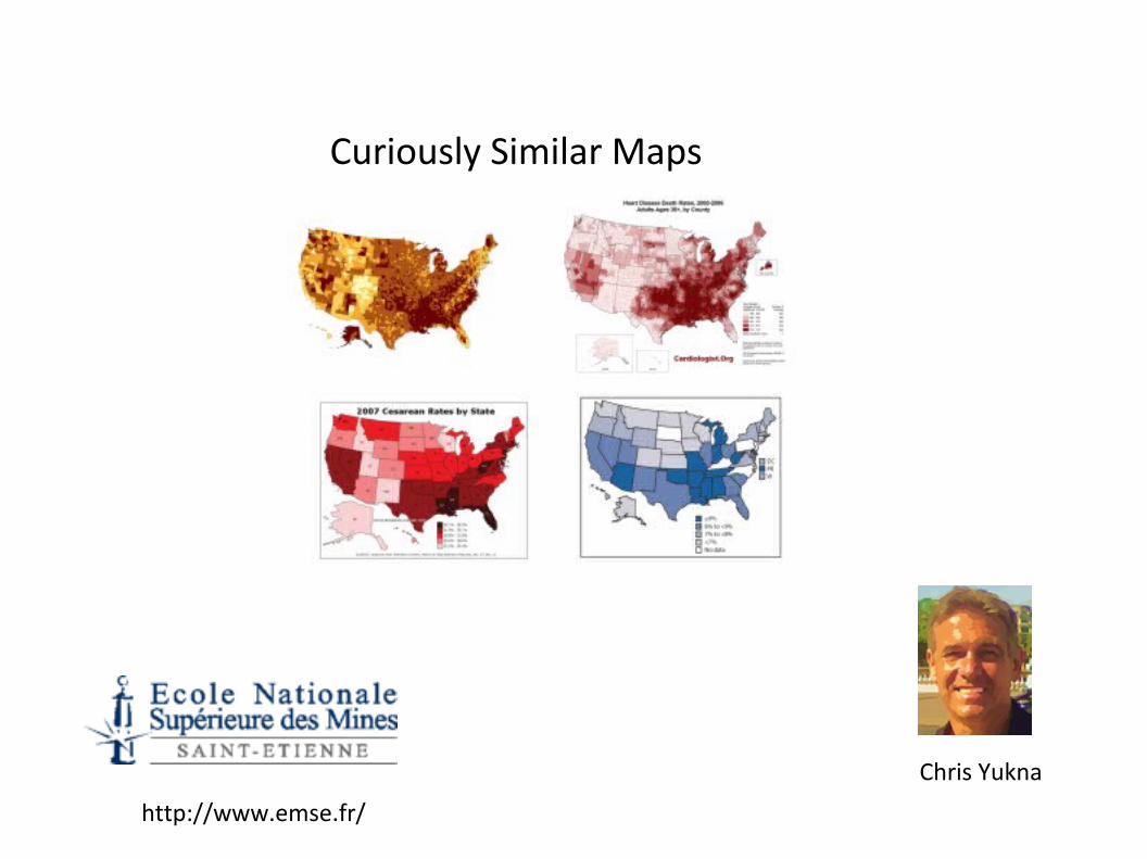
Curiously Similar Maps
Chris Yukna
http://www.emse.fr/
Curiously Similar Maps
● Most of the following maps were created by the Center for Disease Control or other reputable organizations
● You do not have to use advanced statistical methods to see that they are similar, you just have to look.
● Since they have a similar distribution do they share the same cause?
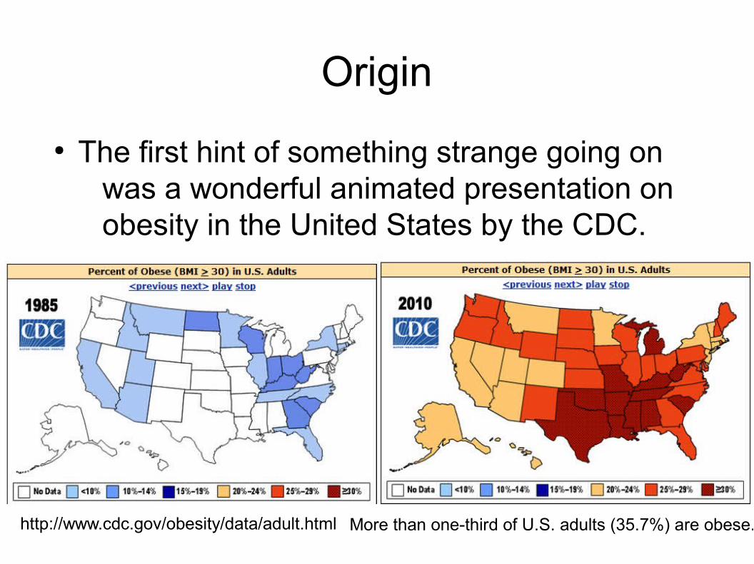
Origin
● The first hint of something strange going on was a wonderful animated presentation on obesity in the United States by the CDC.
http://www.cdc.gov/obesity/data/adult.html More than one-third of U.S. adults (35.7%) are obese.
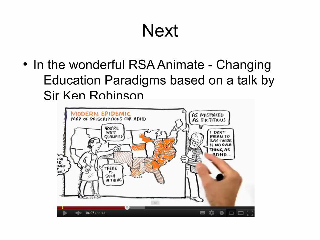
Next
● In the wonderful RSA Animate - Changing Education Paradigms based on a talk by Sir Ken Robinson
Then
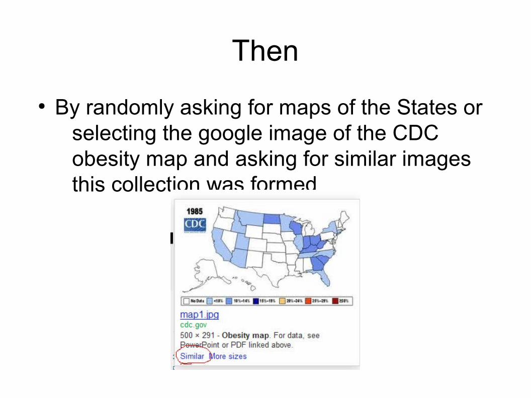
● By randomly asking for maps of the States or selecting the google image of the CDC obesity map and asking for similar images this collection was formed
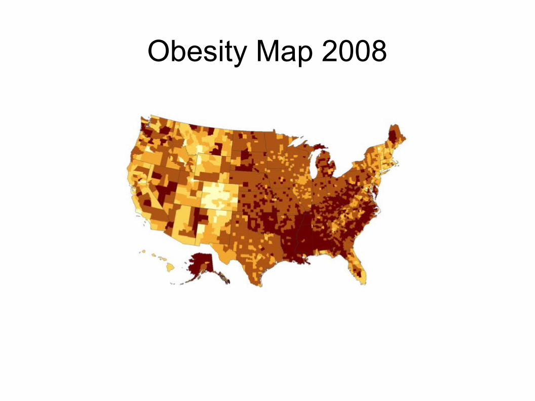
Obesity Map 2008
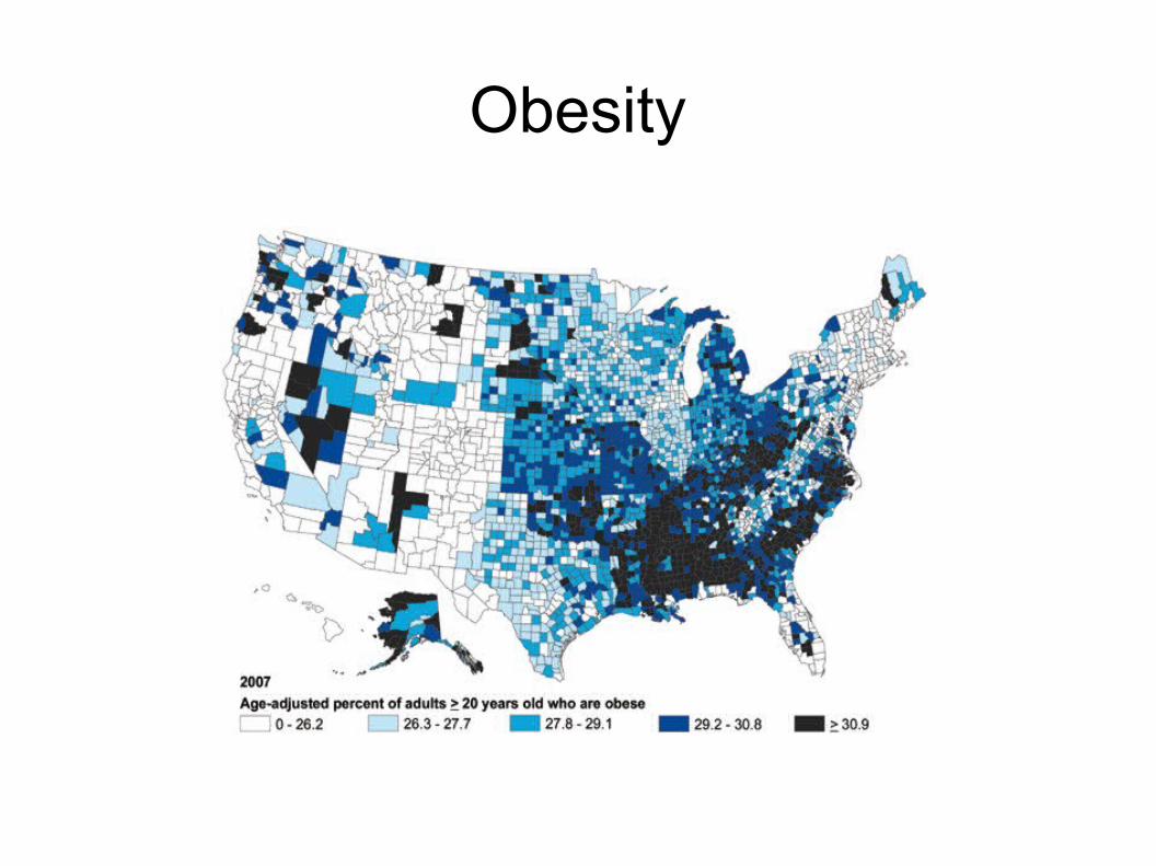
Obesity
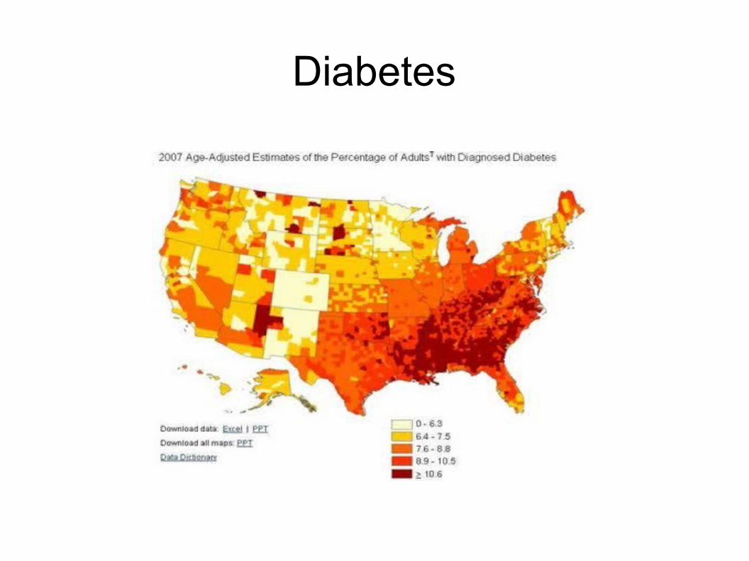
Diabetes
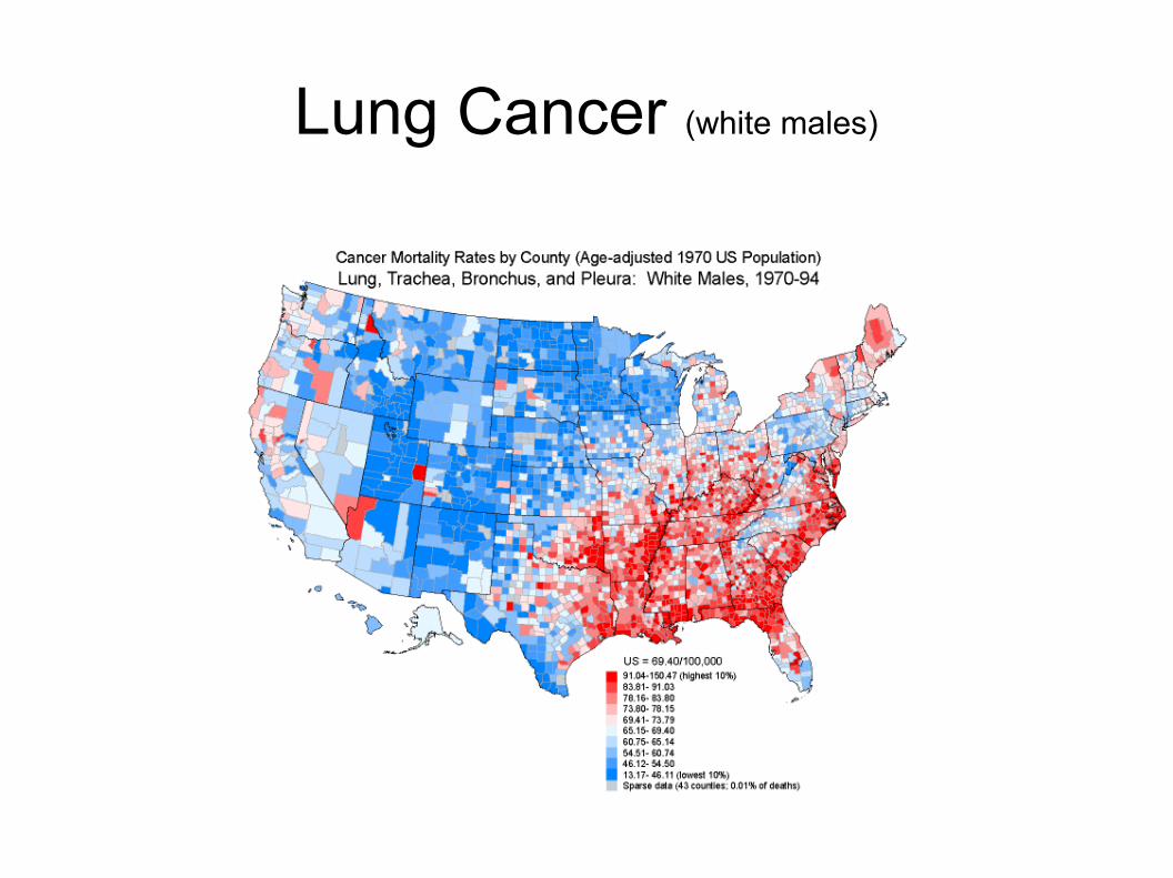
Lung Cancer (white males)
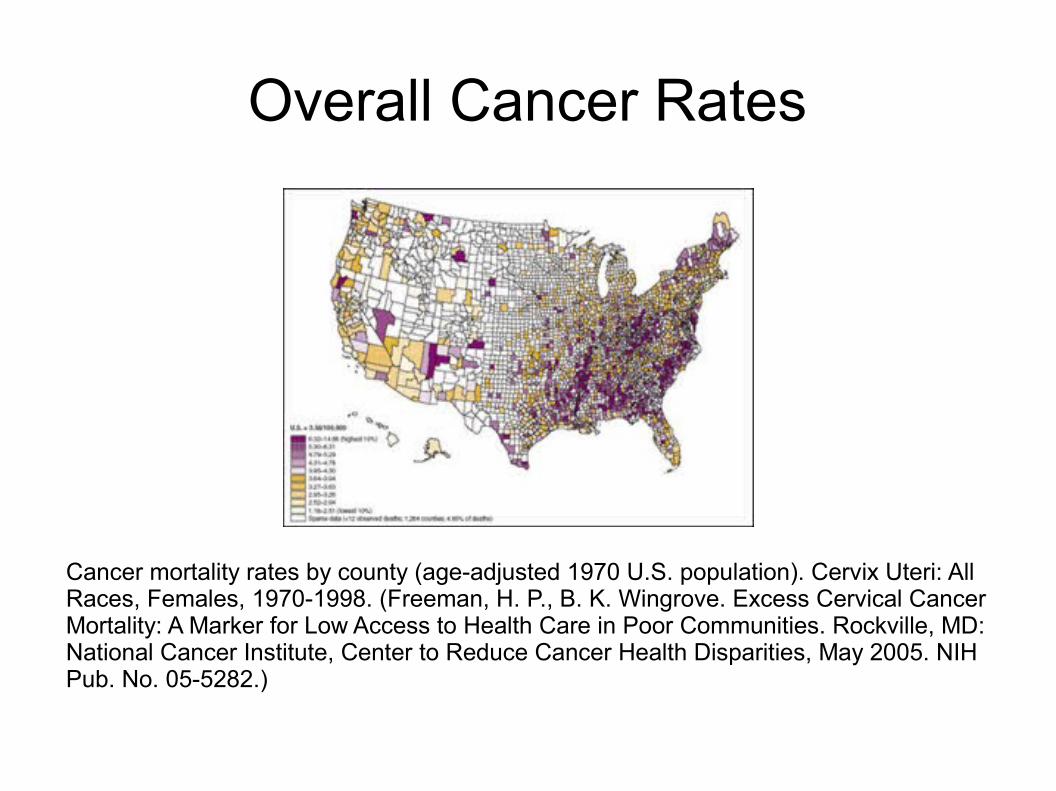
Overall Cancer Rates
Cancer mortality rates by county (age-adjusted 1970 U.S. population). Cervix Uteri: All Races, Females, 1970-1998. (Freeman, H. P., B. K. Wingrove. Excess Cervical Cancer Mortality: A Marker for Low Access to Health Care in Poor Communities. Rockville, MD: National Cancer Institute, Center to Reduce Cancer Health Disparities, May 2005. NIH Pub. No. 05-5282.)
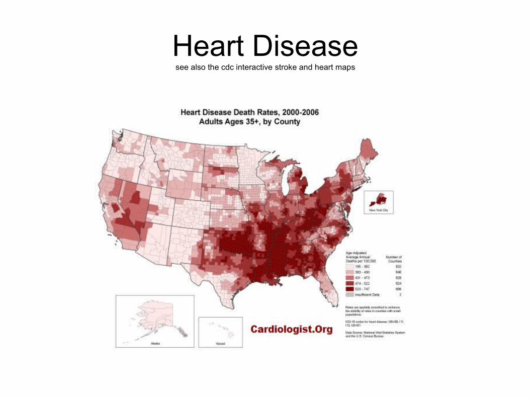
Heart Diseasesee also the cdc interactive stroke and heart maps
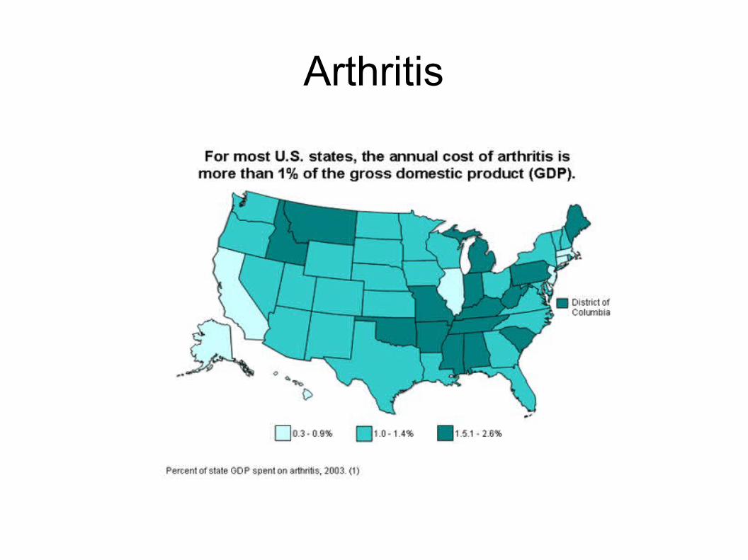
Arthritis
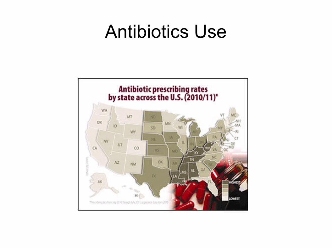
Antibiotics Use

Strokes
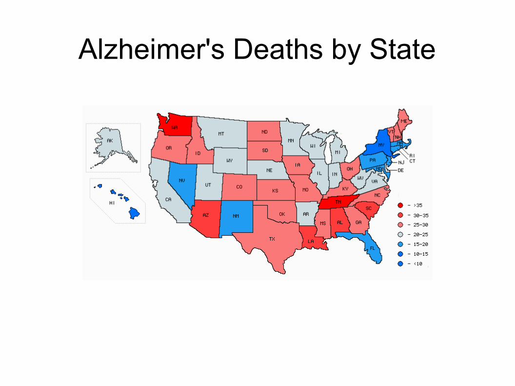
Alzheimer's Deaths by State
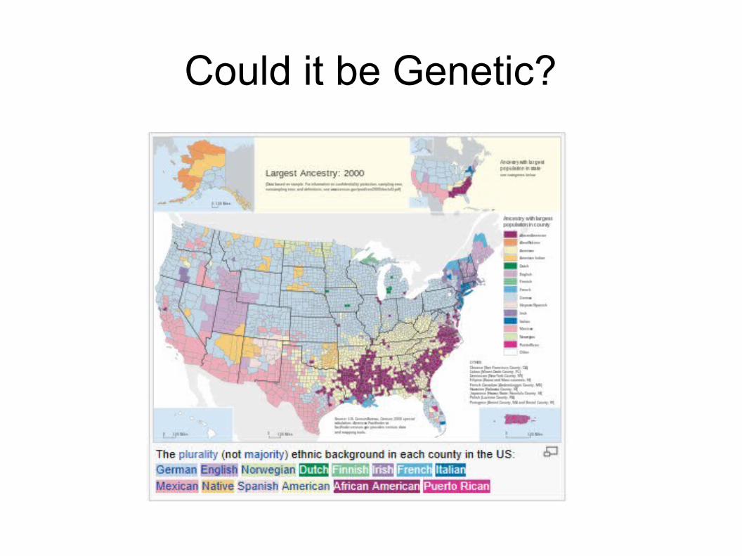
Could it be Genetic?
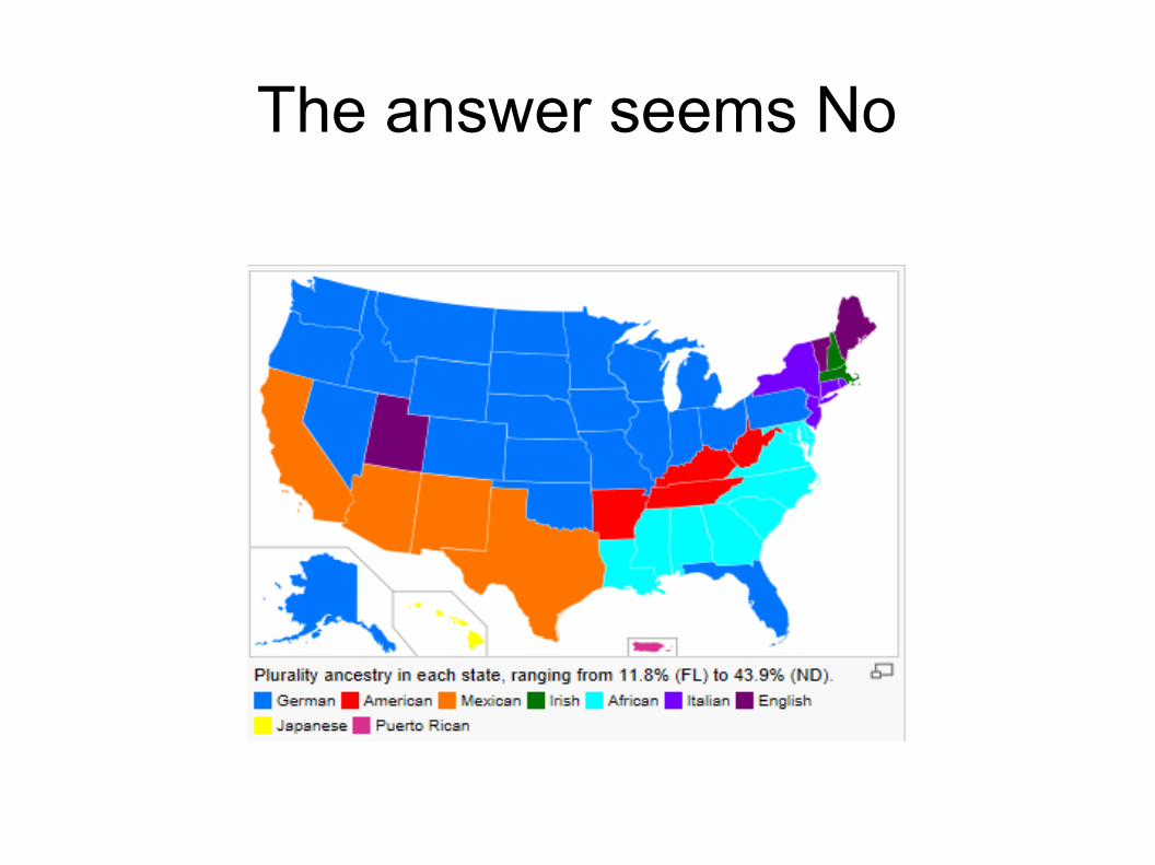
The answer seems No
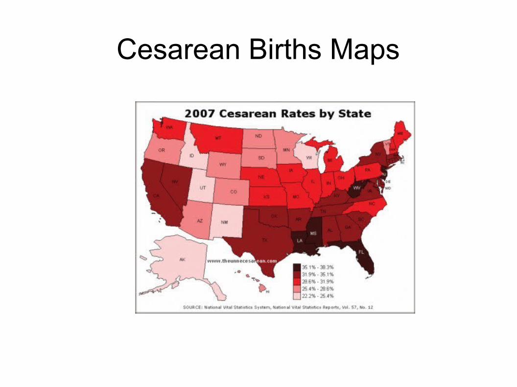
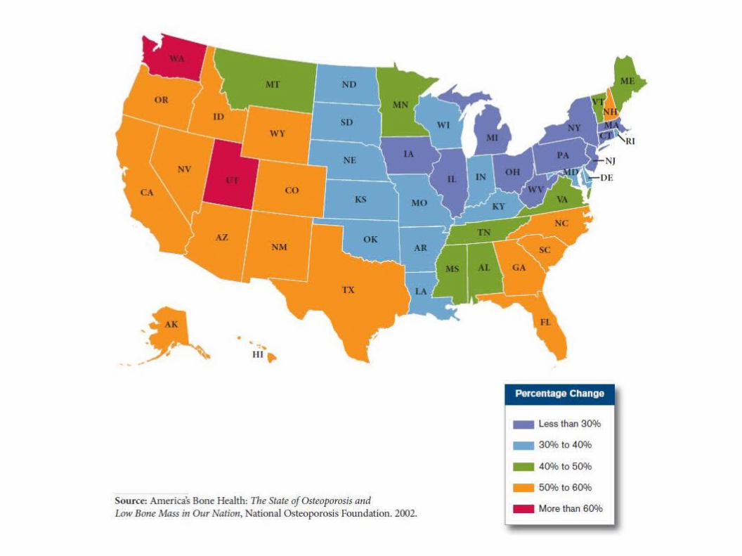
Cesarean Births Maps
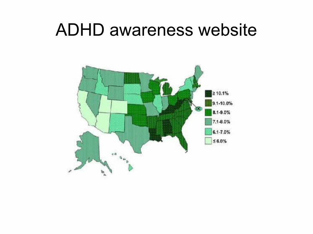
ADHD awareness website
By Christopher Yukna yuknachris(at)yahoo.comScience General: http://yukna.free.fr/science/general.phpEcole des Mines Saint Etienne Francehttp://www.emse.fr/
Thank YouAre there any questions?