d esktop p ublishing w hat is desktop publishing ? using a personal computer, word processor,...
TRANSCRIPT

DESKTOP PUBLISHING

WHAT IS DESKTOP PUBLISHING?
Using a personal computer, word processor, graphics editor, and page layout software to design, lay out, and produce a publication electronically

DESKTOP PUBLISHING BEGINNINGS
The three most popular types of software for many years were word processing, database, and spreadsheet.
The introduction of laser and inkjet printers led to the growing popularity of software called desktop publishing.
Desktop publishing can be accomplished using dtp software such as Adobe PageMaker or Microsoft Publisher.

IN-HOUSE DTP BENEFITS
More dtp jobs can be done “in-house” than in years past. “In-house means
that someone within the company does it”
More direct control over the project
Provides a better, more solid understanding of the needs of the business
Reduces costs Saves time

THE DESKTOP PUBLISHING PROCESS
The creation of a publication begins with two stepsPlanning the publicationCreating the content
PLANNING THE PUBLICATION
Determine the purpose (provide info, sell a product, get a response, etc.)
Who is the target audience? What format will be used? What do you want your audience to do
after reading the message? Look at examples for ideas
CREATING THE CONTENT
The most important goal in desktop publishing is to get the message across! The most effective design won’t work if the
content doesn’t get the message across. Identify the purpose and organize
materials. Prioritize information . . . what is most
important? Clear and organized information
combined with good design makes for an effective document.

DESIGN CONSIDERATIONS
What is the feeling that the document is meant to convey?
What is the most important information and how can it be emphasized so that the reader can easily identify the purpose of the document?
What different types of information are to be presented and how can these be distinguished, yet kept consistent?
How much space is available?
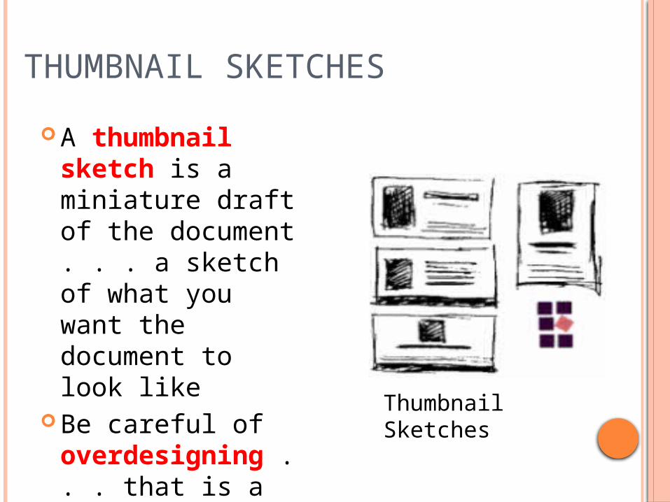
THUMBNAIL SKETCHES
A thumbnail sketch is a miniature draft of the document . . . a sketch of what you want the document to look like
Be careful of overdesigning . . . that is a tendency of beginners in dtp.
Thumbnail Sketches

DESIGN CONCEPTS/ELEMENTS
Focus Directional Flow Consistency Color Balance Proportion Contrast Repetition Alignment Proximity

FOCUS
An element that draws the reader’s eyes.
This is created by using elements that are large, dense, unusual, and/or surrounded by white space.White space is the background
where no text or graphics are located.

GRAPHIC ELEMENTS HELP PROVIDE FOCUS
Titles, headlines, and subheads
FontsReverse textDrop capsRuled linesClip artWatermarks
IllustrationsPhotographsCharts, graphsDiagramsTablesPull quotesSidebars

POINTERS WITH GRAPHIC ELEMENTS
Legibility . . . graphic elements should support the message and not detract from it.
Communicate, don’t decorate!Less is best!
Apply the KIS principle . . . Keep It Simple!

CREATING BALANCE
Balance is achieved by equally distributing the weight of elements on a page.Symmetrical balance contains
similar elements of equal proportion or weight on the left and right sides and top and bottom of a page.
Asymmetrical balance uses different design elements of varying weights and/or proportions to achieve balance on a page.

PROPORTION Larger elements are generally viewed as
more important (titles, some graphics) Readers are more likely to read a page
where all the elements are in proportion to one another
Determine the importance of each element of the document and size it proportionately.

CONTRAST Contrast is the difference in the degrees of
lightness and darkness on a page. A strong or high level of contrast is more
visually stimulating and helps to draw in your audience. . . keeps the reader’s interest longer.
Contrast can be used as an organizational aid so readers can identify the organization of the document (titles, subheads, etc.)
Contrast can be achieved with graphic elements (symbols, watermarks), white space, and color.

MORE ABOUT CONTRAST!White space is important in achieving
contrast. A more open and light feeling is projected
with more white space on a page. Limited white space projects a more
closed, darker feeling as well as crowded. The use of color in a heading, a logo,
a graphic image, a rule line, or as a background can also add to the contrast.
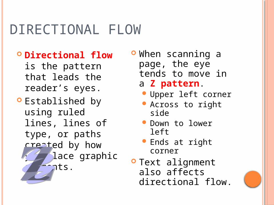
DIRECTIONAL FLOW
Directional flow is the pattern that leads the reader’s eyes.
Established by using ruled lines, lines of type, or paths created by how you place graphic elements.
When scanning a page, the eye tends to move in a Z pattern. Upper left corner Across to right side Down to lower left Ends at right corner
Text alignment also affects directional flow.

CONSISTENCYUniformity among specific design
elements establishes a pattern of consistency in a document.
Design elements should remain constant throughout a document to achieve a degree of unity.
Repetitive, consistent elements can also provide identity to your document(s) and provide the reader with a sense of familiarity.
Inconsistency can be frustrating! Keep the design simple and distinct.
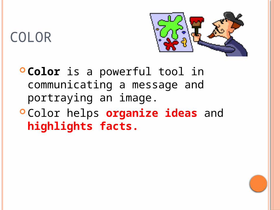
COLOR
Color is a powerful tool in communicating a message and portraying an image.
Color helps organize ideas and highlights facts.

MORE ABOUT COLOR! Use color to create
focus, organize information and documents, and add emphasis.
Color can elicit a response.
Use color sparingly. Limit to two or three colors (including the paper).
The message is most important; color adds emphasis and style.
Text printed with light colors is usually more difficult to read.
Color can be used to identify a consistent element.

REPETITION The principle of repetition states that
you repeat some aspect of the design throughout the entire piece.Bold font, thick rule (line), a certain
bullet, color, format . . . Anything the reader will visually recognize
Repetition focuses on consistency The purpose of repetition is to unify
and to add visual interest.
ALIGNMENT Nothing should be place on the page
arbitrarily. Every item should have a visual
connection with something else on the page. There needs to be something that ties together all of the elements of the page visually.
Alignment focuses on unity. The purpose of alignment is to unify
and organize the page.

PROXIMITY Group related items together.
Move them physically close to each other so the related items are seen as one cohesive group rather than a bunch of unrelated bits.
Items or groups of information that are not related to each other should not be in close proximity (nearness) to the other elements.
The purpose of proximity is to organize.

PUTTING IT ALL TOGETHER! Design can be learned by studying
good design and by experimentation. Layout and design is a lengthy process
of revising, refining, and making adjustments.
Remember:Take time to design!Communicate; don’t decorate!Less is best!