dance music magazine layout research
TRANSCRIPT
Magazine research
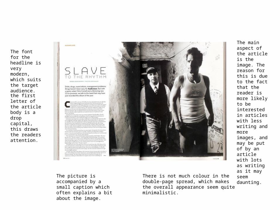
There is not much colour in the double-page spread, which makes the overall appearance seem quite minimalistic.
The main aspect of the article is the image. The reason for this is due to the fact that the reader is more likely to be interested in articles with less writing and more images, and may be put of by an article with lots as writing as it may seem daunting.
The font for the headline is very modern, which suits the target audience.
The picture is accompanied by a small caption which often explains a bit about the image.
the first letter of the article body is a drop capital, this draws the readers attention.
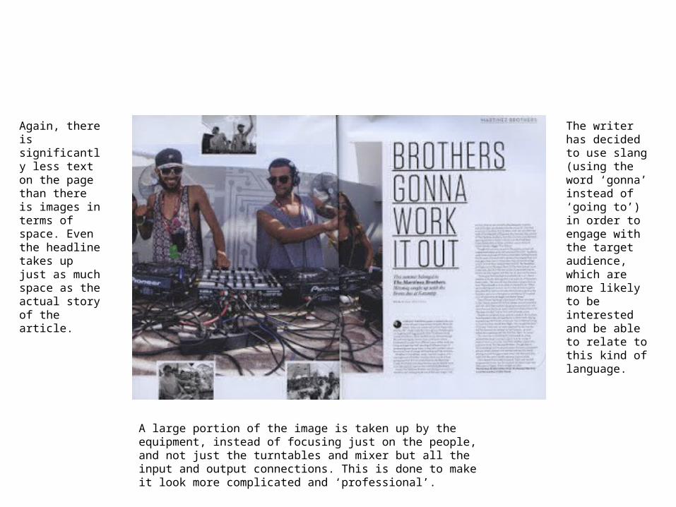
The writer has decided to use slang (using the word ‘gonna’ instead of ‘going to’) in order to engage with the target audience, which are more likely to be interested and be able to relate to this kind of language.
Again, there is significantly less text on the page than there is images in terms of space. Even the headline takes up just as much space as the actual story of the article.
A large portion of the image is taken up by the equipment, instead of focusing just on the people, and not just the turntables and mixer but all the input and output connections. This is done to make it look more complicated and ‘professional’.
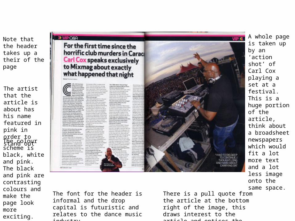
Note that the header takes up a their of the page
The artist that the article is about has his name featured in pink in order to stand out
A whole page is taken up by an ‘action shot’ of Carl Cox playing a set at a festival. This is a huge portion of the article, think about a broadsheet newspapers which would fit a lot more text and a lot less image onto the same space.
The colour scheme is black, white and pink. The black and pink are contrasting colours and make the page look more exciting.
The font for the header is informal and the drop capital is futuristic and relates to the dance music industry.
There is a pull quote from the article at the bottom right of the image, this draws interest to the article and entices the reader to read it.