data analytics and transportation planning
TRANSCRIPT
Data Analytics and Transportation Planning
Managers Mobility Partnership
March 23rd, 2017
Max O’Krepki, ‘18Dan Sakaguchi, ‘18

The Research Team
● Dan Sakaguchi● Stanford ‘18 | M.S. Earth Systems● Stanford ‘16 | B.S. Physics● Hometown: Portland, OR
● Max O’Krepki● Stanford ‘18 | M.S. Civil Engineering● Virginia Tech ‘16 | B.S. Civil Engineering● Hometown: Hammond, LA

Table of Contents❏ Spatial Analysis of Commuters in the MMP❏ Who and Where are the Commuters in the MMP?❏ Feasibility of Local Express Shuttles in the MMP❏ Who are Stanford’s Commuters?❏ Modeling Commute Mode Choice❏ Data Processing Workflow❏ Identifying Groups of SOV Commuters

Spatial Analysis of Commuters in the MMP

Methodology
Data Extraction and Cleaning Survey
Cluster Into Groups Map and Analyze in Excel and ArcMap
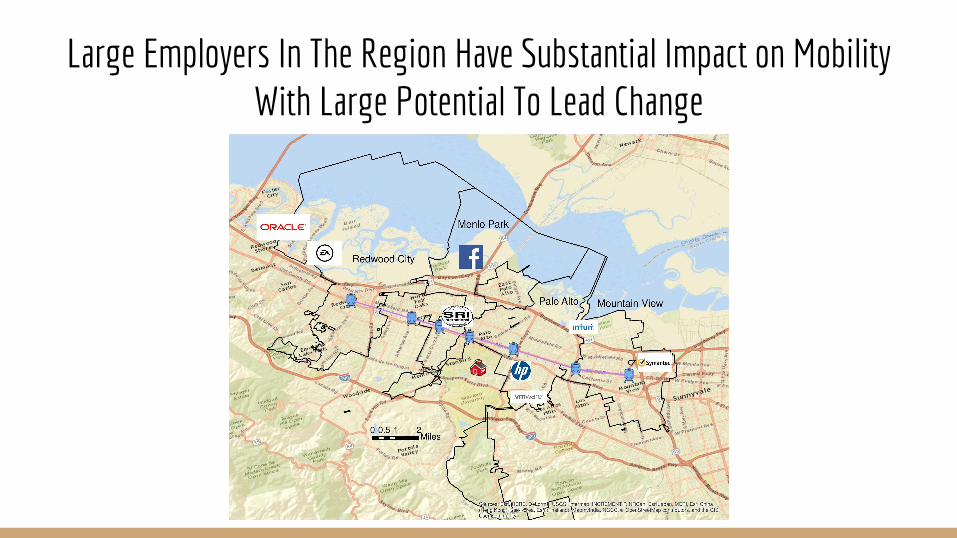
Large Employers In The Region Have Substantial Impact on Mobility With Large Potential To Lead Change

Who and Where are the Commuters in the MMP partner cities?

Stanford’s Surveyed Commuters in 2016 Live All Across the Bay

Stanford’s Surveyed Commuters in 2016 Live All Across the Bay

Commuting In The Partner Cities Dominated By Cycling And SOVS
● Carpools ● Cyclists ● SOVs ● Transit Riders

SOV Commuters In The Partner Cities Makeup ~27% Of All Stanford SOVs Commuting To Campus
● Redwood City ● Menlo Park ● Palo Alto ● Mountain View ● Others

Despite Large SOV Share, SOV Commuters From Partner Cities Account for ~10% Of Daily VMT By All Stanford SOVs
● Redwood City ● Menlo Park ● Palo Alto ● Mountain View ● Others

Distribution Of Surveyed Commuters In MMP Partner Cities● Cyclists● Transit Riders● Carpools● SOVs

Distribution Of Cyclist In MMP Partner Cities ● Cyclists● Transit Riders● Carpools● SOVs

Distribution Of Transit Riders In MMP Partner Cities ● Cyclists● Transit Riders● Carpools● SOVs
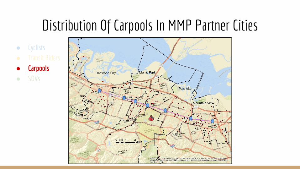
Distribution Of Carpools In MMP Partner Cities ● Cyclists● Transit Riders● Carpools● SOVs
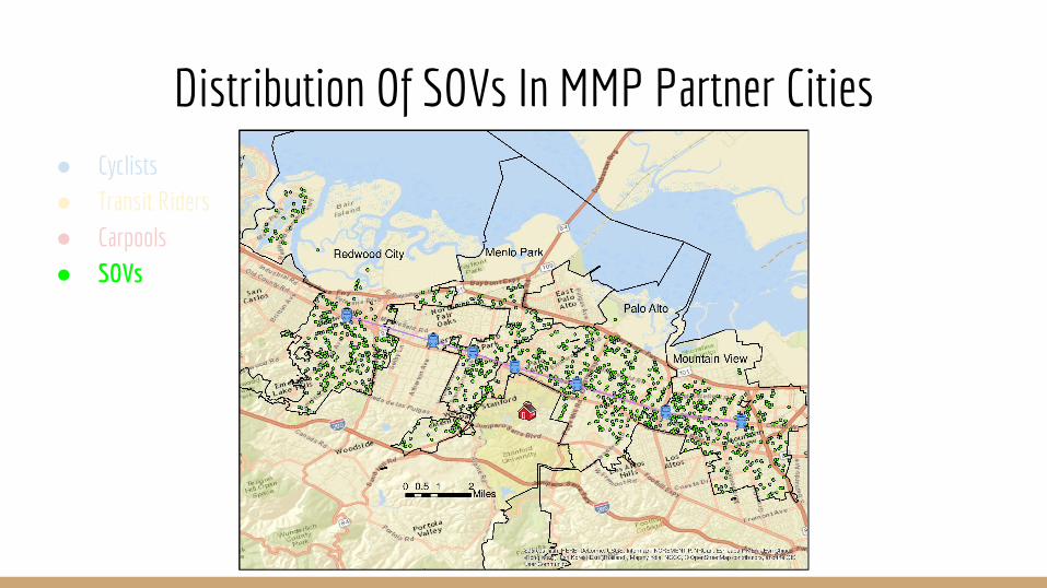
Distribution Of SOVs In MMP Partner Cities ● Cyclists● Transit Riders● Carpools● SOVs

Commuter Clusters In The Partner Cities: Cyclists● High Density Clusters● Medium-High
Density Clusters● Mean Density
Clusters● Medium-Low Density
Clusters● Low Density Clusters

Commuter Clusters In The Partner Cities: Transit Riders● High Density Clusters● Medium-High
Density Clusters● Mean Density
Clusters● Medium-Low Density
Clusters● Low Density Clusters

Commuter Clusters In The Partner Cities: Carpools● High Density Clusters● Medium-High
Density Clusters● Mean Density
Clusters● Medium-Low Density
Clusters● Low Density Clusters

Commuter Clusters In The Partner Cities: SOVs● High Density Clusters● Medium-High
Density Clusters● Mean Density
Clusters● Medium-Low Density
Clusters● Low Density Clusters

Feasibility of an Express Shuttle

Residents In The Partner Cities Indicate A Wide Variety Of Reasons For Commuting Alone

A Variety Of Approaches Will Be Required To Shift Commuters From Driving Alone

Shuttle Demand Concentrated In Areas Where Transit Is Not As Competitive As Driving Alone And Biking Not A Feasible Option

Even a Small Fleet of Shuttles or Vans Could Have a Sizeable Impact
● A look into the survey respondents that drive alone residing in the partner cities indicating interest an interest in a shuttle○ 19% of all SOVS in the Partner Cities
■ Generating an average 14 VMT/person each day○ Accounts for ~10,000 daily VMT or 44% of all daily VMT generated by residents in the partner cities
● The Impact of one shuttle or van○ Each 15 passenger vehicle would
■ Reduce daily VMT by 189 miles■ Reduce CO2 emissions by 0.08 metric tons each day

Census Tracts With Greatest Demand For Express Shuttles
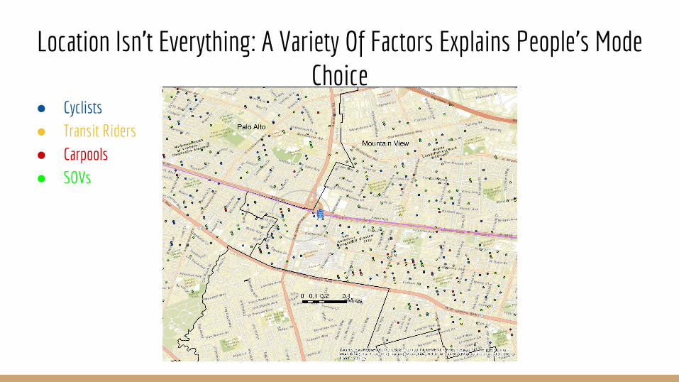
Location Isn’t Everything: A Variety Of Factors Explains People’s Mode Choice
● Cyclists● Transit Riders● Carpools● SOVs

Trying to understand commuter mode choice -
who are Stanford’s Commuters?

Most of Stanford’s Commuters use SOV
SOV
Transit
Biking
Carpool

Employees each have different commuting behaviorsOther Teaching
CCT
Graduate TGR
Graduate
Postdoc
Professoriate
Hospital SH
Hospital LP
Staff

How can we determine the influence of people’s resources on their mode choices?

Answer: A model

Suppose we model a commuter deciding how to get to campus...

There are a variety of factors that will influence this decision...
Owns home...
High income...
Has children....
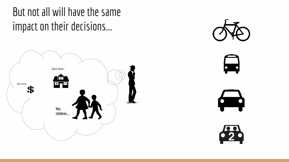
But not all will have the same impact on their decisions...
Owns home...
High income...
Has children....

Based on these factors, they will rank their options with a particular utility...
Owns home...
High income...
Has children....
12
7
14
3
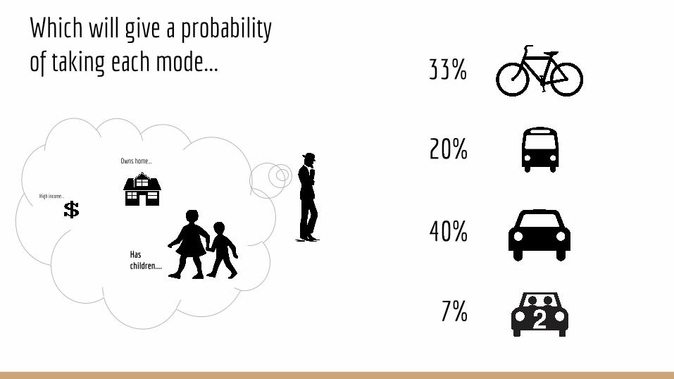
Which will give a probability of taking each mode...
Owns home...
High income...
Has children....
33%
20%
40%
7%

Of which, we assume they will take the highest
Owns home...
High income...
Has children....
33%
20%
40%
7%

The Multinomial Logit Model

The Multinomial Logit ModelUtility score for a given mode
Probability of a mode
Weights for influences

The Data Workflow

EPA Smart Location Database
Stanford P&TS Commuter Survey
Google Maps API
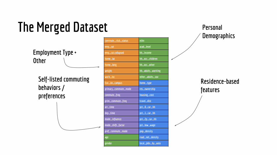
Merged Dataset
commute_club_status ethn
emp_cat acad_level
emp_cat.collapsed hh_income
home_lat hh_occ_children
home_long hh_occ_other
weight hh_adults_working
work_loc other_adults_sov
live_on_campus home_type
primary_commute_mode res_ownership
commute_freq housing_cost
prim_commute_freq travel_dist
arr_time pct_0_car_hh
dep_time pct_1_car_hh
mode_influence pct_2p_car_hh
mode_shift_factor pct_low_wage
pref_commute_mode pop_density
age road_net_density
gender local_jobs_by_auto
The Merged Dataset
Residence-based features
Personal Demographics
Self-listed commuting behaviors / preferences
Employment Type + Other

Data Processing with R Informative Results
Merged Dataset

Results

Biking probability is highest closest to campus

Biking probability is highest closest to campus
Stanford University

Biking probability is highest closest to campus
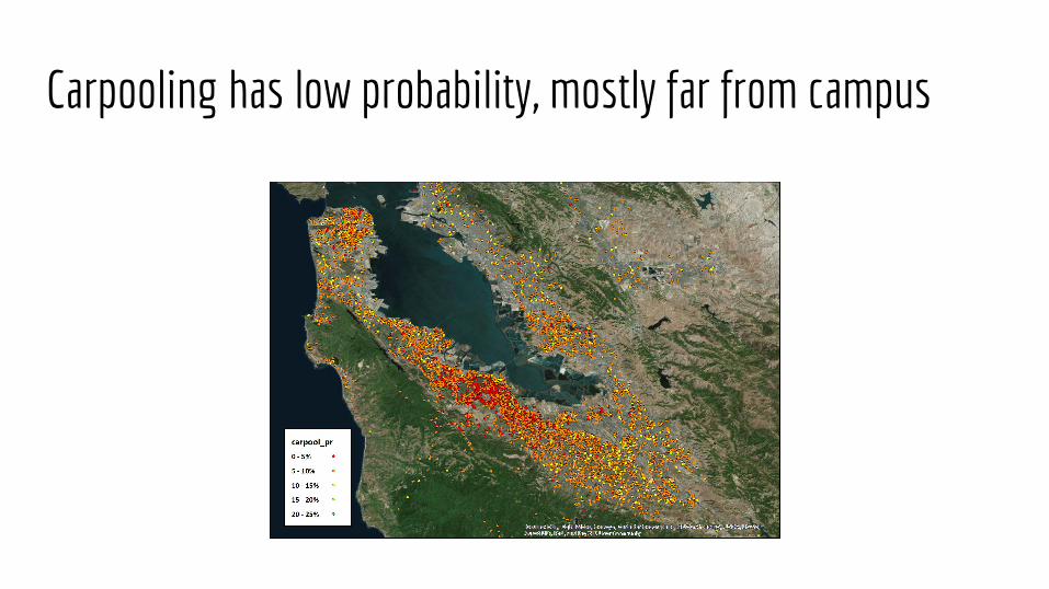
Carpooling has low probability, mostly far from campus

Transit is more likely near high density areas with easy access
But how can we tell who exactly are ideal commute switch candidates?

Commute mode is strongly influenced by distance

Commute mode is strongly influenced by distance
SOV
Transit
Biking
Carpool

People close to campus are more likely to switch to biking
0 -10 miles
Ideal candidates to switch from:
SOV-> Biking

People far from campus are more likely to switch to transit
> 10 milesIdeal candidates to switch from:
SOV-> Transit[*see report]
Let’s take a closer look at the SOV commuters close to campus

Finding Clusters of Commuters

The Average SOV Commuter Close to Campus
Demographics: 43 years old, 31.3% male, 63% white, some college education, $147,000 household income, about .7 children, about 50% rent their homes
Where they live: 5 miles from campus, average neighbor has 1.6 cars, medium population density

4 Types of SOV Commuters Close to Campus

4 Types of SOV Commuters Close to Campus
Cluster 1
Demographics: older, more women, higher household income, more children, nearly all own their homes
Where they live: slightly lower density neighborhood

4 Types of SOV Commuters Close to Campus
Cluster 2
Demographics: younger, more women, lower household income, fewer children, nearly all rent their homes
Where they live: slightly closer to campus

4 Types of SOV Commuters Close to Campus
Cluster 3
Demographics: younger, more men, much lower household income, nearly all rent their homes
Where they live: fewer neighbors own cars, higher proportion of neighbors are low wage workers, much higher population density

4 Types of SOV Commuters Close to Campus
Cluster 4
Demographics: older, more men, whiter, more educated, much higher income, more children, most likely own home
Where they live: slightly further from campus, more neighbors own cars, very low population density

The Average Biker Close to Campus
Demographics: 37 years old, 47% male, 68% white, most have college education, $120,000 household income, about .5 children, about 80% rent their homes
Where they live: 3 miles from campus, average neighbor has 1.5 cars, medium population density
SOV: 43 years old, 31.3% male, 63% white, some college education, $147,000 household income, about .7 children, about 50% rent their homes]
SOV: 5 miles from campus, average neighbor has 1.6 cars, medium population density

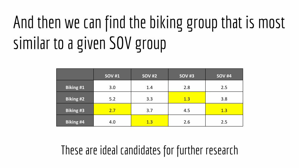
We can do similar clustering with the bikers and find how similar the groups are...
“Distance” between SOV cluster #2 and Biking
cluster #2

And then we can find the biking group that is most similar to a given SOV group
And then we can find the biking group that is most similar to a given SOV group
These are ideal candidates for further research

Take-Aways
❏ Modeling can provide broad insight into the relative importance of different demographics / resources
❏ Clustering techniques can be useful for segmenting a diverse group of commuters❏ Similar modeling / data analysis can be conducted for other similar institutions to
Stanford
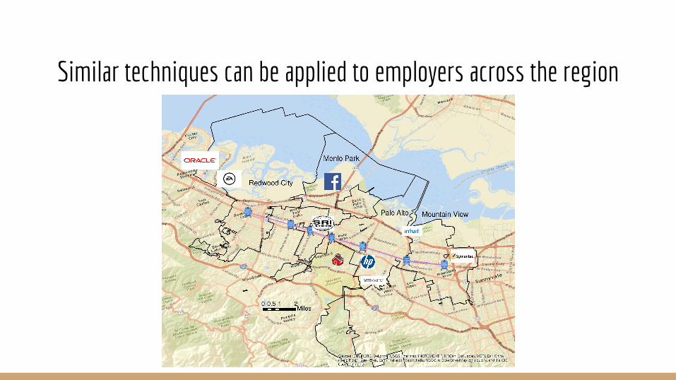
Similar techniques can be applied to employers across the region