data management sharing a model of practice
TRANSCRIPT

Data Management
Sharing a Model of Practice
10th November 2010
Julian Mc Gale
Saint Patrick’s College
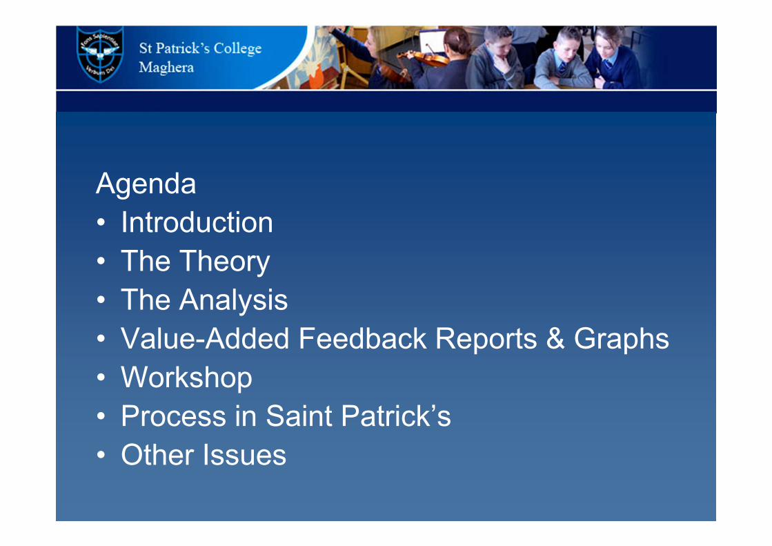
Agenda
• Introduction
• The Theory
• The Analysis
• Value-Added Feedback Reports & Graphs
• Workshop
• Process in Saint Patrick’s
• Other Issues

Goal:
To provide data that helps staff and the SMT to confidently identify the root of educational
challenges and to track progress. This will enable staff and departments to more readily develop action plans that will have a positive
impact on the students

Data is a key driver as identified in ESAGS;
• Assessment and other data is used to effectively inform teaching and learning across the school and in the classroom and to promote improvement.
ESAGS
• Rigorous self-evaluation is carried out by teachers and the whole school, using objective data and leading to sustained self-improvement.
ESAGS

Where the
data is used
Across the school
By departments By individual teacher
For reporting to parents

What the data is used for
• to inform student placement decisions
• to identify pupils requiring support at subject level
• to identify pupils requiring support across a range of subjects
• to identify high achievers
• to identify areas for improvement in teaching and learning
• to identify and share areas of best practice
• to set targets and measure pupil progress in real time

For this to happen
the data sets used must
1. Provide reliable and valid predictors of future student
achievement
2. Provide reliable measures of change over time
3. The teacher data inputs must be authentic and based on
sound judgement

The Theory

Types of data, variances and reporting formats
Standard deviation
Value added
Target setting

• Standard deviation shows you how tightly
all the results are clustered around the
mean.
• A graph of the normal distribution shows
how the standard deviation is spread
• For a small standard deviation the normal
distribution graph will be narrow.
• For a large standard deviation the normal
distribution graph will be spread out.
Now a short exert from the BBC’s Bang Goes the Theory show

Smaller standard deviation the normal distribution
graph will not be spread out.
Mean

Larger standard deviation the normal distribution
graph will be spread out.
Mean
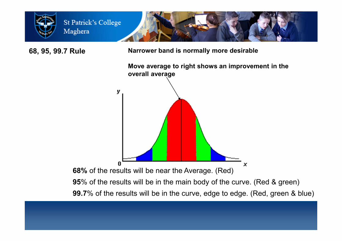
68% of the results will be near the Average. (Red)
95% of the results will be in the main body of the curve. (Red & green)
99.7% of the results will be in the curve, edge to edge. (Red, green & blue)
68, 95, 99.7 Rule Narrower band is normally more desirable
Move average to right shows an improvement in the
overall average

• Why this shape?
– If a process is in control you will always
get this shape.
• Why is this important to us?
– It allows us to use standardised tests
like MidYIS, Yellis and ALIS to
benchmark our pupils.

• Standard deviation is important as any process in control will give
you this shape of graph.
• There are numerous reasons for having values far from the mean
value and these can be school specific. For example;
a grammar school should have a narrower graph
then an all ability school
there could be errors and bias leading to
inaccuracies in the results (e.g. small classes, large
classes)
• Using a large data set, like YELLIS, reduces errors and bias and
allows you to confidently predict future grades and measure value
added.
The Analysis

Baselines
Year 8
Year 9(+ additional)
Year 10
MidYIS Paper test or
Computer Adaptive Baseline Test
Year 11
Year 12 Yellis Paper test or
Computer Adaptive Baseline Test
Year 13
Year 14 GCSE
ALIS Paper test (TDA) or
Computer Adaptive Baseline Test
GCSE
A / AS / Btec / IB etc

.
Subject X
0
2
4
6
8
10
4 5 6 7 8
Baseline
Outcome
0 2 4 6 8
-ve VA+ve VA
Residuals
Subject X
Linear Least Squares Regression
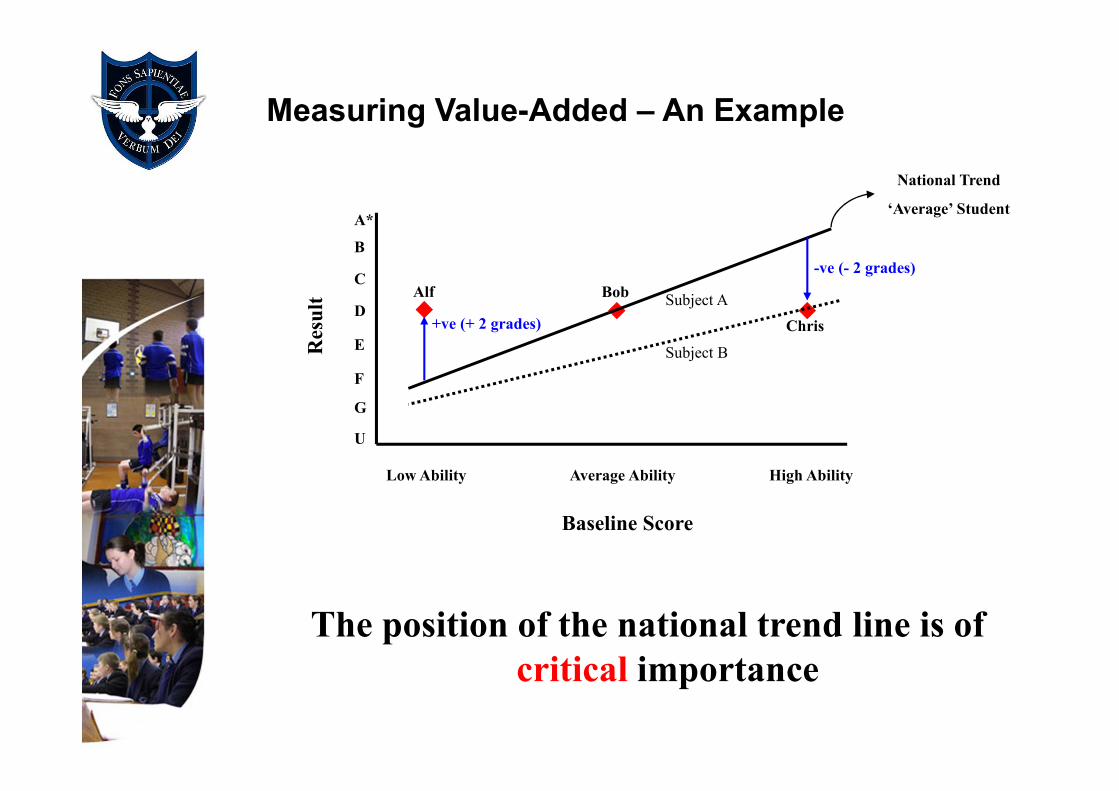
Measuring Value-Added – An Example
Low Ability Average Ability High Ability
Baseline Score
A*
U
B
C
D
E
F
G
Result
Alf Bob
Chris+ve (+ 2 grades)
-ve (- 2 grades)
National Trend
‘Average’ Student
The position of the national trend line is of
critical importance
Subject A
Subject B

Some Subjects are More Equal than Others2.
A-Level (ALIS)
E
D
C
B
A
C
Gra
de
B A A*
Average GCSE
Physics
Maths
Psychology
Sociology
Latin
Photography
English Lit
>1 grade

F
E
D
C
B
A
A*
Test Score
GC
SE
Gra
des
Art & DesignBiologyChemistryEconomicsEnglishFrenchGeographyGermanHistoryIctMathematicsMedia StudiesMusicPhysical EducationPhysicsReligious StudiesScience (Double)Spanish
Some Subjects are More Equal than Others2.
GCSE (MidYIS or Yellis)
1 grade
• Good news:
When using MidYIS,Yellis, ALIS and FFT all the statistical work is completed for the school.
• Once the marksheets are set up in assessment manager the data is uploaded in the school a few days after the pupils have completed the tests
• Once the GCSE results are in, these are sent to CEM who manage MidYIS,Yellis and ALIS and they return a residual – value added score
� Actual score – predicted score = value added
NB: this is given as a raw score as well as a standardised score. The standardised score is the one to use.

Value-Added Feedback
Reports & Graphs

Value Added Feedback2
Statistical Process Control (SPC) Chart
What is my score ? does it matter ?
-0.40
-0.32
-0.24
-0.16
-0.08
-0.00
0.08
0.16
0.24
0.32
0.40
1995 1996 1997 1998 1999 2000 2001 2002 2003 2004 2005 2006
Average Standardised Residual
Year
-0.40
-0.32
-0.24
-0.16
-0.08
-0.00
0.08
0.16
0.24
0.32
0.40

Subject Summary: Standardised Residual Graph

The Scatter Plot
Baseline Score
Gra
de P
oin
ts E
qu
ivale
nt
Look for Patterns…
General Underachievement / over achievement ?
Do any groups of students stand out ?
– high ability vs low ability ?
– male vs female ?

Other things to look for…
Why did these students do so badly ?
Why did this student do so well ?
How did they do in their other subjects ?

Workshop

Workshop : Ranking
Criterion based marking
verses
Ranking

Ranking can be carried out using different methods.
For example,
• Top 10% get a grade A irrespective of marks, next 20% get
a B and so on.
• By percentiles, top 25% in class, bottom 25% in class and
so on.
• By position in class, 1st, 2nd, 3rd C
Before looking at the reasons for using ‘ranking’, in groups look
at the sample marksheets provided on the desks.
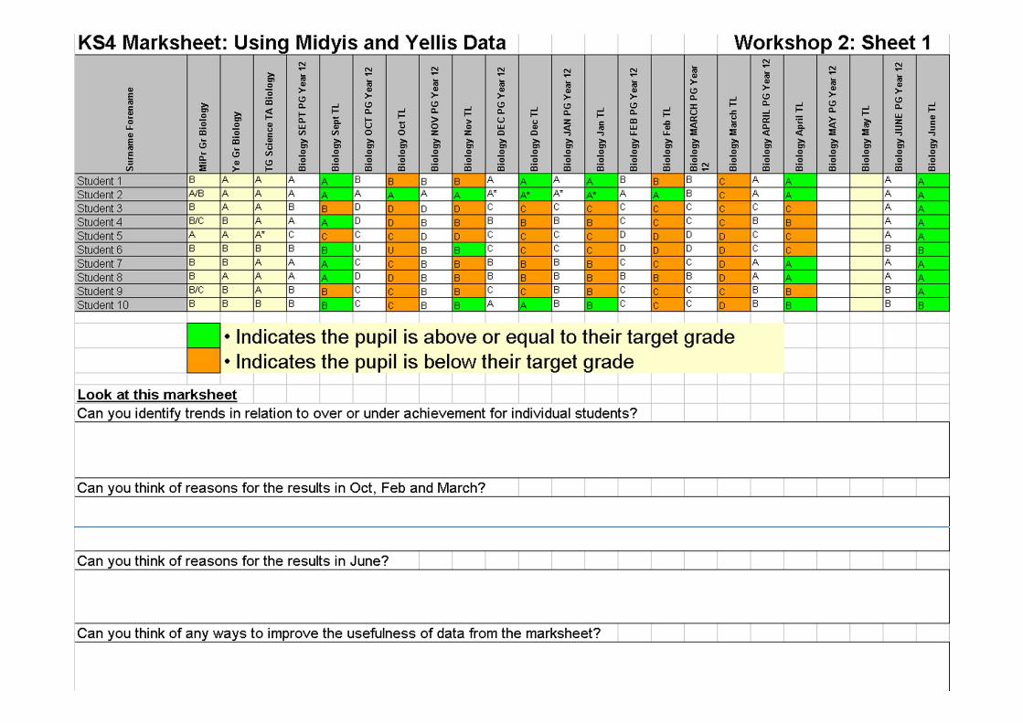
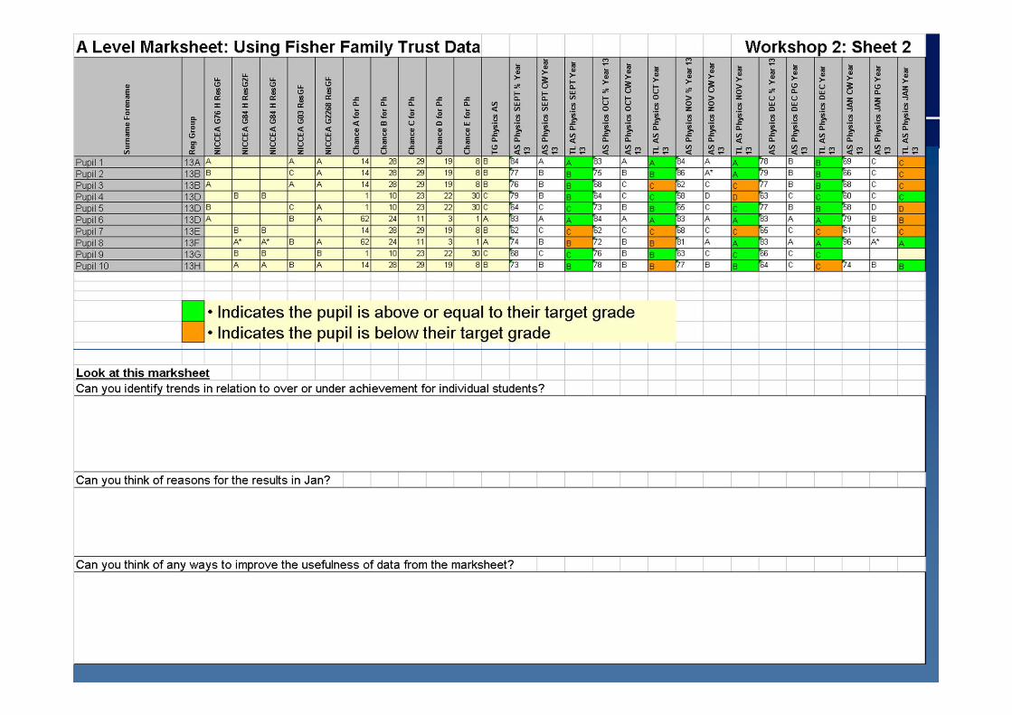


Criterion based marking is needed to
assess the knowledge learnt
There are problems with criterion based
marking. Even though it gives a percentage
and/or grade there is no measure of:
• How a pupil performed relative to others
• How hard the test was
• How standardised the marking was

Using Rank order give two additional advantages -
A student’s performance is a function of ability and
effort. When a student achieves their desired grade
they can ‘relax’.
• It allows you to assess how a pupil is performing
across a range of subjects and a range of classes.
• It can be linked directly back to the pupil’s
standardised score (e.g. MidYIS or Yellis).
Pupils underachieving can be highlighted easily using
ranking.

Conclusion to workshop
Data must be robust and wide ranging to allow the analysis of different groups of pupils to identify strengths or areas for development/intervention
Percentages, grades and position are all important in providing real time performance data and objective value added data
A teachers professional knowledge is vital in setting targets which should be aspirational.
Data provides the questions, not the answers and should be used for planning, carrying out, checking and improving to create a culture of continuous improvement

Process in Saint Patrick’s

ALIS & Fisher
Family Trust:
Y13/14
Yellis : yr 11/12
MidYIS : yr 8/9/10
Secondary Age Range Projects

Typical Timeline
Measure BaselineJune/Sept
Prediction
Reports
Collect Results
Value-Added
Feedback
August
SeptemberTarget grades
Set
September
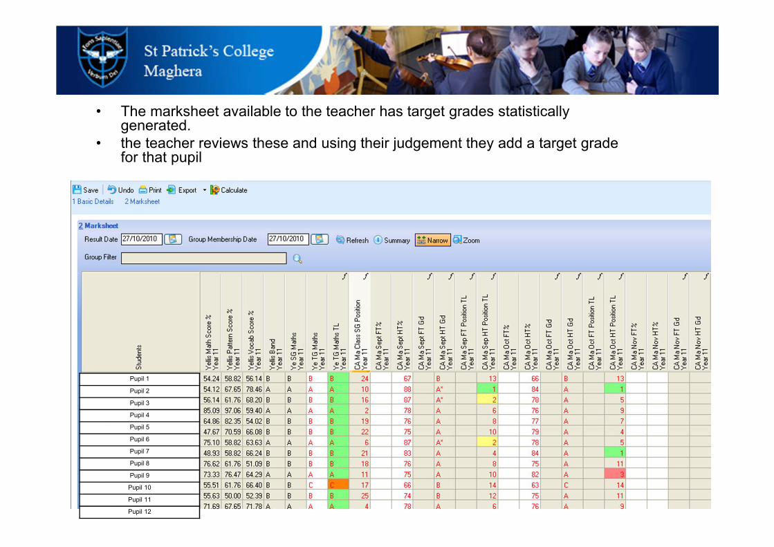
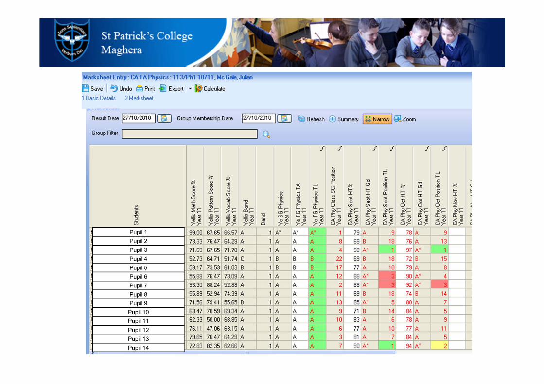
• The marksheet available to the teacher has target grades statistically generated.
• the teacher reviews these and using their judgement they add a target grade for that pupil
Pupil 1
Pupil 2
Pupil 3
Pupil 4
Pupil 5
Pupil 6
Pupil 7
Pupil 8
Pupil 9
Pupil 10
Pupil 11
Pupil 12
Pupil 1
Pupil 2
Pupil 3
Pupil 4
Pupil 5
Pupil 6
Pupil 7
Pupil 8
Pupil 9
Pupil 10
Pupil 11
Pupil 12
Pupil 13
Pupil 14
Other Issues

43
• Saint Patrick’s future development
– Learning styles
– Staff training in access and
interpretation of data
– Ranking across mark sheets
– Standardised mark sheets in and
across curriculum areas
– Exam analysis – automated on SIMS
– Parental access - C2K Gateway
44
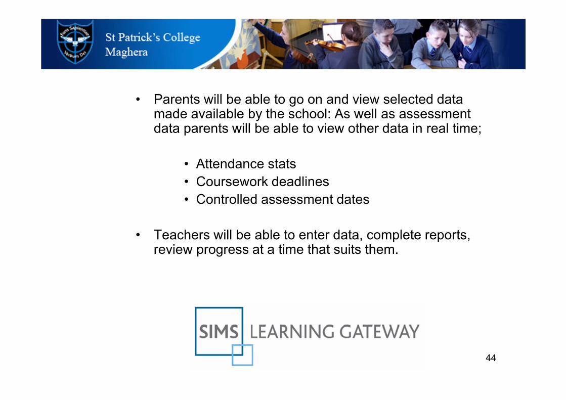
• Parents will be able to go on and view selected data made available by the school: As well as assessment data parents will be able to view other data in real time;
• Attendance stats
• Coursework deadlines
• Controlled assessment dates
• Teachers will be able to enter data, complete reports, review progress at a time that suits them.

45
Plan
Do
Check
Improve Data must be used to
Conclusion
The use of data in Saint Patrick’s is a driver for
educational decision making that results in the
continuous improvement in teaching and
learning across the school
Planned use of data is a common
characteristic of high-performing
schools.
Plan to build the system,
Use standardised data like MidYIS,
Yellis and ALIS to provide reliable and
valid predictors of future student
achievement
Use ranking to provide a reliable ‘real
time’ measures of change over time
Ensure all staff are involved and results
are entered in a timely fashion.
Ensure standardised reports are
generated monthly.
Translate data into priorities, goals
and strategies that are clearly linked to
school-planning and decision-making
processes.
Teachers need a clear process, time
to acquire skills and guidance to translate
data into useful information.
specific issues.
Successful use of data;
to drive curriculum changes
to target mentoring
to inform decision making
all resulting in a strategic focus on
specific issues.
Conclusion
The use of data in Saint Patrick’s is a driver for
educational decision making that results in the
continuous improvement in teaching and
learning across the school
Thank you