data presentation ii
TRANSCRIPT
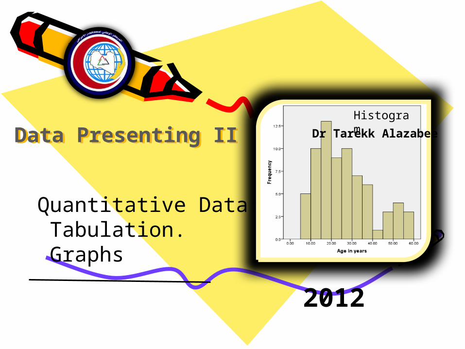
Data Presenting IIData Presenting II
2012
Quantitative Data: Tabulation. Graphs
HistogramDr Tarekk Alazabee

The Objective
• Identify the different methods of quantitative data presenting. Tabulation
Stem and leaf
Histogram
Box Plot
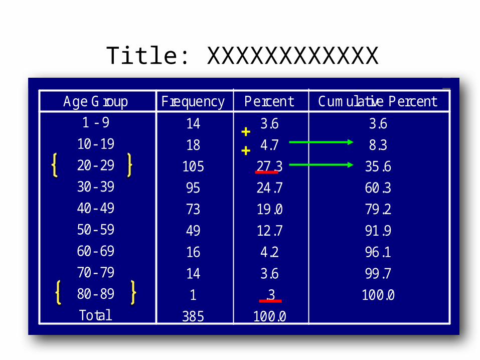
14
3.6
3.6
18
4.7
8.3
105
27.3
35.6
95
24.7
60.3
73
19.0
79.2
49
12.7
91.9
16
4.2
96.1
14
3.6
99.7
1
.3
100.0
385
100.0
Age Group1 - 910- 19
20- 2930- 39
40- 4950- 59
60- 6970- 79
80- 89Total
FrequencyPercent
Cumulative Percent

Quantitative Data Presenting
I. Tabulation
Quantitative Data Presenting
14 3.6 3.6
18 4.7 8.3
105 27.3 35.6
95 24.7 60.3
73 19.0 79.2
49 12.7 91.9
16 4.2 96.1
14 3.6 99.7
1 .3 100.0
385 100.0
Age Group1 - 9
10- 19
20- 29
30- 39
40- 49
50- 59
60- 69
70- 79
80- 89
Total
Frequency Percent Cumulative Percent

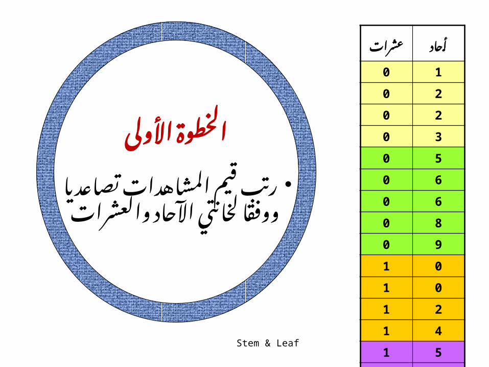
مثال
أعمار • مصاب 15كانت :امريضا التالي النحو على باأليدز
10 6 112 6 214 8 215 9 315 10 5
جدول : في المرضى بعمر المتعلقة البيانات مثل المطلوبمحددة عمرية لفترات وفقا

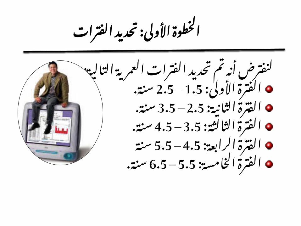
تحديد : األولى الخطوةالفترات
العمرية • الفترات تحديد تم أنه لنفترض: التالية الثالث
: األولى .5– 1الفترة سنوات : الثانية .10– 6الفترة سنوات
: ترةالف سنة. 15– 11الثالثة
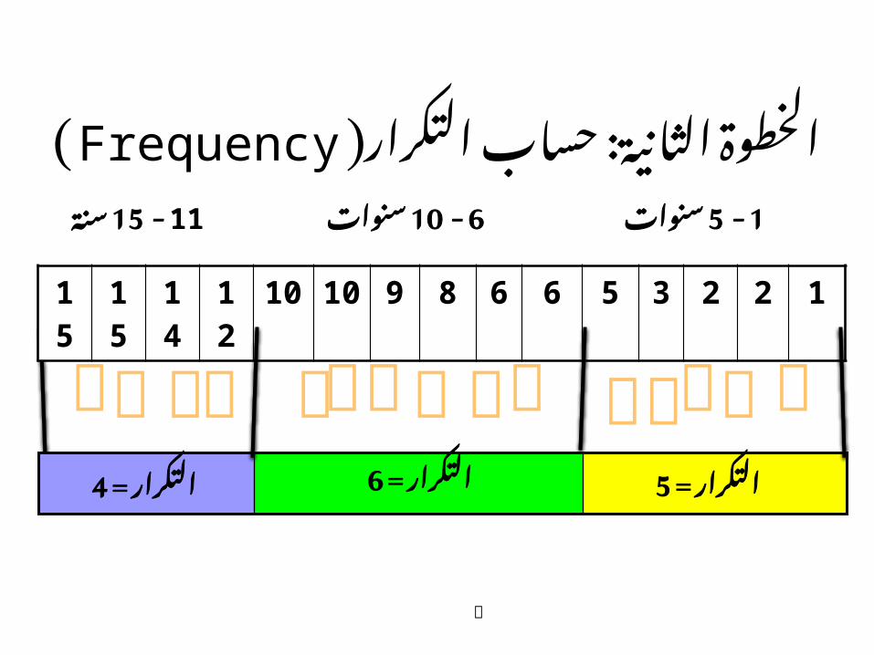
: حساب الثانية الخطوة (Frequencyالتكرار)
15 15 14 12 10 10 9 8 6 6 5 3 2 2 1
سنة 15- 11سنوات 10- 6سنوات 5- 1
4التكرار = 6التكرار = 5التكرار =
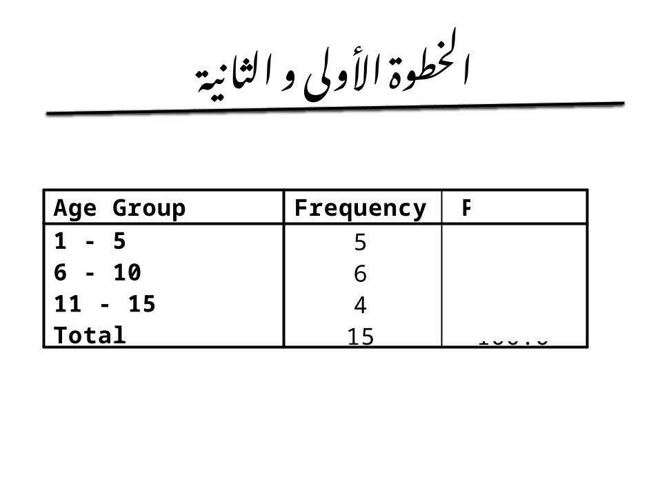
الثانية و األولى الخطوة
5 33.36 40.04 26.7
15 100.0
Age Group1 - 56 - 1011 - 15Total
Frequency Percent

: المئوية النسبة حساب الثالثة الخطوةفئة لكل
ل المئوية العمرية النسبة ( =سنوات 5– 1) لفئة
العمرية ) للفئة المئوية (:سنوات 10– 6النسبة
العمرية ) للفئة المئوية ( = 15– 11النسبة
515
x100= %33.3
x 615= 100 %40.0
415
x100 %26.7 =
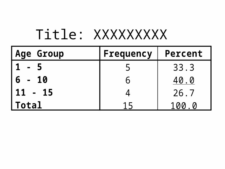
Title: XXXXXXXXX
5 33.36 40.04 26.7
15 100.0
Age Group1 - 56 - 1011 - 15Total
Frequency Percent
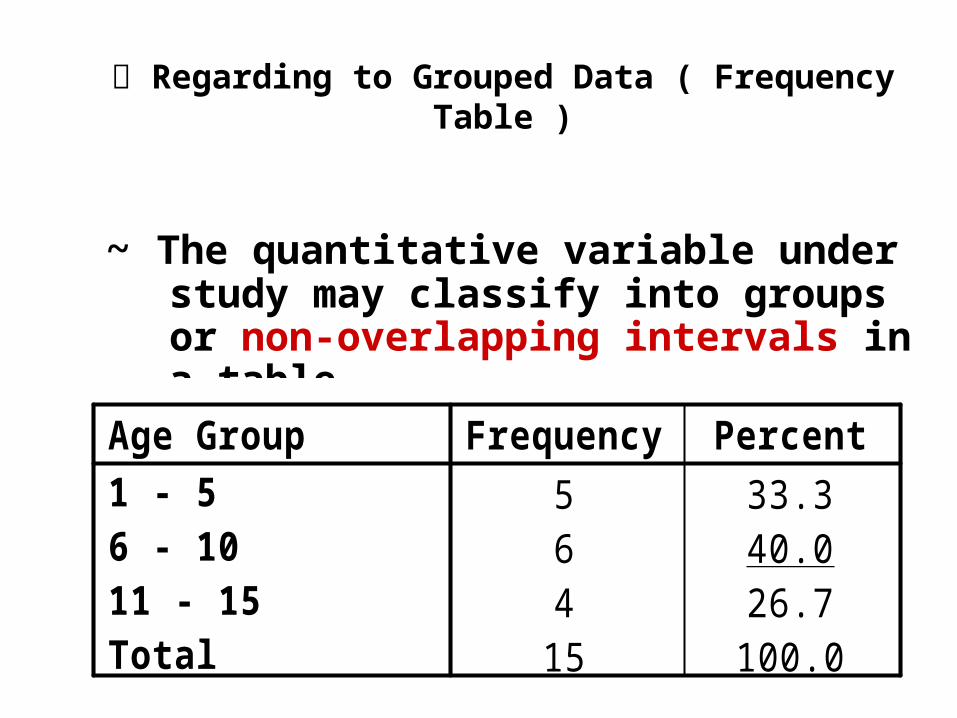
Regarding to Grouped Data ( Frequency Table )
~ The quantitative variable under study may classify into groups or non-overlapping intervals in a table.
5 33.36 40.04 26.7
15 100.0
Age Group1 - 56 - 1011 - 15Total
Frequency Percent

The number of intervals should be reasonable.
- Too few intervals makes the table is compressed; resulting in loss of information.
- If too many intervals are used; the goal of summarization will not be met.
14 3.6 3.6
18 4.7 8.3
105 27.3 35.6
95 24.7 60.3
73 19.0 79.2
49 12.7 91.9
16 4.2 96.1
14 3.6 99.7
1 .3 100.0
385 100.0
Age Group1 - 9
10- 19
20- 29
30- 39
40- 49
50- 59
60- 69
70- 79
80- 89
Total
Frequency Percent Cumulative Percent
Title: XXXXXXXXXXXX
++
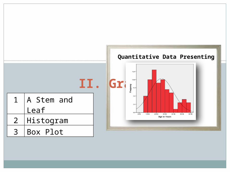
Quantitative Data Presenting
II. Graphs
Quantitative Data Presenting
1 A Stem and Leaf
2 Histogram
3 Box Plot

1. A stem and leaf

مثال
أعمار • مصاب 15كانت :امريضا التالي النحو على باأليدز
10 6 112 6 214 8 215 9 315 10 5
المرضى : بعمر المتعلقة البيانات مثل الورقة بطريقة المطلوب و الغصن
عشرات
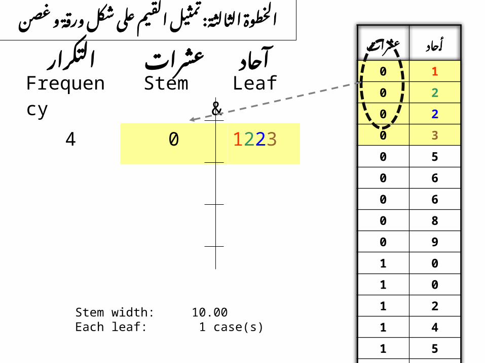
أحاد
0 1
0 2
0 2
0 3
0 5
0 6
0 6
0 8
0 9
1 0
1 0
1 2
1 4
1 5
1 5Stem & Leaf
األولى الخطوة
تصاعديا • المشاهدات قيم رتبوالعشرات اآلحاد لخانتي ووفقا
Frequency Stem & Leaf
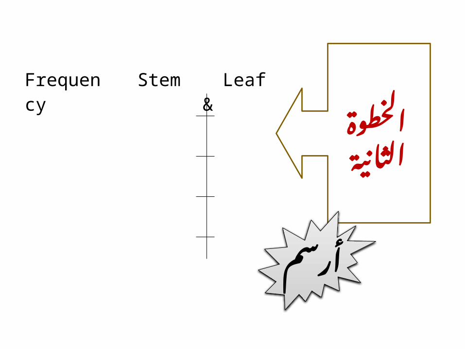
الخطوةالثانية
أرسم
Frequency Stem & Leaf
4 0 1223
عشرات
أحاد
0 1
0 2
0 2
0 3
0 5
0 6
0 6
0 8
0 9
1 0
1 0
1 2
1 4
1 5
1 5
Stem width: 10.00 Each leaf: 1 case)s(
: غصن و ورقة شكل على القيم تمثيل الثالثة الخطوة
عشراحادآت
التكرار
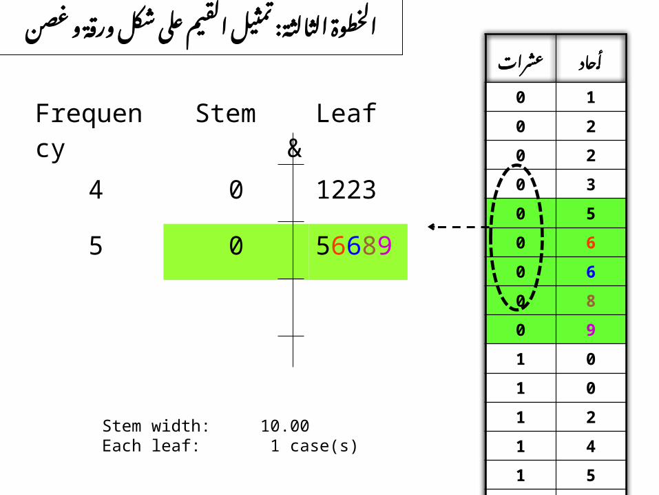
Frequency Stem & Leaf
4 0 1223
5 0 56689
عشرات
أحاد
0 1
0 2
0 2
0 3
0 5
0 6
0 6
0 8
0 9
1 0
1 0
1 2
1 4
1 5
1 5
Stem width: 10.00 Each leaf: 1 case)s(
: غصن و ورقة شكل على القيم تمثيل الثالثة الخطوة
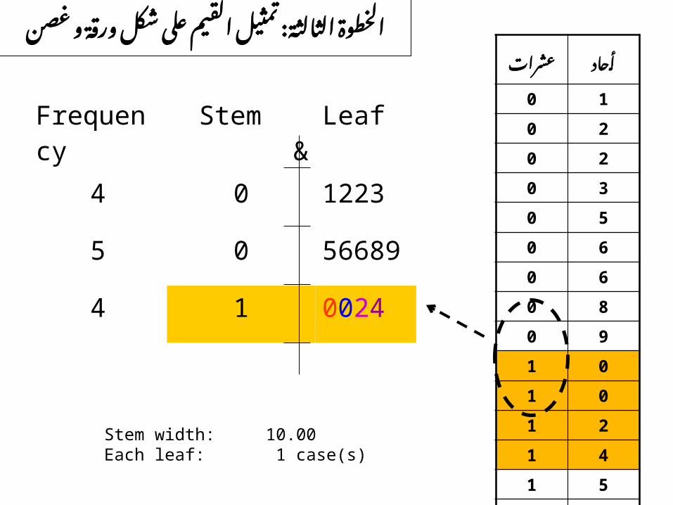
Frequency Stem & Leaf
4 0 1223
5 0 56689
4 1 0024
عشرات
أحاد
0 1
0 2
0 2
0 3
0 5
0 6
0 6
0 8
0 9
1 0
1 0
1 2
1 4
1 5
1 5
Stem width: 10.00 Each leaf: 1 case)s(
: غصن و ورقة شكل على القيم تمثيل الثالثة الخطوة

Frequency Stem & Leaf
4 0 1223
5 0 56689
4 1 0024
2 1 55
عشرات
أحاد
0 1
0 2
0 2
0 3
0 5
0 6
0 6
0 8
0 9
1 0
1 0
1 2
1 4
1 5
1 5
Stem width: 10.00 Each leaf: 1 case)s(
: غصن و ورقة شكل على القيم تمثيل الثالثة الخطوة

Frequency Stem & Leaf
4 0 1223
5 0 56689
4 1 0024
2 1 55
عشرات
أحاد
0 1
0 2
0 2
0 3
0 5
0 6
0 6
0 8
0 9
1 0
1 0
1 2
1 4
1 5
1 5
Stem width: 10.00 Each leaf: 1 case)s(
النهائي الشكل

5512
002414
5668905
122304
LeafStem &Frequency
5512
002414
5668905
122304
LeafStem &Frequencyقيمة أصغر
قيمة أكبر
تكرار أكثر
تكرار أقل

Stem and Leafs Plot
Used with relatively small quantities quantitative data.
It provides information regarding the range of data set..
Show location of the highest and lowest concentration of measurements

Stem and Leaf Plot (cont..)
Shows the information in single values.
As a rule it is not suitable for use in annual reports or other communication aimed at the general public.

• Range • Highest frequency• Lowest frequency
Kindly find out:

2. A Histogram

مثال
أعمار • مصاب 15كانت النحو حصبةبال امريضا على5التالي: 4 2
5 4 25 4 36 4 36 4 3
الحصبة : مرضى بعمر المتعلقة البيانات مثل بطريقة المطلوبالتكراري ) (Histogramالمدرج
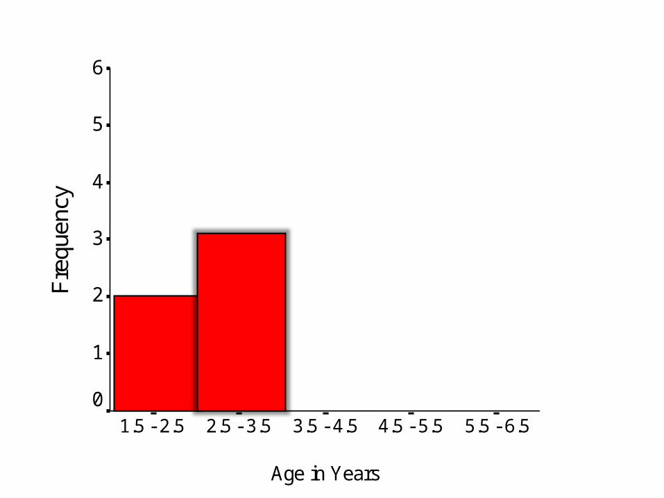
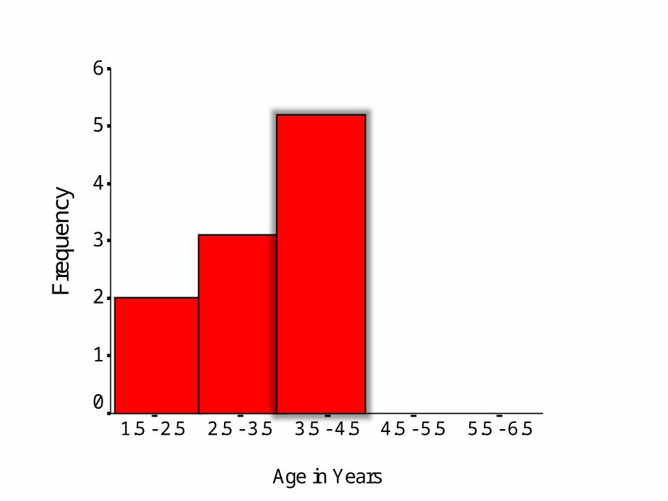
الخطوة األولى: تحديد الفترات
: التالية العمرية الفترات تحديد تم أنه لنفترض : األولى .2.5 – 1.5الفترة سنة
: ترةالف سنة. 3.5 –2.5الثانية : الثالثة .4.5 – 3.5الفترة سنة
سنة 5.5 –4.5: لرابعةا ترةالفا .6.5 – 5.5: لخامسةالفترة سنة

Age in Years
5.5 - 6.54.5 - 5.53.5 - 4.52.5 - 3.51.5 - 2.5
Fre
quen
cy
6
5
4
3
2
1
0
الخطوة الثانية: أرسم محورين
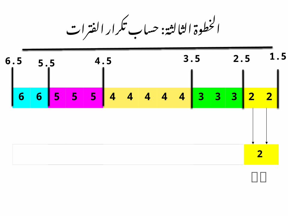
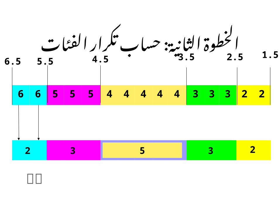
الخطوة الثالثة: حساب تكرار الفترات
6 6 5 5 5 4 4 4 4 4 3 3 3 2 2
1.52.53.54.55.5
223334444455566 223334444455566 235
6.5

Age in Years
5.5 - 6.54.5 - 5.53.5 - 4.52.5 - 3.51.5 - 2.5
Fre
quen
cy6
5
4
3
2
1
0

6 6 5 5 5 4 4 4 4 4 3 3 3 2 2
1.52.53.54.55.5
223334444455566 223334444455566 235
6.5
الخطوة الثالثة: حساب تكرار الفترات
Age in Years
5.5 - 6.54.5 - 5.53.5 - 4.52.5 - 3.51.5 - 2.5
Fre
quen
cy6
5
4
3
2
1
0

6 6 5 5 5 4 4 4 4 4 3 3 3 2 2
1.52.53.54.55.5
223334444455566 223334444455566 235
6.5
الخطوة الثالثة: حساب تكرار الفترات مع الرسم
Age in Years
5.5 - 6.54.5 - 5.53.5 - 4.52.5 - 3.51.5 - 2.5
Fre
quen
cy6
5
4
3
2
1
0

: الفئات تكرار حساب الثانية الخطوة
6 6 5 5 5 4 4 4 4 4 3 3 3 2 2
1.52.53.54.55.5
223334444455566 223334444455566 2353
5.5

Age in Years
5.5 - 6.54.5 - 5.53.5 - 4.52.5 - 3.51.5 - 2.5
Fre
quen
cy6
5
4
3
2
1
0
: الفئات تكرار حساب الثانية الخطوة
6 6 5 5 5 4 4 4 4 4 3 3 3 2 2
1.52.53.54.55.5
223334444455566 223334444455566 23532
6.5
Age in Years
5.5 - 6.54.5 - 5.53.5 - 4.52.5 - 3.51.5 - 2.5
Fre
quen
cy6
5
4
3
2
1
0

Histogram
Special type of bar chart.
Is only suitable for variables whose values are numerical ( Quantitative) and measured on an interval scale.
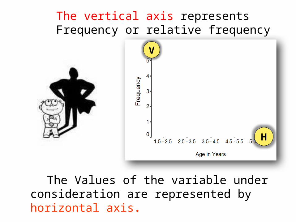
H
V
The vertical axis represents Frequency or relative frequency
The Values of the variable under consideration are represented by horizontal axis.

It is generally used when dealing with large data sets, when stem and leaf plots become tedious to construct.
A histogram can also help detect any unusual observations (outliers), or any gaps in the data set.
Histogram
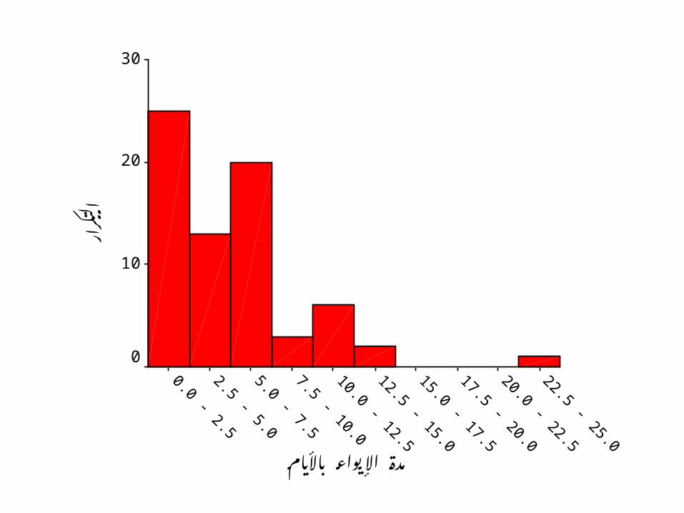
مدة اإليواء باأليام
اركر
لتا
30
20
10
0
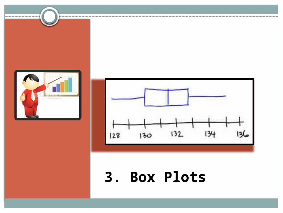
3. Box Plots
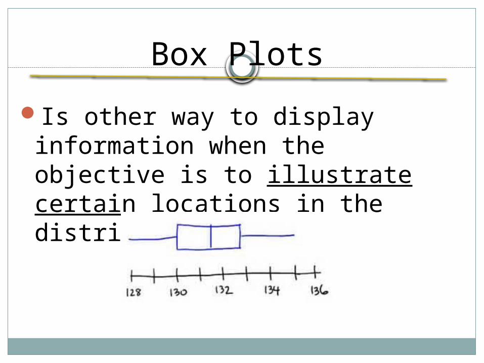
Box Plots
Is other way to display information when the objective is to illustrate certain locations in the distribution
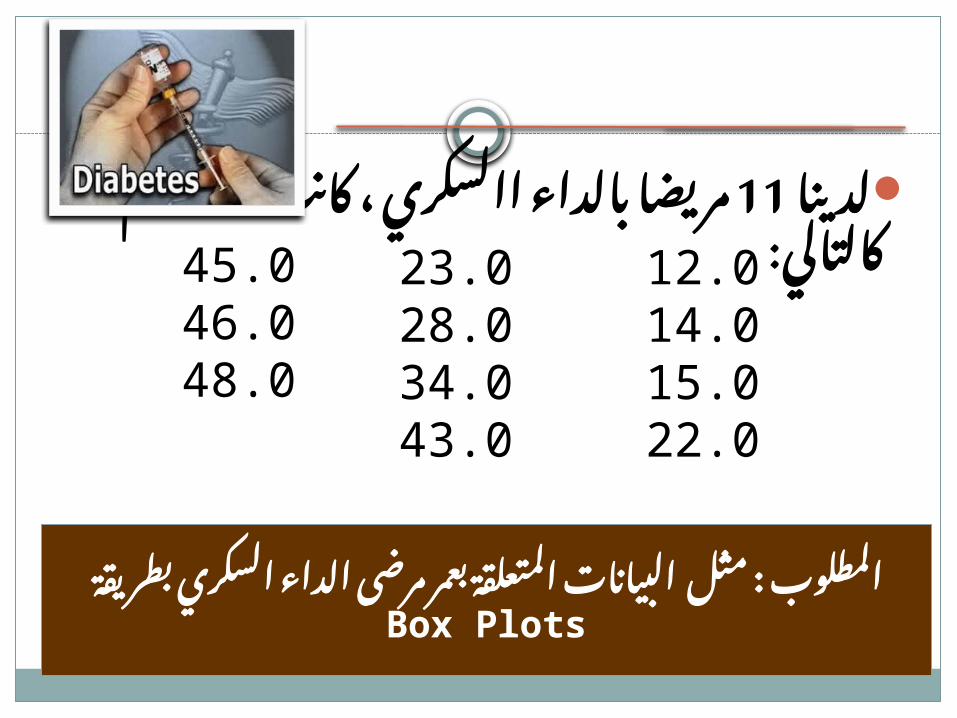
مثـــال
مريضا بالداء االسكري ، 11لدينا : كانت أعمارهم كالتالي
السكري : الداء مرضى بعمر المتعلقة البيانات مثل بطريقة المطلوبBox Plots
45.046.048.0
12.014.015.022.0
23.028.034.043.0

البياني الشكل (Box Plots رسم بخطوة ( خطوة
12 14 15 22 23 28 34 43 45 46 48
1

البياني الشكل Box Plotsرسم
12 14 15 22 23 28 34 43 45 46 48
10 20 30 40 50
12
Age in Years
2
أصغر قيمة

البياني الشكل Box Plotsرسم
12 14 15 22 23 28 34 43 45 46 48
10 20 30 40 50
12 48
Age in Years
3
أكبر قيمة

البياني الشكل Box Plotsرسم
12 14 15 22 23 28 34 43 45 46 48
10 20 30 40 50
12 48
Q2 = Median = 28
Age in Years
4
إلى المشاهدات تقسم التي القيمةمتساويين قسمين

البياني الشكل Box Plotsرسم
12 14 15 22 23 28 34 43 45 46 48
10 20 30 40 50
48
Q 1 = 15
Age in Years
5
األول ) من (: Q1الربيع األول النصف تقسم التي القيمةمتساويين قسمين إلى المشاهدات
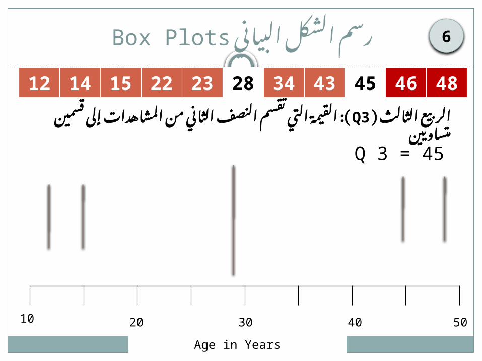
البياني الشكل Box Plotsرسم
12 14 15 22 23 28 34 43 45 46 48
10 20 30 40 50
Q 3 = 45
Age in Years
6
الثالث ) من (: Q3الربيع الثاني النصف تقسم التي القيمةمتساويين قسمين إلى المشاهدات

البياني الشكل Box Plotsرسم
12 14 15 22 23 28 34 43 45 46 48
10 20 30 40 50
Age in Years
7

البياني الشكل الشكل ) Box Plots رسمالنهائي (
12 14 15 22 23 28 34 43 45 46 48
10 20 30 40 50
قيمة أصغر قيمة أكبر
Q 1Q 2 = Median Q 3
Age in Years
8
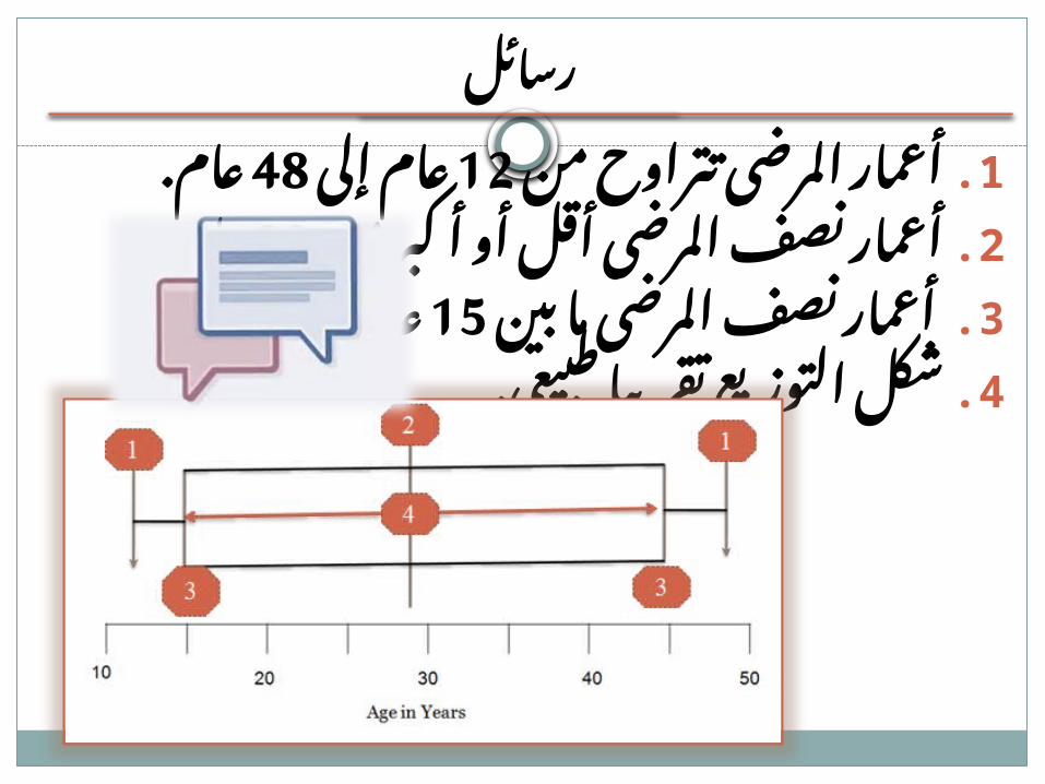
رسائل
عام 12أعمار المرضى تتراوح من 1. عام.48إلى
أعمار نصف المرضى أقل أو أكبر 2. عام.28من
15 أعمار نصف المرضى ما بين 3. عاما.45عاما و
شكل التوزيع تقريبا طبيعي. 4.

Box plots and outliers
Box plots can also help detect any unusual observations (outliers)
An outlier: is an observation point that is distant from other observations.
Outliers
Outliers

Finally
Quantitative Data Presenting
14 3.6 3.6
18 4.7 8.3
105 27.3 35.6
95 24.7 60.3
73 19.0 79.2
49 12.7 91.9
16 4.2 96.1
14 3.6 99.7
1 .3 100.0
385 100.0
Age Group1 - 9
10- 19
20- 29
30- 39
40- 49
50- 59
60- 69
70- 79
80- 89
Total
Frequency Percent Cumulative Percent
1. Tabulation 2. Stem & Leaf
3. Histogram4. Box Plots