data visualisation in spreadsheets - vorlesungen · data visualisation in spreadsheets julia lesky,...
TRANSCRIPT
Data Visualisation in Spreadsheets
Julia Lesky, Majda Osmic, Stefan Simon
706.057 Information Visualisation SS 2014Institute for Information Systems and Computer Media (IICM)
Graz University of Technology
21 May 2014
Abstract
Spreadsheet applications are calculation and data processing applications, probably the most popular being Mi-crosoft Excel. Considering the fact that the Microsoft Office Suite is widely used in business and home officesand that there are several other similar alternatives, it makes sense to explore the data visualisation potentialsof these tools. In this survey, built-in features as well as some extension tools for Microsoft Excel and onefree alternative, LibreOffice Calc, are examined. The built-in features of Microsoft Excel and LibreOffice Calcare investigated and advantages and disadvantages of both applications enumerated. Furthermore, this surveycovers an overview of two plugins for Microsoft Excel, NodeXL and chart-me, one a plugin for visualisationof network data and one a tool for the creation of expressive business charts. In the last point, a short summaryof a few apps for Microsoft Excel 2013, available in the Microsoft Office Store, is given.

Contents
1 Introduction 1
2 Microsoft Excel built-in features 32.1 Pivot tables . . . . . . . . . . . . . . . . . . . . . . . . . . . . . . . . . . . . . . . . . . . . 32.2 Pivot Chart . . . . . . . . . . . . . . . . . . . . . . . . . . . . . . . . . . . . . . . . . . . . 32.3 Conditional Formatting . . . . . . . . . . . . . . . . . . . . . . . . . . . . . . . . . . . . . . 32.4 Sparklines . . . . . . . . . . . . . . . . . . . . . . . . . . . . . . . . . . . . . . . . . . . . . 32.5 Combined Charts . . . . . . . . . . . . . . . . . . . . . . . . . . . . . . . . . . . . . . . . . 32.6 Export . . . . . . . . . . . . . . . . . . . . . . . . . . . . . . . . . . . . . . . . . . . . . . . 6
3 Libre Office Calc 73.1 Pivot Tables . . . . . . . . . . . . . . . . . . . . . . . . . . . . . . . . . . . . . . . . . . . . 83.2 Charts . . . . . . . . . . . . . . . . . . . . . . . . . . . . . . . . . . . . . . . . . . . . . . . 83.3 Export . . . . . . . . . . . . . . . . . . . . . . . . . . . . . . . . . . . . . . . . . . . . . . . 93.4 Performance . . . . . . . . . . . . . . . . . . . . . . . . . . . . . . . . . . . . . . . . . . . . 93.5 Remarks . . . . . . . . . . . . . . . . . . . . . . . . . . . . . . . . . . . . . . . . . . . . . . 9
4 Microsoft Excel Plugins 134.1 NodeXL . . . . . . . . . . . . . . . . . . . . . . . . . . . . . . . . . . . . . . . . . . . . . . 13
4.1.1 Template . . . . . . . . . . . . . . . . . . . . . . . . . . . . . . . . . . . . . . . . . 134.1.2 Data Creation and Import . . . . . . . . . . . . . . . . . . . . . . . . . . . . . . . . . 134.1.3 Network Graph Layout . . . . . . . . . . . . . . . . . . . . . . . . . . . . . . . . . . 144.1.4 Group Metrics . . . . . . . . . . . . . . . . . . . . . . . . . . . . . . . . . . . . . . 144.1.5 Visual Parameters of Edges and Vertices . . . . . . . . . . . . . . . . . . . . . . . . . 164.1.6 Data Filtering . . . . . . . . . . . . . . . . . . . . . . . . . . . . . . . . . . . . . . . 184.1.7 Grouping . . . . . . . . . . . . . . . . . . . . . . . . . . . . . . . . . . . . . . . . . 184.1.8 Subgraphs . . . . . . . . . . . . . . . . . . . . . . . . . . . . . . . . . . . . . . . . . 194.1.9 Graph Export and Upload to NodeXL Gallery . . . . . . . . . . . . . . . . . . . . . . 194.1.10 Performance . . . . . . . . . . . . . . . . . . . . . . . . . . . . . . . . . . . . . . . 19
4.2 Chart-me . . . . . . . . . . . . . . . . . . . . . . . . . . . . . . . . . . . . . . . . . . . . . 194.2.1 Template . . . . . . . . . . . . . . . . . . . . . . . . . . . . . . . . . . . . . . . . . 204.2.2 Charts, Sub-charts and Data Insertion . . . . . . . . . . . . . . . . . . . . . . . . . . 204.2.3 Chart Export . . . . . . . . . . . . . . . . . . . . . . . . . . . . . . . . . . . . . . . 224.2.4 Performance . . . . . . . . . . . . . . . . . . . . . . . . . . . . . . . . . . . . . . . 22
5 Microsoft Excel 2013 Apps 255.1 Office Store Visualisation Apps Overview . . . . . . . . . . . . . . . . . . . . . . . . . . . . 25
5.1.1 SmartCharts . . . . . . . . . . . . . . . . . . . . . . . . . . . . . . . . . . . . . . . 255.1.2 Histogram . . . . . . . . . . . . . . . . . . . . . . . . . . . . . . . . . . . . . . . . . 255.1.3 Histogram 2D . . . . . . . . . . . . . . . . . . . . . . . . . . . . . . . . . . . . . . . 25
i

5.1.4 Treemap . . . . . . . . . . . . . . . . . . . . . . . . . . . . . . . . . . . . . . . . . 275.1.5 Streamgraph . . . . . . . . . . . . . . . . . . . . . . . . . . . . . . . . . . . . . . . 275.1.6 Bing Maps . . . . . . . . . . . . . . . . . . . . . . . . . . . . . . . . . . . . . . . . 275.1.7 Geographic Heat Map . . . . . . . . . . . . . . . . . . . . . . . . . . . . . . . . . . 275.1.8 Gauge . . . . . . . . . . . . . . . . . . . . . . . . . . . . . . . . . . . . . . . . . . . 30
5.2 Performance . . . . . . . . . . . . . . . . . . . . . . . . . . . . . . . . . . . . . . . . . . . . 30
6 Concluding Remarks 31
Bibliography 32
ii
Chapter 1
Introduction
“A picture says a thousand words.” These days, data comes in a variety of forms, but cannot be interpreted easilymost times. At this point, data visualisation becomes more and more important, as the human mind capturesand interprets data more easily through vision than any other sense. Although spreadsheet applications providenumerous ways to process data and adapt it to the user’s needs, it is often easier to just look at a diagram tosee trends or get a general overview of a particular dataset. In this survey, a closer look at all possibilities todata visualisation in spreadsheet applications is taken. Microsoft Excel, a commercial spreadsheet application,provides a wide range of built-in features, plugins and add-ons, not only for data processing, but for datavisualisation as well. For a direct comparison LibreOffice Calc, part of a free open source Office suite, isconsidered and the same examinations are done.
In Chapter 2, the built-in data visualisation features of Microsoft Excel are presented. A short introductionon data pre-processing with Pivot Tables is done, followed by some visualisation possibilities, including simplestandard charts, Pivot Charts, which are standard charts linked to the data of the chosen Pivot Table, andSparklines, which are small charts the size of one cell. Furthermore, export possibilities of visualisations areexamined.
In Chapter 3, the same aspects are considered in LibreOffice Calc, a free alternative to Microsoft Office.The first thing presented is again the creation of a Pivot Table to prepare data for the following visualisations.However, for the reason that LibreOffice Calc is not as powerful as Microsoft Excel, only an overview of thestandard charts is presented. The last points covered are image export of the visualisations, performance and alist of some drawbacks in comparison to Microsoft Excel.
Chapter 4 covers two plugins for Microsoft Excel. The first, NodeXL, is a plugin to download and visualisenetwork with a broad variety of customisation possibilities to interpret network data visualisations, which makesit different from all other features, plugins and add-ons in this survey. The second, Chart-me, is a commercialtool to create templates for meaningful and consistent business dashboards. In Chapter 5, some of the appswhich can be purchased in the Microsoft Office Store, are introduced.
In Chapter 6, all previous points are summarised, the presented applications compared and advantages anddrawbacks listed for a final conclusion.
Disclaimer: The report was created using LaTeX based on the skeleton provided by Keith Andrews. Allgraphics have been created by the authors.
1

2 CHAPTER 1. INTRODUCTION
Chapter 2
Microsoft Excel built-in features
Microsoft Excel is the most widespread spreadsheet program. It costs about C60 in the standalone version butis also available in a package with applications like Word and PowerPoint in Office 365 from C4,10 per month[Microsoft Corporation, 2014b].
2.1 Pivot tables
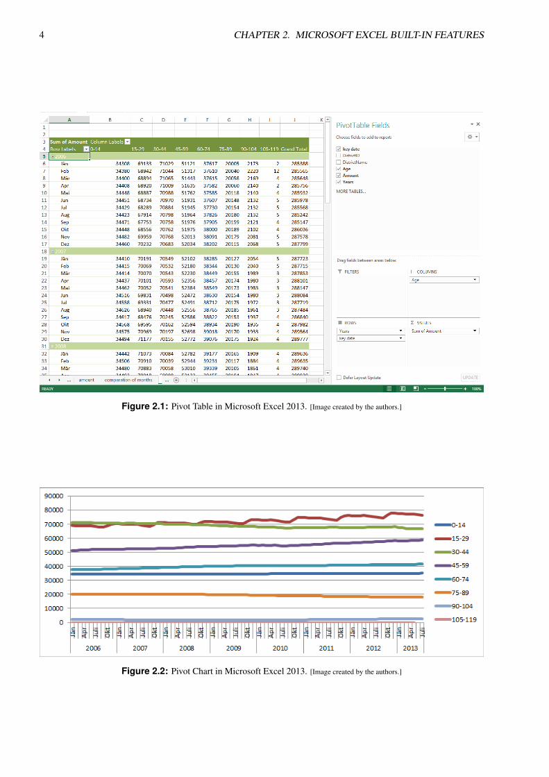
An important part of creating good charts is a good data set. This could be easily created with Pivot Ta-bles, which are built-in features of Microsoft Excel (Figure 2.1). They seem to be complicated in the firstplace, but the learning curve is steeply rising and there are many tutorials available [Microsoft Corporation,2010][Video2Brain, 2014]. It is possible to connect two or more Pivot Tables. That is, all filters and groupsettings are synchronized.
2.2 Pivot Chart
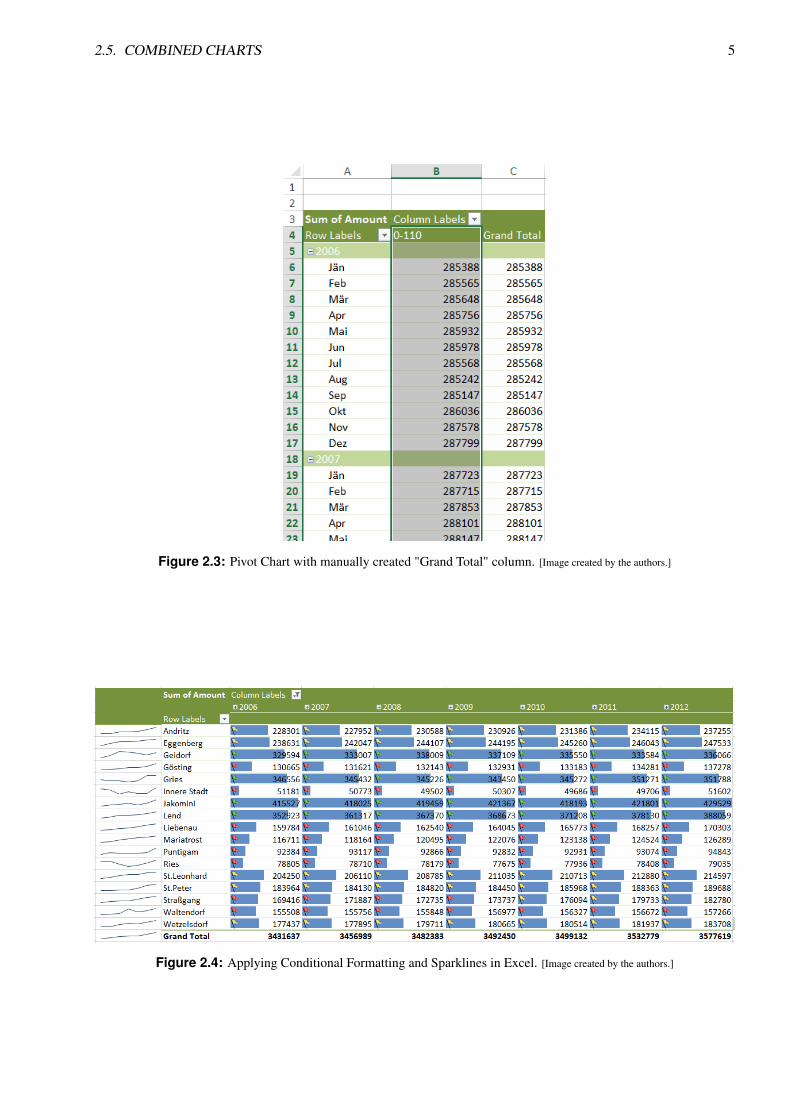
Pivot Charts (Figure 2.2) are currently only available on Microsoft Excel for Windows. One advantage of PivotCharts is that charts update automatically when filtering or grouping of the pivot table has changed. PivotCharts have no restrictions to standard charts unless it isn’t possible to make a diagram of the column "GrandTotal". The only way to achieve this is to copy the values in a separate chart and create a standard chart ormanually grouping the values to a single column (see Figure 2.3).
2.3 Conditional Formatting
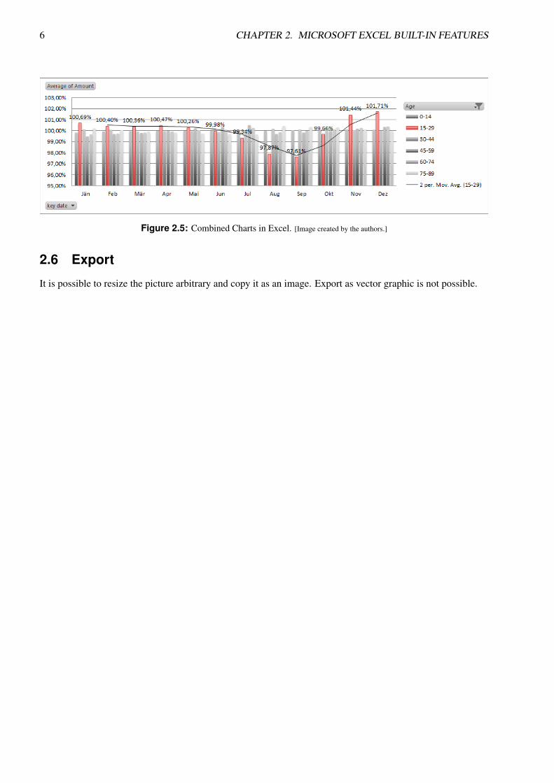
Conditional Formatting is a possibility to format a cell depended of its value. Rules can be applied to changefont style, background and borders. It is not possible to use relative references in these rules. There are somepredefined rules, which can not be reproduced with self-created rules, for example icons directly in the cell,color scales or bar charts (Figure 2.5).
2.4 Sparklines
Sparklines are an enchancement of Conditional Formatting and let the user create small diagrams in a cell.They are limited to line charts, bar charts and Win/Loss bar charts (Figure 2.5).
2.5 Combined Charts
In Excel it is easy to combine several chart types into one chart. Very useful are the automatic calculatedTrendlines (Figure 2.5).
3
4 CHAPTER 2. MICROSOFT EXCEL BUILT-IN FEATURES
Figure 2.1: Pivot Table in Microsoft Excel 2013. [Image created by the authors.]
Figure 2.2: Pivot Chart in Microsoft Excel 2013. [Image created by the authors.]
2.5. COMBINED CHARTS 5
Figure 2.3: Pivot Chart with manually created "Grand Total" column. [Image created by the authors.]
Figure 2.4: Applying Conditional Formatting and Sparklines in Excel. [Image created by the authors.]
6 CHAPTER 2. MICROSOFT EXCEL BUILT-IN FEATURES
Figure 2.5: Combined Charts in Excel. [Image created by the authors.]
2.6 Export
It is possible to resize the picture arbitrary and copy it as an image. Export as vector graphic is not possible.
Chapter 3
Libre Office Calc
LibreOffice is advertised as “a powerful office suite which embeds several applications that make it the mostpowerful Free & Open Source Office suite on the market” [The Document Foundation, 2014a]. For that reasonthe LibreOffice suite is often mentioned as a free alternative to some applications of Microsoft Office.
In this chapter a closer look at LibreOffice Calc, the spreadsheet application of LibreOffice, will be taken,and, in more detail, especially built-in features and external plugins for spreadsheet data visualisation. Aftersome research, other than for Microsoft Excel, no concrete and easy-to-use external plugins for LibreOffice Calcwere found. There exists a plugin called GeOOo [The Document Foundation, 2014b], which maps numericaldata to geographical areas, but it cannot be used with LibreOffice Calc alone – LibreOffice Draw is neededto process spreadsheet data and draw the visualisation. In addition to GeOOo being only able to visualisegeographical data, several tests on a Windows 8 laptop with current technology to map sample spreadsheet datato a geographical map led to a crash of LibreOffice Draw. Moreover, GeOOo is not compatible with the currentversion number 4.2.4 of LibreOffice (by date May 18, 2014).
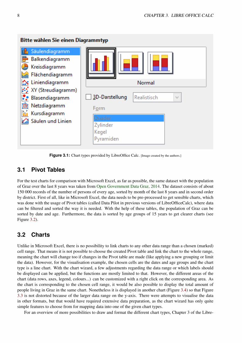
Therefore the focus was switched to examine only the built-in features to visualise spreadsheet data withLibreOffice Calc and compare them to results obtained with Microsoft Excel. At a first glance, it seems thatLibreOffice Calc provides the same chart types as Microsoft Excel, which are the following, each with severalsub-types to choose from (see Figure 3.1):
• Column Charts,
• Bar Charts,
• Pie Charts,
• Area Charts,
• Line Charts,
• XY Scatter Charts,
• Bubble Charts,
• Net Charts,
• Stock Charts and
• Column and Line Charts.
Taking a closer look, these charts are the only possibilities to visualise data in LibreOffice Calc, other thanMicrosoft Excel, which offers a broader variety of built-in features, like Pivot Charts, which are directly linkedto Pivot Tables, or Sparklines (see Chapter 2).
7
8 CHAPTER 3. LIBRE OFFICE CALC
Figure 3.1: Chart types provided by LibreOffice Calc. [Image created by the authors.]
3.1 Pivot Tables
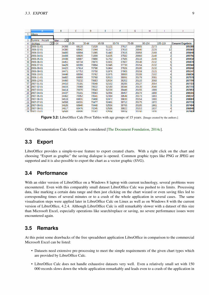
For the test charts for comparison with Microsoft Excel, as far as possible, the same dataset with the populationof Graz over the last 8 years was taken from Open Government Data Graz, 2014. The dataset consists of about150 000 records of the number of persons of every age, sorted by month of the last 8 years and in second orderby district. First of all, like in Microsoft Excel, the data needs to be pre-processed to get sensible charts, whichwas done with the usage of Pivot tables (called Data Pilot in previous versions of LibreOfficeCalc), where datacan be filtered and sorted the way it is needed. With the help of these tables, the population of Graz can besorted by date and age. Furthermore, the data is sorted by age groups of 15 years to get clearer charts (seeFigure 3.2).
3.2 Charts
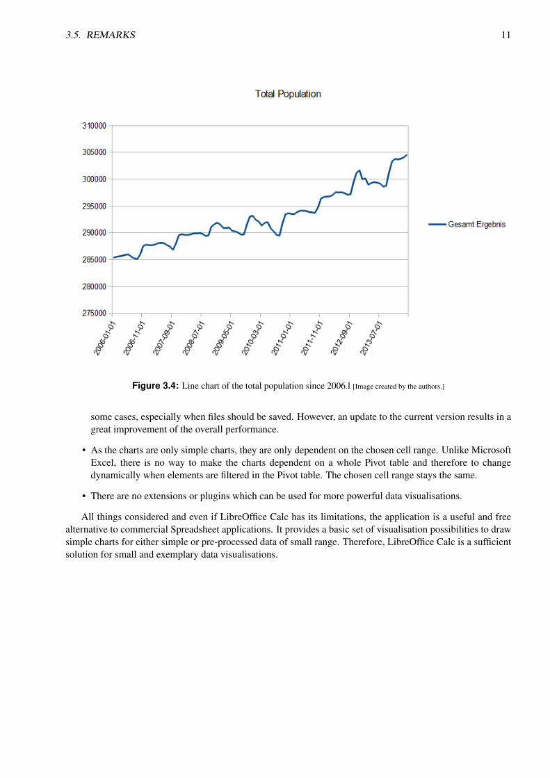
Unlike in Microsoft Excel, there is no possibility to link charts to any other data range than a chosen (marked)cell range. That means it is not possible to choose the created Pivot table and link the chart to the whole range,meaning the chart will change too if changes in the Pivot table are made (like applying a new grouping or limitthe data). However, for the visualisation example, the chosen cells are the dates and age groups and the charttype is a line chart. With the chart wizard, a few adjustments regarding the data range or which labels shouldbe displayed can be applied, but the functions are mostly limited to that. However, the different areas of thechart (data rows, axes, legend, colours...) can be customized with a right click on the corresponding area. Asthe chart is corresponding to the chosen cell range, it would be also possible to display the total amount ofpeople living in Graz in the same chart. Nonetheless it is displayed in another chart (Figure 3.4) so that Figure3.3 is not distorted because of the larger data range on the y-axis. There were attempts to visualise the datain other formats, but that would have required extensive data preparation, as the chart wizard has only quitesimple features to choose from for mapping data into one of the given chart types.
For an overview of more possibilities to draw and format the different chart types, Chapter 3 of the Libre-
3.3. EXPORT 9
Figure 3.2: LibreOffice Calc Pivot Tables with age groups of 15 years. [Image created by the authors.]
Office Documentation Calc Guide can be considered [The Document Foundation, 2014c].
3.3 Export
LibreOffice provides a simple-to-use feature to export created charts. With a right click on the chart andchoosing “Export as graphic” the saving dialogue is opened. Common graphic types like PNG or JPEG aresupported and it is also possible to export the chart as a vector graphic (SVG).
3.4 Performance
With an older version of LibreOffice on a Windows 8 laptop with current technology, several problems wereencountered. Even with this comparably small dataset LibreOffice Calc was pushed to its limits. Processingdata, like marking a certain data range and then just clicking on the chart wizard or even saving files led tocorresponding times of several minutes or to a crash of the whole application in several cases. The samevisualisation steps were applied later in LibreOffice Calc on Linux as well as on Windows 8 with the currentversion of LibreOffice, 4.2.4. Although LibreOffice Calc is still remarkably slower with a dataset of this sizethan Microsoft Excel, especially operations like search/replace or saving, no severe performance issues wereencountered again.
3.5 Remarks
At this point some drawbacks of the free spreadsheet application LibreOffice in comparison to the commercialMicrosoft Excel can be listed:
• Datasets need extensive pre-processing to meet the simple requirements of the given chart types whichare provided by LibreOffice Calc.
• LibreOffice Calc does not handle exhaustive datasets very well. Even a relatively small set with 150000 records slows down the whole application remarkably and leads even to a crash of the application in

10 CHAPTER 3. LIBRE OFFICE CALC
Figure 3.3: Line Chart with one line for every age group, except the total amount. [Image created by theauthors.]
3.5. REMARKS 11
Figure 3.4: Line chart of the total population since 2006.l [Image created by the authors.]
some cases, especially when files should be saved. However, an update to the current version results in agreat improvement of the overall performance.
• As the charts are only simple charts, they are only dependent on the chosen cell range. Unlike MicrosoftExcel, there is no way to make the charts dependent on a whole Pivot table and therefore to changedynamically when elements are filtered in the Pivot table. The chosen cell range stays the same.
• There are no extensions or plugins which can be used for more powerful data visualisations.
All things considered and even if LibreOffice Calc has its limitations, the application is a useful and freealternative to commercial Spreadsheet applications. It provides a basic set of visualisation possibilities to drawsimple charts for either simple or pre-processed data of small range. Therefore, LibreOffice Calc is a sufficientsolution for small and exemplary data visualisations.

12 CHAPTER 3. LIBRE OFFICE CALC
Chapter 4
Microsoft Excel Plugins
4.1 NodeXL
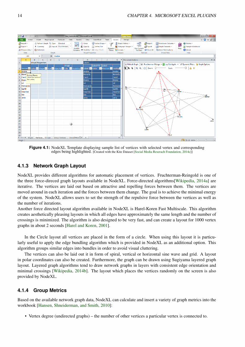
NodeXL is a Microsoft Excel 2007, 2010 and 2013 add-in for interactive visualisation and analysis of networkgraphs [CodePlex, 2014a]. The creation of the NodeXL add-in was supported by the Social Media ResearchFoundation [Social Media Reserach Foundation, 2014a] whose main goal is to develop tools optimised forcollection, visualisation and analysis of social media network data. NodeXL is free and open-source.
4.1.1 Template
NodeXL is an add-in for Microsoft Excel 2007 or higher. When installed, NodeXL adds a new section in theMicrosoft Excel Ribbon. A spreadsheet template is also provided with several sheets that define the list ofvertices, edge list (directed connections between the vertices), groups and overall network metrics. Columns ineach sheet contain network data and parameters for visual representation of vertices and edges, such as label,colour, width, style, opacity, and many other visual and other attributes.
NodeXL provides certain interactive features, such as zooming, scaling, selecting or deselecting one ormore vertices along with the corresponding edges, as well as the navigation through large graphs using thehand tool. The data can be dynamically filtered in or out of the graph.
4.1.2 Data Creation and Import
The network data can be either imported or created by the user by inserting the necessary data in the template.When it comes to importing, NodeXL provides a variety of possibilities. Apart from standard network datarepresentation formats, such as GraphML or Pajek, the data can be imported into NodeXL from any currentlyopened Microsoft Excel workbook in which case the user has to manually select vertex and edge columns.NodeXL can also import network data based on the emails a user has exchanged, provided that an email clientsuch as Microsoft Outlook or Thunderbird is used. Although NodeXL can visualise any sort of network graphs,it has been primarily created for visualisation and exploration of social networks. For this reason, NodeXLprovides download and import of network data from several popular social networks such as Flickr, Twitteror YouTube. Import from Facebook is possible using a Social Network Importer library[CodePlex, 2014b] forNodeXL. In order to use this functionality, an active account on the relevant social network is required. Theimport from Twitter can be fairly slow because Twitter has limited the number of API requests to 15 within a 15minutes window [Twitter, 2014], so the download is often paused and continued after 15 minutes if it requiresmore than one API request to complete. The download of the network data from all other previously mentionedsocial networks runs without major difficulties .
13
14 CHAPTER 4. MICROSOFT EXCEL PLUGINS
Figure 4.1: NodeXL Template displaying sample list of vertices with selected vertex and correspondingedges being highlighted. [Created with the Kite Dataset [Social Media Reserach Foundation, 2014c]]
4.1.3 Network Graph Layout
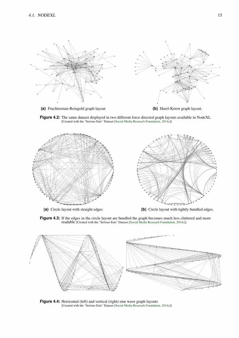
NodeXL provides different algorithms for automatic placement of vertices. Fruchterman-Reingold is one ofthe three force-direced graph layouts available in NodeXL. Force-directed algorithms[Wikipedia, 2014a] areiterative. The vertices are laid out based on attractive and repelling forces between them. The vertices aremoved around in each iteration and the forces between them change. The goal is to achieve the minimal energyof the system. NodeXL allows users to set the strength of the repulsive force between the vertices as well asthe number of iterations.Another force directed layout algorithm available in NodeXL is Harel-Koren Fast Multiscale. This algorithmcreates aesthetically pleasing layouts in which all edges have approximately the same length and the number ofcrossings is minimized. The algorithm is also designed to be very fast, and can create a layout for 1000 vertexgraphs in about 2 seconds [Harel and Koren, 2001].
In the Circle layout all vertices are placed in the form of a circle. When using this layout it is particu-larly useful to apply the edge bundling algorithm which is provided in NodeXL as an additional option. Thisalgorithm groups similar edges into bundles in order to avoid visual cluttering.
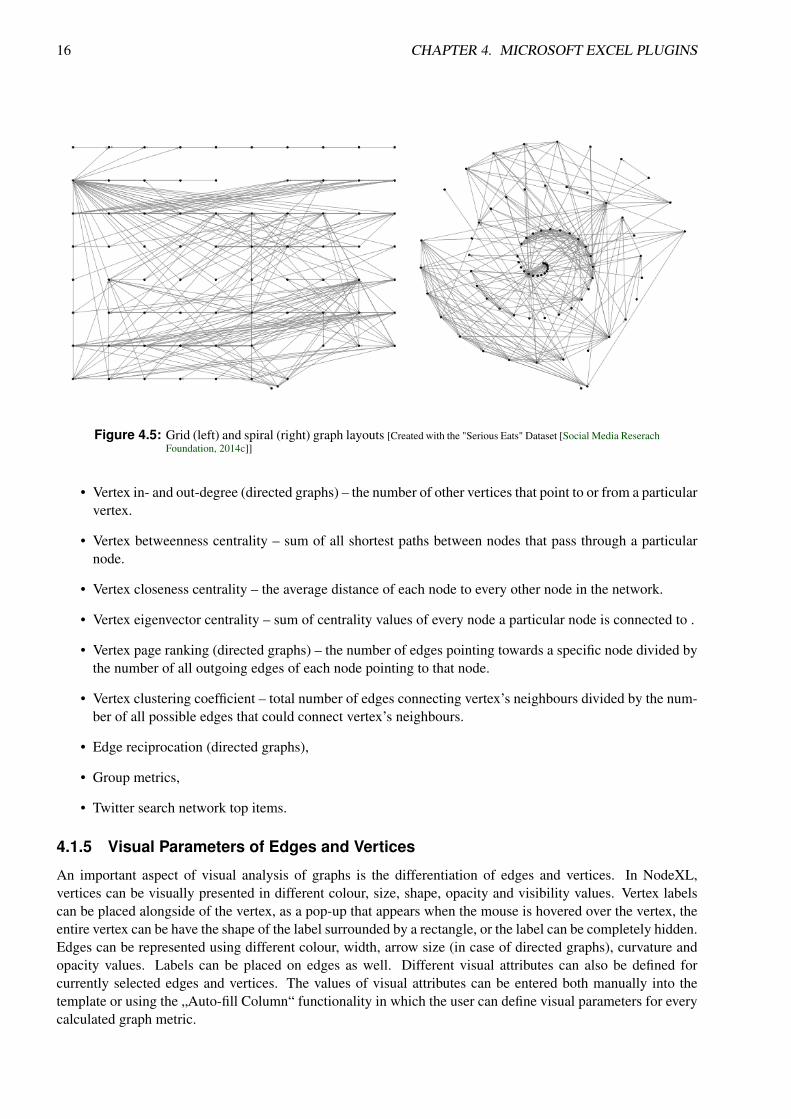
The vertices can also be laid out it in form of spiral, vertical or horizontal sine wave and grid. A layoutin polar coordinates can also be created. Furthermore, the graph can be drawn using Sugiyama layered graphlayout. Layered graph algorithms tend to draw network graphs in layers with consistent edge orientation andminimal crossings [Wikipedia, 2014b]. The layout which places the vertices randomly on the screen is alsoprovided by NodeXL.
4.1.4 Group Metrics
Based on the available network graph data, NodeXL can calculate and insert a variety of graph metrics into theworkbook [Hansen, Shneiderman, and Smith, 2010]:
• Vertex degree (undirected graphs) – the number of other vertices a particular vertex is connected to.
4.1. NODEXL 15
(a) Fruchterman-Reingold graph layout (b) Harel-Koren graph layout.
Figure 4.2: The same dataset displayed in two different force directed graph layouts available in NodeXL[Created with the "Serious Eats" Dataset [Social Media Reserach Foundation, 2014c]]
(a) Circle layout with straight edges (b) Circle layout with tightly bundled edges.
Figure 4.3: If the edges in the circle layout are bundled the graph becomes much less cluttered and morereadable [Created with the "Serious Eats" Dataset [Social Media Reserach Foundation, 2014c]]
Figure 4.4: Horizontal (left) and vertical (right) sine wave graph layouts[Created with the "Serious Eats" Dataset [Social Media Reserach Foundation, 2014c]]
16 CHAPTER 4. MICROSOFT EXCEL PLUGINS
Figure 4.5: Grid (left) and spiral (right) graph layouts [Created with the "Serious Eats" Dataset [Social Media ReserachFoundation, 2014c]]
• Vertex in- and out-degree (directed graphs) – the number of other vertices that point to or from a particularvertex.
• Vertex betweenness centrality – sum of all shortest paths between nodes that pass through a particularnode.
• Vertex closeness centrality – the average distance of each node to every other node in the network.
• Vertex eigenvector centrality – sum of centrality values of every node a particular node is connected to .
• Vertex page ranking (directed graphs) – the number of edges pointing towards a specific node divided bythe number of all outgoing edges of each node pointing to that node.
• Vertex clustering coefficient – total number of edges connecting vertex’s neighbours divided by the num-ber of all possible edges that could connect vertex’s neighbours.
• Edge reciprocation (directed graphs),
• Group metrics,
• Twitter search network top items.
4.1.5 Visual Parameters of Edges and Vertices
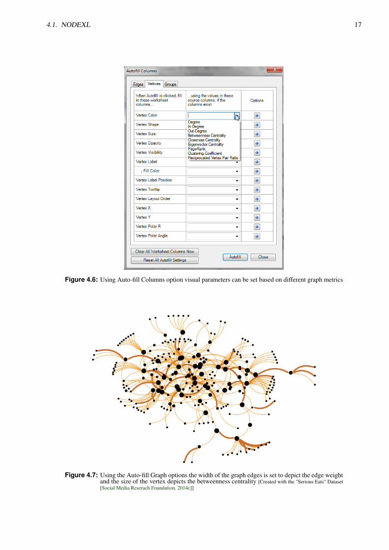
An important aspect of visual analysis of graphs is the differentiation of edges and vertices. In NodeXL,vertices can be visually presented in different colour, size, shape, opacity and visibility values. Vertex labelscan be placed alongside of the vertex, as a pop-up that appears when the mouse is hovered over the vertex, theentire vertex can be have the shape of the label surrounded by a rectangle, or the label can be completely hidden.Edges can be represented using different colour, width, arrow size (in case of directed graphs), curvature andopacity values. Labels can be placed on edges as well. Different visual attributes can also be defined forcurrently selected edges and vertices. The values of visual attributes can be entered both manually into thetemplate or using the „Auto-fill Column“ functionality in which the user can define visual parameters for everycalculated graph metric.
4.1. NODEXL 17
Figure 4.6: Using Auto-fill Columns option visual parameters can be set based on different graph metrics
Figure 4.7: Using the Auto-fill Graph options the width of the graph edges is set to depict the edge weightand the size of the vertex depicts the betweenness centrality [Created with the "Serious Eats" Dataset[Social Media Reserach Foundation, 2014c]]

18 CHAPTER 4. MICROSOFT EXCEL PLUGINS
Figure 4.8: Edges and vertices can be filtered in or out of the graph based on different graph metrics usingthe displayed sliders
4.1.6 Data Filtering
NodeXL provides the option for auto counting and merging of duplicate edges. After the duplicate edges havebeen merged, the edge weight of every merged edge increases depending on how many times the edge wasduplicated. Dynamic filters can be applied in order to filter out certain parts of the graph. For example, onemight want to view only the vertices with certain in-degree values. Edges and vertices can be filtered based onall available graph metrics. The parts of the graph that are filtered out are not completely removed from thegraph but made invisible. Because of this, the graph can be redrawn very fast even after the parts that have beenfiltered out are put back into the graph.
4.1.7 Grouping
In network graph analysis often groups and clusters of vertices are observed. In NodeXL, vertices can begrouped by vertex attributes such as in- and out-degrees, betweenness, closeness and eigenvector centrality,page rank and other. Custom vertex attributes can be defined and used to group the vertices. NodeXL can alsoidentify motifs and connected components of the network graph and group the vertices accordingly. In networkgraphs, clusters are made of a set of densely connected vertices with only a limited number of connectionsto other clusters [Hansen, Shneiderman, and Smith, 2010]. NodeXL provides three algorithms for vertexclustering: Caluset-Newman-Moore, Wakita-Tsurumi, Girvan-Newman.
4.2. CHART-ME 19
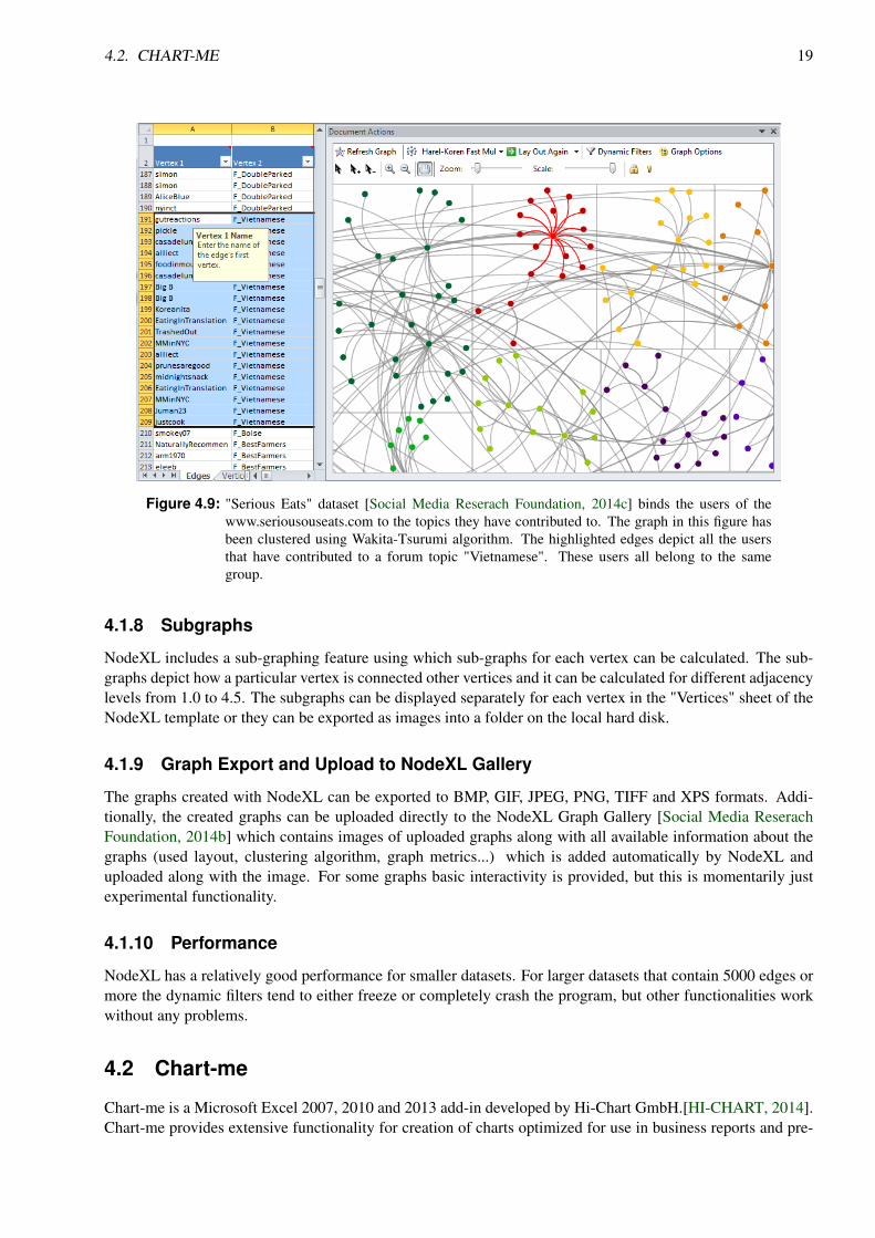
Figure 4.9: "Serious Eats" dataset [Social Media Reserach Foundation, 2014c] binds the users of thewww.seriousouseats.com to the topics they have contributed to. The graph in this figure hasbeen clustered using Wakita-Tsurumi algorithm. The highlighted edges depict all the usersthat have contributed to a forum topic "Vietnamese". These users all belong to the samegroup.
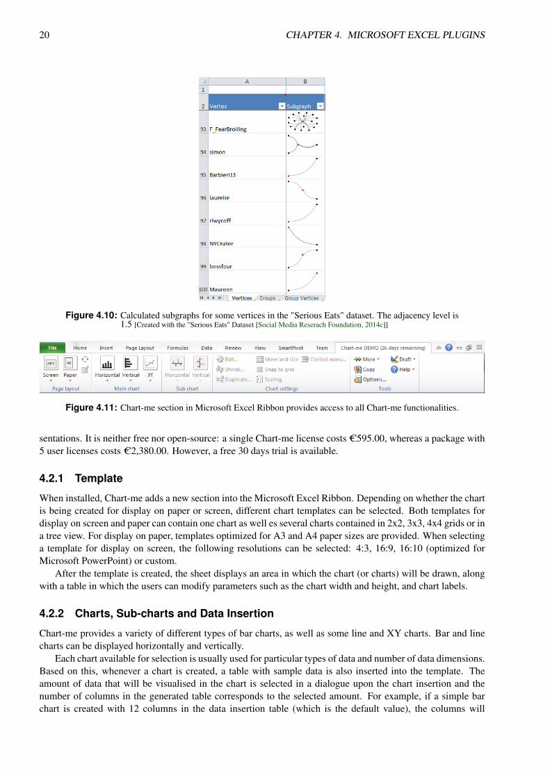
4.1.8 Subgraphs
NodeXL includes a sub-graphing feature using which sub-graphs for each vertex can be calculated. The sub-graphs depict how a particular vertex is connected other vertices and it can be calculated for different adjacencylevels from 1.0 to 4.5. The subgraphs can be displayed separately for each vertex in the "Vertices" sheet of theNodeXL template or they can be exported as images into a folder on the local hard disk.
4.1.9 Graph Export and Upload to NodeXL Gallery
The graphs created with NodeXL can be exported to BMP, GIF, JPEG, PNG, TIFF and XPS formats. Addi-tionally, the created graphs can be uploaded directly to the NodeXL Graph Gallery [Social Media ReserachFoundation, 2014b] which contains images of uploaded graphs along with all available information about thegraphs (used layout, clustering algorithm, graph metrics...) which is added automatically by NodeXL anduploaded along with the image. For some graphs basic interactivity is provided, but this is momentarily justexperimental functionality.
4.1.10 Performance
NodeXL has a relatively good performance for smaller datasets. For larger datasets that contain 5000 edges ormore the dynamic filters tend to either freeze or completely crash the program, but other functionalities workwithout any problems.
4.2 Chart-me
Chart-me is a Microsoft Excel 2007, 2010 and 2013 add-in developed by Hi-Chart GmbH.[HI-CHART, 2014].Chart-me provides extensive functionality for creation of charts optimized for use in business reports and pre-
20 CHAPTER 4. MICROSOFT EXCEL PLUGINS
Figure 4.10: Calculated subgraphs for some vertices in the "Serious Eats" dataset. The adjacency level is1.5 [Created with the "Serious Eats" Dataset [Social Media Reserach Foundation, 2014c]]
Figure 4.11: Chart-me section in Microsoft Excel Ribbon provides access to all Chart-me functionalities.
sentations. It is neither free nor open-source: a single Chart-me license costs C595.00, whereas a package with5 user licenses costs C2,380.00. However, a free 30 days trial is available.
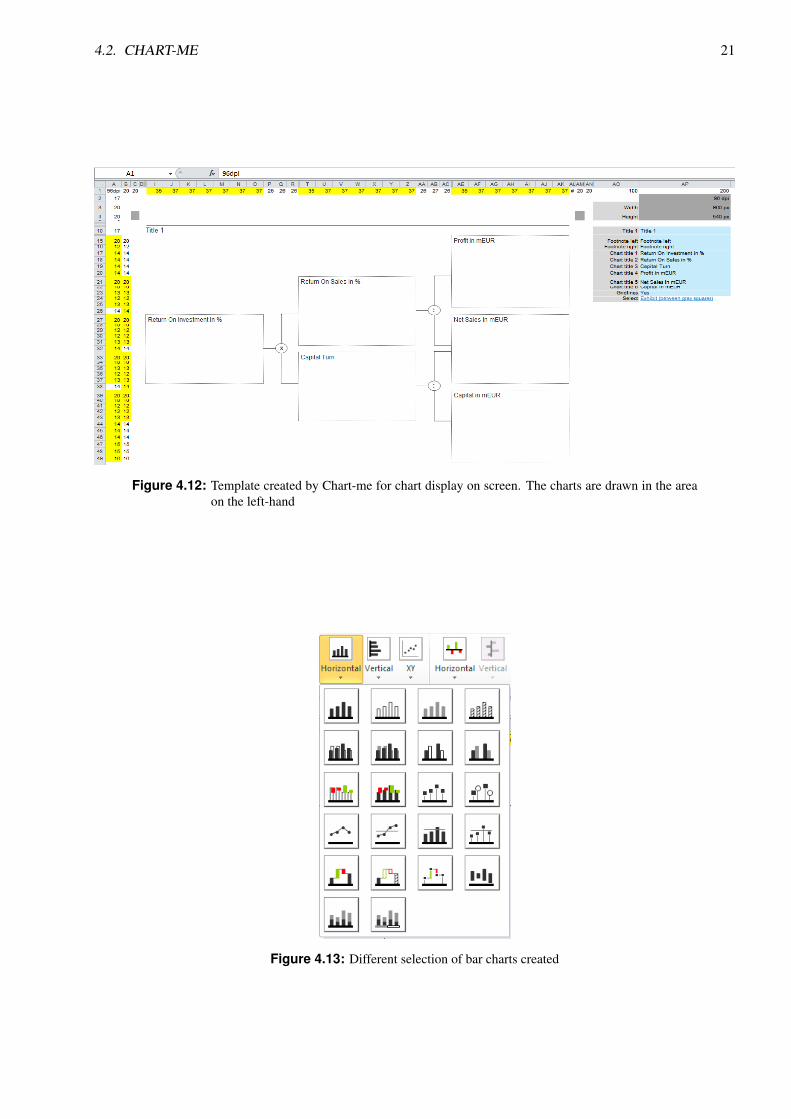
4.2.1 Template
When installed, Chart-me adds a new section into the Microsoft Excel Ribbon. Depending on whether the chartis being created for display on paper or screen, different chart templates can be selected. Both templates fordisplay on screen and paper can contain one chart as well es several charts contained in 2x2, 3x3, 4x4 grids or ina tree view. For display on paper, templates optimized for A3 and A4 paper sizes are provided. When selectinga template for display on screen, the following resolutions can be selected: 4:3, 16:9, 16:10 (optimized forMicrosoft PowerPoint) or custom.
After the template is created, the sheet displays an area in which the chart (or charts) will be drawn, alongwith a table in which the users can modify parameters such as the chart width and height, and chart labels.
4.2.2 Charts, Sub-charts and Data Insertion
Chart-me provides a variety of different types of bar charts, as well as some line and XY charts. Bar and linecharts can be displayed horizontally and vertically.
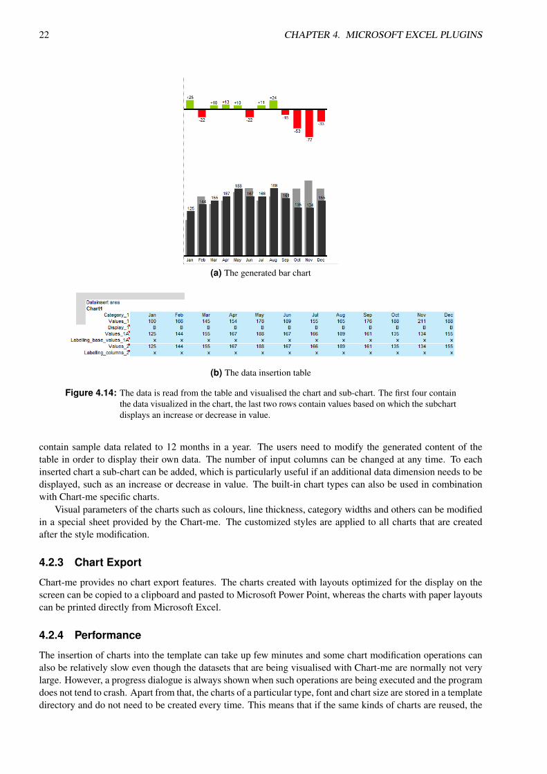
Each chart available for selection is usually used for particular types of data and number of data dimensions.Based on this, whenever a chart is created, a table with sample data is also inserted into the template. Theamount of data that will be visualised in the chart is selected in a dialogue upon the chart insertion and thenumber of columns in the generated table corresponds to the selected amount. For example, if a simple barchart is created with 12 columns in the data insertion table (which is the default value), the columns will
4.2. CHART-ME 21
Figure 4.12: Template created by Chart-me for chart display on screen. The charts are drawn in the areaon the left-hand
Figure 4.13: Different selection of bar charts created
22 CHAPTER 4. MICROSOFT EXCEL PLUGINS
(a) The generated bar chart
(b) The data insertion table
Figure 4.14: The data is read from the table and visualised the chart and sub-chart. The first four containthe data visualized in the chart, the last two rows contain values based on which the subchartdisplays an increase or decrease in value.
contain sample data related to 12 months in a year. The users need to modify the generated content of thetable in order to display their own data. The number of input columns can be changed at any time. To eachinserted chart a sub-chart can be added, which is particularly useful if an additional data dimension needs to bedisplayed, such as an increase or decrease in value. The built-in chart types can also be used in combinationwith Chart-me specific charts.
Visual parameters of the charts such as colours, line thickness, category widths and others can be modifiedin a special sheet provided by the Chart-me. The customized styles are applied to all charts that are createdafter the style modification.
4.2.3 Chart Export
Chart-me provides no chart export features. The charts created with layouts optimized for the display on thescreen can be copied to a clipboard and pasted to Microsoft Power Point, whereas the charts with paper layoutscan be printed directly from Microsoft Excel.
4.2.4 Performance
The insertion of charts into the template can take up few minutes and some chart modification operations canalso be relatively slow even though the datasets that are being visualised with Chart-me are normally not verylarge. However, a progress dialogue is always shown when such operations are being executed and the programdoes not tend to crash. Apart from that, the charts of a particular type, font and chart size are stored in a templatedirectory and do not need to be created every time. This means that if the same kinds of charts are reused, the

4.2. CHART-ME 23
process of creation takes long only the first time.

24 CHAPTER 4. MICROSOFT EXCEL PLUGINS
Chapter 5
Microsoft Excel 2013 Apps
With Excel 2013, Microsoft introduced an easy way to add apps to their Office products. The Office Storecan be accessed directly from Excel, and apps can be added by clicking a button. One of the main differencesbetween Microsoft Excel plugins and apps is that upon installation of plugins, such as NodeXL or Chart-me,usually add a new section in the Ribbon, whereas the apps provide access to all their functionality through aspecial window displayed directly in the spreadsheet. Another difference is that the plugins are mostly availablefor Microsoft Excel 2007, 2010 and 2013, whereas the apps are available only for Microsoft Excel 2013.
There is a wide selection of free and and paid apps, some of which are used to visualise data. Thesevisualisation apps mostly work only with special types of datasets that have to be inserted in a predefined dataformat. In the following sections, some of these apps are presented.
5.1 Office Store Visualisation Apps Overview
5.1.1 SmartCharts
SmartCharts ([devscope, 2014]) is a Microsoft Excel app that provides visualisation of date change over time.The app is available for C4.99, but a trial version that visualises only sample data can be downloaded for free.Using the free samples, a short overview of the SmartCharts app can be given.
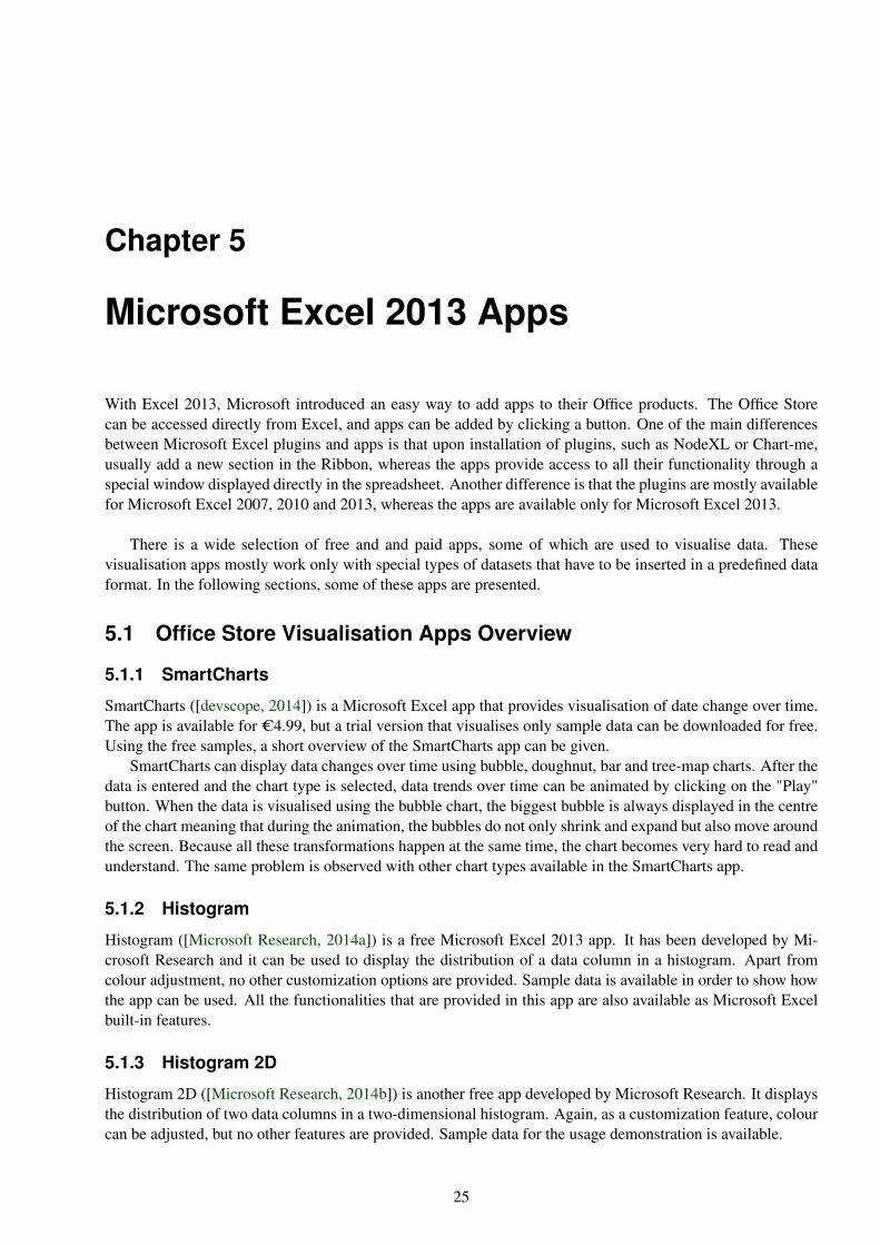
SmartCharts can display data changes over time using bubble, doughnut, bar and tree-map charts. After thedata is entered and the chart type is selected, data trends over time can be animated by clicking on the "Play"button. When the data is visualised using the bubble chart, the biggest bubble is always displayed in the centreof the chart meaning that during the animation, the bubbles do not only shrink and expand but also move aroundthe screen. Because all these transformations happen at the same time, the chart becomes very hard to read andunderstand. The same problem is observed with other chart types available in the SmartCharts app.
5.1.2 Histogram
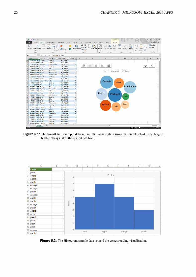
Histogram ([Microsoft Research, 2014a]) is a free Microsoft Excel 2013 app. It has been developed by Mi-crosoft Research and it can be used to display the distribution of a data column in a histogram. Apart fromcolour adjustment, no other customization options are provided. Sample data is available in order to show howthe app can be used. All the functionalities that are provided in this app are also available as Microsoft Excelbuilt-in features.
5.1.3 Histogram 2D
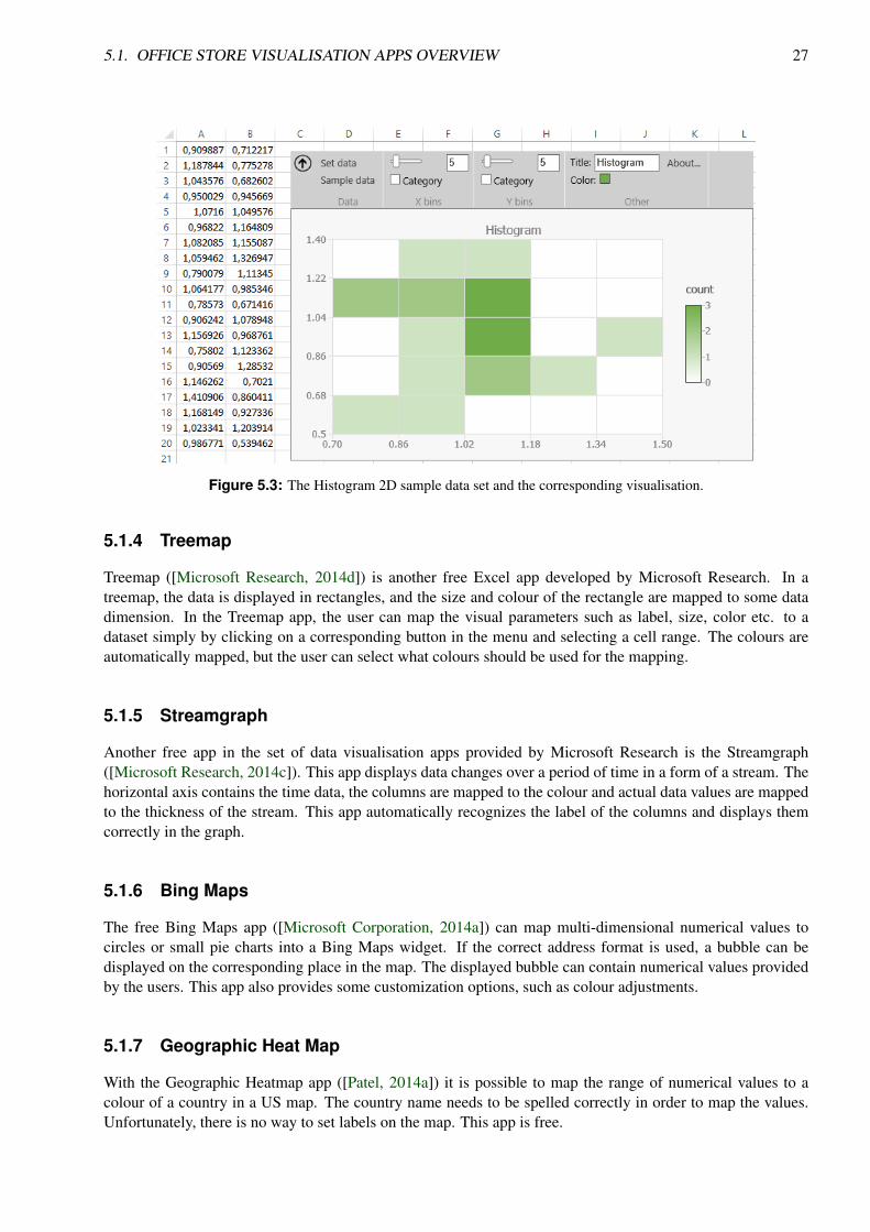
Histogram 2D ([Microsoft Research, 2014b]) is another free app developed by Microsoft Research. It displaysthe distribution of two data columns in a two-dimensional histogram. Again, as a customization feature, colourcan be adjusted, but no other features are provided. Sample data for the usage demonstration is available.
25
26 CHAPTER 5. MICROSOFT EXCEL 2013 APPS
Figure 5.1: The SmartCharts sample data set and the visualisation using the bubble chart. The biggestbubble always takes the central position.
Figure 5.2: The Histogram sample data set and the corresponding visualisation.
5.1. OFFICE STORE VISUALISATION APPS OVERVIEW 27
Figure 5.3: The Histogram 2D sample data set and the corresponding visualisation.
5.1.4 Treemap
Treemap ([Microsoft Research, 2014d]) is another free Excel app developed by Microsoft Research. In atreemap, the data is displayed in rectangles, and the size and colour of the rectangle are mapped to some datadimension. In the Treemap app, the user can map the visual parameters such as label, size, color etc. to adataset simply by clicking on a corresponding button in the menu and selecting a cell range. The colours areautomatically mapped, but the user can select what colours should be used for the mapping.
5.1.5 Streamgraph
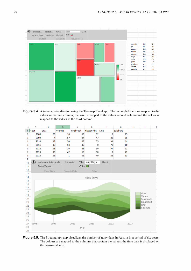
Another free app in the set of data visualisation apps provided by Microsoft Research is the Streamgraph([Microsoft Research, 2014c]). This app displays data changes over a period of time in a form of a stream. Thehorizontal axis contains the time data, the columns are mapped to the colour and actual data values are mappedto the thickness of the stream. This app automatically recognizes the label of the columns and displays themcorrectly in the graph.
5.1.6 Bing Maps
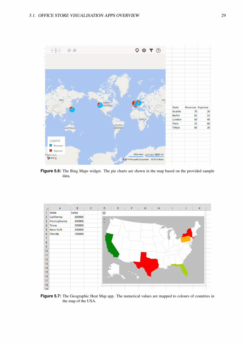
The free Bing Maps app ([Microsoft Corporation, 2014a]) can map multi-dimensional numerical values tocircles or small pie charts into a Bing Maps widget. If the correct address format is used, a bubble can bedisplayed on the corresponding place in the map. The displayed bubble can contain numerical values providedby the users. This app also provides some customization options, such as colour adjustments.
5.1.7 Geographic Heat Map
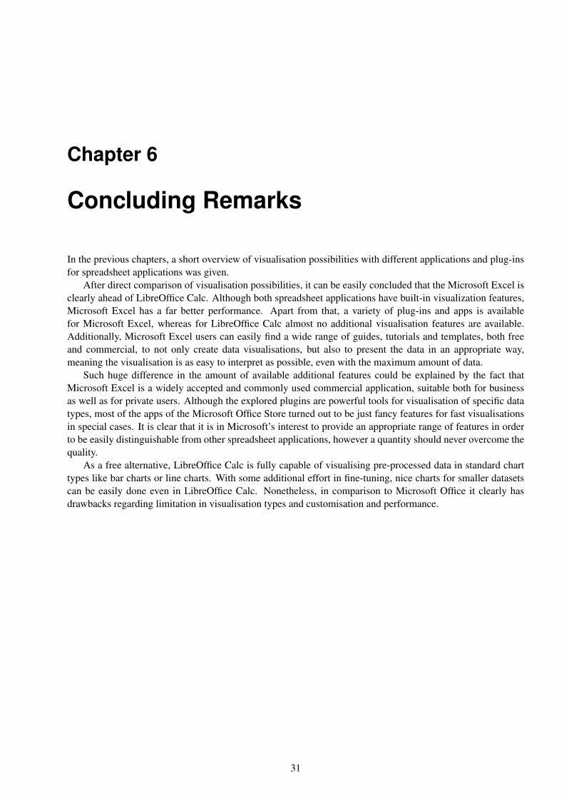
With the Geographic Heatmap app ([Patel, 2014a]) it is possible to map the range of numerical values to acolour of a country in a US map. The country name needs to be spelled correctly in order to map the values.Unfortunately, there is no way to set labels on the map. This app is free.
28 CHAPTER 5. MICROSOFT EXCEL 2013 APPS
Figure 5.4: A treemap visualisation using the Treemap Excel app. The rectangle labels are mapped to thevalues in the first column, the size is mapped to the values second column and the colour ismapped to the values in the third column.
Figure 5.5: The Streamgraph app visualizes the number of rainy days in Austria in a period of six years.The colours are mapped to the columns that contain the values, the time data is displayed onthe horizontal axis.
5.1. OFFICE STORE VISUALISATION APPS OVERVIEW 29
Figure 5.6: The Bing Maps widget. The pie charts are shown in the map based on the provided sampledata.
Figure 5.7: The Geographic Heat Map app. The numerical values are mapped to colours of countries inthe map of the USA.

30 CHAPTER 5. MICROSOFT EXCEL 2013 APPS
5.1.8 Gauge
Gauge [Revision Design, 2014] a free and very simple app that takes numerical value from a spreadsheet celland displays it in a gauge based on user-defined minimum and maximum values. The users can choose betweenthree different gauge looks.
5.2 Performance
Although the apps described in the previous section provide mostly simple functionality, some of them showedvery poor performance. The SmartCharts app crashed all the time, despite the fact that the tests were done onthe sample data. Some of the apps available in the Office Store did not work at all, such as the Radial Bar Chart[Patel, 2014b] or Slider Chart App [Zulu, 2014].
Chapter 6
Concluding Remarks
In the previous chapters, a short overview of visualisation possibilities with different applications and plug-insfor spreadsheet applications was given.
After direct comparison of visualisation possibilities, it can be easily concluded that the Microsoft Excel isclearly ahead of LibreOffice Calc. Although both spreadsheet applications have built-in visualization features,Microsoft Excel has a far better performance. Apart from that, a variety of plug-ins and apps is availablefor Microsoft Excel, whereas for LibreOffice Calc almost no additional visualisation features are available.Additionally, Microsoft Excel users can easily find a wide range of guides, tutorials and templates, both freeand commercial, to not only create data visualisations, but also to present the data in an appropriate way,meaning the visualisation is as easy to interpret as possible, even with the maximum amount of data.
Such huge difference in the amount of available additional features could be explained by the fact thatMicrosoft Excel is a widely accepted and commonly used commercial application, suitable both for businessas well as for private users. Although the explored plugins are powerful tools for visualisation of specific datatypes, most of the apps of the Microsoft Office Store turned out to be just fancy features for fast visualisationsin special cases. It is clear that it is in Microsoft’s interest to provide an appropriate range of features in orderto be easily distinguishable from other spreadsheet applications, however a quantity should never overcome thequality.
As a free alternative, LibreOffice Calc is fully capable of visualising pre-processed data in standard charttypes like bar charts or line charts. With some additional effort in fine-tuning, nice charts for smaller datasetscan be easily done even in LibreOffice Calc. Nonetheless, in comparison to Microsoft Office it clearly hasdrawbacks regarding limitation in visualisation types and customisation and performance.
31

Bibliography
HI-CHART [2014]. Chart-me. 2014. http://www.hi-chart.com/en/ (cited on page 19).
CodePlex [2014a]. NodeXL: Network Overview, Discovery and Exploration. 2014. http : / / nodexl .codeplex.com/ (cited on page 13).
CodePlex [2014b]. Social Network Importer for NodeXL. 2014. http://socialnetimporter.codeplex.com/ (cited on page 13).
devscope [2014]. SmartCharts. 2014. http://www.devscope.net/products/SmartCharts (cited onpage 25).
Hansen, Derek, Ben Shneiderman, and Marc A. Smith [2010]. Analyzing Social Media Networks with NodeXL:Insights from a Connected World. San Francisco, CA, USA: Morgan Kaufmann Publishers Inc., 2010. ISBN
0123822297, 9780123822291 (cited on pages 14, 18).
Harel, David and Yehuda Koren [2001]. “A Fast Multi-scale Method for Drawing Large Graphs”. In: Proceed-ings of the 8th International Symposium on Graph Drawing. GD ’00. London, UK, UK: Springer-Verlag,2001, pages 183–196. ISBN 3-540-41554-8. http://dl.acm.org/citation.cfm?id=647552.729397 (cited on page 14).
Microsoft Corporation [2010]. Overview of PivotTable and PivotChart reports. 2010. http://office.microsoft.com/en-us/excel-help/overview-of-pivottable-and-pivotchart-reports-
HP010342752.aspx?CTT=1 (cited on page 3).
Microsoft Corporation [2014a]. Bing Maps. 2014. http://office.microsoft.com/en-us/store/bing-maps-WA102957661.aspx?queryid=63956a44-1cee-4ce6-85cb-0860931673eb&css=
bing%20maps&CTT=1 (cited on page 27).
Microsoft Corporation [2014b]. Buy Office 365. 2014. http : / / office . microsoft . com / de - at /business/compare-office-365-for-business-plans-FX102918419.aspx (cited on page 3).
Microsoft Research [2014a]. Histogram. 2014. http://office.microsoft.com/en- us/store/histogram-WA104042888.aspx (cited on page 25).
Microsoft Research [2014b]. Histogram 2D. 2014. http://office.microsoft.com/en-us/store/histogram-2d-WA104068025.aspx?queryid=b8bc194d-90a7-438c-a2f4-6512243939fa&
css=histogram%202d&CTT=1 (cited on page 25).
Microsoft Research [2014c]. Streamgraph. 2014. http://office.microsoft.com/en-us/store/streamgraph-WA104067192.aspx?queryid=cc20eb72-9a86-4465-a9cf-bfd031e49122&
css=streamgraph&CTT=1 (cited on page 27).
Microsoft Research [2014d]. Treemap. 2014. http : / / office . microsoft . com / en - us / store /treemap-WA104067194.aspx?queryid=0ff6e2e7-a4e7-4305-886b-794e6f587657&css=
treemap&CTT=1 (cited on page 27).
32

BIBLIOGRAPHY 33
Open Government Data Graz [2014]. Population of Graz by year and age. 2014. http://data.graz.gv.at/daten/package/die-grazer-bev-lkerung-nach-bezirk-und-alter (cited on page 8).
Patel, Keyur [2014a]. Geographic Heat Map. 2014. http : / / office . microsoft . com / en - us /
store/geographic-heat-map-WA103304320.aspx?queryid=7b450d15-61f3-4956-9e4e-
f8eb70c92fa2&css=geographic%20heat%20map&CTT=1 (cited on page 27).
Patel, Keyur [2014b]. Radial Bar Chart. 2014. http://office.microsoft.com/en- us/store/radial-bar-chart-WA103857593.aspx (cited on page 30).
Revision Design [2014]. Gauge. 2014. http://office.microsoft.com/en- us/store/gauge-WA103524919.aspx (cited on page 30).
Social Media Reserach Foundation [2014a]. About Social Media Research Foundation. 2014. http://www.smrfoundation.org/about-us/ (cited on page 13).
Social Media Reserach Foundation [2014b]. NodeXL Graph Gallery. 2014. http://www.nodexlgraphgallery.org/ (cited on page 19).
Social Media Reserach Foundation [2014c]. NodeXL Teaching Resources. 2014. https://nodexl.codeplex.com/wikipage?title=NodeXL%20Teaching%20Resources (cited on pages 14–17, 19, 20).
The Document Foundation [2014a]. LibreOffice. 2014. http://www.libreoffice.org/ (cited on page 7).
The Document Foundation [2014b]. LibreOffice Extensions. 2014. http://extensions.libreoffice.org/extension-center/geooo (cited on page 7).
The Document Foundation [2014c]. The LibreOffice Calc Guide. Chapter 3, pages 81-121. 2014. https://wiki.documentfoundation.org/images/4/47/CG41-CalcGuideLO.pdf (cited on page 9).
Twitter [2014]. REST API Rate Limiting in v1.1. 2014. //https://dev.twitter.com/docs/rate-limiting/1.1 (cited on page 13).
Video2Brain [2014]. Suchergebnisse für ’pivot’. 2014. https://www.video2brain.com/de/search.htm?search_entry=pivot (cited on page 3).
Wikipedia [2014a]. Force-directed Graph Drawing. 2014. http://en.wikipedia.org/wiki/Force-based_algorithms (cited on page 14).
Wikipedia [2014b]. Layered Graph Drawing. 2014. http://en.wikipedia.org/wiki/Layered_graph_drawing (cited on page 14).
Zulu, Bongani [2014]. Slider Chart App. 2014. http://office.microsoft.com/en- za/store/slidder-chart-WA104213984.aspx?redir=0 (cited on page 30).