data visualization: basic principles - github...
TRANSCRIPT

Data visualization: basic principles

Visualization: encoding data by visual cues
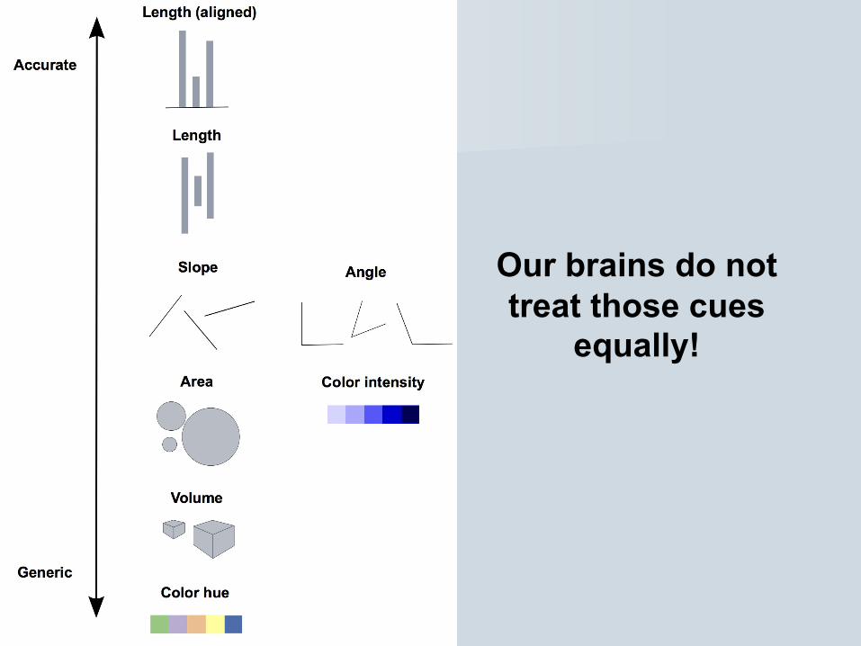
Our brains do not treat those cues
equally!
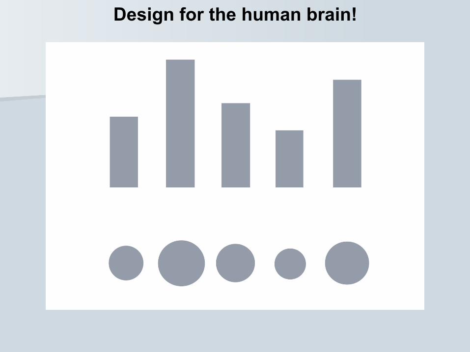
Design for the human brain!
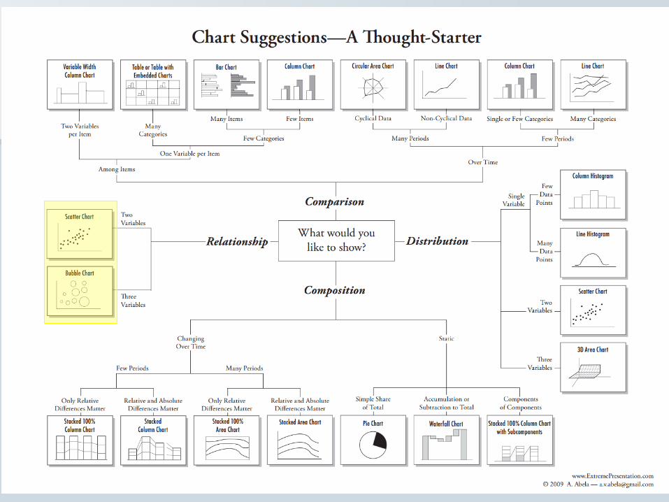
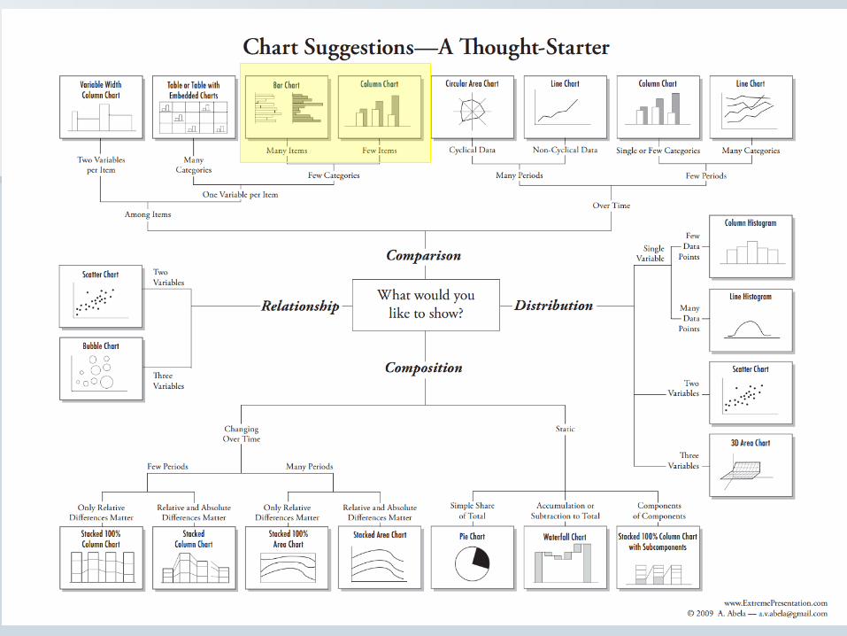
What type of chart should I use?


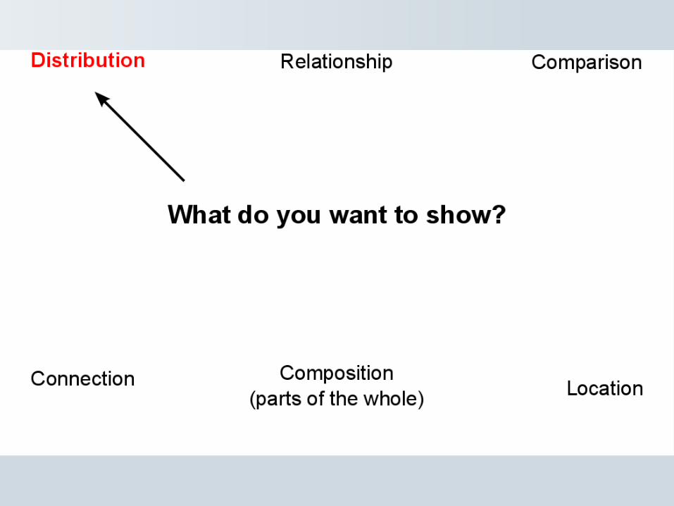


Consider the distribution

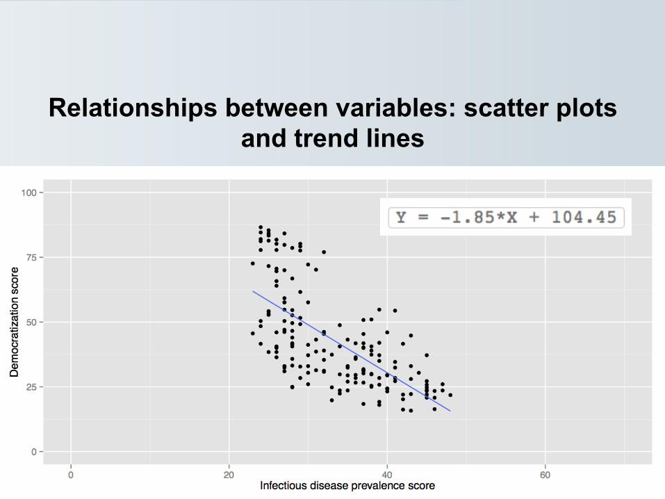
Relationships between variables: scatter plots and trend lines

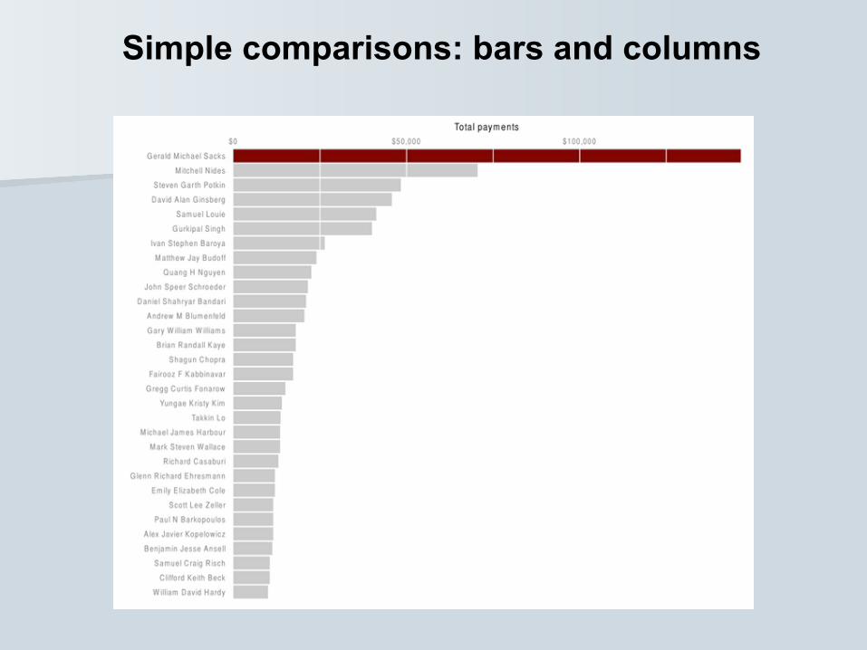
Simple comparisons: bars and columns
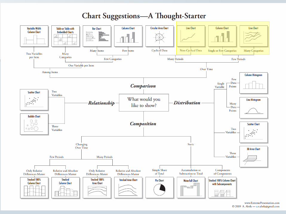
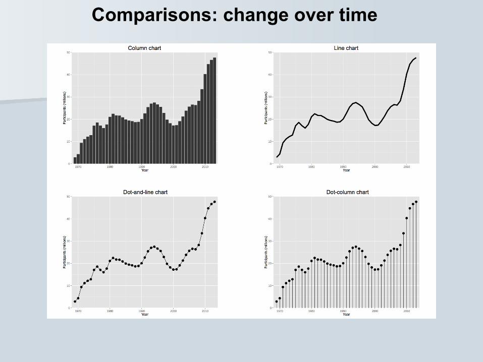
Comparisons: change over time

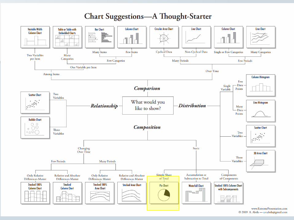
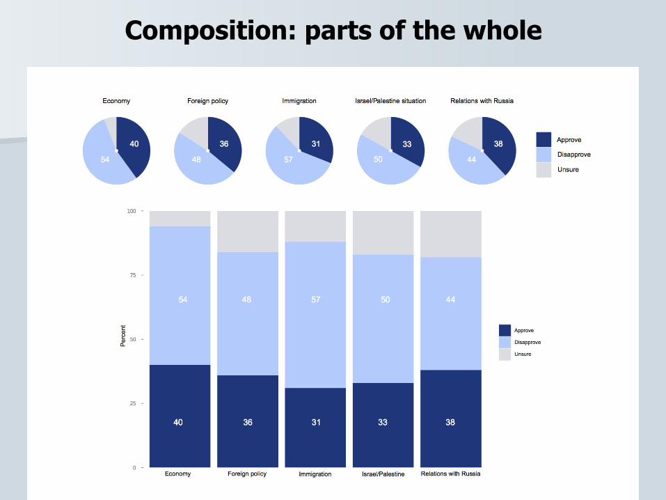
Composition: parts of the whole
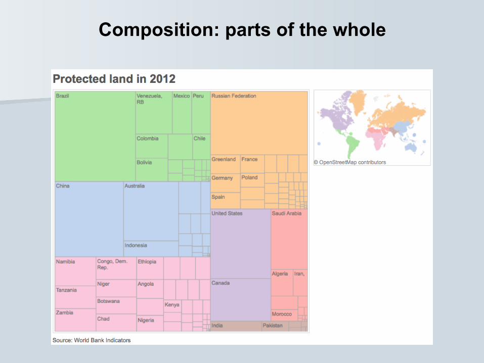
Composition: parts of the whole
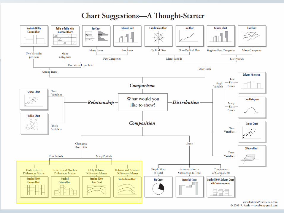
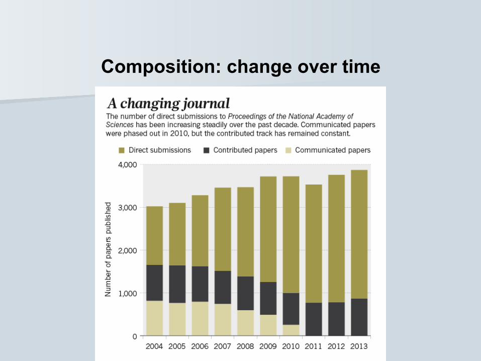
Composition: change over time
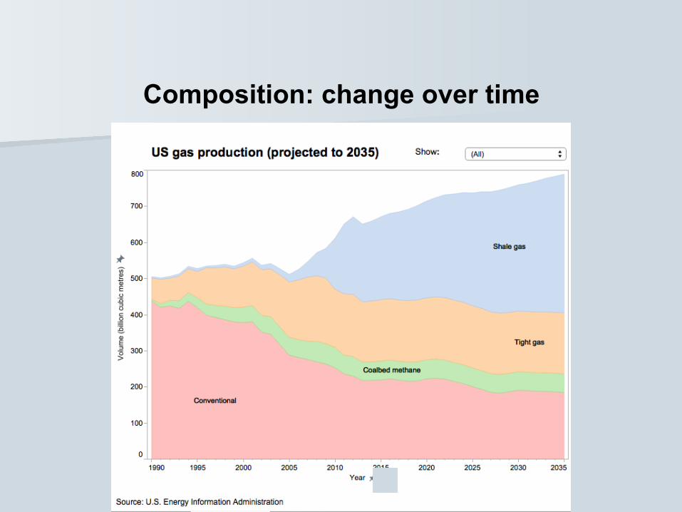
Composition: change over time
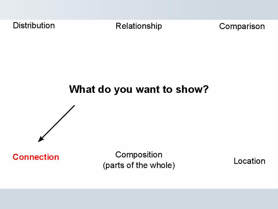

Connection: network graphs
New Scientist
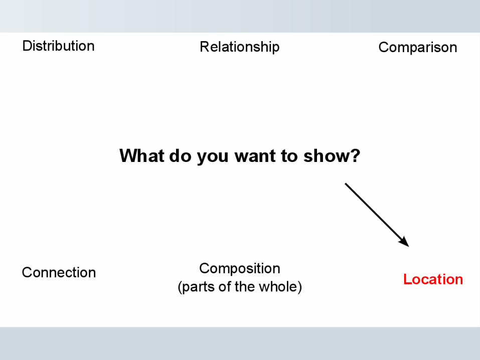
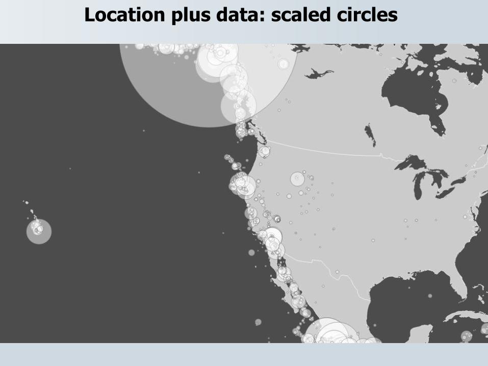
Location plus data: scaled circles
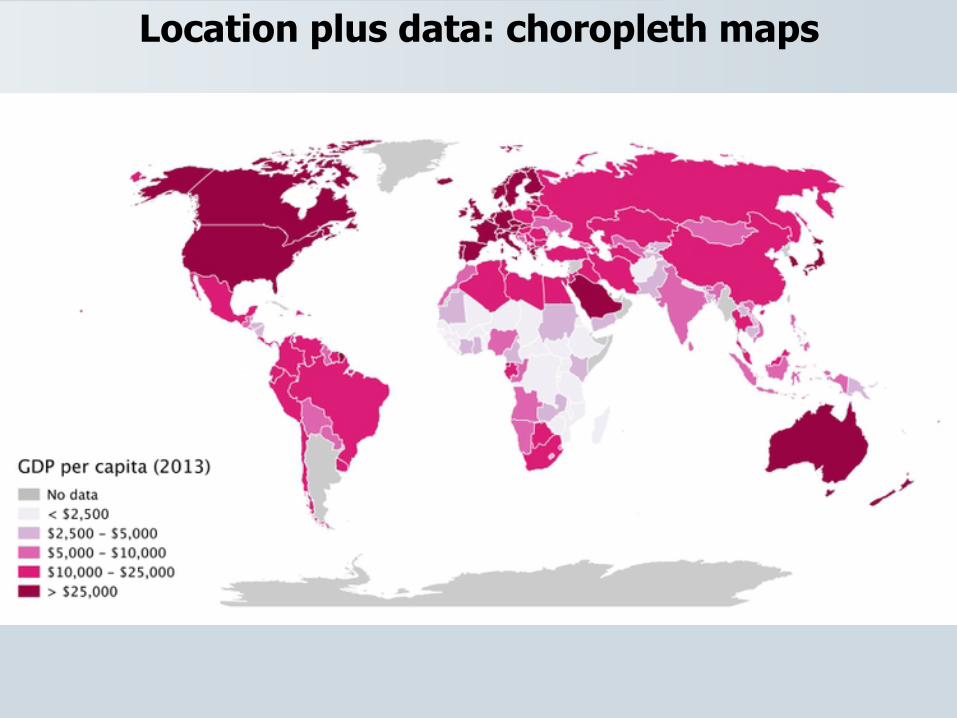
Location plus data: choropleth maps
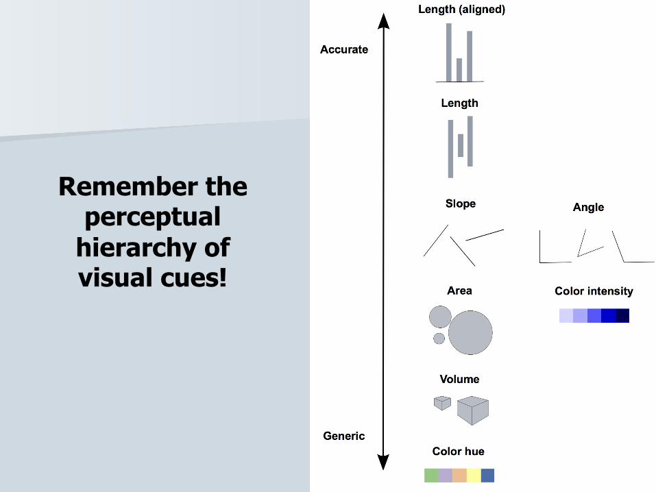
Remember the perceptual
hierarchy of visual cues!

So ask yourself: Is a map the best way to tell the story?

Case study: Immunization in California kindergartens

Length on aligned scale

Slope, note the y axis scale
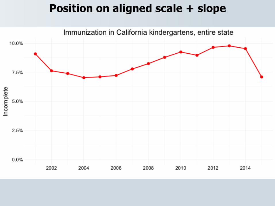
Position on aligned scale + slope
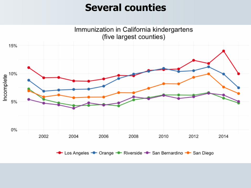
Several counties
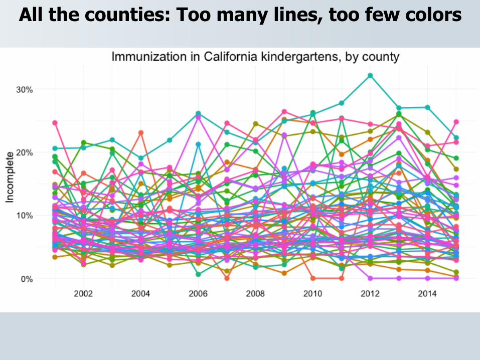
All the counties: Too many lines, too few colors
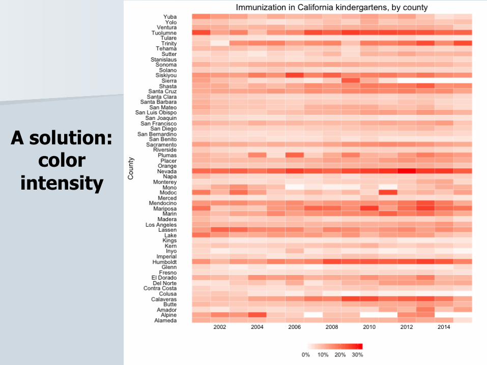
A solution: color
intensity
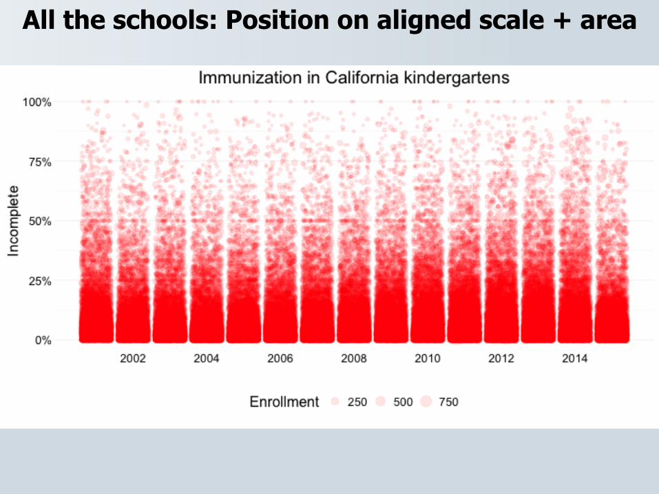
All the schools: Position on aligned scale + area

Using color effectively
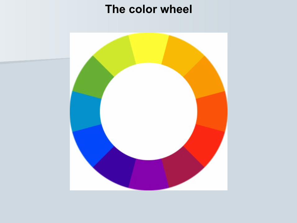
The color wheel
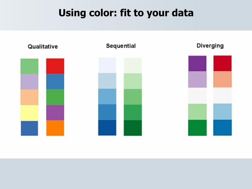
Using color: fit to your data
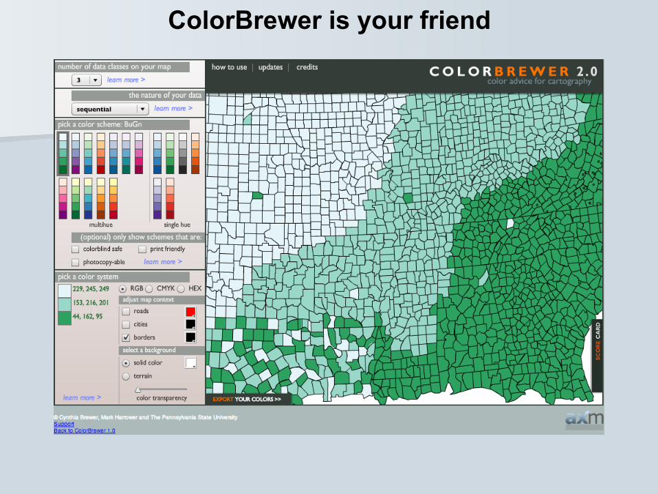
ColorBrewer is your friend
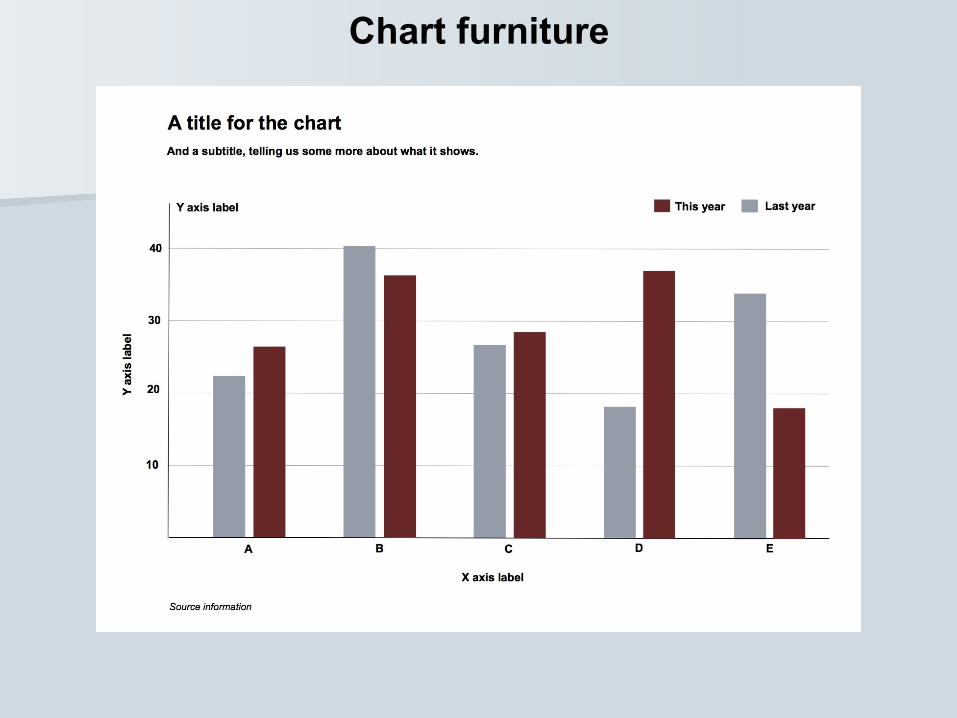
Chart furniture
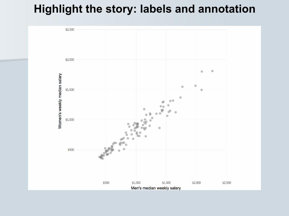
Highlight the story: labels and annotation
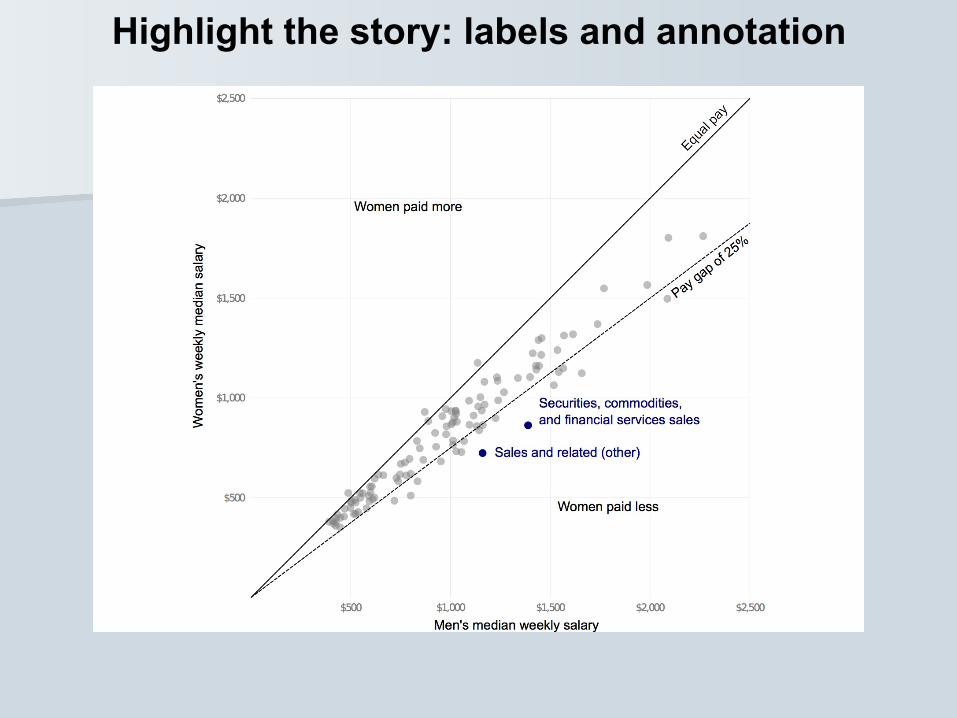
Highlight the story: labels and annotation
When in doubt:
keep it clean, clear and simple!
(But aim for clarity over simplicity)
Experiment! Sketch!
That may be how you find the story
Show people. If they’re confused, try another approach
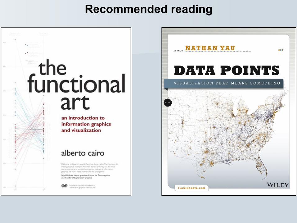
Recommended reading