data visualization workshop - scholar.harvard.edu
TRANSCRIPT

Data Visualization Workshop
UN Innovation Network
Hong QuAdjunct Lecturer
Harvard Kennedy School

Agenda• How to create charts and maps using
• Excel• Flourish• Datawrapper• Tableau
• Highlight to focus attention• Annotation• Animation• Interaction (exploration)
• The annotation layer• Color and contrast• Workflow and design process• Question and discussion• Software demonstrations
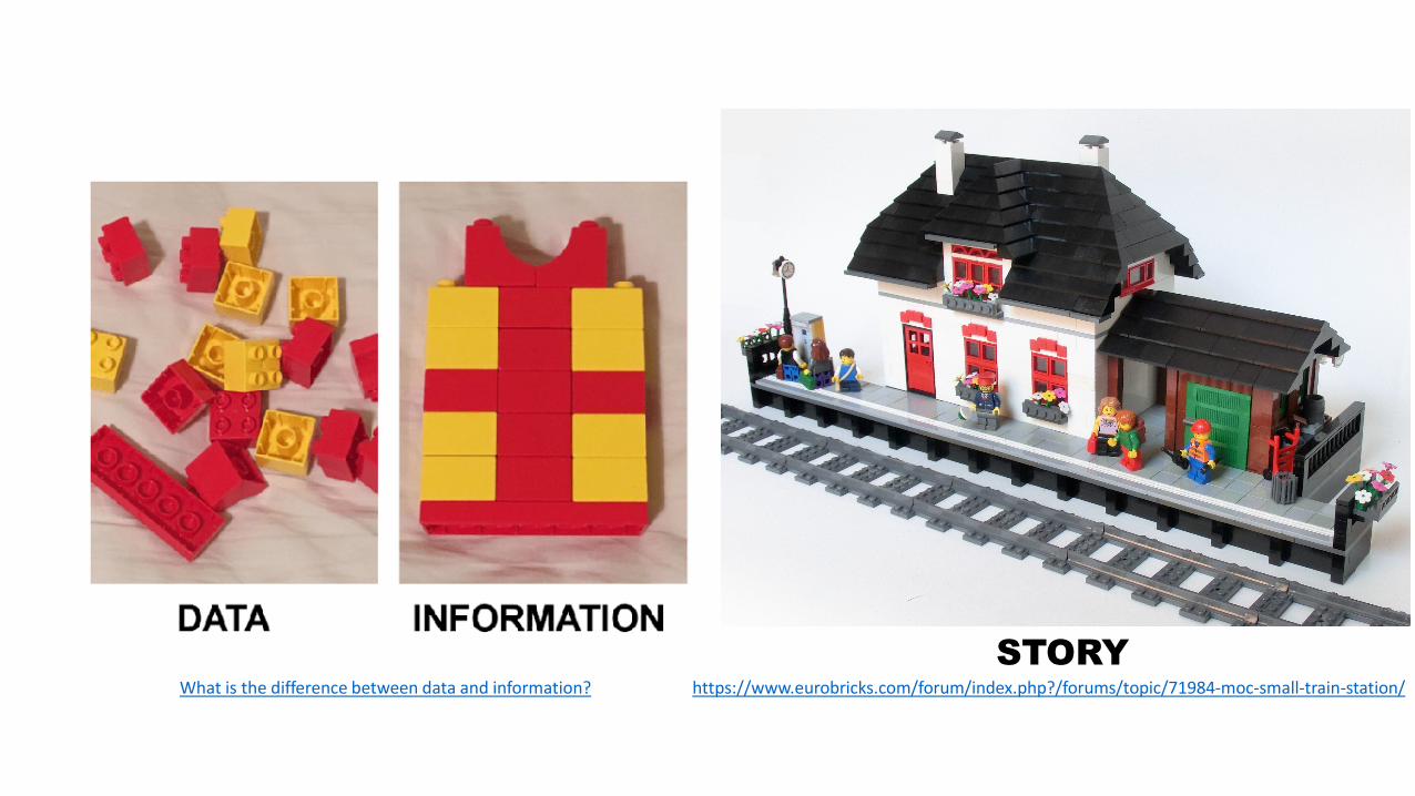
What is the difference between data and information? https://www.eurobricks.com/forum/index.php?/forums/topic/71984-moc-small-train-station/STORY

Data: The 30 Largest Cities 1950-2035
United Nations, Department of Economic and Social Affairs, Population Division (2018). World Urbanization Prospects: The 2018 Revision, Online Edition.


–Jeffrey Heer, Michael Bostock, Vadim Ogievetsky
“The goal of visualization is to aid our understanding of data by leveraging the human visual system’s highly tuned ability to see patterns, spot trends, and identify outliers.”
A Tour Through the Visualization Zoo
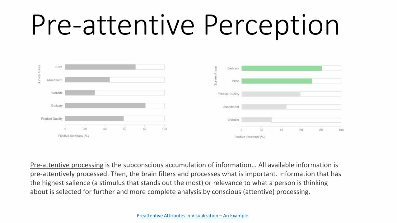
Pre-attentive Perception
Preattentive Attributes in Visualization – An Example
Pre-attentive processing is the subconscious accumulation of information… All available information is pre-attentively processed. Then, the brain filters and processes what is important. Information that has the highest salience (a stimulus that stands out the most) or relevance to what a person is thinking about is selected for further and more complete analysis by conscious (attentive) processing.

https://www.vox.com/recode/21727016/2020-in-charts-covid-vaccine-pandemic-election

Contrast
Discrete
Continuous
Color
Opposites
Key point

– John Burn-Murdoch
“Making a graphic is the equivalent to interviewing your source; but it’s then your job to actually pick out…the bits the reader should know about.”
Three Ways to Annotate Your Graphs
The Annotation Layer

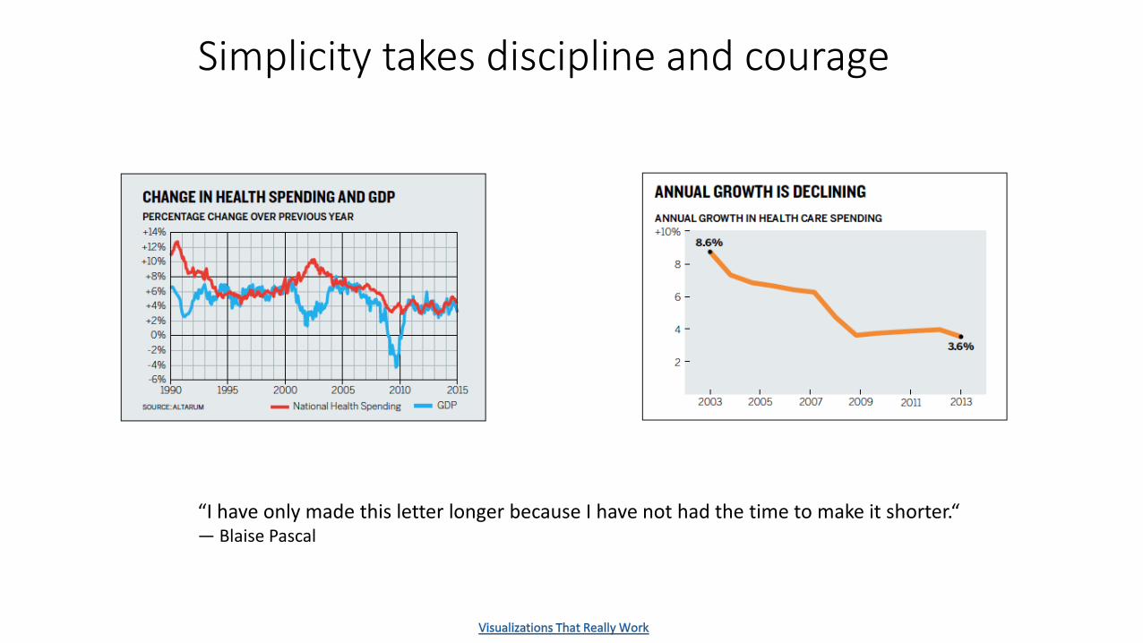
Simplicity takes discipline and courage
“I have only made this letter longer because I have not had the time to make it shorter.“― Blaise Pascal

How people actually “see”

What most people see:


Recap• Your mission is to enrich:
1. Data2. Information3. Story
• Declutter and highlight to focus the viewer’s attention• Make use of the annotation layer• What makes a good visualization? Information Story Goal Visual

RESOURCES
• Software• Tableau for exploratory data analysis and interactive dashboards
• Tutorial videos on LinkedIn Learning• Book Practical Tableau: 100 Tips, Tutorials, and Strategies from a
Tableau Zen Master• Flourish Studio for animations
• Tutorial videos by Alberto Cairo• Datawrapper for charts and maps
• Tutorials• Canva for infographics
• Design Books• Storytelling with Data: A Data Visualization Guide for Business Professionals• Now You See It: Simple Visualization Techniques for Quantitative Analysis• Information Is Beautiful• Good Charts: The HBR Guide to Making Smarter, More Persuasive Data
Visualizations• Functional Art, The: An introduction to information graphics and visualization
• Data Visualization Society• Nightingale Medium Journal

The Power of Visualization in Data Science
The Five-Step Process
Questions and Discussion

Software tools
https://flourish.studiohttps://www.datawrapper.de
https://www.tableau.com

Excel vs Datawrapper


Flourish


Thank you
Workshop exercise files