dataset building a roc curve with wekaeric.univ-lyon2.fr/~ricco/tanagra/fichiers/en_tanagra... ·...
TRANSCRIPT

Didacticiel - Etudes de cas R.R.
20/02/2006 Page 1 sur 21
Subject Comparison of TANAGRA, ORANGE and WEKA when we build ROC curve on a dataset. TANAGRA, ORANGE and WEKA are free data mining softwares. They represent the succession of treatments as a stream diagram or a knowledge flow. Sometimes, there is a little difference between these softwares. Nevertheless, we show that in spite of these differences, these softwares often handle the same problems and give a very similar presentation of results. In this tutorial, we try to build a roc curve from a logistic regression. Regardless the software we used, even for commercial software, we have to prepare the following steps when we want build a ROC curve. • Import the dataset in the soft; • Compute descriptive statistics; • Select target and input attributes; • Select the “positive” value of the target attribute; • Split the dataset into learning (e.g. 70%) and test set (30%); • Choose the learning algorithm. Be careful, the softwares can have different
implementation and present a slightly different results; • Build the prediction model on the learning set and visualize the results; • Build the ROC curve on the test set. According the softwares, the progression can be different but it is clear that we must, explicitly or not, process these steps.
Dataset We use the dataset from the Komarek’s website which implement the LR-TRIRLS logistic regression library (http://komarix.org/ac/lr). The DS1-10 dataset contains 26733 examples, 10 continuous descriptors; the frequency of the positive value of the target attribute is 5%. We use ARFF file format for WEKA and TANAGRA, TXT for ORANGE (TANAGRA can also handle TXT file format).
Building a ROC curve with WEKA The number of methods is impressive in WEKA, but it is also the main weakness of this software, a through initiation is necessary. The needed components for the construction of a roc curve are not obvious.

Didacticiel - Etudes de cas R.R.
20/02/2006 Page 2 sur 21
Execution of WEKA
When we execute WEKA, a dialog box enables to choose the execution mode. We select the KNOWLEDGE FLOW option. We have used the 3.4.7 version in this tutorial; the results can be slightly different on the others versions. The organization of the software is classic. In the top of the window, we find the tools, machine learning components, in some palettes. The KNOWLEDGE FLOW layout allows us to define the succession of data treatments.
Tool palettesComponents :Data Mining tools
<< Stream pane
Load the dataset
The ARFF LOADER component (DATASOURCES palette) enables to load a dataset. We add it in the workspace, we can select the file with the CONFIGURE menu of the component.
Descriptive statistics
The ATTRIBUT SUMMARIZER component (VISUALIZATION) shows the data distribution; we can quickly detect abnormalities in the dataset. We add this component and we to connect ARFF LOADER to this new component (DATASET connection).

Didacticiel - Etudes de cas R.R.
20/02/2006 Page 3 sur 21
The treatment will be executed when we select the START LOADING menu of the ARFF LOADER component. To see the results, we select the SHOW SUMMARIES option of ATTRIBUTES SUMMARIZER.
We see that there are not abnormalities on the descriptors; we see also that we have imbalanced dataset (804 “positive” vs. 25929 “negative”).

Didacticiel - Etudes de cas R.R.
20/02/2006 Page 4 sur 21
Define target and input attributes
The last column is the default class attribute for WEKA, but we can also explicitly select the column of the class attribute. In this case, we use the CLASS ASSIGNER component (EVALUATION palette). We add this component in our diagram; we connect ARFF LOADER to this new component (DATASET connection). We select the CONFIGURE menu in order to select the right class attribute.
In the following step, we must specify the “positive” value of the class attribute. We use the CLASSVALUE PICKER (EVALUATION palette) component and select the “TRUE” value in the parameter dialog box.

Didacticiel - Etudes de cas R.R.
20/02/2006 Page 5 sur 21
Subdivision of the dataset into “learning” and “test” set
We want to build our prediction model on the 70% of the whole dataset, and compute the ROC curve on the remaining. So, we set the TRAINTEST SPLIT MAKER (EVALUATION) in the diagram and configure its parameters.

Didacticiel - Etudes de cas R.R.
20/02/2006 Page 6 sur 21
Logistic regression
The logistic regression component is in the CLASSIFIERS palette. We set it in the diagram, we connect twice the TRAIN TEST SPLIT MAKER to this new component: twice because we must use together the training and the test set which are produced by the same component.
The results
To see the results of the regression, we connect the LOGISTIC component to TEXT VIEWER (VISUALIZATION palette) that we set in the diagram.

Didacticiel - Etudes de cas R.R.
20/02/2006 Page 7 sur 21
We execute again the diagram (START LOADING of ARFF LOADER component). The SHOW RESULTS of TEXT VIEWER opens a new window with the results of the learning process.
We obtain the regression coefficients.
ROC curve
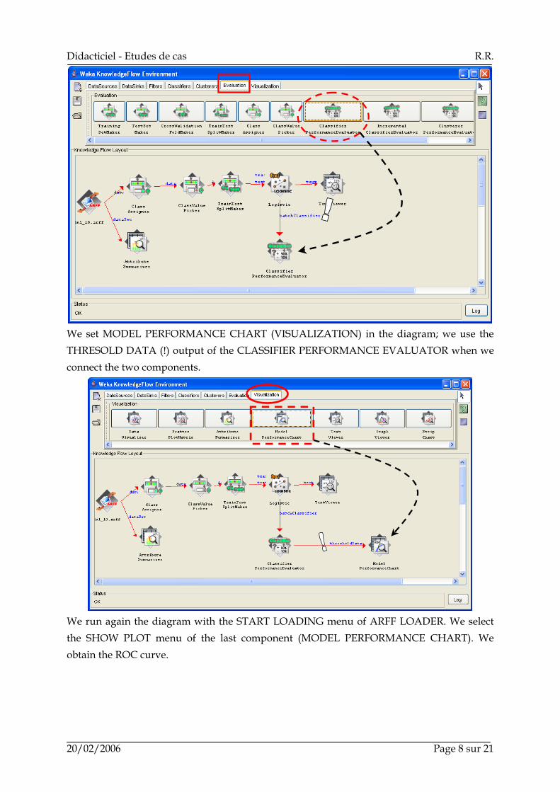
In order to evaluate the learning process, we add the CLASSIFIER PERFORMANCE EVALUATOR component (EVALUATION). We connect the BATCH CLASSIFIER output of LOGISTIC to this new component.
Didacticiel - Etudes de cas R.R.
20/02/2006 Page 8 sur 21
We set MODEL PERFORMANCE CHART (VISUALIZATION) in the diagram; we use the THRESOLD DATA (!) output of the CLASSIFIER PERFORMANCE EVALUATOR when we connect the two components.
We run again the diagram with the START LOADING menu of ARFF LOADER. We select the SHOW PLOT menu of the last component (MODEL PERFORMANCE CHART). We obtain the ROC curve.

Didacticiel - Etudes de cas R.R.
20/02/2006 Page 9 sur 21
WEKA is a very powerful tool, but knowing all its features is not obvious.
ROC curve with TANAGRA There are three parts in the main window of TANAGRA. A the left, we have the stream diagram where we define our treatments; at the bottom, the data mining tools in various palettes; at the center, the window for displaying the results.
Load the dataset
We select the FILE / NEW menu in order to create a new diagram.

Didacticiel - Etudes de cas R.R.
20/02/2006 Page 10 sur 21
Descriptive statistics
We add a DEFINE STATUS in the diagram (click on the toolbar icon); we set as INPUT all continuous attributes.

Didacticiel - Etudes de cas R.R.
20/02/2006 Page 11 sur 21
We set the MORE UNIVARIATE CONT STAT (STATISTICS) in the diagram, we execute the component (VIEW menu), detailed results are displayed.
Subdivision of the dataset into “learning” and “test” set
We select again the root of the diagram and insert the SAMPLING component (INSTANCE SELECTION); we set the right parameters (PARAMETERS menu).

Didacticiel - Etudes de cas R.R.
20/02/2006 Page 12 sur 21
Target and input attributes
With a new DEFINE STATUS component, we set CLASS as TARGET attribute, the continuous attributes as INPUT. We obtain the following result when we select the VIEW menu.
Supervised learning
We want to add the logistic regression component in the diagram. There are two steps: first, we add a “meta-supervised” component (SUPERVISED LEARNING from META-SPV LEARNING palette); second, we embed the LOG-REG TRIRLS component (palette SPV LEARNING). This component comes from the Komarek’s library (http://komarix.org/ac/lr). Its implementation seems very fast and robust. The results are displayed in a new window.

Didacticiel - Etudes de cas R.R.
20/02/2006 Page 13 sur 21
The confusion matrix is not relevant in our context because our dataset is unbalanced. The most important is that our classifier can set the “positive” examples before the “negative” ones according a computed “score” which is proportional to the “positive” conditional probabilities.
Computing the “score”
We set the SCORING component (SCORING) in the diagram; we select the PARAMETERS menu in order to define the “TRUE” value of the class attribute as “positive”.

Didacticiel - Etudes de cas R.R.
20/02/2006 Page 14 sur 21
ROC curve
We add a new DEFINE COMPONENT in the diagram; we set as TARGET the class attribute, and the generated attribute SCORE_1 as INPUT. We can select several INPUT attributes here and compare the performances of various learning algorithms.
Last, we add a ROC CURVE component in the diagram. We select “TRUE” as the “positive” label; the computation must be realized on unselected examples (test set).

Didacticiel - Etudes de cas R.R.
20/02/2006 Page 15 sur 21
We obtain the results (VIEW menu). We do not build the curve but a table with all necessary values (TRUE POSITIVE rate, FALSE POSITIVE rate). Several indicators are available.

Didacticiel - Etudes de cas R.R.
20/02/2006 Page 16 sur 21
TANAGRA enables to compute quickly the ROC curve. We note the importance of DEFINE STATUS before the ROC component. It enables to compare various input columns for the examples ranking: they can be computed by supervised learning algorithm, but they can be also supplied by another process.
ROC curve with ORANGE The utilization of ORANGE is very simple. It is particularly well suited for our subject. But, sometimes, some default options are not clear; we must study carefully the parameters of the software.
Orange
The main window of ORANGE is similar to WEKA interface: tools are in the top of the window; there is a workspace where we can define the stream diagram.
Tool palettes Components :Data Mining tools
<< Workspace
Load the dataset
ORANGE can handle TXT (tab separator) file format. We select the FILE tool, it is automatically added in the workspace. We can select the dataset with the OPEN menu.

Didacticiel - Etudes de cas R.R.
20/02/2006 Page 17 sur 21
Descriptive statistics
ORANGE offers nice graphical tools for descriptive statistics. We select the ATTRIBUTE STATISTICS component. We connect FILE to this new component; the execution is automatically started. We can see the result with the OPEN menu.
Target and input attributes
By default, the last column is the class attribute. We can modify the selection with the SELECT ATTRIBUTES component (DATA). We see that the default selection is right.
Didacticiel - Etudes de cas R.R.
20/02/2006 Page 18 sur 21
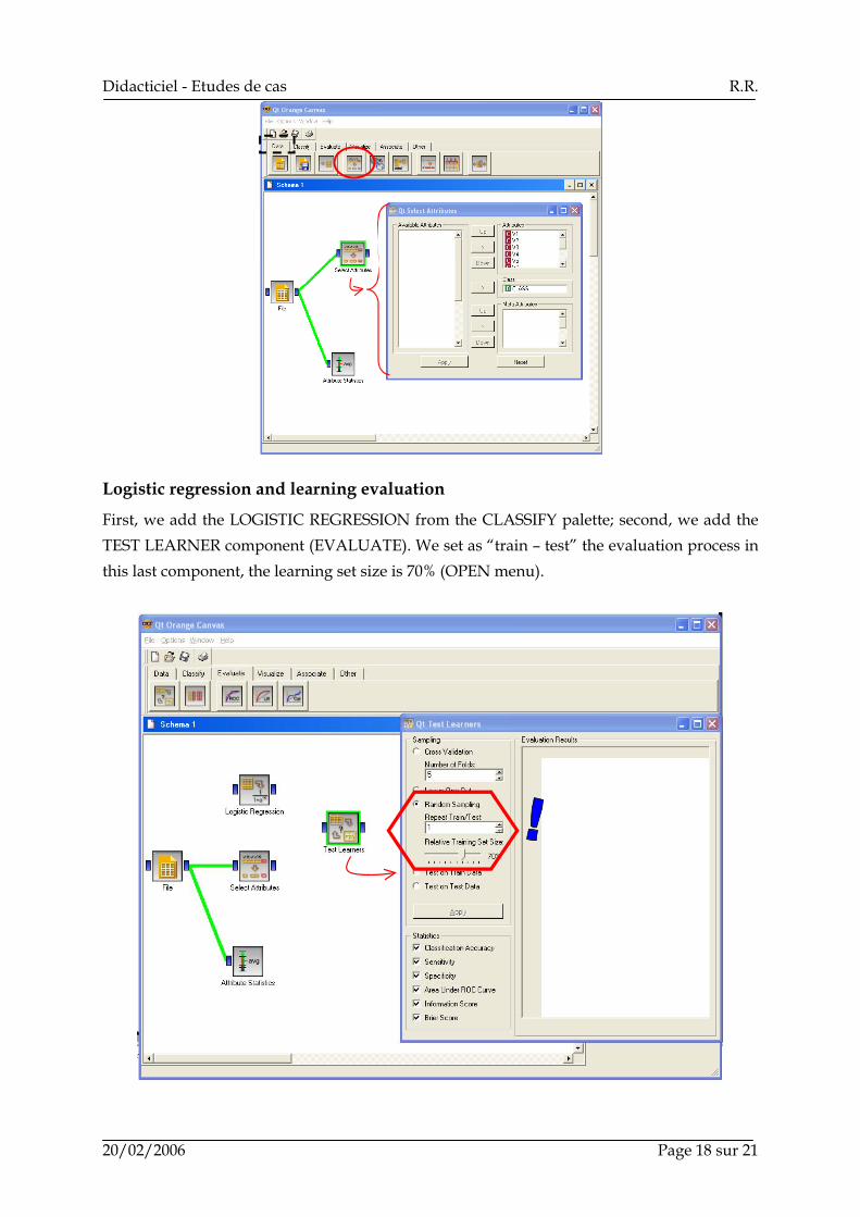
Logistic regression and learning evaluation
First, we add the LOGISTIC REGRESSION from the CLASSIFY palette; second, we add the TEST LEARNER component (EVALUATE). We set as “train – test” the evaluation process in this last component, the learning set size is 70% (OPEN menu).

Didacticiel - Etudes de cas R.R.
20/02/2006 Page 19 sur 21
We connect the LOGISTIC component to TEST LEARNERS, and SELECT ATTRIBUTES to TEST LEARNERS. In this last connection, a dialog box appears, it enables us to select the right dataset.
When we confirm this connection, the computation is automatically started. We can display the results with the OPEN menu of TEST LEARNERS.

Didacticiel - Etudes de cas R.R.
20/02/2006 Page 20 sur 21
Various indicators are computed, including the AUC ratio. But we do not find which value of the class attribute defines these results.
ROC curve
ORANGE has an interactive graphical tool for ROC curve computation. We set this component (ROC ANALYSIS from EVALUATE) in the diagram. We connect the TEST LEARNERS to this new component.
When we activate the OPEN menu of ROC ANALYSIS, we obtain the following chart. We can interactively select the “positive” class.

Didacticiel - Etudes de cas R.R.
20/02/2006 Page 21 sur 21
ORANGE is very easy to use. If we want to compare the performances of various learning algorithm, we add the learning components in the diagram and connect them to TEST LEARNERS: the new ROC curves are automatically included in the ROC ANALYSIS tool. Impressive!
Conclusion So that the results are really comparable, it would have been necessary to subdivide the file in training set and test set, then launching the softwares on the same datasets. ORANGE and WEKA use the same strategy. The dataset is subdivided into two files. Because they use graph, their diagram can handle several data sources. TANAGRA adopts another strategy. We must add a new column in the dataset; it defines the role of each example. Then we replace the SAMPLING component with the SELECT EXAMPLES component in the previous diagram, the other components of the diagram are the same one.