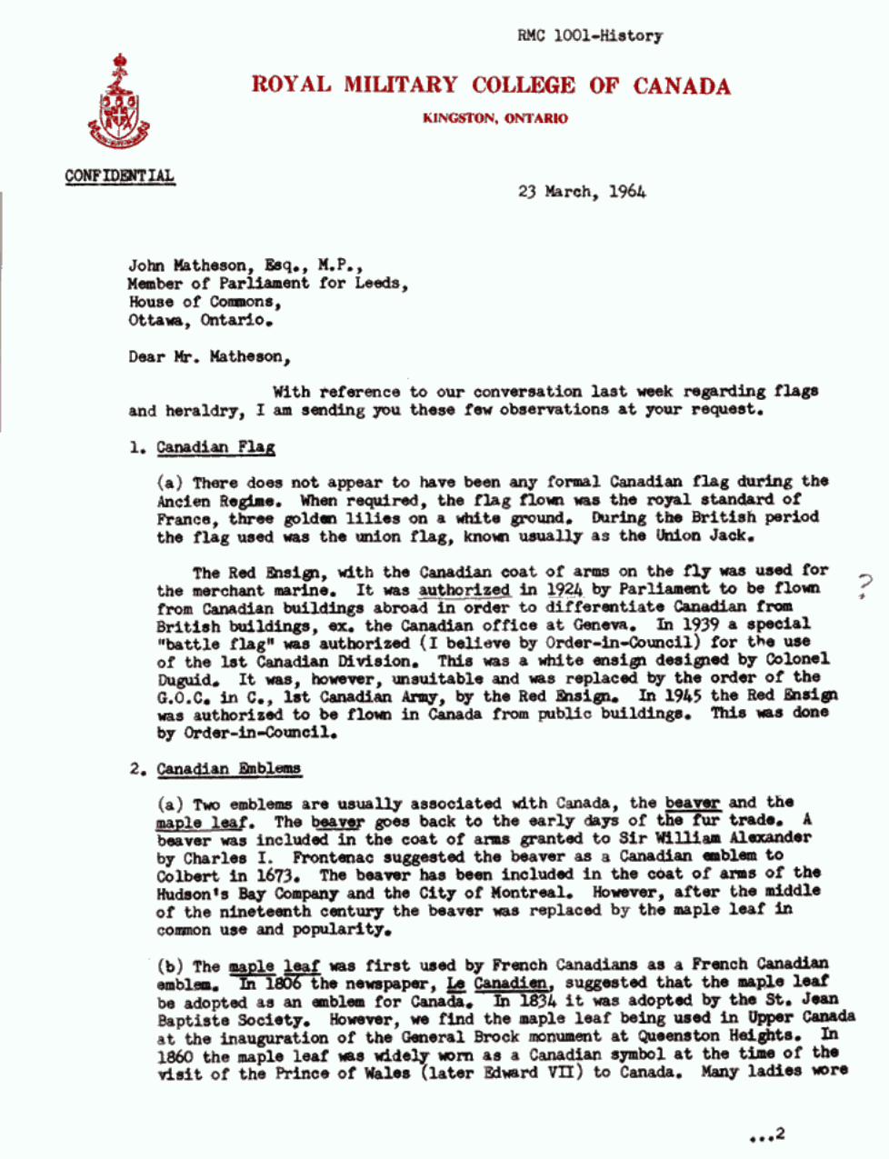
david ellison letter to the prime minister
DESCRIPTION
David Ellison has a unique association with the history of New Zealand icons. He is a Kai Tahu upoko (leader), a retired soldier and educator. Oh, and he is the descendant of the first New Zealand rugby captain who was instrumental with the adoption of a silver fern on an all black uniform. Here is his letter to the Prime Minister explaining the history of New Zealand symbols of nationhoodTRANSCRIPT
Page 1 of 10
The Rt. Hon John Key Prime Minister Executive Wing Parliament Wellington Wednesday, 26 August 2015 Dear Prime Minister,
THE FLAG CONSIDERATION PROCESS
I hope that this letter reaches you for your personal attention. I write to you out of concern about the transparency and fairness of the flag consideration
process that you instigated this year. My concerns are twofold:
1. That the quality of decision-making is unreasonable to the extent that no reasonable group of people acting on proper expert advice or accurate information would have reached the same decisions; and
2. That the consideration process is perceived to not be transparent or fair. Whilst I support your position to support the adoption of a silver fern on a black field, I
question the quality of information and processes used by those operating within your department and those delegated by your department to select the long-list of forty designs released on 10 August 2015.
1. PROPER ADVICE (a) My History
I am a Kai Tahu upoko with Te Ati Awa lineage. My ancestors include Thomas Rangiwahia
Ellison and Te Whiti o Rongomai. Thomas was the first captain of the New Zealand rugby team and designer of their uniform, which featured a silver fern on black material. Te Whiti was a leader of passive resistance to New Zealand Government politicians using confiscated Maori land to buy the votes of settlers.
Thomas was a member of the New Zealand Native Rugby team that toured Britain between
1888 and 1889. That team was the first representative body to adorn the silver fern on a black jersey. Also, as one of the first Maori lawyers, Thomas had a well-structured argument that convinced the New Zealand Rugby Football Union to adopt a silver fern on an all black uniform for the first national side.
Thomas Ellison’s grandmother was Te Whiti o Rongomai’s daughter. Many members of my
family were imprisoned without charge and had their land confiscated in breach of Magna Carta and the Treaty of Waitangi.

Page 2 of 10
(i) Black Black is a colour of authority, respect, and mana to both Maori and Pakeha. It is for these
reasons that Thomas Ellison chose it as a suitable national colour that would unify and embolden those who wear the colour.
For Maori, the origins of black was the white-tipped black huia feather. Those of mana wore
two huia feathers in their hair. Maori wear black to tangi to show respect, as well as at other cultural events.
The first Europeans of mana in New Zealand were Church Missionary Society missionaries
and Royal Naval officers. Both groups wore black uniforms. Maori recognized this demonstration of authority and vice versa.
New Zealand is fortunate to be the only country to have black as a national colour. When
England proposed wearing black uniforms during the 2011 Rugby World Cup, I was deeply offended and declared utu. Similarly, when on Waitangi Day this year your position for a black field on a new national flag waivered, many Maori, including myself, were offended.
(ii) The Silver Fern
I applaud your recognition of the silver fern as being the most appropriate emblem to appear
on a national flag, especially your Waitangi comment:
“It is the symbol of New Zealand, it is internationally recognisable.” My concern is the design of the silver fern.
(Clockwise from top left) Thomas Ellison’s silver fern design, A silver fern leaf, a common plant fern, a white
feather, an acacia stem, and a kowhai (Maori for yellow) stem. Thomas Ellison’s silver fern made special effort to ensure that the unique botanical elements
of the silver fern were evident whilst differentiating it from a white feather, which was the symbol of cowardice.

Page 3 of 10
Botanists during the Victorian era sought after the elegantly shaped and shiny silver fern.
Unlike the common plant fern, which is found on four continents, the silver fern had leaflets proportionate to the leaf with symmetry, recurring translations, and consistently diminishing scale along its stem.
The Flag Consideration Panel – indeed the current All Blacks – have failed to learn the lessons
of my ancestors. The ferns don’t look like silver ferns at all. They resemble feathers, plant ferns, or kowhai. The panel clearly didn’t consult the expertise of a botanist or a designer familiar with stylizing the silver fern’s unique elements.
(iii) The Southern Cross
To many Maori, the Southern Cross in its current form on the New Zealand flag is not a unifying symbol of a nation’s people but rather the symbol of the New Zealand Government. Whilst many waka used the Southern Cross for navigation, the Romanized cross configuration of four pentagrams differ greatly to the configuration used in the United Tribes flag of 1835, which was based on the Australian Colonial Flag.
The Southern Cross in its Romanized form originated in a flag for the Australasian Anti-
Transportation League - an Australian movement against shipping prisoners to Australia. Albert Hastings Markham, a Royal Naval officer and prominent Freemason, saw that configuration while based in Queensland and incorporated it into his design for a New Zealand flag.
Whilst no prisoners were ever shipped to New Zealand, it was the politicians who adopted
the current New Zealand flag who imprisoned many Maori in breach of many fundamental principles of Magna Carta, which the Treaty of Waitangi incorporated.
As an election stunt (and free up more land for his demanding voters) during the 1881
campaign, Native Minister John Bryce mounted a white charger, pillaged Parihaka, and shipped the villagers off to Dunedin as prisoners. Bryce’s electorate boundary changed to include Parihaka and he was coaxed by media and land-hungry settlers to act while Governor Gordon was overseas.
The 1881 election was the first universal one-man-one-vote election for non-Maori. It was
also when the North Island population first surpassed the South’s. While Maori men held universal franchise since 1867, they were marginalised to only four seats in Parliament.
Maori have been sceptical of representative government since its inception in 1854 as
politicians have used democracy as a weapon to redistribute Maori taonga to buy votes. Similarly, Maori are also wary of populism to influence decisions. It was the New Zealand Herald and Wanganui Chronicle who created a state of fear and encouraged the raping and pillaging of the peaceful Parihaka village.
I have travelled throughout the world, including North America. I have observed the depth of
feeling that African Americans have towards symbols like the Confederate flag. I have observed the disgust that Jews have towards the swastika. Whilst both those symbols originated as religious symbols, they came to symbolize oppressive regimes. Considering the oppressive

Page 4 of 10
acts of politicians in New Zealand who adopted the Southern Cross as their symbol, I hope that you can empathise with the strength of feeling by many Maori towards that symbol.
I believe that I speak for many Maori when I say that, while we accept that many New
Zealanders wish to remove the Union Jack from the canton of our national flag, the Southern Cross is a divisive and distasteful symbol to keep on any new New Zealand flag.
(b) Comparable History
I was a schoolteacher in Canada during the 1960s when Canada debated and then changed its
flag. The Prime Minister, Lester Pearson, also created a cross-party ‘special flag committee’ to find a new flag within six weeks. The committee recommended flags that combined the Union Jack, Fleur-de-lys, and the maple leaf.
During the year leading to the flag change, the Berlin Wall appeared and the United States
completed the Distant Early Warning Line in Canada to warn against Communist nuclear attack. Pearson was wary of red in Canada’s flag at the height of the Cold War and promoted his red, white, and blue flag design, which earned the nickname ‘Pearson’s Pennant.’
Fortunately, the decisive turning point in the flag debate was a memorandum from George
Stanley, the Dean of Arts at the Royal Military College of Canada. He identified the emblems and colours of Canada and set down the following principles for the design of a new flag:
4. Principles to be followed in the selection of a Canadian Flag (a) simplicity - it should be clean cut and not cluttered. (b) easily recognizable. (c) use traditional colours and traditional emblems. (d) serve as a rallying symbol and hence to be a unifying force.
Furthermore, he stated:
(e) If the flag is to be a unifying symbol it must avoid the use of national or racial symbols that are of a divisive nature. It is clearly inadvisable in a purely Canadian flag to include such obvious national symbols as the Union Jack or the Fleur de Lys.
In applying these principles, Stanley stated:
The single leaf has the virtue of simplicity; it emphasizes the distinctive Canadian symbol; and suggests the idea of loyalty to a single country. In this respect the leaf resembles the eagle, the star or the crescent used as national symbols in other countries.
Stanley also went on to say that only one symbol should be used and heraldic symbols should
be avoided. Applying these criteria to New Zealand, the Southern Cross should be avoided and the silver fern should only be used.
The most vocal opponents against any flag change was the Royal Canadian Legion. It was a
political masterstroke that George Stanley based his design on the flag of the college that trained Canada’s military elite.

Page 5 of 10
(c) The Flag Consideration Panel long-list
George Stanley’s principles have often been quoted and applied for numerous flag consideration processes since. The Flag Consideration Panel should have applied these most fundamental elements of vexillology.
In my opinion, the Flag Consideration Panel has fallen short of these most basic principles.
More specifically:
(i) None of the silver fern designs are simple to draw, or appear uncluttered; (ii) None of the silver ferns are actual silver ferns or recognisable as silver ferns; (iii) Most of the flag designs do not contain recognisable New Zealand emblems; (iv) Only a handful of designs contain an appropriate use of our national colour; (v) None of the designs serve as a rallying symbol or unifying force;
In fact, all the silver fern designs are trademarked and licenced brands. Former Saatchi & Saatchi Worldwide creative director, John McCabe, knows the difference
between a brand and a design suitable for a national’s flag:
Considering that many sports teams, trade organisations, military and civil service emblems use the silver fern, any new national flag’s silver fern needs to be compatible. In other words, it must not introduce new elements that confuse what a silver fern looks like. I think of the national flag as being at the top of the family tree. Every existing silver fern emblem/logo/brand has to look like a descendant of what appears on the national flag. This is where the ferns in the long-list fail. Most of them are the New Zealand Way Limited’s registered trademark, which is licenced to multiple businesses and government bodies across all classes. That design is an evolved design – the great grandchild of silver fern designs. It contains too many unique elements and departures from the fundamentals of a silver fern.
Ted Kaye, who is a leading vexillologist advising Fiji on their flag, criticised the panel’s choice of long-list:
“Many designs combine the fern with the Southern Cross, but it's better to choose one or the other to avoid unnecessary complexity.”
Regarding the use of the colour black, he stated:
“I’m struck by the popularity of the color black. I don’t buy the argument that a flag with a flag field would be confused with ISIS, and therefore should be avoided—New Zealand’s flag will fly long after ISIS is in the ashbin of history.”
Page 6 of 10
2. FAIRNESS
(a) Perception
In your New Zealand Herald column of 22 August 2015 it states:
In the future, no one will remember or care who the politicians were when we changed the flag, just as they do not remember or care who the politicians were when we got our current ensign. It simply does not matter. All that is important is to ensure the decision is taken fairly and democratically.
I disagree. Your legacy will be similar to Thomas Ellison’s. I, due to my unique association
to key New Zealand icons, see my role as similar to George Stanley’s. Whilst I appreciate your distance from the process, I question the perceived transparency,
consistency, and expertise of those influencing the decision-making process. For a start, I take exception to the panel setting criteria and not following them. I also take
exception to the panel saying one thing and doing another. More specifically:
(i) The panel set design criteria for entries but chose a long-list not based on that criteria; and
(ii) The panel stated that it would release a long-list of 60-70 different designs in mid-August but released 40 similar designs on August 10; and
(iii) Selected designs based more on the number of entries by designers rather than the concepts of the designs.
Effectively, the panel has ignored its own rules, moved the goalposts, and tilted the level
playing field. Whilst you argue that politicians won’t be remembered, your panel has either ignored or
overlooked the best designs. At this stage of the flag consideration process, it is not a competition but a collaboration of
ideas. It is about the contribution of ideas, not personality politics. It isn’t democratic but it should be judicious.
Under the Flag Consideration Panel conditions, it states: “The Panel and the Crown each
reserve the right to consider other flag designs suggested before, during or after the Suggestion Period.” That is as clearer indication as any that the panel is meant to welcome the expertise and experience – the collective brain of the nation – to find the best design.
But that is not as most see it. The panel has not adequately communicated this condition and
the process of narrowing designs to a final four has degenerated into a popularity contest led by celebrity endorsements with no expertise or experience that could assist the panel.
In effect, those designs not long-listed have been shut out of the debate and the media have
ignored the expertise that could contribute.

Page 7 of 10
(b) The Black & Silver flag design
(Left) The New Zealand War Service Medal.
(Right) The Black & Silver flag.
All Second World War returned servicemen received the New Zealand War Service Medal, which featured a black and white ribbon and a silver fern on the medal. The white, black, white ribbon design was based on two huia feathers. The silver fern was based on the emblem that New Zealand military has used since 1853.
To many, the Second World War earned New Zealand’s independence from Britain. To my
Maori Battalion ancestors, the war service medal was a strong symbol of nationhood. I proudly wear my father’s medals every ANZAC Day, alongside my own. I know what it
means to defend our colours. When I first saw Canada’s flag, I envisioned how New Zealand’s new flag would look like,
and my instinct drew comparisons with the NZ War Service Medal. When I searched the Flag Consideration Panel’s website database, only one design featured the pattern of the ribbon and a suitable silver fern design.
The name of the flag entry is called ‘The Black & Silver’. I bought a flag to show as many
people as possible. They are unanimous that the flag should be New Zealand’s next flag. What is especially important about The Black & Silver flag design is that it is actually a flag
that follows established vexillological principles. It is also the best use of the silver fern and our national colour.
Regarding colour, John McCabe made an important point:
Adding other colours to the mix can diminish a brand and create confusion. The only reason for adding a colour should be to accentuate the core colour. Adding contrast through framing or balancing the amount of a second colour are two ways of achieving this.
Take a look at the Canadian flag’s use of those colours. If New Zealand were to include
a silver fern on its flag, it should take centre stage and capitalise on the contrast with the national colour to make it stand out. To accentuate the central emblem on a rectangular

Page 8 of 10
flag, I would recommend flanking the emblem with white pales in the same way the red stripes on the Canadian flag complements the red maple leaf.
Unfortunately, the flag was not on the long-list. I have expressed my dissatisfaction about this
decision and many agree with me. Vexillologist Ted Kaye expressed a strong view on the flag design:
“I believe the “Black & Silver” design is a strong contender and could hold its own alongside the 40 designs short-listed by the committee and currently under consideration by the public.”
This flag is the best researched and designed by far and the designers have the support of
many leaders in their fields. The silver fern design is classical, instantly recognisable, and easy to draw.
The design is the collective contributions of three leading designers with diverse
backgrounds. They also drew on the experience of colleagues who are also leaders in their fields and consulted widely with the general public.
What many flag designs have overlooked is that the flag features are distinguishable in low
wind conditions, like good flags should be. Also, the design incorporates the ability to be ensigns for the civilian and defence services – as well as for any representative body.
(Clockwise from top left) Ensigns for the Governor General/ Parliament, Army, Navy, Air Force, Fire Service
and Police Force.

Page 9 of 10
(c) Unfairness The Black & Silver flag may have simply slipped through cracks in the process. Looking through the Flag Consideration Panel’s website, I noticed that most of the designers
whose designs made the long-list entered multiple times, often with a variety of designs. Kyle Lockwood’s silver fern design is credited in 628 submissions, whilst Sven Baker is credited with 117 designs.
The Black & Silver is only one submission. I can accept that, while processing so many
designs, that the panel simply did not see the Black & Silver design. If this is in fact the case, then the panel needs to address this.
To me, the fact that the Black & Silver team entered only one design demonstrates a strength
of conviction that they did all the research and came up with one design that encompasses all their hard work. They should be commended, not excluded.
In conclusion, the exclusion of The Black & Silver from the long-list is the result of: 1. The panel not grasping the George Stanley principles of good flag design; 2. The panel not having access to the right advice when reaching decisions; 3. The panel inconsistently applying its decision making process; and/or 4. An administrative error where the panel did not fully assess the design; By all accounts, the exclusion of the flag design is unfair and would have made a credible and
considerable contribution to the flag consideration process.
(d) Recommendations The Black & Silver flag could have unified New Zealand. The RSA would struggle to counter
such a powerful symbol. Instead, the panel shut it out of the public debate. The panel said in June that they would release a long-list of 60-70 different designs in mid
August. Instead, they released 40 similar designs much earlier. As a result, they have in many ways made life unnecessarily tougher for themselves.
Since my article that was published throughout Fairfax publications, I have been contacted
by many prominent Maori. They share my concern with the choice of designs in the long-list and especially the exclusion of the Black & Silver flag design.
The overwhelming view from leading creatives that have contacted me is that most of the
long-list designs need further work, especially those that feature a silver fern. The panel, in my view, can and does need to bring in expert designers and vexillologists and tweak some of those designs.
Considering that The Black & Silver is perceived to be out of the running, Ted Kaye made
one suggestion:
“Taking the Lockwood silver fern design, simplifying the fern, and adding vertical white bars to the hoist and fly would be a wonderful way to replicate the success of the

Page 10 of 10
Canadian flag. Making the bars 1/5 the flag’s length distinguishes it from Canada’s bars of 1/4. And such a design would have the added advantage of reducing the political/cultural challenge posed by a solid black field.”
What the panel should do is release a ‘short-list’ before announcing the final four designs. A
short-list of at least 10 further designs could consist of at least 5 designs that the public have stated should have made the long-list and 5 designs that the panel has designed based on the long-list of 40. This should refine the process so that they can make a more informed decision.
If the panel does not act, it threatens to undermine its own credibility and our international
reputation. It also threatens your desire for a new flag. Whilst I appreciate your intention for the Flag Consideration Panel to be independent, your
responsible minister can introduce designs outside the Suggestion Period. I request that, after you consult with Cabinet, my recommendations are agreed to.
I look forward to your response and decisive action to remedy this unfortunate situation.
Otherwise, you will leave me to review other avenues. Yours Faithfully, David Ellison, 41D North Road, North East Valley, Dunedin ENCLOSED: George Stanley’s Flag Memorandum