describing and interpreting data - university of houstontech132/6300p1.docx · web viewfor...
TRANSCRIPT

HDCS 6300 / Introductory Concepts (goodson)
Statistics is the science of data. It is a body of methods and theory that is applied to numerical evidence when making decisions. For a given data set, the process involves the following.
Collect and classify Organize Summarize and analyze Interpret
Descriptive statistics are used to summarize and describe data. Define/collect Data to describe the variable(s) of interest in a population or sample. Characterize the data: tables, graphs, or numerical summary tools Identify of patterns in the data Present / Visualize / communicate data Examples: US Census describes the US population at a given point in time -
presents information re the population such as gender, race, income…
Inferential statistics are used to make generalizations about the population by investigating a sample from the population.
Identify the Experimental unit /variable(s) of interest Identify the Population and the sample Make inferences about the population based on information contained in the
sample using estimation, hypothesis testing Make decisions about population characteristics Examples : opinion poll, rating systems, election polls – used to describe all in the
population based on a subset of the population (the sample)
For DiscussionClassify each of the following as examples of inferential or descriptive statistics.1. The collection and summarization of the socioeconomic and physical characteristics
of the employees of a particular firm2. The estimation of the population average family expenditure on food based on the
sample average expenditure of 1,000 families3. The number of registered voters who turned out to vote for the primary in Iowa to
predict the number of registered voters who will turn out to vote4. The methods involving the collection, presentation, and characterization of the data if
the Human Resources Director of a large corporation wishes to develop an employee benefits package and decides and selects 500 employees from a list of all (N = 40,000) workers in order to study their preferences for the various components of a potential package.
Sampling Concepts
6300p11

A population is a total collection of objects or persons of interest. The sample is a subset of the population.
Begin by defining the frame: a listing of the items that make up the population.
Use the frame to collect a nonprobability or probability sample. The method of sample selection of the sample is of particular importance in inferential statistics. A probability sample allows you to make inferences about the population.
Nonprobability sample –items selected with unknown probability of selection Probability sample - items selected with known probability of selection
A random sample of n experimental units is a sample selected from the population in such a way that every different sample of size n has an equal chance of selection.
A random sample will never exactly portray the population from which it is drawn; note the possible error types.
Coverage error – The sample used does not properly represent the underlying population being measured - excludes of groups. Selection bias results when a subset of the experimental units in the population is excluded so that these units have no chance of being selected for the sample
Non response error – There is a failure to gather data on all items in the sample.Nonresponse bias results when the researchers conducting a survey or study are unable to obtain data on all experimental units selected for the sample.
Sampling error – differences between the population and sample due to chance (random variation in the sample observations).
Measurement error – There is a difference between the actual value of a quantity and the value obtained by a measurement- inaccuracies in the values of the data recorded. In surveys, the error may be due to ambiguous or leading questions and the interviewer’s effect on the respondent.
6300p12

For DiscussionClassify each of the following types of errors that might occur with the following.
1. Survey question: "How many times have you abused illicit drugs in the last 6 months?" (N)
2. Survey question of managers regarding their typical weekly workload? (N)3. Questionnaire that cannot be completed in a reasonable amount of time (M) 4. Questionnaire that uses language that is not easily understood by both the interviewer
and the respondent (M)5. Only employees in a specific division of the company were sampled. ( C )6. A classic error occurred in the 1936 presidential election between Roosevelt and
Landon. The sample frame was from car registrations and telephone directories. In 1936, many Americans did not own cars or telephones and those who did were largely Republicans. The results wrongly predicted a Republican victory.
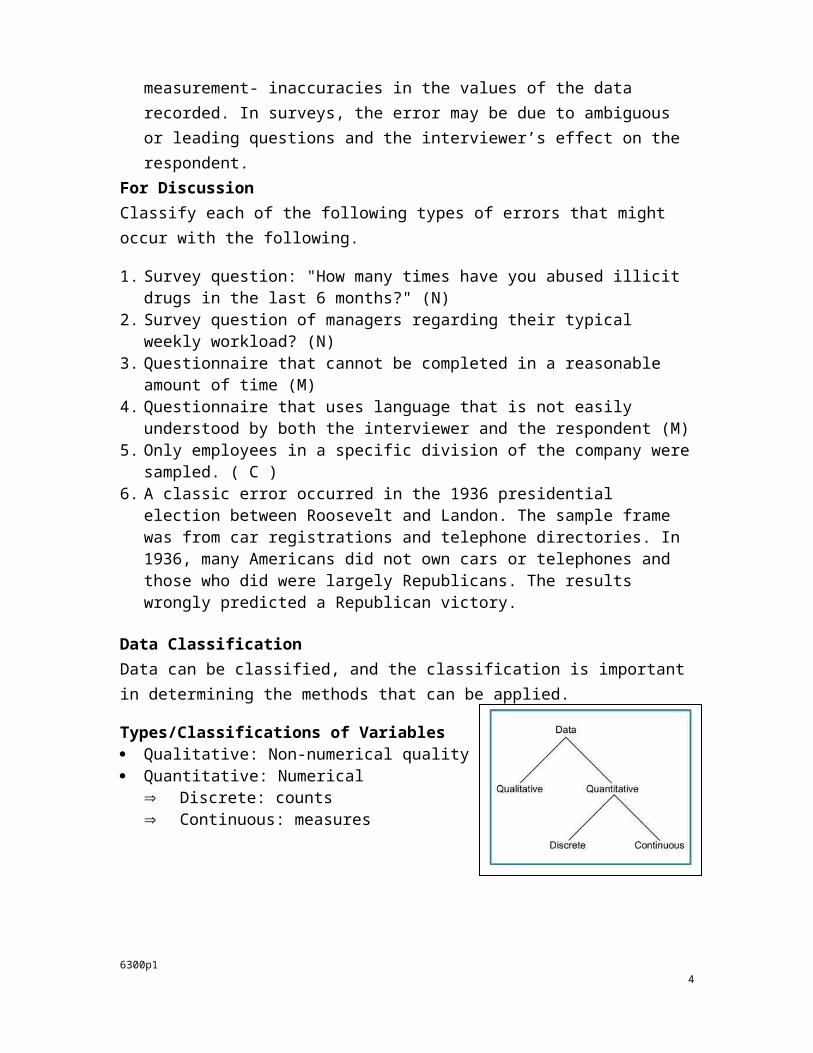
Data ClassificationData can be classified, and the classification is important in determining the methods that can be applied.
Types/Classifications of Variables Qualitative: Non-numerical quality Quantitative: Numerical
Discrete: counts Continuous: measures
Qualitative Data This data describes the quality of something in a non-numerical format. Counts can be applied to qualitative data, but you cannot order or measure this type of
variable. Examples are gender, marital status, geographical region of an organization, job title….
Qualitative data is usually treated as Categorical Data.With categorical data, the observations can be sorted according into non-overlapping categories or by characteristics. For example, shirts can be sorted according to color; the characteristic 'color' can
have non-overlapping categories: white, black, red, etc. People can be sorted by gender with categories male and female.
Categories should be chosen carefully since a bad choice can prejudice the outcome. Every value of a data set should belong to one and only one category.
Analyze qualitative data using: Frequency tables, Contingency tables (for 2 variables) Modes - most frequently occurring Graphs: Bar Charts, Pie Charts, Pareto Charts
Quantitative Data6300p1
3
Quantitative or numerical data arise when the observations are measurements. Discrete Data
The data are said to be discrete if the measurements are integers (e.g. number of employees of a company, number of incorrect answers on a test, number of participants in a program…)
Continuous Data The data are said to be continuous if the measurements can take on any value,
usually within some range (e.g. weight). Age and income are continuous quantitative variables. For continuous variables, arithmetic operations such as differences and averages make sense.
Analysis can take almost any form: Create groups or categories and generate frequency tables. Effective graphs include: Histograms, Stem-and-Leaf plots, Dot Plots, Box
plots, and XY Scatter Plots (2 variables). All descriptive statistics can be applied.
Classification based on Measurement Scale Data can be classified based on measurement/1. Nominal – categorizes data into one or more with no implied rankings
Gender, employed vs unemployed, owner of a product vs non-owner
2. Ordinal – classifies data with an implied ranking among all data elementsStock Rating, course grade, economic status (low, medium and high), political orientation (Left, Center, Right)
3. Interval - ordered data plus the difference between variables is meaningfulStandardized exam score, time of day on a 12-hour clock
4. Ratio - ordered plus the difference between variables is meaningful plus there is a true 0 in measuring Age, cost of a particular product, ruler (inches), years of work experience
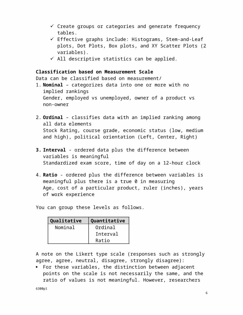
You can group these levels as follows.
Qualitative QuantitativeNominal Ordinal
IntervalRatio
A note on the Likert type scale (responses such as strongly agree, agree, neutral, disagree, strongly disagree): For these variables, the distinction between adjacent points on the scale is not
necessarily the same, and the ratio of values is not meaningful. However, researchers often assume the intervals are equal and treat this data as ordinal.
Usual Analysis – use: Frequency tables
6300p14
Mode, Median, Quartiles Graphs: Bar Charts, Dot Plots, Pie Charts, and some Line Charts (2 variables)
Note: it is possible to move the data classification ‘down’ - from quantitative/continuous data to categorical data. It is not possible to go from categorical to continuous.
Examples of measuring variable as discrete of continuous: note the ways the following variables can be measured.
For DiscussionClassify each variable in the Salary _ Experience data set. The set has 150 items; the first 27 are shown in the following.
6300p15
From: Salary _ Experience data set
6300p16

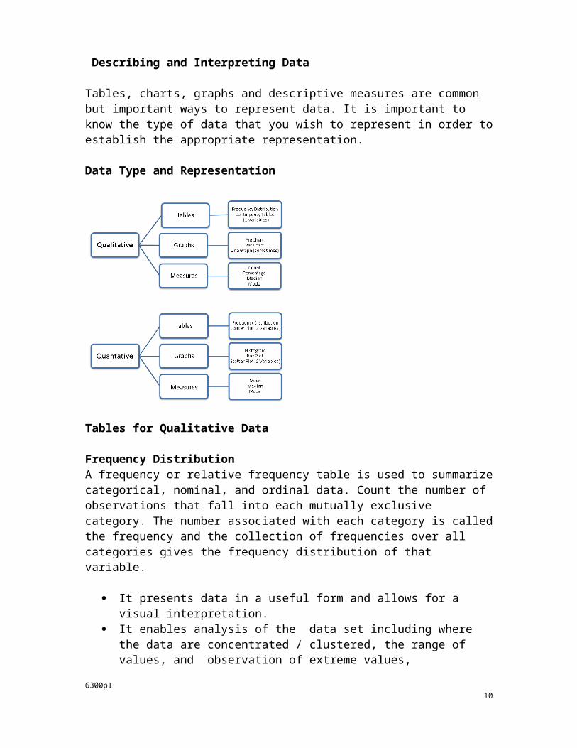
Describing and Interpreting Data
Tables, charts, graphs and descriptive measures are common but important ways to represent data. It is important to know the type of data that you wish to represent in order to establish the appropriate representation.
Data Type and Representation
Tables for Qualitative Data
Frequency DistributionA frequency or relative frequency table is used to summarize categorical, nominal, and ordinal data. Count the number of observations that fall into each mutually exclusive category. The number associated with each category is called the frequency and the collection of frequencies over all categories gives the frequency distribution of that variable.
It presents data in a useful form and allows for a visual interpretation. It enables analysis of the data set including where the data are concentrated /
clustered, the range of values, and observation of extreme values,
The relative frequency (labeled % in the following table) is a number which describes the proportion of observations falling in a given category. Instead of counts, we report relative frequencies or percentages (% of total).
The cumulative relative frequency distribution adds the percentage in a category to the sum of those percentages in the preceding categories (Cumulative %)..
6300p17

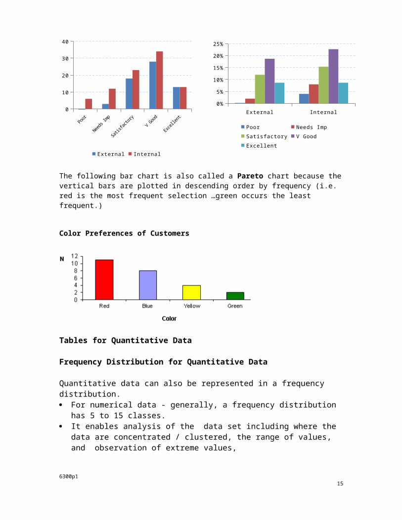
Manager's Employee Ratings
n % Cumulative %Excellent 26 17% 17%Very Good 62 41% 59%Satisfactory 41 27% 86%Needs Improvement 15 10% 96%Poor 6 4% 100%Total 150 100%
Contingency Table for Categorical DataA contingency table cross tabulates data using two or more categorical variables to allow for analysis of relationships between the variables.
Manager Rating by Origin of Employment
Origin / Rating Poor
Needs Improvemen
tSatisfactor
y V Good Excellent TotalExternal 0% 2% 12% 19% 9% 41%Internal 4% 8% 15% 23% 9% 59%Grand Total 4% 10% 27% 41% 17% 100%
Note that contingency tables can also be based on 1) percentage of row total and 2) percentage of column total.
For DiscussionReview the table and consider questions such as the following.1. What percentage of the employees originated from within the organization?2. What percentage of the employees are both internal and rated ‘Very Good’?3. What percentage of the employees received ‘Needs Improvement’ or ‘Poor’?4. What category contains the greatest number of employees?5. Do you see any notable differences in the percentage by category?
Graphs for Qualitative DataNote Excel (and other software) will create any graph that you specify, even if the graph that you select is not appropriate for the data. Remember - consider the data that you have before selecting your graph.
Pie Charts A circle is divided proportionately and shows what percentage of the whole falls into each category. The size of each wedge of the pie varies according to the percentage in each category. These charts are simple to understand. They often convey information regarding the relative size of groups more readily than
does a table.6300p1
8

Color Preferences of Customers Color Preferences of Customers
Bar ChartsBar charts also show percentages in various categories and allow comparison between categories. The vertical scale is frequencies, relative frequencies, or percentages. The horizontal scale shows categories. Consider the following in constructing bar charts.
all boxes should have the same width leave gaps between the boxes (because there is no connection between them) boxes can be in any order.
Bar charts can be used to represent two (or more) categorical variables simultaneously
Manager's Employee Ratings
Excellent V Good Satisfactory Needs Improvement Poor0%
10%
20%
30%
40%
50%
Rating
6300p19
For DiscussionWhat is the difference in the following tables? Which one do you think is the most informative? Why?
Manager Rating / Origin of Employment
Poor Needs Imp Satisfactory V Good Excellent0
10
20
30
40
External Internal
Manager Rating by Origin of Employment
External Internal0%
5%
10%
15%
20%
25%
Poor Needs Imp SatisfactoryV Good Excellent
The following bar chart is also called a Pareto chart because the vertical bars are plotted in descending order by frequency (i.e. red is the most frequent selection …green occurs the least frequent.)
Color Preferences of Customers
Tables for Quantitative Data
Frequency Distribution for Quantitative Data
Quantitative data can also be represented in a frequency distribution. For numerical data - generally, a frequency distribution has 5 to 15 classes. It enables analysis of the data set including where the data are concentrated /
clustered, the range of values, and observation of extreme values,
6300p110

Salaries (x $1000)
For DiscussionConsider the above Frequency Distribution of Salaries.1. What percentage of the employees earns less than $80,000?2. What is the salary range of values?3. What is a mid-range of salaries?4. What salary category includes the most employees?
Graphs for Quantitative Data
The following graphs are commonly used to represent qualitative data. Stem and Leaf Histograms Percentage Polygons Box plots XY Scatter Charts (2 variables) Line Graphs (e.g. time series)
Stem and Leaf Plots
A stem-and-leaf plot puts data into groups (called stems) so that the values within each group (the leaves) branch out to the right on each row. The advantage of a stem and leaf plot is that it utilizes the data as a part of the graph.
For DiscussionConsider the following stem and leaf display of CEO Compensation. (n= 182)1. What is the lowest CEO salary?2. What is the highest CEO salary?3. Where are these salaries concentrated/ centered? 4. Are there any extreme/unusual values? 5. What percentage of the CEO’s earned $27 mil or above? 6. What percentage of the CEO’s earned $11 mil or below?7. What percentage of the CEO’s earned from $11 mil to $27 mil? (169/182)
6300p111

n = 182
Histograms
Histograms depict the frequency distributions of continuous variables. They look similar to Bar Charts, but they are drawn without gaps between the bars because the x-axis is used to represent the class intervals (on a continuum). However, many of the current software packages do easily not make this distinction (e.g. Excel) and the graphs need to be formatted. The data is divided into non-overlapping intervals (usually use from 5 to 15). Intervals have the same length. The number of data values in each interval is counted (the class frequency). Sometimes relative frequencies or percentages are used. (Divide the cell total by the
grand total.) Rectangles are drawn over each interval. The area of a rectangle is proportional to the
relative frequency of the interval. Shifts in data concentration may show up when different class boundaries are chosen.
As the size of the data set increases, the impact of alterations in the selection of class boundaries is greatly reduced.
When comparing two or more groups with different sample sizes, use either a relative frequency distribution or a percentage distribution
Note: XL does not give mid points; it uses bins – each bin represents a range of values. The upper boundary of a bin is explicitly given – no value in the bin exceeds
the upper boundary. All the values in the bin are greater than the lower boundary. See the Salary Experience data file for an examples of constructing
histograms with Excel.6300p1
12
Note the first line. The first stem is 10; it is followed by four leaves-each 9. This means that the original data has four values of 10.9Stem
leaf

The following chart shows the XL output for the table. A better format for the table is shown in the above example of a frequency distribution. Note: There is one employee with a salary between $40,000 and $50,000. There are 20 employees with a salary between $50,000 and $60,000.
Salaries (x $1000)
Salary ($10000)
Frequency
40 0
50 1
60 20
70 53
80 43
90 26
100 6
110 1
Figure : Salaries (x $1000)
40 50 60 70 80 90 100 1100
10
20
30
40
50
60
Salary
Salary (x $1000)
Freq
uenc
y
To describe / interpret the data in a histogram, consider the following. Shape of the Distribution
Symmetry / Skewness Modality: most frequently occurring value Unimodal or bimodal or uniform
Centrality – mid range of values Spread – range of values Extreme values - outliers
For DiscussionConsider the Salary Histogram.1. Does the distribution of salaries seem symmetrical?2. Give the mid-range - range for most of the salaries?3. What is the range of salaries?4. Are any salaries extreme in value?5. Compare the above XL display with bins to the Frequency Distribution of Salaries.
How does the presentation of information vary?
6300p113

Frequency Polygon for CEO Compensation
A frequency polygon is particularly useful in comparing two groups. The midpoint of an interval represents the data within the interval.
Salaries (x $1000)
40 50 60 70 80 90 100 1100
10
20
30
40
50
60
Salary (x$10,000)
Frequency
Note that in graphing the polygon, the vertical axis should show 0 to avoid distorting the data.
Ogive for Salaries (Cumulative Percentage Polygon)
The ogive plots cumulative frequencies or percentages along the vertical axis.
Salaries (x $10,000)
40 50 60 70 80 90 100 110 More0
10
20
30
40
50
60
0%
20%
40%
60%
80%
100%
120%
Salary
Salary (x $10000)
Freq
uenc
y
Box Plots provide a good way to graphically present data. They are discussed in the section on Descriptive Measures
For DiscussionDescribe the data in the polygons of salaries. What information is given by the line?6300p1
14
Use midpoints to represent the data
Mid Pt n
45 1
55 20
65 53
75 43
85 26
95 6
105 1
150
Cumulative percentages are plotted along the Y axis. Reading from the chart -approximately 80% of the salaries are less $75,000.
Graphing Two Numerical Values
XY Scatter ChartThis type of chart is best used with two variables when both of the variables are quantitative and continuous.
Plot pairs of values - use the rectangular coordinate system to examine the relationship between two variables.
Salaries (x$1000 by Experience
Note: the patterns of relationships between variables and associated measures are discussed in the section on Descriptive Measures.
A Line Chart is similar to the scatter chart; however, it can be used when the values of the independent variable (shown on the horizontal axis) are ranked values (i.e. they do not have to be continuous variables). It is also used for time series plots.
Notes on Table and Graph Presentation
Basic Principles for Constructing All Plots
Data should stand out clearly from background. Keep the graph as simple as possible. The information should be clearly labeled and include:
title axes, bars, pie segments, etc. should include units that are needed to interpret data axis labels scale including starting points. The vertical axis will typically begin at 0.
Sources of data should be identified, as appropriate.
6300p115

Do not clutter the graphs with unnecessary information and graphical components that are really not necessary.
Do not put too much information or data on one graph. Sometimes, you have to try several approaches before selecting an appropriate graph.
Some practical advice for constructing graphs includes the following. (See Tufte.) Every bit of ink on a graphic requires a reason. And nearly always that reason should
be that the ink presents new information. In most cases, non-data ink clutters up the data. Avoid content-free decoration, including chart junk.
Type should be clear, precise, and modest. Usually - type in upper and lower case. The grid should usually be muted or completely suppressed so that its presence is
only implicit - lest it compete with the data. Dark lines are chart junk. They carry no information, clutter up the graph – generating graphic activity that is unrelated to the information you wish to show.
The representation of numbers, as physically measured on the surface of the graph itself, should be directly proportional to the numerical quantities represented.
Clear, detailed, and thorough labeling should be used to defeat graphical distortion and ambiguity. Label important events in the data.
Show data variation, not design variation. Graphical elegance is often found in simplicity of design and complexity of data Horizontal and vertical scales; what is the relationship - are the distances between, for
example, 10 and 20, the same on each axis? A no answer may distort the interpretation.
The center point - of particular importance in comparing two histograms. Look at the starting point of the vertical scale - does it start at 0? How could this affect the interpretation of the data?
Chart junk refers to visual elements on a graph that distract from the data; distracting patterns, inappropriate use colors and unnecessary grids are some of the elements of chart junk. It is all visual elements in charts and graphs that are not necessary to comprehend the
For Discussion
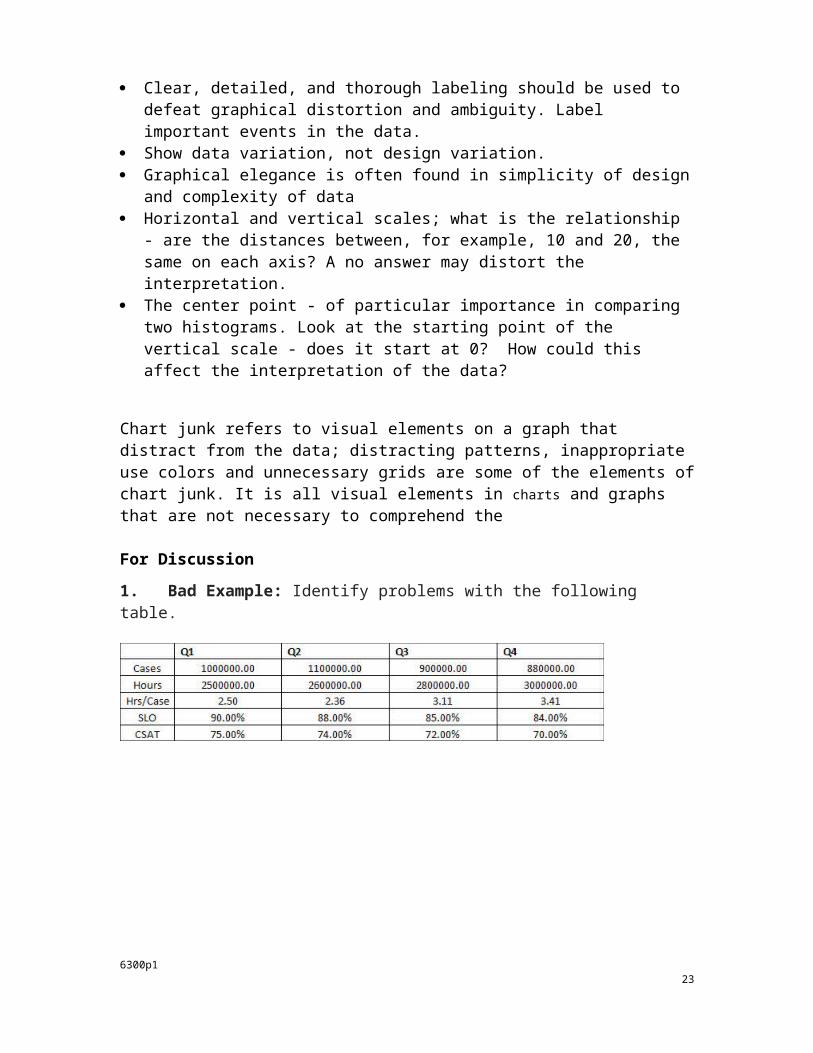
1. Bad Example: Identify problems with the following table.
6300p116

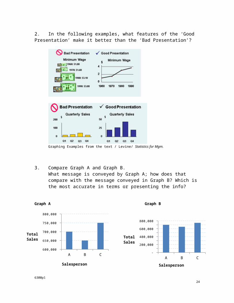
2. In the following examples, what features of the ‘Good Presentation’ make it better than the ‘Bad Presentation’?
Graphing Examples from the text / Levine/ Statistics for Mgm.
3. Compare Graph A and Graph B.What message is conveyed by Graph A; how does that compare with the message conveyed in Graph B? Which is the most accurate in terms or presenting the info?
Graph A Graph B
A B C 600,000
650,000
700,000
750,000
800,000
Salesperson
Total Sales
A B C -
100,000 200,000 300,000 400,000 500,000 600,000 700,000 800,000
Salesperson
Total Sales
6300p117
3. How could you improve the following graph?
Answer to #1
Useless Information – Don’t show decimals if they are not needed Poor Alignment – Make sure alignment makes sense
o Don’t center numbers, always right justify – try to align decimal pointso Consider the appropriate placement of row titleso Headers are left justified – align with the numbers?
Difficult to Read – Use commas used when the number exceeds a thousand
6300p118

Describing and Interpreting Data /Descriptive Measures
This section presents concepts related to using and interpreting the following measures.
Measures of Central Tendency
Mean
A mean is the most common measure of central tendency. A mean is what we commonly think of as the ‘average’ value. Calculate by summing the values and dividing by n (the total number of values) population or
by n-1 for a sample. Extremely large values in a data set will increase the value of the mean, and extremely low
values will decrease it.
To calculate a weighted mean, first multiply each cell frequency by its weight (the cell frequency), and then sum and divide by the total frequency.
Median
The median is the central point of the data. Half of the data has a lower numerical value than the median. Half of the data has a higher numerical value than the median. To find the median, arrange the data in order from smallest value to largest value, and
If there are an odd number of points, find the value that is in the center of the dataIf there are an even number of points, add the two middle values and divide by 2.
The median is not affected by extremely large or small values.6300p1
19
Extreme values affect the mean.

(Levine)
Mode
The mode is the data value that occurs with the greatest frequency. The mode is not affected by extreme values. There may be no mode or there may be more than one mode.
(Levine)
For DiscussionSales personnel for the Eastern Division report the following number of orders for the first quarter of the fiscal year.
Total Orders 160 175 190 215 230 240 290 290 320 350
The Sum = 2,460. Find and interpret the mean, median and mode.
If the 160 was entered in error ant it is actually 60, what will happen to the mean value?What will happen to the median and the mode?
Measures of Spread /Variation
A measure of variation is a measure of variability (i.e. spread or dispersion).
6300p120
Measures of Variation
RangeStandard
Deviation / Variance
Coefficient of Variation
The median is not affected by extreme values so this measure is used when the data set contains extreme values.
The most commonly used measures of variability are the range and standard deviation.

The values of the range and standard deviation are positive, and as the value increases as the spread of the data increases. If there is no variation, these measures equal 0.
Range
Subtract the smallest value from the largest - or Report the smallest and largest values. Note that the range can be a misleading value.
(Levine)
Variance/Standard Deviation
The standard deviation is the average variation of the data values from the mean of the values and is the most commonly used measure of variation.
The standard deviation is found by taking the square root of the variance, and the standard deviation is more useful than the variance in reporting results so it is the measure that is typically reported.
6300p121
Note that the values for the standard deviation are different for a sample and a population.
In the calculation of the sample, divide by n-1.
In the sample of the population, divide by N (population size).
XL also has functions for these values: STDEV(array) and

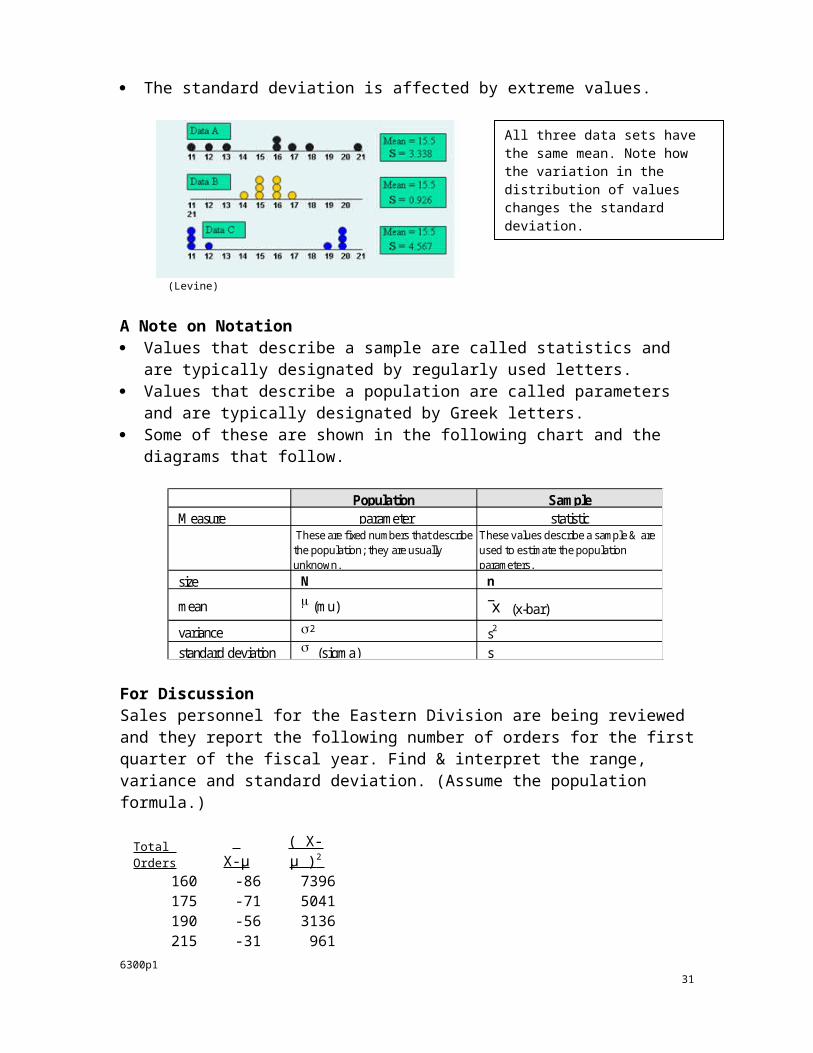
The standard deviation is affected by extreme values.
(Levine)
A Note on Notation Values that describe a sample are called statistics and are typically designated by
regularly used letters. Values that describe a population are called parameters and are typically designated
by Greek letters. Some of these are shown in the following chart and the diagrams that follow.
Population SampleMeasure parameter statistic
These are fixed numbers that describe the population; they are usually unknown.
These values describe a sample & are used to es timate the population parameters .
size N n
mean m (mu) x̅ (x-bar)
variance s2 s2
standard deviation s (sigma) s
For DiscussionSales personnel for the Eastern Division are being reviewed and they report the following number of orders for the first quarter of the fiscal year. Find & interpret the range, variance and standard deviation. (Assume the population formula.)
Total Orders X-µ ( X-µ ) 2 160 -86 7396175 -71 5041190 -56 3136215 -31 961230 -16 256240 -6 36290 44 1936290 44 1936320 74 5476350 104 10816
36,990
6300p122
All three data sets have the same mean. Note how the variation in the distribution of values changes the standard deviation.
Sums:2,460Interpreting the Measures of Center and Spread
Coefficient of VariationThe coefficient of variation shows the variation of the data relative to the mean and is useful in comparing the variation of two data sets. Note that it is always expressed as a percentage.
For example, consider the test scores for two groups.
Group 1
Mean score = 80SD = 5
CV = 5
80∗100 % = 6%
Group 2
Mean score = 64SD = 9
CV = 9
64∗100 % = 14%
The z-scoreThe Z-score is the number of standard deviations a data value is from the mean.If a data point has a z score that is less than -3 or greater than +3, it is considered to be an extreme value.
Where:X represents the data value
X is the sample mean S is the sample standard deviation
Suppose the mean score on the test is 80 and the standard deviation is 5. A grade of 70 has a z-score of -2. It is 2 standard deviations to the left
of the mean. It is not an outlier. A grade of 100 has a z-score of 4 standard deviations and is an outlier.
6300p123
An outlier is generally more than 3 standard deviations from the mean or less than -3 SD’s from the mean.
There is more variation with Group2 – it has a larger standard deviation and a higher coefficient of variation.
Z= X−XS
For Discussion1. For the Eastern Division orders in the preceding discussion problem, find the
coefficient of variation. Find some z-values.
Sales Orders 2
60175190215230240290290320350
2360
2. Find some z-values.
X Mean X - Mean SD zSales
Orders 1 160 246 -86 64 -1.34350 246 104 64 1.63
Sales Orders 2 60 136 -76 84 -0.90
246 136 110 84 1.31
3. You reviewing two stocks and are interested in minimizing fluctuation. The following information is available. Which stock would provide the least fluctuation?
StockA B
Mean Price/Share for the last year 60 10Standard Deviation 6 2
6300p124
Sales Orders
1
Sales Orders
2
Mean 246 236Median 235 235Mode 290 290Standard Deviation 64 84Range 190 290CV 26% 36%

The Empirical Rule Apply this rule to interpret the measures when the data is symmetrical. At least:
68% of the data values are within one standard deviation of the mean: µ ± 1𝞼90% of the data values are within two standard deviation of the mean: µ ± 2𝞼99% of the data values are within three standards deviation of the mean: µ ± 3𝞼
Example
Tchybychef’s Inequality Apply this method to interpret the measures when the data is skewed or when the
shape of the distribution is unknown of the values will fall within k standard deviations of the mean (k > 1)
At least:75% of the data values are within two standard deviation of the mean. : µ ± 2𝞼90% of the data values are within three standard deviation of the mean. : µ ± 3𝞼
6300p125
68 % of salaries in the range 71.6 ± 10.768 % of salaries in the range 60.9$ to 82.3$
95 % of salaries in the range 71.6 ± 21.495 % of salaries in the range 50.2$ to 93.0$
99 % of salaries in the range 71.6 ± 32.199 % of salaries in the range 39.5$ to 103.7$

↑ ↑
Measure of the Shape of a Distribution / Skewness & Kurtosis
Compare the mean and the median. Symmetrical: mean = median Left skewed: mean < median Right skewed: mean > median
Review the Skewness coefficient produced in the table you found using: Data / Data Analysis / Descriptive Statistics. The following values were suggested by M. G. Bulmer., [Principles of Statistics (Dover, 1979)] for interpreting the Skewness coefficient.
For Discussion1. Evaluate the Eastern Division sales data from the previous example using the
Empirical Rule. (Note: Skewness = 0.262)
2. Evaluate the Eastern Division sales data from the previous example using the Tchybychef’s Inequality.
6300p126
75% of the data are within 2 standard deviations of the mean.

3. Analysis of the Salary Experience Data gave the following results for employee years of related experience. Interpret.
4. Suppose a company advertises that – with use – the mean weight loss that is expected in two months is 12 pounds. Suppose you discover that the median loss is 3 lbs. a. Is the weight loss skewed right or left? b. Which measure is of the most value in this situation?
6300p127
In XL, use Data/Data Analysis/Descriptive Statistics to generate the table.

Measures of Relative StandingCommon measures of position (relative standing) within a data set include: Percentiles Quartiles
Percentiles A percentile is a location marker along a range of values. The 50th percentile is the median or middle number in the range of values.
If your percentile score on the GRE is 90 then you scored better than 90 Than 90% of those taking the test and you scored lower than 10% of those taking the test.
If you are the fourth tallest person in a group of 20, you are taller than 16 people and represent the eightieth percentile.
Quartiles
Each quartile contains 25% of the total observations based on data that is ordered from smallest to largest.
First Quartile 0 - 25th Percentile of Range
Second Quartile 25th - 50th Percentile of Range
Third Quartile 50th - 75th Percentile of Range
Fourth Quartile 75th - 100th Percentile of Range)
The lower quartile point (Q1) is the same as the 25th percentile. 25% of the scores are lower and 75% of the scores are higher than the lower quartile.
The upper quartile point (Q3) is the same as the 75th percentile. 75% of the scores are lower and
25% of the values are greater than the upper quartile. The median (Q2) is the same as the 50th percentile.
IQR = Q3 – Q1
6300p128
In XL Use:QUARTILE(Ax:Axx,1)insert the correct range and specify if you want the lower quartile (1) or the upper quartile (3)
In XL Use: PERCENTILE(A2:A16,0.5)Be sure to put in the appropriate range of values and specify the percentile of interest.

The Interquartile Range measures the spread in the middle 50% of the data and is the third quartile minus the first quartile.
The IQR is a measure of variability that is not influenced by outliers or extreme values.Measures like Q1, Q3, and IQR that are not influenced by outliers are called resistant measures.
The following table shows quartile measures for the Salary Experience Data.
Salaries (x $1000)
The quartile values are used to construct a boxplot of the salaries.
Employee Salaries (x$1000)
Notice that the quartile values provide information regarding the symmetry of the data.
(Levine)
6300p129
This graphic also shows the relationship between the curve (use histogram) and the corresponding boxplot.
Note: If right skewed -the distance from Q1 to Q2 is less than the distance from Q2 to Q3.
Q1 Q3

(Levine)
For Discussion1. Interpret the employee salary boxplot. What can you determine from reviewing the graph?
2. John’s salary is $86, 000 and it ranks at the 75th percentile. What does he know about the salaries in the organization?
Measure of Relationships between Two Quantitative Variables
Correlation
Correlation (r) is used in describing the strength of the relationship between two (or more) variables.
r can vary from a low of -1 (perfect negative correlation) to +1 (perfect positive relationship). A value of 0 means there is no correlation
Correlation coefficients reflect whether the relationship between variables is:1) positive (i.e. as one variable increases, the other variable increases) or 2) negative (i.e. as one variable increases, the other variable decreases).It also may indicate that there is no relationship.
There are many different types of correlation coefficients and selection of the appropriate one depends on the variables. We will consider Pearson Product-moment Correlation Coefficient which assumes continuous quantitative data.
Borg and Gall, Educational Research from Longman Publishing, provide the following information for interpreting correlation coefficients. Correlations coefficients ranging from 0.20 to 0.35 show a slight relationship
between the variables; they are of little value in practical prediction situations. With correlations around 0.50, crude group prediction may be achieved. In
describing the relationship between two variables, correlations that are this low do not suggest a good relationship.
Correlations coefficients ranging from 0.65 to 0.85 make possible group predictions that are accurate enough for most purposes. Near the top of this correlation range, individual predictions can be made that are more accurate than would occur if no such selection procedure were used.
Correlations coefficients over 0.85 indicate a close relationship between the two variables.
6300p130
Note that XL does not generate a Boxplot; use an add-in like PHStat.
It is important to understand that even a high correlation coefficient does not establish a cause and effect relationship. There may be other factors that relate to both of the variables.
Line of Best Fit and Other Considerations It is always good to look at an XY scatter plot to see what you think about the
relationship between the variables. In comparing two variables, you can take the square root of the correlation
Coefficient of Determination to get the correlation coefficient; this measure gives the percent of variation in the dependent variable that is ‘explained’ by the independent variable.
Excel will not only give you a correlation coefficient, but it will also give you the equation for the Least Square line which can be useful in describing the relationship between the two variables and in making predictions of the dependent variable from the independent variable. Note the slope of the line; it tells how much the y value changes for each unit change in x.
Note that in making predictions of y based on x, stay close to the data set in your selection of x; the function may not look the same outside of the given data range.
Sample Correlation Coefficients
For Discussion1. Would you expect the correlation between engine size and gas mileage to be positive
or negative? Why? 2. An analyst reviewed the closing prices for the Dow Jones Industrial Average (DJIA)
and the Standard & Poor's (S&P) 500 Index over a 10 week period. The sample correlation coefficient between the DJIA and the S&P 500 index was found to be r = 0.927.a. How would you classify the linear relationship between the
variables?b. For the week when the DJIA is high, what would be your
6300p131
In XL, use the function wizard to find the correlation coefficient:
CORREL(A2:A16,B2:B16) insert/highlight the correct range

expectation for the S&P index in that week?3. The following plot shows the relationship between a test for employment (Score 1)
and the results of a test given after training (Score 2). Interpret - Consider factors such as slope, coefficient of determination, and correlation.
70 75 80 85 90 95 10070
75
80
85
90
95
100
f(x) = 0.678082191780822 x + 29.1917808219178R² = 0.535434791515864
Scatter Plot of Test Scores (Score 2 by Score 1)
Score 1
Score 2
6300p132
In XL, use: Insert/ScatterRight-click on a point and choose: Add Trend Line, Display equation / Display r-squared.