design and implementation of a portal application for ... and implementation of a portal application...
TRANSCRIPT

Design and implementation ofa portal application for mobile
handsets
Christian Olander
January 10, 2010Master’s Thesis in Computing Science, 20 credits
Supervisor at CS-UmU: Hakan GullikssonExaminer: Per Lindstrom
Umea UniversityDepartment of Computing Science
SE-901 87 UMEASWEDEN

Abstract
Mobile services and technology have become essential parts of everyday life for a largeportion of the world’s population. Portals are applications installed on mobile handsetsthat allow users to browse and use mobile content and services. This master thesis reportpresents the design and implementation of an interface for such a portal application.The main focus is on navigation and presentation of content. User interfaces for mobileapplications have several limitations such as small screen real estate and slow inputmechanisms, and this interface has been developed with those issues in mind. Thereport describes an iterative user-centered design process that resulted in a proposal forthe interface. The design concept was evaluated during several stages of the projectand was well received by the target group. For a demonstration of feasibility a demoapplication was successfully implemented on the target J2ME platform.

ii

Contents
1 Introduction 1
1.1 Background . . . . . . . . . . . . . . . . . . . . . . . . . . . . . . . . . . 1
1.2 The infoCenter application . . . . . . . . . . . . . . . . . . . . . . . . . 2
1.3 Target group . . . . . . . . . . . . . . . . . . . . . . . . . . . . . . . . . 2
1.4 Assignment . . . . . . . . . . . . . . . . . . . . . . . . . . . . . . . . . . 2
1.5 Method and results . . . . . . . . . . . . . . . . . . . . . . . . . . . . . . 3
1.6 Limitations . . . . . . . . . . . . . . . . . . . . . . . . . . . . . . . . . . 3
1.7 Report outline . . . . . . . . . . . . . . . . . . . . . . . . . . . . . . . . 3
2 Usability for the small screen 5
2.1 Introduction . . . . . . . . . . . . . . . . . . . . . . . . . . . . . . . . . . 5
2.2 Usability explained . . . . . . . . . . . . . . . . . . . . . . . . . . . . . . 5
2.2.1 An example of poor design . . . . . . . . . . . . . . . . . . . . . 5
2.2.2 Definition . . . . . . . . . . . . . . . . . . . . . . . . . . . . . . . 6
2.3 Interacting with a small screen device . . . . . . . . . . . . . . . . . . . 7
2.3.1 Role of context . . . . . . . . . . . . . . . . . . . . . . . . . . . . 7
2.3.2 Display . . . . . . . . . . . . . . . . . . . . . . . . . . . . . . . . 8
2.3.3 Input . . . . . . . . . . . . . . . . . . . . . . . . . . . . . . . . . 8
2.4 Designing the user interface . . . . . . . . . . . . . . . . . . . . . . . . . 9
2.4.1 Normans design principles . . . . . . . . . . . . . . . . . . . . . . 9
2.4.2 The Golden Rules of Interface Design . . . . . . . . . . . . . . . 9
2.4.3 Customization . . . . . . . . . . . . . . . . . . . . . . . . . . . . 10
2.4.4 Transferring from the desktop . . . . . . . . . . . . . . . . . . . . 11
2.4.5 Visualization techniques . . . . . . . . . . . . . . . . . . . . . . . 11
2.5 Discussion . . . . . . . . . . . . . . . . . . . . . . . . . . . . . . . . . . . 13
3 Method 15
3.1 Overview of the design process . . . . . . . . . . . . . . . . . . . . . . . 15
3.2 Research . . . . . . . . . . . . . . . . . . . . . . . . . . . . . . . . . . . . 16
3.2.1 Naturalistic observations . . . . . . . . . . . . . . . . . . . . . . . 17
3.2.2 Contextual inquiry . . . . . . . . . . . . . . . . . . . . . . . . . . 17
iii

iv CONTENTS
3.2.3 Focus groups . . . . . . . . . . . . . . . . . . . . . . . . . . . . . 18
3.2.4 Probes . . . . . . . . . . . . . . . . . . . . . . . . . . . . . . . . . 18
3.2.5 Modeling users with personas . . . . . . . . . . . . . . . . . . . . 18
3.3 Design . . . . . . . . . . . . . . . . . . . . . . . . . . . . . . . . . . . . . 19
3.3.1 The interaction framework . . . . . . . . . . . . . . . . . . . . . 19
3.3.2 Design patterns for inspiration and structure . . . . . . . . . . . 20
3.3.3 Conceptual design . . . . . . . . . . . . . . . . . . . . . . . . . . 20
3.4 Communicating ideas with prototypes . . . . . . . . . . . . . . . . . . . 22
3.4.1 Low-fidelity . . . . . . . . . . . . . . . . . . . . . . . . . . . . . . 22
3.4.2 High-fidelity . . . . . . . . . . . . . . . . . . . . . . . . . . . . . . 22
3.5 Evaluation . . . . . . . . . . . . . . . . . . . . . . . . . . . . . . . . . . . 22
3.5.1 Think Aloud Protocol . . . . . . . . . . . . . . . . . . . . . . . . 23
3.5.2 Quick and Dirty evaluation: Asking users . . . . . . . . . . . . . 23
3.6 Implementation: Software development with J2ME . . . . . . . . . . . . 23
3.6.1 Targeting mobile phones . . . . . . . . . . . . . . . . . . . . . . . 24
3.6.2 MIDP user interface development . . . . . . . . . . . . . . . . . . 25
4 Accomplishments 27
4.1 Research phase . . . . . . . . . . . . . . . . . . . . . . . . . . . . . . . . 27
4.1.1 Observing the users . . . . . . . . . . . . . . . . . . . . . . . . . 27
4.1.2 User Interviews . . . . . . . . . . . . . . . . . . . . . . . . . . . . 28
4.1.3 Focus group session . . . . . . . . . . . . . . . . . . . . . . . . . 29
4.1.4 Probing . . . . . . . . . . . . . . . . . . . . . . . . . . . . . . . . 29
4.1.5 Using the research data . . . . . . . . . . . . . . . . . . . . . . . 31
4.2 Design phase . . . . . . . . . . . . . . . . . . . . . . . . . . . . . . . . . 33
4.2.1 Application flow . . . . . . . . . . . . . . . . . . . . . . . . . . . 33
4.2.2 Screen real estate and button layout . . . . . . . . . . . . . . . . 34
4.2.3 Concept development . . . . . . . . . . . . . . . . . . . . . . . . 35
4.3 Low-fidelity prototypes . . . . . . . . . . . . . . . . . . . . . . . . . . . . 35
4.3.1 Paper prototypes . . . . . . . . . . . . . . . . . . . . . . . . . . . 36
4.3.2 Evaluation of low-fi prototypes . . . . . . . . . . . . . . . . . . . 39
4.4 High-fidelity prototypes . . . . . . . . . . . . . . . . . . . . . . . . . . . 40
4.4.1 Flash prototype v1 . . . . . . . . . . . . . . . . . . . . . . . . . . 40
4.4.2 Evaluation of Flash prototype v1 . . . . . . . . . . . . . . . . . . 40
4.4.3 Flash prototype v2 . . . . . . . . . . . . . . . . . . . . . . . . . . 41
4.4.4 Final concept evaluation . . . . . . . . . . . . . . . . . . . . . . . 42
4.5 Implementation of the demo . . . . . . . . . . . . . . . . . . . . . . . . . 44
4.5.1 System design . . . . . . . . . . . . . . . . . . . . . . . . . . . . . 44
4.5.2 Providing a rich GUI . . . . . . . . . . . . . . . . . . . . . . . . . 44
4.5.3 Targeting mobile devices . . . . . . . . . . . . . . . . . . . . . . . 45
4.5.4 Layout using CSS . . . . . . . . . . . . . . . . . . . . . . . . . . 45

CONTENTS v
5 Results 47
5.1 The infoCenter GUI . . . . . . . . . . . . . . . . . . . . . . . . . . . . . 47
5.1.1 Main screen . . . . . . . . . . . . . . . . . . . . . . . . . . . . . . 47
5.1.2 Softkey menu . . . . . . . . . . . . . . . . . . . . . . . . . . . . . 50
5.1.3 Most used feature . . . . . . . . . . . . . . . . . . . . . . . . . . 50
5.1.4 Search . . . . . . . . . . . . . . . . . . . . . . . . . . . . . . . . . 51
5.1.5 Customization . . . . . . . . . . . . . . . . . . . . . . . . . . . . 51
5.2 Implementation . . . . . . . . . . . . . . . . . . . . . . . . . . . . . . . . 51
5.2.1 System layout . . . . . . . . . . . . . . . . . . . . . . . . . . . . . 53
5.2.2 Style definitions . . . . . . . . . . . . . . . . . . . . . . . . . . . 55
6 Discussion and conclusions 57
6.1 Assignment . . . . . . . . . . . . . . . . . . . . . . . . . . . . . . . . . . 57
6.2 Research and design . . . . . . . . . . . . . . . . . . . . . . . . . . . . . 57
6.3 Demo application . . . . . . . . . . . . . . . . . . . . . . . . . . . . . . . 58
6.4 Future work . . . . . . . . . . . . . . . . . . . . . . . . . . . . . . . . . . 58
7 Acknowledgements 59
References 61
A Naturalistic observation: Analysis 65
B Contextual inquiry: Analysis 67
C Focus group: Analysis 69
D Focus group: Introduction tasks 71
D.1 Task A . . . . . . . . . . . . . . . . . . . . . . . . . . . . . . . . . . . . . 71
D.2 Task B . . . . . . . . . . . . . . . . . . . . . . . . . . . . . . . . . . . . . 71
E Focus group: Moderator guide 73
E.1 Introduction (5 minutes) . . . . . . . . . . . . . . . . . . . . . . . . . . . 73
E.2 Introduction task (10 minutes) . . . . . . . . . . . . . . . . . . . . . . . 73
E.3 Graphics and animation in the user interface (15 minutes) . . . . . . . . 73
E.4 Navigation and shortcuts (15 minutes) . . . . . . . . . . . . . . . . . . . 73
E.5 Summary: What makes a good interface? (15 minutes) . . . . . . . . . . 74
F Interaction Diary: Instructions 75
F.1 Introduction . . . . . . . . . . . . . . . . . . . . . . . . . . . . . . . . . . 75
F.2 Basic information (required) . . . . . . . . . . . . . . . . . . . . . . . . . 75
F.3 Other information (optional) . . . . . . . . . . . . . . . . . . . . . . . . 75
F.4 Example . . . . . . . . . . . . . . . . . . . . . . . . . . . . . . . . . . . . 76

vi CONTENTS
G What do you like? Instructions 77
G.1 Introduction . . . . . . . . . . . . . . . . . . . . . . . . . . . . . . . . . . 77
G.2 Submission . . . . . . . . . . . . . . . . . . . . . . . . . . . . . . . . . . 77
G.3 Example . . . . . . . . . . . . . . . . . . . . . . . . . . . . . . . . . . . . 77
H Where do you want to go? Instructions 79
H.1 Introduction . . . . . . . . . . . . . . . . . . . . . . . . . . . . . . . . . . 79
H.2 Submission . . . . . . . . . . . . . . . . . . . . . . . . . . . . . . . . . . 79
H.3 Example . . . . . . . . . . . . . . . . . . . . . . . . . . . . . . . . . . . . 79
I Personas 81
I.1 John 31, IT consultant . . . . . . . . . . . . . . . . . . . . . . . . . . . . 81
I.2 Emma 17, student . . . . . . . . . . . . . . . . . . . . . . . . . . . . . . 82
J Mood board 85
K Requirement specification 87
K.1 General requirements . . . . . . . . . . . . . . . . . . . . . . . . . . . . . 87
K.2 Demo system requirements . . . . . . . . . . . . . . . . . . . . . . . . . 87
K.3 Usability requirements . . . . . . . . . . . . . . . . . . . . . . . . . . . . 88
K.4 Aesthetic requirements . . . . . . . . . . . . . . . . . . . . . . . . . . . . 88
L Low-fi prototypes 89
L.1 Four Seasons . . . . . . . . . . . . . . . . . . . . . . . . . . . . . . . . . 89
L.1.1 Interaction . . . . . . . . . . . . . . . . . . . . . . . . . . . . . . 89
L.2 Cross . . . . . . . . . . . . . . . . . . . . . . . . . . . . . . . . . . . . . . 90
L.2.1 Interaction . . . . . . . . . . . . . . . . . . . . . . . . . . . . . . 90
L.3 Icon list . . . . . . . . . . . . . . . . . . . . . . . . . . . . . . . . . . . . 91
L.3.1 Interaction . . . . . . . . . . . . . . . . . . . . . . . . . . . . . . 91
L.4 Expanded list . . . . . . . . . . . . . . . . . . . . . . . . . . . . . . . . . 92
L.4.1 Interaction . . . . . . . . . . . . . . . . . . . . . . . . . . . . . . 92
L.5 Cube . . . . . . . . . . . . . . . . . . . . . . . . . . . . . . . . . . . . . . 92
L.5.1 Interaction . . . . . . . . . . . . . . . . . . . . . . . . . . . . . . 92
M User testing with TA Protocol 95
M.1 Instructions and procedure . . . . . . . . . . . . . . . . . . . . . . . . . 95
M.1.1 Test order . . . . . . . . . . . . . . . . . . . . . . . . . . . . . . . 95
N Low-fi prototype evaluations 97
O High-fi prototype evaluations 99
O.1 Flash prototype v1 results . . . . . . . . . . . . . . . . . . . . . . . . . . 99
O.2 Flash prototype v2 results . . . . . . . . . . . . . . . . . . . . . . . . . . 99

CONTENTS vii
P GUI Frameworks for MIDP development 101
P.1 TWUIK . . . . . . . . . . . . . . . . . . . . . . . . . . . . . . . . . . . . 101
P.2 J2ME Polish . . . . . . . . . . . . . . . . . . . . . . . . . . . . . . . . . 101
P.3 TinyLine Toolkit . . . . . . . . . . . . . . . . . . . . . . . . . . . . . . . 101
P.4 LWUIT . . . . . . . . . . . . . . . . . . . . . . . . . . . . . . . . . . . . 101
P.5 Kuix . . . . . . . . . . . . . . . . . . . . . . . . . . . . . . . . . . . . . . 102

viii CONTENTS

List of Figures
2.1 Usability framework . . . . . . . . . . . . . . . . . . . . . . . . . . . . . 7
2.2 Semi-transparent widgets. . . . . . . . . . . . . . . . . . . . . . . . . . . 12
2.3 Normal view (left) vs Fisheye view (right). . . . . . . . . . . . . . . . . . 12
3.1 Design lifecycle model . . . . . . . . . . . . . . . . . . . . . . . . . . . . 16
3.2 The ”hub and spoke” design pattern . . . . . . . . . . . . . . . . . . . . 20
3.3 One window drilldown architecture . . . . . . . . . . . . . . . . . . . . . 21
3.4 Three mental models . . . . . . . . . . . . . . . . . . . . . . . . . . . . . 21
3.5 Widely used J2ME application structure . . . . . . . . . . . . . . . . . . 24
4.1 Screenshot from Google Maps . . . . . . . . . . . . . . . . . . . . . . . . 31
4.2 Answer to What do you like? . . . . . . . . . . . . . . . . . . . . . . . . 32
4.3 Answer to Where do you want to go? . . . . . . . . . . . . . . . . . . . 32
4.4 Application flow . . . . . . . . . . . . . . . . . . . . . . . . . . . . . . . 33
4.5 Screen real estate usage . . . . . . . . . . . . . . . . . . . . . . . . . . . 34
4.6 Essential key layout . . . . . . . . . . . . . . . . . . . . . . . . . . . . . 35
4.7 Screenshot: Expanded list . . . . . . . . . . . . . . . . . . . . . . . . . . 36
4.8 Screenshot: Four Seasons . . . . . . . . . . . . . . . . . . . . . . . . . . 37
4.9 Screenshot: Icon list . . . . . . . . . . . . . . . . . . . . . . . . . . . . . 37
4.10 Screenshot: Cube . . . . . . . . . . . . . . . . . . . . . . . . . . . . . . . 38
4.11 Screenshot: Cross . . . . . . . . . . . . . . . . . . . . . . . . . . . . . . 38
4.12 Physical prototype . . . . . . . . . . . . . . . . . . . . . . . . . . . . . . 39
4.13 Screenshot: Flash prototype v1 . . . . . . . . . . . . . . . . . . . . . . . 41
4.14 Windows Vista folder view . . . . . . . . . . . . . . . . . . . . . . . . . 42
4.15 Screenshot: Flash prototype v1 . . . . . . . . . . . . . . . . . . . . . . . 42
4.16 Standard Scenario Path . . . . . . . . . . . . . . . . . . . . . . . . . . . 43
4.17 Early system design . . . . . . . . . . . . . . . . . . . . . . . . . . . . . 44
5.1 infoCenter screens . . . . . . . . . . . . . . . . . . . . . . . . . . . . . . 48
5.2 infoCenter Main screen . . . . . . . . . . . . . . . . . . . . . . . . . . . . 49
5.3 Spinning wheel concept . . . . . . . . . . . . . . . . . . . . . . . . . . . 49
ix

x LIST OF FIGURES
5.4 Options menu . . . . . . . . . . . . . . . . . . . . . . . . . . . . . . . . . 50
5.5 Most used scenario . . . . . . . . . . . . . . . . . . . . . . . . . . . . . . 51
5.6 Search scenario . . . . . . . . . . . . . . . . . . . . . . . . . . . . . . . . 52
5.7 Custom screens . . . . . . . . . . . . . . . . . . . . . . . . . . . . . . . . 52
5.8 System layout . . . . . . . . . . . . . . . . . . . . . . . . . . . . . . . . . 53
5.9 Modular system units installed . . . . . . . . . . . . . . . . . . . . . . . 54
5.10 Code snippet: Style-definitions directive . . . . . . . . . . . . . . . . . . 55
5.11 Code snippet: Style-definitions . . . . . . . . . . . . . . . . . . . . . . . 55
I.1 Persona image: John . . . . . . . . . . . . . . . . . . . . . . . . . . . . . 81
I.2 Persona image: Emma . . . . . . . . . . . . . . . . . . . . . . . . . . . . 82
J.1 Moodboard . . . . . . . . . . . . . . . . . . . . . . . . . . . . . . . . . . 85
L.1 Screenshot: Four Seasons prototype . . . . . . . . . . . . . . . . . . . . 89
L.2 Screenshot: Cross prototype . . . . . . . . . . . . . . . . . . . . . . . . . 90
L.3 Screenshot: Icon list prototype . . . . . . . . . . . . . . . . . . . . . . . 91
L.4 Screenshot: Expanded list prototype . . . . . . . . . . . . . . . . . . . . 93
L.5 Screenshot: Cube prototype . . . . . . . . . . . . . . . . . . . . . . . . . 93
O.1 User scenario path . . . . . . . . . . . . . . . . . . . . . . . . . . . . . . 100

List of Tables
4.1 Schedule for naturalistic observations . . . . . . . . . . . . . . . . . . . . 28
K.1 General requirements . . . . . . . . . . . . . . . . . . . . . . . . . . . . . 87
K.2 Demo system requirements . . . . . . . . . . . . . . . . . . . . . . . . . 87
K.3 Usability requirements . . . . . . . . . . . . . . . . . . . . . . . . . . . . 88
K.4 Aesthetic requirements . . . . . . . . . . . . . . . . . . . . . . . . . . . . 88
M.1 Prototype codes for user testing. . . . . . . . . . . . . . . . . . . . . . . 95
M.2 Low-fi prototype test order. . . . . . . . . . . . . . . . . . . . . . . . . . 95
N.1 Summorized results. User testing of low-fi prototypes. . . . . . . . . . . 97
xi

xii LIST OF TABLES

Chapter 1
Introduction
In this chapter the master thesis project will be introduced through a short backgrounddescription, a presentation of the assigned task and its limitations.
1.1 Background
The limitations faced when designing for the mobile handset are not easy to overcome.The end user unfortunately is struggling with a frustrating and limited ability to accesswhat they want, when they want it. A solution to these problems can be to providethe users with an application to gain quick access to mobile services and applications,a portal to useful content. The scope of the portal can be customized to every user byproviding facilities to download and install applications or widgets. This approach isusually called an On Device Portal (ODP). ODP applications often include three majorareas of functionality [33]:
– Offline portal. An application that provides the user with the ability to browsecontent categories in an environment that blurs offline and online experiences.
– Store. A client-server application that allows users to browse and add usefulwidgets and other content.
– Dashboard. Replaces the home-screen of the device and serves as an access-pointto the customized content.
A WAP-portal is a similar way of providing a gateway to on-line content, whereinformation is being downloaded to the handset. A problem with this approach is thecosts since mobile network operators often charge a substantial amount for mobile data,and the browsing requires access to the network on every page visited. A portal installedon the handset can tailor the access to the network by pre-caching and locally storecontent on the device, thereby reducing network usage and costs. Locating, downloadingand installing 3rd party software applications can be troublesome [33]. Widgets orapplication available from a portal are often easier to get started with.
1

2 Chapter 1. Introduction
1.2 The infoCenter application
The assigner of this thesis project is Distinct Design, a company based in Umea(Sweden)that specializes in web-development and graphical design. They are now expandinginto mobile application development with the infoCenter application. The infoCenterapplication has the vision of being a powerful portal to both on-line and off-line mobilecontent. The project is still on a concept stage, but is planned to be part of a systemthat spans over three different platforms:
– Browser
– Desktop computer
– Mobile handset
The vision is that these three platforms will be tightly coupled for each individualuser. The services provided by infoCenter are customized to fit the platform of currentuse. The individual user profile spans over the boundaries of the platform, for exampleare the users going to be able to tailor their mobile experiences from the browser ordesktop application by using customization facilities such as drag-and-drop of interfacecomponents. This separates infoCenter from other ODP:s where store access are requiredfrom the handset.
1.3 Target group
The target group of the infoCenter application is a group of consumers with the followingcharacteristics:
– They incorporate their mobile handsets actively in their everyday lives.
– They are interested in expanding their mobile experience.
– Their knowledge with using the mobile devices range from intermediate to expert.
The target group would like to see their mobile devices (mobile phone, Smartphone) asan extension of their desktop computer and would (with the right services) use theirdevices for information- or leisure-purposes in contexts where they do not have theability to a desktop computer or laptop.
1.4 Assignment
The main focus of this thesis assignment was in to focus on the dashboard of the portalapplication, i.e. the access-point to the installed widgets. The dashboard should be de-signed to enrich the user experience and offer an intuitive and engaging way of browsingand selecting the available content. The dashboard or home-screen of the infoCenterapplication was to be designed with focus on the user experience, with evaluations toserve as a proof of concept. To make sure the concept could be further developed andintegrated with other parts of the infoCenter system an implemented demo of the appli-cation was included in the assignment. The selected platform for the demo was J2ME(Java 2 Micro Edition), and the code was to be written following Java Sun Code Con-ventions. The demo was intended to be used as a proof of technology, to make sure thedesign could be implemented using the J2ME platform.

1.5. Method and results 3
1.5 Method and results
To accomplish the specified goals of this thesis project three major areas where identifiedand explored:
– Research and exploration into usability issues for mobile handsets.
– User-centered iterative design.
– Implementation and testing.
The research consists of a literary study on usability for small screen devices and wasconducted to get a better understanding of the problem area. This resulted in a chapterof this report highlighting different usability aspects of small screen interface design.
To provide a target-group approved interface for the dashboard of infoCenter aniterative user-centered design process was executed, with the involvement of potentialusers. This resulted in a document describing the design, and was used as a specificationfor the implementation stage of the project.
The implementation of the demo-application required a platform analysis and evalua-tion. Mobile device software applications have requirements regarding processing powerand storage capacity, and these requirements often lead to design trade-offs. The demoapplication was developed with the main goal of presenting an interface with minimumnumber of trade-offs, and secondary goal was to optimize the source code for deviceswith constrained resources.
1.6 Limitations
The assigned task has been scheduled to fit in a timeframe of 20 weeks for one person,and therefore several areas both in concept design and implementation of the infoCenterapplication have been excluded. It is important to note that this thesis does not presenta full ODP concept proposal; there are several areas that need to be conceptualized toget an idea on how the full product will function.
1.7 Report outline
– Chapter 2: Usability for the small screen. This section consists of a literarystudy focusing on usability for small screen devices. The chapter includes discus-sions on the definitions of usability, aspects on interaction with mobile handsetsand general interface design guidelines.
– Chapter 3: Method. This chapter presents an overview of the scientific methodsand techniques used in this thesis. This includes a description on motivations,examples and the typical results for each method.
– Chapter 4: Accomplishments. The contents of this chapter describe differentphases of work with the infoCenter application, presented in chronological order.Each subsection describing an area of work includes a stated goal and motivationfor the methods used.
– Chapter 5: Results. This chapter presents the concept proposal of the infoCen-ter interface and details about the implemented demo.

4 Chapter 1. Introduction
– Chapter 6: Discussion and conclusions. This chapter consists of a presenta-tion on personal reflections by the author on issues about the work of this thesisproject. The chapter ends with looking forward on further work with the resultsfrom this thesis.

Chapter 2
Usability for the small screen
This chapter is a literature study with the aim to present and discuss different aspectsof usability for handheld devices.
2.1 Introduction
Technology offers to make life more easy and comfortable, and with each new technologynew ways of assessing the user needs are suggested. On the other hand, new technologycan add complexities which increases difficulties and frustration. Donald A. Norman [34]calls this ”The paradox of technology”. What good is technology if it is too complex touse?
The Nokia N71 is one of the most popular mobile phones today [15]. Beyond makingsimple calls and sending text messages, the phone ships with 93 applications. Amongthem are email-clients, numerous games, file and document handlers and instant mes-saging applications. This phone can be used as a media player, alarm clock, nutritioncoach or a blogger tool. With all of this in mind, one should realize that the displaysize in only 176 x 208 pixels and the input facilities are limited. How do applicationdesigners of small screen devices such as the Nokia N71 avoid making the technologytoo complex?
The aim of this literary study is to present different aspects of usability on wireless,small screen devices such as a mobile phone or a PDA. The study does not make anattempt to explain all aspects of usability, but does aim at providing an overview ofissues and constraints using different examples selected from literature.
The study is organized as follows: First the concept of usability is explained, followedby a section focusing on the interaction with handheld devices. Then guidelines anddifferent aspects regarding interface design are presented, both general and specific forthe small screen.
2.2 Usability explained
2.2.1 An example of poor design
It may be hard to believe that an everyday water faucet could need an instruction manual.I saw one, this time at the meeting of the British Psychological Society in Sheffield,England. The participants stayed in dormitories. Upon checking into one of these, the
5

6 Chapter 2. Usability for the small screen
Ranmoor House, a guest was given a pamphlet that gave useful information: where thechurches were, the time of meals, the location of the post office, and how to work thetaps (faucets). ”The taps on the washband basin are operated by pushing down gently”.
When it was my turn to speak at the conference, I asked the audience about thosetaps. How many have trouble using it? Polite, restrained tittering from the audience.How many have tried to turn the handle? A large show of hands. How many had toseek help? A few honest folks raised their hands. Afterward, a woman came up to meand said that she had given up and had to walk up and down the halls until she foundsomeone who could explain the taps to her.
A simple sink, a simple looking faucet. But it looks like it should be turned, notpushed. If you want the faucet to be pushed, make it look like it should be pushed. It canbe done, the airlines do it right.
Pity the house porters, always getting calls for help about the faucets. So instructionswere put in the orientation sheet. Who would ever think of having to read instructionsbefore using a faucet? At least put them on the faucets, where they can’t be missed. Butwhen simple things need instructions, it is a certain sign of poor design.
The example above is taken from a collection of similar situations that can be foundin Donald A. Normans book ”The design of everyday things” [34]. In order to fullyunderstand why the usability of the water faucet is very low, the concept of usabilitymust be discussed. This section will concentrate on usability for software products, butlet the example above serve as a reminder that usability is a quality that exists in everyproduct, not only software applications.
2.2.2 Definition
The International Organization for Standardization (ISO) defines usability in ISO DIS9241-11 [3] as:
”The effectiveness, efficiency and satisfaction with which specified users canachieve specified goals in particular environments...”
By ”effectiveness” is meant that the user is able to accomplish a specified task. Anineffective system doesn’t support achievement of the user’s goal. With efficiency, thefactor of expended resources to complete the task is taken into account. Examples ofresources are time, money and mental effort [3]. If a system or a tool completes the taskspending less resources, it is more efficient. The concept of user satisfaction is complexand can be related to all kinds of aspects. This is a subjective concept and can be hardto measure. Faulkner [11] defines it as how acceptable the system is to the user, andhow comfortable they are in using it.
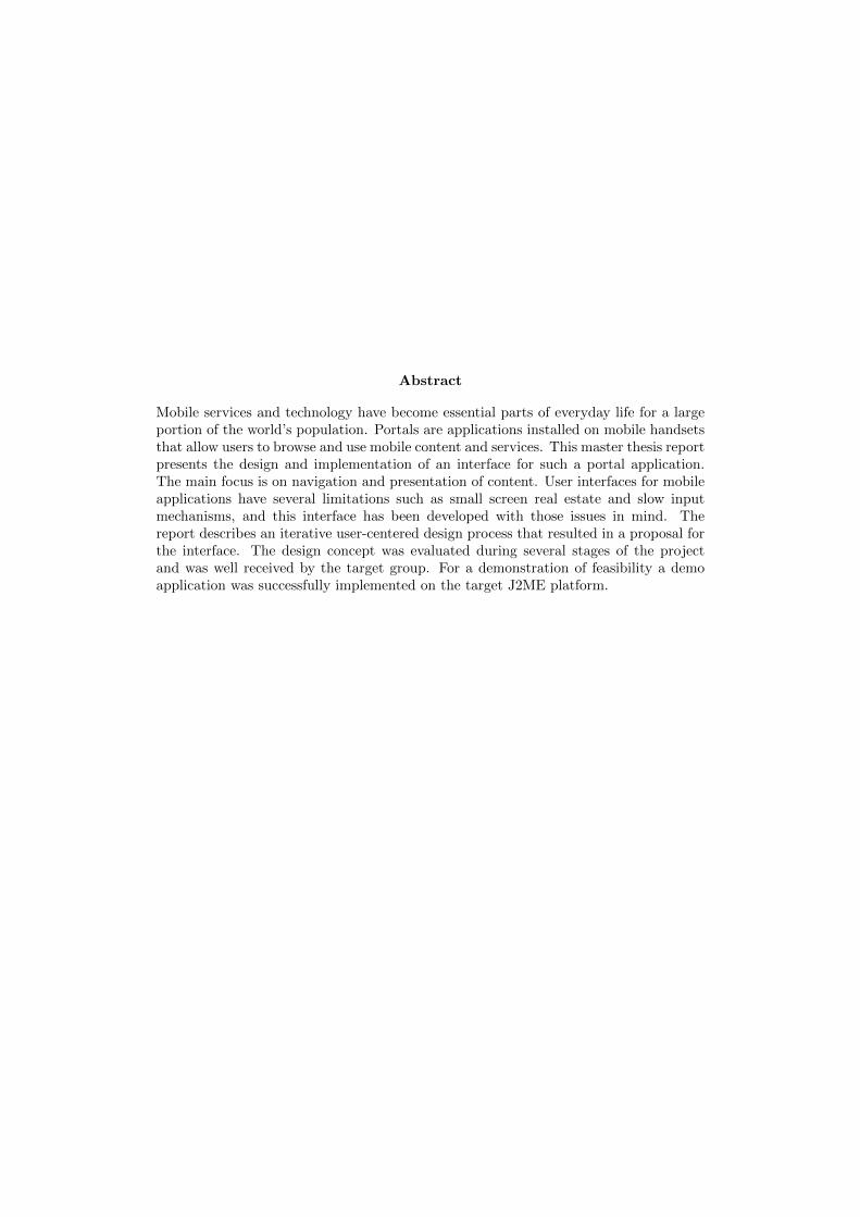
According to Bevan et al. [3], ISO 9241-11 also points out that usability is dependenton the context of use. The users themselves are a factor, and also the physical andorganizational environment. Figure 2.1 Usability framework gives an overview of thefactors that influences the achieved usability of a product. An advantage with thisdefinition is that it provides a broad, unified and concrete explanation of what usabilityreally is. Usability is seen as a measurable of aspects such as system perspective, userperspective and context of use.
An advantage with this definition is that it provides a broad, unified and concreteexplanation of what usability really is. Usability is seen as a measurable of aspects suchas system perspective, user perspective and context of use.
2.3. Interacting with a small screen device 7
Figure 2.1: Usability framework
2.3 Interacting with a small screen device
2.3.1 Role of context
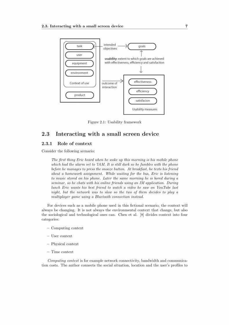
Consider the following scenario:
The first thing Eric heard when he woke up this morning is his mobile phonewhich had the alarm set to 7AM. It is still dark so he fumbles with the phonebefore he manages to press the snooze button. At breakfast, he texts his friendabout a homework assignment. While waiting for the bus, Eric is listeningto music stored on his phone. Later the same morning he is bored during aseminar, so he chats with his online friends using an IM application. Duringlunch Eric wants his best friend to watch a video he saw on YouTube lastnight, but the network was to slow so the two of them decides to play amultiplayer game using a Bluetooth connection instead.
For devices such as a mobile phone used in this fictional scenario, the context willalways be changing. It is not always the environmental context that change, but alsothe sociological and technological ones can. Chen et al. [8] divides context into fourcategories:
– Computing context
– User context
– Physical context
– Time context
Computing context is for example network connectivity, bandwidth and communica-tion costs. The author connects the social situation, location and the user’s profiles to

8 Chapter 2. Usability for the small screen
the user’s context. Physical context are factors such as lighting and noise levels. Timecontext consists of factors regarding time, such as day or night and season of the year.
The changing context can definitely be an inhibitor for usability [40]. Lack of networkcapability and sufficient bandwidth can reduce the sense of freedom and safety. As inthe scenario described earlier, Eric had to change his plan to stream a video due toinsufficient network capabilities. This could be a cause for user frustration, and therecould be more consequences beside the change of plans mentioned in the scenario.
An efficient way of improving the usability of mobile services and applications is toadapt the content and presentation to each individual user depending on their currentcontext of use [25]. In mobile computing location is usually used to approximate contextand to implement context-aware applications [41]. Marcus et al. [29] separates location-and contextual-awareness. Where location awareness is enabled by the use of GPS andBluetooth technologies. According to the authors, user-interface designers should focuson the users location as a way to improve usability. An example system discussed intheir paper is a location-based reminder called Mob-i. The application knows wherethe user is, and can help remembering a certain task by reminding at the appropriatetime and place. By using contextual-awareness, the device can use the advantage ofunderstanding the users context to assist as much as possible, and by doing so reducingthe need for explicit input [29]. Sensors can give information about the physical context,a device can adjust the volume according to the noise levels in the current context, andlight sensors can adjust the contrast and brightness of the screen.
2.3.2 Display
The size of the device limits the maximum size of its screen. According to Kamba et al.[26], user-interface designers for mobile devices must balance two opposing forces:
– The need for a small screen that can be embedded in a small device.
– The need for the screen to be sufficiently large so that can show enough informationfor the device to be useful.
The effects of screen size and the amount of information showed to the user havebeen studied by Jones et al. [23]. The authors reviewed other studies and where thetask was reading and comprehending text, and found that the effects of varying screensize of small screens were not very dramatic. Reading times are about 25% faster on afull width display compared to a size 1/3 of a display. The impact on varying the displayheight was smaller. Although 1-2 lines of text gave poor performance, comparing fourlines of text and 20 lines, there were no significant improvements in comprehension, andreading times were just 9% faster. The authors conducted a study when two groupswere to navigate a web-page for answers to given questions. Both groups were usingthe same input techniques; the only difference was the screen resolution. Conclusionsmade from the study is that the succession rates was twice as high for the group usingthe higher resolution, and results from a questionnaire reinforce the indication that thesmaller screen reduces task performance, and also user satisfaction and control.
2.3.3 Input
With a wide range of wireless devices on the market today, there is no standardizationof input techniques. Desktop applications can typically rely on the presence of a mouse

2.4. Designing the user interface 9
or a keyboard, but on mobile devices the interaction facilities are often device-specific[36]. On many devices there is no full alpha-numeric keyboard, which makes textualinput slower and more frustrating compared to a full keyboard. Paelke et al. [36] pointsout that alpha-numeric input are often provided by indirect means such as handwrit-ing character recognition and virtual keyboards. According to the authors, with thesetechniques additional problems arise and make them far less usable than traditionalkeyboards. Devices such as the Blackberry 8100 include a physical keyboard [14], butthe keys are small and some users must learn to write with both thumbs. Data entryand error rates suffer from this approach [12]. GUI: s on desktop computers often use apointing device, typically the mouse, but also different pads or graphic tables [36]. On amobile device, different pointing devices have their limitations. A touch screen requiresa large screen when operated by fingers, or an additional component such as a styluspen for high precision.
Context-aware applications have the possibility of discover and take advantage ofcontextual information and adapt for a richer and more comfortable user experience.[8]. By using information about the user’s location or previous actions, the interface canadapt to make input easier. A wide selection of choices in a list could be narrowed downby introducing intelligence to the system [24]. These are done by processing contextualinformation and only present suitable options for the current context.
2.4 Designing the user interface
2.4.1 Normans design principles
Donald Norman [34] gives advice on how to make a product as useful as possible. Nor-man concludes that it should be easy to translate the goal - such as silencing a mobiledevice in a library - into a plan of action - the press of a mute key. Then the user shouldbe able to see the results of their interactions with the system - in icon or text showingthat the device is silenced. To help designers, he sets down four principles to achievea high level of usability or ease-of-use. The following principles can be seen as groundrules of design, and are highly applicable on small screen interface design.
– Present a high degree of visibility that allows the user to work out the currentstate of the system and the actions available.
– Provide feedback, clear information about the results of actions.
– Give a good conceptual model, allow the user to build up a true picture of howthe system works and how to change the current state to the next.
– Offer good mappings, which are good and natural relationships between userperformed actions and the system response of these actions.
– Provide high affordence, using perceivable clues to how to operate elements ofthe system.
2.4.2 The Golden Rules of Interface Design
Ben Schneiderman [43] proposed a number of guidelines to achieve effective usability:
– Strive for consistency - For example, use the same term for the same things.Be consistent with the user’s wider life knowledge.

10 Chapter 2. Usability for the small screen
– Enable frequent users to use shortcuts - The product should appeal to allkinds of users. Novice users might need guidance to the task but experienced userswant to go the fastest way possible to be efficient.
– Offer informative feedback - For example, relate error and other messages tothe user’s task.
– Design dialogues to yield closure - Give the users a sense of beginning, endand middle of an interaction.
– Prevent errors, and help users to quickly recover from them - On smalldevices, watch for mistaken input.
– Allow ”undo” - Make it easy to reverse errors.
– Make users feel in control of a responsive system - System delay can makethe users feel out of control. With limited processing power and bandwidth, whichis the case for mobile phones and PDA:s, designers should use the resources wisely.
– Reduce short term memory load - Avoid complicated codes and numbers asmuch as possible.
Gong et al [16] considers some of Schneidermans rules to be applicable on mobiledevices without explicit changes. In his paper, he discusses how the other rules shouldbe modified. Considering the reversal of actions (allow ”undo”), mobile devices have lessprocessing power and less memory to store past events. The tracking of former states canbe more difficult. The author recognizes the limitations of a users short term memory,and suggests that very little memorization should be required during interaction witha mobile device. In a changing context, designers should be aware that a user has topotentially deal with a lot of distractions compared to a stationary environment. Gonget al. also proposes the addition of some guidelines specific for small wireless devices.Some of them are listed below:
– Reduce textual input - Make the user select from lists of words instead ofwriting them.
– Design for speed - A mobile application should be started, stopped and resumedwith little effort.
– Design for limited attention - This could be done by using sound or tactileoutput.
– Use top-down interaction - Present information on a high level and let the userdecide to retrieve more details.
2.4.3 Customization
Guidelines give designers concrete advice on how to build an effective, efficient and sat-isfactory user interface, but to present an interface that is appropriate for all users inall situations is difficult [28]. Considering the changing contexts of mobile systems, asolution could be to give the users the control to tailor their own interfaces to suite theirparticular needs at a given time. The process of changing the system could be eithersystem- or user-initiated. The former is when the system recognizes that customization

2.4. Designing the user interface 11
of the interface can be performed and suggests this to the user [5]. Work related mo-tivations to provide customization include for example to automate repeated processesor flexible UI: s for group collaboration purposes [28]. Socially related motivations forcustomization, often referred to as personalization [5], should not be overlooked. Ina study by Blom et al. [5] Finnish high-school students discussed personalization oftheir mobile phones. Among the reasons for personalization were reflection of personalidentity and membership of a group. Mugge et al. [32] has studied the effects on userspersonalizing a products appearance. He concludes that when a person invests energyin the product, and the products is used to express his/her self, this positively affectsthe bond or degree of attachment experienced by the user. This can be used for exampleto increase the lifetime of a product. [32].
2.4.4 Transferring from the desktop
One strategy when designing for small screen devices is to take approaches successful onthe desktop computer and bring them to the smaller devices. Jones et al. [22] concludesthat there are both advantages and disadvantages with such strategy. On an applicationlevel, benefits include a minimum of re-learning, and a freedom for the user to carry onactivities in different settings. Using a similar look and feel on an interface level mightalso reduce learning times, and could be successful in marketing. But there are challengesas well. When studying the teenage use of Instant Messaging(IM) applications, Grinteret al. [17] found several aspects that need to be considered when transferring those kindsof applications to a mobile device. The teenagers in their study used IM in parallel withother computer-based activities. On a small screen it is much more difficult to supportmultitasking. IM applications on desktop computers also support several concurrentconversations using multiple IM windows, which can be hard to provide on a smallscreen.
Holmquist [20] gives a good example of conventional user-interface components maybehave very differently on small devices. As an example, the author takes a simplescrollbar on a touch screen device. When operated by a left-handed user, and positionedon the right side of the screen, the users hand will cover most of the display.
2.4.5 Visualization techniques
To present as much information as possible on a small screen to make an applicationuseful, Kamba et al. [26] suggests a the use of semi-transparent widgets to maximizescreen space. See Figure 2.2 for an illustration.
A major challenge for this technique is that if the widgets are semi-transparent andlying on top of selectable content, it is not directly clear which of the two layers that isselectable. In the article the authors propose a technique for determine which of the twolayers receiving user interaction. The selection is based upon variations in the durationof the interaction. In other words, the length of time during which the user interactswith the overlapping region of the physical screen would determine which virtual layerthat receives the interaction. After conducting user tests of this technique, the authorsconclude that after an initial learning period, the test subjects were able to select bothlayers. However, the test subjects had problems selecting objects from one kind whenand other kind of object was the ”top” layer, where they had to interact during a longertime period to switch layers.
Sometimes redesign of the user interface to fit the smaller screen is not the optimal

12 Chapter 2. Usability for the small screen
Figure 2.2: Semi-transparent widgets.
approach. At times, according to Gutwin et al. [19] the only solution is to navigatea large user interface with the small screen. Three techniques of accomplishing this ispanning, zooming and fisheye distortion.
Panning is based on scrolling or paging a large space. This is done by moving afixed viewpoint over a document, or moving the document under the viewport [19].
Zooming - can be preferable when the documents are particularly large [19]. Zoom-ing can be controlled by the user, or can use a set of levels that have some meaning tothe task [2].
Bederson et al. [1] introduced DateLens, a PDA calendar application using fisheyedistortion. This is a technique based upon the concept of distorting the informationspace so that focus items are enlarged and peripheral objects are shrunk [24]. Forexample, when a user selects to view the weekends in greater detail, the other weekdayswill be shrunk down in size. See 2.3 for an illustration of this concept.
Figure 2.3: Normal view (left) vs Fisheye view (right).
Reports about the effectiveness of fisheye techniques have been mixed, but the generalconclusion is that fisheye views are appropriate when users need to see details of somespecific items in the context of a large information space [24]. In their article, the authors

2.5. Discussion 13
sees great potential in DateLens, and concludes that it is offering better performancefor some complex tasks compared to static calendars [1].
2.5 Discussion
Section 2.4.1 and 2.4.2 presented some guidelines for interface design. They are directand useful advice that can be practiced for developing interfaces on all platforms, notspecifically for the small screen. This section will not discuss these aspects since theyare considered general guidelines.
The following guidelines are based upon research presented in this article. They arenot intended to cover every aspect or detail of interface design, but they are focusing onsome key issues on usability for the small screen.
Examine and evaluate the interface in different contexts Due to the natureof changing contexts, the user will most likely be more distracted during the use of amobile device compared to a stationary counterpart. The short term memory or workingmemory has limited resources, about seven ”chunks” of information such as words ordigits [10], and the interface of small screen device does not benefit from requiringtoo much attention to be properly used. Mobile devices will be used in private, noisefree locations, but just as likely in a context which in some ways demands much moreattention.
Do not think of a small screen device as a shrunken desktop computer Anapproach that is successful on a desktop computer will not automatically be successfulon s small screen device. The limited screen real estate will cause usability issues ifthe information is simply shrunk to fit the small screen. To get around this probleminformation must be redesigned to fit the small screen. This will in most cases include theremoval of some features, although visualization techniques such as panning or fisheyedistortion can be used in some cases.
Optimize for efficiency The usability measurement of efficiency is an importantaspect considering the scarce resources a mobile device provides compared to a desktopcomputer. Besides the obvious limitations such as processing power, bandwidth andmemory capabilities, the time factor is also important. Compared to a desktop com-puter, a user is probably more likely to use the small device in short bursts. Thesebursts of activity are often goal-oriented, and user frustration should probably be ex-pected when not presented with a fast way of reaching the goal. Navigation of theinterface and manipulation of interface artifacts are examples of elements that can beoptimized for efficiency.

14 Chapter 2. Usability for the small screen

Chapter 3
Method
This chapter gives an overview of the selected frameworks, techniques and model usedfor this thesis project. This includes a description of methods used in the user-centerediterative design process and ends with a section on software development for mobiledevices.
3.1 Overview of the design process
In interaction design, the key focus is investigating the products use and domain byuser-centered development. User-centered means that rather than technical concerns,the need the users direct the development [37]. But there will always be situations whenthere are conflicts in requirements, and making trade-offs are part of the design processas well. There are a number of models and frameworks developed for the interactiondesign process [12, 6], and many of them are similar.
Preece et al. [37] suggest a simple and general model that can be used as a guide forthe design process (see Figure 3.1) which distinguishes four basic activities of interactiondesign:
– Identify needs and establish requirements. The first aim of this activity isto understand as much as possible about the users, their actions and the contextin which the future product is going to be used. The second part is to form aset of stable requirements from the gathered data. These requirements should bedocumented and used as a basis for further design work.
– Design. Preece et al. consider this to be the core activity, and it consists ofsuggesting ideas to meet the gathered needs and requirements. This activity canbe further divided into two separate parts: conceptual design and physical design.Conceptual design work focuses on how the product should behave and look like,while the physical design is a more concrete phase which covers aspects of theproduct in more detail.
– Build an interactive version. When engaged in a user-centered design processof an interactive product, an obvious way of evaluating designs is to let the usersinteract with the product. This requires an interactive version of the design. Anumber of techniques can be used, with different fidelity and costs. Important toremember is that this step does not require an implemented version of the product,
15

16 Chapter 3. Method
Figure 3.1: Design lifecycle model
with some creativity an interactive version capable for user testing can be builtsimply by using pen and pencil.
– Evaluate. To make sure that the user’s needs are taken into account through-out the development process, the design needs to be evaluated on various stages.Key aspects of this activity are to focus on the users and their tasks, and mea-sure/analyze performance and satisfaction.
The authors also list three key characteristics of the interaction design process. Theseare: focus on users, specific usability criteria and iteration. The focus on users is centralin every aspect of the design, since their needs are to guide the design at all stages.Specific usability criteria should be identified and clearly integrated in the creative partof the process to guide designers when choosing between different ideas. Iteration isthe key to let evaluation at different stages be the major factor when refining parts ofthe design. Throughout the process of user-centered design, more is learned about theusers, their context and their interaction with the product. By iterative design, thesedetails can be taken into account and guide the development closer towards the statedmain goal.
3.2 Research
Research is made to get a better understanding of the problem domain , which in user-centered design can be stated as understanding the user themselves, their tasks and the

3.2. Research 17
context in which the product is going to be used [37]. Faulkner et al. [11] stress the pointthat gathering needs is not as simple as writing down a list of features. Consideringthe iterative nature of the design process, the established requirements will evolve overtime. For example, an evaluation can result in the addition of new requirements, and theremoval of others. The research phase is to establish some basic guidelines for furtherdesign, with the notion that some of these might be changed during the process. As inevery research paradigm, it is essential to make motivated choices about what to study,and how the collected data should be analyzed [22].
Cooper et al. [9] states that achieving a good understanding about the users and theproblem domain is done with qualitative research. According to the author, qualitativetechniques enable the designer to gain deep insights into the design landscape. Theauthors do however propose some areas when quantitative research can work as a com-plement to qualitative techniques, such as market research complementing qualitativeresearch.
Lovgren and Stolterman [27] define two aspects of research:
– Investigation. The search for factors focusing on the present situation.
– Exploration. The search for different possible solutions and problem statements.
During the research phase of this project, the investigation part consists of fieldobservations, contextual inquiries and a focus group interview. The exploration partis a literature study of usability for small screen devices (Chapter 2 - Usability for thesmall screen).
3.2.1 Naturalistic observations
Data gathering with observations involve spending time with users in the natural contextof their work, with emphasis on collecting as much details as possible [35]. This work iscarried out in order to get a detailed view about a certain situation or task. Observationsare a way to elicit user needs that can be hard for the designer to extract from aninterview or questionnaire [37].
Jones [22] concludes that field observations can be very time consuming, and withouta motivated framework a researcher can spend much time in the field with little valuableinsights as result. Jones also emphasizes the need for ”discount” or rapid techniquesin mobile product development, since mobile products life-cycles are often shorter thanother products. Millen [31] uses a metaphorical telephoto lens to address this problem.The author describes traditional field studies as a wide-lens approach, when the camerais collecting a very large amount of data. For rapid results and the minimization ofnon-useful data, he suggests a narrower lens used for research. This can be achieved bychoosing a strategic time period to sample data to avoid waiting. Millen also suggests awell defined research question, so that the observer knows where to aim the camera atall times, thus capturing more useful data for later analysis.
3.2.2 Contextual inquiry
Contextual inquiry introduced by Hugh Beyer and Karen Holtzblatt [4], suggest therelationship between a designer and the customer (user) as the one of an apprentice(designer) and master (user being studied). In their method the designer attempts tounderstand the users by interacting with them while their activities are performed. In a

18 Chapter 3. Method
traditional interview, the subject of interest is taken out of their environment to discusstheir behavior. Beyer and Holtzblatt points out that being on the scene forces thedesigner to change his perspective and acknowledge what the actual issues are and whythey matter.
The inquiry often follow this following pattern [22]:
– The designer observes while the participant engages in an activity.
– The designer then interrupts to question the reasons behind a particular action.
– Then the participant begins to provide a commentary, explaining while doing, likea master craftsman reflecting on their creative process.
3.2.3 Focus groups
A focus group session often include 3-10 people from the target group having an open-enddiscussion lead by a moderator on predefined topics [7]. Preece et al. [37] discuss focusgroups as an alternative or verification of standard one-to-one interviews. Accordingto the authors, it can be very revealing to have a group of people discuss issues andrequirements, to get a consensus view or highlight areas of conflict and disagreement.
Calder [7] mentions the concern about the subjectivity of this technique, and therisk of getting different results with other participants, setting or moderator. Preeceet al. [37] suggest careful planning of the focus group sessions, and reflects about thepossibility that that one or few people may dominate the discussion and influence otherparticipants.
3.2.4 Probes
A probe is an instrument that is set out to gather information about the unknown, andhopefully return with useful data. As a method of user research, Gaver [13] introducescultural probes, a package of materials or instructions to provoke and question partici-pants over time, returning items from the people in their own time and terms. This canbe a media diary to get insights about the everyday lives of the target group. Then theparticipants are handed the probe (notebook or similar), to be filled in and returned.Gaver suggests a range of different types of media included in the probe, to get as muchuseful data as possible. He also stresses the point that for best results, the probes shouldnot be intrusive or tedious to deal with, since response will likely be affected negatively.
3.2.5 Modeling users with personas
A persona is a user model presented as a specific human being. They are not actualpeople but are synthesized directly from observations. According to Cooper [9], personaslike any model must be based upon real-world observations. The author suggests theprimary source of data to create personas should be in-context interviews with actualand potential users. Even though they are represented as individual people, personasrepresent a class of users. A persona includes a distinct set of behavior patterns identifiedby research data.
A persona profile can, according to Cooper [9] help the designer in several ways.Some major benefits from using personas are listed below.

3.3. Design 19
– The use of personas can determine what a product should do and how it shouldbehave.
– Personas can be used to communicate with stakeholders of the project.
– Design choices can be tested upon personas in a similar way as testing on realusers, to measure the effectiveness of the design.
Cooper warns about the pitfalls when creating personas. He emphasizes that apersona is based on ethnographic data and should not be based on a stereotype. Thestereotype is typically the result of biases and assumptions rather than factual data,and a persona created without sufficient data or respect to interview subjects could runthe risk of degrading to this description.
3.3 Design
Using the analyzed data from research as a basis, the logical next step is to actuallypropose a solution to meet the requirements. During the initial design phase, Cooper[9] proposes a top-down approach to facilitate creative thinking. Cooper advices againstbeing too specific and detailed, and gives a house-building metaphor to exemplify hisidea.
”If we were to build a house, at this point, we’d be concerned about whatrooms the house should have, how they should be positioned with respect toeach other and roughly how big they should be. We would not be worriedabout the precise measurements of each room, or things like doorknobs,faucets and countertops”
3.3.1 The interaction framework
Copper [9] suggests that one of the first steps to be taken in the design work is to definethe interaction framework. The framework should describe the overall structure of theuser’s experience. The author suggests a checklist for defining the framework:
– Define form, factor, posture and input methods. When developing a mobileapplication, the key visual elements must be visible in different lighting and othersettings. A products posture is related to the amount of attention the user willdevote to interacting with the product, and input methods is the way the user isgoing to interact with the product.
– Define functional and data elements. Functional elements are the actions thatcan be performed on data elements and their representation in the user interface.Copper suggests looking at developed scenarios and personas to get an idea aboutthe best way of represent these elements.
– Determine functional groups and hierarchy. Following the process of listingthe different elements in the interface, the next step is to organize them intofunctional groups and reflect on the hierarchy.
– Sketch the framework and validate using key path scenarios. Nextsketches should be to used to visualize the former steps, and constructing sce-narios to validate design. The scenarios should be detailed, and describe majorinteractions with the interface in exact detail.

20 Chapter 3. Method
3.3.2 Design patterns for inspiration and structure
An approved design pattern within small screen interface design is the hub and spoke.The concept of the pattern is to isolate the application into small separate parts [44].Each has one way in (from the main page or ”hub”), and one way out (back to the hub).The concept is shown in Figure 3.2.
Figure 3.2: The ”hub and spoke” design pattern
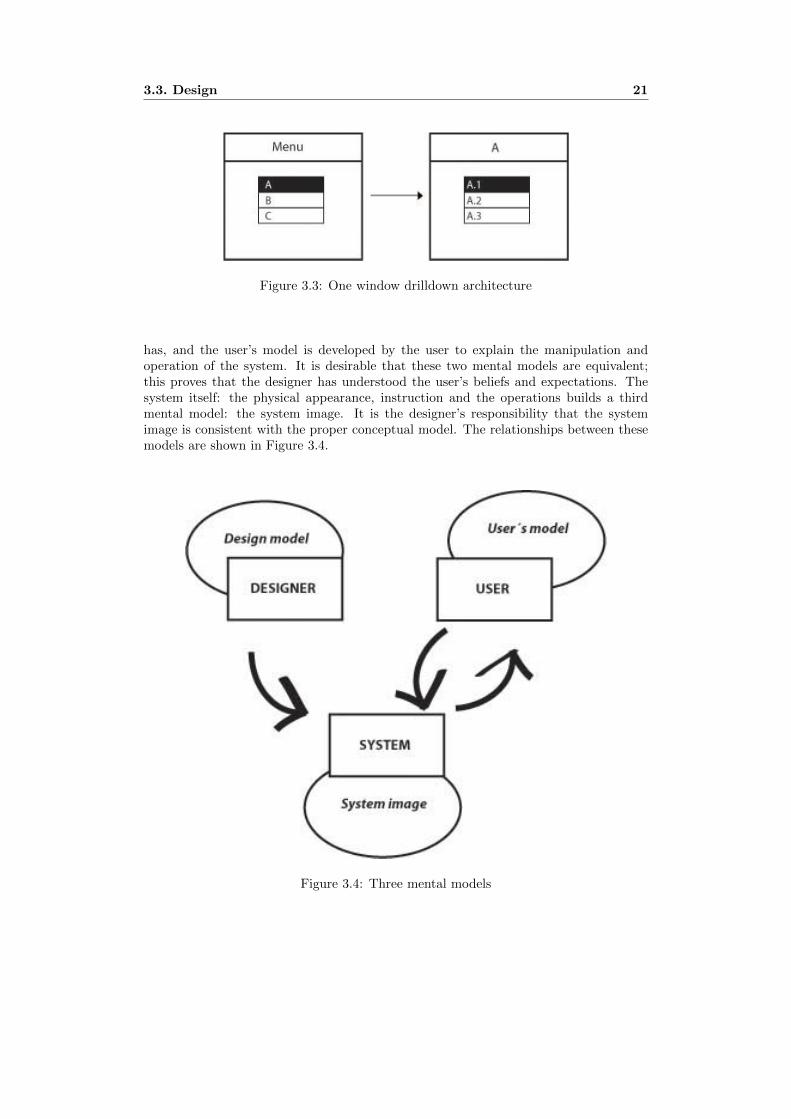
For small screen devices, Tidwell [44] suggest this pattern to be used in conjunctionwith the One window drilldown architecture. This is a pattern which is based upon theconcept of showing each of the applications pages within a single window. As a useris navigating deeper within the application, for example by using a menu, the selectedobject’s details are shown with a completely new page. See Figure 3.3 for a visualexample of the pattern.
3.3.3 Conceptual design
Conceptual design is the explicit formulation of ideas and concepts about what a productis, what it can do, and how it is intended to be used [42]. Norman [34] states thatit is crucial that the designer presents a conceptual model that is appropriate to theuser. The model must capture the important parts of operation of the system that isunderstandable by the user.
Norman [34] describes three different aspects of mental models: the design model, theuser’s model and the system image. The design model is the concept that the designer
3.3. Design 21
Figure 3.3: One window drilldown architecture
has, and the user’s model is developed by the user to explain the manipulation andoperation of the system. It is desirable that these two mental models are equivalent;this proves that the designer has understood the user’s beliefs and expectations. Thesystem itself: the physical appearance, instruction and the operations builds a thirdmental model: the system image. It is the designer’s responsibility that the systemimage is consistent with the proper conceptual model. The relationships between thesemodels are shown in Figure 3.4.
Figure 3.4: Three mental models

22 Chapter 3. Method
3.4 Communicating ideas with prototypes
There are not really any rules about what a prototype is, but the common basis is thatprototypes enables the designer to express an idea fast and relatively cheap [9]. Theprototype can be used as an aid for communication between designers and stakeholdersinvolved in the project, or as a tool to verify requirements. According to Preece et al.[37], the activity of building the prototypes also encourages reflection by the designer.How the prototype is implemented also differs. A programmer might think it is easierto create a skeleton for an interface in their programming language of choice. An artistcan draw a sketch instead, and does not have to learn programming to express ideas.
3.4.1 Low-fidelity
Low-fidelity prototypes are often used early in the design process, and are classifiedas low-fidelity as they do not behave and feel like the actual system if it should beimplemented. These simple screen-shots or sketches are tools to inform, communicateand educate rather than a basis of which to code [21]. Activities such as demonstratingor testing low-fidelity prototypes often require a facilitator that knows the applicationvery well, to stimulate the flow of the interface by switching screens or turning cards[39]. Studies have shown that simple prototypes like screen mock-ups can be competentin detecting usability problems [46].
3.4.2 High-fidelity
High-fidelity prototypes trade off speed for accuracy, since they are more costly to pro-duce but represent the actual interface of the product much better than their low-fidelitycounterparts [21]. These prototypes often involve some programming in a language suchas Visual Basic or ActionScript (Flash). Compared to screenshots or sketches, program-ming is more time-consuming and in some cases the development team may benefit fromcreating a vertical- or horizontal-prototype [39]. A vertical prototype is an interactivehigh fidelity prototype which only represents a subset of the functionality in the actualproduct, but mimics this subset in great detail. Horizontal-prototype contains high levelfunctionality, but does not include all the low-level details. Both of these approachesare limited in scope, but may be well enough to provide the essential functionality to beused for demonstrations or user testing [39].
3.5 Evaluation
The basic premise of a user-centered design process is that user needs are taken intoaccount throughout the design process. According to Cooper et al. [9] it is importantto evaluate your work as soon as constraints allow [9]. The authors explain that nomatter how good a designer’s idea is, there will always be something that is overlooked.By evaluation, problems and overlooked aspects can be identified and treated. Preeceet al [37]. remind readers that following design guidelines does not guarantee a usableproduct. And a strictly usable product may not be enough to engage the users in thesystem. The total user experience must be positive.
User experience” encompasses all aspects of the end-user’s interaction withthe company, its services, and its products. The first requirement for an ex-emplary user experience is to meet the exact needs of the customer, without

3.6. Implementation: Software development with J2ME 23
fuss or bother. Next comes simplicity and elegance that produce productsthat are a joy to own, a joy to use. True user experience goes far beyondgiving customers what they say they want, or providing checklist features”[18]
According to the Preece et al. [37] evaluation is required to make sure the usersunderstand the product and like it. The authors introduce the DECIDE framework toguide novice evaluators.
– Determine the overall goals that the evaluation addresses.
– Explore the specific questions to be answered.
– Choose evaluation paradigm and techniques to answer the questions.
– Identify the practical issues that must be addressed.
– Decide how to deal with ethical issues.
– Evaluate, interpret and present the data.
Next follows an introduction of one technique (Think Aloud Protocol) and oneparadigm (Quick and dirty evaluation) that was used for evaluation concepts and ideasduring this project.
3.5.1 Think Aloud Protocol
Usability testing involves measuring typical users performance on prepared tasks. Thedefining characteristic of usability testing is that it is strongly controlled by the evaluator[37]. The Think Aloud (TA) protocol is often used in usability studies to see how userswork with a product or interface [38]. The basic principle of TA is to let users explaintheir actions by verbalizing their thoughts. This way valuable data can be gatheredabout how users are operating with the system and their strategies to execute a task.
3.5.2 Quick and Dirty evaluation: Asking users
This type of evaluation is explained by Cooper et al. [9], and they classifies this type ofevaluation as a form of ethnography, but is much less formal. They suggest this type ofevaluation to be used when rapid feedback on initial design ideas is needed. To conductthis type of evaluation the evaluator should simply meet users and gather feedback onthe ideas by showing them the prototype [9].
3.6 Implementation: Software development with J2ME
Java ME was originally created to deal with the constraints associated with buildingapplications for devices with limited memory, display size and power capacity [45]. TheJ2ME platform is a collection of technology that can be combined to develop a Javaruntime environment to fit the requirements for these devices. It is based upon threeelements [30]:
– A configuration profile that provides the most basic set of requirements and virtualmachine capabilities.
24 Chapter 3. Method
– A profile that is a set of API: s that supports a narrower range of devices.
– An optional package is a set of technology specific API:s.
3.6.1 Targeting mobile phones
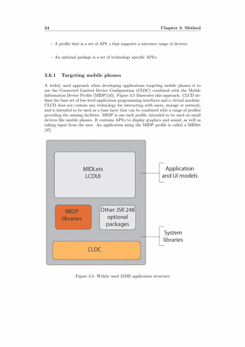
A widely used approach when developing applications targeting mobile phones is touse the Connected Limited Device Configuration (CLDC) combined with the MobileInformation Device Profile (MIDP)[45]. Figure 3.5 illustrates this approach. CLCD de-fines the base set of low-level application programming interfaces and a virtual machine.CLCD does not contain any technology for interacting with users, storage or network,and is intended to be used as a base layer that can be combined whit a range of profilesproviding the missing facilities. MIDP is one such profile, intended to be used on smalldevices like mobile phones. It contains API:s to display graphics and sound, as well astaking input from the user. An application using the MIDP profile is called a MIDlet[45].
Figure 3.5: Widely used J2ME application structure

3.6. Implementation: Software development with J2ME 25
3.6.2 MIDP user interface development
Java UI technologies such as AWT (Abstract Window toolkit) or Swing provide de-velopers with the freedom to create rich GUI:s that can be used in a multi-windowedenvironment, but are not viable options for mobile interface development [45] in termsof complexity and resources.
The MIPD profile uses a set of UI components and a screen-based programmingmodel better suited mobile application development. The screen based programmingmodel basically requires only one ”window” to be displayed at a time, but the developerhas the option to switch between different windows during runtime.
Simplicity in this case leads to less control of the look-and-feel of the GUI, and thebasic features of these high-level UI components do not allow for much customization[45]. To allow applications like games to have more control of the interface the MIDPalso includes a low-level API, which gives complete control of what is shown and how.The drawback of using the low-level API is that the developer must code everythingthat appears on the screen and interpreting every input the user performs.

26 Chapter 3. Method

Chapter 4
Accomplishments
This chapter provides details about the work conducted during this thesis project. Thedifferent stages of the development are explained in subsections that gives informationabout the choice of method, procedure and results.
4.1 Research phase
The main goal of the research phase was to establish a requirement specification for thedevelopment of the InfoCenter GUI. In order to accomplish the stated goal, the researchwas planned to get a deeper understanding of these aspects:
– The users from the target group.
– The context in which the infoCenter application is going to be used.
The assignment stated that the results from the user-research part of the projectwould be used later in other areas of the InfoCenter project, and research phase wasplanned to give a detailed view of the target group and their context. This includedthe use of four different data-gathering methods, which are described in the followingsections of this chapter. Selected and used methods are listed below:
– Naturalistic observations
– Contextual inquiry
– Focus group session
– Probing
4.1.1 Observing the users
The focus of this part was to identify user behavior and the dynamic contexts duringinteraction with mobile devices by users selected from the target group in their everydaylives. Time-limited interaction with a mobile device is referred to as a session. Theobserver took notes regarding time of usage, social and physical setting and the behaviorof the subject during the session. Observations were conducted by the author duringtwo full days. This were strictly passive observations, so user goals and details about
27

28 Chapter 4. Accomplishments
Table 4.1: Schedule for naturalistic observationsDay Location Duration(hrs)
1 Vasaskolan, Gavle 82 City centre, Uppsala 9
the actual activities from the sessions were not identified. Table K.4 gives some basicdetails about the observations.
About 150 sessions were identified and properly documented for analysis. The anal-ysis consisted of examining the collected data for patterns of usage. See APPENDIX A:Naturalistic observation: Results for an analysis of the data.
4.1.2 User Interviews
The goal with this part of the research-phase was to get a deeper understanding about themotives and goals of typical users from the target group. Contextual Inquiry (see chapter3.2.2) was selected as data-gathering technique. This resulted in the collaboration withtwo users from the target audience, and the focus was set on identifying how theseusers interacted with the interface of their mobile devices to perform tasks in differentcontexts. The data was then analyzed to derive usage patterns.
After an initial pilot study was conducted to identify possible practical and privacyissues, selection and approval of two users from the target audience followed. Then someground rules for the interview were set in cooperation with the two participants:
– Questions are to be asked anytime during the interview, even in the middle of aninteraction-session.
– With the exception of private text messages and images, the interviewer can lookat the screen of the device to see the interaction in real-time.
– The participants are to explain emotions and other reflections concerning theiractivity as detailed as possible.
Participant A was a 26 year old male Swedish student. The interviews which lastedsix hours took place on a weekday while the subject was at school. Participant B was a16 year-old Swedish high-school student. The interview lasted five hours and was heldon a Saturday. The subject spent the day shopping at the city centre and then doingschool assignments at home.
The questions and answers were audio recorded. After the two interviews, the inter-actions were written down and grouped together to form patterns. A typical transcriptfrom an observed interaction included answers to the following questions:
– What initiated the activity?
– What were the goals/sub goals of the interaction?
– How does the device/application/interface support the achievement of these goals?
– How were the interaction affected by the static or dynamic context?
For detailed analysis of the results from the interviews, see APPENDIX B: Contex-tual inquiry: Results.

4.1. Research phase 29
4.1.3 Focus group session
The main goal of the study was to get an idea of the target audiences attitudes towardsgraphics and other functionality of user interfaces on mobile devices.
Five members selected from the target audience agreed to attend a focus groupsession. The meeting took place around a large table in a home environment, and somerefreshments were offered. The meeting was carefully planned and followed a guidewritten in advance (see Appendix E: Focus group guide). First a brief introduction washeld by the moderator, including of some information about the goals of the sessionand some basic conversational rules. Then the participants were given a sheet of paperand a pen for notes. Before the discussion started, the participants were given a taskto start their thinking around the theme of the session (see Appendix D: Focus group:Introduction tasks). The task encouraged the participants to construct a base for theircontribution to the discussion.
The participants were encouraged to explain exhaustively, draw sketches and usescenarios if needed. The session was audio recorded for later analysis. The sessionlasted a bit longer than the expected hour; the participants were talkative and gave lotsof examples and information. The discussion brought up questions and issues like:
– The co-existence of advanced presentation graphics and information content. Cangraphics be more important than functionality?
– What makes an interface a pleasure to use?
– Navigation and the use of shortcuts
– Customization
For a full analysis of the data collected from the focus group session, see APPENDIXC: Focus group: Results.
4.1.4 Probing
The details behind probing as a method for research be found in section 3.2.4 - Probing.Compared to the other techniques used for research in this thesis project probing wasconsidered experimental but still highly interesting. The aim was to getting to knowthe target group better, to extract details about the users without the direct presenceof the researcher.
The areas of interest were stated:
– Motives and methods for interaction with an intelligent device in every-day life. This includes details about why and how the target group used artifactslike mobile phones or computers.
– Inspiration and interests. The primary focus was to extract information aboutwhat the target group takes satisfaction in watching, hearing or experiencing.
To receive data about these areas, three assignments were planned and handed outto five users selected from the target group. Each of the assignments took place duringa week-long period, so in total there were three weeks of probing assignments.

30 Chapter 4. Accomplishments
Assignment 1: Interaction Diary To collect data of the usage of intelligentartifacts an Interaction Diary was selected as probe. The participants were equippedwith a notebook and were asked to write a diary for one week describing their interactionwith computers, mobile phones, MP3-player or other screen-based devices. They wereinstructed to at least give the following information in every entry:
– Basic device information. What was the artifact? Stationary computer, lap-top, mobile phone, kiosk or handheld device?
– Basic motive/ goal information. Why was the interaction session initiated?
– Basic result information. Was the initial goal achieved? If not, why?
They were encouraged to write as much details as possible. Examples of otherrelevant information were:
– Name of application or website.
– Reflections about their choice of method to achieve goal.
– If they were to do the same choices again if faced with a similar goal in the presentfuture.
For more details about what kind of information the participants received for thisassignment, see APPENDIX F: Interaction Diary Instructions.
Assignment 2: What do you like? This assignment aimed at extracting visualinformation about what the target group likes to look at. What do they find aestheticallybeautiful, cool or modern? To accomplish that, they were asked to answer the question:”What do you like?” The participants were given four detailed and different exampleson different methods of communicating this type of information back to the researcher:
1. I like - The layout of website A.
2. I like - The dance B.
3. I like - The graphics of videogame C.
4. I like - Object D.
The examples were provided so the assignments would be as effortless as possiblefor the participants. The examples included the use of screenshots from their computerscreen, copy-pasting web addresses and search via Google/YouTube. Apart from thevisual representation of their answer to the question, the contributors were asked to givesome sort of motivation. In short they were asked to answer: ”Why do you like it?”For more information about assignment details, see APPENDIX G: What do you like?Instructions

4.1. Research phase 31
Assignment 3: Where do you want to go? The third assignment focused onplaces of interest and inspiration. The participants were asked to repeatedly during aweek-long period answer the question ”Where do you want to go?”, along with a shortmotivation of their answer. The participants were instructed to use Google Maps topinpoint their destination. Google Maps is dynamic, interactive maps which can beused in a browser so there is no need for special software to be installed. See Figure 4.1for a screenshot of the application. When finished searching the maps, the participantswere told to copy the link to their destination and place it in a mail. The contributorswere provided a walkthrough on how to use Google Maps, and instructed to use anylevel of detail Google Maps provides, from great continents to addresses or monuments.See Appendix H - Where do you want to go: Instructions for more details.
Figure 4.1: Screenshot from Google Maps
Results After three weeks a total of 234 notebook entries, 198 visual and writtenanswers to ”What do you like?”, and 312 Google Maps destinations were transmitted.A typical example of a notebook entry is given below:
22:00 - Visited SAS website using my laptop to look for flights to Gothenburgin November. I was mostly interested in the price-range. I got a pretty goodidea on how much it costs, but I have seen commercials with a much lowerprice. Need to look at other airlines before i make my bookings.
Examples of a data collected from the other probing assignments can be seen inFigure 4.2 and Figure 4.3. All text in the figures are translated from swedish.
4.1.5 Using the research data
The data from the user research were collected, analyzed and composed to documentsthat were going to be used during the following stages of the design process. All mate-rial gathered from the observations, interviews, focus groups and probing assignmentswere the cornerstones of the personas (see Appendix I: Personas), requirement specifi-cation (see Appendix K: Requirement specification) and Moodboard (see Appendix L:Moodboard).

32 Chapter 4. Accomplishments
Figure 4.2: Answer to What do you like?
Figure 4.3: Answer to Where do you want to go?

4.2. Design phase 33
4.2 Design phase
In the design phase of this project the main goal was to be creative and generate ideasto match the requirements and persona profiles extracted from research. Though thequantity of ideas was desirable, the first priority was to establish a framework for thedesign in order to generate as many feasible solutions as possible. These steps arediscussed in the following sub-sections.
4.2.1 Application flow
As explained in Chapter 1.2: the infoCenter application, the basic idea is to have anapplication that serves as a tailor-made portal to useful content. The design of thesecomponents was not a part of this project, but the structure and functionality of theportal itself influences the constraints of these applications in these two areas:
– Screen size
– Power and bandwidth capacity
Both of these aspects in mobile application development lead to the decision thatonly one content-application can be active at a time. The constraints of the screen canbe solved with multiple tabs or windows, but several applications running at the sametime will probably be too consuming in processor power, bandwidth and battery power.Following this decision a general flow of the application was stated. Five different statesfor the application were identified and will be introduced below. Figure 4.4 shows avisual representation of the states and how they relate.
Figure 4.4: Application flow
– Browse - The is a state that can also be called the ”main” state. The user canin browse the available contents of InfoCenter.

34 Chapter 4. Accomplishments
– Talk - An accepted incoming call can interrupt other states and force the appli-cation into Talk-state.
– Application - This state is activated when the user has selected and started anapplication via the browser state.
– Sleep - The application goes into sleep-mode to save battery power. Terminationof the sleep state are user- or system-initiated events such as a key-presses orincoming calls.
– Exit - This state exits the application. It is only reachable via the browser state
4.2.2 Screen real estate and button layout
Some rules for the usage of real screen estate were stated. The screen should alwaysgive room to a top-panel which can be used to show the logotype, clock and other smallicons. At the bottom, there should be a panel to show the changing use of softkeys. (SeeFigure 4.5 for an illustration). These guidelines made the room for application contenteven smaller, but were considered essential for the design space.
Figure 4.5: Screen real estate usage
A presumption was made that the hardware buttons available were at least :
– Four navigational buttons (up, down, left, right).
– Two soft-keys at the upper left and upper right part of the device.
– One middle-key, often placed in the middle of the four navigational buttons
– One clear-key, often used for editing input-text
With the use of these buttons((see Figure 4.6), the interface should provide interac-tion in a way that makes sense. All additional keys were not considered essential, andcould be used for example to supply shortcuts for the more advanced or experiencedusers.

4.3. Low-fidelity prototypes 35
Figure 4.6: Essential key layout
4.2.3 Concept development
Given the structure of infoCenter, the hub-and-spoke pattern described in section 3.2.2was considered appropriate. The isolation is made natural by the separate applica-tions themselves. The idea generation followed a simple plan to make sure a top-downapproach was used throughout the process.
1. Express the idea in a high level of abstraction - Focus on aspects such asmetaphors and general grouping and categorization of interface components.
2. Evaluate - Evaluate with focus on key-words such as familiarity, uniqueness.
3. Express the idea in a lower level of abstraction - Sketch, decide aboutplacement and size of components.
4. Evaluate the total concept - Use personas and requirement specification atthis stage.
4.3 Low-fidelity prototypes
After the initial idea generation phase five concepts were selected to be implementedand tested as low-fi prototypes. The major motives for creating the prototypes weretwofold:
– Force the concept to be expressed in a concrete way.
– Be able to conduct user testing, and to evaluate and compare ideas.
As explained in section 3.4.1, even prototypes with low fidelity can be useful indetecting usability issues. The result wanted from prototyping at this stage was to havean evaluation base from which a decision should be made about which prototype todevelop further.

36 Chapter 4. Accomplishments
4.3.1 Paper prototypes
The prototypes were created with Adobe Illustrator CS3. The aim for the prototypeswas to have a selection of ideas regarding navigation and interaction with the applicationcontent. Color and form should not be evaluated, so the prototypes used similar colorschemes. The prototypes generated are listed and briefly explained below. For moreinformation about the specific prototypes, see APPENDIX J: Low-fi prototypes
– Expanded list - The concept was to classify the applications into categories, andreveal details by expanding the categories. See Figure 4.9 for screenshots.
Figure 4.7: Screenshot: Expanded list
– Four Seasons - The idea was built around the ”hub and spoke” pattern describedin section 3.3.4. The user has quick access to four different categories by using thenavigation keys. See Figure 4.8 for screenshots.
– Icon list - This proposal was built around the One window drilldown structureexplained in section 3.3.3. There is no natural boundary regarding the amountof categories, and the list uses most of the screen for a good overview concerningthe different applications, but at the cost of overview of the categories which isnon-existent. See Figure 4.9 for screenshots.
– Cube - This experimental concept presents the different categories as the sides of acube, and the user can rotate the cube with the navigational buttons. See Figure4.10 for screenshots.
– Cross - This concept is using a variant of the fisheye distortion technique describedin section 2.4.1. Fisheye view gives the opportunity to present an overview of thecategories as well as details at the same time. See Figure 4.11 for screenshots.

4.3. Low-fidelity prototypes 37
Figure 4.8: Screenshot: Four Seasons
Figure 4.9: Screenshot: Icon list

38 Chapter 4. Accomplishments
Figure 4.10: Screenshot: Cube
Figure 4.11: Screenshot: Cross

4.3. Low-fidelity prototypes 39
4.3.2 Evaluation of low-fi prototypes
The evaluation of the five low-fi prototypes of the infoCenter interface was used with avariant of Talking Aloud (described in section 3.5.1) known as Concurrent Talking Aloud(CTA). CTA requires the user’s verbalization take place simultaneously with their taskperformance. The aim of the evaluation was to compare the different concepts, identifyusability issues and gather feedback from real users. The results from the evaluationwould then be considered when moving on to design of higher-fidelity prototypes.
To simulate interaction with a handheld device, a mobile phone was created in card-board, and screens of the prototypes were printed and placed on the cardboard phone(seeFigure 4.12).
Figure 4.12: Physical prototype
The tasks were planned to test user performance in navigation of the interface. Theusers were instructed to recreate a written scenario. For example:
1. Find and start the application Frogger.
2. Find and start the application MyMail.
All scenarios included the tasks to find and start two different applications. Theapplications were selected from different categories so the test would guarantee standardnavigation of the interface. After an initial pilot study, five users were selected from thetarget audience. To eliminate the risk that some interfaces would benefit from learningeffects, the order of prototypes tested were mixed. See APPENDIX M: User testing:Think aloud protocol for more information.
A Quick and Dirty evaluation (described in section 3.5.2) of the low-fi prototypeswere conducted with each of the five users immediately after finishing the CTA test.

40 Chapter 4. Accomplishments
The evaluation was conducted as an informal discussion between the participant andthe author. This way, the participants got a chance to interact with the prototypes(CTA), and shortly afterwards give feedback back to the designer. The results fromthe two conducted evaluations are summarized in APPENDIX L: Evaluation of low-fiprototypes.
4.4 High-fidelity prototypes
Before the selection of a concept to further develop, a document was created and pre-sented for the project initiators where the different prototypes were explained in detail.With the evaluation of each concept as a basis, a recommendation on the future workof the project was included in the document. With respect to all stakeholders of theproject the Cross-concept was selected to be implemented as a high-fidelity prototype.
A work plan for the implementation and evaluation of the high-fi prototype wascreated. This included five steps:
1. Implement a horizontal prototype (explained in section 3.2.3) of the concept.
2. Evaluate.
3. (Re)Design issues identified in the previous step.
4. Add further functionality to the prototype.
5. Evaluate.
4.4.1 Flash prototype v1
A horizontal version of the Cross-concept was implemented using Adobe Flash CS3.The motive for using Flash as a prototype tool was mainly speed. The ability to reusescreens and components from the low-fidelity prototype made the implementation faster.
The first version of the prototype consisted of the ”main window”. Implementedfunctionality in the prototype was the ability to browse applications using the naviga-tional buttons. Interaction using these buttons was considered the core of the interface.See Figure 4.13 for a screenshot from the prototype.
4.4.2 Evaluation of Flash prototype v1
The overall goal with the first high-fi prototype evaluation was to identify any real orpotential issues regarding ”core” -navigation of the interface. Some initial questionswere stated and used as a framework for the evaluation.
1. Do first-time users understand the concept of the fisheye-view?
2. Do users navigate with ease using the four navigational buttons?
3. With a goal in mind (finding an application), do users search for groupings (cate-gories) first or do they scan at detail level (application names and icons)?

4.4. High-fidelity prototypes 41
Figure 4.13: Screenshot: Flash prototype v1
To make sure the first question could be properly answered users from the targetgroup could not be reused from the low-fidelity evaluation study. The second questionwas hard to measure and strongly linked to the first question. By using video recording ofboth the users (facial expression and body language) and the interface (video recordingof the screen) some clues of the user experience could be derived. The third questionrequired some form of direct feedback while testing.
The first evaluation technique was selected to be CTA (explained in section 3.5.1)while engaging in recreating a written scenario similar to the one used in the evaluationof the low-fi prototypes. The scenario was created so that the users were required to dostandard navigation of the interface (browsing both at high-level and detail-level).
Three users from the target group were selected to perform the test. They weregiven a short introduction about the project and the evaluation, and then handed thescenario they were to recreate. They were encouraged to ask questions before the teststarted. The entire test was recorded with:
– Audio (users).
– Video (users and screen).
Following the CTA test a Quick and Dirty evaluation (see section 3.5.2) was con-ducted, and the users were given the option to freely speak about their experience withthe prototype. The results from the evaluation can be found in APPENDIX M: Resultsfrom High-fi prototype evaluation.
4.4.3 Flash prototype v2
The implementation of Flash prototype v2 included both redesign with respect to theissues found in the previous conducted evaluation and the addition of features andcomponents already specified in the design documents. This included softkey-menusand features made accessible via this component. These features were a search-function

42 Chapter 4. Accomplishments
which provides a name-search of the available applications. Another feature was a Mostused -feature which lists the most used applications for quick access.
The evaluation of the first high-fi prototype showed a trend that users looked directlyinto detail mode and started scrolling the application in the default expanded category.An effort was made to redesign the interface so that they would do an overhead scan ofthe categories before they went into detail-mode. This was done by adding an icon ofthe first application in the collapsed category. A technique similar to this can be seenin Windows Vista Explorer in when the icon-view is set to large(see Figure 4.14).
Figure 4.14: Windows Vista folder view
The resulting prototype can be seen in Figure 4.15. There were also some changesregarding color of the interface.
Figure 4.15: Screenshot: Flash prototype v1
4.4.4 Final concept evaluation
The aim for this evaluation was to evaluate as much of the concept as possible. Thespecific questions stated in the first evaluation of the high-fidelity Cross-prototype (sec-tion 4.2.2) were addressed again with the addition of new questions. All questions arelisted below:

4.4. High-fidelity prototypes 43
1. Do first-time users understand the concept of the fisheye-view?
2. Do users navigate with ease using the four navigational buttons?
3. With a goal in mind (finding an application), do users search for groupings (cate-gories) first or do they scan at detail level (application names and icons)?
4. Can the users easily locate and open the softkey-menu?
5. Do the users map the text of the sofkey-menu to correct functionality?
The method and techniques used in the first evaluation of the Flash prototype wereused again for several reasons:
– The reuse of the scenario created to identify issues with standard navigation ofthe main window made a comparison the two high-fi prototypes possible.
– The procedures for the evaluation techniques along with practical/ethical issueswere already identified.
The written scenario for the CTA-evaluation was extended to include tasks involvinginteraction with the softkey-menu. To get a measure of speed and accuracy of theinterface, all performances were evaluated against a Standard Scenario Path(see Figure4.16. The path was identified by the designer and constructed using the presses ofbuttons needed to perform the task without shortcuts, so therefore it could not becalled the optimal solution with respect to time and effort. Deviations from the scenariopath could imply a difference between the mental models of the concept.
Figure 4.16: Standard Scenario Path
Results from the evaluation are summarized in APPENDIX M: Results from High-fiprototype evaluation.

44 Chapter 4. Accomplishments
4.5 Implementation of the demo
With evaluations at several stages the proof of concept for the InfoCenter GUI wascompleted, and for the next phase of the project a J2ME demo was required for a proofof technology, to see if the design could be implemented in a way that is technologicallyfeasible.
4.5.1 System design
Requirements of the demo application were that the system components should be pre-pared for integration with other parts of the system, and provide modularity for futuredevelopment. The scope of this project was the implementation of the main interfaceand functionality for browsing the application content, so other parts of the system wassimulated. The separation of demo-specific components and integration-ready compo-nents was clearly visible in the system design. Figure 4.17 illustrates the concept. Byusing this architecture simulated parts of the system could be integrated with the GUIwith minimal effort.
Figure 4.17: Early system design
4.5.2 Providing a rich GUI
The research and the design phase of the project resulted in a detailed specification onhow the interface should be presented for aspects such as animations and static compo-nents. Early in the project it was recognized that the high-level interface components

4.5. Implementation of the demo 45
of the J2ME MIDP profile would not be enough compose a GUI that suits the require-ments. A study of solutions to implement the specified concept with as little trade-offsas possible was conducted by the author.
Using low-level API:s supports the ability to custom-made components and full con-trol of the graphics on the screen, but the disadvantages such as developer effort wasconsidered to be overwhelming and the estimated time to implement the concept wouldnot fit in the timeframe of the project. The survey focused on libraries that providedrich GUI frameworks for MIDP development. A summarized list of libraries can befound in APPENDIX N: GUI frameworks for MIDP development.
J2ME Polish was selected as framework for implementation. J2ME Polish consists ofmultiple tools for wireless Java programming, but the main reason for developing withthe use of the framework was the built-in GUI components and control.
4.5.3 Targeting mobile devices
The objective to target as many devices as possible for the demo application was accom-plished using high-level interface components provided by the J2ME-Polish API. Thehigh-level interface components only guide the device on how to lay out the visual repre-sentations of objects, which resulted in greater portability. The use of images and iconswas necessary to present a rich GUI, but J2ME Polish provides scaling opportunities tosupport the targeting of devices with different screen sizes.
4.5.4 Layout using CSS
J2ME Polish toolkit includes the option to customize the layout of components in theapplication using the web-standard Cascading Style Sheets(CSS).
The demo application was built using ordinary MIDP code, but within the buildingprocess J2ME Polish weaves the necessary code and classes into the application au-tomatically after processing the style-definition file. The use of the external file withXML-standard makes future development and customization of the interface easier thanchanging the source code.

46 Chapter 4. Accomplishments

Chapter 5
Results
This chapter presents the results achieved during this thesis project. The chapter isdivided into two parts, the first giving an overview of the proposed design supported byscreenshots, and the second part lays out details about the implemented demo.
5.1 The infoCenter GUI
The InfoCenter application is targeted at people interested in using their handhelddevices to enriching their lives in a multitude of ways. The vision is that most of thecontents (widgets) are going to be distributed and managed by third-party developersand therefore there are no strict limitations of what can be added within the borders ofthe application.
The InfoCenter GUI is developed with this vision in mind. The main purpose ofthe GUI is to present the content in a way that is useful and scalable. Scalability isimportant since users tailor their application by selecting widgets themselves, and thenumber of widgets or applications installed on the device is chosen by the user.
The structure, composition, behavioral flow and graphical design of the GUI arethe result of an iterative user-centered design process. All major decisions have beenconfirmed by the project assigner.
The concept includes (see Figure 5.1 for an illustration):
– A Main screen using the fisheye distortion technique to provide overview + detail.
– A filtered-search function where the user can search all widgets installed on theirprofile.
– A Most used list for quick access to favorite widgets.
– A customization feature which includes the option of personal backgrounds andnotifications.
5.1.1 Main screen
The main screen is what is presented to the user directly after startup. It is the centerof the application and is a navigational hub to other elements of the application.
The main screen consists of the following elements (see Figure 5.2 for an illustration):
47

48 Chapter 5. Results
Figure 5.1: infoCenter screens
1. Title bar - Includes logotype at the upper left corner and space for status- oralert-icons.
2. Content Area - This area provides representations of the available widgets (de-tail) grouped in logical categories (overview).
3. Bottom bar - Presents the user with the options to exit the application or openthe softkey-menu, which provides further functionality.
The hierarchies of the content-area are categories at a higher level, and a categoryholds widgets assigned to their category. Navigation of categories is made by the upand down navigational buttons.
When a category is selected, this interaction will result in the expansion of theselected category, and the ability to browse the widgets (detail level) with the ”left” and”right” navigational buttons. The available widgets of the category are organized as awheel, with three widgets visible. If the category holds more than three widgets the useris forced to browse with the navigational buttons to see the total content. The conceptof a ”spinning wheel” renders itself playful, and the users can spin to get a view of thecontents of the category and stop when they want. See Figure 5.3 for an illustration.
When the user has browsed the interface and the widget of choice is centered in theexpanded category the user can run the widget by pressing the middle/ok-button or byselecting Run from the Options-menu accessible via the left softkey. More experiencedusers can simply browse to the widgets category and use the numeric keypad to quick-start the widget in expanded category corresponding to the number of the key beingpressed.

5.1. The infoCenter GUI 49
Figure 5.2: infoCenter Main screen
Figure 5.3: Spinning wheel concept

50 Chapter 5. Results
5.1.2 Softkey menu
The user interacts with the softkey-menu labeled Options by pressing the left-softkeyof the device on the main screen (see Figure 5.4). The menu consists of four choices:
Figure 5.4: Options menu
1. Run - Starts the currently highlighted widget.
2. Most Used - Opens the Most Used popup-window.
3. Search - Opens the Search popup-window..
4. Settings - Opens infoCenter settings.
5.1.3 Most used feature
The concept for the ”Most used” - feature was extracted from the requirements of quickaccess to favorite widgets. The idea is simple; the start of a widget increments it’s totalvalue and the Most used screen lists the widgets in descending order from their value.This way the user has quick access to a personal ”Top five” -widgets list. An alternativeto this concept is a list of favorites picked by the users themselves. In the end both ofthese lists would probably look similar, but the selected concept requires no user effort.The Most used screen was selected to be a popup-window with the background fadedto avoid clutter.
With the use of shortcuts provided by the numerical keys start of the most usedwidget would result in a total of three keypresses:
1. Open the menu with the left softkey.
2. Select Most used with the numeric key.
3. Run the widget with the left softkey or middle button.
See Figure 5.5 for a scenario.
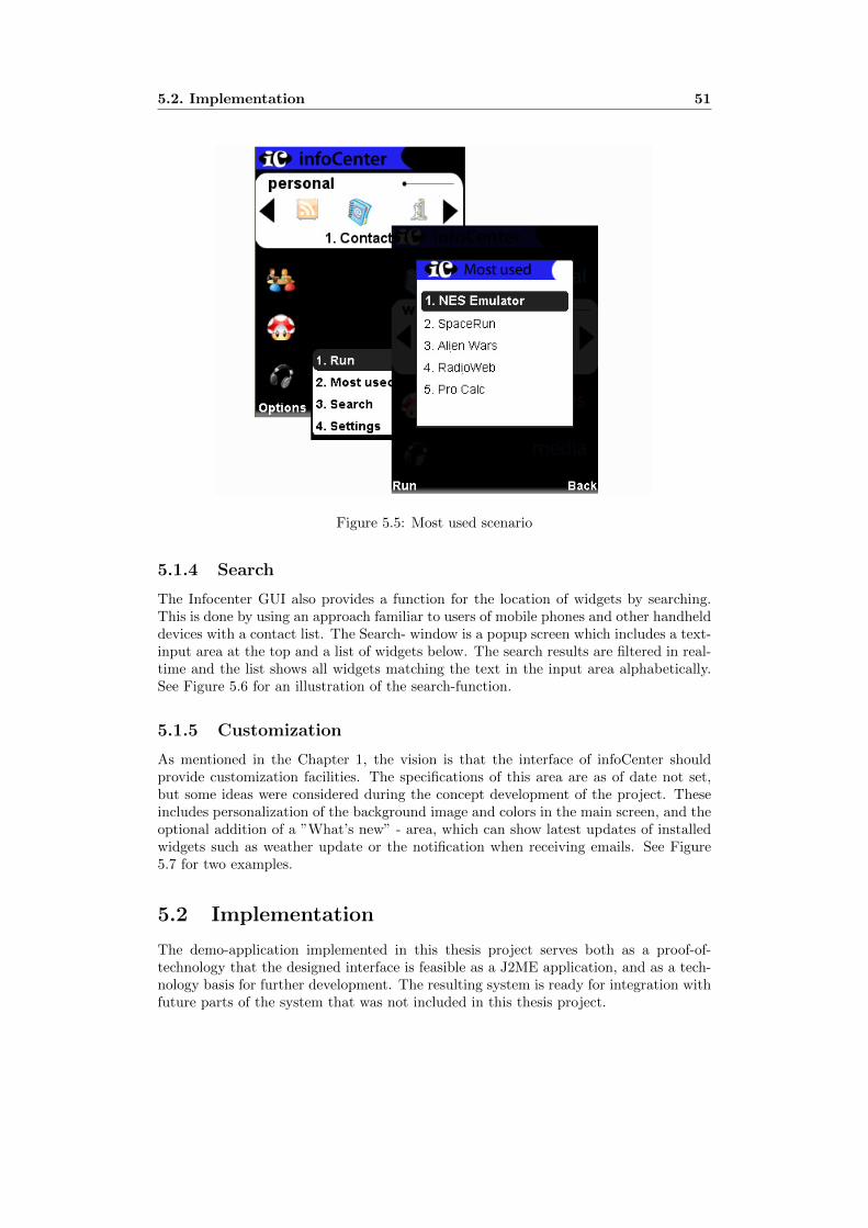
5.2. Implementation 51
Figure 5.5: Most used scenario
5.1.4 Search
The Infocenter GUI also provides a function for the location of widgets by searching.This is done by using an approach familiar to users of mobile phones and other handhelddevices with a contact list. The Search- window is a popup screen which includes a text-input area at the top and a list of widgets below. The search results are filtered in real-time and the list shows all widgets matching the text in the input area alphabetically.See Figure 5.6 for an illustration of the search-function.
5.1.5 Customization
As mentioned in the Chapter 1, the vision is that the interface of infoCenter shouldprovide customization facilities. The specifications of this area are as of date not set,but some ideas were considered during the concept development of the project. Theseincludes personalization of the background image and colors in the main screen, and theoptional addition of a ”What’s new” - area, which can show latest updates of installedwidgets such as weather update or the notification when receiving emails. See Figure5.7 for two examples.
5.2 Implementation
The demo-application implemented in this thesis project serves both as a proof-of-technology that the designed interface is feasible as a J2ME application, and as a tech-nology basis for further development. The resulting system is ready for integration withfuture parts of the system that was not included in this thesis project.

52 Chapter 5. Results
Figure 5.6: Search scenario
Figure 5.7: Custom screens

5.2. Implementation 53
The results of the implementation phase of the project can be categorized in twodifferent parts:
– System layout
– Style definitions file
5.2.1 System layout
The system layout is based around the concept of separation of the application logic/storage,presentation and input processing. The scope of this thesis was to implement the presen-tation of the UI and the response to user actions, so the other parts had to be simulated.Figure 5.8 shows the system design at a high level of abstraction.
Figure 5.8: System layout
The Controller part of the system are the center of the application flow. At startup itinitiates the buildup of the presentation classes via the UI-factory. It has the responsibil-ity of both communicating with the application logic and storage layer, and respondingto user input. If an interaction is made by the user the event-handler of the controller

54 Chapter 5. Results
notifies the logic-layer of possible changes in the applications state. If the interactionshould result in some changes in the output (view) of the system the controller notifiesthe presentation layer so that it can change its state.
The classes included in the Presentation part of the system makes subclasses of high-level interface components included in the J2ME Polish API or the MIDP 2.0 profile.The presentation-classes hold information on how to render the content provided by thestorage and logical layers of the application.
The logic and storage layers are simulated in the demo application. The contents(available widgets) are not fully implemented and functional applications, but are gen-erated to provide some content to work with for the other implemented layers of theapplication. The interface between the logic and storage-layer and the Controller layerincludes modular units for future integration with none-simulated content. In the demoapplication widgets are created using some basic information such as name and image-url. The methods for adding widgets are modular and the information can be parsedfrom an XML-file and then passed on for initialization of the widgets in the applicationinterface. An illustration of this is given in Figure 5.9.
Figure 5.9: Modular system units installed

5.2. Implementation 55
5.2.2 Style definitions
The CSS-file for the demo application contains the style-definitions for all items andscreens of the application. These includes:
– Color definitions
– View-types
– Backgrounds
– Positioning
References to style-definitions in the code are made with preprocessing directives.The code snippet in Figure 5.10 gives an example.
Figure 5.10: Code snippet: Style-definitions directive
The style-directive (style mosteUsedPopUp) makes a reference to attributes forthis element that are specified in the external style-definition file. This will generate thenecessary code and classes into the application. The code snippet in Figure 5.11 givesan example of a style-definition:
Figure 5.11: Code snippet: Style-definitions

56 Chapter 5. Results

Chapter 6
Discussion and conclusions
This chapter holds a discussion regarding the work and the results of this thesis project.Important aspects of all stages of the project will be reviewed, followed by suggestionsabout future work.
6.1 Assignment
The assignment involved design and implementation of the dashboard area of a portal ap-plication for mobile handsets, with the focus on navigation and presentation of content.The assignment did not include a full concept proposal of the infoCenter application.Results from this work (design and implementation) are not a complete application,and the full concept must be further developed to transform infoCenter into a usefulproduct.
The included results from the research phase of the project can be reused whendesigning future parts of the system. Some requirements can be considered as generalusability needs and can be further used in other parts of the system. The developed per-sonas can be used as characters in scenarios for the extraction additional requirements.
A challenging part of this thesis was to focus on the assignment when there wereelements of the full concept missing, and the most favorable approach would be to havea design team working in parallel with separate areas of the future product, with teammeetings at all stages of the project. To have a single designer developing a part of aconcept and implement this part for a proof of technology is still useful if the achievedresults can be reused when needed, and developed for integration with future parts ofthe system.
6.2 Research and design
The in-depth study, ”Usability for the small screen” fulfilled its purpose of providingan overview of the problem area. The topic could have been narrowed down to strictlyinvolving navigation and presentation of interactive elements on a small screen. Adiscussion on these topics could have been more helpful for the work on this thesisproject.
All data from the user research of this project was assembled and analyzed by a one-man research team and the involvement of other points-of-view was non-existent. The
57

58 Chapter 6. Discussion and conclusions
data collected was mostly qualitative and the risk of biased results is always present inthis kind of research. As mentioned in section 3.5.2, personas risk of being stereotypicaldescriptions, and the analysis of data from the probing assignments are also elements ofthis project that could have benefited from the involvement of other researchers. Theresults from the research have been a basis for the future work in this project, and theiterative design process included carefully planned evaluations with participants selectedfrom the target group. This decreases the risk of usability or user experience issues beingthe results of misinterpreted data.
User testing is limited, especially when it comes to mobile applications. The evalu-ations of the flash prototypes were all conducted on a laptop computer, and the testingenvironments were in many cases far from the actual contexts in which the system isgoing to be used. The low-fi tests included a cardboard prototype of a mobile phone,but the tests were made in a laboratory setting that did not recreate contexts such asbusy environments or changing of lighting and surrounding noise levels, which couldhave affected results.
6.3 Demo application
The implemented demo application was planned to give a demonstration on how theinterface behaves and looks like on a real handset. This was made using an emulatorprovided by Sun Technology. There was never a requirement that the demo shouldbe transferred to a real handset for demonstration, and that was considered a bonus ifaccomplished. Unfortunately the time-frame and budget of this project could not realizethat.
The demo application has been developed for the small handset, but there are moreways of making the resulting system ready for a mobile handset. Several tools for thismatter were identified during research, for example the compression of images.
The demo application suffers from some issues such as a poorly functional input-textbox in the search function. This minor issue is documented and should be dealt withbefore conducting any user testing of the prototype.
6.4 Future work
It has been proven that the resulting concept has a user value. The next step wouldbe to further develop the concept of the portal application with an addition of requiredelements such as a store or presentation of downloadable content. The connections tothese parts of the concept should be included in the interface such as a menu-option.
The demo-application should be optimized for transferral to a real handset and prop-erly tested and evaluated to identify any potential issues that the conducted evaluationsmight have overlooked. This could be done in a laboratory setting. Another evaluationproposal could be to simulate real widgets such as a weather service or news feed andlet a test group operate the demo (on a real handset) for an extended period of time,reporting issues and reflections for instance in the form of an interaction diary or similar.

Chapter 7
Acknowledgements
I would like to thank all people that, in one way or another, have contributed to thisproject.
Thanks to my supervisors, Hakan Gulliksson at Umea University and Anders Sa-lander at Distinct Design for advice and ideas throughout the project.
Thanks to everyone who have shared their opinions, experience and time with meduring the research interviews, focus groups and probing assignments.
A special thanks to my friends and family for their support and encouragementduring the project.
59

60 Chapter 7. Acknowledgements

References
[1] B.B. Bederson, A. Clamage, M.P. Czerwinski, and G.G. Robertson. DateLens:A fisheye calendar interface for PDAs. ACM Transactions on Computer-HumanInteraction (TOCHI), 11(1):90–119, 2004.
[2] B.B. Bederson and J.D. Hollan. Pad++: a zooming graphical interface for exploringalternate interface physics. In Proceedings of the 7th annual ACM symposium onUser interface software and technology, pages 17–26. ACM Press New York, NY,USA, 1994.
[3] N. Bevan. Human-Computer Interaction Standards. Advances in Human FactorsErgonomics, 20:885–885, 1995.
[4] H.R. Beyer and K. Holtzblatt. Apprenticing with the customer. Communicationsof the ACM, 38(5):45–52, 1995.
[5] J. Blom and A.F. Monk. Theory of Personalization of Appearance: Why Users Per-sonalize Their PCs and Mobile Phones. Human-Computer Interaction, 18(3):193–228, 2003.
[6] J.O. Borchers. A pattern approach to interaction design. AI & Society, 15(4):359–376, 2001.
[7] B.J. Calder. Focus Groups and the Nature of Qualitative Marketing Research. InJournal of Marketing research XIV. American Marketing Association, 2007.
[8] G. Chen and D. Kotz. A Survey of Context-Aware Mobile Computing Research.Technical report, Dept. of Computer Science, Dartmouth College, 2000.
[9] A. Cooper, R. Reimann, and D. Cronin. About Face 3: The Essentials of InteractionDesign. Wiley Publishing, Inc, 2007.
[10] M.W. Eysenck and M.T. Keane. Cognitive Psychology: A Student’s Handbook.Psychology Pr, 2005.
[11] X. Faulkner. Usability Engineering. Macmillian Press Ltd, New York, 2000.
[12] J. Forlizzi and S. Ford. The building blocks of experience: an early framework forinteraction designers. In Proceedings of the 3rd conference on Designing interactivesystems: processes, practices, methods, and techniques, pages 419–423. ACM NewYork, NY, USA, 2000.
[13] B. Gaver, T. Dunne, and E. Pacenti. Cultural Probes. Interactions, 6(1):21–29,1999.
61

62 REFERENCES
[14] GetJar. Blackberry 8100 specifications. http://www.stats.getjar.com/device/BlackBerry/8100(visited: 2008-10-01.
[15] GetJar. Nokia n70-1 specifications. http://www.mobref.com/device/Nokia/N70-1(visited: 2008-09-23.
[16] J. Gong and P. Tarasewich. Guidelines for Handheld Mobile Device Interface De-sign. In Proceedings of DSI 2004 Annual Meeting, 2004.
[17] R.E. Grinter and L. Palen. Instant Messaging in Teen Life. In Proceedings of the2002 ACM conference on Computer supported cooperative work, 2002.
[18] Nielsen Norman Group. User experience - our definition.http://www.nngroup.com/about/userexperience.html (visited: 2008-09-19.
[19] C. Gutwin and C. Fedak. Interacting with big interfaces on small screens: a compar-ison of fisheye, zoom, and panning techniques. In Proceedings of Graphics Interface2004, pages 145–152. Canadian Human-Computer Communications Society Schoolof Computer Science, University of Waterloo, Waterloo, Ontario, Canada, 2004.
[20] L.E. Holmquist. Will Baby Faces Ever Grow up. CHI-98, pages 706–709, 1998.
[21] S. Houde and C. Hill. What do prototypes prototype. Handbook of Human-Computer Interaction, 2:367–381, 1997.
[22] M. Jones and G. Marsden. Mobile Interaction Design. John Wiley & Sons, Ltd,2006.
[23] M. Jones, G. Marsden, N. Mohd-Nasir, K. Boone, and G. Buchanan. ImprovingWeb interaction on small displays. Computer Networks, 31(11):1129–1137, 1999.
[24] C. Julien and G.C. Roman. EgoSpaces: Facilitating Rapid Development of Context-Aware Mobile Applications. IEEE Transactions on software engineering, pages281–298, 2006.
[25] E. Kaasinen. User needs for location-aware mobile services. Personal and UbiquitousComputing, 7(1):70–79, 2003.
[26] T. Kamba, S.A. Elson, T. Harpold, T. Stamper, and P. Sukaviriya. Using smallscreen space more efficiently. In Proceedings of the SIGCHI conference on Humanfactors in computing systems: common ground, pages 383–390. ACM New York,NY, USA, 1996.
[27] J. Lovgren and E. Stolterman. Design av informationsteknik - materialet utanegenskaper. Studentlitteratur, Lund, 2004.
[28] W.E Mackay. Users and customizable software: A co-adaptive Phenomenon. PhDthesis, Alfred P. Sloan School of Management, Massachussets Institute of Technol-ogy, 1990.
[29] A. Marcus and E. Chen. Designing the PDA of the future. interactions, 9(1):34–44,2002.
[30] Sun MicroSystems. Java me technology. http://java.sun.com/javame/technology/index.jsp(visited: 2008-10-02.

REFERENCES 63
[31] D.R. Millen. Rapid ethnography: time deepening strategies for HCI field research.In Proceedings of the 3rd conference on Designing interactive systems: processes,practices, methods, and techniques, pages 280–286. ACM New York, NY, USA,2000.
[32] R. Mugge, H.N.J. Schifferstein, and J.P.L. Schoormans. Personalizing Product Ap-pearance: The Effect on Product Attachment. In Proceedings of the InternationalConference on Design and Emotion Ankara, Turkey, 2004.
[33] Troy Norcross. On device portals & mobile content: The way forward.http://www.newmediaedge.co.uk/reports/odpwhitepaper.pdf (visited: 2008-09-21.
[34] D.A Norman. The design of everyday things. MIT-Press, London, 1998.
[35] J.S. Olson and T.P. Moran. Mapping the Method Muddle: Guidance in UsingMethods for User Interface Design. Defense Technical Information Center, 1995.
[36] V. Paelke, C. Reimann, and W. Rosenbach. A visualization design repository formobile devices. In Proceedings of the 2nd international conference on Computergraphics, Virtual Reality, visualisation and interaction, pages 57–62. ACM PressNew York, NY, USA, 2003.
[37] J. Preece, Y. Rogers, and H. Sharp. Beyond Interaction Design: Beyond Human-Computer Interaction. John Wiley & Sons, Inc. New York, NY, USA, 2002.
[38] J. Ramey, T. Boren, E. Cuddihy, J. Dumas, Z. Guan, M.J. van den Haak, andM.D.T. De Jong. Does think aloud work?: how do we know? In Conference onHuman Factors in Computing Systems, pages 45–48. ACM New York, NY, USA,2006.
[39] J. Rudd, K. Stern, and S. Isensee. Low vs. high-fidelity prototyping debate. inter-actions, 3(1):76–85, 1996.
[40] S. Sarker and J.D. Wells. Understanding mobile handheld device use and adoption.Communications of the ACM, 46(12):35–40, 2003.
[41] A. Schmidt, M. Beigl, and H.W. Gellersen. There is more to context than location.Computers & Graphics, 23(6):893–901, 1999.
[42] D. Schwabe and G. Rossi. The object-oriented hypermedia design model. Commu-nications of the ACM, 38(8):45–46, 1995.
[43] B. Shneiderman. Designing the user interface: Strategies for effective human-computer interaction (ed.). Menlo Park, C: Addison Wesley, 1998.
[44] J. Tidwell. Designing interfaces:[patterns for effective interaction design]. O’ReillyPublishing, 2005.
[45] K. Topley. J2ME in a Nutshell. O’Reilly, 2002.
[46] R.A. Virzi, J.L. Sokolov, and D. Karis. Usability problem identification usingboth low-and high-fidelity prototypes. In Proceedings of the SIGCHI conference onHuman factors in computing systems: common ground, pages 236–243. ACM NewYork, NY, USA, 1996.

64 REFERENCES

Appendix A
Naturalistic observation:Analysis
A pattern regarding time of use was identified. The interaction with the device cameoften in short sessions, about half a minute or shorter. These sessions occurred oftenwhen the users were waiting for something, such as their turn in a queue, or the attentionof a waiter. There could be numerous short bursts of interaction during a longer periodof time. Exceptions were when the users talked in their phones, when the interactiontypically lasted longer.
The attention the users gave their mobile devices depended heavily on the physicaland social context. When they were interacting with their devices, they often allowedthemselves to be distracted, to direct their attention elsewhere. Later they would oftenpick up their device again, maybe to resume the activities or start new ones. However,this observation does not include users talking on their phones. Whilst talking, the userswere not as easily distracted.
During use, the users could change physical stance such as switching from two-handedto one-handed interaction to react to the physical environment. Two-handed interactiontypically occurred when sitting down or standing still, while one-handed interaction wasmostly used when walking.
When in groups with more than two people, the operation and use of a mobiledevice were often considered private. If a user started to interact with his or hers mobilephone the others of the group turned to each other instead of the person engaging inthese activities. The dynamics of the group changed, and returned to normal when theinteraction session was over. There were exceptions, and this change of group dynamicswas noticeable, but the phenomenon was common and did not seem to bother anyone.
65

66 Chapter A. Naturalistic observation: Analysis

Appendix B
Contextual inquiry: Analysis
After reviewing the data gathered from the two interview sessions, the interactions weredivided into three categories from a goal-oriented point of view:
– Information gathering/sharing - This included for example browsing the In-ternet and looking up contacts.
– Amusement - Playing games, listening to music. Taking or viewing photos. Thiscategory also includes customization activities such as changing the ringtone orwallpaper of the device.
– Asynchronized communication - Text messaging, Instant Messaging, e-mail.
– Synchronized communication - Making/Receiving calls.
Some applications that are available in mobile phones or PDA:s today can be hardto assign to one of the specific categories, depending on the user’s expectations of anapplication or service.
Depending on which type of interaction category, the data showed similar patternsof usage and expectations/requirements.
– Activities such as playing games or viewing media of some kind were often initi-ated when the users wanted to pass time, and these activities were often endedbecause of distractions in the context, or when some time had passed. The hard-ware/technical limitations were not especially frustrating to the user. For example,one user had problems when downloading a game to his mobile phone due to us-ability issues of the WAP-site visited, and showed no irritation at all. The sameuser then became upset because of the bandwidth limitation when he tried to readhis email online.
– Synchronized communication is very context sensitive, and since the user had ex-pectations from another party to contribute to the communication, the probabilityof frustrations regarding changing context are high.
– When the users has a goal which places the interaction in information gatheringor communication, the expectations of the interface is directly to support theachievement of that goal and nothing else. When trying to pass time as themain goal, the exploration of the interface can be a sub-goal itself, and that can
67

68 Chapter B. Contextual inquiry: Analysis
set higher expectations on the user experience. Then it is more likely that theuser wants more functionality of the interface, since there are numerous ways toaccomplish the main goal.

Appendix C
Focus group: Analysis
As expected, there were a few participants who talked a lot more the discussion despitethe efforts by the moderator to let everyone speak. But a lot of questions were addressedand got multiple views and approaches. The participants agreed that the main functionof the user interface of a mobile device was to present a way to the user to reach his orhers goal. But the participants disagreed about the importance of aesthetically pleasinggraphics and animations. Some argued that compared to a desktop computer or alaptop, exploration of the interface is not something that they would want to spendtime on. Other participants argued that they would sacrifice some efficiency if they gota more pleasing and fun interface to play around with. But groups agreed that speedand instant feedback is important. Graphics and animation that slows the interfacedown considerably would be classified as ”bad”.
Regarding the navigational issues a top-down approach seemed to be favorable com-pared to a bottom-up approach. The overview should come first, and then the detailscan be retrieved. The participants expressed the need for ”where am I” function, sothey would not feel lost in sub-menus with high detail.
To summarize the lesson learned from the focus group session:
– Design for speed, but do not depend on shortcuts since they may not be used.
– Some low-level customization can be expected, but more advanced activities suchas function keymapping will probably not be used.
– Appropriate graphics and animation should be selected to support the main goalfirsthand.
– A top-down approach is favorable, and a good view of the current location inrelation to other top-level elements while in detail-view would prevent frustration.
69

70 Chapter C. Focus group: Analysis

Appendix D
Focus group: Introductiontasks
These assignments are a tool to help you reflect on different elements of a user inter-face and what you think is important. Your answers will not be collected, and theassignments are voluntary.
1. Rank these following statements where: [1]= Most important and [3]=Least important
D.1 Task A
– I think advanced graphics should be provided in an interface for a handheld devicesuch as a mobile phone.
– I think the user interface should provide me with a way to achive my goal asquickly as possible.
– I think the interface should provide an overview of all the functions at my disposal.
D.2 Task B
2. Give examples of good/bad interfaces or parts of an interface that youhave come across. Write as many details as possible and motivate youranswer. Examples of qualities to get you started:
– Easy/hard to understand.
– Fast/Slow
– Fun/boring
– ...
71

72 Chapter D. Focus group: Introduction tasks

Appendix E
Focus group: Moderator guide
E.1 Introduction (5 minutes)
Give a short introduction of what is expected of this group session. The goals are adiscussion around interfaces of small screen devices. The result is going to be analyzedand used in the requirements definition of a user interface design project. Introduce thegroup members to each other.
E.2 Introduction task (10 minutes)
See APPENDIX D: Focus group introduction tasks
E.3 Graphics and animation in the user interface (15minutes)
– How important are presentation graphics?
– What sort of graphics is fun to watch and interact with?
– Customizing the graphics, fun or gimmick?
– (If there are time) Let the participants give examples of good use of graphics inan interface or application.
E.4 Navigation and shortcuts (15 minutes)
– What makes navigation and wayfinding easy in a small screen interface?
– Explore the attitudes towards navigational shortcuts?
– Customization of navigation shortcuts
– (If there are time) - Let the participants give examples of products or applicationswith good navigation.
73

74 Chapter E. Focus group: Moderator guide
E.5 Summary: What makes a good interface? (15minutes)
Let the participants discuss the most important aspects of a user interface, and whatelements make one better than the other. Encourage examples.

Appendix F
Interaction Diary: Instructions
F.1 Introduction
This week’s reporting for the probing assignments is an interaction diary. You have beenequipped with a notebook and a pen, and that is all you need for this assignment. Yourtask is to report your interactions with various devices and some details around it forone week in the form of diary entries.
I want to remind you again that your partnership in this study are totally anonymous,and your diary will be returned after the analysis.
F.2 Basic information (required)
To be able to analyze your contributions correct, I have put together some instructionsthat I want you to follow. In every entry, try and give this basic information:
– What was the device? Desktop computer, mobile phone...?
– Why did you interact with the device? What were your goals?
– What came out of it? Did you accomplish your goal?
F.3 Other information (optional)
Try and be detailed in your answers if you find it necessary. Other information that canbe of use are:
– Name of application/website
– You own thoughts about your interaction. Was it fun/boring, slow/fast, hard/easy?
– Would you use the same methods again if you had the same (or similar) goal?
75

76 Chapter F. Interaction Diary: Instructions
F.4 Example
This is an example of a fictional entry:
”Saturday, 17:00. I was using the internet on my desktop computer, trying tokill some time before dinner with Flash games at addictivegames.com. Foundsome really funny games on that site”
This example above is not especially detailed but it is still useful information. Goodluck!

Appendix G
What do you like?Instructions
G.1 Introduction
This week I want you to repeatedly ask yourself the question above. And I want you tofocus on what you find aesthetically beautiful, cool, nice or enjoyable to look at.
G.2 Submission
There are several ways of communicating this. In the introduction meeting we wentthrough several techniques including the use of Google Image search and YouTube. It isup to you how you want to submit your answer, but some sort of visual representationis preferable.
When you have an answer, I want you to submit the answers to me by email. Ialso would appreciate some sort of motivation to your answer so there will be minimalof misinterpretations. Try and distinguish as much as possible of what engages you tosubmit this specific answer. Remember: There are definitely no right or wrong answerto this question!
G.3 Example
Say for example, that you really love the flow of salsa dance. To appropriately commu-nicate this, you would have to illustrate with a video example. Search for ”salsa dance”on youtube.com, select a nice video and submit the link to me and explain why it is sobeautiful. Good luck!
77

78 Chapter G. What do you like? Instructions

Appendix H
Where do you want to go?Instructions
H.1 Introduction
This week I want you to repeatedly ask yourself the question above. If you could travelinstantly and without any limitations (on our globe), where would you go and why?This daydreaming exercise can result in a number of locations during one day, and youare free to submit as many as you like.
H.2 Submission
We will use Google Maps as a way of travel. You have been given an introduction tothis, and if you have forgotten you can browse to the Users Guide from this website:
http://maps.google.com
Every destination has a link available, and that link I want you to submit alongwith a motivation of why you want to go there. Be as detailed as you want to in yourexplanations. Remember: There are definitely no right or wrong answer to this question!
H.3 Example
Say for example, that you love the beaches of Anguilla. Search or navigate to the areaon Google Maps and submit me the link in an email, explaining why you want to gothere right now. Good luck!
79

80 Chapter H. Where do you want to go? Instructions

Appendix I
Personas
The two personas introduced below are the result of the identification of personal andbehavioral patterns from the research conducted in this thesis. Contextual inquiries,focus groups, probing assignments and naturalistic observations have been the source ofdata for extruding the patterns.
I.1 John 31, IT consultant
John is an IT-consultant specializing in Business Intelligence. His job includes long daysat the office or at clients, but he enjoys the responsibility he is granted by his employer.Hi has worked almost five years in the industry and has great plans for his future career.He would like to advance within the company and be the head of his division.
Figure I.1: Persona image: John
He lives with his fiancee in an apartment and they are talking about expanding theirfamily with a baby. Their home is of minimalist design with a lot of white furniturethat contrasts the black, glossy electronic devices. His private economy is good and hesurrounds himself with technical gadgets like the latest mobile phone and videogames.
81

82 Chapter I. Personas
He considers himself to be updated with computer technology, since he is working inthe industry and likes using technology in his free time.
His daily routine consists of many interactions with mobile technology. He uses hisnew mobile phone as an mp3 player and organizer, checks his email on his way to workto be updated when he reaches the office. He also is a frequent reader of news in theworld of sports; he has an RSS-reader on his phone to get him the latest updates.
His motivations for using mobile services are the following:
– He can use them almost everywhere.
– He likes to have something to do while waiting.
– He can use services to manage his business network associations, to help him inhis job.
– He can keep in contact with friends and family in simple ways by using text-messaging or emails from his phone.
I.2 Emma 17, student
Emma is a high-school student from the outskirts of a larger city in Sweden. Shecommutes to school by train every day. Her plans for the future are to further educateherself, but she is still searching for her field of interest. She also enjoys travelling andis loosely planning an around-the-world trip with a close friend.
Figure I.2: Persona image: Emma
The life at school involves at lot of free time and she actively uses her mobile phonefor playing games or to quickly scan her email or look for Facebook updates. She hasalso tried Instant Messaging applications that she is familiar to use on her laptop. Sheloves the ability to exchange ringtones via Bluetooth with her friends at lunch, and hasbought several phone charms on the Internet.
Emma’s top motivations for extending her use of mobile services:

I.2. Emma 17, student 83
– To expand her social networking with new applications.
– To kill time while on the commute.
– To gain easy access to personalization services for her phone.
– To be a better student with information based applications.

84 Chapter I. Personas

Appendix J
Mood board
The moodboard is composed from patterns in the data gathered during the user researchphase of the project.
Figure J.1: Moodboard
85

86 Chapter J. Mood board

Appendix K
Requirement specification
The collected information from the assignment provider, research and user studies andpersonas have been the source of data from which requirements were extracted and usedto develop the infoCenter design and demo-application. The requirements have beendivided into functional requirements (F) and non-functional requirements (N).
K.1 General requirements
Table K.1: General requirements# Requirement F/N1 The user should be able to start do all the required inter-
action to start a widget by using the only the navigationalbuttons and the middle button
F
2 The interface should function as dashboard in which theuser can browse installed widgets and launch them at will.
F
K.2 Demo system requirements
Table K.2: Demo system requirements# Requirement F/N3 Platform used for the demo should be J2ME N4 Source code should be optimized for wireless handsets. N5 Source code should follow Java Sun Code Conventions N6 Source code should follow good Object-oriented design. N7 The system should be developed for integration with future
parts of the systemF
8 The code should be clearly documented. F
87

88 Chapter K. Requirement specification
K.3 Usability requirements
Table K.3: Usability requirements# Requirement F/N9 The user interface should provide easy and quick naviga-
tion.N
10 The interface should be developed for operation in differentcontexts.
F
11 The interface should present a fun way of browsing thecontents.
N
12 The interface should present shortcuts in lists and menus. F13 Text and language should be clearly understandable to the
target users.F
14 The GUI should be consistent in its presentation of ele-ments.
N
15 The hierarchy of overview and detail should be clearly dis-tinguishable.
N
16 The system should give direct feedback upon interactionand provide a short response time to actions.
N
17 Information about location should always be provided. N18 Feedback while the system is loading should be visible. N19 The interface should be designed for short bursts of inter-
action.N
20 The interface should provide a search-function of installedwidgets.
N
21 The interface should provide some personalization facilities. N
K.4 Aesthetic requirements
Table K.4: Aesthetic requirements# Requirement F/N22 The screen layout, animations and colors should attract the
target users.N
23 The flow of animations and graphics of the interface shouldbe smooth and non-interfering.
N

Appendix L
Low-fi prototypes
L.1 Four Seasons
Figure L.1: Screenshot: Four Seasons prototype
L.1.1 Interaction
Start screen
– Navigation keys (up, down, right, left): Takes the user to one of the four categories.
– Softkey (GO TO): Goes to pop-up menu.
– Softkey (Exit): Closes the application.
89

90 Chapter L. Low-fi prototypes
Category menu
– Navigation keys (up, down) Cycle through menu choices.
– Middle-button: Starts the selected application.
– Softkey (Select): Starts the highlighted application.
– Softkey (Back): Returns to start screen.
Pop-up menu
– Navigation keys (up, down) Cycle through menu items.
– Middle-button: Selects menu item.
– Softkey (Select): Selects menu item.
– Softkey (Back): Returns to start screen.
L.2 Cross
Figure L.2: Screenshot: Cross prototype
L.2.1 Interaction
Main windwow
– Navigation keys (up, down) Switches between categories.

L.3. Icon list 91
– Navigation keys (left, right): Switches between applications in the expanded cat-egory
– Middle-button: Selects highlighted item.
– Softkey (Options): Starts highlighted item.
– Softkey (Exit): Terminates application.
Pop-up menu
– Navigation keys (up, down) Cycles through menu items.
– Middle-button: Selects highlighted item.
– Softkey (Select): Starts highlighted item.
– Softkey (Back): returns to start window.
L.3 Icon list
Figure L.3: Screenshot: Icon list prototype
L.3.1 Interaction
Main windwow
– Navigation keys (up, down) Cycles application items.
– Navigation keys (left, right): Cycles categories.
– Middle-button: Selects highlighted item.
– Softkey (Options): Starts highlighted item.
– Softkey (Exit): Terminates application.

92 Chapter L. Low-fi prototypes
L.4 Expanded list
L.4.1 Interaction
Main window (No expanded categories)
– Navigation keys (up, down) Cycles category items.
– Middle-button: Expands marked category.
– Softkey (Options): Pop-up menu
– Softkey (Exit): Terminates application.
Detail view (Expanded category)
– Navigation keys (up, down): Cycles categories/detail items.
– Middle-key: If an application is marked: start application. If a category is marked:Expand/collapse category.
– Softkey (Select): If an application is marked: start application. If a category ismarked: Expand/collapse category
– Softkey (Exit): Terminates application.
– Softkey (Back): Collapse expanded category.
Detail view (Popup-menu)
– Navigation keys (up, down): Cycles through menu items..
– Middle-key: Selects menu item.
– Softkey (Select): Selects menu item.
– Softkey (Exit): Terminates application.
– Softkey (Back): Return to start screen.
L.5 Cube
L.5.1 Interaction
Unlocked Cube Mode
– Navigation keys (up, down, left, right): Rotates cube.
– Middlekey: Locks cube
– Softkey (Lock): Locks cube
– Softkey (Exit): Terminates application.
Locked Cube Mode

L.5. Cube 93
Figure L.4: Screenshot: Expanded list prototype
Figure L.5: Screenshot: Cube prototype

94 Chapter L. Low-fi prototypes
– Navigation keys (up, down): Cycles applications.
– Middlekey: Starts marked application.
– Softkey (Select): Starts highlighted application.
– Softkey (Back): Unlocks cube.

Appendix M
User testing with TA Protocol
M.1 Instructions and procedure
After a brief introduction about the TA protocol by the evaluator, the test subjects weregiven the cardboard prototype. A quick check was made to make sure the users hadsome experience with the different physical buttons, as this was a presumption.
Then the screens from the prototypes were laid out for the evaluator, so the changeof screens would go as quick and smooth as possible. However, the test subject couldonly see the screen they were supposed to at all times.
The evaluator also explained how screen dynamics would be simulated by switchingprinted screenshots on the prototype, so the users would not be confused by the removaland change of screen.
M.1.1 Test order
A = Expanded List
Table M.1: Prototype codes for user testing.Code Prototype
A Expanded listB CubeC CrossD Icon listE Four Seasons
Table M.2: Low-fi prototype test order.TEST SUBJECT PROTOTYPE ORDER
1 A, B, C, D, E2 E, A, B, C, D3 D, E, A, B, C4 C, D, E, A, B5 B, C, D, E, A
95

96 Chapter M. User testing with TA Protocol

Appendix N
Low-fi prototype evaluations
Table N.1: Summorized results. User testing of low-fi prototypes.Prototype Positive remarks Negative remarks Conclusion
Expanded list Good overview ofcategories
A lot of scrollingneeded when ”back”- button was notused to collapse cat-egories
Easy but slow com-pared to other pro-totypes in the test.Need detailed anima-tions
Icon list Provided good detailoverview. Fast whenusers understoodcategory scrolling.
Users sometimes feltlost when looking foranother category.
For first time usersthe absence of astart-screen can beintimidating. Norestrictions aboutthe amount ofcategories.
Cross All users understoodthe use of cross-navigation withouttraining. Overview+ detail at the sametime was appreci-ated, none seemedlost.
Some users had atendency to startscrolling sidewaysfirst instead of look-ing for the rightcategory.
Lot of positive reac-tions. Raised someissues about whatshould be expandedfirst.
Four seasons Users liked the po-sitioning of the app-menus.
Restricted to fourcategories.
Powerful with huband 4 categorieswithin the press of asingle key.
Cube The concept wasconsidered by sev-eral users as a coolidea.
Lots of usabil-ity issues. Usersdidn’t understandlocked/unlockedcube.
Suffers from majorusability issues.
97

98 Chapter N. Low-fi prototype evaluations

Appendix O
High-fi prototype evaluations
O.1 Flash prototype v1 results
– All three test participants did not seem to have any issues with the fisheye-viewconcept. They understood what category that was selected to browse at detaillevel.
– Even though they had a specific application to find (find a game called X ), withan clearly place in the listed categories, they had a tendency to start browsing thetop (default expanded) category anyway. This could indicate playfulness and/orexploration as well as misinterpretation of category names. When asked in theQaD (Quick and Dirty) evaluation afterwards, they did not express any difficultiesregarding these issues.
– All test participants executed the tasks within at the expected (wanted) timeframe.
– Test participants thought the response-time on interaction with the prototype wasok.
Some selected quotes from the QaD-evaluation:
– ”I like the animations and fading of the non-selectable applications”
– ”The categories not expanded looks empty”
– ”The interface needs more graphics and color, there is a lot of white (empty) space”
– ”A cool way of navigating”
O.2 Flash prototype v2 results
Figure O.1 shows a typical transcript from a scenario path:
– Users still have a tendency to browse horizontally, but as in the evaluation of thefirst scenario, which results in more keypresses than on the Standard ScenarioPath, but the comments and expressions of the users do not indicate any userfrustration.
99
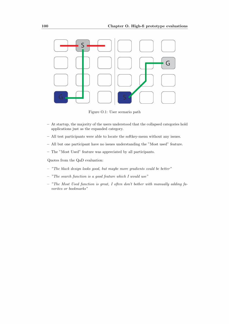
100 Chapter O. High-fi prototype evaluations
Figure O.1: User scenario path
– At startup, the majority of the users understood that the collapsed categories holdapplications just as the expanded category.
– All test participants were able to locate the softkey-menu without any issues.
– All but one participant have no issues understanding the ”Most used” feature.
– The ”Most Used” feature was appreciated by all participants.
Quotes from the QaD evaluation:
– ”The black design looks good, but maybe more gradients could be better”
– ”The search function is a good feature which I would use”
– ”The Most Used function is great, I often don’t bother with manually adding fa-vorites or bookmarks”

Appendix P
GUI Frameworks for MIDPdevelopment
P.1 TWUIK
The sample applications has a Flash-like user interface with advanced animation andeffects . Uses XML for UI structure and design. Despite the rich user interfaces thesupported devices includes budget and mid-tier phones.
P.2 J2ME Polish
A large development framework, consist of several tools for mobile application devel-opment. It comes with a device-database (XML-file) which is being fully maintainedand updated. This gives developers a chance to tailor their application to a specificdevice or a group of devices by collecting their specifications in the database. As forGUI components, J2ME Polish has a rich library with animations and graphics objects.Developers can control the design of the application through a CSS-file (XML) whichis processed during the build process. With this definition-file most of the layout andcustomization of the interface can be executed without changing the source code of theapplication. J2ME Polish is licensed under GPL.
P.3 TinyLine Toolkit
The TinyLine API supports SVG fonts, raster image and text elements and paths. Tiny-Line has a well developed support for SVG Graphics with their SVG Tiny 1.1+ enginefor J2ME platform. It has support for SMIL (Synchronized Multimedia Integration Lan-guage) which is a W3C recommended XML markup language for describing multimediapresentations. Extensive documentation in the API.
P.4 LWUIT
The Lightweight UI Toolkit (LWUIT) uses a programming paradigm similar to Swingand have many high-level interface components in their library. The LWUIT develop-
101

102 Chapter P. GUI Frameworks for MIDP development
ment team are working very closely with Sun Microsystems. Their library supportstheming and screen transistions. MajiPlayer, a popular music application is developedusing LWUIT.
P.5 Kuix
Kuix stands for Kalmeo User Interface eXtensions for J2ME. Kuix is a developmentframework that allows the creation of high end Java ME applications. It provides mostUI elements (buttons, textfields, lists, menus, etc.) needed to create rich user graphicalinterfaces. Uses an XML/CSS approach to describe the screens and the user actions inthe application.