design demo
TRANSCRIPT
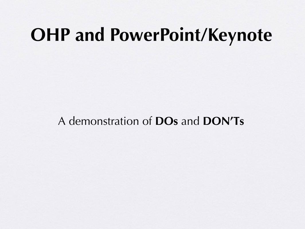
A demonstration of DOs and DON’Ts
OHP and PowerPoint/Keynote
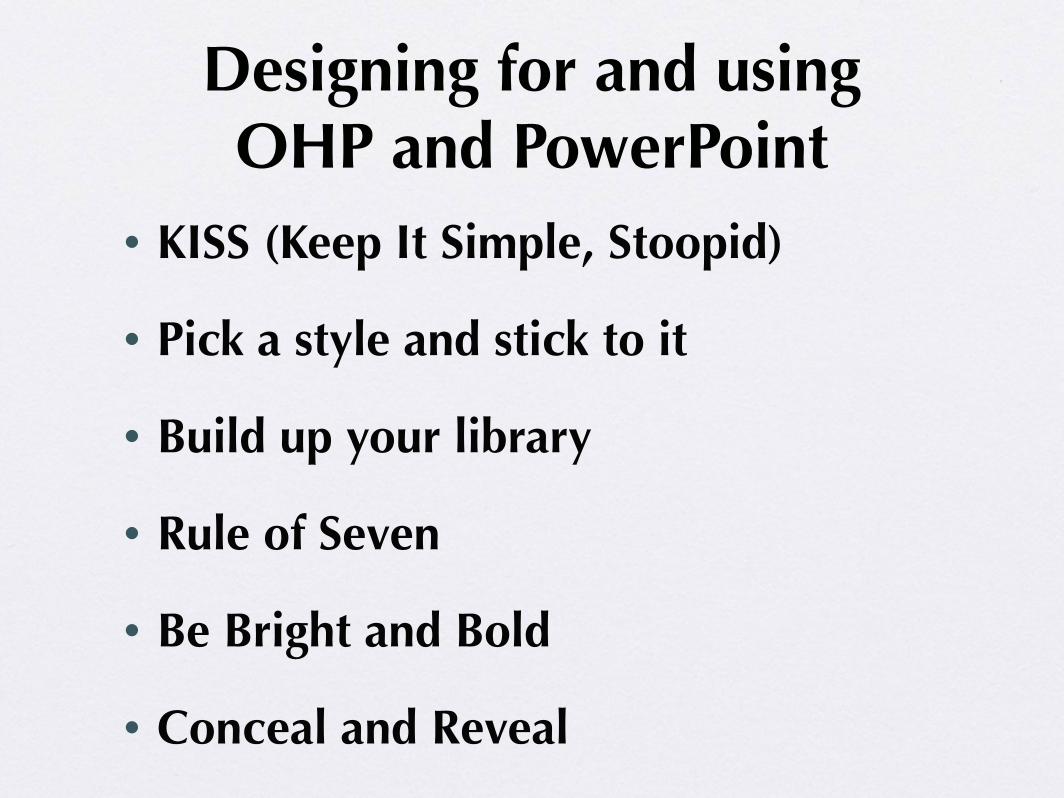
• KISS (Keep It Simple, Stoopid)
• Pick a style and stick to it
• Build up your library
• Rule of Seven
• Be Bright and Bold
• Conceal and Reveal
Designing for and using OHP and PowerPoint
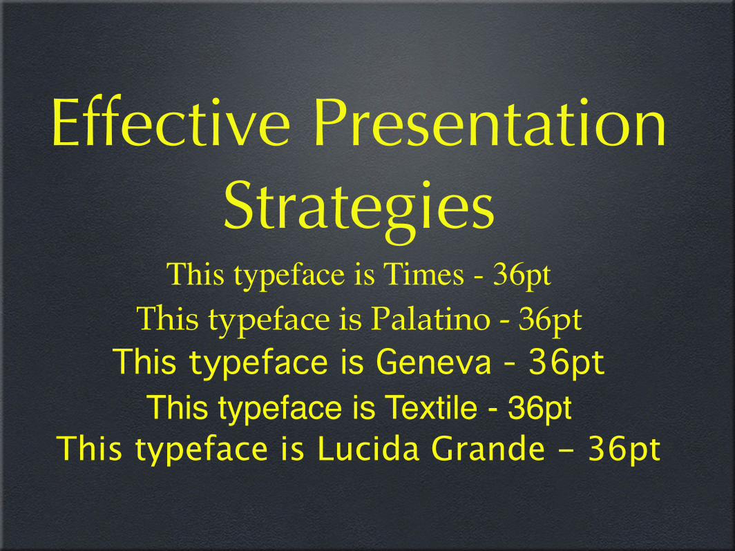
This typeface is Times - 36ptThis typeface is Palatino - 36pt
This typeface is Geneva - 36ptThis typeface is Textile - 36pt
This typeface is Lucida Grande - 36pt
Effective Presentation Strategies
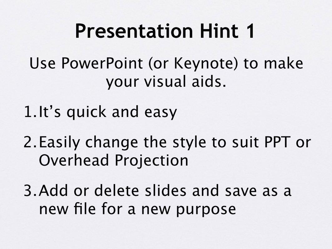
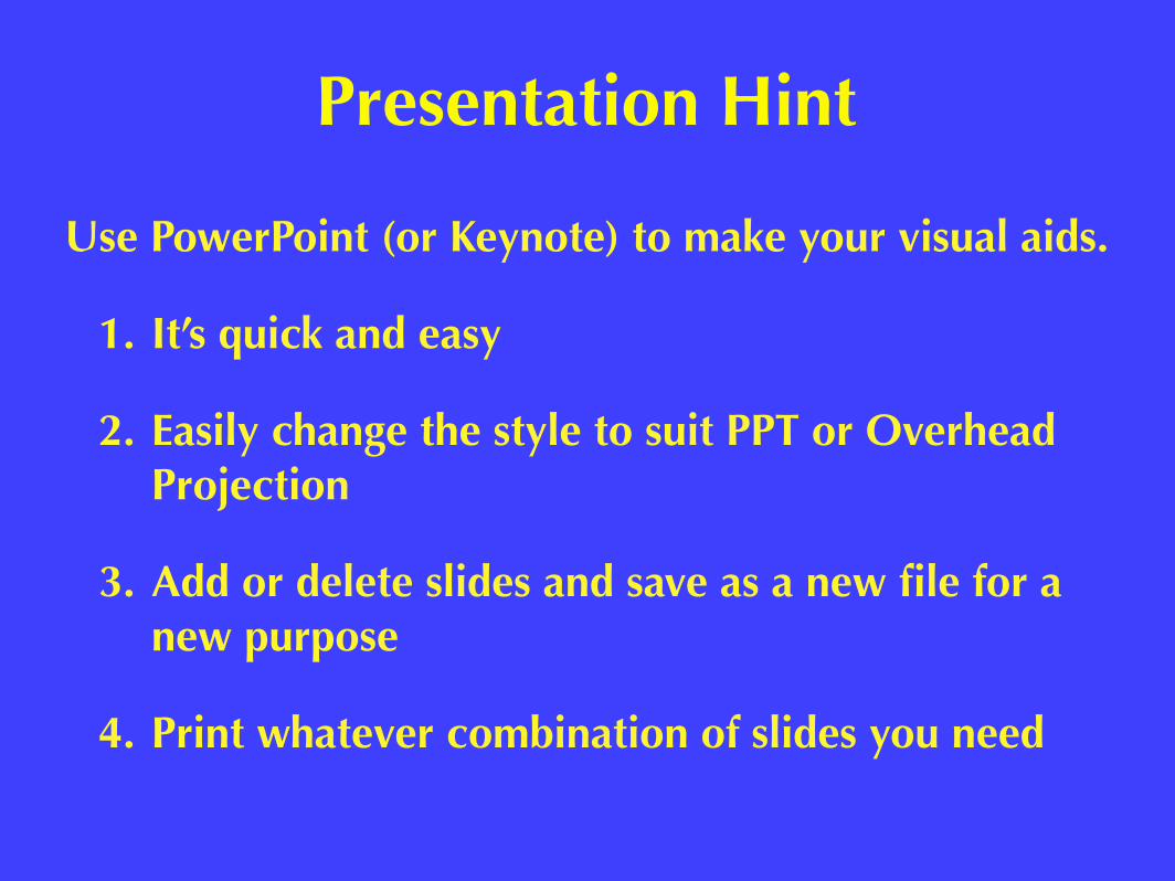
Use PowerPoint (or Keynote) to make your visual aids.
1.It’s quick and easy
2.Easily change the style to suit PPT or Overhead Projection
3.Add or delete slides and save as a new file for a new purpose
Presentation Hint 1
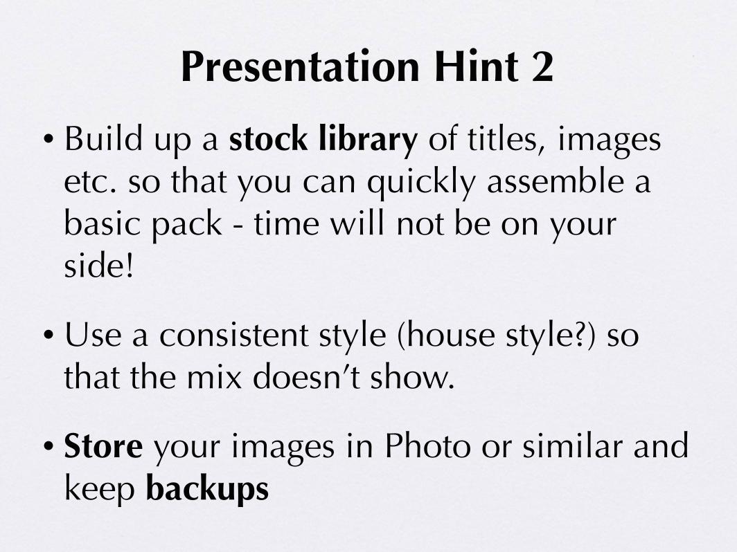
• Build up a stock library of titles, images etc. so that you can quickly assemble a basic pack - time will not be on your side!
• Use a consistent style (house style?) so that the mix doesn’t show.
• Store your images in Photo or similar and keep backups
Presentation Hint 2
Presentation Hint
Use PowerPoint (or Keynote) to make your visual aids.
1. It’s quick and easy
2. Easily change the style to suit PPT or Overhead Projection
3. Add or delete slides and save as a new file for a new purpose
4. Print whatever combination of slides you need
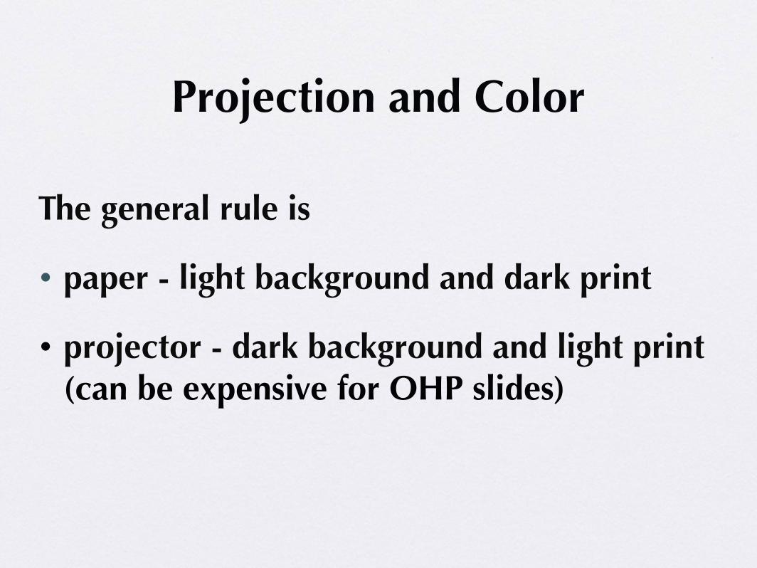
The general rule is
• paper - light background and dark print
• projector - dark background and light print (can be expensive for OHP slides)
Projection and Color
Projection and Color
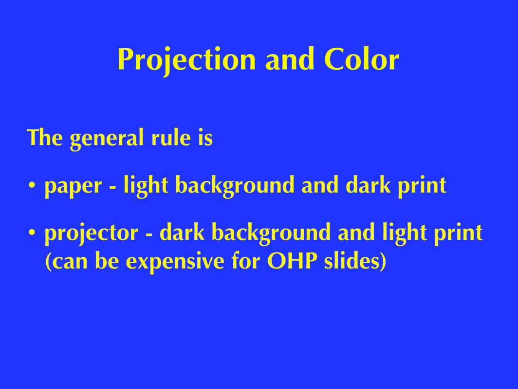
The general rule is
• paper - light background and dark print
• projector - dark background and light print (can be expensive for OHP slides)
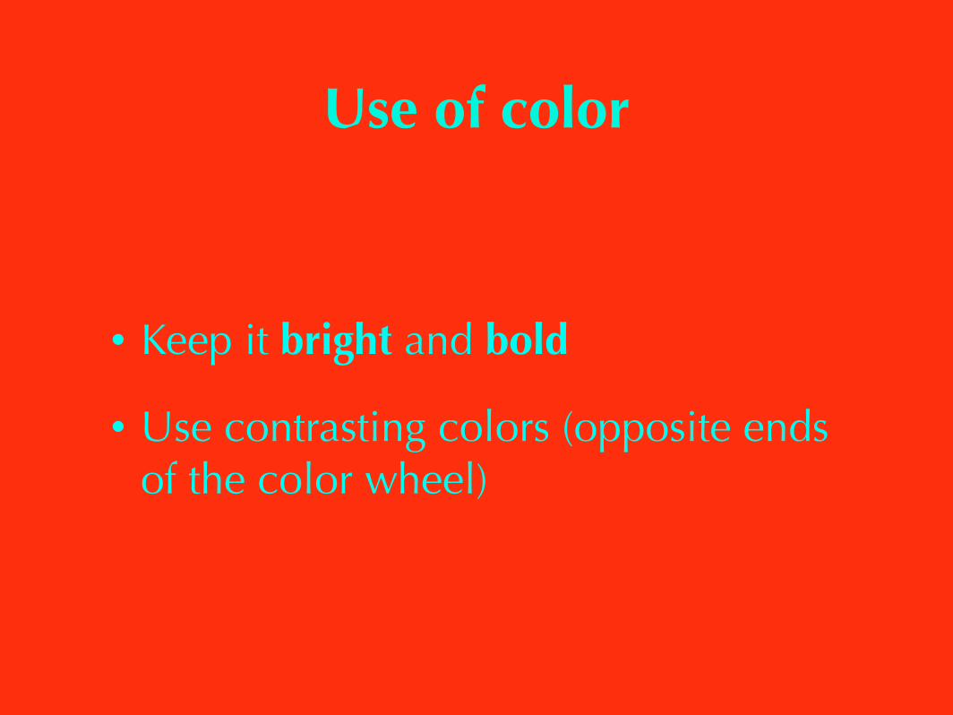
• Keep it bright and bold
• Use contrasting colors (opposite ends of the color wheel)
Use of color
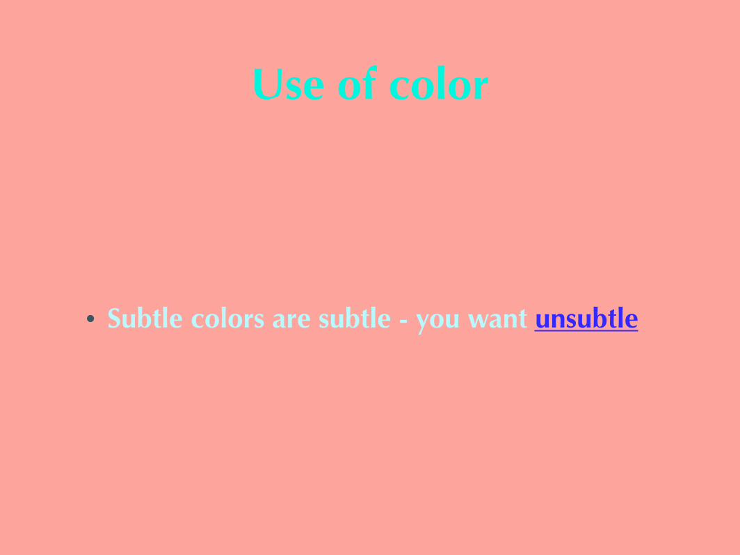
• Subtle colors are subtle - you want unsubtle
Use of color
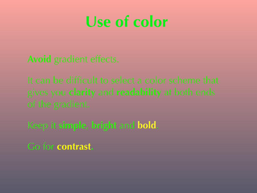
Avoid gradient effects.
It can be difficult to select a color scheme that gives you clarity and readability at both ends of the gradient.
Keep it simple, bright and bold.
Go for contrast.
Use of color
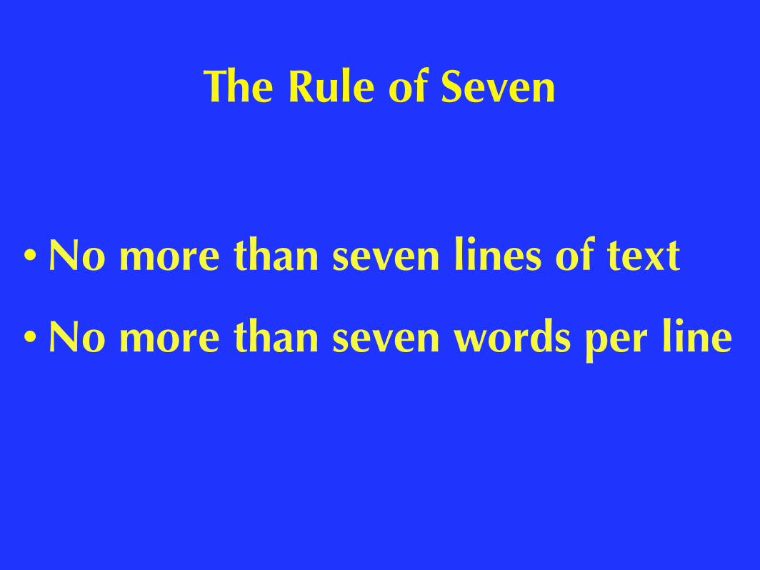
• No more than seven lines of text
• No more than seven words per line
The Rule of Seven
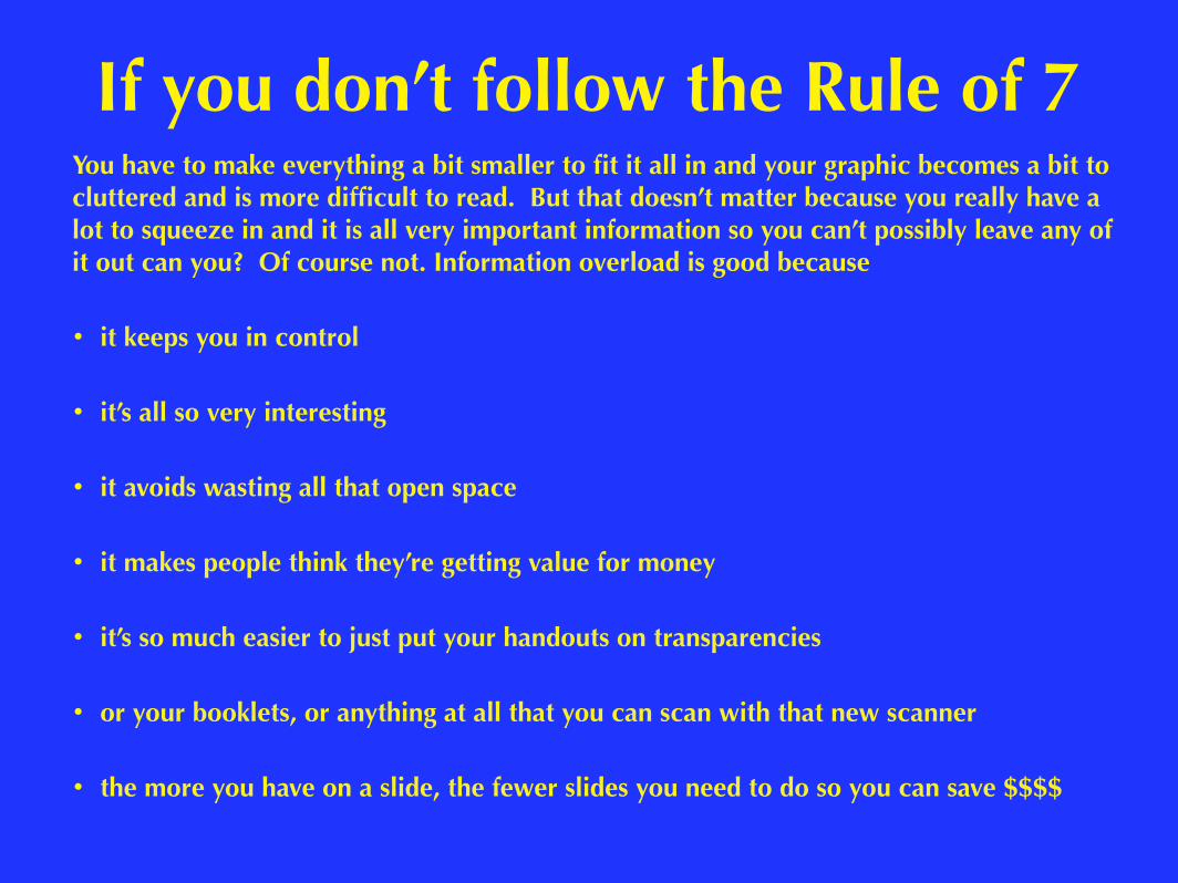
You have to make everything a bit smaller to fit it all in and your graphic becomes a bit to cluttered and is more difficult to read. But that doesn’t matter because you really have a lot to squeeze in and it is all very important information so you can’t possibly leave any of it out can you? Of course not. Information overload is good because
• it keeps you in control
• it’s all so very interesting
• it avoids wasting all that open space
• it makes people think they’re getting value for money
• it’s so much easier to just put your handouts on transparencies
• or your booklets, or anything at all that you can scan with that new scanner
• the more you have on a slide, the fewer slides you need to do so you can save $$$$
If you don’t follow the Rule of 7
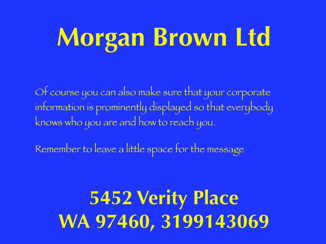
Of course you can also make sure that your corporate information is prominently displayed so that everybody knows who you are and how to reach you.
Remember to leave a little space for the message
Morgan Brown Ltd
5452 Verity Place WA 97460, 3199143069
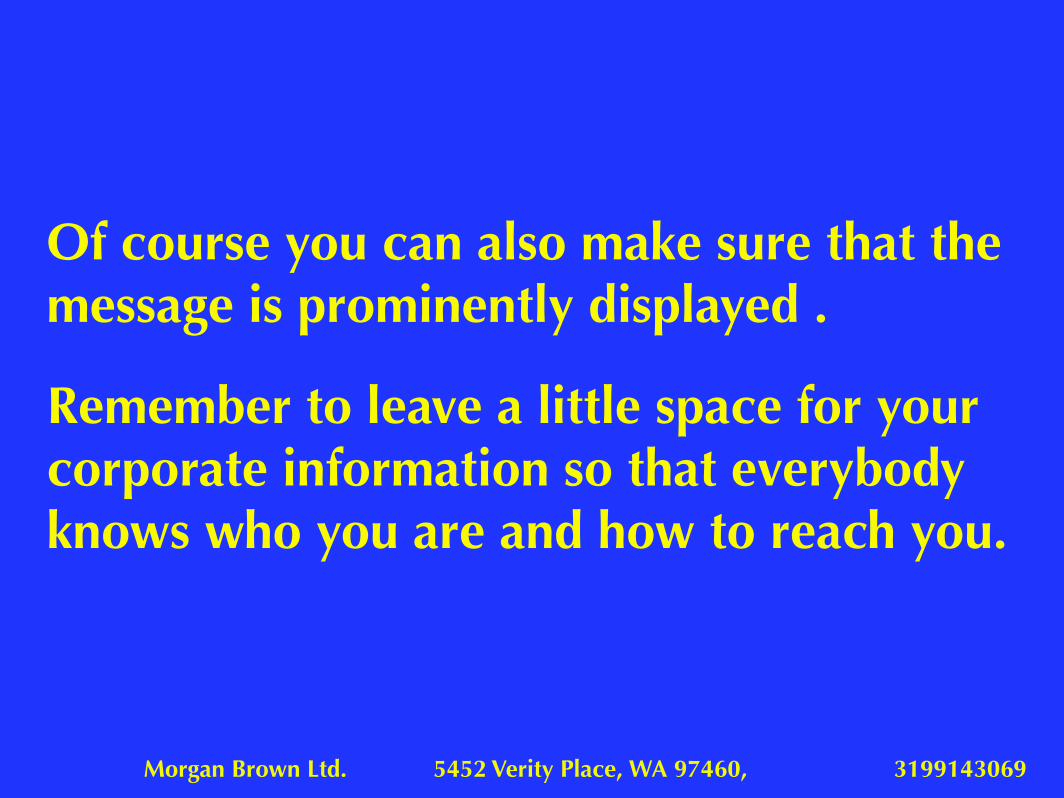
Morgan Brown Ltd. 5452 Verity Place, WA 97460, 3199143069
Of course you can also make sure that the message is prominently displayed .
Remember to leave a little space for your corporate information so that everybody knows who you are and how to reach you.
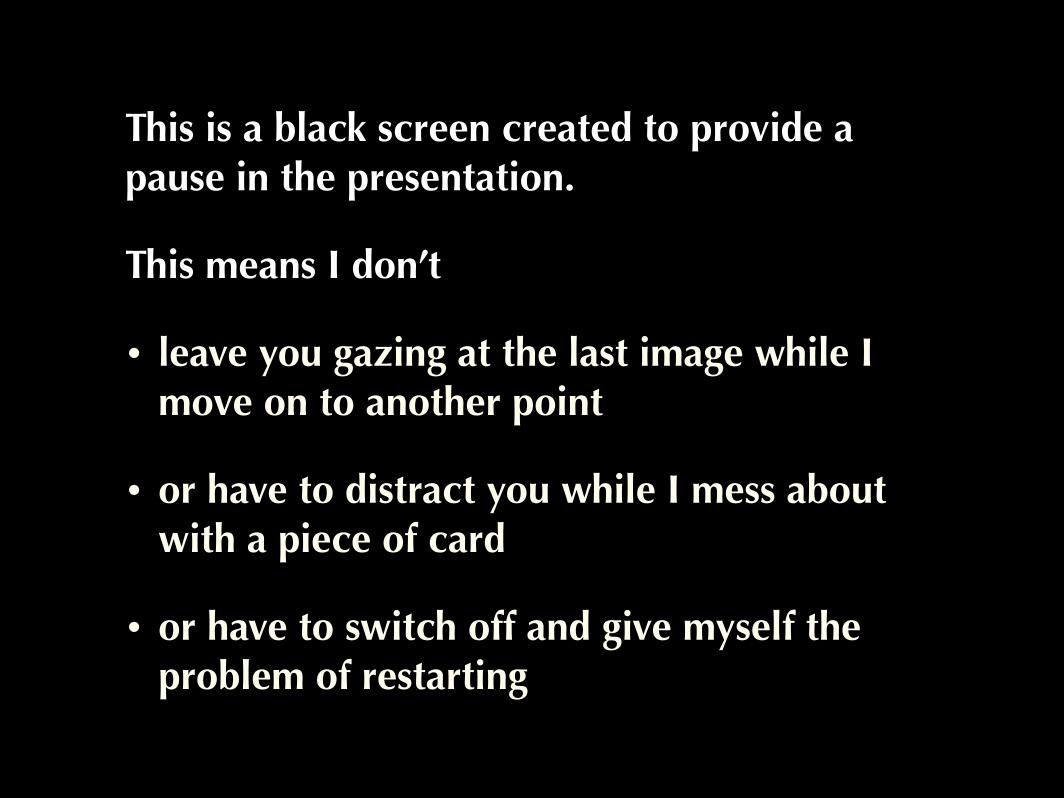
This is a black screen created to provide a pause in the presentation.
This means I don’t
• leave you gazing at the last image while I move on to another point
• or have to distract you while I mess about with a piece of card
• or have to switch off and give myself the problem of restarting
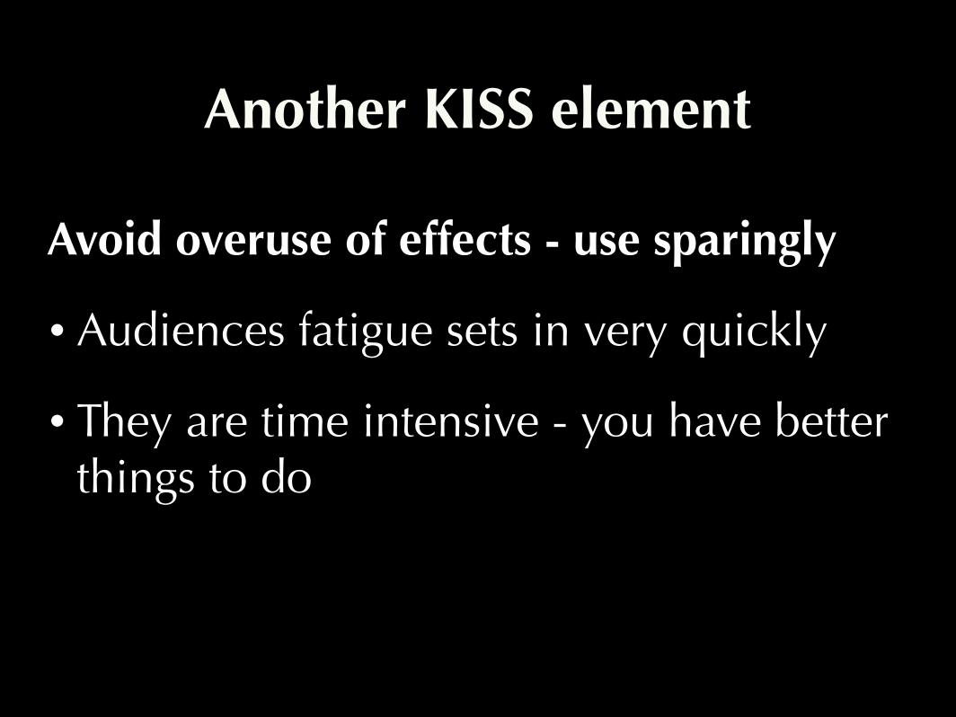
Avoid overuse of effects - use sparingly
• Audiences fatigue sets in very quickly
• They are time intensive - you have better things to do
Another KISS element
The End
