designing digital colour new layout june 2008
TRANSCRIPT

1
Designing Digital Colour Designing Colour Documents for Printing

2
©2008 KONICA MINOLTA BUSINESS SOLUTIONS (CANADA) LTD. All rights reserved. Reproduction, transmission or format conversion in whole or in part without written permission is prohibited. Konica Minolta, and The essentials of imaging are trademarks of KONICA MINOLTA HOLDINGS, INC. All other brands and product names are registered trademarks or trademarks of their respective owners. No warranties are made, express or implied, with regard to the contents of this work, its merchantability, or fitness for a particular purpose. The author(s) shall not be liable for direct, indirect, special, incidental or consequential damages arising out of the use of or inability to use the information contained within.

3
Table of Contents Topic Page Introduction................................................................................................. 4 The Beginning ............................................................................................. 6 The Most Important Questions ................................................... 6 Two Primary Uses for a Colour Copier.................................................... 7 Composite Proofing ...................................................................... 7 Final Output .................................................................................. 8 Your Colour Printer or Copier ................................................................. 8 Utilizing a colour standard........................................................... 9 Paper ......................................................................................................... 10 Paper equivalency ......................................................................... 11 Rule of thumb for paper............................................................... 12 Designing Your Colour Documents Properly for Digital Printing ........ 14 Software categories ....................................................................... 14 Software selections ........................................................................ 15 Guidelines ..................................................................................... 15 Pantone Colours.......................................................................................... 17 Pantone colours and final output ................................................ 17 If you must use Pantone ............................................................... 18 Best practices................................................................................. 19 Technology and Design Considerations.................................................... 19 Matching colours 100% accurately............................................. 20 The colour matching tools ............................................................ 21 Solid colours .................................................................................. 23 Gradations ..................................................................................... 24 Registration ................................................................................... 26 Conclusion ................................................................................................... 28 Tips and Tricks ........................................................................................... 28

4
Designing Digital Welcome to the amazing world of colour.
Konica Minolta strives to be your vendor of choice for affordable, high quality colour output solutions.
The goal of this guide is to educate users on the use of a colour printer when the printer is being utilized as a final output device. Final output devices are discussed in the next section.
Professional colour users will also benefit from learning some of the issues they will encounter when designing for a colour copier as a “composite proofing” device or to supplement offset printing with shorter-run digital printing.
Additionally, this guide will instruct users how to match colour 100% accurately when printing to a Konica Minolta colour laser copier or printer using the “Konica Minolta Colour Survival Kit” which comes standard with every Konica Minolta colour multi-functional device in Canada.
The “Konica Minolta Colour Survival Kit” is a unique colour matching process that allows users to select printable colours based on known colour mixtures from a spectrum of colours. By selecting the colours from the Colour Survival Kit palette you are able to obtain the colour you desire. The The“Konica Minolta Colour Survival Kit” has an additional benefit of showing a user when a colour is “out of gamut” (or out of range) for the printer. This saves you time and allows you to make decisions on how to proceed with colours which can not be print on your colour copier or printer.
When a user prints to a colour printer for the first time, they quickly begin to realize that printing in colour is not as simple as printing in black and white. This guide should be one of the first resources that a user turns toward to find the recommendations and solutions to the most common issues seen on virtually every colour printer or copier on the market.
This guide will offer solutions and suggestions to some of the most common issues that occur on a colour copier / printer.
Some of the issues that this guide will discuss include;
• Matching colours • Working with Pantone • Solid colours • Blends and Gradations • Front to back registration when duplexing

5
In addition to offering solutions to some of these common issues, this guide will introduce many tips and best practices utilized by many colour professionals.
As you read this guide, you must determine if the ideas and suggestions brought forward will work for you. The guide will expose you to the issues and introduce generic solutions that may need to be tweaked or altered for your environment or equipment.
Some of the ideas and suggestions brought forward in this booklet may be considered rudimentary for experienced colour users. In today’s digital colour printing environment, it is important to recognize that most users have not been exposed to basic colour printing ideas and principles.
As a manufacturer, it is Konica Minolta’s goal and responsibility to ensure that our users have a great experience with our products. Part of this process is to make certain that users are aware of the capabilities and issues that will arise when printing in colour.

6
The Beginning The Most Important Question
The most important question a user can ask themselves when designing a colour document is: “What is my Final Output device?”. The Final Output device is the printer that you have selected to print your colour document on.
Once you have determined your Final Output device, you can then make decisions regarding the design of your document. Some of the questions that need to be answered prior to creating your colour document are dependent upon your equipment or document and may include:
Are the colours I require available in the printer I am printing my document on? • Colour printers/copiers can not print all colours
If my document is duplexed, how accurate does the front to back registration need to be?
• This an important question if you are creating business cards or you intend to print on both sides of the paper and lining up both sides is important.
• Additional consideration must be given to the correct design of the document when attempting to cut or duplex print on the paper.
How will my large areas of solid colours or gradations appear on the printer? • Many colour printers have issues when printing certain solid colours or gradations
Does the printer offer good Pantone simulations and how close are they to the actual colour?
• Pantone was never designed for a colour laser copier or printer. You must determine how you want to handle your Pantone colours.
How fast and what additional finishing features are available on the printer? • If you have deadlines to meet, how fast your printer operates and finishes documents
will be critical to completing your print job on time.
Once you are able to answer these and other questions regarding your final printer, you can then design your document quickly and easily and obtain the printed colour results you desire.
If a user fails to get these answers prior to the creation of their document, the result is last minute modifications to the document or the lowering of the users expectations of the colour output. In most situations, neither of these is desirable.

7
Two Primary Uses for a Colour Copier / Printer
There are two primary ways that users utilize their colour printer. A colour copier/printer can be utilized as a Final Output device and/or as a Composite Proofing device.
As a Composite Proofing device, the desire exists for supplemental or ongoing short run colour print jobs to match the printing press from the same computer file. One of the largest misconceptions in the marketplace today is the belief that a single colour document can be printed to multiple colour devices and the same colour results can be obtained. Even with today’s sophisticated colour management technologies, the same colour document printed to different colour printers will be visually different in some areas.
The requirement of short run colour prints to match a printing press print (or other colour printer) by Composite Proofing users is a maturing goal for all colour copier/printer manufacturers. While it is not possible to match colours 100% accurately to another colour device, colour management technologies are allowing this desire to become closer to a reality.
Composite Proofing
Using a colour printer or copier as a Composite Proofing device implies that the colour printer is being utilized as an intermediate “proofing” device prior to printing the document on another device to obtain the final output results. In this type of workflow, the final output device is usually a traditional printing press but could include other devices such as large format inkjet or high speed digital printing.
When using a colour printer or copier as a Composite Proofing device, the goal is to setup the colour printer to simulate the printing press as close as possible. This allows the designers of the colour document to obtain a “feel” of how their document will appear on the printing press.
The word “feel” is used because there are limitations on how close a colour copier/printer can be made to simulate a printing press or other device. Ultimately, the goal and desire of users and many manufacturers is to have a digital colour printer or copier offer virtually identical print results to a printing press. When this occurs, this will allow the printing industry to archive a single colour document and when additional prints are required, depending on the quantity, they will be able to print additional sets either digitally or through traditional printing press methods.
It is important to note that in today’s marketplace, the same document printed to a printing press and a high speed digital device will not typically offer identical colour results. Colour differences can range from minor to significant.
It is this limitation in digital colour printing technologies that forces you to ask the questions listed on page 6.

8
Final Output Device
Over 90% of all colour documents that are created today will never be printed on a printing press.
When a colour copier or printer is used as a Final Output device, this implies that the document is being designed and printed digitally without going to another device such as a printing press.
The output from the digital copier or printer is given to the final reader or recipient, therefore; the name, Final Output.
Typically this choice is made when the document life span is shorter. An example of short life span colour documents would include proposals, sales materials, variable data, mail merges and other documents that are not typically archived for later printing.
For those users that plan on utilizing their colour copier in this fashion, this booklet will offer solutions to the most common issues that will arise. Being aware of these issues in advance will allow the user to design their colour documents more quickly and correctly for colour printing. Without this information, documents can print with incorrect colours, imperfect registration, bad solid colours, banding in blends and many other undesirable colour printing effects.
Your Colour Printer or Copier One of the most important features that your colour printer or copier must have is the ability to offer consistent colour. Imagine printing a document on your printer today and then printing the same document tomorrow and obtaining different colour results. This is unacceptable to most users and leads to an unmanageable workflow.
Colour consistency on most printers and copiers is done via a manufacturer specific internal process or could involve a manual process referred to as calibration. In some devices, it is combination of both. Please read your users manual to learn how your colour printer obtains and maintains colour repeatability and how frequently you need to calibrate. If you are required to perform a manual calibration, the frequency of your calibration will be dependent upon one of several issues, including;
How vital and accurate does the consistency need to be?
Does the printers colour drift over time or a long print run?
Are you printing large quantities of colour pages over a short period of time?

9
Each of these issues may require you to calibrate more frequently.
In general, most business users will be satisfied with a weekly calibration while more demanding colour environments such as print shops and graphic design users may require at least a daily calibration.
An important side note for users that are performing the calibration is to calibrate your printer for the paper you intend to print on. If you find that you don’t have the ability (or time) to calibrate for every type of paper you use, calibrate on the brightest and whitest paper possible which will offer the widest spectral range of your colours. Apply this calibration to all papers to obtain good results on all papers. For some printers and copiers a densitometer or spectrophotometer represents the best device(s) to obtain the best possible calibration.
Now that you have a colour printer/copier that offers you the same colour results on a daily basis, it is now possible to implement proven workflows that allow you to create high-quality colour accurate documents. Utilizing a Colour Standard
If your organization has been using a colour printer or copier for a period of time, there is a comfort level that many of the users have with the way that colour printer/copier prints colours.
Through trial and error (in most situations), the end user has found what has worked for them in obtaining their colours, and is able to obtain the results they want.
When a new colour copier or printer is introduced into this environment, it is likely that the entire trial and error process may have to be performed again for the user to obtain the results that they want. Needless to say, this becomes a level of frustration for the user.
To reduce or eliminate many of the issues seen when printing to different printers and colour copiers, it is recommended that your next colour printer/copier contain a standard that is adhered to by many of the manufacturers. The standard that most manufacturers are attempting to simulate is SWOP (Specifications for Web Offset Printing). Not all colour copiers, printers or raster image processors (RIPS) adhere to this standard. It will require investigation to ensure that the colour printer or copier you are acquiring meets this standard.
The first time you introduce this standard to your environment, you will still have issues of setting up your documents to print with the colours you desire (in comparison to your previous colour printer or copier) but, the benefit is that you are now designing your documents to a standard that is transferable to other

10
devices. This is much better for an organization rather than designing documents differently for each colour printer and copier.
The SWOP standard has been adapted from the printing press environment and has been applied to many colour copiers and printers. This is the standard that you want to have in your colour printer or copier to allow similar printing across different colour copiers and printers.
While there are strengths and weaknesses to utilizing the SWOP standard, the importance of adhering to a standard far outweighs some of the weaknesses seen in the SWOP standard.
This standard implies that your colour printer or copier is able to offer results that are similar (not identical) to a printing press. When all manufacturers are attempting to adhere to the same standard, this allows the user to print their document on different manufacturers SWOP devices and obtain similar results. This reduces much of the trail and error with colour that occurs when any other standard is utilized in your colour printer or copier.
Paper
One of the most important items with regard to your colour printer or copier is paper. You should adhere to the manufacturer’s guidelines for paper on your device.
There are usually one or two papers that will maximize the output quality and results on your colour printer. As a user trying to maximize the quality of your colour document, you should adhere to these papers.
In the real world, users want to use a wide range of papers. This section will discuss some of the paper issues that may arise when you print your document on different types of paper.
Utilizing brighter white, smooth bond papers will typically yield the best colour printing results on a laser printer or copier. On inkjet printers, using the special inkjet papers will yield the best results.
Many users wish to use papers that were developed for other purposes on their colour copier or printer and the results on these alternate purpose papers can range from fantastic to atrocious.
Types of Paper (for laser based printers and copiers)
There are 4 primary types of paper that can potentially be used on a laser colour copier or printer. They include;
• Bond Paper
• Offset Paper
11
• Index Paper
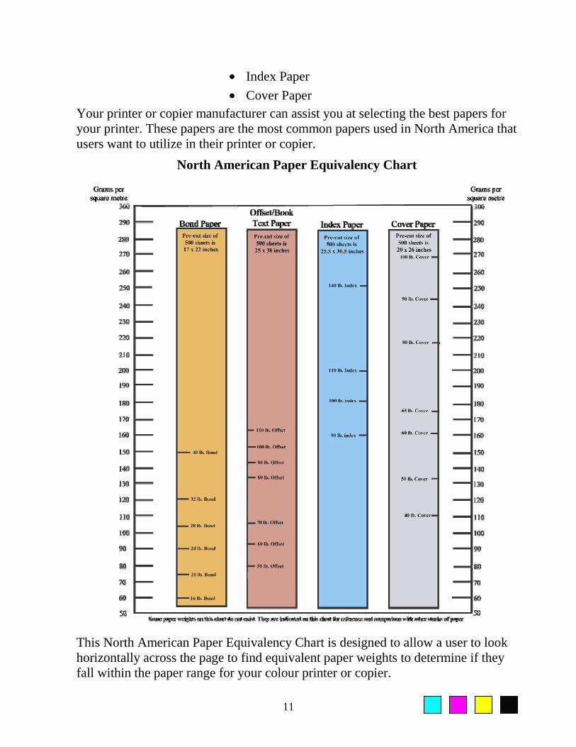
• Cover Paper Your printer or copier manufacturer can assist you at selecting the best papers for your printer. These papers are the most common papers used in North America that users want to utilize in their printer or copier.
North American Paper Equivalency Chart
This North American Paper Equivalency Chart is designed to allow a user to look horizontally across the page to find equivalent paper weights to determine if they fall within the paper range for your colour printer or copier.

12
For example, a 24lb. bond paper is approximately the same weight as a 60lb. offset paper and they are both close to being 90 grams per square meter. Grams per square meter are a paper weights used outside of North America but are gradually being added to Canadian paper packages.
This chart is only meant as an approximation. Always inspect the paper label from the manufacturer to obtain actual paper weights and thicknesses.
Paper Feeding
Half the battle of printing your document on your colour printer is making sure that the paper you select feeds into the machine. Glossy and coated papers typically cause the most problems when fed into a laser printer. These types of papers come predominantly from the printing press environment. The primary reason that these papers have difficulty being fed into a printer is the strong static electric charge which holds the sheets of paper together. When a stack of this type of paper is fed into a colour printer, the feeding mechanism of many printers is unable to separate the statically charged paper which causes a mis-feed.
Other issues that can reduce paper reliability through your printer or copier include:
Paper dust from cutting the paper. The dust from the stacks of cut paper can make its way into the printer or copier and cause reduced quality issues by blocking the transfer of colour to the paper. Coatings and Powders used on a printing press. Some users would like to feed pre-printed (from a printing press) documents back through a colour copier or printer. Sometimes this will not work. Some coatings used during the printing press process prevent toners from being “fused” (heated) into the paper. This leads to reduced image quality or toners that will not stick to the paper. Always ask your Printer to blow off any excess powders or coatings used in the printing press process. Extremely thick papers. Some thick papers can not be handled by the feed mechanisms of laser printers and copiers. Paper that can not be fed causes the printer to cease operation.
Rule of Thumb for Paper Try to utilize the papers recommended by the printer or copier manufacturer. If you decide to try other papers, the results that you receive on those papers can range from spectacular to horrible.
Spectacular Papers for toner based printers and copiers are usually bright white, smooth papers to offer the best transfer of toner onto the paper. Your printer or copier manufacturer can assist you with other types of papers.

13
Mediocre Papers on toner based colour printers and copiers would include 20lb. bond recycled paper. While this paper will go through a toner based copier/printer, the colour results would be considered mediocre compared to the bright white smoother papers.
Poor performance paper would be papers that offer unacceptable printed colour results, papers that adversely affect the printer or copier or papers that can not be fed into the printer/copier with a high reliability. If you find a paper that does not offer you results to your satisfaction, you will need to find another similar type of paper or use one of the manufacturers recommended papers.
For Inkjet printers, a wide range of papers designed specifically for ink based printers offer the best results. Utilizing bond papers on inkjet printers can lead to printouts that have absorbed too much ink into the paper and significantly reduce the quality of the colour output.

14
Designing Your Colour Documents Properly Many of the colour printing problems that occur can be easily resolved during the design process of your document. This section is structured to offer information on the correct design of a colour document when printing it to a digital colour copier or printer. It offers many tips and explanations that leave you to decide whether they fit within your preferred workflow.
Software Category
Before creating a colour document you must identify a category for your software. There are many different software on the market that allow you to design in colour. How each software works with colour will determine which category they fall under.
In the most simplistic term, software is either RGB based or CMYK based. Depending which software you utilize will determine how you should create your colour document.
The following list offers a summary of some of the more common software available on the market today and which category they fall under.
Software RGB
Colour Selection
CMYK Colour
Selection
Pantone Colour
Selection
Other Colour
Selection
Microsoft Word/Excel/Powerpoint
PC – No
MAC - Yes No HSL
Corel WordPerfect No
Corel Draw! Many
Adobe Photoshop Many
Adobe Illustrator Many
Adobe InDesign Many
Adobe Acrobat Many
Quark Xpress Many
AutoCad No Custom Palette
Frontpage No No HSL
DreamWeaver No No HSL

15
In general, most graphic based software allow for RGB, CMYK, Pantone and other methods for working with colour while business, animation, video and internet based software typically work in RGB.
As the colour marketplace continues to mature, many of these software will most likely be expanded to include a wider range of colour selection. As a good example of this continued development, MS Office for the Macintosh incorporates CMYK as a method of working with colour whereas the PC version does not.
Please note that the information contained in the previous chart was current as of the writing of this booklet and may have changed with the release of new versions of the software.
It is important to know which colour spectrums your software works with so that you can better determine what your print results and workflows will be.
Software Selection for Colour Documents
Some software allows a limited selection of how to work with colour, while other software offers you a plethora of colours to work with. Regardless of which software you use, there are some general tips and guidelines that the user should be aware of.
Guideline #1 - Work in CMYK colours - If you can
As a general rule of thumb, if you can work using Cyan, Magenta, Yellow and Black colours in your software, that is the preferred choice. The reason for this recommendation can be easily explained.
Colour printers and copiers use Cyan, Magenta, Yellow and Black to print colours onto the page. Instructing your software to place 10% Magenta and 10% Yellow (a red colour) onto the paper will yield your printer’s representation of those two percentages of colour on the paper. If you were to utilize a Red, Green, Blue based software and send the command 10% red to the printer, you will not know what percentages of Magenta and Yellow (The colours required for red) will be printed on your printer to represent 10% red. The conversion process occurs behind the scene usually at the printer level.
Working in CMYK offers the user more control over the colours than RGB. If you work in RGB you are leaving the decision of how the colours will print to some other process outside of your control. For some software, the user does not have a choice and must work in RGB. If you must use RGB for designing your documents, please use reference colour charts for matching or determining the availability of colours on your printer. Colour matching will be discussed later.

16
At some time in the future when colour management becomes a common workflow in everyone’s environment, it may become the norm to work in RGB, but for now, CMYK remains the preferred choice.
Guideline #2 – Work with CMYK or RGB, but not both in the same document
Another important issue when designing a colour document with software is to work in one colour space. It is incorrect to design a document that contains both RGB and CMYK elements. Everything on the page should be done in CMYK or everything on the page should be in RGB – not a combination of both. This is a very common error made by new users creating and printing colour documents. Controlling the colour is why you want to work in one colour space or the other.
Guideline #3 –Use TIFF, BMP or EPS File Formats for Colour Critical Images
The JPEG (Joint Photographic Experts Group) file format has been around for several years now and has been widely adapted on the internet and in other areas of design. There are several benefits that JPEG offers compared to other file formats including smaller file sizes, faster print times and an increase in portability. What many users forget is that JPEG receives it small size format from removing (compressing) colour from the image.
Depending on the amount of compression, the JPEG version of the image can print noticeably different from the TIFF or other non-compression file format. The differences could include colour shifts, reduced sharpness and unwanted artifacts which remain in the JPEG image. Once you save an image in JPEG format, you can not return to the original image. It is a good idea to save a copy of the image in the JPEG format and not write over or delete the original image so that it may remain in its’ maximum quality.
If you must use JPEG or prefer to use JPEG file formats, use the JPEG format with the smallest amount of compression or the highest image quality. This will minimize the loss of colour to the original image.
These represent some of the more general mistakes seen in colour documents. If colour document creators reduce or eliminate these issues, it will lead to a smoother printout of their documents.

17
Pantone Colours
Pantone Inc. is a company that was started in the 1960’s with the idea of solving the problems associated with colour matching on a printing press. Their solution was to create customized inks that when printed on specific paper(s) yielded the same colour, regardless of where the printing was done. As long as you purchased their ink and printed it on a specific paper, the colours would match anywhere in the world.
Pantone Inc. has been very successful at expanding their business to include textiles, plastics, architectural and design interiors. They have not expanded into a universal colour matching system for colour printers or copiers, instead; they are developing dynamic solutions for assisting users at obtaining Pantone colours as close as possible (not exact) from different colour printers and copiers. How accurate can a colour printer or copier simulate a Pantone colour? In some instances, it can be very close, in many other instances the Pantone colour is outside of the colour range of the printer and can not be reasonably simulated.
Since Pantone has never been developed for use on colour laser printers and copiers, this guide recommends avoiding the use of Pantone when designing for Final Output on your colour copier or printer if possible. Why use a colour matching system when less than 50%* of the colours you select will not print accurately or with a good simulation; especially for final output on your device.
Organizations that have remained current with technology have already made changes to their Corporate Logo Policies. As an example, the Konica Minolta Corporate Logo Policy indicates that the Konica Minolta blue is Pantone 300C when printed on coated paper on a printing press, but also indicates that;
CMYK colours are 100%Cyan and 40%Magenta (for CMYK printing press colours)
RGB colours are Red=0, Green=102, Blue=204 (for screen display)
Websafe colours: #0066CC for display on a website
Munsell Value: 2.5PB 4.25/14 (offers a 3 dimensional definition for Konica Minolta’s blue colour)
Pantone was designed to offer a method for matching colours on a printing press, yet on a colour copier/printer it can only offer simulations which can range from a close simulation to extreme colour differences. If the goal is to obtain a colour match on your copier or printer, Pantone is not a good method for matching colours.
The fact that many Pantone colours can not be simulated well means that you will not know whether a Pantone colour can be printed on your colour printer until you actually print your job. It is not a good time to learn that your Pantone colour can not be printed when you are at the printing stage. *varies depending on colour printer or copier

18
When it comes to matching or obtaining a specific colour, the best solution is to use a colour chart. The best type of colour chart to use is the charts which have been created in the software from which you are printing. If you are printing from Adobe Illustrator, you should obtain a colour chart which is created in Adobe Illustrator and print this chart from your computer to your printer using your preferred print driver settings (preferably the default print driver settings). This will allow you to visualize the colours available and offer the RGB or CMYK values needed to obtain this colour.
If You Must Use Pantone
There will be some users that must (or want) to continue using Pantone in their documents. Two examples of these types of users would include somebody that is designing a document that will eventually be printed on a printing press (which has access to Pantone colours) or a user that has many documents they have previously designed that contain Pantone colours.
If you are one of these users, your expectations of the colour print from your colour copier or printer falls into one of these three categories;
Category 1
The Pantone colour can be simulated well on your colour printer or copier. There are no issues with your print job.
Category 2
Your Pantone colour prints noticeably different on your colour copier or printer compared to the desired Pantone colour. At this stage, a user needs to investigate if a better simulation can be obtained from the printer. This can be done in a number of different ways. One of the best ways to learn if your colour printer or copier can better simulate your Pantone colour is through the use of colour charts from your printer. These colour charts allow you to view a wide range of colours on your printer to allow you to determine if you can better match your Pantone colour.
Colour charts will also identify if a Pantone colour is outside of the range of your printer. In other words, if the colour can not be printed. This will save time and frustration when determining if a printer can obtain your colour.
Once you have determined a better simulation exists, if your printer has a Pantone or Custom Colour Library built in, you can change the library to reflect your preferred CMYK mixture for a Pantone colour. This would allow you to specify your own preferred colour mixtures (CMYK) for the Pantone colour.
19
Category 3
Your Pantone colour prints noticeably different on your colour copier or printer compared to the desired Pantone colour and you are unable to find a better match from your colour charts. At this stage, you must choose between accepting the colour that is printed (or the custom mixture you created) or decide to print your document on another device that offers a better simulation or the actual Pantone colour. To obtain a better simulation of a Pantone colour, printing presses can obtain Pantone colours precisely and many inkjet printers can offer a better simulation. Inkjet printers printing onto their special papers have a wider range of colours than a toner based printer or copier and can offer better simulations.
While switching to another device may have your Pantone colour simulate better, it will alter the colours for the other items in your document.
Pantone Colours - Best Practices
There are several recommendations for users that wish to continue using Pantone in their colour documents. Users should always test their Pantone colours on their colour printer prior to designing their document. This will save time by determining in advance if your printer can obtain a good simulation of the Pantone colour you wish to use rather than learning during the printing process.
A second recommendation would be to use a printer that has a user editable Pantone Library. This allows the user to continue using Pantone colours in their software as they always have and have the printer lay down a user determined mixture of colours that best represents that Pantone colour.
A final recommendation for users that wish to continue using Pantone in their colour documents is to limit the number of Pantone colours to one or two Pantone colours. This is considered proper design and will also aid in reducing the frustration levels of working with Pantone on a colour copier or printer.
Technology and Design Considerations When a user designs a colour document, their expectations are that it will print similar to what they see on the computer screen. Needless to say, this rarely happens.
There are number of issues that must be planned for when you print your colour document. Some of these issues are due to the limitations of the technology found in the colour printer or copier and other issues are related to the actual design of your document.
This section will draw to your attention some of the more common issues that must be taken into consideration on your way to designing the perfect document for colour printing.

20
Matching Colours 100% Accurately
Imagine that you have a colour document on your screen and you are about to print it to your colour printer. The following items represent everything in your printing process that could alter or change the way colours print:
• The software application • The print driver • The Operating System • The RIP • The copier or printer with marking method • The paper stock
Changing any one of these items (or the printer) can alter the way colours are printed.
It is because of all of these variables that the following statement can be made. “Every colour printer and colour copier prints colours different”.
A user should not expect to design a single colour document and then print it to several different printers and obtain the same results. This is an unrealistic expectation with today’s technologies. While there are technologies that are showing some promise such as colour management to get closer to this goal, these technologies have not resolved the issue of cross-platform colour matching.
Until a cross-platform technology exists to match colours, a user will need to ask themselves the following question every time they develop a colour document that they desire to print with accurate colours (see page 6 for additional questions).
“What is my Final Output device?”
Once you know the colour printer or copier that you will be printing your final output on, it becomes easier to create a workflow and a method for matching colours.
It is estimated that over 90% of colour documents created in business today WILL NOT be printed on a printing press.
This estimate would imply that other devices such as colour printers and copiers are being utilized as final output devices for the vast majority of colour documents. Regardless of the colour copier or printer being utilized, it is possible to match colours 100% accurately on that device.

21
The Colour Matching Tool
The solution to matching colours on any colour printer or copier used for final output is the colour chart.
This sample Konica Minolta colour chart was created in Microsoft PowerPoint. Each one of the colour squares is labeled with its respective values for Red, Green and Blue which can be typed into the colour picker of PowerPoint and once the chart is printed on your printer, the colour seen on the printout can be obtained.
To utilize this method for matching colour, your printer/copier must be returned to its’ normalized or calibrated state. Once calibrated, this chart is opened in Microsoft PowerPoint and printed to your printer.
In order to use this colour chart for an extended period of time, you must calibrate or normalize your printer on a regular basis. This will allow the colour chart to offer selectable colours for users that print to the colour printer in a final output format.
From this colour chart, you are able to visualize how colours will be printed on your printer without a trial and error process.

22
It is important to note that the colour you see on the screen may or may not match the colour seen on the colour chart, but the colour will print properly. Most colour printer users are already familiar with screen colours not matching printed colours.
This method of matching colours works with all Konica Minolta colour devices and has become an integral part of the Konica Minolta colour experience.
Konica Minolta has developed colour charts in RGB and/or CMYK for all major software applications and now includes them with every colour copier sold. This allows Konica Minolta customers to match colours 100% accurately and also; equally important, quickly learn if a specific colour is out-of-range of the colour device. This allows the user to decide to accept the printers’ version of the colour, tweak it to their own preference or find another device (printing press or other colour copier or printer) that will print the colour.
Konica Minolta’s colour charts are the only known method on the market that allows colours to be matched 100% accurately. There is no other software or hardware that makes this claim.
Select the colour you desire on the colour chart that you printed on your colour printer or copier. Type the value from the chart Blue =150, Red=255, Green=200 into the Microsoft PowerPoint colour selector and the colour indicated on the printed colour chart will print.

23
Solid Colours
Many users like to create documents with large areas of solid colour. These areas could range in size from one-eighth of the page up to the entire page being covered with a single colour. This type of colour coverage is typically utilized in programs such as PowerPoint and in professionally designed graphics.
Most colour printers and copiers have difficulties printing some solid colours. The natural question after this type of statement would be; which colours?
It is not possible to offer a list of problem colours because each printer or copier will have their own specific solid colours that they are unable to print well. One of the main contributing factors to this issue is the technology that each printer uses to lay down their dots of cyan, magenta, yellow and black colours. A second issue is the dot patterns used by each manufacturer in their colour copier or printer.
As a user, you should test any solid colours on your printer prior to creating a colour document with a specific solid colour. It is much better to learn whether your printer can print this solid colour prior to creating the document rather than at the printing stage.
If you do not have the luxury of testing your solid colours on your printer prior to creating your document, here are some suggestions on how to modify the printer to possibly print your solid colours better.
Most colour printers have many different options in the print driver. By selecting or making changes to these options you may be able to have your solid colours print better. Please note that some of these changes will alter all items in the document and not just the solid colour you are trying to have printed better.
In the Print Driver, look for options such as:
• Changing the gradation or smoothing adjustments
• Changing the document type to Text, Text/Photo, Image, Map etc..
• Changing screens, halftones, dot or line patterns
• Increasing or decreasing resolutions
• Quality adjustments
• Some minor colour adjustments may allow the solid area to print better
• Changing the paper can also affect how well solid colours print
Most of these options in your print driver are altering the way the dots are lay down onto the paper in the hopes of having a specific solid colour print better. If you have multiple solid colours in your document, these changes may adversely affect the other colours or images.

24
Please note that some of these options may not be available in your print driver.
It is still a better workflow to test your solid colour(s) on your printer first before designing your document.
If you want to work with solid colours, here are some guidelines that will aid at minimizing printing issues with solid colours.
• Use lighter colours
• Use a pattern in your solid colour (a repeating pattern)
• Avoid utilizing colours that will consist of more than the combination of 2 of the primary colours (cyan, magenta, yellow and black)
• Convert an image into a monochromatic (single colour) image and utilize this as your background
• Try to keep your solid colour areas smaller rather than larger
Using these tips will assist you when working with solid colours.
Colour Gradations or Blends
Many designers and graphic personnel will utilize colour gradations similar to the gradation seen above in their designed documents.
Similar to the problems seen with solid colours, almost all colour printers and copiers have problems when printing some gradations. This issue is commonly referred to as banding.
A Colour Gradation with Simulated Banding
Every colour copier and printer has this problem with banding, but once again, the colours that cause banding for each printer are different. The technology, dot pattern and toner of each printer are the main contributing factors whether a colour gradation will print with banding.

25
The solution to resolve banding in gradations is similar to the solid colour solution which is to test colour gradations on your printer prior to printing your document.
If you do not have the luxury of testing your gradations on your printer prior to creating your document, here are some suggestions on how to modify the printer or your file to possibly print your gradations better.
In the Print Driver, look for options such as:
• Changing the gradation or smoothing adjustments
• Changing the document type to Text, Text/Photo, Image, Map etc..
• Changing screens, halftones, dot or line patterns
• Increasing or decreasing resolutions
• Quality adjustments
• Changing the paper can also affect how well solid colours print
In your document, consider the following to have your gradations print better:
• Use different colours
• Use a smaller area for your gradation
• Use graphic programs such as Illustrator or Photoshop to alter the number of colours or steps between the blends
• For more sophisticated users, change line screen frequencies and attach these frequencies to your blend. If your printer respects these changes when printing your document, you may be able to have your colour blend print better.
Please note that some of these options may not be available in your print driver or document creation software.
It is still a better workflow to test your gradations on your printer first before designing your document. Recognize that you will eventually find gradation colours that will always band on your printer regardless of your efforts to resolve the banding.

26
Registration Registration is important to those users that are going to cut the paper after their print job has been printed or for users that are printing colour on both sides of the paper. Printing on both sides of the paper is commonly referred to as duplexing on a digital copier or printer. Some printers can perform this task automatically, while others may require you to feed the paper through the printer a second time. Please see your printer manual to learn how duplexing is handled on your printer.
To begin this section, it should be made clear that the majority (if not all) of colour copiers and printers do not have the ability to offer 100% registration accuracy.
Most colour printer and copier manufacturers will specify how close their machine is capable of registering the front and back sides. This measurement is typically given in millimeters.
If the double-sided document that you print is mis-registered up to the manufacturers’ specification, it is considered to be correct for the machine.
If printers can not exactly line-up documents front to back precisely, then how do you obtain the highest possible registration for your document?
This mis-registration problem has existed for many years, even on a printing press.
Professional Designers have learned how to compensate for a known mis-registration to allow their documents to have the appearance of absolute perfect registration.
The following examples help clarify how to design registration critical documents.
Sample of Good Business Cards
27
The previous example of business cards represents the proper way to design registration critical documents. The yellow lines have been added to aid in the explanation of the design and do not show up in the actual design. The yellow lines represent where the paper is going to be cut. The page has also been cropped since the entire page is not required for this illustration example.
You should notice the following points about this design.
• The gray Bezier curves in the letter C in the back ground extends outside (also known as bleed) the cutting area. This allows for a cutting tolerance to compensate for the mis-registered prints. This is how you compensate for all colour printers – allow for tolerances.
• There is a gutter between the cards in the centre of the page. Many users may attempt to place the cards side by side in the centre of the page. Placing cards side-by-side is incorrect because the centre of the page can shift up to the manufacturers specification for mis-registration.
• Text is not right against the edge of the cutting area. Issues would arise when cutting if the text were to be directly against or very close to one of the cutting lines.
• For the best cutting results, an 8.5 x 11 inch sheet of paper should hold no more than 8 business cards depending on the design of the card.
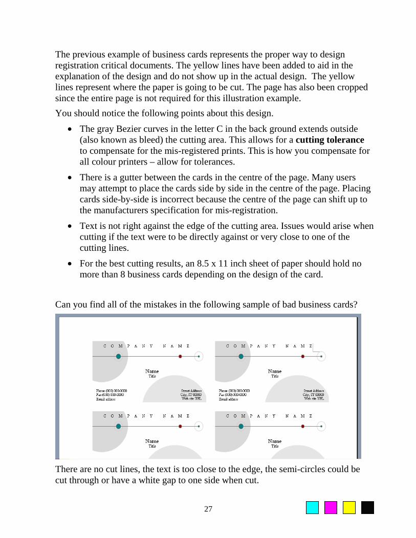
Can you find all of the mistakes in the following sample of bad business cards?
There are no cut lines, the text is too close to the edge, the semi-circles could be cut through or have a white gap to one side when cut.

28
The same ideas discussed with the creation of business cards apply to those documents that are created for duplex printing. You must design your document knowing it can not be printed with 100% registration and compensate within your document.
The design of one or both sides will have to extend beyond the cutting area and your document will need to be printed on a paper size that allows you to cut all 4 sides of the paper.
Final Tips and Tricks This section is designed to share some of the more common tips and tricks that users utilize when they are creating colour documents. Many of these tips have been shared by Konica Minolta customers. Working with PowerPoint It is very common to create two versions of the same presentation in Microsoft PowerPoint when colour accuracy is critical.
One of the versions should be designed while your computer is connected to your method of presentation. If using an LCD projector, connect it to your computer and select the colours based on the way they are displayed through the projector. Be sure to shine your projector onto the wall or screen you intend to use to compensate for any colour variations seen on the wall or screen.
The second version of your PowerPoint presentation should be completely independent of the first. Make a copy of the first presentation and open this copy in PowerPoint. Use a Konica Minolta colour chart to have your PowerPoint colours print properly to your colour copier or printer.
Logos Designed in Illustrator – Used in MS Office
When you design a logo in Adobe Illustrator and utilize that logo in Microsoft Office, be prepared for the logo to print differently from Microsoft Word than from Adobe Illustrator. The reason this occurs is that Microsoft Word will convert most colour files from Illustrator into RGB even if the original logo was designed using CMYK or Pantone.
The best solution? – Open the Adobe Illustrator colour charts from the Konica Minolta suite of colour charts and save it as a format that can be opened into Microsoft Office.
Import these files you created into an MS Office Program and print it.

29
This allows you to visually see how colours selected in Illustrator will be affected when imported into MS Office applications.
Matching Colours in a PDF Workflow
Many users are considering a PDF workflow for their environment. One of the drawbacks of PDF has always been working with colour and not obtaining the necessary colour results from working in PDF workflows.
Konica Minolta’s suite of colour charts resolves this problem because you are able to open up our colour charts in your software application and make a PDF file using your preferred settings within Adobe Acrobat.
Print the resulting PDF file to your colour printer or copier and utilize this colour chart for matching colours.
For example, open the PowerPoint colour chart on your computer. Make a PDF file using whichever settings you have standardized on for your organization. Print this PDF file to the printer you will be using for your final output.
Anytime that you want to match colours 100% in your PDF file that was generated from Microsoft PowerPoint, select the colours on this colour chart.
Colour Workflows
Every colour copier and printer driver comes with a wide variety of options for altering your colour print out.
Samples of print drivers with options for altering colour output

30
A wide variety of colour adjustments in the print driver can be an advantage and a disadvantage.
The advantage is being able to adjust the colour(s) at the last minute prior to printing. Some users appreciate and use these adjustments widely.
The disadvantage is; through these adjustments, you will alter the colours to be printed on a normalized (calibrated) printer. As long as this document (or elements in this document) are never going to be printed again, this is acceptable. If the document (or elements on this document) are to be reprinted or used in another document, software program or by someone else, you have complicated your workflow.
The complication is caused by customizing your output to your own preference rather than accepting the printers default. How is someone else (or software program) going to match your personal preferences when they print?
It is for these reasons that it is recommended that:
• Try to avoid changing the colour settings in your print driver when you print your files. Instead, set the printer to a repeatable state.
• It is a good practice to install the print driver and never change the colour defaults. This ensures that a repeatable workflow can be achieved.
• It is good practice to correct all colours at the software level and print to a standard (calibrated) printer so that similar print results can be obtained every time the same document is printed or the same element is printed
The reason for these recommendations is easy to understand.
If you alter the colour settings in your print driver to obtain the results you desire, you will need to record these color settings you made for every document that you print if you ever hope to achieve the same colour printing results for that document or any element in that document.
If the printer can be set to offer the same default colour results everyday, designing your document to this default will ensure repeatable colour print results.
One of the only times that colour adjustments should be made is if there are deadlines to be met and the default printer is not offering the results you need. If you have read most of this booklet, this should not be an issue for you since you have taken the necessary steps to design your document properly.

31
Troubleshooting Documents
There will come a time when you print a colour document to your colour printer and the results will either be incorrect or the document does not print at all.
It is safe to state that if all of your other documents are printing normally on this printer and it is a single document that is not printing properly, it is probably the document that is causing the problem and not the printer.
To assist with these types of documents, here is a list of the most common issues that can cause colour documents to print incorrectly and some tips to assist at correcting your document issues.
When a document prints incorrectly or not at all, please investigate the following issues:
1) Fonts
• Change all of the fonts in your document to Times, Arial or another standard font. Corrupted fonts have been known to cause documents to print incorrectly.
2) Images
• Change your image formats. If your original file was JPG, try resaving the file as a TIFF, EPS and re-importing
• Try to never cut and paste images
3) Some printers will print your document up to the mistake. This is an important feature to turn on in your printer and will help you by showing you which page failed in the print process. This aids at finding the problem page(s).
4) Pantone colours have also been known to cause printing issues. As a troubleshooting test, try changing your Pantone colours to either CMYK or RGB and reprinting your document.
Conclusion Many of the issues discussed in this booklet are designed to minimize issues when printing in colour. Many of the solutions offered are generic in flavour designed to work with all colour printers and copiers.
Printing in colour is not difficult when an organization teaches you the correct way to print your colour documents.
For more information on designing colour documents correctly, contact your local Konica Minolta reseller.

32
Konica Minolta Colour Solutions Konica Minolta Colour Solutions for your business allow you to scan, print, copy, store and fax at an affordable price.
With fast output at up to 25 ppm in both colour and B&W, the bizhub C253 is perfect for all businesses, large and mid-sized companies, departments, branch offices and workgroups.
It's also a central document resource that puts you at the hub of your business, incorporating all-in-one print/copy/scan productivity. The built-in Emperon™ Print System gives you integrated print control with a simple user interface.
You'll also have fast, flexible scanning, high-volume Super G3 walk-up and PC network fax option, and powerful PageScope™ software to manage networked devices, documents and print queues more efficiently.
The bizhub C451 offers high-speed black and white output for everyday business document needs – plus; spectacular, cost-effective colour printing and copying for extra communications impact. Additional options allow for short run finishing and high-speed fax.
The bizhub C451 offers speeds of 45 ppm in black and white, 45 ppm in colour.
If your business depends on color graphics applications, add the Fiery® IC-409 Image Controller to your system -- and take advantage of advanced document control. The Fiery offers colour management and colour tools that allows you more precise control with the colours in your document.
For demanding environments that require high quality colour output at production speeds, Konica Minolta offers the award winning bizhub PRO C6500. The bizhub PRO C6500 copies and prints at 65 pages per minute and offers online finishing such as 200 page booklets (with trimming), post insertion of pre-printed documents, support for paper up to 13 x 19.2 inches and 300 g/m2, envelope production, 6 different online-folds and a variety of other finishing capabilities required for central reproduction environments and demanding printing organizations.
The bizhub C451
The bizhub C253