desktop publishing using fonts. the key to creating attractive published documents is found in the...
TRANSCRIPT

Desktop PublishingDesktop PublishingDesktop PublishingDesktop Publishing
Using FontsUsing Fonts
• The key to creating attractive published documents is found in the decisions surrounding the text.
• A beautifully designed and written piece can be quickly ruined because of the font style, size, or color. Making good design decisions increases the attractiveness and readability of your work.
• In the following sections, we will examine categories of text and contrast in font size, weight, form, direction, and color.

• Attractive typeset uses contrast to attract the eye, but the difference between contrast and conflict can be the difference between beautiful and repulsive. The goal is for your readers to look at your work and want to continuing reading.

Categories of Type• You can find thousands of different
fonts in different software packages or on the Internet; however, most of these fonts can be divided into five categories:– Oldstyle– Modern – Sans serif – Script – Decorative

• Oldstyle fonts have certain characteristics in common.
• They are based on the hand lettering techniques of calligraphers and scribes.
• They always have "serifs." Serifs are the little tags and the ends of the letters. In the oldstyle font category, the serifs are drawn at an angle because of the angle that a calligraphy or script-writing pen is held.
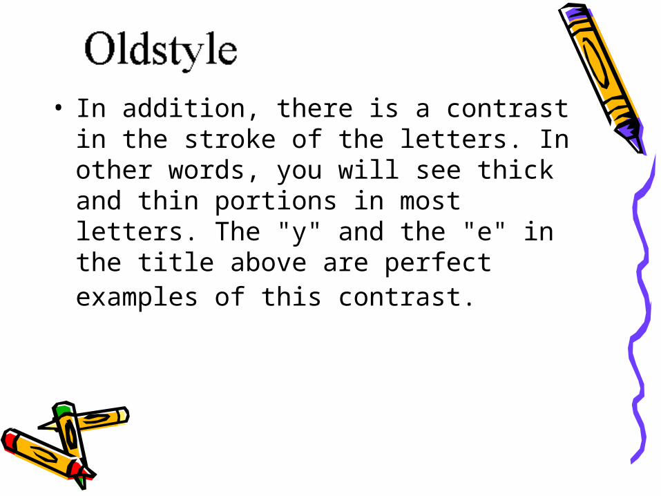
• In addition, there is a contrast in the stroke of the letters. In other words, you will see thick and thin portions in most letters. The "y" and the "e" in the title above are perfect examples of this contrast.
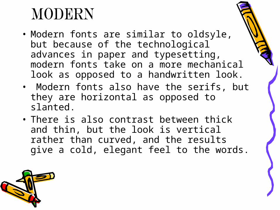
• Modern fonts are similar to oldsyle, but because of the technological advances in paper and typesetting, modern fonts take on a more mechanical look as opposed to a handwritten look.
• Modern fonts also have the serifs, but they are horizontal as opposed to slanted.
• There is also contrast between thick and thin, but the look is vertical rather than curved, and the results give a cold, elegant feel to the words.

• Since "sans" is French for "without," "sans serif" means "without serif."
• The lines in the letters are almost always uniform in width, without much contrast between thick and thin portions.
• Sans serif fonts give the text a clean modern look and can provide an attractive contrast to other text elements.

• Script fonts give the appearance of handwriting or calligraphy.
• Be careful to use Script fonts cautiously, and never put together long passages that use script fonts.
• Even though it adds elegance and class, too much can make the document difficult to read.

• Fonts that are decorative are easy to distinguish from others. Just ask yourself, "Could I stand to read a long section of text in this font?" If the answer is "no," then it probably is a decorative font.
• They add whimsy and fun to documents and can be powerfully attractive. Because of that, use them sparingly.

• This is one time when you really need to think about the message that is being conveyed by the font. These decorative fonts give a strong first impression so make sure you are giving the right message to the reader.

• In many desktop published documents,
you will find combinations of different typefaces and fonts.
• There are principles of contrast that will work to provide focus, organization, and flow to the page.
• The goal is to use contrast to provide attractiveness, as opposed to conflict that will offend the eye of the reader.
• Here are guidelines that will help you make your work pleasing to your audience.
Contrast

Size• Contrast in size is the difference
between large and small. • In order to use contrast in size, you
need to be bold in your differences. The difference between 12 and 14 may be hardly noticeable, but the difference between 14 and 24 can be quite obvious and provide a greater impact.
• Make sure that the item that you want to have the greatest impact is the largest.

Size• Small type can also get noticed. One
line of text in a much smaller font can provide just as much of a contrast as large sizes and draw the eye to the information written in smaller letters.
Weight• Contrast in weight refers to the
thickness of the letters. • The weight of the font can range from
light to ultra bold. • This is another place you need to be
fearless in your decisions - greater differences provide a greater visual impact.

Weight• In addition to impact, weight can also
add organization to the text. Bolded words can act as headings within the text and allow the reader to see at a glance the important categories of information.

Direction• Using word processors and desktop
publishing software, you will be able to change the direction of text boxes from the conventional horizontal orientation to an angled or completely vertical position.
• Use this technique with caution - your reasons for making this design decision are important.
Direction• In general, slanting upward provides a
positive feeling and slanting down gives the impression of negativity. If you don't want to give a particular impression, don't move the position of the text.
• However, the position of vertical text on the side of a newsletter, for example, provides a real drama and makes the document unique.
Color• Color is another way text can give a
message to the reader. • The warm colors (reds and oranges) pop
out on the page and demand attention. • The cooler colors (greens and blues) tend
to withdraw from our vision and don't carry the impact of the warmer colors.
• If you use cool colors and want to draw attention, you must increase the amount of text that is cool in color.
• Any color draws attention to the text and will make a reader stop and look.
Color• Again, be frugal in the use of colors - too
much can be detracting. One or two words in one different color is more attractive than six words in six different colors.
• Remember that black is also a color. There are many shades of grey that can provide the same contrast and attraction as changing the color palette of the page.
• Experiment until you get the look that provides the message that you mean to convey.

Credits• George Mason University, Online
Learning Academy