digipack drafts
TRANSCRIPT
Digipack Drafts
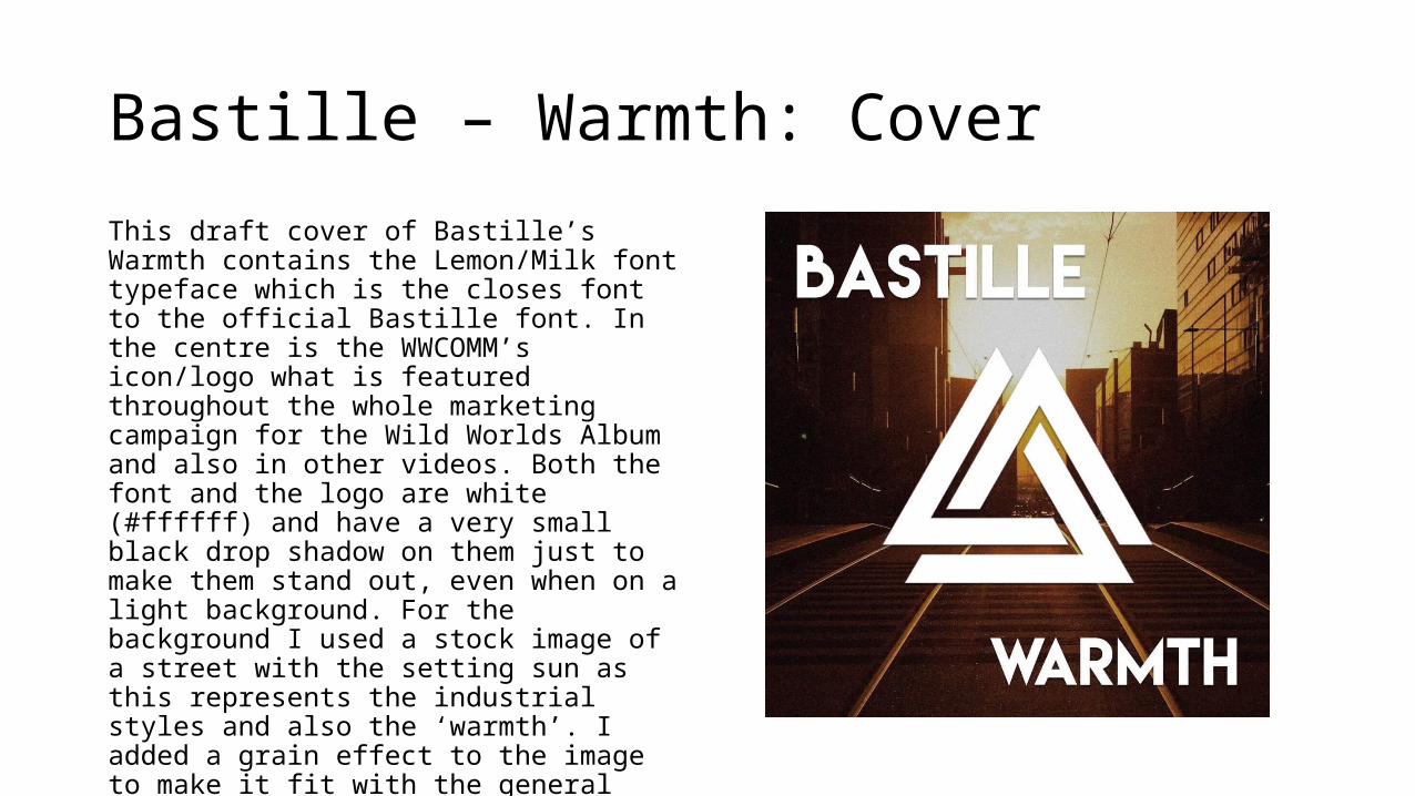
Bastille – Warmth: CoverThis draft cover of Bastille’s Warmth contains the Lemon/Milk font typeface which is the closes font to the official Bastille font. In the centre is the WWCOMM’s icon/logo what is featured throughout the whole marketing campaign for the Wild Worlds Album and also in other videos. Both the font and the logo are white (#ffffff) and have a very small black drop shadow on them just to make them stand out, even when on a light background. For the background I used a stock image of a street with the setting sun as this represents the industrial styles and also the ‘warmth’. I added a grain effect to the image to make it fit with the general style of Bastille covers and themes. I also altered the brightness and the contrasts in the image to make the sun brighter and the surrounding streets darker and more shadowed to put greater emphasis on the light and the ‘warmth’.
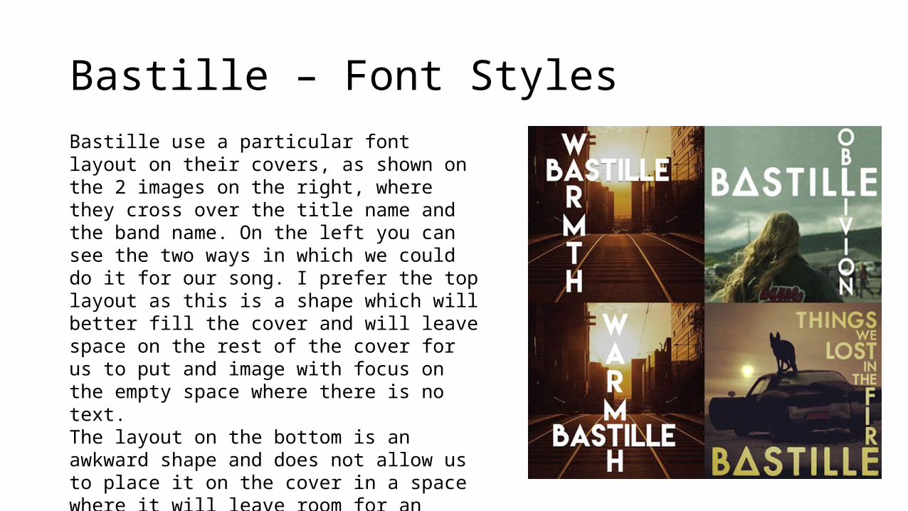
Bastille – Font StylesBastille use a particular font layout on their covers, as shown on the 2 images on the right, where they cross over the title name and the band name. On the left you can see the two ways in which we could do it for our song. I prefer the top layout as this is a shape which will better fill the cover and will leave space on the rest of the cover for us to put and image with focus on the empty space where there is no text.The layout on the bottom is an awkward shape and does not allow us to place it on the cover in a space where it will leave room for an image without reducing the size of the text.
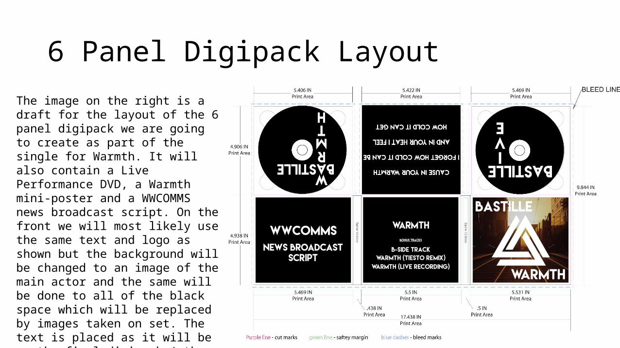
6 Panel Digipack LayoutThe image on the right is a draft for the layout of the 6 panel digipack we are going to create as part of the single for Warmth. It will also contain a Live Performance DVD, a Warmth mini-poster and a WWCOMMS news broadcast script. On the front we will most likely use the same text and logo as shown but the background will be changed to an image of the main actor and the same will be done to all of the black space which will be replaced by images taken on set. The text is placed as it will be on the final digipack (other than if we have to move it to better fit the panel with the selected image).

Bastille Custom Font - LogoThe font that best fits the Bastille font that I can find online is the Lemon/Milk typeface and is the font used in the logo which I created on the bottom image. I could have just used the official Bastille logo from online but as I cant find the exact font which they use it would not look completely correct. Therefore I created my own version so everything will look the same. I did this by typing Bastille in the Lemon/Milk font and then adding a rounded corners effect and after altering the ‘A’ into the triangle.
Official Logo
Custom Logo

Bastille Poster DraftThis is my poster draft for the Bastille Warmth launch poster. It is very basic and is only black and white but features everything I want in the final version. This sticks very closely to the common features of Bastilles marketing however I would like to add some new styles and effects into the final version by using images taken on set to make it slightly different and creative.At the bottom I have featured a 5 Star review by NME and I have used various different font sizes for the headlines dependent on their importance. The Lemon/Milk typeface is used throughout.